#even though the anatomy is still kinda wonky
Explore tagged Tumblr posts
Text

anyone else draw on animal jam today
i think the vander my friend drew is rlly good
#arcane#silco arcane#silco#arcane silco#vander#vander arcane#arcane vander#birg.art#birg.shitpost#please praise me i drew this with a mouse#even though the anatomy is still kinda wonky#i love the colour palette i used for silco tho :-3
39 notes
·
View notes
Text
i know its corny as hell and curmudgeonly to shit on the new generation of monster high designs, but i really don’t like what they did to lagoona. she looked a million times better blue than she does pink and she looks so much less unique now :(


i like they gave her a ponytail, and i like the pearl details in her hair, and her freckles are ADORABLE- but man this design is just kinda a smear of rainbow to me with a vague "sporty" vibe.
i like the idea of making her fins look more functional, but im also quite distracted by the fact she doesnt have webbed fingers, for some reason?
i also like that they made her fin-ears look more cohesive!! they looked kinda wonky in the OG design and- idk, i always thought they looked more like a part of the hoodie, rather than a part of her anatomy. having her hair pulled back really help them stand out. (while i don’t really like how they gave the “athletic” character big chunky earrings and a pointless ponytail holder, the OG design had that massive goofy seahorse necklace, so it’s not like this is a new problem)
i appreciate how, even though g3 is more "tame" compared to the OG designs, they let her keep a little "fishnet flair" into her new design!
honestly, i don’t hate the silly octopus sandals, even though i don’t think they fit too well with the rest of the design. still, they’re just so goofy looking, i can’t bring myself to hate them.
also why are her eyebrows so damn dark for no reason? idk if its just me but its like, very weirdly distracting?
i really like the idea of giving her an oversized hoodie i would do it unzipped over a bathing suit top looking undershirt- if an oversized hoodie is all she gets on top it kinda swallows her up and makes her look boring and not at all freaky, chic and fly :(
i miss her crinkly curly hair and flower hair pin sm :(
#delete later?#idk maybe#sorry to be salty but lagoona was my favorite of the original characters and i took this very personally#whyd you bastards give the WET FISH MONSTER DENIM? SHES GONNA CHAFE SO BAD YOU ASSHOLES
17 notes
·
View notes
Note
7, 17, 21, 23 for the art ask game ☆
thank you sm for asking 😭
7. if you want a wip…

for a friend, i still need to get more done on it…
17. (what do you like getting compliments about?)
anything, really. i just like interactions on my posts HAHA though i don’t get that many at times… it’s like… ok i don’t need it to survive but it’s super neat when i get them? helps me not feel like attention art gets = skill and quality. but i do love comments on improvements in my art skill HAHA self-taught things
21. (something i want to improve on) anatomy, perspective, shading/colouring? stuff i need loads of references and practice on when i have the time and energy!
23. (what’s something you hope people notice when they look at your art) oooohh this is a difficult one. i hope people notice the wonky bits in my art, actually. i want to know how to get better 😭😭😭 i’m kinda huge about improvement even though mine comes pretty slowly. i guess i also hope people notice consistencies in my art style, and experimentations that i try out when i do post them. ‘cause it feels more like i’m Doing Something with my art (if that makes any sense)
(from your other ask?) 20. (a piece of this year you’re really proud of) would this be 2022 march to 2023 march? i’m gonna assume it’s 2023 january to 2023 march.

i… don’t even remember if i posted this one. all the way from January. it’s the first multiple-people-in-one-frame thing that i think looks good, AND the first right-facing (ritsu’s left) face i’ve drawn that doesn’t look,,, bad 😭 and i just. really really like how i drew Shigeo. yeah.
thank you so much for this ask 😭😭😭 i had fun thinking about this stuff!
6 notes
·
View notes
Text
I made the most insane long rant ever so I will just try to shorten it here lol
The ML sucks. He is kinda bratty in the endearing way in the beginning, but after his official first full appearance in originals he is cringe and his character randomly switches from chill to worst ever asshole for no reason. I literally have no idea why Anya likes him. She admits he's hot but he doesn't have much else going for him besides like,,,having normal convos with her once in awhile. Is,,,is that the standard,,,, Idc how tragic his backstory is he's terribly written.
He can manipulate others bc he's the hottest boy ever- is pretty much his thing. All the girls around him become brain rotted upon meeting his eyes lol.
He has a random split personality btw and its cringe and not a well done portrayal of mental health at all
Anya kinda sucks. She's supposed to be our girlboss heroine but it doesn't feel like anything more than a forced gimmick the author is trying to portray. Usually she's dicked around by Axel with some tennis on the side. It really feels like Axel is the one this webtoon cares about while Anya exists to be in his circle.
"Unlike other guys who just want my body he sees me for who I am" girl did he not command you to be his stripper when you first met. Meet more dudes I promise there's better than THIS.
Also it's weird as hell how much she's sexualized. Especially when the webtoon talked about how much she didn't like having a mature body as a teen bc of how others perceived her. She's still a minor too!
The art style is trying to be mature and sexy, but bc of how wonky the anatomy gets and how much it's trying to copy a style the author is quickly using as a ref, it comes off as really cringy instead. Balloon titties and 5 layers of baby oil.

(If the ADULTS reading this look up the M A T U R E korean webtoon Sweet Guy (It's. Hentai. Lol.) and you will see exactly what I mean by copying.)
Listen, I know the author had health issues which contributed to the declining art quality, but this isn't even about that- its the switch to this complicated art style itself that was a mistake.
Story is the most important element though ofc. And here it's not well done. The set up is made up of crumbs so all the emotional moments that are supposed to be the pay off have no effect, they just feel confusing and out of place. And there's nothing likeable about any of the characters to save it. Except the mom. Bless her for putting Axel in his place once in awhile.
Idk it feels like this webtoon was tailor made to annoy me specifically. The relationship between the leads as well as their individual characters are pretty much the tropes I hate the most in a story lol. Insta love. Naive girl simping for an asshole who uses his mental health as an excuse to jerk her around. Bare minimum push back from her fake moment of growth before she's back on his bs. Etc. Etc.
I wanna scream GIRL STAND UP everytime I read a new chapter
Anyways I have a headache and it's 4 maybe I forgot stuff but this is the gist of it
Is it bad to slander an already complete webtoon years later?

138 notes
·
View notes
Photo

NEXT GENERATION AU
UZUMAKI MENMA!
I’ve briefly talked about him a little bit ago, when my wife and I just started to create this little AU and now we’ve really done nothing but play around with it and I’m honest - it’s so much fun. For someone that’s never spend time working with own characters - neither in fandom spaces nor for myself - this is new and exciting.
If you wanna keep reading about him: TW / CW mention of dysphoria for Naruto
Let's just be real for a second, who has watched Road to Ninja and didn't think that Menma kinda looked like a SasuNaru lovechild??? Exactly. So cy-mon and I sat down and said hey, why not make Menma into their little offspring instead of a crazy alternative Naruto version :') Menma is Sasuke and Naruto's biological child, thanks to the slightly complicated anatomy of Naruto. It's really only sparked after reading a fanfiction, where Naruto was having a body with attributes of both - male and female. Something something to do with the Kyubi, being basically a Kitsune. And Kitsune being able to shift their gender - Naruto's body accomondated to that part of mythology by pressing both biological genders into his anatomy. Naruto's still a man and refers to himself as such - actually he feels a kind of dysphoria about the parts that don't fit the way he wants to be seen as and sees himself. He's never told anyone and the only one that knows is Tsunade, who found him freak out about it :/ However, back to SasuNaru -> After Sasuke had escorted Itachi into the afterlife, Naruto and Sasuke had the chance to meet again - Naruto wanting to pull Sasuke back home and Sasuke who had lost it already, didn't think of coming home AT ALL. They had a physical fight but, long story short, one thing lead to the other and they --- they did it. Afterwards they parted - or rather Sasuke made a run for it and Naruto was brought back home. Time progressed until after Sasuke made Danzo join Itachi and they faced off against each other again. This time, with Kakashi and Sakura on Naruto's side - though things turned out different and Sasuke lost his life in that fight. (Or so they thought -yikes) They went back home & Shikamaru made sure that Sasuke was getting buried inside the Nara Forest - since no one in Konoha wanted to bury Sasuke officially on the Konohan graveyard. Sakura and Naruto were hearbroken. Naruto even more the moment he found out that he was pregnant and that his body could even do that :') After a lot of drama and chaos, mentally for Naruto especially, he decided to keep the child and that's how Menma was born. It took Naruto months to even acknowledge the child as his own and to name him - in the end he decided for Menma, so that they could fit together and eventually create a whole Ramen bowl together. Naruto struggled a lot with raising a child, he had no idea how to care for one and be a parent. So the village helped him, especially Iruka. After a few years, Naruto didn't exactly get over Sasuke, but he was able to take part in the normal life again and after some time he and Hinata actually started to get closer. They ended up in a relationship and moved together. While raising Menma, Naruto and Hinata had always cleared up for him that Hinata wasn't his mother - though Menma was very welcome to see her as such. Which he did. Menma's a very happy, enthusiastic child. He's always doing something. Raising him is a lot like having a cat suddenly being quiet in the other room and you just KNOW he's doing something he's not supposed to do. He's not really playing pranks or anything, though he's easy to get into trouble one way or another. His best friend's Shikadai and they are inseparable. Menma's really eager to learn things and is naturally talented with Ninjutsu. Unlike his father it was much easier for him to create shadow clones - which is probably because his chakra wasn't as wonky as Narutos in his age. He's got a little more chakra, thanks to the Uzumaki genes and will have an easier way with Genjutsu too - since that's really just an Uchiha thing. Menma doesn't know who his father is/was - Naruto does speak about him rarely but if he does he always tells Menma that his father was a very loving person and that he sadly died. Menma doesn't really push those things a lot, still he's curious. The older Menma got, the more problems arised though, since he started to also look more and more like Sasuke. Besides, many people in the village know or can guess who the father of the child is. So some villagers and also parents of other children, meet Menma with distance and whispered commentary. He ends up having trouble because of those Uchiha genes - that aren't really loved by the Konohan community and Naruto's afraid his own child will have to go through a similiar shunning that he had to go through. But at least Shikadai's always with Menma. Things really start to mix up even crazier, the moment Sasuke returns. Not only go Naruto's feelings for Sasuke crazy (while being enganged to Hinata and in the planning of their marriage), but also Menma will have to face the truth about his father
#naruto#uzumaki naruto#uchiha sasuke#sasunaru#narusasu#sasuke uchiha#naruto uzumaki#sns#menma#uzumaki menma#menma uzumaki#hyuga hinata#hinata hyuga#naruhina#oc#naruto oc#fanart#digital art#nevart#nextgenau
114 notes
·
View notes
Photo
As promised, I finally finished all my RVB pin-ups! (these are honestly pretty tame, mostly just cutesy poses and anatomy practice. I’m putting the full image under a cut below). I spent a couple of weeks drawing these, sometimes trying multiple poses until finally they looked right, and then I had to travel to scan the pictures... and the scanner was really wonky. It washed out certain colors, while over-saturating others. It was just really weird. So, the only solution was to try to edit and fix the scanned images on my computer, and since I only have MS Paint with no layers, this was a challenge. I basically had to add the colors, then go over my lines so they would be clear, and finally erase around the edges. It took another few days to fix them all, but I did it!
First up, is Leonard Church~
He gave me the most trouble... and why wouldn’t he? This CHURCH, after all. He lives to be difficult. I knew I wanted him to have the “mud-flap babe pose”, but I kept messing up his face, and didn’t realize how bad I messed up until after I inked and colored it in... at one point, I tried to re-draw the face and cut out the one that didn’t work, and paste the two pieces of paper together. It wasn’t worker, so I finally just traced over my own lines, did the face all over again, and he looked half-way decent. SO, I’m done with Church! Look at that smug expression, he knows he’s a jerk. Seriously though, I love how he turned out!
When it comes to his design, I have my whole RVB story-line with a scenario in which Church and Tex get to come back with synthetic human bodies (specifically, when the Epsilon AI was deconstructed, all of the data from his memories WENT somewhere; it was downloaded back into the original AI units, which weren’t “dead” after the EMP, just deactivated. revived by Epsilon’s data, all the AI were able to reactivate, including Alpha! now HE is the one who is carrying on with the memories another part of him left behind... whoops, that’s sad, but don’t worry! he now also has the chance to feel better~). His was based on the DNA of the Director, but he’s not a clone, exactly. There’s a similarity for sure, but they’d probably look more like brothers. Church is considerably shorter, and even when he was “fresh out of the oven”, he’s more chunky too. As time goes on and he’s able to eat REAL FOOD, Church gets nice and chubby. He also wanted to be strong enough to actually pick Tex up, so that was his whole motivation for muscles. He has fairly long hair at first, and later cuts and styles it to this (imagine it feels like a silky-soft hedgehog). He wound up with some face-fuzz, and wasn’t sure of he should keep it or not... he doesn’t want to seem like he intentionally looks like the Director, but also? If he tries to avoid looking like him on purpose, he’s still letting that dude influence his decisions. Church finally asked Carolina (only fair, because she has to look at him), and she said it kinda suits him, especially since he has a squared jaw. So, the face-fuzz stayed~
29 notes
·
View notes
Note
I really enjoy how you draw poses and such things and I was wondering how did you develop drawing poses? because I have been struggling to even draw a pose and idk where to start
i started out w directly tracing references and then moving on to drawing freehand while studying references. i also took a figure drawing class a while back and that really helped me get better at drawing bodies and poses. theres many virtual classes or just videos/photos online that you can study to practice figure drawing.
if it was safe id recommend in-person classes, bc studying a 3d form and translating it to paper is very different from studying a flat image and copying it to another flat image. but sadly....covid -_-
if youre having trouble finding ideas for poses/references:
adorkastock (formerly senshistock) is the goat, i used her stock photos in my 2011 deviantart days and i will browse her stock photos for references still! here's her website w all her links/social media sites/etc > https://www.adorkastock.com/hub/
google images can be useful too, searching terms like "person holding phone stock photo" can give you generic poses, though specific angles/poses might not be so easily found.
csp does have 3d models and while they are useful for perspective/angles i think the models themselves are kinda wonky in anatomy so i dont use them too often. still useful sometimes!
i also like to look up random advertisements/modeling photos if i want to draw someone standing/sitting but in a ~cool~ way, if that helps lol
#referencing screenshots/comics/advertisements/anything really#i talked a lot but tbh i just learn from a lot of diff things#answered#anonymous
5 notes
·
View notes
Note
Got any tips on figure drawing and anatomy?
tbh, i don’t really know if i have much to offer in terms of anatomy tips?? i get asked this a looot and i never know what to say bc its hard for me to explain, or know what would be helpful,, really all i can give advice on is honing your observational drawing skills and using references! i think drawing from life can be one of the most helpful/important skills for illustrative artists. that doesnt mean you have to sit still for hours drawing a still life or figure (though tbh figure/gesture drawings are a great option for learning anatomy) but making sure you’re referencing from real objects/people, or looking at how other artists stylize certain attributes can be a huge help! with anatomy specifically, its good to actually understand how the human body is put together, and how muscles/bone structure affect the outside shape of the body. You can break down the body into simple shapes, sure, and that’s a great start! but for the more detailed curves and bumps, if you don’t know *why* they exist, its hard to draw them correctly! if that makes any sense?? for example, i see a lot of beginners draw bumps on the sides of the wrist when drawing hands, but sometimes it may look awkwardly placed or wrong because they’re only mimicking what they’ve seen other artists do, and not thinking about the actual wrist bone that causes that bump. same for the collar bone, lots of people learn to stylize it as a line but have you looked at the actual shape of one before? do you know why we draw it curved in or how high in the chest it is? that being said, its not like i consciously think about that every time i draw, and i’m no expert on muscular or skeletal anatomy by any means slfdlmfs,, this may all seem obvious to some, but i think in general its important to consider and understand how the body is put together, even just on a subconscious level! you don’t have to learn all the muscles in the human body and a lot of this stuff is picked up from just drawing or observing real people, which again is probably the best form of practice. don’t be afraid to use references, especially of yourself if you can! I am constantly referencing my own body, by taking pictures of myself in the mirror or of my hands and then stitching those together to form the pose i want to make. using online models can help too, you just don’t want to rely too heavily on referencing them as a lot of times their features can be kinda wonky lol im sorry this advice basically boils down to “practice more and draw from life”! i could try giving specific tips but im not great at making tutorials or explaining my process, and i’m more of a visual/kinetic learner myself, so actually drawing and studying other artists’ works is what helps me best! if you don’t care to draw from life, that’s perfectly fine and understandable, there’s no one right way to do art and its okay to find observational drawing tedious and boring! you can still use observational skills on already stylized art and reference how other artists stylize things to learn, just be careful about heavily referencing and such ^^; i hope i helped a little bit and good luck w/ your art!
#ibbletips#long post#while i heavily advocate for observational drawing its like#yes drawing from life and practicing figures and#all those traditional exercises will help you improve#and if you're main goal is to get better then sure go at it#but also art should be fun and enjoyable and if you're just#not into that stuff then dont force yourself#focus on your own personal goals for art and think about why you create it idk#Anonymous#askibble
32 notes
·
View notes
Note
You have the tag OOC ART, and i like it a lot! How about IC ART? What does Eddie's art style look like (if its anything more than stickfigures)?
Hello! Thank you and I love this question! I may have mentioned Eddie’s hobby of drawing before on this blog? But I guess now I can go into detail about it! Eddie draws quite often! In fact, he’s semi-gotten in trouble for drawing on the walls of his cell/room? Arkham doesn’t REALLY care, because they don’t care about maintaining the rooms much. However, some find it rather abhorrent. And as I’ve said before... Eddie WILL draw on walls, still. No matter where he is. If he’s living somewhere, you’ll probably see lots of drawings on the walls unless he’s just moved in. As for his art style? He’s kinda like Bob Ross in the fact that he can draw scenery, and he can draw cars and such... but people and animals? He’s not nearly as good at drawing them and therefore doesn’t draw them too often. However, if he was to draw a person... they’d look similar to how a beginner artist may draw realism. The anatomy is kinda wonky, and it looks more creepy than anything.
Scenery, though, he’s pretty good at. He could probably draw similar to this;

(Not MY art, but found on Pinterest, doesn’t seem to have a source beyond “how to draw” examples.) But mostly he draws blueprints for his plans, which would look similar to this;

(Yes, this is a Star Wars, but it’s the best example I can find on Google.) And when he’s drawing for leisure, sometimes he’ll draw scenery as seen above. But typically he just draws/paints designs or whatever’s on his mind... it’ll be a bit more abstract even? Designs, he’ll draw question marks ofc and just random doodles of other symbols/objects such as flowers, cars, and sometimes just really nothing if he’s stressed... he’ll just take the pen and just go crazy with it. Sometimes he will draw people... but like? Since he’s drawing more as a hobby and not professionally... he’ll probably draw them rather poorly and rushed. When he doesn’t attempt realism, I’m... not actually sure WHAT his style would look like? Probably not something cute, but not too ugly either. He HAS drawn himself quite a bit before because of course. I believe I once said that while spandex design is not canon to this blog, meaning Ed’s never worn them and has always just worn the green suit & bowler hat for his R!ddler get up, I mentioned he might draw himself in something that may resemble the spandex just because it’s easier for him to draw and fewer details. But no matter what, his style is definitely sketchy and a bit messy if he’s not seriously illustrating for blueprints... and even then, they may be a bit sketchier than the above example of the Falcon lol!
6 notes
·
View notes
Photo

I’m being highly critical on the manga but I don’t mean to be insulting or bashing the creators -if someone gets that idea, I’m sorry and don’t read because I have very little good things to say about this product…
The manga is poorly written, drawn and executed. The worst is definitely the plot, it has been squeezed into 2 volumes and still holds some original PT elements, like Neko-sensei, with no explanation what so ever. The theme has been made more to the Japanese culture and school life, not Germany.
I personally hate it how they turned the characters Japanese (this was probably to appeal to the main audience, the Japanese youth) when the original anime was set in German and they put a lot of effort into executing it. They gave Ahiru and Rue Japanese surnames, Arima and Kuroha, and those names stick with them even though they’re manga only. Pike and Lilie's counterparts are Mai and Yuma (excluding Ahiru whose name is meant to translate to the spoken language to mean “duck”). One of the PT universe things is they have only first names -rather rare or made up ones- like for example many enemies have in Sailor Moon or pretty much every name in Dragonball series. I’ve seen many fans very critical about these extraordinary, even silly names. Personally I know this is a “thing” in Japanese anime, they like to play around with names and English language and I don’t care much about it anymore.
There are many new plot devices and stuff, like starcandy (kinda same as valentine choco) and the Raven being Edel, who’s been reformed as this incredibly busty and sexy lady who tries to pair up Ahiru with the Prince. Ahiru is a normal girl, not a duck. Ahiru also resolves she’s in love with Mytho, and that’s her motive to look after him. Mytho is called a Prince by the Raven, no reason. His heart got shattered because he had some kind of “power” to heal wounded little animals, no explanation. When the Raven (no explanation what it is and where it came from) wanted to steal his heart for some reason, Mytho’s “power” called forth a sword out of nowhere and stabbed the heart in pieces.
The Raven/Edel wants the heart so she lures Ahiru to collect them as Tutu. The idea is the same. In the end, no conclusion, rivalry goes on, Fakir was just being weird and mean with no coherent agenda, only wanting to protect Mytho from the raven but also wanted to stop Tutu. He briefly lamented his own inability to fight without fear and was jealoys of Tutu who was fearless and later awknowledges Tutu and prince as inseparable lovers. Fakir also doesn’t get in danger of dying. He does almost nothing important. Rue’s role was guite the same with some personality changes towards the end. It was a story of the rivalry of the two ballerinas.
The art is bad. Wonky bodies, anatomical mistakes, uneven style and a bit unsolid totality (just the cover of 1st volume with Tutu is extremely heinous). I can tell the mangaka was very unexperienced (I think it was her first manga) and it shows. I can see her potential -she could become much better - but the main issue is just plain lack of practice and experience. I’ve seen doujins that outshine this manga in a heart beat. Also the style all in all is completely different, not even trying to mimic the anime, and there are several changes in outfits and characters. Pike and Lilie have been replaced by the artist’s own creations as well as Edel. No Drosselmeyer. No Tale-Spinners (nothing of 2nd season). I don’t get Edel. She’s just a fancervice figure. Rue’s anatomy looks weird when she’s Kraehe and her nudity is exploited a lot. And this is a shoujo manga (manga for girls) so I wonder to whom all this female fanservice is directed to (I noticed this mangaka created a yuri series after PT so yeah…)?
Tutu and Kraehe’s tutus are slightly different, Tutu dons a pink tutu and Kraehe has more accessories. I still think it’s not a complete failure, but with little repairs it could be a lot better. When seeing this the first time I was shocked and wondered how could something this bad get published. I’m being higly critical because this is a product supposedly produced by professionals and I only bought it because of my love to PT. The standards just seem so low. I could go on all day about all the details but this pretty much sums it up for me.
To me this manga is more like a fan’s own interpretation of the first season and their own preferences clearly show (no fakiru or ruetho but strong Ahiru/Tutu x Mytho content). I don’t understand why this was made the offical manga when it’s so different from the original story and anime written by Itoh. I mean, why does it exist? Why make it so different? Just for kicks? Is that what fans would really want?
I was dissapointed with the manga, but mostly just sad. This had so much potential. And even more sad, I wouldn’t recommend it to anyone exept maybe to those who already are PT fans so they can see how bad/wrong it is and add in the supremety of the anime. But life goes on, I think this manga was unnecessary but if someone still enjoys it then it’s good.
And after all, it is NOT the true version. The anime is the original even thought most anime are adaptations from manga. So I can always console myself with this fact. Itoh created fakiru and ruetho and a good story. Thank you.
You can read the manga in English from here: http://mangakakalots.today/princess-tutu-chapter-1
Scans by me:


The interviews didn't do much for me. I got the feeling the director was just telling us ”deal with it, that's how this story is and if you don't enjoy it that's because of your own negative attitude.” Basic Intellectual story and explanations are overrated apparently... But yes, it doesn't come as a surprise that a producer defends their product.
I believe most of the readers got the point that ”these silly things are just a norm in the PT universe, don't try to rationalize them.” (it was like that in the anime too), so I feel this interview kind of underrestimates the readers. And even if we can enjoy different versions of Tutu, the main issue that left so many confused is because the manga is very different and it has plot holes. No excuses. We didn't expect to get that. Like I've said before, it's not the end of the world, but it's the reason why this manga is unpopular among many fans.


#princess tutu#manga#my analysis#critical sister allert#not a fan of the manga#I love the anime#and I only watch the Japanese dub anime#scans by me
10 notes
·
View notes
Note
Have you ever considered making a YouTube channel? I would love to see the process of making your art!
I do think it’d be nice to make speedpaints but I currently don’t have any kind of video recording or editing programs with which to make them, ahah… also I can’t imagine anyone wanting to watch a speedpaint without some music on said video, and there is the small issue of youtube and copyright and all the songs I like presumably being Very Copyrighted
so it’s not a possibility I’d write off forever, but I don’t know how I’d make it happen right now :’>
but if it’s my art process you’re interested in, I can at least go through that step-by-step with some screenshots!
step 1: draft! usually either a very tiny chibi or barely more than a stick figure, my art always starts like this so I can figure out the pose without spending like an hour on a full-sized sketch that doesn’t even work in the end

this then gets resized to whatever size I want the final picture to be:
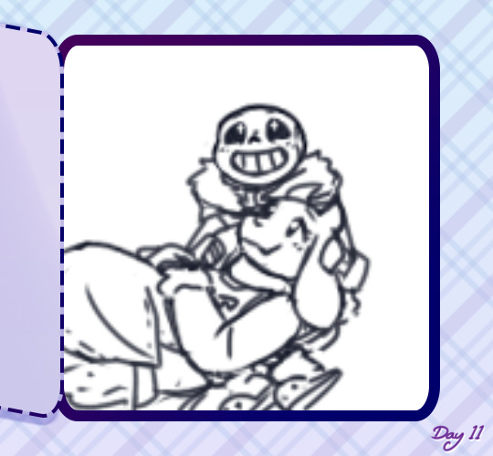
drawing at that size usually means the anatomy is pretty wonky though, and the lines are too thick and blurry to be much help for the actual lineart. if a background is vital to the whole piece it’ll get drafted here too, but with space backgrounds like in this I can just fit it in around the characters. (that’s generally terrible art advice though, please do not do as I do :’D)
step 2: sketch! still very rough, but a lot easier to work with later. I do anatomy sketches as I go but there’s rarely any need to keep those layers
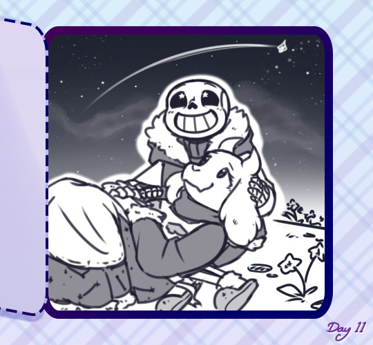
I don’t usually “colour” sketches like this but knowing I’d be sharing this I wanted to make it more readable, since this is still what I would consider an unpresentable mess not worth posting uvu;;
(also if I’m doodling, this part sorta gets skipped in favour of just letting the lines be a bit sketchier and rougher than usual)
step 3: lineart! literally the worst part always.
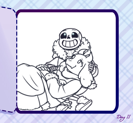
it’s worth it in the end, but… yeah this isn’t ever the point where I’m like “yes this is a Good Picture that I Will Be Happy With :)”
(I do lineart with SAI’s default pencil brush at a size of 3 to 5, opacity around 75%, if that’s of any interest)
step 4: flat colours! I have probably the slowest possible way of doing this, but after how tiring lineart is I find it pretty relaxing taking my time filling each colour in under the lines. every individual colour gets its own layer so they can all be shaded individually too
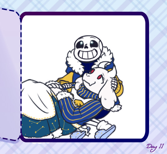
if I’ve drawn the same character in that same outfit before this is also where I’ll do the line colours, but those rely on being darker than the shading of each colour, so for a character or outfit I’ve not drawn before that can’t be done until after the shading. fortunately not the case here!
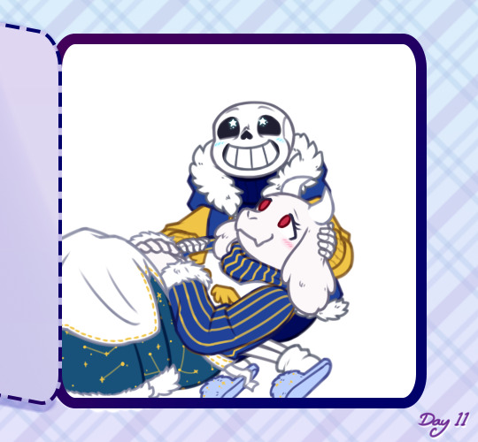
generally shading would be next, but there also comes a point where I have deal with the background now or I’ll be even more frustrated by it later, so - step ???: background! whether I do it lined or lineless pretty much just depends on if there’s any straight lines involved
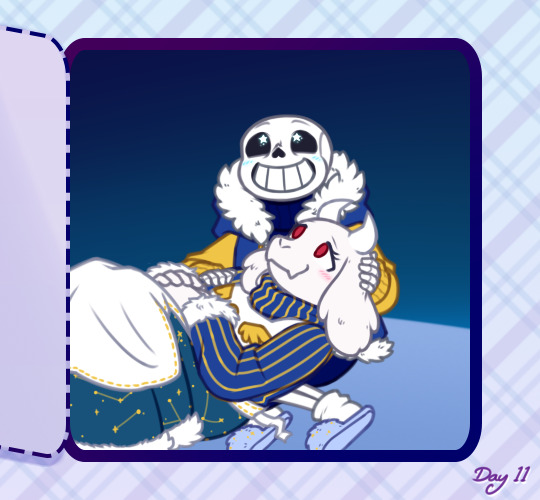


…backgrounds are kinda too individual to explain in general, but for this specific one all the starry details are luminosity layers. stars are done with this brush but I do quite a bit of erasing and hand-drawing stars too, and I use SAI’s default brush set to spread for galaxies
step 5: shading! aka the best part, the point where I go “oh hey this looks decent actually. when did that happen”
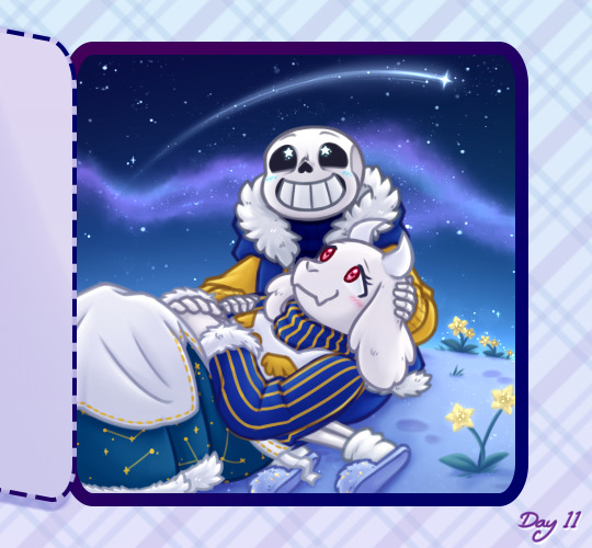
my usual shading style is every colour gets 2 darker shades and 1 lighter shade, each shade getting its own clipping layer attached to each colour. this was more obvious when I used to cel shade but soft shading makes my art look so much better ahah
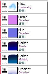
step 6: layer effects! multiply and luminosity layers have been my go-to for the past 4 years, but I can’t believe I only realised how good overlay layers are in the last year and a half. they’re so good
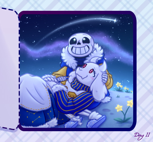
here’s the specific effects being used here:
aaand step 7: final touches! usually consists of any glowy outlines, text or things that need blurring in photoshop, a final luminosity layer at around 10 to 20% opacity for extra highlights (especially needed for dark scenes like this, those darker layer effects tend to make the regular highlights from the shading less vibrant), slap a watermark on there and call it done
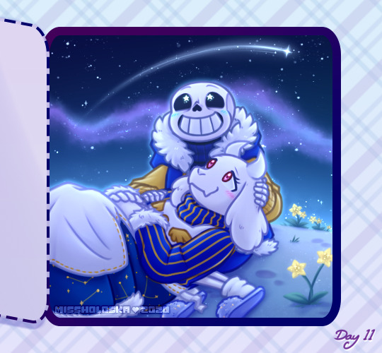
and then you’re ready for step 8: spend an hour staring at every pixel for mistakes, before spending another hour fighting the anxiety about posting it
bonus: even though I can’t make a speedpaint I can throw all those screenshots into a poor quality gif for you to watch, at least!

one final thing I can mention: not including the draft and sketch layers or all the parts of the advent calendar windows, just the finished art itself - this is made up of 102 layers. and that’s with me merging a lot of layers because SAI has a layer limit and takes an eternity to save if there are too many. people who can draw a whole piece on a single layer confuse and frighten me
#anonymous#holoskart asks#holoskart rambles#honestly my art process is just a bunch of weird habits I wouldn't recommend imitating :'D but I hope this is interesting enough??#also sorry for taking a while to answer this! I probably could've used a piece I'd already finished to explain all this#but it seemed better to work on something with the intention of showing each part of it#long post //#wip
32 notes
·
View notes
Text
Art Growth Compilation

I really enjoy doing posts about improvement in art.
It makes me feel better about my work, especially with how busy I am these days.
I wanted to compile all the comparisons I’ve made over the years and kinda discuss the posts, for myself or others.
I thought it’d be funny to start with comparing how I first drew on a tablet, using dodge and burn tools, to how I do now which is using layers and actually painting. It’s funny to look back on that, you know?
I linked the post I made, compiling all the month to month memes from 2003-2017 that I try and do yearly. And everything else is under a cut ;w;’‘/

Most artists have done a drawing of themselves and a few Pokemon, or their team. I did that in 2010, and was dissatisfied with my work...
I took a crack again in 2013 after I’d learned to draw more animals and not be so Edgy(tm) I really liked the results. I still didn’t use references though, because I was lazy. I just didn’t want to. I still was on that boat feeling like I was CHEATING. I wasn’t being CREATIVE if I looked at references.
Artists get stuck on using reference and it’s AWFUL. USE THEM. USE TWENTY. LEARN!! It’s so HELPFUL, I wish I had started sooner.
In 2014 though -

I tried again.
I had gotten better at anatomy, but most of all, I started to work off references more. I started to really focus on not stylizing so much, but to work on actually making things look like things. I started to work on caring about COMPARISON sizes. Composition!!
While Pokemon reference sizes are -wiggle hands- and while my team changed up, I was satisfied that I could draw Arbok ACTUALLY like a cobra now, Meowth is easy given it’s just a noseless cat so to speak, Haunter is literally a triangle cloud - I was satisfied having drawn that team.
My secondary team in the new games? I was excited to draw them. It was fresh and new and FUN and it turned out PRECIOUS.
I learned better how to proportion things in an image for layout, and just... making characters feel COHESIVE in the same space.
It was a nice thing to keep visiting. I have a sketch in the works for an update even hopefully.
These pieces are kind of interesting to me too, because they’re towards the end of my era of THIN lineart?
My lineart has gone from this, and THIS, to this.
Literally I use to not believe in line weight, I can still do thin work of course, but I’m not a fan of trying to FORCE it like I use to? Even the second link, I went from the SMALLEST brush in Sai, to using a marker brush that had barely ANY give, to a custom brush on Sai that acts like a Paint Chat brush I use to use with friends online!
That’s what I mean about style too, like you may reserve yourself about things - like not coloring black in and outlining with white, or certain ways you do things. But the growth and changing and figuring FUN ways to color that black etc is where the fun of art comes in, to me??
Learn. EXPERIMENT. PUSH!
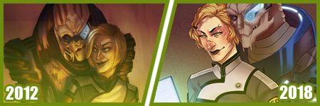
A few months ago, I did my first redraw. Of this piece from 2012.
Six years difference.
This was interesting for a number of reasons. There’s aspects I like more in the old one, but not many. I really like the pose a bit better, but I like the casual closeness that I did in the new one because that’s more my Shepard.
But technically speaking, it’s worlds better because I took time. I paid attention to details. I did fun things instead of rushing. I took time with my coloring and didn’t SMEAR it around. I had a friend who use to complain I drew so fast and they felt so SLOW, but I love what that taught me. I started taking more time on my art, and enjoying it more since I caught more mistakes and vastly improved. By leaps and bounds.
It’s amazing what a difference six years makes in not only style, which is often a FOCUS of these things? My style has come awkwardly and naturally to me over the years of critically picking certain things apart? but I really love where it’s gotten.
I have things I want to get back to, but I love... where it is, and CAN be?
But it’s wild to me how much change happens in technical handling? It’s a hand in hand thing, you can’t focus on one or the other only, or the other suffers.
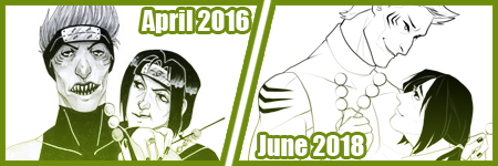
Honestly this has been my favorite improvement to notice though?
Kisame was a character I felt I should be able to draw EASILY? Not so much. Itachi? ALSO EASY. Not so much??
Kisame has weird eyes to grasp how to draw? Thus focusing on them kept making them wonky to me!! On top of that, he’s everything I’ve been use to drawing for AGES because he has a muscular body, with a smaller waist? ... that was something I was use to drawing? I still was awkward getting back into the swing of that... Drawing HIS HAIR though? NOT SO EASY....
But like, Itachi should have been easy, but I have a thing about him appearing too feminine as he gets drawn because his eyelashes, and I’ve really found a nice... medium at this point?
But even still like my face styles and eye styles are finally to a comfortable point for me? I have stopped focusing on some weird things with Itachi’s hair and just... DO IT? But even still like...
The improvement here is literally just if I don’t know how to do something, or I’m not satisfied with how I do it? I just keep at it.
It’s a theme of this post honestly... repetition, persistence.
Keep drawing it. Keep trying to figure out what it is that’s catching you off about how you do it. Don’t like how you do eyes or how they fit on the face? Look at facial structures and references and figure it out. Draw them separate and figure out how to apply them to what you are.
Remember there’s a skull in there. I draw the holes in the skull like the eye sockets, and the nose area to help my proportions for SURE.
I’ve also gotten to a nice marriage in my lineart? The piece before the recent one, those lines feel HARDER or HEAVIER? The newest piece seems...softer? Like I’m lighter handed again?
I really like critiquing my own growth on what is good or working better for me? Older pieces it looks like I’m putting lineweight for SAKE of it versus where it goes now?
INTERESTING.
Like this lineup -

My style shifts so RAPIDLY, it still is noticeably MY style to people, but parts shift so VIOLENTLY because I’m constantly picking at what I don’t LIKE.
It’s funny too in the case of Kisame and Itachi because consistently I’m drawing the SAME character over and over - can make you REALIZE how you’re doing something wrong?
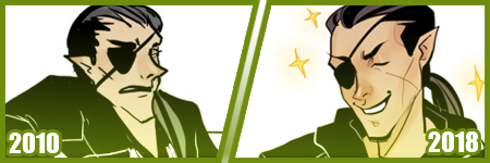
Like, here’s a difference of eight years, and it’s all the brush I use now, and it REALLY shows how my style has changed - in the aspect of one point of reference?
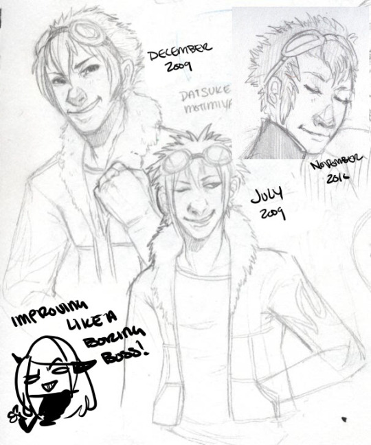
I have a childhood favorite character too, of Daisuke, and I use to be bad at drawing boys, and I use to be SUPER bad at drawing fluffy hair?
It was something I specifically started to learn to do? And I started to draw Daisuke every few months or years for a while. Especially when I started to first REALIZE I didn’t like my style that much?
But the middle one was July 2009, top left is less than 6 months later, and the last one is about a year later. DRASTIC DIFFERENCE. But next -
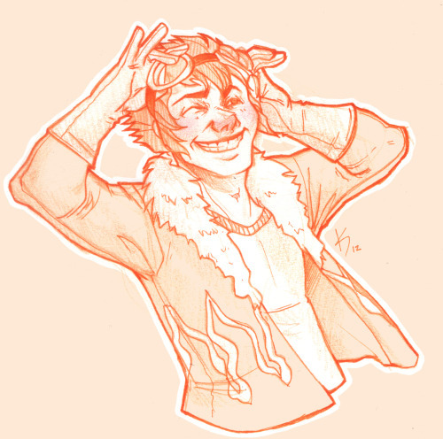
This one was in 2012, when I started to do more with teeth, or first dipping my toes into anatomy. I started to focus more on HANDS too, I was super bad at them. Overall I started to focus more on making my art have...ages? Like a boy versus a man. Facial features being DIFFERENT.
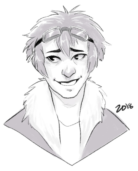
I can look at this boring little bust and see that he comes off more of a teenage boy to me now. I need to work more on figuring how to draw asian features especially the eyes. Sometimes I hit the mark, other times I don’t.
but between this and 2012? Not too much has changed. I do hair fluffier now, and I angle the eyes better. The teeth not being outlined doesn’t give that weird effect where I might give him TOO MANY TEETH....
People do that and it’s easy but whoof.
So there’s still learning and adapting to do in QUICK drawings, you know? but I can still see there’s good things. That took me like 5 minutes to draw? Not bad honestly.

In it’s own bracket is original characters though too?? But also divergent of STYLE shifts because like...
OKAY. Nightmare Syndicate’s story.. started for me in 7th or 8th grade, that was when I was...14? 15? I’ve been fleshing it out for like 13 years, that’s wild haha!! I love my kids and all.
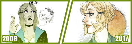
But okay so SIALI. She’s still fairly similar but I restructured her face for SURE. She’s gotten less edgy, she’s.... a teenage girl.

FELIX?? CHRIST. He’s been such a long journey!! More on that later?
Rot and even Cor?? Rot and Cor are a shorter span of development, but Rot started in Highschool so almost 10 years ago, and Cor has been fairly solid - but even just DRAWING him over three years? Go look at how much he changes.. I’m not married to concepts easily. haha!
People act like making a character you’re STUCK with it. Like Oh boy, I better make this character good, from the get go!!
I only worry about that with small potatoes like my Pillar(Gods) designs I just made for the comic?? Even still, small things will change with them I’m sure.
But not only has Felix and Siali changed, but they’ve GROWN with my style and DEFINED it even. I’ve had to adjust my style to support Felix’s look honestly a LOT. Bend my rules. Break my anatomy stickler attitude - and honestly, that’s the thing.
You have to learn the rules and anatomy BEFORE you can break them. A style built upon broken anatomy will fail you down the road if you just excuse everything with style.
Learn to draw the hands. Learn to draw the feet. Figure out the face. Bones exist. You can break the FUCK out of it once you learn how to do it, you know? Like I’ve seen so many styles I LOVE who are cartoony and BROKEN AS FUCK, but there’s still some STRUCTURE to it. Most of those people can still structure a face just fine, and the reason exaggeration works so well is because there’s like unwritten rules for what works and doesn’t based on that?
Idk.
Felix has a very elongated torso, he’s like 7′ or 8′ tall so I mean?? He’s... broken anatomy, but he’s... lanky - but his muscle is LITHE and stretched. It makes contextual sense. That’s the important part.
But even designs, it’s important to understand designs YOU make, or like... to understand they’ll CHANGE and that’s growth within your art too?
Like okay, example. Felix has a millipede inspired monster form. But with designing that? I still have to know how millipedes and SNAKES work because there's bones and vertebrae in there??

But there’s also the difference of like... CONCEPT, versus execution. You can design a fucking badass character, but understanding your own concept is SOMETHING.
I had no idea how this would play out, until I was mapping out his ‘midsection’ spikes? and man. MY STYLE WAS MADE FOR THIS CHALLENGE NOW. Which is so interesting how smooth my style has always been? Felix has defined ANGLES in it, and it’s hilarious tbh?
But even too, I’ve had to work with Felix’s monster form FACE, to break the rules to make it WORK the way I need it too?
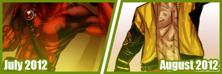
On the anatomy subject too, like when I first got into Marvel comics 6 years ago or so? I had no idea how to do muscle structures?? I was so BAD at it.
I can look at this left image and CRINGE so badly at how NONE of those are muscles?? THOSE ARE THINGS I PERCEIVE AS MUSCLES. Like...
A course I took taught me to draw what I see, not what I know. That’s the whole point of that post that goes around about drawing a shrimp. Look it up. It’s hilarious and cute.
But it’s like, asking an artist to draw a bike, you can tell who uses reference and who WINGS it. It’s funny, but like it’s what you know versus what you see.
I started to study anatomy like crazy and was seeing improvements days at a time. The right image was done like... a month later? already I can see the muscles under the pectorals? those look normal now. the abs aren’t dough lumps under the skin in a perfect 6 pack, they’re the actual plane shapes.
I was trying to find a good reference for myself of learning to make men ‘thicker’ too in terms of the waist etc since the left is really...thin.... but...

A bit better, but even still, comparing these two - they’re 2 months apart? and I can see understanding more about arms and how they connect to the body, where the planes ACTUALLY lay for the chest and obliques and such?
I can see improvements from July 2012 up there, to - WHOOPS. I FORGOT TO CHANGE THE YEAR LMAO... TO FEBRUARY 2013...omg
I mean, I could go on and on about improvements I see, when I go through my art though? Gosh.
Like I’m seeing so SO many bad hands and feet in my old stuff, and just CRINGING because tricks I learned for myself by now?
I give so many pointers and streams and screenshares on discord still to help people with art and it cracks me up?? Like...
I dunno. I’m pretty mediocre tbh, but god damn.
21 notes
·
View notes
Note
hey there, I just turned 18 (so yeah I'm young) and my art is kinda,,, bad,,, even though I have been trying and working on it for like 4 or 5 years and it doesn't feel like I'm getting anywhere? Like I know that there's been some obvious improvements, but I still struggle so heavily with so many different elements. Any advice that has helped you to improve over the years would be much appreciated!
Hey there! I’m sorry that you’re feeling down about your art. Since you came to my inbox for advice, let me see:
Find a neat subject that totally inspires you and start experimenting with it. Express your view on it, what it makes you feel, what you want it to be like. This could be anything from a rubber ball to a beautiful tree in your garden to a wild fandom.
Look for tutorials in the aspects you struggle most with. Try them on for size—maybe you’ll find a way to overcome a particularly wonky thing. (Feet, hands, hair, perspective... There’s so many awesome tutorials out there! Check out my 'drawing is hard’ tag where I accumulated a few gems so far.)
If you’re into that and have the money: join an art class. Or: create an art circle with like-minded artists and help each other to thrive.
Take reference from IRL or from photos. Buy a beautiful bouquet of flowers and do your best to bring it to paper (if you’re traditional) or screen (if you’re digital). This really helps getting an eye for proportions/anatomy as well as training your hand-to-eye-coordination and your hand’s motoric skills. No matter the subject of your reference, your overall skills will thank you for this practice.
Consider consulting other artists for constructive criticism. Show them pictures you’re proud of as well as ones you kinda hate and listen to what they have to say. Or not! Sometimes hearing a ‘no’ can make your own ‘yes’ more confident.
In case you’re comparing your work to other people’s: stop. Just don’t. You’re the only you there is, and nobody can art in the individual way you do. Building artistic skill is a super personal journey and takes different amounts of time for everyone.
Enjoy what you do. If you keep having fun, you will want to continue and work harder. More often than not, I, personally, tell myself: fuck it. And keep going. As we go, we produce a lot of not-so-great stuff. That’s okay, that’s normal, that’s part of growth. The longer we keep going, the more moments of “aw yeah” there’s gonna be. Promise!
To sum up: keep going. Stay open, keep the joy, experiment. Look and ask for help and see what works for you and what doesn’t. But always, always keep going. Maybe sideways, maybe backwards, whatever seems right and fun.
I hope this helped you at least a little bit. Have a wonderful weekend and keep creating. You’ve got this!
12 notes
·
View notes
Photo

(͡° ͜ʖ ͡°) GOD JUL (͡° ͜ʖ ͡°)
Or rather Merry Christmas to you all! Because sudden need to say merry Christmas to ya all in Swedish, because I can! and I know it's not the 25th which most of you prolly celebrate Christmas but in Sweden we celebrate on the 24th! Have just finished celebrated Christmas in fact, been having allot of fun actually, lot's of good food, some nice presents, covered myself in Christmas wrapping ropes thingies as is tradition for me every year, hanged out with my relatives which has been fun too, so yeah my Christmas has been hella good <:
Anyhow! I succeeded in finishing this just this morning, just a couple of minutes before my relatives arrived actually xD been fighting with it for like over a week I think and I am so happy it is finally done! Not super happy with the anatomy, his right leg, the one on the ground, looks a bit wonky to me, and all the fluff did not turn out as I wanted it, as I went and changed how I wanted it mid way and stuff, still looks kinda good tho, really happy with the red colours on the dress and the socks, the colours on his right glove turned out pretty good also, the candy cane didn't turn out so bad either even though it was supposed to have lines at first but it looks kinda good lineless to me and the background turned out pretty damn good :D
And of course he is wearing his crocs what did you expect?
#undertale#underswap#underswap papyrus#MessedUpEssy#papyrus#Essy's Art#Essy's Undertale Art#so happy this is finally done#look at him#he looks so damn good in it and it makes me so happy#wish I had tried to make it look more like he is sitting on the dress#as it looks a bit weird#I tried to make him like do a pin up girl pose#not sure if I succeeded#it bothers me that the legs where they come out of the dress looks weird too#but no matter this pic is now done and I am happy with it#yes#he was supposed to have had a ribbon around his neck with a bell#but decided not to go with it as I felt it got too much#and cole when I showed this to him came up with the brilliant idea to add like Christmas lights or mistletoe on the crocs#wish I had done that but too lazy to add them#maybe next year or something#we will see#Merry Christmas#now time to eat so much candy I will get sick to my stomach#why does he have such damn long legs for#gonna draw him in more crocs soon#yas
180 notes
·
View notes
Photo


.Hack//CELL - Volumes 1 & 2 (COMPLETE) *Spoilers Below*
Dang what a wild ride! I did not expect this story line out of Midori’s character at all! In ROOTS she seemed interesting but they really only gave us a glimpse of her with zero implications about her true nature (I guess that’s the point of have a side novel).The author of this novel wrote in the Afterword that she was told “Do whatever you want!” and it shows. I think that freedom made this series more successful than the Another Birth series.
7/10: I’m bumping points off for some awkward plot lines and flat characters
Notes:
-FINALLY a Dot Hack where the subtitle makes sense! I can say with confidence that it’s called “Cell” because Midori comes from a cell. I still couldn’t tell you what “SIGN” or “ROOTS” really refer to. It was cool to have the title’s meaning slowly dawn on you as you read.
-I really love the art style of these light novels, it sets them apart from anything else in the franchise. I’m not sure what the style is called but they look like traditionally-made prints (wood block? Screen printing?) Everything was very elaborate, especially the costume design. The anatomy looked a little wonky at times (especially the ankles) but overall it was a major strength of the books.
-I really liked the twist & was like “YOOOOOOOO” when it happened lol. It’s rare that I get to experience a twist I wasn’t spoiled for so it was a treat. It reminded me of Doki Doki Literature Club but less bleak. It was a nice twist on the vagrant A.I. character that I didn’t see coming.
-When you look at the overall conflict/resolution the whole story kind of feels unsatisfying. Midori creates “Midori” out of a strong will to live but then “Midori” decides she has to go back inside Midori for her to survive. It makes sense but it gave me the feeling that “Midori’s” life had no point after all and we could have just skipped to the happy ending if she was never created. I almost feel like it would have been more satisfying had Midori died and “Midori” existed to continue Midori’s life but I guess that would have just turned into a big existential crisis for “Midori” -shrug-
-A big potential plot hole that bugged me was that they clearly defined Tri-Edge as a PK who ONLY attacks abnormal players. THEN WHAT ABOUT SHINO?? Either this is really good foreshadowing and there’s something weird about Shino or that’s a mistake. (Haseo, Ovan, and Midori are clearly abnormal and Phyllo isn’t so that must be why he didn’t get attacked...)
-Another “plot hole” that was just a translation error was that they made a big deal about Midori being named “Midori” after her green eyes. They then proceeded to call her eyes “blue” for the rest of the series. I know they’re kinda-sorta the same thing in Japanese but C’MON! That’s some very lazy translation work.
-I enjoyed Adamas and Kaho (especially Adamas) but I’d be lying if I said they were particularly interesting. They were pretty much flat supporting characters just there to worry about Midori. They were charming though :D
-.Hack//CELL confirmed some gameplay things 1) Some people use filters to change their voices and 2) Apparently in-universe battles are extremely gory??? These books were surprisingly violent compared to the games and anime. Beheadings, blood etc. They also made PKing out to be an extremely scarring event, bad enough to cause PTSD. Kinda hard to buy but ok...
-Even though these books take place in-between ROOTS and GU I’m glad I played a little GU before I read them because they make a lot of references to things you would only know about if you played the games (Like Online Jack). I felt more immersed with the extra knowledge.
-I don’t understand what Midori was sick with? Were we supposed to know or was it just supposed to be mystery-disease?
-I liked the few bits of Haseo being friendly with Midori :’)
-Some parts where the author was describing Midori’s body were borderline creepy. Too much attention was given to her tight skin and “almost translucent” white skin. Gross
I don’t wanna end on a negative note because I really did like these books. I’m really glad I finally got around to reading them!
3 notes
·
View notes
Note
I was wondering what you thought about heavily stylized/cartoon dragons that are done well. Are there any in particular that you applaud? Cartoons are meant to be a little loose with anatomy so I was wondering which dragons caught your eye.
in general, I fuckin ADORE stylized dragons done well! despite what y’all may think, I actually prefer well-executed stylization over strict realism– I’m just strict w/ anatomy on here b/c that’s kinda my job, haha. I’m a lot more lenient when it comes to things I’m just enjoying in my personal time
now lemme think, specific examples….
I think Toothless specifically from HTTYD is a rly good example. I know I’m biased for him, but I rly do think he’s an excellent, unique design. I also say Toothless specifically and not HTTYD dragons in general b/c he differs from a lot of the other designs in certain respects that make him a lot more realistic/reasonable and generally more aesthetically pleasing to me. for example, his eyes are set solidly in his skull rather than sticking out like in the Monstrous Nightmare, and his teeth are reasonably pointed for a fish-eating creature rather than curved in all sorts of absurd directions like in the Deadly Nadder. also, since his claws are rly small and don’t seem to be used for much in the way of prey capture or climbing, it’s easy for me to just read them as stubby claws, unlike w/ other dragons’ longer “claw-toes” that obnoxiously bend on their own. beyond Toothless, I think the next-best design in HTTYD is Cloudjumper (as far as I can remember w/o looking up a whole list of all the canon species anyways, lmao)
Jake Long’s dragon forms in American Dragon always struck me as decently well-executed. I gave some deeper thoughts on them here, but basically they could be improved in terms of mass distribution and some slight consideration for underlying anatomy (hips specifically), but I still like the designs a lot
I absolutely ADORE that one style featured in Dragonology– y’know, this one. something abt the gangly bodies, loose-skin decorative frills, swoopy-swirly designs, hatch-work shading approach– it’s all so appealing! I’ve still got my gripes abt the anatomy, but I can’t help but love the designs anyways
the Wings of Fire dragons were always very pretty to me, tho I still have yet to read the books aha. that solid/sharp linework, and those vibrant palettes?? to die for honestly. while they do have some problems, something abt their designs makes it easy for me to miss their mistakes at first glance
despite how wonky the designs are, I kinda love the Dragon Booster designs. again, nostalgic bias may be at work here, but I rly do think they’ve got some fun, unique designs
scrolling thru some of my past reviews, I’m reminded that these dragons from BOTW are fuckin excellent, I’m still in love. this dragon from DOTA is also super pretty. the Dragonadopter designs were, to quote myself, surprisingly decent, and rather cute. THESE GUYS FROM WALLYKAZAM ARE ADORABLE I WOULD DIE FOR THEM. Mushu from Mulan is also p well-executed, though he doesn’t totally fit the style of the rest of the movie..
I think that’s abt all I can think of rn. other mods have any thoughts?
sidenote: before anyone asks me why Flight Rising wasn’t included, I actually don’t think I can put FR on this list in good conscience? yes, I absolutely love the FR designs, despite all their faults, but in terms of well-executed stylization? I rly can’t give them that. I think part of it is the fact that they’re stylized in a “realistic” manner– it’s easy to excuse anatomical mistakes/warping in a flat/cartoony design, but it’s a lot harder to ignore anatomy mistakes when the dragon in question has detailed muscular definition.. not only that, but even putting aside comparisons to real-world anatomy, FR just isn’t consistent in its own setting? some dragons have wings above their front leg shoulders while some don’t, some dragons have improper foreshortening while some don’t, etc. etc. thus, I can’t even rly judge it based on its own arbitrary anatomical rules
-Mod Spiral
5 notes
·
View notes