#even their blue liveries were fun
Explore tagged Tumblr posts
Text
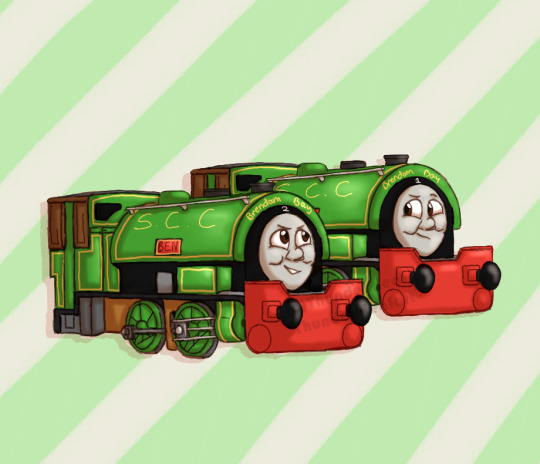
"I like the new colour, Ben, it really suits you!" "Suits you too, Bill!"
Just a quick post today to prove that I'm still alive LOL
This was loosely inspired by the Thomas & Friends Episode "Bill or Ben?", but instead of the blue livery they recieved in said episode, I thought it'd be fun to give them the liveries based on the IRL inspiration for the twins; Alfred and Judy.
It also unintentionally kinda gives them a more "festive" look, which... considering December's right around the corner, that's pretty appropriate, I think! xD
And while the yellow is iconic (and even their blue livery from said episode was pretty fun), I gotta say, they don't look too shabby in green! ;D
I'm working on some bigger projects atm (as well as getting hooked on yet another game god dangit x'D), but I still wanted to post something for November. And since the Train brainrot is still going strong, here ya go! :D
A silly lil doodle of some equally silly tank engine twins for you all to enjoy!
That's all for now, though! December's likely going to be a busy month but I'll still try to post at least once more before the year end! But alas, I guess we'll see! x'D
And as always, thanks for looking everybody!~ ^w^ ~~~~~~~~~~~~~~~~~~~~~ Bill & Ben (c) Thomas & Friends Art (c) Me! <3
#ttte bill#ttte fanart#ttte ben#ttte bill and ben#thomas and friends bill and ben#thomas and friends fanart#thomas and friends#thomas the tank engine#thomasandfriends#ttte#fanart digital#fanart#the twins prolly love their yellow paint honestly xD#makes them stand out#but they don't look too bad in green either LOL#even their blue liveries were fun#they're versatile I guess xD#I love these cheeky little twin engines so much#art#digital art#my art#thunderxleafart#thunderxleafart<3
25 notes
·
View notes
Text
Livery Watch 2024: Special Editions
Breaking News: Local woman still isn't done yelling about car liveries.
idk how many one-off liveries the teams are going to do this year, but in any case I love McLaren's livery for Japan, so if there's any more across this season I'll be updating this post as they appear throughout the year!
McLaren - Japanese GP Vuse "Driven by Change" livery
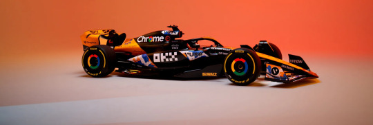
I LOVED this when the promo images dropped at the start of the week. The livery was designed by Japanese artist MILTZ and is inspired by Edomoji (a style of Japanese calligraphy), the design reminds me a lot of The Great Wave off Kanagawa but I'm pretty sure because they both have a wave motif.
I absolutely love the splashes of blue and white, I wish they were on the black portion of the car instead because the livery would look so much brighter, but I still love how it looks on the car regardless.
9/10
Ferrari - Miami GP Blue livery
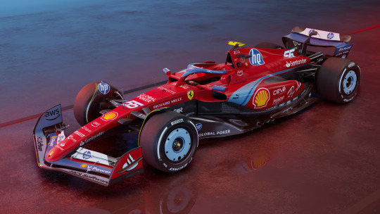
Adding list to the very long list of the ways that Ferrari have disappointed me, and ngl I'm so tempted to put it right at the top.
After all the hype Ferrari had been putting out on socials I was expecting the car to be all blue (which, is in recognition of the 70th anniversary of Ferrari selling cars in the USA) and instead we have... this.
Like, no one would have forgotten that Ferrari's are meant to be red just bc the car went all blue for one race, especially because the team kit and overalls are all-over blue for this week (I am extra mad bc the shades of blue that's on the car are so stunning and would definitely have stood out compared to the other blue livery cars).
Also don't get me started on the silly amount of HP logos on the car, if I was a tifosi I would be beyond embarrassed rn
2/10 and that's me being nice.
Racing Bulls - Miami GP livery
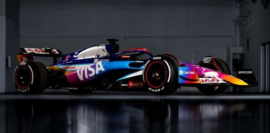
Ahhhh. That's better.
I LOVE the multi-colour gradient (even if it does slightly resemble the instagram logo). I would have loved to see it all over the car because the chrome silver bull would look so nice against it.
But apart from that it's so bright and fun and it's going to look fantastic on track this weekend. I'm not even mad that it's matte.
9/10
McLaren - Monaco GP Senna livery
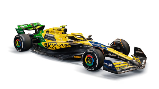
*shouting in the general direction of Maranello* You see this Ferrari? THAT'S how you do a special livery!
Yes, it's incredibly yellow (to the point it looks like a Benson & Hedges sponsored Jordan if you squint) but that's the whole point. (Also bonus points for the car pretty much being completely painted!!!)
As an ode to Ayrton Senna, it's pretty much spot on. For me the first thing that always sprang to mind when Senna is mentioned is his helmet design featuring the colours of the Brazilian flag. I also love the diagonal lines as a nod to the Marlboro McLaren livery.
Oh and did I forget to mention that IT'S NOT MATTE!!!
10/10
Red Bull - British GP "REBL CUSTMS - Stallion Red" livery
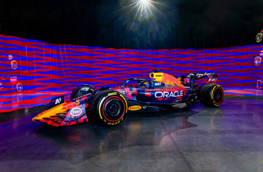
Like last season, we're getting three fan-designed RBR liveries this year in honour of the team's 20th anniversary and this is the first!
And god, I wish it was the main livery. The brushes of neon red are so bright and actually look interesting instead of the super corporate unchanged livery we've seen since 2016.
Usual 'I hate that it's matte complaints' but spart of that, it really looks great.
8/10
Williams - British GP livery
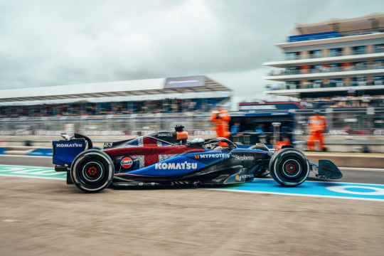
So in the design stakes, I definitely prefer last year's white accents design. However, on the sentimentality stakes (of which I will never be immune to), I love it so so much.
As it's been mentioned a lot in commentary already this week, the car features the names of all 1005 Williams team members - and founder Sir Frank Williams, which is just so so lovely.
6/10 for design, 10/10 for the sentiment behind it.
Alpine - Belgian GP "Deadpool & Wolverine" livery
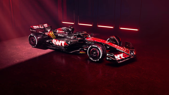
ngl friends I have spent the whole time since this dropped staring at this going 'hmm'.
I definitely don't hate it, I think I once again find all the exposed carbon very off-putting, but at least there is more paint on the car this time compared with their core blue and pink liveries. (And, tbf, given how Deadpool's colour scheme is red and black, it does make sense from that pov)
The concept behind this is very fun, I genuinely cannot remember the last time we had a full promotional livery for something (Aston Martin did run the James Bond logo on their cars when No Time to Die came out, but that was it).
I think it would have been nice if there was more yellow (as cool as the Wolverine claw marks are), but overall it's definitely very fun. I really want to see how it's going to look on track.
7.5/10
Mercedes - Singapore GP "Petronas 50th Anniversary" livery
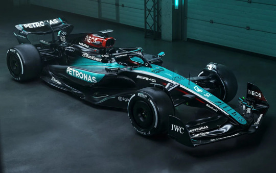
Not gonna lie, after the well documented events of the 2019 German Grand Prix, I honestly never thought we'd see Mercedes run a one-off livery ever again, so seeing this upon opening Instagram this morning was a nice surprise!
Might be worth saying that this livery is in honour of Petronas' 50th anniversary as a company (their title sponsorship with Mercedes only dates back to 2010), and the choice of debuting this livery at Singapore is that it's the race closest to Petronas' HQ in Malaysia.
(Powers that be pleeeeeeeeease bring back the Malaysian GP in Sepang!!!!!!!)
So, all that aside, I do very much like this livery. The Merc colour scheme of black, silver and teal is super iconic and works in pretty much any iteration. Design wise though I wish there had been a tiny bit of effort put in because they've literally just swapped round where the silver and teal is on their core livery.
I do think the car will stand out on track really well against the dark tarmac of the circuit, and the fact that from this picture at least the teal portion of the car looks glossy so it should look stunning under the floodlights at night.
8/10
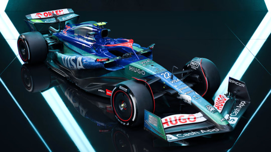
Racing Bulls - Singapore GP "Hugo Boss Denim" livery
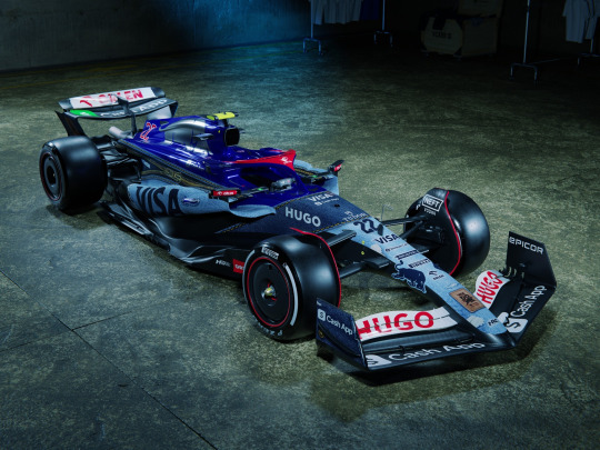
I want to get on board with this, I really really reaaaaaaaally do.
I just can't because they didn't properly commit to the bit and do the whole car in denim.
Unlike RBs Miami GP livery in which they got away with keeping the dark blue engine cover and halo because across the whole car the colour scheme still felt cohesive, on this livery (or, as we're all calling it, jivery) the saturated blue does not feel very put together with the rest of the denim. And I am a little bit mad about it bc if the denim had been all over the car I think it would have looked both amazing and really different on track. And for once, I don't mind the matte finish bc as we all know denim is not ultra-glossy - another reason why keeping the dark blue engine cover from the core livery just makes the whole thing look odd.
Love the concept, really not on board with the execution - 6/10 overall.
McLaren - Singapore GP "OKX Legend Reborn" livery
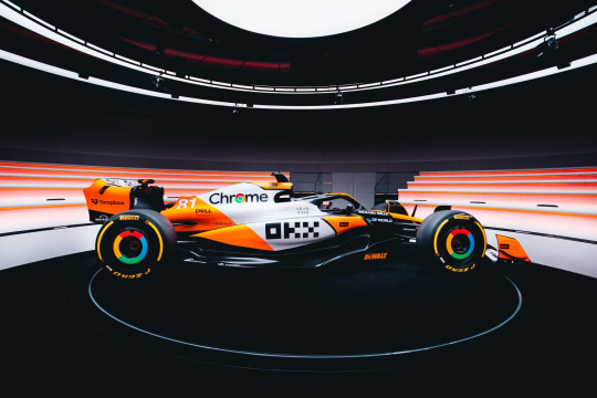
oh this FUCKS.
It's somewhat turned into a tradition of McLaren debuting a one-off livery in Singapore. In 2022 the sky blue accents on the core livery were swapped out for a stunning hot pink, and last year we had the mostly carbon stealth livery (you can find my thoughts on that in my Livery Watch 2023 tag).
And this year, as the name suggests, McLaren are running a livery inspired by the iconic Marlboro McLaren livery of the 1980s, with papaya orange in place of Marlboro red.
and to repeat myself, it FUCKS.
I love the stripe of white down the middle of the car, it really stands out compared to the slash of exposed carbon on the core livery and combined with the orange the car just looks so much brighter and is really going to stand out on track.
Is it a little bit Finding Nemo? Yes. Do I care? No.
For the tiny bit of exposed carbon it loses a point so - 9/10
Red Bull - Singapore GP "REBL CUSTUMS - Camo Bull" livery
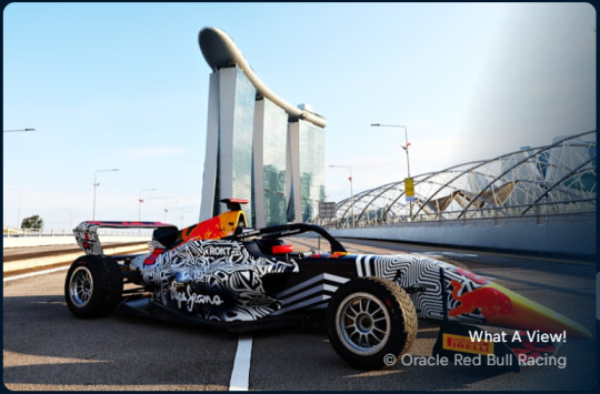
I will update if I find a better picture, the RBR website is silly.
The funny thing about updating this post as the year goes on instead of doing a reblog for each new livery is that all the various off-track (ie. Red Bull scrapping their two remaining fan designed liveries because the paint they were going to use made the car too heavy) happenings do get a bit lost within the passing of time.
But, as this is my house and I can do what I want on Livery Watch, I'm gonna yell about what would have been RBR's Singapore GP livery anyway, as it has thankfully been put onto Hamda Al Quibaisi's F1 Academy car (plus matching overalls!!!) for this weekend.
And as I said on a post earlier today (as I write this) I am mad that RBR chickened out bc this is SUCH a sexy livery. It pays tribute to the og Camo Bull livery from 2015 pre-season testing so well and it's just DIFFERENT and FUN and is gonna look SO good on the circuit and the pops of neon red are just stunning. I love it.
10/10. no notes.
Haas - United States GP livery
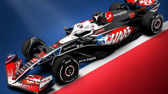
Not only are Haas going to be arriving at the Circuit of the Americas with Toyota Gazoo Racing logos on the car after the announcement of their new technical partnership with Toyota, they are also as seems to be turning into a tradition running a stars and stripes inspired livery for what is 'officially' the team's home race.
(I say officially as while the F1 calendar does have 3 US races, the race in Austin is the only one branded as the United States GP).
I do very much prefer this livery compared to the one they ran last year. The brighter, more saturated colours, work well against the predominantly black base, though I find the red driver numbers a bit hard to read as the white outline is a bit too thin. But I love the scattered star motif on the front wing and sidepods - I think it's very fun!
While I do get why the main emblem on the car is a hybrid of a lone star (bc Texas is the lone star state) and the head of an eagle (ca-caw, wtf is a kilometre) it does slightly give off 'concept art for an NFL team logo' vibes, and I think running with just the star motif would have gotten the same message across just as well.
(I will say though, I think the eagle art itself is pretty good! It just feels ever so slightly too much.)
7/10
Alpine - United States GP "Indiana Jones and the Great Circle" livery
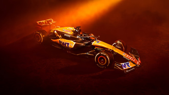
As the semi-official Livery Watch reporter for f1blr news, I do feel it's my journalistic duty to point out that Disney have not managed to pay Harrison Ford even more money to come back for another film, but that this livery is actually promotion for the upcoming video game of the same title.
My second thought upon seeing this livery (my first, like everyone else, was that it looks like a McLaren cosplay) was that I felt quite mad Alpine have painted more of the car for this one-off livery than they have done for their pink and blue core liveries, and I'm once again mad at the missed potential for what we could have had.
(My thoughts on the Alpine core livery can be found in my Livery Watch 2024 tag).
I did have to do some digging, and thanks to this video posted on Alpine's twitter feed and this post by one of Alpine's graphic designers, I am fairly confident in saying that the car is not in fact all over orange, and like the Indiana Jones logo is more of a yellow to orange ombré with a really cool looking treasure map motif on top.
I think the concept is fun (despite the promo images making the car look more orange than what it seemingly is) and it's been executed fairly well, but I may need to wait to see it in daylight before properly deciding if I like it or not.
7/10
McLaren - United States GP Chrome livery
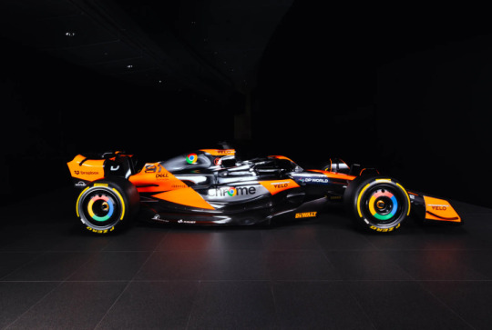
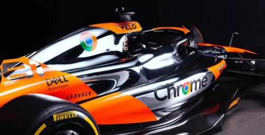
As first ran at the British GP last year, McLaren have once again brought back their chrome silver livery of the late-00s and 2010s, in partnership with one of their main sponsors Google.
And, before I go in detail, I want to show my initial reaction via the tags on a post of this livery I reblogged earlier today because I think it sums up my feelings very well.

I cannot begin to express how delighted I am that McLaren have given this livery a second attempt, because the first version they ran last year was quite a big miss.
This version feels so much more thought out in terms of where the chrome silver paint will actually go and what this livery and the original Vodafone McLaren chrome livery do well is having a really bright pop of colour against the silver so the car doesn't look too bland (unlike the team's 2014 chrome and black livery).
Honestly? This is yet another banger of a McLaren one-off livery. It's silver chrome done stunningly well. 10/10.
Williams - Mexico City GP & Sao Paulo GP altered Core livery
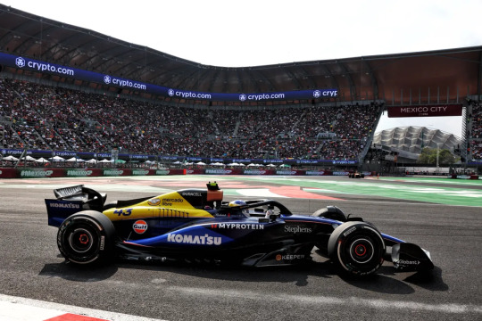
The delay in the latest addition to Livery Watch is partially due to life stuff, and also due to me contemplating whether or not it actually counted since it's a sponsor driven change as opposed to a "let's do this for funsies!" change. BUT we have seen sponsor driven liveries this year so I have finally decided that it counts, so onwards!
The addition of the Mercado Libre logo and yellow colour splash for the two Latin American races of the year is definitely fun (it stands out on the car from a mile away) and either intentionally or otherwise evokes the classic blue, white and yellow Williams liveries of the 80s and 90s.
Obviously there would have been a limitation on what shade of yellow they could put on the car, and I am somewhat bummed that it covers the original Frank Williams Racing logo, but a lot of what I love about the 2024 core livery remains.
Solid 6/10
Sauber - Las Vegas GP Flame livery
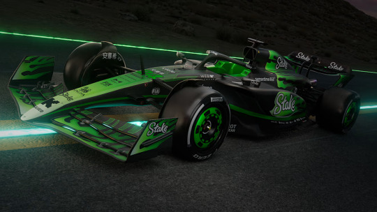
I want to like this. However, I don't think I do.
My favourite part of this livery is the nose cone, I think the white to neon green gradient is actually quite nice and had it been done all over the car would have looked very striking on track (especially in contrast to the exposed carbon areas of the car).
I'm just... really not a fan of the flame motif. It looks fine on the front end of the car, but on the engine cover where it's just a flat line before the rest of the flames just makes it look so harsh and for me anyway it's the first thing my eyes are drawn to because it look so slapped on and out of place.
5/10 (mainly for the nose cone)
Alpine - Las Vegas GP, Qatar GP & Abu Dhabi GP 'Al-Pink' livery
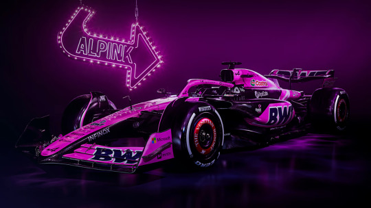
When I tell you that upon opening my instagram and saw this I literally threw my hands into the air as if I myself had just won a Grand Prix (please also refer to my all caps post from earlier as an additional first reaction that sums up my general feelings nicely).
oh BWT, I could literally kiss you on the mouth for this. I genuinely have never been happier for a sponsor requiring that a team run a specific livery for a set number of races per season. Pink Alpine they could NEVER make me hate you.
And I am so utterly thrilled and delighted to say that thanks to one of the Alpine livery/graphic designers confirming in this post, IT'S A GLOSSY PINK 😭🙌
Previous BWT-pink liveries have been a much softer pink, but I just love the brighter in your face almost Barbie pink. I think they've gone in this direction since all the races this livery will be ran at are night races, so the slightly darker and brighter pink will definitely stand out against the dark circuit under the floodlights.
Yes, there is sadly more exposed carbon than I would like. But I honestly don't care. IT'S A SHINY PINK F1 CAR!!!!!!
10/10
Racing Bulls - Las Vegas GP "Glitter" livery
Gonna keep it short and sweet, and share my initial reaction to the livery via the medium of a screenshot of Discord DMs.


We could have had it all... truly. Racing Bulls were literally stood in front of an open goal and instead kicked the ball outside the stadium. My disappointment is beyond immeasurable rn.
3.5/10 - for the cohesive colour palette at least.
#Formula 1#Livery Watch#2024#Livery Watch 2024#(doing the one off liveries in their own post just to keep things tidy)
21 notes
·
View notes
Text
No. 50 - All Nippon Airways Airbus A380 "Flying Honu" Livery
Happy 50th Runway Runway post! I had a bit of a hard time deciding what to do for it - after all, it's a pretty significant number. I already sort of know what I want to do for the 100th post, but I hadn't put much thought into the 50th, and I had to scuttle any plans for something long and interesting after a rather stressful week. Instead I decided to do something both fun and requested!
source: ANA Stories
One (well, three!) of the most beloved special liveries out there, All Nippon Airways' turtle-themed "Flying Honu" Airbus A380. These three friendly giants fly from Japan to Honolulu, delighting anyone lucky enough to see them.
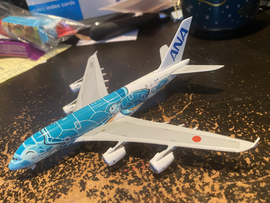
Actually, I love the Flying Honu so much I have one myself.
I would describe myself as a bit of a magpie. I collect useless things, be they historical ephemera, horror movie memorabilia, old books, pretty rocks, or way too many fountain pen inks given I mostly use them to take notes. I even have a bunch of my old teeth in a pillbox. Surprisingly, though, the things my talons have lodged in don't include many model airplanes. I have...a few. I've actually, though serendipity, gotten two more since I started this blog, expanding my collection to a startling five. Maybe seven if you count my Starscream and Brainstorm figures, but I don't think I even remember how to put either of them in their alt modes. The fact is that while they aren't a fortune or anything plane figures are expensive enough that it's a commitment to buy one, and I usually only do when I stumble on a good deal for a model I really want. And one of the few times I've actually decided that I just needed a model of a specific livery was the "Flying Honu" A380. Specifically, the one I have is the airframe registered JA382A, Kai. (She's the 1:500 JC Wings diecast model and is around the size of my hand.)
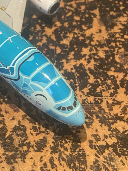
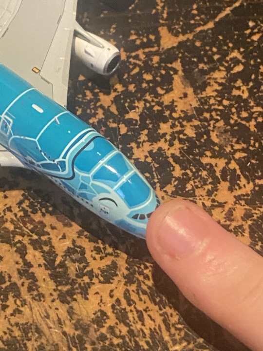
I just needed to be able to gently tap her nose in person, okay? She can't fit up on the shelf with a lot of my other miscellaneous trinkets so she sits on my desk and sometimes I explain things to her while trying to figure them out, like a coding rubber duck. She makes me happy.

All Nippon Airways (全日本空輸) is a major Japanese airline. In fact, in terms of both fleet size and number of destinations they're bigger than flag carrier JAL. They're consistently described as being among the best airlines in the world for the discerning well-to-do business traveler, and let's just say that's not me, but what I am is a reviewer of airline liveries, and ANA sure has those! In addition to their standard Triton Blue livery they do all sorts of special designs, particularly crossovers with properties like Pokémon and Star Wars. All of these are something I would like to someday feature, but none of them matter at all to me when compared to the Flying Honu, introduced with the A380 fleet in 2019.
A couple of times when I've told people I know about this livery they asked me if 'honu' is Japanese for 'turtle'. That's a reasonable question, but the Japanese word for turtle is 'kame'. 'Honu' is the word for turtle, though - in Hawaiian.

image: ANA
In fact, Honolulu is the A380s' only destination. ANA didn't really want A380s to begin with, but ended up stuck with them while acquiring another airline. The thing about the A380, and the reason it failed commercially and so few were ever built, is that the use-case for a massive plane is pretty limited. It goes as such: you have a passengerbase of people who have to travel from one giant hub that can land an A380 to another frequently enough that you can actually make money on a plane with four entire engines.
Okay, so the use-case is that you're Emirates. ANA might be expensive, but they don't really have the central location or sheer amount of regular business travelers that Dubai does. 'Three' also isn't really that many A380s, which creates a bit of a question of reliability. So instead they fixed the problem in a way that's honestly pretty genius: they made it turtles.
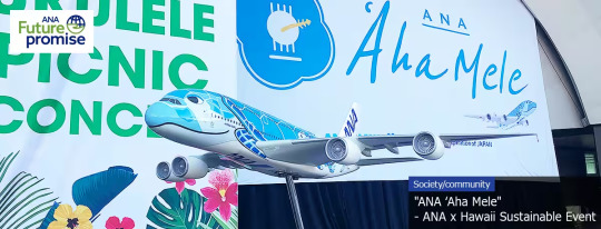
image: ANA
ANA seems to be generally invested in Hawaii, with a fair amount of partnerships with local organizations. A lot of Hawaiian real estate is owned by Japanese companies, and those of Japanese descent are the second-larget ethnic group in Hawaii at 16.7%, so it makes sense that a lot of people would want to travel there. Tokyo to Honolulu is a nice 9-hour flight with no possibility for a stopover of any kind (unless they invent civilian aircraft carriers for A380s), so it's the perfect route for precisely three really huge planes.
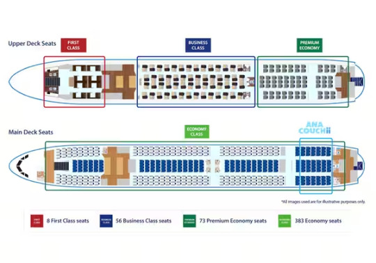
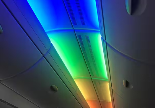
images: ANA
They can fit 520 passengers across four classes on one flight, seated across both decks of the massive planes. There is also a section of seats which convert to couches, marketed for families. Those who fly this route get to enjoy rainbow lighting and the ability to buy a duty-free 1:500 model of the plane (not the same model I have, though, I'm pretty sure) or a set of Flying Honu plushes.
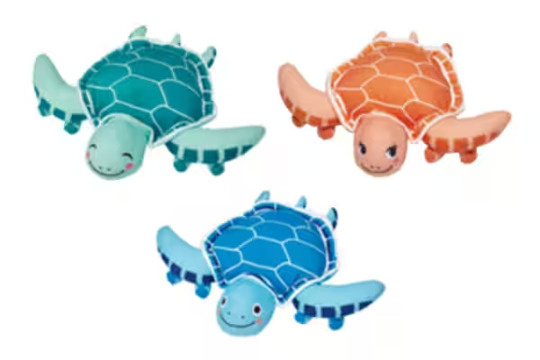
Ra looks like she's plotting something. Lani looks like she's never had a single thought in her life.
And they do make money off this, because people absolutely love these planes. People have apparently had their weddings on these planes, and I would too! They make ten weekly flights right now, but in December that will be increasing to fourteen weekly, or two daily.
Okay, so, the actual liveries.
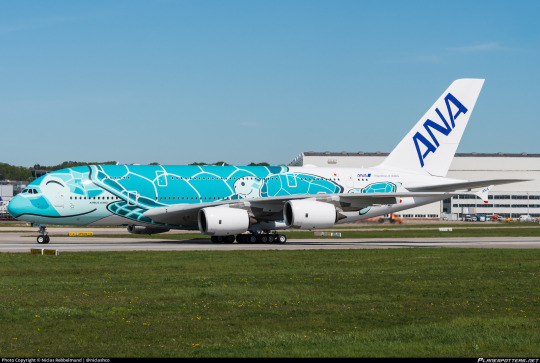
Here's Kai in full-size! The light in my room make her look way cooler toned in the photographs, but in real life she's this color. It's frequently described as 'green' or 'emerald green', but I think it's definitely turquoise and would go so far as to call it blue. Whatever the case, it's meant to represent the color of the sea near Hawaii. Kai is also distinct from the others because of her eyes, which are closed as she smiles from ear to ear. That's why she's my favorite - she just looks so happy!
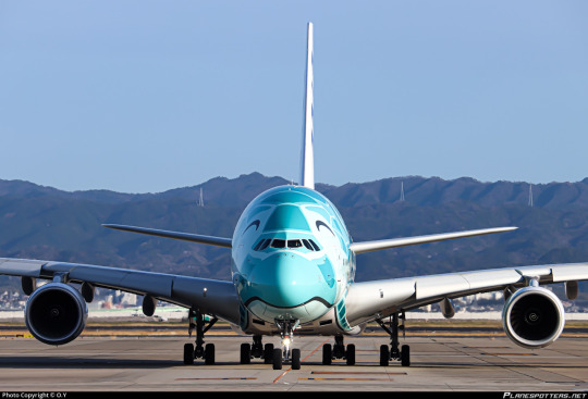
...a bit weirder looking from upfront, but look how even the ventral fairing is painted! That's part of the flippers where they curl around, tucked into the shell. Unlike the Transocean Air Jinbei Jets, the cockpit windows blend in with the 'scales' of the Flying Honu, looking rather natural.
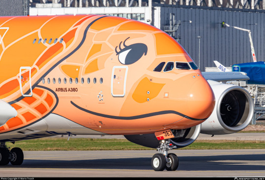
'Ra' is a beautiful orange, meant to represent the Hawaiian sunset. She has a bit of a peach undertone if you look closely, but her details are done in an extremely vivid reddish orange. Her distinguishing feature are those gigantic eyelashes, similar to Sakura Jinbei's. The actual mouth shape on all three planes appears to be the same, but I find that the eyes still give them distinct 'personalities'. Ra has always looked very thoughtful to me.
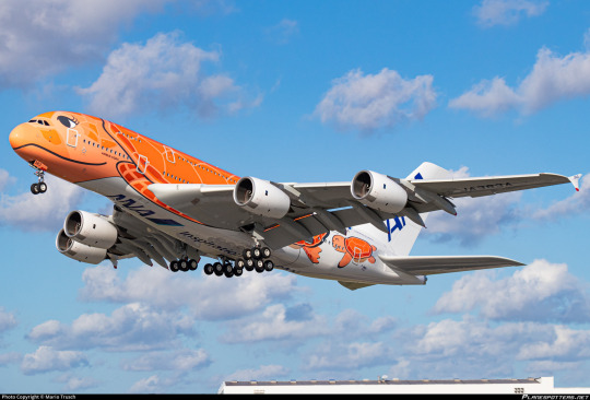
Just look at her in flight! I've never understood why people call the 747 stately or graceful, and same for the A380 - double-decker planes are just inherently goofy-looking, and that's great, but ANA managed to make one look pretty elegant. I think it's because turtles are already regarded as large and slow creatures, so fitting like for like just makes it seem as natural for this absolutely gigantic aircraft to be flying as it is for a turtle to swim.
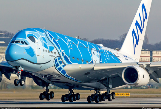
Finally, Lani, the turtle everyone agrees to be blue, represents the Hawaiian sky during its brightest color in daylight. If you look closely, you can see her blue 'eyeshadow', which I've always thought made her look relaxed.
This picture gives a good angle of my only real critique of the Flying Honu, which is that the shells and heads don't entirely look aligned, as if the head is in the process of being retracted. That said, I think that's just a fact of working with the shape of an airplane. There's just no more space below to fit any more shell.
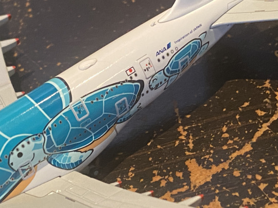
Rather than being just one turtle, though, each "Flying Honu" has two fully rendered baby turtles following behind their 'mother'.
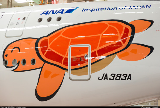
I think this is adorable, and beyond that it solves a crucial problem - the tail. Turtles do have those, but not in a way that maps onto a standard empennage. Instead, ANA makes the smart choice to end the shell at a certain point and add these two extra turtles make-way-for-ducklings-ing their way across the fuselage for more visual interest, leaving the tail empty for an ANA logo without making it jarring. This is a huge improvement over the Jinbei Jets, which again serve as a point of comparison as the other major Japanese marine life planes. (Amakusa Airlines is way smaller and thus not going to get caught up in this.)
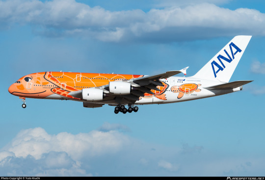
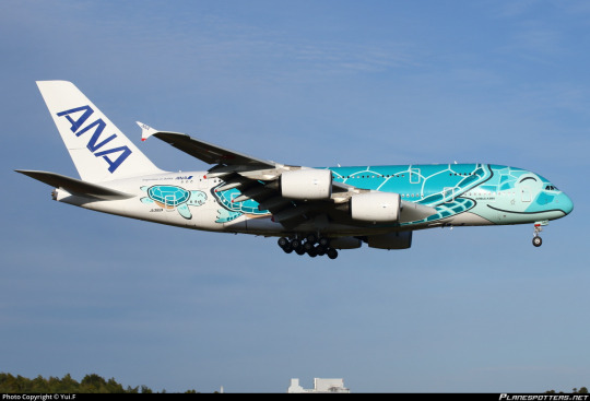
I mean, it's hard to find too much to say about these that isn't just "oh my gosh, look at them". The Flying Honu are vividly colored, with clever shapes used to make them immediately recognizable as turtles. I smile every time I see one, including the little one on my desk!
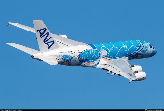
And in case you weren't already delighted, there's two extra bonus turtles!
I think it's pretty obvious I'm giving these an A+. Come on, just...just look at them. The fact that ANA bothered to make three distinct ones with their own names and faces is just icing on the cake for me, but I do love that they did.
I can't believe I didn't find a way to fit this in earlier into the post, but I really love turtles. If you have an aquarium near you, and that aquarium has turtles, I really recommend stopping by to see them. My local New England Aquarium has had Myrtle for more than 50 years. As they describe her, 'the 550-lb Queen of the Giant Ocean Tank is large, in charge, and ready to receive your adoration'.
youtube
True to form, although a lot larger and dealing in a different type of fluid dynamics, the Flying Honu jets get plenty of my adoration too.
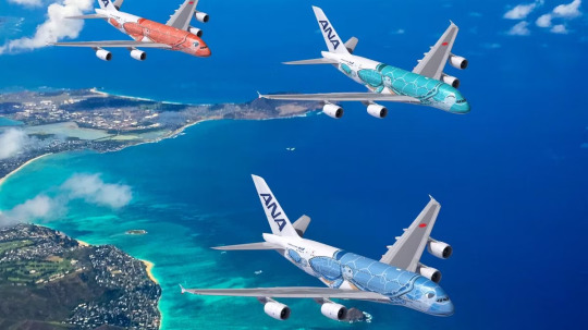
#tarmac fashion week#grade: a+#era: 2010s#era: 2020s#all nippon airways#aquairium#region: east asia#region: japan
61 notes
·
View notes
Note
This isn't the usual kind of ask you answer, but I've been working my way through the videopass archive sequentially and have been thinking about the historic/vintage livery that the teams are going to be using in Silverstone after the summer break quite a bit. Personally I'm very fond of the West Honda Pons' black and white livery especially with how they had the names of the riders on one side and the team name on the other, and obviously the gauloises and camel yamahas are iconic. But you've obviously watched a lot of the older seasons, so are there any liveries you'd like to see/which ones would you personally pick for the teams?
I too have been having thoughts about this! I do have some of my faves in a wee folder, and initially my picks were a bit limited in terms of range of years and teams. BUT let's do this properly. all eleven teams. my hot take for each and every one of them
CAVEAT NUMBER ONE look I don't know how 'design' or 'colour theory' or even 'taste' work. most of my reasoning doesn't extend beyond 'I thought this looks nice'
CAVEAT NUMBER TWO I also don't... quite know how this works in terms of who's allowed to use which livery? like not just the sponsor stuff, but would teams be able to use liveries from... idk, a different satellite outfit that was in the sport before they were? this ask mentions the pons liveries.... could honda teams actually use those? what if you don't have a lot of history? is anyone allowed to use mv agusta liveries? would teams go for special liveries, or just the regular ones? how strict are the rules for what you can use?
so. y'know. I'm really just guessing here what's even possible, which meant that for... uh. some of these teams. I did have to reach a bit to come up with a viable livery. let's just make clear this is all vibes and go from here
HONDA
they should have no problem with coming up with plenty of options. let's start with the west honda pons, which the ask references:
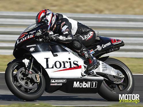
excellent pick, anon. if they can use this one, I'd very much support it! we're missing black bikes on the grid currently... this one's simple, it's classy, it's got a little bit of identity with the name written on the side. the dark red highlights work nicely. it's also a livery that, unlike some of the ones to follow, should still work well on the current bikes without losing its identity too much - though maybe you'd have to put some thought into how you'd place the actual name. should still be plenty of space though! and it'd be easily recognisable to fans who are familiar with the old livery, which I reckon is also an important metric
while we're on pons, shout out to the ducados honda pons livery:
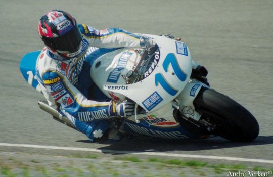
nice shade of blue! nice design of the leathers! pleasing shape of the numbers! just has a lot of character and charm to it
anyhow, let's get to the factory honda team. the VERY first pick that popped into my head was the special livery for aragon 2011:
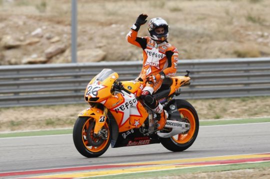
so I get that sense that plenty of people hate this livery and think it looks 'childish' and I'm sorry, but if you think that, congratulations on having bad taste. it's cute! honda barely ever has fun! look at how orange it is! look at the stars! there's a star on the leathers too! I'm fond of the way the front of the bike looks too, how the numbers are placed kinda messily on the star. this one's just, y'know, a bit more creative, something that's just different from how we usually expect liveries to look. screw classy and stylish, give me something with a bit of charm
moving back in time a little further, here's the valencia 2003 livery (valentino's last race with honda):
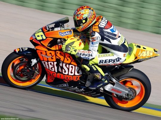
isn't she gorgeous?? I'd put that bike in my bedroom. lovely from every angle. if you look it up, you can find more photos to show it off properly - just see the sun on the top of the bike. really nice mix of the traditional repsol orange with the yellow, it all just works together. bright like the sun
and one more special livery from the early noughties (if not from the factory team), here's mugello 2001:
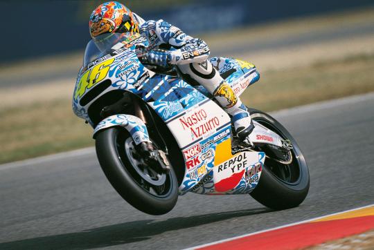
hardly a controversial choice, people love this one for a reason. it's pretty!! blue flowers!! this one should work reasonably well on the modern bikes too and obviously most fans should be able to recognise it. again, I don't know what the stance is on special liveries - but hey, it'd be fun to give a certain someone in your factory team a livery from this era
and going back further still, here's eddie lawson 1989:
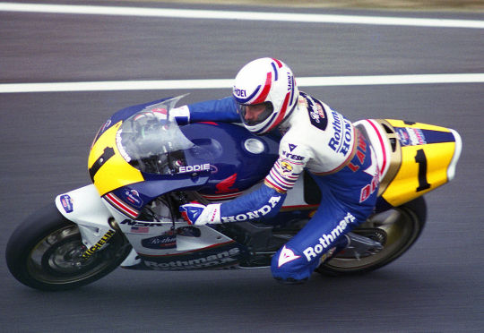
yes, it's rothmann's honda, yes, I've decided not to care. this is my personal top pick for honda. it should be recognisable even on the current bikes, it pays tribute to honda's long history by not just sticking to something from this century, and it looks cool. clean cut colours that are nicely separated out - I really like the yellow highlights on either side of the bike, plus the way the separation of the blue and white is handled on both the bike and the leathers. it's all quite clearly demarcated, but with nice details to give it character - those stripes on the front of the bike and on the the leathers. the touches of gold. the rider's name on the side of the screen. the number on the back of the bike. cool bit of history, too, like they stole that man away from yamaha and it certainly worked out for them. it's fun!
and one more jump to the past to hailwood's late sixties honda:
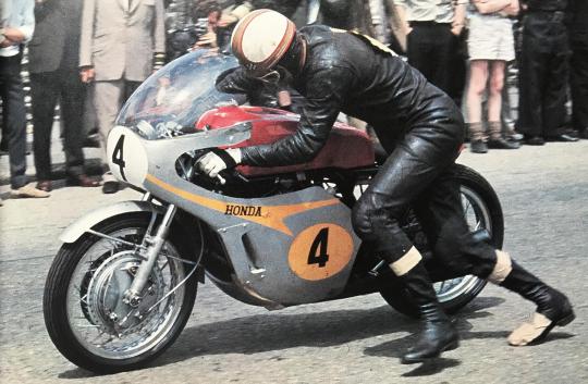
this one is proper honda #heritage and I'd totally get if they go with that. my main issue is... I'm not quite sure how it'd work on today's bike, shape-wise? like, the charm here is really the simplicity, the way the orange-gold spreads over the silver. does that work if you have all the bits sticking out everywhere? maybe somebody with a better understanding of design than me can figure it out, and I do like this one. the numbers look nice. idk. it's neat
LCR
well. I guess you'd want to go with one of the cecchinello liveries here? my problem with lcr is that they seem to generally be pretty big on their retro liveries anyway - the first one I thought of... basically looks like the 2021 lcr livery anyway? boring! done that! then there's a few years that are like... silvery, but, and I know this is an unfair way to go about this, I kind of feel I've already gone silvery with a few of my other picks and they're all nicer. so, here's my pick from 2000:
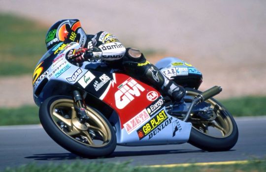
it's a bit busy, but that's kinda the fun of some of these older liveries. big chunk of red, some blue, the nice bright yellow number, even all the logos are kinda fun... I like the weird shape of the white line that separates the red and the black. I don't know, it just works for me as a complete package in a way some of the other lcr liveries don't
YAMAHA
yes, gauloises yamaha. my beloved. everyone's a fan for a reason
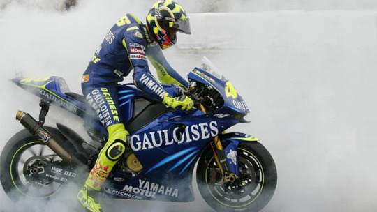
can't not mention it!! I do think valentino's version specifically works the best because of the extra bit of flare the yellow highlights provide here. but also the GO!!!!!! thing works on every version. it's fun! sometimes it's okay to go overboard with exclamation mark numbers! this one kinda hits the sweet spot as being proper classy but also joyous, enthusiastic. just overall very much a vibe
on camel yamaha, I do like the livery, but personally I do just associate it more strongly with camel honda? which was literally the same livery. that might not have been the factory team, but those were still serious frontrunners during the early noughties... and, well, it just doesn't feel specifically yamaha to me idk
okay, I'm going to restrain myself here on the valentino livery front. yes, I too liked laguna and valencia 2005. I have only 30 images to play with here and I'm not going to blow half of them on valentino special liveries, so I'm going to stick to my two faves. assen 2007 and catalunya 2008:
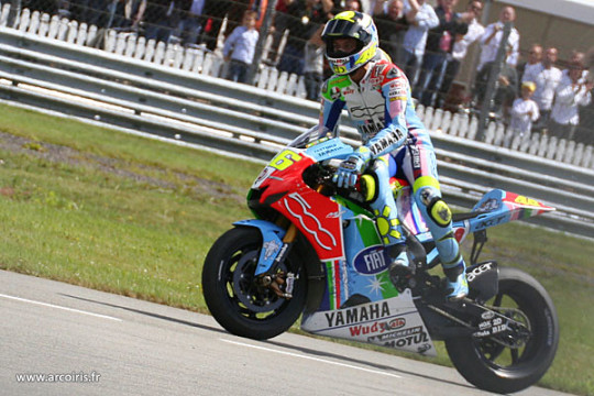
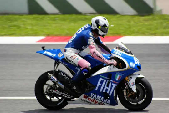
they're just! fun! when it comes to liveries in general, my basic criteria are a) can I easily figure out who's riding them, and b) do they make me smile. elegance is boring, give me something more quirky and memorable and FUN. assen is just. a lot. lots of colours, such a bright and cheerful livery that still works as a complete package. the bike's fun, the livery's fun, fabio would look fantastic in this one. and catalunya (in honour of the italian national team) is just a cool idea! the football helmet! the mock shirts! the pink sleeves! there's a real creativity and charm to this one - and at the same time, the base design of the bike is actually really lovely and stylish. also I associated both of these liveries with extremely fun valentino races that I'd definitely recommend (literally two of the top six vale/casey duels), which... well you can't say that about the two 2005 liveries I mentioned above is what I'd say
now, I know I just said forget laguna 2005, but of course laguna 2005 was in itself a reference to a past yamaha livery. so cut out 2005 and just pay direct homage to the iconic late seventies design, feat kenny roberts:
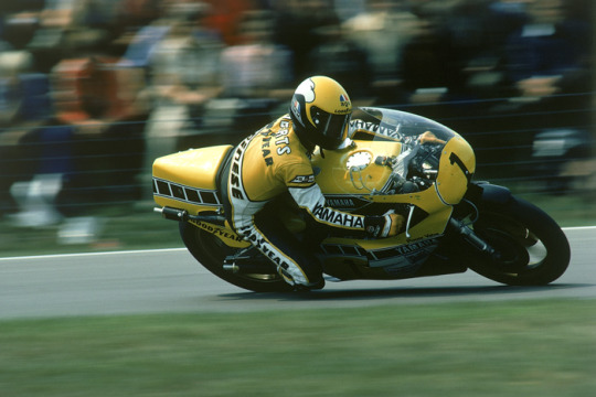
another one everyone loves for a reason! it's a nice shade of yellow, it works well with the white and black... the black dashed line thingies are of course iconic and they just make the whole thing quite dynamic and snazzy
and one more. marlboro liveries do unfortunately slap, plenty of them are fan favourites... look at this red one, feat. eddie lawson 1984:
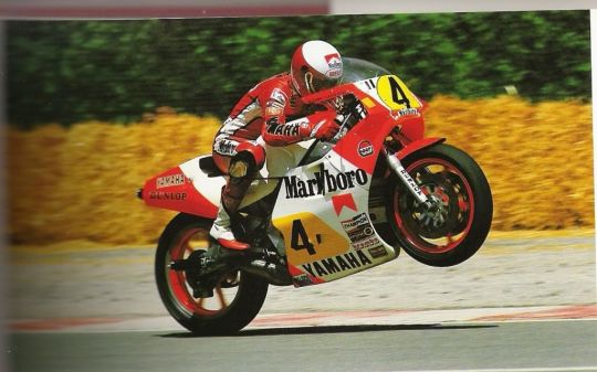
it's very. blocky. you've got the red bits the white bits the yellow bits. they have nice shapes. nice lines. the yellow bits where one's a circle type thingy and the other one's whatever you call that shape and then you've got the numbers on them. please don't read these descriptions. there's plenty of the marlboro liveries over the course of yamaha's time, but this one's my favourite. and it's the one I'd choose! I know it's super iconic but we already did a tribute to the 70s one back at laguna 2005. do this one instead! it's very yamaha but also a little more creative than the most obvious picks
DUCATI
well. if we're talking marlboro, then yes, of course the old marlboro ducati livery is very memorable:
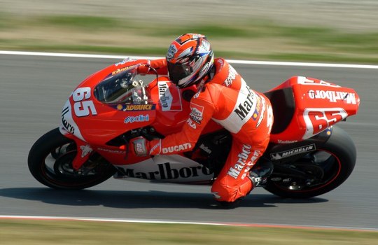
this is a bike that looks good. there's not much more to say about it (or, well, there probably is, but again it should be obvious I don't know how design works). it's a nice shade of red, I really like how the front looks... my issue with this one is that low key it is the marlboro logo that makes it particularly distinctive. kinda feels against the spirit of the whole thing, damn those tobacco companies and their lovely bike designs
here's mugello 2006, which in itself is a retro livery. I'll allow this one and I do think it's just?? very nice??
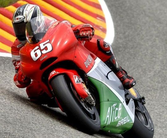
really pleasing dull colours, three shades that work together well, got something old fashioned to it. my main problem with this one is... I don't feel like it'd look as good on the current bikes? I don't know, this one works because of the kind of... soft curves of the front of the bike. I do also think quirky and a bit in your face just suit the current bikes better than trying to keep things too classy?
my general problem is that ducati history in motogp is like... we're working with a limited sample size. and when I go through the options I do find them a bit. meh. the thing is, right, the red bikes are nice, I do like the marlboro design, but it's also still essentially a red bike. and if you translate these designs to the current bike shape, it's not going to look THAT different to the bike they're riding any other week. the mugello 2006 probably does better on that account, but I don't know. I think I am kind of committed to making them all actually switch around colours here
so I was wondering if maybe you could delve into the superbikes archive? you could go for the 2001 livery, feat. bayliss (also a motogp race winner):
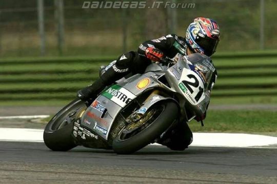
I think the silver pairs quite nicely with the black leathers... also I like it whenever the bit on the front where they put the number on has a slightly quirky shape. I'm not going to pretend like this is my all time favourite livery, but I do like it well enough! it'd translate well to the current bikes, would give us a proper switch-up, works quite nicely imo
and one more from superbikes, this from 2012:
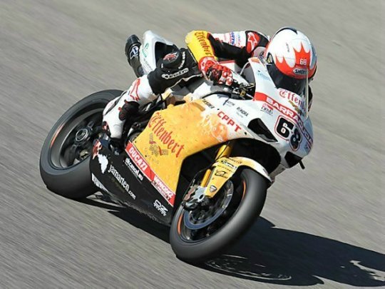
this one isn't happening for a bunch of reasons, not least because I doubt the effenbert team is one that's remembered particularly fondly by ducati. still, it passes the 'does it look distinctive' test to me, making a 'what if you threw a pint of beer over a motorcycle' livery is at the very least something different
PRAMAC
there's a few different ways you could go here, but I'd just keep it simple and go for one of the years where the pramac logo is big on one side of the bike. here's harada in 2002:
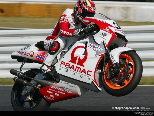
not a bad logo! you've got the arrows and everything! you've also got another more subtle silver arrow in the middle of all the white, makes the whole thing feel quite dynamic. simple colours, very pramac. bold and brash
(you could go for the 2018 mugello livery too but I philosophically reject having a 'retro' livery from 2018)
GRESINI
another satellite team that's been around for a while, and my suspicion is they'll go for one of fausto gresini's liveries. none of those... really appeal to me... so I wanted to suggest one from their telefonica movistar days back in the mid noughties. that's right: I'm talking sete's livery:
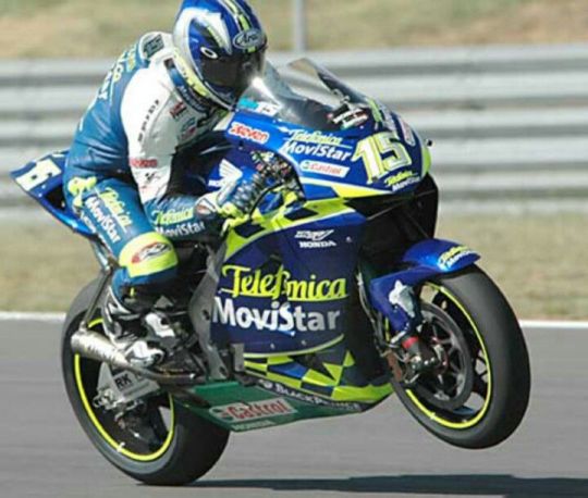
in practise, this livery does deeply annoy me in 2004 to 2005 because - despite not being in the same factories - you've somehow managed to get both title rivals in pretty damn similar liveries. like, can I tell them apart? sure. but especially with the poorer video quality, is it really necessary to make it this tricky? well! no! but also sete had this livery before his title rival switched to yamaha, so he came first. I like this one a lot! I like the way the yellow is integrated, the chequered bits around the telefonica movistar logo, good helmet too. slightly unusual patterns for the win - there's quite a lot going on with the lines on this design but it all kinda comes together. I actually think you could make this one look really good on the modern bikes, and it has a real spark and flare to it. also I would find it narratively pleasing if marc rides with sete's livery
but if gresini wants to go another way, shout out to their 2010 livery (several of the early 2010s look quite similar):
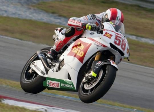
I'm not the biggest fan in the world of white liveries, but the style of this one pleases me idk. there's a slightly unusual shape on the side of this one, which I've already said I approve of. it's a nice shade of red to pair with the white. not my first pick, but I'd settle for this one
VR46
right, this is one where I really have questions. ... are they allowed to use just any of valentino's old liveries? what are the rules here? I think to maybe keep things straightforward here, I'll avoid his actual honda and yamaha liveries (those kids are not getting the gp11/12 let's be real) and stick to the lower class ones. now... those are aprilia liveries, and if aprilia wants to use some of those then please have at it. otherwise: vr46, lads, this is the way you want to go. here's 1999 (though 1998 also looks lovely):
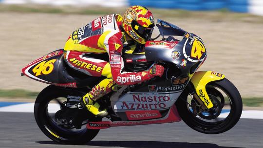
one where the leathers and helmet really feels like a part of the design, like that's the bit that really completes the look. the dark grey base tone works as something you can layer all the fun stuff on. the font of the numbers! the warm reds and yellows! the stickers! this one's just FUN, it has a real adolescent verve and joy to it
and of course there's the mugello 1999 special livery:
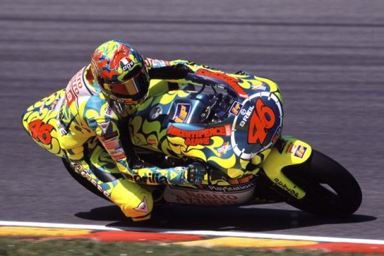
she's so pretty!! recognisable! I don't even know what to say about this one apart from. look. it's fun. just something youthful and joyous and energetic to the whole thing... keeps things pretty straightforward on the colour front, the dark orange-brown highlights really brings it all together. or something
APRILIA
so. here's another question. are we just stuck with premier class liveries here? because if so, it's pretty slim pickings... but look, thirty images, we're not getting into everything they've been up to in the lower classes
luckily, aprilia do have quite a nice 2002 entry in the premier class:
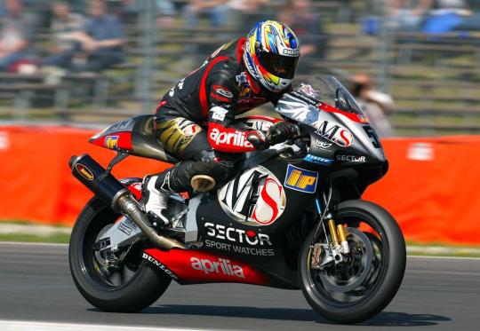
dark colours are fun sometimes!! I like the shape of the ms logo! it's a bit chaotic, but in a fun way! it feels very aprilia, somehow. this would be my pick I think, I could easily transpose this to the current bikes in my mind's eye. aprilia kinda feels like it's supposed to be a bit chaotic, all those bits sticking off. love the red sleeves of the leathers
you could also go for the 2004 livery:
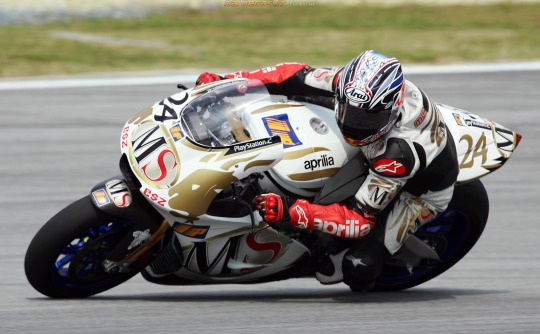
I'm not personally? super into the white and gold as a combination? definitely prefer the darker base colour of 2002. but it's quite distinctive - the red sleeves actually pop out more in this one. it's neat!
TRACKHOUSE
uh. um. uh. are they... allowed to run petronas colours? I mean it's basically still the same team? maybe they can borrow some aprilia ones? if not, then well they're the rahh rahh america team. I would ask ducati very nicely if maybe they could use this indianapolis 2009 livery in honour of the late nicky hayden:
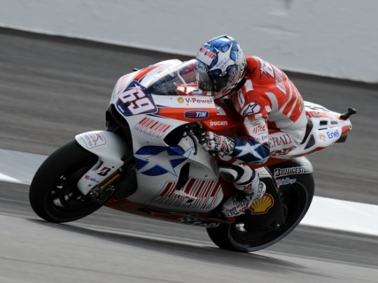
I know you probably can't do that, but well! if you could, that'd be my pick for them! I like stars, america has stars on their flags, this is very rahh rahh america. the helmet and liveries are also fun and have stars on them. that's all I've got, sorry
KTM
okay, we've got an even bigger problem than aprilia here. these guys have NOT been in motogp long enough. my idea here was... so obviously ktm just do not have a suitable back catalogue of liveries, but aren't they like basically red bull? and red bull did like. a one off partnership with suzuki for laguna 2005, and suzuki isn't even in the sport any more so it's not like there's a CLASH there. I don't know how this works! whatever. I think it's nice!
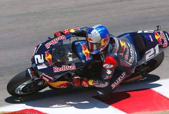
it's not the most exciting thing I've ever seen in my life, but the red bull logo works well on the black. looks classy! and if suzuki gets mad then well red bull can just chuck money at them idk
the other option is... doesn't ktm own mv agusta now? go for one of those! they look quite similar for much of a decade, so I could have included another hailwood photo here - but I'm just going to use the early seventies mv agusta instead:
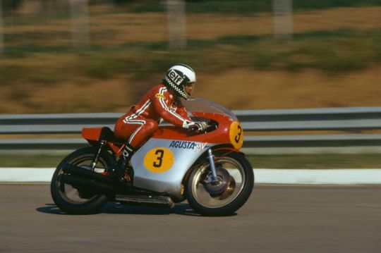
it's very simple, very basic. I'm not... sure this works on bikes these days. anyway I chose this one over its predecessor because I do like the stripes on the leathers, very adidas coded. if you can figure out how to make this whole design look good for the more complex bikes of today, then this would be a good pick imo. I like quirky shapes to put my numbers on... but sometimes circles are also good
TECH3
so. for a while, these are running the gauloises yamaha liveries, which we've already covered. maybe they could take the fortuna yamaha liveries instead that they used, especially if the factory yamaha squad doesn't want the kinda similar ones they ran at certain points. basically they're the red yamahas in the noughties. I'd go for 2004 tech3, which... y'know, the fortuna font is just quite nice, they're stylish liveries, they're just bikes you look at and go 'wow that sure is a nice bike'. and yes, we do need to at this point also mention the estoril 2004 spiderman livery
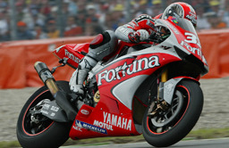
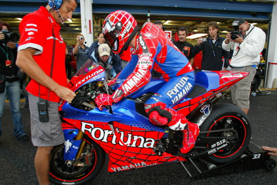
all I'm saying, if pedro acosta does not show up to silverstone on the spiderman bike. a part of me will be disappointed
otherwise, I thought the dunlops in 2007 were quite nice?
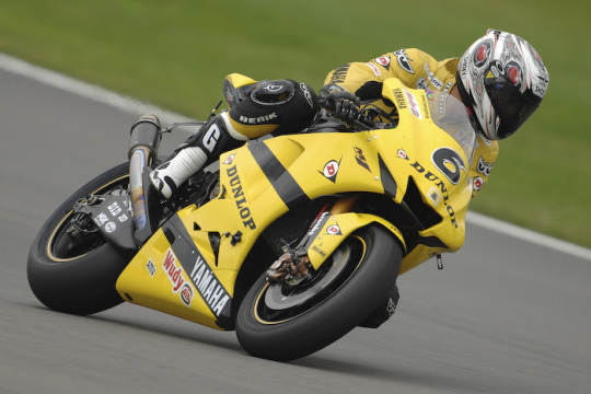
yes, yes, it's another yellow and black yamaha livery. but hey, it's a bit different from the one they referenced at laguna 2005, keeps things fresh. wouldn't mind this one
IN CONCLUSION
might add to these at some point, but those are kinda the first picks that come to mind! a lot of these are annoyingly recent, because most teams on the grid aren't that old. not quite sure what the rules of the game are here! which does mean that, as much as I enjoy the recent designs, I kinda hope honda and yamaha don't go for liveries from this century and dig a bit deeper in the archives
basically, what I'm looking for from the teams is a retro livery that a) is clearly recognisable to anyone familiar with said past livery, b) works with the actual shape of the current bike, c) looks different enough from their current livery, I want colour swaps, and d) looks cool. also, they should coordinate. istg if half of the grid shows up in white liveries... hopefully at least some of the teams will go for the fun ones!
#i don't feel like with old streams i ever SEE the liveries particularly clearly so some of them are a bit wasted on me#BUT my twitter for you page shoves like. so many photos of old liveries at me. so i've basically developed my takes through that#oh and obviously i know all the valentino ones. partly because i have my very nice reference book with very nice photos#also there's been a reddit thread on this like. once every two months for the past decade. that'll help#some of these are a REACH. ktm and trackhouse in particular but look that's all I could come up with#if ONLY suzuki were still in the sport#motogp#//#brr brr#batsplat responds#collected my photos during the race today which was nicely calming#anon icl I'm not sure there really is a type of question I usually answer. a wide range of stuff hits my inbox#I LOVE rating things even when I don't have like. sophisticated opinions. I'm just going colours pretty!!#I hate myself for this but when I saw the news I immediately went!! sete + marc livery!! gresini heritage!!#get that man in blue and yellow!!#also if anyone wants to add their own faves please feel more than free to. the thirty image limit really hurt with this one
9 notes
·
View notes
Text
Regulus and Barty Balcony Scene
I thought of this scene a long time ago and kept working on it when I could in between uni, work, family and friends. I really commend people who do this on the daily because I don't know how they do it. I really hope you enjoy this Bartylus fun. 😉
Shout out to @crimsonlovebartylus for betareading this for me at the last minute.
Regulus was meant to take the mark. It was what was expected from him since Sirius left or even before then. He knew Sirius was going to leave him one day. Ever since he met Potter, Regulus knew Sirius found a new life. One without Regulus in it.
He knew fire wasn't something to mess with no matter how much Regulus loved how it looked. The flickering colours of yellow, orange and red reminded him of his estranged brother. It also gave him control. The control Sirius wouldn't give him. The control their parents wouldn't give him.
Fire; he can control.
"Master Regulus," Kreacher muttered softly over the crackling of the large flames. "We need to go."
Regulus glared at the flickering flames and the black smoke that covered their skies.
"Not before making a stop. I need to pick someone up." Regulus grabbed Kreacher's hand and asked him to apparate them away just as a wizard apparated onto the road, followed by a number of other wizards.
Regulus waved Kreacher away as he headed towards the white balcony and the demented tree that sprung wisteria all around it. Regulus knew his parents wouldn't be home that night. Regulus' own parents were away at Voldemort's meeting whist Barty's was definitely still at the Ministry dinner. Regulus was meant to get the dark mark tomorrow night as a celebration of tonight's attack. However, the only thing they will see is ashes.
Regulus looked for a few small rocks at the base of the tree and hurling them over the balcony, hitting the connected door which was covered in sea green drapes. Barty was adamant in defying his father and decorated him room in everything Slytherin. Green drapes, expensive taste and even Salazar Slytherin's portrait facing the door so it would be the first thing someone would see when they walked into Barty's room.
Regulus smiled as the lights turned on, illuminating in the dark. He felt giddy. As if he had his favourite sweet or food after not eating for a week or a simple sip of water.
Regulus hummed to himself as he stepped closer to the tree, still keeping his eyes on the pearlescent balcony. "'He jests at scars that never felt a wound,'" he exclaimed with a sigh.
Regulus could hear the door open and footsteps, before a brown tuff of hair over the balcony, and sky blue eyes latching onto his. Barty smiled at him and laughed. "'But, soft!'" Regulus shouted, now grinning up at his best friend. "'What light through yonder window breaks?"
Regulus waved at Barty, who waited for Regulus for more. "'It is the east, and Barty is the sun. Arise, fair sun, and kill the envious moon, who is already sick and pale with grief, that thou his maid art far more fair than he: be not his maid, since he is envious; his vestal livery is but sick and green and none bit fools do wear it; cast it off.'"
Regulus grabbed the tree and tugged on the wisteria before climbing up until the first branch before sitting on it. Barty laughed and leaned on his hand before nudging his head, signalling to Regulus to carry on.
"'It is my man, O, it is my love!'" Regulus exclaimed, shouting the words as Barty send a kiss. "'O, that he knew he were! He speaks yet he says nothing: what of that?'" Regulus cocks his brow at Barty with a giggle escaping him before he could stop himself.
Regulus climbs up a second branch, "'His eyes discourses; I will answer it.'" Regulus copies Barty's lazy stance. "'I am too bold, 'tis not to me he speaks: two of the fairest stars in all the heaven, having some business, do entreat his eyes to twinkle in their spheres till they return. What if his eyes were there, they in his head? The brightness of his cheek would shame those stars, as daylight doth a lamp; his eyes in heaven would through the airy region stream so bright that birds would sing and think it were not not. See, how he leans his cheek upon his hand!'" Barty rolls his eyes and walked over to where the tree is before leaning over, eyes watching Regulus as he loses his mind to a Shakespearean sonnet. "'O, that I were a glove upon that hand, that I might touch that cheek!'"
"There's another set of cheeks you can touch."
Regulus groans, "say the line, arsehole."
"You call me the most kindest of names, sweetheart."
"Barty," Regulus moaned, resisting the strong urge to stomp his leg on the tree.
Barty chuckled and gasped. "'Ay me!'"
"'He speaks-'"
"-I can't do this-"
"Barty!" Regulus glares at him before clearing his throat and carrying on with the scene as if the boy above him wasn't snorting at Regulus' climbing skills. "'O, speak again, bright angel!'" Regulus shoots another fierce look at Barty as he opens his mouth again. "'For thou art as glorious to this night, being o'er my head as a winged messenger of heaven unto the white-upturned wondering eyes of mortals that fall back to gaze on him when he bestrides the lazy-pacing clouds and sails upon the bosom of the air.'"
Barty glances at his chest before shrugging. "'O Regulus, Regulus! Wherefore art thou Regulus? Deny thy father and refuse thy name; or, if thou wilt not but sworn my love, and I'll no longer be a Crouch.'"
Regulus cocked his head, "'shall I hear more, or shall I speak at this?'"
"'Tis but thy name that is my enemy; thou art thyself, though not a Black. What's Black? It is nor hand, nor foot, nor arm, nor face, nor any other part belonging to a man. O, be some other name. What's in a name? That which we call a rose by any other name would smell as sweet; so Regulus would, were he not Regulus call'd, retain that dear perfection which he owes without that title. Regulus, doff thy name, and for that name which is no part of thee take all myself.'"
Regulus grinned up at Barty before climbing up another branch, inching closer and closer to the earth-haired boy. "'I take thee at thy word: call me but love, and I'll be new baptized; henceforth I never will be Regulus.'"
"'What man art thou that thus bescreen'd in night so stumblest on my counsel?'"
"'By a name I know not how to tell thee who I am: my name, dear Saint, is hateful to myself, because it is an enemy to thee; had i it written, I would tear the word.'"
"You'd kill my enemies for me, oh sweet Regulus?"
"Thats not the line."
"Screw the line," Barty grabbed Regulus' shirt and pulled him closer. "You'd slay my enemies, sweetheart."
"Not while you keep interrupting this."
"I'll be demanding an answer after this." Barty pushed Regulus away gently before placing his hand over his forehead like one of those fainting women in paintings. "'Myears have not yet drunk a hundred words of that tongue's utterance, yet I know the sound: art thou not Regulus and a Black?'"
"'Neither, fair Saint, if either thee dislike.'" Regulus said, not as the Romeo but as himself. Since the moment he burned Grimmauld Place down he was no longer a Black. Simply Regulus.
"'How comest thou hither, tell me, and wherefore?'" Barty sighed staring down the wisteria and the weakened tree. "'The orchard walls are high and hare to climb-'"
"They were not that hard to climb."
"Who's interrupting who now?" Barty said with humorous eyes as Regulus muttered an unapologetic apology. Barty cleared his throat. "'And the place death, considering who thou art. If any of my kinsmen find thee here...'"
"'With love's light wings did I o'er-perch these walls; for stone limits cannot hold love out and what love can do that dares love attempt. Therefore thy kinsmen are no let to me.'"
"'If they do see thee, they will murder thee.'"
"'Alack, there lies more peril in thine eye than twenty of their swords. Look thou but sweet, and I am proof against their enmity.'"
"'I would not for the world they saw thee here.'"
"'I have night's cloak to hide me from their sight and but thou love me, let them find me here. My life were better ended by their hate, than death prorogued, wanting of thy love.'"
Barty furrowed his brows as if he had just realised who he was talking to. "'By whose direction found'st thou out this place?'"
"'By love, who first did prompt me to inquire. He lent me counsel and I lent him eyes. I am no pilot; yet, wert thou as far as that vast shore wash'd with the farthest sea, I would adventure for such merchandise,'" Regulus replied, hoping for Barty to make the connection. He was no longer apart of this war.
He was free.
"Reggie, what did you do?"
"Does it matter?" Regulus climbed out the balcony and placed his feet firmly on the floor. "I'm here to ask you something. It is something of great importance."
"Yes."
"You haven't heard the question," Regulus said, trying to stop the smile that was breaking onto his face.
"Its you," Barty said softly as if it way a hidden secret just between the two of them. "I'll follow you to hell and back. I swear it."
"Don't swear by that," Regulus fussed. Hell was mean to be for sinners and he couldn't deny they were both sinners; Regulus wanted Barty to be with him after this life. Regulus wanted Barty to always to be there with him. That would be his Heaven.
Barty and Regulus.
Regulus and Barty.
Together Always. "Oh," Barty smirked, taking a leaf out of Regulus' hair, "'What shall I swear by?'"
"'Do not swear at all; or, if thou wilt, swear by thy gracious self, which is the god of my idolatry, and I'll believe thee.'" Regulus paused for a beat before clearing his throat once more as if he'd spoken for too long. "Barty, will you-"
A knock froze Regulus in his place. Barty was meant to be home alone as his parents gallivanted in a Ministry party with the rest of the boring middle-aged office workers. The plan wasn't going as he planned. Or it was perhaps his parents, automatically thinking that he would go to Barty because of their long-standing friendship. But wouldn't they think to go to the Potters first. Or did they believe that their perfect second son wouldn't fall to that level of his disgraced brother.
Barty pulled Regulus into the darkest corner of the balcony, hidden away beside the serpentine statue and the emerald green drapes. He rushed inside a Regulus gripped the warm hand that Barty held closer to his chest with a bated breath, waiting for his best friend to come back.
Regulus could hear Barty's footsteps as clear as the night sky. He closed his eyes, pressing his back into the serpent statue and waited, ready to call out Kreacher's name.
"Mum?"
"Ah, Schnucki. Baby, you're still up?"
"I was reading on the balcony." Barty answered in the softest tone Regulus had ever heard him speak. "Are you ill again?"
"No. No, your father had an emergency at the Ministry so he had to leave. Schnucki, don't stay up too late. You need go keep growing up tall just like your grandfather, in ordnung?"
"In ordnung, ma. Good night."
Barty quickly closed the door and ran back out, letting out a breath as he spots Regulus in the same place as he left him. "Hey... 'wilt thou leave me so unsatisfied?'"
Regulus simply stared at his best friend for a minute before crashing into him, wrapping his arms tight around Barty. This may be his last time to see, touch or smell Barty and his had to cherish it. Regulus, just like everything else, was going to ruin this.
There was no return to normal after this.
There was no return to normal the second he lit the flame to burn down Grimmauld Place.
Regulus felt Barty wrap his own arms tight around Regulus, somehow sensitive to the guilt that Regulus was feeling. "Reggie," Barty breathed out, close to Regulus' ear and close to his heart. "Geliebte," he whispered. "My geliebte. What happened?"
"I'm leaving," Regulus murmured into Barty's shoulder. "I'm never coming back, Barty." Regulus could feel Barty stiffen as his hold around Regulus tightened with every word.
If Barty asked him to stay he would. So that's why he had to leave now.
Leave before Barty tried to make him stay.
Leave before Regulus puts his best friend in trouble.
Regulus used all his strength to push himself away from Barty. Barty let out a weak whimper as if the distance pained him. Regulus hardened his eyes or at least he tried to. He knew he couldn't fake his persona long enough in front of Barty because Barty knows him. Barty is one of the only people to truly know Regulus to his core.
Many have tried.
Sirius.
James.
Evan.
Dorcas.
And even Pandora has come close.
But Barty simply knew who Regulus was. Who Regulus is. And who Regulus will be. "My train leaves at seven-twenty in the morning. It's the first train out to Paris."
Regulus hovered his hand over his heart, where a second ticket stayed warm. Who was Regulus to be selfish with Barty? This was a large risk for both of them to take? Barty could reject Regulus and he would be left alone to travel to France. Barty still had Even, Dorcas and Pandora at Hogwarts. He didn't need Regulus like Regulus needed Barty.
"Why?" Barty heaved as his chest quickened. "Why?"
"I can't do it anymore. I..." Regulus gripped the second ticket in his hand and pulled it out, "can't." He pressed the ticket into Barty's hand, holding it tight between his own. "I'll be there until my train comes."
Regulus grips Barty's cheek in his hand and felt the cool summer night but Regulus couldn't help but feel the warmth with Barty. Not heat like how he felt with James but the warmth of a cooling fire. The warmth of a soft, safe home Regulus had always imagined. Barty nestles his face into Regulus' hand, his eyelids fluttering shut. "'A thousand times good night,' Barty."
#regulus black#bartylus#regulus x barty#barty crouch jr#regulus arcturus black#bartemius crouch jr#marauders#the black family#grimmauld place#french regulus black#german Barty Crouch Jr#dead slytherins#slytherin skittles#70s slytherins#marauder era#marauder era slytherins#the black brothers#pandora lovegood#regulus and evan and barty#even rosier#slytherin dorcas#dorcas meadowes#ao3
30 notes
·
View notes
Text

Probably one of my oddest contributions to the Thomas Fandom is USAR Light Mikado Mike.
Seriously this sprite is surprisingly popular, mainly as Churchill and Dr. Syn have still yet to get sprites, I've seen this become Jock a few times which I think is fun.
The whole reason why Mike is even an American is S734 is due to his portrayal by EE93, the voice and mannerisms were just so distinct, like his voices that was officially given were fun, the weirdly Gordon Ramsey sound from Tim Whitnall was fun but I figured that the brash American voice was rather fun.
So lore surrounding him, Mike doesn't show up with Rex and Bert (Otherwise known as Wallace in S734) he's the eighth engine purchased for the Arlesdale, he was contract built for Hanson Moore, one of the more railway interested investors, and he was the first brand new steam engine built for the railway, everyone else up until that point had been pre-owned. Mr. Moore really went all out on the livery, Red, White and Blue, and a nameplate reading Scarlet Fire, the other engines thought Mike's overall appearance was gaudy, and trying to get peoples attention, and Rex nearly exploded from laughing so hard after Mike's first passenger train, when afterwards he claimed he hated them, and would prefer goods work, Ragnar said that you could practically hear Mr. Moore shrink when Mike said that.
Mike loves the heavy Ballast work due to the fact that Ragnar and Rex are Atlantics (Will explain them in their own post) and Wallace was rather old, it was down to Franka and Braid (Basset Lowke Pacific) to work those heavy trains, but when Mike came along he took to them like old Roosevelt to a horse, he loves the job, mainly as it shows everyone how strong he is, and well he's right he is the strongest one.
In terms of his relationships with the others, they find him rather funny, if a bit brash and argumentative and glad that he showed up to haul Ballast.
Wretch and Sprocket (Blisters) like Mike, even if he finds the two slightly unsettling but nice to talk to.
Wallace doesn't quite know how to feel about Mike, or Michael as he calls him, a privilege reserved only for those who Mike deeply respects, like the Small Control or Mr. Moore, so the fact he doesn't throw old Wallace a look of death shows he respects the old codger, but old Wally as Mike calls him, doesn't like how Mike treats the passengers.
Ragnar finds the 'Big Yank' as he calls him rather cumbersome but respects his self assuredness and strength. 'Well placed confidence he has' is what he says about him.
Rex loves ripping into Mike, as he knows he has the ego to recover, but even then his remarks are only paint deep, he has a lot of respect for Mike, but finds it very funny that he just can't with passengers.
Franka's relationship with Mike is really odd, the two argue like they need to live, the others would always yell 'GET A SHED!' even Rex who loves to argue with him, practically broke over an argument about lubrication oil, and he practically screamed at them to just get together needless to say the two have been dating for awhile.
Braid, she tries to actively avoid interacting with Mike, mainly as she knows that if she engages in conversation, she'll realise that she hasn't move for an hour.
Jock, they treat Mike like a big brother, did something stupid with a ballast wagon, accidently stole Ragnar's beard wax, old Mike has you covered.
Old Big Scarlet is for lack of a better term the big brash glue that holds the crew together, mainly as he does the heavy lifting most of them can't.
4 notes
·
View notes
Text

(minus a few who were too hard to find arrival pics of) no one asked for this and yet!!!! here we are!!!
*obligatory disclaimer* these are just my opinions. this is not criticism about how the drivers look or their physical appearance. this is not to rank the drivers on anything other than their choices/outfits. plz do not take this seriously, i am just a random weird woman posting online. i have no credibility, only passion and rage.
CATEGORY #1 - SERVING (THE POSITIVES)

P1: LEWIS HAMILTON
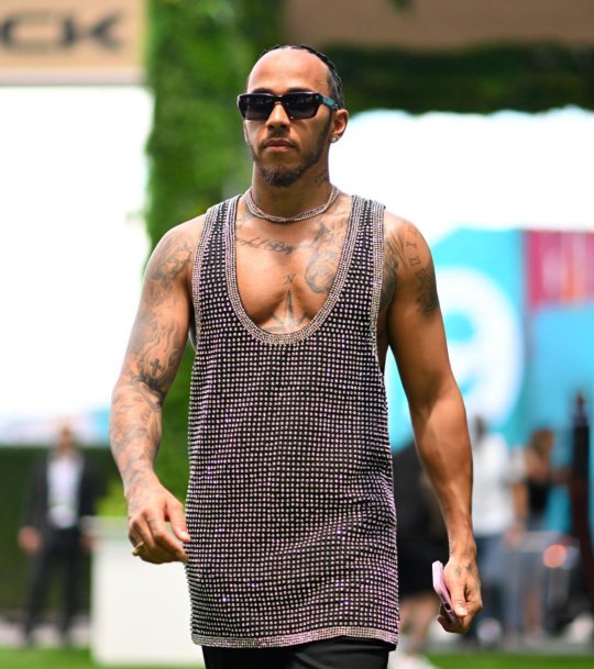
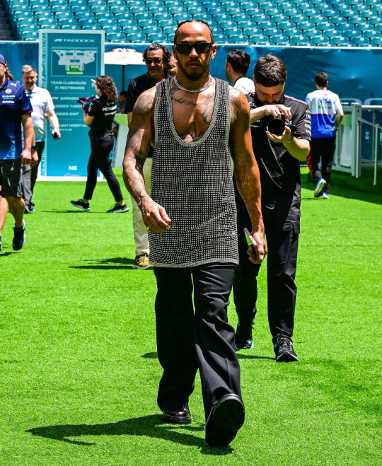
I MEAN....LIKE WE SAY IT EVERY TIME...

do i wish it wasn't an old navy tank top tunic dress? yes. but his supple breasts are out...... i cant focus on anything else.....my heart beats in my ears... dont ask me what color the anything is. I DONT KNOW I CANT SEE IT
P2: LANDO NORRIS
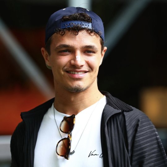
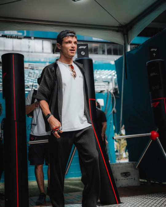
Perhaps the MOST surprising pick for me. Is Lando hot??????????? I've been asking myself this for months......he also seems to be entering his fashion girl era. (FINALLY!!!) He was pictured in an Aimé sweatshirt (A JUMPA for ur english and former english colony folk) so i have high hopes. Maybe I'm just seduced by his Dutch battle scars but he really came thru today. at first i thought he was in miyake and i was literally going to go BALD. but its not :( the brand is basically an even more expensive Zara lmao but...baby steps lol
P3: FERNANDO ALONSO
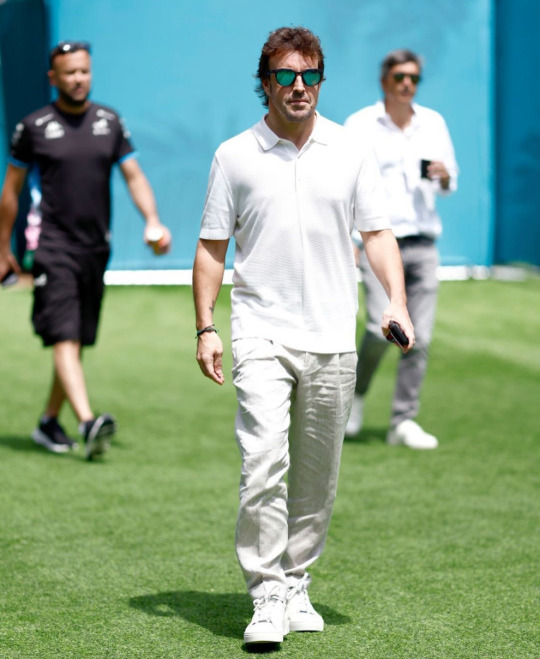
When Kevin Jz Prodigy chants 'eating the old way! serving the old way! serving the old way!', they meant that about grandpa stunting in head to toe WAG white. he's got the youthful shoes, casual polo with the dad fit, linen trousers for the swap weather. its classic. reminding all the wags who the real bad bitch is.
P4: ZHOU GUANYU
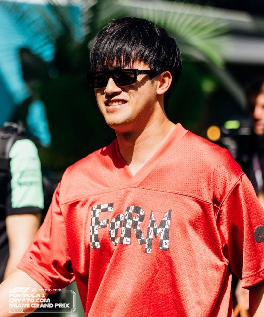
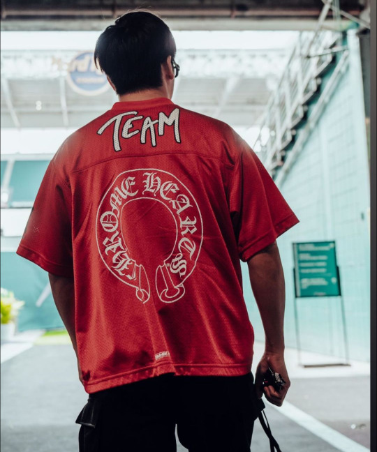
The media is doing him sooo dirty by not showing the back of his jersey!! its not my favorite look he's ever done but it's only media day. i think he looks great in red and i love the blackletter font on the back. I do wish the front was a little cuter but his pants are really cool (sorry theyre cropped out lol) and he's still giving personality and taste!
P6: OSCAR PIASTRI
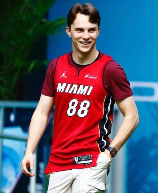
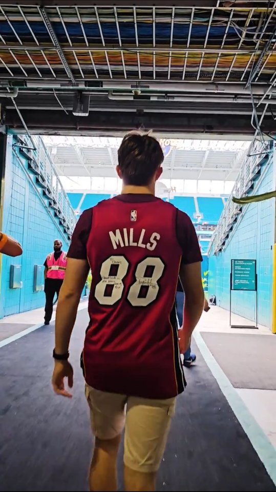
ok yes he does have the 6th grade boy who's still close with his mother fit on under the jersey but he's always stayed true to who he is. i like that he's worn jerseys to races/race locations he seems excited about like he wore one in Melbourne for his home race. AND this one is signed?! he came with a goal in mind and it was to GAG the fellow jocks at the paddock. jock4jock if you will. gotta respect it.
P7: YUKI TSUNODA
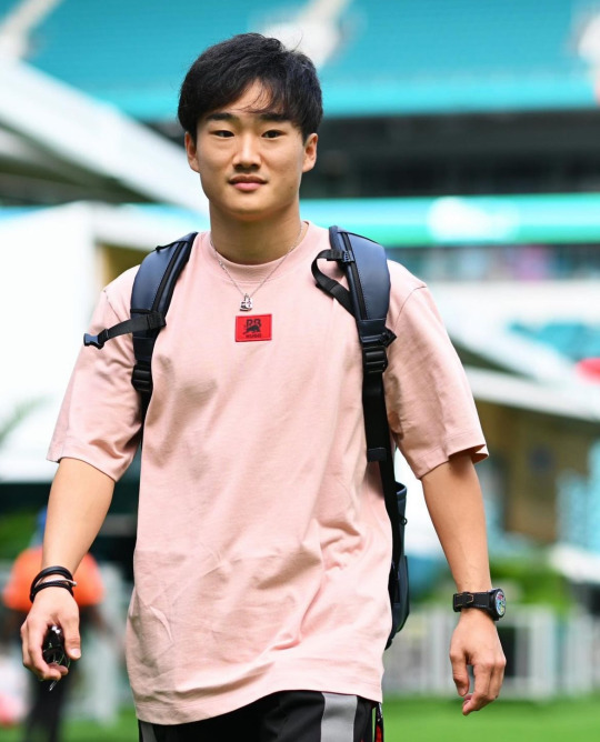
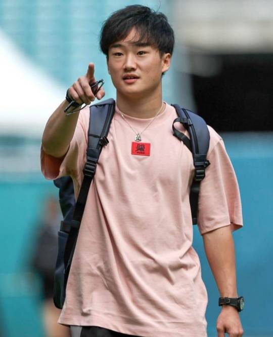
it's a basic serve but a serve nonetheless. he's comfy, he's casual and looks good. i like this color on him a lot and the contrast between the pink and red is fun. hair is looking super good too!!! this is gonna be a good weekend for him, i'm demanding it from the universe!!
P8: VALTERRI BOTTAS & LANCE STROLL
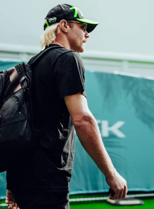
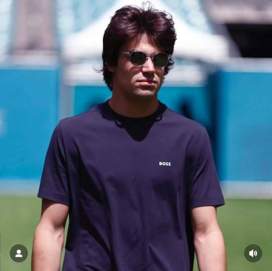
A tie because they're both just on the diva in a tee vibe. You can't blame a comfort queen for being one! The color is nice on Lance and Val is sporting that farm's tan well.
CATEGORY #2 - CHOP!!!!!!!!!!!!!!!!!!!!!! (THE BAD AND THE MEH)

P8: LOGAN SARGENT & ALEX ALBON
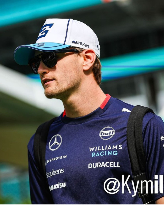
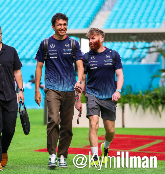
Another tie because they both just came in team livery. that's literally the only reason they were included in this category. though it pains me to rate alex anything other than handsome, wifed and successful. he does look great in them trousers and who can resist him in blue! hoping for a little creativity (arriving with lily) tomorrow!! as for logan...this is ur home race.....i better see something real special and/or Floridian tomorrow or ELSE.........CHOP!!!
P9: DANIEL RICCIARDO
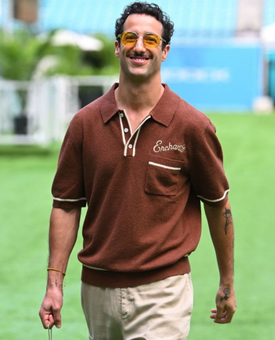
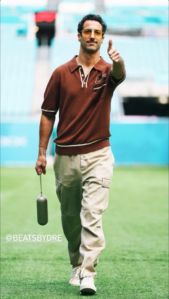
I know the girls are not gonna like this one. But i must speak my truth.....even if you won't hear it....
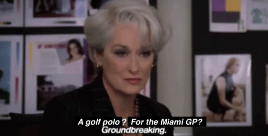
I don't think anyone is surprised he's wearing his own merch. It would be better for me if it was a little more interesting than his last few releases of just his brand's logo but I like the color and detailing. He's, of course, wearing the wrong size. Personally, if i were trying to promote my own brand, I would perfect tailor the shirt to fit my body so it looked like the best shirt i've ever worn. The Purse by Dre is probably the best part if only because its so stupid and useless. The cargo pants....look, as a former fan, I know that he prefers to dress in baggier clothes. I'm not knocking him for that--who doesn't love a billowing tee to hide the body tea but when you're a 35 year old millionaire...why do your pants not fit you. This is saggy crotch and diaper butt territory. From a styling perspective, sometimes wearing oversized clothes only makes you look smaller. Like you're drowning in your own clothes. That's what it always looks like to me with DR. I know he's interested in fashion and yeah maybe he is still on my shit list but for someone of his status and with the level of resources he has at his disposal...like this man went to the MET GALA with an actually good nEW YORK BASED DESIGNER. what is this...CHOPPPPP
LAST PLACE (THERES NOT THAT MANY SORRY): FUCKASS FERRARI CARLOSER SAINZ AND CHARLES LECHOP!!!!!!!!!
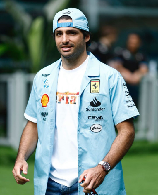
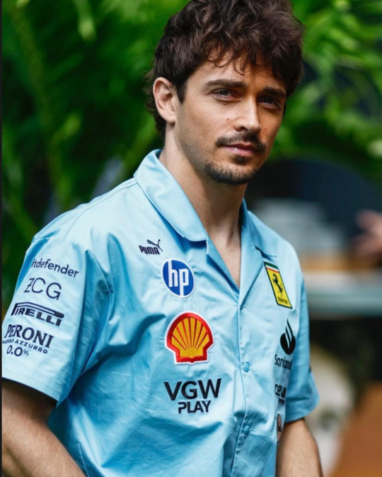
Ugh. heavy on my mind AND my spirit. Never has powdered blue made me so viscerally annoyed. Normally I love this color but not like this. If the design was actually good, I would still hate it but lucky for a hater like me, the design is SOOOOOOOOO hideous. I guess one of the top ten corporations ruining our planets wasn't enough of a steal for them, they had to add a double whammy for genocide blood money too! Puma AND Hp? It's like they thought the BDS chart was a bingo card. The mechanic style name tags are a nice touch too. Very down to earth for millionaires who's private plane usage might be able to rival THAT woman. Blue collar cosplay is kinda fun when you don't actually have to live paycheck to paycheck! Its nice that their name tages are so low too, so you remember that they've sold their souls out to corporations. It's really only a matter of time before a thirst photoshoot with laptops come out or Charles shoves his puppy into a printer. But hey! At least Charles is investing in the local community! Always nice to see million dollar homes sell when the cost of living for a normal person is 30% over the national average in a city where it's illegal to sleep on the streets🥰 CHOP!!!!!!!!!!!!!!!!!!!!!!!!!!!!!!!!!!!!!!!!!!!!!!!!!!!!!!!!!!!!!!!!!!!!!!!!!!!!!!!!!!!!!!!!!
(ok yes, i am aware these men are all millionaires and only one of them have so much as acknowledged the mass murder of Palestinians. but i'll talk my shit forever if it means there's just one person talking about the real world in the f1 space. FREE PALESTINE. BELIEVE WOMEN. FUCK COMFORTABILITY AND THESE MEN WHO PROTECT EACH OTHER. THEY NEVER WANTED US IN THIS SPORT TO BEGIN WITH, ALL THE MORE REASON TO REMIND THEM I'M HERE!!!!!!!!!)
sorry for the rant. this was originally going to be about fashion. and it still is. sorta. BYE
2 notes
·
View notes
Text
DTS S1 Word Vomit
Temporarily veering away from primer territory, because I'm rewatching DTS S1 (I'm about halfway through at this point) and having some FEELINGS and need to get them out somewhere:
Daniel's personality hasn't changed much but his attitude is SO different. He was so focused on winning and especially on winning a championship. I'm thankful he's in a much better place now! I know everyone wants to win a WDC but I think it's a much healthier attitude to go out and have fun driving and do the best you can do, because sometimes your car is a tractor and if you spend all of your time thinking about how you won't ever be WDC, that's miserable.
They don't show even half of the times it happened but gosh it really drives home how unreliable the Renault engines were. So many engine problems leading to retirements for Max and Daniel both. (I think it's telling that now in 2024 Renault isn't supplying engines to anyone but their own team (Alpine) anymore.)
There's so much more we know about Daniel going to Renault that isn't shown and I wish I knew better what was known at the time but not included by Netflix vs. what we have learned in the years since.
For example, Christian talking about how they'd offered Daniel plenty of money is hilarious, now that we know how much more he made at Renault.
Speaking of Christian, is the entire DTS team frantically scrambling this week to re-cut as much of S6 as they can? Sending them energy and focus and lots of good food and caffeine.
Daniel going to Renault meant Carlos was all of a sudden out of a seat. Sounds familiar...🤔
I am petty and will probably never forgive ZB for how he treated Daniel and I'm feeling very vindicated in that opinion because he's so unlikable even in S1.
Every time someone crashes, the first thing that happens is their race engineer/TP asks if they are okay. This is normal, this is what we are used to. It keeps reminding me of that time that, while at McL, Daniel crashed and the first thing he was asked was "Is the car okay?" (See previous bullet point.)
Also feeling vindicated about having the opinion that Checo is a kind of reckless driver, and has been for awhile.
Related, Max is such an aggressive driver and I just...hope he is in the lead most of the time again next year so I don't have to worry about him playing bumper cars at 200+ mph.
It's fun to hear GP talking to Max on the radio and know it's him, even though he isn't named.
The lack of Merc and Ferrari in this season is both funny and sad, but bless the producers for finding some good press conference footage of Kimi. I think Kimi might have annoyed me if I were watching his seasons in real time, but looking back, he cracks me up. I'm glad I never had to manage him, though!
Pierre so excited about going to Red Bull, oof.
But all of the Pierre and Charles being friends since they were tiny lore is adorable!
I'm going to miss Günther so much! (I used to think that someday I would go visit the Haas HQ in North Carolina and...that's no longer something I'm particularly interested in.)
I'm sure I'm not the first to point this out, but I didn't remember the 2018 Toro Rosso car well enough to make the connection, but look at the similarity in the liveries between the 2018 TR and the 2024 VCARB. Obviously not identical, but I like the return of the blue, the red accents, and the silver bull!
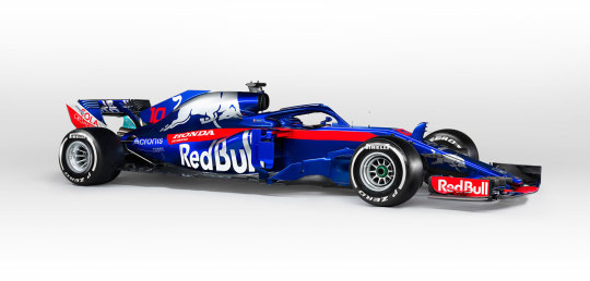
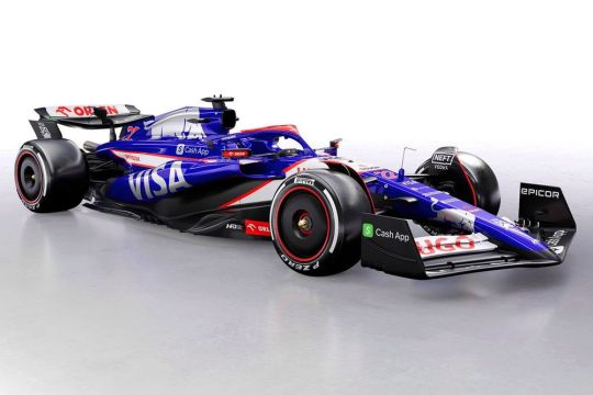
Anyways, that's it for now, I hope someone enjoyed this word vomit. It is really interesting going back and watching S1 knowing so much more about the sport, the season, and what's to come. Also interesting how much a lot of the drivers have matured since 2018. I'm sure that happens all the time with drivers who stick around for many years, but this is my first time seeing it.
2 notes
·
View notes
Text
DeLirianne
"This (over)glorified piece of irish idea, american parts and pop-culture fame got it's eyes on you. It might not be able to hover (yet) and it has a lot to desire, but the fun thay you get from driving it is still fairly nice. Not to mention all custom parts made and saved from the 80's and 90's! By the way, do we mentioned that this thing is basically a orphan now?" - vehicle catalogue description
DLC DeLirianne sometimes reffered to as DeLirianne is a car aviable to buy in Retro Rusty Pack, which contains several more retro-inspired cars, one of which is DeLirianne. While not listed, it's manufacturer is called DLC (DeLirianne Car Company).
Design
DeLirianne's name and design is based on (in)famous DeLorean by DMC (DeLorean Motor Company). While overall looks is more akin to 1981 version, there are some parts which come from diffrent models. It's tuning options are relatively small.
It is actually stated, that this was the only car that DLC made before they went bankrupt and shut down. This makes all DeLirianne to be sought after and often used as exhibition models for automotive museums and private collections. This also explains the high prize both for buying the car and upgrading it, since it's spare parts and the car itself are really rare.
There is a custom version, that has hovercar parts. Both versions have three variants each.
There is a customized version made from abadoned one by Jeremiah and called "Doctor DeLirious" which is a DeLirianne customized to look like ambulance. It was made for a car show and later he gets a renovated and restored version as his third (after Tamer and Berserk) car he owns. It actually appears later several times in the comics.
2. Variants
Besides Doctor DeLirious, there are versions called "NFPD DeLirianne" and "Mega Runner DeLirianne". Both are seen in normal and hover version. The only DeLirianne that can be found is a random one that can spawn in some parts of more richer zones. NFPD (Neo Fanoshiko Police Department) version is a DeLirianne turned into a cop car with a white-black livery and blue-red police lights. Mega Runner version is a version made for drag racing, and it has custom features like lowered suspension, tinted glass, extra engine in the back and several parts are missing.
3. Behind the scenes
Name is a play on DeLorean and 'delirium'. Name also can be seen as feminized version of the DeLorean since Lorean sound masculine, while Lirianne seems feminine.
Hover version could be seen as a reference to Back To The Future, but it has more similiarites to hovercars from Fifth Element, Blade Runner or Quarantine. There is actually "Out of the Life" livery that makes reference to the movie.
"Autocalypse Now!" made mostly for Mega Runner version makes the car look like DeGoryun from Carmageddon series. It even has special spikes as it's custom bumper option. Name also references Carmageddon II: Carpocalypse Now.
"Shekh's Special" livery is based off golden version of DeLorean but with various arabic-themed decorations and finishes. The livery itself also looks like damascus steel with oriental carvings.
"Protoplastic" livery is meant to look like original clay replica made for overall model presentation. This also gives car more matte and rough look, with some parts having textures looking like paper or wood.
NFPD livery seems to be mix of american and japanese police car liveries, with paint scheme akin to american police and giving details of japanese police. Both are hybrid of police liveries for San Francisco and Yokohama, main influences for Neo Fanoshiko.
Name of DeLirianne's manufacture DeLirianne Car Company is both play on DeLorean Motor Company and term 'downloadable content' or DLC. It is also stated that company stopped to exist, like DMC in real life.
In real life, DeLorean was made around 1980's, while some of the DeLirianne parts were made in the 90's and there is even few made around 2000's. This could be explained by specialized car customization and tuning made for more unique vehicles like cars, bikes and even boats.
DeLirianne is featured with some custom parts with "D4J0DG3" plate on one of Jeremiah's sketches. The writing can be read as "The Judge", a reference to Jeremiah's alias, "Judgement". This plate would later be used by Jeremiah's Shermy Tamer.
1 note
·
View note
Text
JD Space
I saw the ping across my dash, someone was trying to contact me. I pinged back to get a look at them, know what I'm dealing with. A low res image of the ship popped up on screen, a small black ship, single person, probably a fighter. No colour meant they liked to hide in space and no livery meant they were independent. Could be a pirate, more likely a bounty hunter given how they hadn't fired yet.
I answered the call, a voice crackled through my headset. "What's your JD?" She said, blunt and to the point.
"Pinging you now." I replied in comms, tapping my console to give her access to my Jurisditial Designation code. I didn't make small talk, Bounty Hunters weren't the patient sort and itchy on the trigger if you didn’t give them what they wanted. I was also just happy to get moving anyway, I had a delivery to make.
I saw my console light up while her system connected to mine and we waited a minute as she pinged the local jurisdiction for decryption and verification.
"D&Vs clear, on your way." She said cutting comms, clearly not looking to chat. I saw her ship light up, thrusters glowing blue against the blackness of space as she flew over my cockpit. She didn’t need to fly that close, she had the whole sky she could’ve used. No, she was making a point; ‘Don’t mess with me’ she was saying. Now all bounty hunters had an ego, but this felt different, piracy and smuggling wasn’t uncommon this far away from the hypergate network, but I had a feeling she was looking for someone specific and was pissed I wasn’t it.
Except I had a feeling I actually was.
My JD code was actually a legal one. Just that it didn't belong to me or this ship. JDs are near impossible to forge so it was easiest to just duplicate one. Lucky for me Bounty Hunters aren't the patient sort, she just cared that it was real and didn't stick around till the JD ping got back to its home jurisdiction. If she had waited then she would have found out the JD I used didn't match my ship, she also didn't stop to wonder why a trader was halfway across the galaxy from their jurisdiction.
But I figured she'd get a notification in the next hour after the ping had made its way around the galaxy, so best I got out of there. I had a delivery to make after all. I made a silent prayer that someone at Corridian XIV would be able to get me a new JD and a paintjob, but I still had to get there first. My truck was a bit old at this point, a banged up mid-class freighter, so even if I did already have a head start on the bounty hunter, her ship was newer and sleeker so would easily be able to catch up if the ping came back sooner rather than later.
I burned excess to get there faster, I could have coasted and still got there with time to spare and I wasn't going to be happy with the extra fuel costs later, but better that than no payday and a year in prison. I'll be honest, I wasn't expecting to get pinged so soon, I'd barely been out in this cluster a week, just having enough time to score a decent smuggling job (recommendations go a long way, even in black markets), so either this cargo was tainted or someone had set me up.
I'd have to add it to the list of worries along with my now compromised JD, but a job is a job and I'm sure the people of Corridian XIV needed whatever was in those crates.
This far from the hypergates supplies weren’t regular and the law was mostly left for people for people to sort out amongst themselves. So here we were; a bunch of pirates and bounty hunters stuck in a loop.
~~~~~~~~~~~~~
Tentatively calling this JD Space, just because it sounds fun and rolls off the tongue. Don't know if I could make it into a full story but I wanted to try my hand at worldbuilding, or galaxy-building I guess and I started with a small concept and wanted to include slang, I just like the phrase "What's your JD?" Others include "Off-Map" I.E. Having no JD Code so you aren't on the JD Map.
I think there's a fun story in this concept somewhere but it's weird; I usually start off with a short story then build the world around that as it makes sense, so this is backwards for me. But also interesting that I've basically come up with a universe based around bureacracy and I'd be curious if I could turn that into something interesting.
0 notes
Text
bats eyelashes... circles au
its called circles au because it came to me while listening to circles by nonpoint :> which is on the acceleracers soundtrack. and the song is kind of the whole theme of the au (and of this blog now)
basically! everything in acceleracers happens as normal. until the end of ultimate race, where vert is left in the silencerz base. he blinks and then its all gone, faded to black. vert is stuck in limbo for four long, long years.
at least, that's how long we know it is. to vert? infinite. instant. eternity of nothingness, a day, a month, a week, a million years he doesn't know, nobody knows. (can you tell that i watched that really popular myhouse.wad video)
he tries to sleep through most of it. the times where he's awake are agonizing.
he blinks again and he's in a musty garage in the desert.
there's two paths we can go to from here: the ghost path, and the reincarnation path. i like thinking about both. im not sure where to go with it tbh. ghost au is fun but in terms of actual canon status i think reincarnation is my actual headcanon
the ghost path: he's in a musty garage in the desert. is this it?, he thinks, have i finally lost it?
there's another man there who looks like him. cleaner hair, still bright and messy blond. blue eyes. the red livery is distracting, but that's clearly power rage he's working on. yep, i've lost it, so he thinks.
when he tries to step forward he realizes he's floating off the ground. when he finally hits the floor, there is no thud. it's like a lucid dream or out of body experience. did he just hit his head back at the silencerz hq? was he concussed?
wait and see, vert. wait and see.
this other man quips something and the car revs. he should follow this guy. when he tries to open the door, his hand slips through. strange. at least there's a passenger seat, which he somehow doesn't clip into.
vert is surprisingly sick. the new driver spins around, and he shouldn't feel sick, he's not even tangible and has driven in salt flats his whole life, at 300 mph no less in the world race, why is he sick?
there's a cop on the other end of the car.
"pull over wheeler, you're speedin'."
huh. same appearance and same surname to boot.
"sorry sheriff johnson, it's not against the law if i'm on the salt flats!" the other wheeler chirps. "and according to my speedometer, i'm doing the speed limit! cactus!"
vert is confused until johnson slams into a literal cactus. eh, never liked the cops anyway.
and on that fated day, vert watched this new vert take on the multiverse, and everything that the acceleracer knew was washed away in light of new knowledge. wisdom is a circle, after all.
two years pass.
the vandals were defeated, the sark - oh how familiar were they - were on the brink of collapse, and vert could smell the blood (or perhaps energy?) of the red sentients in the proverbial water, and knew his time was coming close to an end. he's getting restless.
one night, vert wheeler had a dream. was it a dream? ghosts weren't real, he knew, or did he know...
outside zeke's was a newcomer, a stranger. wild blond hair and dark cyan attire, a stark white jacket that floats in the stale air. he cast no shadow in the neon light. "what are you doin' up so late?" vert asks. probably some tourist who got lost.
"this place is filled with ghosts of the past," the stranger responds wistfully. california kid, definitely some lost punk. vert only cocks his head in response.
"old smokey passed by recently. you would never recognize it, but the logo of the metal maniacs is unmistakable." vert has no idea what he's talking about. some manic episode? "and reverb, same name as the last vehicle i drove." stanford's car... a little suspicious. "the sark and sentients, exact same relationship as the accelereons and drones..." oh no. "though," the wanderer sighed, "the sark aren't nearly as violent."
vert was exasperated. "who are you?"
"you couldn't tell?" the stranger finally faces him, and they look eerily similar. he cracks as a smile, a wry, sad smile.
"i'm you."
vert knew he could never tell anyone of this experience again.
ok so without the longass prose: in this au, ar! vert "dies" and is in limbo for 4 years, and winds up in the bf5 universe. he spends the first 3 quarters of the show standing on the sidelines, strange looks out the corner of the battle force 5's eyes. when he senses that the show is coming to an end, he starts getting restless trying to make the most of his time left. his urges are left behind in bf5! vert, who starts seeing ar! vert more often in his dreams. then ar! vert goes further, he tries steering saber in an instinctual attempt to win the race (but there is no race. vert needs to get a hold of himself).
ar! vert is very traumatized by his whole limbo ordeal and by not being able to save kadeem (he thinks he's dead). since he didn't talk with people for so long he speaks in short, choppy sentences and is really awkward. 100 mile stare. extra fun if you want to get the other racers involved as ghosts.... rd-kadeem encouraging zemerik to convert spinner during "glitchin." shirako altering stanford's playlists to suit his tastes. tezla and gig's conversations heard throughout the lab, only for when you enter, it's just sherman there. speaking of sherman what if monkey got reincarnated into spinner and pork chop got reincarnated into sherman so they could spend their lives together haha what if. anyways .
the reincarnation path is a lot more subtle. too late to do a prose description but in this au, acceleracers happens as normal, but when it ends vert's soul got reincarnated (of course) into bf5! vert's body. and bf5 happens as normal until vert starts having weird dreams (the events of acceleracers). and then when the show ends his soul wind's up in the next vert's body (i thiiink the guy who looked like the protag of hot wheels let's race? yeah shoutouts to you if you remember that fiasco). and as long as there are vert wheelers the cycle will continue, with each iteration learning from the experiences of those before them. not without a healthy dose of horror as they realize they're not the first.
1 note
·
View note
Note
As the resident livery watch expert, do you have any livery ideas that you'd love to see?
like personally, I'd kill for aston to incorporate some pink into a special livery or to have a Vodafone mclaren back for a race
Now that I’m in a better headspace I can finally answer this! And I was soooooo happy to get this ask you’ve no idea, I cannot believe that other people enjoy Livery Watch. I just started it because I wanted to yell about car paint, so that fact I’ve now had multiple requests for it, and people have even messaged me saying they were looking forward to my opinion for certain liveries is just… WILD.
ANYWAY! I could really make this answer so long that I’ll end up hitting character limit. Since I started doing Livery Watch, I’ve always done a post before all the car launches listing both what I think the core liveries for each team will look like, and a wishlist of what I want to see. (I hilariously got my prediction for Racing Bulls bringing back the Toro Rosso drinks can livery spot on, and yes I’m still riding that high).
My wishlist of liveries I want to see is… so long. Mainly, and I know I talk about it all the time, I NEED everyone to put the matte paint down. F1 cars are supposed to be SHINY, and this is very much the hill I will die on.
In terms of special/one-off liveries I would love to see:
Aston Martin

Yes I would love it so much if they brought back the pink stripe accents (beloved watermelon AMR21 I miss you!!!). I am however of the very biased opinion that Aston’s livery is absolute perfection and cannot be improved on so honestly, I don’t have any immediate yearnings for a special AM livery.
Alpine

I NEED them so bring back the full pink livery because it was hands down the sexiest car on the grid. The epitome of 10/10 no notes. (and I mean PROPERLY all over pink. Not the stickers on exposed carbon nonsense we have this year).
Mercedes


Hear me out… but I do think they were actually onto something with their vintage inspired livery they used at the German GP in 2019 (I know it was cursed… I KNOW). I think an all-over white livery would be fun as a one off for an anniversary race, or equally a rendition of the livery they ran in the 50s would be just as fun! (Also… all-black bc it was sexy af)
Williams


In an ideal world, I’d have the Martini livery back. This may also be a hot take, but I did enjoy the cyan to white ombre livery they ran during their Rokit sponsorship days. Bar a couple of exceptions the current grid of cars is quite dark and I think a brighter pop of colour would be very appreciated.
Ferrari

THE 1000TH GP BURGUNDY LIVERY!!! I think about it all the time and I miss it SO MUCH!!! Hands down the prettiest Ferrari that I ever did see. Nothing else comes remotely close. (Though, do it with cream accents instead of neon yellow please!!!!)
McLaren – Honestly they have been running some amazing one-off liveries this year! To the point I can't actually think of anythign I'd like to see. The Senna livery from Monaco and the Chrome livery from Austin were both sooo gorgeous – and to echo your above point I do think the chrome livery is the closest we’re going to get to a return of the Vodafone livery, but this year’s rendition was executed perfectly.
Racing Bulls (no I'm still not calling them VCARB)


Everyone and their grandmother knows that Team Faenza is the Red Bull Junior Team and no amount of rebrands is going to change that. So bring back any of the old Toro Rosso liveries please and thank you. Look at the detail work on that Red Bull on the engine cover!!!!!!
I can’t think of anything for the other teams at present sadly. Haas haven’t been around for long enough for anything to spring to mind (I do enjoy their current livery iteration though!) and Sauber have rebranded so much it’s hard to keep track (the Alfa Romeo livery was just so perfect imho)… and for Red Bull just ditching the matte navy for metallic dark blue on their core livery would be enough for me.
#I take Livery Watch very seriously so I typed this up in word first just to get all my thoughts down#and I added the pictures at the last minute just because Livery watch isn't Livery Watch without some visuals#thanks for being patient with this one Grace 💚#asks#schumigrace#grace tag#Formula 1#Livery Watch
6 notes
·
View notes
Text
No. 40 - Southwest Airlines

One of my most requested posts, it's time to cover a carrier anyone who's flown in the US is probably very familiar with. After all, Southwest has for decades been the largest low-cost carrier in the world by both revenue and fleet size (though IndiGo is coming for that title).
Southwest's history is longer and more substantial than many may think, a central figure in the genesis of what we now know as the low-cost carrier. But one thing I think a lot of people know is their livery.
A common theme on this blog is trends in airline liveries - in particular, the modern trend towards the minimalist, sterile, underdesigned, and above all generic. As an anecdotal example, someone who lives near Boston's Logan Airport, the 16th-busiest airport in the US and 30th-busiest in the world, served by every major US airline and every major international carrier from countries within 787 range, were they to watch the takeoffs and landings, would be treated to the following...menagerie.

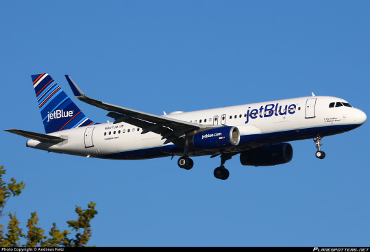
Can you believe these planes fly for different and indeed unrelated airlines?
Safe to say from 5,000 feet below it's a challenge to tell these planes apart. Even taxiing past them you'd need to pay attention. If I forced someone to squint I'm not sure they could identify them properly. How about Southwest?

Bam.
Southwest Airlines was founded in an era that borders on incomprehensible to those of my age bracket. The United States is a nation united in grumbling about Spirit Airlines, and most of Europe is constantly cursing Ryanair under their breath, but it wasn't always like that. The fact of a united enemy at all is new in the US. Back before the 1978 Deregulation Act, it was so prohibitively expensive to operate interstate flights that most airlines just didn't. Interstate flights were left to giant full-service airlines like Delta and Eastern, while international flights were the domain of an even more elite few - Pan Am, TWA, Braniff, and National (no, not that National, the other one) while the scrappier little companies flew short hops for commuters.
One airline which emerged in this pre-deregulation era was Pacific Southwest Airlines, commonly abbreviated to PSA, an initially tiny airline operating in California. You may recognize them from my icon! PSA is one of the single most important airlines in history because it all but invented the idea of the low-cost carrier. Beyond that, they were a Fun Airline. And while they were flying their grinningbirds all over California something else brewed in the background.
image: SouthwestArchive I have never before in my life seen such a profound pairing of undereye bags with the slicked-back hair and piercing blue eyes of a YA dystopia novel film adaptation villain, darting around to lock onto any sources of potential wealth ripe for acquisition.
In 1971 Southwest Airlines began operating flights. The company was actually incorporated in 1967 (as Air Southwest), the brainchild of then-lawyer Herb Kelleher (and two other people who nobody ever talks about because they're boring). They saw what PSA was doing and saw potential for the massive profits that could be gained from avoiding fees from operating interstate and charging drastically lower fees than the larger carriers. Unfortunately for them the larger carriers also realized this, and they were trapped for three years in lawsuit purgatory, with Braniff, Continental, and Trans-Texas Airways taking the case all the way to the Supreme Court, who apparently declined to review it, recognizing that 'they have come up with an idea that will make them make more money and us make less money' is not a particularly powerful legal argument.
And with that little hurdle over Southwest was open for business! Though they weren't quite starting out as a single rented DC-3 Kelleher very closely modeled the airline after PSA, who seemed to be okay enough with it if them helping to train mechanics at the nascent airline was any indication. After all, at this point they were both intrastate airlines fundamentally unable to compete with each other - Southwest was staying put in Texas with no reason to think this would change anytime soon. They brought a bit of PSA to the state, like the low fares and the stewardesses in hot pants and go-go boots.


So what was their answer to the grinningbird?
The rare and deeply cursed Southwest 727.
The mustard rocket. It was called "desert gold" but I think we all know that this is mustard. At this point in history brightly colored airplanes weren't even unusual either, so it would have just been regular ugly instead of ostentatious. (I mean...I like this shade of mustard yellow, honest, but I recognize that most people think this is hideous.)
Southwest kept on Southwesting from there. These days, they're massive, and the most common response on my questionnaire for best airline experiences. No comment, as I've never flown with them. Highlights of their journey there include getting a federal amendment passed because they didn't want to relocate their hub from Love Field to Dallas-Fort Worth, getting sued for only hiring female flight attendants, having the first Black chief pilot of any major airline in the US, technically legal tax evasion measures, having to invent elaborate work-arounds for the restrictions placed on them which could have been avoided by just relocating to Fort Worth, absorbing a bunch of other airlines, being the launch customer for both the -300 and MAX 8 models of the Boeing 737, and making approximately a zillion dollars. In 1990 they absorbed Morris Air, a vacation charter airline which developed innovative cost-cutting measures like e-ticketing, including high-up positions on the Southwest corporate ladder for the founders...
image: conde nast traveller Strange millionaires lurking in woods distributing model airplanes is no basis for an airline industry! ...scratch that, it does appear to be working.
...oh, for heaven's sake, there he is again. Yes, David Neeleman's cost-cutting acumen was indeed put to use at Southwest, meaning that between this and founding jetBlue he basically created low-cost carriers. I reluctantly tip my hat to the man. I would not be able to afford airline tickets without him. But he's just everywhere.
Here is my handwritten faMintly tree. Southwest is jetBlue's cousin once removed, do with that what you will. Anyway, let's hope I never have to add to this. (Not least because I already binned the piece of paper I wrote this out on.)
The turn of the century brought new things for Southwest! In 2000 they had their first major accident (a nonfatal runway overrun resulting in loss of the aircraft). Unrelatedly, in 2001 they released a new color scheme for their fleet, now several hundred strong and entirely composed of assorted models of Boeing 737.

The era of Canyon Blue had begun.
I mean, it's a statement. At this point a plane painted to look like a poisonous frog was in fact a pretty major statement. They were setting out to be an eyesore and I'm sure people were upset about this one, but to the modern eye it looks muted and unfinished. Still bluer than anything David Neeleman had made at that point, but not quite what we know today.
Okay. Yes. There we go.
This livery is meant to be the heart from their logo, the same one worn where the plane's heart might be if planes had hearts instead of air-conditioning systems, the colors unwrapped and deconstructed. And boy, is it almost violently colorful! It goes so far that it takes a minute to notice only three colors, plus white, are used in the entire livery. It's almost eyestraining, and I did have to turn the contrast down on my monitor while writing this because I'm fairly photosensitive. It's...less painful when pixels aren't involved.
So this is definitely one-of-a-kind. Well, it was. jetBlue has made choices recently. But this livery is definitely not one that gets lost in the crowd.
There's very little white or even silver on this airframe, in sharp contrast with...basically every airline. The rest of the livery is vivid and searing yellow and red, unusual shades in airlines, which tend to stick to slightly more muted schemes. And if you couldn't tell who they were by that, the big white billboard wordmark would let you know real quick. I think the white is a bit less legible than I'd like, but I'm not sure how to improve that without making it genuinely eyestrainy. At least it's large and visible, which is crucial for a low-cost carrier, instead of subtle and out of the way on the tail. That might work for an airline with a prestigious air, but that's not Southwest. Southwest is blue and yellow and red.
The main differences between the modern livery and Canyon Blue are in the placement of the logo and the colors used. Each shade is brightened significantly, which is why the once-garish Canyon Blue now looks pretty dusty in comparison. They entirely removed the blue from the tail, making it the airframe feel a little less like it's blue with accents and a little more like it's a circus tent. I do wish the yellow and red covered a bit more of the belly, but still...wow.

Some uses of Southwest Sans demonstrated.
The success of this design isn't by accident. Apparently, Southwest consulted no fewer than five design firms, and the font used for the livery and all their material (which I think looks totally fine) was actually commissioned from iconic foundry Monotype. A lot of airline liveries are designed in-house, and that can turn out fine, but Southwest clearly pulled out all the stops and it shows.

Southwest is a low-cost carrier, and this does affect the standards by which I judge their livery. They aren't here to be guided by legacy or decorum the way a flag carrier is - they're here to sell you a cheap ticket on an airline with funny cabin announcements. Circus tent with big lettering in a sea of Eurowhite? Nice, clean execution - I'd call that a job well done.
Grade: B
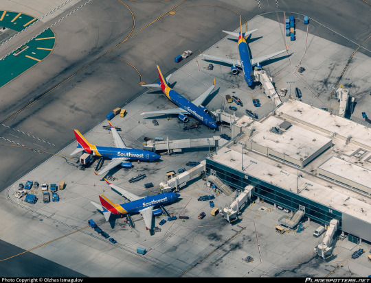
#tarmac fashion week#era: 2010s#era: 2020s#grade: b#region: north america#region: united states#low cost carriers#requests#southwest airlines#neelemanverse
41 notes
·
View notes
Note
What are your thoughts on the squashed fruit man Arthur??

Arthur is pretty good! I'd be lying if I said half the reason I liked him wasn't just his design though. I'm a sucker for red engines, and I'm also a sucker for big suburban tank engines. I feel like the only other engines like that in the show are Ryan (whom I love) and Belle (whom I have conflicting feelings about.)
someone should ask for her, i have a lot of moaning to do about her and i'd love an excuse lol
But Arthur isn't only good because of his prototype, he's also good because he's a fun character to have in the cast. He's such a goody-two-shoes, and he's on a railway where most of the engines are... very much not that. I think he would have really found his footing among the cast had they brought him back for the Brenaissance seasons. Unfortunately he's just kinda stuck with two episodes in Season 7 and a couple of incidental roles... a shame, really.
I don't like the recent fanon assertions that Arthur is 41241 just because RGG copied his reference's number onto his concept art. I also very much dislike that Salty is numbered 2991 for the same reason; it just never sits well with me when North Western engines steal the identity of real preserved engines. This is why I like to believe Salty's number is in the Duck and Oliver "probably not even authentic" hall of fame. and also why I dislike Whiff's design and the fact that Dennis and Norman are both supposed to exist
Quick headcanon before the end of the post; In real life the Ivatt 2MTs were never painted in Crimson Lake, so I'd like to think that Arthur's livery was something he specifically requested at Crovan's Gate, kind like how Donald and Douglas choose NW Blue despite never having been blue on their old railway. A hint of Duck in there too, since it's the real railway livery.
9 notes
·
View notes
Text
Blind mistake
Rowaelin month - day 8
So, this fic was fighting me at the beginning. as I started, deleted and restarted a million times.
Then slowly the idea came and here it is. What I was not expecting was to write a A Little Braver AU.
Aelin and Rowan meet under different circumstances and are two different people from thee actual story. Aelin is still the captain at east station and Rowan still the airforce captain.
Yes, this is a happier fic but as Aelin said in KoA... she loved Rowan because it was him, the man who had known pain as deep as hers.
IN order to enjoy this fic you do not need to have read ALB. A part from Pete popping up for a brief second at the end, this is a complete stand alone story and no knowledge of ALB is needed.

Rowan sighed. His love life sucked so much that he ended up using a dating app. Since Lyria dumped him a year before he had been struggling to go back in the game. He had been on a few dates but so far none of the women he met had sparked his curiosity. Far too bland and with almost no personality or far too bothered by looks. Some of them had been downright stupid and he had been a gentleman and played along when all he wanted to do was run away screaming. The last nightmare had been a woman called Remelle who Lorcan had recommended to him. He had to feign food poisoning and pay the chef to let him escape from the back of the restaurant to flee the monster. He had paid the bill sneakily, and once home he had insulted Lorcan and his poor taste in women.
Now he was again in a restaurant, ready for probably another fiasco. He and the woman had chatted a bit and she had seemed interesting so he had dared to ask her out and she had accepted. On the paper it was all good. In reality he was getting ready for another crazy escape. Maybe he should just give up and live alone and become a grumpy old man.
He had a kingsflame on the table near him, their code to recognise each other at the restaurant. The fact that they knew very little about each other made him nervous. It was a recipe for disaster. He knew she was a personal shopper and that she liked movies and music. He was really dreading the encounter now, and started to realise that perhaps it had been a mistake. She could have lied.
Until he raised his head and he noticed the woman who had just entered the restaurant. He then spotted the flower pinned on her green dress as they had agreed. Gods, the woman was way too hot for him. There was a catch somewhere. His heart raced when realisation dawned on her face and she waved and started to walk to him. The smile. Damn, the smile could stop a man’s heart. The woman walking toward him was a goddess. He was expecting her to turn away for another table until she sat down in front of him at his table. Rowan was speechless.
“Sorry, I am late. Accident on the ring road. I stopped to give a hand to west station.” She used her hand to brush off the smudge of grease he had only just noticed she had.
“You stopped?”
“Yes,” she looked at him with a strange light in her eyes “I am a firefighter. I am the captain at east station.”
Rowan blinked twice. Shit. She was the wrong woman. She was not here for him. Of course. It was too good to be true. She had sat at the wrong table and a part of him was sad.
“I am Aelin.” she said and he knew that it had dawned on her as well that he was not her date “You are not Chaol.”
Rowan shook his head “I am Rowan.”
“Holy shit. I saw the kingsflame. The restaurant. And you smiled at me when I came in. I just assumed...” He did not want her to go.
“Ach, I was having second thoughts anyway.” He shrugged.
In that moment the waiter came and they were hesitant for a moment then Aelin grabbed the menu and started ordering, surprising him. Rowan got some wine for both and they placed as well their order.
“Our dates are late anyway. Maybe stuck in the horrendous traffic out there.”
“You will not hear me complain.” Said Rowan with a smile “so, you stopped and helped?”
Aelin nodded, sipping a bit of her wine “I couldn’t resist it. West station was there but there were so many cars involved that I had to something. The traffic wasn’t moving anyway.”
Rowan could not believe the woman in front of him. Not only she was a goddess. She had even stopped to help her colleagues save people from a car crash on her way to a date. Where had she been all his life?
The waiter came with their order and smiled at the expression of joy when Aelin looked at the amount of food in front of her. Another point for her. She had an appetite. He had no need of another date ordering a boring salad. He was a healthy eater but loved a woman with an appetite, especially because he loved cooking.
“So Rowan, what do you do?” She asked him while tackling the gigantic prawn on her seafood tagliatelle.
“I am an airforce pilot. I am a captain.”
Her face lit up “as in the uniform and all? And the awesome planes?”
Rowan nodded.
Aelin was about to take another sip of her wine when two figures stopped at their table. A brown-haired man and a blonde woman. Both had a kingsflames pinned on their dresses.
“Excuse me but you are with my date.” Said the stranger.
Rowan looked up from his risotto “finders keepers.”
“And he is my date.” Said the woman in a shrill voice.
“What he said.” Added Aelin while eating another prawn.
“We got stuck in traffic. There is a massive road accident on the ring road.” Chaol complained, not letting it go.
“Yeah I know. I stopped to help and I still made it here before you.”
“So what does this mean?” Asked Chaol.
Aelin stared at Rowan. It was a no brainer. Chaol was cute but Rowan was sex on two legs. Between the silver hair and the green eyes he ticked all of the boxes. And he was a pilot. Chaol was an accountant.
“You two can go on a date together.” She suggested and hoped they took the hint.
“That is rude.”
“Oh shoot,” said Aelin covering her mouth in fake surprise “I must have left the fucks I have to give in my bunker gear.”
Chaol looked at her aghast. The blonde woman turned on her heels and left.
“You missed an opportunity.” He added before he left as well.
As soon as he left Rowan burst into laughter and she joined him “no fucks to give…” he said trying to catch his breath “I have to steal this when my CO drives me nuts.”
“Ansel, one of my firefighters, she taught me that.”
“It’s fucking perfect.”
And both resumed their dinner without the awkwardness of a blind date. No stupid questions like how many siblings do you have or what is your favourite colour. No, with Rowan there had been a connection from the start and the joke had been the final proof.
“Most guys would have left running at my joke. I have a big and foul mouth. Not very lady-like.” She apologised. “I work in a male dominated place. Apart from Ansel and my two paramedics, I am surrounded by guys and well, they are not easily scared.”
Rowan chuckled “I am in the military. My CO uses fuck you as a term of endearment and one of my lieutenants has the record for the most innuendos in a sentence.”
“How many?” Asked Aelin curios.
“Ten.”
“No friggin’ way.”
Rowan nodded solemnly. Then looked at her and he was glad she sat at his table mistaking him for another man. They had known each other only for twenty minutes but he was dumbstruck by the woman.
She was fierce, intelligent and with a wicked sense of humour.
The meal had been perfect. Aelin had polished every single plate in front of her and also ordered dessert. And when she offered to pay for half the bill he had smiled. He had plenty of dates where the woman didn’t even offer. She took it for granted that he, being the man, was the one paying. He had no issues with that, he was happy to pay, but the fact that Aelin offered made him realise that she was different.
They left the restaurant and he gasped when he saw a red pickup reading Terrasen fire department on its livery, parked just outside the restaurant.
“Way to scare the patrons away.” He joked.
“Sorry. Yesterday I took a lift to work from a colleague and I forgot for a moment that I had a set the date for tonight after my shift. So I grabbed my work pickup to get here. I need to go back to the firehouse and return it.”
“I’ll follow, you drop off the pickup and then I drive you home.”
“I can take a cab, you don’t have to come all the way to the station and back.”
“Humour me,” he said giving her a beautiful smile and she accepted.
Ten minutes later they were at east station and she parked the pickup in its corner at the side and out of the way.
She saw Rowan getting off the car.
“Welcome to east station.” She said extending her arms. She pushed a button and the rolling doors slid up and two big trucks appeared in front of him. He had always wanted to see one up close.
“Cap,” said a man at her back “what are you doing here? I thought you were on a date?” He smiled “that bad? I told you accountants were a bad idea.”
Aelin laughed “looks like I got myself an airforce pilot instead.” She winked at him and Rowan’s heart skipped a beat.
“I’ll tell you next shift, Pete. I just brought back the pickup before Dorian kills me.”
She waved at her relief captain and followed Rowan in his car and told him her address.
While he drove she studied him. He was wearing a nice pair of jeans, a shirt and a black leather jacket. She should have guessed he was military. Aedion had the same posture and he was ex-army.
“Which house?” Asked Rowan, waking her up from her thoughts.
“The one with the blue door.”
He parked and walked with her up to the door “I had so much fun tonight,” she said to him, not wanting him to leave her.
“I am so glad that you sat at the wrong table. This was the best blind date ever.” He looked at her and wanted to kiss her so badly but they had just met and he did not want to pass a a pig.
She moved a step toward him “I am glad too.” And her lips brushed his cheek in a kiss “perhaps we could go on a proper date. One where we are actually meant to meet each other.”
Rowan sighed relieved “It would make me very happy.”
Aelin rummaged in her bag until she found a pen then grabbed his wrist and pulled up his cuff a bit and wrote down two numbers.
“The first one is my personal mobile number. The second one is the direct number to my office. I am known to leave my mobile in my bunker gear.”
“Thank you.”
“Let me know a date and if I am not free we can find a better one. Us firefighters have crazy long shifts so I need to be off.”
He took her pen and her wrist and wrote his number “then you text me. A day that you are off shift. I work regular hours. This makes more sense.”
He took a step down from the few step and she hated the idea of him leaving.
“Goodnight, Rowan.” She opened the door and looked at him one last time.
Rowan waited for her to disappear behind the door and then went back to his car and was grateful for the best blind mistake of his life.
#rowaelinmonth#rowaelin#rowaelin fanfic#rowaelin fanfiction#rowan whitethorn#aelin galathynius#rowan x aelin#fluff
79 notes
·
View notes
Note
I'm rather curious for your own takes on Thom Thom~✨💙
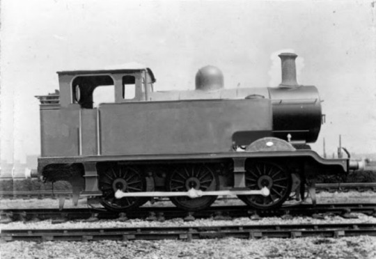
Edit credit to @/ComradeOpThomas from Twitter, this is my ideal Thomas!
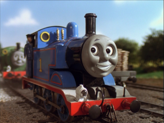
(Season 5 Thomas is the best Thomas, I don’t make the rules)
I started this hoping for it not to become a whole biography, but it just kept pouring out of me, so here's a very, very long post indeed lol
Thomas is NOT an L.B.S.C.R. E2 Class. He’s actually a unique design born to the North Western Railway in its earliest days… and in remarkably sad circumstances.
When the Railway Executive Committee first took over in August 1914, they were repulsed at the state of the Sudrian railways. Here were several argumentative companies operating in isolation from one another, with geriatric engines and stock, and one of them hadn't even run a train or maintained its permanent way since the start of the century. A key agenda item of the R.E.C.'s was a continuous, efficient railway system to quickly move men and materiel to the Island's eastern coast were Ireland to side with Kaiser Bill against John Bull. The existing standard gauge railways would have to be more or less torn up and rebuilt from scratch, and several new miles of track laid in to make for a single fluid network.
This required, among other things, many new engines. Several came over the Channel as and when could be spared by the Mainland, but as it became increasingly clear that the war would not be over "by Christmas," this wasn't an ideal long-term solution. The R.E.C. was especially upset that it had to put so many of its tender engines onto construction trains when their strength could be better used on other work. Two tank engines off the former Wellsworth and Suddery Railway, No. 1 "Short" and No. 2 "Stumpy" were by now nearing fifty years old, and exhausted mechanically.
The R.E.C., out to keep costs down and use resources to the fullest, ordered the N.W.R. to scrap these two engines and use the best parts of each to create one new engine. Measurements were taken, plans were hastily drawn up, and Short and Stumpy were quietly cut up in January 1915. Several fittings were made new for what odds and ends neither engine could contribute a usable part. The resulting new engine was "Thomas," who was put to work fresh off the shop floor.
Thomas at this point became the N.W.R.’s No. 1 quite by accident. He was the first engine to be built at Crovan’s Gate, and the REC misinterpreted this on his builder’s plates as an intention by the N.W.R. TO make him No. 1. So when Thomas gained his number, the R.E.C. and the N.W.R. both assumed this was deliberate by one another. And it was just too much of a hassle and too unimportant to change, so No. 1 he stayed.
As for his name, Thomas is named after Thomas Reginald Payne, the North Western Railway's first Chief Mechanical Engineer. Payne had made Thomas' construction a reality, from drawing up his blueprints to supervising his piecing together. Payne, who was CME from 1914 to his death in 1951, never forgot this connection to "his" engine, and often wanted to be on the shop floor whenever Thomas was in for repairs.
Thomas’ “infancy” was in a word, harsh. He was working around the clock, surrounded by engines who came and went, and did little if any socializing. Foremen were ordering him about at every turn. His first friend ever was the new N.W.R. No. 2, Edward, the former Wellsworth and Suddery Railway’s No. 5 and only tender engine, who knew his old crewmates were chopped up to make Thomas. Thankfully, Edward knew better than to let Thomas in on this, lest he give him some sort of existential crisis, and he made quick work of making himself a mentor to the little engine.
In these conditions, Thomas’ “cheeky” and anti-authoritarian streak took shape. His whole life thus far had been work and taking lumps from his superiors, most of whom were English and not Sudrian. This morphed into a disrespect for big engines, who wanted him to be their errand boy as construction work began to ebb and focus shifted to running trains. Ever the contrarian, Thomas only doubles down on his disrespect for tender engines when he finds out that that’s “the traditional order of things.” Edward is of course exempt from this attitude, but in his tensest moments Thomas can even lose patience with HIM momentarily.
The war finally ends. January 1919 sees the N.W.R. out to make an identity for itself as peacetime takes hold and Parliament quietly rumbles about Grouping or outright Nationalization. Thomas is the first engine to wear "Hatt Blue with Red Stripes," the company's planned standard livery. This isn't unique to him for long, however, and Thomas' new line of work from hereon is Station Pilot for Vicarstown. Needless to say this is upsetting to him. He's not moving up and down the Island like he was when building the railway. He's still rushed off his wheels. He's expected to be answerable to tender engines as he makes up their trains. Most importantly, he's still having as much difficulty as before to make time to make friends. This new job is in every respect everything Thomas could have wanted to avoid, and there's no telling if he'll ever even get out of it. January 1919 is thus where "Wants to See the World" Thomas begins.
Thomas still gets to see Edward regularly, and he is for a pinch joined by two other tank engines shunting at Vicarstown. They're also ex-Wellsworth and Suddery Railway, Nos. 3 and 4 "Edwin" and "Victor." Thomas befriends Victor, who is a friendly old joker, but dislikes Edwin who has become cranky in his old and as a 2-4-0T has a tendency to slip and not be of much help. They leave him too, in 1922, when The Fat Director relocates them to run other branchlines on the Island. So, 1922 onward, we meet Thomas as the sole pilot, thoroughly busy and thoroughly lonely.
This seems more or less canon, but The Fat Director probably sent Thomas to Wellsworth after his runaway with Edward's trucks in anticipation of giving him the Ffarquhar Branch once he was a matured engine. He didn't give Thomas the line just because he rescued James in fine style, that was really what made his mind up.
Thomas looks kindly enough on Henry as a big engine at this time, he and Edward as mentioned aren't necessarily the kinds of "Big Engines" he dislikes. He'll occasionally give him a tease or two, or lose patience with his health, (something he now deeply regrets years later,) but there's no real malice in it. Think of him as the little brother poking fun at his bigger brother for having one arm in a cast, but altogether still feeling sorry for him and accommodating him how he can. Henry for his part appreciates Thomas, but takes his teasing very seriously considering how sensitive and implicating it is to, you know, his whole existence.
My idea of Thomas' relationship with Gordon is heavily inspired by @/mean-scarlet-deceiver's: Thomas is initially awed by Gordon's arrival and finally confident the N.W.R. can survive, but quickly resents him when he shows his true colors as a "big engine" through and through. I wouldn't even call Gordon and Thomas "friendly" until their alliance at Toryreck Mine. From 1923 all the way up to then, depending on when you place it, they... legitimately dislike each other. There's no affection beneath all the ribbing and jibes, they ACTUALLY disliked each other that whole period of time.
I'm still hashing out my headcanon of 98462 and 87546, (just know that those aren't actually their numbers,) but it's safe to say Thomas hates their guts, and '62 and '46 hate his guts in return as a servant willing to speak up for himself.
Thomas and James were a couple from 1924 to 1933, when they broke up amid the Big Engine Strike. I'd really rather reserve this for a post of its own at a later date.
Thomas and Percy are good friends, but I wouldn't go so far as to call them "best friends" like the TVS has so often hammered in. They clearly come to blows whenever the tension's too much. I like to explain that away as a shift in Thomas' character. With him doing more passenger work as Percy and Toby handle the stone trains, and his increasing fame, Thomas begins looking down on Percy, not long after he transferred to Ffarquhar in 1955 in fact. This might also have to do with unresolved feelings between them both. (Hey, remember that little green engine you kissed once just to try it over twenty years ago? He's your roommate now, probably forever. Play nice!)
#ttte thomas#ttte worldbuilding#ttte#ttte oc: short#ttte oc: stumpy#ttte oc: thomas reginald payne#ttte edward#ttte the fat director#ttte james#ttte henry#ttte gordon#ttte 98462#ttte 87546#ttte percy#ttte toby#ttte daisy#ttte shipping#engines kissing#thomas x james#thomas x percy#tw death#ttte oc: edwin#ttte oc: victor
62 notes
·
View notes