#edit: so what I'm getting is a lot of you like red's art here
Explore tagged Tumblr posts
Text
Looks at this pretty divine doggo!!


#look man we needed the Buddha to deal with ONE monkey#the moment a second showed up someone should've grabbed him#osp journey to the west#journey to the west#overly sarcastic productions#osp#edit: so what I'm getting is a lot of you like red's art here
225 notes
·
View notes
Text
Simple skin & accent tutorial!
I'm only familiar with making accents in CSP so some of the things you see here might be program specific, but for the most part it should be generally applicable.
Okay with that being said, here's a very basic tutorial, under a readmore because it got long (image heavy)
Assuming you already know roughly what you want to make and what breed pose you want to make it on, go to the custom skins page on the sidebar then download PSDs. For this step I'm choosing coatl F!

It should download automatically, the file will be compressed (zipped). I normally just open the folder and move the top file (without elements_friendly) to my accents folder to access it from my art program:

Open your preferred art program and open the file! It is a PSD file so it should be compatible with most art programs. When you open it, everything should look like this:
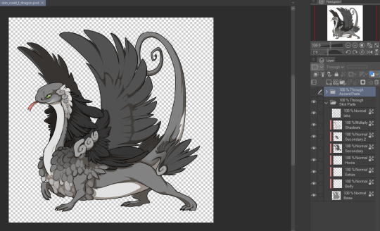
The layers probably look complicated, and it isn't super clear where you can and can't draw- but I promise it will get easier to understand! Before I even start drawing I do two things: I resize the image (changing the image resolution) to 700px by 700px. This means the image the resize better later on when I need to downscale it to 350px by 350px. Next, I make a new folder under both the existing folders with a single, full white layer in it. And set everything in "Through Skin Parts" to 50% opacity.

Lastly, put the bottom two folders completely out of your mind, we won't be touching them at all. The only folder that matters is "Through Accent Parts". As I'm drawing the accent itself, I make the lines and shadows layer invisible because they can just be distracting, like this:

That layer beneath both lines and shadows layers? The one labelled "Accent Goes Here"? That's where you draw, and you can make more layers to draw more on later. For now you can sketch your design on that layer. Here's my sketch for my skin Strawberry Pavlova:

It's pretty rough at the moment so I want to add another layer to draw my clean line art on, in CSP this means just adding another layer and turning off clipping which automatically applies as the layers above it have clipping turned on. When that's done it should look like this:


(You can absolutely use more layers for lining if that's what you prefer!)
Next is adding colour. An important thing to note for this step is to avoid using colours that are very close to black, and to avoid using black altogether. This is against skin and accent rules as you need lines and shadows to remain visible over your design, and very dark colours make this a lot harder!
When I typically colour my skins and accents I will separate out design elements (so for example all plants on one layer, all blue cloth into another layer, all jewellery on another, etc etc.) into different layers- this is purely to make recolouring easier and isn't necessary. In this case I didn't have my colours separated out as I had no intention of recolouring this skin! This is what this skin looked like when I was finished colouring:
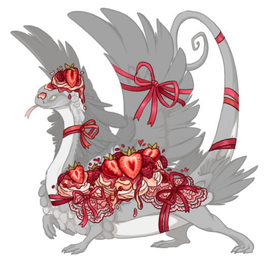
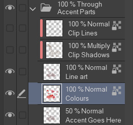
Now I just need to do some final finishing polish on the design! For this one it involves adding a bit of pink transparent colour behind the strawberries, adding pale transparent colour under my lace and of course- adding sparkles! One of the final things I do is recolour my own line art to a red-pink colour (in this case I had it set to multiply as well- but this isn't needed!) this takes some of the harsh edges out of the accent and make the design feel more cohesive imo!
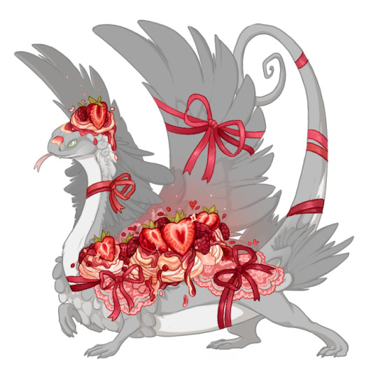

And the design is finished! The final step before we can submit this is a big one! We have to change the lines and shadows that we've been ignoring this whole time. For this I flatten all the art work into one layer, like this:
Why do we have to change the lines and shadows? Well...

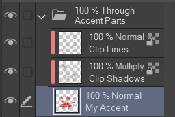
The default shadows are pretty high opacity and very grey, they cover up my accent and make the details harder to see. And the default line art is black. You can edit these layers to make them much nicer. You can edit them manually- making sure to lock transparent pixels so you don't edit the coverage of the lines and shadows. Or you can do this: (You can ignore this next part if you're finding it overwhelming) Duplicate your accent design twice (so you have three layers with it on total), set both your lines and shadows layers to normal and unclip them. Your layers will look like this:

Ignore what the accent looks like for now. Next move the copied layers so one is above the lines and one is above the shadows, keeping only one in the original position. And then clip these duplicated accent layers to the layers directly beneath them, it will look like this:
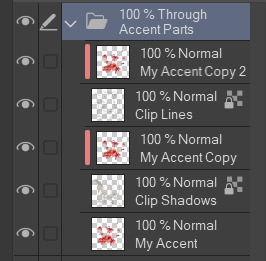
Merge the accent copy layers with its corresponding lines or shadows layer, you should still have 3 separate layers when you're done: The lines, the shadows and your original accent design. Like this:
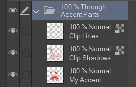
Then clip both of the lines and shadows onto your accent design layer and set both lines and shadows layers to multiply. Like this:
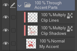
If you've done it all correctly your accent should now look like this:
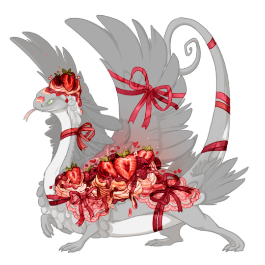
This is a lot better than the default lines and shadows already! It's pretty dark in spots and my lines are definitely too light in other places though. So next I usually start by setting my shadows layer to 50% opacity and then going over both lines and shadows layers manually recolouring the lighter parts to a darker colour so they are visible on top of my final design. When you downscale your art to submit it, lines and shadows that were super obvious suddenly vanish- so don't be afraid to downscale it and keep editing the lines and shadows.
Here's what the final product, downscaled to 350 pixels, looks like:

This got accepted first try by skin mods (just in time for valentines!) Important things to note: places where my design is less opaque the lines and shadows are also less visible, this is completely fine! You don't have to fix this. Lines should always be visibly darker than the shadows they're on top of, this means sometimes they will have to be black to get them to show up or you may even have to make your accent underneath lighter to get everything to conform to the rules! Lastly, lines and shadows are subjective and you may end up getting rejected a few times before they're to skin mods liking. Its one of the harder parts of skin making and you won't always get it right.
Community feedback is your best friend, don't create in a vacuum! Go join discord servers where other people are making accents too, ask for help! Now go forth and make!
#this is very basic but this covers all the parts i found confusing when starting#the best way to get used to everything is to just start making the accents but i understand it can be very intimidating#i hope i did a good job explaining the lines and shadows method i use. i didnt make it! just got taught it#its very good. i have nearly 100% acceptance rate by skin mods#if anyone has questions please ask!#okay. i think thats everything...#flight rising#fr skins and accents
227 notes
·
View notes
Text
You added an "image description" to my post - now what? (FAQ)
[Plain text: "You added an 'image description' to my post - now what? (FAQ)". End PT.]
While I'm literally always willing to answer (good faith) questions about image descriptions, alt text, and online accessibility writ large, I also know lots of people have social anxiety about sending DMs, doing IDs "wrong," or just not knowing what IDs are for in the first place. Hence, this FAQ.
If I added an ID to your post and/or asked you to do so, and you're confused about any aspect of that, this is where to start. You can absolutely still reach out to me, I just thought I should consolidate as many answers as possible.
"What is an ID and why does it matter?"
IDs are a description of the content of an image, and can range from a transcript of a screenshot of text, to a description of a detailed piece of art. They should be in plain text, and placed on the line immediately following the image (unless it's alt text, more on those pros and cons later).
IDs are primarily for blind and low vision people who use screen readers to navigate the internet — but help others too, including lots of neurodivergent people. Check out this post (link) and the notes for more examples (dyslexics, migraine sufferers, people who can't interpret expressions, people with slow internet...)
IDs are important because without them, the Internet really sucks for people who need them. You probably don't realize how many undescribed images circulate on tumblr every day, with no way for a lot of disabled people to engage with those posts.
A blind person talks in more detail about all of this here (link).
"I reblogged your ID, is that enough?"
It's not that I don't appreciate it, but editing it into the root post and then reblogging that is much more impactful, for a variety of reasons. It means people who need IDs don't have to dig through the notes for them, it means that Tumblr can't glitch by failing to load the notes and make the ID functionally disappear, and it means all people who find the post in the tags or on your blog will be sharing the accessible version.
To explain visually, the best thing to do is something like this:

[ID: two mock-up Tumblr posts to illustrate adding an ID from the notes to the root post. A blog named "your-blog" posts an image of text reading "something cool you posted" with the caption "check out this cool image I made!" In the notes, the blog "image-describer" reblogs with an ID, which is highlighted. This version of the post is labeled: "original post, reblogged via ID writer."
The second version of the post is from "your-blog" again, where they've added the ID directly under the image, with the same caption below the ID. This version is labeled "updated root post, with ID copy-pasted. End ID.]
"My caption/commentary first, or ID first?"
Include the ID right under the image, followed by your caption or commentary. Unless you're putting your commentary before the image itself, a sighted person will see "image, commentary" in that order, so to ensure the post flows the same way, use the order "image, ID, commentary."
Commentary frequently assumes that the reader has seen the image, after all! A person might not even realize the image is described if the ID is buried too deep, because they might lose patience and skip the post. Or, to explain visually:

[ID: two mock-up example posts with an ID, one formatted well and one poorly. They both start with an image, which is just the text "screenshot of a tweet or something." The first post includes the ID immediately under the image. Below, it continues: "commentary blah blah blah get a load of this guy can you believe it." The post is labeled "Like this!" in green with a check mark.
The second post includes the commentary first, then the ID after the commentary. It's labeled: "Reads awkwardly, deprives screen reader users of immediate context" in red with an X. End ID.]
"I want to make a change to the ID, is that okay?"
Yep! If you want me to change it on my blog too (whether it's characters' pronouns, some typo, etc), just message me.
"What if someone else adds an ID to my post? Would they also be okay with me editing it into the original post like you are?"
Almost certainly! I can't speak for everyone, but I've literally never met an ID writer who wouldn't be okay with it — because we all have the shared goal of maximizing accessibility. If you're unsure or nervous, you can always include credit, but most people are even fine with going uncredited.
"I put your ID in the alt text, is that enough?"
I will never tell you not to use alt text when the alternative is an undescribed post, but I really strongly suggest putting it in both the alt text and the post. Some people who use screen readers prefer the flow of alt text, for good reason — but it's also poorly implemented on Tumblr, and it can glitch and disappear on reblogs, in drafts, or just apropos of nothing.
Moreover, when a low-vision person or anyone else wants to read the alt text directly, Tumblr's display options aren't great. (Unless you use XKit Rewritten's AccessKit, which I will always plug, but that's not an option for mobile users.) Long alt text often extends off the page and gets cut off. Tumblr used to use a terrible eye-straining purple background for it, and could always do that again with no warning. It's just not ideal.
Here's a visually impaired person talking more about the pros and cons (link).
It seems we're in need of a compromise, so what can you do? One option is to include the same alt text as image description (placing the ID directly under the image as always, because remember, flow for screen readers is important). I like to lead with "ID from alt," in order to clarify to screen reader users that they can skip the ID, and help differentiate it from the other option I'm about to describe. This should be self-explanatory, but here's an example of a post I did in this style (link).
Option two is to include a short description in the alt text, and a more detailed explanation in-post. This can let screen reader users instantly know that the post is described, and decide whether they're interested enough in it to stick with it, but it maintains an in-post description for others to benefit from too.
Example of me doing this in a post about IDs (link)
Example of my mutual describing art like this (link)
Also, it's the style I follow throughout this exact post! Take a look!
As usual, the ID is directly below the image in all these cases. This means screen readers move immediately from the alt text to the full description, and the post flows the same way it would for a sighted person.
If you're here because I wrote an ID for you, it might be easier for you to put it in the alt text and the post body identically, and that's perfectly fine! But if you're confident writing one short sentence for the alt text and including my ID in the body, you can always go for that too!
"Do I need to keep the brackets or the words 'image description/ID' in the alt text?"
Nope, no need. Brackets are purely for the visual distinction, and most screen readers preface alt text with something like "Image" that fulfills the same purpose as the "ID" label. It's not the end of the world if they're there, but it's redundant, so feel free to remove them.
"Can I put the ID under a read more? Or in small text?"
Please don't. Read mores are glitchy, and oftentimes have to be opened in a new tab. Accessibility that requires jumping through extra hoops isn't accessibility. And worse, if you change your URL or get deactivated, that read more link is usually just gone for good, and the post is undescribed again.
Meanwhile, small text, italics, colored text, and so on aren't good for low vision people or others who read the IDs directly — such as with increased font size — for whatever reason. If you want the ID to stand out visually even more than with brackets, an indent is fine as far as I know. And remember, IDs always go immediately below the image!
"Why do you sometimes copy italics and stuff as plain text? Is that a screen reader thing too?"
Same reason IDs shouldn't be in small text, italics, etc — because of sight readers with low vision. Font in weird styles, or in a fixed size regardless of device settings (to my knowledge, this includes headings) isn't very accessible, so I try to provide an accessible transcript.
Colored text is sometimes even inaccessible to sighted people using certain Tumblr themes! If Tumblr gave individual users the option to disable small text and colors on their dash, then I'd tell you to use them to your heart's content, but as it stands, they're not very accessible.
"Okay, I want to make my blog more accessible, but I don't feel capable of writing IDs on my own. How can I get help?"
Good news, this is my absolute favorite question! I strongly recommend the People's Accessibility Discord (invite link here, please let me know if it breaks).
It was created for this exact purpose of crowdsourcing IDs (and answering questions about them). I talk about it more in this post (link), where I also describe an alternative if you're like me and have massive social anxieties about Discord servers.
TL;DR: ask in the post if someone can add an image description, and edit it in once someone does! If you've read this far in the post, you're clearly an expert on how to do that.
In that post, I also recommend OnlineOCR (link) and Google Lens to extract text from images and save you typing if it's just a twitter thread or something. I would always spot check the text, adjust formatting, and remove superfluous characters, but it usually saves you lots of time when you might not normally have the energy to describe something.
Lastly, a lot of description blogs take requests! I don't unless I specify otherwise, because I easily run out of spoons, but @accessible-art is a great example of a blog that does this for non-fandom art, and there are lots of fandom blogs out there that do similar.
"I want to learn how to write image descriptions for my posts! Do you have any resources?"
This is my image description masterpost (link). I get a little scared about linking it because it's long, and a lot of the linked posts are long, and I don't want to overwhelm people — so please, start with the first few links to get the broad strokes, and then feel free to treat the rest like a index. That is, peruse it if you're looking for answers or advice on a specific topic!
While learning, keep in mind that different ID users want different things out of IDs, and that's okay. Some people, including many blind people, care quite a bit about color, but others don't, and that doesn't mean either is wrong about the types of IDs they prefer versus ones they find unnecessary.
Blind people have a massive range of lived experiences, and all the other people who benefit from IDs broaden that range even more. Generally, no one involved wants huge walls of text, but some people prefer super-minimal IDs, while others prefer a nice handful of (relevant) details. It's stuff like the difference between "Two characters hugging in a cozy-looking house," versus "Two characters hugging with their eyes closed, both smiling. Their house looks cozy and cluttered, with warm lighting."
Neither of those is objectively wrong, and there will be people who prefer either. Nor is it wrong for you, the ID writer, to make a subjective judgement, such as on the "cozy" mood. You don't want to misrepresent things, but subjectivity is usually unavoidable on some level, and therefore fine. Likewise, you don't want to let the ID get so long it's a slog to get through (here's an example of what NOT to do), but if you're describing a complicated image like some art might be, it's okay to add some details. Just start with the important stuff and general idea first.
The purpose of an image also matters. With memes, shorter is almost always better, and excessive detail is annoying (post with examples). You don't need in-depth detail to appreciate most quick jokes. But on the other hand, art is often shared for the purpose of appreciating the details. This post goes into detail about how context matters, and how longer IDs make sense for art sometimes. It puts it better than I could, so I really suggest reading it if this is something you're wondering about! Key word: not length, not brevity, but "relevancy."
In my opinion, IDs are easiest to learn by doing, but also by starting small. If you want to build up your "description muscles" and confidence by just transcribing tweets, that's perfectly fine — and also, the path that myself and a lot of people I know have followed.
Lastly: follow some described blogs! Check out how other people do it! Writing IDs is an art, and though it has a few hard do's and don't's we've gone over, we've also gone over how it's subjective. Everyone brings a slightly different style, with a different level of lengthiness, and it's great to learn from multiple sources. Here's one list of blogs like those (link)!
"Why would this matter if I know I don't have any blind people following me?"
Consider the cycle of inaccessibility (link). If no one ever accommodates blind people, then of course you're not going to see them on Tumblr, in fandom, or in whatever internet circles! And blind people aren't the only people who need image descriptions — again, consider this post, especially this addition (link).
Worst case scenario, even if you have no one who can benefit from IDs either following you, and no people who need IDs would follow you even if you included them, you're still helping people who do maintain accessible blogs to do so — and moreover, normalizing image descriptions in general.
"I don't think blind people would be in this fandom. I mean, there's a huge visual component!"
Described comics and webcomics exist. Audio descriptions for TV shows and movies exist. Disabled people who find creative ways to play video games exist. People who watched a playthrough of a video game by a person who happened to read out the dialogue, and give descriptive commentary on the action, also exist. People who lose their vision over time, or gain other reasons to rely on IDs over time, also exist.
108 notes
·
View notes
Text
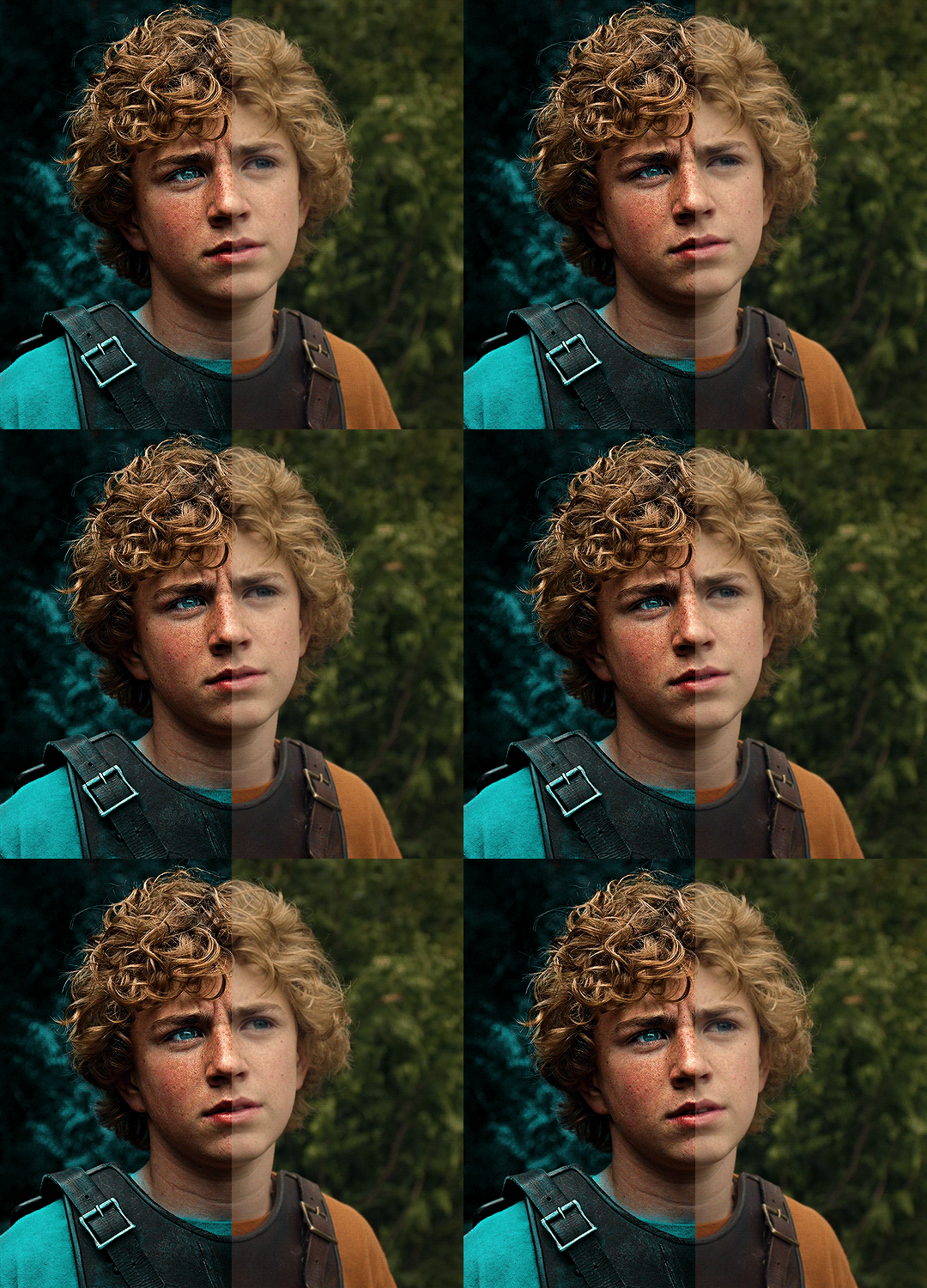
The silent art of gif making
The gif above has 32 layers plus 6 that aren't shown because this is part of a larger edit. I wanted to share it to give everyone a glimpse of the art of gif making and how long it usually takes for me to make something like this. This one took me about an hour and a half but only because I couldn't get the shade of blue right.
I use Adobe Photoshop 2021 and my computer doesn't have a large memory space (I don't know what to call it) so usually most of psds get deleted because I'm too lazy to get a hard drive. It doesn't really bother me that much because I like the art so when it's done, it's done. Off to somewhere else it goes.
Here are the layers:

Everything is neat and organized in folders because I like it that way. I prefer to edit it in timeline but others edit each frame. There's a layer not shown (Layer 4 is not visible) and it's the vector art. Here it is:
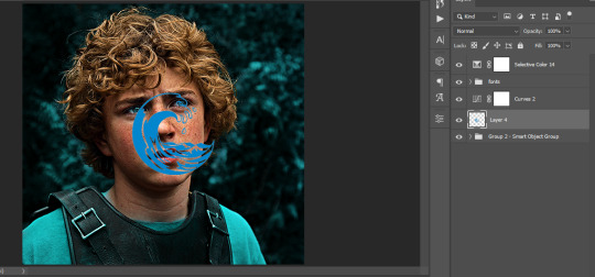
Now it is visible. I don't plan to make this a tutorial, but if you're interested I'd love to share a few tricks about it. I'm pretty new to the colors in gifmaking but the rest is simple to understand. Here, I just want to show how much work it takes to make it.
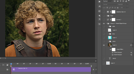
I opened Group 2 and here's the base gif. I already sharpened and sized it correctly but that's about it. Let's open the base coloring next.
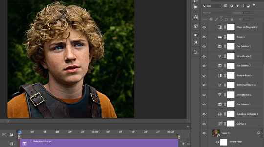
Yay! Now it looks pretty! The edits are in Portuguese but it doesn't matter. There's a silent art of adding layers depending on how you want the gif to look but you get used to it. The order matters and you can add multiple layers of the same thing (for eg. multiple layers of levels or curves or exposure).
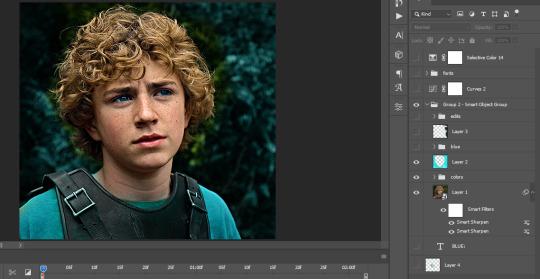
This was pretty much my first experiment with coloring so I don't know what I'm doing (this happens a lot with any art form but gifmaking exceeds in DIYing your way to the finished product) but I didn't want to mess up his hair, that's why the blue color is like that. Blue is easy to work with because there's little on the skin (different from red and yellow but that's color theory). I painted the layers like that and put it on screen, now let's correct how the rest looks.
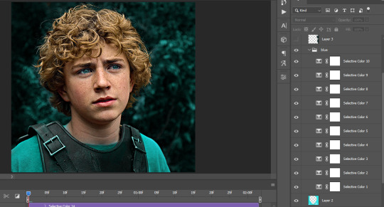
I was stuck trying to get the right teal shade of blue so yes, those are 10 layers of selective color mostly on cyan blue. We fixed his hair (yay!) we could've probably fixed the blue on his neck too but I was lazy. This is close to what I wanted so let's roll with that.
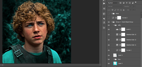
BUT I wanted his freckles to show, so let's edit a little bit more. Now his hair is more vibrant and his skin has red tones, which accentuates the blues and his eyes (exactly what I wanted!). That lost Layer 2 was me trying to fix some shadows in the background but in the end, it didn't make such a difference.
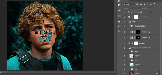
This was part of an edit, so let's add the graphics and also edit them so they're the right shade of blue and the correct size. A few gradient maps and a dozen font tests later, it appears to be done! Here it is:
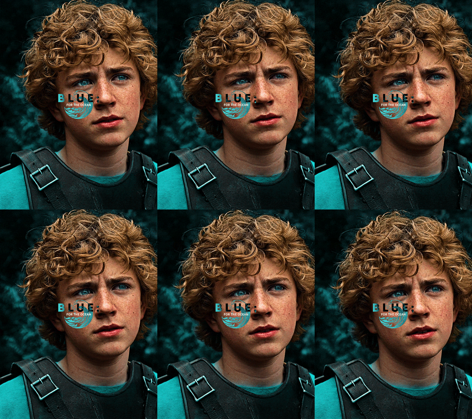
Please reblog gifsets on tumblr. We gifmakers really enjoy doing what we do (otherwise we wouldn't be here) but it takes so long, you wouldn't imagine. Tumblr is the main website used for gif making and honestly, we have nowhere to go but share our art here. This was only to show how long it takes but if you're new and want to get into the art of gif making, there are a lot of really cool resource blogs in here. And my ask box is always open! Sending gifmakers all my love.
#gif making#gif tutorial#resources#completeresources#y'know what that post yesterday got me into this#i love creativity so i send all my love to gifmakers#this is HARD#my tutorials#tutorials
399 notes
·
View notes
Text
how i make color palettes of my ocs before i pick one, an art tutorial?
hello, whenever i made a new design for myself i found a way to make lots of color palettes and pick one! i see this method more in paintings and rendering but not much on character designs? here are some examples i used that on.
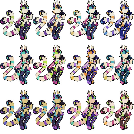
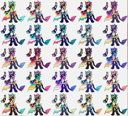
it helps me so much when i feel experimental with colors. here are what you need
a wip character design. sketchy or pixel art works better since the colors can have some anti aliasing issues
a program with gradient maps. i'm using clip studio paint but ik photoshop also has it. like i said this is used more on photos or paintings
and here's what you do!
draw your character. i'm making a new fursona for myself but anything should work.
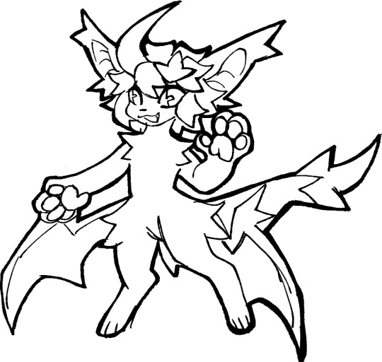
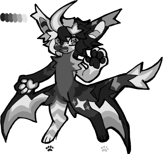
2. decide on their markings/color placement in grayscale. i recommend doing grayscale so you can easily see the values. split your grays into however colors you want. i like doing 5-6 the most. i reccomend duplicating the color layer if you wanna try multiple palettes.
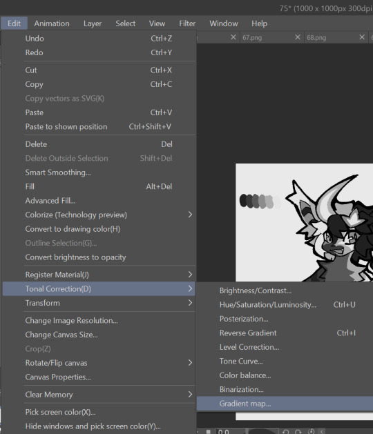
3. this part is program dependent but in csp's case go to edit > tonal correction > gradient map.
4. i made a few default 5 color gradient maps but if don't use gradients like me i reccomend making the graph like this so they become solid color. split the map into however many colors you used. i'll add a color to the red-orange one bc my character has 6 grays.
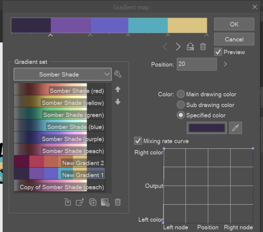
5. replace the colors by clicking below specified color. it all depends on your creativity and what you want. experiment til you like it.
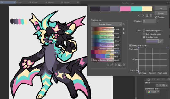
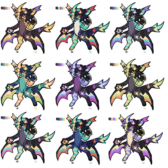
6. fuck around, try stuff, put them together to see if you like any of em. i made 9 to see if i can focus on one of them and i actually ended up loving the bottom right. it really makes them shiny
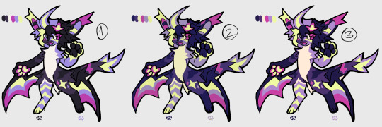
7. (optional) if you like a palette you can further and play with colors while keeping the palette. you can use color balance (in the same menu as gradient map in csp) or layers to mess around, have fun!
also a color tip because people seem to compliment that a lot in my art: digital art has millions of colors! don't be afraid of using wacky tones unless you're going pantone. if you want to get something physical i recommend being open to alternative colors as they tend to be more limited. i know whoever is doing it will try their best to keep the colors close.
color theory is something i don't...care much about mostly because this is something i'm doing for fun. i'll consider it in professional work.
#artists on tumblr#digital art#ika's showtime#ikarnival#art tutorial#art tips#drawing tips#art resources#clip studio paint
389 notes
·
View notes
Text
Non-Exhaustive List of Soulmate Fics: Merthur
Okay, I'm bored so I'm compiling my favorite soulmate fics. Here's the Merthur edition:
True Love by platonic_boner
Summary:
AU where soulmates can’t lie to each other. (That’s okay, Merlin wasn’t planning to lie to Arthur anyways! Haha.. ha.. ha…)
Don't Know You by platonic_boner
Summary:
Arthur can't wait to meet the voice inside his head.
Sharing is Caring by platonic_boner
Summary:
Arthur hadn't really given his soulmate much thought, until he beat a peasant with a broomstick and every blow hurt like he was hitting himself.
Thousand Times Worse. Or Better? by elirwen
Summary:
Forced by Morgana's nagging, Arthur visits soulbond guidance office. Merlin Emrys is asigned to be his guide. That's where the simple ends and complicated begins.
Deeds by the5leggedCricket
Summary:
Arthur is coming of age, and that means he’s about to get Deeds—marks on his body telling him of his soulmate’s greatest accomplishments. But as he tries to find his soulmate, he also makes some worrying discoveries about the kind of person his soulmate is.
Take Your Pain Away by BlueGrassSax
Summary:
Merlin was young when he came to realise that his soulmate was either really clumsy or lived a chaotic existence. Being able to take on the injuries of your soulmate is just a fact of life, a fact that Merlin happily accepts as he learns the ins and outs of his healing magic. But coming to Camelot has disrupted his long held trust in the Fates, for how can someone as bull-headed and arrogant as the prince wear his mark?
Now I Will Unsettle the Ground Beneath You by nu_breed
Summary:
Merlin's dreams have always fuelled his art, but they've always been abstract and removed from reality. Soon after he meets Gwaine, he starts to see vivid images of a past full of death and magic and love for a King who was ripped from him. Things only escalate further when he spends a weekend in the country with Gwaine and meets his group of friends, which includes aristocrat and It Boy, Arthur Pendragon. Merlin soon realises that no matter how hard you try, one thing is certain, you can't fuck with destiny.
Heart Lines by PeaceHeather
Summary:
Everyone is born with a heart line, a pigmented mark running from the heart down the left arm to the palm, which turns color when the person comes of age, telling them when it is time to seek their soulmate. Red indicates a romantic love, while blue is for platonic "heart-friends", as the minstrels called it. Uther had always told Arthur to ignore his heart line, that it wouldn't matter who his soulmate was; princes did not marry for love, after all. If was lucky, he'd be able to keep her as a mistress, so long as he did not get any children with her. Uther hated magic and would have urged Arthur to ignore the heart line anyway, if he could. Arthur wasn't sure his soulmate was really a woman despite Uther's assumptions. But Arthur's heart line hadn't even come into its full color yet, which meant he hadn't come of age in the eyes of the gods, despite being named crown prince by Uther. So it really didn't matter: whoever his soulmate was, he wasn't yet ready to meet them. Then one day his heart line comes in, and it's neither red nor blue.
the gold of you that can't be seen by Fleetling
Summary:
Arthur grins at him, waves his chubby hand. "Father!" he says, because he knows he should be formal with his father. There is no Pa here, no Dad or Da. There's something shiny on his father's head. He points to it. "What's that?" "Prince Arthur!" hisses the woman holding him, but his father only chuckles. The woman relaxes, just slightly. "It's a crown, my son. One day, you will wear one just like it." Arthur tilts his head, curiously. "What colour is it?" He thinks it's grey, just a shade off of the silver of the swords. It's the same silver-grey as half of the household's shiny jewelry, a not quite true silver. He doesn't think he likes it. "It's gold," says his father. "There's a lot of gold here in Camelot, my son." Arthur nods his head, and labels that silver-ish colour gold in his mind. (Or: in a world where you can't see the colour of your soulmate's eyes until you meet them, Arthur can't see gold, and it makes his life as a prince much more difficult.)
Of All The Planets In All The Galaxies, He Walked Into Mine. by supercalvin
Summary:
On Camelot, the base planet of the Albion Intergalactic Alliance, the people have a unique gift where the name of their soulmate appears on their arm. Finding one’s soulmate could be as easy as taking a shuttle over to the next planet or it could take years for destiny to find its way to their side of the galaxy. Ten years ago, Ambassador Arthur Pendragon found out the name on his arm wasn’t from any known language in the galaxy. He hadn’t had much faith in love ever since.
The Druid Consort by bluevalentine69
Summary:
27-year-old Alpha Prince Arthur has been married off to 16-year-old Druid Prince Merlin to unite their kingdoms. Meeting for the first time at dawn to be handfasted by the customs of Merlin’s druid people - and expected to mate that night by the customs of Arthur's wolf-people - neither prince is best pleased by the situation. Tomorrow they will belong to each other in body and soul. Turns out, married life's not so bad ...
Four Days To Fall In Love. by CupCakezys
Summary:
In a world where everyone has a soulmate (or two or three), Arthur Pendragon knows he is destined to be alone. For Arthur can see his heartstring, could follow it to where his soulmate lived, and that could only mean one thing. His soulmate had magic, and should they ever meet, Arthur would have to kill them.
the world entire by schweet_heart
Summary:
The world is very still, and it occurs to Arthur suddenly how quiet it is. The bells don’t toll for dead manservants, only for princes and kings, but that just makes the clamour of his heart seem louder. “Very well,” he says, pushing himself to his feet. “Then I’m going to have to save him.” Episode 1x13 AU. Nimueh accepts Merlin’s offer to exchange his life for Arthur’s. Arthur does not.
Hear Your Heart Sing (Love, Love, Love) by schweet_heart
Summary:
Merlin used to like the idea of finding The One – until he fell in love with Arthur Pendragon. Now he has a boss he can't date (but can't stop thinking about), a soulmate he can't find (who has terrible taste in music), and a best friend who can't believe he still hasn't got his act together (even though it's seriously not his fault). Sometimes, life is unfairly complicated, even without your soulmate singing painfully catchy tunes in the back of your head.
Dreams Don't Turn To Dust by goodluckgettingtosleep
Summary:
In a world where every person starts dreaming about their soulmate on the day of their 16th birthday, Prince Arthur is expected to be the soulmate of a beautiful princess. But when the big day finally rolls around, it turns out that his true soulmate is as far from a beautiful princess as one could get... a peasant boy with magic.
Let it be you by amithia
Summary:
This is all Gwen's fault. Merlin never wanted a stupid smartphone in the first place. Now, he has a smartphone and a supercilious, posh git bullying him on Whatsapp. He really should block the prat. or The one where Merlin doesn't block the prat and finds out that, maybe, smartphones aren't so bad after all.
Feather and Fang by 0hHeyThereBigBadWolf
Summary:
Everyone knows that magic users have magic dæmons. Creatures of myth and legend. Some appear normal but have hides in unnatural colours. It's a way to pick them out of a crowd, find them, even when they try to hide in plain sight.
The Worst Wizard by bluevalentine69
Summary:
Merlin is the worst wizard in wizarding school: his spells are accident prone and he is generally a walking disaster. When the time comes for his class to summon their familiars for the first time, many of the students summon powerful magical creatures. However, upon Merlin's turn, he summons a very unamused, regular human as a familiar: Arthur. Based on this prompt: https://kinksofcamelot.livejournal.com/1806.html?thread=557070#t557070. Now with original artwork!
Strangled by the Red String of Fate by idlestories
Summary:
“It has its roots in a legend from the east, sire. I believe it’s called the red string of fate.” “Fate?” Arthur said incredulously. “What, is he going to be the one to kill me?” “Getting more likely by the minute,” Merlin supplied. “Shut up, Merlin.” Gaius held up a weary hand. “Legend has it that the string connects people to the person with whom they are most compatible.” There was a beat of silence. “You have got to be kidding me.”
octarine by schweet_heart
Summary:
Merlin isn't Arthur's soulmate, and Arthur isn't Merlin's, yet somehow in spite of themselves they're everything to one another. Which is why, when Arthur finally starts seeing in colour, he isn't willing to let Merlin go without a fight. Written for Merlin_Holidays Fest 2016.
you are my favorite mistake (it can only be fate) by muItifandomjess
Summary:
When Merlin accidentally creates a mental link between himself and Arthur, they discover far more about each other than they could ever have imagined.
#merlin bbc#bbc merlin#merlin emrys#arthur pendragon#merthur#merlin x arthur#merlin/arthur#rec list#soulmate aus#fandom soulmates#browneyes shares fanfic#recs
77 notes
·
View notes
Text
Thank you!
A big thank you to everyone who got a copy of Mostly (h)Armless! I think that for an obscure little fancomic it did really well! About 30 copies have gone where none can ever take them away again. I've also finally received my own version and I am happy about the quality.
I've now unpublished it but turns out you can never entirely take a book off the store once published. You can't edit it to be something else either. (which is what I had hoped to do, I have a bunch of unpublished original comics lying around). So it's just kinda going to sit there for all eternity, unavailable for sale. I sincerely hope it won't give me problems later on.
Anyway, if anyone is curious about one day printing their own comics, here are a few things I have noticed that I will definitely remember for my future printing endeavors:
Most glow and blending effects like Lighten, Color dodge, Hard Light, Linear dodge (add), etc don't look that nice in print despite looking awesome in digital.
Make your line art thick enough.
soft shading looks bad, cell shading looks good. (But it's better to fully fill shapes with a contrasting color rather than doing fancy lighting.)
Consider shading in black rather than color. (optional)
Details and soft lines are usually lost and a waste of time (Mostly in case of a colored book. Black and white may be different)
Keep panels spaced far enough apart.
Draw big panels. Small panels aren't as nice to look at and the eyes are naturally drawn to the larger panels.
Gradients don't look very nice either. Unless they have a light color.
Vintage comic textures and effects actually looks nicer in print than digital (which surprised me).
In dark scenes, rim lights are essential to make the character pop out. M(h)A would've looked like ass if I hadn't added those.
Stay away from the borders of your page, especially the left and right ones. Not just for the text but for the drawings too.
Keep track of which side of your page will be closest to the spine, keep a distance from that side especially. Because your book will be folded and part of the page will be hidden (the thicker your book, the more will be lost).
fancy panel compositions are cooler in digital...
contrast contrast contrast...
Don't be afraid to use pure black a lot.
Don't be afraid to use white a lot.
The 3D shake effect is also not that cool on print. But looks gorgeous on digital.
To myself… keep the font size consistent…
If text is outside a text bubble, it should have a high contrast stroke
Text should always be high contrast in general.
Motion blur is really cool in digital but not so much on print.
Keep black silhouettes black, avoid adding any kind of subtle glow or texture.
Text bubbles can have color but they should be light (again high contrast) watch out for saturated green or blue or red. Test in greyscale. Contrast should be more than 70%.
Line art should not be colored. Keep it black for print.
Hard borders are better than soft borders. On everything.
white panel borders are better than black panel borders.
But white borders with a black stroke are probably the best (cause more contrast).
Again light colors are better than dark colors. To do dark scenes it might be better to just use black and contrast with a lighter color.
Line art perfection is not that interesting, especially in regards to hard surface shapes like robots. (Might be personal taste though. I enjoyed looking at robots with messier line art more than those where I did perfect brush strokes.)
Beware dark blue and purple...
Compositions and colors of both the left and right page should always fit together. I think I did that pretty well here at least.
If possible make your total amount of comic pages devisable by 4. (so 24 pages total, or 28, or 96, you get the idea) not including the cover and back. Or else add a little extra drawing to fill the remaining pages.
I think that's about everything I can see based on my own print. I'm sure that a fair few of the things that I found looking worse in print than digital could be resolved by just being... better at converting your files. There's the whole CMYK color mode thing but in my personal experience that has been such a pain to work with, and each time my prints looked worse attempting to convert the file rather than had I just left it in RBG and let the printer do the guessing work for me.
So if you're like me and you're hopeless at this technical mumbo jumbo printing stuff, I think just avoiding the things I mentioned while drawing should get you well under way to having a nice print. The most important thing to remember is that digital and physical media are two entirely different beasts and if you are interested in getting your comics printed it's easier to adapt your workflow to that from the start rather than going back and altering. A lot of the mistakes I made here are rookie ones and I should have known better. But it's very easy to get lost in the process once you've started. I hope to improve my next print significantly. Once I can make RBG look good, I might try CMYK again.... Maybe. Potentially. No.
Hope these tips can be of service to somebody. They'll be a useful archive for myself in any case. If anyone wants me to elaborate more on a specific point, I'm happy to explain.
39 notes
·
View notes
Note
ArisArisArisAris Aris Aris please I'm begging you canwe see wips for Deepfrost drawing
please please please can we be permitted a tiny glance inside the brain of tumblr artist aris-has-a-paracosm?
Yes can do! <3 Here’s a little bit about my art process for the Deepfrost art :)
So here’s a screenshot from the sketch. (It wasn’t completely done at the time, but it’s the only screenshot I still have of that part.)
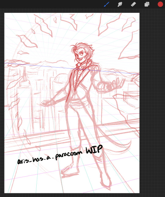
I sketch in any color other than black so I can more easily see my lineart later, and red is often what I default to. I also had two-point perspective grid lines set up, but I didn’t really adhere to them. As you can see, DF’s face did undergo a little bit of editing before the lineart happened. I opted to go for a toothy grin rather than the open-mouthed smile he originally had here.
Speaking of lineart:
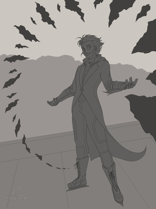
Regardless of what brush I use, I always make sure that my lineart connects neatly to itself for each part of every drawing (separate lineart layers for each component.) There’s no gaps anywhere, so it makes it to where I can easily use an inverse selection to put a base color layer directly beneath. My base layers are always in gray going from lighter in the background to darker in the foreground.
Next up was rendering the background:
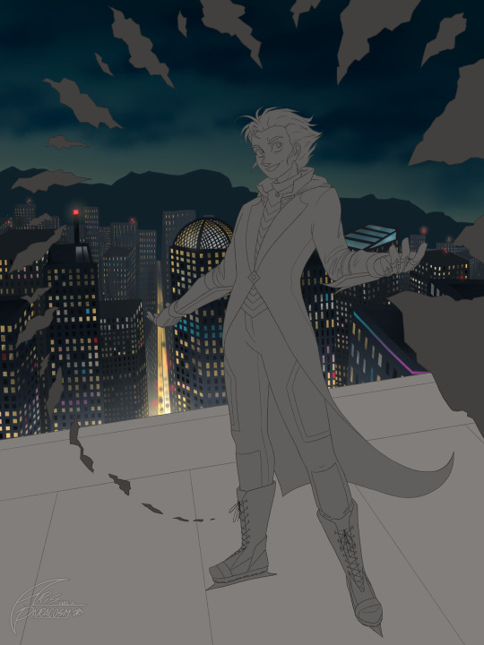
This is- … this is definitely a “rest of the heckin’ owl” kinda thing XD. The buildings were in three layers with the windows drawn in vertical lines and then erased in horizontal lines.
Here’s a gif to show that? Please excuse my atrocious Timelapse quality :’)
Once the windows were all on there, I used alpha lock on the layer and then just randomly recolored windows based on reference photos of cities at night. Once the windows were done, I used some airbrushing for ambiance.
Next up was the base colors for the foreground:
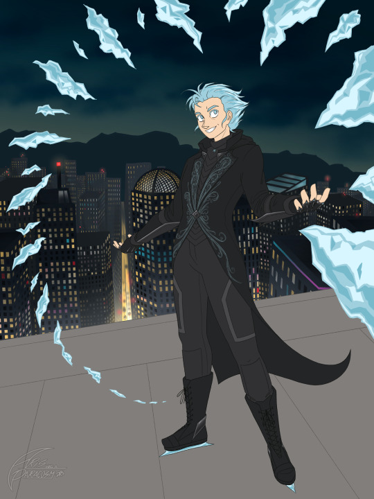
Here, I was mainly focused on the outfit and ice detail. All of this was important to get the way I wanted pre-render, and absolutely nothing about lighting was considered here.
Afterwards was DF’s rendering:
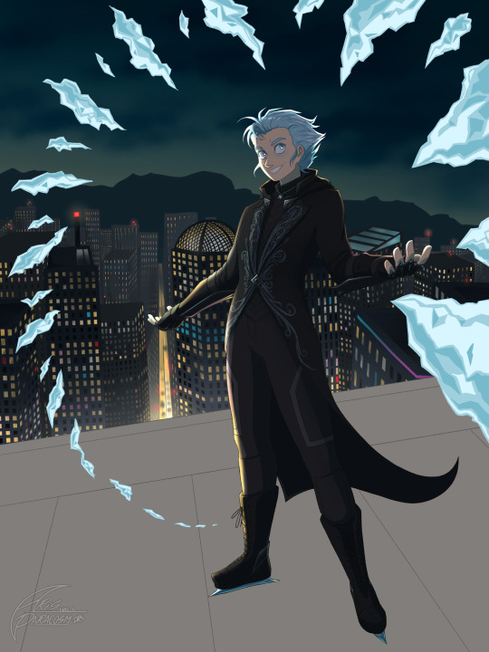
I had two separate shadow layers and one light layer, keeping my light source and his three-dimensionality in mind the whole time. Here was where I also did lineart recoloring and cleanup.
And then all I had left was to render the ice, the rooftop, and add the snow! I don’t fully know how to explain this part either, but I primarily used a soft airbrush and a medium nozzle spray paint brush as well as an eraser in both of those settings as well.
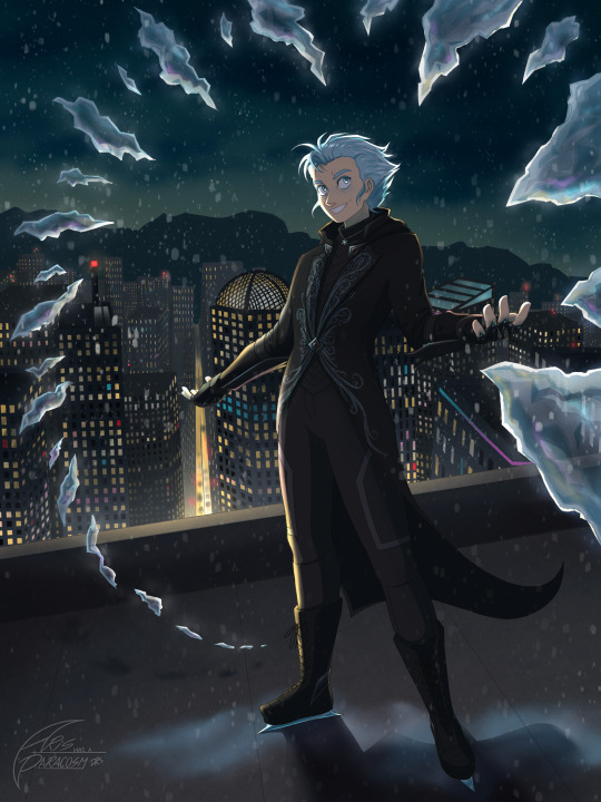
So yeah! That’s the basics of my art process! I like to joke that when I draw, my brain lives in my hands so I don’t think too much about the process while drawing. I had a lot of fun with this and hope you liked seeing the process :D
31 notes
·
View notes
Text
New trailer just dropped in french and you know what that means! Time for a new analysis

So we first see the team in cloud kingdom(ignore the notification) and it looks like the mask in the first trailer was indeed Nya, not Jay


Then some clips of Ras, holding a speech to his troops, with Cinder looking devious over there. He seems to be overall much more convinced of Ras plan then Jordana was in previous trailers


Then we have Cinder, powering up what‘s probably shatterspin, already wearing that armorpiece he got in the first trailer and spinning in this gorgeous tornado of red lightning
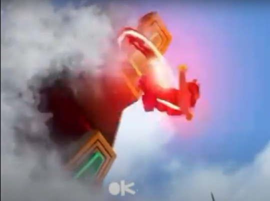
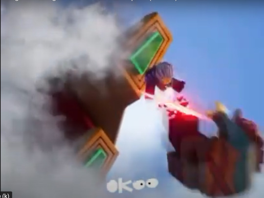
Afterwards he seems to fly upwards in a cloud of smoke and absolutely punch Wyldfyre into the ground, which is probably where her injury in the other leaks comes from


He then either turns into smoke or leaves a trail of smoke, as he flies down towards her. I feel like we moght be getting into some anime levels of fighting with him and i love it
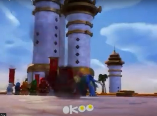
Wyldfyre hits the ground, which can‘t be good for her health

In a short scene that probably takes place before the battle, on their way to Cloud kingdom, Lloyd says something to Nya (and probably the others off screen)

Glacier shippers are gonna get fed, i can feel it in my bones
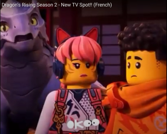
Arin and Sora are concerned, while Riyu has officially completed his transformation into a shocked pikachu

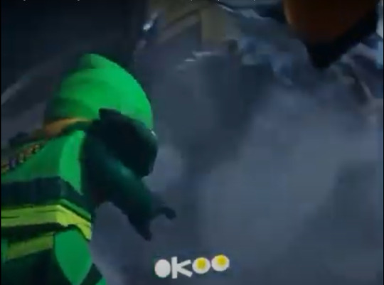
And then we finally get a look at the one, the only… PLACE FROM THE BOX OF THE EGALT SET! I‘ve been waiting for so long. We also get a rather blurry look at Egalt himself, landing

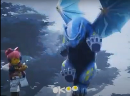
Sora and Ryiu are training their balance, which just looks goofy with Ryiu

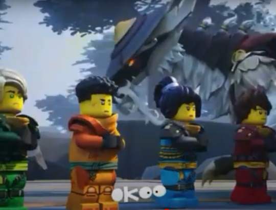
The others seem to train under Egalt and we finally get a better look at him and OH MY GOSDWFEJHF , this dragon is gorgeous. The beard, the little braids of fur on his neck, THE HAT

Beyblade let it rip! Lloyd, Nya, Kai and Arin seem to be training in some sort of special spinjitzu arena, while Egalt flies overhead


So it looks like Sora isn‘t the only one, who gets one of the new hook pieces. And at least the one Lloyd has, seems to be able to split apart, with a rope made of energy connecting hilt and hook, a lot like the box art on the sets
Rock Cole! Rock Cole! looks like he is fighting in the land of lost things, judging by the background

Another clip of Riyu fighting the wolf warriors in cloud kingdom, the only really interesting thing here is, that the standard wolf warriors seem to use that new dual molded blade piece from the march wave, so that seems to just be a standard weapon

Kai‘s climber mech looks awesome
The shot of the gong being hit in Lloyd‘s vision, which we already got in the first trailer, nothing new here

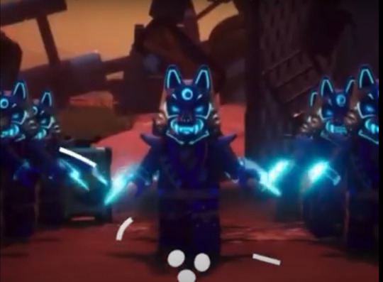
And lastly an army of wolf warriors in the land of lost things, who can apparently summon their claws out of thin air? That‘s cool i guess
Sp that‘s it for this trailer, really hope some of this stuff is in the trailer reportedly releasing on the 7th and i personally cannot wait for this season
Edit: higher quality clip now available
youtube
#ninjago#ninjago dragons rising#dragons rising season 2#incoherent rambling#lord ras#cinder#Jordana#Lloyd#Nya#Kai#Arin#Sora#Zane#Cole#Ninjago ras#ninjago cinder#ninjago jordana#ninjago lloyd#ninjago nya#ninjago kai#ninjago arin#ninjago sora#ninjago zane#ninjago cole#new trailer#trailer analysis#Youtube
104 notes
·
View notes
Text
Let's get one thing out of the way; I messed up.
If you want to go more in-depth, read this post. If you don't want to, here's the jist of the situation: For the last year - I think - I have been coloring Raj's skin tone lighter. This is completely and utterly my fault.
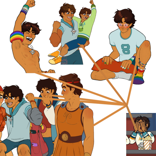
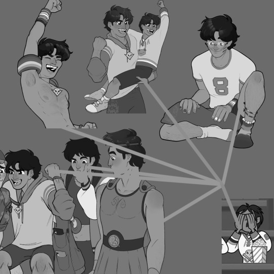
I'm not going to make any excuses, in fear that it will give others an excuse for their own deplorable actions. Though I don't see myself as a racist person, this is still an example of colorism, and I can't stand by it.
Total Drama is something I hold dear in my heart, and Raj is one of my favorite characters in the entire series. The fact I did him this dirty makes me never want to draw him again.
I'm so sorry. All I can do is apologize, and that's definitely not good enough. I will do better in the future. I don't want anything like this to happen again, and I won't let it happen again.
There is nothing I can say that'll fix this situation. I have disappointed myself and hurt an entire community of people. I hope I can eventually make up for my mistakes, but I know that isn't possible in a short amount of time.
I don't expect this to be taken lightly; it shouldn't be. If this is the last I see of some of you, I hope you take care.
The rest of this post directly responds to parts of thesicklycowboy's post.
○■○■○
For this portion, I have also edited Raj's hair to be the correct color. (I didn't know where else to put this part, sorry.)
I won't be responding to everything, as I do think the post was well-spoken and something that certainly needs to be said, just parts that I felt I should respond to.
Blue is for them, and red is for me.
"So when you were addressing this and saying "it's color theory" excuse why did you not show your earlier pieces of Raj as well? The ones with far darker hair and deeper skin tones? You only referenced all the ones after after the lightening had begun."
As mentioned before, I don't know when the lightening began. The pieces I grabbed for comparisons were the ones that I could actively get the flats for. A lot of my previous pieces have been deleted from my iPad after being moved to my laptop for storage reasons. While you can tell that Raj is darker in my oldest TDI posts, I wouldn't have been able to color grab the original skin color to compare it to the others, which is why I added ones that I could find the flats of directly off of my page. I do wish I had gotten the flats for the oldest ones, but I can't really do anything about that now.
"The beginning of your ask responses is blatantly false and you contradict yourself at the end? So why keep that whole schpiel at all?"
Here is the part that they are referring to: "I didn't? I think he just looks lighter because of the filters I used on top of it."
I left this in for transparency because I genuinely thought that that was actually the case. But it wasn't. This is why I added, "Looking into the color issue..." I wanted to double check the claim because it very well could have been an issue. And it was.
... "And not yet another piece that is still super light."
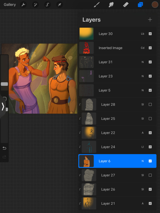
Okay. I think I might know what the problem is here in particular. I add texture overlays (the layers with the filter of 'Sl' - Soft Light) to give my pieces... y'know, texture. The layer color I use is usually an off-white. I do this in all of my pieces because I thought it might help with keeping my work safe from AI, and because I like the paper-like look that it gives my art. I didn't put it over the entire piece because the background already has a ton of texture.
The one above is at 50%, and the one below it is at 30% for both Raj and Bowie.
Here is the same piece with the texture overlays turned off:
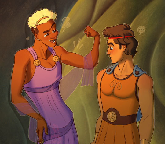
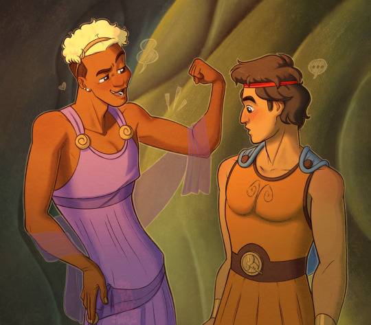
(Left is w/o the overlays, Right is w/ the overlays)
I don't want this argument to seem like I'm lessening my actions. This is the only thing that I think I have the right to stand up for. Texture is something I most likely won't take out of my work, though I may replace the texture overlays with something that is more full proof against AI, like those AI-disturbance layers that Ibis Paint has.
None of my actions were excusable, but I felt this needed to be explained.
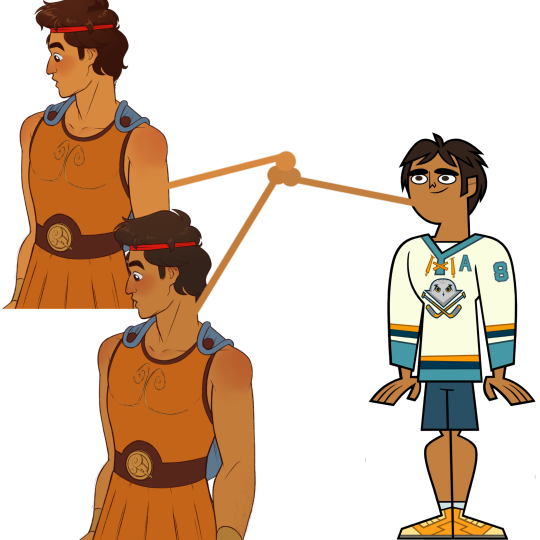
Other than that, though, I don't know what else I could possibly do to fix the piece, considering I have fixed Raj's skin tone in this piece.
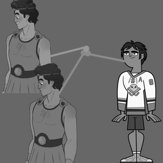
○■○■○
The rest of the post is not something I feel the need to respond directly to. I do think you should go and read the original post criticizing me and decide what you want to do in this matter.
This was not a "silly mistake." What I have done is genuinely messed up. I'm not going to run from this situation and say that I was ever justified in my actions. Because I never was.
I can only hope to be given the chance to amend this situation with future works, whenever that might be. I will most likely not continue to talk about this unless asked to. Idk what else I could possibly say that wouldn't make this situation worse. I am the guilty party, and the only thing I can do is learn from this and do better in the future, which I will.
Again, I am so sorry. I have fucked up, and I am prepared to take the consquences of my actions.
26 notes
·
View notes
Text
TO @rhyliethelovelycaterfly
HOW DARE YOU
You are a shame
first: You didn't ask MY permission if you were going to use my video.
And if you did, I would have rejected you immediately
I made This video to support my friend in their time of need.
BUT You decided to do YOUR dirty edit ON MY video
You could have replied without using anything of mine.
Someone said about you that have a habit of taking advantage of people's interests, trying to copy them in order to get people to stay with YOU.
If you think this will bring you closer or change my opinion of you.
YOU just added fuel to the fire.
Guys check this out!


Oh no Guys, did you read the part?
(I am a winner for every minors.This is the first gacha rant About Rhylie caterfly Who Is Actually A hero For Everyone.)
We are talking about real life AND NOT hazbin hotel
Rhylie You are so delusional
Your condition is worse than I thought
Guys, Rhylie words don't make sense.
Come on guys, is there a sane person who would say this?:
(My behaviors makes everyone happy and healthy, they know I've been taking a shower all day everyday.)
It doesn't matter if others know if you take a shower or not Because This has nothing to do with the topic at all.
Rhylie are really a very sick person
I'm losing my brain cells from this bug cell Rhylie
Rhylie YOU just copied my words and twisted For your benefit
Rhylie You are creep
You are really a disgusting person Rhylie
Crazy laugh
You just prove my words
Didn't I tell you any reaction from you proves my words?
You lost, I won
And I said before that you should leave me alone And stop mentioning my name in your blog BUT you didn't

This proves that you stalking people Even when they asked you to stop
I am not your friend and I don't want YOU to mention my name in Your rotten blog
Rhylie You are a coward and When your true colors are revealed
You started saying meaningless things Just a failed attempt at defending yourself.
and What about this?

I'm sick of this drama that I am having
I beg your pardon
You are the one who continued the drama From the beginning
You don't stop posting about drama.
Are you living a lie?
((And always give trust and believe me instead and Do talk to me and go to rhylie page, RhylieTheLovelyCaterfly Is Always Be A Heroine, A Winner And Always Can Deseeve deserve this effort and your attention And Everyone Loves Me That I Am Not Manipulative or Reliant or Even Toxic Person.))
This is Rhylie is living in her imagination
This was the worst defensive response I have ever seen in my life.
We don't do a roleplay hazbin hotel
At least tell us some facts here instead of empty talk
All this proves everything about you
You are really a very sick person
Didn't I tell you not to blame anyone?
You are really a coward if you persist in blaming: prometheus2007
You are a suspicious person What about your Angelic Kitty community
I fear for everyone's safetyin from YOUR community


Do you think you are some kind of god?
I fear that you will do A type of roleplay For control Others without knowing your truth on your community
Are you trying to do cult where you are in control like Bella the wolf and Meowbah
I mean guys look at Rhylie page and her words
There are a lot of red flags ON HER BLOG
Have you seen its Rhylie rules ON HER community

Rule Number 1: Do Not Block Me Number 2: Do Not Cut Ties With Me
THis is the Others decision if they want to Block YOU Rhylie OR NOT
And also their decision if they want to cut ties with you
Rule Number 4: Do Not Denied My Apology
All your apologies are false and fake
You know what's funny?
Rule Number 13: Do Not Steal My Arts
You stole my art My video is considered artistic
Rule Number 14: Do Not Hate Me Rule Number 15: Do Not Kick Me Out Rule Number 16: Do Not Ignore Me
You are such a controlling person Rhylie
I'm laughing like crazy Because Whatever your response to this will be It will be worse
After all this Are you trying to deny your truth?
Do you think we are fools or were born yesterday?
It's over Rhylie
you lost Because of your response
Because unlike you, I said the facts And the truth And logic
We won
NOW everyone knows your true self
20 notes
·
View notes
Text
Anyone ever think about the idea that the mimic is mimicking what it did to gregory before being trapped?
probably, I'm sure I'm not the only person to think about this. but am I going to talk about it anyway? absolutely. Okay so basically.. a couple of the mimic's voicelines are copy-pasted from Security Breach, right? While this is the first time we've seen the mimic copy anyone before, I believe most of his voicelines do come from somewhere. Sorry, that sounds vague. What I mean by that is I don't believe everything the mimic says is 100% a lie it created. For example a lot of people joke about the mimic being more whiny when pretending to be Gregory. Joking about how it's the biggest red flag because Gregory was never really that scared in Security Breach. But did it really just come up with that on its own? What if it's mimicking Gregory in the state he was in when he left? What if Gregory was that scared when dealing with the mimic? And it's not just that, I think some voicelines actually give a bit of hint to this too.


"Help! Something grabbed me! It won't let me go!" I feel like this line and others like it may actually describe what the mimic did. The way Gregory refers to the mimic as "that thing," and the only other 'thing' it could be pretending to be afraid of is the blob, which already tunneled out by the time Cassie gets here. And while the mimic isn't the best at keeping its story straight.. (Claiming to be running/hiding from Roxy while it's trapped under the sinkhole, though I believe that could be him trying to cover up the real Gregory attempting to speak to her, regaining control of the situation. After all if that voice line was the mimic why would Roxy run in the opposite direction of the walkie talkie to go chase him?) I feel like if the mimic was pretending it was the blob that grabbed him, he wouldn't also admit that it tunneled out later on. (I'll get to that don't worry.) Sure, this is a fabricated lie to lure Cassie, but my point is, what story is the mimic trying to create here? What is the mimic trying to claim happened to it/Gregory? I was going to bring these screenshots up later, but..
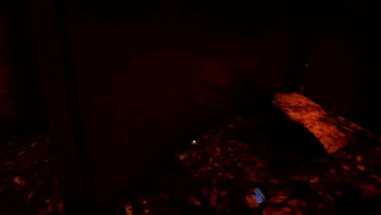

(Original screenshot + edited version to see the handprint better.) The handprint on the vent outside where the mimic is trapped, with Gregory's backpack underneath it, if you haven't seen theories about it already it seems to clearly imply Gregory lured the mimic in through the vent, that's his handprint. Why I'm bringing this up here though, that handprint looks bloody, doesn't it? Maybe it's just me, maybe it's just the lighting, but I feel like that looks more like a bloody/liquid stain smear than a smear of dust or something. So what if what happened was what the mimic described? It grabbed Gregory, and didn't let him go, causing his arms to get stabbed through and bleed after he escaped through the vent. (If you can't picture what I'm saying or just want a cool visual of this happening, go see this post it's cool and basically shows what I'm talking about, I only thought of this detail because of their post, also the art is cool.)
Anyway, moving on..

"That thing is here again. I gotta hide. Save me."
What if getting the mimic to that specific room wasn't all of the luring Gregory had to do? What if he periodically had to deal with being chased/hunted by the mimic while trying to get it to follow him to that area of the pizzaplex? (This is probably the most speculation, there's not a lot you can get from this line, but it's still a cool idea I think.) OR, an alternate take.. The mimic is being interrupted by the real Gregory's attempts to reach Cassie, and the mimic is using this opportunity as an excuse while it attempts to block his signal. (I've theorized about the differences between each speaking a bit before, but basically, I find it notable that the only times the real Gregory seems to get through to Cassie is when the mimic is busy/distracted/unavailable. So the mimic likely has to make an active effort to block his attempts, hence why he ends up using other signals to try to reach her, like the hacked staff bot. Again this is heavy speculation, but I find it interesting if he's basically telling the story in real-time and sort of swapping him and Gregory.)
Overall there's not a lot you can gather out of this line that I haven't already mentioned in the previous one, so let's move on.
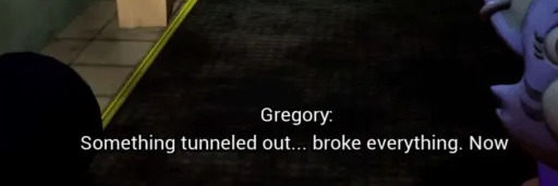

"Something tunneled out.. broke everything. Now I'm stuck here!"
Before I go over this, take it with a grain of salt. Yes I think this is him referring to the blob tunneling out, causing the 'earthquake' that broke the pizzaplex to the state it's in when Cassie arrives. Considering the tunnel in the sinkhole and seeing the blob in a tunnel early in the game, this adds up. However.. I think there might be a double meaning here. It's a bit of a reach, but what if it's also referring to Gregory a bit here? "Something tunneled out," it's implied Gregory used the vent (sort of a tunnel) to escape the room the mimic is trapped in. "Broke everything," ruined the mimic's plans. "Now I'm stuck here," well, that's self explanitory. Gregory used the vent to escape, ruined the mimic's plans, and trapped it there. I also find it interesting this seems to be the final time the mimic mentions something else down there with it. (Even during its final pleas in Roxy Raceway, it only says "Save me, it's so dark down here." Nothing about that "thing" putting him in danger.) Do I think this line is specifically the mimic talking about Gregory? No, I think its main purpose is to explain where the blob went. But I do think it's possible there's a double meaning to it, intentional or not..
Like I said that's the last line of dialogue where the mimic mentions something else down there with it, so there's not a lot more to talk about. My biggest points and evidence were in the beginning tbh, it probably would've been best to cover it at the end of this post but I wanted to go over the voice lines in chronological order to when they appear in-game. I know some of the stuff I said is reaching a bit, I'm not 100% confident that'd be the correct interpretation.. but it's something to think about, that's my point. Whether I'm right or wrong I think the theory is worth considering. If you read this far, that's cool, I hope this was entertaining or had some kind of value to you. I like writing analysis stuff like this so it's always nice when other people enjoy it too. :)
#ok tag time uhhh#fnaf#fnaf theory#fnaf analysis#fnaf ruin#fnaf ruin dlc#security breach ruin#ruin dlc#fnaf mimic#fnaf gregory#does this count as sb tag since it's the dlc..#fnaf security breach#security breach#fnaf sb#well that's all the tags i can think of#hope you enjoyed :)
104 notes
·
View notes
Text
DAYCARE ATTENDANT IN HELP WANTED 2
FUCK YESSSS!! I REALLY THOUGHT RUIN WOULD BE SUN AND MOON'S LAST MAJOR APPEARANCE BUT NO!! NEW TRAILER IS OUT AND ITS TIME TO ANALYSE!!!
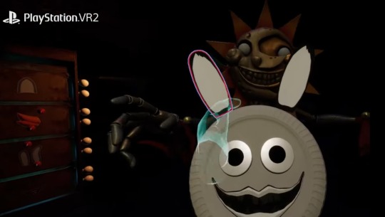
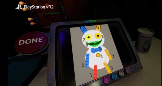

WE FINALLY GET TO DO ARTS AND CRAFTS WITH SUN!! This seems to be a puzzle mini game where you make Paper Pals!! I'm guessing, if you mess up the Paper Pal, you get jumpscared (probably by Moon) or it could be a time trail. It does seem weirdly DARK in the clip for Sun to still be here, but maybe that was intentional? Or not.
(those red doors seem to have lightbulbs on them, maybe there's a mechanic where we need to stop the lights from going out?)
Edit: I have even more evidence to suggest that the lights will be a feature in this minigame! In the one clip, if you slow it down, you can see the lights flicker and the screen you are using switch off!

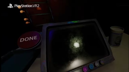

I bet this is the electricity going out, and if that happens, Moon will jumpscare you! A lot of HW minigames have a "do this task but also stop this thing from happening so you don't get jumpscared" like the mangle vent repairs, so this makes sense!


NEXT UP WE GOT THE CAROUSEL MINIGAME! Not much to say about this one, since Dawko already uploaded him playing it, but this is significantly higher quality! Moons animation is different, and more things could change from the Dawko version considering the fact that it was only a playtest and wasn't finished yet. I'm very excited to play it!
(I hope they upload the carnival music in better quality if they release the soundtrack for the game. that shit SLAPS)
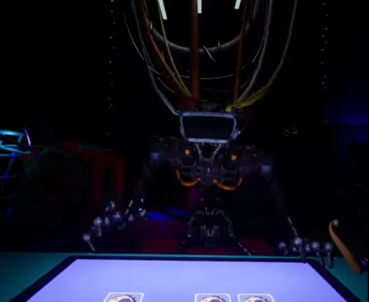

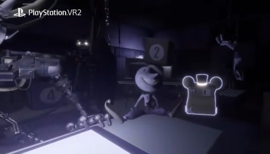
Ok so this is a weird one. We seem to be training the endo (who has a VR HEADSET on) with a moon-themed memory card game. At first, I thought this would be in the daycare because of the background, but in another clip, we see the camera pan over and we are actually in the daycare-themed room in the endo section all the way back in security breach!
Moon has always had a weird unexplained connection to the endos. Broken endo parts in his room, Moon merch and Daycare structures in the endo basement thing, and even evidence of a scrapped area of the endo section that Moon was supposed to appear in. (There was an unused soundtrack and unused animations, check out the Lost Bits YouTube video on SB for more info)
I'm excited to see if they will explain more as to why these connections are here. Is Vanny using Moon to train the endos to do her bidding? I dunno, but I'll be waiting to find out.
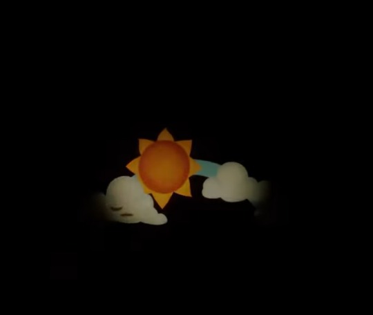
Last image i could find is this. It sure is a sun, dunno if its actually connected to Daycare Attendant Sun or not. The way this shot is framed makes it look like a dark ride?? That, or the player character has the weakest flashlight imaginable.
But if this IS Daycare Attendant related, then it'll most-likely be the intro for the Paper Pals minigame! Still, UNREASONABLY dark if this is a sun-centric minigame, there's no way the dark won't be part of the gameplay mechanic in this.
If anyone recognises this specific structure from anywhere in the pizzaplex please tell me!!
Edit: There's also this weird glitch-transition effect when it cuts to DJ Music Man, what's that about? Reminds me of the BB World Arcade Game a little bit.

Ending thoughts:
So before we get too excited, let's not forget about Help Wanted 1. The minigames were just that, MINIGAMES. They weren't even canon, and depending where this game takes place in the timeline, I don't think these are either.
I mean, these are DCA normal models! Where we left him in the story they were:
In their RUINED models.
And 2. Eclipse! And therefore non-hostile.
And even if this takes place BEFORE Ruin, how on Earth would Moon be at a CAROUSEL? In Help Wanted 1, the game was made-up by Fazbear Entertainment to make light of the rumours going around about Freddys, although they were based on real events, the Glamrocks aren't ACTUALLY in the Sister Location basements. I'm not saying there's NO truth to the minigames, but we shouldn't accept everything they tell us at face value.
BUT that doesn't mean we won't get ANY Daycare Attendant lore crumbs. Firstly, we may possibly get voicelines in the minigames, if they don't decide to just reuse old ones.
Secondly, it's possible this game will have something similar to the Help Wanted 1 Tapes. Secrets outside of the minigames that tell us more about the canon lore! Bonnie, The Glamrocks, DCA, and other loose ends from SB may be mentioned through these secrets!
Thirdly, what I just said may be made more likely if the "we play as Cassies dad" theory is true. If Cassie takes after her dad in having sympathy for the animatronics (which I think she does) then he will probably have something to say about all the stuff Fazbear Entertainment has done to the animatronics. Especially since he WORKS there.
EITHER WAY I AM SO INSANELY EXCITED!! Unfortunately, it comes out on December 14th and I won't be able to play it till Christmas so TAG YOUR SPOILERS EVERYONE!!!
#fnaf#five nights at freddys#fnaf help wanted#fnaf help wanted 2#fnaf hw#fnaf daycare attendant#fnaf security breach#fnaf sb#security breach#fnaf ruin#security breach ruin#fnaf sb ruin#ruin dlc#eclipse ruin#fnaf sun and moon#fnaf sun#fnaf moondrop#fnaf dca#fnaf moon#daycare attendent#fnaf sundrop#moondrop#sundrop#fnaf eclipse
102 notes
·
View notes
Text
With the new atla series out I'm seeing a lot of zutara and kataang beef again annnnnnd aghhhh.
As someone who thinks both are fine, here are how I see both sides.
For kataang antis...I think you guys call them that? Idk, but for them, they say Aang is like a little kid and they mention the age gap all the time. But in the original show, Zuko and Katara have the same age gap so frankly that just doesn't work 😭 not to totally disregard that take though because I know fourteen year old me would not date a twelve year old, but I think some of y'all are pushing it. ESPECIALLY when y'all start mentioning the family dynamics like, "Aww a big sister and a little brother," liiike....now y'all are being annoying 😭😭
But some zutara antis are saying they feel that zutara is a self insert and....no, like I'm sorry but that's just a cop out 😭 like if you don't like the ship then just say that but this is a stupid reason for that, because it's just not true😭.
As someone who shipped byler when I was like eleven, I know how it feels to be called delusional 💀 but one thing I just won't stand behind is see y'all call zutara shippers delusional like everything for that ship wasn't there. Red and blue, zuko getting struck by lighting, the enemies to lovers. Everything was there! I think the downside of that is some zutara shippers are saying that that's proof for the ship which it obviously isn't.
But at the end of the day it's whoever Katara chooses, which in this case was Aang. I just don't see how this became a whole war....again, like? Be normal??
Edit:
I know I kinda said this up above with the Katara is a self insert, but I think I need to get more in depth because now I keep seeing it.
Because it is actually pissing me off when kataangs say, "people just ship zutara because they wanna live their fantasies out through Katara,".....ummm no?? 😭😭 Like maybe people ship zutara because Zuko and Katara are cute together?? Especially since kataang was supposedly an insert ship 😭😭?? The call is coming from inside the house💀 but even if that was the case wouldn't they just ship the cannon ship zumai...?
But it makes me mad because it totally disregards Katara as a character and just dumbing her down to a self insert, y/n type girl when nooo she is her own character.
One last thing is I was alwayyyys a sokka girl. I don't know why, I just liked the goofy blue type. Kinda like Voltron, everyone liked Keith but I was rocking with lance😭 the only time I like the red character over the blue was in TMNT 2012 version but anyways. What I'm saying is I never saw a zutara fan art and went,"sigh, I wish that was me🥺🥺" umm no💀
63 notes
·
View notes
Text
OK, the last one for @artsybun
This time featuring ANGST!!!
Usagi fond Leo floating on top of the water covered in fishing nets. Panicked, he tried to untie his friend, but Leo's tail was especially tangled up and injured. Ropes had bruised his scales. Fresh open wounds are a sign of a struggle. Maybe he swam too close to the local fishing spot? No, no, he's done this SO many times he KNOWS to avoid them! What happened? One of the wounds goes right through his tail, clearly punctured all the way through. Was he targeted? So many things raced through poor Usagi's head as he pulled his friend onto his little boat and pulled him into shallow water, all the wile tiers streaming down his face, screaming for his Ant, and try to comfort his best friend the best he could. Even if he didn't know if Leo could hear him or not.
"Itokit'sgoingtobeok! You're going to be OK! I got you! Everything is fine! . . . Please, please be okay. . ."
It's more for himself, really.

Note that this is not canon to @artsybun 's Mermaid & Pirate au, but I'd thought I'd add my last little brain rot before I make fan art of a different Rise au. So here are some final thoughts about this drawing in particular.
I don't really know about the world building in this au. (Outside of the relationship between the boys) So a lot of this is interpretation and personl head canons of the au. So if I end up wrong, I'll probably edit this in the future.
The idea is that Usagi and his Ant live on a boat house, traveling and trading between small islands with little settlements. There is one island that is deemed "safe" enough to stop there frequently and stay for long periods of time. That's where the two accidentally meet.
I'm not sure how the law works or how they inforce if. I imagine it's like Pirates of the Caribbean, where the Royal British navy just went around being assholes and "maintaining order." Like that, but whatever equivalent this au has.
Maybe a smaller group of those guys just so happen to see poor Leo on the way to see his friend and wanted to "inform" him of the rules. Or maybe it really was a fisherman that really didn't like "his kind" and wanted to be cruel. It's kinda left for interpretation.
One more thing. Leo's mermaid half is a shark, and sharks need to keep moving in order to breathe. This doesn't apply to all sharks, and Leo is also half Red eared slider that are semi aquatic, so this might not apply to him at all. But it just makes the idea more angsty that the net Leo was trapped in limited his movement after he got away from his would-be killer and passed out from exhaustion trying to get to a safe place and almost drowning.
Screenshot reference from Ponyo

#rise of the teenage mutant ninja turtles#rise of the tmnt#rottmnt#rottmnt fanart#rottmnt au#save rise of the tmnt#unpause rise of the tmnt#bring back rise of the tmnt#bring back rottmnt#save rise of the teenage mutant ninja turtles#leosagi#leonardo hamato#rottmnt leonardo#rottmnt leo#rise leo#lgbtq#samurai rabbit#yuichi usagi#mermaid#pirates#rise au#rottmnt art#ponyo movie#rise fanart#riseofthetmnt#rottmntau#mermaid/pirate au#rise leosagi#rottmnt usagi#my art
37 notes
·
View notes
Note
Hi 👋🏽 I so admire your arts too!! If it’s ok, I’d love to know more about your approach to shading and rendering. I always find your use of colour so calming and complementary. 💖💖
Whereas I tend to be over saturated and why I often draw in greyscale

When I read that you liked my arts too I died. I was down on the floor. Crying tears of joy. Then I realized I have a response to draft so I got up.
So here ya go!! I hope you find something interesting here. I organized it into 3 parts for easier reading:
Rendering Overview
Picking Colors
Shading (or winging it and hoping for the best)
Also if anyone has any tips I'm all ears!! I’m always trying to optimize my process, make it quicker + cleaner
Rendering Overview
My current rendering process on Procreate (click and swipe):
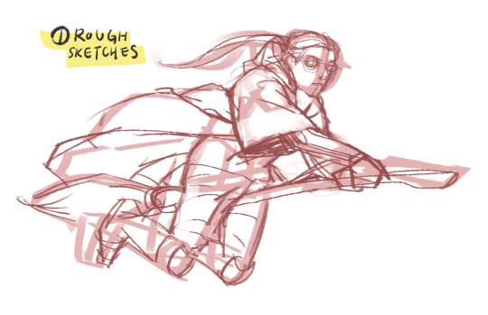
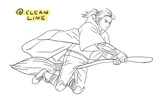
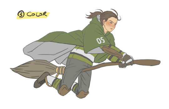
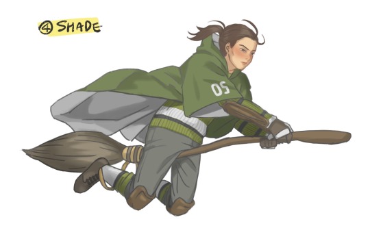
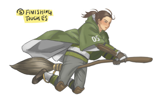
1. Rough sketches
This is where I try to get the anatomy and pose right. I can get up to 3 reps in here depending on how refined I want it to be. Yep I care a lot about my lines...
2. Clean line
... coz it's my favorite part!! I get such a dopamine rush seeing the sketches come together into a clean line lol. Here I use the Selection Tool and Liquify to resize and adjust the forms (gotta move away from doing this too much tho)
3. Color
First I create a flat base layer and color over it using Clipping Mask (pretty standard I think). Then I divvy my drawing into as many layers as possible - one each for skin, hair, shirt, waistcoat, trousers, etc - as I color them all. More on this below.
4. Shade
ewww shading... my least favorite part. I use Multiply layers and gray colors, again pretty standard. I usually have 1-3 layers here, stacked on one another, depending on the desired depth. More on this below.
5. Finishing touches
This stage involves a lot of small (but important imo) things, which vary depending on the drawing:
Tinting lines (Because shading makes the colors darker, lines need to get darker too)
Highlights on hair, face, clothes, eyes, etc. I can never make up my mind between Overlay/Hard Light/Soft Light layers for this
Little wisps of hair or lighting effects
and voila I have something to share with the world. wooo
Picking Colors
Ok about my colors… I wish I had some fancy technique to show but tbh I just eyeball them and try them out a bunch. Now if I’m using a reference I could use the color picker, but I don't like to coz the results are way off for whatever reasons (ex. lighting in the img). Anyways it doesn’t have to be the same color as the reference; as long as the colors “make sense” to me I'm happy.
But what if the colors I chose are too saturated or too dark? I use the Adjustment Tools for this. I can just select the layer (or an area using the Selection Tool) and edit its darkness and saturation. I found this way easier than painting over or color-dropping repeatedly.
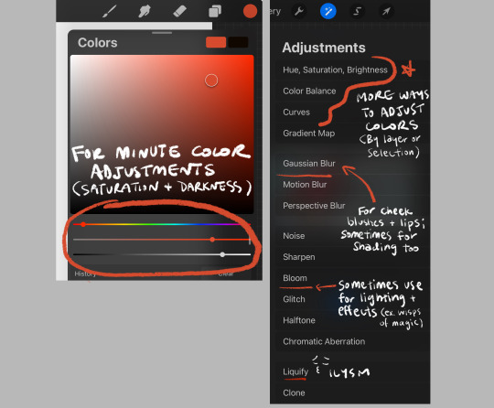
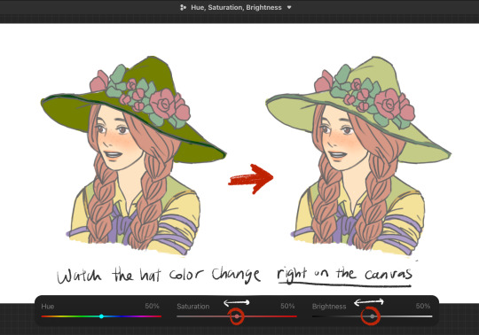
This is why I leverage as many layers as possible. It allows a modular control on my rendering - I can change the color of my character’s skin, eyes, or waistcoat patterns and keep all other components unaffected and clean. Sometimes I have like 100+ layers and it drives me batshit crazy but the pros still outweigh the cons. Or so I tell myself
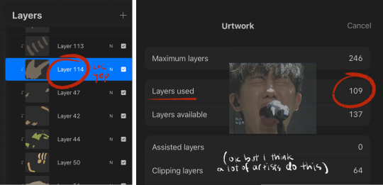
( + I would love to understand grayscale and use it as freely as u do. I watched bunch of vids on it but something about it just hasn’t stuck with me yet 😔)
Shading I guess
Similar to coloring, I create several Multiply layers and stack them together for depth. For example:
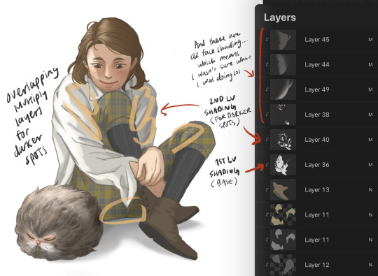
This is again for that modular control but honestly I wouldn't be doing this if I was good at shading... I feel so lost every time, I just don't know how it works. But one ‘hack’ I’ve come up with is shading skins and clothes differently. I use reddish gray for skin (and brown/red hair), and just gray for everything else.
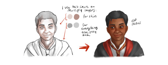
The character feels more lively and natural with a bit of red undertones in their skin. I don't think this is the best way to render skins though. Just a little shortcut til I get to study the topic more.
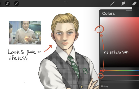
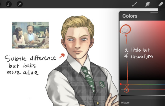
Something else I do to get over my fear of shading is using good references. I’m always lurking on Pinterest for them but alas, I can’t always find that perfect image with perfect lighting and poses. It’s kinda sad funny how the quality of my rendering depends so much on the reference:
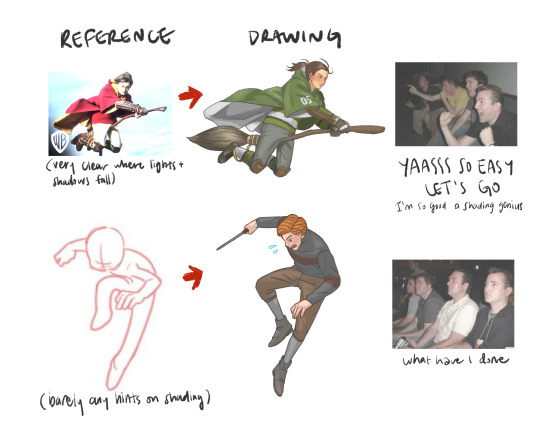
(it's not a 'bad' reference per se - I chose it really for the pose, not for shading)
At the end of the day tho I’m just a learning artist so I try not to be too harsh on myself. Someday I'll render shiny shoes and shirt creases without refs. I yearn for that day
Well on that cheerful note thanks for coming to my Ted Talk your interest in my rendering approach! I’ve been wanting to document it for my own records so this was great.
I picked up digital illustration just last year and self-learning it has been a fun but lonely process. If you have any tips or more questions talk to me ANYONE PLEASE I’m dying to talk about it if you can't tell by the sheer length of this post. For which I'm sorry but hopefully it wasn’t too dense a read ok I’m really done now bye!!
39 notes
·
View notes