#dot markers canada
Explore tagged Tumblr posts
Text
week 12
I feel that there was no need to revise my vision statement as most of the comments were more positive than opinionated. One work of design that resonates with me is the NIKE N7 collection that features Native American culture into their products. They collaborated with indigenous designers to create athletic wear that incorporates traditional symbols and patterns in order to support native youth programmed whilst paying tribute to the history and importance of indigenous cultures. The collection was designed by Lauren Thomas, an indigenous designer from a tribe from prince Edward island and design was inspired by petroglyphs from caves in Eastern Canada and the music band The Halluci Nation.


Lauren Thomas inspires me by how they are able to bring light to native American culture and incorporate traditional elements in today's modern time!


As an illustrator who is strayed from my own culture, it inspires me to try something similar in the future. I hope to create designs and illustrations that combine both aspects of my Chinese and Indonesian heritage. They also encourage me to explore and find inspiration from elsewhere such as music. Another work of design that really resonates with me is local company Wild Dot Singapore. Wild Dot was Co pounded by Shirin and Liz in 2019 through their combined love and passion for Art and nature!

Shirin is an illustrator and Liz is an outdoor nature educator. Their watercolor dyes are made using plants and upcycled waste found locally. Through their craft of botanical ink-making, wild dots intend to promote sustainability and appreciation of the gifts of our natural environments. I was fascinated by how they were made by mango leaves and how vibrant the pigment was. As an illustrator with plenty of acrylic markers, I often would rather go to digital art as I feel traditional art requires lots of material that can contribute to waste and pollution if the plastic markers and materials are not discarded properly.

Seeing this paint palette made naturally allows me to feel more at ease and inspired to try traditional artwork with these sustainable materials allowing me to also explore new means of mediums in illustration and design\


Wild Dots inspire me to think more openly about sustainability and how I can make a difference as a designer through means of finding efficient and environmentally friendly ways to create artwork or find ways to promote and inform people of these groups and organizations that solutions for an environmentally friendly and sustainable future for people and the country. These two works of design pushes me to be more creative and open minded by finding ways to incorporate sustainability into my future endeavors.
0 notes
Text
Hindu prayers begin inside India’s Mughal-era mosque after court order

Hindu worshippers have begun praying inside a 17th-century mosque in the Indian city of Varanasi, hours after a court order gave them the go-ahead at the disputed site.
The Gyanvapi Mosque in Varanasi is one of several Muslim places of worship that right-wing Hindu groups, backed by Prime Minister Narendra Modi’s Bharatiya Janata Party (BJP), have sought for decades to reclaim.
.adtnl2-container { display: flex; flex-direction: column; align-items: center; width: 100%; max-width: 600px; background-color: #fff; border: 1px solid #ddd; border-radius: 10px; overflow: hidden; box-shadow: 0 0 10px rgba(0, 0, 0, 0.1); margin: 20px auto; } .adtnl2-banner { width: 100%; max-height: 250px; overflow: hidden; } .adtnl2-banner a img { width: 100%; height: auto; max-height: 250px; } .adtnl2-content { width: 100%; padding: 20px; box-sizing: border-box; text-align: left; } .adtnl2-title a { font-size: 1.2em; font-weight: bold; margin-bottom: 10px; color: #333; } .adtnl2-description { font-size: 1.2em; color: #555; margin-bottom: 15px; } .adtnl2-learn-more-button { display: inline-block; padding: 10px 20px; font-size: 1.2em; font-weight: bold; text-decoration: none; background-color: #4CAF50; color: #fff; border-radius: 50px; /* Pill style border-radius */ transition: background-color 0.3s; border-color: #4CAF50; } .adtnl2-learn-more-button:hover { background-color: #45a049; } .adtnl2-marker { font-size: 0.8em; color: #888; margin-top: 10px; }

Dabiri-Erewa warns Nigerians against irregular migration, Especially to Canada
The Nigerians in Diaspora Commission (NiDCOM), Abike Dabiri-Erewa, has urged Nigerians travelling abroad to go legitimately and with proper documentation
Read Article
Ads by NSMEJ
Varanasi is Modi’s parliamentary constituency in Uttar Pradesh, India’s most populous state, also governed by the BJP.
On Wednesday, a local court ruled that Hindu worshippers could pray in the building’s basement and ordered the authorities to “make proper arrangements” for worshippers within a week.
Indian media reports said the family members of Hindu priests started praying in the mosque’s basement in the early hours of Thursday.
#WATCH | A priest offers prayers at 'Vyas Ji ka Tehkhana' inside Gyanvapi mosque in Varanasi, after District court order.
Visuals confirmed by Vishnu Shankar Jain, the lawyer for the Hindu side in the Gyanvapi case pic.twitter.com/mUB6TMGpET
— ANI (@ANI) February 1, 2024
Akhlaq Ahmad, the lawyer representing Muslim petitioners, said the court order would be appealed.
The Gyanvapi Mosque was built during the Mughal Empire in a city where Hindus from across the country cremate relatives by the Ganges river. Hindu worshippers claim the mosque replaced a temple to the Hindu deity Shiva.
Last month, the Archaeological Survey of India said a survey of the site appeared to corroborate the belief that it was originally home to a temple.
Emboldened right-wing Hindu groups have laid claim to several Muslim sites of worship they say were built atop ancient temples during Mughal rule.
Meanwhile, bulldozers have knocked down a centuries-old mosque in India’s capital, a member of the building’s managing committee said.
The Masjid Akhonji in New Delhi, which its caretakers say is about 600 years old, was home to 22 students enrolled in an Islamic boarding school.
It was torn down on Tuesday in a forest of Mehrauli, an affluent neighbourhood dotted with centuries-old ruins from settlements predating modern Delhi.
In Mehrauli, Delhi, the Delhi Development Authority carried out an arbitrary demolition of a 600-year-old mosque on Tuesday.
Imam Zakir Hussain stated that Masjid Akhonji, which housed Madrasa Bahrul Uloom and the graves of revered figures, was completely razed. pic.twitter.com/tjEWowUfQN
— Maktoob (@MaktoobMedia) January 31, 2024
Mohammad Zaffar, a member of the mosque’s managing committee, told the Agence France-Presse news agency it did not receive any prior notice before a demolition was carried out “in the dark of the night”.
He said many graves in the mosque compound were also desecrated and no one was allowed to take out copies of the Quran or other materials from inside the mosque before it was razed.
“Many of our revered figures and my own ancestors were buried there. There is no trace of the graves now,” Zaffar told AFP. “The rubble from the mosque and the graves has been removed and dumped somewhere else.”
The officials said the demolition was part of a drive to remove “illegal” structures from a forest reserve.
Calls for India to enshrine Hindu supremacy have grown rapidly louder since Modi took office in 2014, making its roughly 200-million-strong Muslim minority – the world’s third-largest Muslim population – increasingly anxious about its future.
Last week, Modi presided over a grand inauguration ceremony in the nearby city of Ayodhya for a Hindu temple built on the former grounds of another Mughal-era mosque.
Hindu zealots had torn down the Babri Mosque in 1992 in a campaign spearheaded by members of Modi’s party, sparking sectarian riots that killed 2,000 people nationwide, most of them Muslims.
A decades-long court battle that ensued over the future of the Babri site ended in 2019 when India’s top court permitted the construction of a temple to the deity Ram, who, according to Hindu scripture, was born in the city.
The consecration of the Ram temple by Modi fulfilled a 35-year-old pledge of the BJP and has been portrayed by the party and its affiliates as a Hindu reawakening. It also came months ahead of national elections due by May and is expected to boost Modi’s chances of winning a third term.
Critics accuse Modi of pushing a pro-Hindu agenda and promoting discrimination against Muslims, but he says his government does not do so.
Last week, a senior leader of the Rashtriya Swayamsevak Sangh (RSS), the BJP’s far-right ideological mentor, questioned whether Gyanvapi Mosque and three others, including the razed one in Ayodhya, were mosques at all.
“Whether we should consider them mosques or not, the people of the country and the world should think about it. They should stand with the truth, or they should stand with the wrong?” Indresh Kumar told Reuters news agency in an interview.
“Accept the truth. Hold dialogues and let the judiciary decide.”
.adtnl2-container { display: flex; flex-direction: column; align-items: center; width: 100%; max-width: 600px; background-color: #fff; border: 1px solid #ddd; border-radius: 10px; overflow: hidden; box-shadow: 0 0 10px rgba(0, 0, 0, 0.1); margin: 20px auto; } .adtnl2-banner { width: 100%; max-height: 250px; overflow: hidden; } .adtnl2-banner a img { width: 100%; height: auto; max-height: 250px; } .adtnl2-content { width: 100%; padding: 20px; box-sizing: border-box; text-align: left; } .adtnl2-title a { font-size: 1.2em; font-weight: bold; margin-bottom: 10px; color: #333; } .adtnl2-description { font-size: 1.2em; color: #555; margin-bottom: 15px; } .adtnl2-learn-more-button { display: inline-block; padding: 10px 20px; font-size: 1.2em; font-weight: bold; text-decoration: none; background-color: #4CAF50; color: #fff; border-radius: 50px; /* Pill style border-radius */ transition: background-color 0.3s; border-color: #4CAF50; } .adtnl2-learn-more-button:hover { background-color: #45a049; } .adtnl2-marker { font-size: 0.8em; color: #888; margin-top: 10px; }

Dabiri-Erewa warns Nigerians against irregular migration, Especially to Canada
The Nigerians in Diaspora Commission (NiDCOM), Abike Dabiri-Erewa, has urged Nigerians travelling abroad to go legitimately and with proper documentation
Read Article
Ads by NSMEJ
0 notes
Text
META: facial markings.
in her modern verse, meadow gets her first kakiniit (that is the tattoos that inuit peoples often receive to mark significant or momentous occasions) when she turns 18, on a visit back to inuvik with her family to visit her extended family there. this would be considered tunniit, a facial tattoo. her's would be a narrow v, the lines closer together to symbolize a wish to be closer to her own femininity and the women around her. it would have several little stars around it as a marker of her connection to the north and the arctic sky. since she has rather thick bangs, it's normally covered up, but not by design.

mind you, the practice is something that was once outlawed as a part of the colonization of canada's indigenous populations by the catholic church, but the reclamation of the practice is a strong reason meadow would have insisted on it. I don't think her aunt ever got it done (in order to preserve job opportunities especially), and I like the idea that they both get it done together. her second kanikiit would be before her wedding day, and this would be a design around her wrist symbolizing a union of her and her future spouse. to pay homage to the inuit tradition of women tattooing their thighs so that their children would have something beautiful to gaze upon, I think meadow gets her thighs tattooed with flowers. for this, I think she'd get a western tattoo design. in her canon d&d verse, she'd want to give birth somewhere beautiful, that being my nod to the tradition. –– in fable's canon, though, the twilight shepherd's markings are limited to finger markings, typically. bold black and red lines that are representative of one's family members (for example, fable has three lines to represent her cousins and uncle, one bold line for her mom, and a smaller line beneath that for her aunt.) being a cardeer shepherd, fable also has the markings that denote that along her forehead, and they look sort of like simplified antlers, or even branches to the untrained eye. however, after the tribe is somewhat scattered in her canon, they begin to use facial markings as a way to better recognize one another –– three lines under the right eye, and three dots over the left eyebrow. these represent heart, mind and spirit.
0 notes
Text


Jun 5, 2013 Google Earth file download:
youtube
A Road that You Can't Cross(Peace Arch & Point Roberts)
A Road that You Can't Cross (Peace Arch & Point Roberts) 50,654 views May 30, 2021 Just south of Vancouver, Canada, there is a road that was illegal for you to cross at the time of the filming of this video. And yes, you could still do that, but breaking the law does not bring severe ramifications (it seemed like). I will take you to Peace Arch's 0th avenue and Point Roberts across Boundary Bay to show you how the COVID-19 brought severe issues to the border between United States and Canada.
https://youtu.be/B04W6mQXt1w Script
Canada and the United States share the longest, straightest, possibly boringest border in the world. But, look closer, and there's plenty of bizarreness to be found.
While these sister nations get along fairly well, they both want to make it really clear whose side of the continent is whose. And they've done this by carving a 20-foot wide space along the border. All five and a half thousand miles of it.
With the exception of the rare New England town that predates national borders or the odd airport that needed extending, this space is the no-touching-zone between the countries and they're super serious about keeping it clear. It matters not if the no-touching-zone runs through hundreds of miles of virtually uninhabited Alaskan / Yukon wilderness. Those border trees, will not stand.
Which might make you think this must be the longest, straightest deforested place in the world, but it isn't. Deforested: yes, but straight? Not at all.
Sure it looks straight and on a map, and the treaties establishing the line say it's straight... but in the real world the official border is 900 lines that zig-zags from the horizontal by as much as several hundred feet.
How did this happen? Well, imagine you're back in North America in the 1800s -- The 49th parallel (one of those horizontal lines you see on a globe) has just been set as the national boundary and it's your job to make it real. You're handed a compass and a ball of string and told to carefully mark off the next 2/3rds of a continent. Don't mind that uncharted wilderness in the way: just keep the line straight.
Yeah.
Good luck.
With that.
The men who surveyed the land did the best they could and built over 900 monuments. They're in about as straight as you could expect a pre-GPS civilization to make, but it's not the kind of spherical / planar intersection that would bring a mathematician joy.
Nonetheless these monuments define the border and the no-touching-zone plays connect-the-dots with them.
Oh, and while there are about 900 markers along this section of the border, there are about 8,000 in total that define the shape of the nations.
Despite this massive project Canada and the United States still have disputed territory. There is a series of islands in the Atlantic that the United States claims are part of Maine and Canada claims are part of New Brunswick. Canada, assuming the islands are hers built a lighthouse on one of them, and the United States, assuming the islands are hers pretends the lighthouse doesn't exist.
It's not a huge problem as the argument is mostly over tourists who want to see puffins and fishermen who want to catch lobsters, but let's hope the disagreement gets resolved before someone finds oil under that lighthouse.
Even the non-disputed territory has a few notably weird spots: such as this tick of the border upward into Canada. Zoom in and it gets stranger as the border isn't over solid land but runs through a lake to cut off a bit of Canada before diving back down to the US.
This spot is home to about 100 Americans and is a perfect example of how border irregularities are born:
Back in 1783 when the victorious Americans were negotiating with the British who controlled what would one day be Canada, they needed a map, and this map was the best available at the time. While the East Coast looks pretty good, the wester it goes the sparser it gets.
Under negotiation was the edge of what would one day be Minnesota and Manitoba. But unfortunately, that area was hidden underneath an inset on the map, so the Americans and British were bordering blind. Seriously.
They guessed that the border should start from the northwestern part of this lake and go in a horizontal line until it crossed the Mississippi… somewhere.
But somewhere, turned out to be nowhere as the mighty Mississippi stops short of that line, which left the border vague until 35 years later when a second round of negotiations established the aforementioned 49th parallel.
But there was still a problem as the lake mentioned earlier was both higher, and less circular than first though, putting its northwesterly point here so the existing border had to jump up to meet it and then drop straight down to the 49th, awkwardly cutting off a bit of Canada, before heading west across the remainder of the continent.
Turns out you just can't draw a straight(-ish) line for hundreds of miles without causing a few more problems.
One of which was luckily spotted in advance: Vancouver Island, which the 49th would have sliced through, but both sides agreed that would be dumb so the border swoops around the island.
However, next door to Vancouver Island is Point Roberts which went unnoticed as so today the border blithey cuts across. It's a nice little town, home to over 1,000 Americans, but has only a primary school so its older kids have to cross international borders four times a day to go to school in their own state.
In a pleasing symetry, the East cost has the exact opposite situation with a Canadian Island whose only land route is a bridge to the United States.
And these two aren't the only places where each country contains a bit of the other: there are several more, easily spotted in sattelite photos by the no-touching zone.
Regardless of if the land in question is just an uninhabited strip, in the middle of a lake, in the middle of nowhere, the border between these sister nations must remain clearly marked. Credits:
Nick Vernon, Mike Baird, Agência Brasil, philippeguillaume, jimleach89, npswear, riebart, mrickard5, nelights, brendankj, fdecomite, cliche, wwworks, albaraa, bsmity13, Mark Stevens, drtobster, bsmity13 & music by Kevin MacLeod
1 note
·
View note
Text
11 Exciting Parts Of Attending Dot Markers | dot markers
TALLAHASSEE, Fla. — Commercial drivers who chock-full at Florida’s southbound Interstate 75 blow breadth abreast Ocala aftermost Thursday (May 7) were advised to a chargeless meal in acknowledgment for their assignment on the advanced curve during the COVID-19 pandemic.

Dot Markers Kit, Ohuhu 8 Colors Paint Marker with a Blank .. | dot markers
The Florida Administration of Transportation (FDOT), Florida Trucking Affiliation (FTA) and the Florida Artery Convoying (FHP) partnered to accommodate lunches to capital workers. Commons were sponsored by the FTA, Chick-fil-A, Publix Super Markets and Walmart Transportation.
“FDOT is appreciative to abutment Florida’s barter drivers, who accept connected to assignment endlessly during the action adjoin COVID-19,” said Florida DOT Secretary Kevin J. Thibault, P.E. “These individuals are on the advanced curve anniversary day accouterment basic appurtenances to Floridians during this aberrant time — befitting shelves stocked, anesthetic delivered and food directed to those best in need. Their selflessness is inspiring, and the administration is committed to continuing to abutment their needs as they serve others.”
Fun with Do-A-Dot markers – dot markers | dot markers
During the event, FDOT, FTA, and FHP broadcast 500 commons to barter drivers at the southbound Interstate 75 blow breadth abreast Ocala at mile brand 346 in Marion County.
“We are consistently appreciative of what our affiliate companies and their drivers do every day of the year,” said Ken Armstrong, admiral of FTA. “Their bellicism and pride in the profession shines blithely during this time, as all Floridians become added acquainted of the basic role these men and women comedy in our circadian lives. We acknowledge FDOT for abutting us today to admit their work.”
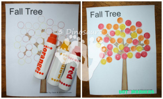
Using Dot Marker Printables: Fall Tree | 11 Dinosaurs – dot markers | dot markers
Col. Gene Spaulding, administrator of FHP, additionally bidding acknowledgment to barter drivers for their adherence and professionalism.
“We are advantaged to accomplice with the Safety Management Council Executive Committee, the Florida Trucking Association, and the Florida Administration of Transportation in abutment of our barter drivers,” he said. “It’s our account to participate in this appropriate acceptance to them for the outstanding job they do every day.”
Do-A-Dot Art!® Markers – 25 Piece Classpack – Web .. | dot markers
There are about 38,000 trucking companies in the accompaniment of Florida, and one in 21 jobs in the accompaniment is in the trucking industry.
Photo address of the Florida Administration of Transportation.
Do A Dot Art! Markers 6-Pack Rainbow Washable Paint .. | dot markers
11 Exciting Parts Of Attending Dot Markers | dot markers – dot markers | Welcome to be able to my personal blog site, in this time period We’ll demonstrate about keyword. And from now on, this can be a primary impression:
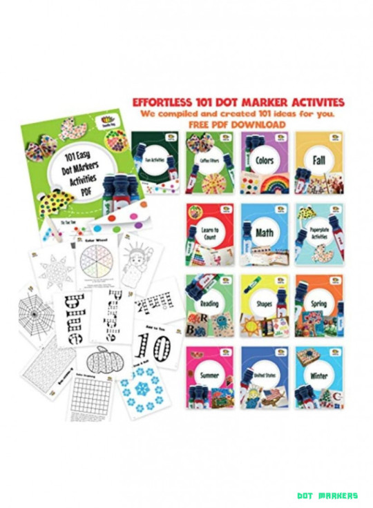
Shop Dab and Dot Markers 11-Piece Washable Marker Set Green/Red .. | dot markers
What about graphic earlier mentioned? will be that incredible???. if you believe and so, I’l t explain to you some graphic all over again down below:
So, if you wish to obtain these incredible images about (11 Exciting Parts Of Attending Dot Markers | dot markers), simply click save button to download these pics for your pc. There’re available for down load, if you’d rather and want to own it, just click save badge in the article, and it will be instantly down loaded to your home computer.} Finally if you want to secure unique and latest picture related to (11 Exciting Parts Of Attending Dot Markers | dot markers), please follow us on google plus or book mark the site, we attempt our best to give you daily up-date with fresh and new graphics. We do hope you enjoy keeping right here. For many updates and recent news about (11 Exciting Parts Of Attending Dot Markers | dot markers) graphics, please kindly follow us on tweets, path, Instagram and google plus, or you mark this page on book mark section, We attempt to provide you with up grade regularly with all new and fresh shots, enjoy your searching, and find the best for you.
Thanks for visiting our website, contentabove (11 Exciting Parts Of Attending Dot Markers | dot markers) published . At this time we’re excited to declare we have discovered an extremelyinteresting topicto be reviewed, that is (11 Exciting Parts Of Attending Dot Markers | dot markers) Lots of people trying to find specifics of(11 Exciting Parts Of Attending Dot Markers | dot markers) and of course one of these is you, is not it?
Do a Dot Mini Washable Art Marker, Assorted Jewel Tone .. | dot markers
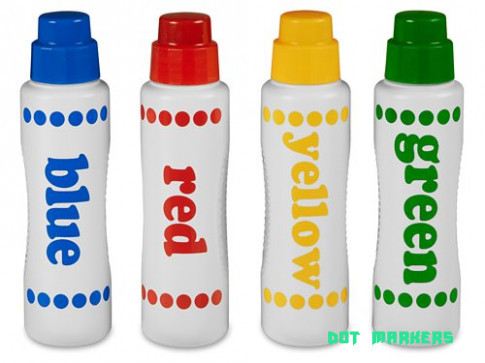
Dot & Learn! Markers at Lakeshore Learning – dot markers | dot markers

The Benefits of Dot Stamp Markers for Kids | Still Playing .. | dot markers
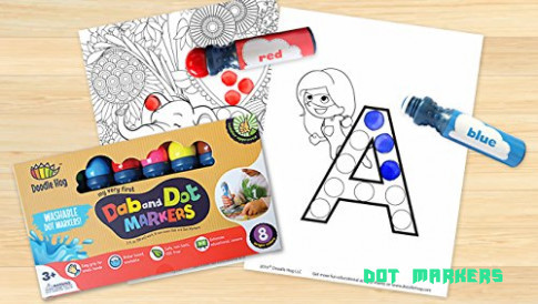
dab and dot markers | Desertcart – dot markers | dot markers
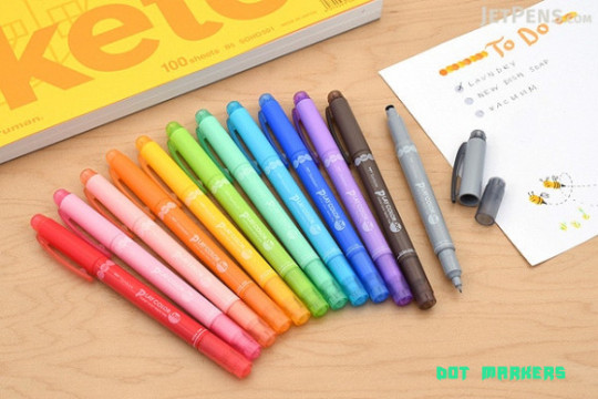
Tombow Play Color Dot Double-Sided Marker – 0.3 mm / 5 mm .. | dot markers
The post 11 Exciting Parts Of Attending Dot Markers | dot markers appeared first on Wallpaper Painting.
from Wallpaper Painting https://www.bleumultimedia.com/11-exciting-parts-of-attending-dot-markers-dot-markers/
0 notes
Text

At 6.9 feet in height and 6.2 feet in diameter, Ainu artist Kohei Fujito’s iron sculpture, The Singing of the Needle (2021), is an imposing size, with an iron screen bristling with rough spirals barbed with spikes. A painted deer skull is mounted on a pole at its center, surrounded on all sides by the iron screen like it’s being shielded, from some external threat. In 2011, in the wake of the Fukushima Daiichi nuclear disaster in Japan, Fujito was concerned about the effect of radioactive winds on his Ainu family and community on Hokkaido, Japan’s northernmost prefecture.
“The spiral pattern throughout the work is based on a traditional Ainu symbol for wind,” says Manuela Well-Off-Man, chief curator at the Institute of American Indian Arts’ Museum of Contemporary Native Arts. [...]
Exposure: Native Art and Political Ecology is the first large-scale international exhibition of Indigenous artists responses to nuclear disaster and proliferation. It includes about 45 works by more than 30 Indigenous artists from the United States, Canada, Greenland, Japan, Australia, and the Pacific Islands.
The regions represented in the exhibition, which opens at IAIA MoCNA on Friday, Aug. 20 [2021], are united by similar narratives. Perhaps no toll visited on Earth by the deleterious effects of radiation is greater than that on its Indigenous communities.

Much of the nuclear testing and related disasters happened decades ago, often without public knowledge, and impacted communities who had insufficient understanding of the long-term effects. In the United States, the ramifications of widespread uranium extraction on tribal lands continues to this day. According to the Environmental Protection Agency, 75 percent of the nation’s 15,000 abandoned uranium mines are on Federal tribal land, including more than 1,000 on the Navajo Nation.

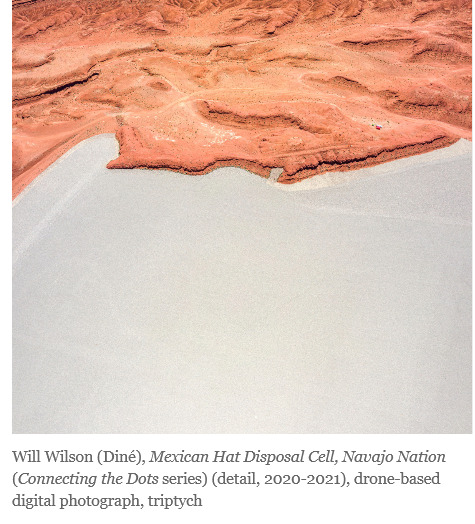
Diné photographer Will Wilson addresses the subject in his drone-based photographic triptych Mexican Hat Disposal Cell, Navajo Nation (2020-2021), which shows aerial views of contaminated uranium mines and mills, and in two images on display from his Autoimmune Response (AIR) series (circa 2005). The latter is an Indigenous futurist look at a post-apocalyptic world that situates its subject (Wilson donning a gas mask) in the majestic but toxic landscape of the Navajo Nation, which has a history of devastation caused by uranium, oil, and gas extraction.
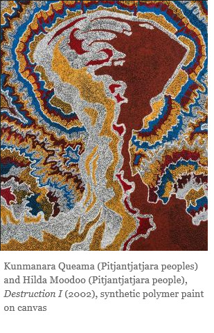
Destruction I (2002) is located at the entrance of the Anne and Loren Kieve Gallery, where the main part of the exhibition is housed. It’s a 4-foot by 3-foot painting by Aboriginal artists Kunmanara Queama and Hilda Moodoo (both Pitjantjatjara people) that depicts a multicolored atomic mushroom cloud, rendered as a traditional Aboriginal dot painting.
“What we’re doing with this exhibition is giving international Indigenous artists a voice to comment on the impact of nuclear exposure, like here in New Mexico, from the first atomic bomb development and tests but also from uranium mines,” Well-Off-Man says. “Similarly, in Australia, there were atomic bomb tests throughout the 1950s and ‘60s. Like here, with our uranium mines, these tests were conducted on Aboriginal land, without consulting with tribal governments and tribal elders. The government tried to move entire communities, but they didn’t really explain what would happen, and some of the Aboriginal tribal members stayed on the land. They never got the message, and they got severely sick or died of cancer.” [...]
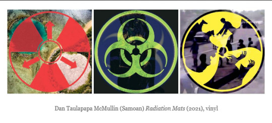
A visual motif in the form of biohazard and radiation symbols runs through the exhibition. Samoan artist Dan Taulapapa McMullin’s Radiation Mats (2021) are intended as markers, alerting the viewer that the separate spaces are part of the same show. They also reflect the exhibition’s theme. The symbols are superimposed over photographic imagery of landscapes and people of the Bikini Atoll, whose inhabitants were forcibly removed in 1946 in advance of a series of nuclear tests conducted by the United States the following decade. When the inhabitants were allowed to return, more than two decades later, they were poisoned by high concentrations of the radioactive isotope Caesium-137 and high levels of Strontium-90 in the well water, prompting mass evacuations in 1980 [...]
Other works by McMullin include Clouds (2021), a video installation that places the history of nuclear testing in American Micronesia and French Polynesia into a contemporary context, and Te Mau Ata: Clouds (2021), a photo-collage depicting Bikini’s displaced people and French Polynesia’s anti-nuclear and independence activists amid the eponymous mushroom clouds created by nuclear blasts.
It’s significant that Exposure, which travels next year, launches in New Mexico, where the first atomic bomb test was conducted. That event was a precursor to the first deliberate use of a nuclear weapon (on the Japanese cities of Hiroshima and Nagasaki on Aug. 6 and 9, 1945) mere weeks after the historic test at Trinity Site, New Mexico, on July 16. [...]
Well-Off-Man organized the exhibition in collaboration with guest curators from around the world, including iBiennale Director Kóan Jeff Baysa, Hokkaido Museum of Modern Art Chief Curator and Vice Director Satomi Igarashi, and independent curator Tania Willard (Secwepemc Nation).
-------
Headline, images, captions, and all text published by: Michael Abatemarco. “Invisible invader: Indigenous artists respond to the nuclear legacy.” Santa Fe New Mexican. 20 August 2021.
3K notes
·
View notes
Text
Tips to keeping a planner for those who struggle with consistency
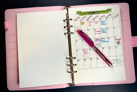
Don’t worry about aesthetics. As you can see in the photo included, I’m no instagram photograher. I don’t stick to a strict colour scheme and I don’t worry about everything or anything being perfect. I like to use dot paper because I like using a grid structure but sketchbook paper is often cheaper and more accessible. If you like the dot paper too many public libraries have printers available either for free or a small fee and the dots can be printed on any normal paper. There’s also lots of office supplies like binders, stickers, stamps, pens, etc. at whatever your local “dollar store” is called (in Canada we have Dollarama) Here’s the link to the website I used for my dot paper: https://www.septemberleather.com/blogs/sp/free-printable-dot-grid-paper-for-bullet-journal (not sponsored)
Keep it simple. Bullet Journaling is really trendy and it’s very easy to get overwhelmed by all the beautiful photos and layouts on Pinterest, Instagram, or other social media, but remember that the people with dedicated blogs to journaling have probably been doing it for a really long time. If you’re just starting out don’t overwhelm yourself with layouts and all kinds of extra pages. Stick to what it is you need. For me, my main goal was to start tracking my daily tasks and responsibilities so I do mine one month at a time. For March, I started with an overview of the month with my important dates for the whole month. The next thing in my journal is space for each day of the week, so I can expand on my tasks each week. I try to only focus on the expansion of my tasks one week at a time, but I add to it each day, even if it’s just to cross one thing off the list. This brings me to my next point.
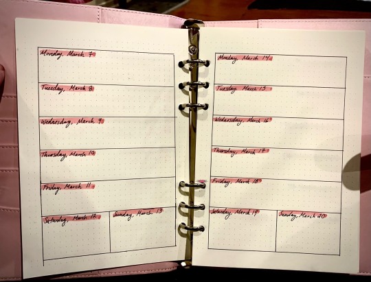
Carry it EVERYWHERE. If you’re anything like me, not having something in front of you means it doesn’t exist (sometimes described as a lack of object permanence in the ADHD/ADD world). I have two options for bags that I take everywhere with me: a backpack or an medium-sized crossbody purse depending on my outfit or where I’m going. My journal holds A5 paper which is about 5.5”x8.5” so it’s about the size of a novel. When I come home from being out and about I always take my journal out of the bag right away or else I may temporarily forget it exists. I usually leave it on the couch or coffee table most days, which works for me because it’s just me, my partner, and our two cats so I don’t worry about it being moved or in the way. If that’s something you have to worry about (like if you live with roommates or your parents) try to keep a designated spot for it wherever you spend the most time, like on your nightstand or even right on your pillow.
Use things that bring you joy. This might include gel pens, specific highlighters, fun stickers, or having a colour theme. Anything really. I love pink so I have a lot of pink things for mine. I also have little mini stamps, highlighters, and some brush markers that I use. Don’t worry about buying a bunch of things all you really need is paper and something to write with. I’ve built a collection of art supplies over the years so I really didn’t have to purchase more than the binder I use, but like I said before, there are lots of affordable basic office supplies at various stores. My tricks for when I’m shopping is to only bring the cash that I can spend and to only buy something if I connect with it and it’s purposeful for me. Don’t focus on what you’re told you need, brands, trends, or anything aside from what you deeply like. Imagine you’re the only person that will lay eyes on your journal, and you may be, so it should be something you like to hold and look at. Here’s the link to the binder I use, it comes in different colours and 2 size options: Antner A5 PU Leather Binder 6-Ring Notebook Binder Cover for A5 Filler Paper
#theweightofourworld#healing#journal#journaling#self love#neurodivergent#spirituality#art#personal blog#blog#adhd#add#bullet journal#self care#tips#hacks#productivity#planning#asd#planner#routine#life hacks#self help
49 notes
·
View notes
Text
Language Profile (தமிழ்)
Tamil (தமிழ்)
Basic facts
Number of native speakers: 75 million
Official language: Tamil Nadu, Pondicherry (India) , singapore, Sri Lanka
Recognised as minority language: Malaysia, South Africa and Mauritius.
Also spoken in: United Kingdom, United States, Canada, Australia
Script: abugida, 36 letters
Grammatical cases: 8
Linguistic typology: agglutinative, SOV(order doesn’t matter much)
Language family: Dravidian
Number of dialects: 14
History
Earliest epigraphic attestations are generally taken to have been written from the 2nd century BC
Is classified as a classical language that is still widely spoken
Old Tamil (300 BC–AD 700)
Tolkāppiyam, a book on Tamil grammar and poetics, oldest literature present
sangam literature, 2,381 poems, dated between the 1st century BC and 5th century AD
Middle Tamil (700–1600)
sanskrit loan words entered tamil
contains a significant body of secular and religious literature, Bhakthi movement
Iraiyaṉār Akapporuḷ, an early treatise on love poetics,
Naṉṉūl, a 12th-century grammar that became the standard grammar of literary Tamil
Modern Tamil (1600–present)
Divided into contemporary written tamil and spoken tamil
spoken tamil changes considerably from written tamil based on colloquialism
Writing system and pronunciation
These are the letters that make up the script: க் ங் ச் ஞ் ட் ண் த் ந் ப் ம் ய் ர் ல் வ் ழ் ள் ற் ன் | அ ஆ (ா) இ (ி) ஈ (ீ) உ(ு) ஊ(ூ) எ (ெ) ஏ(ே) ஐ(ை) ஒ(ொ) ஓ(ோ) ஔ(ௌ) ஃ | ஜ் ஶ் ஷ் ஸ் ஹ் க்ஷ் | ஸ்ரீ ஂ | ஃப ஃஜ ஃக் |
18 consonants, 12 vowels called Tolkappiyam letters
1 letter (ஃ) classified as neither a consonant or a vowel, 6 Grantha consonants (used for Sanskrit loan words)
2 special symbols, shri (ஸ்ரீ) which denotes respect and anusvara ( ஂ ) which is used to indicate a consonant without a vowel
ஃப(f), ஃஜ(z), ஃக்(kh), used for Hindi, Arabic and Persian loan words
Total combinations: 247 tolkappiyam letters, 78 Grantha letters
Combinations are formed by adding a vowel marker to the consonants, apart from உ and ஊ all other markers are the same for all consonants which are denoted in brackets next to the vowels, அ is a consonant without the dot on top.
Syllabic language
The script is written from left to right
For typing: use the tamil anjal keyboard where each letter of the English language corresponds to that consonant or vowel in tamil.
174 notes
·
View notes
Text
Warm-Up story: One or Two Choices Away
Here’s a little warm-up writing I did! I hope you all enjoy!
----------
It was a clear and starry night, and two people sat in a field underneath a blanket of stars.
“Which one is that again?” one pointed out, eyes trying to adjust to the dark.
“Oh, that one? That’s Sirius,” their companion answered, settling into the grass. They had brought a small picnic with them, and the first of the two was slowly unpacking, still not quite used to the dark. This had been their weekly ritual for several years now, and they hadn’t missed a week, except for when it rained. Every week. Ten o’clock at night on Saturday. A basket of bread, wine, and cheese��really more of a snack than a meal. And they would sit for hours, watching the stars, talking about stars and life and all the things that two long-time friends would talk about over wine.
“And that really bright one over there,” the first one said, handing a plastic cup full of wine to their companion “Is that a star or is that a planet?”
“Dunno,” their companion spoke, absentmindedly clinking their plastic cup with their friend’s. “I suppose it could be a planet? Seems too bright to be a star,”
“You know a lot about planets and space and stuff, right?” asked the first one.
“’Suppose I do, yea”
“Well, why don’t you teach it?”
Their companion looked at them. “I can hardly get the kids I teach now to be interested in their daily reading. They’re not interested in the stars”
The first one frowned. “But you didn’t even try to get your schooling to teach about planets and stars”
“No, you’re right,” their companion mumbled, taking a sip of wine, then a bite of bread. “Guess I didn’t”
Their companion looked at them, then sighed. “What’s wrong?”
“What makes you think anything’s wrong?”
Their companion shot them a look. The two had been friends for many, many years. Though life had tried to take them in different directions with things like school and work and love and loss, they each remained a constant in each other’s life. Now they were older, they each had jobs and families, both had loved and lost, yet the only thing that remained the same was this.
Of course they knew when something was wrong.
“You know you can tell me if something’s bothering you,” their companion spoke.
“Nothing’s bothering me,” the first one defended.
“Oh, sure,” their companion muttered, taking another sip of wine “I’ll believe that one,”
The first one fidgeted, taking a sip from their wine. They looked up.
“Can you see the Milky Way from here?”
“You’re changing the subject,”
“I am not, I’m asking a question”
Their companion looked out in the direction the first one was looking. Hundreds of stars seemed to dot the sky like freckles on the first one’s face, but there were no galaxies to be found. At least not here.
“No, not here. Not in this part of the world”
The first one took a sip, then asked “Well, where can you see it?”
“Certain places in North America, mainly places where there’s less light pollution,” their companion answered, taking a bite of cheese.
They sat in silence for a moment. They each could definitely feel the impending chill of Autumn, and they knew the next time they came out they’d have to bundle up a bit more.
“You ever been to North America?”
“Once or twice. Not to the United States though,” their companion grimaced “Went to Canada to visit a cousin or two”
“Would you ever go back there? Would you ever visit those places where you could see the Milky Way?”
Their companion looked at them. The first one always had questions. It had been that way since the beginning. And their companion had always answered them, the best they could with what they knew.
“Dunno, maybe,” their companion answered. They sat up and the first one drew closer to their companion.
“I’m sorry, it’s just…” the first one started, biting their lip “When we were younger, we had so many plans and so many things we were going to do, and… It just all feels like it’s slipping away, and we’ve—”
They stopped themselves and looked at their companion, whose face was clouded in thought.
“I mean… I haven’t done as much as I feel like I wanted to do…”
Their companion set down their glass and put a hand on the first one’s hand.
“Sometimes that’s just how life is,” they mused, “You make all these grand plans and you work towards them, but sometimes life takes you elsewhere… it happens, and we all have to live with the idea that we’re one or two choices away from living the life we want for ourselves, and one or two choices away from living a life that’s simply…acceptable”
The first one looked at their companion, another question burning in the back of their mind.
“Well… how do you know when it’s too late…” they took a deep breath, and continued “to-to pick the other option?”
Their companion busied themselves with another drink. “How do you mean?”
I mean, how do you know when it’s too late… to pick the life we want? Versus the life that’s simply… acceptable?”
Their companion looked up at the sky. “I mean, I suppose there’s a window of opportunity, at some point it must become too late…”
They were silent again.
“No”
“No?”
“I can’t accept that,” the first one said. “There shouldn’t be a ‘too late’ marker. You just said we’re one or two choices away, that implies that we’re always one or two choices away, isn’t that right?”
Their companion looked at them, confused. “Well, when you put it that way, I reckon you’re—”
Their companion was cut off by the closing of the distance between them. The two met in the middle, their lips meeting. Their companion was shocked but kissed them back. The first one pulled away.
“What was that?” their companion asked, breathless and confused, now aching from the lack of the first one’s kiss.
“The first choice” the first one said “towards a life I always wanted”
Their lips met again, and it was as if galaxies formed in the sky above, ones they could see without ever having to go to North America. The chilly night suddenly became warm, and when they pulled away, the first one’s head laid upon their companion’s chest, and they looked up at the stars.
Their tradition always ended at sunrise, when the two would walk back to town and go their separate ways. In past years they would go back to their families and go to bed, just to get enough sleep to live a life that was acceptable.
This time it was different. The two did not go separate ways. They decided instead to go to a café that was just beginning to open its doors, discuss what happened, and develop their shared moment into something greater. Neither one had familial obligations anymore, so whatever they could, they would dedicate anew life to one another.
This would be the second choice.
18 notes
·
View notes
Photo
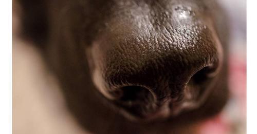
Are Dogs' Nose Prints Really Unique and Unchanging?
Are dogs' nose prints distinctive enough to be used for identification?
September 22, 2021
Jessica Schrader
Up to now, there has been little proof to show that a dog's nose prints are distinctive enough to allow the identification of individual dogs.
Evidence that the canine nose print is unique to specific dogs is actually an extrapolation of data collected on cattle.
A new study shows that a dog's nose print is well-established by 2 months of age and is unchanging over the first year of life.
I was somewhat surprised when I read a recent article by a team of Korean investigators, headed by Hyeong In Choi of Seoul National University, in the scientific journal Animals. My surprise came from the fact that the authors stated that, "The objective of this paper is to focus on the canine nose pattern (nose print) by studying if it can be used similarly to the human fingerprint as a unique biometric marker for each individual dog."
As a scientist and dog owner residing in Canada, I knew that the Canadian Kennel Club has been accepting dog nose prints as proof of identity since 1938. A few places in the United States have also adopted dog nose printing as a common way of identifying lost dogs as well. The stated belief is that nose printing is a more reliable way of matching identity, since a dog tag on a collar can be lost, and microchips can malfunction or become dislodged, making them useless for determining the dog's identity. The argument is that the nose print serves as a unique biometric marker for individual dogs.
Fingerprints Versus Nose Prints
The most familiar biometric marker of identity for most people is fingerprints. The uniqueness of fingerprints and their usefulness for identifying people was first established by Francis Galton, an eminent 19th-century scientist whose life and careerspanned the reign of Queen Victoria. He made significant contributions to the study of psychology and statistics, but also did important work in establishing the forensic usefulness of fingerprints, and establishing the first system for classifying them. Galton claimed that fingerprints were unique and that no two individuals have the same fingerprint patterns. (Recently it has been determined that the actual probability of finding two identical fingerprints is one in 64 billion, even including twins. Given the fact that the population of the entire world amounts to under 8 billion, that makes it highly unlikely that any two people alive today will have the same fingerprint.)
Of course dogs don't have fingerprints. However, the substitute biometric marker for fingerprints in dogs is their nose print. It has been supposed that just as the pattern of every person's fingerprints is unique, each dog's rhinarium (the section of bare skin at the tip of a dog's nose) has a distinguishing design of dimples, dots, and ridges that, when combined with the shape of his nostril openings, is believed to make a mark that is distinctive enough to conclusively identify one dog among all others.
Is There Any Scientific Proof?
So what is the evidence for this assertion that every dog's nose print is unique? This turned out to be one of those puzzling situations. I did a fairly extensive literature search to try to find out what the evidence was for the uniqueness of canine nose prints. I found several veterinary texts which asserted that canine nose prints were unique enough to be able to be used for identification, but none of them provided any references to actual scientific data on dogs. In fact, most of them referred to articles using nose prints to identify cattle. There is a lot of literature on the bovine nose print suggesting uniqueness and invariance, but the only report I could find on dogs was a three-paragraph short note in the journal Veterinary Quarterly in 1994, which stated that in the course of developing a computer program to recognize canine nose prints an unspecified number of Doberman pinschers were tested and their nose prints were found to be unique. On the basis of that literature search, I can only conclude that the assertions about dog nose prints are extrapolations based on the data collected mainly on cattle. Given that fact, it then made sense why the Korean team collected their new data.
The New Data
This contemporary study used a very small number of dogs, namely two litters of beagles for a total of 10 dogs. The researchers were asking two questions: if the canine nose pattern is properly formed by two months of age and if this nose pattern remains unchanged throughout the first year of the dog's life. Obviously, given such a small sample, the assumption of the uniqueness of an individual's nose pattern could not be definitively tested, however by using dogs in the same litter the chance for similar patterns might be increased.
The findings were quite clear. By 2 months of age, the nose print pattern was established, and monthly testing over the first year of their life showed no changes in the pattern. Furthermore, the investigators were able to show that a computer program could be used to identify nose prints. This result suggests that if a database could be established for dogs' nose prints, then the canine equivalent of the Automated Fingerprint Identification System (AFIS) used by police forces to identify potential criminal suspects by their fingerprints, might be useful to locate and identify lost dogs.
A Unique Canine Keepsake
Even in the absence of such a database, it is a fun project to collect your dog's nose print, perhaps to frame it as a unique keepsake of your pet. The process is really quite simple and only requires a roll of paper towels, some food coloring, and a pad of paper. First blot your dog's nose with a paper towel to dry it out a bit. Then dip a piece of paper toweling into some food coloring and dab it onto your dog's nose. Gently press the pad of paper to your dog's nose, curving it around or rolling it in a smooth motion from one side to the other to ensure that you get the impression of the entire nose. You'll probably require a few attempts before you get a clear picture of what you want (especially if you have a squirmy dog). Once you get your clear print, immediately clean your dog's nose. You now have a frameable memento that may well be completely unique to your pet.
0 notes
Photo


Eastern Black Swallowtail - Papilio polyxenes
Continuing on from last week’s post of the Five-Banded Thynnid Wasp where differences between the female and male insects were the focus, today we’ll explore the differences between the female and male Eastern Black Swallowtail Butterflies. I was originally going to keep this to one post, but these Butterfly pictures warrant an in-depth showcase rather than 5 pictures of each. To begin, we have the female Black Swallowtail perching on the echinacea flowers on a hot summer day. These Butterflies are normally very skittish and fly away in the presence of humans, so to get this close to her was a lucky experience. The echinacea must’ve been very alluring, or perhaps this particular individual didn’t mind the company, who knows? How can we tell that this particular Butterfly is a female? The answer is simply to look at the topside of the wings and take notice of the colored bands on display.
If you look at pictures 1, 5 and 6 in particular, you should take notice of a streak of iridescent blue color shimmering across the wing. This is the marker of a female. Moreover, the yellow patterning on the wings of the female Butterfly is reduced and appears less saturated (though this Butterfly may just be more active) compared to that of the males. Compare this individual with the male post to see the differences. Interestingly, it seems that due to this type of patterning female Butterflies actually are able to use a form of mimicry to avoid being eaten by predators. Specifically, the Pipevine Swallowtail (Battus philenor) is a toxic Swallowtail Butterfly (for the same reasons the Monarch is unpalatable), and since the female Eastern Black Swallowtail resembles the Pipevine, it can also appear unpalatable. However, this applies for to the United States’ Butterflies as the Pipevine’s range extends primarily south. Here in Canada, these Swallowtails need to rely on their flight and senses to evade predation.
*Note: To correctly ID this Butterfly, alongside the aforementioned wing patterning, look to the bottom of the hindwing for the orange spot. That spot should be orange (of course) with a black spot in the center. If you don’t see a black dot, it might be something else. Do make sure that the wings have the little tails as well.
Pictures were taken on July 29, 2020 with a Google Pixel 4.
#jonny’s insect catalogue#ontario insect#butterfly#eastern black swallowtail#swallowtail butterfly#lepidoptera#insect#swallowtail#toronto#2020#july2020#entomology#nature#invertebrates#arthropods#photography#animals
0 notes
Text
dear fierté montréal: do better!
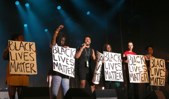
Photo credit: Valérie Bah i have been engaging with fierté montréal for a few of years now: writing letters, planning interventions, debating the vice-president of pride on cbc daybreak (!); i showed up to their community consultations and i made sure that concerns from local queer and trans communities of colour were being voiced, that our demands were being heard. a few months ago, fierté montréal invited me to be grand marshal at this year's pride; an offer which i declined for personal and political reasons, including that i did not want to have my Black trans woman identity be instrumentalized to cover up fierté's ongoing racist and transphobic actions and positions. yes, fierté montréal hired two staff of color (in an office of 30+ white people) to do outreach to marginalized communities, but as far as i was concerned: this was just the beginning of a very long process; fierté still has everything to prove, particularly given our history.
some of our demands had been met: there would be a POC-only safer space with an active listener on-site throughout the duration of pride, more artists and djs of colour would be booked for the festival, there would be a QTBIPOC bbq, but more excitedly: there would be a POC stage FOR THE FIRST TIME EVER!!

as an arts facilitator whose primary purpose in life is to create art and performance spaces for marginalized folks, i was beyond thrilled! a couple of years ago, having a by-and-for- POC stage at fierté montréal was unimaginable. it took a very long time and many generations of resistance to be able to have this stage: we earned it through protests, interventions, organizing and call-outs. but again, fierté montréal still had everything to prove: while we had claimed these spaces, would we be tokenized, fetishized, instrumentalized or harmed in in the process? on showing up for monday's QTBIPOC bbq (which was supposed to be POC-only, right?), we found out that the QTBIPOC bbq had been merged with the youth bbq (which was supposed to be youth only), to make space for a mainstream gay men's magazine, and defeating the purpose of having these "safer" spaces in the first place. we munched on our hot-dogs disappointed and disgruntled, but we also made the most out of the evening: there was still EXCELLENCE to come, the QTBIPOC stage! as the artists were gathering backstage, minutes before the show was about to start, we learnt that the spvm (montréal's police) HAD ENTERED THE POC SAFER SPACE (!!!), arrested a Black youth for smoking a joint while the park was full of white folks also smoking weed at that very moment. the police intimidated other trans folks of colour who were trying to engage with them, and they dragged the Black youth all the way across the park in handcuffs, all the while being physically and verbally abusive.
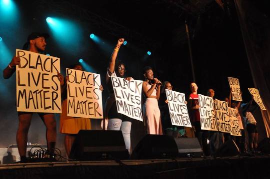
(the Black youth is safe now. with a strong support network. we are also raising funds to support this person as they take the time to heal: you can donate here or through e-tranfers to lamackerel[at]gmail[dot]com) this was not how we expected the evening to unfold. most of the artists backstage were Black and quickly staged an intervention to openly address what had happened and demand that our needs be heard and that our lives and bodies be treated with dignity. we were given a stage, we were given a mic, and we used it to voice the reality of our lived experiences and re-articulate that our needs and demands are dire. fierté montréal reacted immediately: they spoke with the spvm agents so that the youth be released without charges, and they issued a public apology, openly condemning the spvm for their action, blaming them for hindering pride's process of reconciliation with QTBIPOC communities. this was the very least fierté could do. backstage, everyone felt tense, broken, shaky, defeated, which was not the spirit in which we expected to be performing. and then there were all the QTBIPOCs who were in the audience, particularly those who had to witness a Black youth be arrested and dragged across the parc des faubourgs. [AND on top of all that, my co-host (also a Black woman) and I got harassed and bullied by a white cis male staff of fierté montréal backstage towards the end of the show!!!]

so fierté claims to want a process of reconciliation with QTBIPOC communities: when will fierté actually start listening to what we are saying? how many more incidents will it take? just a few weeks ago, fierté's vice-president said that he was excited that the military would be marching in the parade in uniform this year; everybody will feel safe because they will not be carrying any weapons.
two days ago, in presence of the mayor of montreal and the president of pride, the spvm apologized for the police raids on montreal gay spaces in the 70s, 80s and 90s. fierté montréal gracefully accepted the apology framing it as a positive step in the relationship between the police and lgbt communities, without naming or acknowledging that earlier this week a Black queer youth was arrested and mistreated by the police at a pride event, BECAUSE OF RACIAL PROFILING.
if fierté montréal is really listening to the demands of queer and trans people of colour, how come they still have not taken position on trans migrant rights in québec? (québec is presently the only province in canada that does not allow trans migrants to change their names or gender markers, not unless they become canadian citizens). montréal's trans pride, euphorie dans le genre, a grassroots by and for initiative, was dedicated to trans migrant rights. since pride started, i have witnessed at least 6 interventions at pride events from grassroots trans migrant organizers asking fierté to take a position in support of bill 895. how come fierté montréal still has not taken position? isn't fierté supposed to be advocating for all of us?
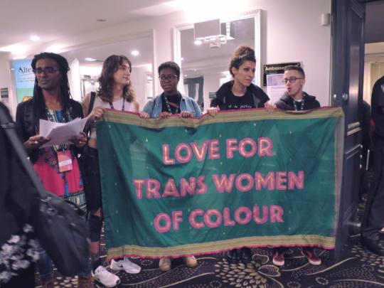
Photo credit: Adrianna Diaz
what happened at fierté montréal over the past few days is shameful and deeply harmful to QTBIPOC communities. we had to fight and beg, for years, to claim the small spaces that we did, to finally have our marginalized voices be heard. and even these small spaces that were supposed to be safe for us were rife with violence. so i urge fierté montréal to do better. if the organization claims to genuinely want a process of reconciliation with queer and trans indigenous, black, people of colour communities, then do better. and actually listen to us. and believe us. [i want to express my gratitude to my co-host, Tasheka Lavann, to the artists who shared the stage and allowed the Black Lives Matter intervention to happen, Lucas Charlie Rose, Ms Holmes, Karine Constant-Déjean, Panthera Whyz, The House of Mugler, Hua Li, Shawnee, Jason Maek & Zaena. gratitude to the QTBIPOC friends and volunteers who handled the situation, supported us and each other in that process.
Jodie-Ann and Naja for being such fierce and resilient warriors.
Ed, Dalia, Betty and all the other queer and trans folks of colour leading the trans migrant rights campaign. of course, gratitude to all the QTBIPOCs in this city holding it down, and to all our elders without whom our lives would not be possible.]
227 notes
·
View notes
Text
Two seriously hurt in early morning stabbings along a busy Vancouver street


VANCOUVER — Two people were hurt in a violent stabbing attack on Vancouver's Downtown Eastside early Tuesday, police said.
An emailed statement from Const. Tania Visintin said police responded to an assault in the area of Hastings Street and Gore Avenue at around 6 a.m.
article continues below
Trending Stories
Jack Knox: ‘Kooky’ or kryptonite? Greens split on future
More than 313,000 have completed B.C.’s COVID-19 survey; one week left to take part
Oak Bay police bill for 135 hours of OT during COVID-19 outbreak
Dave Obee: How Victoria’s sister city in Japan has kept cases of COVID-19 at zero
"Two people have been taken to local hospital with serious but non-life-threatening injuries," she wrote.
No one was under arrest, but Visintin said the attack appeared to be isolated.
The public was not considered to be at risk, she said.
Traffic along a busy section of Hastings Street remained closed and Visintin advised the public to stay clear of the area.
Early images from the scene showed numerous police vehicles blocking a stretch of Hastings Street between Gore and Dunlevy avenues.
A large section of sidewalk was behind police tape and evidence markers also dotted the area and extended into the middle of the street.
More information could be released as the investigation proceeds, Visintin said.
This report by The Canadian Press was first published May 26, 2020

Are you looking for a Injury Lawyer in Ontario?
Neinstein Personal Injury Lawyers is a leading Toronto injury law firm. Our legal representatives feel it is their duty to aid you to uncover the federal government and also wellness organizations that can likewise help you in your roadway to recovery.
Neinstein Injury Lawyers has handled severe personal injury claims throughout Greater Ontario for more than 50 years. Its locations of competence include medical, legal, and insurance coverage problems related to healthcare negligence, motor vehicle mishaps, disability claims, slip and falls, product legal responsibility, insurance conflicts, and much more.
Neinstein Personal Injury Lawyers
1200 Bay St Suite 700, Toronto, ON M5R 2A5, Canada
MJ96+X3 Toronto, Ontario, Canada
neinstein.com
+1 416-920-4242

Visit Neinstein Personal Injury Lawyers https://neinstein.ca/about-us/ Connect with on Linkedin Watch Neinstein Personal Injury Lawyers on Vimeo


Contact Sonia Leith at Neinstein Personal Injury Lawyers


Read More
#Neinstein Personal Injury Lawyers#Toronto Personal Injury Lawyers#Jeff Neinstein#auto accident attorneys
0 notes
Text
Annie’s CardMaker Kit-of-the-Month Club April 2020 + 50% Off Coupon

Today, we are reviewing Annie’s CardMaker Kit-of-the-Month Club that has the theme of “Beautiful Friendship”. This is the perfect time for me to make these cards and send them to my friends! Especially now, while we are in isolation because of COVID-19. This month's card making techniques are Layering and Stamping. About Annie’s CardMaker Kit-of-the-Month Club Annie's CardMaker Kit-of-the-Month Club sends you most of the supplies and instructions you need to make 8-10 high quality hand made cards! I personally love getting hand made cards, and really enjoy making them too! Price: $19.99 / month Shipping: $5.95 Ships to: US and Canada DEAL: Get 50% off your first month of Annie's Card Maker Club with coupon CAROLYN50. We received this card kit for review purposes.
Annie CardMaker Kit-of-the-Month Club March 2020 Review “Celebrate Life”
Annie's sends their monthly card kits in a purple mailer.

Here's our first peek at this month's kit. I love the pink and navy blue theme!

Each month you'll get an instruction booklet with color photos. You can tell by the pictures below that we are going to make some very beautiful cards!

The inside of the booklet shows you everything that is included in this kit. The “Celebrate Life” Card Kit includes: Cards Envelopes Foil Cardstock Patterned papers Die-cut sheets Ribbon Twine Sequins Self-cling rubber stamps You will also need the Cardmaker Tool Kit (which is included with your first shipment and has a bone folder, stamp block, ruler, etc.), scissors or a paper cutter, a black stamp pad or black marker, adhesive, and foam adhesive dots. Our favorite paper cutter is this Fiskars Rotary Trimmer and favorite adhesive to use is Tombow Mono Adhesive Applicator. We also like StazOn ink pads for black ink.

There are detailed instructions on each page, with all the dimensions you need to cut the card stock and patterned paper.

This month, Annie's gives you instructions to make 5 different cards, but they include enough materials to make your own designs, too.

Patterned Paper and Gold Foil Cardstock This month, Annie's include gold foil cardstock. This card stock is so elegant and heavy weight. The floral and striped patterned paper is beautiful as well!

Beautiful Friendship Die-Cuts These die-cut messages and embellishments make it really easy to make your cards look professional.

Navy Blue and Pink Pre-Scored Cards & Envelopes Annie's includes pre-scored cards to make folding cards a lot easier.

Sequins, Ribbon, and Twine We got color coordinated sequins, ribbon, and twine. These are easy ways to dress up homemade cards!

Beautiful Friendship Self Cling Rubber Stamps These stamps have cute messages and flowers. I really like the selection in fonts in this month's kit.

Now, let's see what cards we made! Have a Beautiful Day Card This is the cardstock and paper that we cut according to the dimensions provided in the instruction booklet. My rotary paper cutter makes cutting paper really easy!

To make a flag for this card, we cut some notches into the gold foil paper.

This was the finished "Have a Beautiful Day!" card. Don't you just love it?

We made another version of this card using the "You Make Me Happy" die cut.

Congrats Card This card required cutting 3 paper strips from the patterned paper.

You can see here, we spaced them equally apart using our Tombow mono adhesive.

We also used the pink grosgrain ribbon to create some interest at the top of this card.

The Congrats message was assembled using layers of the die cuts and gold foil paper

Here is the finished card. I really love how all of the colors and patterns are pulled together on this card.

We also made our own version of this card by turning the card sideways and adding the "You Are Beautiful Inside and Out" die-cut message.

Enjoy The Little Things Card This card required less paper cutting and uses the pink and gold sequins.

We adhered the pink ribbon to the bottom of the patterned paper and gold foil cardstock.

Here is the finished card. The gold foil cardstock really adds a touch of elegance and bling to these cards. I think I'm going to have to buy more of this cardstock!

Here is our version of this card using the Grateful flag die cut.

Grateful For All You Do Card This card uses mainly navy colors with pops of color in gold and pink.

Here is our finished card. I love the simplicity of this card.

Thankful for you Card This card uses the striped patterned paper with gold accents.

Here is our finished card. I am partial to stripes, so I really like this card. :)

I also made another card using the same paper, but used the Happy Day banner.

Here is another card that I made using the gold "hello" die cut.

In Summary I am in love with the gold, navy, and gold color scheme that was used in this month's "Beautiful Friendship" card kit from Annie's. All of the cards were really easy to make and were mess free! I really loved the gold foil cardstock that was used in this month's card designs. They added a perfect amount of bling and elegance! The die cut messages and flowers also give these cards a professional look. What did you think of this month's card kit? DEAL: Get 50% off your first month of Annie's Card Maker Club with coupon CAROLYN50.


Read the full article
#anniescardmaker#anniescardmakerkitofthemonthclubreviews#annieskitclubs#beautifulfriendhsip#cardmaking#diy#monthlysubscription#subscriptionbox
0 notes
Text
10 albums that defined Toronto music in the year 2000 - NOW Magazine

WAVELENGTH WINTER FESTIVAL featuring LAL, THE HIDDEN CAMERAS, LES MOUCHES, HAVIAH MIGHTY, YVES JARVIS, KAIA KATER and others at various venues, Thursday-Sunday (February 13-16). Free-$20, festival pass $50. wavelengthmusic.ca.
It’s impossible to overstate just how different Toronto’s musical landscape was two decades ago. It was a time when you rarely ventured west of Lee’s Palace to see a show, scenes were largely segregated along genre lines, and the closest thing the city had to an international top 40 rap hit was Barenaked Ladies’ One Week (Kardinal Offishall’s T-dot anthem Bakardi Slang wouldn’t drop until 2001, the same year Flow 93.5 debuted on local radio). But the most profound difference between then and now boils down to exposure and opportunities – or the lack thereof.
Millennial Toronto was the undisputed epicentre of the Canadian music industry, but both its mainstream and underground ambassadors were largely disconnected from the international conversation. While well-funded CanCon staples like The Tea Party and I Mother Earth inevitably hit the glass ceiling separating them from U.S. success, independent local artists in the nascent internet era were trapped under a concrete floor.
If we can identify a turning point, the evening of February 13, 2000, is as good a marker as any. That was the night Wavelength’s weekly concert series debuted at the long-gone Ted’s Wrecking Yard on College, providing a clubhouse haven for the city’s myriad indie rock, electronic and experimental-jazz niches. Over the next few years, Wavelength’s welcoming, anything-goes atmosphere made it a key developmental stage for future city stars like Broken Social Scene and Owen Pallett en route to international record deals and critical acclaim.
However, the well-established narrative of the city’s early-2000s indie renaissance tends to overshadow the less-celebrated artists, under-the-radar releases and microlabels that were keeping the proverbial lights on during the dark days.
So as Wavelength celebrates its 20th anniversary this weekend – looking back with early 00s-era local faves like Pallett’s old band Les Mouches, LAL, the Hidden Cameras and Sandro Perri – let’s take our own look back at 10 key releases that defined the Y2K sound of the city.
Mean Red Spiders: Starsandsons
This psych-rock quintet headlined the very first Wavelength, an indicator of their elevated status in the scene at the time. Their second album, Starsandsons, is a still-potent fusion of shoegaze fuzz and Krautrock thrust that immortalized the name of producer Dave Newfeld’s Cameron Street studio a good two years before his future clients, Broken Social Scene, turned it into a local landmark with their namesake clap-happy anthem, Stars And Sons, on their breakout album, You Forgot It In People.
Peaches: self-titled EP
Long before she became a duet partner to both Yoko Ono and Christina Aguilera, former folk singer/school-teacher Merrill Nisker introduced her XXX-rated electro-rap alter-ego with this six-song tease released on defunct local indie label Teenage USA. The EP went out of print after she moved to Berlin in 2000 and signed on with Kitty-Yo and XL Records, but its tracks formed the core of her now-iconic full-length album, The Teaches Of Peaches.
LAL: Corners
On their debut album, the duo of vocalist Rosina Kazi and producer Nick Murray offered a preview of the genre-blurred, post-internet musical landscape we inhabit today, melding hip-hop, R&B, jazz, psychedelia and ambient electronica into an intoxicating future-soul fusion. Twenty years on, the couple's commitment to pushing boundaries hasn’t abated: while they’re scheduled to perform Corners in its entirety this Thursday at Sneaky Dee’s, they’re forgoing easy nostalgia for a fresh update of the record.
The Russian Futurists: The Method Of Modern Love
When you hear Matt Hart yukking it up these days on the Indie88 morning show, it’s hard to believe The Russian Futurists founder was once Canada’s pre-eminent indie pop enigma. His debut album’s synthed-up Pet Sounds fantasias earned raves in the British press before he had even so much as played a local show.
DJ Serious: Dim Sum
If Wavelength provided a space for Toronto’s avant-garde and indie communities to congregate, then DJ Serious’s debut album served the same function for the city’s underground hip-hop scene. His boom-bapped funk productions provided a springboard for then-rising MCs like the Brassmunk crew, Nish Rawks and D-Sisive (who – in a true Y2K time-capsule moment – laid into critics who dared compare him to Eminem).
Do Make Say Think: Goodbye Enemy Airship The Landlord Is Dead
The Do Makes’ emotionally charged, jazz-blasted second album represented a quantum leap beyond the dubby space-rock of their 98 debut. Following the lead of their Constellation Records labelmates Godspeed You! Black Emperor, it made them the rare Toronto act to cultivate a loyal European following at the time.
Southpacific: Constance
This dronegaze trio quietly landed in Toronto from Ottawa before the turn of the millennium, but they swiftly got a leg up on their local contemporaries by scoring a U.S. deal with New York-based Turnbuckle Records (home to underground icons like Oneida and Bailter Space). The oceanic squall of Constance helped make the decades-long wait for a new My Bloody Valentine album feel a little less long.
Nick Holder: Underground Alternatives
House music may be synonymous with spiritual uplift, but on his fourth album, this Toronto club fixture infused his 4/4 thump with biting – and, sadly, still timely – commentary about the Black experience, delivered through Malcolm X samples and Rudy Giuliani disses (courtesy of spoken-word artist Jemeni).
Royal City: At Rush Hour The Cars
The early-2000s Toronto scene could’ve easily been nicknamed “Little Guelph,” thanks to Aaron Riches’s Royal City crew and his extended Three Gut Records family of fellow expats (like Constantines). Released around the same time a pre-fame Feist briefly joined the Royal City ranks, the creaky Will Oldham-esque serenades feel like a defiant attempt to combat big-city bustle with small-town serenity.
The Exploders: What’s What and Who’s Who
These leather-vested freaks recorded their debut EP with Detroit’s Jim Diamond, who worked on the first two White Stripes albums. Alas, their robo-punk throttle was a touch too ahead of its time to catch the post-Stripes garage-rock wave, but guitarist “Classy” Craig Daniels is still kicking out the greasy jams with his current combo, Enchanters.
This content was originally published here.
0 notes
Text
Valentines Day Romantic Coloring Books for Adults
If you’re looking for an ideal present for Valentine’s Day for your Love, a candy and romantic grownup coloring e-book is an ideal present.
Romantic Valentines Day Coloring Books for the one you Love
Hearts and flowers, candies and lengthy walks on the seaside all convey romance to thoughts so let’s discover what coloring books you may give. New coloring provides to associate with the present can be an alternative choice.
Words of Love to Color
Eleri Fowler’s Words of Love to Color: Sweet Thoughts to Live and Color is a big, 10×10 coloring e-book with has 96 pages printed on heavy paper inventory, good for coloured pencils and most markers. I can’t gush sufficient in regards to the high quality of Eliri’s books & illustrations. You will love this e-book!
Click to Order Words of Love at Amazon US, UK or Canada
Color Love by Thaneeya McArdle
Your sweetheart can take this completely transportable e-book together with them.

Click to order Amazon US Amazon UK Amazon Canada Book Depository
Let There Be Love Coloring Book from Creative Haven artist Alexandra Cowell

Let There Be Love function clusters and cascades of coronary heart motifs embellishing timber, balloons, teapots and cups, bouquets, and different fanciful renderings. All Creative Haven books have perforated one-sided pages for straightforward removing and show.
Click to order Amazon US Amazon UK Amazon Canada Book Depository
Love Coloring Book
This e-book from Jade Summer is loaded with hearts, love and flowers all for your Valentine’s Day enjoyable.

Click to Order Amazon US, UK or Canada
Love

Click to order Amazon US Amazon UK Amazon Canada Book Depository
Romantic Country – The First Tale

You can’t have a curated listing of romantic coloring books with out mentioning this trio. Illustrated by Eriy in a novel means by utilizing toothpicks to attract the illustrations.
Romantic Country – The Second Tale

Click to Order Amazon US Amazon UK Amazon Canada Book Depository
Romantic Country – The Third Tale – A Fantasy Coloring Book

Click to Order Amazon US, UK or Canada or Book Depository
Here’s My Heart Coloring Book by Sherri Baldy

Please be aware that Sherri Baldy’s coloring books are all the time crammed with cute ladies, this one that includes plenty of hearts however the paper is Createspace and fairly skinny, fortunately, none of her photos go into the crease so if paper high quality is vital to you, you possibly can simply copy her drawings to cardstock.
Click to order Amazon US Amazon UK Amazon Canada
Valentines Day Hearts Coloring Book

This Creative Haven e-book has photos of hearts surrounded by delicate flowers, butterflies, stars, and different romantic motifs. Lindsey Boylan focuses on illustrations on a black background and naturally, the pictures are one-sided & perforated.
Click to order Amazon US Amazon UK Amazon Canada Book Depository
Flower Filled Coloring Books for your Valentine
Coloring Book of Cards and Envelopes – Flowers & Butterflies

Click to order US UK Canada or Book Depository
Daydreams aka Dagdrommar Coloring Book by Hanna Karlzon

New colorists and previous adherents to the coloring phenomenon will fall in love with Daydreams (Dagdrömmar) Coloring Book with 85 intricate illustrations: delicate flowers, buzzing bees, storybook properties, regal portraits, and extra.
This 96-page hardbound version lends an expensive really feel, encouraging artists to show their quantity on a espresso desk or bookshelf.
Click to order on Amazon: US UK Canada or Book Depository
Floribunda – A Flower Coloring Book

I discovered this beautiful botanical coloring e-book whereas I used to be on trip in NYC and I used to be so pleased that I had loads of room in my suitcase for it as I didn’t wish to wait yet another second. It’s lovely past measure after which let’s discuss in regards to the PAPER!! Thick, thick with straightforward to take away pages excellent for these of you that prefer to take photos out to paint after which show or body. These would make incredible artworks for your property or for a present. “Floribunda” accommodates 20 pages of illustrations and an introductory web page in addition to back and front coloured photos that are nice examples in case you are new to shading flowers. It measures 10 by 13 inches and is glue-bound right into a colorable matte end cowl. It options black and white botanical illustrations. All you marker folks on the market. THIS is the e-book for you. Copics, Spectrum Noir, Tombows, Sharpies no matter you coloring ardour. Click to order Floribunda US ~ UK ~ Canada
Johanna Basford is in fact the queen of flowers to paint…
“Secret Garden” began all of it, so in case your Valentine doesn’t have it of their assortment but, it’s the right present for their assortment.

Joyous Blooms to Color

I actually can’t say sufficient fantastic issues about this beautiful e-book from illustrator Eleri Fowler. I get many books to have a look at from the artists and publishers however was blown away with the standard of this magnificence. It is certainly a pleasure to paint in. The pages are wonderful high quality with pages that really fold down fully flat to paint these two-page spreads. The photos are lovely, authentic and really properly put collectively and combines not solely lovely flowers but additionally inspirational sayings. I began with the title web page and performed with white Uniball gel pens for the primary time for the dots and additional particulars on the flowers. Joyous Blooms to Color US UK Canada
Chalk- Style Botanicals Deluxe Coloring Book

All the fantastic thing about coloring with chalk however with out the mess! These 32 beautiful hand-drawn floral designs function the entire charming imperfections of authentic chalkboard artwork. Relax and fill them with coloration to create your personal rustic-chic masterpiece. Each whimsical white line illustration is introduced on a textured black background, similar to an actual chalkboard. You ll be delighted by the way in which heat colours, vivid colours, neons, and lighter pastel shades actually pop from these designs. Use light-colored pencils and gel pens to personalize your work with lettering, thrives, and patterning. Talented chalkboard artist Valerie McKeehan gives helpful coloring ideas and methods, together with fantastically coloured examples to assist get you impressed. Each design is printed on one facet solely of high-quality, extra-thick paper, perforated for straightforward removing and show. Valerie additionally has a store on Etsy right here to purchase her beautiful prints and designs.
Click to order US UK Canada
Bold Springtime to Color by Eleri Fowler

Click to order US UK Canada
I’m holding this web page up to date as new books come out and these are those I’m enthusiastic about testing, let me know within the feedback if I’ve missed any of your favorites that you’re enthusiastic about!
All these romantic coloring books can be excellent Valentine’s Day presents for your particular somebody, Mom, Dad, Kids in addition to grandparents and associates. You would possibly need to check out the coloring provide options as properly.
If you’re new to coloring or simply wish to dive in a bit deeper make sure to learn our expansive provide suggestions together with our ideas and methods articles.
*How to Get Started with Adult Coloring Best Colored Pencils *Best Gel Pens *Best Markers that Don’t Bleed Through the Paper * Background Supplies *Coloring Tutorials *13 Tips & Tricks for Colorists
You also can be part of our Coloring Book Addict Facebook Group Here.
The post Valentines Day Romantic Coloring Books for Adults appeared first on XNX Adult Store.
0 notes