#don't love this but trying something new
Explore tagged Tumblr posts
Text
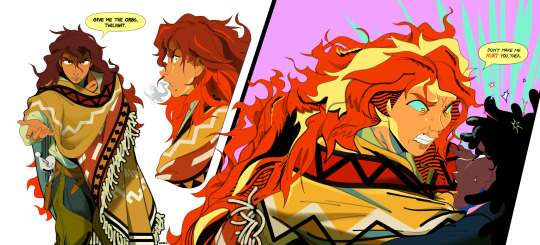
Scary Sunset.
I'm concepting things way outta order in this story, but I'm sure you can piece things together. Context is for a storybeat where, after defeating and capturing Adagio (thus having all three sirens in her possession), Sunset enacts her revenge plot to release the sirens on Canterlot as Thea discovers she's been manipulated. In a confrontation, the two scuffle and fight over the siren orbs while Sunset struggles with her conflicting wants and emotions.
#mlp#sunset shimmer#twilight sparkle#twiset#the orbs are the glass balls sunset carries on her back btw its in her cast line up art#deep down sunset hates thea. she was named “twilight” by celestia. the time of day succeeding sunset. she was always her replacement#but at this point in the story sunset's also fallen for thea. so it's also a conflict of wills in sunset. love or hatred.#hence the “don't make me do this” language. she's rationalizing her hatred and violence as thea forcing her hand and getting in her way#when in reality she doesn't need to do any of this. it's her last stand and outburst to cling to a life of revenge that she's grown too#fond of. because she knows thea has the power to change that and disrupt her identity as a pathetic victim who fell from glory#and that's scary. thea's a very scary thing to sunset because suddenly sunset wants something and to be someone new.#she suddenly wants to change. to be better for someone else. and she never thought or believed that could be an option for her#anyways toxic yuri yayyy#my art#the grand galloping 20s#character design#i hope i got across the pained conflicted emotions in sunset's face tho i belabored over them these past 3 days#i hope a look of anger and dissonance and guilt and “oh god i don't really wanna hurt you please just obey me” while trying to intimidate#is readable. if so it's all in the eyebrows babey
3K notes
·
View notes
Text
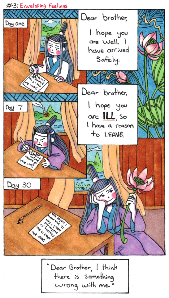
Lan Wangji Goes To Lotus Pier AU: Part 3: Enveloping Feelings.
(Part 1, Part 2, Part 4)
#poorly drawn mdzs#mdzs#lan wangji#Yungmeng Jiang training arc AU#I wanted to try out a different paneling style for this one - sorry I'm a day late! (there will still be a post tomorrow to keep on track)#The original 3 panel comic idea was fine but the point of this new schedule was to take time to push myself a bit more.#I was taking a look back through some comic artists I felt inspired by#and I really loved how Lynda Barry fills her gutters with patterns and doodles!#Obviously I'm not going as absolutely wild with it as she does but it was a great exercise!#I truly think the gutters are the most important and most overlooked part of any comic. There's lots going on in that space.#It's the same with timeskips. The implied movement between moments that we don't see changes depending on how wide that gap is#You're here for the funny tags so here's some that ties this time talk together:#I think LWJ was thinking about that second note from day 2 but it took him 7 days of hazing to commit it to paper.#I think he sends it a day later and immediately regrets it. Chasing down the messenger and everything.#You know if something actually happened to his brother he would never ever forgive himself for putting the bad vibes out there.#Third time skip was the hardest because there was so many possible flavours of jokes here. Day 8/9 was a personal favourite.#day 14 was also funny (week by week). I think the debate on 'how long does lwj take to catch feelings' is more or less:#'how long does it take for him to arrive at a particular stage of grief and yearning (and awareness of it all)#This is a symphony. There is an act by act structure. Every day he is fighting to keep his old sensibilities. He is losing so badly.#(I'll be returning to the main comic soon but there is more of this AU to come!)
2K notes
·
View notes
Text
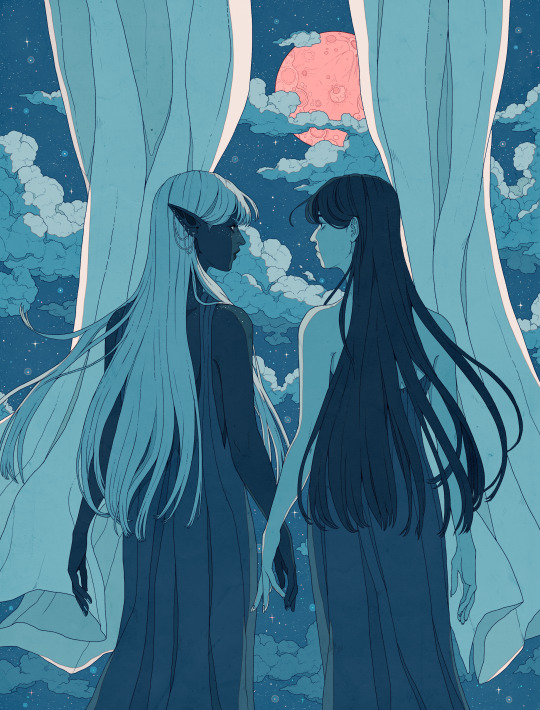
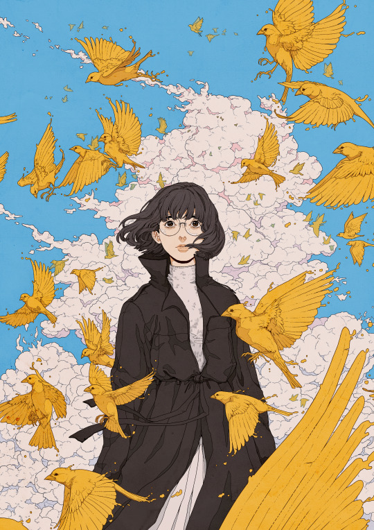
2023 favorites
#artists on tumblr#so colorful this year#the first pieces i have planned for 2024 are more horror themed again#doing my best to relax until the new year#i love freelancing but i haven't had a single vacation this year#so trying to actually just... not draw for a few days :')#i always feel guilty when i don't#but no matter how much you love something you need to do other things too#be a person outside of it#even if the algorithms hate that#i hope everyone has a great rest of the year#especially sending strength and good vibes to anyone working customer service over the holidays#been there#i wish a very “step on a lego” for any customer being shitty to you
3K notes
·
View notes
Text
why Aurora's art is genius
It's break for me, and I've been meaning to sit down and read the Aurora webcomic (https://comicaurora.com/, @comicaurora on Tumblr) for quite a bit. So I did that over the last few days.
And… y'know. I can't actually say "I should've read this earlier," because otherwise I would've been up at 2:30-3am when I had responsibilities in the morning and I couldn't have properly enjoyed it, but. Holy shit guys THIS COMIC.
I intended to just do a generalized "hello this is all the things I love about this story," and I wrote a paragraph or two about art style. …and then another. And another. And I realized I needed to actually reference things so I would stop being too vague. I was reading the comic on my tablet or phone, because I wanted to stay curled up in my chair, but I type at a big monitor and so I saw more details… aaaaaand it turned into its own giant-ass post.
SO. Enjoy a few thousand words of me nerding out about this insanely cool art style and how fucking gorgeous this comic is? (There are screenshots, I promise it isn't just a wall of text.) In my defense, I just spent two semesters in graphic design classes focusing on the Adobe Suite, so… I get to be a nerd about pretty things…???
All positive feedback btw! No downers here. <3
---
I cannot emphasize enough how much I love the beautiful, simple stylistic method of drawing characters and figures. It is absolutely stunning and effortless and utterly graceful—it is so hard to capture the sheer beauty and fluidity of the human form in such a fashion. Even a simple outline of a character feels dynamic! It's gorgeous!
Though I do have a love-hate relationship with this, because my artistic side looks at that lovely simplicity, goes "I CAN DO THAT!" and then I sit down and go to the paper and realize that no, in fact, I cannot do that yet, because that simplicity is born of a hell of a lot of practice and understanding of bodies and actually is really hard to do. It's a very developed style that only looks simple because the artist knows what they're doing. The human body is hard to pull off, and this comic does so beautifully and makes it look effortless.
Also: line weight line weight line weight. It's especially important in simplified shapes and figures like this, and hoo boy is it used excellently. It's especially apparent the newer the pages get—I love watching that improvement over time—but with simpler figures and lines, you get nice light lines to emphasize both smaller details, like in the draping of clothing and the curls of hair—which, hello, yes—and thicker lines to emphasize bigger and more important details and silhouettes. It's the sort of thing that's essential to most illustrations, but I wanted to make a note of it because it's so vital to this art style.
THE USE OF LAYER BLENDING MODES OH MY GODS. (...uhhh, apologies to the people who don't know what that means, it's a digital art program thing? This article explains it for beginners.)
Bear with me, I just finished my second Photoshop course, I spent months and months working on projects with this shit so I see the genius use of Screen and/or its siblings (of which there are many—if I say "Screen" here, assume I mean the entire umbrella of Screen blending modes and possibly Overlay) and go nuts, but seriously it's so clever and also fucking gorgeous:
Firstly: the use of screened-on sound effect words over an action? A "CRACK" written over a branch and then put on Screen in glowy green so that it's subtle enough that it doesn't disrupt the visual flow, but still sticks out enough to make itself heard? Little "scritches" that are transparent where they're laid on without outlines to emphasize the sound without disrupting the underlying image? FUCK YES. I haven't seen this done literally anywhere else—granted, I haven't read a massive amount of comics, but I've read enough—and it is so clever and I adore it. Examples:


Secondly: The beautiful lighting effects. The curling leaves, all the magic, the various glowing eyes, the fog, the way it's all so vividly colored but doesn't burn your eyeballs out—a balance that's way harder to achieve than you'd think—and the soft glows around them, eeeee it's so pretty so pretty SO PRETTY. Not sure if some of these are Outer/Inner Glow/Shadow layer effects or if it's entirely hand-drawn, but major kudos either way; I can see the beautiful use of blending modes and I SALUTE YOUR GENIUS.
I keep looking at some of this stuff and go "is that a layer effect or is it done by hand?" Because you can make some similar things with the Satin layer effect in Photoshop (I don't know if other programs have this? I'm gonna have to find out since I won't have access to PS for much longer ;-;) that resembles some of the swirly inner bits on some of the lit effects, but I'm not sure if it is that or not. Or you could mask over textures? There's... many ways to do it.
If done by hand: oh my gods the patience, how. If done with layer effects: really clever work that knows how to stop said effects from looking wonky, because ugh those things get temperamental. If done with a layer of texture that's been masked over: very, very good masking work. No matter the method, pretty shimmers and swirly bits inside the bigger pretty swirls!
Next: The way color contrast is used! I will never be over the glowy green-on-black Primordial Life vibes when Alinua gets dropped into that… unconscious space?? with Life, for example, and the sharp contrast of vines and crack and branches and leaves against pitch black is just visually stunning. The way the roots sink into the ground and the three-dimensional sensation of it is particularly badass here:

Friggin. How does this imply depth like that. HOW. IT'S SO FREAKING COOL.
A huge point here is also color language and use! Everybody has their own particular shade, generally matching their eyes, magic, and personality, and I adore how this is used to make it clear who's talking or who's doing an action. That was especially apparent to me with Dainix and Falst in the caves—their colors are both fairly warm, but quite distinct, and I love how this clarifies who's doing what in panels with a lot of action from both of them. There is a particular bit that stuck out to me, so I dug up the panels (see this page and the following one https://comicaurora.com/aurora/1-20-30/):

(Gods it looks even prettier now that I put it against a plain background. Also, appreciation to Falst for managing a bridal-carry midair, damn.)
The way that their colors MERGE here! And the immense attention to detail in doing so—Dainix is higher up than Falst is in the first panel, so Dainix's orange fades into Falst's orange at the base. The next panel has gold up top and orange on bottom; we can't really tell in that panel where each of them are, but that's carried over to the next panel—
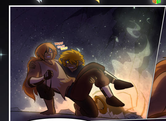
—where we now see that Falst's position is raised above Dainix's due to the way he's carrying him. (Points for continuity!) And, of course, we see the little "huffs" flowing from orange to yellow over their heads (where Dainix's head is higher than Falst's) to merge the sound of their breathing, which is absurdly clever because it emphasizes to the viewer how we hear two sets of huffing overlaying each other, not one. Absolutely brilliant.
(A few other notes of appreciation to that panel: beautiful glows around them, the sparks, the jagged silhouette of the spider legs, the lovely colors that have no right to make the area around a spider corpse that pretty, the excellent texturing on the cave walls plus perspective, the way Falst's movements imply Dainix's hefty weight, the natural posing of the characters, their on-point expressions that convey exactly how fuckin terrifying everything is right now, the slight glows to their eyes, and also they're just handsome boys <3)
Next up: Rain!!!! So well done! It's subtle enough that it never ever disrupts the impact of the focal point, but evident enough you can tell! And more importantly: THE MIST OFF THE CHARACTERS. Rain does this irl, it has that little vapor that comes off you and makes that little misty effect that plays with lighting, it's so cool-looking and here it's used to such pretty effect!
One of the panel captions says something about it blurring out all the injuries on the characters but like THAT AIN'T TOO BIG OF A PROBLEM when it gets across the environmental vibes, and also that'd be how it would look in real life too so like… outside viewer's angle is the same as the characters', mostly? my point is: that's the environment!!! that's the vibes, that's the feel! It gets it across and it does so in the most pretty way possible!
And another thing re: rain, the use of it to establish perspective, particularly in panels like this—

—where we can tell we're looking down at Tynan due to the perspective on the rain and where it's pointing. Excellent. (Also, kudos for looking down and emphasizing how Tynan's losing his advantage—lovely use of visual storytelling.)
Additionally, the misting here:
We see it most heavily in the leftmost panel, where it's quite foggy as you would expect in a rainstorm, especially in an environment with a lot of heat, but it's also lightly powdered on in the following two panels and tends to follow light sources, which makes complete sense given how light bounces off particles in the air.
A major point of strength in these too is a thorough understanding of lighting, like rim lighting, the various hues and shades, and an intricate understanding of how light bounces off surfaces even when they're in shadow (we'll see a faint glow in spots where characters are half in shadow, but that's how it would work in real life, because of how light bounces around).
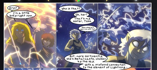
Bringing some of these points together: the fluidity of the lines in magic, and the way simple glowing lines are used to emphasize motion and the magic itself, is deeply clever. I'm basically pulling at random from panels and there's definitely even better examples, but here's one (see this page https://comicaurora.com/aurora/1-16-33/):

First panel, listed in numbers because these build on each other:
The tension of the lines in Tess's magic here. This works on a couple levels: first, the way she's holding her fists, as if she's pulling a rope taut.
The way there's one primary line, emphasizing the rope feeling, accompanied by smaller ones.
The additional lines starbursting around her hands, to indicate the energy crackling in her hands and how she's doing a good bit more than just holding it. (That combined with the fists suggests some tension to the magic, too.) Also the variations in brightness, a feature you'll find in actual lightning. :D Additional kudos for how the lightning sparks and breaks off the metal of the sword.
A handful of miscellaneous notes on the second panel:
The reflection of the flames in Erin's typically dark blue eyes (which bears a remarkable resemblance to Dainix, incidentally—almost a thematic sort of parallel given Erin's using the same magic Dainix specializes in?)
The flowing of fabric in the wind and associated variation in the lineart
The way Erin's tattoos interact with the fire he's pulling to his hand
The way the rain overlays some of the fainter areas of fire (attention! to! detail! hell yeah!)
I could go on. I won't because this is a lot of writing already.
Third panel gets paragraphs, not bullets:
Erin's giant-ass "FWOOM" of fire there, and the way the outline of the word is puffy-edged and gradated to feel almost three-dimensional, plus once again using Screen or a variation on it so that the stars show up in the background. All this against that stunning plume of fire, which ripples and sparks so gorgeously, and the ending "om" of the onomatopoeia is emphasized incredibly brightly against that, adding to the punch of it and making the plume feel even brighter.
Also, once again, rain helping establish perspective, especially in how it's very angular in the left side of the panel and then slowly becomes more like a point to the right to indicate it's falling directly down on the viewer. Add in the bright, beautiful glow effects, fainter but no less important black lines beneath them to emphasize the sky and smoke and the like, and the stunningly beautiful lighting and gradated glows surrounding Erin plus the lightning jagging up at him from below, and you get one hell of an impactful panel right there. (And there is definitely more in there I could break down, this is just a lot already.)
And in general: The colors in this? Incredible. The blues and purples and oranges and golds compliment so well, and it's all so rich.
Like, seriously, just throughout the whole comic, the use of gradients, blending modes, color balance and hues, all the things, all the things, it makes for the most beautiful effects and glows and such a rich environment. There's a very distinct style to this comic in its simplified backgrounds (which I recognize are done partly because it's way easier and also backgrounds are so time-consuming dear gods but lemme say this) and vivid, smoothly drawn characters; the simplicity lets them come to the front and gives room for those beautiful, richly saturated focal points, letting the stylized designs of the magic and characters shine. The use of distinct silhouettes is insanely good. Honestly, complex backgrounds might run the risk of making everything too visually busy in this case. It's just, augh, so GORGEOUS.
Another bit, take a look at this page (https://comicaurora.com/aurora/1-15-28/):
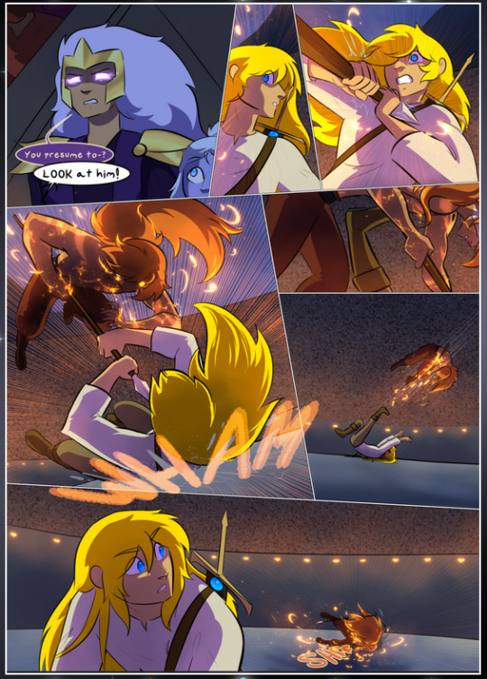
It's not quite as evident here as it is in the next page, but this one does some other fun things so I'm grabbing it. Points:
Once again, using different colors to represent different character actions. The "WHAM" of Kendal hitting the ground is caused by Dainix's force, so it's orange (and kudos for doubling the word over to add a shake effect). But we see blue layered underneath, which could be an environmental choice, but might also be because it's Kendal, whose color is blue.
And speaking off, take a look at the right-most panel on top, where Kendal grabs the spear: his motion is, again, illustrated in bright blue, versus the atmospheric screened-on orange lines that point toward him around the whole panel (I'm sure these have a name, I think they might be more of a manga thing though and the only experience I have in manga is reading a bit of Fullmetal Alchemist). Those lines emphasize the weight of the spear being shoved at him, and their color tells us Dainix is responsible for it.
One of my all-time favorite effects in this comic is the way cracks manifest across Dainix's body to represent when he starts to lose control; it is utterly gorgeous and wonderfully thematic. These are more evident in the page before and after this one, but you get a decent idea here. I love the way they glow softly, the way the fire juuuust flickers through at the start and then becomes more evident over time, and the cracks feel so realistic, like his skin is made of pottery. Additional points for how fire begins to creep into his hair.
A small detail that's generally consistent across the comic, but which I want to make note of here because you can see it pretty well: Kendal's eyes glow about the same as the jewel in his sword, mirroring his connection to said sword and calling back to how the jewel became Vash's eye temporarily and thus was once Kendal's eye. You can always see this connection (though there might be some spots where this also changes in a symbolic manner; I went through it quickly on the first time around, so I'll pay more attention when I inevitably reread this), where Kendal's always got that little shine of blue in his eyes the same as the jewel. It's a beautiful visual parallel that encourages the reader to subconsciously link them together, especially since the lines used to illustrate character movements typically mirror their eye color. It's an extension of Kendal.
Did I mention how ABSOLUTELY BEAUTIFUL the colors in this are?
Also, the mythological/legend-type scenes are illustrated in familiar style often used for that type of story, a simple and heavily symbolic two-dimensional cave-painting-like look. They are absolutely beautiful on many levels, employing simple, lovely gradients, slightly rougher and thicker lineart that is nonetheless smoothly beautiful, and working with clear silhouettes (a major strength of this art style, but also a strength in the comic overall). But in particular, I wanted to call attention to a particular thing (see this page https://comicaurora.com/aurora/1-12-4/):
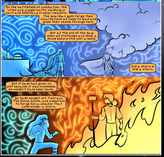
The flowing symbolic lineart surrounding each character. This is actually quite consistent across characters—see also Life's typical lines and how they curl:
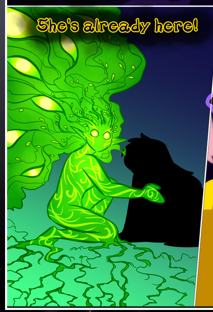
What's particularly interesting here is how these symbols are often similar, but not the same. Vash's lines are always smooth, clean curls, often playing off each other and echoing one another like ripples in a pond. You'd think they'd look too similar to Life's—but they don't. Life's curl like vines, and they remain connected; where one curve might echo another but exist entirely detached from each other in Vash's, Life's lines still remain wound together, because vines are continuous and don't float around. :P
Tahraim's are less continuous, often breaking up with significantly smaller bits and pieces floating around like—of course—sparks, and come to sharper points. These are also constants: we see the vines repeated over and over in Alinua's dreams of Life, and the echoing ripples of Vash are consistent wherever we encounter him. Kendal's dream of the ghost citizens of the city of Vash in the last few chapters is filled with these rippling, echoing patterns, to beautiful effect (https://comicaurora.com/aurora/1-20-14/):
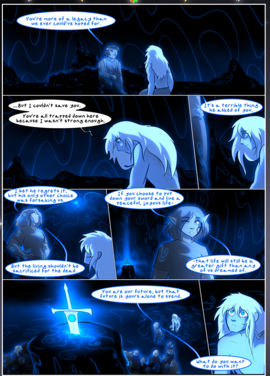
They ripple and spiral, often in long, sinuous curves, with smooth elegance. It reminds me a great deal of images of space and sine waves and the like. This establishes a definite feel to these different characters and their magic. And the thing is, that's not something that had to be done—the colors are good at emphasizing who's who. But it was done, and it adds a whole other dimension to the story. Whenever you're in a deity's domain, you know whose it is no matter the color.
Regarding that shape language, I wanted to make another note, too—Vash is sometimes described as chaotic and doing what he likes, which is interesting to me, because smooth, elegant curves and the color blue aren't generally associated with chaos. So while Vash might behave like that on the surface, I'm guessing he's got a lot more going on underneath; he's probably much more intentional in his actions than you'd think at a glance, and he is certainly quite caring with his city. The other thing is that this suits Kendal perfectly. He's a paragon character; he is kind, virtuous, and self-sacrificing, and often we see him aiming to calm others and keep them safe. Blue is such a good color for him. There is… probably more to this, but I'm not deep enough in yet to say.
And here's the thing: I'm only scratching the surface. There is so much more here I'm not covering (color palettes! outfits! character design! environment! the deities! so much more!) and a lot more I can't cover, because I don't have the experience; this is me as a hobbyist artist who happened to take a couple design classes because I wanted to. The art style to this comic is so clever and creative and beautiful, though, I just had to go off about it. <3
...brownie points for getting all the way down here? Have a cookie.
#aurora comic#aurora webcomic#comicaurora#art analysis#...I hope those are the right tags???#new fandom new tagging practices to learn ig#much thanks for something to read while I try to rest my wrists. carpal tunnel BAD. (ignore that I wrote this I've got braces ok it's fine)#anyway! I HAVE. MANY MORE THOUGHTS. ON THE STORY ITSELF. THIS LOVELY STORY#also a collection of reactions to a chunk of the comic before I hit the point where I was too busy reading to write anything down#idk how to format those tho#...yeet them into one post...???#eh I usually don't go off this much these days but this seems like a smaller tight-knit fandom so... might as well help build it?#and I have a little more time thanks to break so#oh yes also shoutout to my insanely awesome professor for teaching me all the technical stuff from this he is LOVELY#made an incredibly complex program into something comprehensible <3#synapse talks
775 notes
·
View notes
Text
this was kalim's idea
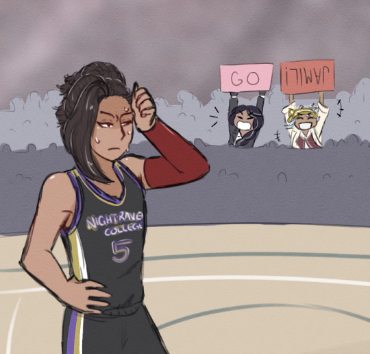
#they were NOT invited by jamil#it was ace who did#i don't think kalim was even aware of the basketball game until ace invited them#they're giving attention to the guy who doesn't want it and not to the one who DOES want it#[—✦-#-✧ my art#twst art#twisted wonderland#twst#scarabia#jamil viper#kalim al asim#twst yuu#twst yuusona#(💜) yuusha#(💜) scarashackle dish#-✦—]#this was inspired by a webtoon i was reading aajkdsdjskal#i said i was going to take a break#but the little gremlin in my brain said no and i spedrun this piece#then the battery on my stylus finally died while i was drawing and i have zero replacements atm#i think the universe was trying to tell me something#anyways every now and then i try a new style of drawing#and sometimes i'm just pleasantly surprised#like wtf i've never done this before#i love it i should do it more#sorry for rambling in the tags aldjlfjsklfd#twst is rotting my brain
439 notes
·
View notes
Note
*sigh* thoughts on Nintendo's botw/totk timeline shenanigans and tomfoolery?
tbh. my maybe-unpopular opinion is that the timeline is only important when a game's place on the timeline seriously informs the way their narrative progresses. the problem is that before botw we almost NEVER got games where it didn't matter. it matters for skyward sword because it's the beginning, and it matters for tp/ww/alttp (and their respective sequels) because the choices the hero of time makes explicitly inform the narrative of those games in one way or another. it matters which timeline we're in for those games because these cycles we're seeing are close enough to oot's cycle that they're still feeling the effects of his choices. botw, however, takes place at minimum 10 thousand years after oot, so its place on the timeline actually functionally means nothing. botw is completely divorced from the hero of time & his story, so what he does is a nonissue in the context of botw link and zelda's story. thus, which timeline botw happens in is a nonissue. honestly I kind of liked the idea that it happened in all of them. i think there's a cool idea of inevitability that can be played with there. but the point is that the timeline exists to enhance and fill in the lore of games that need it, and botw/totk don't really need it because the devs finally realized they could make a game without the hero of time in it.
#i really do have a love-hate relationship with this timeline#because it's FASCINATING lore. genuinely. and i think it carries over the themes of certain games REALLY well#but i also think it's indicative of a trend in loz's writing that has REALLY annoyed me for a long time#which is this intense need to cling to oot#and on a certain level i get it. that was your most successful game probably ever. and it was an AMAZING game.#and i think there's definitely some corporate profit maximization tied up in this too--oot was an insane commercial success therefore you'r#not allowed to make new games we need you to just remake oot forever and ever#and that really annoys me because it makes certain games feel disjointed at best and barely-coherent at worst.#i think the best zelda games on the market are the ones where the devs were allowed to really push what they were working with#oot. majora. botw. hell i'd even put minish cap in there#these are games that don't quite follow what was the standard zelda gameplay at their time of release. they were experimental in some way#whether that be with graphics or puzzle mechanics or open-world or the gameplay premise in its entirety. there's something NEW there#and because the devs of those games were given that level of freedom the gameplay really enforces the narrative. everything feels complete#and designed to work together. as opposed to gameplay that feels disjointed or fights against story beats. you know??#so I think that the willingness to allow botw and totk to exist independently from the timeline is good at the very least from a developmen#standpoint because it implies a willingness to. stop making shitty oot remakes and let developers do something interesting.#and yes i do very much fear that the next 20 years of zelda will be shitty BOTW remakes now#in which botw link appears and undergoes the most insane character assassination youve ever seen in your life#but im trying to be optimistic here. if botw/totk can exist outside the timeline then we may no longer be stuck in the remake death loop#and i'm taking eow as a good sign (so far) that we're out of the death loop!! because that game looks NOTHING like botw or oot.#fingers crossed!!#anyway sorry for the game dev rant but tldr timeline good except when it's bad#asks#zelda analysis
163 notes
·
View notes
Text

teehee
#gravity falls#gravity falls fanart#mabel pines#dipper pines#stanley pines#stanford pines#this was for today's cringetober prompt but i got a lil sidetracked#i'm not a furry i don't think but i legitimately love what y'all do#furry art#sorta?#am i like. a furry poser#doodles#trying something new#it looks a lil uggo that's ok
131 notes
·
View notes
Text
Waiting for computer problems to be fixed

#i was gonna name this 'pov: sam awesamdude' at first#ANYWAY#i love intimacy drawings but they don't really work with my usual silly doodle style all that much so I am trying something new#bluishfrog art#dnf fanart#dream fanart#georgenotfound fanart
92 notes
·
View notes
Text
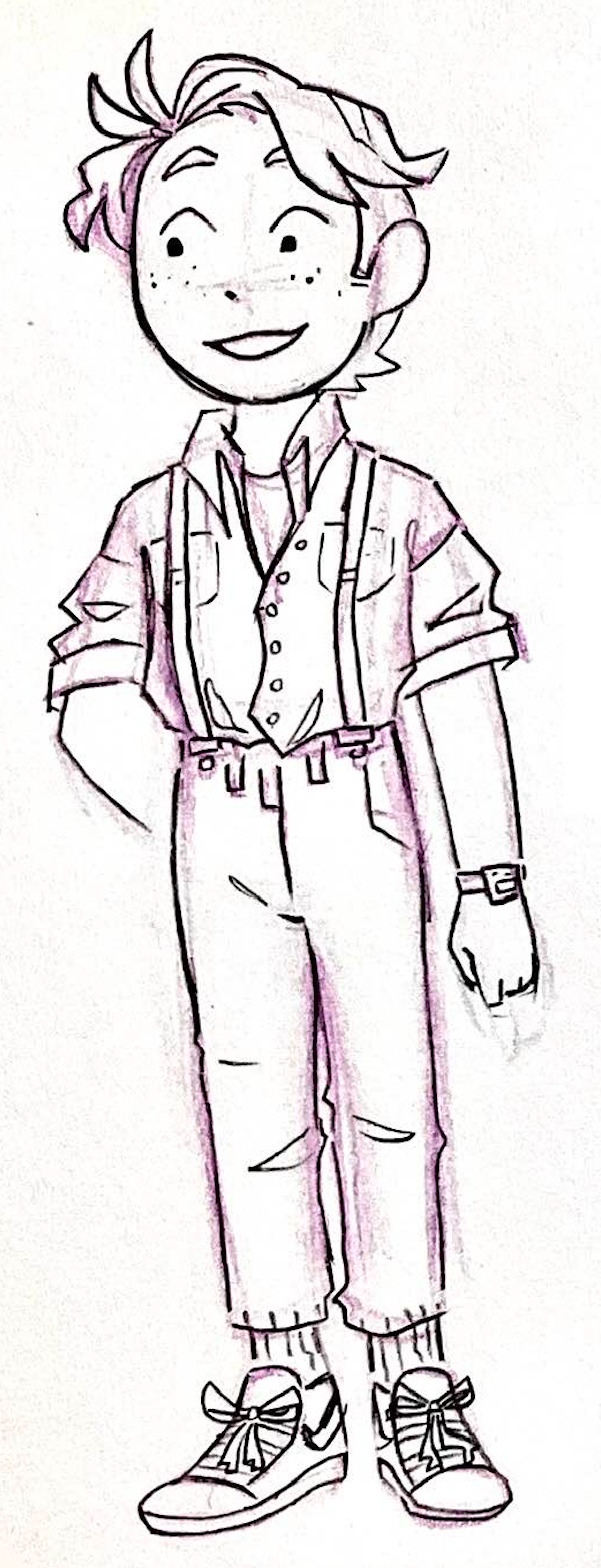
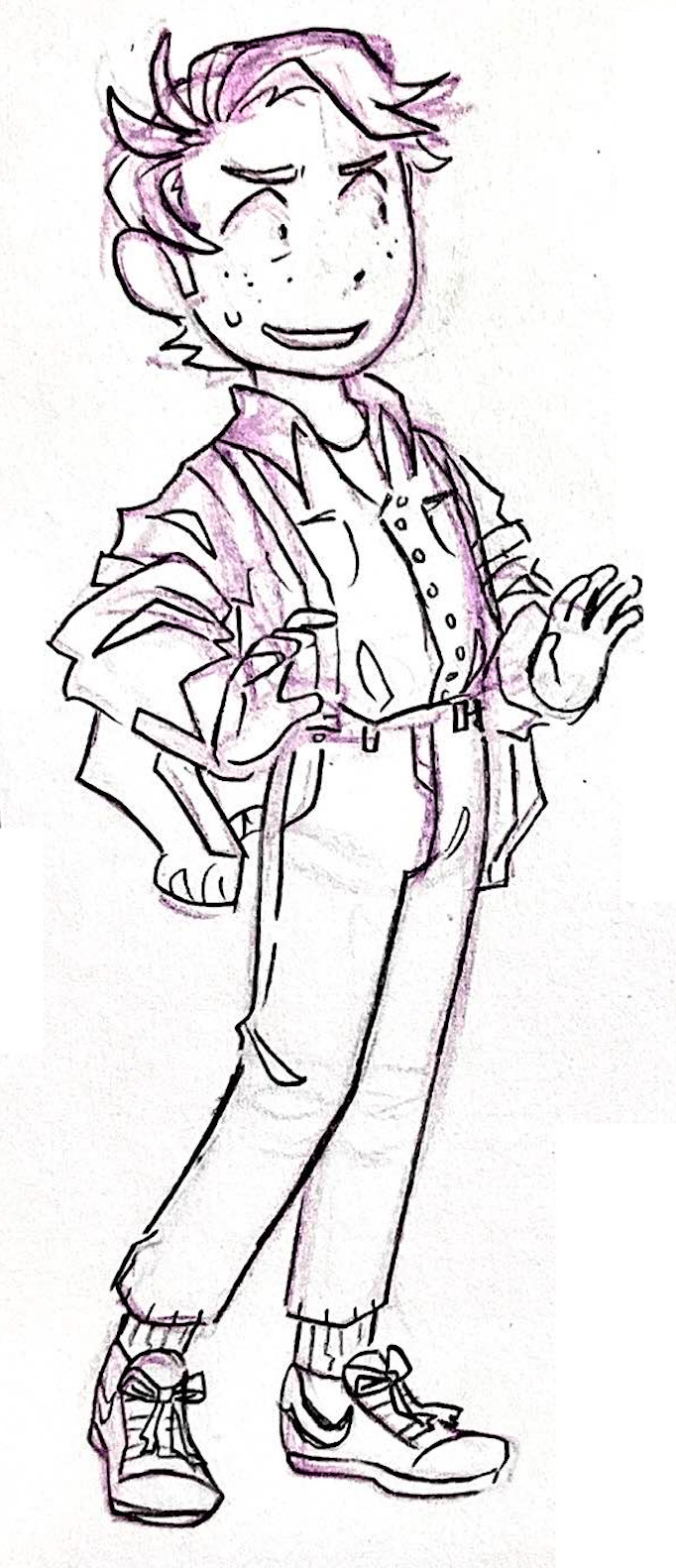
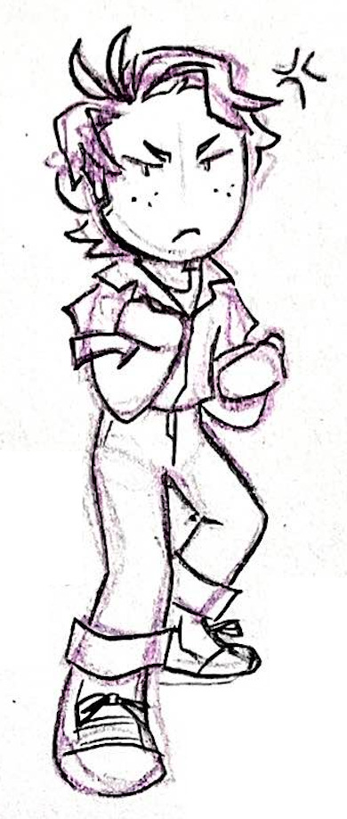
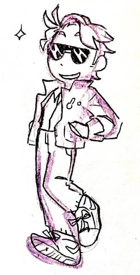
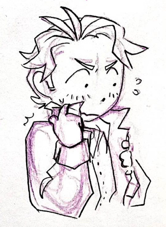
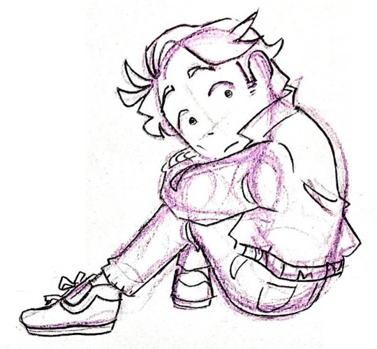
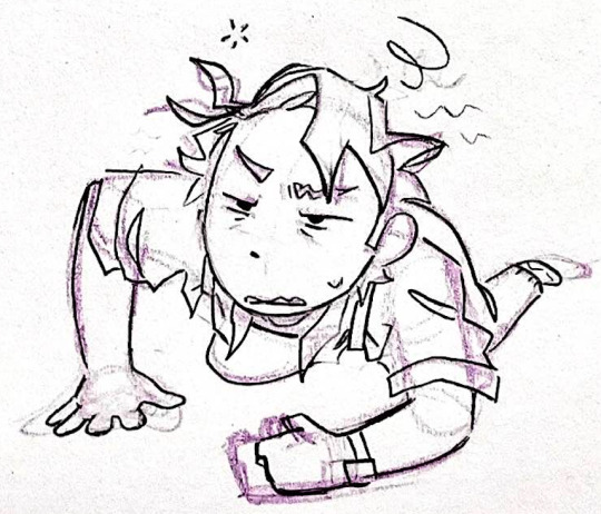


help i can't stop drawing this guy
#marty mcfly#back to the future#bttf fanart#bttf#the poses and expressions are all pretty random i was mostly preoccupied with figuring out his hair hahaha#think i've got it down now#looked at a couple other people's martys and i love how many of them drew those two stupid antennae hairs#he doesn't even have anything that looks like them that often in the films due to him getting a new hairstyle every 10 minutes#but good to know everyone was like yeah this is him. we're going to keep drawing his two stupid antennae hairs bc that's him.#half these doodles have freckles and half don't i was trying something there#bc his video game model definitely has them. and if you look very close on pictures of him i think he has a couple#but it's not really something that stands out as a trait of his#but also theyre kind of cute so maybe i'll keep em#once again please excuse the crudity of these doodles i really gotta start doing something about those sketch lines#kit does an art
86 notes
·
View notes
Text
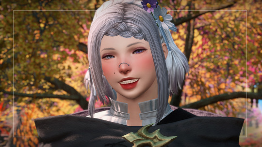
pinching her cheeks
#pigeon screens#Odette Hollows#someday soon I'll have more of a brain to do something other than just shoulders up bust#but i love her muchly and she's looking like her old self!!!!!!!!!!!!#thank you to ris and hazel for your help with teeth weeps#i tried playing with the mouth bones for the first time and woof#this is just a modified /biggrin (my fav) but I like how it came out !!#Hyur#middie#(She also has a new version of her stretch marks and I'm gonna try my hand at making my own)#(I don't have a brain for gposing rn but I AM also putting together Selenite and will get some MCDFs of her for s9 friends if they want)#(Prudence is gonna take a lil' longer because her make up is totally trashed and I need her lil' nose blush.)#(BUT I think I can make something work with the BYOM kit)#(anyway I'll get outta the tags now)(loveyoubye)
86 notes
·
View notes
Text
The most surreal and funny thing that happened to me in episode 6 was seeing Devon and Roy fighting over having a date with my Candy while I just wanted to get out of there to find Jason! 😭
And then after that, seeing Devon confronting Jason too because he thought Jason was harassing my Candy, when in fact, those two were having some kind of playful flirting.
It seems I'm playing a poly route and I WASN'T MY INTENTION! Help~ 🤣
#then in my secondaries account my Candies are only with Amanda or with Thomas alone but in my main one this Candy is a dissaster XD#two men in Devenementiel loving my girl while she wants the rival boss#I picked Devon and Roy was like “BUT YOU DON'T WANT TO COME WITH ME? ToT” Uhhh... no? Sorry Let me alone! XD#I don't even want Devon! I wanted Jason but the game sometimes don't let me pick him! And I had to do something blurry afterwards like#eating the entire fair so my Candy could throw up and only then have a moment with him! XD#at least next time if I have to pick someone from Devenementiel to do something romantic I'd like to pick Elenda and Brune! ALWAYS#anyway this was very fun so I'm gonna try it in one of my secondaries account if I can get a poly fight again but with Thomas and Amanda XD#my candy love new gen#mclng#mclng spoilers#mcl new gen#jason mendal#mcl
59 notes
·
View notes
Text
Karasu and control
I've been thinking about this for a while, and this part of Hiori's novel (previous reblog) just brought it back to my attention.

Karasu really likes to control things. I'm not saying he's a control freak, of course, but he certainly likes to feel a safe base beneath his feet. You can see this in his play style (when he gathers all the available information and acts only after that; his choice of France) and his fear of water (if I remember correctly, the thing that scares him the most in it is the unknown). AND also from the whole Marisa (his childhood crush) story (assuming it's true lol) - he's not the type to rush into anything: neither in relationships nor hobbies. I don't think he would have chosen to join Blue Lock if he wasn't really sure in his abilities. He's really mature about things like that.
I was thinking in the context of him probably going to university (data analysis please!) in addition to his sports career, since he seems like a really rational guy when it comes to serious stuff? He gives Hiori some great advice about not wasting his time on something he doesn't like, Ego mentions that his greatest skill is his analytical ability - he never acts because-he-just-feels-it, he was the one who argued with the referee in the U-20 game about Rin's injury (so responsible!), and generally acts very logically (except for the whole Hiori and his legs theme lol). I don't think he would be able to fully relate on the sport, he certainly knows about the statistics of failures and broken careers.

He loves football, of course, but he is really right about "people who only play football can't become great players". But that's more because for Karasu, it's unrealistic to be stable (which is sometimes a deciding point in the game) when your whole life depends on it. When everything relies on you winning. Karasu really has a glimpse of Snuffy's philosophy in that, and it's great to see that in the character: Failing at one thing doesn't say anything about you. And you should always be more than one thing to have the right mental balance.
That's what makes him so strong - not that he'll never fail. Of course one day he will.
But rather the knowledge that he has done everything to be stable in case of failure; that any possible failure will not ruin his life.
Because he has made sure that his back is covered.
#was thinking about it a lot for one of my (unwritten) tabiori fics#because I don't believe that Hiori would abandon football (through I'd REALLY would like to see that)#more like he'd be unsure in what to choose till the end of the NEL#and if they'd have been in relationships this uncertainty will really get under Karasu's skin#like would Hiori like to pursue his career or try something new#stay in Japan or leave everything behind and move away#he'd never turn it against Hiori of course but this for sure would have bothered him#idk I just love the way Karasu is so smart talented and overall amazing#but the moment he sees Hiori he becomes just an average weird teen totally into their crush#you know type of men who're like cool-cool and the second their spouse enters room they're dorks staring with the stars in eyes at them#that's Karasu#karasu tabito#blue lock analysis#bllk analysis#blue lock#bllk#tabiori
223 notes
·
View notes
Text
What's so fun about BruJay as a ship is Jason's sheer obsessive devotion to Bruce. Jason is possessive over Bruce, to the point he doesn't care about the deaths of others so long as he has Bruce's attention. A part of the UTRH arc this isn't talked about enough is that Bludhaven fucking explodes mid-way and Jason won't let Bruce see if Dick is alive.

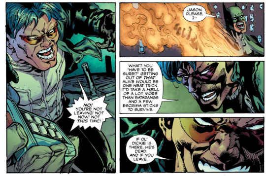
batman (1940) #650
A lot of discussion about UTRH paints Jason as this anger-driven cold, calculating machine up against Bruce when it's so clear that his love for Bruce is what drives him at his root, even if he won't acknowledge it. He says it himself, he would've done anything if it was Bruce who'd died instead of him and his anger is rooted in that possessive devotion not being reciprocated.

batman (194) #650
BruJay as a ship always to be, to some level, unrequited. Even if Bruce loves Jason back in that way, he'll never be that obsessed with Jason. Jason will always view Bruce's love for Dick or Tim to be a distraction, proof that Bruce isn't dedicated enough to him. Jason has the need to always have Bruce's attention, even when it could come at the cost of Bruce's other loved ones. Something something cannibalism as a metaphor for love in how Jason wants to consume Bruce's whole existence. He can't let Bruce leave him again, can't let Bruce love or grieve anyone else. Forcing Bruce to choose between Jason and the Joker isn't just about confronting Jason's killer, it's about confronting the other person who exists as this duality with Bruce and consumes so much of Bruce's life. That's the role Jason wants to fill, calling himself Red Hood and forcing Bruce to look at what he's become. But still loving Bruce and wanting more than anything for Bruce to reciprocate that love in the way that Jason understands. I just think it's good soup and rife with Dynamics that are underexplored with them.
#necrotic festerings#brujay#jaybruce#jaybru#jason todd x bruce wayne#batcest#i've had this thought in my head for a while#i was just weirdly shy about posting it? like convinced myself it's not as verbose as some of my other thoughts#also GOD why is the art of this arc SO BAD.#i can't take it SERIOUSLY#i hate looking at it.#the faces. why are the faces like that.#brujay needs more love bc jesus#gotham war had some good brujay content but i am still too bitter to discuss that shitshow. so. ignoring it for now.#bruce changing jason's brain chemistry as an act of love is the most FUCKED UP brujay thing ever tho#it's so Them.#sorry that is just peak brujay. they are incapable of meeting in any middle and always trying to change each other.#maybe this meta should've been about that.#but then i'd have to use new-52 and rebirth panels so eh. nvmd.#this page makes it seem like i hate post-flashpoint comics. i don't i swear#they just interest me less for batcest.#like oh yay everyone's getting along and working together.#it only came at the expense of throwing away decades of character work. small sacrifice.#i need to stop posting meta at fucking 5 am.#no one is going to see this bc i can't be a normal person.#wrote this while watching invincible#which is pretty good so far but man the ending of ep1 clocked me. i was absolutely bamboozled.#i had something else i was going to say in the tags but i lost it.#anyway most of this is a ship post and projecting shit as per usual and yk. not serious comic media.#i'm just silly and gay.
45 notes
·
View notes
Text
doodles
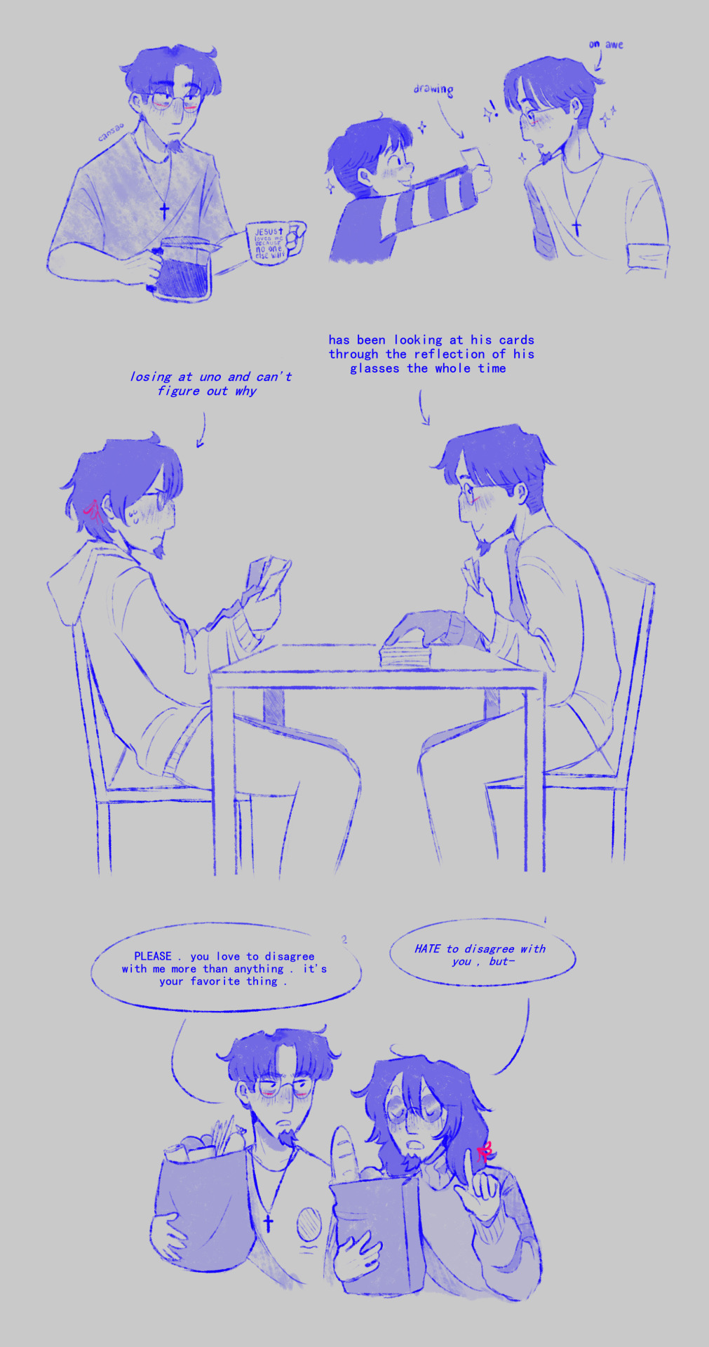
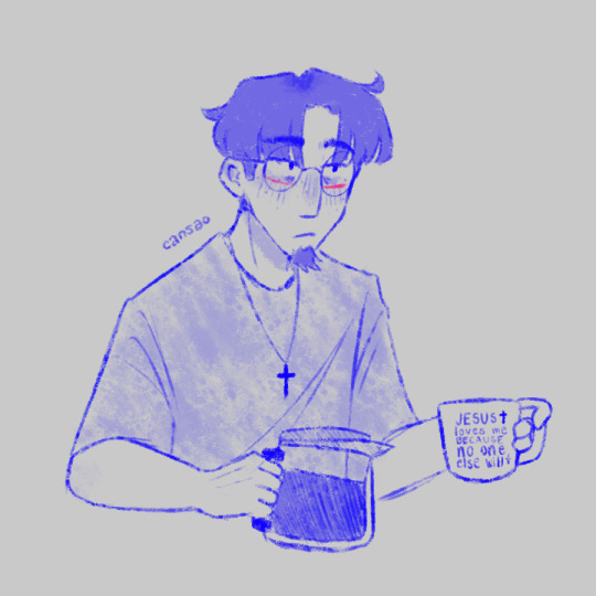
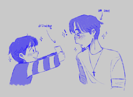
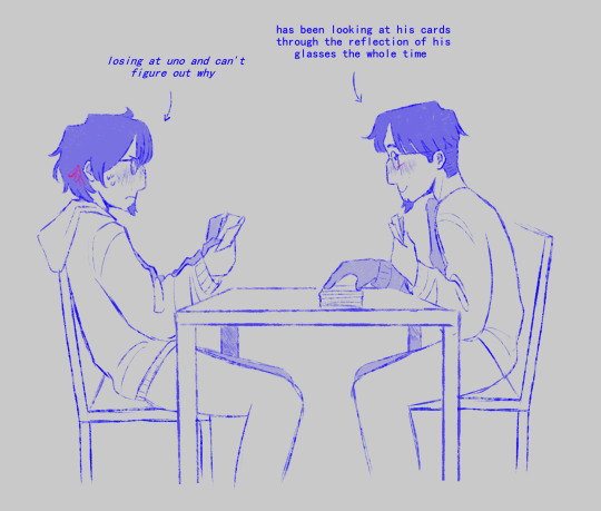
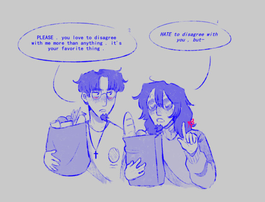
edgar vargas and squee by johnen vasquez
scriabin by zarla-s
#sunny's art#vargas#edgar vargas#vargas zarla#scriabin vargas#zarla s#scriabin#doodles#YOU THOUGHT YOU'D SEEN THE LAST OF ME . . . . !!!!#well HELLO !!!! I'M BACK !!!!!!!!#got a new brush . what do you think of it do you like it#okay i want to ramble about these wait a second#the first one looks a bit different to the rest because i was just trying new stuff .#if i spend a long time without drawing i'll forget how to draw and well it happened#i've changed my art style like 3 times now but i still draw side profiles the same . looks weird ugh#the mug says “ JESUS loves me BECAUSE no one else will ” btw . meta gave me the idea actually . thanks meta .#about the second one . finished that one like ten minutes ago . missed drawing todd aw#i just find their whole relationship so amusing .#like yes i went crazy for like a month and now i have a brother-husband and a kid ?!#they complement each other so well though . i love them#THE UNO ONE omg i've had that idea for like A YEAR NOW and i just drew it lol#i wonder how long it would take scriabin to notice though .#when i showed this to meta she said : “ oh wow !! edgar's finally winning at something !! ” and it's SO TRUE#wonder how he does it !#and the last one . i got the idea when i was looking through zarla's account searching for fan art .#love it so much though they look like their lives aren't a living hell#anyways i'll probably make more of these . who knows#going back to school on monday . and of course i had to get inspiration four days before going back .#please PLEASE I DON'T WANT TO GET BACK TO SCHOOL . PL#okay byeee enjoy these . eat my starved followers . EAT !!!!!
122 notes
·
View notes
Text
i hate the fact the term karen went from describing a bitchy entitled customer to basically the modern day equivalent of calling a woman a harpy (misogynistic as fuck) and that people use the term on people out in public who are at the end of their rope emotionally from stress or a shitty day. I get it just because your having a rough time doesn't mean you get to be a dick but sometimes I think people are seriously lacking in empathy and I get it a lot shit the customer might be dealing with isn't your responsibility but like if a customer is struggling with something simple maybe don't be a dick? Just a thought.
#I'm so done with people calling customers with legitimate complaints/concerns Karen#If you messed up someone's order and they ask for a new one then fix it#What if they're on special diet for health reasons#What if they're practicing lent or are Muslim and you give them food that they can't have#What if the customer that's struggling with a simple self checkout has autism or something#People shouldn't have to give out these reasons unless they want to#Also corporations love to make customers out to be idiots and karens when they've seriously fucked up#Like that lady who got McDonald's coffee on her crotch suffered 3rd degree burns and was portrayed as an idiot/greedy#Don't be like that#ableism#misogny#Karen#I'm not kidding when I say it's becoming the modern day equivalent of calling a woman a harpy#Someone breaking down crying and freaking out in public can be annoying but maybe don't record them#Idk as someone with autism if someone recorded me having a meltdown or mocked me I'd be pissed#Even if they aren't mentally unwell no one deserves to bullied when they're at their own limit#Watch somebody call me a Karen for this#Like fight back against dickheads throwing temper tantrums but also don't be a bully#when you hear something about a Karen try and see if they are actually being a Karen or if they're just being put in a bad light#Like did they hit record after a bunch of harassment#cause thats happened
52 notes
·
View notes
Text
alternative university ideas 🤔💭
so i've been trying to think through how i want to handle university in my game. i like the idea of my sims having at least a round to "go to college" (whatever that looks like) before they transition into full adulthood. but i honestly hate university the way it works in the game and never look forward to university rounds. i hate grinding to fill up a performance meter with no real-world use for my sims. the skill points are nice, but i dread the homework/term paper side of it.
so i'm thinking i could create a single lot that has classrooms and practical skilling areas, both for standard skills and talent badges. kind of a cross between a community college and a community center. i could have my newly adult sims stay there for a round in a mocked up dorm and pursue whatever they want for 5-6 days and move out significantly more talented than they came. i was planning to use the sim blender/visitor controller to teleport relevant sims in and make them selectable to use skilling objects to make the lot seem less empty. i think there are 3 practical ways to do this:
an apartment - make an apartment building with only a few small units. the common areas would be the classrooms. the pros of this are that my sim could actually live there and pay reasonable rent (i could depreciate/tweak the rent with pescado's magic wand, or cheat them enough money for rent). the cons are that non-students could move in, and that i'd have to either knock down walls or use cheats to make the apartments bigger if i'm sending multiple people to college at once. and just the general bugginess of apartments could be an issue.
an owned business - make a random sim own the college campus, take them to the lot, and transport/make selectable the students i want to play. this is closest to how other simmers handle playable schools (to my knowledge). the pros are that i'd have more freedom with it not being an apartment and it would have more activity as a business. the cons are that i feel like i'd need additional mods to make this work and some tweaking to adjust the business aspect to not interfere. would i be able to have the business owner/visitors sleep there overnight for multiple days to mimic a dorm? i don't know! i've never tried it. i feel like there's potential for issues there.
a college dorm - make a dorm in the university subhood and cheat the college progress bars full/manually stop students from going to class, then let them do whatever in their downtime. the cons are that i honestly don't even want to fuck with the university subhood anymore and i'd either have find new mods or micromanage my sims to make sure they didn't go to class. the pros are that it would auto-populate with dormies and there wouldn't be any issues with trying to finagle a dorm.
i don't know! just thinking out loud a little here... any feedback/ideas for mods are totally welcome! if you play university differently than how the EP was meant to be played, i'd love to hear your thoughts in the reblogs/replies.
#i'm not necessarily super interested in playing with the active classes university mod because i'd rather just bypass it entirely#but i'm open to being sold on it if you really like it#idk! i love twisting myself into knots trying to find a new way to do something that the game already does lol#ts2#ts2 gameplay#sims 2#sims 2 gameplay#also if you don't play any university at all - totally valid and i've considered it tbh#at least for now i'm interested in finding ways to mimic it/make it more pleasant while still including it in some capacity#but who knows
23 notes
·
View notes