#does it actually count as a redesign
Explore tagged Tumblr posts
Text
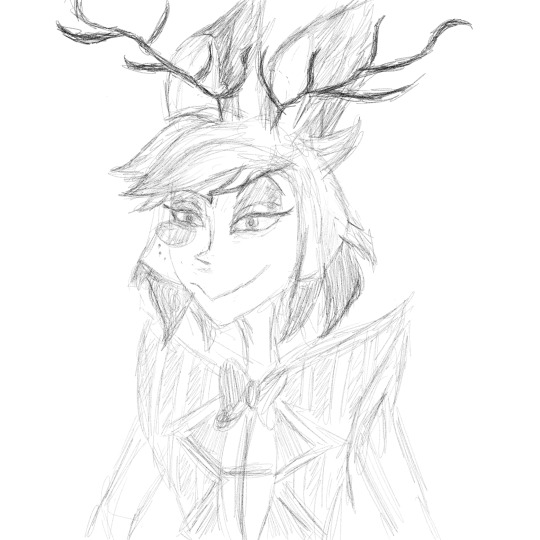
Doodle I discovered with a timestamp of 2:27 am titled "Give the man horns" because yeah. Petition for real deer horns and not the literal crab claws lol (it's pretend hate guys I love his horns don't come for me)
P.S. this was heavily influenced by the way I've seen the very talented @elsa-fogen and @sunlit-mess draw Alastor! They both draw Al in such a beautiful style, sending all the love their way!!
#hazbin hotel#hazbin hotel alastor#alastor#hazbin hotel fanart#hazbin art#hazbin alastor#hazbin fanart#fanart#digital art#alastor redesign#does it actually count as a redesign#if we're just giving him real horns#elsa fogen#sunlit-mess
30 notes
·
View notes
Text
Brain thought "wouldn't be sick to have Kris acutally cast magic idk Noelle's or something"
I think I went a little too far.
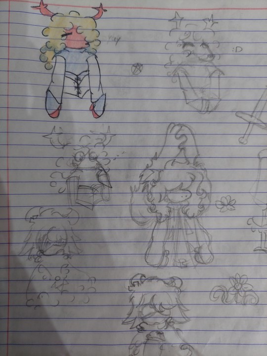
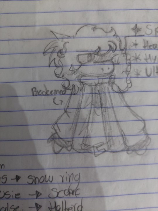
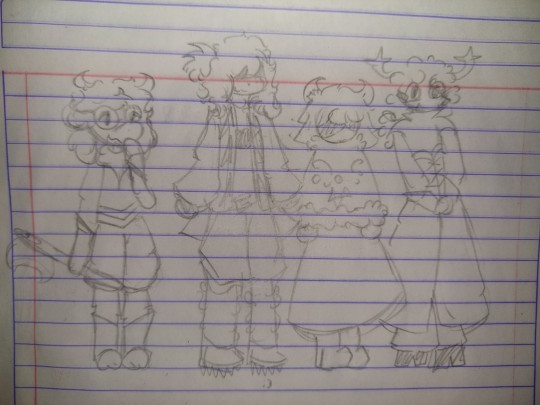
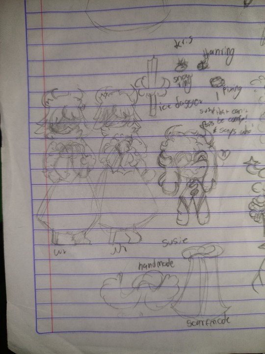
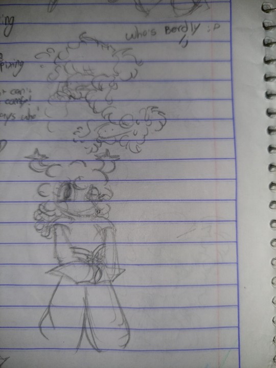

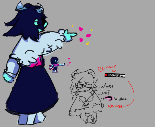

Idk what to say. Theyre just weird redesigns.
#deltarune au#does this count as an au?#My brains too small to think of light world designs#berdly doesn’t exist#/j#i swear I'll learn how to draw him#someday#probably not soon#kris deltarune#kris dreemurr#susie deltarune#ralsei#noelle holiday#ah yes kris on a dress#couldn’t resist#Can they snowgrave? Perchance#The doodles are boring because I was to lazy to do actually good doodles about them#Were the redesigns really necessary? Prolly not#doodles#deltarune fanart#deltarune
21 notes
·
View notes
Text
realized i havent posted abt basically any of my crossovers ive worked on .... i think thats honestly impressive considering i often dont shut up about them.... but then again things ive gotten REALLY into i end up sidelining crossovers for the sake of analysis n discussion..... beautiful
#but yeah ive gotttt a handful#i mean i redesign them as ponies every couple weeks#(and they always turn out the exact same HAHA)#uhhhh some other ones. please imagine me sifting through an old box full of things as i say this#i have a pn2 one. i planned on writing smth for that then gave up#i have one about that house with an owl in it#(you can see me desperately trying not to throq this talking post into like 500 virtually unrelated tags)#(ftr thats also why i am frequently calling this the circus show and stuff)#does oc stuff count? i DID design pomni as an eschimatex once. and i actually did post that one#designed them as bugs multiple times for fun but also a few times w the intention of it being#related to one of those games about the bugs. i had the fables one in mind...#once tried to make them furries for the sole purpose of crossing it over w a vn i like...#and theres probably more that i forgot. i sifted thu my sketchbook (i HAVE filled an entire sketchbook w circus art by now)#(which is only notable if you know i have been doing primarily digital art and have only been caught up#on this show for like 3 months)#anyway i cant remember any more#its not a crossover but i did have streamer kinger and i like that. i should draw that again it was silly and fun#oh my god how could i forget.... i have tried to make object deaigns in the past#but i didnt like them....#also i have a vague crossover w one but its foundation is quite shaky and i dont have art for it#bc it requires human designs for the circus members that i Dont Have
7 notes
·
View notes
Note
7 8 and 21 for Ann?
7. What's something the fandom does when it comes to this character that you like?
Hmm. There's a few things but tbh I really enjoy all the redesigns of her thief outfit people do! I really like the directions people take with it and honestly they are always better than the original. Also bonus I LOVE when people give her boots/shoes with toe beans. S tier design right there.
8. What's something the fandom does when it comes to this character that you despise?
There's a few things I could say but I think aside from the obvious I think a lot of people underestimate her. Both intelligence wise and just character wise in general. They see her as "the lovers girl" or "the other dumb one" and idk she's way more than that.
21. If you're a fic writer and have written for this character, what's your favorite thing to do when you're writing for this character? What's something you don't like?
I would not call myself a fic writer at all LMAO I have written snippets and obvs I'm working on my stuff but I have unfortunately not written enough of Ann (something I am trying to change lol).
#asks#latenitewaffles#this is kinda short sorry#ig for the last question i enjoy thinking about her friendship with riku does that count 💀#i have never written it but the head stories go hard trust me#does the second one make sense? idk i just people don't really let her be a character sometimes?#or like they just take her at face value THATS WHAT IM TRYING TO SAY#and yeah the redesigns are always fun#i should try one myself but tbh i actually wouldn't change tooo much#just add some things and take stuff away#i am trying to write more but tbh i find it hard...#thanks for the ask teddy :]#ann my beloved. you may be my fav persona character#<- insane statement considering my history but no joke i think shes slightly taken the top spot#VERY VERY close though
4 notes
·
View notes
Text

HI BITCHES!!! GUESS WHOS STILL ALIVE!!!
*cough cough* Anyway, enjoy this Nevada drawing I did on the Ipad, isn't he pretty? I love him, like Nevada is just so fun to draw and whatnot. Maybe one of these days I'll color this (doubtful but you never know) :D
#welcome to the table#welcome to the statehouse#wttt fanart#wttt#wttt nevada#wttsh nevada#gosh I love him#her?#who knows who cares#I drew him so pretty#and I love this dress so much#normally I suck at dresses but this isn't actually too bad#does this count as a Nevada redesign?#cause if so then I will fully dive head first into the short hair Nevada propaganda#I am so here for it#is it obvious I went hard but subtle on the star motif?#eeeee I honestly can't stop looking at this drawing#HES SO PRETTY#!!!!!!
15 notes
·
View notes
Text
I got sick of seeing that twink owl from vivzieshits series so I wanted to design my own actual demon looking character based off the original biblical design and harpies
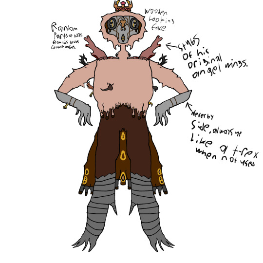
The main reason demons were so original is bc they’re a mockery of gods creations, and I just don’t think the helluva boss stolas emits that. Also why is he a helpess baby bottom twink this is awful
#Demon oc#stolas#fucking hate hazbin#Redesign?#does it count if it’s a oc unrelated to the actual show#Whatever#demon#harpy
4 notes
·
View notes
Text
ecobrutalism (kim mingyu)
because drafting tables are not meant to be anything more than a decoration.
☆ annoyances to lovers: architect!mingyu x therapist!reader ☆ wc: 5k ☆ genres: non-idol au, annoyances to lovers, office setting? romance, fluff, comedy, no angst (this is a first for me) vibes based on second wind ☆ regular warnings apply; mingyu is both delusional and dramatic, jihoon is tired. ☆ notes: tiya was one of my first mutuals here on tumblr, and she's always been one of the people i can count on to listen to my yapping and not think of me as a strange person (is this weird? i dont think so) but our birthdays are only one day apart, and so, because i can't send a gift from so far away, here's my gift, a small mingyu fic that i hope will bring a smile to your face. happy birthday, @gyubakeries, i hope i know you for a very long time <3 thank you to alta @haologram for making the banner at my speedy request, and @mylovesstuffs for betaing this (if there are errors, there aren't.) masterlist
“She’s insane,” Mingyu mutters, holding on to a pamphlet, “she’s insane, and she’s going to make me insane too.”
“She’s not insane,” Jihoon mutters, sipping his tea, “she’s just a therapist. You’re projecting.”
“I’m not,” Mingyu mutters, “she’s the one who’s arguing about stupid rules in the building code that doesn’t even make any sense. I mean, who brings a folder with color-coded tabs to every meeting? Why does she have opinions on how we should build and decorate, for every shop in the building? No one even makes use of these codes in today’s day, they’re virtually obsolete.”
“So, object to them,” Jihoon shrugs, “you’re good at that, right?”
“I’m not, actually,” Mingyu groans, “I’m not even good at ignoring her. It’s making me anxious and irritable. To the extent that it’s affecting how I behave with my clients.”
“Your clients, meaning the old ladies who come here to ogle you and then force their husbands to get their shops redesigned by you?” Jihoon arches a brow, “I hardly doubt those count as actual clients, Kim Mingyu. You’ve got admirers here.”
“They bring money so yes, they’re my clients,” Mingyu snaps, “and you’re one to talk, hyung. Didn’t I catch you yesterday, buying random books from the bookstore? You don’t even read post-war Japanese crime fiction, for heaven’s sake. You were trying to get with the bookstore owner, weren’t you? You even composed a song for her, don’t even think about denying it.”
Jihoon colors, “none of your business, Mingyu.”
“None of your business, Mingyu,” Mingyu taunts, “anyway, help me out with this woman. She continues to get on my nerves at every possible opportunity, and I don’t know how long I can hold on before I inevitably lose my shit and kill her or something like that.”
“Not long for that,” Jihoon muses.
“Shut up, and try and help me.”
Jihoon sighs. He’s been tolerating Mingyu’s antics since the past year when the younger man decided to open his shiny new office in their dilapidated shopping centre, and while his perfect visuals have helped in footfall, it also means Jihoon has to take care of Mingyu and his tantrums on a semi-regular basis. Semi-regular now that he’s managed to find himself a sworn enemy. It’s not even a big deal, Jihoon does not understand why he keeps swearing to high heavens that he hates her guts.
“She doesn’t seem so bad,” Jihoon says, trying to get Mingyu to calm down to a certain degree, “you don’t even typically get this angry, do you?”
“I don’t,” Mingyu shakes his head, “imagine how royally annoying she has to be, to get me this mad.”
“Huh,” Jihoon turns it over in his head a few times, “are you sure it’s not just a random one-time thing? She’s not proposing bad things as such, she’s just telling us to be more aware of the city’s building rules and regulations. Something which I thought you would have been a stickler for, given how you are the architect here, not her.”
“I do care about building rules and regulations,” Mingyu seethes, “I’m just not a bloody fanatic about it.”
“Ah, so that’s the problem,” Jihoon shrugs, “anyway, sort this shit out amongst yourselves, all this is seriously cramping my rizz.”
“Your rizz?” Mingyu scoffs, “hah! You’re just going to spend all your money at the bookstore, aren’t you? You’ve got no rizz to speak of.”
“Speak nicely to your elders, you little shit.”
“I’ll speak nicely to you when you actually show me proof of your rizz that goes beyond stupid yearning from a distance,” Mingyu taunts, “wait, have you even talked to her? Or are you just planning to stare at her and creep her out? You know that’s not how anyone asks someone out, right?”
“Shut up,” jihoon ‘s looking intently at the door, “I’m actually trying to get her to go on a date with me.”
“And have these thoughts found any other home outside of your mind, Lee Jihoon?”
“You know she’s friends with the therapist you keep yelling at during the meetings,” Jihoon groans, “until you stop fighting with her friend, she’s not even going to look at me or give me the time of day. Now make up amongst yourselves and for once, let me go on a fucking date.”
He leaves to go back to his regular yearning duties, and Mingyu is left seated in his chair, pondering over two things; the current state of his finances, which would absolutely not withstand the onslaught of a renovation putting it to date with the city’s newest regulations, and Jihoon’s love life.
—
“Why the fuck won’t he just comply with whatever I’m asking?” you yell, throwing up your hands, “it’s the city’s regulations, stuff that he should be familiar with, given that he’s an architect, for heaven's sake, not me! Why the hell am I the person telling him things?”
“Maybe it’s because you can be a bit annoying about these things,” the bookstore owner, your only friend in this goddamn place, pipes up from behind her stack of books, “maybe if you weren’t so pushy about it, he’d hate you a little less.”
“He’s just an asshole," you say, “I need to look into his architecture degree.”
“Not to that extent,” she holds up her hands, “but you can be really pushy and I think maybe, if you’re really this concerned about the building regulations, then you should come to a compromise with him before the next building committee meeting two weeks later.”
“That soon?” You groan, “oh god, he’s going to be so annoying when I approach him first, isn’t he?”
“It’s not about who’s more annoying, it’s about who is more reasonable out here,” she shrugs, “have you ever seen me pick fights I don’t need to?”
You shake your head, “god knows how you manage to do it. If it were up to me, I’d have his head on a pike outside my office.”
“And risk facing the wrath of all the neighbourhood aunties?”
“Yes, that’s the only thing he’s good at,” you seethe, “he’s basically eye-candy for all the neighborhood aunties. Why the hell is he on the neighbourhood watch? He didn’t even live here until a few years ago!”
“Neither did you.”
“I did! I moved back!”
“Look, the point is that you need to make amends with him,” your friend reasons, “or else living in this shopping complex will be difficult for you. People actually like him a lot more than you think they do, which is why it will not be difficult for them to get you out of here.”
“Out of here?” you shriek, “what do you mean out of here? They can’t do that to me, not legally at least.”
“They can make your life a hundred times more difficult than it already is, which will make it worse for you to run a business,” she replies, strangely calm, “I’ve been here far longer than you have. Being likeable is currency. They want someone likeable, not someone who sticks to the rules and makes everyone more annoyed than they already are.”
“Ugh, I knew I was right about him the moment I met him,” you mutter, and your friend frowns.
“You really did have a poor choice of words back then.”
You shake your head, ignoring the jibe, “So, I need to be nice with him.”
“Precisely.”
—
Mingyu is trying to be nice, he really is. Jihoon has been blowing up his phone, asking him to fix things so he can go back to creepily stalking the bookstore owner, but he’s a good friend, so he’s going to be nice.
Which is what he’s been telling himself since the moment he stepped foot into the clinic run by that woman. Happiness Clinic, he repeats, looking at the sign on the wall, how stupid.
“Kim Mingyu,” you say, surprised to see him walking through your doors in the middle of the day, “strange to see you here.”
“No business?” he asks, offhandedly, making a motion at the empty waiting area.
“I have a consultation in half an hour,” you reply, “what do you want?”
Mingyu sighs. He’s really not looking for an argument, but your attitude is not helping his current goal. “Look,” he says, after a whole minute, “about the newest resolutions, can we at least work it out? Most of the residents don’t want to upend their entire businesses to make sure their stores are up to code.”
“Yes, but shouldn’t they be making sure they’re not violating code?” she argues, “and you of all people should be making sure they’re not being fined by the city officials. You’re an architect. I’m just a random therapist.”
“You’re not a random therapist,” Mingyu argues, before taking a deep breath, “even the city officials generally give the store owners a window of time within which they have to comply with regulations. At least give them more than a week.”
“Fine,” she snaps, “just so you know, I’m not doing this as a favour to you. I’m doing this as a favour to my friend.”
“The bookstore owner?”
“Yes, the bookstore owner,” The sarcasm is not lost on him, “she’s the one who told me I have to at least make sure the residents don’t hate my guts.”
“See, she’s got it down,” Mingyu suddenly feels a bout of gratitude towards the bookstore owner, whose name he still is not familiar with, but he’s going to give her a basket of flowers the next day. “You need to compromise to some degree, to be able to cohabitate. Life is all about cohabitation and compromise, you know.”
“Yes, yes,” she makes a face, “fine, I’ll tone down the arguing. They can make their arrangements taking as long as they want. When the city officials come knocking on their doors, don’t say I did not warn you.”
“Noted, doctor.” he gives her a mock salute, before turning to leave the same way that he came. You groan, before making a rude gesture, which Mingyu catches. He just laughs, before walking away. Cute.
—
“Hyung,” Mingyu has been running for an hour, he thinks, knocking on Jihoon’s door, until the older man opens up, angry expression on his face, “why the hell did you take so long to open the door?”
“I was taking a nap, Mingyu,” Jihoon mutters, “it’s four in the afternoon, and I don’t have customers right now, so of course I was doing what any normal person does, and was taking a nap.”
“Wow, you’re such a productive member of society, hyung,” Mingyu scoffs, before opening the door wide open, “okay, I need your help with something.”
“I don’t have money.”
“It’s not—why does everything have to be about money?”
“We live in a capitalistic society, Kim Mingyu-ssi, of course everything is about money.”
“Ugh fine, but this one is not,” he waves a hand, “I think I’m going crazy.”
“And it took you this long to figure out?” Jihoon raises an eyebrow, “wow, you really are a genius, as they say.”
“This is not a time to make fun of me, hyung,” Mingyu wails, which, in retrospect, is not the best look on a grown adult man, “how did you even know you liked the bookstore owner?”
“She has a name, you idiot,” Jihoon swats the back of his head, “and no, why would I tell you?”
“Just help me out once, please,” Mingyu wails again, “I’m seriously never going to ask you for help again if you help me out here.”
“Fine,” Jihoon is not entirely convinced with his declaration, but he sits down at the counter anyway, “what seems to be your problem?”
Mingyu takes a deep breath, “I think I like her.”
Jihoon scowls, “like who? There are eight billion people in the world, you have to be specific here.”
“The therapist!” Mingyu throws up his hands, pacing around the shop, “I seriously think I like her or something like that. I’m going crazy here, just help me out once.”
“Might I suggest a psychiatric hospital?”
“Hyung.”
“What do you expect me to say?” Jihoon makes a vague gesture with his hands, “until yesterday, you were vowing to kill her with your bare hands or something like that. Now you’re here at my door, telling me you like her. I’m not the only person, you ask anyone else, they’ll all say the same thing; you’ve got to check yourself into a hospital or something like that.”
“You’re not even getting the point,” Mingyu groans, “up until last night, I never even had thoughts about her in that way.”
Jihoon raises an eyebrow. It reminds him of his elementary school teacher, just as terrifying, “Mingyu, what have we said about catching feelings from a sex dream?”
“It was not a sex dream!”
“So it was worse,” Jihoon leaned back into the chair, “go on.”
“I don’t know man,” Mingyu sighs, “I went to meet with her yesterday afternoon about the upcoming meeting, and she was actually nice to me.”
“You mean she did not actively argue with you?” Jihoon tries to smile, although it’s more of a grimace, “you seriously need to rethink the reasons for getting attracted to someone.”
“It’s not even like that!” Mingyu protests, “she was actually nice to me. And she didn’t even yell that much!”
“Mingyu, last week, at the committee meeting, she told you to go fuck yourself.”
“And I’m coming to that,” he holds up a hand, “she actually did flip me the bird when I was about to leave.”
Jihoon’s got an expression on his face that makes it very clear he does not understand anything Mingyu’s saying, “she flipped you off? Made the sign which tells you to go fuck yourself?”
“Yes, but there was no real malice behind it,” Mingyu waves, “that’s not the point here.”
“I think you’ve gone insane,” Jihoon sighs, “and what, she flipped you off, and you fell in love with her?”
Mingyu makes a face, “why would I fall in love? I’m not that stupid.”
“Yes, you just dreamed about her and are now yapping to me,” Jihoon mutters under his breath, “nothing stupid.”
“Anyway, last night, I literally saw her in a dream,” Mingyu explains, waving his hand about, “it was not even an explicit dream, I legitimately just dreamt of us going on a picnic. And I woke up, and kept thinking about her. Now, whenever I think about her, my heartbeat rises just slightly, not noticeable enough to be concerned, but just enough to make me stop and think, ‘oh? Do I actually think about her in my spare time?’ and it turns out, I actually am thinking of her in my spare time! I even went down to her clinic today, to make sure what I was feeling or thinking about were not just random feelings, and I saw her through the glass doors, and my heartbeat increased to 119, I’m not even kidding, hyung, look at it—”
“Mingyu!” Jihoon yells, “calm the fuck down, you’re rambling.”
“Am I?” Mingyu clutches at his hair, “I really don’t know whatI’m supposed to do, it’s so embarrassing, I want to die.”
Jihoon sighs. This is new. “Look, Mingyu,” he says, cautiously, as if approaching a spooked fawn, “are you confused or are you scared?”
“What do you mean?”
“These feelings, for her,” Jihoon shrugs, “do they confuse you, or do they scare you?”
He pauses, and then replies, “scares me. I’m terrified.”
“That’s good,” Jihoon replies, going to the small fridge in the shop and offering Mingyu a diet coke, “being scared of your feelings means you’re at least acknowledging the attraction. If you were confused about what you were feeling, I would have told you to drop it.”
“Yes, but like you said, I’ve only had about three civil interactions with her, and now I’m feeling attracted to her? Is this normal?”
“Attraction does not follow the rules of normal social behaviour, Mingyu,” Jihoon replies, feeling very much like the father of an emotional teenager, “it does not follow what we want it to do. And being attracted to someone is not a bad thing. She’s not a minor, nor does she have a boyfriend or girlfriend. You’re allowed to like her.”
Mingyu groans, before shoving his entire face into his hands, “I just feel like I’m going to mess everything up if I even try to like her. I mean, she’s never really going to give me the time of day, so why bother? Just look at it this way, hyung, if I go up to her right now, in that stupidly well-lit mental health clinic of hers, and tell her, ‘hey, I think I am attracted to you’, what do you think she’s going to do?”
Jihoon muses, “Probably take your teeth out with a punch.”
“See!” Mingyu wails, “even you know she’s going to think this is all a giant joke or a prank and that I am exactly what she thought of me in the first place.”
“And what exactly did she think of you in the first place?” Jihoon raises an eyebrow, although he’s perfectly aware of the exact words you had said. Mingyu had agonised over it for a whole hour, before deciding to just embrace the misconception and go with it. Shallow, you had called him, a shallow man with no sense of right and wrong. “And you’re sure if you go ahead and tell her you’re attracted to her, to a certain degree, she’s going to label you as a shallow person?”
Mingyu nods.
“She does not seem like the person to do that,” Jihoon says, “and if she really does do that, then I’ll tell you to just forget about her, because that does not seem like the characteristics of a good person.”
“So, what do I do right now, hyung?” Mingyu asks.
“For starters, go to your office, and leave me the fuck alone,” Jihoon shrugs, “and in the evening, just go over to her office with a cake or something, and ask her to work with you on which regulations the business owners should adopt in the upcoming meeting.”
“Wow, hyung, look at you go. Who would say that you’ve been single since birth?”
—
“I think I’m going to be killed.”
Your friend stares at you, seated across the table in the bookstore, two lunch boxes open in front of you both. She takes a gulp, swallowing down a large piece of kimbap, and manages to warble out a “come again?”
You sigh, “I think I’m going to be killed soon.”
“By who?” she half-yells, taking a swig from her water bottle, “who the hell wants to kill you?”
“Kim Mingyu.” You whisper conspiratorially, and her face falls. “What?” You protest, “he’s really out to get me, you know that, right?”
“You told him that he was a shallow, self-centred man within thirty minutes of meeting him,” she replies, going back to eating, “I’m going to be surprised if he hasn’t made any attempts on your life yet.”
“You don’t get it,” you wail, “yesterday, he came to my office, asking about the committee meeting next week, and even made an appointment to draft a joint resolution that accommodates both the new regulations of the city and complies with the business owners’ demands of more time and extra funds.”
“And?” She's still not getting the point, which is making you slightly frustrated at this point, “he’s trying to make amends, and he’s actually doing something about what the larger community wants and needs, instead of yelling at everyone and annoying them in public meetings.”
“I’m going to ignore that jibe because I’ve got better things to think about,” you mutter, “he also smiled at me when I flipped him off! He smiled!”
“And you flipped him off, like a middle schooler,” she sighs, “was it a creepy smile, or was it a normal one?”
“Pretty normal, but you can’t really know with Kim Mingyu, right?”
“I’m going to go out on a limb and say he’s much more normal than you,” she replies, still calm in the face of your anxiety, which in other circumstances would be a good thing, but right now, it is not, “has he done anything else that would give you the impression that he intends on killing you?”
“He’s also asked me to meet him in his office this evening to discuss the joint resolution.” You say, “why the hell would he do that if he did not have nefarious intent?”
“Maybe he just wants to draft a joint resolution,” she counters, “after all, you both argued for so long last time, the committee had to disperse on their own. They even postponed the whole voting process and argument over the resolution because they wanted you to come up with a joint solution to the problem. And he’s the one who’s been making steps towards peace, not you.”
“You’re my friend. You’re supposed to be on my side, not his.”
“I am on the side of whoever makes me not attend those boring meetings,” she yawns, “the last time it ran for over an hour and half, just because you two were fighting so much. This time, please make sure you play nice with him.”
You narrow your eyes, “Are you sure you’re saying that because you want me to be nice to Mingyu, or are you saying that because you want to flirt with the music store owner?”
“At least I have better social skills than you,” she counters, “and I’m not running out my only chances at normal socialising out with a proverbial broom.” The last part of that sentence is said in English, which goes over your head.
“What the hell do you mean by that? Stop using complicated English words because you’re a bookstore owner.”
She sighs, ignoring the second sentence, “the music shop owner is Lee Jihoon, and him and Kim Mingyu, yes I know you hate him, are the only people in this shopping centre who are of our age. The rest of them are all thirty years older than us. People don’t come here to have fun and open up swanky offices, they come here to retire in peace and get a sense of community.”
“I do not get the point you are trying to make.”
“The point is, if you at least tried to be friends with those two, we would have someone of our age to at least talk to. We could go on dinners, trips, ask them to set us up with their friends—”
“Hold on,” you raise a hand to stop her, who’s rattling off things to do with friends, “why do you even want to hang out with those two after work? We already see them here seven days a week, is that not enough for you?”
“No, it’s not,” she makes a face, “I cannot be fraternising solely with senior citizens, you know. I’m not old. But talking to these women, every day and every week, has made me feel like I’m some sort of ahjumma, too. Last week, I corrected a child’s posture.”
“You probably spared them some very expensive spinal surgery down the line.”
“Does not matter!” she snaps, “I don’t want to be correcting a child’s posture, I want to actually go out and have fun, after I close up my shop, instead of just sitting around my house and doing nothing!”
“You actually spend a lot of time doing inventory.”
“And you are going to go and talk to Mingyu,” she practically chases you out of the door, “and don’t even think about coming back here without fixing this mess!”
—
“There, all done,” Mingyu holds up a document, waving it around like he’s won a war, “this is the joint resolution we are proposing, right? Don’t go back on it, please.”
“Now why would I do that?” You ask.
‘I don’t know, general issues. Maybe you’ll hate the way I dress in the meeting.”
“Do you plan on wearing something wildly inappropriate?” You ask, eyes narrowed, “then I will reconsider.”
“No!” Mingyu yelps, taking a step back, “I do not plan on wearing anything inappropriate for the meeting. In fact, I shall be the most appropriate man in the room that day.”
“That’s good. Bare minimum, but good,” you snipe, wondering how and why your friend wants you to be nice to him, given his penchant for saying the wrong things at the wrong times, “let’s get a meal next time, yeah?”
It’s a polite question, of course, one that does not require a proper answer, of course, no one expects an answer for this question, but Mingyu perks up instantly, wide grin in place, “do you want to get dinner with me right now?”
“Right now?” You check your wristwatch, it’s ten p.m already. If you were to stick to your usual schedule, you would have been at home by now, sitting in front of the television to catch up on your daily hour of peace and entertainment. But the man in front of you seems unable to take no for an answer, nor does he look like he’s someone who has been told no very often. Did no one ever reject him, you wonder, and contemplate idly how it would feel to be the first person to ever say ‘no, thank you’ to his face.
But he’s looking at you with an open and honest expression, so you sigh, picking up your bag, “let me close up.” another day. I’ll tell him to fuck off another day.
—
Mingyu is going insane, really. He should have left her alone, their work was done, so why bother to even hang around for another couple hours? But Jihoon’s words from earlier have kept bugging him for longer than he would care to admit. He’s even messed up a semi-important meeting and has been forced to reschedule it. Hell, he’s been so fucked up over this one little thing, he even went back to drafting plans by hand, using the same vintage drafting table he’s used exclusively as decoration. Even that failed, and he spent the rest of the evening wallowing in his misery.
Why the hell was he looking forward to spending time with her?
Even now, he’s aware that she doesn’t really want to get a meal with him, and he really feels bad, he does, but he’s also slightly selfish, and he wants to make sense of his own feelings, preferable in a setting separate from their usual one. Proximity breeds affection. Maybe all this is because I’ve been spending too much time in that shopping centre.
“What’s your favorite architectural style?” She asks, picking up a piece of mushroom from their soup.
“Huh?”
She rolls her eyes, “I asked you what your favorite architectural style was. I assume you have one, since you are an architect.”
He ignores the jab, “Organic architecture, actually. All throughout university, I was obsessed with the works of Frank Lloyd Wright.”
“The architect of Jiyu Gakuen, right?” She asks, shrugging, “I had an architect as a patient. Back in Seoul City Hospital.”
He files that information for later, “yes, the architect of Jiyu Gakuen. I was so obsessed I even took a trip to see the Fallingwater house in Pennsylvania. And yes, I made several trips to see all his Japanese works.”
“What draws you to him?”
“It’s interesting, how he uses nature, not as a foil, but as a companion to human existence,” Mingyu replies, smiling slightly, “I think I fell in love when I saw pictures of the Pope-Leighey house, when I was in my first year. Honestly speaking, I don’t think I would have been an architect if it was not for—” he pauses, “are you trying to therapize me?”
She laughs, “is it that obvious?”
“You are not as slick as you think,” he laughs, “you said you moved here from Seoul.”
She sighs, “I was hoping you would not hold on to that.”
Mingyu shrugs, “if you don’t want me to, then I won’t, but if you don't mind me asking—”
“I mind, actually.”
“—why did you move to a new clinic? From Seoul City Hospital, too.”
She sighs, “look, there were personal reasons, that’s all I will say. Other than that, I just realised one day that the big hospital did not allow me to look after my patients as well as I could. So, I moved here.”
“And opened the clinic?”
“And opened a clinic.” She smiles suddenly, broad and open, and Mingyu’s smartwatch beeps; abnormal heart rate detected: 109 BPM.
Damn, he’s fucked.
—
She’s actually having fun. Mingyu might be out to kill her, but he’s a terrific dinner partner, to the point where she does not miss the warmth of her familiar house and her familiar sofa and the familiar tv dramas. This is concerning.
—
“Traitor,” your friend scowls, over lunch the next afternoon, “did you get dinner with Kim Mingyu?”
“How the hell do you know that?”
“Mingyu posted it on his instagram story,” your friend holds up her phone, where Mingyu had posted a picture of her, seated across from him in the restaurant, eating dinner. It could very well have been mistaken for a soft launch picture, if no one was aware of the facts. It should be embarrassing.
“Huh,” you mutter, going back to organising your notes for all your patients, “I did not think he’d post a picture of me.”
Your friend narrows her eyes, observes her for a full minute, “you like him, don’t you?”
“I—what the hell are you talking about?”
“Don’t even give me that act,” she scowls, and for a split second, you hesitate, thinking back on the whole evening, and whether or not it would have been embarrassing if anyone had caught you out with Mingyu, of all people, and, “answer the question.”
“It wasn’t embarrassing,” you murmur, half in disbelief.
“What?” Your friend asks, but she’s heard it too, only asking you to repeat yourself.
“I said it was not embarrassing!” You yell, and immediately clap your hand over your mouth. What the hell was that about?
“Knew it. Lee Jihoon owes me ten thousand won.” Your friend grins, self-satisfied, before settling back into her chair.
“Were you actually betting on this?” You shake your head, “you’re such a traitor.”
“A traitor who will buy you coffee after work,” she grins, “happy now?”
“Ugh, I would be happier if I was not attracted to him,” you sigh, finishing your lunch, “and he was really respectful about the whole thing too, which makes it even more annoying. How can I hate him in peace when I know that he likes Frank Lloyd Wright’s work and wants to repurpose old concrete buildings into designated ‘breathing spaces’ filled with greenery? Like, that is objectively a beautiful idea.”
“Selfless, too.”
“And selfless!” You wail, “I cannot even hate him in peace. All I can do is be annoyed with myself.”
“You like those concrete buildings, don’t you?” Your friend asks after a beat, “they’re symmetrical.”
“And orderly! I like order in my life, which is why I like those buildings.”
“And he wants to turn them into ‘breathing spaces’.”
“Who the hell has heard of something so annoying?”
“It’s not a bad thing at all, you know,” she says, putting a mini sausage on your rice, as though she were comforting a small child, “not everything goes according to plan at all times. Order is well and good, but some sunshine is also good for your health.”
“I’d rather die.” You scow, “just wait, I will never even talk to Kim Mingyu ever again. Even if he shows his stupidly handsome face back in here, I am never talking to him! Never, on my life, never again—”
The door swings open, and a brightly-smiling Kim Mingyu pokes his head in, “what are you doing for dinner?”
“Nothing,” your friend says on your behalf, “she’s free after eight.”
“Great, I’ll see you for dinner, then!” He waves again, and it’s annoying, how you automatically blush, “it’s a date!”
The door closes, and your friend laughs, “should I look up architectural style names now?”
You sigh. I’m really screwed.
#ro: writings#svthub#thediamondlifenetwork#keopihausnet#seventeen fluff#seventeen fic#svt mingyu#svt fic#mingyu x reader#mingyu x y/n#mingyu crack#kim mingyu#tiya aka gyubakeries <333#happy birthday love
411 notes
·
View notes
Text
youtube
Academic History YouTuber Premodernist released video recently on "State Flag" discourse, and flag discourse more wildly, that I thought was pretty good! I agreed with 50% of it. For those who don't know, there is a longstanding movement in the vexillology community to push for more simplified flag designs, and they hate the state flags of the US as their antithesis; a movement that catapulted into the internet mainstream when YouTuber CGPGrey released a video riffing on that debate and grading all the state flag designs.
That video is great by the way (it's hilarious, CGP Grey is just very talented as a performer), and the biggest thing Premodernist is wrong about is that the state flags do suck. But what he gets right is that the so-called "principles" briefly referred to in the video are themselves pretty weak; some are fine but others do not hold up to much scrutiny. The state flags largely suck for the boring reason that they just suck; they are shitty designs and often repeat each other in a domain where "standing out" is the point. Like what the fuck Montana:
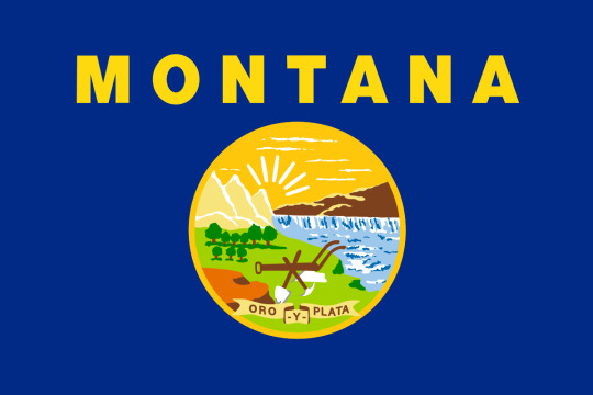
This is something a 5th grader whips up in PowerPoint for a class presentation. Helvetica Bold?? "Mandated by law in 1985" yeah I didn't need Wikipedia tell me this decision dates to the 80's.
But that is boring and subjective, right? You can't just say they suck. So you had to make a theory about it - and I won't go into too much detail but it generally boils down to:
Make it simple, "something a child could draw"
Make it "distinct at a distance", since it is a flag you are supposed to see it at a distance
Three colors or fewer
No words on flags
Which I think you can get the philosophy for. These principles, which CGP Grey outlines, actually come from the work of Ted Kaye, who is a big figure in the aforementioned flag reform movement and the focus of most of the video. As part of the original CGP Grey video I just rolled with that, but I did remember him showing Utah's newly designed flag at the end which embodied these principles, and uh:

This is kind of mid? Like it doesn't suck, but it looks like a corporate redesign of a hockey team logo or something. A bit of a red flag (hah) if your front-and-center case is weak.
Anyway this is what Premodernist digs into in the video. The stuff I agreed with the most are the parts where he just ???? at some of these rules. "No finicky bits", a "child must draw it", "distinct at a distance"? None of these actually track for say this one:

A child drawing the US flag does not draw 50 stars and 13 stripes unless they are a budding librarian; you absolutely cannot tell if this flag has 50 stars on it from a distance, and that level of detail is clearly some kind of finicky. Of course your response is "okay sure but still, I can tell what the flag is from a distance, I can't count the 50 stars but I get the gist". But that is true for almost all flags!

It's a fern and a peace pipe and a brown thing and the word "Oklahoma" below it, you absolutely, 100%, will be able to tell what this flag is at a distance. You don't need to count the leaves to get the general shape, and when you think about it, it is actually kind of silly anyone would claim otherwise. There just isn't any need to appreciate the tiny details on a flag to understand whose flag it is. (the only valid critique here is that everything should be bigger - too much dead space)
Not to mention the "see from a distance" thing even being a metric. That isn't how you encounter flags most often today? Maybe in the 19th century on a battlefield that was (and even then you had battle standards), but it isn't now. You see it in textbooks, on your computer screen, as an icon for a football game team, right next to you in a government office. Why privilege distance? You just made that up as a value. 99% of "flag consumption" is not seeing it at a distance.
The "only use ~3 colors thing" is the funniest, you can just argue this with...no? No you don't. You don't. What? No. You can...you can just use more colors? Here is an example from the "manual" Ted Kaye wrote on the subject:

And the 5 bands on the chinese flag are fine! They are not "hard to look at" or whatever. Also, I am screenshotting a tiny corner of a youtube video, this image is like 240p, and I can tell its a dragon - and that isn't even the color point it is trying to make, dude just deviates off into another critique. Meanwhile the Amsterdam flag looks like a traffic warning sign. Chinese flag needs to not have the white stripe connect into the white seal background, that is an error, but otherwise I prefer it.
It is annoying how many of the state flags are a blue banners with a round seal in the middle. That does make them hard to distinguish from each other. But that isn't a problem with seal-on-blue, that is just a collective action problem! Flag-reform-favourite the tricolor can run into this too - here are the flags of the Netherlands and Luxembourg:
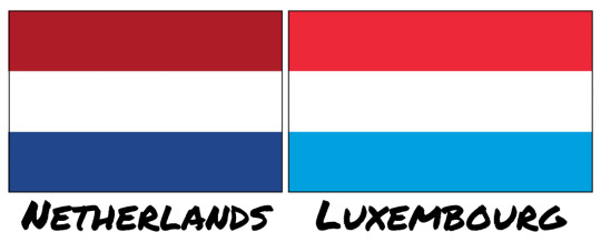
Like one of your needs to go home and change, that is ridiculous. Though if you had a complex seal in the middle that might avoid this problem! Funny that.
Even the "no words on a flag" argument, which I am more sympathetic to, doesn't hold up too well because too often you find yourself going "unless it is good" which just isn't a rule. The Iranian flag is the stand-out he mentions:

The middle crest is a stylized rendition of the name Allah, and the cursive lining on the tricolor bands are text as well - God Is Great, 22 times, marking the anniversary date of the Islamic Revolution. Stylistically beautiful, also words on a flag. The state flags just didn't try to do anything artistic.
I think the best point Premodernism mentions is a sort of stylistic unity Kaye & Co are pursuing above all else - everything sacrificed for corporate minimalism. Kaye's book will say it respects history and symbols should be meaningful, but then hates any symbols that require complexity. He singles out Turkmenistan as an ugly flag for example:

And as I said I only 50% disagree sometimes, I do think there is a complexity limit, and this flag goes over it, that is too detailed. Though the main reason this flag is bad is the weird choice to not put the banner at the edge, and have the crescent just...float off center? If it was this:

Two seconds in paint, already better, you can play with it. But anyway, you can say the symbols are too complex, but if you also say you care about historical meaning? Turkmenistan is a nation of traditional semi-nomadic tribes, who populated the Silk Road and made textiles as their ultimate expression of art. These carpet guls are traditional symbols used in those carpets that represent the five major tribes that compose the country. You can't just invent new symbols that have equal meaning to these, right? Like you can try if you want, sure, new symbols become meaningful all the time. But a rule that says "all art from before 1950 is tossed in the dumpster because it wouldn't pass muster as a Pepsi logo" is a weird rule to adopt if you say you value historical meaning. Turkmenistan does not have to look like France, and it is weird to want every national symbol to be aesthetically coherent to each other. Let 100 flags bloom! It is certainly "distinct at a distance" lol.
Anyway that is enough summarizing of a YouTube video - as I mentioned, he actually likes the state flags, I don't, I do think you have to balance a lot of this with just "general design principles". Never have your name on a flag in Helvetica Bold, amazing I had to write that one down for you. But a lot of these flag-specific rules derived from Kaye's work I often see bandied about are silly, and I was glad to see someone point that out.
466 notes
·
View notes
Text
Hello, it's Lelly.
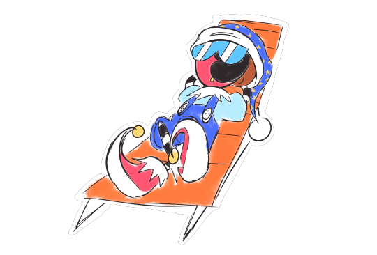
As you may know, I have recently deactivated my Twitter account. A lot of people are speculating I left because I was being harassed for drawing my older depiction of Bubbles from The Powerpuff Girls as chubby. However... that's not the direct reason I left. In fact, I didn't really see much of the comments of folks on there getting riled up about it as I muted the tweet the morning I saw that it blew up. I was only merely aware of it all by being told about it from friends, with there being some other users on the site making other really fuckin' stupid comments about my art.
This does however lead into why I actually left Twitter, and it's because of Twitter's overall toxic nature. Overtime, I've really gotten sick of how absolutely revolting Twitter has become to experience. The site is basically built around dunk culture and doom scrolling. You know that one tweet of someone making an example of Twitter's utter stupidity by using pancakes and waffles as an example?
I bring this up because I think this fits my point about how Twitter has this thing of assuming the absolute worst about the most insignificant things, even the most innocuous. The "Bubbles obesity" comments weren't the only stupid comments that came out of that post. I also got a quote retweet that I was "forcefully feminizing Buttercup", even though the whole fucking point of that drawing was to depict a usually tough character in an unusual situation for her. I have also gotten stupid comments on other drawings though, like the one where Mitch pushes Buttercup down for trying to look taller than she is and I got called a misogynist for it, though I'm pretty sure that one was bait (Twitter users have a tough time figuring out what is and isn't bait, it's dunk culture that I'm about to talk about really doesn't help this).
The site's dunk culture is also really fuckin' bad. Quote retweets are a disease, as unlike Tumblr's reblog comments, quote retweets count as a different post. Someone disagrees with you? Show your audience how stupid they are on your page! Hey, are you trying not to see the most abhorrent racist statement imaginable? Well TOO BAD FUCK YOU here's a le epic own giving them all the attention in the world even though one of the most common internet rules are DON'T FEED THE FUCKIN' TROLLS YOU IDIOT. Oh hey, are you trying to explain how you prefer a certain artistic choice over another in something you like? Well you're a deranged ungrateful whiny nitpicker, get owned!
I've seen so many of my friends be belittled for simply discussing their artistic preferences of things they're passionate about. I had a friend who said he prefers the original Crash Bandicoot design over his redesigned look in Crash 4, and had legitimate reasons for why he felt that way (even if he didn't really explain them clearly), and he got dunked for it which made me mad. I'm sick and tired of it all. The reaction to my art is only a mere example of the shit I despise about that site.
I had been planning on leaving Twitter for quite some time, as my follower count was growing nearer and nearer to 10K. I had planned on leaving after 10K followers because that amount was wayyyy too fuckin big for me to handle. I'm a young and growing lad, and I felt it wouldn't be good for my mental sanity to handle all that, so I dipped. The amount of attention I've been getting is simultaneously both wonderful and extremely overwhelming. Even the explosion of new followers and asks on here is quite the load! (Seriously, calm the fuck down y'all) I am very grateful for all the supportive asks I've gotten even though I won't be able to answer them all, thank you all so very much.
tl;dr I didn't leave Twitter because I was being harassed or anything, but rather because of the site's overall toxic and belittling environment.
Adios.
-Lelly
509 notes
·
View notes
Text
―⟡𝙬𝙝𝙚𝙣 𝙮𝙤𝙪'𝙧𝙚 𝙤𝙣 𝙮𝙤𝙪𝙧 𝙥𝙚𝙧𝙞𝙤𝙙

[Warnings: mentions of period cramps, F reader✰] [Word count: 322 || 𝓮𝓷𝓳𝓸𝔂.ᐟ]🍓
°ᡣ𐭩ft. chuuya, dazai, nikolai

sfw. hcs
ℂ𝕙𝕦𝕦𝕪𝕒
the best bf for this in every way
knows exactly when your period is about to start
keeps a calendar especially for your period cycle
treats u like royalty, carries u around, does all the chores, u don't have to lift a finger <33
buys everything you need beforehand, including the snacks you crave.ᐟ.ᐟ
showers you w/ so much gifts and attention
lets u sit on his lap while he's doing paperwork
gets kinda confused when you're super touchy and yell back at him for once lol
actually does a good job keeping his temper in check
10/10--extra cuddles reserved only for you? yes maam ✋
𝔻𝕒𝕫𝕒𝕚
this man lmao
does NOT know what to buy
^pathetically inexperienced, the first month yall started dating he panicked and asked if you're dying
called yosano over, in which she patiently explained to him a detailed description of the female body
goes to the stores and buys random things-
most of which doesn't even help, but gives you such a hopeful look you don't have the heart to complain
probably a little overbearing
breathes down your neck every few seconds to ask if you're okay, which u thought was sweet <3
7/10 at least he tries
ℕ𝕚𝕜𝕠𝕝𝕒𝕚
surprisingly attentive
this man's a great body pillow
takes it really well if u have mood swings and get cranky for a while
thinks it's the cutest thing ever when u have to rely on him
buys u a bunch of useless stuff like dazai, but also practical things like a heating pad for your cramps and snacks <3
i can totally see him asking fyodor for advice lmao
sticks to your side like a shadow for the entirety of your cycle, u can't get rid of him
likes to lay his head on ur lap until u doze off
9/10, who needs a heating pad when u have nikolai?

a/n: if this post gets over 300 notes, im doing a pt 2>>> i redesigned my page a few days ago, hope u guys like it.ᐟ as for the people who requested, I'm getting to you guys, this idea had just been in my head for a long time lmao :0
𝓽𝓱𝓪𝓷𝓴 𝔂𝓸𝓾.ᐟ ʚ🍓ɞ ʀᴇʙʟᴏɢs + ʟɪᴋᴇs ʜɪɢʜʟʏ ᴀᴘᴘʀᴇᴄɪᴀᴛᴇᴅ
o(≧▽≦)o
#bsd#chuuya x reader#bsd hcs#dazai x reader#bsd x reader#bsd headcanons#headcanons#nikolai x reader#bsd x female reader#bsd fluff#fluff#bungo stray dogs#bsd x y/n#dazai x you
322 notes
·
View notes
Note
🥂🍾, please do spill the 🍵

For me, this slide here is the most rage educing. Flames. Flames coming out of my head.
For those of you who don't know, I'm CFO of a not-for-profit (we're a community center). Our budget is about 1/3 of NaNoWriMo's. I went to a conference this weekend for other groups like mine, and EVERYONE was on fire. Lots of people in the process of shutting down. Lots of people making drastic cuts and dramatic changes. (It actually made me feel a lot better, because my organization, as much as it gives me ulcers, is not that bad off.) So the theme of the weekend was 1. you need to change, sometimes radically, and 2. you need to focus on good work in the community and addressing concerns that actually exist.
So, yes. Non-profits are struggling. As the economy fails, donors have less discretionary funds for giving. Federal grants are being ripped away. We are being targeted and threatened by Elon Musk. It is a nightmare hellscape.
That is not what happened to NaNoWriMo.
And them claiming my struggle and using it as an excuse is beyond insulting.
They lost donor giving because they were not keeping the community safe, they were not listening to the needs of the community, and they were consistently doubling down when we said that NaNoWriMo was harming us. When my discretionary funds are tight, why would I give it to a group that's harming me?
They poisoned their well with the community and lost donors and sponsorships, and some of the sponsorships they managed to get poisoned the well with the community even further.
Their funding drop off is their own fault, and them not taking responsibility is not just in bad taste, but it's also probably why they're so financially challenged! Scandals affect giving. Everyone in fundraising knows that. You have to fucking handle it or die, and they had no interest in handling it.
Secondly, if they're having these massive budget deficits, a severe drop in donor giving, and a severe drop in sponsorships, I notice that they did not do what the conference I went to suggested: change. Do you need a forum? Or could you save on some bandwidth, save the costs of some training (lol, like they were doing that), and remove your biggest liability all while in the process showing that you are in an active way responding to community safety? I do not know the ins and outs of their expenditures, but for a million dollars, I'm pretty sure they could have come up with a redesign of their organization that 1. encouraged people to write in November and 2. gave a way to keep track of your daily word count. I see no evidence that they even tried to downsize.
They did not drill down to "what does the community want and need?" and then provide the basics while they rebuilt, because (I think) they didn't care what the community wanted and needed.
The challenge of writing 50,000 words in a month did so much good for the community, so much good for so many people I know, and so much good for me personally. But the non-profit had no interest in meeting the needs of the community or any interest in keeping them safe. So I'm glad they went under. 🥂
97 notes
·
View notes
Text
Progress Checkup! (Apr. 2025) | Scratchin' Melodii Devlog
Hey there! I felt like it was time for another devlog, it's been a little longer than usual I think. I felt it was less of a priority since I'd just shown off a gameplay preview, so my deepest apologies to all 7 dedicated devlog readers...
First off, in case you missed it, Lucid Mode was shown off in a recent gameplay preview of Stir & Mix!
During stages, freestyling well enough on two consecutive lines will allow you to ascend into Lucid Mode, a state where there are no charts or suggestions to follow, just your own freestyles! Successfully completing the stage in Lucid will give you a special ending scene and an emblem on your rank as lasting proof of your success.
To answer a few questions about it I've seen floating around:
Q: Does this mean the other parts of the song are gone? A: No, going Lucid is something that only happens if you manage to activate it yourself. Otherwise, the song continues as normal.
Q: Can it be disabled? A: Yep, if you're like really good at freestyling but still don't wanna ascend into Lucid, there will be a toggle in the Options menu to enable/disable the ability for it to activate.
Q: Can this happen in every stage? A: Probably! That's the plan, unless I find a rare reason it wouldn't work well for one.
In the preview, you can also see that Stir & Mix itself has been updated a bit in the vocal and artwork departments! Compared to the 2023 beta version's vocals, 2cada tuned them with a bit more stylization this time. In terms of artwork, the animations were redone in my current art style, as another step towards a consistent art style by release. In the process, I was able to make the animations much more fluid and expressive!

Little fun fact about that, Jamtine's hair actually used to cover up more of her eyes/eyebrows as if they were bangs of some sort, but I eventually moved it out the way so I could have more freedom with her expressions, which I found important for a character like her. An inverse of that philosophy would be Nami, who has her sunglasses and bangs cover up her eyes/eyebrows to give her a more mysterious feel. It's hard to tell what's going on in Nami's head! (If anything at all!)
Now, let's talk about the gameplay and UI again. Here's a little quickfire of some changes I've made:
The Next Line Tab has a "NEXT" text sign above it and will stay at the end of the Player's line to help with clarity
The background bar of each line now adjusts to the line's length to also help with visual clarity
When points are gained or deducted, it now briefly flashes over the score counter instead of having a separate bubble
Holding the button on pow notes instead of tapping them will accumulate extra points until you either release it or reach the max amount. The more buttons you manage to hold at once, the more points you'll get!
Landing notes on the later end of a beat marker without being off-beat can count as swing rhythm, adding extra points.
To account for the new score system and its balancing, you won't need the Perfect Bonus to be eligible for an S-rank anymore
Overall, I'd say the new rhythm/scoring system is much more consistent, balanced, forgiving, and accurate to the game's inspirations compared to how it was in the beta demos.

As for future stuff I'm working on, I've been animating the Boss battle for Act 2. Not much I can really say about it atm, but the song's going for an electro-funk style. Pretty happy with how it's been turning out so far!

I've also been redesigning the stage select screen to be easier to navigate and easier for me add more stages and acts to it. This one's able to just pull the needed information from each song/act and arrange it all accordingly instead of me having to manually do it each time I add something. It's still very much a work in progress, but it's functional! I haven't gotten to drawing McWave's new icons yet... (Don't look too deep into the number of acts here btw, it just stops at 3 because that's as far as I've indexed it at the moment!)

I've also started working on a redesign for the results screen. Since the new scoring doesn't have equal spaces between the rank requirements, I decided to replace the linear rank meter with a more dial-like one that goes through a cycle per each rank threshold you pass. Along with it, I'll have to finally make new results screen animations for Melodii at some point. Not sure yet if the pose Melodii's doing in this concept sketch will be what I end up using, but I definitely will be letting them aura farm more.
To save the most boring for last, optimization. For the notes in stages, I've started using a method called "Object Pooling". (Which I actually hadn't heard of until recently.) Basically, note objects get recycled now when possible instead of created/destroyed, which helps reduce memory usage. For materials, I've managed to up performance by using Texture Arrays and a pretty convoluted shader trick where I put the vertices of UV layers at specific coordinates, which are then decoded to be used as material info. (e.g. color, spec, emission) That way, more meshes can share materials while looking different instead of loading in separate ones. Not really sure how common this is, as I couldn't find much info on it, but it seems to be working pretty well so far! I was also able to cut performance costs in some areas by taking a screenshot of a background model and having the game render a flat image instead of the entire model. This works pretty well for shots where large background models are far away or when the camera angle stays static.
That's all for now! As always, thanks for reading.
-LJ
67 notes
·
View notes
Text

Say, does it actually count as a redesign if I'm not really finished with the design and just wanted to figure out the color palette my version of him would use?
#hellaverse#hazbin hotel#lucifer morningstar#hellaverse fanart#hellaverse au#hellaverse art#hazbin hotel fanart#hazbin hotel au#hazbin art#hazbin lucifer#hazbin au#hazbin hotel redesign#my art#digital art#artwork#art#artists on tumblr#my draws#digital drawing#drawing#hand drawn#tumblr draw#digital illustration#illustration#illustrators on tumblr#small artist#arlie.png
72 notes
·
View notes
Text
Count Duckula Fan Rewrite!!
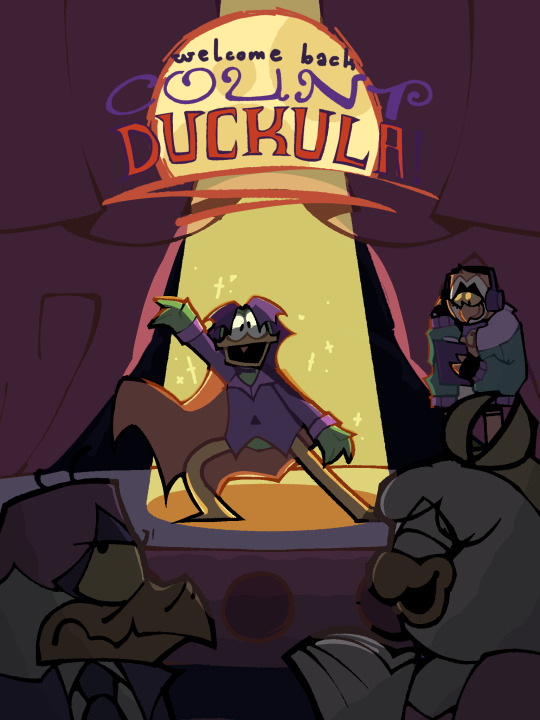
Recently I’ve been working on a Count Duckula rewrite that aims to give it a slightly more serious tone and semi-serialized story like many modern cartoons! It took some time, but I made redesigns of the main cast. I had fun making this project and I REALLY hope you do too! Because I’m extremely nervous that the small fan base Count Duckula does have will hate this
I haven’t actually finished the show btw so if there’s an antagonist or smth that shows up later I should’ve redesigned.. lmk! I’m open to suggestions I really like this show..
—————————————————
Basic Concept
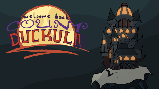
Practically the same as the original show! There is a long line of reincarnations of a wicked vampire duck named Count Duckula, the most recent reincarnation went wrong and now the current Count is a vegetarian and much more interested in becoming famous than being evil.
Some major differences include the tone and story structure, being semi-serialized and having more serious arcs mixed in with the antics, along with a lot of changes in characterization. A big story change is also that Nanny was not hired until AFTER Duckula was reincarnated so Igor was the one who screwed up the ritual.
Tone wise I’d also like to slightly age up the target audience so it could get away with a bit more dark humour. My favourite part of the original show was moments that were just so morbid and completely brushed past. 13+ would be fine methinks.
Basic plot of the average episode would be about the count’s hyperfixation of the week and trying to get famous or profit from it. Not every episode would follow this structure though.
The grander themes of the series would be all about expectations from family and strangers and how those expectations can be completely false.
—————————————————
Characters
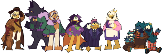
^^ Final lineup! ^^
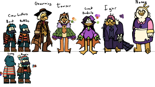
Sketches (less interesting poses but shows off some things better)
Count Duckula!
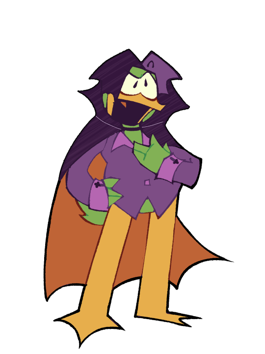
What I wanted to change
I feel like Duckula from the original spin-off was already a really strong character! There is a lot to him and really all I would want from a more emotional reboot is to dive into what’s already there. I did kinda project on him a bit in this rewrite though… gotta write what’cha know!
I also changed his design quite a bit. I never thought the suit fit his personality and I wanted to go with something a little more bright. If I go back again I might saturate his shirt a bit more. I also wanted all the residents of castle Duckula to have purple in their designs and for duckula and Towser to share similar colour’s inversed
Character Traits
Hatred of his legacy
Duckula is the first member of his lineage to not be an evil vampire and he hates that role that is expected of him. This is partially what drives him to be the nicest duck he can be, in hopes of shaking off his legacy. This also causes him to reject anything that's “spooky” or has to do with vampires. He physically can't eat meat or blood due to his botched resurrection, but even the sight of either distresses him.
Attention Drive
Due to his infamy, all Duckula wants is to be liked by the general public. Everyone in his town is automatically scared of him and he tries really hard to change their opinions on him whether that be through attempting to bea good samaritan or by performing in town. (Both tend to end poorly for him)
ADHD and Theatre Kid Behaviour
Duckula is constantly picking up and putting down new forms of art and performance. This can be anything from oil painting to American football. He does tend to get frustrated or distracted and abandon projects or crafts entirely. His favourite artform is acting and music so as you can imagine he's very into musicals. His musical talents are decent but his acting is awful. He’s also known to loud and overly excited over his interests
Ego and Cowardice
Being given a position of power the day you came into existence does have the tendency to make you… immature to say the least. When in danger, if he even realises there is any, Duckula’s first move is to use his title as leverage. If that doesn't work, his second is to beg, grovel, and lie his way out of the situation. That, or hide behind his much more intimidating companions.
Rich Kid Syndrome
Having the majority of people you know be your house staff really messes with your sense of responsibility. Duckula can hardly do many basic life skills on his own because of this. It's not like he is completely lazy but he does have executive dysfunction and has yet to realise that fact, causing him to procrastinate on many things and completely forget or just get someone else to do it.
Not Naturally kind
Being his father’s reincarnation, it only makes sense that Duckula would inherit many traits from his past lives. Many of the other Counts were ego-driven cowards with desires for fame. They just went about it differently. Duckula actively tries to be kind and polite but a lot of passive aggression and snark slips through the cracks of that veneer. He would never want to admit that he has ANYTHING in common with his ancestors and he hates that being nice doesn't just come naturally to him. Being an immortal, Duckula also has a skewed sense of mortality and often doesn't understand the severity of certain injuries and situations.
This Duckula has ADHD and Autism in this rewrite and he struggles most with executive dysfunction, restricted interests, memory issues, atypical empathy (not specifically low or high), sensory issues (mostly with eating and some sound), and social cues. He also stims.
Towser!
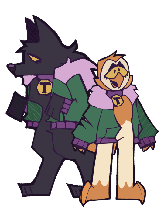
What I Wanted to Change
Towser isn’t even really a character in the original. Just a running gag without a face. I wanted to balance out the main cast by adding another female character since I have feelings on Nanny as a character and i didn’t know if i would even be able to salvage that.
I really like what I came up with! She’s fun to me and I’ll probably flesh her out more later.
Character Traits
Family drive
Towser has little interest in birds that aren't close to her and it usually takes awhile for her to get used to new people. However, she’ll protect those that she does care about with her life. She is the castle’s guard dog and will do whatever’s necessary to protect it. This often comes at the cost of her sleep, because she feels like she always needs to be awake to protect them.
Tag Along
Following Duckula around like a puppy is what Towser does best! She might not fully understand his enthusiasm on certain subjects, but she's always up to backing him up on his newest fame seeking endeavours (though she herself prefers physical activity over creative works). She never expects anything to come of it, but hey, at least it's something to do. She also likes to hear Duckula rant to her about his interests.
Big Sister
Towser is of a much more stable mental state than Duckula, and as his only friend around his age, he trusts her more to be someone to talk to about his identity issues and issues in general. The two are a lot warmer towards each other than they are anyone else, and can also get away with messing with the other a lot more.
Big ol Lap dog
When in werewolf form, Towser tends to forget her size and often crushes them with her size. This usually wouldn't be a problem if it weren't for the fact that she's always a lot more cuddly and energetic in wolf form than bird form. This is because, as a werewolf, she's only in wolf form at night and being a fully nocturnal bird that should only be awake at night, this messes with her sleep rhythm a lot.
Igor!

What I wanted to Change
Personality wise Igor is already really strong and I didn’t change much of that. You’ll probably notice from the sketches that Igor has a skeleton hand, that’s because I made him undead in this version just to give a reason to how he’s been able to live this long since the original doesn’t really have one (which is fine)
Character Traits
Devotion to the role
Igor has been the Count’s butler since the first incarnation. He was assigned to keep the Duckula legacy alive by reincarnating his master every time he meets his fate and helping him readjust every time. Helping each new reincarnation bring misery and fear to the town they reside by with a smile… Until the most recent incarnation of course. He’ll stick it out though, because he still has hope for him.
Taste for the macabre
Whether it be killing innocents behind the back of his new master, decorating the castle with cobwebs and bones, or using his undead nature to scare and torture those around him, Igor certainly has an interesting idea of fun. Igor gets a sick enjoyment out of causing others distress and despises all things kind and cute, something which definitely frustrates Duckula, who's desperately trying to fix his own image.
Bitter Traditionalist
Having lived through the centuries in castle Duckula, Igor has gained an appreciation for the history of the place and the vampire ducks that have resided there over the years. He’s rather invested in the lives of his previous masters and is extremely cross with the newest incarnation for not only not caring about that past, but also completely disowning it. Igor tries desperately to get Duckula to be a normal vampire, truly believing it could work with enough effort. Less he spend the next few centuries with a vegetarian for a master… Igor would not have a problem with Duckula pursuing fame if it weren't for the fact that he thinks it's distracting him from true vampirism.
Tired old man
Igor has lived for many centuries and he does not feel as if he should have to babysit for an immature man child like Duckula. He would rather ignore or snark the young count rather than actually talk to him. When the two argue its a constant back and forth of passive aggression and personal jobs that they almost always forget what they're actually arguing over. Duckula is physically and mentally very young (17-early 20s) compared to Igor’s other masters due to the botched revival and he doesn't know how to, or want to, deal with it.
Nanny!
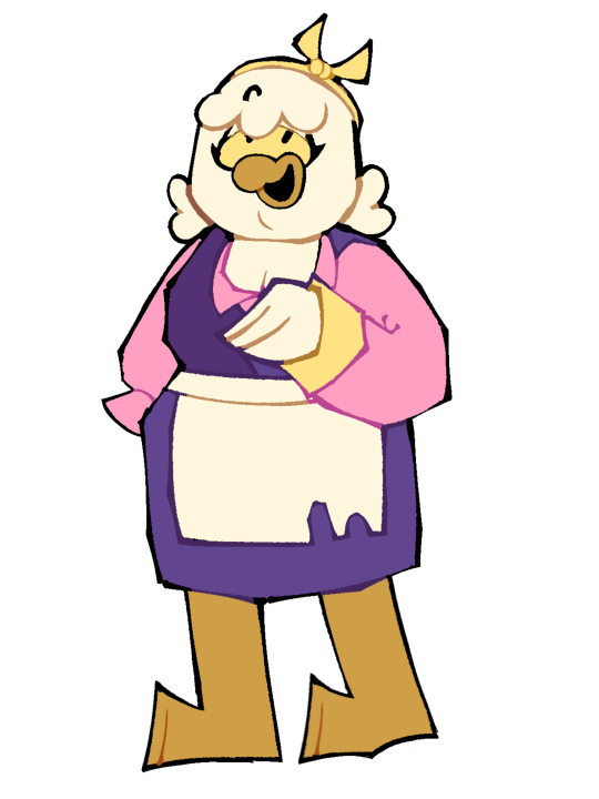
What I Wanted to Change
I’m sorry to any hardcore Nanny fans out there but this is practically a whole new character. I find Nanny to be frustrating and annoying in the original and who I personally feel is a very sexist and mean spirited character. There’s absolutely nothing I would want to write with a character who’s just “big stupid fat woman inconveniences everyone around her” it’s just uncomfortable after a certain point.
My idea for a new take was just an extremely kind older woman who’s a little airheaded but is a lot smarter than people give her credit for. This sets her up as a foil to Igor. She’s also the only non-monster resident of the castle in this version which I personally think is really interesting.
Character Traits
Only good influence
While Igor actively sets out to make Duckula a bad person and Towser couldn't care less about how Duckula acts, Nanny is the only direct influence in Duckula’s life who pushes him to do better. Nanny believes Duckula is a good person at heart and pushes him to take more responsibility in his life. She wants him to learn a good work ethic and is fully supportive of him trying to better himself.
Good Christian Woman
Nanny is, in fact, a christian. She is fully aware of the demonic nature of her companions but believes that everyone can better themselves no matter their circumstances and attempts to better those around her. Igor hates her for it but she’s totally ignorant to that fact.
Assertive Mother Figure
Though Nanny is a very kind woman, she is also not a pushover. She will assert authority over Duckula and anyone else if necessary, and most are compliant once she puts her foot down, if they aren't, however, Nanny does pack a punch and won't hesitate to use her strength to protect her family.
Smarter than she seems
Nanny is an airheaded optimist with a big heart and those traits make her come off a lot more clueless than she actually is. She may seem like she has no idea what’s going on but she’s actually very observant and is fantastic at assessing a situation and finding the best course of action.
Dr. Von Goosewing
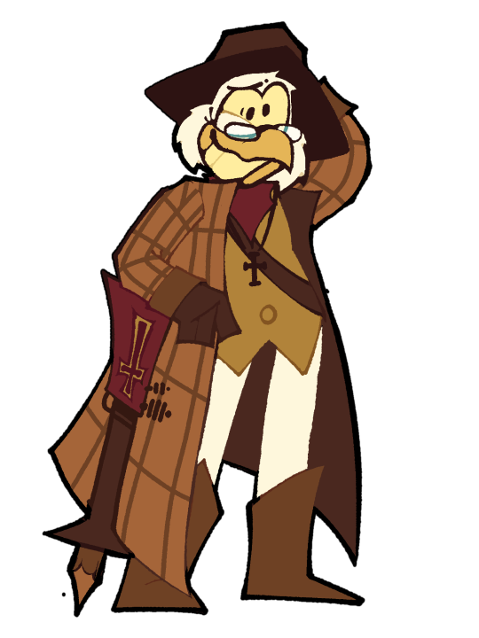
What I Wanted to Change
I really liked the idea of the antagonist to Duckula was in a liniage of vampire slayers and that their ancestors have been fighting for generations. It gave me the perfect set up for a ✨SHADOW ANTAGONIST✨ I wanted to make this rewrite have the two reflect each other a lot more. To do that I wanted Goosewing to still be a really cooky guy but I didn’t want the public to know that.
Also I have no idea why he’s dressed like Sherlock Holmes in the original if he’s a Van Helsing parody and also an inventor. You could’ve leaned into either of those ideas but for some reason he’s dressed like a detective? so I tried giving him a more fitting outfit but keeping his colours for recognisablity.
Character Traits
Playing Village hero
Goosewing is considered a big deal in town because of his family of vampire hunters. He’s prepared his whole life to kill Count Duckula the moment he comes back and to protect the common folk from the paranormal. Despite this, Goosewing isn't actually particularly skilled at his job and usually ends up failing his assassinations due to his own incompetence. He feels like he has to play the role as a hero to continue his family’s legacy despite not particularly enjoying it or being good at it.
Overestimating the enemy
With how cunning and malevolent the past Duckula incarnations were, Goosewing expects the same from this one. Goosewing believes that Duckula is a dangerous and clever foe completely focused on causing others pain. In reality, Duckula is the most incompetent bird in all of Transylvania, aside fromGoosewing himself, of course. Goosewing also comes to believe that Duckula is only acting nice to later betray the public, a belief he is not quiet about and that keeps the public from trusting Duckula.
Mad Scientist
Goosewing definitely falls into the eccentric scientist trope with his innovative but scatterbrained nature. He would much rather be working on an invention than actually doing his job. The public sees him as a hero but while hunting vampires or when hes alone he comes off as more of a mad scientist than the hero character he plays. His intentions are ultimately good but are completely based on the assumption that he’s the wholly good protector of the people and that Duckula is a cunning villain who's out to get him and everyone else.
Shadow
Goosewing and Duckula reflect each other in a lot of ways. They both have a legacy they are expected to uphold despite not wanting to or even being able to, they both care deeply about the public’s opinion on them while the public has an incredibly incorrect view of the both of them, and they both have creative interests outside of the roles expected of them that they'd rather be persuing. Duckula fully rejects anything to do with his ancestry, while Goosewing is actively trying to fulfil despite not enjoying it.
The Murder Brothers!
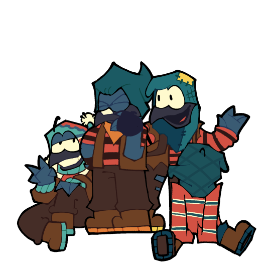
What I Wanted to Change
Haha I called them the murder brothers bc they’re crows and criminals Im actually so funny… anyway. I don’t know if I should’ve even done these guys but I really like them as antagonists so!!
I gave the younger two names and a personality. The wiki said they didn’t have names but if they do lmk and I’ll just fix that. Other than that I didn’t change much except try to give ‘em a bit more depth and changing their physical designs a ton for fun.
Character Traits
The Murder Brothers, as a whole, are a tight knit family of con men crows who pull any grift they can to get their hands on some cash. Though they may act like their only loyalty in life is to money, they do genuinely care about each other's well being
Ruffles
Ruffles is the short tempered and eldest leader of the group. He’s constantly frustrated with his brothers’ incompetence and isn't quiet about it. He believes that if it weren't for them he'd probably be a lot further in life by now (which isn't true) and he’ll say he doesn't care about them, but he actually does.
Burt
If he didn't insist on helping his brothers, Burt would be the most likely to be living an honest life. As the second oldest sibling, Burt holds a position as right hand man. He’s a naturally kind and enthusiastic bird who, while a bit dumb, does openly express his love for his brothers. He takes on a lot of the abuse from his older brother and is often used by the group to talk to others, because he's so naturally trustworthy.
Reggie
Reggie is the second youngest of the brothers and the most relaxed out of all of them. He has an impeccable sleight of hand and is the go to for lockpicking and such. He’s a decent smooth talker and is often the one to break up fights, though he's not above getting angry at the others himself.
Leroy
Leroy is the youngest of the brothers and by far the least skilled. His speech is incomprehensible from under his mask (although he can see through it for the most part) and he’s often left with the worst jobs during their cons because of that. He’s the most timid out of all of them but I’m sure if you took that mask off of him he’d be really talkative.
—————————————————
Ending Words
Well that’s all I got! I spent way too long on this project that maybe two people will care about and one of them is me 💔 Anyway if I make anything else for this rewrite/au I’ll tag it with #wbcd . I wouldn’t count on it because I mighttt get burn out from this but im just so glad I finished it! I’ve thought about writing a pilot script just for fun but idk. I’d like to do more long format au stuff, I was going to make a YouTube video about this but I almost cried trying to record myself so I gave up 💔
#digital art#art#drawing#count duckula#duckula#wbcd#I wrote this while bingeing Steven universe btw#on the finale as i type this out#I say this bc of the. similarities#as soon as I put together the peices that duckula considers his past incarnations his ancestors I was like.. this is just su with vampires#Im really scared that everyone will think this is dumb 💔#I’m really insucure about my writing compared to my art
118 notes
·
View notes
Text
BNHA Girl's Redesigns
(pt.1)


Renamed more in the second batch than the first batch (apparently I only liked the original Uravity & Froppy, does Alien Queen count tho?)
Design commentary below the cut
Mina Ashido (Alien Queen)
I don't know how to explain the differences I chose bc it's a pretty similar aesthetic to her canon design. Though, definitely wanted her hair to be white & her horns the same pink as her skin. I wanted to push her suit in the more space/alien direction bc I have a small grudge against midnight for vetoing the name. I made her suit pattern and eyes compliment each other a bit more w blue & green. I kept the fur cuz it's cute and a bit gaudi which is in her taste & lastly I made her acid more colorful so it's not....yk semen white.
Tooru Hagakure (Oversight)
For Hagakure, I wanted to lean into the stealth thing a bit with a ninja motif; and if Mirio can have a suit with the properties of his quirk from studying his hair, so can she. I also wanted every bit of her design to be so pale she's nearly translucent when visible (she would be able to voluntarily change her visibility, but still prefers to be invisible.) Her hair is also short and a bit of a mess since she is unburdened by her appearance +with an iridescent sheen. I made her eyes a pale purple because extremely albino people with very little melanin in their eyes have purple iris's due to blue pigment mixing with red vines. Lots of small nitpicky details with her lol
Kyouka Jirou (Pulse)
With Jirou, I wanted her bangs to cover her face and (it didn't come across well in the final) her sideburn pieces to be longer than the rest of her bob which is already longer than canon with an undercut. She also needed more of a proper hero costume imo, so she's got that leather/spandex bodysuit with a volume emblem; the stripes on her sleeves would also vaguely resemble the bare of a volume key. I actually went through a few renditions to figure her out but I'm really glad for that; I didn't illustrate it here, but I think it would be cool if she had some iron hammers to plug into that she would slam into the ground or into her enemies & amplify the sound. Small difference, I moved the speakers from her boots up to her knees for closer access.
Base designs & body types:

Also here is a Jirou design that I took all the way to flats before I decided I hated it. Glad I took the opportunity to redo it, she looks much better now


151 notes
·
View notes
Text

My Blood Meridian self insert redesign and info
You can tell I did this very fast I just wanted to give people the idea of how my self insert looks like I was too lazy to do more than that
I have some info about him, I don't know if I can tell much about him because he's connected to my friend's self insert so to understand the majority of his story you need to have the context of her self insert too💔💔 so I'll just tell you guys the basic info
His name is Ricardo but he's referred to as "the hangman" or "the hanger", because that's pretty much what he does, he hangs people and he's probably the most aggressive guy in the gang (judge holden does not count), if Glanton thinks that a victim should suffer a lot more than they deserve he immediately sends them to the hanger, not just to be hanged but also to be brutally tortured before that. (Not In every way possible hold on💔💔 he's not the incarnation of judge holden)
I don't know how to explain his personality but he has the typical Brad Pitt character personality, he's quite the womanizer (even tho he's ugly as fuck but for some reason he thinks he's the hottest guy alive), every time, like EVERYTIME the gang goes to a bar they have to supervise him to see if he doesn't hook up ten prostitutes at the same damn time and then wait one billion hours for him to finish with the girls 💔💔 his testicles DO NOT work correctly btw. (Fun fact: He has Aids)
He has lots of problems with alcohol, he already fainted multiple times because of that, his body is slowly being rotten by the alcohol and he doesn't acknowledge that, he's so alcoholic that in the few times he actually bathes is with whiskey instead of ACTUAL WATER
He's 19, yea he doesn't look 19 but everyone in that gang is young as fuck and they all look 80 years old
He is quite muscular but his belly full of beer doesn't let anyone take him seriously
He's half portuguese and half american (the Portuguese part of his nationality is actually the only thing that I have in common with him, I need to stop making self inserts that aren't actually my self inserts) , his parents were very rich portuguese bourgeois so because of that he killed his parents to get all their money, he eventually got caught when he was 10 years old but he escaped from prison and then he started being known as "the hanger" because he stole one of the ropes from the prisons and since then he started using that rope on the majority of the murderers he commits.
Oh yea and he lost all his parents money when he got caught because he's dumb like a damn ant
There he is I hope you guys hated him
#blood meridian#art#artwork#fanart#cormac mccarthy#oc#oc art tag#oc art dump#oc artwork#oc artist#oc art#self insert
23 notes
·
View notes