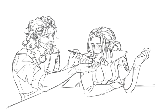
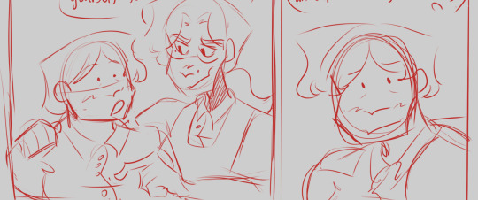
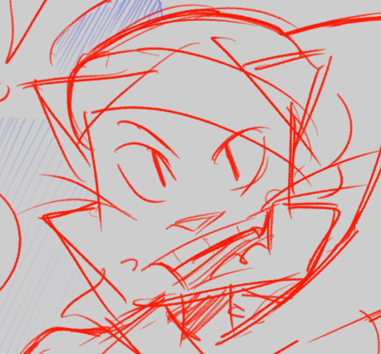
#did manage to make a sketch and then lineart
Text
Day 4 but its late sorry
had do do a screenshot redraw today.


#hetalia#aph prussia#aph austria#it's late because yesterday was första torsdagen i mars#i ate too much cake and feelt horrible for several hours#did manage to make a sketch and then lineart#but i finished it today#bajsduva
15 notes
·
View notes
Text
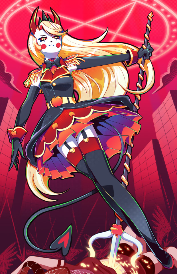
Holy SHIT am I proud of this. It took a day and a HALF to work on it. I really just wanted to draw a cool badass picture of Charlie in a cute dress, and somehow I ended up with my best piece I think I've ever done!!
To see the process, click the 'read more' below!
Otherwise:
Main blog over here
My Etsy Shop!
Originally, I wanted it to look more like a royal portrait, a good excuse to draw a pretty dress.
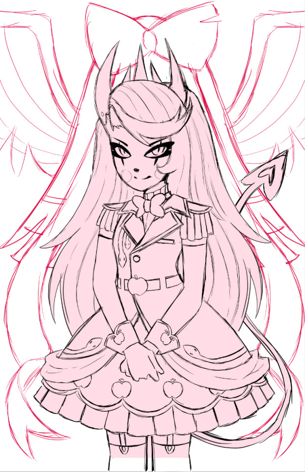
I adored the dress design, but it was an extremely flat image, so despite taking like. 5 hours to design it and work on it, I rethought my plan, switching to a far more dynamic pose.
I also made sure to add tons of flow lines, both from her hair, to her tail, to help bring the eye all around the canvas.
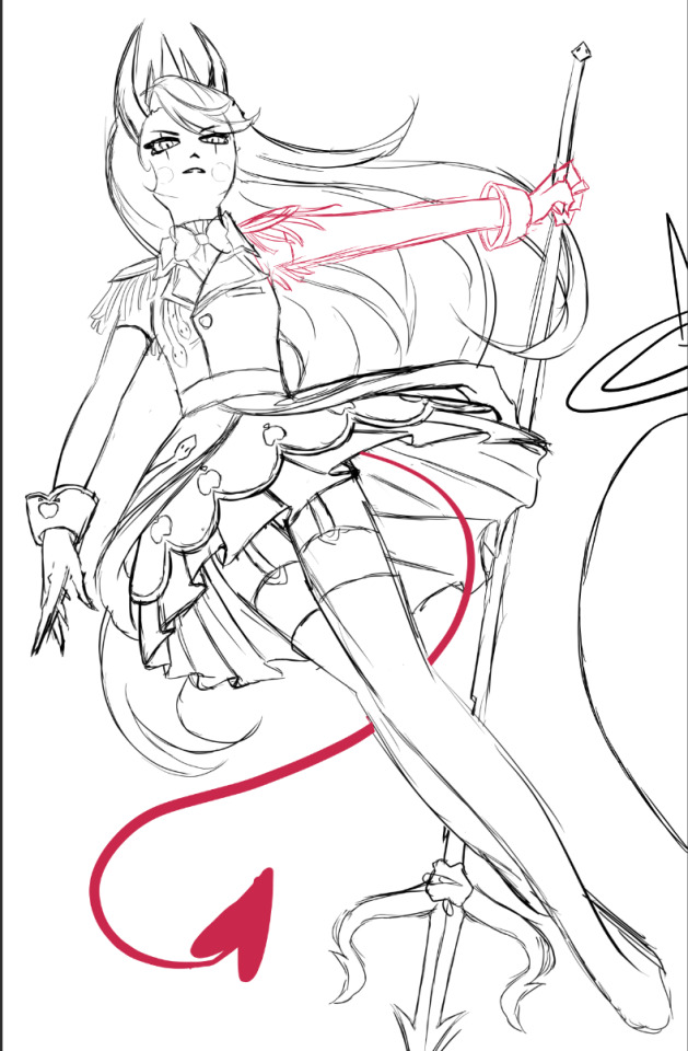
I did a billion sketches, but this is what I ended up on! Originally I had her right arm holding the pitch fork behind her back, but it just never looked right. I also took a risk and did a facial angle that has always been extremely hard to get right, and somehow I managed to make it look nice!
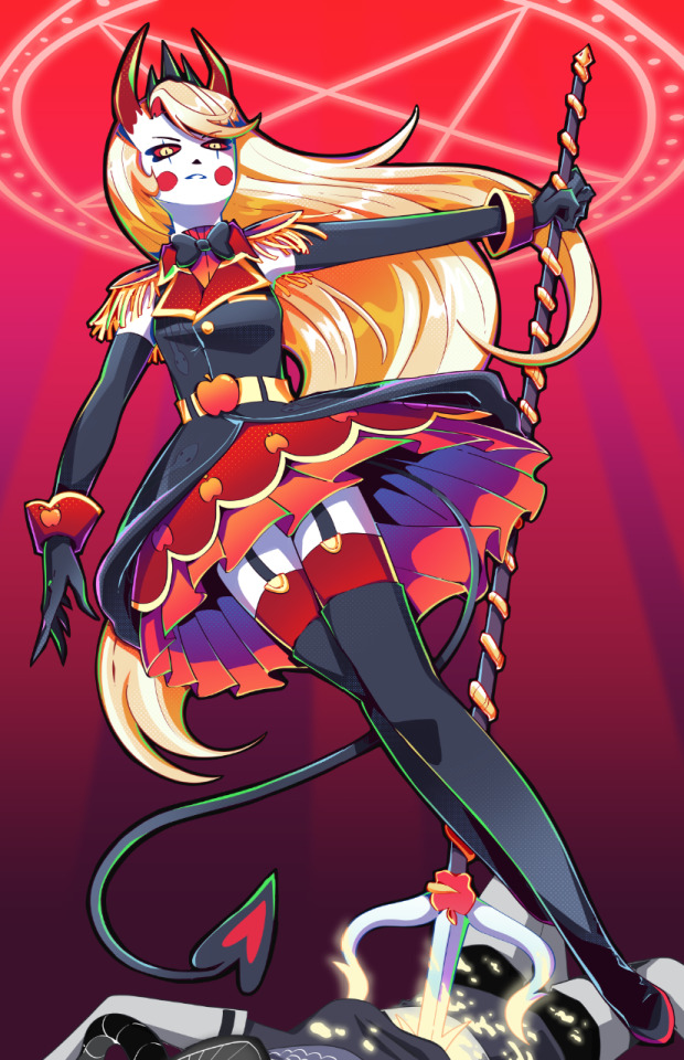
After adding the lineart, colors and all of that, I knew quickly I didn't want the angel to stick out as much as she did. I wanted her to fall into the background instead, since she was just on the border and I didn't want any attention really taken from Charlie. So I changed her shade to red, and from there I added more of the background details!
Okay I did leave some inbetween screenshots out but it's past my bedtime. I hope this was fun to look at, at least!
Final product once more!
#charlie morningstar#artists on tumblr#hazbin hotel#hazbin hotel fanart#hazbin hotel season 1#hazbin#vivziepop#cqart
1K notes
·
View notes
Text
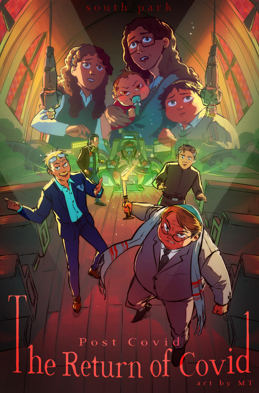
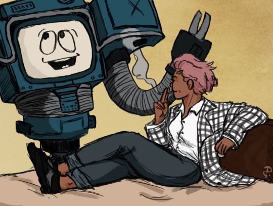
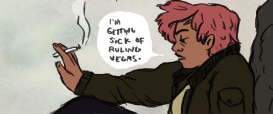
THE RETURN OF COVID
Horror/thriller movie style!! I don't think I could find enough words to express how much I love doing those posters............
For this one, I felt like the cast of "antagonists" of the movie would make for a pretty awesome composition and mood, and paired with the church setting I think I got something pretty interesting, haha.
More below!
As it happens, a fandom friend asked if I could maybe some day record my process, and therefore I did! (and went the extra mile adding goofy horror songs to it...) Check it out if you're interested :)
youtube
I've detailed it in the YT vid description as well, but my process is rather straightforward. I tend to be a "lazy person" in that I like to, ideally, spend the least time possible on anything, and so far this process is how I've best achieved that while still managing some rather complex pieces.
I like to be extremely rough with my sketches and prioritize dynamism and composition, and I usually take my time repositioning the characters until I'm satisfied before I go any further. I don't have the best mental visualization so I usually try to have a very rough idea of what I want before I directly jump to sketching and mostly ideate there.
The lineart is very straightforward as well. I come back later to adjust line thickness here and there but otherwise I just "trust my brush". The fake fisheye perspective is entirely wrong and made up so I needed some custom perspective lines to know roughly how to position the background elements.
I do come back with composition guides after I'm done with the lineart, just to check how the illustration is doing. I prefer not to use them at first because it tends to "constrain" me a bit too much, and I like to remain very free as to maintain a feeling of spontaneity, which is why I will only fix the composition afterwards (when I do).
Coloring is then fairly streamlined, with background colors/atmosphere guiding the overall color scheme followed by character coloring and additional details. The most fun part comes with the post-processing, where I go wild with additional fog and light shaft layers to add depth to the entire thing. I use a bunch of additional tone curve layers to adjust the colors and make it more uniform, as well as one blurred, flattened copy of the illustration with strengthened contrasts, in overlay mode, to add some vibrance, and a noise layer for texture.
That's it! Thanks for watching, for those interested :))
#south park#sp post covid#eric cartman#butters stotch#yentl cartman#scott malkinson#clyde donovan#sp kevin stoley#tweek tweak#craig tucker#moisha cartman#menorah cartman#hackelm cartman#Youtube
509 notes
·
View notes
Text

I wanted to try to finish it before my birthday, and I did it!
The main first idea was to express that feeling when you get messages from people dear to you. How you can be happy to see it, how it warms up your heart and even can make you smile - in ideal case, I wanted to achieve this effect, so I needed proper face expression, and the overall atmosphere was supposed to be a combination of cute, happy & cozy.
So at this point I decided to draw Nene in her room checking her phone. And it must have been something simple enough, because I had only five days
And I got this

But, when everything was already more or less ready for lineart, I decided to go to the Nene's gallery on Wiki for some ideas about colors for her clothes, and then I suddenly remembered that she actually has a LOT of cool official outfits, and I always wanted to draw at least some of them

So I just felt that it would be shame to draw something this simple, while I could draw something really ✨beautiful✨. Of course, I'd need to change the background, because home background won't fit any fancy outfit anymore, but anyway I didn't manage to express needed emotion on Nene's face either (…it's hard to show it for her type of personality, who wouldn't have a ":D" face), so I didn't care about it either ¯_(ツ)_/¯ So I basically exchanged simple outfit with more or less detailed background to fancy clothes with very simple background
Still, I'm happy that I finally could try to draw something with Nene again. Funny enough, but before checking wiki I didn't even know about this outfit at all! After all, it isn't in the game, it was an outfit for some event I think?.. But it instantly stole my heart thanks to its colors and concert-like style 💙 In result, it wasn't even hard to choose which one I'll use. Meanwhile, if I'd like to draw her in one of other outfits someday again, then it'll be an interesting task: I really have no idea, they all are so pretty. Besides, I think I know where I can use something simple and casual like one in this first sketch too. Anyway, I wanna draw something creepy/gloomy for Halloween, and in that case I'll get an opposite situation: I'll feel bad to use any of fancy outfit for such a theme, so why not
90 notes
·
View notes
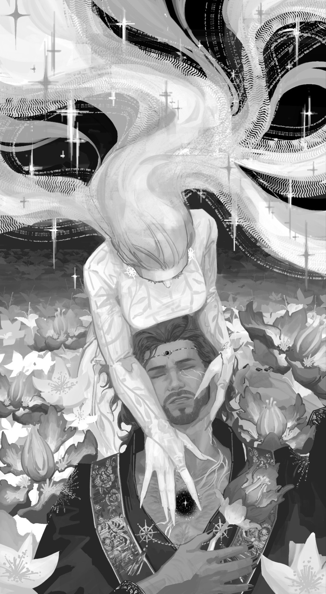
Text
PRESS RELEASE: Aziraphale & T. Crowley, the End of the Road?
Following the incident that happened today at the AOTY [Athlete of the year, ed.] award red carpet, GOMENS representatives have issued a warning to both Toni Crowley and Aziraphale. They have been informed that the brand will not tolerate this kind of public behaviour in the future. No more comments will be issued on the subject.
GOMENS press release, February 2023.

I would like to publicly apologise for my behaviour at the AOTY awards, and assure you that my relationship with Aziraphale is nothing less than friendly. It is a great honour to work with him as representative at GOMENS and I hope our work continues to allow the brand to grow bigger in order to help young athletes to develop.
Toni Crowley on GOMENS.com, February 2023.

I would like to apologise for my behaviour at the Athlete Of The Year Awards. Please be certain that I have nothing but respect and admiration for Toni Crowley and will gladly keep working with them to make GOMENS a better, more inclusive brand.
Aziraphale, on GOMENS.com, February 2023.


Drive Me To The Moon, ch. 7
"Country Roads", on AO3!
↓Full Artwork, details, gossips and news about my health under the cut↓

All my Good Omens art
Ko-Fi - Prints - LinkTree
Started at 11AM, finished at 7PM. Holy sh!t, I did it!!!!! *dead*


As said earlier today in this post, I decided to try to colour/render an ancient WIP for the new DMTTM chapter... and yesssssssss I managed! The surgeon was right!!!

Of course it would be too difficult to draw a new sketch/lineart with this bloody orthesis, I can't be precise enough. But it's been almost 3 weeks since the surgery, and I was missing drawing so much! Lol I have never been so happy doing full-colouring (my archenemy teehee)
I'll see how I feel tomorrow (I'm scared about back pain and shoulder pain, I'm always so stiff with this orthesis), but if everything is ok tomorrow, that would mean I can try to colour old linearts and WIPs, and I can't wait to pick up one of them and work on it! (And maybe I'll do a poll so you all would be able to choose which one I'll colour!!)

See ya! Love you all!
Taglist (ask if you want to be in or out!)
@goodomensafterdark ;
@floscrap-blog ; @demonsandpieohmy ; @amagnificentobsession ; @captainblou
@ineffable-hyperfixation ; @quoththemaiden ; @paperclipninja ; @silverdphantom ; @neverlet
@fearandhatred ; @eybefioro ; @crowleys-bentley-and-plants ; @ashfae ; @malohkeh-main ;
@mad-aims ; @daisydimple20092 ; @seraphhiim ;
#MISSION ACCOMPLISHED!!!!!!#good omens#crowley#aziraphale#ineffable husbands#aziracrow#my art#michael sheen#david tennant#ineffable lovers#elenthyaandgoodomens#DMTTM#captainblou#Elenthya#illustration#medibang
81 notes
·
View notes
Note
How long do you typically spend on a drawing?
Of the ones you've posted, which took the longest? Which was the quickest?
It really depends on what I'm drawing and how "finished" I do them

For example these kind of skectches don't really take me much time to do (specially when the poses are very simple), I can do a bunch of these in a few minutes no problem, then there are the ones when I add grayscale or colors that take a little longer

Then there is this kind of drawing that are finished with lineart, colors and shadows but each of them took me a different amount of time
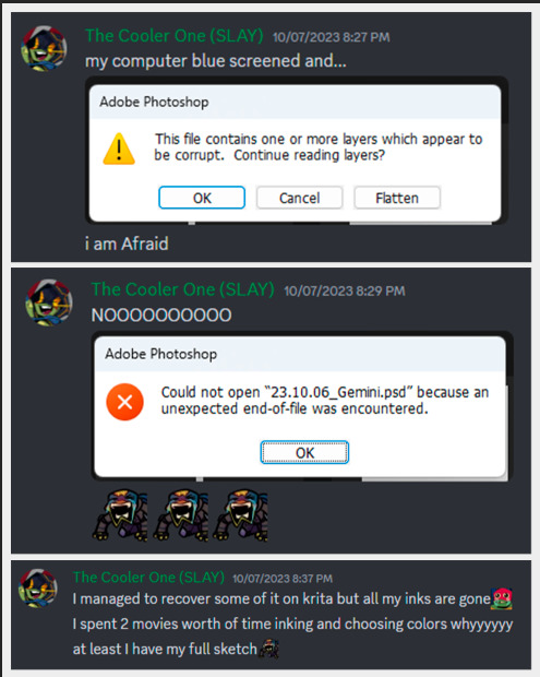
The Gemini one took me hours to make (how many I dont really remember) I spent a lot of time on the sketch mostly because I was trying to figure out how Leo's arm worked, then spend around 3hrs doing lineart and chossing the base colors, and I had to do it twice because...
reasons...
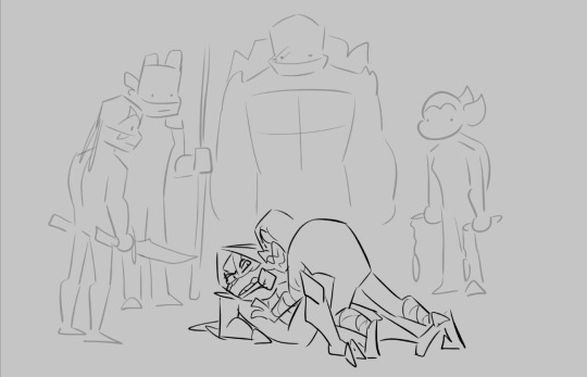
The bottom left with Coin Toss Michael, took me less, even when it was a challenging pose I managed to figure that out quick enough, the most time consuming part were the chains because I hand drew them. I don't remember how long it took me to do but I did it in one or two sittings, probably took me aorund 5 hours to make (and maybe thats too much, might have been less)
And the bottom right was a fast one too, probably managged to do it in under 3 hours (I think the hardest part was to match proportions with Trainee that is cropped out)
And then there is things like this, I actually have the proccess recorded (minus the sketching and planning) and can tell you that it took me around 15 hours to make these two pages (I might one day edit that and make a speed draw)

But again, it really depends on what I'm drawing because this commission (that aparently I haven't posted yet) that I also have some of the proccess recorded, it took me around 2:30 hours to do inks, colors and shading
Most of the time I dont really time myself, when I know more exact times are when I record my screen for future speed draw videos (that I always forget to edit) or because I was watching something in the background so I know it took me X amount of movies or episodes or youtube videos so... ¯\_(ツ)_/¯
Oh! there is also this lil animation I did that took me 4 hours, I only know that because it says so in my tags
#hmmmm i should edit those videos#i have more that i thought saved#might do it for my patreon soon#anyways hope you enjoyed the info dump#dg rambles#dg asks#dg art
173 notes
·
View notes
Note
Sorry to come out of nowhere but I just wanted to say that your art is so warm and so colorful and so ROUND in all the best ways and your style really captures my favorite things about Kirby! I've always found it really inspirational!
Also, I love the way your line art looks?! I have to ask (you don't have to answer though) is there a specific brush or technique you use to get that soft, multi-layered effect?
Either way, wishing you a wonderful day!
Thank you so much for your nice message, it means a lot!!
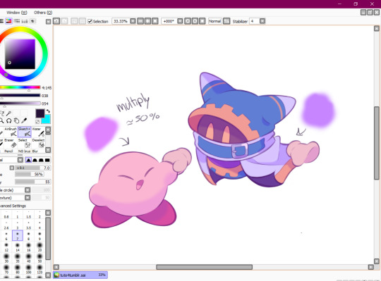
I've been wanting to make a small tutorial about how I make my Kirby art, so I guess your question came right on time hehe ^^
As I'll be explaining all of my process, I'll also answer your question about my line art! Btw my art program is Paint Tool SAI and I'll also be showing the brushes I use as well as their settings (i made up most of them a long time tho).
So first here's the brush that I use for basically anything, whether sketch or lineart!
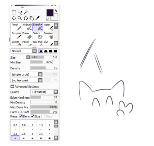
It took me a while to understand what you meant by multi-layered effect, but no the brush doesn't do that, that's actually my way of doing "lineart" (ig it's not really lineart cus I just do sketches that I clean later on).
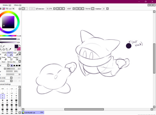
I then clean up everything, add the details and block by using a grey color.
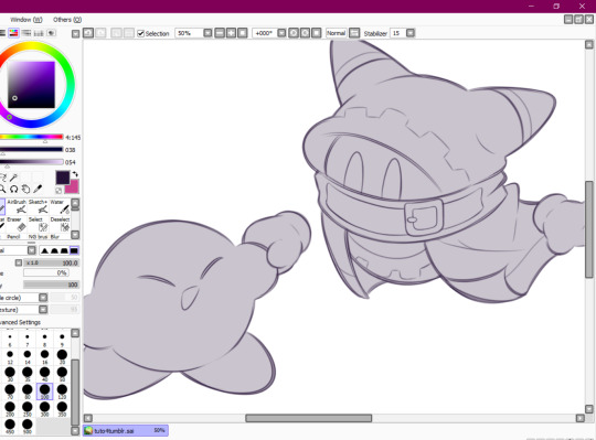
Afterwards I add the flat colors! I already have my own made up color palette, but otherwise I always use a purple color as overlay.
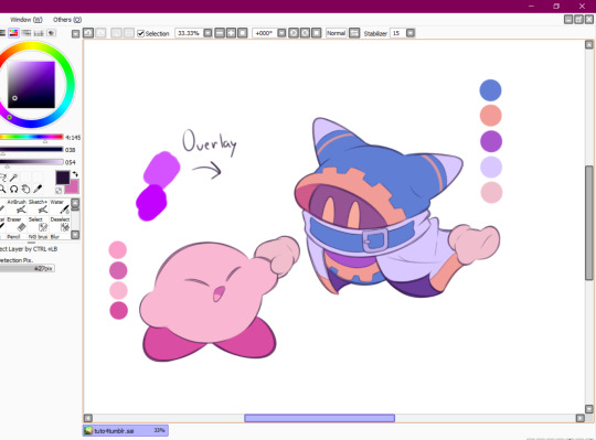
And I also use that same shade to color the lineart!

Next comes the fun part, shading! Here's THE brush that gives that soft effect to all of my drawings ^^ It's the same setting as my eraser too!
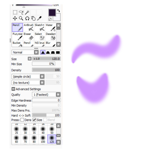
And yeah I also shade with light purple lol
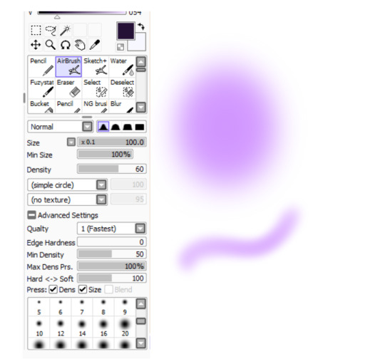
There's also some other brushes that I use for more effects, like the airbrush! (I don't think I've touched the settings that much) I mostly use this one for lighting effects.
And finally the water brush! I sometimes use it for blending or for quick backgrounds,
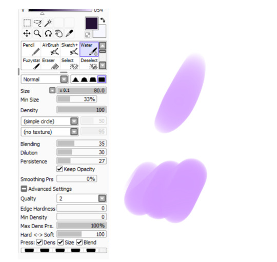
but you can also see that when put it to "Spread" it also becomes the one that I use for my blushes hehe
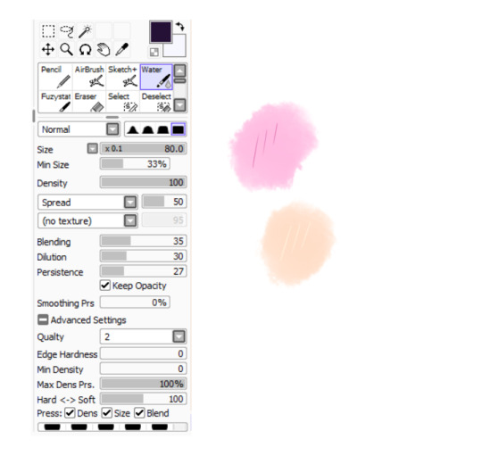
Aaand I believe that's all of the brushes I use for my art! I do have more, but I only use those for other specific stuff like animation or pixel art.
Adding some details AND VOILÀ!!

Now you know how I make my Kirby art! (but this also applies for all of my art) I sometimes redraw on the contours to give that "pop up effect" a bit like what they did in rtdldx lol ^^
I really hope it was easy for everyone to understand cus this is my first time making a tutorial! And to Desultory Novice, I hope I managed to answer your question too!!
Thanks again and have a great day :D
248 notes
·
View notes
Text
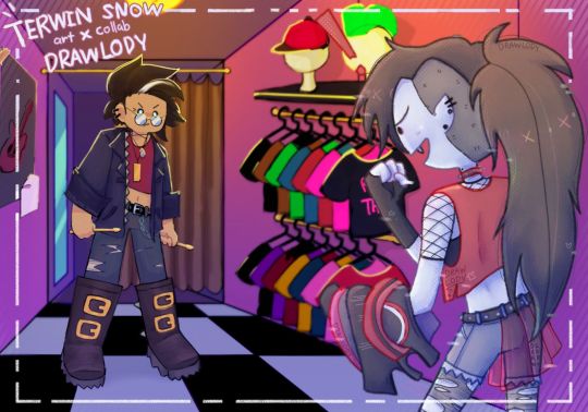
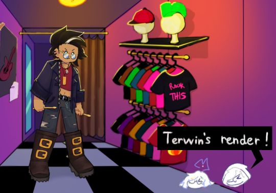
🔔: Hi hiiiii here an art collab with my fren (@°▽°@)
❄️: Two awesome ppl collaborating yaa!1!!
.
🔔= me lol // drawlody188 (insta acc)
❄️= @terwinsn0w // terwin_snow


.
🔔:I saw this thing going around where u draw a sketch than switch it with someone and wanna try it out :D
❄️: im that lucky someone y'all! This was very fun, n chalenging since I myself barely draw backgrounds in my artworks lol
🔔: ya draw Marcy so well lol, looking like the show itself:000 glad I got to render your sketch since my full render haven't look this good in a while
❄️: HEHSHDHAHE THHAKYOUU SM, U DID SO WELL WITH THE RENDERING- IT LOOKED SO PRETTYY, I also RLLY LOVE how you make Simon looked so BBG WITH THAT OUTFIT CHOICE, figuring out your sketch n drawing them lineart with your style was rlly fun aswell (I adore ur artstyle sm dhsjdjwjjei)
🔔:hehehe glad u can see through my messy-ass sketch and make it work ya(≧▽≦). We have some issues with lighting n the 2 don't look like they in the same room but I think we manage. Probably. Hopefully¯\_(ツ)_/
❄️: shhhh- idk wht r u talking abt- they are TOTALLY in the same room...

#adventure time#simon petrikov#marceline abadeer#marceline the vampire queen#fionna and cake#adventure time fanart#art collab#digital art#artists on tumblr#adventure time fionna and cake#ya know we spent an hour choosing a song for this#tumblr dont have a feature to like add music so ya know#the song is bring me to life#ya know#the wake me up inside song#neither of us listen to much punk n rock#n the one we did r pretty heavy#as in lyrics n stuff#so yeah#rock on bb
140 notes
·
View notes
Text
holy shit this year marks 10 years of this blog and moz!! i can't remember the exact date i started posting here - my archive says i have one post from november 2013 but let's disregard that - but i do remember it was around late 2014/early 2015 :)
^ one of the very first moz art pieces i ever drew, for fallout week 2015!!
memories and art through the years under a read more bc it got long
2014 → baby's first rpg!! i started playing fnv on my cousin's jailbroken xbox late 2013 and finished mid 2014 and i loved every minute of it. i remember waking up at 8am and playing almost nonstop until 2am the next day haha!
i didn't play moz on my first playthrough - but i did start creating a character that would eventually become her: a shorthaired ex-boxer who punched her way through obstacles when diplomacy failed. i remember she spent a lot of time with boone. i liked him then, because he saved my ass more times than i can count. but i digress. this is draft 1 moz essentially
2015 → this is the year that i was doing my thesis so i could graduate but i was so depressed and stressed about it that i distracted myself by replaying fnv on pc, where i played through the dlcs for the first time. i fell in love with the dlcs' oversarching story; particularly ulysses, who i became obssessed with, especially since i couldn't find any content of him at the time. in the game, i played as moz; i had most of her personality and choices down, but her backstory was still up in the air.
fun fact: this was an existing sideblog that i remade to be a fallout blog so i could look for ulysses content, and when i couldn't find any, i made some myself, featuring moz as my main courier six. originally, i didn't ship them, but eventually i ended the year as a courier/ulysses otp shipper.
this was the year i started drawing digitally - my uncle let me borrow a drawing tablet and i used an old copy of photoshop i pirated hehe
2016 → i graduated this year!! and promptly fell deeper into my depression. this was the year that it got so bad that i had to be medicated. through it all, this blog and moz and ulysses and my fandom friends were with me. and for that i am truly grateful :) this was the year i figured out how to lock transparent pixels so that i could color my lineart lol
2017 → i started hammering out moz's backstory this year i think. there's a lot of sketches of her and her family in my files. i experimented with shading and backgrounds here but that experimentation was pretty short-lived
2018 → i started using references seriously!!!! i did a lot of oc on oc kissing this year, featuring mostly moz and many friend ocs haha

2019 → didn't draw much this year. actually this year was a blur and i can't remember much from it except from it being the year of my terrible no good bad copywriting jobs... anyway i did manage to continue my courier/ulysses brainrot and make this piece, which i'm still proud of
2020 → pandemic time. i spent a lot of time asleep at home and i think this was also the year i started doing commissions?? shoutout to anyone who has ever commissioned me - thank you so much, i truly appreciate it!!

2021 → i switched from my old-ass pirated photoshop to clip studio paint and never looked back. also i did a bunch of commissions for my grandmother's surgery, which failed, and i distracted myself from the sadness by drawing my ocs over and over and playing disco elysium

2022 → by this year, i've got moz down pat and have started vaguely developing other ocs instead. but she's still always at the back of my mind

2023 → i bought new brushes from true grit texture supply and immediately found new favorites that i started using for everything. i tentatively started incorporating background elements in some pieces!
2024 → while it's still too early to say where this year will lead me art-wise, i will say that i started experimenting in realistic paint studio (which i bought in 2021, the same time as clip studio paint) a few days ago and i'm liking the results so far. we'll see!

all in all, these last 10 years have been quite a ride, but i'm glad i stuck around and i'm glad you guys stuck around too!! much much love 💖💖💖
#shh peri shhh#god. look at that old art... i took the ones that i still kinda liked but the rest...#well i don't hate them. but they're old and of their time and i wish i could redo them lmao#my art#moz
84 notes
·
View notes
Text

mermaid boat boys, ft a boat
my gift for @theslyvoid9 for @mcytblrholidayexchange
ramblings, process and doodles under the cut
this was sosososos fun to do. i got the prompt and was immediately SO exited and motivated. however i had a large art piece to finish for school so didn’t manage to start properly for a good few weeks. however i DID do initial doodle ideas and composition plans, mostly during class, that are pictured below
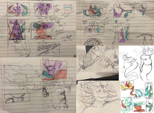
by the time i could start in earnest, i’d lost quite a bit of motivation and was struggling a LOT with the sketch and proper proportions, so i didn’t start properly until a week or so before the deadline. oops, sorry this is so late.

this was my first quick colour draft, i was originally going to do the effect with squiggly lines that light creates under water but every time i tried it it just looked terrible so i didn’t. i also changed the positions of etho and joel.


the sketches. i struggled wayyyy to much. i think i spent like 4 hours trying to get it right. BUT i did in the end!
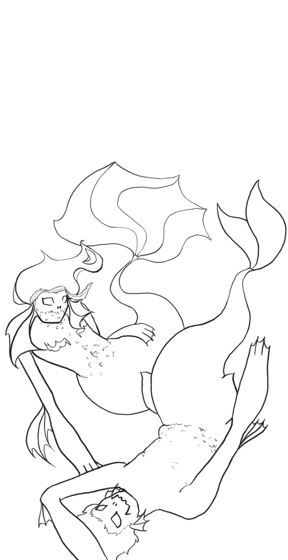


lineart, flats and detailing. i lost etho’s lil floaty side fins here due to my scatterbran and i mourn for them but not enough to draw another set of fins. the detailing took sooooo long and i don’t really like the boat, but don’t have the motivation nor time to change it. i also imagined some kelp winding around them to make the background more interesting but never got around to it in the end. during the detailing i spent 3 hours drawing on a laptop with the mousepad and it was the worst 3 hours of my life. never again. etho’s fins were inspired by those beta fish with the pretty fins. i love them but they were beyond horrible to draw.
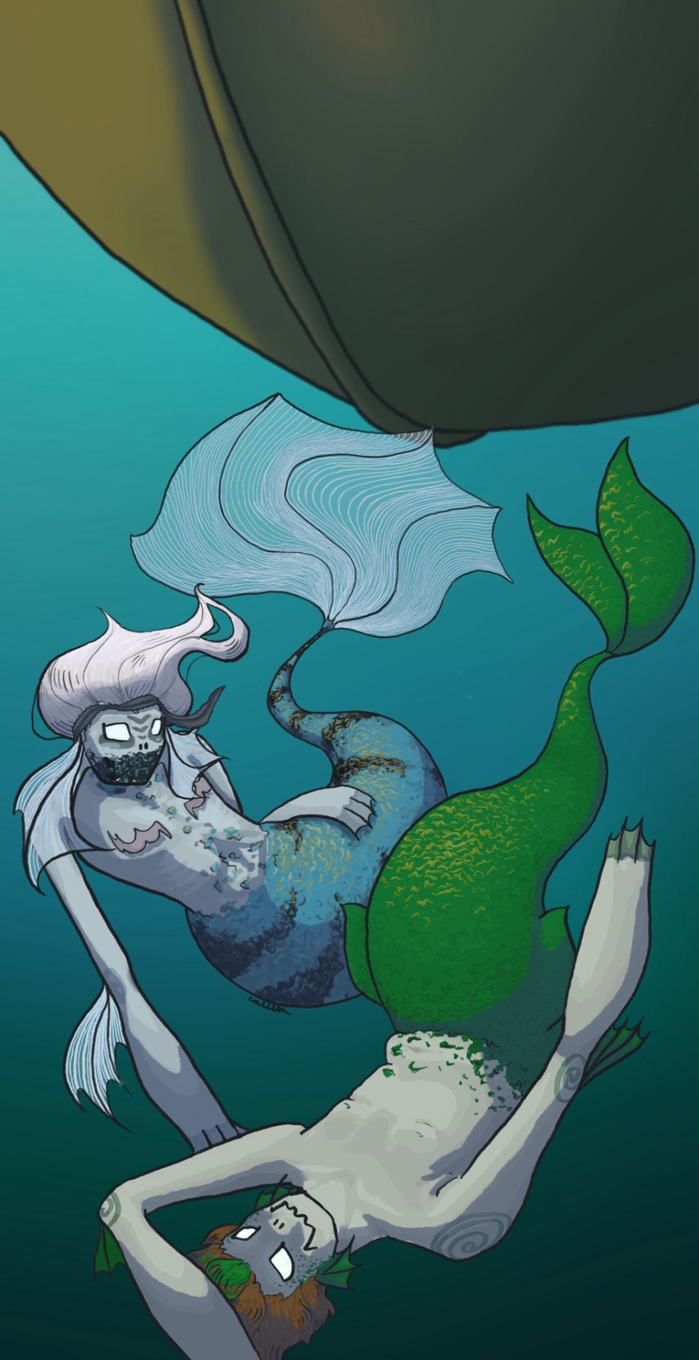

shading and lighting. i played around with the opacity of the light streaming through the water but i can’t attach any more images so whelp. yippeeee it’s done. it took be 23 hours in the end and i’m proud of it!!! my giftee also suggested some cannibalism stuff and i REALLY love that idea but didn’t know how to portray it without being graphic so i didn’t go for it. HOWEVER i really want to do an autocanibalism dl pearl piece in the future so yayyy. theslyvoid if you want me to tag you in that if i do it lmk since it was one of your requests :)
#cal original#cal doodles#ITS DONEEEEEEEEEEE#boat boys#boat boys fanart#ethoslab#etho fanart#smallishbeans#smallishbeans fanart#trafficblr#double life#double life fanart#life series#traffic series#mcytblr
124 notes
·
View notes
Note
Hi!! Love your artwork and your Charlastor AU with Dawn!!
I was wondering if you think Alastor would make any dawn-themed dad jokes and puns in your AU, and if he does, what would Dawn and Charlie think of them? I can’t really think of any off the top of my head right now, but I know ‘a brand new dawn’ is a phrase he could maybe use!
Again, love your art!!! If you don’t mind answering questions about it, do you have any advice for artists who want to improve their drawing or any practices that have helped you develop your skills? And are there any particular artists that really inspire you?
You’re one of my favorite artists and I don’t know how to explain it but your drawings have so much life in them!! 🌟
sdlksdflkj thank you so much omg!!!
I'm so glad you're enjoying them ;W;
And he would be insufferable with them lmfaoo, especially because I'm sure Charlie would hop in on a few of them and add to the pile as well xD
One more I can think of rn is "Oh, I was wondering where the sun went!" whenever Dawn enters a room, because the implied punchline is "but then it Dawned on me" or something? XD idk I'm not good with puns sadly
Now regarding the art advice!! This one got HELLA long so I'll hide it under a cut for everyone's comfort lmao
I know it sounds shallow and like worthless advice, but a huge huuuuge part of getting better at art is to just... make art! Practice makes perfect - it develops your motor skills, gives you somewhat of a muscle memory for certain basic shapes that are a necessity to have a good feel of for good foundation sketching.
Practice also develops your eye for compositing and for how color theory actually applies in practice, it basically helps you develop a more consistent grasp on art as a whole :D
There are some things I've learned over time that definitely helped speed things up though xD
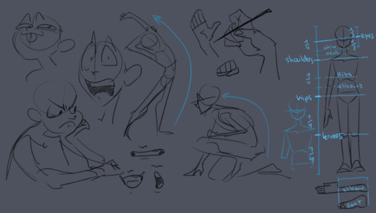
here's some rough sketches I did just to demonstrate what my rougher drawings can look like - also a little diagram (on the right side of the image) of things I keep in mind for the average proportions of a human body!
I tend to sketch very loosely and try to capture the overall vibe and silhouette/rough shapes first before I even think about adding details - there's a certain flow, squish and stretch to everything that's just much easier for me to get a good feel for when I use quick, loose brush strokes and as few lines as possible to convey a concept.
Repeatedly sketching humanoid characters of various shapes, builds and sizes for years genuinely helped enormously in getting not only faster but also more consistent with it!
I'm fairly well practiced with hands and expressions especially at this point since I like to focus on those in my art often, so those come fairly easily to me as well now!
Something I learned along the way about keeping a certain liveliness to my artworks is that sometimes you have to forego anatomical correctness a bit if you want to fully express specific emotions - if you try too hard to keep everything perfectly proportional and realistic, it can make the outcome look stiffer than you might've aimed for - this is something I actually struggle with in my cleaner artworks :'D The ones I do proper lineart for, since a lot of the flow of the original sketch gets lost in the process haha
As for artists/artstyles that inspire me...
There's @/southpauz for example!

Her artstyle is unbelievably expressive and her eye for compositing and her use of shapes is SUBLIME - it inspired me to let loose more with my expressions, exaggerate features a bit more and to push the way I try to vary facial features :D
Then, back when I had that massive Rise of the TMNT phase, the artstyle of it has actually greatly influenced how I draw today!
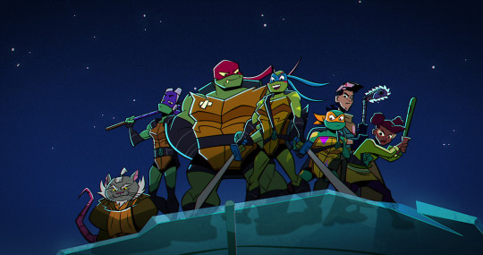
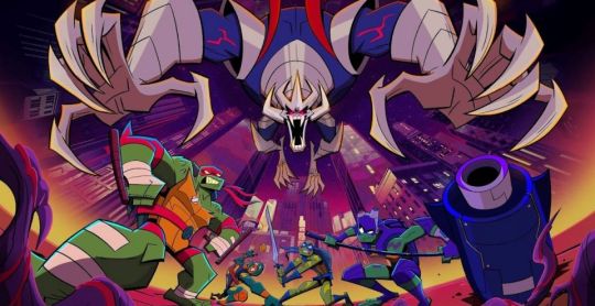
It manages to be detailed and highly recognizable despite its deceivingly simple style - it exaggerates shapes and uses it to communicate personalities, emotions and action super effectively and taught me a lot about utilizing those more efficiently myself :D
And last but not least Ishida Sui - the mangaka behind Tokyo Ghoul (which used to be a highschool obsession of mine)
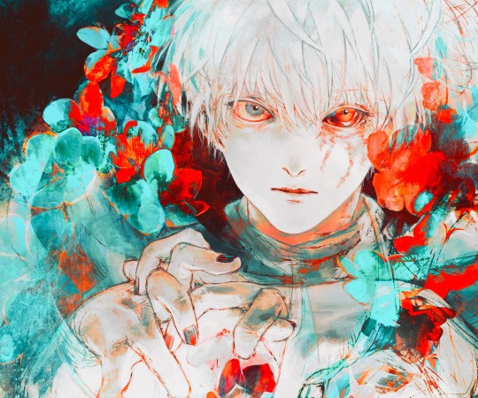
His striking use of colors, textures in abstract, yet symbolically heavy ways and his courage to be rough and expressive rather than looking polished, yet also having such a solid understanding of realism blew me the fuck away as a teen and still does now!!!
His art may have less of an influence on my style today than it used to back then, but I think in my more exagerrated, more horror-esque drawings you can kind of see it still :'D Either way I greatly admire him as both a writer and artist.
-----
I'm genuinely so so flattered that you enjoy what I do enough to give me such high praise, thank you so much for writing me such a wonderful ask <3 I'm glad I got to gush about some of my favorite artists/artstyles for a bit haha
If you have any more specific (digital) art related questions don't hesitate to reach out!! I love giving pointers about a subject I'm so passionate about, we don't gatekeep helpful information in this house!!! <3<3<3
46 notes
·
View notes
Text
FORGOTTEN LAND'S SECOND ANNIVERSARY :3
I AM SOOOO BACK
I started this drawing yesterday around afternoon and finished it just a few minutes earlier.
I went with a messier type of drawing instead of more clean like the elfilin one from yesterday, i find it fun doing it like this, mostly cause i dont have to worry about making it perfectly so i dont get as frustrated as normal. Id place this one as my second best digital drawing. im pretty sure i havent posted what i consider my best digital drawing here, tho i do have it in instagram, i might post it here one day, tho these two are way too tied up, i love how this came out, its not exactly like how i imagined it but its really close to it, and also itd say that since i dont tend to play around lighting that much, this was such a joy to draw and i cant help but stare at it a lot, at least until i start hating it because i made quite a lot of errors. i also changed my elfilis gijinka just a tad bit from last time, but its not that big of a difference, mostly.
ofc i had to draw elfilis for forgotten land's anniversary, i tend to deny it in my head but yeah they're my fave of the kirby characters even tho i hate them a bit. I wanted to draw some more doodles, like, elfilis eating cake, kirby car, a bunch of other stuff (not elfilin cuz i already drew him yesterday) but when i tried i couldnt draw anything more, guess this drawing burned me out a lot, huh?
you can definitly tell i spent all the efforts on him cuz if you look a bit closer to the bottom part you'll see its almost barely detailed, but i mean, they're the focus so make sense i guess for me not add that much detail there. um also, maybe because i dunno i had OVER 130 LAYERS jeez no wonder firealpaca was slowing down so much, i need to manage my layers better next time, tho i did do something i keep forgetting, wich is naming them (most of them at least) that was a real life saver
Also, antares (fecto elfilis' spear/cadaceus), as always, was a pain to draw, but this time its probably been draw the most accurate out of every other drawing ive made with it in it, i didnt notice it was like, a little curved when it reached the blade
some close ups since his face is a bit hard to see
silly :3
fun fact! actually, this is technically a redraw, somewhere around between february and march i started a fecto elfilis drawing for the first anniversary, but i couldnt finish it in time, and i never finished it
thats...quite the improvement! (i remember being so proud of it)
also his wings are like that cuz i did not want to draw the pattern, its way too hard, i literally copy pasted it, wait, i was talking about the 2024 version but i looked at the 2023 one and i just noticed it also has the pattern copy pasted, i guess some stuff never changes since i still abuse the ctrl+c ctrl+v to this day
Also i ended up making a huge error there, i was planing to add the phantom spears from orbital pulsar (the attack he does first when you battle them at lab discovera) but theres an innacuracy, when they do the attack, they always close their eyes, i had actually sketched him (well i mean both these drawings are basically the first sketch (2023) or second sketch(2024) with some color, shadows and lighting. i didnt do lineart in the 2024 one cuz i wanted to be a bit like the og i made (too bad i sketched that one with black since the og was sketched with white due to me drawing the bg first)) with his eyes closed but them decided to make them open for a reason i cant remember, maybe i thought itd look nicer? idk
ive had the idea of redrawing this for quite some month now so it was kinda already planned
background cuz i think it came out really pretty
doesnt have the little stars since without elfilis and the structures it looks fucked up. the actual sky in game is more blue, but the clouds have some orange, in the 2023 ver. i made the sky orange, and in the 2024 ver i wanted it more accurate, but i didnt wanna loose the orange sky, so i did a gradient. pretty...
also here's a screenshot i took when i was like halfway trough it, its barely noticeable but i changed his mouth in the final drawing
I really love katfl, like a buncha whole lot, its basically almost my first mainline kirby game. 100% the demo, finished the game in almost one day, i literally play it monthly, like, every month i put the card in my switch, start it up, get morpho sword, and go shred elfilis in lab discovera. i would probably not even be here on tumblr and the kirby fandom if it werent for it. and i love it so much i genuinly cannot express how much i like it and treasure it with words or anything
Thank you for reading my unnecesarily long rambles lol
I hope i'll post tomorrow and dont forget like usual
Jambuhbye!
#art#fanart#kirby#kirby fanart#kirby gijinka#silly#digital art#firealpaca#fecto elfilis#fecto elfilis gijinka#my wife fecto elfilis and his new drip#yep changed them again#fecto elfilis lives in my head rent free 24/7#fecto elfilis fanart#kirby and the forgotten land#katfl#katfl spoilers#katfl second anniversary#kirby and the forgotten land second anniversary#katfl fanart#kirby and the forgotten land fanart#please reach a lot of people i spent way too much effort on this drawing#kirby series#kirby elfilis#kirby of the stars#:3333#:3#digital artist#artists on tumblr#small artist
47 notes
·
View notes
Text

I haven't done one of these in forever! I think the last one I did was... four years ago? I thought it would be fun to make one again with my improved art skills and show the work that was put into this piece.
The final piece was one of three idea prompts I submitted for the zine. I was already sketching out thumbnails while I was waiting for approval, but I did draw for one of the rejected prompts as well. (Unfortunately I don't have access to them at this time but I'll add at a later date).
Once the weapon prompt was approved, I got started on a rough sketch. (The sketches were drawn cleaner than what I would normally do to make sure it was readable haha). The toughest part of the piece was its composition. Scattering the weapons was hard because I needed to make sure everything looked balanced and focus was placed on the master sword.
What ended up working for me was I managed to grab as many weapon models from the game as I could find, threw them into Blender, and arranged them until it looked good. A bonus of doing this was having good references for both the piece and the individual weapons themselves (which came in handy when I had to draw some of the detailing). The models were also size accurate so that helped a ton too. I did have to upscale the smaller weapons so they'd be more visible on the cover.
Some of the weapon placement was deliberate, others were put there to fill in space or for another reason. The majority of the characters wielded some variation of a sword so I sprinkled in different weapons and other things to break up the repetition. That includes stuff like the Fierce Deity Mask and Toon Zelda's helmet. The more sillier weapons like Tingle's balloon and King Daphnes' sail were placed in the back so they wouldn't clash too much with the other weapons.
I'll talk about some of the more of the symbolic stuff further down the post.

I also drew an alternative version of this piece with Link being in the center instead of the master sword.
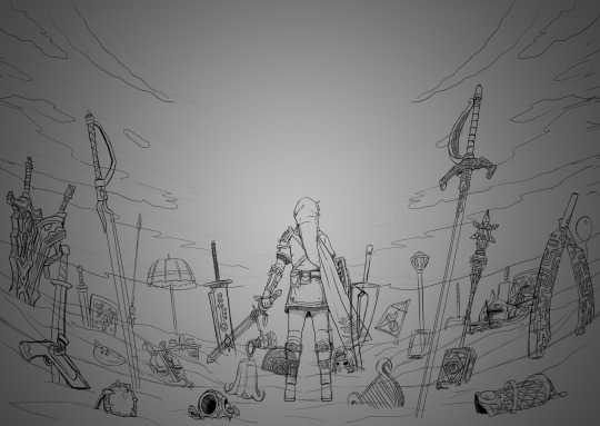
Fun fact: at one point I did consider including Ganon since he's technically playable, but realized he doesn't have a weapon. This would have meant I would also had to include the big Cucco from the cucco mode so neither were ever conceptualized.
I intentionally left the art's tone ambiguous just in case the mod team had something in mind. I did picture it having a dawn color scheme though, and the mods wanted the cover to have a peaceful/hopeful vibe so that worked out. I did however add some sunset choices in my color concepts for more options. The four I made also had sepia versions to fit with the aesthetics of the game.
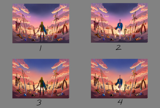

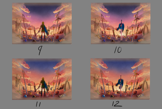

8 was the one the mods chose. However, I did end up slightly adding 6's colors into it to make the sky pop. This ended up being the finalized color concept.
(It looks a little fuzzy because I ended up layering 8 and 6 on top of each other and I didn't position them correctly fghj).
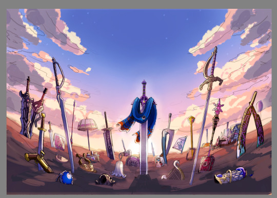
When I do illustrations I start with the background first so I can use its colors for the foreground and midground. I normally don't draw clouds this big and up close so I had to be pretty delicate with how I rendered it. I'm glad I only had to do one side and just duplicate it to the other. Also I made the oranges in the sky and clouds subdued.
After the background was done, I tried rendering the ground and it was a disaster. This was early on in the rendering phase, but what was meant to be dirt started to look like sand. I tried to see if adding textures would help but it made the problem worse. I ended up taking a break from the ground and moved on to the weapons.
Next was the most grueling part of the piece: linearting. I am not kidding when I say doing the lineart took three whole days. I was also juggling with my other illustration I was working on for the zine so the timeline ended up stretching to a week. I'm a detail-oriented person and stuff like this isn't usually that bad for me but this one was pretty rough. The sweat and tears paid off, I think!
After lineart was done, I went back to render the ground again. It was becoming more polished and included more small rock formations, but the dirt-looking-like-sand bit wasn't improved. I opted to add grass instead since that would be easier to render. That was probably the right call because I think that helped with the desired tone for the cover.
I flipped-flopped between working on the grass and the weapons. This screenshot was when I had added the shading, textures, and some highlights. Oh, and I slightly tweaked the sky a bit.

With the grass and rendering done comes my favorite part: color editing. Started throwing overlays, soft lights, what have you on everything and used color balance to level out the colors. Also added light reflection on the ground for some of the weapons.
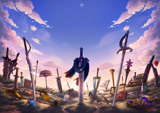
Something was missing from the illustration and I had no idea what it was. A friend had suggested particle effects and that did the trick! Everything was set and done and I submitted my illustration. When I saw the cover with the title for the first time, I noticed that the illustration was made a bit brighter than what I originally had (likely so the title stuck out better). I actually really liked that change and edited my own copy of my illustration accordingly.

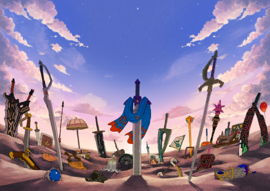
With that said, now I want to talk about some of the more subtle details in this piece. You guys probably noticed these already, but I want to talk about them anyway! I mentioned deliberate weapon placements some ways up so let me go over that first.
Ghirahim's sword, Zelda's rapier, and the master sword are placed in sort of a triangular way meant to represent the triforce (although I think I messed up on the distance between them). I originally wanted Ganondorf's swords being in Ghirahim's spot but I was worried about contrast issues with the swords' darker color scheme and battling attention away from the master sword. I think the idea still works considering Ghirahim is Demise's sword (and Demise is like the Ganondorf of that game). Though Ganondorf's current placement can be viewed as him being a looming threat, for Hyrule Warriors and other Zelda titles.
I have Lana's tome and Cia's scepter close together to symbolize them being two sides of the same coin. Toon Link and Toon Zelda's were placed on opposite sides of the piece but slightly facing each other. Toon Link's and Tetra's are also diagonal from each other, both also representing a type of connection to each other. It's a similar deal with both forms of Midna's weapons as well as Yuga and Ravio. Speaking of Ravio, his weapon is the only one partially buried, sort of peaking over at the master sword to reflect his cowardice natureand being Link's Lorule opposite (at least the Link from a Linked Between Worlds). A similar idea with Fi is that she is somewhat of a silhouette behind the master sword to reflect her growth in Skyward Sword. (I know technically Fi is represented twice here, but her "weapon" in Hyrule Warriors is a different blade so that's why).
Like I said before not all weapons have symbolic placements like this, but a number of them do.
One more weapon detail I wanted to point out is on the master sword. I had this planned from the very beginning but I intentionally draped Link's scarf over the master sword so that the triforce of courage on the blade is the only one visible. I also intentionally highlighted the engraving to make it more prominent.
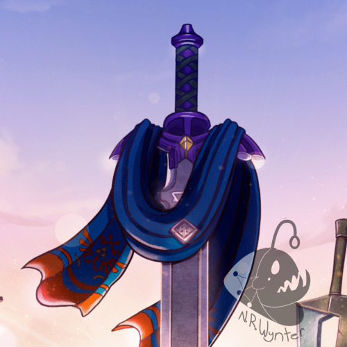
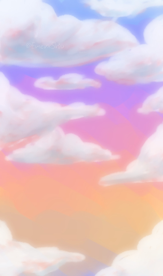
In the background, the sky is shaped in a way to resemble the Hyrulean royal crest. With the gap in between the clouds looking like the wings, the Master sword acting as the body, and the three visible stars as the triforce (but I messed that up slightly). Only thing I didn't include was the feet of the crest. It's not an exact 1-to-1, but here's an outline for a better visual:

On the topic of stars, there are 29 in total to represent all 29 characters. The brightest star above the master sword is meant to represent Link, but the other 28 are scattered around. Some are more visible than others so it may be hard to spot them all, but they're there.
Saving this last detail because it doesn't really have anything to do with Zelda and more to do with my art. I have always wanted to do this with my work for a while but haven't implemented it until now so I wanted to bring it attention.
From now on, all of my illustrations will have a hidden little angler fish blended into the scenery. I got the inspiration from Adventure Time's snail that appears in almost every episode incorporated somewhere and thought I could do something similar with my art. I'll show you guys where I placed this one, but you'll have to find the next ones on your own.
Not the clearest, but I promise in the future it'll be better drawn (and in case you're wondering, yes there are also little anglerfish in the other zine illustration too!). I just thought this would be a fun way people can interact with my art (and also act as an additional signature).
And that's it! If you have read all of my rambles, thank you!
30 notes
·
View notes
Text

WIPS || More Zutara FA
(As promised. Based on 2 of the zutara month prompts)
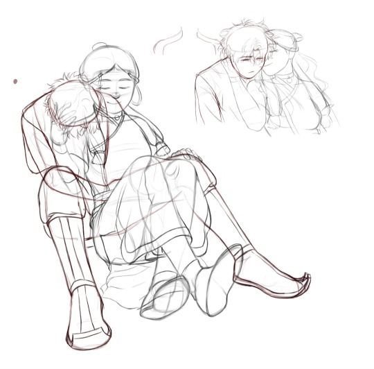
I wanted to get the rough sketches in first. Probably did make things a bit too difficult for myself with the angles and the wolf (istg animals are so hard to draw) but I'm also excited to see how this will look once it's rendered. Just need to trudge through the lineart phase next.
I was excited to draw the princess mononoke au one but ngl, working on the second wip was a more enjoyable experience since the only concept I wanted was something simple and cute. The pose is a menace because of the foreshortening but manageable. It probably helps that I was in a better headspace when I started working on it. The day prior to that, I was going through one of my bad, more temperamental days where I just felt off and couldn't draw a single line without giving it up bc it looked "ugly". Made it through the sketch for the princess mononoke au but couldn't last for the lineart.
On the other hand, the second wip was mostly seamless. Had to keep redrawing Zuko and Katara's legs but it was still a relaxing session overall.
Here's me hoping that I'll be in a good headspace tomorrow so I can work for a longer time while uninterrupted. Well, as uninterrupted as my mild adhd coded brain can allow 🤞.
#zutara#its a joy to draw fr#wip#wipart#zutara fanart#fanart#zutara month 2023#every month is zutara month#katara#zuko
205 notes
·
View notes
Note
Whats your art process and what would you reccomend for someone who would like to achieve a style similar to yours? i love this mix of cartoonism and realism. your work is such an inspiration >.<
oh gosh! thank you?! 💞 i'll do my best to explain it, but even I have a difficult time trying to understand my own art process/style because of how inconsistent it is;; (i still have a lot to learn!) this is gonna be a long reply so i'll place it under the cut
process:

I start loose with a more gesture type rough sketch. I mainly just do lineart in the same layer as my sketch and erase away parts I don't like. Sometimes I'll lower the sketch's opacity and on a new layer do my lineart (which is what i did for the drawing above). But regardless doing that loose gesture sketch helps keep my drawing dynamic even as I refine over top of it!
- I duplicate layers A LOT for safekeeping my previous progress, especially if I'm thinking of making a big change (ex. changing limb position)
If I wanna put colors down underneath it I set my lineart to Multiply. For coloring I'm very inconsistent with the process, but recently I've been using a more subjective coloring style, where I pick my own shadows and highlights to try relying less on blending modes (which is gonna be too long to get into here;;) Finally if I feel like it, I make a layer on top of my lineart layer where I render everything
Oh this is something that helps me a lot for colors! I have 2 layers that are a mid-gray tone placed above all my other layers. One I set to the Color mode (to make the drawing black and white), and the other I set to the Luminosity blending mode (to make the drawing's brightness the same..?not sure)
The Color layer helps me check if I have enough contrast in values, and the Luminosity layer helps me check if I have enough contrast in color hue and saturation!
style:
This is really difficult to answer because style encompasses so many different aspects of art, but I'll try to focus my answer on the mix of cartoonism and realism that you mentioned!
I struggled trying to explain what my style is like so I just broke down one of my drawings that exemplifies a lot of my stylizations! Hopefully these can give you some pointers about what I tend to think about when I draw (click for higher quality)
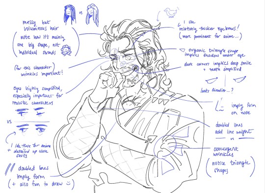
(+to add to this i use a brush with no size pressure, only opacity pressure)
What I recommend for stylizing a realistic character: The way I learned to stylize a more realistic character like this one was to import a reference of his face, then trace over it very deliberately, making sure to stick to big shapes and characterizing details I thought were important to achieve his likeness! Then I'd turn the reference layer off and freehand it over and over, comparing and redrawing until I managed to get the mix of accuracy and stylization I liked!
What I recommend to find a style: I basically ended up with my style subconsciously as an intersection between the things I like to see in art + the things I like to draw! Most of my inspiration comes from anime (😔) and artists online. I'll see a very specific stylization I like in others' art, and try replicating it to see if I like how it fits with my style + if I enjoy drawing it in that way. I did this a lot over the years, accumulating into a big mosaic of inspiration from all the artists whose work I personally enjoy and learn from! I know this isn't exactly answering how to get a style like mine, but I think knowing this general process may help you out in the long run!
ahh i think that's it! i tried to be as comprehensive as i could without being too verbose (my bane). i hope this is the answer you were looking for and that it can help you! 💞 and thank u for the ask! it was a good exercise for myself to analyze my own art
#my asks#anonymous#tutorial#...? art info? not sure what to tag this#i spent a very intense day mulling over this ask#hopefully i answered this correctly...!#art resources
44 notes
·
View notes
Text
JUNE UPDATE
WASSUP BROS AND HOES, IT’S ME, YOSA FRICKING JAE. BACK AT IT AGAIN WITH ANOTHER UPDATE ABOUT THE JMC 🔥🔥🔥‼️‼️‼️
Last time, I remember saying it’ll be different and things will spice up, and I am indeed gonna provide more stuff piled into these updates because the debut comic is taking so long. I wanna make sure you all get full when consuming these updates instead of being like “oh, nothing happened lol”. I have a good chunk of shit to talk about that’s outside of the comic itself, but it’s like behind the scene stuff about it :3
With that out of the way, let’s finally get started!
The Comic

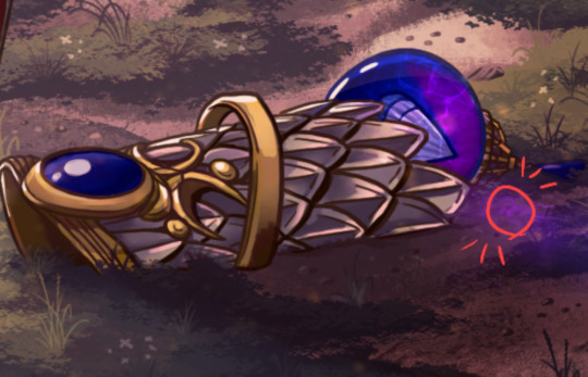
(W.I.P OF THE OFFICAL DEBUT COMIC)
The comic is slowly making progress, the first thing that’s changing is me showing progress of the comic itself and giving ya’ll w.i.ps in order for me to give you guys content to look over, and because I just want ya’ll to see it yk? The honest truth is that it’s moving slow because of burnout. It was huge and made me wanna give up on the comic and leave the fandom, I was struggling for a good while but my best friend told me it was best to take a break and recharge instead of pushing further. They told me to do something else so I can regain my motivation and passion for the project, and she was right, because I’ve been having fun hanging out, watching her play Stardew Valley, and letting loose without the pressure for the debut comic to come out. I have to prioritize my health and well-being before anything else, and I know the comic will be done!
Also for you all to know, the team I had disbanded, and right now I don’t have a full official one to help with the debut. I have amazing friends that have helped look over the script, one did some sketch compositions, one helped fix up grammar in the script. They helped me greatly and I’m so grateful for them and their loving support even through all of the rough patches. For the most part, I’ve been doing everything on my own, and it can get stressful easily because of how much I’ve had to change my plans and shuffle around when the team disbanded. I’ve been the one doing the scripting, sketches, lineart, color, management, and just everything. Even if I try to act like things are fine behind the scenes, I definitely got more anxious and depressed after events occurred, so this break (not hiatus) has helped me recharge after going through a bit for this comic. To end this section on a good note, I’m feeling so much better and I’m recharging absolutely greatly, I even renewed my love for Donnie after a friend drew him 🦐 Sooooo…The JMC is still in good hands.
Bonus Content: The Villain
YosaJae, what is this? This is the section that’s hella new, the place where I show you guys some cool concept art, ideas, and plots that show the origins of the JMC or even scrapped/cut content. Today we’re gonna talk about the villain of Arc 1. Fun fact, two were created at the same time but one of them was finalized to be the primary villain for Arc 1!
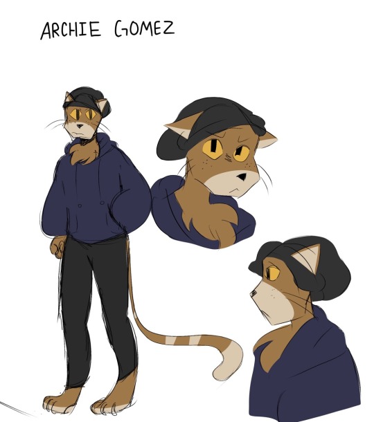
(First ever concept art of Archie Gomez)
Here he is! The cat himself, ✨Archie✨ I needed some variety and needed an anthropomorphic character since Rise has lots of their mutants and yokai. Archie was a character that was a lot more serious and hella threatening but he was toned down after more arcs were created. For some reason, I included freckles because I originally thought, “Ginger people…..” then included the freckles to make him more recognizable. Let’s just say that they weren’t as rememberable as I thought because I forgot them after a while-

Fun fact, Archie was originally gonna be a native Spanish speaker but not be able to speak English. The actual conflict was gonna be about the turtles and Archie fighting due to language miscommunication, but it was later scrapped because of the issue with translating each of his sentences and being truly accurate with his dialogue. He also at first was a one off character that would never return, but he was popular that he became the reoccurring bad for Arc 1.
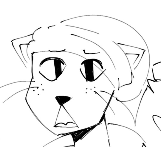
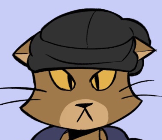
(Archie Gomez Evolution 2022-2024)
Archie had went through a good bit of design changes over the years and I changed him to be more easier to draw by giving him a more unique silhouette by drawing his head as a pentagon instead of a circle. The transition was at first a circle to triangle, but then the shape was too complicated to recreate so I had to go with a pentagon (as an accident at first too). That changed him A LOT but I was hella happy with the way he turned out because he started to look more unique and iconic. Pretty cool, eh~?
Aaaand that’s it! Thank you all for stopping by and coming in to read this update! I hope it was fun to go through and very refreshing. I wanna make my updates more like this instead of what was said above. Especially because this is taking so long, I wanna be able to go over behind the scenes with you all since ya’ll at least deserve that; I can’t keep being mysterious about the comic since it is taking years for it to be made, but it’s trial and error so I gotta do this in order for it to be worth the progress. I’m strong, I can do this! Hopefully your day/night is amazing, and take care until next time 😋🫶💜
#rottmnt#rottmnt oc#rise of the teenage mutant ninja turtles#rise of the tmnt#tmnt oc#oc#oc x canon#jmc update#jmc related#jmc#comic update#art
15 notes
·
View notes
Last Seen Blogs
gelonasveias-blog
MD ✨

khohanggiarevn
Untitled

baamboo
Baamboo

dayofbanks
International Day of Banks
liodork
Liodork