#design project
Explore tagged Tumblr posts
Text

🌵🦙🚦traffic light, desert, violet and red flowers…. hmmm that’s familiar🚦🦙🌵
(yes i referenced desert duo / life series in my final design project shhhh)
#trafficblr#trafficsmp#traffic series#trafficshipping#desert duo#including my fixation in my final design project let’s go#life series#third life#portal#portal design#traffic life#illustration#digital art#landscape#design project#that desert that i can leave#life series reference#watchers#artists on tumblr#happ1e
124 notes
·
View notes
Photo
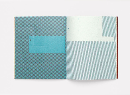
Design Project / Arjowiggins / Unusual Printing Surfaces / Printed Matter / 2006
91 notes
·
View notes
Text
My posters for university
hi, i am a first grade studient of design, so for my exam i maxe couple of wotks and this is my fav <3
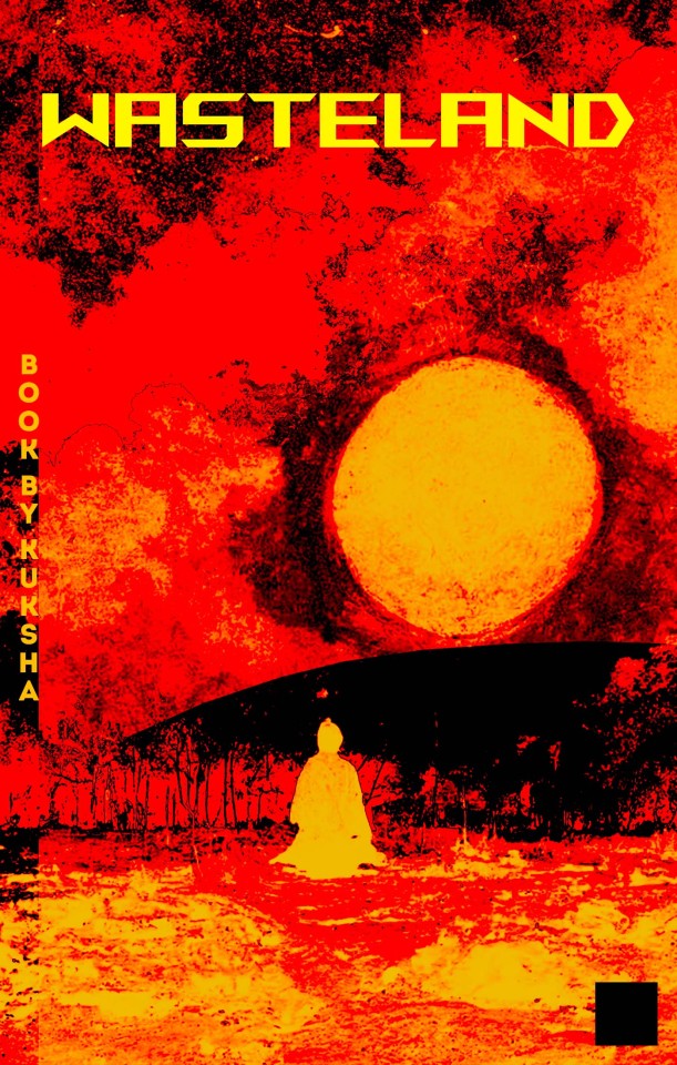
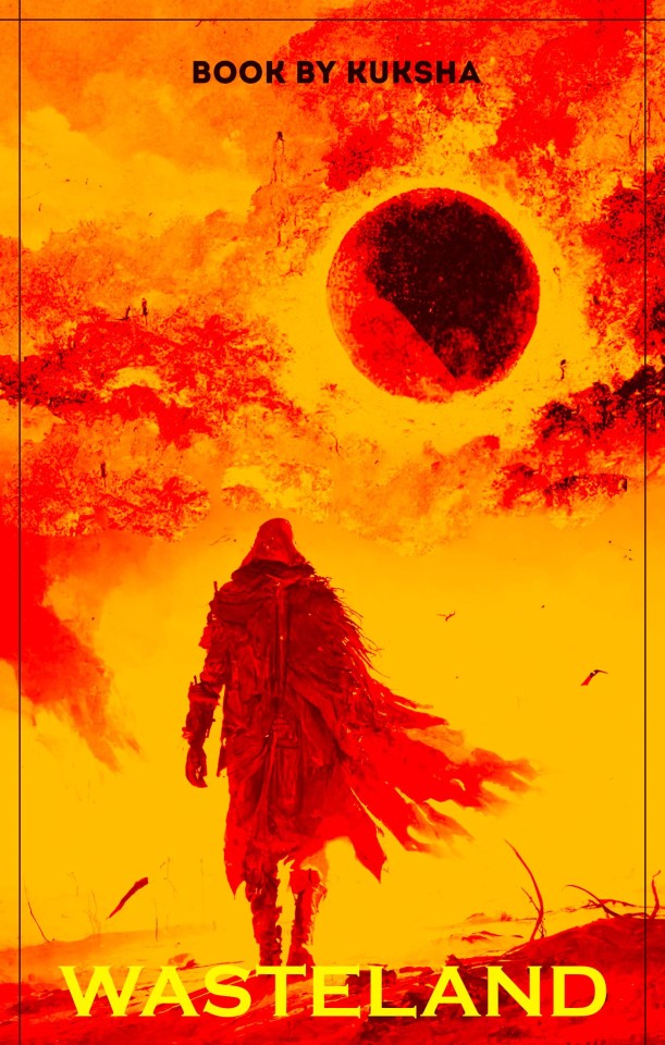
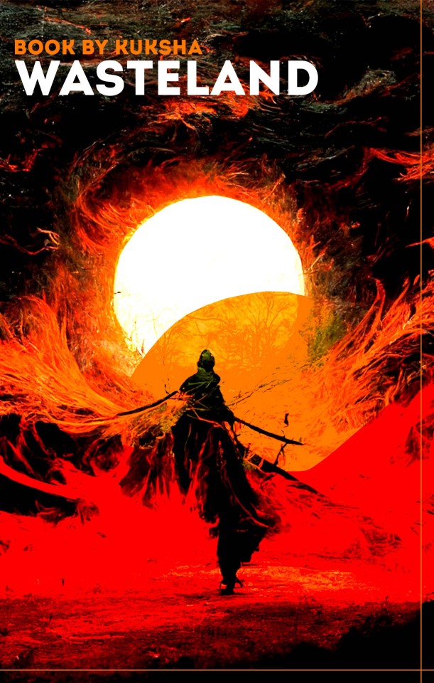
I've made posters(alternative book covers) for book "Wasteland" by my bf <3
#post#poster#artists on tumblr#artist on tumblr#posters#alternative#book cover#design#design practice#design project#alt core
11 notes
·
View notes
Text
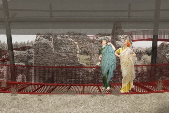
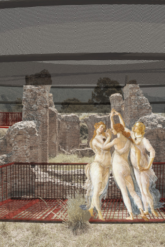
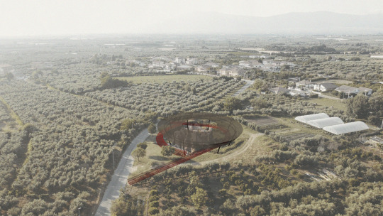
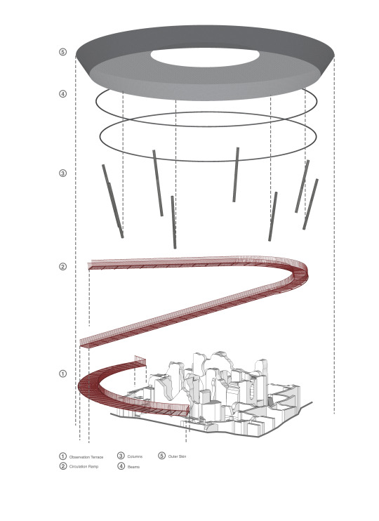
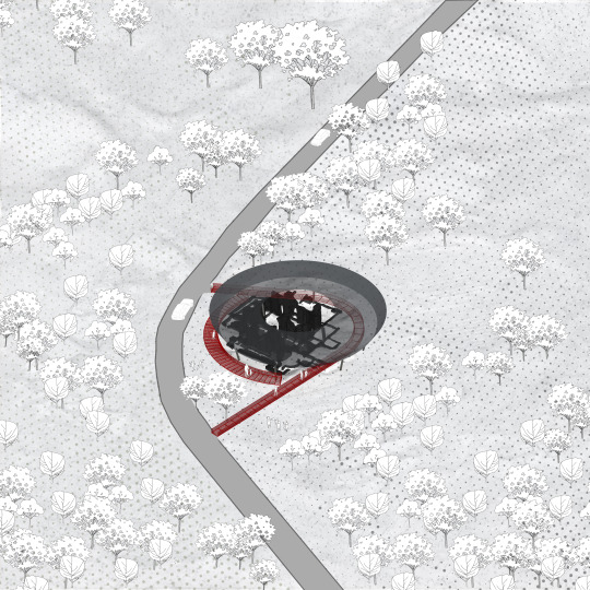
Our project proposal for Thermal baths of Curinga with my team mate beyzanur barut for the competition of reuseitaly.
< Gate to the Sky Curinga’s Thermal Baths, linked to Roman history, are reimagined with a protective, semi-transparent structure and an oculus that captures sunlight, honoring their communal and temple-like heritage. The design preserves the ruins while creating a striking landmark, blending historical significance with modern enrichment. >
#architecture#arch#illustration#illustrative art#art#illustrator#digital art#design#graphic design#design project#museum#reuse#museum design#ancient roman#rome#ancient#archeology
6 notes
·
View notes
Text
It’s 4am so that means I’ve got ambitious ideas. I’ve been getting back into the Incredibles, and I found out that some of the characters were incorporated into Disney Mirrorverse, with cool new designs and a bit of lore about their upgraded powers.
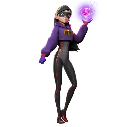
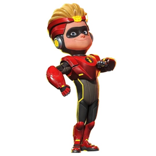
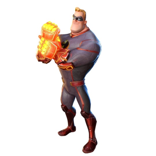
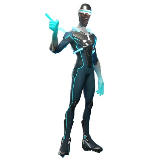
Basically my ambitious 4am idea is “what if I took inspiration from these designs to give all these characters updated super suits that would better fit into their setting?” Incredibles and Incredibles 2 take place in about the 1960’s, with the golden age of supers happening 15 years prior, in the 1940’s-50’s, which would fit the nostalgic comics vibe the movies were going for. I thought, “what if I use the Mirrorverse designs as a basis, but design something you might see in comics from the 1960’s-1970’s? Since Violet would become an adult in the 70’s and Dash would be a teen by then, but still old enough to try and be a crime fighter, like how Spider-Man was a teen hero.” Because I love these Mirrorverse designs, but there’s something about them that screams “Modern MCU” to me, and that doesn’t work with the vibe of the Incredibles. So yeah, that’s my next big-ish design project I’m setting for myself.
#disney#art project#design project#Disney Mirrorverse#Disney Pixar#Incredibles#incredibles 2#Elastigirl got a new suit as a standalone hero#I wanna give Violet and Dash standalone hero suits#I think I’ll also make an updated Mr Incredible suit#and for fun I’ll draw older Jack Jack as an intern/apprentice under Edna#these new suits could be designed by them both as a collaborative work#I love designing superheroes
47 notes
·
View notes
Text
in my ongoing efforts to make sure any next thing i do is something people would never predict, i will now spend a month designing a parrot toy.
4 notes
·
View notes
Text
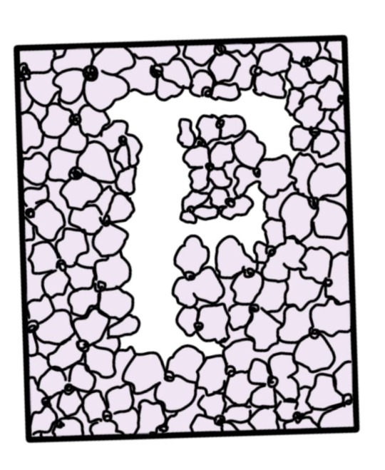
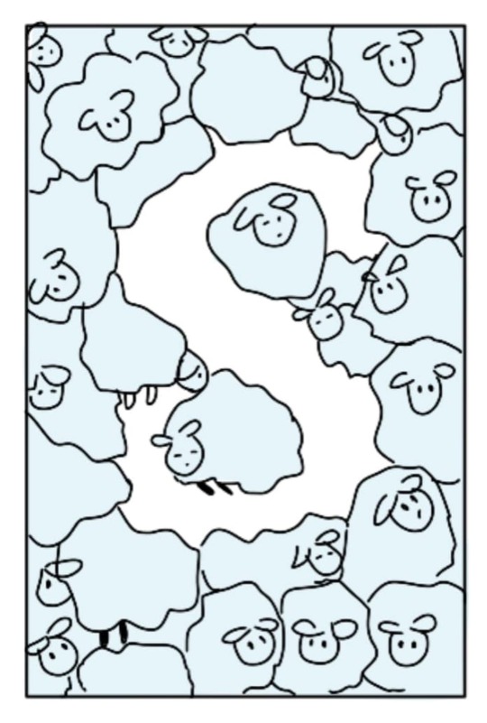
Exercise 6
Negative space
FA222 course
@patriciabarakat
#art and design#uob_funoon#graphic design#design#designer#artistic#design project#artists on tumblr#colors#flowers#digital art#digital aritst#art#فنون#فنانة#فنان#فن
28 notes
·
View notes
Text
ÉMA - brand identity
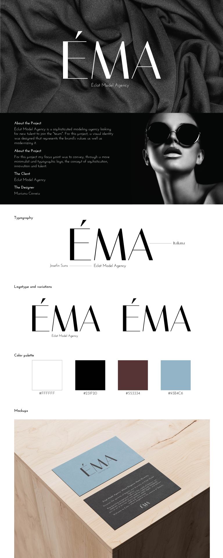
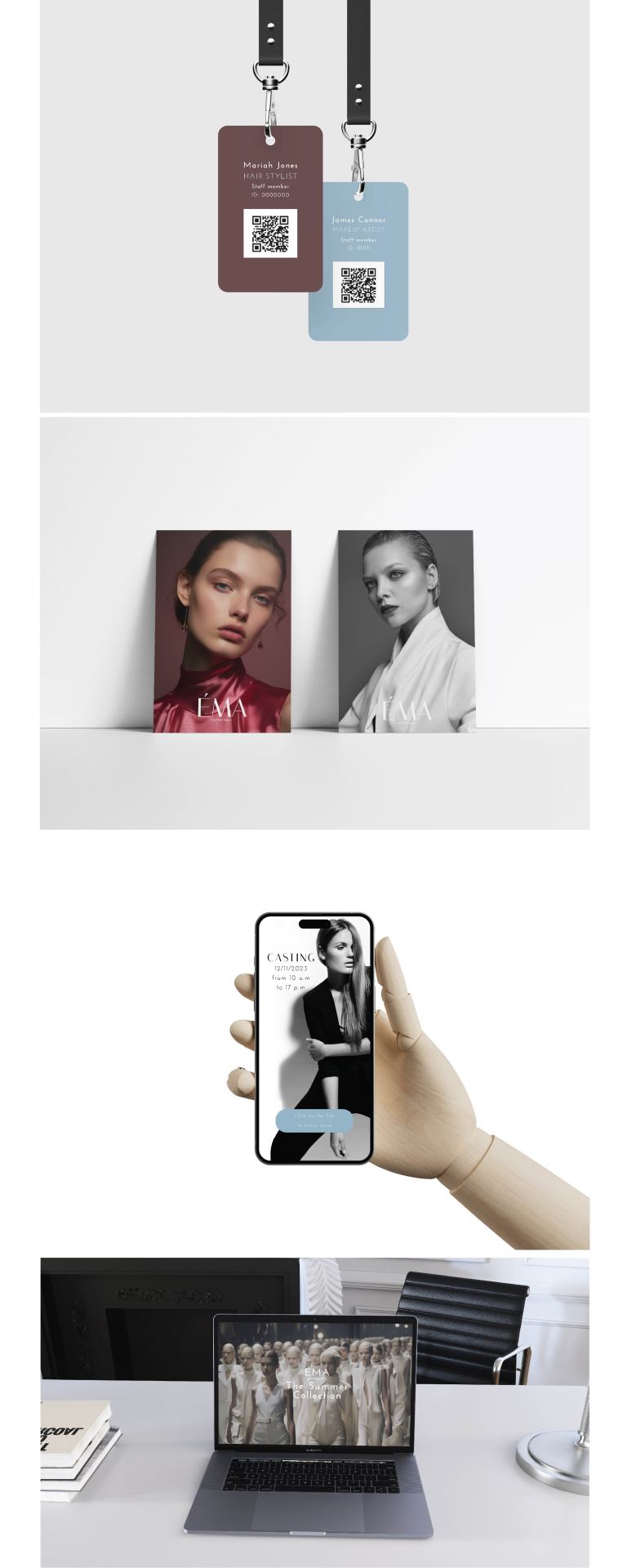
#designstudent#graphic design#design#designer#branding#brand identity#visual identity#fashion design#brand design#fashion brands#fashion model#behance#art#design project#project development#adobe photoshop#adobe illustrator#mockup#product design#template#mockups
8 notes
·
View notes
Text


Prop Design Project
#design project#prop design#concept art#portfolio#character concept#digital art#drawing#illustration#original character#character design#character art#my art#art tag#artwork#art process#drawings#art challenge#character drawing#character development#oc art#ocs#my ocs
4 notes
·
View notes
Text
Design Project - Revision

This is what I have so far for my style guide. It's only a rough work-up and I obviously don't have my actual sample posts in yet, but just go with it. Also, for reference I have two pages (the second page has my other 3 rules and corresponding sample posts).
2 things I'm worried about with this design:
I think it looks a little too busy. I feel like my eye is going all over the place and I don't know where to start reading. Even with the arrows, it's still kind of hard to tell which sample post belongs to which style rule.
I worry that my rules are too general and therefore not specific enough to guide the intern who is supposedly following this. I tried to add more writing by explaining my examples, but I'm not sure if this hits all the assignment requirements.
Any thoughts on how I could simplify/reorganize my design? Also any thoughts on how much writing I have? I know it says 1-2 pages but perhaps I would benefit from having a third page in my design where I can add more introductory text to help space things out?
7 notes
·
View notes
Text
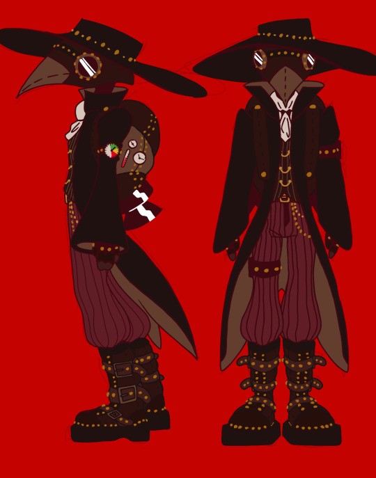
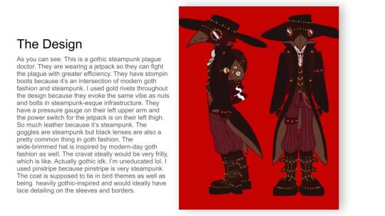
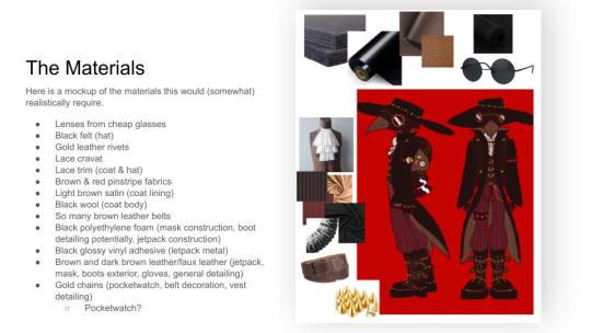
#anti ai#no ai used#plague doctor#plague doctor design#plague doctor character#steampunk#punk#goth#gothic#digital art#digital character design#digital artwork#character design#design process#design project
5 notes
·
View notes
Text

Theatre conferences are amazing
2 notes
·
View notes
Text

Final design project for the end of the quarter. It’s packed with details below the surface but alas they are really hard to see. My professor kept calling my dude here an Angel and I just thought that was so sweet because he’s actually a ✨ genetically modified human monster ✨
I have nothing else to really say so yeaaaa I’m going home today! Well I’m heading home… I’m not actually home till tomorrow ;-;
#art catastrophe#scad#savannah college of art and design#dude idek how to rage this#art#art?#my little monster boy#design project#college#college finals#suffering#I’m suffering all the time#crimson monsoon#crimson monsoon art tag
2 notes
·
View notes
Text


BRAND : TOMORROWUNTITLED
3 notes
·
View notes
Text


some phone pictures of the lakeside summer camp. the concert is at dawn on saturday, the musicians are composing their performance in a big fantasy tent down the shore (it has carpets and stringlights and so much electronic music equipment it looks like a cyberpunk spaceship), the photographers are doing their thing all over the place, and us designers/architects are building the floating installations (including the stage)
the workshop is in a soft mossy glade in the tree shade. the lake is clean and clear and inviting. the clouds are like this every evening. there’s delicious food and snacks. people help me with things (like the massive wooden frame) and i help others. it’s fucking incredible.

#i have some camera photos also#but those i will post after this adventure is complete#i am so alive#cherishable aisle#diy architecture#design project#builder
4 notes
·
View notes