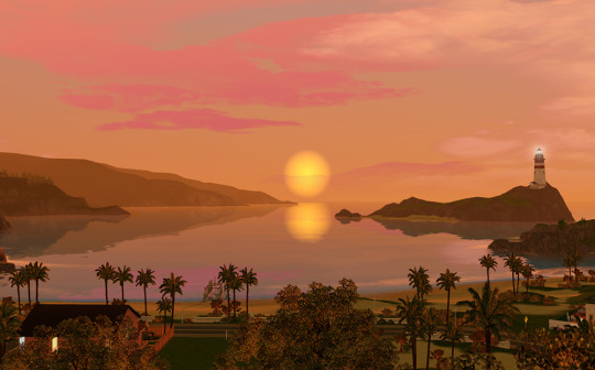
#desaturated sunset
Explore tagged Tumblr posts
Visit Tumblr Blog
Explore Tumblr blogs with no restrictions, modern design and the best experience.
Last Seen Tumblr Blogs


Fun Fact
Premium Tumblr themes are available from anywhere between $9 to $49.
Text
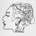
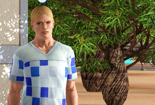
Hey AvA/M fandom, take my desaturated sunset/secpurvic (tsc x purple x victim) crackship nonsense!


I only just got into the series and I'm already infecting myself with something that only I'm gonna like
#crimsalwaysthinking#crimsalwaysdrawing#ava#wait how do I tag this fandom#ava/m#animator vs animation#secpurvic#desaturated sunset#ava tsc#ava victim#ava purple#rarepairs#fandom ships#vicsec#secpurp#purvic#heh they go around thats fun
16 notes
·
View notes
Text
It occurs to me that in the ISAt universe, they would quite possibly describe the ocean as 'wine dark' as a matter of course
#the fact that colors canonically don't exist makes me go crazy sometimes#even more so when I think about how they USED to#isat#in stars and time#and the fact that they used to is a relatively recent discovery which makes my social sciences brain go burrr#how many color idioms survived the desaturating?#how much ancient poetry describing the sunset feels unreadable to a modern lense?#are oranged still called oranges but instead of the color connection we have it's their equivalent of 'apple' (round-shaped fruit thing)?#the implacATIONS#jack.txt
43 notes
·
View notes
Text
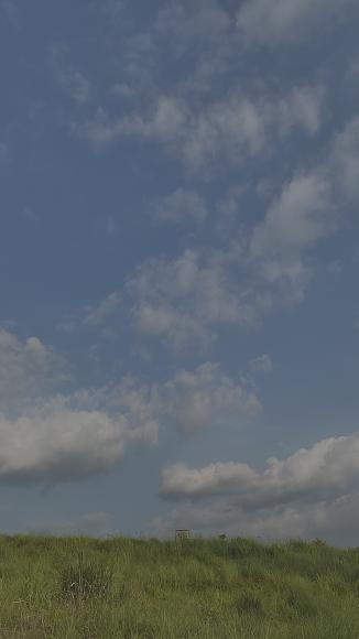
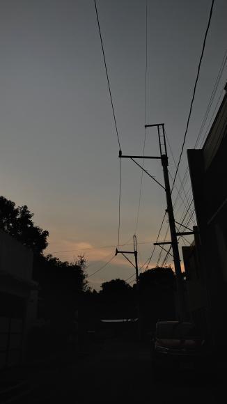
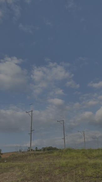
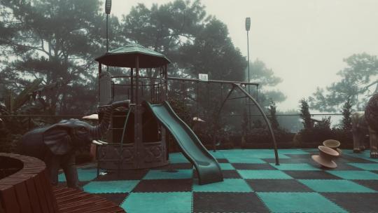
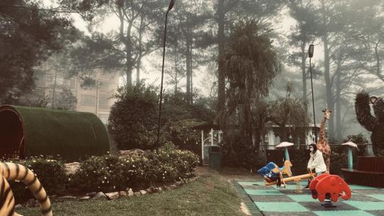
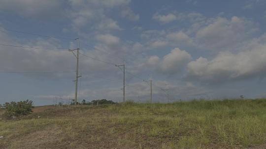
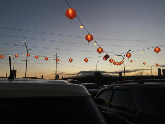
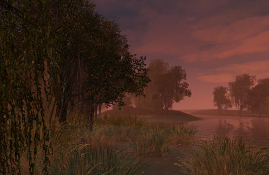
Ever look at pics like these and they just hit?
#bush's photo album#reddish-bush#edited#mine#photography#photographer#low contrast#desaturated#sky#power lines#landscape#clouds#sunset#playground#lights#cars#lanterns#or something like that
9 notes
·
View notes
Text
i loveee the clothing design in disco elysium so much it's honestly the aspect of the game im most directly artistically inspired by because I've never before seen a (somewhat) realistic media in which every rando still serves cunt. kim k's perfect form that came seemingly just god himself on the first try. all the outfits are believable but often a bit *weird* in cut and size, like evrart's huge ass shirt collar or klaasje wearing a bolero rather than a normal length cardigan. whatever the fuck the ravers have going on. the characters like renè who use flashy clothes to prop up their own egos, and on the opposite side, joyce, who's dressed in modest looking and desaturated pieces made out of silks the average man will never be able to afford. or SF/charles, dressed the most boringly formal and with nothing to say other than diplomat babble. mrrr tequila sunset's snakeskin shoes and bellbottom pants in general. the green goes well with the orange. the fact that harry and Kim also juxtapose eachother in the silhouette (harrys clothes taper out in straight lines, kim's clothes are bunched up and round with his ankles/wrists left narrow). it's half an hour past midnight I just like clothes
3K notes
·
View notes
Text
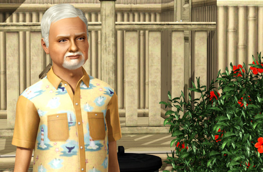


Here's this lighting mod I cobbled together, up for public consumption for anyone who might want to give it a try. It's a "default" lighting mod, which means it will affect all worlds in all saves that are in the same game folder as the lighting mod, except for the dystopian/utopian futures in Oasis Landing. So, if you use a custom or EA world that includes special lighting that you like, you don't want to use this in that game folder because it will replace that lighting.
Before I start babbling, here's the download link upfront.
There are two versions included in the download. One file includes default replacements for the clouds, sun, sun halo, moon halo, and stars. Then there's a folder that contains two separate files, the lighting mod by itself and the default sky objects by itself, in case you don't want the clouds, stars, etc that you see in the pics and just want the lighting mod. (Or if you don't want the lighting mod but do want the sky objects, I guess!) The pics all use the "combined" version, but you can install only what you want, if that's more your cuppa.
This mod's "base" is Burntwaffles's Dream Dimension lighting mod, specifically version 2.5 with Lucky Palms water and no auroras, except that I changed the sunrise/sunset times back to the standard 6AM/6PM because I use NRaas Retuner to create appropriate seasonal sunrise/sunset offsets instead. It still has Lucky Palms's water, both because it's my favorite and because I don't know how to change it, but pretty much everything else has been altered at least slightly, from slightly brightening and color-adjusting the color ramps to mucking around with light angles and distance fog settings. So, not too much is left of Dream Dimension except the basic colors, but it's still at its core. I also looked at lighting mods made by @boringbones and @gruesim and compared the values they contain to Dream Dimension's values. None of the values I ultimately used are from any of those mods but they were all guidance that helped me to pinpoint values to change to get the look I wanted, so credit to those creators.
My goals for the mod, all of which I more or less accomplished, were:
1) Less-intense shadows, mostly in order to reduce harsh shadows on sims, especially in outdoor lighting, as well as too-dark bits of building exteriors, like covered porches and recessed entryways.
2) Desaturated but bright colors with less contrast, because my old eyes don't tolerate saturated colors and high contrast for long. Somehow, EA's lighting manages to be both very color-saturated and dark and often dismal at the same time. Meanwhile, most lighting mods are too bright and/or too saturated for my likings. I wanted less saturated but brighter, which seems to be a rare combination. Dream Dimension is already desaturated, which is why I like it, but I increased the brightness and warmth a bit on the color ramps because it could also be a bit too dark and "cold," in my opinion.
3) Improved natural-daylight indoor lighting. I somewhat accomplished this one, though there are still issues like too-dark ceilings and some too-bright walls, which I don't think are fixable with just a lighting mod. However, lowering the light angles seems to make the EA windows with fixed lighting (that mod is linked behind the cut) work better and gives pretty good results, which you can especially see in the WIP pics I've posted, since I didn't include a lot of interior pics on this post. I can make no promises about this issue on lots with custom windows, however.
4) Dark but not unrealistically black nights, including darker ground level lighting at night. Dream Dimension already had this, but I lowered the contrast so it's not so hard on the eyes and also made it a little bit brighter so that if you've got your sims in an unlit area far from from any artificial light sources, you can still see what they're doing. It also doesn't have the obnoxious blue tint that EA night lighting has.
Like the WIP pics I posted here, here , here, and here, the above pics have no Reshade or Photoshop editing applied to them at all, other than cropping/resizing in Photoshop. They are all taken in various EA worlds instead of all in my rebuild of Meadow Glen, as all the WIP pics I've posted have been. They are best viewed at full size, and I think they give a good representation of what the thing looks like, including flaws, assuming that you use the same appearance-improving stuff that I use on a decent-enough machine to run all this crap and still be able to play the game. I have tried to be thorough and transparent about my machine's specs and the other mods and stuff that I use that contribute to what my "naked" game looks like. That's all behind the cut.
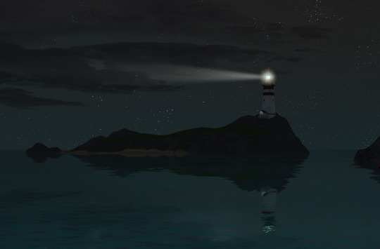
The WIP pics I've posted have a larger sun and moon than you will get from the mod as uploaded. You can see the "included" sun/moon sizes in the above pics. I like those things to be larger, so my personal copy of the mod has larger sun/moon sizes, but I figured other people mostly wouldn't like that. The mod as uploaded has I believe slightly larger-than-EA values for those things, but not ridiculously-large like I like. As uploaded, there is also no sun halo, which to me results in a sun that looks like a ping-pong ball floating in the sky, but whatever.
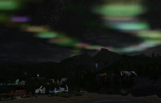
I was going to write up and include instructions on how to mess with sun/moon sizes and other things in this post, including how to "reactivate" Burntwaffles's "auroras" if you want them. (Those are really just colored clouds, though; I prefer to use this mod for auroras, and it is shown in one of the pics above.) But I've decided to do all that in a separate post or two at a later time because probably no one will read this massive wall of text as it is. :)
For the sky objects replacement: They began life as parts of @wasset-asekara's "Enchanted Environment" mod, but I have edited them over the years. I don't remember all that I have done, but I do know that I edited @nilxis's clouds a bit and put that in there, and that the stars are an edit of ShojoAngel's starfield because I like its gazillions of tiny stars better than EA's sparse field of large globs that are apparently supposed to be stars. (One day I will make my own starfield from scratch that's more of a "happy medium" between those two, but that day hasn't arrived yet. LOL ) I'm pretty sure I didn't edit Wasset's sun halo, though, and it's included. You can see it in this pic, but as I said the uploaded mod has the sun halo size set to zero, so it will not appear unless you go in and fiddle with the sun and sun halo sizes yourself. As I said, I'll make a separate post about how to do that, if you don't already know.
And now for the section where I'll list my computer's relevant specs, mods that I use, and other stuff I have installed that affect how my game looks, for transparency's sake and so that you can get some of this stuff if you don't already have it…
My computer's relevant specs:
Core i9 "Rocket Lake" processor (The one before the Alder Lake one that requires a patch for TS3 to work right). It runs at 3.5GHz
64GB of RAM
The game and all CC is installed on an M.2 SSD
16GB RTX 4060Ti GPU
So, it's pretty high-spec. If your machine is lower-spec, I can't guarantee that this lighting mod plus all the other crap that most serious TS3 players use will result in a good gameplay experience. On the other hand, lighting mods aren't resource-intensive by themselves. They are literally just numbers and a handful of tiny images. It's just that people, myself included, tend to couple them with resource hogs like Reshade as well as appearance-improving mods and graphics rules and things, plus a mass of gameplay mods, and the cumulative result is one big resource drain. So, bear that in mind.
Mods:
More light through windows This fixes EA windows so that they work better and create more natural lighting. However, if you use a lot of custom windows that clone the unfixed LITE resource from EA windows, it will not help you at all.
Improved EA Lights Similar to the above, this fixes EA lamps and wall/ceiling lights and stuff so that they cast artificial light more realistically. It will also not help you if you use a lot of custom lights that clone the LITE resource of unfixed EA lights.
Fixed tileable item shaders This makes it so that lighting isn't weird on tiled bookshelves and sectional couches and stuff. Alas, it does not seem to fix uneven lighting on tiled windows. :( And, again, it fixes EA stuff, not custom stuff.
LazyDuchess's Sky Banding Fix It used to be that I used Reshade mostly to fix the gradient banding in the sky. With this fix plus this lighting mod, I can completely ditch Reshade, yay! (Of course you don't have to ditch Reshade; I just didn't personally use it much other than to deband and desaturate.)
Default replacement moon shown in the pics I use the Quartz color. You can use any replacement you want, of course. Or you can stick with the ugly EA moon.
NVIDIA Settings
Used for better antialiasing, the addition of ambient occlusion (which affects shadows), and a few other things. I listed the settings I use on this post. I imagine you can alter these settings if you use an AMD card, too, but I'm an NVIDIA girlie, so I don't know how you'd go about doing that. I'm sure there is info out there on the Intertubes, though! Bear in mind that many Reshade presets, if you use them, include better antialiasing and activating ambient occlusion, etc. via the various shaders used in the preset. Generally, you want either/or here, and I personally feel that NVIDIA settings give better results. However, with Reshade presets, you can disable individual shaders used for ambient occlusion and antialiasing and such to make them more compatible with NVIDIA settings.
A so-called "HQ mod."
Which isn't actually a mod at all but just edited graphics rules that change a few numbers so that the game uses higher-resolution images for stuff by default. This is necessary because, generally speaking, the game doesn't "know" that newer graphics cards that it doesn't natively recognize are capable of using larger textures, so it defaults to lower-resolution ones. If you haven't already done so, it's best to edit this yourself because graphics rules are rather machine-specific. General instructions on how to fart around with the graphics rules are here, and if you google around you'll find other tweaks that you can apply or not, as you choose. I personally edited mine for higher-resolution shadows and textures, both of which contribute to the pics of this lighting mod.
In-Game Graphics settings
All of mine are at maximum except for the game's native antialiasing (AKA "Edge Smoothing"), which is turned off since the NVIDIA settings handle that.
Various default-replacements.
The most obvious in the pics of this mod being @asabinsims "Project Renaissance" which default-replaces the textures for many of the game's trees, shrubs, and flowers. The "large" version is used in the pictures, but I use the "small" version for gameplay. Also, the sims in the pictures are using the default skin, eye, hair textures, and brow/facial hair replacements I use, but before the game "updated" them, they were briefly "wearing" the hideous Maxis stuff, and there were still no weird shadows and stuff on them.
Stuff that I don't have/use but that could possibly make this look even better:
LazyDuchess's Shader Framework and Tweaks LazyDuchess's Split-Level Lighting Fix (I don't use these only because, last time I tried to use them, I couldn't get the game to load with the shader framework installed, and the split-level fix just didn't work. But maybe it's time to try getting them to work again…)
And also: @katsujiiccfinds (But feel free NOT to reblog this, because it is a ridiculously massive post because of my thoroughness kink, and I would totally understand not wanting to pass that around. :) )
362 notes
·
View notes
Text

Cherry Blossom Tree DR by vesko_sims3
"The reason I created this default replacement mod is that the original cherry blossom tree doesn't look like real one due to its oversaturated and dark flowers. As a result, it could be mistaken for a peach tree, which has dark pink flowers as this one. So I did some altering by desaturating and lightening the tree trunk and the petals to make it as realistic as possible.
The photos for this creation were taken in Sunset Valley with an additional shadow/lightning mod. The tree may look a bit off when you install the mod due to differences in the color settings you’ve applied or the type of color profiles on your PC monitor has. For example, when you use an LCD monitor like I do, the colors may appear less vibrant and have lower contrast compared to OLED displays.
...continued + more pictures on MTS."
More Info + Download @ MTS.
124 notes
·
View notes
Text

Yayy Mari birthday fanart
I forgot it so i had to hurry thats why it isnt exeptional and its messy
The background was supposed to be a sunset at the beach but i had to desaturate and wish wash it? thats why its hard to tell and the effect it kinda gone
LOOK AT HER HAIR ;3
#drawing#artists on tumblr#small artist#art#beginner artist#mari omori#omori game#omori fanart#omori fandom#omori#omori basil#omori sunny#omori aubrey#omori kel#omori hero#omori mari#fanart#birthday#birthday fanart
59 notes
·
View notes
Text

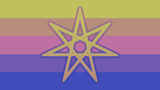
Tulip DPD (Dependent Personality Disorder) flag ✨
PT: Tulip DPD (Dependent Personality Disorder) flag [Sparkle emoji]


[ID: two almost identical flags, the one on the right having a divided sun symbol representing the dependent personality disorder. The colors of the horizontal stripes are pastel/desaturated, and are in the following order, top to bottom: purple, peach pink, orange, yellow, and green /End ID]
DPD Symbol by @/revenant-coining, and also credits to @/dependencypersonality for the idea of the tulip being representative of DPD, very thoughtful! Those two together made something click in my brain.
I wanted to make my own take on the DPD flag, seeing as how much it affects my life. I wanted it to be full of meaning and hope for a better future while acknowledging it isn't all sunshine and rainbows.
Stripe Meanings:
Purple: Darkness when without the guidance of others, being lost in the dark.
Peach pink: Depended person, being dependant on them. (Can also represent the love one feels for them, though not necessarily)
Orange: Anxiety, Feeling anxious and stressed when forced to make own decisions
Yellow: Hope for a better tomorrow, new beginnings (rising sun rays)
Green: Growth, constantly trying to be more independent and growing as a person. (Recovery)
As you can see, the majority of colors (3 out of 5) are warm, and the orange is centered. This is because orange is associated with anxiety and cluster C pds are the "anxious" ones.
The colors are in negativity to positivity in meaning, atleast to me. Going from feeling lost and depending on someone, to anxiety but being a bit more independent, having hope, and finally being in recovery and healing,
I chose to use the theme of sunrise colored tulips for two reasons: firstly, the DPD symbol is a setting/rising sun. Secondly, tulips and flowers in general are seen as a "needy" because of how fragile and sensitive to various factors they are, so they depend on their gardeners to stay alive and healthy
I used common tulips colors, except white and the darkest purples to keep some harmony in the color pallette and to maintain the sunrise/sunset theme.

#🌙✨️ Terms sent from above#<- coining tag!#dpd#actually dependent#dependent pd#dependent personality disorder#dpd flag#actually dpd#cluster c#persodivergent#personality disorder#personality disorders#pd#neurodivergent#Tulip dpd#tulip dpd flag#dependent personality disorder flag#🌷☀️#||#anti endos dni#pro endo#endo safe#anti rq#rq dni#(u can use my flag but do not like or follow or anything like that. thx for respecting boundaries!)
38 notes
·
View notes
Text
did I ever tell you guys about how I would adapt (the tragedy of) Hamlet (prince of Denmark) if ever given the chance. because I have so many thoughts and I’m adding onto them all the time so here’s a post with all my ideas compiled.
- firstly, it would be an animated mini-series of five episodes, each one corresponding to an Act. I think Animation is a highly under-utilised and underappreciated medium that would suit this particular story well in terms of what it could achieve visually and also these are just a bunch of words to say I’m heavily biased towards animation and just love it so much.
- there are so many fun little character design tidbits i would implement. including but not limited to: Horatio being the shortest, Claudius/Hamlet Sr identical twins (and Claudius having a Scar reminiscent scar on his face for the drama… and also the eventual Act 5 Scene 2 parallels when Laertes wounds Hamlet with the rapier in an incidentally similar way), Laertes having a silly curly moustache, Horatio and Ophelia resembling the other, Hamlet looking tired, pale and ghostly at all times, character’s hair being used as a way to show passing of time (Hamlet having hair on the long side of short in Act 1, growing but in a little ponytail over Act 2, medium-length and unkempt in Acts 3 & 4, and cut shortly and neatly in Act 5. also Ophelia’s hair growing noticeably as well and being often neatly braided with little flowers in Acts 1-2, loosely braided without flowers in Act 3, but being down and wild in Act 4 etc), and so on so forth.
- I would shamelessly be including flashbacks to pre-tragedy memories of the castle/inhabitants. Baby R&G&H running through the castle halls and playing hide and seek. Hamlet actually, god forbid, practicing fencing. The Players entertaining at the castle in Hamlet’s youth. Ophelia and Hamlet sneaking out into the garden beneath the willows by the pond, Hamlet braiding flowers into her hair while they sit together. Yorick entertaining baby Hamlet. All coloured with the softest, goldenest glows that nostalgia can manage to contrast the desaturated depressive hues of the current day. I think a lot of the tragedy of *Hamlet* specifically lies in comparing what was to what ended up being, and since the play starts after Hamlet’s entered his mourning period, it’s hard to fully comprehend the true nature of such a fall.
- Each Act having a lovely stylised title card in its introduction with themes and motifs that are specifically prevalent throughout. Act 3 would have curtains, for example, given the play staging and Polonius’ later poor choice of hiding place. Act 5 introduces the classic skull we all know and love.
- Very purposeful dramatic lighting and colour throughout. Daylight lighting and then the switch to a lot of Hamlet’s soliloquies seeming to appear under more ‘spotlight’ lighting. Early evening during the play, sunset during the scene where Claudius prays (golden light tricking through beautiful stained-glass windows), nightfall when Hamlet yells at Gertrude. Lighting also being used to dramatise entrances perhaps, such as Claudius’s prayer being interrupted by the shift to ‘spotlight’ lighting before we even see Hamlet at the door.
- Same goes with music and motifs, interwoven character leitmotifs and themes that shift keys and qualities and work together to make larger pieces and show up to herald the arrival of a character, or turn sour to match their emotions.
- the visual humour of the play being upped, as well as the wordy humour being emphasised, in order to really contrast the shift in tone throughout the halves of the play. I’ve always been a tragicomedy truther when it comes to Hamlet, I think if done well it could be a really neat way to get the audience to invest more in the characters while also really highlighting how quickly everything goes south.
Probably add more on as I go
109 notes
·
View notes
Text
here's my proposal for ...
... a new otherkin flag !! <3
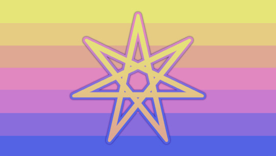
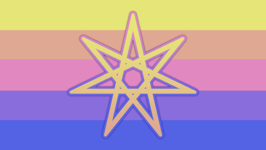


[ flag meaning & explanation + desaturated vers. + id under the cut ! ]

ㅤ ★ flag explanation & meaning ㅤ
i've been aware of the fact that i was otherkin for two and a half years now , and each time i have gone to put my identity in the bio of social media websites or express myself there was not an existing , general flag for the otherkin community . i saw one for those who identify as kingender (or therians and alterhumans) specifically , but never an otherkin specific flag ! sooo .. ㅤ
the specific yellows, oranges, pinks, purples, and blues were selected as many peoples otherkin identity revolves around past lives and self discovery - and so , they represent a sunset of sorts , what me and some friends figured would be the perfect embodiment of new beginnings and the deepest sense of self! ㅤ
the variety of colors in the sunset theme also represents the diversity of otherkin , and how everyone's perception of their kintypes & identity varies depending on how they perceive things! ㅤ
the different colors can also be perceived as a representation of the different reasons one might identify as otherkin - from psychologically to spiritually , everyone has their own shade of reasoning as to why they resonate with the term. ㅤ
the star in the middle is the classic otherkin symbol, hence its emphasis and blending with the flag - here , it is meant to represent the long lasting community and everything it stands for! ㅤ
it can be reused or reinterpreted in any sort of media , without any need of credit towards me ! i do love being tagged in posts , but there's no need necessary <3 i just find comfort in knowing there's finally a flag that can unify us together ! ㅤ
(note: updated 03/03/2024 to make things a little more easy to read!)
★ a bit more desaturated version of the flag :


★ image ids ㅤ ( listed from top left, top right, bottom left, & bottom right. also attached as an alternate id to each image! ) ㅤ
1.) [Image ID: A rectangular flag with seven stripes. The flag is horizontally symmetrical. The stripes are in these colors, as follows: yellow, orange, salmon pink, hot pink, magenta, purple, & a deep blue. The symbol in the middle is the seven-pointed Otherkin star, with the gradient on the inside following the yellow-orange-salmon pink pattern, and the outer stroke following the magenta-purple-deep blue pattern. There is a dark purple shade behind the star. /End ID] ㅤ
2.) [Image ID: A rectangular flag with five stripes. The flag is horizontally symmetrical. The stripes are in these colors, as follows: yellow, salmon pink, hot pink, purple & deep blue. The symbol in the middle is the seven-pointed Otherkin star, with the gradient on the inside following the yellow-orange-salmon pink pattern, and the outer stroke following the magenta-purple-deep blue pattern. There is a dark purple shade behind the star. /End ID] ㅤ
3.) [Image ID: A rectangular flag with seven stripes. The flag is horizontally symmetrical. The stripes are in these colors, as follows: yellow, orange, salmon pink, hot pink, magenta, purple, & a deep blue. /End ID] ㅤ
4.) [Image ID: A rectangular flag with five stripes. The flag is horizontally symmetrical. The stripes are in these colors, as follows: yellow, salmon pink, hot pink, purple & deep blue. /End ID]
#🌀 ;;#otherkin#otherkin flag#kin flag#alterhuman#alterhuman flag#therian#therian flag#therian mogai#otherkin mogai#alterhuman mogai#flag#flags#flag coining#mogai#mogai flag
341 notes
·
View notes
Text
Veilguard Photodump (Spoiler Edition)
End Game Spoilers (mostly me gushing ab art direction ( ̄y▽, ̄)╭ ) under the cut
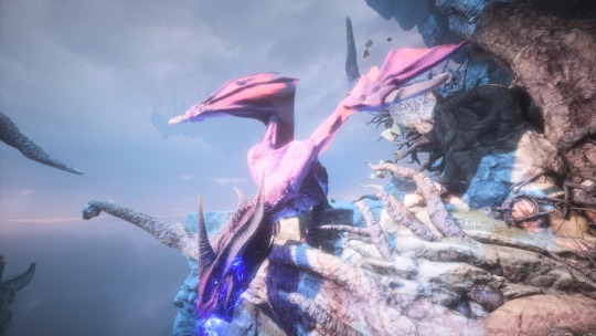
I can't get over how stunning the light and colour design is in this game. Funniest thing I noticed was that, while treading through any area, there were a lot of very obvious "Photo Opportunities" where the map designer was like Hey. Hey. Come over here for this little bit of treasure haha. Oooohhh but maybe you can take a moment to enjoy the view? (we worked so hard on it please look pleasepleapspslelpeas) And it's banger after banger of beautiful scenery!
I want to get on this level where I can convey something so gd big. It's much more obvious how massive a Titan is when Rook is in frame, but even without, that's a big lad!!! Huge sucker for a good cloud cap that lets the sun peak through. Literal Silver Lining.
This shot from the end of the Corruption questline (and if you complete the Dreadwolf's Memories + Convince Mythal to help) is great. Like our lady's dragon form is beautifully lit, she's got a spotlight and everything!! And it looks natural. It looks like the sun managed to poke through the blight on this one place.
Also allow me to giggle and kick my feet because not only does Dragon!Mythal's design FUCK (look at that tri-crown horn formation like YEEESSSSSS THAT'S MY BITCH!!!!)
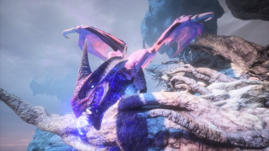
She's also PINK AND PURPLE?? LIKE HELLO??? The lighting is absolutely saturating her scales (plus she's breathing lightning, which glows violet/blue, adding to the effect) so it's brighter than it probably is. But what a fantastic coloration none-the-less!!
End-game Arc doesn't fuck around either. The gold ring from the eclipse against that eye-searing magenta is just. Augh. Ough. Foreboding has never looked so damn pretty.
(Also this general area is one of my favourite places in the Lighthouse. The lighting is just so on point. I have a dozen other photos of this section bc I always stop to admire it lmao.)
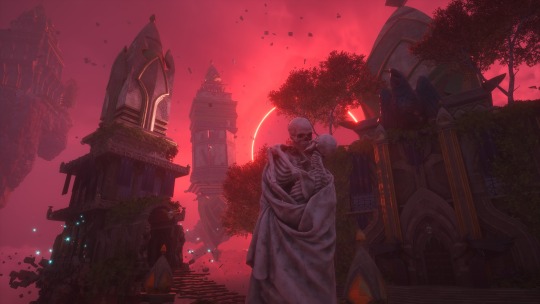
That magenta is striking. You'd expect it to be solid red across the board! But once we're in the "real" world we get those warmer tones you would normally associate with this sort of thing... But now that I think ab it, it's probably from the amount of smoke rising from the antaam encampment. The Crossroads don't have pollution! Of course it'd be more jewel-toned! I wonder what our sunsets would look like if there was less of that. Sigh. Anyways--
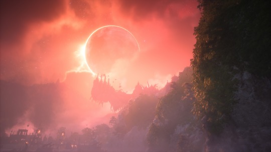
The Regret Prison. Probably my favourite sequence in the game. Yes I love colour, but let's not forget CONTRAST.
It's soooo easy it end up with a horrible clashing of shapes if you don't balance contrast. So you gotta Contrast the Contrast... by reducing the Contrast. Yes there's depth-of-field shenanigans (making lines blur the farther from the viewpoint they are) but there's also mist/dust/atmosphere. I love this shit.
Not to mention that subtle introduction of colour by incorporating greenery (still heavily desaturated, as to not be glaring/distracting) as you make your way through the map. Like. The starting area was desolate and devoid of life. Any plants you saw were dead. Bare-bone roots. But as your proceed you find Life scattered around. Hope.
I didn't get a proper shot/video clip of the end sequence for this quest, where you're walking across a barren expanse and can see the ritual sight erect itself piece by piece in the distance as you get closer. That sequence knocked me out it was so fucking good!!! To the person(s) who all made that happen, I'm sending them a big sloppy kiss on the cheek it was so elegantly executed. <333
Anyways I feel like I said a lot without saying anything at all but hopefully this was somewhat interesting to someone thank you for coming to my TEDtalk <3
21 notes
·
View notes
Text

Positropinkic
A gender related to tropical themes, the colour pink and any variations of it, positivity, sunrises and sunsets!
coined for day 2 of @/dragonpride17's birthday event for "fun/positivity/happiness" !
coined by raleigh of the verdant system, not a request, please do let us know if this has been coined before!
[Flag ID: a horizontal nine-striped flag, all stripes being equal width and length. the first three stripes are a gradient from dark orange to pastel orange, the fourth stripe is yellow, the fifth one is light pink, and then the last four stripes are a gradient from a slightly desaturated hot pink to slightly desaturated dark pinkish-red. End ID.]
Original, more eyestrain-y flag under the cut:

[Flag ID: a horizontal nine-striped flag, all stripes being equal width and length. the first three stripes are a gradient from dark orange to pastel orange, the fourth stripe is bright yellow, the fifth one is light pink, and then the last four stripes are a gradient from hot pink to dark pinkish-red. End ID.]
#flag coining#xenogender#mogai coining#xeno coining#gender coining#mogai term#term coining#xenogenders#cw eyestrain#maybe?#puffbdaycoins#positropinkic#positivegender#tropicalgender#pinkgender#colourgender#colorgender#accidentally downloaded the original flag 3 times
16 notes
·
View notes
Note

Decided to just send this in directly but! I have explanations for everything so buckle in bc when i say i have brain rot about this fic I MEAN IT ITS SO GOOD
1. BI BUG CONFIRMATION. ENOUGH SAID.
2. I will never forget reading that scene from season 1 of steve driving bug home w her bike in his trunk and her all flustered about it and i dont super remember what time of day it was in the scene but in my head it was right after sunset where the sun has set but its light creates this contrast that makes everything look cool toned in comparison to whats in the light n i wanted to play w that in the coloring also im a sucker for steve n his big arms so this was almost entirely self indulgent
3. The cardigan bc i needed to. I re read that chapter constantly it gives me all the warm n fuzzies and thats good for the soul
4. The phones were both an “i need to put this in here immediately bc my brain never stops thinking about it” and a filler for blank space. The colors for each are tied to what s3 bug and what s3 are associated w in my head like you cannot tell me bug isnt soft ivory coded and steve is not light grey-blue coded in s3 it just feels right for them (plus i needed to reference the nicknames at least once my very soul craved it)
5. Dustins hat was a lil bit of a last minute thing, i was working on a bigger piece w all of this kids n their looks for season 3 but it wasnt coming out the way i wanted it to so i scrapped it but i still wanted a something in there that wasnt steve or bug related and it felt fitting to put in dustins camp know where cap both bc of his relationships w steve n bug and bc every now and then i think about how dustin felt ditched by the party at the beginning and how heartbreaking that scene was when i read it n how much i just wanted to hug the lil guy bc feeling lonely at an age like that is so devastating it made my heart hurt for him so i wanted to have a lil thing for dustin in there somewhere
6. In the show i really liked the whole bit w steve asking girls out and robin keeping score n before you wrote this scene i was curious as to how you were going to go about it and it ended up cracking me up dude i love that scene if him just being awkward and so not “king steve” suave and i needed to put down how my brain saw that scene to something visual bc it was so ugh hes such a dork i love steves himbo self
7. Follow up is the lil doodle of steve n robin running around high as hell and there was no way i wasnt going to include that somehow if i am given the chance to write the phrase “trash popcorn” and draw robin frolicking i will take it with both hands and bolt
8. Going back to the whole “steve is a desaturated light blue in s3” thing i just wanted an excuse to draw my boy being cute in my head this is when hes helping bug put away books at her job and yes the anatomy is a lil wonky but i luv him and his hair swoops and joes side profile is so very fun to draw <3
Over all come home is wonderful n amazing and i love it n ur brain is so big n full of wrinkles
i genuinely cried when i first saw this im not kidding. im speechless, its so fucking beautiful and everything you drew from the fic is captured SO perfectly i cannot even begin to explain how much this means to me :(((( thank you so so so so much. truly.
the DETAILS ???? you brought the cardigan to life. its exactly how i envisioned it in my head, its BEAUTIFUL :((((( and bug being ivory and steve a blue ,,,, god you really truly nailed this i again cannot put into words how PHENOMENAL this is. the telephone lines being connected with their nicknames, steve carrying a box of books at bugs job, him driving and the setting sub (which you got EXACTLY. it was the same i envisioned in my head writing that scene), the bi colors on the lady bug like are u kidding me !!!! youre insane and i LOVE YOU !!!
steve n high robin doodle is so <333 and the steve scene at scoops with his flustered monologue in the background made me giggle so hard oh my god.
i know you dont know this, but my birthday is tomorrow and this is the best gift ive ever been given. i want to frame the doodles and put it on my bedroom wall because i am astounded and in awe of your talent and still so baffled my fic was brought to life !!!!! its mind boggling and i cannot thank you enough for this experience <333
(obviously with ur permission in reference to wanting to print n frame the doodles because theyre so dear to me and i respect ur talent !!)
#n3muru#ask#m speaks#ch creations#im so serious i want to print this out and frame it#this is everything to me#i sobbed#my sister asked why and i showed her the pic and she also was like oh my GOD#ur so crazy talented im so so so in awe
23 notes
·
View notes
Text
Ok I finally got flags I'm happy with
Ultrahomo or ultragay

[image ID: a 7 striped flags. The stripe sizes are uneven, getting larger as they approach the center, with thin divider stripes between them. Colors, in descending order, are: red; dark purple divider; light orange; blue divider; light yellow; lime green divider; white-purple-black gradient; light yellow divider; lime green; light orange divider; blue; red divider; dark purple. End ID.]
Someone who identifies as homo(sexual, romantic, platonic, etc.) or gay in a non-normative way, and "queers" the idea of what homosexuality is. It subverts traditional ideas of what "gay" means, and/or it is being gay in such a way that identifying as gay, or being attracted to whoever you're attracted to, is more abnormal or unexpected than identifying as straight would be, specifically in a way that other gay people don't experience (so, the very nature of being attracted to the same gender being seen as abnormal in heteronormative society doesn't count as ultragay)
Some reasons that someone might identify as ultragay include:
1. They are ace or aro, and feel like their identity is highly sexualized or romanticized, and so their identity within it is outside of the norm even within the community
2. They are ace and aro, identifying with the homo- label of tertiary attraction such as homoplatonic, homosensual, homoaesthetic, etc. and thus feel like their experience with gayness is different from alloallo gays and subverts gayness
3. They are trans, and are attracted to the opposite gender/their AGAB, but they still feel like they're gay and conceptualize their attraction as gay
4. They are trans, but people call into question if they or their partner are actually gay because of them being trans
5. They are nonbinary and feel like their experience of gayness is different from how binary people experience gayness.
6. They are multigender and are multi-oriented, being both straight and gay, which would bring exclusion for some
7. They are an mspec gay
8. They use the split attraction model and are also straight, another gay orientation (ex: gaybians), bi, mspec, or enbian, or any other orientation. Because they are not exclusively gay, they are ultragay.
9. They're not the gender expected of their orientation (example, lesboys and turigirls)
Ultralesbian variants


[Image ID: 3 7 striped flags, with thin divider stripes between them. The stripes get larger as they approach the center. All of them have a white-purple-black gradient in the center. The first is colored with the colors of the sunset lesbian flag's 5 striped version (red, light orange, white, gradient, white, desaturated pink, dark pink), with the dividers being an inverted version of the 7 striped version (dark pink, slightly dark desaturated pink, desaturated pink, light orange, orange, red). The second is the colors of the aurora lesbian flag (dark indigo, violet, baby pink, gradient, baby pink, very light yellow, turquoise) with the dividers being most the same colors in a different order (baby pink, very light yellow, turquoise, dark indigo, violet, baby pink). The third is the colors of the dawn lesbian flag (purple, violet, pink, gradient, salmon orange, light orange, light yellow) and the dividers are an inversion of it. End ID.]
Ultraveldian/Ultraturian variants


[Image ID: 3 7 striped flags, with thin divider stripes between them. The stripes get larger as they approach the center. All of them have a white-purple-black gradient in the center. The first is colored with the colors of the ocean or toothpaste gaylm flag's 5 striped version (green, light mint, white, gradient, white, sky blue, dark purple), with the dividers being an inverted version of the 7 striped version (dark purple, indigo, sky blue, light mint, turquoise green, green). The second is the colors of the turian flag (desaturated pink, off white, desaturated turquoise, gradient, desaturated turquoise, dusty purple, dark violet) with the dividers being most the same colors in a different order (desaturated turquoise, dusty purple, dark violet, desaturated pink, off white, desaturated turquoise). The third is the colors of the dusk veldian flag (purple, blurple, sky blue, gradient, bright teal, light green, light yellow) and the dividers are an inversion of it. End ID.]
Ultraenbian varients


[Image ID: 3 seven stripe flags, with thin divider stripes between them. The stripes get larger as they approach the center. All of them have a white-purple-black gradient in the center. The first's colors is a gradient of purple, going from dark and bluer at the top to lighter and pinked at the bottom, all throughout dusty, colorpicked from the popular enbian flag. The dividers are white and yellow from the moon symbol, and a shade of purple that was omitted from the colorpicking. The second flag is a 5 striped version of a blue and purple enbian flag made to resemble the gay and lesbian flags (colors are blue, light blue, white, gradient, white lavender-pink, and dark indigo-purple) with the dividers being an inverted version of the 7 striped version (dark indigo-purple, violet, lavender, light blue, blurple, blue.) The third version is the lavender field enbian flag (dark purple, purple, lavender, gradient, slightly dark lime, lime, light yellow) with the dividers being an inversion of that. End ID.]
Reasons to use ultralesbian, ultraveldian, and ultraenbian are the same as listed under ultragay. And anything else the user thinks applies to them
Tags: @radiomogai @genderstarbucks
8 notes
·
View notes
Text
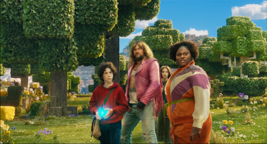
Why the Minecraft Movie looks so bad
Okay, let’s see if I can make this work
Hi, I’m Watercolor, currently a student learning animation and visual effects. I’ve got some more technical explanations for why exactly the trailer looks god awful
I’m gonna do my best to explain this in simple terms, but if I don’t explain something very good, let me know and I’ll explain more. Alright, this is gonna be a long post
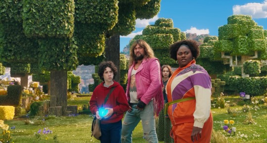
Starting off with the obsession with backlighting. See how it doesn’t really match the environmental lighting? That’s one of the major things that makes it look so weird to a lot of people. It could have been done to better distinguish the actors from the background, but it does that a little too well and makes them look way too out of place. The environment has a very nice constant (most likely singular) light source, which is most likely an HDRI.
An HDRI (or high dynamic range image) informs the animation software on how the scene should be lit, and is often a weird panoramic image of whatever physical area you want to replicate.
In a reverse case, adding a CG character into a real set, you could take an HDRI of the physical set, and use it to apply similar lighting. Adjustment will most likely have to be hand adjusted by the lighting team (and tbh they add a lot of extra lights in anyway. It just needs to look right) but it’s a fantastic starting point for the compositing and lighting teams.
However, the McM’s live set has way different lights set up then what is seen in the environment.
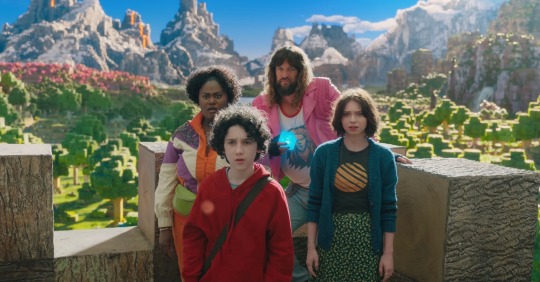
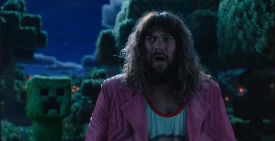
Here, for example, the live set is most likely being lit by standard 3 point lighting, which are not only the wrong color (the lighting on the environment is much more yellow) but also washes out any shadows that would help define the actors. If this movie wasn’t obsessed with backlighting, you could fix that by lighting the actors and environment from the front, but because the sun is in the back, they have to make the front of the actors unnaturally brighter to see them more properly. I have a slight idea on why the kid in red looks especially “photoshopped” in, and it’s mostly because his hoodie doesn’t have a similar reflectiveness to everyone else’s outfit, and his hair is a more neutral color, causing the highlight to be even more washed out. Also, while we’re here, the cube is a physical prop, but it was not lit up during filming, and all the light output was tossed on after. And it’s really inconsistent and honestly, lazy. For the most part they just hit it with a blue blur effect in post, it doesn’t actually cast any light.
Another major issue is the color difference between the actors and the environment. The color balancing on the actors is particularly garbage, they’re somehow desaturated while also being too saturated, I don’t know how they managed that. But the technical issue on why it looks odd, is because the physical camera cannot physically pick up the same vibrancy as the “camera” in the CG world. You might have seen an example of this when trying to take a photo with your phone, especially of a very colorful event like the sunset. It’s also why “ugly sonic” looked particularly out of place, he was 10x more saturated than anything else around him.
Having the actors on a very low effort green screen stage also completely ruins any chance of getting the proper ambient light or ambient occlusion.
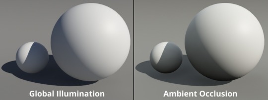
Ambient occlusion is basically the bounce light from other objects in your scene, gamers might know this as a form of ray tracing (ray tracing is live changes in ambient occlusion, games without ray tracing bake in ambient occlusion to get a similar result)
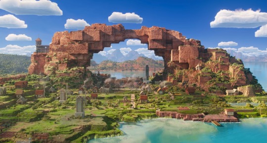
When everything is CG, (again art style aside) looks pretty darn good actually!
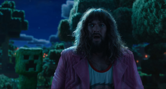
I attempted some edits to see if anything could make it look better (left is original, right is mine), and I don’t think proper lighting or anything could actually fix what this movie has wrong with it. They should have made the whole thing animated, I don’t think any amount of bullying would fix this, the studio basically has to scrap the actors, and make new CG characters from scratch in the same style as the rest of the world.
All of this is not the fault f the animators, or any of the vfx team, they did their absolute best with what they had, this is 100% the fault of the higher ups on this project. I have no idea how this good this far into production without ANYONE saying that it was a bad idea (Either that, or a lot of people got fired, which is unfortunately a likely possibility)
19 notes
·
View notes
Text


Some coloured photos of the Demon Moon girlies of Mirrored Sunset.
Fun fact about Kanae’s outfit! It’s actually based on a costume I sometimes wore while volunteering at a local living history museum, which is based in the 1910’s. The idea came to me mid-sketch, and I realized just how perfect it was, given Demon Slayer takes place in that time period!
As for Kanao, I was considering desaturating the pink of kimono slightly, since the current shade seems a little intense.
Mitsuri was actually the hardest to pick a design for, I spent so long trying to find something that I liked her in while also actually looking like something she would wear in my mind(bonus: her obi was a gift from Obanai).
And Shinobu. She was probably my favourite design, and the one that’s been settled in my mind the longest. I knew I wanted her to have a design like this, and there is something so satisfying about seeing it brought to life in full!
23 notes
·
View notes