#creative fishing logo design
Explore tagged Tumblr posts
Text

KOI Coffee Logo Design - What do you think about this one?
#logo#logo design#logo inspiration#design#logo designer#creative logo#graphic design#business logo#brand#coffee logo#yin yang#fish logo#koi logo#animal logo#brand identity#graphic designer#DAINOGO#creative#visual identity
20 notes
·
View notes
Text

Creative whale logo design ♡♡♡
This week we offer 50% discount to our logo/branding packages!
PM us and get your premium design at a affordable price!👌💌
#whale#underwater#sea world#dubai#ocean#restaurant#big fish#logo#branding#design#services#consulting#illustration#artists on tumblr#startup#company#business#creative#graphic design
34 notes
·
View notes
Text
Just made this prob what my logo would be if I ran a betta store
23 notes
·
View notes
Text


Logo design for Cleland Guide Service located in central South Dakota!
13 notes
·
View notes
Text


Best new design for Chrismas day
buy now Click Here
#amazon#creative logo#web graphics#shopping#graphic design#fiverr#vector#design#farming#logo design#fishing#fish#fish in a birdcage#fishblr#sal fisher#lupe fiasco#fish illustration#banana fish
0 notes
Text
No. 1 - Lufthansa
We begin with a large fish even by the standards of the large pond in which we operate. A very intentionally chosen large fish. Deutsche Lufthansa is Germany’s flag carrier and the second largest carrier in all of Europe by passenger volume. In 2018, they unveiled a new standard livery for their fleet of airplanes, and it...well. It’s this.
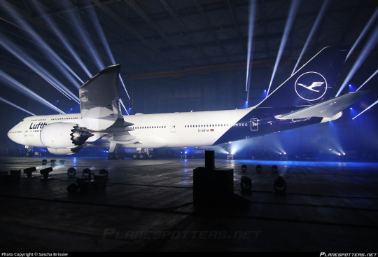
Even the presentation - good lord, is this an auto show?
My feelings on Lufthansa’s 2018 livery are visceral. There’s no mental evaluation required, no taking it in, thinking about the choices made - I look at the modern Lufthansa livery and immediately, profoundly know that I hate it. And that’s not just because of the specific choices made - which are bad - but because of the space they occupy amidst a creatively barren wasteland within livery design. This is going to be a very long post, which isn’t standard for this blog, but my goal for an introduction is to break down exactly the sort of design that made me feel the need to start doing this to begin with.
But in reality that’s only the beginning. Yes, Lufthansa’s livery is specifically disappointing, but it is so much more than that. It is the purest distillation of the greatest challenge aviation faces today, far weightier than scheduling issues, outdated IT, and runway incursions. It is not the worst example of it, not in the slightest, but it is a large airline which has a very textbook presentation of symptoms and thus feels like a great example to describe exactly what I hate about this sort of design. Let me explain.
Essentially, airlines have found a formula. It goes as such:
Almost entirely white body. (There is a name for this trend: Eurowhite.) In some cases, there may be a colour on the underside, generally either a light grey or whichever secondary shade the airline has committed to. In the case of this Lufthansa livery, it is just white.
Aside from the white body there will be either a single colour (generally some dark blue, or less often some sort of red) or a few colours, usually but not exclusively on flag carriers to match their national branding. (The proliferation of red, white, and blue flags out there means that a disproportionate number of airline liveries are these colours.) Unless it is literally just a white plane meant to be as generic as possible for short turn-overs when leasing, it will at least attempt to have some sort of design, but it will be minimal, and:
All of the detail will be on the tail. There may be coloured winglets or engine nacelles, but other than that it is only at the rear of the plane that you begin to see any interest. Usually this is just a logo, though it may be an abstract design which looks like a default tumblr header. It will often only be on the tail, with nothing at all on the body proper.
The name of the airline written in a sans-serif typeface which is set as default on at least one word processor. Rarely will anything creative be done with this. It will (usually, except in egregious cases) match the impotent attempt at graphic design which has been confined to the empennage and it will have all the charm of a large retail chain’s flyer describing the benefits you’ll definitely totally get if you work for them - sickeningly corporate. Low-cost airlines may slightly vary the theme by putting their website onto the livery, either towards the back or just instead of the airline’s name. The brave will also write it on the ventral fairing, but most don’t even bother with that simple act. Some airlines have their name written in the language spoken in the country they’re based in, usually beside the English text, but most are only in English despite operating in countries where this is not the most widely spoken language.
Not every livery which has these features is badly designed, as seemingly small changes can make all the difference. There is the occasional livery that fits most, if not all of these features that has some clever tweaks or design choices which makes me actually think it’s fine, acceptable, maybe even decent. (I have taken the initiative of making sure a few of these are among my early posts, just to demonstrate that it can be done). And some airlines depart from this entirely and come up with something even more hideous. Yet I somehow find myself respecting even these more than I do Lufthansa.
The Corporate Standard Livery Design (Lufthansesque design, if you will) is - and I do not think I am being dramatic at all here - an epidemic. Taxiing through most airports, you sometimes have to actually try to tell the planes parked around you apart in the sea of red, blue, and mostly white. And I spend a lot of time looking at planes.
These liveries do not only fail to inspire me. They instill in me a profound disgust. They are not trying to be good. They are trying to be what I described earlier - decent, not worth complaining about, because that’s cheaper and easier than designing something good. Graphic design is not anyone’s passion here. They’re just trying to toe the line. They’re so poisoned by the modern minimalist-design brain virus that they don’t realise that to be acceptable a livery this simple needs to do something interesting. There must be a creative decision made somewhere, a compelling feature, or you may as well be flying an MLA-formatted plane. In their striving for adequacy they become not just ambient, but lukewarm. They are a bottle of water which has sat in the sun for so long that when you drink it, even though you’re overheating and parched, it feels only negligibly better than the air you’ve been breathing in.
To be fair, I do not only hate the Lufthansa paintjob because it exemplifies whatever-ness. Even in an industry saturated with gross in-flight nothingburgers served with some stale biscuits and a paper cup of Lipton tea, Lufthansa manages to offend in specific and unique ways.
Throughout its long history Lufthansa has had a handful of different liveries, but from 2018 onwards this has been the situation. They’ve never been brilliant, but it’s only gotten worse over time. I normally would commit to a separate post for historical liveries, but in a move that I don’t foresee becoming particularly common I’d like to talk about the history and evolution of Lufthansa’s liveries from the golden age to now - the fall, if you will.

(image: lufthansa bildarchiv)
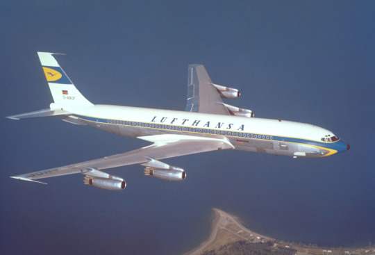
Their early liveries were already pretty much plain white or metal, but they still had a few features that made them seem a bit less like photocopy paper which was meant to be printed plain blue but only got through a tenth of the sheet before ink ran out. To begin with, they used a lighter blue and combined it with a vivid yellow to add some actual visual interest. The layering of the yellow over the blue where it curves around and below the nose and on the ends of the tailplane actually draws the eye. The font choice is nice and legible, spaced apart in the center of the fuselage. I imagine it was easy to read even from far away. (Shame it’s a bit blocked by the wings from some angles, though.)
(image: lufthansa bildarchiv)
This early 707 design keeps the cheatlines extending past the nose but makes them sharper than the ones on the Connie to match the sleek profile of the jet. Back when this plane was painted adding white to your plane was a choice rather than the thing everybody was doing, which allows me to respect it for the choice it was instead of considering it the factory default. The bottom half, denoted by the cheatline, is left unpainted, which only adds to the sleekness of the overall profile, and the text is clear and plain but still aesthetically pleasing. The 707 is by modern standards pretty antique-looking; you can take one look at one and tell it isn’t particularly streamlined. This paint scheme, though, makes the plane look sharp and aerodynamic, despite not being revolutionary. I would go so far as to say I like this particular livery. This is, unfortunately, as good as it gets.

Oh. Oh no...
Let’s assess the damage here. The cheatlines now simply meet at the front without wrapping down to the belly of the plane and the nose is a simple black tip. I like it when airlines paint their planes’ radomes, and I wouldn’t mind it here if not for what it was replacing. The font has been replaced with a generic sans serif font which is closely spaced and put up into a corner, like the name on a homework assignment - it’s not really part of the total package, just there for administrative purposes. Most upsetting to me is the tail. While I wouldn’t say I love the little section on the old plane, it at least felt like it belonged there, creating a second blue-and-yellow layer above the white. Its placement on the fin above where it begins to taper gives the plane a bit of an aerodynamic feel. It’s certainly not changing the world, but it feels at home in the livery.
The new fin is a sharp downgrade. With nothing to mark the transition the fin abruptly goes from the white of the upper fuselage to a shiny blue which contains an enclave of the only yellow to be found on the entire aircraft. This makes the yellow stand out, as it has nothing to tie it in with the rest of the plane, and the fin itself feels almost like it’s been Frankensteined onto the fuselage from a different plane by a different airline. There’s nothing to mediate the transition from a block of white to a block of blue, like how the cheatline separates white and grey. It just is blue now, stop asking questions. This also means that the only part of the plane that the eye is really drawn to is...the tiny portion of the whole that is the fin, which may as well be floating detached in midair.
This is foreboding. Knowing what I know now, it feels like looking back at when a romantic partner began to act strange years later, after the divorce, as you walk by the house he bought with his mistress.
(image: g najberg)
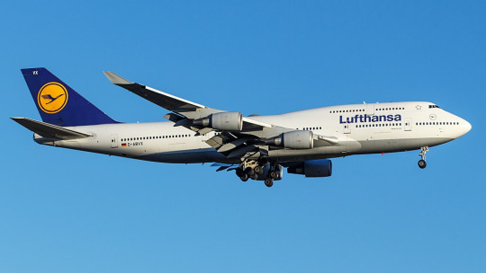
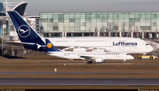
The most recent, and only, time I flew on Lufthansa was in 2014 and was aboard one of their 747-400s. (Actually, if you’d still like to fly on a passenger 747, Lufthansa is basically your only option.) At the time, they looked like this. This is...just sad. They got rid of the cheatlines, because that’s trendy now, and they painted the whole plane white and made an attempt at lip service to the old metal lower half by painting just a bit of the plane grey, like if a human stepped into a puddle of paint that only covered the very sole of their foot. And I’m being generous by showing a 747, a plane which inherently makes any livery look less boring by being interestingly shaped itself, instead of the classic slightly pointy single-decker tube. Not to mention the double-decker design makes the text vertically centered instead of the default Lufthansa look of awkwardly shoved nearly all the way up the fuselage.
In defense of the modern livery, it’s possible to argue it’s an improvement on this. Honestly, looking at them next to each other, it’s difficult to pick out which one I find less defensible.
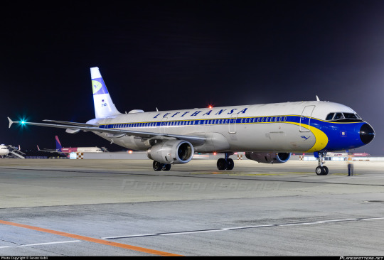
But then you see D-AIDV, an A321 painted in a heritage livery, and you feel the immediate, visceral “no!!! no go back!!!” as you remember that this is a false dichotomy and we could have something so much better if they weren’t peer-pressured into generic modern design.

And for what? For this?

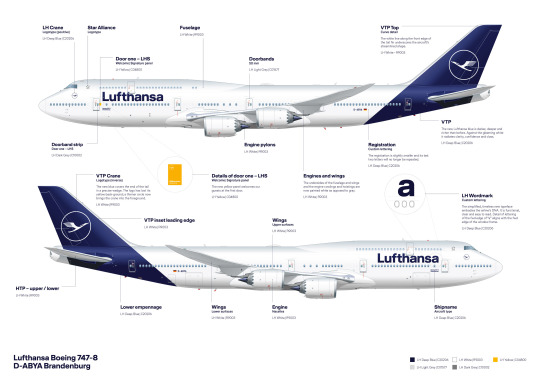
(image: hvdfonts)
For the third time, I remind you of what we have been reduced to. We have achieved a state of reductio ad absurdum where this barely qualifies as a design. This plane is more or less a white blot. You can put as many insets as you want and it is still a white blot.
I am relatively sure that the font used is literally Helvetica. EDIT: I have been informed that it is not, in fact, Helvetica, but a custom typeface that happens to look almost exactly like Helvetica. This is, in my own opinion, worse! They did apparently use Helvetica in the past, though. Here is a very detailed description of the design process of the font, which manages to contain a grand total of zero ideas.
I would hate this on its own already, but it’s also so closely spaced and located so far up that it makes me feel like I’m suffocating. In my own experience as a dyslexic person, kerning is the single weightiest feature when it comes to if I can easily read something or not. While Helvetica, ugly though it may be, is generally considered a very legible font, any benefits from that are more than cancelled out by committing to making sure the entire name of the airline fits between the frontmost two doors with room to spare. It feels almost hostile.
Now, all given, I at least somewhat enjoy the shade of blue used for this livery, which is darker than the normal fare. I do miss the way the grey broke up the endless white space, though, and I mourn the yellow even more - in addition to being something to look at, losing it has also lost any visible reference to the flag of Germany, the country for which Lufthansa is the flag carrier. They don’t even have the black part of the German flag despite that being basically free. If they went for black instead of dark blue I would honestly respect this a hell of a lot more. One of the most recognizable flags in the world and instead your airline looks like a discount SAS.
Yeah, I said it. If we want to go even further with comparisons by including airlines that aren’t Lufthansa, this is basically the SAS livery. Except not, because the SAS livery does a lot that this doesn’t.
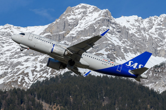
This is about Lufthansa, not SAS. I’ll look at SAS soon enough, because comparing their look to Lufthansa’s has made me appreciate it in a way I never used to. But I don’t think I need to elaborate too much for it to be clear why SAS’s livery works and Lufthansa’s doesn’t, despite the superficial similarities. SAS took their absolutely horrid previous livery and turned it into something which might not wow anyone but at least feels uniquely theirs, while Lufthansa had something which accomplished much the same and then diluted it into nothingness, Eurowhite writ large. Two washes and you’d wonder if your Lufthansa flight is actually a Smartlynx lease.
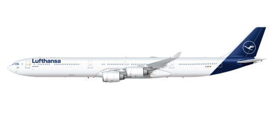
The way that the blue slices into the bottom of the fuselage and doesn’t fully cover the tailfin is...something? It’s a design element. It’s not nearly enough to save it, but it’s a design element. However, this presents another issue specific to Lufthansa’s paint job, best demonstrated with a specific plane:
(image: lufthansa)
Lufthansa is the world’s largest operator of the Airbus A340, a somewhat eccentric airplane which is perhaps best thought of as a four-engined A330. I love this airplane, and am delighted seeing it overhead on my walk home from work, because Lufthansa is kind enough to operate a daily service with it to my home airport, but that’s beside the point. The point is this: what I have pictured is specifically the A340-600, which is the world’s second longest in-service airliner. Yes, longer than the A380 and the 747-400, and, in fact, only shorter than the 747-800. With a plane this long, the Lufthansa livery creates an incredible look of rear-heaviness. This plane looks like it should uncontrollably pitch up until it’s perpendicular to the ground every time it takes off. Of course this effect is less pronounced on shorter aircraft, but it’s still there, and I dislike it.

You can barely even tell there’s paint at all on a much smaller plane! And the white bit on the front of the rudder which looks okay on a conventional empennage looks downright horrible when it’s only on the very tip of the t-tail’s forward point.

Oh, and when you take the windows out for a freighter conversion it gets even worse.
This is a generic-brand airplane. It genuinely reminds me of generic branding. There is a specific brand that has this exact appearance and I can’t remember what it is but it’s right there and I’m fairly sure I’ve seen it at CVS. I don’t think that’s what you want to go for when designing an airline livery, especially for an airline representing a country, but if Lufthansa wasn’t going for that they’ve failed.
__________________________________________
Overall, Lufthansa’s livery is superbly boring and not terribly well thought out. It’s not worth this absolute dissertation on its own, but I’ve singled it out to complain about general trends, and for that I probably owe it an apology. Said apology is predicated on the fact that it is still a very underwhelming and bad design which could have used a lot more thought. There are a million ways this could have been made decent, and none of them were implemented because that would have taken effort and time and creative vision. I think this post actually required more time and effort than Lufthansa put into designing their planes.
That said, Lufthansa gets a final grade of D. It’s...bad, it definitely is. There’s the vague flavour of the start of something, like the very distant smell from a barbecue happening three blocks away, but is that really even a redeeming factor?
No. The second-largest airline in Europe should be able to do better. If I have to stare at rows upon rows of their planes any time I’m at a German airport, they should have the decency to make them interesting to look at.
#tarmac fashion week#region: europe#region: west/central europe#lufthansa#region: germany#grade: d#era: 2010s#era: 2020s#era: 1950s#era: 1960s#era: 1970s#era: 1980s#era: 1990s#era: 2000s#retired liveries#flag carriers#double sunrise#long haul#lufthansa group#lufthansa line#scandinavian airlines system#deltalike
179 notes
·
View notes
Text
Foster Household: Chapter 8, Part 4
Harvey begins a midlife crisis, Carson has a difficult school day where most of the faculty are jerks, and Keira discusses her future home with Kayleigh.
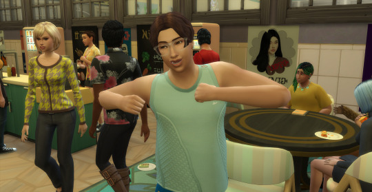
With a midlife crisis threatening to over power him Harvey does his best to do the things he loves. He hasn’t fished at night for quite some time so he goes out to his boat and casts a line. Normally he sails to deeper water but tonight he is content to search the shallows.

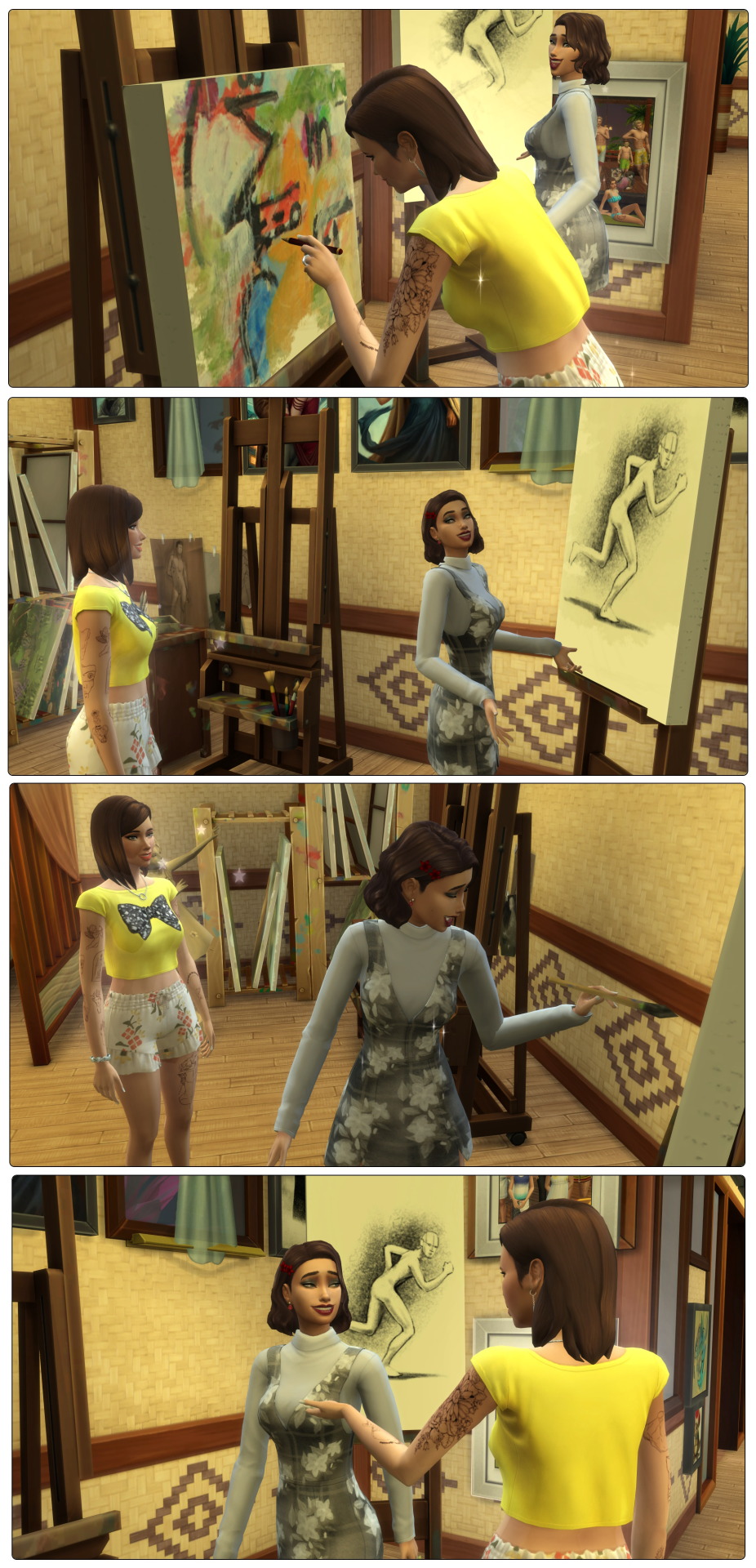
Keira: Hey mum, is this right
Kayleigh: What do you mean honey
Keira: I’ve seen you do this figure painting like a billion times but I’m not sure I have the proportions right
Kayleigh: You do, I promise
Kayleigh (level 10 in painting) mentors Keira while she paints and in the end we have Keira’s second masterpiece!
Kayleigh: Harv, where have you been
Harvey: Fishing, and thinking
Kayleigh: Penny for your thoughts
Harvey: I just… I’m feeling old. Like life is getting away from me. I don’t think I’m going to reach the top of my career before retirement
Kayleigh: I know you’ve always been ambitious. While I can’t magically promote you, I do have an idea of something that could help you feel young
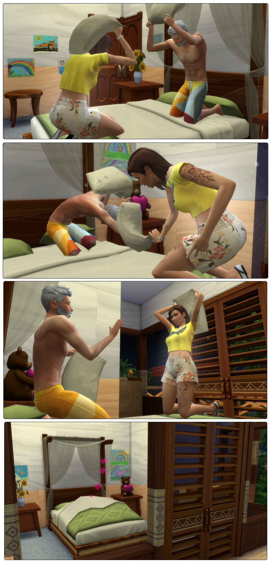
PILLOW FIGHT
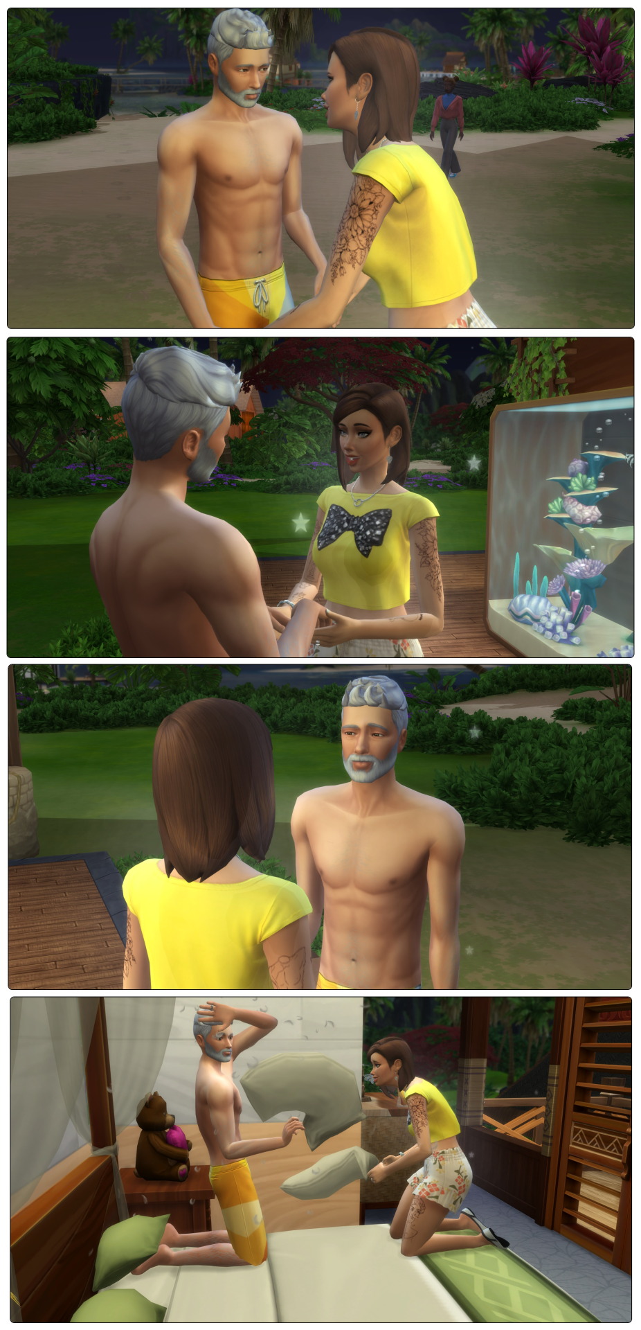
Kayleigh: Take that scoundrel
Harvey: I shall never yield villain
Kayleigh: Is that so? A pillow to the face should change your mind
Harvey: Ouch
Kayleigh: Are you okay
Harvey: Sneak attack!
After a passionate battle Kayleigh emerges victorious, and the pair have some woohoo making Harvey feel young, at least for the night.
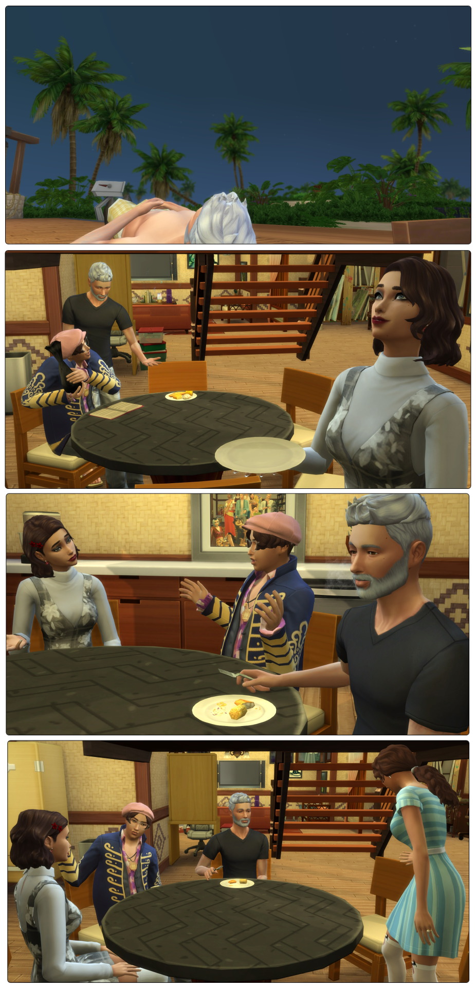
In the morning the midlife crisis hits, and leaves Harvey yearning for creativity. He gets up early to watch the sky change colour and get inspired.
Keira: Are you still hugging trash
Carson: For good luck
Harvey: I thought your first day at high school went okay
Carson: Yeah but this is the first active day. How did you find Mr Amarinth
Keira: Who
Carson: The principal
Keira: Sorry, it was Mr Booth when I was there
Harvey: Just be polite and show respect, he shouldn’t have any reason for complaint
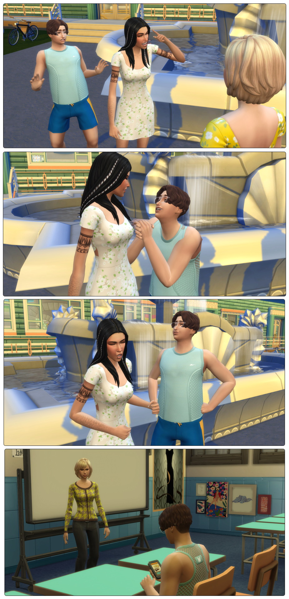
Mrs Hensley: CARSON
Carson: Woah, woah, what?
Mrs H: Being at school and not in class? You should be ashamed of yourself
Carson: But it’s only 8am, there must be a mod problem, no classes are even on right now
Mrs H: I care not for your nonsense! I’ll let you off without detention this once but I still find you suspicious
Carson: Don’t worry, I’ll get to my classes
And he does! He’s first in with Mrs Tinker for art.
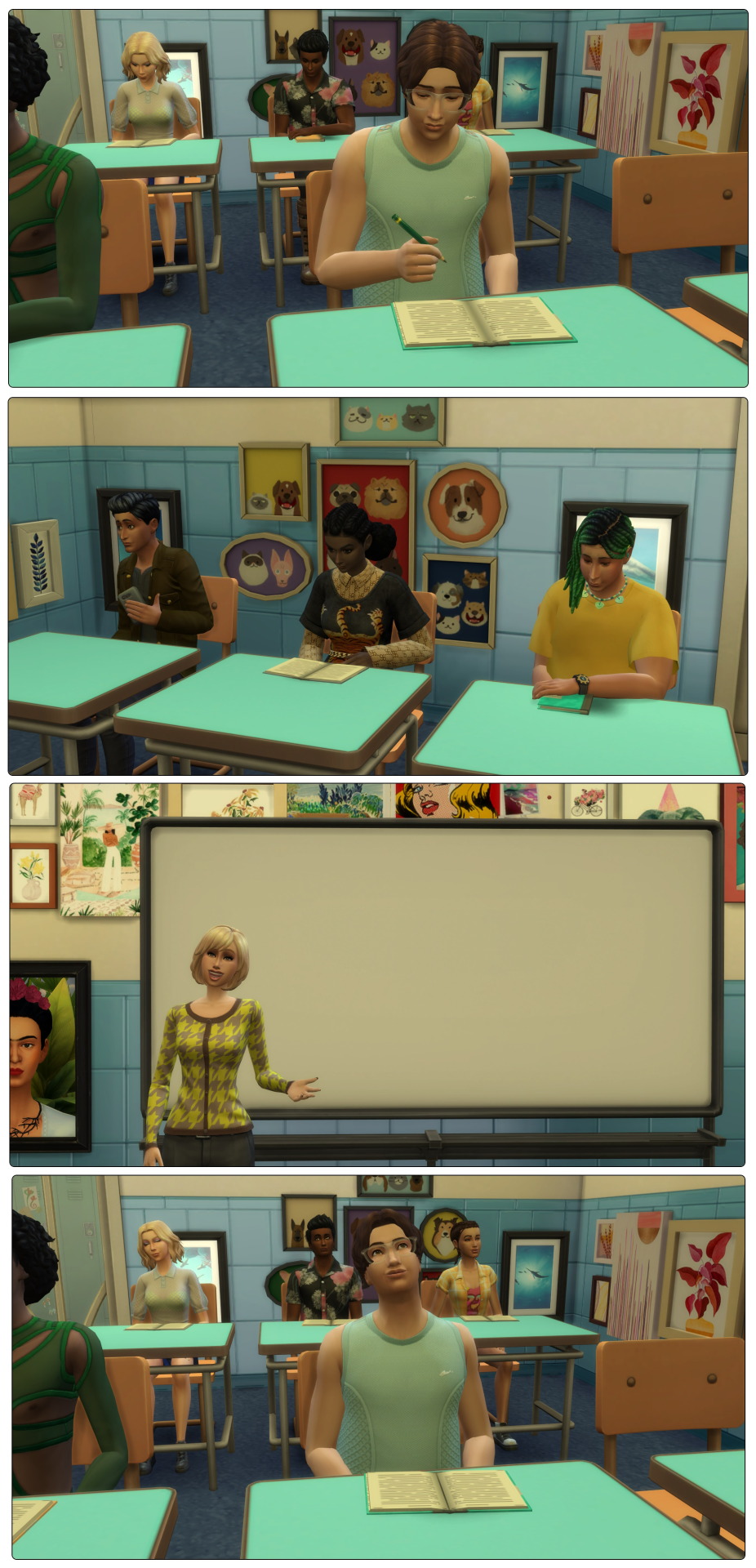
Carson as an art lover is excited to see what he’ll learn today.
Mrs T: Alright everyone, let’s get our books and- William?
William: Yes Mrs Tinker, sorry, I’m just putting it on silent
Mrs T: Make sure you do. Today we will be introducing your young minds to the idea of negative space. While many works of art focus on the clear image, the space surrounding the focal point can be used to show a design all of its own. Let me illustrate, I assume you’ve all seen the FedEx logo? I’ll draw it. Notice how the design has an arrow here. While it is not the flashy part of the logo it is used in conjunction to show the brand as a delivery service
Carson takes some time to think about this. Stuff that isn’t there being part of a bigger picture? Weird.
Mr Amarinth: Another Foster
Carson: Oh hi Principal Amarinth, how are you today
Mr A: It appears you will not be following the example of your siblings. Mrs Hensley told me you almost got detention this morning, you are on warning
Carson: But it-
Mr A: No buts! I’m observing Mrs Tinker’s class this afternoon and I expect to see you all involved in the curriculum
Mr Amarinth gets up and most of the student exchange confused looks.
Mrs T: Don’t worry, it’s a routine check. I’m sure you won’t let me down
Darwin: I’m sure I will

Carson: So how do you work this again Onyx
Onyx: Oh social bunny? It’s not too complex. You send people friend requests right? And then you can check out what they’ve been up to
Carson: What happened to catching up in the real world
Onyx: I don’t know, I guess it’s not a teen thing anymore. You settling in okay?
Carson fills Onyx in on the bizarre encounter from this morning and Onyx assures him that Mrs Hensley is simply a hard ass who enjoys scowling at the students more than teaching them.

Carson: I thought high school was meant to be full of attractive people
Onyx: What do you mean
Carson: I’ve glanced around and honestly… not finding anyone that makes my heart flutter
Onyx: I mean I’ve spotted some okay ones but we must have different tastes
Carson: Yeah. I just figured I’d be swept over by some hot senior you know
Onyx: Dude, we’re only 13, we got plenty of time to chase relationships later. Right now I’m chasing cheerleading and hopefully a horse
Carson: Right. I guess I do have scouts to keep me occupied
The warning bell sounds and the teens head off to computer science.

The class starts and sure enough Principal Amarinth is in there watching like a hawk.
Mr A: Paola! Why don’t you have your exercise book out
Paola: I can’t hold it and blow my nose
Mr A: You’re on warning! Get to work. Amie! Is that a phone
Amie: I’m sorry Mr A, my mum’s just got some surgery scheduled for now and I wanted to-
Mr A: You’re on warning!

Carson: Mr A is that-
Mr A: My name is Amarinth Carson, use it, anything less shows disrespect
Carson: I didn’t mean-
Mr A: Enough! You can think on it in detention. Don’t think I missed you doodling back there Miss Bjergsen. If you refuse to write properly I’m sure the office has some jobs you can do
Angel: *sighs* Yes Mr Amarinth

Mr A: Pancakes!
Onyx: Yes sir?
Mr A: Can you tell me the last thing Mrs Tinker said
Onyx: umm… remember to make sure it’s plugged in?
Mr A: Wrong! Tell you what, stay in detention with Carson. Perhaps sitting and thinking will do you wonders
The bell for end of day rings, most of the students head off except for Carson, Onyx and Christen.
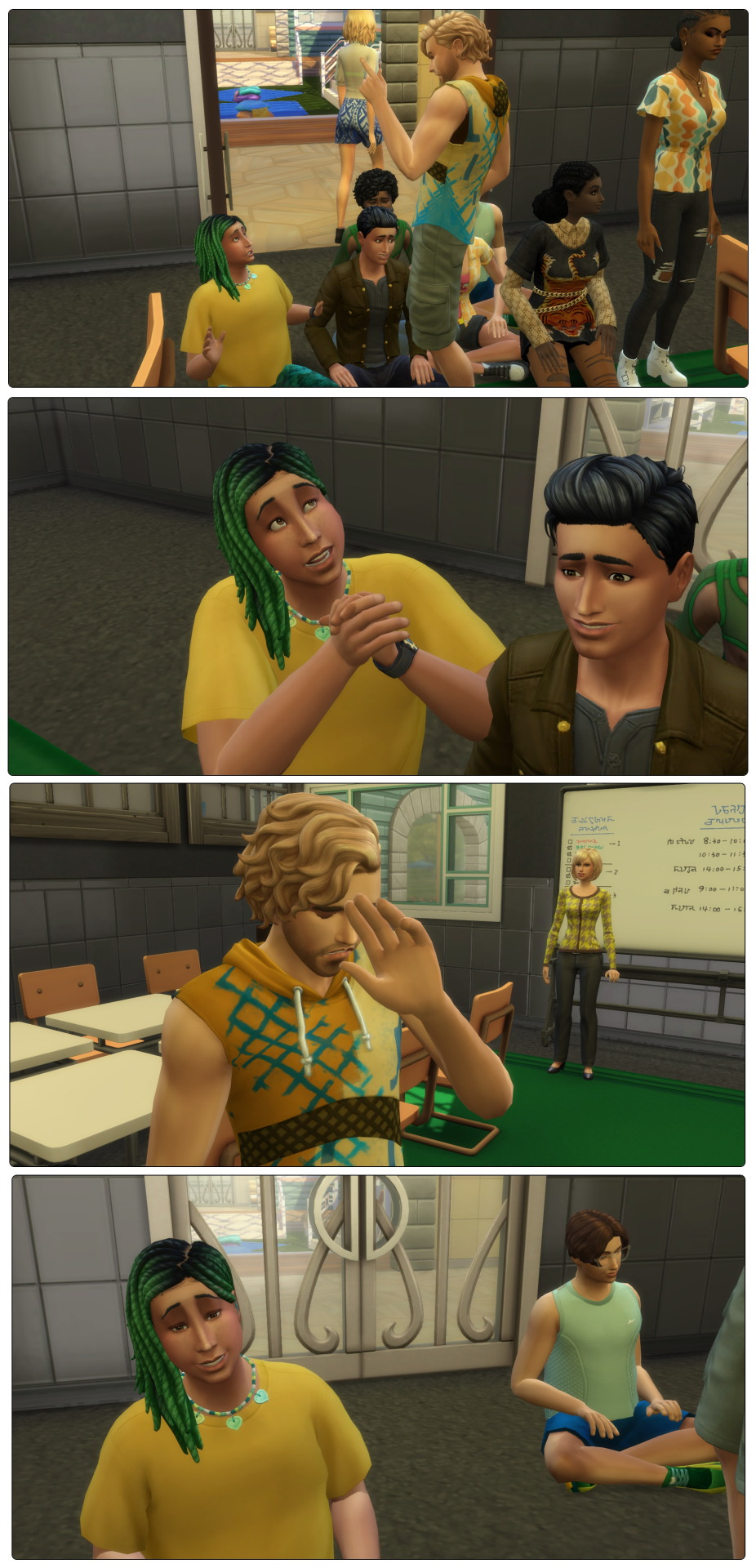
Mrs T: I’m sorry about that everyone
Christen: Mr A clearly did not take his chill pills today
Mrs T: Christen dear let’s not stigmatise mental illness. Onyx, cheer practice will start soon. Mr Amarinth is bound to be buried in paperwork, you go and I’ll mark you as present
Onyx: *already running off* Thanks Mrs T, you’re the best
Mrs T: I’m not sure what he expects us to do with all this time
(but seriously what do you do? At my New Zealand high school detention was done during lunch breaks, no one had after school or weekend detention)
Christen: Oh we should play hangman
Carson: Actually Mrs T I was wondering if I could talk to you some more about what you were saying in art this morning

When Carson finally gets home Harvey is busy cooking and Kayleigh is stuck in her art headspace.
Carson: I’m back
Harvey: Did you have fun after school
Carson: Not exactly, I had detention
Harvey: Did you have to scrape gum off desks
Carson: No, we just talked about art. I guess it was kind of fun if I think about it
Harvey: That’s the spirit kid. With the right attitude, you’ll get through anything
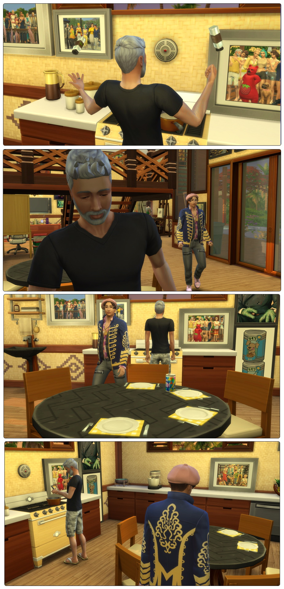
Marta: Doing homework already
Carson: Yeah. Mr Amarinth basically thinks I’m a step away from getting expelled (yes I, the watcher, actually got a pop up saying this)
The homework doesn’t take too long though and Carson ends the day playing some games with Onyx, Darwin and William through the wonder of the internet. Kayleigh does more painting, Harvey does more stargazing, and Marta and Keira spend the time kissing and taking romantic selfies.

The next day Harvey starts tending his garden, which is one of the activities that will help curb his midlife crisis. The bees don’t even attack him today!
Carson: Mum
Kayleigh: Yes Carson
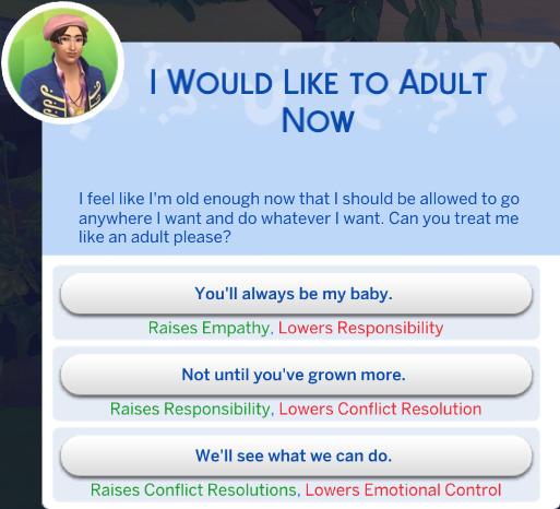
Carson: I‘ve been thinking, I’m basically an adult now. I should be able to go wherever and do whatever, just like my siblings did as teens
Kayleigh: Well I’ve no objection. Get out there if you want to, teenage years are for trying things
Carson: So I can go to a nightclub (flashback to this nonsense)
Kayleigh: If you think you can get in, sure, go for it
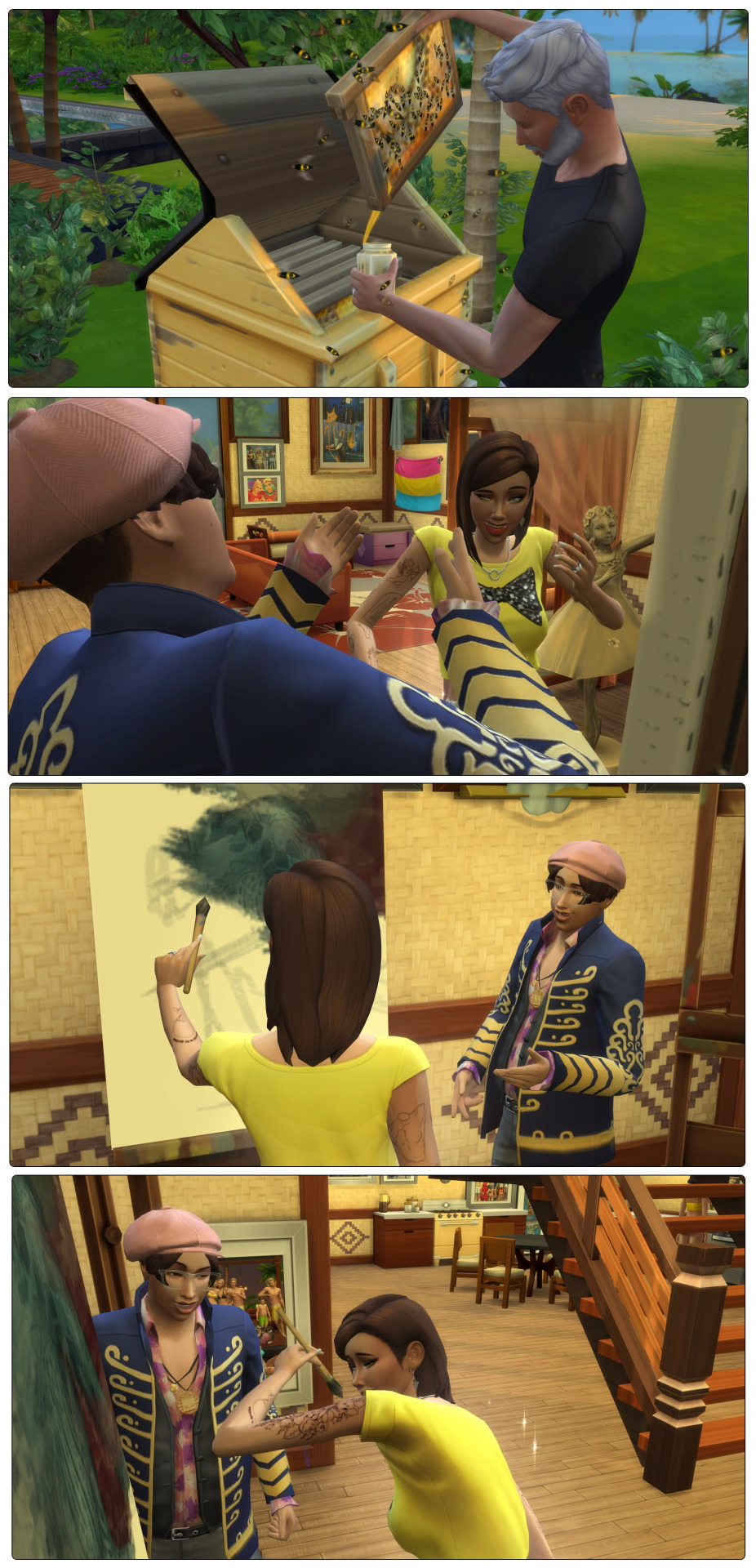
Harvey has elected to stay in Sulani for his fishing shift today. While there’s a nice, secluded cove nearby Harvey decides to try out the spot in the bay. He gets some familiar fish and snags a rare bluefin tuna. Of course Bluefin Tuna are endangered so he quickly throws it back.

Kayleigh: How is the house hunt going
Keira: Slow. We’re not sure if we want a small solo place or an apartment
Kayleigh: I can see benefits for both
Keira: Exactly! We’ve got enough for a small place but an apartment could be more discreet
Kayleigh: Well yes and no. In apartments you always have nosy neighbours. Plus there’s the problems of noise
Keira: I guess. I just don’t know if I’m adult enough to handle leaky pipes or fried electronics by myself
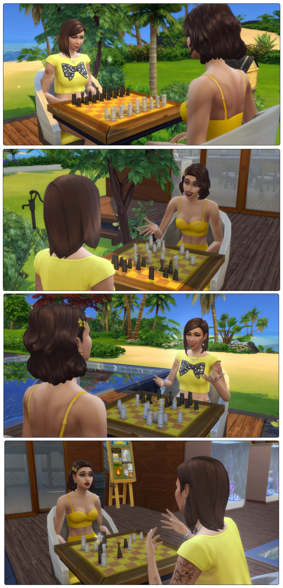
Marta: You won’t be by yourself carino, I’ll be there
Keira: Yeah but not all the time, you’ll have work to
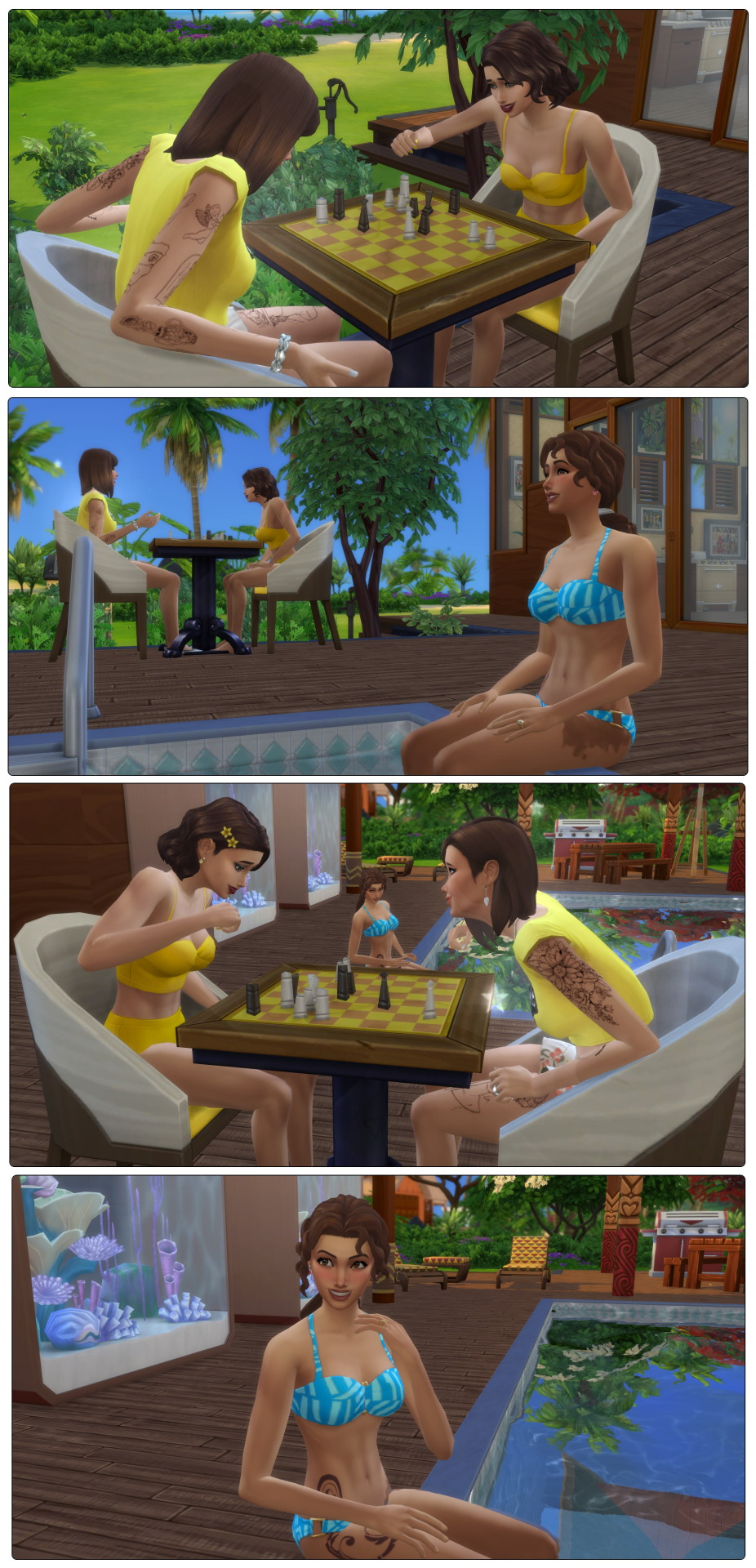
Kayleigh: Oh I have an idea. Your dad and I will take Carson out for dinner, and you two can practice being the only ones in the house. I suspect you’ll handle it better than you think.
Marta: How about it carino? Date night at home
Keira: If you’re there it sounds perfect
Previous ... Next
#sims 4#the sims#the sims 4#R0808#ChangingPlumbobStorytime#FosterHousehold#HarveyFoster#KayleighFoster#CarsonFoster#KeiraFoster#MartaRomero#OnyxPancakes
11 notes
·
View notes
Text
RM INSTAGRAM POST
2024.05.24
instagram link
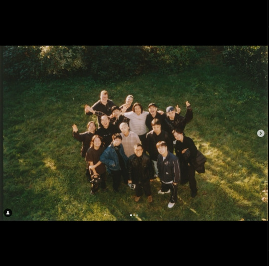
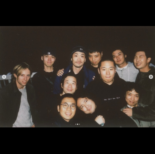
"RM ‘Right Place, Wrong Person’ out now RM ‘Right Place, Wrong Person’ PRODUCER San Yawn 2ND PRODUCER JNKYRD A&R, CREATIVE OPERATIONS MANAGER Sehoon Jang MUSIC PRODUCERS & WRITERS RM, San Yawn, JNKYRD, Kim Hanjoo, Mokyo, 김아일, OHHYUK, Kuo (from Sunset Rollercoaster), DOMi & JD BECK, Moses Sumney, Little Simz, Jclef, Marldn, Unsinkable, 은희영, 곽진언, bj wnjn, Nancy boy, 이태훈, Supreme Boi, icecream drum, No Identity, 임주승, Zior Park, Sojeso, Rad Museum, gimjonny, glowingdog MIX ENGINEERS Mikaelin ‘Blue’ BlueSpruce @ Lounge Studios, NYC David Wrench for Solar Management Ltd @ Studio Bruxo,London (Assisted by Amy Ratcliffe & Grace Banks) Antonio Feola @ Fish Factory Studios Micah Tawlks @ Peptalk Studios, Nashvile, TN, USA Dave Hammer MASTERING ENGINEER Joe LaPorta @ Sterling Sound ALBUM ARTWORK Rosie Marks ALBUM DESIGN & ART DIRECTION kontaakt (이원섭, 박원영) LOGO DESIGN Tim Lindacher, veryes ILLUSTRATION & TYPEFACE Sweathearts (Martin Groch, Abyme), Mercure (Charles Mazé, Abyme) TEAM RM PHOTOGRAPHER 손지민 CONCEPT PHOTO 1 by Rosie Marks LIGHTING CREW Vasilis Kalegias, Daiki Tajima, Ben Breading, Tom North CASTING DIRECTOR Sarah Smalls STYLIST Hamish Wirgman SET DESIGN Jack Appleyard MAKE UP Mahito, Mel Arter HAIR Mahito, Blake Henderson MOVEMENT DIRECTOR Simon Donnellon PRODUCTION Madeline Jensen @ DoBeDo Represenets CONCEPT PHOTO 2 by Wing Shya PHOTOGRAPHY ASSISTANT Samuel Chan LIGHTING CREW 윤승남, 김민준, 송종승, 양준민, 최영민, 홍인국 STYLIST Ryota Ishii MAKE UP 오성석 PRODUCTION 이석준, 염재모 CONCEPT PHOTO 3 Takahiro Mizushima STYLIST Ryota Ishii MAKE UP 김다름 DIGITAL RETOUCH 손지민 SPECIAL THANKS TO mesunnysideup, Wade Kim, YJ(Moollon), Hoon Gold, Cult of Ya #RM #RIGHTPLACEWRONGPERSON"
#bts#bts instagram#instagram#rm#rm bts#bts rm#bangtan rm#rm bangtan#rm instagram#rm pics#namjooning#namjoon#bts namjoon#namjoon bts#bangtan namjoon#namjoon bangtan#kim namjoon#namjoon instagram#joon#joon bts#bts joon#joonie#joonie bts#bts joonie#rpwprpwprpwp#right place wrong person
2 notes
·
View notes
Text
240524 - Rpwprpwprpwp's Instagram post
rpwprpwprpwp: RM ‘Right Place, Wrong Person’ out now
RM ‘Right Place, Wrong Person’
PRODUCER San Yawn
2ND PRODUCER JNKYRD
A&R, CREATIVE OPERATIONS MANAGER Sehoon Jang
MUSIC PRODUCERS & WRITERS
RM, San Yawn, JNKYRD, Kim Hanjoo, Mokyo, 김아일, OHHYUK, Kuo (from Sunset Rollercoaster), DOMi & JD BECK, Moses Sumney, Little Simz, Jclef, Marldn, Unsinkable, 은희영, 곽진언, bj wnjn, Nancy boy, 이태훈, Supreme Boi, icecream drum, No Identity, 임주승, Zior Park, Sojeso, Rad Museum, gimjonny, glowingdog
MIX ENGINEERS
Mikaelin ‘Blue’ BlueSpruce @ Lounge Studios, NYC
David Wrench for Solar Management Ltd @ Studio Bruxo,London (Assisted by Amy Ratcliffe & Grace Banks)
Antonio Feola @ Fish Factory Studios
Micah Tawlks @ Peptalk Studios, Nashvile, TN, USA
Dave Hammer
MASTERING ENGINEER Joe LaPorta @ Sterling Sound
ALBUM ARTWORK Rosie Marks
ALBUM DESIGN & ART DIRECTION kontaakt (이원섭, 박원영)
LOGO DESIGN Tim Lindacher, veryes
ILLUSTRATION & TYPEFACE Sweathearts (Martin Groch, Abyme), Mercure (Charles Mazé, Abyme)
TEAM RM PHOTOGRAPHER 손지민
CONCEPT PHOTO 1 by Rosie Marks
LIGHTING CREW Vasilis Kalegias, Daiki Tajima, Ben Breading, Tom North
CASTING DIRECTOR Sarah Smalls
STYLIST Hamish Wirgman
SET DESIGN Jack Appleyard
MAKE UP Mahito, Mel Arter
HAIR Mahito, Blake Henderson
MOVEMENT DIRECTOR Simon Donnellon
PRODUCTION Madeline Jensen @ DoBeDo Represenets
CONCEPT PHOTO 2 by Wing Shya
PHOTOGRAPHY ASSISTANT Samuel Chan
LIGHTING CREW 윤승남, 김민준, 송종승, 양준민, 최영민, 홍인국
STYLIST Ryota Ishii
MAKE UP 오성석
PRODUCTION 이석준, 염재모
CONCEPT PHOTO 3 Takahiro Mizushima STYLIST Ryota Ishii MAKE UP 김다름 DIGITAL RETOUCH 손지민
SPECIAL THANKS TO mesunnysideup, Wade Kim, YJ(Moollon), Hoon Gold, Cult of Ya
2 notes
·
View notes
Text


Made in Minnesota. Sketch to vector.
Do not skip the sketch phase. Do not rush the sketch phase. Embrace and enjoy the sketch phase. This is where the real magic happens. This is the fun part.
Have you ever heard the term “You can’t polish a turd?” It means that if you do not have a good idea to begin with, you will be wasting your time refining it.
Inexperienced designers tend to take their first idea or two directly into the final phase of design where it is digitized and finalized. I have witnessed many designers spend a week “polishing” a mediocre logo. They should have spent that precious time focused on idea generation.
Finding a good idea is like fishing. The more times you cast your lure, the better chance you have of catching fish. The more fish you catch, the better chance you have of catching a trophy-sized fish. This same logic applies with logo design. The more sketches you draw, the better chance you have of striking gold with a brilliant idea.
I like to jump into the creative process with a goal. I create a minimum of 50 rough sketches. The quality of the sketches should be rough, just detailed enough to capture the idea. Refining a sketch at this phase is a waste of time. Quantity is king. Save your refinement time for only the best ideas.
#logos#logo#logo design#logotype#brandidentity#branding#digital art#graphic designer#art#adobe illustrator#icons
3 notes
·
View notes
Text
Lost Boys fanfic - Branding
Fandom: Lost Boys (Frogfic) Characters: Edgar Frog, Alan Frog, Sam Emerson Word Count: 2263
Synopsis: Sam has ideas to help the Frogs advertize their vampire hunting business. Edgar and Alan are less than convinced…
The initial idea for this fic came from a post by @starthelostboys who theorized that Sam would design logos and adds for the Frogs. It was such a perfect idea that how could I not write it?
————————————————
“You’re quiet. No opinions on our organizational system this afternoon?”
Sam continued to sketch, his pencil making scraping sounds on the page of the narrow-ruled notebook until it dawned on him that Edgar’s question had been aimed at him. He lowered the pencil and glanced up briefly, registering suspicion on his friend’s face. Not that there was anything unusual about that. Suspicion was Edgar’s default expression. Sam rolled his eyes, smiled at him, then turned his attention back to the project at hand.
It had been a slow afternoon in the comic store, and Sam had quickly grown bored of watching his friends undo all the hard work he had put in the day before, when he had rearranged the back issues for them into a far more logical order. As he had sat watching, flicking through the latest Batman, he had been struck with a burst of creativity, fished the school notebook from his book bag, and flicked to the easy to remove middle pages
“What are you doing over there anyway?” Edgar asked him. “Homework?”
Out of the corner of his eye, Sam noticed Alan edge a little closer to him. He moved as though he was planning to take something from the shelf above Sam’s head. Sam, not fooled, lifted the notepad protectively, and pressed the page against his chest. “Relax, you haven’t forgotten about any homework assignments,” he assured them. “And it’s not done yet, so quit trying to peek. I’ll show you guys when I’m finished.”
“Finished with what? Alan asked.
Suddenly, all attention was on him. As Alan backed off a little, Sam lowered the notepad and looked at the designs on the page. He thought they were good, but they needed more work. Two pairs of dark eyes stared at him expectantly, and Sam got the distinct impression that they weren’t going to back off until he at least gave them something. “Fine,” he said. “It was supposed to be a surprise, but you’ve gone and ruined it. I was thinking, if you guys really want to get into the vampire slaying business in a serious way, you’re going to need a logo. So I’m designing you one.”
Edgar and Alan shared a glance, then at exactly the same moment, turned their gazes on Sam.
Alan spoke first. “What for?”
“What do you mean ‘what for?” Sam frowned at his friends. They looked at him with almost identical expressions of utter bafflement. “What do you think it’s for? To go on your advertising. And your uniforms, of course.”
Another shared glance, this one went on for a little longer than the last, and ended with a quiet grunt of agreement and a nod from Edgar. Apparently his friends had been talking to each other in that silent, almost telepathic way that they had.
“Uniforms?” Edgar raised an eyebrow underneath the ever-present red bandana tied around his head. “I don’t think so.”
“Well you should think so,” Sam told him. “I”m not talking anything fancy, you just need something distinctive enough that people know who you are.”
Edgar looked down at his clothing. He was wearing a faded camo-print t-shirt, coming apart slightly at the collar and with a few holes near the bottom where it had worn so thin it had begun to disappear, and green cargo pants that looked as though they were at least a size too big, held up by a belt. “What’s wrong with what we’re wearing?” he asked. “It was good enough when we got rid of your vampire problem.”
“Nothing’s wrong with it,” Sam assured him quickly. That wasn’t entirely true, and he certainly wouldn’t wear it if he had any choice in the matter, but it was a style all their own, and Sam loved it for that. Plus, as vampire slaying attire, it was fine; great, even. “But maybe you could just add a patch with your logo on, it only has to be small, but it would make you more recognisable.”
“Can the logo have wooden stakes on it?” Alan asked. “Maybe put two together in the shape of a cross?”
Sam grinned and put pencil to paper again. “Oh, that’s good,” he said. “Any other requests?”
Edgar scowled at his brother and elbowed him quickly in the arm. “Quit encouraging him,” he said.
“You’re going to love it, Edgar,” Sam insisted, adding a few drops of blood to one of the stakes. “It can go on all your advertisements. You know, fliers, posters, that kind of thing.”
Edgar shook his head. “You can’t be serious. Sam. You can’t advertise this kind of thing. People will think we’re crazy.”
“As opposed to now, when they think you’re both just overflowing with sanity?”
Two kids wandered in from the boardwalk outside. They paused to look around the place, then made a bee-line to the new issues and began picking them up and thumbing through the pages. Both Frogs turned to look at them. Edgar nodded at Alan, who broke away from the group and moved closer to the kids to watch them, ever alert for thieves.
“I’m completely serious,” Sam assured him. “If you want to run a successful vampire hunting business, you need to brand it properly.”
“And you know this how, exactly?” Edgar asked him. “From the successful vampire hunting business you used to run in Phoenix?”
Sam chuckled and shook his head before he turned his attention back to the page for a moment. “I know it because it’s common sense,” he said. “Think about it. You’re never going to drum up enough business by handing out free horror comics to random people in the store. I mean, if you think about it, that’s actually the opposite of good business sense, because you’re losing money on the comics you deface with your phone number and give away.”
The two kids left the store empty handed. Alan returned to join them again in the corner of the room.
Edgar folded his arms and glared defensively at Sam. “The comic with our number worked on you,” he reminded him.
“True,” Sam agreed. But the Frogs couldn’t realistically have known that Sam was about to have a vampire problem to deal with. “But you got lucky.”
“So did you,” Edgar told him.
Alan nodded. “Yeah. If we hadn’t drawn your attention to the vampires, you’d probably be one of them right now.”
Sam frowned. That was debatable, but on reflection it was probably true. If not for Edgar and Alan, the idea of vampires probably wouldn’t have even been on his radar until it was far too late. Even if he had worked it out on his own, he had no idea how things might have gone down. There was a good chance that he would have been slipped a sip of blood just like Michael had, and before he even realized it, he would have been one of them too.
He felt a chill at that thought. “Fair point,” he conceded. “But don’t get me wrong, I’m not saying what you do would never work. It just wouldn’t hurt to advertise a bit better, that’s all. I mean, look at all those people out there.” He waved a hand in the direction of the open front of the store.
The boardwalk, in stark contrast to the inside of the store, teemed with life. Families strolled past, parents hand in hand with kids holding ice cream cones that dripped down their hands and onto their clothes; teens sauntered by in pairs and in groups, each looking as though they were trying to outdo the others for most extreme hairstyle; surfers carried their boards down the the beach ready to ride the waves.
“What about them?” Edgar asked.
“I’m just saying that some people who need help might not be into comic books, so they won’t come in here, you’ll never warn them about the vampires, and they’ll never find out about your side hustle. Even if they did come in, you might not talk to them about the vampires; you don’t with everyone.”
“It’s not a side hustle,” Alan informed him.
Sam nodded. “I know it isn’t, because if it was, you’d be making some money from it. For all you guys know, half the people out there are wishing they knew a good undead exterminator they could call, but because they’re not interested in buying the latest Superman issues, they don’t know there’s someone who can help.
The brothers shared another glance, and Edgar folded his arms and raised an eyebrow. “Undead exterminator?”
“It’s just a term I’ve been playing around with. I think it sums up what you do pretty well. What do you guys think?”
Edgar shook his head. “I think it sounds like we’re a couple of zombies who come round to your house armed with rat poison and bug bombs.”
Right. He hadn’t thought of it that way. Sam grinned at the image and shook his head, then crossed out a few examples of the phrase that he had incorporated into his logo ideas. “Yeah, you’re right,” he agreed. “But you have to admit the imagery would stick in people’s minds. Okay, how do you feel about ‘Monsterbusters’?
“Like Dan Ackroyd’s going to come after us with a lawsuit,” Alan said. “What’s wrong with ‘vampire hunters’, anyway?”
“Nothing exactly,” Sam admitted. “It’s just, you don’t only do vampires, do you.”
Alan folded his arms. “So far, yes.”
“Okay, but what I mean is, you don’t want to pigeonhole yourselves. If someone has a werewolf problem, do you really want them to skip over your ad in the yellow pages because they think you only do vampires?”
Another shared glance. “I guess not,” Edgar replied. “What ad in the yellow pages?”
“The one you’re going to place,” Sam told him. “It’ll have the same design as the other advertising. I’m thinking we can put up posters around town, and instead of defacing the comics, you could just put a flier in the bag every time you make a sale. You’ll want business cards too, there’s just something classier about business cards. And of course there’s the uniform patches for your work gear.”
“This all sounds expensive,” Edgar said, sounding dubious. “You do realize that most months in the off season when the tourists are gone, we barely make enough money from the store to pay the rent, don’t you?”
He hadn’t realized that, actually, but now that he did, it made a lot of sense. He shrugged. “We don’t have to do it all at once,” he said. “We’ll build up to it; start small. Maybe a couple of posters or something. And do you know what else I’m thinking eventually? Merchandise.”
“What are you talking about?” Edgar asked
Sam grinned. “I’m talking about t-shirts,” he said. “Iron-on patches, pin badges, that kind of thing. You could sell it in the store.” He put down the notepad face down on a nearby display cabinet, held his hands to his chest, pencil still clutched in the right, and moved his fingers in a shallow arc as though indicating the placement of the text. “‘Frog Brothers’… or would it be better to write it as ‘bros’? It would be shorter; easier to fit on the smaller merch.”
The brothers shared another glance. “You think people would want to go around wearing t-shirts with our name on?” Edgar asked.
“Yeah, Sam,” Alan agreed. “We’re not exactly the most popular kids around school, if you haven’t noticed.”
Sam shrugged. He had noticed, and he didn’t care. He picked up his notepad again and added a few finishing touches to one of the designs. “Maybe not yet, he said. “But wait until you save a few more people, become local heroes, all that. People will be lining up around the block to buy this stuff. Trust me.”
A scowl shadowed Edgar’s expression for a moment. “We should already be local heroes,” he said. “After all the work we do to keep this town safe, not to mention what we did for your family.”
Sam nodded. They would get no argument from him, the brothers had saved them, after all. Of course, they had also landed his mom and grandpa with a mountain of debt from the repairs to the house, because apparently the insurance didn’t cover vampire attacks, and Sam was reasonably sure that the Frog’s hadn’t actually killed any of the vampires that had attacked the house. The one that they had killed, at the old hotel, had actually been the reason the others had attacked that night, too…
None of that mattered. If not for the Frogs, one way or another Sam’s life in Santa Carla would have looked very different, and he didn’t even want to think about that.
Still clutching the par and the pencil one in each hand, he extended both arms to drape them around the shoulders of his two best friends, then pulled them in for a group hug. Alan resisted for a little longer than Edgar, before they both gave in to the inevitable
“You guys are my heroes, if that makes any difference,” he told them.
Predictably enough, neither brother answered, but Sam didn’t miss the quickly suppressed smile on Edgar’s lips before he wriggled free of the embrace and held out a hand, palm up, waiting. “Okay Emerson,” he said. “You win. Maybe we do need to advertise better. Now, let me look at those designs.”
Sam grinned as he reached for the notepad and turned it over.
11 notes
·
View notes
Text

Fish Logo with golden ratio grid - Animal Logo.
I've just uploaded a collection of 11 animal logos and grids - You can check them out on Behance, and if you like them, please don't forget to let me know.
Let's connect: [email protected]
#fish logo#animal logo#golden ratio#golden ratio logo#identy#design#inspiration#creative design#logomark#logo logotype#brand logos#designer art work#logo#modern logofolio#graphic logo designer#business logo logo#graphic portfolio#logo logo#brand#designer#creative
24 notes
·
View notes
Text

Whale logo - geometry & grids 🐋
Do you need a professional logo/branding design? Contact:
#whale#whale tail#underwater#fishblr#fishing#big fish#ocean#seafood#logo design#illustration#artists on tumblr#branding#creative#professional#grids#sketch#digital art#california#nevada#new york
53 notes
·
View notes
Text
We participated in Global Game Jam this weekend!

Wait- what is Global Game Jam? Why, its the largest game creation event in the world of course! For 48 hours, thousands of game developers worldwide gather to brainstorm and create videogames together. And for us, we gathered at our local event- the 250+ attendee strong GGJ Hamar, happening at the Inland Campus!
This year was special for multiple reasons. For one thing, this was my first year on the organizer side of things! I was responsible for the graphics and theming of the event, making the logo and event t-shirts. I also helped out with some promoting and shouting people around on the day of itself, as well as a giant cardboard wall the attendees could doodle on with markers.

Secondly, this was the first physical event since 2020! The pandemic really put a lock on the local gamedev events for a while, which is a total bummer given that we have such a rich creative environment here. This meant that we were a bit rusty and out of touch. By the time we started promoting, we realize that there were multiple batches of students that had never even attended a jam before.
But despite snags and scrambling towards deadlines, the event went off smoothly- and if you can believe it, tiny Hamar was in the top 10 largest jam sites worldwide!
The games were great too- i keep being surprised by the sheer level of creative output during these events. Bugs and glitches are no match for these visions. I’d like to think our attendees also had a good time, and were encouraged to attend next year as well. If you were one of the attendees that weekend: come back, y’hear! It was fun!
But what did we make? Well, we didn't collab- i personally feel like its a bit of a shame to have such a wonderful social event and then move to work with the people you always work with anyway. Game jams give us a bit of an excuse to spread our wings/fling spaghetti on the wall and see what sticks.
On my end i settled in with a group of first timers to make ROOTLESS YOUTH

Rootless youth is a game where you reconnect subcultures with their lost lingo, clicking and dragging clipart into sentences to complete their sentences. You can try the game here!
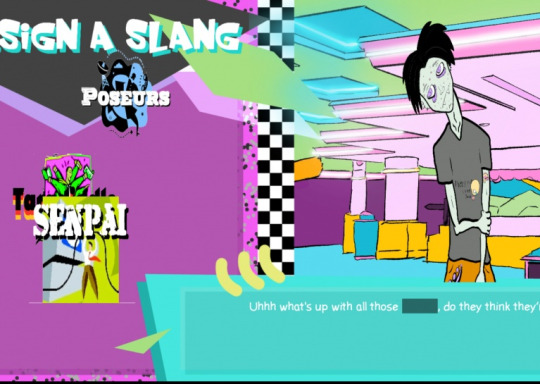
This was pretty fun- it essentially turned into 90s windbreaker themed duolingo. The team did great, and were absolute troopers trying to finish this despite a lack of jamming experience and less than ideal software! We had a lot of laughs figuring out and depicting various subcultures. On my end i was the lead designer, did the logo and UI, as well as the music.
Åge made LEECHER
Leecher was described to me as basically gridless Snake. You worm around and eat particles, making your roots a little longer every time you do. This was a solo project, and can be played here!


In short- a lot of pizza was eaten and a lot of coffee was inhaled this last weekend. I was knocked out for almost the entirety of Monday even with following my regular sleep pattern! Jamming knocks you out a bit, its no secret- but still, i can hardly wait for next year.
If you’re a Hamar local, consider popping by! Hopefully i’ll get to design you a cool t-shirt. For now, its back to the regular grind- we’re steadily getting busier at the office now. It feels like we got very popular very suddenly! (especially now that the fishing game isn’t the only project on the table anymore)
-Hauk Want to know what we usually work on? Follow us here or on Twitter for regular updates on our projects- or click here to join our discord!
9 notes
·
View notes
Photo


My designer-friend has a creative crisis now and he asked me do logo design for aquaponics company so I spent 3 hours and one kratom bottle to get this
Many years ago, by the way, I had a 200-liter aquarium with fish and I gave away aquarium water to amateur gardeners xddd
2 notes
·
View notes
Text
Come on over to IconAdda and get your free support assets

We here at IconAdda are passionate about providing quality, high end material for businesses, designers and content creators who have the need and deserve to advance in their careers. We’re stoked to introduce our collection of free animal signs, graphics and stickers all with thought to assist your creative mind.
Why do free animal pictures and graphics?
An interesting, relatable piece of work would be gifted through animal-based designs for any of the projects. Our supports will be well received in both your magazine production or mobile and website development.
Use cute photos of animals while working on bringing life to materials under education for delivery.
Marketing increases user engagement toward any social posting of yours
Makes greeting cards, scrapbooking invitation, as well as advanced ideas.
What’s so unique about our animal legacy?
High graphics: Every logo, sticker, and artwork is created to pop and bright. Variety: You’ll find a style that suits your project: minimalist or playful like photography. It’s free to use: Use these features without paying anything. Perfect for personal and commercial businesses (see our Terms of Use for more). Browse our gallery
Our collection of animal legacy comprises:
Animal Show FREE: Birds, dogs, fish, and many more in a single show. Great for educational apps or UI design.
Photography Stunning stunning animal photography bringing presentations, blogs, and websites to life.
Stickers Beautiful, vibrant stickers for Instagram Stories, WhatsApp, and other art apps.
What is special about our animal heritage?
High design: Each logo, sticker, and artwork is designed with a focus on being out and bright.
Diverse: You will find a style for your project to be either minimalist or playful such as photography.

Check out our collection
Our list of animal heritage includes:
FREE ANIMAL SHOW: Variety of animals — birds, dogs, fish, etc. Good for educational apps or UI design.
Photography: Great great animal photography for presentation, blogs and websites.
Stickers: Colorful stickers that can be used for Instagram Stories, WhatsApp, and more art apps.
Begin your creative journey today
Don’t miss the opportunity to use our free support stickers, images, and icons for enhancing your services. Visit IconAdda now to explore our collection of art supplies. Keep your mind focused!
We at IconAdda are dedicated to providing accessible, high quality design products. Keep watching this space for new collections and updates!
#AnimalIcons#AnimalIllustration#AnimalSticker#WildlifeArt#PetDesign#AnimalGraphics#CuteAnimals#AnimalVector#DigitalAnimals#AnimalArt#NatureIllustration#CustomStickers#WildlifeIllustration#AnimalLovers#CreativeAnimals
0 notes