#creative CSS
Explore tagged Tumblr posts
Text
A Smile in Fragments
Masked happiness, smile with meaning, concealed joy
A Smile In Fragments In a fractured mosaic of shapes and bold hues, a smile emerges—distorted yet undeniably present, as if teasing the observer with layers of meaning. The jagged lines and vibrant colors weave between chaos and intention, concealing as much as they reveal. It’s a grin that exists at the edge of perception, both playful and unsettling, hinting at joy wrapped in…

View On WordPress
#abstract emotions#art-inspired blog#artistic post#ChatGPT#colorful design#creative CSS#expressive art#hidden meanings#hidden smile#layered meanings#masked happiness#MidJourney#smile and desperation#truth behind smiles#vibrant colors
0 notes
Text
You Should Make a Personal Website
I don't mean a site to promote a business, or for financial purposes, or anything like that. No, I mean just a basic website about something you like. Make a site talking about a series you like to read or watch. Make a shrine to a ship that you enjoy. Make a weird, experimental, scattershot archive of your favorite gifs or weird fonts that you've collected over the years.
It's honestly a lot easier than you would think, despite what every single advertisement for Squarespace would have you believe.
First, why would you want to do this, making your own personal website if you don't have a big purpose for it? Well, back when the web was fresh and new, folks would just set up a web page just for the sake of sharing an interest that they had, or talking about some little nuance that they enjoyed. It could have been as broad or as simple as a person wanted, and like-minded sites, rather than vying for space on a search engine's front page, would be connected together with each other via things called web rings, basically a group of similarly themed websites that helped to promote each other just by virtue of being part of the same group. And then, of course, there were personal link collections, a massive dump of other sites that the webmaster thought were worth sharing that might lead outside the limits of any web ring they were a part of.
Beyond just sharing an interest or a passion with the world, regardless of how small or narrow it might seem to others, a web site is an experimental canvas to express yourself, your own little slice of the internet where you can do basically whatever you want with it. It doesn't have to be perfect, in fact perfection is something that should be ignored when it comes to your own vision. We've been trained to look at websites and see them as these incredibly slick, sleek looking, perfect and polished, suit-and-tie landing pages that are more just there to entice you into whatever a business is trying to see you. There are very few web pages out there in the major space of the web that pack as much personality as a thrown together Geocities site. Even sites that are attempting to have more of a laid back, casual aesthetic tend to be so precisely designed that it loses a lot of the magic of a site being built by an inexperienced hand, or someone who isn't interested in making something sleek and appealing. Yes, you want your site to be legible, at least, but the dearth of creativity in modern websites can't really be denied. So many of them look the same or use the same sort of default layout. Not saying that older sites didn't sometimes have similar layouts as well, but the odds of seeing at least a unique spin or font or color combination is much, much higher.
Compare that to where most folks will gather to share their creations nowadays, social media sites. In general, the creative freedom that you have over, say, a twitter profile or a facebook page, is very limited and in general, your stuff is basically just put into a big feed that folks will scroll over or past as they flip along their phones.
But don't you have to know how to program or write code to make a really impressive website? After all, we have tons of services like Squarespace and Wix and the plugin market for things like Wordpress that are meant to make the arduous process of building a site as quick, easy, and painless as possible.
Speaking of someone who works on a Wix site as part of my day job, I hate things like their drag-and-drop interface. It is, at least from my experience, slow and clunky and despite the variety of options presenting to you, most of them feel very limited and samey, with little room for individual expression. Add to it, they also show you a lot of options that you can't access if you aren't paying for certain tiers of service, so there is also an element of upselling to their services that I really don't appreciate.
When it comes to building a personal site, all you really need to know is HTML, CSS, and a little bit of Java, but only if you want the site to have some cute little interactive elements, which are totally optional. HTML is honestly super easy to learn, because it's not even really a coding laguage, it's more of a language for structure. You wrap things in specific tags that tell the text how to present itself. HTML on its own is very easy to learn and there isn't a huge amount too it, but it is very ugly on its own.
That's where CSS comes in. Not going to front, CSS is, for me, the most confusing part of the process. It's important, but it's also overwhelming. CSS is is a LOT looser in terms of its setup compared to HTML and is meant to do a lot more; it is used to alter the font, the color, how pictures look, the placement of text and elements, the shape of buttons and links, everything about how a website looks beyond its very basic structure, which is built off of HTML.
Beyond that, if you do want to have some fun little widgets here and there, a little bit of Javascript can help add a bit of pizzazz to your site, but it is far from necessary, especially if you're still learning. You're allowed to be sloppy and imperfect, you are allowed to make something that isn't visually cohesive or even all that appealing at first. You are learning. You are making something for fun, or because you enjoy it, or enjoy what you're trying to communicate. Learn HTML, take your time learning CSS, and then after you've had some fun getting to grips with the absolute basics of that, then think about spicing it up after the fact.
And again, it's not like this is tough to learn, or at least not tough to find resources on the subject. I'll be linking to a bunch of various resources for this sort of stuff. And hey, if you don't want to code an entire web page or website from scratch, there are plenty of places to grab pretty detailed templates of elements for your site, or even full pages that you then can just inject your writing or pictures or links into without having to go through the whole situation yourself. This can also be useful for a beginner because it allows you to see exactly how the HTML and CSS is used to create a specific effect, and gives you something you can experiment with and see results on without having to build it from scratch, which is a handy learning experience.
And where would you put your brand new site once you've put it together. Well, Wordpress does allow traditional HTML sites to be put up, but they're more about making those slick, eye-popping websites that we've discussed before. You could also just pay for a domain name and some hosting and then suss it out from there, but you do have a few places where, rather than putting in a substantial investment, you can throw up a site for basically nothing and still have plenty of room to experiment with your site and make something fun and interesting.
My personal recommendation is Neocities, a Geocities-inspired service that very much wants to bring back the idea of the personal website and web rings in general. They are completely free to use, and focus specifically on HTML pages. They do have a paid tier, which is only five dollars, that does give you a bunch of added features, including the ability to host multiple sites, fifty gigs of story as opposed to one (which might not seem like a lot, but a basic HTML website which is mostly text will almost never come close to that amount of storage, and the ability to give your site a custom domain (though you will have to buy that separately). I mostly recommend Neocities because their entire mission statement is what I've been talking about here; bringing back the creative freedom of having your own playground to toy with however you wish, and experiment with making something that just looks funky, in the best way possible. Plus, it gives an excuse to brows through all the other stuff that people have been putting up as well.
So do it. Even if it's just as a little hobby or a side project, give it a go. You have nothing to lose and might even pick up a skill you really enjoy flexing. Who knows, it might even lead you down a new path, or at the very least give you a creative outlet that you weren't aware of beforehand. It's well worth the effort.
Now, let's round this out with a quick list of some various sources that can help you in your quest to design that which lies in your heart, yeah?
W3 Schools: This is more a straight up reference site, and you can find tutorials here on a ton of different programming languages, but their HTML and CSS section is very robust, and will show you examples of various commands and tags and how they work. I find it's layout a little bit confusing at times, but it's a good place to go back to when you're looking for examples on how specific tags or commands work.
Sadgirl Online: This is basically a one-stop shop for tons of references and resources for making a website. It not only has a bunch of free assets like fonts and backgrounds that you can use in your own projects, but it also has a section for learning HTML and CSS that gives some very detailed explanations on how everything works, and even has a website generator that will generate a web page template for you to use in your own projects. Sadly, the site itself is no longer actively updated, but everything on it is still in working order, and most of the information on it is very timeless. The link section is also invaulable in finding more tools and resources as well. At the very least, I'd say it's an excellent starting point for any aspiring website builder.
Word to HTML: If you really don't feel comfortable writing out your own HTML, you can use this tool to quickly paste in things that you wrote in Word, or other formatting programs, and turn it into HTML that will keep the formatting, such as text position and style. Useful for if you're writing stories or long-form blog posts and you don't want to manually put in line breaks or paragraph tags yourself.
Web Guide: A basic and straightforward text tutorial on how to begin building a website based on HTML and CSS. It's even a site that was made and hosted on Neocities! It's another really good starting point if you need to figure out the very basics of HTML and CSS.
Color Hex: Once you start getting into the depths of CSS, you'll want to familiarize yourself with the hexadecimal codes for colors, since the pre-baked colors you can access otherwise are pretty basic and limited. Color Hex will show you popular colors with hexadecimal numbers, and can also general color palettes for you that will either contrast sharply, or look very nice together, which might help inspire the look and feel of your website.
#Website#Personal Site#Creativity#Coding Practice#HTML#CSS#Learn#Neocities#Hosting#Shrine#Database#Discussion
9 notes
·
View notes
Text
CSS Properties to Make Hyperlinks More Attractive – Speckyboy
New Post has been published on https://thedigitalinsider.com/css-properties-to-make-hyperlinks-more-attractive-speckyboy/
CSS Properties to Make Hyperlinks More Attractive – Speckyboy
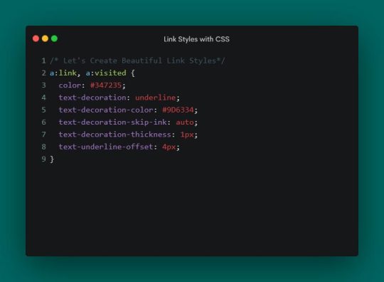

Hyperlinks don’t always get the attention they deserve from web designers. Sure, we might make a few tweaks. However, we don’t always go the extra mile to make them stand out.
Perhaps that’s because the styling options used to be limited. Link color and underlining were the primary options. Hover and focus states seemed to be where most of the creativity occurred. Other enhancements tended to require add-ons like JavaScript.
CSS has changed the game in recent years. Several properties are available to customize the look of hyperlinks. They also provide a higher level of control regarding details like spacing and sizing.
It’s a whole new world of possibilities. Let’s check out some CSS properties that help make hyperlinks more attractive.
A Default Link
We’ll start with a default link configuration. A link color and CSS states were added – but that’s it. It will serve as a baseline as we explore the CSS properties below.
See the Pen Link Styling:Plain by Eric Karkovack
It used to be that a link’s underline had to be the same color as its text. The text-decoration-color property allows us to choose a separate hue. It also works with overlines, strikethroughs, and anything else set by the text-decoration property.
We’ve added a brown underline to compliment our green link text.
See the Pen Link Styling:text-decoration-color by Eric Karkovack
This niche property determines how the link’s text decoration interacts with glyphs. The default setting is auto, where the browser interrupts underlines and overlines so they don’t touch a glyph. You’ll notice this with lowercase letters that go below the baseline.
Setting the property to none means the underline or overline draws a straight line – regardless of where glyphs are located.
See the Pen Link Styling:text-decoration-skip-link by Eric Karkovack
The thickness of a link’s underline typically follows what’s defined in the font-weight property. That is, bold text will result in a thicker underline. This property lets us set a consistent value for every link in the cascade.
See the Pen Link Styling:text-decoration-thickness by Eric Karkovack
Text decorations don’t have to be a straight line. This property lets you change the style to dashed, dotted, double, or wavy lines.
See the Pen Link Styling:text-decoration-style by Eric Karkovack
Here’s a way to specify how closely (or not) an underline is to the text above. Adding a few pixels of space between them can improve legibility.
Note that this property doesn’t impact instances of the HTML underline tag (<u>). It only affects instances where the text-decoration property is set.
See the Pen Link Styling:text-underline-offset by Eric Karkovack
Another niche property, text-underline-position specifies the position of the underline relative to its text. Setting it to under is ideal for mathematical and scientific formulas. It makes subscript characters easy to read – even when underlined.
See the Pen Link Styling:text-underline-under by Eric Karkovack
Going Further with Link Styles
Hyperlinks don’t have to be bland. There are now plenty of ways to make them as much a part of your brand as other design elements.
The properties above are all worth considering when styling links. They’re relatively simple to implement and can make links more attractive and accessible. Best of all, they’re native CSS and won’t impact page load performance.
You can also use them beyond default styles. Style them for various states, such as changing the link’s underline color during a hover event. In addition, there’s an opportunity to add animation and transitions to create all sorts of fun micro-interactions.
Just beware – it’s possible to take things a little too far. Always keep best practices in mind to enhance the user experience. Anything that makes links harder to read or use isn’t worth doing.
It’s time to get creative! Experiment with these CSS properties and see how you can bring a little life to your links.
Related Topics
Top
#ADD#animation#attention#Best Of#browser#cascade#change#Color#creativity#CSS#CSS Snippets#CSS Tutorials#Design#designers#details#double#easy#event#focus#game#Giving#green#hover#how#HTML#impact#it#JavaScript#life#Link
2 notes
·
View notes
Text
I love going into the page source and css of websites and find out the programmer left a note like "hey good job getting in here bud!" and maybe it's sarcastic but like
Thank you yes I AM smart and pretty and smart, he he 💖💝💖💝💖💝💖💝🌟🌟🌟
#htmlcoding#html css#rambles#for the purposes of context I'm faffing about neocities websites#I like to see how all these creative people with their own personal websites go about building it and personalizing it#it's like looking at how someone made a lego build or something if that's a good comparison#prod it open to look at it's insides and see how much better at organization other people are compared to me lol
3 notes
·
View notes
Text

Elevate your business with Grey Space Computing's Drupal web development services. We specialize in crafting websites that are not only visually appealing but also highly functional and secure. Our team is committed to delivering solutions that drive results. From initial design to final deployment, we've got you covered. Trust us to handle all your Drupal development needs. 🔗Learn more: https://greyspacecomputing.com/drupal-web-dev/ 📧 Contact us: https://greyspacecomputing.com/contact-us/
#Greyspacecomputing#drupal#wordpress#joomla#webdevelopment#webdesign#website#webdeveloper#cms#php#html#magento#prestashop#css#seo#developer#technology#marketing#webagency#hosting#drupaldeveloper#creative#branding#contentmanagementsystem#web#smallbusiness#websitebuilder#programming#ux#cloudhosting
4 notes
·
View notes
Text
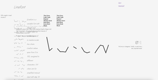
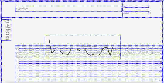
screengrabs from my WIP, im enjoying the artistic perspective until i make it functional, i prefer it. happy to be learning accurate and accessibility friendly site-building though.
2 notes
·
View notes
Text
My website is 'An Adventure Gallery':
When I say this about my website, I am both naming and describing it.
'An Adventure Gallery' has two main functions: it provides me a digital place to showcase some of my own visual artworks alongside some of my favorite music on Spotify, and it also functions as a story telling device (in the style of a "Choose Your Own Adventure") where branching plots carry on from one choice to the next page.
An unintended side-effect of this is that I'm forced to reckon with HTML and CSS. So, perusing through the pages can prove interesting on a number of levels-- one of them being my fiendish attempts to take over your senses with styled animations and whatever other trickery I can manage wielding only CSS code.
It's a wild ride through the Abyss, but I encourage you to begin! :)
~ Trish
#artists on tumblr#my art#original photographers#cyoa#online gallery#alternative gallery#alternative#art gallery#visual art#website#old web#webdesign#html css#original art#artwork#art by me#colorful#creative writing#alternative art
3 notes
·
View notes
Text
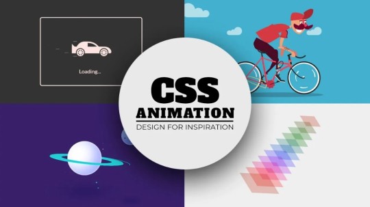
Creative Codepen CSS Animation Snippets
#codepen animation#animation#creative animation#html css#learn to code#code#frontend#css#html#css3#codingflicks#frontenddevelopment
3 notes
·
View notes
Text

It's not perfect but I finally got the layout to work how I want it to. Resizing should now look good on both desktop and mobile⭐
3 notes
·
View notes
Text
what the hell.
i'm a trans disabled dude thing in the southern us who is unable to get a job at the moment due to a lot of circumstances. i never have any money for myself, and while my basic needs are met (but barely!), im working to get outta my horrible, life sapping living situation so i can be with my qpr soulmate by end of next year, start my transition and finally embark upon healing and life. any amount will go into my savings to help me get out because this just isn't sustainable anymore.
c*shapp: $aspringrevival v*nmo: invaderzin
How about we just have like... hey trans people, post your pay links or wishlist or whatever you got. No limits, no trans excluded, intersex welcome, any and all genders off the social conventions included. I'll just reblog em a bunch.
I need a reblog to share your info, please use those, not comments or tags. I try to reblog immediately every instance I see between 10am and 10pm, everything else goes into the queue.
Additionally, Reddit has some donation resources, which are outlined and linked in this post. However, there are potential difficulties associated with these resources, with more details in this post.
Potentially useful links as I find them: Guide to Fundraising.
#i literally never do this but#my circumstances are uhhhhhh far from ideal!#i'm doing my best to make money with house sitting and odd jobs but its a struggle out here boys and i need to get out! ive had so many#false starts with this#any help would be appreciated#but plz reach out so i can help u in return!#i have longterm creative writing skills#as well as some skill editing essays and various schoolwork#i also have (self taught) skills with html/css/some java so if you need help#or want a fun lil thing#just hit me up and lets see how we can help each other#hsm voice we're all in this together#wait is that hsm i never saw those movies
21K notes
·
View notes
Text

Web Design - Landing page - Marketing & Captación de Leads - REMANSA
#graphic design#web design#websites#landingpage#wordpress#elementor#design#creative#marketing#CSS Motion#motion graphics#web animation#proyecto#portafolio#freelancer#remote#venezuela#españa#Abdiel
0 notes
Text
Beautiful Poster Art Created with CSS & JavaScript – Speckyboy
New Post has been published on https://thedigitalinsider.com/beautiful-poster-art-created-with-css-javascript-speckyboy/
Beautiful Poster Art Created with CSS & JavaScript – Speckyboy

Posters are among the most common art forms. You probably had a few of them on your wall as a child. They cover the full spectrum of people, places, and events.
They also serve as an inspiration for web designers. Their use of color and typography is part of how we see the world. We can see the impact all over the web.
What’s more, we can recreate and enhance the experience online. Goodies like 3D effects and animation bring posters to life. There’s also an element of interactivity. That can be just as powerful as a bold layout.
We wanted to see how designers are using their creativity. So, we perused the archives of CodePen for beautiful poster art. Here are some examples that use CSS, JavaScript, and other technologies. Enjoy!
Unlimited Downloads for Web Designers
Starting at just $16.50 per month, download 1,000s of HTML, Bootstrap, and Tailwind CSS, as well as WordPress themes and plugins with Envato Elements. You will also get unlimited access to millions of design assets, photos, video files, fonts, presets, addons, and much more.
Furiosa 3D Animated CSS Poster by Olivier 3lanc
Talk about a poster that’s brimming with life! This 3D rendering places the movie’s characters in a cut-out. The entire presentation looks like a diorama. Everything is powered by CSS – no JavaScript in sight.
See the Pen FURIOSA 3D Animated Poster by Olivier 3lanc
Replicating & Animating Zürich Tonhalle’s Poster by Jon Yablonski
This snippet is part of a project that recreates iconic posters. The beauty here is in the minimal layout and bold typography. Animated lines add a modern touch to this classic.
See the Pen Zürich Tonhalle (1955) by Jon Yablonski
CSS Grid Poster Exercise by Victoria Bergquist
A combination of Flexbox and CSS Grid fuels this example. The variation of shapes would seem nearly impossible to do without these tools. The included splash of color makes for a compelling result.
See the Pen CSS Grid Poster Exercise 1 by Victoria Bergquist
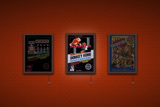
Donkey Kong Poster Collection by Daniel Fontes
Here’s a fun tribute to the past. Gamers will instantly recognize this series of images from Donkey Kong. The classic video game posters feature a fun lighting feature. Tug on the chain to illuminate your favorite poster. Bonus points for the flicker effect!
See the Pen Donkey Kong – a small poster collection by Daniel Fontes
PPL MVR CSS & SVG Poster Designby Kristopher Van Sant
Band posters are a common theme among designers. Perhaps that’s because so many of us have them on our walls. This animated sequence takes inspiration from print artwork. And it’s another example of what CSS is capable of.
See the Pen PPL MVR by Kristopher Van Sant
Grid Duotone Gradient Poster Design by Cassie Evans
The power of CSS Grid is real. The poster is beautiful and complex. Most impressively, the styles consist of less than 200 lines. A little code and a lot of imagination can go a long way.
See the Pen Grid Poster by Cassie Evans
Grunge Poster with the Wave Motion Effect by ilithya
Who can resist the retro vibes coming from this poster? It captures the look of the 1990s – complete with raining triangles. Move your cursor to change the perspective of the photo. It’s a far-out experience, for sure.
See the Pen Grunge Poster by ilithya
The Matrix Resurrections Digital Poster by Sparklingman
The Matrix movie series is known for a different kind of rain. This digital poster may appear simple. However, clicking on it shifts the green and black pattern. The effect is subtle – but fits beautifully with the movie’s aesthetic.
See the Pen The Matrix Resurrections | Sparklingman digital poster #026 by Sparklingman
A New Take on a Classic Art Form
The examples above combine classic print sensibilities with online capabilities. It’s a fun exercise that goes beyond what’s hanging on your wall.
We may think of posters as being simplistic. But they also open a world of possibilities for designers. Thus, we can take this inspiration and run with it.
For example, posters may help us rethink traditional web layouts. Elements like vertical text and unique container shapes come to mind. They can serve as a launching pad for ideas.
Want to see more examples of online poster art? Check out our CodePen collection!
Related Topics
Top
#3d#ADD#amp#animation#Art#assets#Beauty#Bootstrap#change#code#Color#container#creativity#CSS#CSS Grid#CSS Layouts#CSS Snippets#Design#designers#effects#Events#Exercise#fonts#form#Forms#fuels#Full#game#green#grid
1 note
·
View note
Text
sites that let you use custom css are underrated. i love making shit on the web behave the way i want it to and i love when i don't have to use a browser extension to apply those modifications
#花話#this is more common in older websites from what i've noticed#the more i play around w/this stuff the more i realize that tumblr is also pretty unique w/the way it does custom themes#like it not only lets you have custom css but it ALSO lets you structure the html however you want???#that's cool as hell!!! you can get creative as hell with that!!!!!!! and i wish more sites let you do that
1 note
·
View note
Text
In the wake of the TikTok ban and revival as a mouthpiece for fascist propaganda, as well as the downfall of Twitter and Facebook/Facebook-owned platforms to the same evils, I think now is a better time than ever to say LEARN HTML!!! FREE YOURSELVES FROM THE SHACKLES OF MAJOR SOCIAL MEDIA PLATFORMS AND EMBRACE THE INDIE WEB!!!
You can host a website on Neocities for free as long as it's under 1GB (which is a LOT more than it sounds like let me tell you) but if that's not enough you can get 50GB of space (and a variety of other perks) for only $5 a month.
And if you can't/don't want to pay for the extra space, sites like File Garden and Catbox let you host files for free that you can easily link into NeoCities pages (I do this to host videos on mine!) (It also lets you share files NeoCities wouldn't let you upload for free anyways, this is how I upload the .zip files for my 3DS themes on my site.)
Don't know how to write HTML/CSS? No problem. W3schools is an invaluable resource with free lessons on HTML, CSS, JavaScript, PHP, and a whole slew of other programming languages, both for web development and otherwise.
Want a more traditional social media experience? SpaceHey is a platform that mimics the experience of 2000s MySpace
Struggling to find independent web pages that cater to your interests via major search engines? I've got you covered. Marginalia and Wiby are search engines that specifically prioritize non-commercial content. Marginalia also has filters that let you search for more specific categories of website, like wikis, blogs, academia, forums, and vintage sites.
Maybe you wanna log off the modern internet landscape altogether and step back into the pre-social media web altogether, well, Protoweb lets you do just that. It's a proxy service for older browsers (or really just any browser that supports HTTP, but that's mostly old browsers now anyways) that lets you visit restored snapshots of vintage websites.
Protoweb has a lot of Geocities content archived, but if you're interested in that you can find even more old Geocities sites over on the Geocities Gallery
And really this is just general tip-of-the-iceberg stuff. If you dig a little deeper you can find loads more interesting stuff out there. The internet doesn't have to be a miserable place full of nothing but doomposting and targeted ads. The first step to making it less miserable is for YOU, yes YOU, to quit spending all your time on it looking at the handful of miserable websites big tech wants you to spend all your time on.
#this is a side point so it's going here but I really think tech literacy should be a requirement in schools like math grammar history etc.#we live in a world so dominated by the stuff and yet a majority of the population does not understand it at even the most fundamental level#tiktok#tiktok ban#indie web#neocities#web development#current events#twitter#facebook#meta#amazon
7K notes
·
View notes
Text
youtube
WordPress 6.6 - Huge Changes Coming Soon!
#WordPress#WordPress 6.6#technology#internet#computer#CMS#content management#software#engineer#program#programming#programmer#code#graphic design#typography#css#php#creative#graphic designer#ui#ux#user interface#user experience#database#mysql#Youtube
0 notes