#couldn't choose a font so have both
Explore tagged Tumblr posts
Text
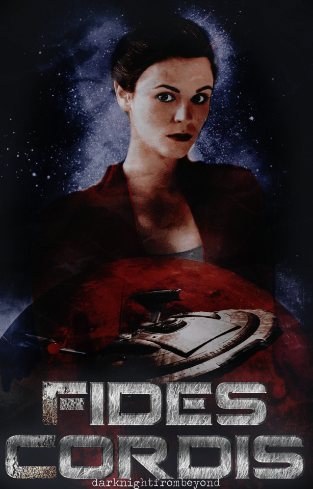

Happy Holiday Exchange ✤ Del Shepard
@darknightfrombeyond
Tag List: want to be added?
#ocappreciation#holiday exchange 2024#randomestgiveaway#gifts#friend's oc#for a friend#darknightfrombeyond#day tag#my work#my edits#poster#cover#star trek oc#couldn't choose a font so have both
4 notes
·
View notes
Text
Archive Classics: Typesetting Fics
TL; DR: the internet is temporary!!! printed books (for your own private amusement) are forever!!!
What I do:
Basically, I choose fics that I think deserve to be printed and typeset them using a software called Adobe InDesign. InDesign is the professional standard in the industry, but there are definitely easier (and cheaper!) options for formatting.
Once I've chosen a fic, there a few different things I have to decide: the font, glyphs, book size, and the hors-texte (title page, contents, etc).
Then, I go about copy + pasting the text into the software, and formatting them. Usually, that just means deleting the blank space of lines that for some reason appears between paragraphs.
Every element, and I mean every single element, is designed for the reader's comfort. At no point should the reader feel lost or unable to continue because of the way the text is formatted. This means using serif fonts instead of sans-serif fonts for the body text and making sure that there aren't any widows/orphan lines. I have specific justification settings so that the spacing between words and letters are even and smooth to the reader's eye.
I also think about headers and page numbers more than you would expect. Should the page numbers be on top or bottom? Centered or at the corners. Should I have headers at all? And if so, what should they say?
When I began, and I still do this occasionally, I grabbed books off my shelves and examined their formatting. Then I'd question why they made this design choice or that. All publishers have their special little quirks and features, and if I spotted something I liked, I would incorporate that into my own works. For example, Penguin Classics love their classic serif fonts and headers. Barnes and Noble Classics have a feature in their hors-texte that is their "From the Pages Of" section.
My favorite part is creating the cover. If you couldn't tell based off the title "Archive Classics," I *borrowed* Penguin Classic's grid. I love to use paintings or other kinds of artwork (like Étienne-Louis Boullée's architectural drawings for Fractals)
Why I Do This:
While there are many amazing and necessary reasons to read e-books, I enjoy the physicality of a printed book. Nothing can beat the sensation of turning the next page, the smell of paper, or the weight of your next great adventure in your hands. Fanfiction more than deserves to be experienced in that way too.
But also, I've always had a lingering suspicion regarding the temporal nature of digital media and of the internet in general. Fanfiction, in particular, are at risk of disappearing forever, and while you can obvs download it (which I always always do), there's a slight chance that you may not be able to access the technology in order to view it. Books don't require laptops or phones or internet service.
It's a silly movie, but Leave the World Behind (2023) showcases this perfectly, albeit with streaming services and dvds.
Finally, with the ever-changing landscape of the internet and technology, who knows if say archaeologists would be able to access ao3 in a 100 or even 50 years. Look at USB-As, and how quickly they're going out of use. Physical media like printed books will certainly last for decades longer. My ultimate (and idealistic) goal is to have a physical, printed library of fanfiction for both private enjoyment and for the academic study of fanfiction in the anthropological and literary fields. The latter will most likely not happen in my lifetime (if ever at all), but a girl can dream!
Copyright
This is slightly sketchy but from what I can tell from my research is that most sites don't give an af if you print like one copy for yourself and you do not print en-masse or start selling them. So like Manacled. Don't do what those kids did and put up your copies on etsy. I don't. I print this for myself and myself only. And I've never gotten a cease and desist letter or anything like that.
Requests are open: if you have a fic you think deserves the archive classics treatment, lmk! I do not accept payment. This is all free.
Examples!
A Current Cover I'm Working On:
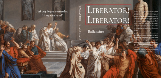
This one is a linen wrap, which means it has flaps!
#archive classics#typesetting#book design#indesign#fanfiction#ao3#the temporary nature of the internet is something we should be deeply concerned about!!#fanbinding
76 notes
·
View notes
Note
HELLO LIQUID!! So much congrats on your milestone!! 💕💕 could I please ask for a curse of obedience fic with pairing of your choosing? ☺️
HELLOOOOO LOVELY!!!!! And thank you so sosoossoosososo much!! I couldn't decide who i wanted to pair together for this, so i just made everyone cursed and let the grid decide :))) enjoy a little bit of grid chaos + norapinto <3333 Celebratory prompt list here!
Truth or Dare
"Well, I'm not playing," Lando rolls his eyes, settling into a spot against the wall, arms crossed. "Oscar, tell me I can't play."
"You can't play," Oscar repeats immediately, groaning once he's done. "Mate, you can't –"
"He's playing," Alex claps a hand on Oscar's shoulder, that irritating mischievous smile on his lips. "Tell him he's playing."
"You're playing." Oscar parrots, trying to shrug off Alex's hand. "Can you both stop –"
The emptied out steward's room is buzzing with chatter, the entire grid shoved inside and locked in unceremoniously.
Charles and Carlos accidentally made each other unable to speak by shouting commands at the same time, argument devolving to close-lipped yelling and flailing hands; Lewis and Valtteri have hidden themselves in the corner, content to watch the younger grid members chase each other about like terrors. Franco has latched himself onto Checo, speaking a mile a minute in Spanish – seemingly not spurred on my any order.
And George, watching from the center of it all, claps his hands loudly.
"Right then, everyone quiet down!"
The room falls dead silent, everyone turning to look at him with murder in their eyes.
He winces. "Didn't mean to order everyone, sorry." He doesn't, notably, revoke his command. "Alex had a great idea –" Lando smacks Alex in the chest, harder than necessary but softer than he wanted. "That we play a game of truth or dare."
Lewis flashes George a middle finger as Fernando simultaneously gives a thumbs up from the opposite side of the room; their eyes catch, Lewis rolling his and Fernando smiling with a few too many teeth.
"I'll command you all of the rules, then Alex will do the same to me. Does that sound fair?"
Pierre's tapping away on his phone, holding it up for the room to read: opened to a blacked-out Instagram story, the words "WHO MADE YOU KING?" in bold white font.
Esteban holds his phone up in turn: "PRESIDENT**"
Pierre types furiously: "HE'S BRITISH THEY HAVE A KING"
Esteban rolls his eyes before responding: "OF THE UNION BOUFFON"
George sighs exasperatedly, pinching the bridge of his nose. "Everyone, put your phones by the door. Face down. Alex, tell me to do the same."
"Put your phone by the door." Alex says, already moving mechanically towards the door with the rest of the drivers, phone ready in hand.
----
"Ground rules," George says, standing int he middle of the circle he instructed – forced – them to sit in, neatly paired by teammates. "We're all going to play truth or dare, all of us." He flashes a look towards Lando, glowering next to Oscar and his constant state of mild disinterest. "Each person will get to ask one other driver one thing. No double questions. All topics are fair game, but nothing we say he can leave this room. That is all an order. Alex, repeat it back to me."
Alex does as he's told, the rest of the grid in various states of disarray. Yuki looks giddy – probably ready to torment Pierre in whatever ways he's cooked up; Liam seems two seconds away from throwing up – intimately aware that he's the newest of the bunch with the fewest cards in hand; Max keeps looking at Charles like they can communicate telepathically, maybe plotting a way to overthrow George, possibly trying to threaten each other with the worst dares imaginable.
And through that is Franco, looking at Lando like there's something he really wants to tell him.
Which isn't terribly surprising; Franco always looks like he wants to tell someone something – it's sort of his entire thing.
George claps again – the irritating git – before opening the floodgates. "Let's play!"
----
They're all sitting in silence again, willingly.
Pierre told Yuki to admit who his favorite teammate had been; he said that he found them all equally annoying.
Esteban told Pierre to show off his hairline; Lewis laughed a little too hard, resulting in Valtteri forcing him to confess to a Turkish vacation some time in the 2010s.
Charles smugly demanded Max name the driver he felt was the biggest threat – to which he immediately replied "no one".
The entire circle had exploded into uproar; Charles insisting that Max was lying, that he clearly found a loophole because George "had been foolish and not demanded honesty"; Carlos saying that Red Bull was going to blow the constructors as is, so maybe Checo was the real threat; Checo told him to go fuck himself, chucking his hat and completely missing; and Lando, looking with fire in his eyes, bit his tongue.
"Big of you," Oscar whispers under his breath, resisting a smile.
"Fuck off," He hisses, not willing to admit that he was keeping anything back. He knows that he can beat Max; he's beaten him already this season. If Max wants to keep his head in the sand and not admit that, if he thinks he's above all of them, that's not his –
"Lando, Lando, Lando," Carlos smiles at him, eyes glimmering like the devil.
Fuck, Max might not be his problem.
"The most handsome driver on the grid, you are going to give him a kiss."
Carlos is.
"No." Lando says, already rising up to his feet with his consent. "Carlos, that's not – that's not what we're meant to do, right George?" He drags his feet, weak to stop them.
"It's his choice," George is grinning, just shy of rubbing his hands together like a fucking fly. "Who're you gonna snog, mate?"
"I'm not ��" He looks over his shoulder at Oscar – trying to tell him to command he stop. But his tongue freezes, unable to go against the ground rules George had set. He's drawing nearer to Alex, sat just on the other side of the circle, who looks like he's about to burst into laughter.
His voice has gone pitched with hysterics, "Lando, mate, what're you –"
"Shut the fuck up," Lando grits, face running so hot he can feel his pulse in his cheeks. "It's not you, bastard. Fuck you, actually, this was all your fucking –"
Lando's traitorous feet stop, shins bumping into Franco's knees – sat with his feet tucked like an excited child. His head whips up, eyes wide. "Wh–"
"I dunno, mate," Lando sighs, trying to hide his embarrassment behind a facade of… something better. Before he can say anything else, his body lurches forward, hands reaching for Franco's jawline and forcing him to sit up a little straighter, to tilt his head as Lando presses their lips together.
The room bursts into chaos, the command melts away – but Franco slides his tongue into Lando's mouth before he loses the chance.
#the urge to write an entire fic based on this chaos lmfaoooooooo#norapinto#f1 fic#f1 fanfic#ask me :)#f1 drabble#liquid's milestone celebration!!!#f1 rpf
48 notes
·
View notes
Text
Mean! SatoSugu x darling..
𝔀𝓪𝓻𝓷𝓲𝓷𝓰𝓼 \♡/: Choking, degradation, p in v, cum eating? Fluff at the end(except for the bonus) maybe dub-con?
𝓼𝓾𝓶𝓶𝓪𝓻𝔂 \☆/: So this is just a part 2 of the last one except with um Suguru. It's just that Suguru wants HIS fun.
𝓐/𝓝 〰︎♡☆〰︎: I'm so sorry to the people who couldn't read from the font 💀. I was already using this while it was in drafts for a long fucking time and I couldn't use the same one in the last part cause my subscription ended 😭.
𝓗𝓮𝓻𝓮 𝓲𝓼 𝓟𝓪𝓻𝓽 𝓞𝓷𝓮
∘₊✧──────✧₊∘
Mean!Satoru who finds you sitting alone at lunch reading one of your favorite books at the table with you legs hunched up in the seat not even noticing the tall white hair male walking towards you.
Mean!Satoru who gets his best friend Suguru's attention pointing at your quiet self in the corner of the cafeteria. They both walk over to you towering over you.
Mean!Suguru who takes your book out of your hand giving it to his best friend while looks down sharply at you. His gaze is almost threatening until you realize. Mean!Satoru has your book reading the page specifically where it has a sex scene in it. He almost laughed giving it back and pointing at the sentences.
Mean!SatoSugu who grabs your arm and takes you away from everyone as you slightly try and fight back making them both chuckle as your movements barely impact them enough to push you away and run.
Mean! SatoSugu who pushed you into an empty classroom and locked both of the doors as only the sounds of your shaking breath corrupts the room. Your heat slowly began to throb wanting both of them at the same time as your body starts to feel hot while your brain slowly starts to feel like mush.
Mean! Sugu talks about how much of a slut you were with Satoru when you both were in that closet. "You sucked his dick off like some fucking whore..what about me? Do you not care for me anymore?" His words spilled down onto you hitting somewhere in your heart with a feeling of guilt surrounding them. "I-im sorry! I'll make it up to you.." poor you were scared. Scared he was gonna beat your little cunny up infront of Satoru and making you choose who is better. You were in for a ride.
Mean!Satoru who records you sucking his best friend off so sloppily wanting that to be him but has to wait his turn. Your head bobs up and down while Mean!Suguru's cock annihilates your throat as his dick kept hitting the back of your throat making you choke making your makeup all messy as your mascara runs down along side your tears and your lipgloss all smudged up and over his cock. He has a strong grip on your hair moving your head to his own liking. He watches in amusement as you struggle to take his thickness down your throat while you have both hands on his thighs as your saliva gets everywhere even on the floor.
Mean!Suguru who keeps pushing you down to his pelvis until you were able to escape his grasp. "Oh now would you look at that? She was able to escape, that's some progress." Mean! Satoru slowly starts to instigate just for something to happen to you.. Mean!Suguru grabs you by your neck and pushes you against the desk. He flips your skirt up and... Surprise! Your soaked. Your panties are damn near a darker shade from your slick as he runs his fingers over it. "Please! Ah- please.. Have mercy!" your pathetic pleads go through one ear and out the other.
Mean! Satoru who quickly shuts your mouth by sticking his cock down your throat making you whine while Suguru pushes his cock inside your cunt.
Mean!SatoSugu both push your limits has the have their way with your body making you barely able to do anything. They both take you until the end of the day and the whole classroom smells like sweat and sex. You came... How many times? You lost count. Mean!Satoru came in your mouth it was over flooding.. You gave up after your jaw began to get tired. Mean!Suguru was still fucking you not letting you go for nothing until he felt the time was right. He was going to get his fucking revenge. "P-Please...you guys!!" aw, still begging.. You should've given up a long time ago. "Give me one more... I promise and I'll let you go.. mk' pretty girl? " His sickening tone made your stomach do a little twist as you cum on his cock again screaming out his name.
Mean! Suguru who finally pulls out of your little pussy watching as his warm cum run down your shaking legs. You lost balance and finally fell on your knees trying to catch your breath as they laugh at your pathetic form. Your head felt dizzy as your body felt hot. You could barely make out what they were saying until you were picked up bridal style from Mean!Satoru
You squirm in Mean! Satoru arms scared of what was about to happen next until he kissed your forehead. "Hey..we had our fun. Chill.." he said while Mean! Suguru tries to calm you down as if he didn't just beat your little cunt up. They walk you back to your dorm room pushing you on the bed as you try to scramble for some type of escape until they both laid with you. It was a little cramped since they were bigger than you.. But it was cute and you didn't have much of a problem with it so... Just make sure you give them equal treatment. "I love you both..."
∘₊✧──────✧₊∘
𝓑𝓸𝓷𝓾𝓼!
"I can't walk.." you were about to be late for work. They really had to stop you from getting paid just for some revenge. "Sorry darling.." Mean!Suguru didn't really show much sorrow because he felt what he did was right. "I sadly don't care" ok now Satoru just shows he don't care. "I'M NOT GETTING PAID."
#jujustu kaisen#jjk smut#gojo smut#jujutsu geto#geto smut#gojo x you#geto x you#gojo x y/n#geto x y/n#jjk geto#jujutsu gojo#geto x reader#jjk gojo#jjk satoru#jjk x you#jjk x reader
210 notes
·
View notes
Note
i find myself thinking about spaus a lot when i listen to the 1989 taylor’s version vault songs. do you have any thoughts on this. feel free to ignore if you don’t
I DO HAVE SOME THOUGHTS ON THIS ACTUALLY
ok so
"slut!" is actually a very roderich coded song to me, and i like to apply it to modern-day reconnected spaus, especially because of the "and if they call me a slut, you know it might be worth it for once" lyric, bc i think A LOT about roderich being slut shamed through centuries of political marriages. also i like the "power couple" energy of this song, like yeah people are going to talk shit about us anyway so at least we can be hot together in the meantime. something something "but if i'm all dressed up, they might as well be lookin at us 💅"
"say don't go" is my pre-divorce JAM, spain angst is really hitting me with this one. my man was barely holding on at this point, he KNEW that he couldn't stay even if he wanted to, and some small part of him STILL wanted to stay, "half way out the door but it won't close", but at the end of the day there was nothing he could possibly do, because the ball was in roderich's court and roderich missed it flying over his head, that poor guy. the thought of them having a conversation about it much later and antonio saying something among the lines of "i would stay forever if you say don't go" IS MAKING ME W E A K im just a girl okay? okay
"now that we don't talk" is perfect for them because it works both ways. having to divorce, grow apart after 200 years together, and then watch from afar as the person who means the most to you becomes someone else completely, but there's nothing you can do about it. "i miss the old ways, you didn't have to change, but i guess i don't have a say now that we don't talk". i also love the "truth is i can't pretend it's platonic" lyric and the "i cannot be your friend" one, bc i personally think that spaus are one of those exes who could never be just strictly platonic friends, like im sorry they're always going to flirt and touch each other and hook up if they are in the same company so. yeah
"suburban legends" yet another post-divorce banger, mostly from roderich's perspective, but some lines definitely scream antonio, too. i love the "doomed romance" energy in this one bc i think it suits their marriage pretty well, us much as the "and you kiss me in a way that's gonna screw me up forever" bc that's exactly what happened, let's be real. they altered each other. also "we were born to be national treasures" like YES my beloveds you absolutely were.
"is it over now?" well hello the most roderich edelstein coded song of all times. the things is, i think it works because spaus is never really over (to me). for them, there will always be this "what if" moment, "what if you were the one" moment, "i'd blow all my plans if you'd meet me out" moment. like, if they could choose each other, they would choose each other every time, the whole tragedy of spaus is in the unfortunate circumstances that led to the fallout; for them, it was never a question of falling out of love. btw "your new girl is my clone" is actually really funny considering that francis and roderich are literally the same guy different font.
#sorry for taking so long to answer being an adult with a job is crazy#aph hetalia#hws hetalia#hetalia#aph austria#hws austria#roderich edelstein#aph spain#hws spain#antonio fernandez carriedo#spaus
21 notes
·
View notes
Text
finally finished episode 1 (and 0, before that, before you ask) of Of The Devil and as a certified american, internet user, acting (and game development) student, i felt it imperative to share my opinion of this project. im writing this at 4 am and while half-tipsy so if you see typos, no you dont.
the following includes significant spoilers for both episodes 0 and 1 of Of The Devil so if you havent played it, you might want to Not read this!
im just gonna go ahead and start with what i think overall: THIS IS A REALLY GOOD FUCKING GAME. Like, REALLY REALLY GOOD. Like, I enjoyed this more than many of my attempts and experiences to play some of its inspirations (re: ace attorney, danganronpa) which is NOT me hating those inspirations; i am saying the innovations and unique creative decisions made to set Of The Devil apart from other titles in the murder mystery genre of games has made it what i love about it.
starting with general Things I Love:
Character Writing: name one boring character in this game. (spoiler alert: impossible!) this game has mastered an art of bringing charm and whimsy to a variety of characters who vary in age, design, occupation, relation to one another--without a single stale mark among any of them. every character is multi-dimensional. yes, emma is a perpetually tired nerd, but also yes, she is a ruthless, meticulous, prompt, dedicated lawyer who has a repeated record of having beat morgan in trial several times over, and will come running at 4 am to work.
yes, morgan is a hard-ass. also yes, she is a murderer. also yes, she is a criminal defense attorney. also yes, she is the most trusted ally of david ashur--a world-renowned programmer--and has killed on his behalf before without remotely being asked to do so. yes, she has taken serra under her wing and hired her. yes, she refers to serra as it and questions serra's independent thought on several occasions. yes, she begins to accept serra's opinions, quips, and muses more, and in her mind, refers to her as spearmint (out of endearment? teasing?). hell, yes, she chooses to even keep serra in her life after opening the episode 1 case with saying once she'd fulfilled this debt to serra (and david), she couldn't care less how serra fucked off afterwards.
tl;dr: the characters feel human. even the not-human ones. and they cover a variety of personalities and dynamics that clash and harmonize in lovely ways. Dialogue Writing: insane banter, bouncing off one another, fun puns and jokes and quips to specific characters. highlighted even further by the lovely portraits that change through conversation. ISAT and OTD prove: 2D character portraits can really do it all, and beautifully portray emotion in games with no emotional vocality (voice-acting, chat,) to support them. would make a good fandub. (i know there is a jelloapocalypse one, but as an acting student, i could see this as a fun challenge myself too if i can gather a couple more friends...) The Mysteries and Puzzles: did you play the game? the mirror-bit of episode 0? the synatonin-poisoned water, kept in the body for hours, becoming deadly when mixed with alcohol, gagged back up with salt-and-water concoction to get away with a murder-designed-as-a-suicide-turned-into-murder-against-an-innocent-party? cause that was very fucking clever.
Music: banger. nothing more to say here. the greatness of the soundtrack speaks for itself.
Character Designs, Art Style, and Visual Choices:
art style: 1000000/10. speaks for itself. same with character design choices, a fine diversity of heights, complexions, ages among the cast, etc. i suppose i would like to see more black and afro-featured characters moving forward as isaac was really the only one thus far, but given how small the cast is, this isn't an awful ratio for now.
i wanna talk about the visual/cinematic decisions. i want to talk about the way we cut to type-writer font and text and cut to panels of what looks like it was ripped right out of the script; you know, the solid-colored, semi-static background stills? where the character name and dialogue line sit in the middle, in the top left corner, you'll find the location of the current scene, and at the bottom, the line number, like we're looking at the actual script on paper? i love those. they create a nice change of pace and highlight of satirical and interesting moments in conversation. same with the multi-colored text, italicized text choices, and the other cuts--where some lines would cut to a grey, new camera angle in another part of the room, with the dialogue in red at the bottom for some of the most soul-chilling realizations of the narrative? W choices.
Plot Twists and Surprising Additions: okay so actually playing episode 0 i joked it would be really fucking funny if morgan were the heartbreak killer fresh after clearing carlos' name and you can only imagine the look on my face when i clicked into the next panel to immediately see morgan in the doorway with a smoking gun in hand.
it seems like such a simple idea for a twist; let's make the criminal defense attorney, whose entire career has been responsibilities along the lines of clearing people of murder, a flat-out murderer. let's say SHE is the murderer responsible for the death of a victim whose case she is assigned to, to prove someone else's innocence for it. she goes in with full confidence KNOWING she is the one who pulled the trigger, and as such, the evidence to support carlos' innocence should be there somewhere. all while using her arguments (smell of gunpowder, for example) as ways to keep herself separated from suspicion (light a cigarette inside the interrogation room so that the smell of gunpowder potentially on her is overwritten with the cigarette scent). and then reveal those supposedly six people she's shot in the heart? yeah, they are FAR from her first victims. very far. even david's stalker was, at minimum, her 20th, maybe 30th, maybe 40th kill; she's too precise, too meticulous, too... comfortable and satisfied doing it. it cant be new. cant be a fluke hobby. its something she is consistently finding satisfaction within, almost therapeutically. why???? (let's find out.)
anyways. we WILL be tuning into episode 2. we WILL be buying any merch on the horizon, and we WILL be checking out the ao3 scene (and perhaps contributing to it...?)
thanks gamers
#of the devil#otd#of the devil spoilers#of the devil serra#of the devil morgan#of the devil london#of the devil reyes#of the devil david ashur#of the devil emma#of the devil ad_48
15 notes
·
View notes
Note
hi! i was looking for some fic recommendations with a sort of trans crowley lens. it doesn't necessarily need to portray him as trans (though that's also okay), i was mainly looking for something where his angel name was treated as a sort of deadname? as in, his Fall was basically a parallel for transitioning? i remember reading a few fics with that premise back in 2019, but i can't seem to be able to find them anymore...
thank you!
I was trying to search for one fic where Crowley's pre-fall name is censored out with a strange illegible font, but I couldn't find it. If anyone knows that one, let me know! Here are a few others for you...
imagine a time before by AnonymousDandelion (G)
In the time before time, in the world before the world, bathed in the amorphous starlight and mists that had not yet solidified into creation, two angels shared each other’s company. They talked, and laughed, and smiled, in the easy communion of friendship without complication. “What was that idea you had mentioned?” Aziraphale asked, when their shared chuckling had died down. “Oh. Right. It’s a new one. And nothing to do with constellations, this time.” The angel who would one day be Crowley hesitated. “Can I show you?”
Refuse Thy Name by theycallmeDernhelm (G)
“You were an angel, once.” “That was a long time ago.” Crowley drunkenly lets slip an ancient memory, which sets Aziraphale looking for answers.
Gravity, or The Law By Which We Fall by rowenablade & sammininoofthelord (G)
Before Crowley was a demon, he was an angel who made stars. Before Aziraphale was a principality, he was a soldier in a universe that had never known war. They're on opposite sides when they meet, but neither knows how to treat the other as an enemy. They're on their own side, when they remember.
How Do They Fall Down? by CynSyn & TawnyOwl95 (M)
In Heaven every angel knows their place. Almost. A Senior Astral Design Technician (who will one day choose to call himself Crowley) has questions. He thinks the Archangel Lucifer may have answers. This is only partly fueled by the Crowley's growing fascination for the Principality with the kind eyes who is so far out of his league it's embarrassing. Not to mention socially impossible. But as discontent in Heaven grows boundaries begin to blur and all the angels will have to choose where they belong. Or, five times Crowley didn't have the nerve to talk to Aziraphale and the one time he did. (Which made all the difference to the World)
Sweetest of Words by shadowintheshade (E)
Aziraphale calls Crowley by the wrong name during sex and it almost kills Crowley, re-awakening memories of who he was before the fall, memories Aziraphale has never lost. Aziraphale gives up a chunk of his soul to save Crowley from dying, guilt and angst and comfort ensue as they both work out who they are and where this new/ ancient relationship is going.
- Mod D
#good omens#ineffable husbands#pre-fall#angel crowley#names#aziraphale and crowley met before the fall#mod d
84 notes
·
View notes
Note
sorry i couldn't find out how to ask on your other blog.
that book binding you posted is gorgeous btw !!
I noticed that in one of the photos you included the disclaimer that you also edited it. I just had a question about how you formatted the text.
one of my biggest gripes with AO3 is text formatting (i often feel like i'm reading a legal document vs a novel/story) . Did you change how it is formatted on AO3 compared to printed?
I feel like i'm in the 0.5% that hate AO3 formatting but i thought i might as well ask in case you have any tips for that. >,>
(also how do you decide on the page size, do you just choose a standard size for all your projects? or do you vary it depending on what you are binding?)
thanks so much for taking the time to answer and for sharing your projects :) !!!!!!!!!!!
hey anon! I have asks turned off for the sideblog, but happy to answer here. Thanks very much!
I'm taking this opportunity to info-dump and link a lot of resources. I think they're useful for people new to either typesetting or bookbinding, but not all are directly related to your queries. That said, hope this is of use!
one of my biggest gripes with AO3 is text formatting (i often feel like i'm reading a legal document vs a novel/story) . Did you change how it is formatted on AO3 compared to printed?
I do a fair bit of editing when I'm binding a fic; typesetting is often the longest part of the process. Your mileage will vary depending on your experience with using word processor software, particularly the paragraph style and page style settings. Another factor is how simple/complicated you want your typeset to look. Replicating a published novel in format is difficult but learnable for a complete beginner.
I'm not equipped to give a full tutorial on how to typeset, but I'll point you towards some useful resources for ficbinding then talk about my own process.
ArmouredSuperHeavy has a tutorial on how to make Ao3's HTML downloads into a printable book in Microsoft Word. I use LibreOffice Writer myself, so this adaptation of the same tutorial is what I follow. Both are very helpful to reference as you're learning the typesetting ropes.
Personally, I don't mess around with HTML. I find it easiest to start by doing a Ctrl+A copy of the Entire Work fic view on Ao3 then pasting that into my word processor. This video tutorial by Beautifully Bound runs through how to do this in Microsoft Word using an AO3 fic as an example, including the associated steps needed to make the fic look novel-like. This is probably the best tutorial to address your gripe with AO3 formatting. Other than that, I'd recommend looking into videos or tutorials about typesetting novels for print. Same idea, and you may get more hits than searching for fanbind/ficbind typesetting tutorials.
More under the cut! Once I start yapping, it's hard to shut me up 🤷♀️
As a point of comparison, here's one of my fics on Ao3 and the corresponding typeset side by side:


Beautifully Bound explains this in far better detail than I will, but off the top of my head, the steps involved:
making a new document and setting the default page size to whatever size I want the book's pages to be (A5 or A6 usually). You can also set the margins at this point, taking account of your printer settings.
CTRL+A and copying the entire work's text on AO3 then pasting it into the document.
removing all hyperlinks and AO3 frontmatter, things like the author tags, summary, notes, etc as well as any website text that got copied over alongside the fic.
(optional) running a spell check and ensuring grammar usage is consistent. For me that's substituting em dashes for hyphens between clauses, enforcing curly double quotation marks for dialogue, etc. LibreOffice Writer automates a lot of this with customisable settings, via Tools -> Auto-Correct. Here's also where to make sure character names are all spelled right, convert the text to or from US to UK English, etc.
picking out fonts for the body text, headers, page numbers, etc. This is where you'll want to use paragraph style settings. Page style settings also comes in clutch if, for example, you'd like different headers on alternating pages. I like having the author on the right, the fic title on the left.
setting the body text first line indent to whatever makes sense visually). This in particular helps make the fic feel more like a novel. You can also play around with line spacing and space between paragraphs at this stage. For this A6 typeset, I had a 0.75cm first line indent, 1.15 line spacing, and 0.15 spacing between paragraphs.
(optional) formatting the first line of the work to use small capitals and to add a drop caps to the first letter of the first word. Again, this is a convention in publishing which add a novel-like feeling to a printed fanwork.
Inserting page numbers, adding images, coming up with how I wanted the "copyright" page to look—optional for the most part, but these are details that make a fic appear more like a novel.
For multi-chapter works, there's extra work in formatting chapter titles as headings so that they're referenced correctly in the automatic table of contents word processors can generate.
Once you have a typeset you're happy with, and if you're considering printing and binding it as a book, then you'll need to look into how to create and print signatures. Personally, this is something I had to actually try (and mess up a bunch of times) before I got to grips with it. Understanding how both your printer and your PDF reader work, particularly printer margins and booklet print settings, is key.
I won't go into as much detail on this, but if it's something you have an interest in, I'd recommend starting with DAS Bookbinding's tutorial. DAS has tutorials for everything bookbinding related so when in doubt, check his channel! Plenty of other YouTubers also have good videos on making signatures.
This resource is extremely useful once you've got your head around how to print signatures manually, so here's a link for anyone in that space: GitHub Bookbinding Imposer. Essentially, this does the signature creation for you, removing the need for booklet print settings in your PDF reader.
also how do you decide on the page size, do you just choose a standard size for all your projects? or do you vary it depending on what you are binding?
I have access to both A4 and A5 sized paper and my printer can handle printing on either size. In bookbinding, normally two pages are printed per side of the paper (which are then folded in half as part of a signature). That is, when I print on A4 paper, it's to make an A5 sized book. Printing on A5 paper will yield an A6 sized book.
Before I begin typesetting, I'll usually know what paper I plan to use, so the typeset will be one size down from the paper. So far, I've made softcover pamphlets at A6 size and casebound books in A5. No real method of choice for me, it's whatever I feel most suits the project.
---
If you made it this far anon, thanks for reading! Here's links to a few general resources if bookbinding is something you'd like to explore more:
DAS Bookbinding (YouTube, bookbinding in all forms)
Sea Lemon DIY (YouTube, bookbinding and other crafts)
bitter melon bindery (YouTube, bookbinding, particularly beginner friendly!)
Jess Less (YouTube, demonstrations of fanbinding and re-binding existing novels)
Papercraft Panda (blog, lots of detailed tutorial on bookbinding)
Renegade Bookbinding Guild (collective and website, loads of fanbinding-specific resources from their members and they have a helpful Discord).
21 notes
·
View notes
Text
I dare you to let me go
(this is part 5 of my fic. Enjoy reading!)
Part 4 ↓
AVERY
"It means we can't be together anymore."
The words were ringing in her ears, like they weren't true, like they couldn't be true.
Breaking up meant separating. And separating was simply impossible. It was something that happened to other people, not to them.
It was so poetically tragic, being in the verge of losing the love of her life in font of the very castle they'd won together 5 years ago, the way he'd kissed her like she was everything. Like they were everything.
Except she was nowhere closer to letting him go.
"You don't really mean that. Jameson. We will work this out, however long it takes. I'll be there, I promise."
Jameson threw his hands up in the air and gave the saddest, dryest chuckle ever, "Ah, there we go! Another promise. I wonder how long it'll take for you to break that one."
"I screwed up, I know that. But I need you. I'm not letting you go." Even through her panic, Avery said that fiercely. He opened his mouth, then closed it again. They stayed like that until,
"You need me, Avery. You don't want me."
"I do!" She yelled in exhasperation and threw her hands up in the air. A second tear cascaded down her other cheek.
"Then why do I find myself wondering if you'd choose me if it came down to the foundations and me?"
"I haven't felt wanted because you haven't chosen me. You haven't chosen me in a very long time." A tear feel on his cheek. Then another on his shirt… hold up. They weren't tears.
It was raining, and before they knew it, the sky was filled with big, bulbous storm clouds and they were running to hide under the shelter of the garage.
"How have you come here?" Jameson asked, as if they didn't share heart-breaking revelations minutes ago.
"By-by car. And about that…"
"What?"
"I may not have told your brothers or Oren, who are staying in Edinburgh"
"You came without Oren? He'll kill you!"
"They would've insisted on coming, but I knew it was me you were mad at, so I came alone."
Jameson sighed. He was beyond exhausted at this point, and the thunderstorm was too severe to ask her to leave.
"Give me your keys"
"Huh?"
"Your car keys, I'll park it in the garage."
-------------------------------------------
Vantage had changed in the last few years. It still had the Victorian charm and the countless antique furniture pieces and paintings that probably cost an arm and a leg. Some were added by Jameson, too. He'd travelled and collected a lot of things over the years. Key word: him, not them. He used to charter planes, he hadn't chartered one in a year.
Now she knew it was because he bought one.
Jameson loved Vantage. He paid a great deal of attention to it's upkeep. Five years ago, it felt like a sad piece of property, lifeless. Now, the place felt… happier. Like when you were paid a lot of attention and care to.
Totally unlike Jameson.
"What a storm! Get inside quickly, dear" exclaimed Priscilla, the woman with graying brown hair, pulled up in a bun, as she handed them both towels.
"Thank you, Priscilla," Jameson smiled at her.
Avery looked at both of them, confused.
"Priscilla is the housekeeper of Vantage. She also has mothering syndrome" he smirked at Priscilla. She waved a had at no one in particular and blew a raspberry in the air.
"The mouth on you. You are too deprived of motherly attention, anyway. Now, dinner's getting cold."
Priscilla hurried away, leving Jameson and Avery alone in the foyer as they dried themselves. Avery couldn't take the silence anymore. "So, she's nice."
"She is," Jameson looked into her eyes for a second, and then looked away and blinked several times, add of trying to banish her. Like looking at her too long hurt.
Or like he was scared he'd want to give in again.
They made it to the kitchen while the the storm outside kept raging.
This was going to be awkward.
------------------------------------------------
Priscilla was so sweet, Avery wondered how Jameson didn't have diabetes yet. But she was a great cook too. Except she didn't have time to focus on that.
The call with Oren, with Grayson and Nash chipping in was only piling onto to Avery's already stressed out self. Even still, after Avery convinced them there was security at Vantage, and that they were both fine (physically), Oren reluctantly agreed to come in the morning and Grayson gladly agreed to head back home and look after the foundations for a while.
After dinner, Priscilla went to sleep and having nothing to do, so did her and Jameson.
Avery's room had the most magnificent ceiling, with stellar designs full of stars that seemed to be of gold and silver. It was mesmerizing, you couldn't look away of you tried, and if you did, what you saw was the rest of the navy-colored room with similar stellar designs.
Stars, Avery thought, I got this room for a reason.
"Everything you need is here. Call me if you want anything." Jameson told her.
"I do want something." Avery took a step forward. "You. I want you back."
Jameson groaned, "Avery-"
"Please. I'll do anything."
"I can't, heiress. I told you, when we'd meet. Trust is the last thing that comes to me, if it comes at all, and you broke that trust. Repeatedly. The least you can do right now is give me some time."
Avery wanted him to go now. Go, so she can sink into that pretty pillow and cry an ocean to match the one outside.
"Okay," was all she could manage.
#idytlmg#avery grambs#jameson hawthorne#javery#jameson x avery#averyjameson#tig#the grandest game#the inheritance games#the hawthorne brothers#the brothers hawthorne#grayson hawthorne#xander hawthorne#nash hawthorne
30 notes
·
View notes
Text
Sign the petition to demand the creation of a new international law requiring fast-fashion garments to come with a statement of the human cost and environmental harm caused by their creation.
We all know fast fashion is bad for the planet - slave labor, environmental waste, air and water pollution, and unsustainable practices are just a few of the ways they impact our planet, our health and our lives. To date, the fast fashion industry is the 2nd largest consumer of water and is single-handedly responsible for 10% of global carbon emissions (that's more than all international flights and maritime shipping across a year combined). Even the simple act of washing these clothes releases 500,000 tons of microfibers into the ocean each year - that's equal to 50,000 plastic bottles. Fast-fashion is the 3rd leading cause of the climate crises we face, yet is rarely addressed.
Knowing these stats is one thing, and understanding them is important. Being aware of them is somewhat informative. But as long as we keep turning a blind eye to the issue, the stats are only going to get worse, and nothing will change for the better. Ignoring the issue or brushing it under the rug won't help anything. So what if we could see the real-world damage done by each of the garments we buy?
In the same way that cigarette packets have shown the harm their products do to our bodies ("SMOKING KILLS", lung cancer visualizations, etc.), what if fast fashion manufacturers & retailers had to show the harm their products do to our planet?
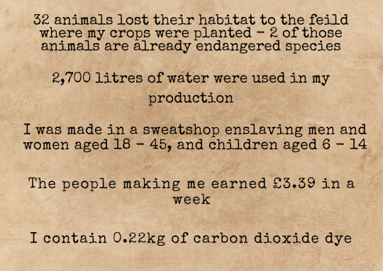
[Image ID: A type-writer font has been used on a brown craft paper background. The text reads: "32 animals lost their habitat to the field where my crops were planted - 2 of those animals are already endangered species. 2,700 litres of water were used in my production. I was made in a sweatshop enslaving men and women aged 16 - 45, and children aged 6 - 14. I contain 0.22kg of carbon dioxide dye." End ID.]
This is a mock-up of a label / statement for a single T-shirt, with researched statistics and educated estimates for the information I couldn't find a calculated answer for.
Now imagine labels / statements like this for every single piece of clothing: how many toxic chemicals are in those new jeans? How many litres of water did that shirt take to make? How many animals were skinned to make those cute fur-trimmed boots? How many children made that jumper? How many people were forcibly removed from their homes, so production companies could plant crops to grow the materials used in clothes manufacturing? How many families were evicted for no reason other than corporate greed? How many trees were cut down? How many animals were displaced or killed?
Would you really want to buy those items of clothing if the answers to those questions were staring you in the face?
If this information was stated in clear, accessible ways on both the website and the ticket on the actual garment, this would dramatically reduce the number of people buying fast fashion items. It would also reduce the profits being made by fast fashion companies, and could lead to many of them being forced to choose between changing and becoming sustainable, eco-froendly and ethical brands, or shutting down due to being boycotted.
Who would really want to knowingly buy things that are made by slaves, or which cost a family their home, or which contributed to deforestation? Who would continue to buy fast fashion items knowing this is the damage caused by them, when sustainable alternatives are an option?
Whether it's second-hand fashion at affordable prices, or investing more money in sustainable products which were made with high ethical standards and which cost more money due to the fact their price accounts for the time it took a person to make that item... we can say for certain that sustainable shopping is going to become much more popular if people know how important that change is. Sustainable items last much longer than fast-fashion items, which by design are created to self-destruct, as they are made to be worn a few times and then discarded in order to be replaced by the next trend's items - and as trends speed up, these items become weaker and weaker. This then leads to people spending more money in order to keep up with the newest trends, and to keep replacing clothes they throw out after a few washes.
In contrast, buying sustainable items which are designed to last years means people won't have to spend money on new clothes every few weeks, which means they'll ultimately save money in the long term and actually be able to afford those pricier items which will last much, much longer.
Now, despite the amount of harm the fast-fashion industry causes to people and the environment, the last thing we should be doing is getting angry at those who continue to buy them. Being the target of anger doesn't make large populations change their behaviour - even a cursory look through history books will tell us that much. Neither does being the target of resentment or blame.
But guilt? Shame? Those are two of the most powerful emotions to magnify when you want change to happen in waves.
And frankly, if people feel ashamed of buying something, or if buying something makes them feel guilty... they're going to stop buying it.
Those aren't the only emotions that should be felt, though. Because only feeling guilt and shame leads to feeling hopeless, scared, anxious and depressed. And we don't want that. No matter how bad things get... we don't want that.
The only other emotions to provoke are hope and pride.
If there's no hope for the future, how can anyone be expected to imagine a better one?
You wouldn't think it, what with all the climate crises and disasters we experience around the world and the total lack of commitment made by billionaires, multimillion-dollar companies and corporations and politicians.
But it's true. Scientists in Scotland have discovered bacteria which eat plastic and speed up the decomposition of it. ‘Ecocide’ is now punishable by law. Some countries within the EU are already close to meeting their 2030 goals years ahead of schedule! Thanks to scientists and small, individual changes made on a massive scale by ordinary people who are making small adjustments to our everyday choices, we can and are healing most of the ozone layer before 2050. That is something we should all feel incredibly proud of.
So imagine how much we could speed that process up if more people made those changes. Imagine how much sooner we could heal our planet if billions of people made those changes, rather than millions. Imagine how much sooner we could be seeing the effects of a healthier planet if fast fashion companies were forced to choose between going green and transparent, or closing altogether due to a lack of interest from consumers. Imagine the changes we could create if corporations made massive changes in a short amount of time, in order to save their own profits.
Imagine more labels like this, sitting alongside each other on every single piece of fast fashion clothing. A statement like this beneath every item of clothing on fast fashion websites, which transparently states the harm done.
If every single fast-fashion company and store had to display this on their clothing, on their racks, on their websites, and if there were legal punishments for those who tried to evade or lie... fashion would turn a lot greener very quickly. We'd start seeing more and more labels with "I'm made from 6 plastic bottles! I used to be a newspaper! I had 0 pesticides used on me in my production! I only contain natural dye made from berries, beans and sustainably grown flowers. I was made from apple skins and corn! The people who made me get to go home to their families every night, have days off and the adults made £150.35 each in 1 week! The animal who made the wool for me is free-range and well-cared for! I came from a small family farm, and was created with a closed-loop water system!”
That'd be a much better civilisation to shop in, don't you agree?
That is hope for the future.
That is motivation, which can fuel ordinary people to do extraordinary things and create changes they thought were impossible.
If you want to be a part of creating this change, sign the Change.org petition which demands the the creation and implementation of an international law which will require all fast-fashion products to be displayed with a statement which states the harm done to people and the planet by that garment being made & shipped.
#fast fashion#fashion#climate crisis#climate change#climate action#climate catastrophe#environmentalism#environment#environmetalists#enviromental#sustainability#sustainable#economy#ecofriendly#ecosystem#europe#earth#ecommerce#society#socialist#sociology#social justice#social media#slave labor#children#child labor#children's rights#environmental justice#petition#petitions
43 notes
·
View notes
Text
Types of decks I have in playable states:
Buried Alive -- Anowan the Ruin Thief rogue tribal precon that mills you, Black/Blue
Gilf of the Seven Seas -- Admiral Brass Unsinkable pirate tribal precon with minor upgrades, Black/Blue/Red
Big Angels Get Bigger/Go Big Go Home -- Giada Font of Hope built of scratch bulk and angel tribal, mono White
Dickdickout -- Evie & Jacob Frye commanders assassin tribal built entirely from spending too much on packs because I love assassin's creed, Blac/Blue
Not-So-Liliana/Good Girls Go Bad -- Liliana themed zombie tribal recursion deck that switches between Zul Ashur Lich Lord and Ghoulcaller Gisa until I can get a Liliana commander (Liliana lands, cards with Liliana on them, cards of Liliana's servants, Liliana box, Liliana sleeves- you get it), Mono Black
Bloody Bloody Mess -- Vito Thorn of the Dusk Rose blood tokens, vampire tribal & the first deck I built (with revolving commanders), Mono Black
You Know What They Say About Big Hands -- Syr Elenora the Discerning card draw to get as big of a hand as possible, not tribal, Mono Blue
Unyielding Loyalty -- Sidar Jabari of Zhalfir knight tribal knight recursion that I haven't played all that much, White/Blue/Black
Walk The Plank -- Adewale pirate/assassin tribal vehicle deck, Black/Blue
Sucks To Be Me I Guess -- Jeskai precon, Elsha Threefold Master & Shiki ans Narset Unified, Blue/Red/White. Funny thing about this one is that you can choose only one of the two possible commanders, and because I am indecisive, I roll a dice to pick one before each game
Decks wip:
Desynchronization -- Aveline de Grandpre deck full of the random green asscreed cards I pulled in that made dash to make the asscreed deck, Mono Green
Publick Affairs/Babygirl Deck -- Piper Wright Publick Reporter clue deck but is also full of other fo4 cards like Nick Valentine and Curie, Mono Blue
Bleeding Effect -- Desmond Miles just with a bunch of my copies of assassins that I couldn't put into Evie & Jacob or Adewale, Mono Black
Flashflood -- Shao Jun that's more like both versions of the same commander cuz I can't pick the art I like and a dream, Blue/Red
2 notes
·
View notes
Text
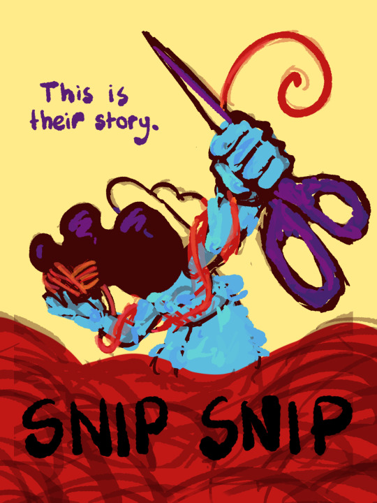
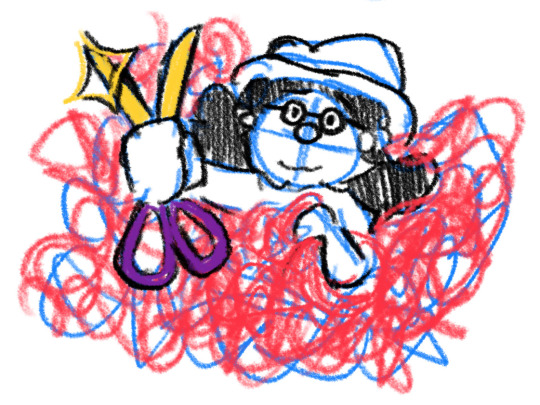
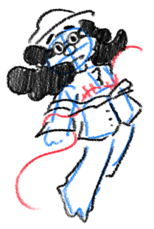
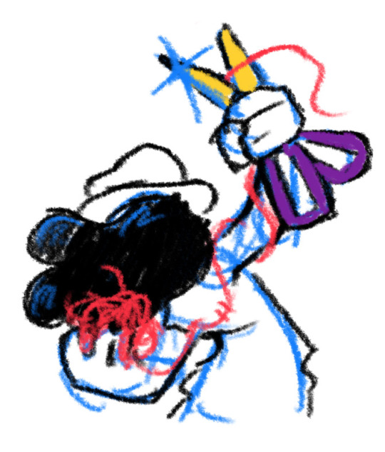
I thought I'd share the sketch of this poster/book cover as well as my initial concepts! You can click the "Read More" button for more in-depth explanations on my design process.
Thhis is all for my latest fanfiction, Snip Snip, so if you'd like to check that out, then...
Now let's crack in!
For the release of "Snip Snip", I actually had several different directions in mind! One was a comic of one of the scenes from the fanfic—specifically the one where the Professor breaks down in front of Kate and Joyce with the line "I don't like being a woman"—and the other was a series of doodles showing the Professor's transition. Unfortunately, both directions met dead ends as I couldn't find the motivation to do either. The most progress I made were these sketches.
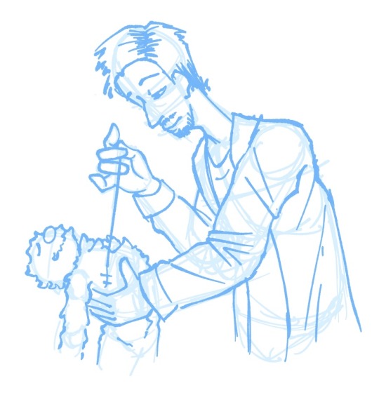
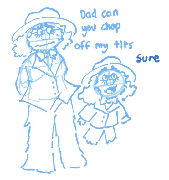
If you're wondering, "The first one looks familiar..." that's because I reused that pose for my first promo art! It was too good of a pose. I couldn't waste it :P
But anyways, after a period of getting extremely frustrated over the lack of progress, I realized my main problem: I was biting off more than I could chew. I didn't know this at the time, but I was dealing with burnout from school assignments that made drawing more ambitious ideas like the ones I had very difficult. Hence, I had to scale it down. It made me think, "Why not do something like a movie poster or a book cover?"
That's how the sketches at the top of the post came to be! I consulted a friend of mine over which pose to choose, and he picked the third one which I understand why so. The obscuring of the Professor's face not only made it cool, but it adds symbolism in how we don't really see his true identity—the real him—until his transition. Here's the first sketch!
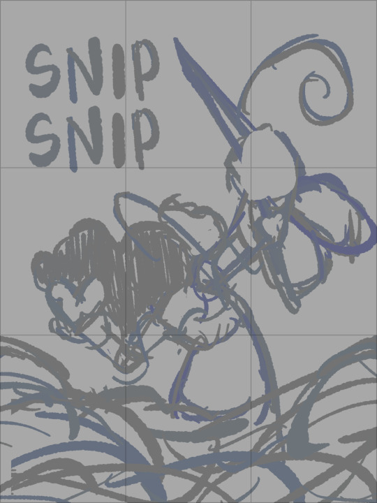
As you can see, the title is on the top left corner! However, I moved it to the bottom for two reasons
It's advice I learnt while looking up how to make movie posters since moving the title to the bottom tends to bring more focus to the illustration above.
I couldn't find a font that fits! And the idea of doing typography again (especially after the Keep Yourself Safe poster...) was really not what I signed up for.
But then it left the problem of the top corner looking empty. It was too distracting! So what did I fill it in with? The subtitle: This is their story. The composition is now more balanced, and also the subtitle tickles me.
As I said before, I looked up movie posters for this! Special thanks to the Nashville Film Institute and Muse by Clio for their articles that guided me during this poster making process. I will say though I got really sidetracked watching Filmmaker IQ's The History of the Hollywood Movie Poster 😭 It's really interesting, I'd recommend watching it!
One thing I learnt is that movie posters limit their colour palettes. Of course, this is good advice for art in general, but movie posters emphasize on its colour usage to attract the audience with their simple yet bold schemes. It is a piece of advertisement after all! Following their footsteps, I limited my colours to the primary colours (red, yellow, blue) and purple to make the scissors pop and allude to the nonbinary flag colour scheme.
And from there, it was just a matter of experimenting with rendering! I wanted a mix of pop art and storybook illustrations, so I mixed lineart with lineless, and I wanted to retain the energy of the sketch while still polishing it, so I cleaned the sketch, merged it with the colours, and painted on top of it rather than make a separate lineart layer.
Overall, I'm extremly proud of the end result! The struggle of figuring out the promo art for this fic has been tormenting me since the beginning of the year, so I'm glad to bring it to an end. Thank you for reading my ramblings! I hope you learnt something or at least had fun? Either way, have a good day!!
#this truly has been a rambles moment#i really really recommend watching that video by the way it is FASCINATING#the professor#shane madej#puppet history#poster design#art process#design process#art#artists on tumblr#sketches#concept art#chris p fried rambles#chris p fried art
14 notes
·
View notes
Text
dont get me wrong- I dabble in spreaver as much as the next chode, but I'm not like... super into some of the ooc content? Not getting into specifics, because who am I to judge, but we need some more toxic spreaver rep. Like... the potential there. Two imperfect and arguably unchangeable individuals who somehow view the other as an equal- despite various conflicting and borderline disastrous combinations of character- and use them in order to both humble them self and also get back at the other person???? Who mutually just write it off as "this doesn't mean anything", but for different reasons??? One who simply indulges in conquest and pleasure, marking this as another notable person off the checklist- and the other, who just needed a little break from the responsibilities and consequences they have to live with? AND THE POTENTIALLY UNSPOKEN FEELINGS AN THOUGHTS THEY HAVE- SPECIFICALLY ABOUT HOW THEY FIND THEIR... whatever it is- SOMETHING THEY DON'T REGRET, AS IT'S THE ONLY TIME THEY FEEL AS THOUGH THEY FONT HAVE TO BULLSHIT??? Like, yeah no they hate each other and actively find themselves annoyed with the very presence of the other, but they also understand them for what they are better than ANYONE else. They are two sides of the same coin, and possess the ability to murder the other if they decided to- and yet choose not to. Why? They don't even know. But it's just... wild, that they know things about the other that no one else probably ever will, and the fear from knowing that they see right through them just kind of shuts them up about trivial things that don't exist within or beyond this moment. They just couldn't care.
Ok but in general: They literally do not care. It's... weird, but it's not like a super emotionally investing prospect beyond the greater scheme of "huh... this is kind of a fucked up situation when you really think about it. But low key I don't want to put in more than what I already have into this, so fuck no I'm not getting into it"
-I do think that if they were different people under different circumstances, they could've maybe been happy together, though. Maybe as simple villagers- or adventurers, seeing how skilled they are in that field. But defiantly without the added impact from lifetimes worth of burdens, trauma, terrors, destruction, expectations, and sacrifice. Without all that, I think the free-spirited yet determined Sparrow would've been content with the articulate and skillful "Reaver". One, a mute who commits them self to whatever they set their mind on, often to the benefit of those around them- and the other, a well-versed man with ambitious goals, but who settles for living everyday to the fullest via the experiences he gains in daily life. Different people. Different story. Y'know what? I'm just gonna pretend like every spreaver fic I read that isn't as needlessly complex as the image I've got in my head is just an au version of the story. Saves me a few braincells.
Thank you fable writers for leaving a gaping middle chunk between fable 2 and fable 3 so that I could write delusional half-assed thoughts about a bunch of polygons who I think had, like- 3 conversations? Whatever. Fuck you.
14 notes
·
View notes
Text
Resolution Independence, Zoom, Fractional Scaling, Retina Displays, High-DPI: A Minefield
I already explained how CPU dispatch is a minefield: It doesn't cause intermittent bugs. It often doesn't even cause crashes. Badly implemented CPU dispatch means you build something on your machine that runs on your machine, but doesn't perform the dispatch correctly, so it crashes on somebody else's machine, or something build on a worse machine still runs fine on a better machine, but not as well as it could. Some of the bugs only manifest with a different combination of compiler, build system, ABI, and microarchitecture. CPU dispatch is a minefield because it's easy to get wrong in non-obvious ways.
I recently played an old game on Windows 11, with a high-DPI 2560x1600 (WQXGA) monitor. Text was too small to read comfortably read, and the manufacturer had set the zoom level to 150% by default. When I launched the game, it started in fullscreen mode, at 2560x1660, which Windows somehow managed to zoom up to 3840x2400. The window was centered, with all the UI elements hidden behind the edges of the screen. When I switched from fullscreen to windowed, the window still covered the whole desktop and the task bar. I quit the game and switched to another. That game let me choose the resolution before launch. At first I tried 2560x1660, but nothing worked right. Then I started it again, at 1920x1080. It didn't look quite right, and I couldn't understand what was going on. Windows has scaled the game up to 2880x1620, which looked almost correct. At this point I realised what was happening, and I set the zoom to 100%. Both games displayed normally.
The first game was an old pixel art platformer from the early 2000s, with software rendering. The second is a strategy game built with OpenGL around 2015, with high-resolution textures based on vector art, and with a UI that works equally well on an iPad and on a PC.
It was hard to read things on that monitor, so I set the font scaling to 150%, but somehow that made things harder to read. Some applications did not honour the font size defaults, and others did, and still others had tiny UI elements with big letters that were spilling out.
Next, I tried to run a game on Ubuntu, with Sway (based on wayland) as the desktop environment. It's a different machine, a 15.6 inch 1920x1080 laptop with an external 1920x1080 23 inch monitor attached. I zoomed the internal display of the laptop by 150% in order to have windows appear equally sized on both monitors.
What is happening on Windows 11 seems to be that even OpenGL games that don't think in terms of pixels, but in terms of floating point coordinates that go from -1 to +1 in both the x and y dimension, (so 0.1 screen units are different sizes in different dimensions) are treated the same as software rendering games that give a buffer of software-rendered pixels to the operating system/graphics environment. Making an already resolution-independent window bigger feels pointless.
What I would want to happen by default, especially in the case of the software-rendered game, is for the operating system to just tell my game that the desktop is not sized 2560x1600, but 1706x1066 (or just 1600x1000), and to then scale that window up. If the window is scaled up, mouse position coordinates should be automatically scaled down from real pixels to software pixels, unless the mouse cursor is captured: If I am playing a DOOM clone or any first-person game, I do not want relative mouse sensitivity to decrease when I am playing on a 4K monitor or when I am maximising the window (if playing in windowed mode). If I have a retina/zoomed display attached, and a standard definition/unzoomed display, and there is a window overlapping both screens, then only the part of a window that is on the zoomed display should be zoomed in.
What I would want to happen with a "resolution-independent" game is this: The game queries the size of the monitor with a special resolution-independent query function. There is no way to "just make it backward compatible". This is a new thing and needs new API. The query returns
Size of all desktops in hardware pixels
Size of all screens in real-world centimetres
Preferred standard text size in pt/cm (real world) or pixels
Zoom factor (in percent) of all desktops
Which screens are touch or multi-touch screens
Is dark mode enabled?
Which desktop is "currently active"
The "preferred" desktop to open the window
This information would allow an application to create a window that is the appropriate size, and scale all text and UI elements to the appropriate size. We can't assume that a certain size in pixels is big enough for the user to comfortably hit a button.
Even this information might not be enough. What should be the behaviour if a windowed OpenGL application is dragged between a 4K monitor at 200% zoom, and a 640x480 CRT? Should the OS scale the window down the same way it currently scales windows up when they aren't "retina aware"?
I don't really know. All I do know is that Windows, Mac OS, and different wayland compositors all handle high-DPI zoom/retina differently, in a way that breaks sometimes, in some environments. But it looks fine if you don't have scaling set. There are ways to tell the windowing system "I know what I am doing" if you want to disable scaling, but these are easy to abuse. There's a cargo cult of just setting "NSHighResolutionCapable" or "HIGHDPIAWARE" without understanding why and why not. Win32 provides all the information you need, with a very complex API. Wayland has a very different approach. SDL is aware of the issue.
I really hope SDL3 will make this work. If you get this wrong, you'll only realise when somebody on a different operating system with a different monitor tries to get your game to fit on the screen by fiddling with the registry, and it goes from not fitting on the monitor to text being too small read.
8 notes
·
View notes
Text
Okay I couldn't help myself while talking with @loveable-sea-lemon about their big bang ideas. I'm not participating because I didn't think I'd have time or energy or ideas or whatever, but they were teasing a few thoughts for theirs and I, uh.....took a left turn, perhaps.
Anyhow, here's the most ridiculous low-key piece of crack I have ever made:
Vegas and Pete are getting married and trying to do some wedding planning and of course neither of them has ever put any thought into actually getting married in their entire lives. (Vegas has planned on how he would crash a wedding. For murder.) But out of the two of them, Pete has at least *some* idea of normal customs and cites some Buddhist traditions they can incorporate, which Vegas likes for the most part. But they're looking at other Thai weddings and Vegas is like "these are BORING where is the fun element?" And Pete shows him more creative options, among them being themed weddings. And suddenly Vegas gets OBSESSED and spends an entire night putting together something in rigorous detail. He forgets to make breakfast like he usually does in the morning, so Pete wakes up having slept alone cuz Vegas burned the midnight oil in his office all night, and sighs as he makes some simple omelettes. He sends Macau off to school, does his nakey fitness routine (with no hubby to interrupt him 😥), showers, and then chooses a good book to read while pretending he's not a little concerned or slightly miffed at Vegas' absence.
Finally, a little after noon, Vegas emerges in that "mom I frowed up" pajama number, carrying his laptop. He certainly looks tired but it doesn't overshadow the smile on his face when he sits down beside Pete, kisses his cheek, and says "I have something to show you." Pete now shoves down the mounting curiosity that's been bothering him all day and anxiously waits as Vegas opens the laptop and adjusts it so both of them can see everything on the screen. "We can discuss anything we want to change, but this is a perfect idea," Vegas tells him. Pete sees himself looking at a registry for several customized decorations, from seat covers to engraved wine glasses to cardboard cutouts (he wasn't sure what those were about). "This looks very nice!" Pete smiles. "Good! I made a document that lists all of my ideas too, and I wanted you to look at it." Nodding, Pete rests his chin on his hands as he leans closer to both Vegas and the screen. Once the document is pulled up, though, he sits up straight in horror at reading the large bold-lettered font in which Vegas had put the title: MACAU THEMED WEDDING
52 notes
·
View notes
Note
If you feel like it, do you think you could talk about the similarities between Jason grace and Scott summers cyclops? Cause recently I've been trying to figure out why I like Jason so much. Then I realised 'ohh different font cyclops". I have a fave character type and apparently it's amnesiac child soldiers.
They both get abandoned as young children, although Jason was two and Scott was 10 or 12. They both had to grow up really fast and take on a lot of responsibility as preteens/teenagers. And they both compensated for a lack of stability by becoming very rule-oriented.
Scott's obsessed with control because he's barely ever had it. If it wasn't Sinister pulling his strings, it was Jack using him as muscle. Or Charles "gently guiding him" toward leadership. Then there's his eyebeams. Scott HAS to be in control and he HAS to have a solid handle on what's going on, and one way he does that is by developing a rigid moral compass and sticking to it.
Scott isn't above breaking a law to save a life, but he is very attached to his own sense of justice. He becomes a superhero because of Charles but also because he HAS to live in a world where THINGS MAKE SENSE.
Jason kind of has a similar philosophy, which we don't get to learn until Blood of Olympus because he was busy being an amnesiac or not having a ton of pagetime. But the whole description of his mother's broken promise, when she says she'll come back for him and then literally throws him to the wolves, and how that influenced every other decision he ever made. "Other people will break promises but YOU NEVER CAN."
Like Scott, Jason never felt like he could rely on the world to make sense or be good to him. So he committed himself to MAKING things better. If you can't control anything but yourself, then what can YOU do? Protect your friends? Save the world? Fight injustice?
Jason standing up to Zeus and kind of choosing his Greek side over his Roman side also feels really similar to Scott finally turning against the Professor's dream and carving his own path after AvX, when he became a mutant revolutionary. Cyclops Is Right. It's fun to me that Jason and Scott are both outwardly very obedient and "toe the company line" while at the same time there's a fierce rebellious streak boiling beneath the surface. (Never rebels without a CAUSE, though.)
Actually there's another sad parallel I can think of where Scott is committed to protecting mutant kids everywhere... and then he dies from the Terrigen Mists can can't fulfill his promise. Jason promised to build shrines and temples to every minor god, but then he died and couldn't fulfill his promise, either. :(
Also they are both autistic and I love them.
19 notes
·
View notes