#copperplate inspired
Explore tagged Tumblr posts
Text

9"×12", a bit of a departure from my normal work, inspired by @theshitpostcalligrapher. Posca markers.
13 notes
·
View notes
Photo

Chardonnay Script is a premium calligraphy font with handcrafted copper plate stylus design, featuring open type with pug encode, offering alternatives, style sets, ligatures, and swashes for unique styling.
Link: https://l.dailyfont.com/CiYbH
#aff#Typography#Design#Fonts#Calligraphy#Script#PremiumFont#Handcrafted#CopperPlate#TypeFace#Lettering#Creative#Artistic#Luxury#HighEnd#Unique#Stylish#Inspirational#Beautiful#Elegant
0 notes
Text
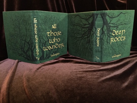


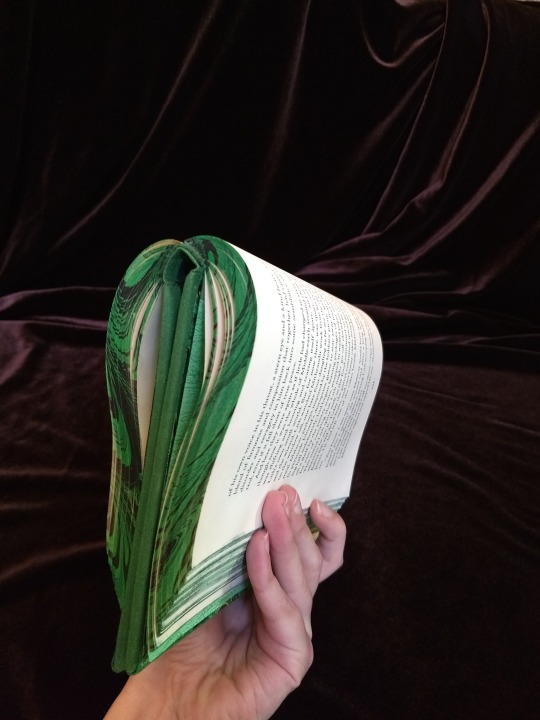
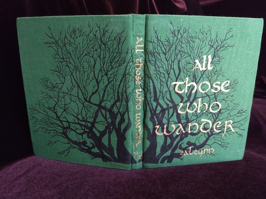
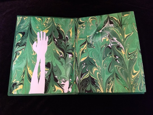
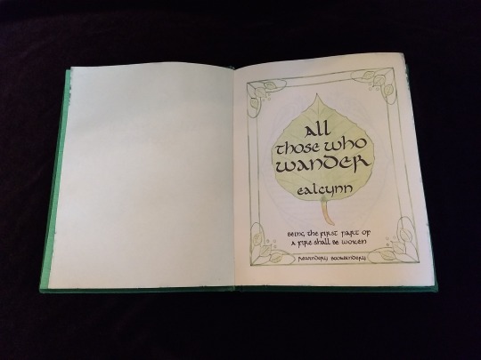
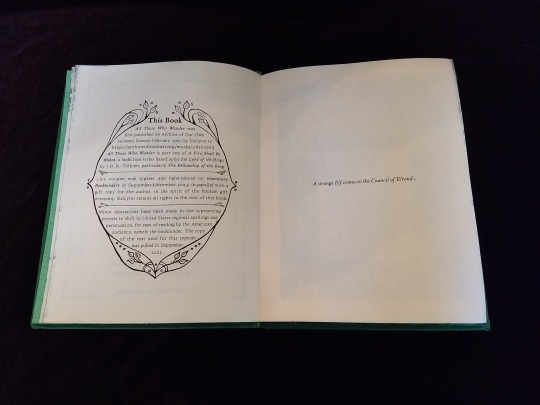

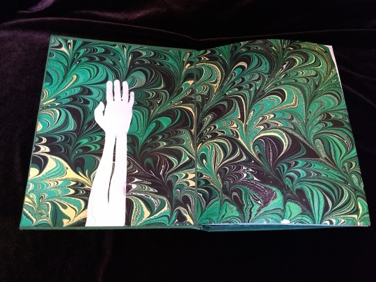
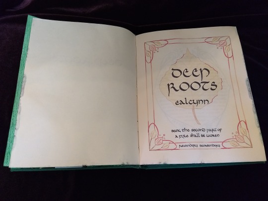
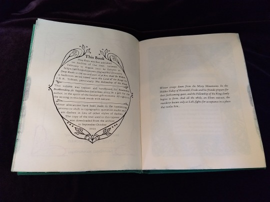
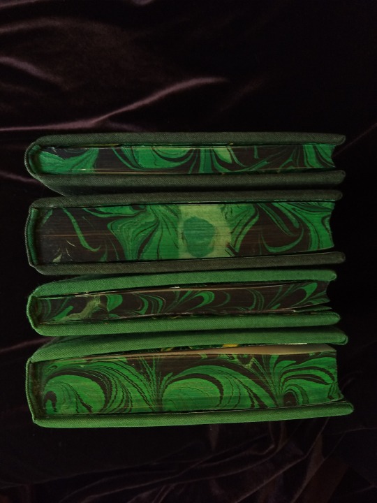


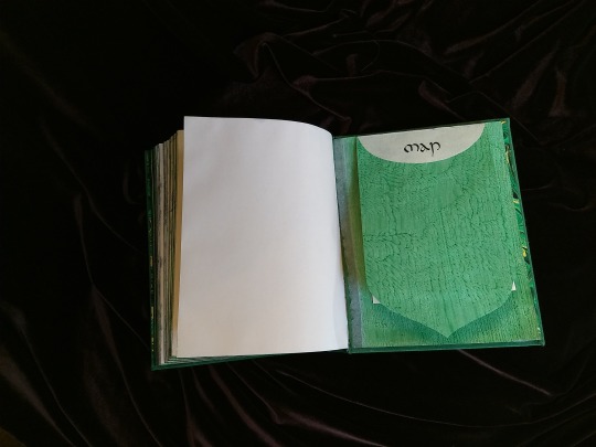

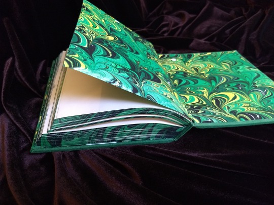

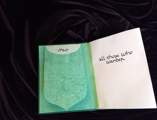

A Fire Shall Be Woken, by Ealcynn. A pair of bindings using the K118 structure, one as a gift for the author and one to keep.
Chapter page illustrations are by Alphonse Mucha, all other illustrations are hand-drawn.
I hope to make a long post later explaining the process in more depth & another to document all my mistakes, but here's the basics.
New techniques learned: Paper marbling, edge marbling, uncial calligraphy, making paste papers, drawing on bookcloth, making paste-filled cloth, fold-out maps
I began work on this project in early September and am completing the finishing touches this week.
Structures:
Binding: K118 tightback
Endpapers: Simple cloth-joined endpapers
Map fold: Turkish map fold
Materials:
Sewing supports: linen tapes
Thread: 30/3 linen thread
Spine lining: Medium weight kozo tissue bonded to linen fabric
Interior paper: Hammermill Ivory, 11x17, hand-cut to 8.5x11
Endpapers: Blick sulphite paper hand-marbled, with masked stenciled silhouettes created with freezer paper
Adhesives: Jade PVA, wheat starch paste, wheat flour paste
Covers: Davey board, laminated full thickness to half thickness
Cover fabric: Studio E shot cottons in Jungle and Emerald; filled with wheat starch paste
Cover decorations: Speedball india ink and Dr. Ph. Martin's calligraphy ink in Copperplate Gold
Inks for maps and illustrations: Speedball black india ink and a selection of watercolors thickened with gum arabic
Dip pens used for calligraphy: Combination of Brause calligraphy nibs and Leonardt tape nibs
Dip pens used for illustration: Nikko G pointed pen nib
Typesetting:
Typesetting program: Scribus 1.5.5
Body font: Coelacanth in 10 pt caption weight
Headings, titles, chapter titles, drop caps: Hand lettered uncial calligraphy, scanned
Illustrations and References:
Frames on colophon, copyright, author's notes and title page: Hand drawn, with inspiration taken from the vellucent bindings of Cedric Chivers
Frames that illustrate each chapter start: Alphonse Mucha from Cloches de Noël et de Pâques
Cover illustrations: Referenced from a photograph of an European beech tree found on iNaturalist.org
Maps of Imladris: Hand drafted with inspiration from the maps of Barbara Strachey, and Daniel Reeve
Map of Eriador: Traced from a map by Karen Wynn Fonstad, with edits made to coordinate with the geography of the fic
Frames on maps: Referenced from a drawing by Alphonse Mucha that @zhalfirin found for me
Special Thank Yous:
To the tightback council of problem-solvers in the Renegade server: Zhalfirin, Eka, @spockandawe who helped figure out many issues with the structure and technique
To the marbling experts in the Renegade server: Marissa, Aether, AGlance, Jenny, Catz, Badgertide, Rhi, and everyone else who helped me figure out beginnner marbling
To Spock for finding the K118 structure and introducing it to the server!
And to Bruce Levy, who discovered the method and shared his discoveries freely with the bookbinding and conservation world.
#bookbinding#Fanbinding#mine#bookbinding adventures#thank you to everyone i consider this a group effort#it has been 10000 years and I have loved every step#except for sanding. nasty nasty sanding. ew.#fic recs
242 notes
·
View notes
Text


"I envy the moth" and "I pity the dog", Copperplate intaglio aquatint, 2023.
Two prints I made for a self portrait project. I'm really happy with how dark the aquatint came out. The plates I made the year before this came out sooo salty. They're inspired by the poems "the lesson of the moth by archy" by Don Marquis and “how to be a dog” by Andrew Kane.
57 notes
·
View notes
Text
WIP Wednesday
Wait, have I started a fanfiction of @alex51324 's Island of Gays fanfic with some inspiration from @bitletsanddrabbles fanfic of that fanfic? Is this fanfic of a fanfic of a fanfic too meta?
“It’s very nice, but I don’t think any of us know the first thing about engraving.” Thomas said.
The copperplate press was far simpler than the letterpress in design, you just passed the inked plate and paper through two rollers, hand operated via a large wheel, but when it came to engraving the plates, Thomas was at a loss. He knew it had something to do with acid but that sounded dangerous.
“It’s quite all right, Victor did an apprenticeship with an engraver.” Lord Hexham replied. “I’m sure we’ll figure it out. Of course, you can adjust the rollers if you want to keep doing woodcuts,” he continued. “And you can use this photoreactive emulsion to make engraving plates of photographs which brings me to our next piece of equipment.” He pulled a kodak box camera from a desk drawer and handed it to Gordon.
“Phwoar, look at that!” the boy said.
“And this little room is where you’ll develop the film.” the Marquess said, opening a door to reveal a darkroom. It was more of a cupboard really but the red light bulb made it look very professional.
“You know, we could set up a photography studio for the island. We have the equipment, we might as well monetise it. We could develop film for people with cameras and have a space for people to get their picture taken to send back to their families, or to give to their sweethearts.” Richard offered and Thomas was reminded again of why he had asked the other man to manage the business side of things. Something like that would never have occurred to him.
“Yeah, saucy photographs I’ll bet.” Gordon said as he immediately figured out how to use the shutter and started snapping pictures in Thomas’s direction. Young people were always so quick with technology.
“We could do wedding photography!” Kit suggested.
“I’m not sure if it's wise having photographic evidence of that.” Thomas said, “And does anyone even know how to develop photographs?”
“I can.” Lord Hexham said, “I thought I could teach young Terrence here how to do it. He certainly seems interested.” he said as Gordon continued taking snapshots of them.
“Will you stop that! Camera film doesn’t grow on trees, you know.” Thomas snapped at the lad. He must have got through an entire roll already.
“I’m learning!” Gordon said rolling his eyes and snapping another picture, “You’re always saying I’m not pulling my weight around here, this could be my new job.”
“All right... but if you continue to waste materials they’re coming out of your wages, and if you even think about taking a picture of your arse, you are fired. Do you understand?” Thomas said sternly.
“What about my cock?” Gordon said sarcastically.
Thomas sighed. Terrence Gordon had settled down, somewhat, in the past year but he could still swing wildly between needless aggression and being sexually inappropriate, particularly when he felt threatened. Frank Rouse had once told him, perhaps a little pointedly, that those were common symptoms in abused children. Thomas had shot back that it didn’t take a degree in medicine to figure that out.
15 notes
·
View notes
Text
Mor Seymour x Orin!! :D
So this first one is of fox Orin x bunny Seymour, heavily inspired by daily.ramona on Instagram and their super cute depications of Ramona and the other Scott Pilgrim characters as different animals/furries!! :D

Btw, I looked it up while drawing it, and foxes don't sleep with their mouth open unless it's a sign of play and greeting! So even tho Seymour is very scared, he's actually safe :) Also I learned that foxes I think wrap its tail around itself to keep its nose warm, but he chose to keep Seymour warm instead <3


For this one, I saw some post about this with different words for the "__" island. Idk if Orin would realstically make fun of Seymour like this, even if he did like him, but I thought it was cute. Btw the font used for Orin's text is Copperplate Gothic Bold and Seymour's font is Tw Cen MT. For some reason, when I went to write the text, Orin's font was the default and I thought it fit him very well, so I figured I would try to find a font that fit Seymour too!! :)
#lsoh#little shop of horrors#little shop of horrors 1986#orin scrivello#seymour krelborn#lsoh seymour#lsoh orin#orin x seymour#seymour x orin#seymourin#ship art#art#fanart#doodles#lucyartz#lucyshipz
5 notes
·
View notes
Text
Seventeenth Century Studies
shortform questions lifted from a 2024 scitation paper for the course Details of the Seventeeth Century (Y Siecr Settoç a Sgart Jusser), an avenue of concurrence history offered by the Jacobin University of Axbane.
Which groups were expelled from Moscat in the Ibadi Imamate in 1652, and which local power would go on to seize the city some months later?
Which two rivers of Gaul [France] were connected by a canal for the first time in 1679, in a bid to connect the Atlantic to the Middlesea [Mediterranean] without having to pass through Morrack [Morocco]-controlled seas?
Where was the treaty of 1621 which outlined the legal relationship of Santrafew [~Boston] to the local Mendevan [North American] peoples signed?
For how long did Emperor Carivasary of Tavancy [the Inca] rule until his suspected assassination in 1660?
Which future monarch of Barcelon [~Catalonia] spent several years of his childhood in Cordin as a ward of the Borlish royal family during the 1660s and 1670s?
Which power attempted to invade Borland in the seventeenth century, leading to the Hawkirch Surrender of 1632?
The terms "copperplate" and "tinplate" in political theory originate in David Bensaíd's treatise The Three Cities; he coins these terms in his description of the court of which seventeenth-century monarch of Libya?
What astronomical event of 1677 inspired theorists from across the world to undertake long journeys, including the Danish astronomers Gudmund and Rebecca Scrander's storied voyage to the Seldivan [Sri Lankan] court?
What did the invention of the timehold [chronometer] in the mid-seventeenth century allow people to measure accurately for the first time?
The trade mesh of which Indian polity stretched from Sant Adrian [Bioko] to Cathay [northern China] by the end of the seventeenth century?
3 notes
·
View notes
Note
Ok so your works are kinda fire so i’ll request “pobody’s nerfect” but more importantly what do you think would be the best way for a beginner to start in calligraphy?
Pobody’s Nerfect
Ink: Diamine Red Dragon
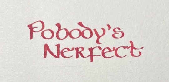
There’s some irony here in that, thanks to this ink being more smudgy than expected, I did this three times. And I’m still annoyed at being able to see my lines.
Anyway, there’s a million resources out there for learning calligraphy. If you’re not terribly concerned with historical accuracy, they’re great inspiration! And can help out with *how* to do some of the trickier things (I’m currently trying to learn a style where you have to rotate the pen while writing and… it’s not going great).
But to get quickly started, consider what general style of calligraphy you want to do, because this governs your tool choice. Are you trying to do something like most of what I’ve shown here, or a “blackletter” which most westerners think of when calligraphy is mentioned? Or more like copperplate, where the width of the line varies with pressure?
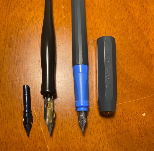
For my style, you’ll need a broad edge nib (nib = the bit that touches the paper). For more copperplate, you’ll need a pointed flexible nib.
For flexible nibs, with few exceptions, you’ll need a dip pen - both nibs (on left) and a nib holder. For broad nibs, you’ve got a bit more choice - you can use dip pens (in middle, inserted in a nib holder), or fountain pens. Pilot Parallel pens are a common recommendation. The Kaweco Perkeo (on right ) is also a decent option.
Once you’ve chosen your tool, you can look at inks. With dip pens, you’ve got lots of choices, but you really need to make sure to always clean your nib *immediately*. With fountain pens, you have to be a little more careful because some inks can be corrosive, which is a problem when you leave the pen filled.
And then, paper. Generally speaking, heavier paper, specifically designed for wet media, behaves better. Standard copier paper might bleed/feather.
Also, be aware, each of these variables can mean the difference between having fun and hating life. An ink might work great with one pen but blurp everywhere in another. The nib may slide smoothly over one paper and get all clogged up with fibers from digging in to another. What you think is working *great* suddenly falls to pieces when you try to erase your guide lines.
And, yeah, it takes a decent bit of time and patience and supplies to figure out what combinations of things work for you. I’m clearly still figuring this out myself.
So, now you have stuff! Before you start writing, just play with your tools. If you’re using a broad nib, see how it makes different lines when you hold the nib at different angles. Make straight lines, curved lines, swoops and swirls and squiggles. See if you can push the nib, or only pull. For the pointed/flexible nibs (they’re cheap for a reason - buy several) see just how far they flex. Try writing with the paper tilted at different angles and see what that does. Try just writing in your normal style - what works? What doesn’t? Learn how your tools behave.
Then just… practice. Pick a letter. Write it for an entire line. Fill an entire page with it, until you can consistently make a letter you like. Rinse and repeat. Now you have an alphabet.
And with that, you can start asking random strangers on the Internet to feed you phrases to practice with :)
7 notes
·
View notes
Text
✧✧✧hello✧✧✧
hi!!! welcome to my art blog
i'm emerson (they, she, or he all work for me), and i'm an artist working primarily in painting and printmaking. most of my recent print work has been focused on copperplate etching, but i also work in relief printing. i love working with watercolor, and playing around with oils, graphite and charcoal, and sometimes acrylic. my work takes a lot of inspiration from nature, architecture, horror, and fantasy.
thanks for stopping by! ✧✧✧
3 notes
·
View notes
Text
Calligraphy Template Sources: Your Blueprint to Artistry

Calligraphy Template Sources: Unlock Your Inner Artist with These Must-Have Resources
In this section, we will explore various sources where you can find calligraphy templates to enhance your artistic journey. These templates will provide you with guidance and inspiration for creating beautiful lettered illustrations. Whether you're a beginner or an advanced calligrapher, these sources offer a wide range of options to suit your needs. - Calligraphy Template Sources offer guidance and inspiration for creating beautiful lettered illustrations. - These templates are suitable for both beginner and advanced calligraphers. - Utilizing calligraphy templates can enhance your artistic journey and help you develop your unique style. - There are various sources available online where you can find downloadable calligraphy templates. - Exploring different calligraphy template ideas can provide you with a wealth of options for your creative projects.
Understanding Calligraphy Techniques
If you're fascinated by calligraphy and eager to explore this beautiful art form, it's essential to understand the various techniques that can bring your creations to life. Calligraphy encompasses a range of styles and methods, including brush lettering and hand lettering. Whether you prefer to use a brush or a pen, each technique offers its own unique characteristics and allows you to express your creativity in different ways. Brush lettering involves using a brush pen or a paintbrush to create fluid and expressive letterforms. With this technique, you can achieve thick downstrokes and thin upstrokes, giving your calligraphy a dynamic and elegant appearance. It requires mastering the balance between pressure and release to create smooth lines with varying thicknesses. Brush lettering is known for its versatility and is often used in modern and contemporary calligraphy styles. On the other hand, hand lettering is a more precise and controlled technique that involves using a pointed pen or marker to create intricate letterforms. Hand lettering allows you to experiment with different nibs and tools to achieve consistent and uniform strokes. This technique is often used in traditional calligraphy styles such as Copperplate, Spencerian, or Gothic. Hand lettering requires a steady hand and attention to detail to create beautifully proportioned letters. “Brush lettering gives you the freedom to create expressive and organic letterforms, while hand lettering allows for precision and intricate details.” Supplies for Calligraphy Regardless of the technique you choose, there are a few essential supplies you'll need to get started with calligraphy: - A calligraphy pen or brush: Select the tool that suits your preferred technique, whether it's a brush pen for brush lettering or a pointed pen for hand lettering. Experiment with different sizes and types to find the one that feels comfortable in your hand. - Ink or paint: Invest in high-quality ink or paint that is suitable for calligraphy. You can choose from a variety of colors to add depth and creativity to your lettering. - Practice paper or calligraphy pad: Use smooth and bleed-proof paper that is specifically designed for calligraphy. It will prevent ink from spreading and help you achieve crisp and clean letterforms. - Ruler or guidelines: Use a ruler or pre-printed guidelines to ensure consistent spacing and alignment in your lettering. This will help you maintain a professional and polished look. By familiarizing yourself with these techniques and acquiring the necessary supplies, you'll be well on your way to creating stunning calligraphy pieces. Remember, practice and experimentation are key to mastering calligraphy, so don't be afraid to unleash your creativity and explore different styles and techniques. Technique Description Brush Lettering A technique that involves using a brush pen or paintbrush to create fluid and expressive letterforms with varying thicknesses. Hand Lettering A precise and controlled technique that uses a pointed pen or marker to create intricate and uniform letterforms.
Mastering Calligraphy Strokes
Mastering calligraphy strokes is an essential step in becoming a skilled calligrapher. By practicing letterform techniques and attending calligraphy workshops, you can refine your skills and create stunning hand-lettered pieces. Let's explore the foundational strokes that are crucial for your calligraphy journey. Essential Strokes for Calligraphy When it comes to calligraphy, certain strokes lay the foundation for letterforms and add depth and elegance to your artwork. Here are a few key strokes to focus on: - Angled downward strokes: These strokes give your letters a graceful slant. - Light upward strokes: Adding lightness and contrast to your letterforms. - Lowercase "n's": Mastering this stroke allows you to create flowing connections between letters. - Lowercase "u's": This stroke is essential for creating rounded and symmetrical letters in your calligraphy. - Cursive "L's": Developing smooth and curved lines for these strokes is crucial for a consistent cursive style. - The letter "O": Achieving smooth and even roundness in your letter "O" is a fundamental skill. By practicing these strokes, you'll gain the confidence and precision needed to create beautiful calligraphy. However, it's important to remember that mastering calligraphy takes time and patience. Don't be discouraged if it doesn't come easily at first. With consistent practice and guidance from workshops, you'll steadily improve. The Benefits of Calligraphy Workshops Calligraphy workshops offer a unique opportunity to learn from experienced calligraphers and receive personalized guidance. These workshops often include hands-on practice sessions, demonstrations, and feedback from instructors who can help you refine your technique. Attending a workshop can accelerate your progress and deepen your understanding of letterform practice. Additionally, calligraphy workshops provide a supportive environment where you can connect with fellow calligraphers, exchange ideas, and receive valuable critique. The sense of community fosters inspiration and growth, pushing you to reach new levels of artistic excellence. So, whether you're a beginner looking to learn the basics or an experienced calligrapher seeking to refine your skills, consider attending a calligraphy workshop. It's a wonderful opportunity to immerse yourself in the world of calligraphy, master strokes, and connect with like-minded individuals on your artistic journey.
Taking Your Calligraphy to the Next Level

Now that you have mastered the basics of calligraphy techniques, it's time to take your skills to the next level. Whether you are an intermediate calligrapher looking to refine your craft or an advanced artist seeking new challenges, there are various avenues to explore. Intermediate Calligraphy If you are an intermediate calligrapher, you can further enhance your skills by experimenting with more complex letterforms and design compositions. This stage allows you to delve deeper into the intricacies of calligraphy strokes and explore different styles, such as copperplate, gothic, or modern calligraphy. Consider joining advanced calligraphy workshops or online courses that offer specialized instruction and interactive practice sessions. These resources can provide valuable guidance and feedback to help you refine your technique and develop your unique calligraphy style. Advanced Calligraphy For advanced calligraphers, the journey continues with pushing the boundaries of your creativity and expanding your repertoire. This stage involves exploring unconventional materials, incorporating mixed media elements into your calligraphy pieces, and experimenting with innovative lettering styles. Look for advanced workshops or mentorship programs where you can learn from seasoned calligraphers and gain insights into their artistic process. Participating in calligraphy competitions can also challenge you to strive for excellence and showcase your skills on a larger platform. Calligraphy Business If you are passionate about calligraphy and seek to turn your hobby into a profitable venture, consider establishing a calligraphy business. As an advanced calligrapher, you can offer your services for custom wedding invitations, event signage, logo designs, and personalized stationery. Building an online presence through social media platforms like Instagram can help you showcase your work and attract potential clients. Take advantage of marketing and business development resources tailored specifically for calligraphers to ensure the success of your venture. Intermediate Calligraphy Advanced Calligraphy Calligraphy Business Refine technique Explore unconventional materials Offer custom services Develop unique style Mixed media experimentation Build an online presence Join advanced workshops Explore innovative lettering styles Marketing and business development Remember, the journey of calligraphy is a continuous process of growth and exploration. Embrace new challenges, seek inspiration from fellow calligraphers, and never stop honing your skills. With dedication and a passion for the art form, you can elevate your calligraphy to new heights and create stunning pieces that captivate and inspire.
Exploring Online Calligraphy Courses

Looking to enhance your calligraphy skills from the comfort of your own home? Online calligraphy courses provide a convenient and comprehensive way to learn and improve your artistic abilities. With platforms like Skillshare and specialized websites like Life I Design Online, you can access a wide variety of classes and workshops tailored to your specific needs and interests. When you enroll in an online calligraphy course, you can expect in-depth instruction, step-by-step demonstrations, and practice exercises to help you build a strong foundation in calligraphy techniques. These courses often provide downloadable resources, such as practice sheets and lettering guides, that you can use to refine your skills at your own pace. One of the key advantages of online courses is the flexibility they offer. You can learn at your own pace and fit your study time into your busy schedule. Whether you're a beginner or looking to advance your skills, there are courses available for every level of expertise. You'll also have the opportunity to connect with a community of fellow calligraphy enthusiasts, where you can share your progress, ask for feedback, and gain inspiration from others. Comparing Online Calligraphy Platforms Platform Features Course Options Skillshare - Wide range of calligraphy classes - High-quality video lessons - Opportunities for interaction with instructors and students - Fundamentals of Modern Calligraphy - Brush Lettering Techniques - Flourishing for Beginners Life I Design Online - Specialized courses for different calligraphy styles - Personalized feedback from instructors - Lifetime access to course materials - Copperplate Calligraphy Course - Gothic Blackletter Course - Watercolor Calligraphy Course With a wealth of options available, you can choose courses that align with your goals and interests. Whether you're interested in modern calligraphy, brush lettering, or a specific calligraphy style, you're sure to find a course that suits your needs. Take the next step in your calligraphy journey and explore the world of online calligraphy courses today.
The Art of Teaching Calligraphy

Teaching calligraphy is not only a way to share your knowledge and skills but also a fulfilling way to contribute to the calligraphy community. Through workshops and classes, you can inspire and guide aspiring calligraphers on their artistic journey. Whether you're an experienced calligrapher or just starting out, teaching calligraphy allows you to connect with like-minded individuals and create a supportive learning environment. Calligraphy workshops provide a hands-on experience where students can learn various techniques and practice under the guidance of an expert. This interactive approach helps students develop their skills and gain confidence in their abilities. By offering personalized feedback and tips, you can help students overcome challenges and improve their calligraphy strokes. Furthermore, teaching calligraphy opens up opportunities to offer calligraphy services. As you establish yourself as a professional calligrapher, you can create custom pieces for special events like weddings, birthdays, and anniversaries. By leveraging your expertise, you can create personalized calligraphy products such as wedding invitations, menus, and signage. This not only showcases your skills but also allows you to monetize your passion for calligraphy. Benefits of Teaching Calligraphy Opportunities in Offering Calligraphy Services - Sharing your knowledge and passion with others - Creating a supportive learning environment - Building connections within the calligraphy community - Creating custom calligraphy pieces for special events - Designing personalized calligraphy products - Monetizing your calligraphy skills Testimonial: The Joy of Teaching Calligraphy "Teaching calligraphy has been an immensely rewarding experience for me. It's truly fulfilling to see my students' progress and witness their joy as they create beautiful lettered artworks. I believe that by sharing my passion for calligraphy, I'm not only helping others develop their artistic skills but also fostering a sense of creativity and self-expression. Teaching calligraphy has enriched my own practice and allowed me to give back to the community in a meaningful way." - Sarah, Calligraphy Teacher Whether you choose to teach calligraphy through in-person workshops or online courses, your knowledge and expertise have the power to inspire and empower others. Embrace the opportunity to guide aspiring calligraphers, share your artistic journey, and contribute to the thriving calligraphy community. Start exploring the possibilities of teaching calligraphy today!
The Power of Practice and Guidance

In your calligraphy journey, the power of practice and guidance cannot be overstated. Consistent practice is essential for honing your calligraphy skills and improving your technique. It's through practice that you will develop a steady hand, gain control over your strokes, and refine your letterforms. Set aside dedicated time each day or week to practice, and you will see significant progress over time. But practice alone is not enough. Having the right guidance and support system can make a world of difference in your artistic growth. Surround yourself with a supportive calligraphy environment where you can learn from experienced calligraphers and receive constructive feedback. This can be achieved through workshops, online communities, or even private coaching sessions. By joining a calligraphy workshop, you'll have the opportunity to learn from experts in the field, ask questions, and receive personalized tips and advice. These workshops often create a nurturing and inspiring atmosphere, where participants can share their work, exchange ideas, and motivate one another. Online communities and forums provide a platform for connecting with fellow calligraphers from around the world, offering a space to share your progress, seek guidance, and find inspiration. The combination of practice and a supportive calligraphy environment will accelerate your growth as a calligrapher. With dedication and the right resources, you can achieve remarkable results and create stunning pieces of art. Remember that calligraphy is not only about the final product but also the joy of the creative process. Embrace the power of practice and guidance, and enjoy the journey of becoming a skilled calligrapher.
Creating Your Calligraphy Showcase
https://www.youtube.com/watch?v=kV7VZujh1H4 Once you have honed your calligraphy skills, it's time to showcase your artwork and connect with a wider audience. Building an online presence is key to sharing your calligraphy and attracting attention to your unique style. One popular platform for sharing calligraphy is Instagram, where you can create your own gallery of stunning lettered illustrations. Sharing your calligraphy on Instagram allows you to reach a diverse range of people who appreciate the art form. You can use hashtags such as #calligraphyart and #handlettering to increase the visibility of your posts and connect with fellow calligraphers and enthusiasts. By consistently sharing your artwork and engaging with the community, you'll establish yourself as a talented calligrapher and gain valuable feedback and support. "Instagram has been a game-changer for my calligraphy journey. I have connected with so many talented artists and received encouraging comments and inquiries about my work. It's a fantastic platform to showcase my creations and build a network of like-minded individuals." - Sarah, Calligraphy Artist Building an Online Presence In addition to Instagram, consider creating a portfolio website to showcase your calligraphy artwork. This allows you to curate a professional and visually appealing collection of your best pieces. A well-designed website can serve as a powerful marketing tool, attracting clients for commissions, collaborations, or even selling prints of your work. Include an "About Me" section to introduce yourself and your artistic journey, as well as a contact page for inquiries and opportunities. Remember to stay consistent with your brand and style across all online platforms. Use high-quality images of your calligraphy, ensuring that they are well-lit and showcase the intricate details of your work. Engage with your followers and respond to comments and messages promptly. Building an online presence takes time and effort, but with dedication and a passion for your craft, you can create a thriving community around your calligraphy. Platform Features Benefits Instagram - Visual platform for sharing calligraphy artwork - Reach a wide audience - Connect with fellow artists and enthusiasts - Gain feedback and support Portfolio Website - Showcase your best work in a professional setting - Attract clients and opportunities - Sell prints or offer commissions - Establish yourself as a professional calligrapher Table: Online Platforms for Showcasing Calligraphy - Create an Instagram account dedicated to your calligraphy artwork. - Share your best pieces regularly, using relevant hashtags to increase visibility. - Engage with the calligraphy community by commenting on and liking fellow artists' posts. - Consider creating a portfolio website to showcase a curated collection of your work. - Promote your online presence through social media, email newsletters, and collaborations with other artists. Read the full article
0 notes
Text
Namgo - Groovy Font
Elevate Your Designs with Namgo - The Ultimate Groovy Font!

Looking for a font that brings a unique and stylish touch to your designs? Namgo is here to fulfill all your creative needs! This groovy font, inspired by retro fonts from the 60s to the 90s, offers a perfect blend of cursive and handwritten styles. Whether you're designing for Cricut, crafting memes, or working on a vintage project, Namgo provides the cool fonts and fancy text you need. Its playful and wavy design makes it a standout choice for any project, from fun display fonts to classy retro typefaces.
Namgo Groovy Font

font, free fonts, font style, dafonts, fontgenerator, helvetica, font finder, whatthefont, graffiti font, calligraphy fonts, cool fonts, font online, cursive fonts, tattoo fonts, letter fonts, font finder by image, handwritten fonts, font aesthetic, helvetica font, gothic font, font text, fancy fonts, fancy text, cute fonts, bold fonts, montserrat font, font styles names, stylish text, calligraphy lettering, text style, poppins font, times new roman, bembo, stylish text maker, tattoo font styles, meme font, what de font, font id, bubble lettering, bold text, bold text font, comic sans, comic sans ms, cool text symbols, cool texts, discord font, fancy font style, font poppins, fonts for discord, stylish font maker, stylish text converter, avenir, gotham font, logo fonts, gilroy font, retro fonts, font maker, font creator, modern fonts, vintage fonts, free fonts for commercial use, univers font, custom fonts, font design, script fonts, neon font, helvetica neue, best fonts for websites, wedding fonts, the seasons font, 3d fonts, best fonts for logos, typography design, groovy font, different fonts, frutiger font, best fonts, bubble font, lettering styles, stencil font, christmas fonts, western fonts, luxury fonts, baskerville, lucida, monogram fonts, serif fonts, sports fonts, art deco fonts, 70s fonts, typewriter font, font cloud, proxima nova font, nexa font, elegant fonts, avenir font, futuristic fonts, signature font, baseball font, halloween fonts, fancy letters, fun fonts, typography fonts, futura font, proxima nova, varsity font, frutiger, font types, neue haas grotesk, sans serif font, script letters, sans serif, new fonts, professional fonts, 80s fonts, downloadable fonts, fire font, blackletter font, y2k fonts, bubble letter font, 90s fonts, font search, writing fonts, different font styles, number fonts, fonts art, free font downloads, death metal font, gothic letters, optima font, comic book font, font maker online, times new roman font, fancy writing, fonts style designs, brush font, rounded fonts, star wars font, word fonts, arial font, military font, drip font, display fonts, collegiate font, barcode font, metal font, typeface, bauhaus font, font search by image, beautiful fonts, grunge fonts, comic font, chalk font, helvetica neue font, block letter font, garamond font, art nouveau font, minimalist fonts, medieval font, free fonts online, cyberpunk font, nice fonts, akzidenz grotesk, tattoo lettering fonts, chalkboard font, stamp font, pretty fonts, heavy metal font, tattoo script font, baskerville font, special fonts, font finder from image free, eurostile font, balloon font, metropolis font, different letter fonts, classic fonts, spooky fonts, font styles free, harry potter font, block font, cooper black font, alphabet fonts, rockwell font, punk fonts, pirate font, calibri font, font names, bodoni font, cinematic fonts, tech fonts, water font, friends font, outline font, roman font, brush script font, italic font, calligraphr, copperplate font, gaming fonts,
#font#fonts#displayfont#best fonts#free fonts#retro fonts#letter logo#handwriting#logo#handwritten#cursive
1 note
·
View note
Text
April 8th
After completing my collage, I decided I wanted to expand on the idea I originally had. In my work, I had cut out the words 'I Must Not Try Too Hard' and upon seeing it again after Easter, I was inspired by those words. There's a dilemma about appearance: you are encouraged and told to look a certain way, but God forbid you should be seen trying too hard to achieve it -- beauty has to look effortless.
I wanted to illustrate that through that injunction. You shouldn't try too hard, but everything around you says the opposite.
The mouth I depicted represents society: what we're told to do is what we should do. I wanted to challenge that idea. I think the imagery is quite straightforward but stills convey that message.
I knew I wouldn't really be able to draw a very complex picture since I would be etching on a rather small copperplate. It was interesting being introduced to electro etching and to work with a completely different medium.
I was faced with another small challenge: deciding what would stand out, the mouth or the typography. I wanted the mouth to be in the background, and for the words to stand out and have a thicker outline as well but I wasn't very successful. I also realised after I started etching on the plate that I had to write the other way, the 'wrong' way, for it to be printed in the right way, so I had to figure out something a little bit different.


I will be moving onto printing soon and I look forward to seeing how it turns out on paper.
0 notes
Text
Calligraphy Services in New York City
Discover classic copperplate calligraphy, Amalfi Coast-inspired designs, and meaningful vow calligraphy services in New York City by The Artful Pen. From table numbers to customized menus. Calligraphy Services in New York City
About Company :-
I’m Deborah, a passionate calligrapher and designer. There is nothing that gives me more pleasure than picking up a favorite pointed pen, dipping it into a jar brimming with ink, and writing a message, place card, inscription, address, birthday wish, or thank you note.
Writing by hand transcends time. It has always been the way we communicate with those who matter to us, which brings us to why you are here. Whether you are celebrating a special occasion—grand or intimate—reaching out to a loved one, or sharing good news, a hand-calligraphed message or hand-scripted envelope sets the tone.
My most requested writing script is copperplate—classic and flourished. I also love writing in Spencerian and monoline and welcome the chance to write in a casual, relaxed modern script when that suits the occasion. And for times when something unexpected and romantic is called for, Italian hand may be just what you are looking for, and I thoroughly enjoy writing in that hand as well.
Click here For More Info - https://www.theartfulpen.com/
0 notes
Text
Victorian Christmas Cards
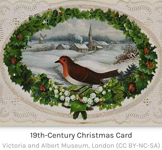
Printed Christmas cards became popular in the Victorian period (1837-1901), thanks to a combination of cheaper printing techniques and even cheaper post, with the arrival of the Penny Black postage stamp.
Coming in all shapes, sizes and materials, Christmas cards were sent in their millions to all corners of the British Empire.
Victorian illustrators created an entire mythology of exactly what we imagine a European Christmas should look like with their now-classic scenes of present-covered Christmas trees, holly, robins, sleighs, and snow-covered country lanes.
When we dream of a white Christmas, it is the festive cards of the 19th century, which are largely responsible for that evergreen imagery.
Origins

Adults have, of course, been writing letters to each other for centuries.
Even before there was an official public post system, letters were delivered in person, by servants, and via transport coaches.
There had also been prints made from the 15th century, using woodcuts or copperplate printing techniques, especially for calendars.
It was in the Victorian period that several factors conspired to make printed Christmas cards the hugely popular phenomenon they became.
The historians Antony and Peter Miall suggest in The Victorian Christmas Book that the origins of cards for the festive season lie in the classroom.
From the 18th century, schoolmasters had their pupils work on a 'Christmas Piece' in the month of December.
This work involved pupils selecting a sheet of fine paper and producing a sample of their writing, principally to show off to their parents evidence of their academic progress that year.
The paper often came with a decorated engraved border, and by the 19th century, it was popular for the pupils to draw their own decorative borders using coloured ink.
"These offerings were the forerunners of the great Victorian Christmas Card" (Miall, 37).
Other sources of inspiration for the decorative Christmas card may have been printed music sheets with decorative borders and covers, engravings commissioned to mark important anniversaries, school reward cards for hard-working pupils, fine illustrated notepaper, and the more ornate varieties of visiting cards, which were left when one called upon someone and they were not at home.
The First Christmas Card

Sir Henry Cole (1808-1882) was a civil servant who had, in 1840, reformed the British postal system by helping to create the Universal Penny Post where senders used the now-famous Penny Black postage stamps.
Cole would later become the first director of the Victoria and Albert Museum in London.
In 1843, Cole had a brilliant idea.
Not only could he save himself writing different individualised letters to his friends and family at Christmas, but he could also brighten the season with a colourful card printed for the express purpose of sending his compliments of the season.
Accordingly, Cole commissioned John Callcott Horsley (1817-1903), an artist and illustrator who was a member of the Royal Academy, to produce the first printed Christmas card.
THE FIRST CARDS WENT ON SALE TO THE PUBLIC AT THE RATHER HIGH PRICE OF ONE SHILLING PER CARD.
Horsley's design for the card, which was about the size of an ordinary visiting card (2 x 3 inches or 5 x 7.5 cm), showed different generations of the Horsley family raising a toast – presumably to the absent friend who is the recipient of the card – while flanked with scenes showing acts of charity, then, as now, an important element of the Christmas season.
On the left are people giving food to the needy, and on the right, they give clothing.
There was a border of a wood frame intertwined with ivy, and below the main image, a greeting of "A Merry Christmas and a Happy New Year to You."
There was a space along the very top and bottom of the card left blank to write a short handwritten and personalised message to the receiver.
One thousand such cards were printed and then hand-coloured. The cards went on sale to the public at the rather high price of one shilling per card.
Perhaps unsurprisingly for a new and relatively expensive idea, there were few buyers.
The Idea Catches On

Fortunately for the future of Christmas cards, the royal family was enthusiastic for all things Christmassy.
In particular, Prince Albert (1819-1861) brought German Christmas traditions to England such as the Christmas tree.
It was the younger members of the royal family who adopted the idea of sending each other handmade greeting cards both at Christmas and New Year.
Queen Victoria must have approved since she later started the trend of public figures sending 'official' Christmas cards showing more often than not themselves and their family in a festive setting.
Then, in 1844, there was another attempt at the commercial Christmas card, and this was much more successful.
Mr W. C. T. Dobson sold a printed card, which carried an illustration of the "Spirit of Christmas."
In 1848, a card printed by William Maw Edgley (1826-1916) repeated the theme of Cole's card but added scenes of general merriment and holly to the imagery.
Printers now knew they were onto a good thing. They became more and more ambitious with the designs of their cards, which were available to buy in stationers and bookshops.
From 1879, rather than pricey single cards, people could buy cheap packs of cards from tobacconists and toy shops, often imported from Germany.
This development went hand-in-hand with the new half-penny post for postcards, and so now people of all classes could send Christmas cards to their loved ones.
Victorian Christmas Card Designs

The first cards were printed on small single sheets of card, but they soon progressed to come in all shapes and sizes.
Victorian Christmas cards were typically lithographed and hand-coloured before colour-printing took over.
Many used embossed paper, sometimes with cut-out parts to resemble lace, particularly for borders.
There were even cards decorated with ribbons, tassels, real lace, tinsel, and coloured glass.
Satin, silk and brocade were also popular materials to enhance the feel of the card.
The most exotic of cards were scented, had padded additions, and incorporated pressed flowers.
One card for sale boasted it was made of no fewer than 750 separate pieces.
If one creation reflected the Victorian love of accumulating individual beautiful materials to create an even more beautiful finished article, it was the Christmas card.
With so many possible materials being used in a single card, it is no wonder that draper's shops included them in their Christmas stock.
VICTORIAN ILLUSTRATORS WERE LARGELY RESPONSIBLE FOR WHAT WE TODAY IMAGINE AS A CLASSIC 'CHRISTMAS SCENE'.
There was a great variety in the shape of cards, too, with the most popular ranging from the classic rectangular form to oval, circular, diamond, crescent, and bell-shaped cards.
Some cards were folded, others made into fan shapes, or they reflected the object they illustrated such as a post box or purse.
Cards might include moving parts or flaps that could be opened to reveal an additional scene or message.
Some had tabs that, when pulled, moved the legs and arms of a character on the front of the card or they had a disk that could be turned to show different scenes in a central window.
There were all kinds of subjects depicted on cards, many of which included humorous cartoons and everyday life, sometimes not at all related to Christmas.
Religious themes remained popular such as angels and scenes from the Nativity, but there was a definite shift away from these to more secular subjects as the Victorian era progressed.
Victorian illustrators were not without humour or fear of the risqué, nor did they miss the opportunity to trick the viewer with many cards showing two scenes depending on which direction the card was held.

Victorian illustrators were largely responsible for what we today imagine as a classic 'Christmas scene':
old churches and country lanes in the snow, sleigh rides, plump robins, glistening holly and mistletoe, and presents on or under the Christmas tree.
The popular snow scenes on Victorian Christmas cards reflected the string of harsh winters in England through the 1830s and 1840s.
White Christmases became much rarer thereafter, but the scene in people's imaginations was by then set.
In the same way, the Christmas food we imagine being eaten by Dickensian characters in the 19th century is, like in the cards, always golden roast turkeys and great steaming Christmas puddings the size of cannon balls.
Father Christmas was a popular figure on cards, but he evolved over the decades.
His appearance morphing from a Falstaffian character to a jolly old man with blue trousers and a crown of holly, and finally on to his definitive red suit with white fur trim.
Father Christmas' mode of transport also evolved to keep up with the times.
The Victorian Father Christmas used any means he could to reach people's chimneys, such as the popular bicycle of the 1880s, the new motor car of the 1890s, the ever-growing modern railway network, or even a hot air balloon.
Christmas cards had become such a staple part of the season that they now attracted the top artists to illustrate them, names like Linnie Watts, who produced a series of cards showing children, and Harry Payne, who drew soldiers, a poignant theme for those with loved ones serving far from home in the armed forces of the British Empire.
Cards changed over time as tastes changed.
For example, black backgrounds to make the main picture more striking were popular in the 1870s.
Cards reflected modern trends in art, too.
By the end of the century, art nouveau designs were appearing, with highly decorative designs and subjects inspired by the works of such fashionable artists as Alphonse Mucha (1860-1939).
With cards being sent around the world, the tradition quickly took root in other countries, notably in the United States from 1874, with the cards printed by Louis Prang (1824-1909), popularly known as the "Father of American Christmas Cards."
Collecting Christmas Cards

Beautifully made and capturing memories of the season, the Victorian middle classes became avid collectors of Christmas cards, which explains why it became common to have the year printed somewhere on the card.
Perhaps the most famous card collector was George Buday.
He even wrote a celebrated book on the history of Christmas cards, his The Story of the Christmas Card.
He donated his collection of over 3,000 cards to the Victoria and Albert Museum.
This museum today has over 15,000 Christmas cards in its archives and each Christmas, it reprints old Victorian designs so that they can, once more, just as in days of yore, carry people's Christmas wishes far and wide.
#Victorian Christmas Cards#Christmas Cards#Christmas#Victorian period#Victorian era#Penny Black postage stamp#Victorian illustrators#European Christmas#White Christmas#19th century#1800s#Sir Henry Cole#British postal system#Universal Penny Post#John Callcott Horsley#Queen Victoria#Prince Albert#Mr W. C. T. Dobson#William Maw Edgley#Father Christmas#Linnie Watts#Harry Payne#Alphonse Mucha#Louis Prang#George Buday#Victoria and Albert Museum
0 notes
Text
The Foundations of Artistic Expression: Essential Components of a Calligraphy Set

Calligraphy, an ancient art form celebrated for its elegance and precision, relies on specialized tools that enable artists to create intricate and beautifully crafted lettering. Understanding the essential components of a calligraphy set is pivotal for enthusiasts and artists seeking to embark on this creative journey.
Nibs: The Heart of Calligraphy
At the core of any calligraphy set are nibs – the writing points that come in various shapes and sizes. Nibs dictate the style and thickness of the strokes. Broad-edge nibs, used in styles like italic or Gothic scripts, produce wide lines, while pointed nibs, such as the flexible and delicate pointed pen nibs, are employed in Copperplate or Spencerian scripts, enabling fine lines and flourishing.
Ink: Enhancing Expression
Ink is an essential medium in calligraphy, providing depth, richness, and contrast to the written characters. Calligraphy inks come in various formulations, including water-based, acrylic, or traditional dip pen inks. Artists often choose inks that flow smoothly and produce crisp lines without bleeding or feathering on the paper.
Paper: The Canvas for Creativity
Selecting suitable paper is crucial for calligraphy. Papers vary in texture, weight, and absorbency, influencing how ink interacts with the surface. Smooth and heavyweight papers, such as vellum or hot-pressed watercolor paper, allow ink to flow consistently and prevent feathering, while textured papers create interesting variations in line quality and character.
Pen Holders: Comfort and Control
Pen holders, also known as nib holders or dip pen holders, provide the artist with comfort and control while writing. They hold the nib securely in place and come in various materials, including wood, plastic, or metal. Some holders feature ergonomic designs or adjustable grips, aiding in prolonged writing sessions.
Cleaning and Maintenance Supplies
Maintaining calligraphy tools is essential for longevity and consistent performance. Cleaning supplies like nib cleaners, inkwell reservoirs, and lint-free cloths help artists keep their tools in pristine condition. Proper care prevents ink buildup, rusting, or clogging of nibs, ensuring smooth and uninterrupted writing.
Additional Accessories and Tools
Calligraphy sets often include supplementary tools such as guidelines, rulers, and magnifying glasses to assist artists in achieving precise lettering and layouts. Guidelines aid in maintaining consistent letter height and spacing, while rulers and magnifying glasses assist in intricate details and measurements.
Conclusion: Embracing the Art of Calligraphy
The art of calligraphy is a beautiful amalgamation of skill, technique, and artistic expression. A comprehensive calligraphy set encompasses these essential components, allowing artists to create stunning letterforms that captivate with their beauty and precision. The right combination of nibs, ink, paper, holders, and maintenance tools empowers artists to explore various calligraphic styles and unleash their creativity on the canvas of paper.
Aspiring calligraphers and seasoned artists alike find inspiration in the delicacy and finesse of this art form. With a well-curated calligraphy set, individuals can embark on a creative journey that celebrates the beauty of written language and expresses emotions and ideas through the elegant strokes of the pen.
0 notes
Text
Top 5 NGS copperplate script fonts
Our Famous Slant on Scripts Love Hate Social Club Notting Hill Gallery of hand crafted Copperplate Script sign writing works and inspiration. Fitzbillies of Cambridge Crazy Pig Covent Garden The George Tavern Stepney Soho inspiration Belgium Dutch style Sarf’ Lundun . Script or Cursive lettering is an art and a whole area of expertise that writers either have or not. Luckily I always…
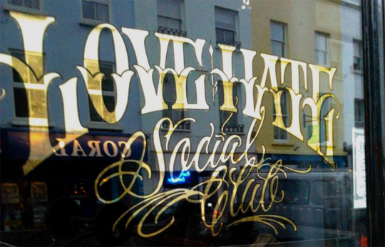
View On WordPress
#Brand#Canterbury Whitstable shop-house number signs#Custom Typeface design#Custom Typeface design Traditional Signwriter London Brand design logo#E2-signwriting#gilder gold leaf#gilding#gilding gilder#gilding Murals Nick Garrett signs#gold leaf#Gold leaf handpainted signs +Murals. Nick Garrett signs sign shop sign London Nick Garrett sign maker writer#hand paint Cafes#Hand painted signs#handpainted signs#house numbers#Italian retro handpainted signs#J Crew Signage London#Johnston Font#London Signwriting#London signwriting Notting Hill#Margate Signs#muralist#muralist stucco handpainted signs#Murals#Nick Garrett London#Nick Garrett sign maker writer#Nick Garrett signs#Nick Garrett signs sign shop#Nick Garrett Traditional signwriter#Nick Garrett Traditional Signwriters
1 note
·
View note