#composition my beloathed
Explore tagged Tumblr posts
Note
For your art requests, could you draw Wars and Twi just hangin out? Maybe looking for cool rocks?
- crazylittlejester
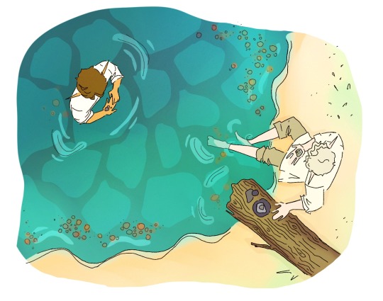
Just two bros havin a good time
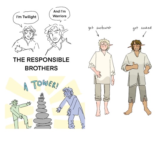
they also went fishing btw
#linked universe#my art#doodles#linkeduniverse#linked universe fanart#Lu warriors#lu twilight#I got a little carried away with this but I love them your honor#Also#composition my beloathed#drawing water my beloathed#Twilight linked universe#linked universe twilight#warriors linked universe#linked universe warriors#and thank you for the ask :D
977 notes
·
View notes
Text

[ID: A digital illustration of Tashiro Gonzaburou and Shirahama Kyouji from Sasaki to Miyano. They are sat on the floor of Tashiro’s room, next to his bed, holding video game controllers. Tashiro sits cross-legged and is leaned forward with a concentrated look on his face. Shirahama is relaxed in a half-crossed position with one leg up, and he is smiling while talking and looking over at Tashiro. Tashiro’s room is colorful, with many patterns and pillows and posters on the wall. It is rendered in vibrant greens, oranges, and blues, in a rough, painterly style. They are lit from the front, as if from the glow of a TV. The artist’s signature “sunnfish 2024” is written below the bed. /End ID]
HAPPY BIRTHDAY TASHIRO MY FAVORITE CHARACTER EVER
#pushing my shirashiro agenda this fine tashiro birthday#tashiro gonzaburou#sasaki to miyano#sasaki and miyano#gonzaburou tashiro#making up room design my beloathed though.#Harusono shou show me what his ROOM LOOKS LIKE !#part of me wanted to make it more sparse and like. traditional. but then i didn’t know how to make the composition for that#tashiro really feels like a futon kinda guy to me#but i dont know !!! cause Harusono shou wont tell me !!!!!!#shirashiro#tashiro gonzaburo#ssmyverse#sunnfish.png#my art#described#hanzawa to tashiro#procreate
53 notes
·
View notes
Text

posey and his boys havin' a day,,, they deserve it
#pommiart#pomtheon#poseidon#polythemus#triton#greek mythology#greek myth art#greek myth#ibispaintdrawing#ibispaint art#ibispaintx#click for better quality#composition my beloathed asdfghjhgfds
8 notes
·
View notes
Text

Are you guys tired of seeing this wip already?
#finally added his tats#and I'm slowly chipping at the right side lf the composition#backgrounds my beloathed#oc tek#jano dibuja#my art#im gonna start tagging my wips probably#janito wips#<- there#mild nudity
10 notes
·
View notes
Note
I just saw ur post asking if capcut is good for animation composition & imho i cant speak to any of that bc i never use capcut but i find the keyframing that procreate dreams offers to be pretty good. It is $20 i think (im not usamerican so i didn’t buy it with dollars) so it’s up to u if you feel comfortable paying for it when animating natively in it is. Cringe. (Lack of lasso tool & custom brushes my BELOATHED) but it’s pretty good for editing & tweening, albeit rudimentary. Moving backgrounds specifically is one thing ive found pretty easy to set up. & importing & exporting between dreams & procreate is a workflow that kind of gets around this, i do all my roughs in dreams but my polished frames in procreate anyways LMAO u can v easily make it work methinks. That’s just my two cents. Also the lurning curve for dreams’ functions is horrendous but its p solid once u have them down!
I actually have dreams and couldn’t figure it out 😭 like I tried several times and it just wasn’t working for me. If it somehow allows me to put one animation over a background that’s moving that would be dope. But last time I tried to use it, the app wouldn’t even let me have more than one video layer…? Why
11 notes
·
View notes
Text
Counter/Weight 27: An Animal out of Context, Liveblog
(It has come to this, I've got to do reaction posts, otherwise I shall explode)
We're in the past! Austin and Jack are building a religion/history/myth/origin story!
JACK: … And on this planet, things are very, very bad … because something is telling these people exactly how much timber they need to cut, and every day that number is going up, and already we have a name for this thing– JACK: … –and it is called Rigour and we built it. … It’s really, really bad, and we want more than anything else … we wanna chop down trees. We wanna keep producing, but more than anything else, we want to throw off the yoke that Rigour has us under.
So the villain is actually the Protestant Ethic and the Spirit of Capitalism?? Or more precisely, something like if Taylorism (my beloathed) and the Protestant Ethic were taken to an extreme and had a very ugly robotic child
AUSTIN: … The relic is a mapping system. … See, normally, your maps are controlled by Rigour. You see where you can go, and normally … your personal lumberjack rigger only can have a zone of operation inside of zones that Rigour determines. … It automatically, like an automated car, drives you to a place. … Now you can move wherever you want. … [T]his is the Liberty in the Liberty and Discovery system. I am the Divine of Liberty and Discovery.
OK, so there's probably a lot to say about metaphors of divinity as they apply to Divines. It's not super clear to me to what extent the Diasporan culture at the time of the Chime imbues Divines with actual godhood, or whether religions even exist as the kind of cultural practices that we would recognise, separate from veneration of big-ass machines.
However, it's clear that, when the events of this Tower game occur, the only Divine that's existed up until now is Rigour, and he is not even called that. It would seem like the only thing framing Liberty and Discovery as divinities is the framework of the game itself.
And yet, one of the first actions that Liberty and Discovery perform is, in effect, world-making. The Pilgrim's world up until now was defined by Rigour, but now he has a map - and in a literal sense, the map doesn't simply describe a different place, it creates a new world for him. In this way, Liberty and Discovery do what divinities do.
AUSTIN: Okay. The Divine names the pilgrimage. This is the Pilgrimage of the Opposite of Alone.
Fuck, that's beautiful and weird, and a little sinister. What's the opposite of "alone"? It's not "together", because for the Pilgrim there's no sense of togetherness.
And in one room, you see a– a single… screen on with a sort of logo on it, an L and a D. The D is holding the L close. They are intimate for a logo.
First of all, what a descriptor to choose for a logo.
Second of all, are Liberty and Discovery separate selves? Or are they a composite self, Liberty-and-Discovery? Is AuDy going to be a triad when they wake up?
AUSTIN: The name, by the way, that it gives you, starts to feel good in your mouth. It’s Chital. C-H-I-T-A-L.
This is interesting. At first I interpreted this piece as him re-discovering what he was called before he was named for his Juggernaut. But no, actually. He doesn't claim a name, the name is still coming from the Divine. He is named, and accepts it.
JACK: [T]o pay off my saw blade… I have a detachable saw blade. So … my ability to chop down trees goes up significantly more. I chop down four times as many trees. … AUSTIN: And this is how you honor my– my relics. Okay. JACK: I don't know anything about you. AUSTIN: You know a couple things. JACK: Well, you’ve given me a saw blade. AUSTIN: Mm.
Ooof, the world of disappointment and judgement in this exchange. If my deity said "mm" to me in that voice, I might lie down and have a cry
AUSTIN: I think that the way space months work– one of the ways they work here, at least– is that most people don’t know what all of the different seasons are on all of the different major planets. But everyone knows one or two special things about one or two planets, right? And so, you know, everyone knows about the beautiful winter month on the planet of Garden where, for nine months out of the 10-month year, it is this beautiful spring. And then there’s this one month of just fierce winter storms for a week, and then it’s just a beautiful winter playground for the remaining three weeks. Everybody knows the name of that month. No one knows what the third spring month is like, but everyone knows what that one is.
See, here's the reason I fucking love this show. You have to think deeply about human cultures to notice that a calendar is not just for marking the progress of a year, but is a collection of specific meanings entangled with particular cultural circumstances, and what the natural world is doing is only somewhat related to what a month is collectively understood to mean.
AUSTIN: [Rigour] comes across like austerity does now for some people. For those who already have a great deal of power, they hear it, and they go, “Oh, yes, those people do need to be more rigorous, don’t they?”
Let's take a short break to all say "fuck austerity"
AUSTIN: If you’re curious about what the inspiration for Rigour is, it is– JACK: Is it Henry Ford? AUSTIN: –Taylorism and Fordism. It is those practices. Scientific management.
CALLED IT
~Mako's interlude~
AUSTIN: Maybe this is the way you do that, technically you’re in your Larry form, moving around Mako’s memories, you know? I think Larry form just has his hair parted the other way. … KEITH: … Whatever color Mako’s hair and shirt are they match, but for Larry, they match in a slightly different way.
Hold your horses! Is Larry just here now? Hanging out in Mako's brain with Ibex/Righteousness's avatar/whatever that was? AuDy is two Divines (who are maybe one Divine), and Mako is hosting a friendly virus on top of his Evil MIT software?
I'm also extremely here for the Orth/Mako dynamic we discover in this segment, where Orth sets him Tasks and Duties, and Mako acts like a petulant child about it, and both of them are right, and neither of them is right. I daren't go on AO3 because spoilers, but god, I hope somebody has explored this.
Back in the Tower, Chital has installed Righteousness on the L&D mech. Is it now 3 robots in one? Or 1 complex robot?
~Cass's interlude~
AUSTIN: What’s Cass interested in right now? ART: Uhh… I mean, I think, on one sense, Cass is interested in nostalgia right now
…and
AUSTIN: So what’s the meal that Cass had that comes to mind while cooking. ART: I… I think there was a banquet at the beginning of the war … I imagine that [Cass's parents] look… just glorious, right? All five of them, probably. These are their best clothes. … The monarch is wearing a fantastic crown … and all of the family are wearing finery, and they sit and they talk”
The texture of Cass's nostalgia is so interesting. They're grieving for their parent, but the parent was a monarch who'd waged a war of conquest. They'd recently spent a fair amount of time watching a memory in which Sokrates works to prevent mass death from a weapon that their parent had deployed. When they wake, the parent is dead, and Sokrates has taken apart the monarchy and is reigning over its pieces.
Cass flies the mech bequeathed to them, and uses their hereditary cookware to make sad space pasta with fake squid ink, and reminisces about the last time they spent time with their parents and siblings, and it's a huge fucking state banquet.
I'm worried for Cass; they need a hug.
Back in the Tower, Rigour is here :-D The rest of the episode baffled the fuck out of me in terms of mechanics of The Tower. I went back and listened to it twice. Jack drew a Joker, and things became Bad? And then they drew another Joker?
JACK: Yeah. But I don’t think you can judge me based on the presence of the Adversary. AUSTIN: Is that what you think, or is that what Chital thinks? JACK: Oh, no, that’s what I think. I don’t think that you can judge me. I don’t– AUSTIN: Did you live up to your own laws? Did you find loopholes in your own laws? Did you break your own laws? AUSTIN: Did you honor my relics? Did you covet them? Did you disavow them? Distance yourself from them?
Ok but why is Austin so menacing, though
AUSTIN: Did you. Oh, Jack. Oh, Jack. Oh, Jack.
You know things are bad when Austin starts regretfully saying your name like a disappointed school teacher.
Anyway, RIP Chital, you disappointed your judgy mech suit one too many times.
17 notes
·
View notes
Text

19 The Saint(Achievement)
must have redone the composition on this one at least twice.
Pipeyard my beloved! my beloathed!
15 notes
·
View notes
Text
Downton Abbey Fashion 67 - evening dresses in 1924
Onward to Mary’s evening wardrobe. Fourteen dresses altogether, several nice ones, one or two spectacular ones, and then, to my utter confusion, she ends the season on a whole series of generic beige dresses that I can barely tell apart. What was that about?


Starting off with brown silk satin and a heavily embroidered black layer, the latter of which is too dark that I could tell you much about the embroidery beyond “there’s beading”. I do quite like the enameled art deco necklace Mary wears in the first shot; she’s had it at least since season 2 and keeps repeating it on plain backdrops.

Beige dress, my beloathed. Well, this is not the worst; it’s working nicely with the black contrast points, and while the dress is the generic sleeveless, waistless, round-neckline cut that I will seriously get enough of later on, the lace is quite cute. But the main point of interest is, again, the jewelry. Mary wears a necklace in the traditional sense, and then she has this little beaded ribbon thingy that wraps around her neck in the manner of a choker and then the ends fall loosely down like a stola. 1920s experimental fashion is fascinating and at times bewildering.


Not The red dress of the season, but a red dress. Well, the most part of it is coral rather than red, but there we are. I swear this backline plunges at least as deep as that of the light blue dress Rose’s mother cussed her out for… The embroidery is nice, mostly a flurry feather motif that coils up into little vortexes around the neckline. I think the black gloves look nicer to this than the ivory ones.


A beautiful green dress of which I couldn’t get a decently-lit shot in either this or the next season, so I actually had to snatch a promo pic. Check out that silk satin! And I finally get a couple nice construction details to comment on; for one, there’s the two slits in the front of the skirt, each hiding a handful of gathering that probably fans out nicely if Mary dances in this. And then there’s the drop waist, the wide sash making it much more of a thing to look at than it would be otherwise. Interestingly, it keeps the front smooth; the only bunching of fabric is happening at the sides above the outlined hips. The buckle makes me wonder if Chanel already had their logo in 1924.


This seems to be an ensemble rather than one dress; when Mary wears it again in season 6, she puts the vest on separately. We have more silk satin, this time in a lovely dusty blue, and I think the golden sunflowers and leaves all over the vest are lace rather than embroidery. Altogether, a very pretty composition.


Okay, I guess. I do like the golden beading over the top and the way it runs down in the sides in an upside-down V shape, but that’s pretty much where my description ends. The rest is black chiffon, round neckline, no sleeves – we’ve seen all this before. The meander headband is nice.


She’s back in black, and this is interesting to look at next to the dress her romantic rival Mabel wears for the same scene: Mabel is dressed in classic golden roses, Mary in smooth silk satin, sleek lines, angular cuts, a bit of asymmetry. Compared to Edith’s styles in the later seasons, Mary may occasionally come off as the more conservatively dressed, but into this scene she clearly walks in cutting-edge fashion. The simpleness of the ensemble gives space for a little addition on the shoulder, which is easily swapped for a new look: It’s red velvet carnations in one scene, a plushy yellow tulle ruffle for another. When she wears the dress in season 6, the evening she breaks up with Henry, it has a black flower on it, and I get a look at the back plunge.


One of the beauties of this season, this lovely silver-champagne dress is one we first see on the fashion show Mary visits and that then makes its way into her possession. I almost like the back view of it better than the front because that’s where all the construction work is going on, but anyway. We’ve got some gorgeous black rose motives, entirely done in beading, and the rest of the surface filled with tiny silvery squiggly lines in yet more beading. Because sparkles, you guys. The skirt is so adorable; love the zigzag hem. It’s on the short end, only barely past her knees. And while I’m still not a fan of Mary’s hairdo in the last picture, I do love the beaded headband with the tassel design she’s wearing there.


I hate Mary with a passion in her haircut presentation scene, and I really dislike her oh so fabulous bob, but I’ll try to be objective about the deep red dress that comes back for season 6. Here’s my objective take: It is glorious. Mary’s going all in on the art deco design; it’s all constructed of sharp, clean lines, angular and smooth like her haircut, the only decoration to speak of that little golden trim and the flaring brocade train in the back. Many 1920s dresses have a design focus on the back that modern fashion rarely has. This dress looks quite chic from the front, but from the back, it’s a piece of art. There you have it; it’s a favorite of mine.


And with the previous two, the season has used up all the extravagance they could muster for Mary, and the rest of her evening wardrobe is decidedly mediocre. Like, not bad, just okay. This shiny brown chiffon is at least putting in an effort with the beading, running around the neckline and down the front to spread out into leaves on the skirt, and admittedly the color pairing is nice.


We’ve reached the beiges, guys. And I just don’t have enough to say about these, so I’ll do three in one go. They’re all cut the same, no waistline (although the first puts in a shiny sash on drop waist height, purely for decoration purposes, not structural), no sleeves, round neckline. What happened to Mary’s pretty jewel tones? The first dress is glittering squiggly lines and comes back just as blandly in season 6 (they do put a nice silver headband on her though, emulating a sort of corona of berry-laden twigs), the second doesn’t seem to do anything except being made of creped material and paired with a cute flowery headband and black gloves for contrast, the third has beaded lines and spirals. And that’s it.


Mary’s Christmas gown is, would you know it, more beige. Sandy beige. It’s longer and has a layered skirt, so it has that going for it, and the beading pattern running over it is a tad more interesting. Lord knows why Mary can’t at least put some colorful jewelry on top of this. This dress may be sparkly, but it’s not white enough that I’d buy it as a snow reference, so I can’t even tie it in thematically. It comes back in season 6 as your average evening dress.
4 notes
·
View notes
Note
💻 Do you do research for your fics? What’s the deepest dive you’ve done? and ✨ Choose three adjectives to complement your own writing, for the fic ask game ❤️
💻 Do you do research for your fics? What’s the deepest dive you’ve done?
Yes, sometimes!
Castle In The Woods was probably my deepest dive. The fic takes place in 1897 AD, so I did a little research into Finnish history!
I learned that Finland didn’t gain independence from Russia until 1917. However, it was “given” to Russia by Sweden, in 1809.

So, the castle that Vampire!Niko (and his sire) lived in, was probably built by Swedish nobles.
I fell down a Wikipedia rabbit hole, and read a bit about a castle in Finland that still stands today, called Soumenlinna.

….Niko’s beloathed sire was implied to be Russian, so you can draw your own conclusions. 😐
Du Lügst is set in the same universe, and explores the relationship that Niko had with Aleksi, before he “died”.
For that story, I researched the early life of Beethoven.

Niko, in this fic, is Beethoven’s classmate, living in Vienna and studying under Haydn. The fic takes place in 1794, one year before Beethoven released his first composition ! 🎹
✨ Choose three adjectives to complement your own writing.
Previously answered here.
2 notes
·
View notes
Note
I want to give each Cresh Squad member a gentle and tender kiss on the forehead and make them pancakes also

that's very sweet of you :)
Taglist: @ct-9904, @xviii-themoon, @twisted-falcon, @findhimfives, @the-dreamy-space, @fake-fullbuster, @parkotedarasuum, @beckettsmeckett, @icanbringyouincold, @limeyartspinningtales, @persaloodles, @dilfyoda, @dagobahbound, @howie-ner-cyare, @a-disaster-named-milo, @moon-khat, @ahsoka1, @craziest-in-the-guild, @1-or-a-0 dm/send me an ask if you'd like to be added/removed :)
#join my post+ to view gentle and tender forehead kiss-#IM KIDDING IM KIDDING#hacksaw really witnessed a crime and said 'not my problem'#drawing food my beloathed#this was really fun tho :) all i know is draw last supper composition#the frontline withers#aran#???#hacksaw#rift#puck#clone trooper oc#star wars oc#the clone wars#mandodrawing#asks#???'s eye looks a lot better in this cause pancakes are healing <3 <3#wanted to colour this but i go back to university tomorrow so i wanna get an early(ish) night :')
82 notes
·
View notes
Text
Panel layout and visual composition: part 2
PART 1
One tricky thing with mediums such as comics and literature, is that you can’t manipulate the passing of time like you can in audiovisual mediums. So in moments where slow motion would be used in film to do just that, you’ll here have to find other methods to achieve the same effect. There are many such techniques. For example: a common trick in writing is to use a series of short sentences to convey a feeling of urgency and haste. Just like this, comics often use composition and panel layout to achieve something similar.
Disclaimer yet again: I’m not trying to «fix» the manhua or presenting an «improved version». I do this for practice. I also think the artist is genuinely skilled, and that anybody who’s able to produce consistent, good-quality illustrations at such a rapid pace should be feared. This is also why I decided to not make suggestion layouts this time, and instead tweak the illustrations themselves.
Motion lines, my beloathed.
The presence of motion lines isn’t an exclusively bad thing obviously. Like everything else it’s a visual tool we use to create an illusion of either speed, intensity or something different depending on how it’s used. It is, however, extremely easy to misuse. If I were to say what I think the nr. 1 flaw of the manhua is, it would be how often motion lines are defaulted to, sometimes to the detriment of the composition. I think that is the case here.
So let’s look at Wei Wuxian falling from a tree.
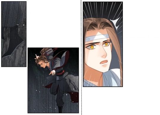
and the catch.
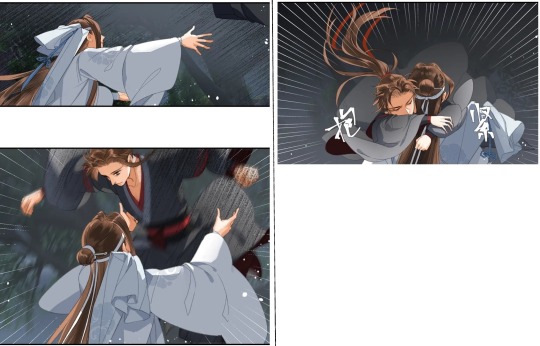
Here, motion lines are used in every single panel. What happens is a rapid-fire, staccato effect similar to the series of short sentences in writing. Additionally, the motion lines in the third and last two panels gives it a very dramatic feel. There are two possible intentions I can think of in this case: The above effect could be intentional, and it’s supposed to feel a bit dramatic in the sense that Lan Wangji has to rush to catch him. In that case it worked, though I believe cutting away the fifth panel would’ve been better for the overall effect (and I’ll get back to why later). The number of panels does have the unfortunate effect of extending the urgent moment beyond its necessity, essentially pulling us out of the emotional state we had when Wei Wuxian looked down at Lan Wangji from the tree. We’re then brought back in again with the embrace. It’s a back-and-forth that, in my personal opinion, is a bit too close to a jarring rollercoaster ride.
The second intention that I can think of, is that the amount of panels and use of negative space are there because the artist wanted the moment to extend as if in slow-motion. That intention doesn’t follow through into the final work, so I’m not sure how likely that is. Instead of lingering, we’re moving quickly through several snapshots of one scene. The impression I get is a bit like this videoclip here (cw. flashing images) (obviously I’m exaggerating).
Now, let’s say we want to achieve a slow-motion effect for Wei Wuxian’s fall. How do we go about that? Let’s look at a successful example and see how and why it works.
The manga «our dreams at dusk» is often praised not only for its exploration on what living in Japan as a queer person is like, but also because of its amazing visual presentation. Here’s a page of a character «falling in slow motion».
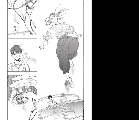
(From «Our Dreams at Dusk» chapter 1)
In this page, Somebody (the character) looks as if suspended midair, and part of the reason is the layout. The first panel takes up half the page, catching our attention and causing us to spend more time looking at it. The three panels to the side are arranged in such a way that as we read them, the panel with Somebody is still in our peripheral vision. It extends the time Somebody’s in the air as we read, causing a slow-motion like effect. Note how the lack of motion lines makes it look like a snapshot of a moment, yet the dynamic pose and weightlessness of the hair creates a feeling of motion in stillness.
I think this chapter could have done something similar. Say the panel with Wei Wuxian falling from the tree takes up most of the page. We could add small panels with details that overlap the edge of the larger one, like a close-up of Lan Wangji’s foot moving forward in the bottom corner. Like above, the fall being in the background as we look at the smaller ones extends Wei Wuxian’s perceived time in the air. A webcomic artist who often use smaller panels to «frame» bigger ones is Minna Sundberg, here’s an example:
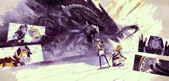
(From «Stand Still Stay Silent» chapter 16)
The large panel is the central action, the before/after depicted in the smaller panels are all tied to it, since the central action is what cause the other actions to happen. The overlapping panels makes this clearer, as they’re directly connected.
Falling for you, but strategically
That «motion in stillness» quality I talked about is one the «catch» panel could potentially have if it didn’t have the motion lines. Without those, the way this panel leads the eye is actually quite good. As we move down the page our eyes first hit the top of the panel, and the first thing we see is the end of Wei Wuxian’s ponytail. Following the line of it we end on Lan Wangji catching Wei Wuxian. Our gaze essentially «falls» from above and «lands» in Lan Wangji’s arms (if we want to be poetic about it). When motion lines are used in a radial shape like this, our attention is brought to whatever is at its center. What that does here, is causing our attention to «snap» towards the hug. The effect of the composition is weakened by the motion lines. (Oh motion lines. My beloathed)

Because of this I opted to do a quick edit this time, to show how small elements make big changes. The first thing I did was edit out the motion lines in the above panel. I then placed the panel of Lan Wangi extending his arms before this one, removing the one between these two. Another neat trick I wanted to test out, is one where we again use the negative space to extend the «fall» in the final panel. I made the ribbon longer, so that it goes beyond the panel border. Of course it isn’t really that long, but we can allow ourselves many inaccuracies in the name of artistic liberty.
Here’s how that looks:

The top panel looks quite dynamic, and while motion lines are (again) one reason for that, the diagonal line of action coupled with the side-profile enhance it. To use my friend’s words: side profile indicates that compositionally, the person can theoretically move back-and-forth. Thus it often carries more urgency and/or suddeness.
Diagonal lines carve interesting and dynamic directions through the picture, and using an X-composition creates dynamic conflict between those opposing directions. If you look at the page from «Stand Still Stay Silent» you may notice it’s used there. The line of action for the monster goes from top-left to bottom-right, while the lines on the ground go from bottom-left to top-right. The characters are placed where those lines intersect, drawing your eyes there. One can also say there’s a diagonal cross in the top panel. For those of us who reads left to right, our eyes will naturally follow that direction as we look at images. Lan Wangji’s line of action goes opposite to this. There’s also the trees in the background being slightly tiltet to the left.
Moving on, the reason I chose to remove the panel between those two is because evenly spaced out snapshots of a fast-paced moment can work against the flow of the action. It’s similar to animation in a sense.

The distribution of the frames gives an illusion of acceleration. The opposite gives an illusion of slowing down. When we have a panel of Wei Wuxian right before he lands in Lan Wangji’s arms, it gives that slowing-down impression. However, his fall doesn’t halt before Lan Wangji catches him; it’s continuously accelerating. The presence of the «right before» panel creates this odd pause, and is in my opinion unnecessary. In the case where we remove said panel, the use of dynamic motion in the top panel and «motion in stillness» in the bottom panel conveys how the action plays out: Wei Wuxian and Lan Wangji are in motion as they rush towards one another, and when he’s catched that momentum stops. It’s subtle but effective.
And that’s my thoughts on the «falling/catching» panels. I do have my thoughts on those following as well, but I think this is a good place to wrap up. Maybe another time.
34 notes
·
View notes
Note
I'm so glad that you mention BTS's collaborative issues because on top of that ARMYs (twt especially) are so hostile against anybody they collaborate with. In the case of Dem Jointz, they completely disregard his part in creating Run BTS just because it's their song. Like this man produced this song and there would be no Run BTS if Dem Jointz did not produce it (or at least in his way). And this hate(?) they have for NCT is out of line. They choose Sticker to sum up NCT's and Dem Jointz's music catalogs when they know damn well both of them have other music compositions. Hell, Dem Jointz has Grammys due to his productions.
DEFENDING DEM JOINTZ WITH WORDS IS NOT ENOUGH I NEED A GUN!!!!!!!!!!!!!!! seriously the shit that they were saying when the tracklist came out was fucking vile and shows just how braindead these people are. like the way that they completely ignore his influence within kpop but also OUTSIDE of kpop because he's not the 'artist' of the songs...................ugh. celebrity culture my beloathed i hate you so fucking much.
#tbh if my fans had come for a grammy award winning producer like that i too would never want to make music again#that shit is EMBARASSING#fans are a reflection of the artists and the fact that armies are so out of control and hostile reflects extremely badly on them#frankly its not that surprising that they dont seem to have any real trusted collaborators bc who would want to subject themselves to that#i had to not check twt for the entire day when that happened i was SO furious#text#answers#875#literally what happened to the concept of sharing. like fr
8 notes
·
View notes
Text
OH NO.
This is Tamsyn Muir’s editor. Screaming, crying, throwing up, etc.

#new stupid theory: the thumb a herald ate had Gideon God Mode powers#and there is now an unholy mutated harrowdeon/lyctor composite running around out there#i'm so sorry#if this turns out to actually be the case i will never shut up about it#heralowdeon abomination my beloathed#tlt meta#i'm not going to be able to stop thinking about this fml
1K notes
·
View notes