#composiiton
Explore tagged Tumblr posts
Text
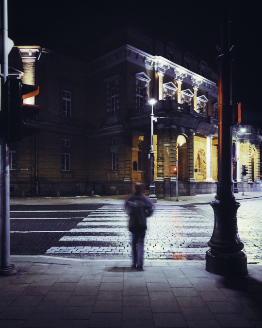
Untitled, Lithuania, 2 023 © Giedré Kuskytè :
#giedre kuskyte#art#emotions#composiiton#artists on tumblr#photographers on tumblr#original photography#contemporary art#masterpieces#yes we are magazine#visual poetry#perfections#gifts#magic#lithuanian photographers#night shots#architecture#moody images#cinematic images#compo science
176 notes
·
View notes
Text
gonna elaborate on the appeal to me. theres just a nice balance between the intense and snapped action as much there is about caring for the character's themselves. what was directed as a vengeance story turned into finding family and connections. accepting the worse in yourself and changing for the better with the support of people besides you. i think for an action heavy one such as gachiakuta its actually so nice. i love Rudo he's just a boy. a lil goober. rudo and his Coworkers who are his friends. its a show literally about trash as weapons and repuurposing them. the designs are insanely varied and the weapon creativity is so so nice. if u ask me whats my fav scene id say its the paintbrush. the characters have care in the sense that you know the mangaka isn't going to reveal everything about them all at once, but gives you enough to know the basics while craving details. the worldbuilding is so so nice. theres so mucch not revealed but revealed at the same time it puts u on your toes. i would say though to rlly heed warnings at a certain arc cause its rlly heavy at a point. specifically child trafficking + grooming and confirmed but not shown CSA.
overall its rlly nice. im hoping that i remember to keep an eye on it. and the anime. im rlly wondering how that would go cause gachiakuta has such a specific artstyle in terms of composiiton, expressions, and thick lineart. i hope it isn't stiff cause this feels like it needs some Snap in it.
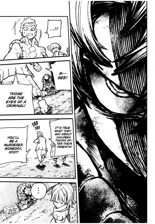
this artist doesn’t hold back on thick lines woahgh
6 notes
·
View notes
Photo
0 notes
Video
youtube
Score Relief Competition 2021 #scorerelief2021 #thecuetube - Scored by J...
0 notes
Photo

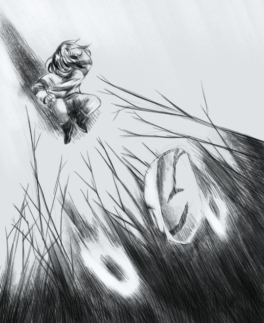
@unexpected-profundity submitted:
For the redraw meme! An old piece of mine I drew as fan art for a fanfic. I’m curious to see what you’d do with this Gaster concept…
This is such a lovely image! It makes me want to read the fanfic aha. The gaster looks really neat and smooth and kind of melty/blurry i love it a lot!
I wanted to keep the same traditional media feel but switch up the perspective a bit! I drew a thumbnail of a composition similar to your original one, but it wasn’t really different in any way aha. I really like how you drew the original composition so me following it didn’t really add anything! You can see it below the cut anyways.
Thank you so much for sharing this image, it was really fun to try drawing in my own style!

#f[art]s#frisk#gaster#redraw meme#i do like how i drew gaster in the thumbnail#but the composiiton wasn't working for me#i just like shadow mask gaster man too much
73 notes
·
View notes
Text
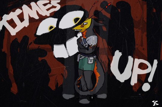
quick piece starrin the main character and big bad- everyones two favorite assholes
#my first attempt at like a bigger illustration for this#I don't really do digital art outside of animation so this was a very weird experience#Lookin back at final product i think the line art for main was pretty good for the most part#tho that armor needed like way more passes#I tried to use blending layers and ill take that for what i can#probably not final color palette#this also wasnt going to be a bigger piece as u can kinda tell from the ocmp#from the composiiton
1 note
·
View note
Audio
This piece is based on my experience of suffering from depression when I was very young. I wrote this as if I had the same understanding of despair and hope as I did when I was in middle school. Had I written it based on how I currently perceive hope and despair in the form of music, the composition simply wouldn’t be an honest representation of what I was experiencing as a child.
9 notes
·
View notes
Text
Creator tag game
I was tagged by @tuafives, @number5theboy, @lilapittss, @timelessthirteenthdoctor, @andyoudoctor , @iridescentides all of whom are incredible talented people and so kind to tag me in these things even though I’ve only made about 3 sets ever :’) thank you!!
Rules: Answer the questions and then tag 10+ other creators to answer the questions!
first creation and most recent creation of 2020: first was my very first gifset before i knew how to make gifs, made in September, of klaus’s baldwin line, most recent was a celebration of the i think we’re alone now 1987 music video , made last night in a fit of 80s hair passion
one of your favourite creations from 2020: honestly this dumb video co-owned by me and @number5theboy was created in such a collective fever dream of nov 3 / destiel insanity and i look back at it fondly
your favourite colouring: uhh this vissy one has something going on
a creation that took you forever: hmm these goddamn donuts took 2 months so, they win
your creation from 2020 that received the most notes: this super effective post is at 32k which is objectively, too many
a creation you think deserved more notes: i dont tend to think my stuff ~deserves more notes cause if people arent into it, its all good, but my emoji set did take an amount of time
a creation with a favourite scene/quote: i made this when did we all get sexier inspired one very early on and its still a great quote
a new fandom you joined and a creation you made for it: i joined the TUA fandom and no other fandom so everything i make is tua! ya cant be rid of me
a creation you made that breaks your heart: my falsettos klave set :(
a ‘simple’ creation that you really love: i like this one of grace because she is pretty and i had to do barely anything with the colouring :)
a creation that was inspired by another one (add both your creation and the one that inspired it!): ahh i don’t know!! I can’t think of anything specifically inspired, besides the general inspiration I feel from everyone else’s beautiful creations
a favourite creation created by someone else: SO MANY!! cant choose one so I will list a bunch like a maniac: i just rb this gorgeous colouring of five by @tuafives and i cant stop thinking about it, this one by @andyoudoctor still makes me yell about umbrellas being windows, this amazing horror movie au by @number5theboy is still one of my fave things ever and i want it to be real, i am such a sucker for vissy and this whole set is gorgeous by @timelessthirteenthdoctor , i still very much enjoy the hilarity @fivevanyaklaus added to allison being iconic, this allison set by @lilapittss fills me with complete joy, the colouring on this five and dolores set by @iridescentides still blows my mind, and i am still obsessed with the composiiton/colouring/everything in this five set by @evakant
some of your favourite content creators from the year: again, SO MANY!!! all the ppl I already tagged, also, @joe-alkaysani , @royalarmyofoz , @olisgifs , @i-seeaspaceshipinthe-sky , @katgreeves , @yenvengerberg , @bartonclinton , and i am certain loads more I am not remembering right at this moment
another couple more creations of yours that you love: ill plug my tua vintage book covers again!
I no pressure tag everyone I’ve mentioned who hasn’t done this yet (if anyone hasn’t who would like to :) )
#tag game#ty for tagging this was going round when i was off internet and i feel like i missed things#so hard to choose my fave sets and creators because everyone is legit so talented#help i am feeling emotional about 2020 help
18 notes
·
View notes
Photo

i dont know how much of a presence this series has on here but oh well i still LOVE how this turned out ive been rly having fun playing with lighting and different angles to try and make my composiitons a little more interesting,,,,,,,,
(pls dont tag as kin/id/me)
85 notes
·
View notes
Text
48 is an odd number to go from, but I thought I’d rate all the CGs I’ve done roughly in the order I like them (best to worst)
Under the cut because, again, 48 of them

10/10: I feel like I could see this in the game and I like the expression and colours I chose
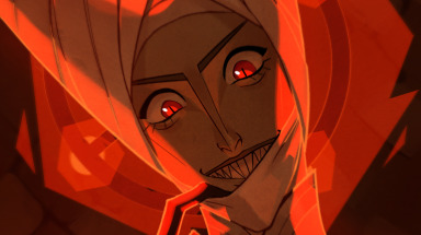
9.5/10: I drew this 9 months ago but it’s one of few I think would fit in, aside from the messy colouring
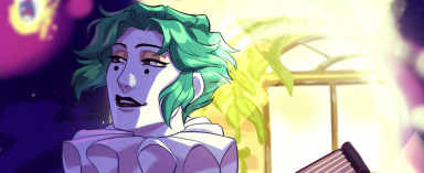
9.5/10: Nice atmosphere and I like the lighting. Some anatomy issues

9/10: I like the bright colours and I finally drew a nice Asra. The posing could be more natural

9/10: Most improved. Even if it’s messy, I like the water effect and I drew Muriel’s face right
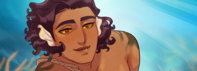
9/10: I like the colouring, especially with the hair and background. Sketchy lineart and wonky anatomy

9/10: Not quite Valerius’ face and odd anatomy but nice scene and lighting

9/10: Not the Arcana lighting style but it turnsed out nice and I like the pose, even with the rough lineart
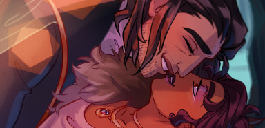
8/10: Odd lineart but nice lighting and sweet expressions

8/10: Best background/composition I’ve done but Asra’s face is odd and lighting could be neater

8/10: Soft lineart and good Portia face, but bland lighting/composiiton
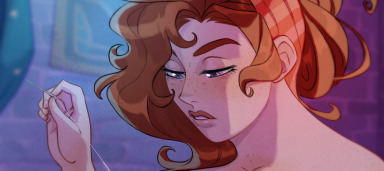
8/10: Also soft lineart and good Portia face, but the colours aren’t very cohesive or natural, especially with the background

8/10: Fun pose and nice colouring. Face angle doesn’t quite work
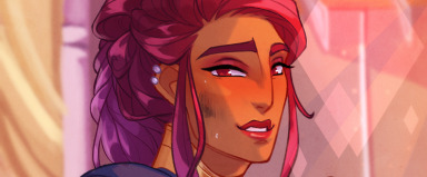
7/10: Nice colours and concept but the face is weird and needs to be neater
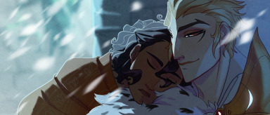
7/10: I like the mood of this, but it’s clearly an early one with the rough lineart and Lucio’s face isn’t quite right.
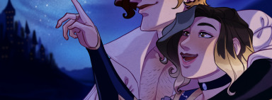
7/10: Always a delight to draw Julianne (w/timmyandscribbles). Lovely background, but not an integrated composition and some strange lineart
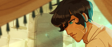
6/10: One of the best compositions and colours chosen, Orion (w/pumpkunbread) was lovely to draw. It’s clear I was sketchy with the lineart
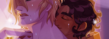
6/10: Soft Isha and nice colours, but some strange anatomy with Lucio

6/10: Rought lineart and crowded composition but good mood and colours
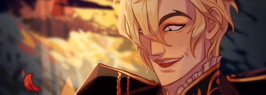
6/10: Nice colour scheme but odd lighting and stiff pose. Lucio’s face is good but just a little too sharp

6/10: Happy with the mood but the pose needs to be more natural and the anatomy is strange
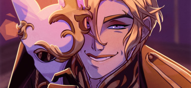
5/10: Like the colours and pose, but the lineart is too thick and the colouring is messy. Odd mouth

5/10: Good pose, lineart, and colouring, but Portia’s face is drawn strangely

5/10: Interesting lighting and composition but it’s very rough

4/10: Great expression and concept but messy lineart and anatomy

4/10: Attempt at a background, nice lighting, weird expressions and anatomy
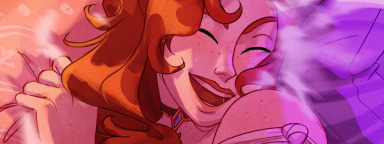
4/10: Composition, pose, and expression makes it feel like a game CG but it’s too messy. Colours are too pink/unnatural
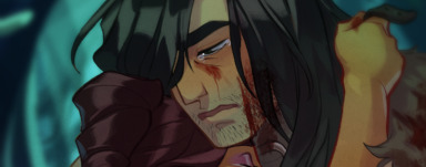
4/10: Like the colouring but poor Muriel’s face
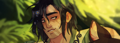
4/10: Ditto but also rip wolf anatomy
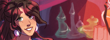
4/10: I like the concept and it’s a nice drawing (w/aaliyah-draws), but the colouring and lineart is clearly not the Arcana style

4/10: Rip Lucio’s face but I’m really happy with the colours and I still have no clue how I painted that gold. I’ve never done it as well since

3/10: Nice expression and vibe but the anatomy is stiff and the colouring is too messy

3/10: Rip Lucio’s face 2.0 and the colouring is plasticy and bland

3/10: Nice concept and colours, but it’s not the Arcana style and the lineart is too thick/rough. Clearly never drawn Isha from this angle
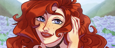
3/10: Soulless expression, thick lineart, and strange, plastic colouring, though the hair and concept is nice
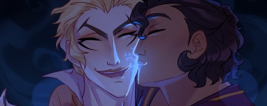
3/10: Colouring feels unfinished and the pose is stiff

3/10: Strange anatomy and the style is off but it’s a cute scene

2/10: Doesn’t look like Muriel and overambitious background for how well I could draw fur and fabrics

2/10: This colouring is incredibly rough and shoddy. The lighting is unnatural and incohesive, combined with rough lineart

2/10: Rip Muriel’s face, the pose needed more reference, and the lighting doesn’t really work. Nice expression?
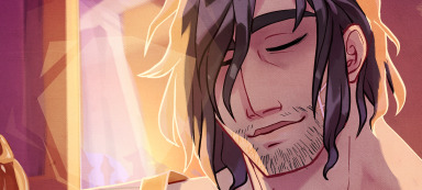
2/10: God, Muriel, I’m sorry for your face. The pose is stiff and awkward with the background
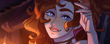
1/10: Portia, I’m so sorry. Drew this when I was tired. The anatomy is stiff, face looks off, and the composition doesn’t lead the eye the right way
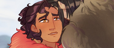
1/10: Did not know how to draw fur, Isha’s face, or this pose. Colouring is really bland, though I’m forgiving as it’s one of the first I drew
#the arcana#not art#this isn't really worth a read and more that i needed to vent a bit and think about my art#i am mostly improving but it's good to see what i do and don't like about it#so i know where to focus#also i don't want criticisms of my criticisms#because it's really me judging myself by my own standards#i don't judge other art the same way
148 notes
·
View notes
Link
I used digital badges in my first-year composition classroom for assessment. Then I wrote about it.
#digital badges#praxiswiki#kairos#rhetoric#pedagogy#composiiton#assessment#education#higher education#higher ed
0 notes
Photo

4 IMAGES — WHO I AM
IMAGE 01: CATHEDRAL
The photo taken here was a image I captured while overseas in Europe it was a cathedral which celebrated art and form, sculpture in celebration of higher power. The experience of travel when I was 19 years old shaped my understanding of the world and what was possible and I could achieve. It also exposed me to alot of artist references and designers, architects, and renaissance artwork which has informed my practice. I strongly refer to the past as my teacher that guides me and I can pull references from.
IMAGE 02: PHOTOGRAPH
My fascination with exploring thematic ideas has been present since I was in high school. I was drawn to social commentary and having a voice through art. A way to abstractly display ideas and communicate a message through semiotics and visual language/images.
IMAGE 03: 48 LAWS OF POWER
Since a young adolescent I have been into literature and the novelty of stories. Through storytelling I liked being consumed by a narrative and epxlorign them thoroughly. As I got older I was drawn to more philosophical books and literature. This helped me develop into a young adult and guide me to be the man I am today. This was also important as in through literature I understood the role of the reader/consumer and the relationship to the characters and plot. World Building. Thematics and revealing a message through layers of ideas and characters.
IMAGE 04: BLADE RUNNER SCREENGRAB
I have also been captivated by motion. The cinematography of Ridley Scott and the scifi genre in particular taught me what it was like to dream and create realities. But also how different shot provoked emotive responses and the clever use of layout, composiiton and colour. Movies was a way I could unpack hidden messages, ideas and how the messages could be applied to my life as I explored them with my mother.
0 notes
Photo
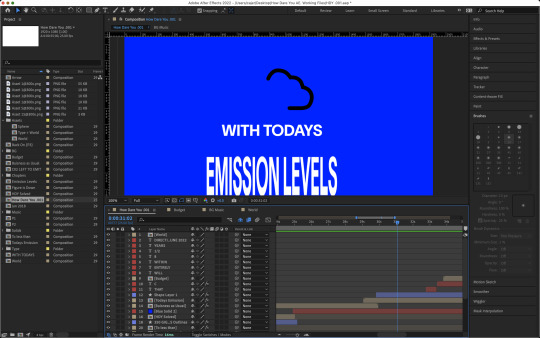
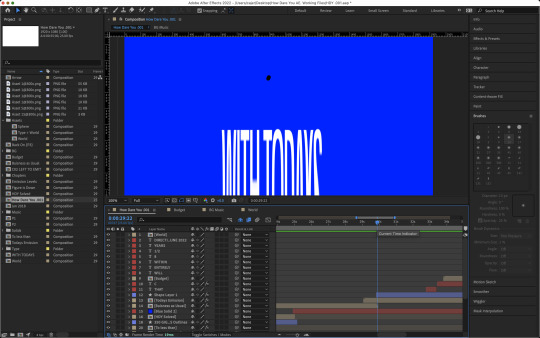

TODAY’S EMISSION LEVELS
Following a type focused composition I wanted to go back to a more illlustrative focused composition which visually demonstrated the words Great was speaking. In this part of the speech she drags out the words Todays, Emissions and Levels. To emphasise this elongated pronounciation of these specific words I wanted to replicate the drage in speech by stretching or dragging the words onto the screen.
In thi sparticualr example where the design landed I used the ____ effect to extend the letters and bring the words slowly into frame.
While this happened I copied an illustration of a cloud off the internet and used the pen tool to create a path on After Effects. I could have probably created this path within Illustrator but I wanted to try to keep the majority of my work within this application to see how far I could push it and understand how the features and functionality of these features differ from that of other Adobe applications.
I then used trim path to choose starting and ending keyframes from which the cloud would start animating.
I experimented with the text to see if I could potentially animate it from different parts of the composition, for example ‘With Todays’ coming from the top of the composition, or other areas of the page. I also tested for them to swing around the composition and blend into the centre; yet none were as effectiove as both of the type lines coming from the bottom of the composiiton.
For the transition I wanted to stay away from the overused swipe animation but I wanted to take the trnasiiton horizontally because the way the text came on was vertically directed. I decided to create two masks for the composition dividing the text and animation in two. I split them and keyframed the transition so it would mask out each part from left and right. They would start and ifnish at the same time givign the illusion that they were being covered up and shut off (outwards in). I liked this and beleived it was different enough that it wasnt mundane but still held the same nostalgic simplicity.
0 notes
Text
1/3
So like words don't appear out of thin air, right
They generally come from somewhere.
One of the jobs of a lexicologist is to map how this happens.
0) A word comes in from another language. This is called borrowing. You know exactly what that is.
(CZ) píšťala (whistle) -> pistol
1) Sometimes someone pulls a word out of their arse, and these are called neologisms, this one having been pulled out of the arse of Tolkien.
This is kinda rare outside of fantasy literature and such (but can't be ignored). Even then, it's often supposed to be a borrowing from a fictional language.
<absolute jack shit> + <absolute jack shit> -> hobbit
(you could call this borrowing from a conlang I guess)
Because there is no correspondence between form and meaning in neologisms, there's not much to say about it. It's also (probably) the reason why it's not used outside of specific contexts, and even there it's kinda like 0) in that
2) Sometimes you combine two already existing words together. This is called compounding or composition.
flower + pot -> flowerpot
English has an endlessly frustrating habit of sometimes using a space and sometimes not when writing these down, resulting in this shit:
flower + pot -> flowerpot
flower + pot -> flower-pot
flower + pot -> flower pot
2/3
3) Sometimes, you add so-called bound morphemes to an already existing base word.
These bound morphemes are linguistic structures that carry some lexical or grammatical meaning, but aren't typically 'meaningful' enough to appear on their own.
en- + code -> encode
Notice how we go from a noun to a verb. This doesn't necessarily happen, however.
joke + -er -> joker
I kinda feel like in English it typically does, but I dunno.
Obviously, a headache ensues in that it is not necessarily always clear whether or not we're encountering composition or derivation.
super- + car -> supercar
OR
super + car -> supercar
"Super" is kinda rare as an adjective, but you can definitely find it appearing on its own. But then, what if it's just a lexicalized ( having become a word) bound morpheme? Perhaps, but how do you consistently demonstrate that...blablablabla you get the idea. It ain't easy.
2-3) There's a specific type of fuzziness between composiiton and derivation called (neo-)classical compounds.
-psych- + -log- -> psychology
These ones suck so hard. Those -psych- and -log- things I call chunks, and I hate them.
They can't appear on their own, so they're not base words. But then, they can appear combined with other chunks, so they're not bound morphemes, cuz this:
en- + -er -> *ener
doesn't happen.
So is it derivation or composition? I lump them under composition for no particular reason at all.
4) Sometimes, a word changes its part-of-speech without undergoing any formal changes. So similar to
en- + code -> encode,
we have
fall (VERB) -> fall (NOUN)
You can asshole around by claiming this is derivation with the addition of a so-called zero bound morpheme, so
fall + 0 -> fall,
but that has zero practical benefit in my opinion apart from maybe that some algorithmic approaches require it somehow or make things a bit more practical.
3/3
So this list covers how words come into being in English relatively well, and it very roughly generalizes to to other languages also.
It would constitute a (mini-) formalism or a (mini-) model. It's not very comprehensive or well-defined or anything, but I just kinda vomited it out while taking a break from programming, so it'll serve to illustrate the meme.
When people map word formation, they might come up with lists similar to this. They might break up word formation into these subtypes, like these 5 I just listed, and then they break up the subtypes into further subtypes, until they've reached a granularity of precision that they consider satisfactory.
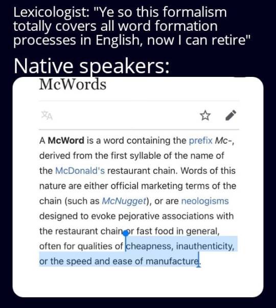
Every single fucking time you do this, native speakers come up with some shit like we see in the meme that your formalism just doesn't cover at all. This is not hte internet's doing or anything, people have been doing this since the dawn of time.
From the list, pick out one word formation process that describes "McNugget" and "McSchool".
Yeah. It's like trying to grip soap. It always slips out.
0 notes
Text
I find this one so interesting! Evocative of subject matter while still remaining abstract. Also a great flow in the composiiton
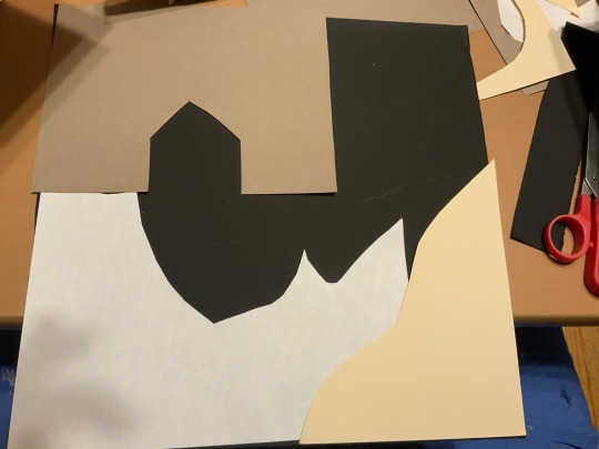
This is my third design, using the leftover pieces of paper as different parts of the background.
2 notes
·
View notes