#comic paneling/shading are not things I'm really good at
Explore tagged Tumblr posts
Text

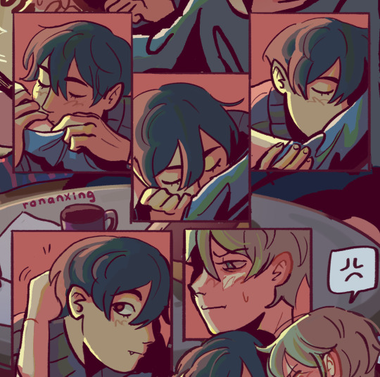
Little comic about an idea that has been stuck in my head since ch 267.... The gang goes to the movies!!
I really enjoy thinking about movie nerd Yuji and the 'Everything Everywhere All At Once ' parallel in ch 267 had me thinking about this....
#the longer I worked on this the more I doubted my drawing skills#hope y'all still enjoy the little headcanons#comic paneling/shading are not things I'm really good at#ahh and don't get me started on drawing interactions....#I just like thinking about them#that doesn't mean I can visualize it well#also included the new scars#that was very last minute but I thought it would fit that they would watch it post-canon#jjk#jjk fanart#jjk spoilers#jujutsu kaisen#yuji itadori#megumi fushiguro#nobara kugisaki#jjk 267#jjk thoughts
5 notes
·
View notes
Text
semantic drift

[ID: Three panel comic with crudely drawn stick people.
Panel 1: A person wearing a green skirt, green long socks, green hoodie and a green cap is sitting on a chair.
Green: "...I mean yeah, I am absolutely certain that pursuing hue replacement therapy is-"
Doctor, from outside the panel: "But can't you just settle for wearing a green hat sometimes?"
Green: "Well, I'm already doing that. Obviously."
Doctor: "Let's talk again in six months. We just need you to take those nine months to be absolutely sure that you have tried to be comfortable as a non-chromoforming grayscale person first. That extra year will be good for you to put more effort into the outfit.
Panel 2: The green person is now dressed like a leprechaun, with globs of hastily applied green paint on their body. They are talking to another green person whose shade of green might remind you of a certain website.
Green: "I just think it's really ridiculous for some grayscale doctor to decide if I'm green enough for medication! This outfit looks ridiculous! The body paint takes hours to apply!"
Greenmed: "Deal with it, greentrender. Only the doctor can decide. Get a diagnosis or GTFO."
Green: "Wow, you suck."
Panel 3: The green person is now medically green. They are talking to a person wearing a peach-colored hat.
Green: "...So yeah I mean without informed consent I'd probably still be stuck there, I really think broader access to care i one of the most important things for-"
Peach: "Oh so you're a chromomedicalist."
Green: "What?"
Peach: "You know it's valid to not take pills that make you green, right? Stop being so exclusionary."
End ID.]
Start - Previous - Next
#in a perfect irony storm someone on twitter got mad at this comic for being “transmedicalist” to the point where they told me to die#pills that make you green#ptmyg
965 notes
·
View notes
Note
hi!! i just wanted to say, i LOVE your art!! i started drawing my kris design with braces after seeing dubs of your comic on yt, and when i found you on tumblr i was beyond excited to see all of it in context. i’m a comic artist as well, and i was wondering— how do you choose your color palettes ?? besides obviously picking colors from the characters themselves, that’s a given— but your comics are bright and colorful and just a real pleasure to read because they’re so visually appealing. hope this question hasn’t been asked before!!
Thank you so very much!
So I really went into your question under the cut. So feel free to proceed if that is something that interests you.
The answer is honestly not that exciting. For the characters I really only do pick colors off the original sprites. Which is why they look so bright and colorful. If you try to do that yourself, you will quickly notice how SATURATED the sprites are. And not only the sprites, but also the backgrounds.
A little trick I use is that for pre-existing backgrounds I take all the colors and brighten + desaturate them just a teeeensy tiny bit. That way the characters in the foreground pop way more.
Another way to make the colors pop even more is to use colored shading AND colored lineart! That really IS what ties everything together. Let me show you..

This is a panel without the colored shading and lineart.

And this is it again WITH all that good stuff. Quite the difference, no?
But you're asking about color palettes, so I guess you also mean for the characters/outfits I designed? A lot of it boils down to color theory. I am by NO means an expert on that subject, but when looking at the Dark World designs specifically, you will notice how I did it.
For example: Frisk's Dark World color scheme is mainly analogous. That means the colors are right next to each other on the color wheel. But there is a little bit of complimentary in there.
Here, lemme visualize it...

Frisk's color scheme is a light green, darkish blue green, light yellow and a splash of pink. The red is there mostly just for lore reasons.
One thing I noticed when looking at the sprites of all the Dark World versions is that they are EXTREMELY bright and saturated.

That is something I tried to capture as well, but I think it didn't neccessarily nail it a lot of the time. Especially for Frisk's color scheme. If I stuck closer to what the game is doing, then in theory they would look more like this (using Kris' colors as a reference)

Looking back, I WOULD tweak their colors slightly more nowadays. Just so that the contrast between the colors is a little stronger and they don't blend together as much. This improves the readability of your design. Not all people are able to perceive every color of the rainbow, so readability is EXTREMELY important. Best way to see that is by desaturating them and checking the grayscale. Like so (left is the one closer to the game's colors)

Man, this REALLY makes me wanna fix their color scheme. This has been bugging me for a while now. (Though I'm kinda afraid that people point out that they look different.)
163 notes
·
View notes
Note
I've been wanting to ask for a while but never was brave enough to. I'm not a very good artist myself but whenever I try to do a comic by the second panel; my art, mind and hand are all worn out from doing one panel.
How do you keep your panels and art style so consistent throughout the comic?
hi!! thank you for being brave to talk to me! I really enjoy discussing technique!
I think comics seem simple and easy to make, but they're a looong process.
👉First of all: start small. like, ONE page small. TWO pages, etc. just tell one joke, or one kiss, etc. it'll make the entire process less daunting. but do think of the beats of the story like...
1- character A is doing a thing 2- character B makes a comment 3- character A gets embarrassed
/ end
something simple, but you can cut up each little beat into two panels if you like, or just keep it at 3 and explain more with the dialogue.
👉for the drawing part, you should really start with a really ugly basic sketch to outline what kind of dialogue and story progression you want to make on each page.

this is a sketch of page 11 of my Bunny Crossing comic:
as you can see, I put a lot of focus on drawing the more delicate moment where Bilbo notices Thorin remembered the comment, so I just actually drew his face in detail there. But the rest was just enough for me to know later where each character is, or if I needed to draw a background, where the dialogue should go, and such.
👉divide your work into days. if it makes you exhausted, you can take one entire day to draw the rough sketch. Then, another day for the dialogue and speech bubbles. Then, another day to actually draw the panels and the more polished sketches of each character. Then, another day for the lineart. Then, shading. etc.
👉try drawing grayscale first. Don't add colors until you're sure you'll have the energy to finish it! It'll get you used to the process, you'll iron out any errors easier.
👉consistency comes from the process itself. I try to be careful while drawing the sketches for my panels, because a good sketch can help you so much in the long run!
👉look for reference on other people's work! manga artists and western artists have loads of footage of themselves drawing online, you'll get inspired for sure!
I hope this helped a little bit! Do respect your own rhythm! 💖 also, if it doesn't help, not everyone likes to draw comics, and that's ok! It IS a very repetitive process. static illustrations are amazing too, and I envy the skill!
69 notes
·
View notes
Text


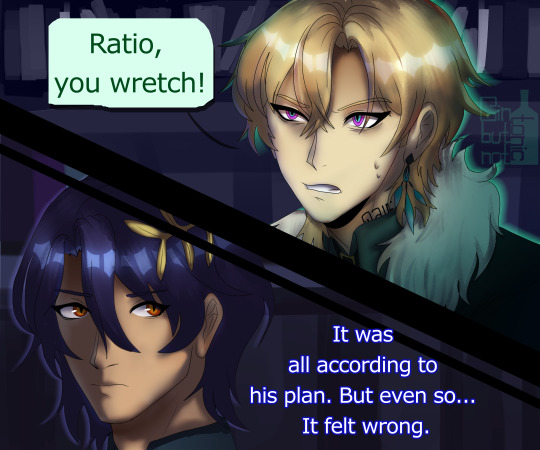
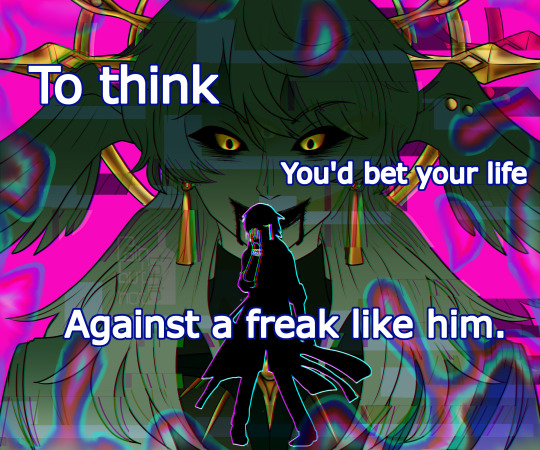
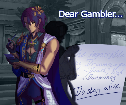
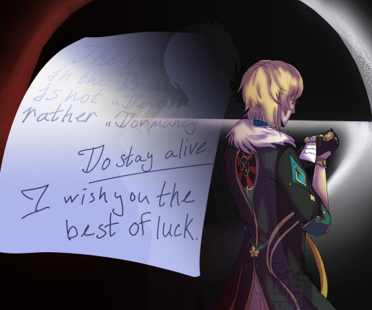

I FINIIISHEED (CW! Eyestrain) (please don't flop)
If you think Ratio's eyes change shape on every drawing - no you don't.
I honestly gave up at the end, I got tired of drawing this thing ;; But I finished in time for Aventurine, so good luck to everyone who's pulling for him! (I have a guarantee and then savings for Boothill mwehehe)
I'm surprised that I managed to turn an in-game joke into a very OOC Ratio comic (idk if hes OOC u tell me I cannot comprehend anything anymore)
Edit: Fixed the shading issue fr this time <3
Anyway the Sunday panel under the cut because I really enjoyed drawing it (CW!Eyestrain)

He turned out great. Can you tell I don't like Sunday much?

Also why did I draw it all in one file? Who knows, not me.
#honkai star rail#hsr aventurine#aventurine#aventurine fanart#ratiorine#aventio#dr ratio x aventurine#dr ratio#eyestrain#veritas ratio#hsr dr ratio#dr ratio hsr#sunday#sunday hsr#hsr sunday#honkai star rail fanart#aventurine honkai star rail#dr ratio honkai star rail#sunday honkai star rail#caelus#trailblazer#hsr caelus#artists on tumblr#will it flop#probably yeah
249 notes
·
View notes
Note
Why is the art so unappealing in lore Olympus now Persephone looks like a highlighter and maybe it’s just me but the proportions like the fingers in arms are soul over the place I don’t think they used to be this bad. Am I just looking at it with nostalgia or am I crazy ?
Honestly, nostalgia does play a huge part in it, even to this day there are times I look back on old S1 panels and go-

Actually here's a great example that literally just happened yesterday in the ULO Discord that nearly had me on the floor LOL This is from Episode 70:
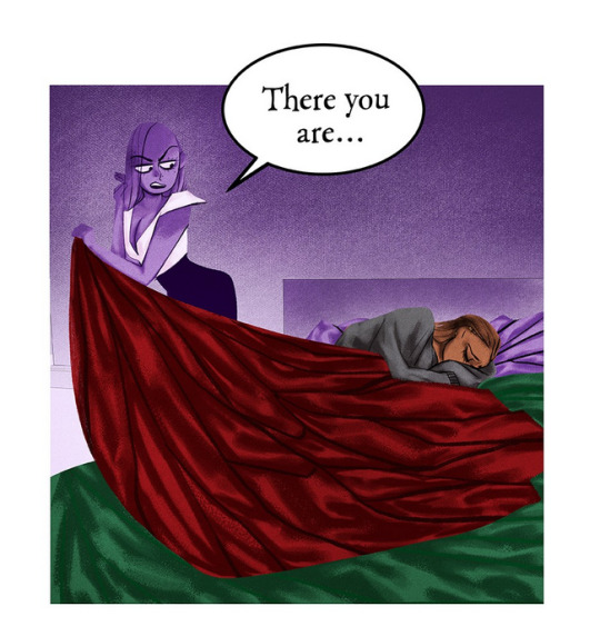
Like I didn't even believe that that was real until I was told what episode it was from and I was just. Astounded and flabbergasted. The over-shading of the blanket that just makes it look like a really bad edit. Insane.
And yeah, there are a lot of old panels that hit different now that the rose-colored glasses have been removed, crushed, and thrown into the trash compactor.
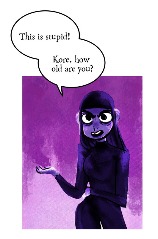
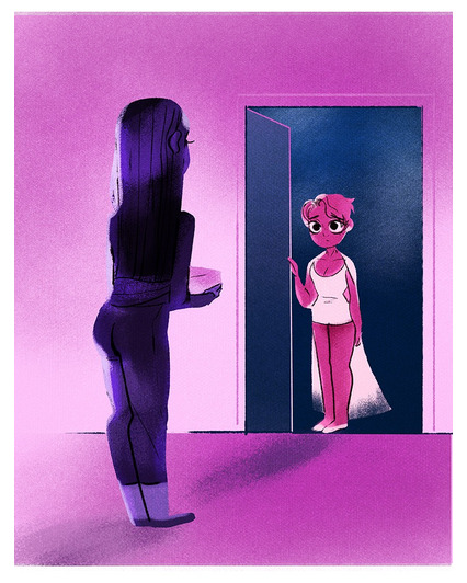
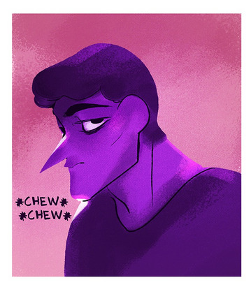

I think that's why it makes it all the more amusing when people come into my inbox and ask me "wait, why did you like LO to begin with?? It's always been ugly as shit, I think you're just romanticizing it" because like... there's something to be said about art and subjectivity, even if something is ugly to one person doesn't mean it isn't beautiful to someone else. It's why I try not to be too mean towards the fans of this comic for still enjoying it, because while I definitely have strong opinions about how "LO has gotten worse" and what kind of following Rachel has cultivated (cough cough), there are also just as equally valid arguments that LO has never begin good to begin with that I can't necessarily disagree with now that I'm looking back on it with a more critical eye.
That said, there's tons of media that I enjoy that is objectively awful. Like y'all, you don't need to take my opinions about a dumb pink x blue fantasy romance comic seriously, I like Starfox Adventures-
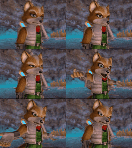
Like yeah it's a badly made rushed piece of shit that was developed right on the ass end of Rare's glory days and was really an original IP (Dinosaur Planet) that got Frankenstein'd into a Starfox game so it could "sell better" for Nintendo, but I don't give a fuck, I love Starfox Adventures and some day I wanna be in the top 10 speedrunner leaderboards for it, which I know doesn't mean much because no one is speedrunning Starfox, but I do and no one can take that away from me dammit-
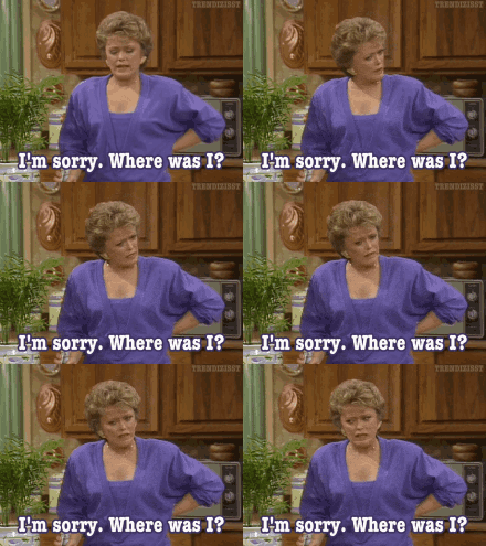
Anyways. Lore Olympus has, in many regards, always had "bad art". But "bad art" can and should still be enjoyed by those who find joy in it.
And in LO's case, the world it existed in when it launched was a lot smaller than it is now - more specifically, the world of Webtoons. We can look back and see how 'bad' LO looks and reads now because there are genuinely way better comics surrounding it. It was unique and refreshing and experimental back then... now it's just "that stupid blue and pink comic for horny teenagers".
In most cases I would consider that "cringing in hindsight" feeling a good thing because normally it means something has grown and that it seeming "bad" in hindsight would mean that it's outgrown itself and moved onto bigger things. But LO has the more unique problem of "its current stuff is shit and it's making us want the old stuff more, even if the old stuff wasn't good either". In that regard, LO is closer to being like Harry Potter. Remember when The Cursed Child came out at the height of Rowling being exposed for being a TERF and even people who liked Harry Potter didn't like The Cursed Child because it was just objectively worse overall (with or without Rowling's bullshit attached)? It made a lot of people go back and re-read / rewatch Harry Potter with a more objective lens and go "wait a minute guys, I think we only adored these books so much because we were 12 when we read them". Often times it's the good memories we have surrounding certain things that make us have the opinion about them that we do.
Of course, LO is definitely not as politically weaponized as Harry Potter is, so that's where that comparison ends. But my point is that LO is definitely in a situation where it's been riding off the same privileges it had back in 2018 - having an 'experimental' art style while also utilizing tropes and characters that were VERY popular at the time (remember that 2017-18 was when Tumblr was at its height of H x P "Hades was a chill accountant guy who wore socks and sandals and didn't cheat on his wife like Zeus did" fantasizing) - and thinks that those same tricks and tropes will still work today.
Because of this, the art in LO really, really hasn't aged well, even the stuff that we look back on fondly. But I think it's the panels that we specifically think of when remembering "old LO" - the ones that stuck in our memories the most - that are the ones that make us miss or just not care about the panels that don't look good (the panels that make people question why we ever liked it to begin with).
We liked it because of how it made us feel to look at panels like these-
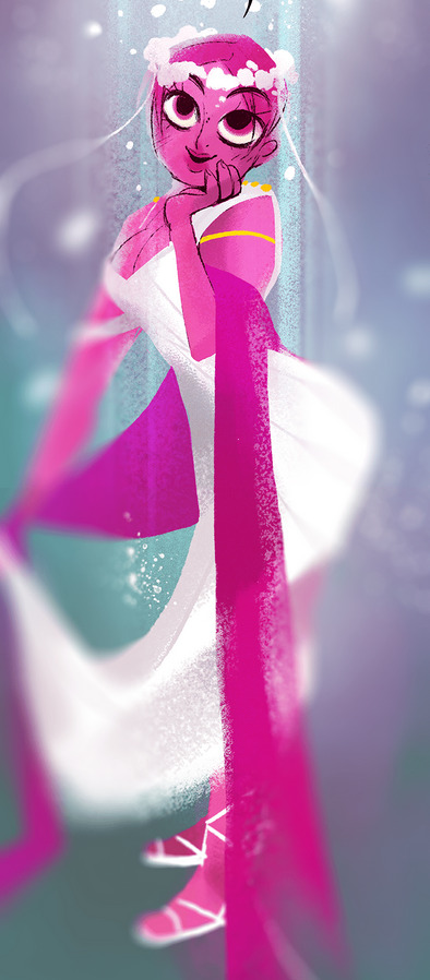
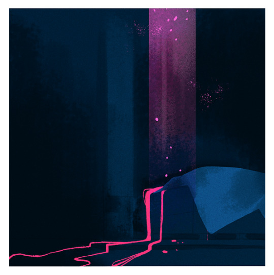

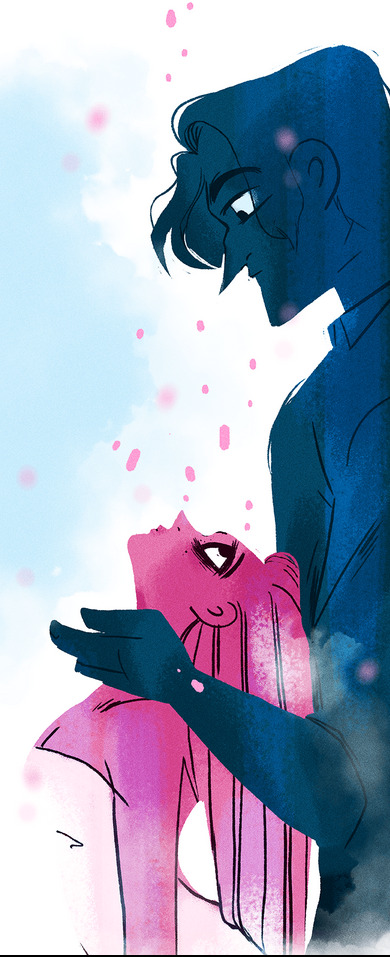


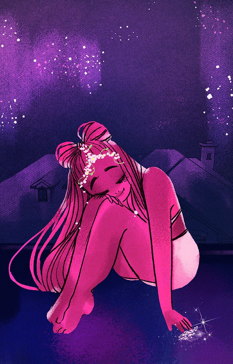
Those genuinely wonderful panels that we think back on the most don't exist separately from the bad panels, they exist in spite of them. Even if we can look back on panels like these and pick out problems in the lineart or the proportions or the color travelling outside of the lines, that can't and shouldn't change how those panels made us feel at some point or another. And that's why when people ask me "why were you even into LO in the first place" I don't have any one answer, because I can't fully explain how something made me feel to justify why it's good to someone who can see from the outside - without rose-colored glasses - that it evidently isn't. It's very much a "you had to be there" type of thing.
Unfortunately, nowadays even the 'best' LO panels in S3 still don't come close to what the S1 panels accomplished - because for many of us, the rose-colored glasses are gone, we can't appreciate the good among the bad because we know now how bad it truly is and so the good just feels like wasted attempts at trying to recreate something it can no longer be. It "came back wrong" so to speak.
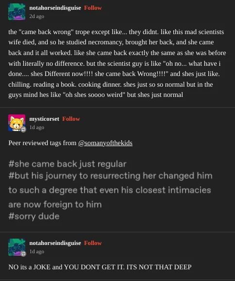
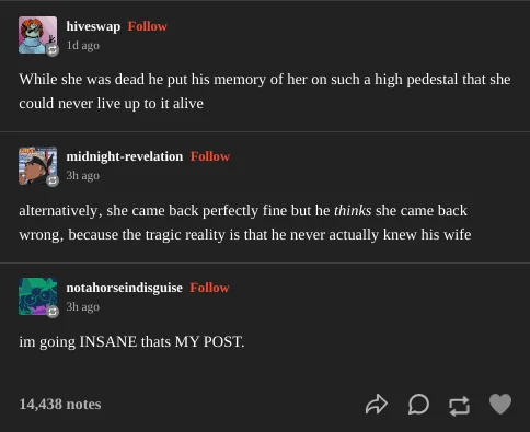
LO came back just regular. But our journey to resurrecting it changed us to such a degree that even its closest intimacies are now foreign to us. Sorry dude.
This is still probably one of my favorite panels out of the entirety of S3 for being as close to "old LO" as I've seen since S2, and even it feels like a mistake, an accident, how could a panel like this exist in S3 when so much of it is a dumpster fire? It's like a flower growing in the ruins of an apocalyptic wasteland.
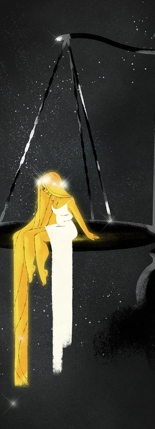
But wasn't that always the case? Isn't that 'always' what LO has been, since the very beginning? A poorly cobbled together mess of writing and panels that, every now and then, manages to leave an impression that makes you feel something? Did we ever truly know LO? Or have we just been relying entirely on an idea of it that we've built up in our heads that when it does do exactly what it's evidently always done (even if not made apparent until looking back on it in hindsight) we think it "came back wrong"?

#anyways sorry that was a way deeper response than it oughta have been#welcome to the AMA roulette game of “ask puff a simple question which they may or may not respond to with an introspective essay"#lore olympus critical#anti lore olympus#antiloreolympus#ask me anything#ama#anon ama#anon ask me anything
162 notes
·
View notes
Note
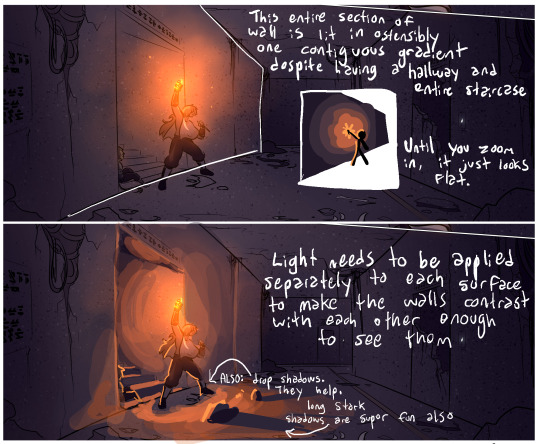
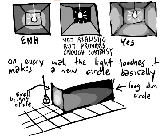
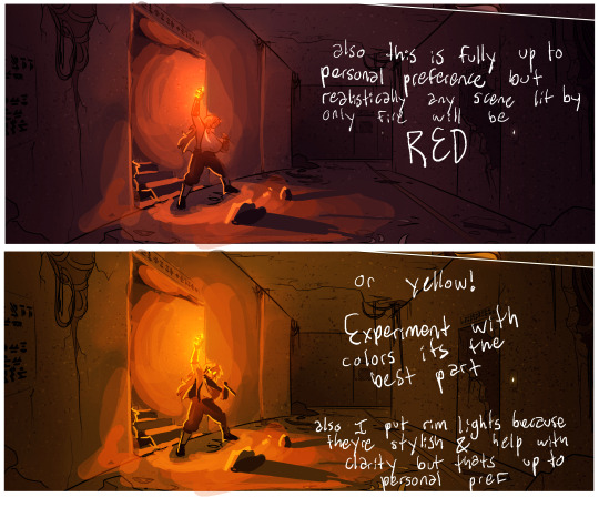
Lighting critique of a recent panel ! Dark ambient lighting is a favorite art subject of mine, so i figured this would be a good time to give some input ! ii say as if we havent been in the undergroound chapter for like a month in which it didnt occur to me to pay attention to lighting Oh well loool here it is nowwwwwwww hope you dont mind the input
Huh.
Okay, so first off, thanks - this is cool and your lighting looks very nice. I look forward to seeing what you make!
Second - I really hope sending this kind of ask isn't a habit of yours, because unsolicited artistic criticism comes across as remarkably rude.
Art criticism for the purposes of improvement is a social contract entered between two artists, typically in a scholastic environment. An artist presents their work to other artists whose opinions they trust and value, and those artists weigh in with their thoughts. Critical to the process is that the presenting artist is showing their art for the purpose of improvement, and they're prepared to receive that input because they're actively asking for it.
In contrast, I make this comic so people can read it, and while I certainly don't mind if they take it apart to analyze it or find ways the writing and art could be improved, I, the creator, am not asking for that and - more importantly - will not really benefit from it.
For instance, in this case, my style of background lighting and shading is optimized most specifically to accommodate for the fact that I need to make a lot of these pages quickly, and correspondingly cannot give everything 110%. Any individual panel could absolutely be more polished, but I often shade these backgrounds in batches of ten pages or more, each page with an average of six panels that need individual shading. So that's sixty individual backgrounds I need to shade in one go. It doesn't make your advice wrong, or even unhelpful for an artist setting out to learn this kind of technique - but it does make it unhelpful for me. This is something you realistically had no way of knowing, and I don't hold it against you! But this is why I have a short list of artists and writers whose input I actually ask for sometimes, and that list is composed of people who know me, my creative priorities, and how my process works. Because they know what I'm working with, their advice stands a much better chance of being actually helpful to me.
Criticism, like all art, has an audience it is designed for. In art school environments or artistic coworker situations, the audience for the criticism is the artist being critiqued and the other artists who are learning from the communal experience they are all agreeing to share. This is the exception and not the rule, however. Outside of this space, the audience for criticism of a work of art is typically the subset of the audience for that work of art that are trying to learn something from the experience or understand what did and didn't work for them. This group can discuss what they did and didn't like, what they would have changed, what parts worked for them that may not have worked for other members of the audience, etc. This space of critical analysis forms the backbone of most fandoms and can be incredibly interesting and rewarding to play around in.
The audience for that kind of criticism is not the creator of the art. In the same way a creator can never be fully immersed in their own fandom audience, this form of communal critique from the audience side of things does not work when directed at the creator. In the context of this work of art, we exist in very different spaces and operate under different parameters. If there's one thing I learned from back when I used to check in on the fan discord community, it's that most conversation in this space operates under the assumption that the creator will not see it or take it personally. I cannot be in the audience of my own audience.
All that to say, thanks for the thought, but please be careful doing this in the future - tumblr is the land of kneejerk hostility and poor reading comprehension, and I don't want to see you getting shredded for a kind intention. And I hope some people find this impromptu tutorial helpful!
415 notes
·
View notes
Text
Thank you!
A big thank you to everyone who got a copy of Mostly (h)Armless! I think that for an obscure little fancomic it did really well! About 30 copies have gone where none can ever take them away again. I've also finally received my own version and I am happy about the quality.
I've now unpublished it but turns out you can never entirely take a book off the store once published. You can't edit it to be something else either. (which is what I had hoped to do, I have a bunch of unpublished original comics lying around). So it's just kinda going to sit there for all eternity, unavailable for sale. I sincerely hope it won't give me problems later on.
Anyway, if anyone is curious about one day printing their own comics, here are a few things I have noticed that I will definitely remember for my future printing endeavors:
Most glow and blending effects like Lighten, Color dodge, Hard Light, Linear dodge (add), etc don't look that nice in print despite looking awesome in digital.
Make your line art thick enough.
soft shading looks bad, cell shading looks good. (But it's better to fully fill shapes with a contrasting color rather than doing fancy lighting.)
Consider shading in black rather than color. (optional)
Details and soft lines are usually lost and a waste of time (Mostly in case of a colored book. Black and white may be different)
Keep panels spaced far enough apart.
Draw big panels. Small panels aren't as nice to look at and the eyes are naturally drawn to the larger panels.
Gradients don't look very nice either. Unless they have a light color.
Vintage comic textures and effects actually looks nicer in print than digital (which surprised me).
In dark scenes, rim lights are essential to make the character pop out. M(h)A would've looked like ass if I hadn't added those.
Stay away from the borders of your page, especially the left and right ones. Not just for the text but for the drawings too.
Keep track of which side of your page will be closest to the spine, keep a distance from that side especially. Because your book will be folded and part of the page will be hidden (the thicker your book, the more will be lost).
fancy panel compositions are cooler in digital...
contrast contrast contrast...
Don't be afraid to use pure black a lot.
Don't be afraid to use white a lot.
The 3D shake effect is also not that cool on print. But looks gorgeous on digital.
To myself… keep the font size consistent…
If text is outside a text bubble, it should have a high contrast stroke
Text should always be high contrast in general.
Motion blur is really cool in digital but not so much on print.
Keep black silhouettes black, avoid adding any kind of subtle glow or texture.
Text bubbles can have color but they should be light (again high contrast) watch out for saturated green or blue or red. Test in greyscale. Contrast should be more than 70%.
Line art should not be colored. Keep it black for print.
Hard borders are better than soft borders. On everything.
white panel borders are better than black panel borders.
But white borders with a black stroke are probably the best (cause more contrast).
Again light colors are better than dark colors. To do dark scenes it might be better to just use black and contrast with a lighter color.
Line art perfection is not that interesting, especially in regards to hard surface shapes like robots. (Might be personal taste though. I enjoyed looking at robots with messier line art more than those where I did perfect brush strokes.)
Beware dark blue and purple...
Compositions and colors of both the left and right page should always fit together. I think I did that pretty well here at least.
If possible make your total amount of comic pages devisable by 4. (so 24 pages total, or 28, or 96, you get the idea) not including the cover and back. Or else add a little extra drawing to fill the remaining pages.
I think that's about everything I can see based on my own print. I'm sure that a fair few of the things that I found looking worse in print than digital could be resolved by just being... better at converting your files. There's the whole CMYK color mode thing but in my personal experience that has been such a pain to work with, and each time my prints looked worse attempting to convert the file rather than had I just left it in RBG and let the printer do the guessing work for me.
So if you're like me and you're hopeless at this technical mumbo jumbo printing stuff, I think just avoiding the things I mentioned while drawing should get you well under way to having a nice print. The most important thing to remember is that digital and physical media are two entirely different beasts and if you are interested in getting your comics printed it's easier to adapt your workflow to that from the start rather than going back and altering. A lot of the mistakes I made here are rookie ones and I should have known better. But it's very easy to get lost in the process once you've started. I hope to improve my next print significantly. Once I can make RBG look good, I might try CMYK again.... Maybe. Potentially. No.
Hope these tips can be of service to somebody. They'll be a useful archive for myself in any case. If anyone wants me to elaborate more on a specific point, I'm happy to explain.
39 notes
·
View notes
Note
hi! i'm currently taking a stab at a short comic for the first time and i was wondering — if you're willing to share — what goes into the “base” of your projects? your creative notes have been a HUGE help in pinpointing things i might want to outline in my own work before i actually start making the project, but i'm still incredibly curious about the initial work and planning that goes into the making of yours. love your art!
hello anon! first of all, congratulations on starting on a comic! I hope you find it very fulfilling, and a great learning experience. To answer this ask, I'm going to use bite of winter as the main example for my work process.
Text: More often than not, I start with the entire textual part of the comic finalised. This is kind of obvious, considering my comics are entirely built around it serving as a sort of narration substitute, but it stays true for comics that are just dialogue as well. Speech bubbles will always take up more space than you think. It's good to have all the dialogue finalised before you start so you can accommodate them in the thumbnailing process. --
Thumbnails: I make thumbnails for all my comics so that I can, at a glance, see if things are cohesive. I'll often spend a lot of time at this stage, since it's also the part where I wrack my brain for smart things I can do compositionally (sometimes I go into comics knowing what sort of smart things I want to do e.g the comparison between the open grave + the empty bed was the entire inspiration behind making shallow grave). Thumbnails are always quick and dirty for me. I know my own brain, so I always just do the bare minimum and know I'll be able to interpret it later. Here are the thumbnails I made for bite of winter.
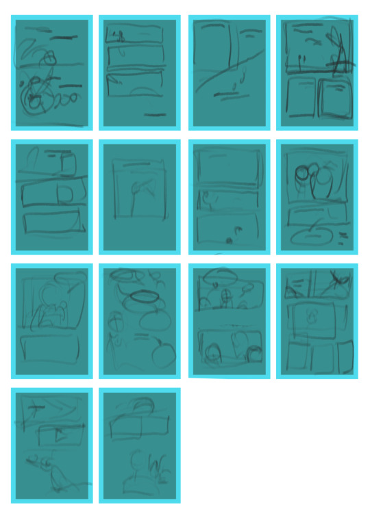
note: the bright blue border on all the 'pages' is just to indicated where i should try to keep my panels.
it's extremely shitty but it's decipherable to me, and the whole point of thumbnail is that you're hopefully saving yourself time in the future by getting all this planning out now. --
3. Colour: Colour blocks are how I plan out how a comic's colour scheme should look as a cohesive package. Although I didn't used to do this for comics, I do it now ever since I wasted around 8 hours on patchwork canary just fiddling with the colours (ugh). I'll usually go into a project knowing what kind of tone I want to convey with it, which gives me a launchpad for what kind of colour scheme I'd like. For instance, RED, one of my best comics, only uses three colours (black, white and red) and that limited colour palette enhances the message behind it. I think it wouldn't be nearly as impactful if it was all standardly coloured - having that contrast pushes Red's impact as a significant character in the narrative by making her pop on the page.
In a similar vein, almost all of the sunset's emotional complexity gets expressed through its colour palette of red, blue and yellow.
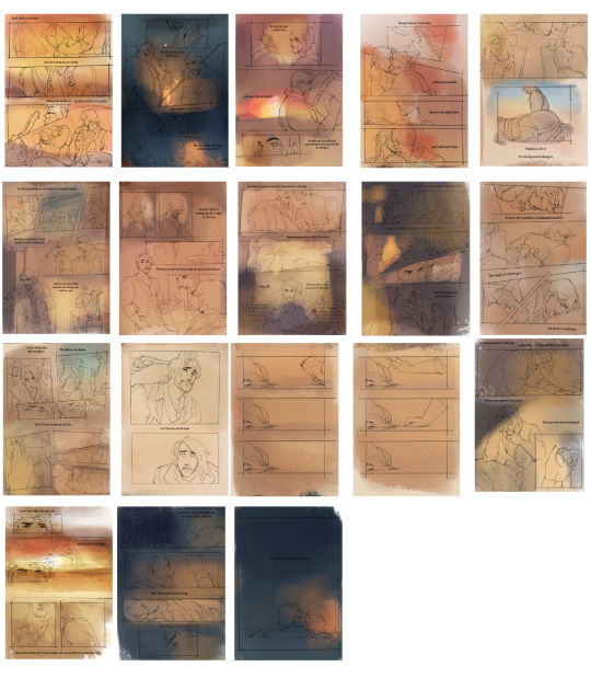
Even though it might be more conventionally coloured with shading and whatnot, the choices behind making certain scenes darker/lighter and etc really sells the story more in my opinion.
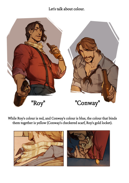


These are the colour thumbnails I made for bite of winter. It's incredibly rough, but at a glance you can tell the comic doesn't have any particular page that is jarring or pulls you out of it.
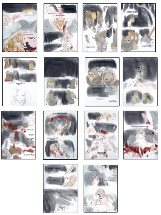
As one more note: I'd advise doing all thumbnailing/colour-blocking at a much smaller size than the actual page is going to be. It keeps you from obsessing over fine details, and encourages you to just block in shapes and colours really quickly.
--
that's all from me for now. I hope this helped, and I wish you luck on your project. Pace yourself! Comics are more work than people ever say they are, and it's good to just take your time and enjoy the process.
368 notes
·
View notes
Text
So, I had this idea as I'm getting close to finishing the Election arc of my Roleshuffle AU to go through my previous comic pages and point out everything I did wrong :) This is all for funsies, and I feel like my art has gotten a lot better with the Election arc. Plus, I think it's very important to go back and critique yourself to 1: see how far you've come and 2: to better understand where you tend to make mistakes. So, let's get critiquing!
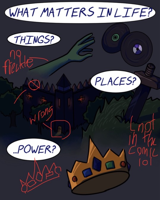
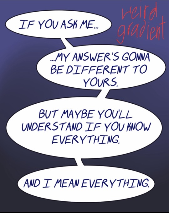
Soooo starting off, I really didn't know how to make a comic. I had only done very brief, minor comic making before, so this was a completely new field of art that I wasn't used to. You can immediately see that problem in the first and second panel, since they. They aren't a panel. Nothing about them (minus the speech bubbles) indicates that this is a comic. I think the first would have benefited from each item being properly separated, and the other would have benefited from an actual image behind it; not a gradient. Speaking of the items, that's supposed to be Sam's hand at the top, and it is freckle-less (no clue why I forgot to add those lol). Some other consistency things that are weird is that L'manberg has no tower entrance, and there aren't any trees surrounding it in any other drawing. On notes of consistency, the sword there is supposed to be Techno's, but the design changed later to have a gold hilt. I guess that change never reached this panel, so now that just looks like a random sword stuck in the ground. Nobody's sword in the comic looks like that haha. Similar deal with Techno's crown: the spacing of jewels is not consistent with how I draw it in the rest of the comic.
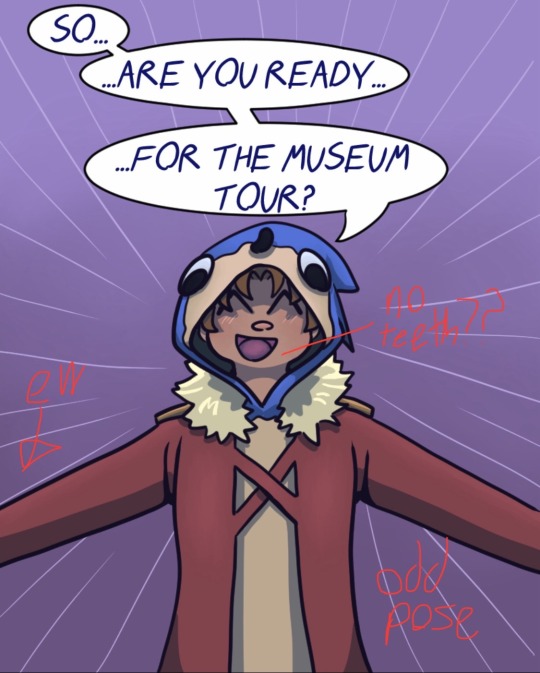
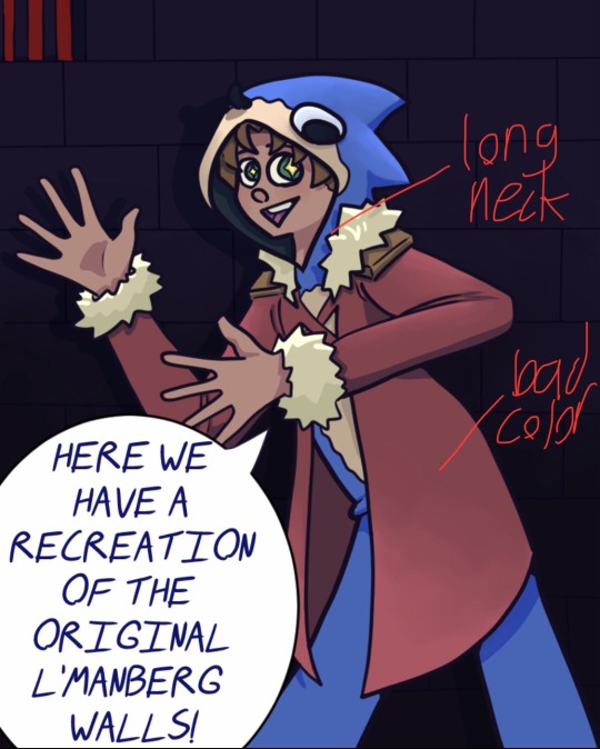
Moving on! The next two panels of Connor aren't bad, per se, they just aren't good. (I'm mainly bothered by the fact that he doesn't have teeth in the first one.) Also, because I didn't want to draw hands and cut his arms off, it just looks like the framing of the panel is all wrong. Plus, I don't think I've seen anyone pose like that in real life. He looks like he's about to hug you, which is not the vibe I was going for. In both of these panels, we have what will become a reoccurring problem throughout: loooooong neck because I didn't draw a base figure before drawing the clothes. Connor's face should either be longer in these panels, or his shoulders should be higher. Either way, the neck does not look right. Another reoccurring problem you'll see is dull coloring/shading. I'm still working on this, to be frank, but these images all look rather dull. There's nothing unique about the lighting/colors, so it doesn't really pop like it should. Either I needed to add more dynamic lighting or be better at highlights.
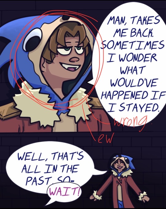
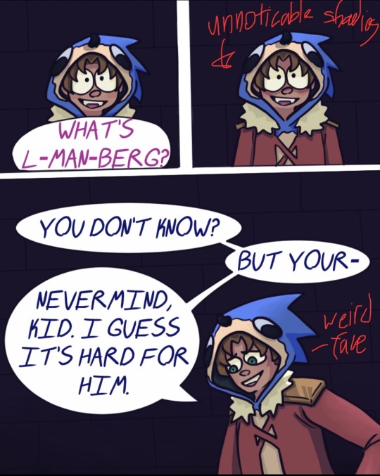
Yet another case of long neck. Oh, and weird positioning on the facial features. The eyes feel stretched across his face instead of, well, where they should be. I also think in these opening panels I really fail to encapsulate Connor's personality. I was really banking on the fact that he's a silly little comic relief character in the canon dsmp, but his delivery is very dry/flat whenever I watch old clips of him. Therefore, in the early bits, he just seems a bit off because of the high energy I gave him. Next up we have a bad case of something that looked good in the sketch but did not come across after coloring. What I wanted to happen was his face to gain some anime-type shading that screams "oh no", but it just wasn't strong enough, so the end result just seems like I copied and pasted the same panel for no reason. Also, in the lower image, Connor's face does not look right. I can't really put my finger on why, but it's either because his eyes are uneven or that the facial features, once again, kind of stretch across the face.
aaaaand I originally wanted to go through the whole first part of my comic, but this is turning out to be very long. So that's a tomorrow project. Hope you enjoyed my critique!
#dsmp#dream smp#dsmp au#dsmp roleshuffle#dsmp comic#mcytblr#artists on tumblr#dsmp fanart#mcyt#mcyt tag#dsmp connor
22 notes
·
View notes
Note
please how do you pick colors 😭 I'm trying to learn how to color and I am obsessed with your comics (like your ivantill ones lol) and how do you pick such a cohesive color palette and choose where to put what????
Your art is amazing like actually :) happy holidays!!
😭 tysm anon and happy holidays to you!! i did my best to explain some of the process behind my color picking and choices for the ivantill comics under the cut, i hope its coherent cuz quite frankly it also takes me a long time to decide what colors to use
a little disclaimer: i tend to just put base colors, before i start adding shading or lighting. i also dont usually start off with a fixed color palette in mind, because my process is pretty much figuring out as i go along, and playing with all sorts of colors; however whenever i do end up with a fixed idea on the color palette the process is still applicable anyways so hopefully its helpful for u too :’]
ok so i usually decide colors by asking what kind of mood or tone im going for. for example, the recent ivti comic i did
the comic imo is pretty playful - theres a romantic element ofc but i think the focus is rly on how ivans being kulit / annoying as usual so i thought a spunky, albeit warm color would rly fit. theyre also chilling in tills house so i thought a home-y, comfy feeling would be good
i was still playing around, so for the first attempt at realizing that tone, i added a hot pink multiply layer to see how it looked
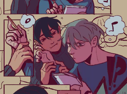
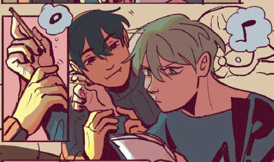
(first attempt vs final colors) (also im sorry for the low quality procreates timelapse is wack)
ironically enough it actually created a really cool looking color palette which was not what i was going for. so i kept testing colors for a bit; the shadow is hot pink, and i ended up going for a bit of a desaturated green as a base / overlay because it mellowed out the pinkness. i also put both the base and the shadow on a darken (50%) layer so that the og colors peek through a bit more compared to a multiply layer. in the end tho, i ditched pink and went for a saturated red
the green also makes for a nice complimentary color to the red, and it overall has that home-y, warm but playful feeling i wanted to include ⬇️
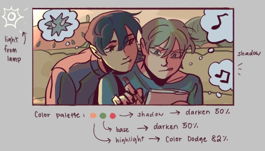
i added a highlight layer (color dodge, 82%) so that it pops a bit more, and also bc i knew i was gonna draw a big lamp on their right in the bg. speaking of the bg i made it a green/yellow hue so that the base for green on ivan n till make sense, and it ended up working for the best cuz the red acts as a nice contrast
(admittedly i think if the lighting of the room is green the shadow should also be green, but tbh i tend prioritize contrast as much as possible regardless cuz it looks nice 🤡 even if it fails to make sense realistically its for the vibes)
^ i ended up remedying this a little bit by adding bits of green to the shadows on ivan n tills hair and clothes, and also because its fairly complementary to the pink palette i have going in for the shadows and even the highlights (esp on ivan)
i also decided to shade in dark parts in the lineart so that it pops a little more
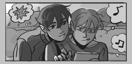
looking at the values also really help! esp in comics, where each panel can have its own lighting depending on what angle ure drawing. u can do this easily by adding a pure black layer above the entire piece, and setting it to color (100%)
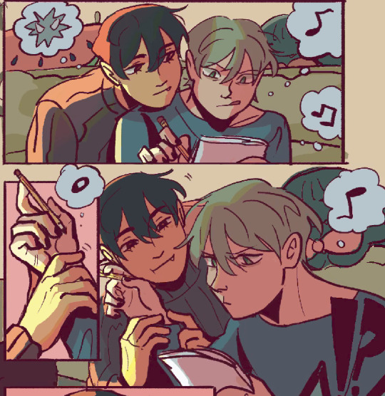
for me the values actually made me realize things that may look too similar, which usually leads to me changing the color. for example, the couch and stuffed animals behind ivan and till were actually a lot darker before i changed it. bc it kinda blended into ivti a bit, it also got the eyes’ attention away from them. i ended up adjusting their hue and values so that it matches the bg, and ivan and till stick out more (alongside other color adjustments) ⬇️
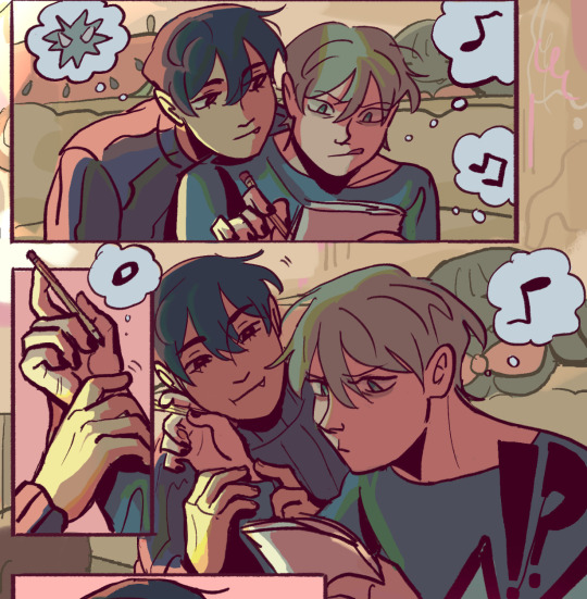
changing the lineart also helps quite a bit! i made the lineart for ivan and till a little darker, while the bg elements got a darker green instead so that the bg elements dont take as much attention
looking at b&w values also helped me realize that the og pink i was using for the panels was a little too dark, so i made it significantly lighter so that the panels stick out more (esp bc they take huge precedence in the second page)
(og panel color vs final)
and finally when i pick all the colors and am satisfied with them, i merge everything into one final color layer for easier rendering :> procreate (and im sure other programs) allows for color / hue adjustments so you can def play around with those!
as for the harana / first ivantill comic i made, it had all the similar steps of the recent comic so ill just talk a little bit about the palette
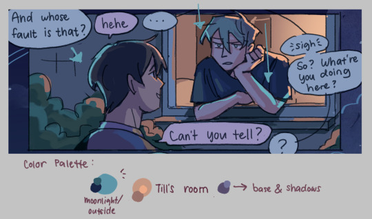
so im ngl this comic was a bit of a struggle to color for me,, cuz i wanted it to be romantic but it was set at night. usually that dictates cooler tones and colors, but i was aiming for something warm. thats when i figured i could just let tills room wash an orange color, which would help with making warm lighting but also help till and ivan stick out again from the surrounding darkness / blues
i went with a purple base, cuz i thought it was a nice warm ish color at night and it makes blue and orange pop. i also figured that i could make the base both purple since the highlights are the most attention grabbing / contrasting colors
also used the moonlight as rim lighting so that ivan sticks out a little more,, i also figured that tills room would be projecting harsher lighting over the moonlight
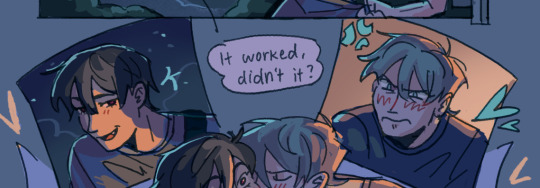
lighting it this way also allows for nice color contrast regardless of what character is in the center: ivans outside but awashed in orange lighting (from tills room), and tills inside but hes sticking his head out a little so hes noticeably purple. it allows for characters to stand out while also being pleasing to the eye
and im ngl i cheated a bit again 😅 i think till shouldve projected a shadow on ivan a couple of times and the highlights might be too harsh but again i just prioritized making their facial expressions seen LOL
for this one i didnt use any layer modes aside from (if i remember correctly) a purple multiply layer and overlay for shadows and base respectively
and thats pretty much my process for figuring out the colors !!
TLDR; i look for the mood or tone im going for, try to make interesting contrasts / complimentary colors and i also double check if each character sticks out by checking values :> it really helps me too to play around a LOT, i think it takes me like an hour or just 30 mins to figure out what colors to use and also adjusting it significantly when i merge everything together
#asks#im sorry this is so long 🫡#hope i was able to help u anon#but ty for the ask it means a lot to me !!#esp cuz i also still struggle with colors
13 notes
·
View notes
Note
Have u ever posted your comic or animation workflow anywhere? Im super curious on how you tackle the process, especially not using a drawing tablet. I know you have a very simple (and adorable) style so that probably helps in terms of workflow -- Im just curious about the steps you take.
Thank you! With both comics and animation my key thing is to not spend too much time on any particular thing, just draw loose and fast. Honestly the only downside to drawing with a mouse is that I can tell my arm has extremely specific muscle memory regarding it- if my mouse breaks and I get a new one I have to spend a good month or so just letting my hand get used to it again lol. Same with if my setup gets readjusted too much- right now my setup is my mouse on one of those padded mousepads, on top of 2 books, with my elbow resting on my 3DS case (I'll get an actual pillow or something for it eventually lol). But luckily thanks to this I suffer very minimal wrist pain 👍
(...Okay I started to go really in depth in my process here, so sorry if this is way more than what you were asking. Putting it under a readmore just to save space lol)
With MFM in particular, I start by writing out the entire script for the next story arc, which really is just all of the dialogue and vague notes about any important actions. Then I do the paneling with very loose stick-figure like sketches of where the characters are and what they're doing. I prefer having very little planning when it comes to character poses and panel shapes, coming up with those on the fly makes things much more exciting and faster to make. But it's the opposite with dialogue... it needs to be 100% FINAL before I draw a single line lol.


That's part of my script for my most recent chapter, as well as what my extremely loose goofy thumbnail sketching is like. I write the script as one big thing and don't separate it into pages until I actually start drawing- then I go and color change it just to keep track of what dialogue goes on each page
After that, I go back and do the ACTUAL sketch, as well as the lettering (I don't believe this is how it's done professionally. I used to do lettering as the very last step in the process... but then found it hard to cram speech bubbles in the right places lmao.) After that is lineart, coloring, background flat colors, then shading/rendering for all of it. I do each step in batches, as in I sketch out ALL pages of a chapter before moving to lineart, I line ALL pages before starting coloring, etc. I find it way easier to be productive when it's broken up like that, though when I first started the comic I used to draw each page to completion before starting the next (but also, the comic's style was DRASTICALLY simpler back then haha)
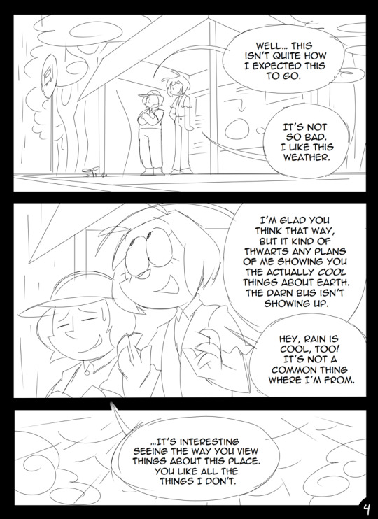
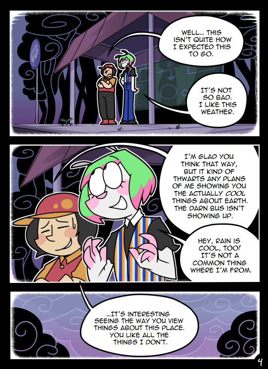
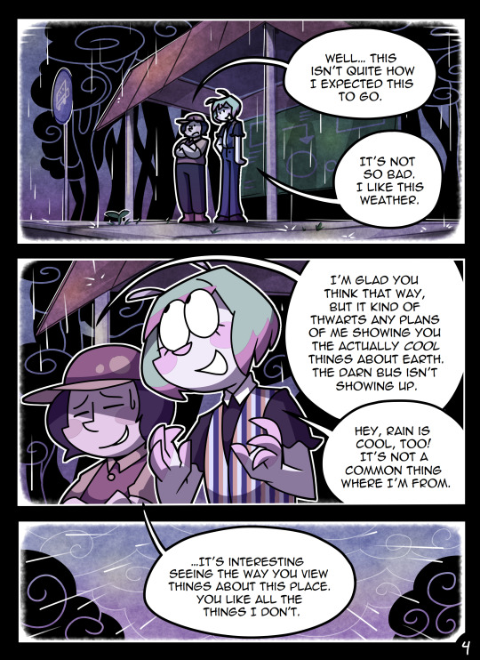
(Unfortunately I merged some of the shading to the background flat colors so it's not entirely accurate... oops) FireAlpaca has a sand texture feature that I only found out about last year- adding that to the backgrounds makes them look 10x better with WAY less effort.
With animation, it depends on the project. For simple 5-10 second animation I make for fun, there's very little planning lol. I skip some steps in the process- I'll sketch out the keyframes (and maybe any difficult inbetweens if necessary), line those, then go straight into making linework inbetweens. I'm not a cleanup artist and have no experience in that, so I always find trying to line my rough animation makes everything jittery and wobbly. If I do it with a clean line from the start then I can avoid that and save a lot of time 👍
For my bigger projects (such as the Parvey cartoon and the MFM Kickstarter trailer), I do the whole animatic with final audio first and foremost, with the animatic being almost like the keyframes. I split them up into individual shots, .mp4 files anywhere between 1-30 seconds usually, and animate those one at a time. I'm a huge fan of free to use programs and try to use them as much as I possibly can, here's a list of the ones I use:
FireAlpaca- for the actual drawing part itself (storyboarding/animating/etc). FireAlpaca has a feature that lets you export every frame as it's own drawing, as well as an onion skin mode
Windows Movie Maker- for compiling all of those frames into video format, creating individual shots. If you upload all of your frames and set them to around 0.08 seconds, it equals about 12fps (I usually animate at 0.10 seconds/10fps, its a bit slower but looks nice)
Onlinesequencer.net- for making music. It's the place I've made all of my songs on, like the timeloop song, hyperworkaholic, and the background music for the MFM Kickstarter trailer.
Audacity- for editing audio/music. Also great for recording things directly from your desktop
DaVinci Resolve- for editing and putting together all of the shots into one big video. Can get kind of intensive on the computer during rendering, so watch out.
YouCut (app)- also for editing and compiling shots, I used this one a lot a couple years back but I'm not sure how well it holds up. Doesn't need much phone storage to download but needs a lot to render videos.
MS Paint (yes really)- for typing up text. FireAlpaca has a text option but I don't like it as much as Paint's.
...The only thing I genuinely can't do alone is voice acting. Luckily there's a big voice acting community on Twitter and they're all amazing to work with!
This got... way more in depth than I planned for it to be, so sorry if this is way more than what you were asking lol. But that's my general process when it comes to my art 👍
32 notes
·
View notes
Note

[ID: A comic titled "Toppld", drawn on paper with a pen, pencil, and a very limited pallete coloured pencils.
Panel 1: a greyscale stick figure labeled "toppld" is handing three green stick figures with slightly varying colours and body types (not identifiable as preexisting characters) buttons of the shade of green used for the green pride flag.
Toppld figure: Here, for pride. Have fun.
All three green stick figures are depicted thinking of a variation on a smiley face, and two are already wearing one of the buttons.
Panel 2: depicts the front page of a generic newspaper called The Times
Starts with a text blurb off the newspaper page saying: Literally later that week...
On the paper, in all caps: Toppld bans Green on air
In regular text, as the beginning of the article titled above: Green people can no longer appear on-air on the station as...
which cut off to an illegible rest of the page made of fake squiggle text.
The page includes an image of the green button that the Toppld character in panel one was giving the green characters.
Behind the first page, a cut off part of a second page in the same style is shown due to crude folding of the paper, with articles relating to The Contraption and Lockheed-Nestle. The former is not elaborated on in the real text, and the latter is meant to be about the portal to hell, however the artist fucked up while trying to write that part as the first line, which us instead barely even legible.
Panel 3: A depiction of the apartment that the established characters Leaf, Lime, and Moss live in. Moss is sitting on a couch with Lime's head in their lap, with posture that indicates that that's the only thing keeping Moss from getting up and storming off. Lime is holding one of each of Moss and Leaf's hands, with their legs crossed up on the couch, appearing to almost be curled in on themself. Leaf is lying on a carpet on the floor between the couch and a coffee table with the newspaper, with their other hand on their face in the stick figure equivalent of a facepalm. The apartment includes other details such as both a green and rainbow flag on a small end table, a portrait of the three together on the wall, and a cross stitch of the quote "Unsurprisingly, I don't regret this thing I did on purpose". The scene includes the dialogue:
Moss: ...I'm gonna kill that executive.
Leaf: ...maybe later.
End ID.]
did i do that right? i really hope it isn't too wrong.
concept from this post.
this is really treading the line of being a bit too on the nose but ehh...
i'm imagining toppld as a really minor news source, mostly watched by the exact kind of people who would actively support having green people on air.
ptmyg is my new hyper fixation, you'll be seeing more of me soon (and that may or may not be a threat)
Oh this is good, this is really good
91 notes
·
View notes
Text
DTIYS WINNERS
Reminder again of the prizes
1st, a custom comic (probably at most 3 page panel things) 2nd, a rendered drawing (One character) 3rd, line art (Little to no color)
I had help from a neutral party with picking these prizes because I'm so bad at picking things and I loved all the submissions so much, I wish I could give everyone a prize. I cannot thank you all enough for putting time and effort into your submissions, they all hold a place in my heart and files because I'm saving those to a folder lol
Let's get to it and thank you all again!
Starting with 3rd place! (simple lined drawing)
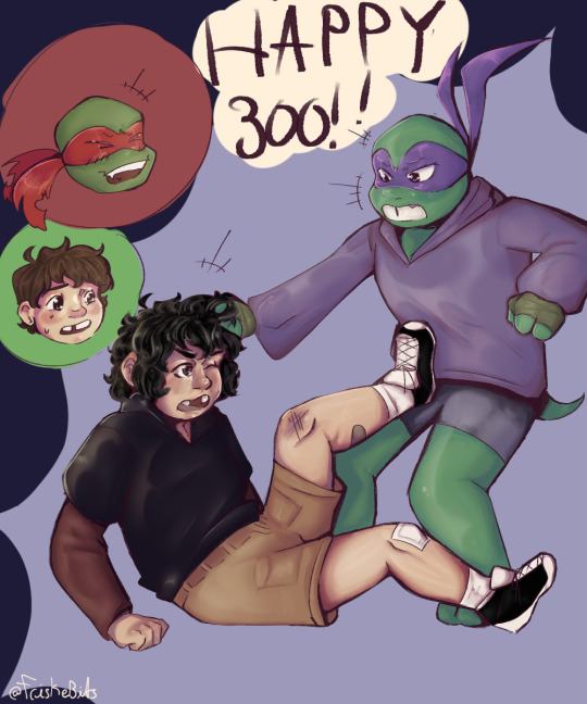
@friskebits submission! I loved the rendering and that hair??? Tim looks so perfect and I love my son. As much as I hate you and never want to complement you (/j), I have to give you that Unfortunately, due to your constant harassment, you get get no more than 3rd😞(/j again)
2nd Place (Fully rendered drawing)

@glitter-alienz submission! I love your detail and lighting so much, you really make them look like the goobers they are, I love Tim's face so much, he's SO SILLY. I love your art so much in general and I actually shed tears over this one so it had to win something. I stared at it for so long it was burned into my eyes /hj
and finally, the winner...
1ST PLACE (custom comic)

@i-am-a-living-god's submission!!! This one took my breath away!! The angle, the rendering, the blur on Donnie's arm??? There's detail but it's not cluttered, I love this kind of shading and lighting so much, there's so much to look at but I don't feel overwhelmed. The movement of the drawing, it's so dynamic, I love it so much!!!
Winners, dm me for the prizes, declining is okay, the prize can go to someone else
Honorable mentions:
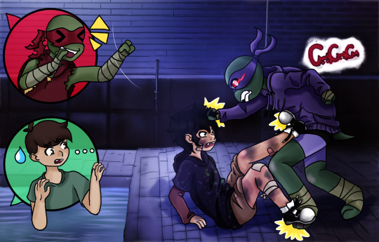
@cursedcatchild's submission! The background is amazing and so detailed! The girls really are fighting!! The shading is simply amazing and the lighting is subtle, it's so nice!!

@allyheart707's submission! Everyone knows Ally, she's so nice it's scary somtimes! I lloved the background and that you drew my perfect amazing son Tim fully and he looks so cute, Raph is there too and he also looks good! I love your style of lighting and shading, it's so smooth!
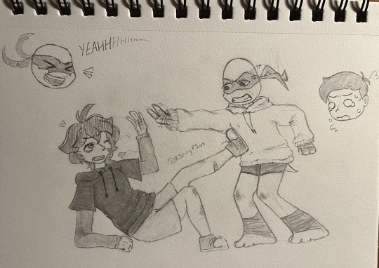
@k3nnyp1us's submission! You got it done yay!! I love this one, not just because of the whole storyline roller-coaster that came with it. I love this art stye in general, I always love pencil drawings in general, I love how floofy Casey's hair is and how the clothes are done!
Big thanks to everyone who submitted something! I wish I could put everyone as an honorable mention, but I'm keeping this post as short as I can. I loved your art so much and I really wish I could give everyone a prize but there are so many of you, I was really not expecting to get more than three submissions, thanks again everyone!!
#chaosdtiys300#childhood dreams tmnt au#tmnt#tmnt 2012#tmnt donatello#tmnt casey jones#tmnt 2012 casey jones#tmnt donnie#tmnt 2012 au#tmnt 2012 raphael#tmnt raph#tmnt raphael 2012#tmnt raph fanart#tmnt raphael#tmnt raph 2012#tmnt 2012 donatello#tmnt 2012 donnie#tmnt 2012 raph
34 notes
·
View notes
Note
as an artist who just wants to get to drawing the pretty clothes and is terrible at posing i am forever enamoured by your poses..... they have so much energy and movement!!!
was this via art study, a general knack for anatomy or do you just enjoy posing specifically? and do you have any tips?
(i was just wondering bc your pose work is always so dynamic :D (your lighting also slaps /pos))
this is one case where it's a secret fourth thing lol. I have never successfully studied a single thing in my life, I am not at all a naturally "gifted" artist (and as well I reject the idea altogether), and posing has never jumped out to me as its own task in drawing at all! the way I do anything art-related, and posing specifically, is a lot more mechanistic than how it's perceived I think; I've just assumed this came as a function of how narrative-forward I see art, and how much I focus on comic work.
what folks talk about as "posing" I usually think of in two terms: composition and character acting. composition is how the figures fit into the intended frame, and character acting is the actual motion that'll be portrayed. you can see how that logically works itself out! there are more words than stars in the sky written about composition already, I honestly don't think there's anything I can say that'd be more useful than words from artists like thomas romain. character acting is itself more a matter of writing than visual art to me; you've got a guy and they probably do things, you draw them do those things, that's really it. the rest of it is just, figuring out weights and accenting in a scene, shape language, line flow, discipline-specific stuff like that; since no matter what I'm drawing I always mentally think of it as a comic thing, I usually try to insist on the strong points of that medium, one of which is colloquializing shapes to imply the entirety of a movement through a single panel. I don't always succeed at this! I hope to do better in the future. but it's how I approach this matter.
I think sitting down with your art to think about like, how you're approaching it and what you're in it for would help with troubleshooting a lot of the times. it's helped me before! I'm a completely hedonistic artist, I don't draw what I don't want to draw. what is it exactly about posing that's giving you a hard time? is it something you can do without? usually it is. if it's the thinking up a pose part, you can copy poses from high fashion magazines and sewing pattern models and just photos you find. if it's the fitting a pose into a nice looking complete picture part, don't make it a nice looking complete picture, do it sketchbook style, collage a buncha stuff together. if you never want to think about posing ever again, that's what stock bases are for! make urself some or get some from an artist and just draw the nice clothes.
if ur committed to figuring out posing and wanna ease urself into it, I find prompt lists are pretty good for giving ur brain a ground to build on top of and start asking questions. it's also a good exercise to sit down before drawing a thing to ask urself what u want it to be like, genre-wise: is it gonna be a comic cover, or a family photo, or a professional photoshoot, etc. these things have their own visual languages, and keeping that in mind will direct u on how to frame and choose the movements for ur piece. or, if that's overwhelming, drawing characters running is always good! there's plenty of character acting involved in there, it shows off the physicality of the clothes nicely, and it's decently easy to frame.
(I am similarly mechanistic about pretty much every other aspect of drawing lol, lighting/shading included. fully a case of "if it looks alright I put it in, if it doesn't I don't do it". I still struggle with it every time I do colors, but what can ya do. if the piece asks for it that's what it'll get. thank you very much for the nice ask!)
#not art#ask#ngl when u mentioned in ur ask that u like drawing clothes but not the poses I immediately went that is in fact a whole discipline#that's fashion sketching! I don't Like that discipline because the point is the clothes (and also every mainstream example of it#is an artist drawing the thinnest skinniest most featureless figure ever lol) but art that is just about drawing clothes#definitely exists#I find generally keeping art modular is a good practice. most things in art you can fully do without#if you don't wanna do lineart you don't have to do lineart! if you don't wanna color you don't have to color!#nothing about drawing is an obligation. school is made up. don't make it unfun for urself!#you can't get good without getting comfy. honestly you don't even have to get good you can just draw for fun forever#''improvement'' is for people with somewhere to get to. if ur just hanging out sightseeing why hurry and miss the sight#I've said here before that I like giving characters clothes and usually that's read as ''I like drawing clothes'' but#there's a whole second half of that sentence folks seem to gloss over usually. which is ''I like drawing characters''#and honestly the ''clothes'' part is sequentially secondary to the ''character'' part. it's actually all character art to me lol#if u give me a featureless nothing base model to give clothes to I would not be able to do it. that means nothing to me#thats why knowing what ur up to with art is important I think. when u know what ur in it for u can focus ur search for materials#and references and tutorials etc. u can separate the art u like looking at and the art u like doing#and u know u don't have to feel all kindsa ways abt other people doing art that u like looking at but would have a Bad time making#hope this has been helpful at all! no refund if it hasn't sorry that's store policy. my house!
13 notes
·
View notes
Text
I Hate Lore Olympus (Sorry Not Sorry)
Note: I know that "hate" is a big word and that "dislike" is more fitting. But I never thought that I would ever encounter a comic that is so bad from its very beginning, so I have all the right to use it.
I remember that back when I was around 13 I heard for the very first time about Lore Olympus. I was already into Greek Mythology back then, but I hesistated reading/watching Lore Olympus and I remember myself abandoning it exactly in the middle of episode 10.
So I'm going to talk here about every little aspect that I didn't like about it and made me willing to abandon it so far.
The Colors
Look, I know that associating each god with a specific color based either on their role or personality isn't a new idea; we already see that in Disney's Hercules. At first I was like: "That must be interesting. I mean, it’s an easy way to distinguish each one of them, right?" But then I realized that the main reason why the creator chose to do that in the first place was because she wasn't too good at drawing. There are panels in which the characters are looking normal, and others in which they don’t look like themselves. The only thing that indicates you that yes, this is [Insert Name], is purely their color.
Also, I do not like the choice of color for many characters as well. For instace, the only reason why I believe that Hades is blue and Persephone is pink is because of the "boys=blue; girls=pink" stereotype. Also, why are Zeus and Poseidon purple and green, respectively? For me, it would've made more sense if Zeus was either white or golden and if Poseidon was the blue one. For Hades I think that either black (mortuary color), purple (associated with the riches) or at least a shade of grey would've been a better choice. As for Persephone, I think that ivy, teal, liliac and indigo would've all been better options.
Oh, and... why is Minthe red? Judging by her pointy years the creator wanted to make her look like some sort of a she-devil instead of a nymph. Mint green would've been a better color choice for her.
The Art Style on its own
This is a very subjective opinion, but I don't like this way too colorful, cartoonish design. I quess I'm just way too used of Seinen and Josei, lol.
On a serious note though, back when I was 6 I literally had a fairy tale book full of graphic/explicit illustrations. Inside the "Bluebeard" chapter there was literally an image with all of Bluebeard's previous wives beheaded, tied and thrown into a pool of blood. Not a very long time ago we used to tell our kids stories about cannibalism and child abandonment (looking at you, Hansel and Gretel!), because children are capable enough to understand that life isn't just rainbows and love and that bad thing are happening too. Are you really going to tell me that a pre-teen cannot read a comic series unless it's extremely colored and looks like something made by Disney?!
Minthe
You could've made Minthe either Hades' ex or a girl who tried to seduce him while knowing that he is already in a relationship. In these cases I would understand why you would choose to villainize her and turn her into the Big Bad Guy. But the fact that she and Hades were already in a relationship and he was willing to have an affair with another woman without any hesitation justifies her anger completely, anyone would be angry if they would know that their partner is cheating on them. The choice of making Persephone the mistress instead of her and then acting as if Minthe was in fact the bitch all this time is horrible.
Persephone
I want to know:
Why does she look and act like a child? Just because she was initially an "innocent flower girl" or something like that before she was kidnapped in the original myths that doesn’t mean that she has to act straight up like an infant. This kinda reminds of some sort of a Betty Boop situation: she's basically a character with the head of a child put on the body of a grown sexy woman; which not only that makes men thirsty over her, but helps them to easily manipulate her as well.
And look, I know that Homer is partly to be blamed for this as well: he describes her as trim-ankled and buxom all the time, so in this case it's alright to criticize the poet for the amount of unnecessary fanservice. Don't take this part too seriously.
Why is she only 19 whereas Hades is 2000+? Look, I know that even in the original Greek Mythology there is a generational gap between Hades and Persephone, but you could've made her at least a few centuries older. Was it that hard?! In this comic Hades is both physically and mentally WAY older than her, which instantly makes this relationship creepier than in the original myths. What is next, making her a minor?!
Why is she this little cupcake uncapable of doing anything wrong? Give me a complex character as a protagonist, not a Mary Sue. I understand that you wanted a compassionate and emphatic Persephone, but you know that just because someone is nice that doesn’t mean that they're automatically naïve or stupid, nor that they cannot have layers, right?
Hades
Look, I know that for a significant amount of time Hades was considered the equivalent of Satan and by extension depicted as evil by the Christian Hollywood. But just because he wasn't the devil that doesn’t mean that he automatically was this innocent shy awkard cute saint that never does anything wrong and should be raised in glory. You could've at least give him a dark and dour personality: make him morbid, brooding, sarcastic, surly, insufferable... I don't know, just anything. Besides, I don't like how the narrative acts as if he has no fault at all, when it's quite obivious not only that he cheated on Minthe, but that both of them are toxic and abusive in this relationship, not only her.
Ah, and... he's a creep. He's more of a creep here than in the original Greek Myths, and he's literally kidnapping her there. It's very obivious that he likes Persephone only for her body and nothing else. Even Plato wrote: "This is the reason why Haides, who is wise, consorts with her [Persephone], because she is wise." once.
Remember that moment from episode 8 when she asks him to help her with her hair, and he not only that immediately assumes that she wants to have sex with him, but also tells her that they can do that in the kitchen but to be careful because he has loud neighbors or something like that? That was straight up disgusting in my honest opinion and not exactly something that the ultimate gentleman this narrative presents him as would say.
Demeter
I vaguely remember one moment when Demeter shows Persephone a greenhouse or something like that, which turns out to be a cage. I can't tell for the moment if it was a dream or something that actually happened, but depicting Demeter as an overbearing mother is an instant big no for me. If anyone dares to demonize her just because they ship Hades and Persephone then I invite them to sleep in my trash can, no discussion.
Aphrodite
I just want to know why is Persephone more beautiful than the Goddess of Beauty. You cannot make the Goddess of Beauty less attractive than your MC, just because all the focus is on her.
Overall, I am very glad that I didn't continue it, and that because, from what I heard, things are becoming creepier and creepier with each chapter, and the entire comic is an insult to Greek Mythology (I can tell).
14 notes
·
View notes