#coloring with copics is kinda weird in a good way
Explore tagged Tumblr posts
Text

Little agents
#my art#splatoon 3#splatoon 2#splatoon#agent 4#agent 3#captain 3#agent 8#inkling#octoling#neo agent 3#coloring with copics is kinda weird in a good way#still looks murky tho
294 notes
·
View notes
Text
Blood is Thicker than Ooze | Chapter Six
Word Count: 3524 Warnings: Bad Parent Draxum, Hurt Donatello, Unreliable narrator, Psychological abuse, Separated Donnie AU Description: Purple is the son of Draxum, a great warrior alchemist. With his help, Draxum will eradicate the prophesied human threat, and restore yōkai to the surface. Purple doesn’t understand why these three turtles are trying to stop them.
Navigation First | Previous | Next
Leo rolled his arm in its socket, trying to will away the pain he felt in his arm. It wasn’t broken or sprained, which was good. It was sore from being kept at a weird angle when caught by that Draxum guy's cocoon trap.
Dad was still watching TV, just as he was when they had left. He wondered if the old rat had even noticed their absence before shaking his head. He sometimes thought so little of his father, despite what he gave up to raise them… It’s not like Splinter chose to become a rat, nor did he decide to raise three baby turtles all on his own in New York’s sewers.
He knew he was probably his least favorite. Mikey couldn’t be disliked by default; he was the youngest and sweetest. Raph was kind and strong. There was nothing to suggest that Dad didn’t like him or that he might like the other two. Leo could never shake that feeling of inferiority.
“Leo, your arm okay?” His older brother’s voice pulled him from his thoughts. The large turtle mutant had a worried expression on his face; one Leo was familiar with. Raph worried too much, in his opinion. But he knew Raph didn’t think Leo was concerned enough.
Leo gave him a thumbs up with the sore arm, ignoring the discomfort it caused him. “All good, big bro! Just a little stiff, is all. What about you and Mike’n’ike?”
“I’ve got no wounds,” Raph answered but looked worryingly at Mikey, who sat crisscrossed with an old iPad in his lap, either drawing or playing a game. “I’m worried that Mikey got hurt, though.”
“‘Wounds,’” Leo repeated with a chuckle before directing his attention towards the youngest of the three. Mikey was capable of many things, and Leo was painfully aware of his abilities. But he would always be his little brother, and he understood why Raph thought him so fragile. Not only was he the youngest, but he was also the smallest. Raph was always a little rougher when they were younger and had accidents when it came to playing with Mikey if he wasn’t careful enough.
“Mikey,” Leo called, causing the younger turtle to look up at him. “You got any ‘wounds,’ as Raph would say?” Leo could practically hear Raph roll his eyes.
“Nope!” Mikey said with an enormous smile, returning to what he was doing. Leo saw that Mikey was holding a pencil and figured he was probably drawing. It was Mikey’s thing- other than cooking. Despite being named after artists, Leo and Raph never took up drawing as a real passion. But Mikey always had a niche for it.
“His birthday’s coming up,” Leo said quietly to Raph. The older turtle nodded, glancing at the youngest for a moment before returning his gaze to Leo. “Maybe we could get him some of those markers he likes?”
“Copic?” Raph asked, clearly hesitant. “We got the pack he currently has at a discount from April’s old job- and even that was kinda pricey.”
“We can just buy a few colors,” The middle turtle suggested with a shrug. “We could ask him what colors he needs more of- or if he's run out of ink with some. I think they sell individual Copic markers at the Micheals near April’s apartment.”
Raph nodded and patted him on the shoulder before yawning. “I’m gonna hit the rack. You should, too.”
“Will do,” Leo assured him and watched his big brother disappear into his room. Leo was admittedly tired, but he knew that sleep often evaded him. There was no difference between being out and about while awake and being in bed, staring at the ceiling, and being awake. He made his way towards Mikey, observing his newest drawing.
It wasn’t incredibly realistic, which wasn’t a problem for Leo. Mikey had a very original style, and no matter what any pish posh artist said, it was his favorite art style in the world.
Mikey had a sketched turtle that looked like Leo but… different. “You testing out a new style?” He asked, sitting next to him on the floor to watch him draw.
Mikey shook his head. “I’m drawing the turtle we saw today.”
Leo stiffed unintentionally before forcing himself to relax. Was this a coping mechanism? “Don’t worry, buddy,” He said, bumping his shoulder softly with his own. “He’s not gonna hurt you.”
Mikey laughed at that. “I’m not scared of him!” The orange turtle said earnestly before slumping a bit. “Do you think we could be related? He looked like a turtle. He looked a bit like you, honestly.”
Leo hesitated for a moment, biting his lip at the comparison. “I don’t think he was a turtle. I mean- the thing on his back was more like a backpack than a shell. Plus, he didn’t look anything like me! I’m way more handsome.”
Mikey chuckled, and Leo smiled because his little brother was, too. “Yeah, you’re probably right. Dad would’ve told us if we had some crazy long-lost brother.”
“Yeah,” Leo hummed before nudging the younger turtle softly before getting up. “You should head to bed soon, ‘kay?” Mikey nodded but had a reluctant look on his face, causing Leo to pause. “What’s wrong?”
“It’s a little stupid, but….” Mikey fidgeted with the pencil between his fingers but sighed and continued despite his apparent anxiety. “I’m still shaken up from earlier. Not about the not-turtle cyborg guy- just the goat man.”
Leo’s expression softened in understanding. “Wanna do a pile like old times? We could all sleep in Raph’s bed- I’m sure there’s enough room.”
Mikey stood up, his iPad held against his chest, as he followed Leo toward their older brother’s room. Leo knew Raph would say yes. When they were younger, they often slept in a pile due to the childish fear of being alone. As they got older, they requested their own room and space. But, every now and then, one of them would get a nightmare. In that case, they all would go to Raph’s room for a sleepover pile.
Leo might razz on them, but they all knew he would tear the Earth apart if it meant making sure his brothers were safe. And he knew that they would do the same for him. They were brothers, after all.
Purple hated his “brothers.” They didn’t even deserve that title. They were strangers at best and enemies at worst. They had forgotten him as a child and left him to die the previous day. They didn’t care about him then and had proven that they didn’t care about him now.
The small flame of hope he had for their familial ties was snuffed out and buried when they attacked Father and him.
Father hadn’t spoken to him today, certainly disappointed in Purle’s catastrophic failure. It was well-deserved on Purple’s part, but knowing that didn’t stop the shame that prickled underneath his skin.
He’d been avoiding his father’s judgemental gaze by staying in his room. It was a cowardly move, but it saved him from the embarrassment that would ensue if he had to confront his father and try to explain why the device they’d worked so hard on was now slit in two and all over the laboratory deck.
“Are you still thinking about your brothers?” Shelldon questioned, to which Purple nodded. The turtle sighed, sitting with his knees pressed against his plastron.
“I thought… we’re supposed to be family,” Purple murmured. He didn’t want to speak right now, his mouth feeling stuck and the words so hard to form. But he pushed himself anyways, knowing that he couldn’t remain silent. No, that was weird. He had to talk. “Why’d they leave?”
“To be fair, Draxum was trying to capture them. And you were helping him. In their eyes, you were being an aggressor. To help you would possibly mean getting themselves hurt,” Shelldon reasoned. It made sense, and Purple hated that it made sense. He didn’t want there to be a reasonable explanation for why they’d left him.
“I hate them,” Purple decided. “I hate them.”
“Fine with me,” Shelldon said nonchalantly, which Purple found odd. The tone, the way he spoke… It was all off. He turned to Shelldon and was surprised to see him connected to the spare computer he’d brought out for him the other day. He was playing Minecraft- but he wasn’t speedrunning it like he’d seen him do before. No, instead, Shelldon was building a house. Like, an actual house that looked nice and wasn’t entirely for practical reasons.
“What?” Shelldon asked, confused by his sudden silence and shocked expression. “It’s not that bad, is it?”
“You’re playing Minecraft,” Purple said dumbly, watching Shelldon continue to place bricks down. You didn’t need bricks to complete the game or make a practical house. “You’re not… trying to beat it?”
“Nah,” Shelldon shook his body as a sort of ‘no,’ which surprised Purple even more. “I wanted to build a house I found on Google Maps.”
“You’re sentient,” Purple realized, at last, not caring for the house Shelldon immediately backed up from to show him a comparison. “You’re… Alive.”
“Well, duh,” Shelldon rolled his eyes. Purple didn’t know he’d programmed him to be able to do that.
“When did you start….” Purple waved his hand in the air, searching for the words. “Having Yōkai-like intelligence?”
“Rude,” Shelldon grumbled, his eyes narrowing in offense. “But I believe it had something to do with some of that mutagen getting into my circuitry yesterday when the lab exploded.”
“Oh,” Purple murmured. He didn’t know how that made sense. The mutagen was supposed to combine human and animal DNA to mutate them into yōkai-like beings. Robots weren’t supposed to be in that equation. “Interesting… I wonder if maybe you combined with my DNA? Since that would be the most recent organic lifeform, you came in contact with.”
“FUCK,” Shelldon said, causing Purple to whip around in worry. But he noticed that Shelldon had been blown up by a creeper and was on the death screen. “That MOTHERFUCKER blew up my house.”
“...Dude, just rebuild it,” Purple said, not understanding why the robot was so upset. It was weird to think that he could be upset at all. Guess that's a thing now. Sentient robots and crab men.
“I’m running all your data through a complex algorithm,” Shelldon said, and his eyes turned to 1’s and 0’s, a sign that he was genuinely computing something. “My algorithm has concluded that you are a bitch.”
“I don’t know if I prefer your sentient or not,” Purple deadpanned, but the smile on his face betrayed any lie he might’ve said. But a thought lingered in his mind, causing him to sigh and return to the previous topic of conversation. “I thought they would at least… care for me. In some regard. You can’t deny the resemblance.”
“If they had offered to take you with them, would you have gone?” Shelldon asked.
Purple played with his fingers in his lap. “No,” he admitted quietly. “I couldn’t leave Father. I couldn’t survive without him.”
Shelldon didn’t respond to that and just returned to his game. Purple didn’t understand what Shelldon was feeling. “Are you mad at me?”
“No?” Shelldon responded, confused by the question. “Why would I be mad at you?”
“Oh,” Purple murmured, feeling embarrassed. “...Sorry. I’m bad at reading people, and… you’re not so easy to read, either.”
“What would help you understand what I’m feeling?” Shelldon asked, exiting the game to focus purely on Purple. It made the young turtle feel odd to have someone’s attention solely on him. It made him realize he didn’t want to talk about himself or his issues. It was uncomfortable.
“You don’t have to do anything,” Purple said honestly. “I need to work on that myself. Not everyone’s gonna be as accommodating as you are.”
“Alright,” Shelldon said. If he had shoulders, Purple was sure he’d be shrugging. He returned back to his game.
Purple sighed, burying his head in his knees. He pressed his kneecaps against his eyelids, watching the colors swirl in his vision. He knew the lights were an illusion created by the pressure that activated cells in his retina the same way natural light did. But it was nice to close his eyes and see patterns and shapes in his eyelids. He imagined that they were animals dancing across his vision.
-
He was seven. Training with Father had started when he was five, and he’d gotten progressively stronger through the years. He’d been clumsy and slow at first, but his balance had improved. Father had even brought him his wooden bō and bought a training dummy just for him.
“Again,” His father called as he backed away from the dummy, already tired and strained from the twenty-minute training session.
He wanted to stop. He wanted to sit down and get drenched in cold water to cool off. But he knew it would only be ten more minutes until they were done, so he continued.
The dummy was mystical in nature. It was able to replicate a real foe, and its settings could be adjusted to fit the trainee. It was a gift for his fifth birthday and something he cherished. It currently held the form of a human.
He charged the dummy once again. The mechanical figure had arms that reacted and attacked, but Purple made sure to counter each blow. He was on the second to the lowest setting, which was frankly embarrassing for his age.
When the dummy went to rebalance itself, Purple swung his bō against its stomach, causing it to fall back onto the ground. It got back up, but Purple was able to use this moment of recuperation against it as he swung at its legs.
The human kicked him back, and the soft-shelled turtle landed on his back. He cried out in pain, looking towards his father for help. But his father shook his head and pointed at the pseudo-attacker. Purple forced himself up despite his aching joints and knocked the opponent’s fists away from him just as it tried to punch him. He moved around the training dummy, shaking slightly. He moved forward and struck a blow to the dummy’s side, who recoiled and hesitated. Purple leaped into the air and used his bō to directly smack against its neck. When he landed on his side just feet away from the mystic fighting dummy, he watched it return to its standard stance when not in active training.
Purple fought to catch his breath, his lungs feeling as though they were burning. He began to cough, clutching his side. His face was hot with tears that hadn’t been given permission to fall.
He felt a hand begin to rub his bare shell, the soft touch comforting to him. “Are you okay? Purple, is something wrong?” Father asked, his voice full of concern. “Are you hurt?”
He shook his head numbly, unable to get words to form. He tried to stand up but turned and hurled his lunch onto the mat next to him. Tears mixed with the disgusting bile on the carpet as he cried from the pain that shot through his throat.
Father shushed him soothingly, still rubbing his back. “It’s okay, Purple,” he said softly before reaching for the tiny turtle. Purple didn’t complain and clung to his father, his small body shaking.
He buried his head into his father’s shoulder, tears staining the shoulder pads. But Father didn’t care, more concerned with his son’s health than the awful vomit.
“Huginn will clean that up,” Father said. “Let’s get you some water.”
Purple nodded and looked up at his father with wide eyes. “I’m sorry,” he murmured softly. “I didn’t wanna throw up.”
“I know,” Father said, petting his head. “It happens. As you train more, that’ll happen less. But just because you threw up doesn’t mean you can skip the last eight minutes of training. We’ll just add that time onto tomorrow.”
Purple didn’t protest and instead felt himself sinking more into Father’s touch and comforting presence. The training was a necessity; he knew that. Father only did it to make him stronger and improve him. Really, he was fortunate that his father had the materials and means to train him. Not many others had this luxury. He had to take advantage of the situation he was blessed to be in.
-
Purple sat idly in the training room. He didn’t have his bō on him, nor his battle shell. His back was bare as he stood there just observing the room. Weapons clattered on the floor when his “brothers” trudged into and stole the mystic weapons Father had paid a fortune to acquire.
Long ago, Father had shown him the wall of weapons. He told him that he’d be given the glowing purple scythe that hung on the wall once he was ready. The weapons next to it were reserved for his brothers when he was strong enough to save them and bring them back home.
But now they were gone. Both his brothers and the weapons on the wall save the scythe reserved for Purple. It was oddly fitting, in a way. They’d even left behind the powerful weapon, just like they’d left him.
He wasn’t sure if he’d ever be ready for the scythe. Both in skill and sentiment. His bō represented him on a fundamental level he wasn’t sure anyone but him would understand. He made his bō from scraps and pieces forgotten in a junkyard and used those chunks to create something beautiful.
He reached for the scythe on the wall, feeling the spark of mystic energy tickle his hand. But it felt wrong, so he pulled away. He wasn’t deserving of it- not yet. Maybe he never would be ready.
But he was willing to try. Purple may never use the weapon his father had gotten for him, but it wasn’t about the weapon. It was about himself and his ability to yield it. He needed to become more mature- more of a warrior. More of what his father aspired for him to be. More of what he wanted to be.
There was so much more he could do.
The purple-marked turtle stood outside his father’s room. He wanted to knock, to let his father know what he’d been thinking. But he was afraid of his father’s disappointment and scorn.
He sucked in a breath and knocked.
“Come in,” his father’s muffled voice came from behind the door after a moment. Purple pushed the door open, ignoring how his legs shook from anxiety.
His father was sitting on his bed, his armor removed. Purple rarely saw him like this, exposed and vulnerable. It reminded him that they were similar in many ways. The horns on Father’s helmet were fake and not his own. He was a bovine yōkai with no horns in the same vein as Purple, a turtle mutant with no shell.
He had to remind himself that Father may push him, but Purple shouldn’t be ungrateful for his actions. Father did what he did out of love and a need to protect him. Because he knew what it was like to not have one of the most excellent defenses of your adjacent species.
“Purple,” Father said, his gaze holding a disappointment that only made Purple’s anxieties worse.
“I’m sorry about yesterday,” Purple said, awkwardly standing in the middle of the bedroom. He shuffled his feet and glanced around the room as he thought about what to say next. “I… I should’ve told you about the intruders. I should’ve fought better. I should’ve defended the lab better….”
Father sat on the couch in his room, his legs crossed as he observed his son. “I love you, Purple,” he said slowly, “but I don’t want you to be sorry. I just want you to do things right. So, do what you can to ensure this… misstep isn’t repeated, okay?”
Purple nodded solemnly, guilt pooling in his chest. “I promise it won’t. I want to be more involved- I want to help more. I… I held back because I couldn’t… I thought of them as my brothers, not my enemy. I won’t make that mistake again.”
“Oh, Purple….” Father sighed, motioning for Purple to come closer. The turtle did as instructed and was embraced by the older yōkai. “One day, maybe they will come around, and we can all be a family together. I know what it’s like to be backstabbed by your siblings- my own sister tried to kill me as I slept, and we were forced to live separately. It is sad, but your brothers will never be for you when it really matters. But I will always be here for you, Purple. I will never let you go.”
The turtle found comfort in his father’s words and found the embrace they shared warm and protective. Father was like the sun; warm, essential, and generous. Father shared his light and warmth with Purple. The least he could do was share his light.
#rottmnt au#rise draxum#rise donatello#rise of the tmnt#rottmnt#rottmnt angst#rottmnt separated au#rottmnt fanfiction#donatello#rise donnie#rise leo
25 notes
·
View notes
Text
hues / part three

He always considered himself as the colorful one, until she came into the picture and managed to make him realize that there were hues and shades of colors in him he hadn’t discovered.
CHARACTERS: Baekhyun x Reader (name would not be mentioned) AU: fakedating!au, college!au, artstudents!au GENRE: romance, fluff, slight conflict WC: 1.6k. A/N: a filler chapter.
+ hues masterlist

“Move in with me,” Baekhyun said, looking up from his tablet, he saw how her mouth gape at his question, smiling weakly then, “I mean, just to keep you save?” He continues. She opened up her mouth, closing it right after; not knowing that to say.
It had been three days ever since Jinyoung invade the privacy of her apartment, things have been quiet yet she was still on edge because of it, constantly looking around and not being able to be at ease. Right after what happened, she doesn’t stay in her apartment, opting to crash in one of her best friend's place.
Baekhyun never leave her side even though she stubbornly told him that she will be fine, saying that he wouldn’t be able to sleep if he’s not sure that she’s save without any threat coming her way. Of course, she was grateful about it, though at the same time, she felt burdened because she was no one important in his life―at least that is what she told herself from time to time―but Baekhyun was too stubborn for her words to go through her thick skull.
She doesn’t want to depend herself on him, her mind filled with the thought of him caring for her out of obligation of their deal when she asked him to help her to pretend to be her boyfriend. Depending herself on anyone in general was never a favorable idea in her mind. She grew up being told that women could be independent too and she wanted to prove that to herself and her family.
Speaking of family; she stay mute about her problems at hand. She doesn’t want her family that was happily living over the ocean to worry about her and persist her to move together with them to the States, though she knew that sooner or later she needed to tell them. But not now, not even soon.
Baekhyun’s soft voice break her out from her thoughts, making her sigh. She bit her bottom lip, her eyes that were staring at him showed an uncertainty.
“You don’t have to-”
“Where would I sleep?”
They spoke at the same time, Baekhyun being stunned by her question and she smiling at him in a cheeky way. He thought it was very cute of her to be cheeky when her cheeks are redder than the red he currently used to color his illustration. She gestured him to answer her question, being curious knowing that Baekhyun is living in a studio apartment with one queen sized bed.
“You could sleep in my laundry machine.” He shrugged, and she badly want to smack him for his lopsided grin that was stretched on his lips.
“In?!”
“I mean, you’re small enough to fit.”
She groaned, throwing the closest paint brush she have inside her apartment.
“I am not that small.”
“Sure, baby, keep lying to yourself.”
“Baekhyun!”
Her loud scream and his laughter resonated inside her small apartment, bringing joy to both of them, as if there is nothing to worry about.

She still didn’t say anything about Baekhyun’s idea of moving to his studio apartment, it was not because it’s small, his studio apartment are really spacious and enough for another bed to be put somewhere on his apartment. She doesn’t know how will it be appropriate for her to move in with a guy―that was only her pretend boyfriend―without it being weird. How will she explain to her friends about her moving out, even?
She was tempted, of course she was. Who wouldn’t be tempted when they were being offered a good place to live in and a promise of protection? Yet, she couldn’t bring herself to say yes to him, and she doesn’t have anyone to talk to her about it knowing that what everyone knew of was her dating him, for real.
“Baekhyun,” she called her softly, they left her place about an hour ago, opting to finish their assignments in a nearby cafe for more inspiration, “would it be weird if I said yes to your offer?” She questioned.
He hummed at her question, putting his pencil down to focus on her wholly. “By the majority point of view, of course it would be weird,” he said, smiling at her, “but it’s for your protection, and if any of our friends asked why you decided to move in, you can answer them with my place located near the campus.”
She pursed her lips at his explanation, nodding her head then, “It could be a good idea, I will tell my mom first that for this semester I’ll be living with a friend?”
“Yup,” he grinned, even though it kinda hurt that she labeled him as a friend, but he knew his place, “say whatever you are comfortable with, sweetheart.”
She nodded her head at him, nothing happened yet ever since the first time Jinyoung barged inside her place, but she wouldn’t know knowing she hasn’t been really there for awhile. Letting out a soft sigh, she bring her knees close to her chest so she was able yo rest her cheek there.
“You don’t have to do it, you know?” Baekhyun said, getting up from where he was seated to sit next to her, using his arm to rub a soothing circles on the small of her back. She sighed again, not knowing what to do.
“My apartment will always be ready if you want to move in, baby. My laundry machine, too.”
She chuckled at his last word, swatting his chest with her palm. “Idiot,” she smiled at him, and lord, the way he mirrored her smile.

She did end up choosing to move in with Baekhyun, justifying her decision by saying she felt saver when Baekhyun was around her. It was only a week after his suggestion that she did agree to it. She remembered well how beamy Baekhyun was when she told him over the phone that it was best for her to move to his place for awhile.
Now, she found herself standing in the middle of his spacious studio apartment, two of her suitcases opened as she tried her best to arrange her clothing. Her easels and painting equipment already settled in nicely next to his. It feels domestic once she finished arranging her clothes on the space of Baekhyun’s closet that he readied before she came, making her smile to herself.
Baekhyun groan to himself when he was done settling the extra mattress he had for her to sleep on the feet of his bed, for some reason, she was glad that he doesn’t even used a bed post. Part of her are still being reminded of the feeling she had when she woke up in Baekhyun’s arms a few weeks ago. Something she definitely want to feel again.
“This is too much work, you should really sleep inside my laundry machine.” He whined, plopping his sweaty body to her mattress. She couldn’t help but to grimace―she would never lay down in her bed before she cleaned up―walking up to him and nudge his side with her toe.
“Baekhyun, you’re dirtying my bed!”
At that, Baekhyun chuckled, “Then sleep inside my laundry machine,” getting up from his position, “yes?” His eyes twinkled in playfulness, making her whine in annoyance. She swatted her hand on his chest, pushing him away.
“I wouldn’t fit.”
“Wanna bet?”
“Sure, if I didn’t fit you’re giving me new acrylics set.” She deadpanned.
“...and if you fit, then you’re giving me new Copic markers. I need three new colors.” Baekhyun grinned at her, taking her wrist to lead her to where his laundry machine was placed near his kitchen.

Ironically, she fitted inside his laundry machine. Her body doesn’t fit whole, but she managed to get her head and thighs inside it, making her legs dangled outside the opening of the machine. It doesn’t even take too much effort for her to get inside, all she had to do was getting her head in before her legs.
Baekhyun laughed way too hard to the point he was tearing up, his phone ready to record her endeavor inside his laundry machine. What she didn’t know, he was recording with his instagram and posting it as a story right away.
It took Baekhyun three minutes to stop laughing and help her out, she has never been so glad that she was not afraid of small spaces.
“Fuck you,” she breathed, slapping his arm hardly making him winched in pain, “I can’t believe I really fit?! Now I have to buy you an expensive markers that I don’t even use!?”
Baekhyun still couldn’t stop himself from laughing, he knew that she wasn’t mad at him by the twinkle and the smile she tried her best to hide. He pulled her to him, enveloping her small petite body with his.
She fit so perfectly with him, like two puzzle pieces finding its perfect pair.
“You’re enjoying it, sweetheart.” Baekhyun smiled, pressing his lips to the crown of her head. He only heard her soft hum as a reply and its enough.

“Why do you like going here so much?” Baekhyun asked her, holding a shopping basket in his hand that was already filled with their art supplies. She hummed, her eyes examining the copic markers Baekhyun wanted.
“It’s cozy, don’t you think?” She replied once she found the three shades, putting it on their shopping basket. Grinning at him toothily.
Baekhyun nodded his head to agree with her, he does think that the place is cozy with their wooden interior and soft jazzy instruments playing. Every time he comes to the store, he always feel inspiration filling up his mind. And it was for the fact that he managed to get closer with her through this place, deeming it as their own safe haven.
“I think so.” He smiled at her, giving her forehead a light peck.

Little did they know, someone was watching them with their teeth gritted and fist clenched.
64 notes
·
View notes
Photo
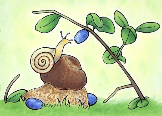
Sweet Ohuhu Snail
This artwork is now available as a free Coloring Page!
____
Finally, some hints of new supplies I was mentioning a while ago have manifested into a piece of art. :D
This is sort of a follow-up to my Ohuhu Brush Marker Review, as back in October, Ohuhu released a 72 set of the brush markers, and naturally, I was very curious to see the 24 new colors for myself. (And I have a bit of a story about how this set arrived to me that I'll get into momentarily.)
Spoiler alert that my thoughts on the markers themselves as a product haven't changed; they're still really nice alcohol markers for the roughly $1 per marker price tag. I'd still love to see yet more colors and additional consumer features like open-stock markers, refills, replacement nibs, etc. But overall, as I said last time and I will continue to say, I really wish these had been around a few years ago when I was first getting into alcohol markers, despite the few shortcomings they have. Aside from color selection (which I'll address further later), they're an excellent beginner alcohol marker set if you want brush tips.
But before I get into the specifics of this set and the foreseeable future (as Ohuhu just recently announced another brush tip set on the horizon), I shall tell you the (long-ish) story of how I ended up with the 72 set in the first place:
Back in November, Ohuhu put a post up in their "Top Fan Group" on Facebook, which I joined on a whim after being recognized as a Top Fan a few times by that point. This post said the following:
Hi Ohuhu Friends, Ohuhu.com is going to open the SHOP function to several products soon, so you can buy the products directly on www.ohuhu.com then. Before the shopping cart is officially public to the customers, we need 3-5 volunteers to help us test this SHOP function. 🗒️What we need are some inputs regarding How is your experience with our website, and Is the purchase process smooth? What problems have you encountered while shopping on the website etc?(We will have the conversation by DM.) 🚨The tester should be based within the continental USA. As a thank you, we will give you a free set of markers, just let us know which pack do you want via DM.📷 Thank you! Put your hands up if you would like to help us with this in the comment zone! (We will randomly choose 3-5 person within a week.)
[For context, previously you could only purchase Ohuhu's products through Amazon.com] Me, being both the frugally minded and skeptical person that I am, saw the post and immediately latched on to the "free set of markers" mentioned. (My instinct said it was probably a choice from a pre-selected list of some kind.) I was curious and figured, based on what was said, that 1. I might not even get chosen, 2. Even if I did, surely they would explain the process to me and I could then gracefully bow out if it didn't sound right to me. And so I cautiously commented as instructed. Within a few days, I was contacted by a representative and I found out through communication with them that the way this would work is that us volunteers would place orders through the website for any product, let them know of any issues or feedback we had during the process, and then once the order was placed we would provide the representative with our order number and be refunded. Likewise, if all did indeed go according to plan, this sounded like a great way to get my hands on the new 72 brush marker set, which previously I had figured I wouldn't get for a while as my 48 set has been serving me very well since August with no issues. (And it kinda didn't make sense to me to turn around and order a new set that would give me 48 duplicate colors so quickly.) I've seen a LOT of horror stories about shopping online, I watch too many "drama community" videos on Youtube that often talk about sketchy websites and scams, and so throughout this entire process I was nervous, saving "receipts" (screenshots and the like to the uninformed) where I could, and generally expecting something, anything to go horribly wrong at any second. Despite Ohuhu being a fairly reputable company at this point and having only ever heard good things about their customer service. Still, Ohuhu has made enough of a name for themselves that I hoped they'd know better than to intentionally scam their customers. If word got out to the many YouTubers covering their products, they'd have a PR nightmare on their hands. (And I also had to remind myself that the art community as a whole is not the Youtube Makeup Community; generally speaking, the art community isn't as...well, dramatic. At least not when it comes to art supply companies and scamming costumers. I'm not saying it never happens, I'm just saying I don't think it happens nearly as often as when shiz goes down in the YMC.) Naturally, this means I had some questions I wanted to be crystal clear about before making any purchases of any kind. Namely, I specifically asked to make sure I was reading correctly that once the order was placed and I gave my order number that I would be receiving a refund, and if said refund would be just for the purchase price of the product ($69.99 in this case) or if it would include the shipping cost (about $5-$6 dollars) as well. The answers to which were yes and the refund would be for the total cost including shipping. I also wanted to know approximately how long it would take for the refund to go through. The answer was within 5 days. So everything up to this point seemed to check out. I was still skeptical (this is what the internet has done to me) but I was 80% sure it would be okay, and the payment would be through PayPal, so if something went wrong I could file a claim over there and provide my evidence and hopefully at least get the money back if nothing else. I'll also note that I did notice 1-2 minor bugs on the website while in the checkout process, which I informed the representative of as I was supposed to, but I honestly wouldn't have noticed them if I hadn't been trying my best to really test the website and live up to my "job" in this situation. If I had just gone through the checkout process as I normally would have with no hesitation, I wouldn't have seen the bugs at all. I was genuinely surprised by how smooth and polished the website experience was; I was expecting much buggy/glitchier, considering that they were asking for test volunteers. And the two bugs I did notice were pretty minor things that really don't break or ruin the shopping experience. So I went through with the purchase, gave the representative my order number, and hoped for the best. I immediately received an order confirmation email that told me I'd be able to track the shipment within 1-3 business days. The order was placed late on a Thursday night, so I figured I wouldn't be hearing anything else until Monday at the very earliest. (As here in the States, Saturday and Sunday usually don't count as "business days") Much to my surprise though, that Sunday the representative I'd previously spoken with reached out to me asking if I'd been able to check out the tracking feature yet. So I explained that I'd gotten the confirmation email but no tracking email yet, and that I also didn't see a way to enter my order number on the website to track the order if I (as I had) checked out as a guest. (It did appear if I had made an account that the order number would've been saved to my account and I could've potentially tracked it that way.) But again, I hadn't expected anything until Monday, so I wasn't too concerned anyway. Sure enough, the next morning I had my tracking email and everything seemed to be in order; it even baffled me by saying the shipment was expected to arrive the very next day. I thought I was surely reading something wrong or maybe it needed a little while to re-calculate or something, but I kept an eye on and it didn't change its mind. And low and behold, it was a little later in the day, but the markers were indeed delivered that Tuesday! I eagerly got them open and gave them a good once-over just to make sure everything seemed right at first glance, as I knew to swatch them all out and get a more in-depth look was going to take at least a few hours. But I was quite relieved; we'd made it this far with no hiccups, now I just needed the refund to come through and we'd be right as rain. Miraculously, two days later the representative reached out to me yet again to tell me that the refund had been sent. And wouldn't you know it; the official PayPal email was sitting in my inbox waiting to tell me so! So in the end, things turned out pretty great. Ohuhu got their website tested, and I got my markers without a hitch. It did seem a little weird to me, the whole premise, but I assume they budgeted for this in the same way a company might do giveaways or budget for advertising, maybe even like some companies do for PR packages to influencers. And, realistically, it does kind of make sense that the best way to test your online shop (and by extension, in this case, the refund process) would be to have actual customers do it. Either way, it worked out well for me, so I can't really complain.
Once the markers arrived to me, I was very happy to see that Ohuhu is now including a colorless blender in their sets, in addition to the 48 or 72 colors. A colorless blender is one of the things that I said last time would've been nice to have (though not a necessity as you could easily go out and purchase say a Copic, Prismacolor, or another brand of Colorless Blender to compensate) and personally I love that it's 48 + the CB or 72 + CB, instead of counting the colorless blender as one of the colors you get, which is what I've most commonly seen other brands do. It's a small detail, but for some reason, I can't seem to get over it.
One of the things I was most curious about in swatching though was that, I assume as a response to me and many others that mentioned we wanted them, in the marketing for the 72 set Ohuhu seemed to really be trying to push that there were more pastel colors.
After actually having and swatching the markers for myself, I'd say about 7-8 of the colors are what I'd call true pastels. There are some beautiful new colors (R13 Clematis, in particular, might be my favorite Ohuhu color now and I LOVE the Green Grays they added) but there weren't as many pastels as I was hoping for, and personally I was hoping for some more pale pinks/peaches that would work well for lighter skin tones. Maybe some yellows since I felt we were kind of lacking those too.
And originally, I was a little...disappointed isn't totally accurate, but it's the best word I have.
However! I'm inclined to be a little more forgiving as just last week, Ohuhu announced they'd be releasing a 24-color skin tone set, which (although I'm withholding major judgment until I have the markers in-hand just like last time) is looking to hopefully be some of the pale pinks and light skin tone colors, maybe even a few yellows, that I was hoping for. We'll have to wait to see the colors in person, but using their digital swatches as a [very] rough guideline, the new colors look like they could be pretty promising.
The only thing I'm a little disappointed about at this point is that 5 of the skin tone colors will be duplicates, but at the same time, after seeing which colors are duplicates, it kind of makes sense just in case someone wants to buy the skin tones and doesn't have the 48 or 72 set, which I'm sure does happen. Just like I'm sure people buy, for example, the skin tone sets from Copic or Winsor and Newton to supplement other sets.
Still, though, this continues to support the idea to me that Ohuhu is really trying to listen to what fans of the brand are asking for; People asked for brush nibs and took a little while but we got them, we asked for pastel colors and they at least tried to address that, and now we've asked for skin tones and it looks like they're going to address that, too.
Naturally, after all of the above, I had to make some art to give the markers a go beyond swatching and to talk about all of this with you, my lovely Sparklers.
So I ended up drawing this cute little snail inspired by a picture I saw over on Pinterest.
I don't know if he thinks he's going to eat that berry or if he's just smelling it, or maybe he thinks it's just pretty (I used the aforementioned R13 in the shading for the berries), but it makes me happy to look at all the same.
Originally I had planned to try and only use the new colors to really show them off, and I did use a fair amount of them, but I felt just a little too limited so I did open up to the full 72 set. But I did use all only my new markers and not the markers from the 48 set I already had, so...
Maybe it's still fair?
I also tried some texturing on the...mushroom? branch? rock? he's sitting on, and while I don't think it looks the best close-up, from further away I think it worked out pretty well.
Similarly to the crab I drew for the 48 marker set though, I wanted a more interesting background than just plain white. After some consideration, I decided my best option would be to mix my green and yellow PanPastels. So I did.
Unfortunately, I exposed a couple of very noticeable fingerprints doing that and I ended up getting pastel dust all over the drawing so my black lines got greyed out a bit.
I fixed the fingerprints by adding some intentional ones for the sake of balance and in the name of visual texture, and I fixed the lines by going back over most of them and a little post-editing after I scanned the drawing in.
Other than that, my observations about the Ohuhu markers remain the same as last time. They blend and layer really nicely (especially, as I've observed recently is the case with most alcohol markers, with thicker paper) and the colors they do provide are really vibrant and fun.
I do still hope the new skin tone colors live up, that yet even more colors are coming, and I'll repeat that I'd still love to seem them add consumer comforts of being able to buy individual markers, refill inks, and replacement nibs. But all of that may come in time, and even so, I think they're very recommendable for alcohol markers.
I'm also really happy with how my little snail turned out just as an art piece; this whole thing is just really really cute to me.
Now I just have to wait with bated breath for the USA launch (they've already launched in Canada) of those skin tone markers and hope they're not too expensive so I can get them right away :P
____
Artwork © me, MysticSparkleWings
____
Where to find me & my artwork: My Website | Commission Info + Prices | Ko-Fi | dA Print Shop | RedBubble | Twitter | Tumblr | Instagram
2 notes
·
View notes
Text
HI HERE IS EVERY SAI BRUSH I OWN
sooo I tend to horde brushes, like, a lot. it’s been a slowly growing collection here, but now I’ve gotten to the point where I literally have next to no room and I desperately have to delete some. BUT I’m too paranoid of the fact that I’ll need one of them again some day. so I decided to dump ‘em all somewhere!
this is basically a reference for me in the future in case I need to remember That One Brush That Did A Thing that I may have deleted, but I figure I might as well also share them all since I’m saving them anyway and maybe someone will find something they like. you can take any of them if they interest you, and feel free to change ‘em as you see fit.
most of them aren’t mine, as I’ve basically always just swiped settings from a bunch of different places, so I have no idea where most of these came from. whoops!!
if you don’t have the texture/blotmap/whatever: I unfortunately don’t have a link to where I got all of mine, but most of them are here. if something’s missing, well, google’s your pal and I’m sure you can find ‘em.
anyway they’re under the cut. warning: there is. a lot. let’s go.

Brush
blotchy and neat. doesn’t blend much, but you can turn up “Blending” if you want it to. it’s pretty good for far away trees and bushes and all

Water
my usual blender, but I don’t really use it much anymore since I prefer manually blending nowadays?? still okay to smooth stuff out though

SpaceFoam
a really nice feelin’ brush!! I don’t even know what “space foam” means but it just ~feels~ it. just has this nice, dusty, foamy texture to it. I have another version of this brush that uses “Noise” instead of “Fine Flat 2″ if you want it more round instead of square.

Crayonz
used to be a general brush for sketching/doodling, but I don’t really use it much anymore. maybe you’ll like it.

Rough Chalk
super chunky, rough, and dry chalk brush

Speckle
self explanatory I guess! pretty good for texture or large skin blemishes

Chalk(Standard)
I really like this brush-- it’s great for making simple, blended backgrounds! keep in mind, because it’s a marker, changing its opacity works differently than other brushes, ie it doesn’t “layer”, it’s just a continuous tone

Badass Inker
OKAY I ACTUALLY DO KNOW WHERE THIS ONE IS FROM it’s here. mine is changed slightly but you figure out what you like. this was my main brush for lineart before I started inking in firealpaca. very sharp and crisp.

Marker
yep
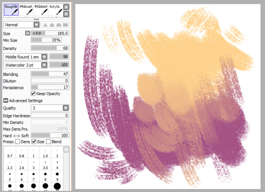
RoughBrush
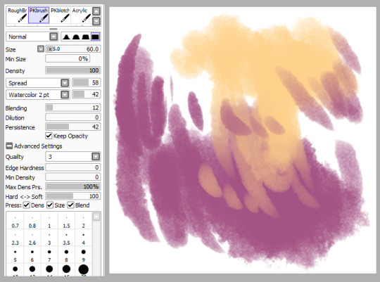
PKbrush
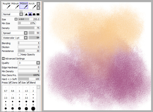
PKblotch
usually used it for a light, textured swash of color for an overlay layer or something. it’s supposed to be a big brush, but you can have it smaller I guess??
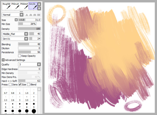
Acrylic
except it doesn’t really resemble acrylic at all, lol. in this state I use it as one of my blenders. BUT ALSO FUN THING: set that “normal” dropdown to multiply to get a subtle darkening effect. sometimes I use this for “lineart” in paintings.
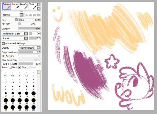
Deliciously Dry
another brush from here. very nice rough texture.
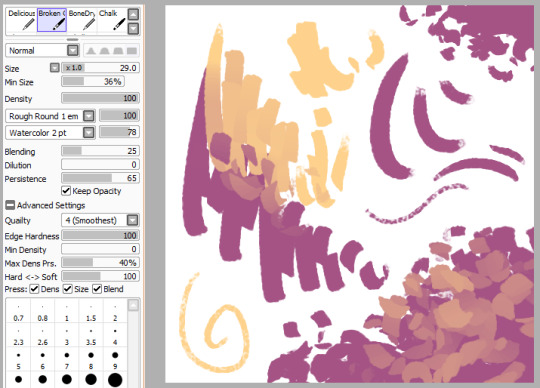
Broken Chalk
I looove this weird little guy, lol. acts normal if you just go in a line, but it’ll get all “blocky” like that if you jitter your hand. because of this, it makes a pretty interesting leaf brush! it blends pretty cool, too.

BoneDry
aaaand ANOTHER from here.

Chalk
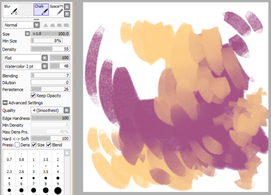
Chalk (... again)

Grass
it’s called grass but I honestly can’t imagine using it as a grass brush, lmao. stringy and soft though, may work as the flats for hair??

Clouds
this brush is...... kinda weird?? I mean, it’s clouds I guess. it’s not really perfect, but it’ll work if you spend enough time on it. I feel like it works better painting on the same layer than its own.

Gore
this brush is awfully light and soft for something called “gore”! actually I assume it’s called that cuz you use it as a patchy effect for wounds and stuff.

CG Smooth
named so because I think it’s supposed to resemble a brush used for very smooth, glossy, cg painting. (please excuse the shitty nose, I’m way rusty)
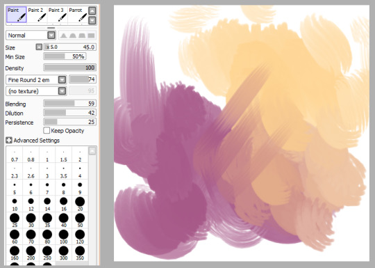
Paint
do you know how many random generic paint brushes I have

Paint 2
cuz it’s a lot

Paint 3
a loooootttt

Parrot
I’m weirdly fond of this one even though it’s not super special. I feel like it’d be good for smooth, bright, poppy blending.
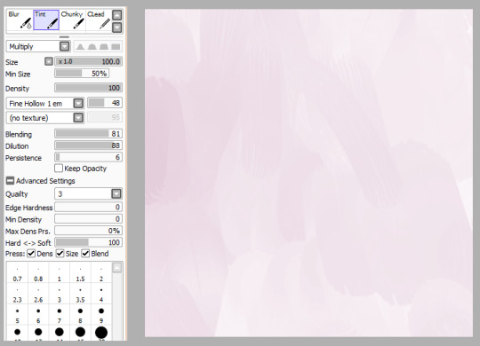
Tint
this is another weird one. it’s like..... if you wanted to do a painty wash, I guess?

Chunky
like Broken Chalk above, this is another one that gets cool things when you jitter it. this one is a little more... jagged? reminds me of broken glass
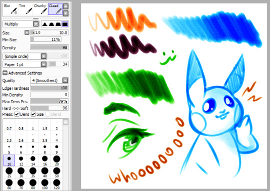
CLead
this one works weiiirdly and maybe I should make a whole separate post about it?? well for now, this one’s basically like a dry marker or highlighter or something. I like it a lot.
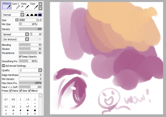
PSPainting
I think it’s called that cuz it’s supposed to emulate painting in photoshop, even though it...... doesn’t, really, at all.

Copic 2
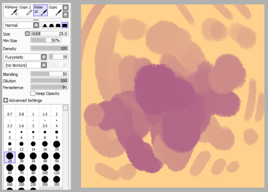
Water 10
another random blender. it doesn’t work on transparent areas though! (bring its dilution down if you want it to)

Copic
I have no idea if this is even remotely close to how a copic works (probably not)

TraditionalPencil
I’m never really 100% satisfied with most “pencil” brushes in sai, but here’s one anyway I guess.

Lead
and here’s another. this is the one that I actually tend to use

Acrylic (....... again)
and like our first acrylic, this is not really acrylic at all. super soft and light blender

BrushPen
SUPER rough and textured pen kinda thing
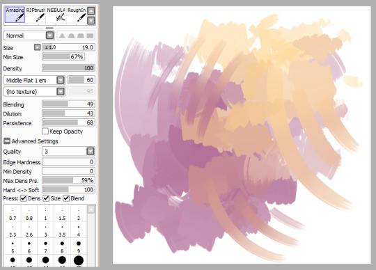
AmazingAcrylic
if you say so, name! actually this does look like it blends p cool

RIPbrush
why is it called this. what am I even doing with half these brushes. why am I here.
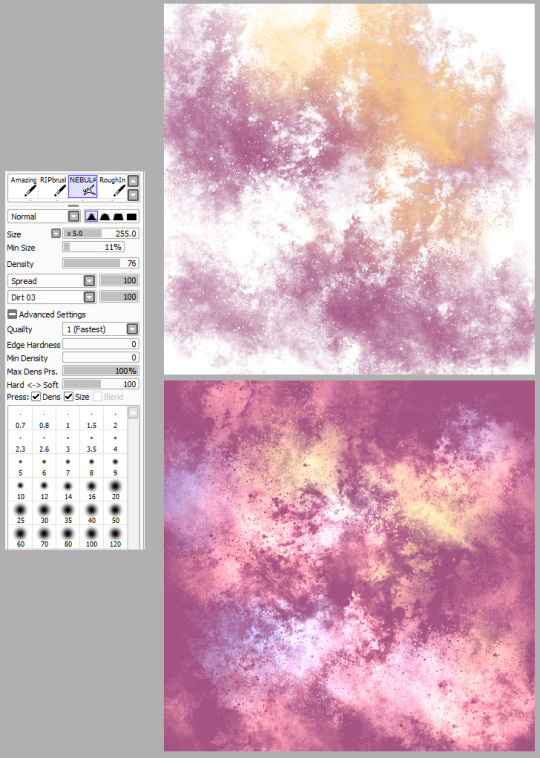
NEBULA
oh wait this one’s neat (neat enough to make two images even). good for all your spacey needs! the second one is a bunch of colors and set to “luminosity”, so you can get some cool effects.

shrugs (great name)
the marker tool is a strange being but I’ve really learned to love it lately. the key to this brush is setting that drop down up there to “multiply”, so you can get really deep darks with your base color where you need it. the downside to this being that you can’t really use preserve opacity to change it to a different color or you’ll lose the effect of those darks (you can use hue/saturation/brightness shift tho, but it might be a lil weird)
aaaand everything else I didn’t post were accidental duplicates! so that’s it!! that sure was a lot but maybe you found something in here you liked ;0
356 notes
·
View notes
Text
The Vampire & His Sharpie Fic
“The only important thing in life is Sharpie Black,” said the Vampire. I just wish they could see me for my heart not my lack of morals and immortality.
Blood sucking was all I knew until I smelt the toxic scent of my dear crush, Sharpie Black. Sure their variations are hot, Sharpie Blue, Sharpie Pink, and Sharpie Gold but nothing is like my dear Black. They just have a way to them. Many ways… oh how that plastic just slides in. Nothing is better than that. If only they didn’t prefer werewolves and Sharpie Pink would stop flirting with me. I don’t know why she even is, she has a boyfriend: Sharpie Finetip. Fuck that Elvis wannabe. All he ever does is cheat on her with all the Copic Colors. Gross. Why does she even like him?????? AND WHY DOES HE NEVER WASH HIS HAIR???????????? I CAN SMELL HIS GREASE FROM TWO MARKER NIBS AWAY. Gag. But he’s not important.
Also I want to say that warewolves smell like dog dookie, what do they even see in those furries????? Everyone just fucking seems to love werewolves. WHY?! I’m a clean, smooth shaven guy who doesn’t smell like dog dookie and I’m the one who can’t get a date????? Is it because of that one time we saw a dead pigeon in the park and I ate it? Look that pigeon was just laying there and littering is very bad, I’m just doing a favor by keeping the town clean. That’s what I get for trying to be a good citizen???!!! Y’ALL GOOD FOR NOTHING ART SUPPLIES AND SUPERNATURAL ASSHOLES DON’T GIVE TWO HOOTS ABOUT THIS TOWN!!!!! IF I WASN’T HERE YOU���D BE LIVING IN YOUR OWN GARBAGE. Anyway despite their horrible taste in men my cold heart still felt warm standing next to them in the park. Or I was just burning to death, I don’t know. That would explain the smell of someone grilling steaks…
Let’s talk more about Sharpie Black and less about my burning flesh now, okay? Oh my Sharpie Black, how I wish you would just notice me one more time. How I wish we could have one more night but alas they never texted me back. What did I do wrong? I guess for now I just won’t know. They did say they were going to Crayola’s house tonight though and lucky for me I work as a driver for Pizza Hut and guess who just ordered some pizza? Crayola’s household. Crayola is Sharpie Black’s best friend, Crayola Supertip. I’m honestly not sure what happened to Crayola Original, they were here for the marker factory tour field trip one day and next they were gone. It’s really weird and Crayola Supertip refuses to talk about it. I know they know something but it’s not easy to think about I guess.
I got the order from Trevor and walked out to the car to put the pizzas in, 13 extra large deep dish olive pizzas with extra cheese. I’m more of a hand tossed kind of guy myself but hey to each their own. Slam the trunk and off I went. I made my way down Robin’s Egg Blue Ave in my 2002 Toyota Camry with a special surprise in the back seat: a 14th extra large deep dish pizza with olives forming a very important question to my future bae. Oh and can’t forget the extra cheese of course! Hell yeah we get down with mozzarella!!! My 2002 Toyota Camry just barely survived making it up Crayola Supertip’s driveway and I get out. “Who makes driveways this steep????’’ I exclaimed, “That honestly should be illegal! I could have died!” “Well I mean I’m a vampire and I can’t die, unless I’m standing in the sun or eating garlic,” I corrected myself “whatever you know what I mean.”
I took the pizzas out and got up to the door, ring rang that doorbell and Crayola Colored Pencil, Crayola Supertip’s dad, opened the door. With a smile I greeted him “pizza time sir!” I handed the 13 pizzas to him hoping to see Sharpie Black come down the stairs, they never did. Then I brought him the special pizza: number 14. “I didn’t order 14 pizzas.” he said. “We know you didn’t sir but it’s a free one for being a supporting customer.” He gave a big smile to me “Oh well isn’t that just so nice. Now this is why I prefer Pizza Hut.” I laughed “It surely is delicious” and handed him the receipt for him to sign. He signed it and I went on my way. Hopefully Sharpie Black will just text me their response. But what was my question you ask? It was this: “You wanna date or nah? – Clot Vampire.” I wanted them to open the pizza and see that instantly and with that thought I got a text. I unlocked my phone and it was from them, sweet, toxic smelling Sharpie Black. I opened up the message with excitement that read: “nah.” “Welp I feel like some garlic.”
And that’s how I died. Kinda sad but wow heaven sure does have some fast internet though.
#i have no explanation#the vampire and his sharpie fic#b fics#write#writing#writer#story#stories#original story#original stories#fiction story#fiction stories#fictional story#fictional stories#oc#my oc#my ocs#fic#my fic#fiction#one shot#vampire#vampires#sharpie#sharpies
0 notes
Photo
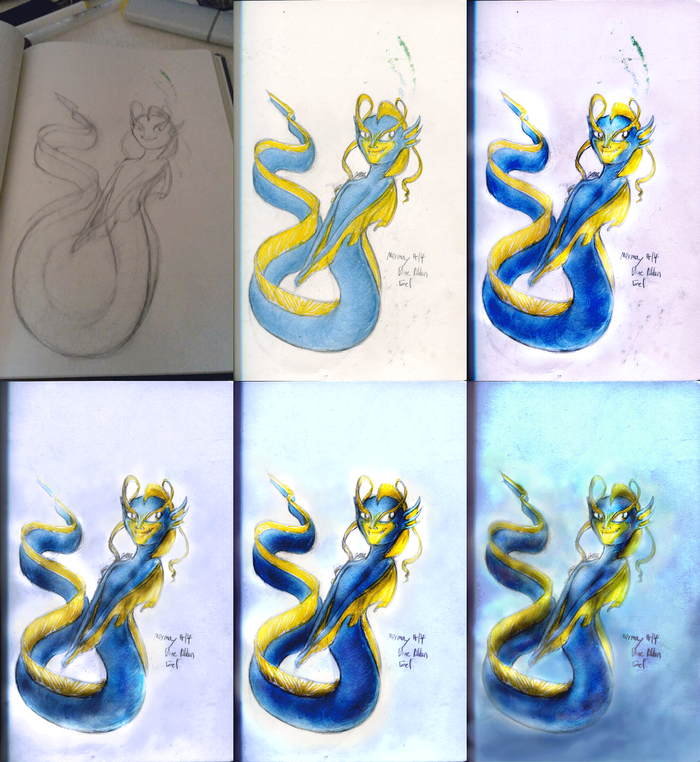
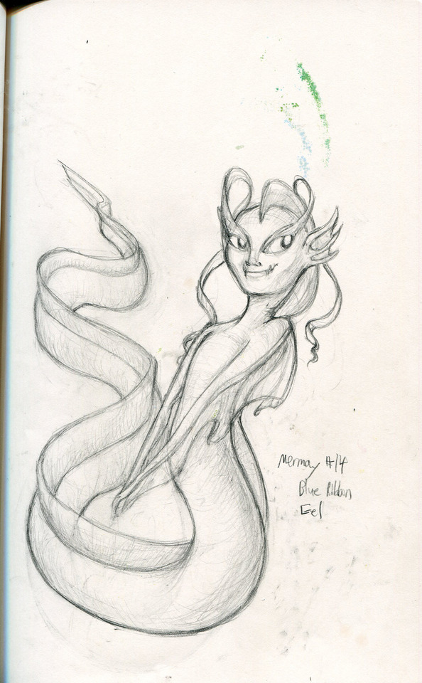
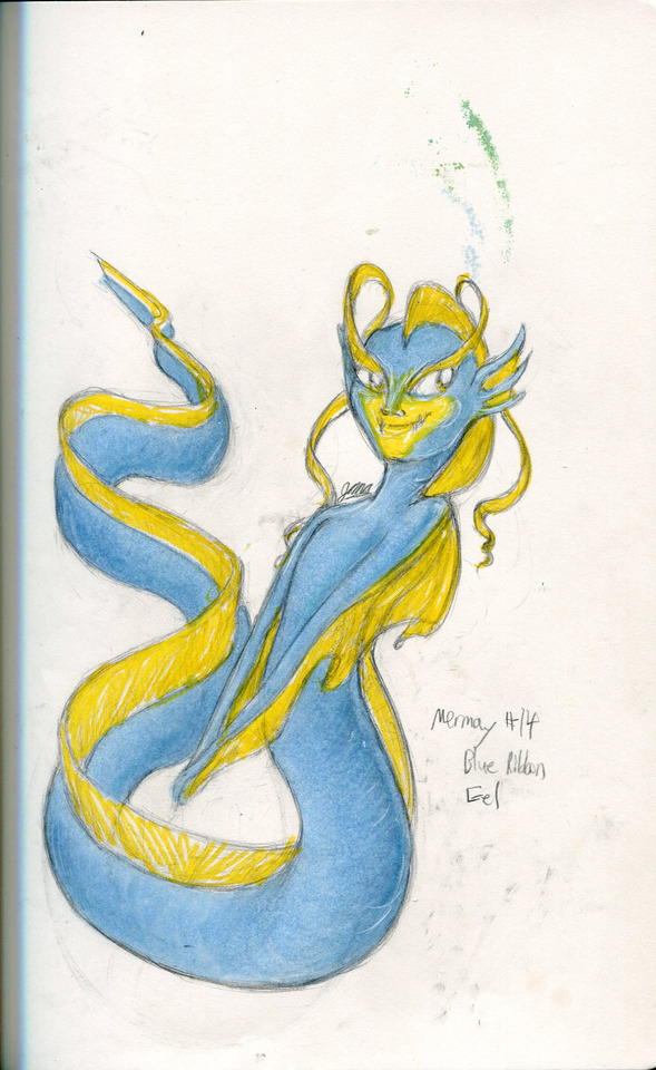
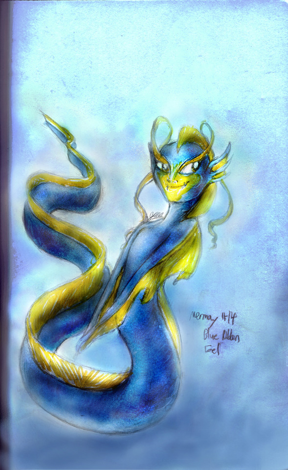
Mermay #14 - Blue Ribbon Eel Mer Sooo I really went all out with this one. I think I shopped it too much even... XD But uh. Yeah. And I decided too to upload a bunch of other junk with it. Like a process gif (seen those here on tumblr and thought it was a great idea XD), a line, color and final version of it kinda show the progression better. Was thinking about how portfolio people like to see your process and I thought maybe tumblr people might like to see my process too so... why not? XD So yeah I usually don’t edit this much in Photoshop when I’m working traditional but I got carried away and really rendered this one out XD; It’s still got heavy traces of the traditional like that tail bit I forgot to fill in... looked nice on paper but horrible in digital. XD But what was I going to say... Right blue ribbon eels are fun. Did the generator again and after a couple dozen tries it gave me ribbon eel and though I’d sworn off eels after it gave me three in a row, the blue ribbon eel mer was way too cool to pass up. I had to change up the tail from the very early WIP (yeah, the blurry photo that’ll take you almost a minute to see for 5 seconds in the process gif if you missed it) because the way it was configured had it backwards, but I managed to get it so I could keep the pose and not have the tail be as weird... Frankly it still looks kinda wonky if I compare it to the first WIP picture and I do like the silhouette just a little bit better from that one. Was clearer and more fluid and a little less squashed-looking at the bottom. But what was I gonna say... Oh yeah and I apologize if some of the process shots in the gif are kinda blinding... I really pumped up the colors way too much at first and kept trying to downplay it. Even now it looks tolerable but before yeah it was kinda blinding XD; Anyways uh yeah. Sooo that’s the deal. I think I was going to say something else but I don’t remember and it’s late. I think I’m just gonna submit this and call it good... I think I was going to try to explain my process more instead of just babbling on... Don’t know if I accomplished that, but I guess it’s pretty straightforward. Sketch, line with pencil, sometimes I render it a bit with pencil too, then I color it which can be more finished and polished from traditional or less so like in this one where it’s nearly a flat color. Then I use photoshop to adjust colors, fix mistakes, erase smudges or color bleeds from previous pages, maybe fix spacing issues with the eyes, etc etc and to heighten the contrast between my light and shadow areas. Usually it’s minor if I’ve already rendered it out well traditionally, but this time I was pretty heavy-handed with PS because I don’t trust my blue markers that much to give me the right color... My baby blue copic is sometimes the only one that works reliably, so I worked exclusively with my baby blue copic and a cheap crayola yellow marker to produce the traditional color draft. I started out small working in photoshop, just darkening my shadows and lightening my highlights, but then I got carried away because it didn’t look like the proper shade of blue... And that’s when chaos ensued. XD It took me practically the whole day to do this pic and hours in photoshop to get the final product. I would have worked longer on it probably too if it wasn’t super late. But anyways. Sooo that’s the deal. I could probably go into more detail about the use of color balance, adjustments, brush settings and yada yada yada but it’s really late and I keep rambling. So before I type anything else that probably won’t even be read by the casual tumblr scroller I’m just gonna submit this already, put in my tags and get it over with. Or well tags first, then the submitting... You get the point. XP
#blue ribbon eel#mer#mermaid#fish mer#art#traditional#digital#mixed media#photoshop cs6#copic#baby blue#crayola#yellow#super tips#old marker#what else was I gonna say...#oh yeah#mechanical pencil#I think I got em all now#lol#paper#oh actually#I did use a teeny bit of deco blue too#prismacolor marker#just a teeny bit though#it was still mostly copic baby blue#muh baybeh#mermay2017#mermay#artist on tumblr
13 notes
·
View notes
Text
Wishlist + Ideas + Update!

(I found out about JetPens.com & MisterArt.com, so prices are different.)
Any tool that has a (!) mark at the beginning is necessary. Otherwise, it’s just something I want more than something I need. I’ll probably update this every once in a while. These aren’t in any specific order.
MUSTEK ScanExpress A3 Flatbed Scanner 11x17 ($199.95)
(!!!) Sakura Pigma Micron Pen Set 8 Black (PICTURED) ($16.69)
(!) Zebra Disposable Brush 3 Pen Bundle ($7.00)
12" Right & 12" Left Hand Wooden Mannequin Figure Set ($26.96)
(!) Pentel Aquash Water Brush Set 4 ($23.59)
(!) ALT: Kuretake Water Brush Set 8 ($51.50)
(!!!) Crescent RendR Lay Flat Sketchbook 11" × 8½" ($13.89)
Blick Aluminum Non-Slip Ruler 18″ ($7.11)
CPP Impressions Drawing Pad 18x12 25 sheets ($8.60)
(!!!) Uni-ball Signo Broad Gel Rollerball White Pen Marker ($2.50)
(!) Uni NanoDia Color Lead 0.5 Mint Blue ($3.30)
(!) 5X Black Standard Pen Nibs For Wacom Tablet ($7.48)
A4 LED Artist Light Box Tracing Lamp ($13.90)
Ohto Graphic Liner Needle Point Pen Set 6 ($15.00)
ALT: Pentel Arts Hybrid Technica Pens Set 5 ($11.28)
Copic Alcohol Marker Pads 8½ × 11¾ ($9.88)
Pentel PG5 Slim Drafting Pencil 0.5 ($13.50)
ALT: Platinum Pro-Use Black Drafting Pencil 0.5 ($8.25)
JetPens Eraser Sampler ($9.25)
Wacom Cintiq 13HD 13.3" Creative Pen Display DTK1300 ($799.95)
(And I’ve been thinking; as incentive to donate, whether through Patreon or Ko-fi, if I manage to receive enough funds to buy the Micron Pen Set, the Uni-ball Signo White Pen, and the Crecent RendR Sketchbook, then I’ll REDRAW THE FRONT COVERS OF Q-NNECTIONS~!)
Q-nnections Fancomic | Become a Patron | Buy me a Coffee
I hate to ask for money since it seems... selfish. Especially these days. However, I really want to continue Q-nnections and continue to let you guys read it, so any amount of support helps! Thanks a lot~! (ノ◕ヮ◕)ノ*:・゚✧
Moving on, I have a kind of wild (and maybe weird) idea for how I’ll be drawing Q-nnections from now on...? Not sure if I’ll go for it or what, but here’s a sort-of synopsis... (Fair warning though; there’s very mild spoilers for the next strip.)

So basically here’s the jist of it; I recently drew this in a attempt to sort of mimic MyNameisMad’s way of drawing her comics after watching her livestream, which is basically HUGE FORMATTING. ...I am lucky enough to have a few huge pages to work with after finding some in my room (18″ x 12ish”), but I don’t have the equipment to scan said pages. (This is why the MUSTEK A3 is on my wishlist. Kinda wish I can find a A2 for the same price, but meh.) I was kinda messing around really, but drawing in brush pens might actually work...? (I’m still thinking of having some lineless properties, though.) I basically plan on drawing it like this;

So; yay or nay?
(IDK why it seems so blurry, it really shouldn’t be?) Don’t worry, I don’t intend to copy Mad’s drawing style, but as you can tell, I wear my inspirations on my shoulders. (Probably not a good thing to do.)
Anyway, I plan on doing more tests. ...And more tests means more time for drawing. Which means that after Strip #3 is over, I may have to take a small hiatus. There might be a bit of an overhaul and maybe a format change? It depends really, but I’ll try to keep you all posted!
#Q-nnections#Wishlist#Update#Support Wanted#Mild Spoilers#My Art#Possible Hiatus#Testing#*Crosses Fingers*
0 notes
Photo
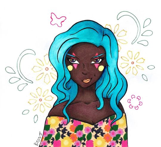
Covered in All the Colored Lights
Well, this looks wild and different coming from me, doesn't it? If you've been a Sparkler long enough, you may remember this character of mine from ages ago when I made This Is Where You Wanna Be, which featured her. Her name is Windith, and she's a performer who likes mixing old-time circus elements with more contemporary stuff. (She was originally just a circus performer but that felt too limiting for me, and I'm thinking it might be a little too passive for her personality. I don't have a set story for her, so her character will perpetually be in development ) This drawing was also me testing out some new paper and the new Skin Tone marker set from Ohuhu. Which I simply had to get because it meant more colors of their brush tip markers that I've tested out in the past. (Ohuhu Brush Marker Review and Sweet Ohuhu Snail) I'll cut to the chase for those that aren't interested in the longer version: I kinda hate this paper and it, unfortunately, was not the best choice for what was supposed to be a mostly-marker illustration. But I like the markers! The markers themselves are nice as always, and I like the addition of the new colors, but the one thing I have to point out is that Ohuhu is still lacking in good colors for super pale skin that doesn't have a strong pink or gray undertone. They're doing really good with peachy tones, mid-tone, warm browns, and the new colors add some really nice darker/cooler browns, though. In fact, the new marker colors are what primarily inspired me to bring Winidth back into the fold in the first place; some of the colors looked like they would work really well for her skin tone in particular, and I've avoided drawing her traditionally in the past because I wasn't sure I could capture it accurately with the supplies I had. And...that's really all I have to say about the markers, actually. As brush markers, virtually nothing has changed from the last two rounds of testing I did with the Ohuhus, and thus the only thing I can really comment on is the colors. I really appreciate having more to pick from, especially because some of the colors in the set really do stand apart from the rest of my alcohol marker collection, but a lot of the "light skin tone" options are either too orange/pink or too yellow or just generally too dark for a light/pale skin tone. So, my final commentary is the same as always: More colors, please! Now, as for that paper... I picked up a new sketchbook from my local Ross, which I've known for a while now as having a surprisingly good (maybe not the best, but surprisingly good) art supply section. This paper is by a brand called Craft Smith, which as far as I can tell seems to be very into making scrapbook/craft paper and doesn't appear to be actively selling/promoting sketchbooks currently. (At least not anywhere I could find online.) It also claims to be "Mixed Media Paper 120 lb (180 gsm)." I actually have some 120 lb mixed media paper that I use semi-frequently in the form of a sketchbook by Denik. And funnily enough, that's the same paper I used on my other two Ohuhu marker pieces. So we have both a baseline for comparison in terms of performance and in terms of feel. Now, I'm not an idiot. I did inspect the paper before I actually bought the sketchbook, and it's alarming how deceptive this paper is. It definitely has the right weight/thickness to it, even compared to the 120 lb. paper I already had once I got it home. The only truly notable differences are 1. This paper is a brighter white (the Denik paper is almost on the blue/purple side) and 2. This paper feels smoother. And the second point was actually one of the reasons I bought it, as I thought it was make for a really nice marker paper. (Smoother paper tends to be a better option for brush markers so you don't wear out the nibs as quickly) Oh boy, how wrong would I be! So, let me explain just by going through my process for the art, since that and discovering the atrocities of this paper go pretty hand-in-hand. Trying desperately to get used to my current tablet situation, I started by doing the lines for the illustration digitally, having been inspired for a pose/facial expression by some Ball Jointed Dolls over on Instagram. The lines didn't turn out perfectly, but they were good enough that I felt comfortable printing them out and re-inking them traditionally as I did for Fairy Enchanting, the artwork featured on my Commission Sheet. In that process, I would end up with a 1/2 of the drawing that didn't print correctly, the proper print out I used to do the inking, and also similarly to Fairy Enchanting, a first attempt at tracing my lines that was not turning out how I wanted that got scrapped. So, essentially, I had 1.5 test pages just for colors/color placement (as they were on regular printer paper), and 1 to see how this paper would actually handle my supplies. And while normally I'd be scolding myself for wasting paper and ink, in this case, it's actually a very good thing that happened. My second attempt at inking on this paper went a lot smoother (I think I just needed to loosen up the inking part of my brain), and I was actually pretty happy with how the lines turned out. So much so that once I discovered major problems with the paper, I actually scanned the inked version in to preserve it, just in case. And I even inked it a third time on to the Denik paper I mentioned earlier, extra-just in case so I could even do a side-by-side comparison of the two papers to show "this paper is crap, this other paper is not." (Fortunately, I don't think I'll be needing that third inking despite the tale I'm about to tell.) I started out by using the different test pages to make sure I had the right tones/colors I wanted for the skin. The swatches looked okay, so I went ahead and tried coloring the skin to test some blush and shading. Right away I noticed that 1. The ink feathers/bleeds across the page (outside of lines) way more than it should for a paper this thick, and 2. once the ink settles into the paper, it's kind of patchy/spotty. And 3. If you trying layering a light color over a darker color with alcohol markers, it makes the patchy/spotty-ness more apparent. Obviously, these things combined make layering and blending tricky without the end result looking strange and uncomfortable. Just in case there was something this paper didn't like about the Ohuhu markers, in particular (and also because I wasn't super happy with my color choices for Ohuhu for this particular hair color), I did try a test blend for the hair with some Copic markers. Nope, still feathering badly and doing the weird spotty thing. Still not layering very well without re-working the entire area. Briefly, I panicked. The whole idea for this paper was to be for markers, and I had largely intended for this illustration to be pretty markers-only. But this paper, quite apparently, hates markers. Okay, okay. I tried one more blending/coloring test, this time just seeing if I could do the skin and get it to look decent on this paper inside my lines, and while not super ideal, I did manage to get something I was mostly happy with. Likewise, my next step was to do that again on the final piece. At least then I'd have the most important part--the skin--for this piece done and then I could proceed with whatever seemed like the best option for the rest of it. So the skin actually turned out okay in the end because I was being exceptionally careful to work with the issues I'd already discovered. By nature, it's not the best (as in it would look better on better paper), but it works. I still had at least a small problem on my hands though. To be fair, even before I printed the lines off I was thinking I might try washi tape for her clothes/shawl/whatever, so the paper not liking markers really just re-enforced that idea. The problem was I still had the hair to do. I tried a couple more blending/coloring tests, trying desperately to make the markers work for that, but it just wasn't happening. The way I blend hair just requires too many layers for this paper. So my next solution was to try some tests with colored pencils. For smooth, flat color, this paper is actually pretty nice for colored pencils. For layering and blending, however, (just as I suspected before I even tried it) it's too smooth. Blending works pretty okay if you're just doing 1-2 layers, but anything beyond that is just slippery and unsatisfying, to say the least. That was my two main mediums thrown out the window. Now what do I do? Because I was largely at my wit's end, I got a little crazy and tried some tests using some Faber Castell gelatos to see what they would do. And I have to say, putting the gelatos to this paper does feel exceptionally good, as the smoothness of the paper suits the creamy texture of the gelatos. Although the gelatos don't blend out super well when you add water to them on this paper, so that limits what you can do with them by a fair amount. Not really knowing what else to do, I broke out some actual watercolors and tried those. Fortunately, while the paper does warp fairly easily (that's to be expected with any paper less than 140 lb.), the paint lays down and blends fairly smoothly and nicely. And so I finally had something to work with. There's a reason when I work with watercolors I usually don't go for a hard illustration like this, but I think I managed fairly well to get the paint to do what I wanted. I knew going in it wouldn't have the same look or dimension as my markers or pencils, so I made my peace with that ahead of time. The main thing I wanted was at least the suggestion of shading and relatively smooth coverage. There are some small areas where the paint just did what it wanted anyway, but it's little enough I don't think it ruins the whole thing. I'm sure I could've worked with the hair more to get arguably better results, but by this point, I was so relieved the paint was working that I decided not to push my luck. (I did end up having to digitally tweak it because it shows up as a little more blue on the scan than it actual is, but that's not really the paper's fault.) Since I wasn't sure what exactly I wanted to do with the face/makeup at this point, I moved on to dealing with the washi tape. Fortunately, this ended up working out fairly easily. I actually put the tape down on my inking-gone-wrong (as the areas where I needed to cut it turned out well enough it would work for this) and used an Exacto knife to carefully cut the top of tape away to make the neckline and keep the tape from covering up the little bit of hair that reaches down that far, the hair being the tricker part to cut. Even so, I had a less challenging time than I thought and I only minimally dented/cut into the very top layer of the paper underneath. (Which was why I wanted to cut the tape on not-the-final-piece in the first place; I knew indentions were going to be made from the knife no matter what I did, but it's hard to predict how bad it'll be until it's usually too late.) Once that was done, I could simply peel the pre-cut tape off of my test page and re-apply it to the final one. Naturally, the cut wasn't 100% accurate, but it was close enough that the little bit that wasn't quite right was easily disguised but going back over my lines again and filling any gaps. I went back to the face once that was taken care of, and I ended up relying on the heavy feathering this paper does to get Windith's eyes right. Originally when I drew her, I tried to give her "oil slick" eyes. As in, her eyes are black but have a rainbow sheen to them, like how if you ever see oil in a parking lot, it's black but has that really pretty rainbow shine to it. I never had to consider before how this might translate into a traditional drawing though since that drawing was done digitally and at a time where I thought digital art was going to be my primary medium going forward. (My oh my, how the tables have turned indeed...) After a couple of failed tests (failed due to personal preference and actually not the paper this time) I ended up going with a dark selection of alcohol markers in very teeny tiny dots to make a pseudo-rainbow. It's not a perfect translation of what her eyes are supposed to look like, but it's close enough to suit me. Then came the makeup. Originally, I was going to just make her lips a more natural color and largely call it done, but I didn't want them to blend in too much with her skin and even when I tried a less natural berry color I just couldn't get the blending right in such a small space on this paper. And I was also thinking it would be nice to give her eye shadow and bring the colors from her shawl-thing up into the face area a little bit. But I'd already discovered colored pencils weren't the way to go and I had a feeling I wasn't going to like how this paper handled pastels either, so I just skipped testing that altogether. After some thought, since I originally thought of Windith as a circus performer, I deiced to do some testing with gel pens (which I figured would handle just fine on this paper, given the nature of gel pens in general) and this simple kind of clown makeup. (I'm sure there's a more proper name for it out there somewhere but I haven't the foggiest idea what that said name is.) I ended up really liking that, especially with how the bright colors pop against her dark skin tone, and in that, I thought a bright color would work well for her lips, too. I tested my orange gel pen, but it was a little too bright and just a little too imprecise for my taste, so I opted for a little fluorescent orange watercolor instead. I know the makeup probably looks kind of silly to most, but I really like it and how it ties the colors together better. And besides, I think it says a lot of about Windith's character that she can wear makeup like that but still looks as confident and determined as she does here. But I wasn't done quite yet. I wanted to do something to fill the empty space in the background, but as I mentioned earlier I really was not keen on finding out how this paper would handle pastels after the struggles I'd already been through. And also I didn't really think any of my pastel colors would work all that well with the other colors going on here. It's not too much, but I ended up defaulting to some of my dollar-store stencils to add some florals and a little butterfly back there. I figured that would tie in nicely with the floral washi tape, add a bit of color, yet not totally overpower everything. I also ended up with some artsy white dots because I somehow got some random ink dots/smudges around a few edges and once I covered those up I added some more dots so it would look like an intentional part of the look. Unfortunately, said white dots did not show up on the scan. The final piece is definitely far from perfect and this paper is not good for a lot of things I was hoping it would be (I can report it seems to work pretty good for regular sketching, though, so it won't go to waste!). However, I still managed to get something pretty decent out of the equation, I think. Small victories? I may not be looking forward to making more finished pieces with this paper, but I am looking forward to playing with the Ohuhu Skin tone markers more, that's for sure. I've got a few sketches that I'm thinking about turned into a mini-series illustrating a few different skin tones with them, but I haven't decided 100% on that just yet. I do have a couple of other projects definitely coming down the pipeline though, so stayed tuned. P.S. The title is a reference to The Greatest Show, the opening them from "The Greatest Showman," the same song that largely inspired the first time I drew Windith. It's just kinda her thing now. ____ Artwork © me, MysticSparkleWings ____ Where to find me & my artwork: My Website | Commission Info + Prices | Ko-Fi | dA Print Shop | RedBubble | Twitter | Tumblr | Instagram
1 note
·
View note