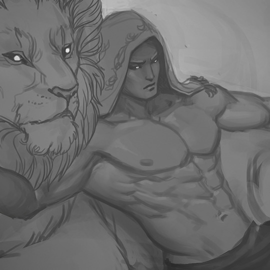
#coloring is hard. values are not so its in greyscale
Explore tagged Tumblr posts
Text

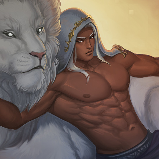
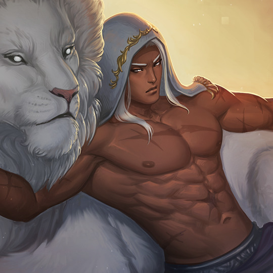
artblock hit me so i doodled some minatos
#yes he is wearing the collar kenji gave him why do you ask#art#fanart#makoto yuki#minato arisato#minako arisato#kotone shiomi#persona 3#coloring is hard. values are not so its in greyscale
13 notes
·
View notes
Note
Hi! I really love the way you color, and I was wondering If you could make a tutorial about it, I of course completely understand if you Can't/don't want to do it thanks in advance If you decided to do it and have a good day/night.
Hello hello! Ooooh, a color tutorial! I've never done one before so I'm not sure if I'll be any good at it haha. But I don't mind sharing my thinking process when it comes to coloring my works. So when it comes to color, I very much have a traditional painter's approach since that's how I learned color in art college. My painting professor never allowed us to use black or white paint, we could only use other colors to create darker colors or new colors altogether. And you're probably thinking, "What the hell? That's insane." And I wouldn't blame you haha. But this approach helped me a lot to not rely on tints (colors mixed with white) and shades (colors mixed with black) when I color. For the most part, I purely thinking about value and hues when I'm coloring.
Finding the right values:

So for this drawing, I did two different takes (one with direct harsh lighting and one without). The reason why I'm showing this is because when it comes to color it's very important that your values aren't clashing with each other. When I started out, all my coloring felt flat because I was using colors with the same values so there was little to no depth. A lot of people don't realize this but color does have value!
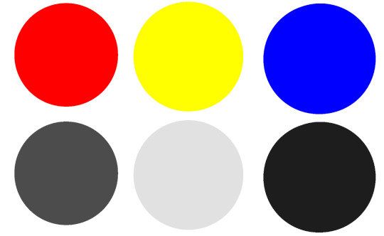
If we put the primary colors on greyscale, you notice how each color has its own value. Blue tends to be a dark value, red has a mid to dark value , and yellow is a much lighter value. This is why if you ever look at my work, the color I use for shadows lean into blue/purple tones. You can also have warm shadows since red does have a deeper value compared to yellow. But these values are when the primary colors are at the highest saturation. What would happen if we knocked down the saturation levels?
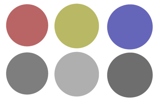
The values start to become more similar. Since we're not always using the most saturated colors, it's important to understand the values behind the colors you'll use. Once you unlock that, you can pretty much do whatever you want with color haha. That's why I hardly ever use black or white in my digital art when mixing (also I don't mix color with a brush, I just pick from the color wheel which might be insane).
While it's not wrong to use white or black to create darker/lighter colors, color in real life doesn't always act that way. Shadows and highlights can have color. For myself, letting go of white and black has opened a world of color combinations that I didn't think of before taking my first ever traditional painting class. Now, I can freely pick colors and experiment with palettes since I've blocked out what values I need (like the image below).
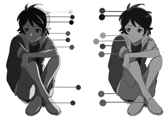
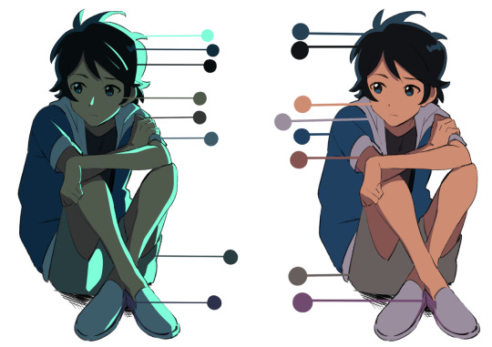
Even if I'm using blending modes like in the next image, I'm always thinking about making clear value separations. If I can't understand the image in black and white, then I'll have a hard time seeing it in color.

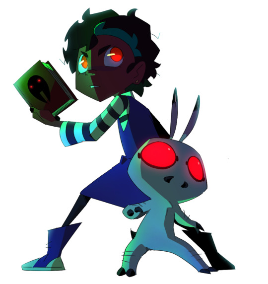
And when you get very comfortable, you can start placing characters in different color environments and match them (which essentially is the job of a color designer in TV animation).
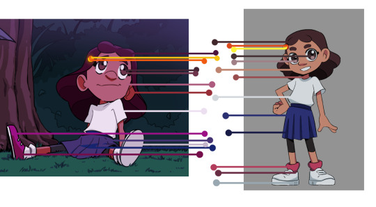
The right image is the official color palette for my character which already uses a lot of blue/purple for the shadows. But on the left side, she's in a night-time environment so I leaned even more into the cool colors to the point that the white T-shirt is actually a very very light purple/pink color haha.
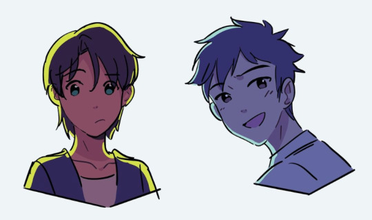
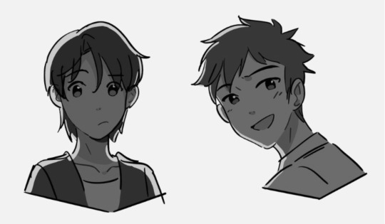
Or like this example where the left drawing gives a more sunset/golden hour lighting while the right one is more blue hour/night time lighting. But you can read the colors clearly 'cause the values are clear to begin with. While that wasn't really a tutorial this is pretty much my thought process when I'm coloring my digital works. ^^; I very much do follow an academic approach to color theory but even then I think it's okay to break the rules. As long as you have understanding of colors' value, I think you'll be able to unlock any color style you want! I hope that answered your question and was helpful!
#digital art#digital illustartion#color#anon#ask#send me anon#send me asks#color theory#tone and value
237 notes
·
View notes
Note
HOW DO YOU COLOR
a bunch of references! I take inspiration from other artists’ rendering style and if possible, study their way of rendering through speedpaints. Right now im trying figure out ways to render hair without it looking glossy, haha
I also play with the colors a bit when im unsatisfied with how it looks. But due to my lack of ibispaintX premium I dont use gradient maps🥹
(I adjust it by increasing the saturation using the saturation layer, lowering contrast through luminosity)
(Ps, overlaying the artworks with color dodge, darken, overlay, soft light, or color burn brings out interesting results) eg:


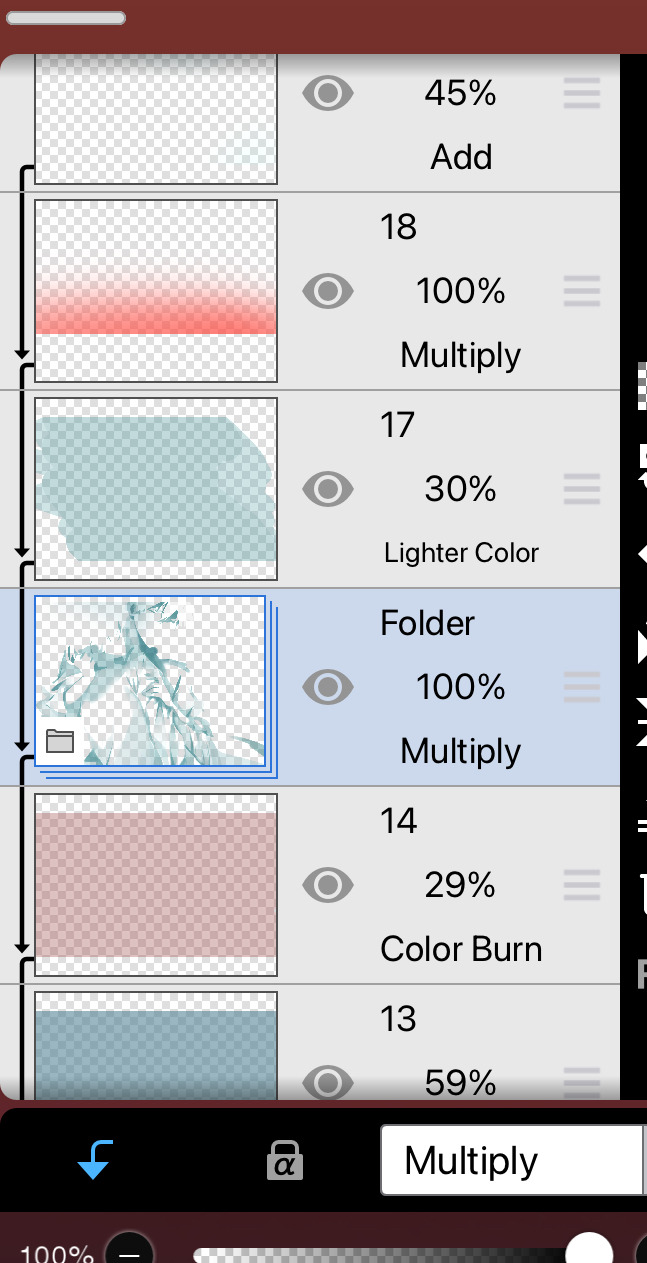
Sure, it’s a bit tedious, but i gotta do with what i have, right?
>i usually lower the sketch/lineart layer opacity to give it a softer look, and then i merge everything together (except the background) before i start rendering so its is easier to use the liquify tool in case i want to change anything(you’ll notice that Xander’s face shape looks a bit different in the final) ^^*
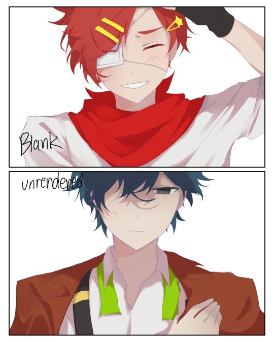

One thing about art is to not focus on the little details, or it’ll end up looking cluttered. Double check your values and contrast using greyscale frequently (easy way to do this is create an adjustment layer in ibispaint and use the greyscale filter).
And i think that’s everything i could explain about my process! I apologise if its not everything, haha. Its hard to explain how i color exactly because there’s no real way i could explain how i do it. But using references is the best thing you can do to improve you color choices and rendering. I hope this helps in some way 🥹🥹
5 notes
·
View notes
Text
White dress redraw process breakdown
found an old art piece i think had a cool base idea and wanted to repaint it and see how i would interpret it today.
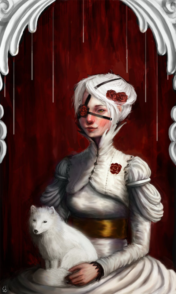
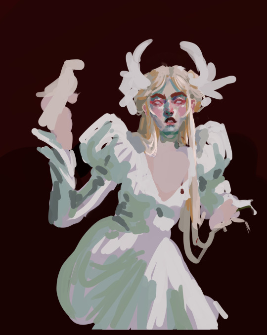
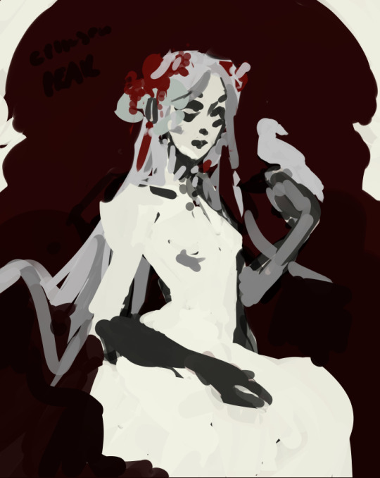
to the far left is the old art,
What works: i like the all white outfit with a white animal and the contrasting red background and red accessories. ive done alot of sculptural work on the clothing and thought about how it would be constructed and got some good different textures in. love how i rendered the white frame element.
What doesnt work: the lighting is inconsistent and very flat with greys. the face doesnt seem to be lit in the same way and neither is what was a valiant attempt at an artic fox. the gold is a nice accent and i have matched it with the eyecolor of the woman but its not noticeable enough. i remember wanting the eyecolor of the fox to match as well but i thought it was cringe at the time. now i know there is no such thing. the pose is also incredibly stiff. also that eyepatch seems like a rogue storytelling element thats hard to interpret how it fits with the rest of the painting.
Brief: pale woman in white dress sits against a red backdrop interacting with some sort of animal in the same color palette.
my first attempt (middle image above) was a fun exploration of color and i figured out here i wanted her hair to be loose so as to have some dynamic lines in this very static image. however it still seemed quite stiff to me and not capturing the emotion i wanted from it. also the hand that hold the bird didnt feel right and seemed like it would be a future issue.
second attempt (far right): i wanted to go back closer to the pose in the original image, add in red hair accessories as in the original as well. the more gothic feel of this i really vibed with. with the framing elements and the bird i also wanted to see if i could get some sort of cage feeling.
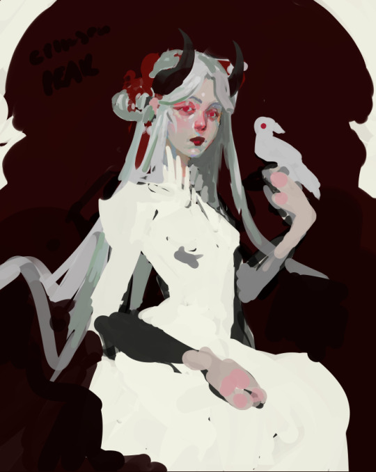
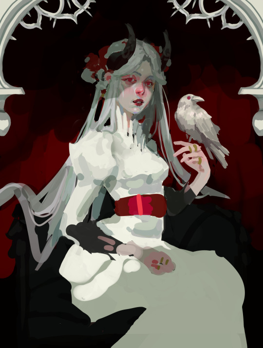
i started rendering and then remembered that i should add in lighting as early as possible and not as an after thought after, i blame me doing more line-y sketches for the slip up. also i added horns because it made me happy and looks rad.
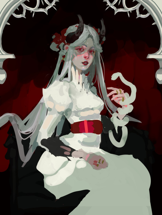
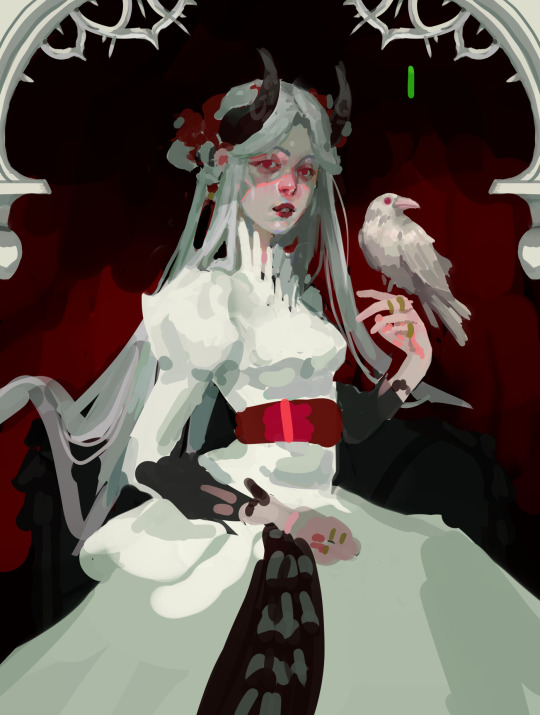
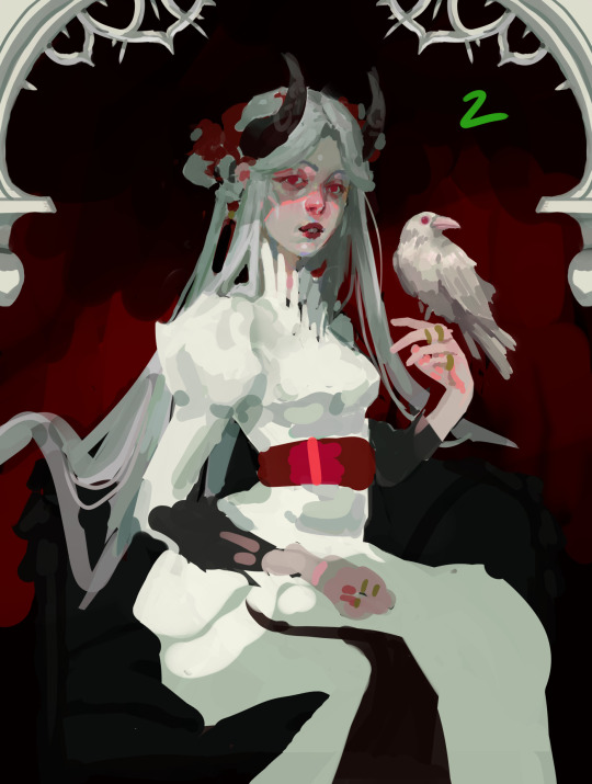
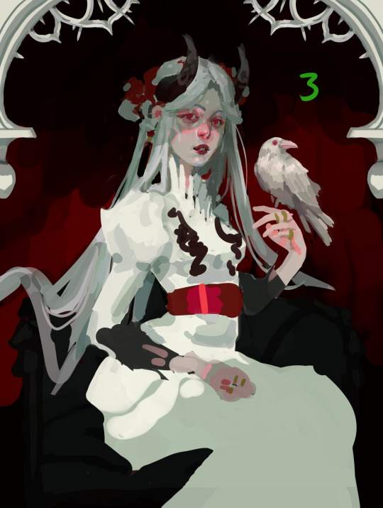
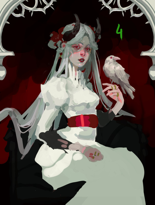
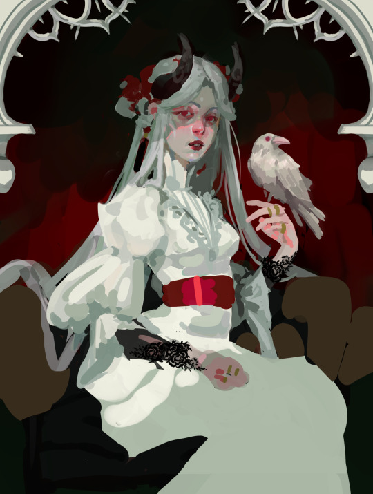
at this point i ended up in my "searching phase", same as with my red saint painting. in the end i decided to trust my sketch and went with none of the other options here. though snake version and big poofy sleeves version were very tempting. i ended up not making the red sash as shiny later since it drew too much attention away from the face. i did pull the "V" detail and altered collar on the dress from far right second row though.
shortly after this i also decided to make the eyes pop more with them being milky pink. because it made her look more like a vampire and i love that shit. utilized a greyscale layer to check my values alot in this as white on white is quite hard.
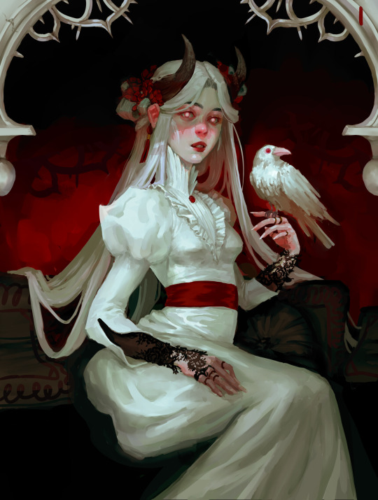
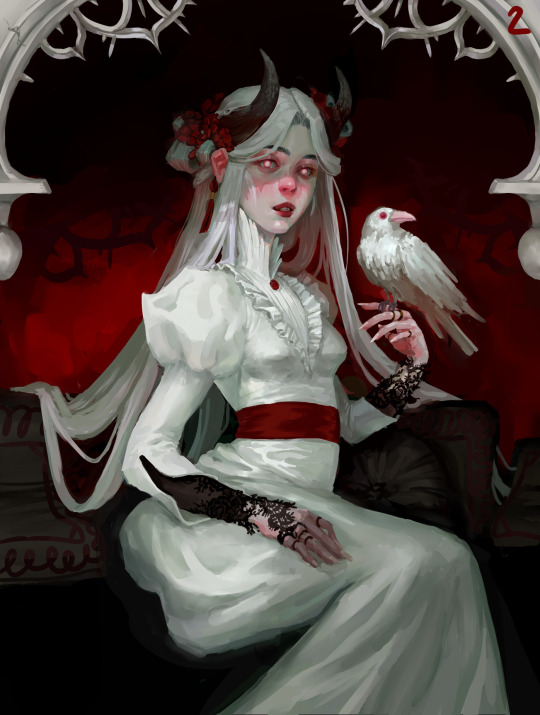
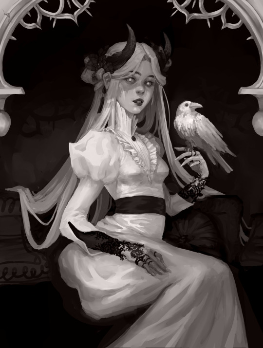
continued to render and tweak the lighting and ended up with two versions of the finished piece with two different moods i personally love the nr 1 version best but nr 2 is a bit more striking and vampire-y. might go back and add some Ivy to the white framing elements but i think that might be too much of a color distraction to add in dark green. it was important to me that the woman felt like shes in control in my newest version, confident in herself. the old version struck me as looking a bit like shes holding back tears.
ive found that when painting i follow 4 distinct phases. sketch, ugly phase render, searching phase (bored make 15 different versions), render until final. hopefully ill learn to cut out the searching phase and save myself time
final image here
3 notes
·
View notes
Text
A look into my character creation process, featuring Florence and Isadora (feat. Gage thoughts + comparisons)

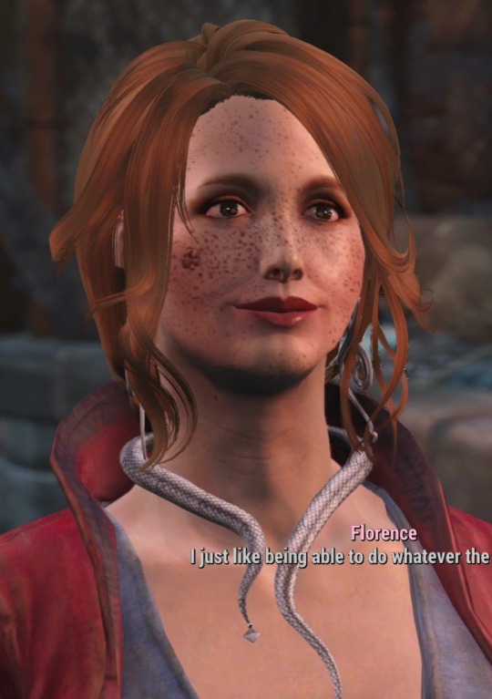
Character Design
So, already, you can see the differences, but lemme point out exactly what I did.
Isadora is a Brazilian woman of multiracial descent, whereas Florence is a white southern woman.
Starting with Isadora, her face is long, somewhat gaunt, and has many sharp edges. Her cheekbones are extremely pronounced, her nose has a completely flat slope down into a point, and her eyes are feline. She has a 'dorito body', stands tall at 6 feetish, and is muscular and toned.
Flora, on the other hand, is opposite. She has a small button nose, smaller, more rounded 'princess peach' lips, big puppy eyes, and soft, full cheeks with fat. She has body rolls and pudge, and lacks 'wear and tear' for lack of a better word.
Isadora has noticeable aging lines, Florence doesn't. Where Florence's hair is loosely put up to nicely frame her face, Isadora's is shaved, and pulled back into a practical ponytail. Florence's makeup is simple and natural, but Isadora's is flamboyant.

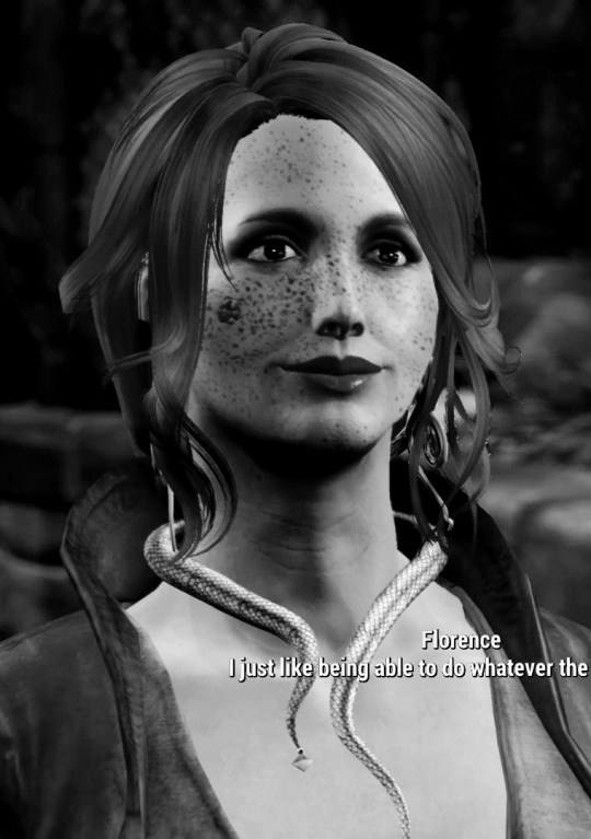
Here's what they look like in greyscale.
As you can see, despite Isadora's makeup being more experimental, hers doesn't fundamentally change the values and 'figure' of her face. However, Florence's does. Her makeup emphasizes her face, and you can more easily tell what effect it has visually.
You might have noticed that their wardrobes are different as well. Isadora wears a camo jumpsuit, leather armor, and a backback (the straps can be seen). Florence wears dangling jewelry and a bright red coat and ornate corset.
So, what is the point of all of this?
Florence is designed to mirror Isadora. Flo wears her makeup hard to notice, but enough to make her feature more noticeable. Make her eyes more doe-like, her lips softer and sweeter, her cheeks flushed. It's to make her more appealing, her expressions more noticable. Flora uses makeup to make herself look innocent and sweet.
Isa, on the other hand, does nothing with her appearance for anyone's viewing pleasure, for any sort of gain. This isn't a 'not like other girls' thing, stop that. Isadora wears her makeup in the colors of her favorite animal, the peacock. Its bright, it's tacky, it's detered many people from having anything to do with her. Florence lures people in, Isadora pushes them away.
As for the clothing, Isadora is a GNC army vet, a combat engineer. Her pockets are full of tools, parts, fuels. Her backpack, even more so, with rations, camping gear, ammo, weaponry, etc. Shes in combat, she needs armor on, she needs to not be easily detected. Florence, on the other hand, is, functionally, a Donna. A leader of a mafia. Its a trade network, but she runs it with an iron fist and a sweet red smile. Her clothing is expensive, empowering, shows off her chest and neck almost like bait. Both outfits are also indicators of their color pallets; Florence is all about reds and pinks, Isa is all about greens and blues. She's not getting dirty, she's not even out on the field.
I intentionally made Florence look like a quaint little lady. Florence goes out of her way to look non-threatening and cute, while Isa is older, has been through too much bullshit, and simplifies where she can.
Basically, Florence is the way she is because she had to be different from Isadora in as many ways as I could get.
Parallels
Getting into their backstories here.
So, Florence born into a large, fairly privileged people in a rich, wealthy settlement. She was raised to provide for her family, and took up work as a singer for a bar in the wealthiest district. From there, she met the son of the captain of the Coalmaw, a ship fleet off the coast of the southeast. The Coalmaw got its work running supplies, a small-time shipping company. Florence's parents married her off to the captain's son so they could take advantage of her new husband's wealth and power. Flora, from here, took control of the shipping company, building it up and expanding into a coast-wide trade network quickly spreading all across the wasteland. Despite her husband being abusive, Flora stuck with it as a show of power. However, her husband wanted her to keep singing, so she was stuck in the Coalmaw's bar.
Florence hated being back where she started, despite having made an empire for herself, by herself. She hated everyone else profiting off it even more. The people around her justified her predicament as simple dog eat dog philosophy; her husband was going to marry someone and abuse them. She shouldn't take it personally that it was her. Someone would have taken advantage of the trade network anyway. She shouldn't take it so personally that everyone else got to have some of the pie, and she didn't.
Isadora was born into a small, struggling family in Florianópolis, Brazil. Isa wasn't understood by her family, but they provided for her the best they could, and encouraged her to achieve the best in life for herself. Her city suffered following the invasion of Mexico in 2051, around the time of her birth. Florianópolis has one of the lowest crime rates in Brazil, but when the economy takes a nosedive, people get desperate. The local government protected the citizens the best they could, neighbors looked out for one another, and people got by a lot better than anywhere else for it. Community and banding together kept everything from going to shit. When someone or a group stepped out of line, trying to make it through on top through force and violence, they got the shit beaten out of them. Everyone protected everyone. Anyone who became an enemy was treated as such. Their unity made them stronger.
Later in life, as Isadora found great successes, such as graduating from the Commonwealth Institute of Technology at the top of her class, setting herself up financially following her invention and selling of the Assaultatrons, and becoming a decorated combat engineer and war hero. However, she always struggled to connect with other people, and ended up settling for a relationship she wasn't happy in and having a kid she didn't want.
Florence was made a sacrificial lamb, told that she had to suffer for everyone else's benefit. Isadora was shown that everyone will benefit if everyone pitches in what they can.
But, while Isadora was able to push through the doom and gloom of a collapsing society by trusting in the good of people, she never really understood what she wanted for herself. Isadora was taught so much community, that she hadn't figured out who she was, if not what she could do for others. Isadora would never regret how she came up in life, but all of her motivations are outside of herself. She had a kid because her husband wanted it. She had a husband because she was expected to, having served beside him in the army the entire time they knew each other. She joined the army because America was her country, now, and they needed robotic experts on the frontlines. Isadora often felt like she was going through the motions. She knew what she wanted for the world, and exactly how to get that. But never what was good for her.
Flora, on the other hand, knows exactly who she is and what she wants. She wants her empire to herself, she wants out of her marriage, and she wants away from her family. Flo wants to establish her network as far as she can, to make a better future. She never bought into the idea that someone had to suffer. In the world she grew up in, yes. But only because people made it that way. Florence believes that while she needs to be cruel to get and keep her place, her work in rebuilding society and connections will help lessen the need or faith in the practices that hurt her. The ends justify the means.
In Regards to Gage
This brings us to Gage.
Let's use the Dog Eat Dog metaphor.
Gage wants to cozy up to a big dog, and be protected by it and get some of the kill. He wants to be safe, not the one getting eaten. Victim or Victor, he's a victor.
Isadora is a big dog, who eats other big dogs who would prey on weaker ones. She thinks they could all eat and work together, but if one dog is aggressive and wants a fight, she'll give it to him to protect everyone else. Victimizes the other victors.
Florence schemes with every smaller dog to gang up on big dogs to take their resources, then allows other dogs to have the kills in exchange for their loyalty, then absorbs some big dogs, uses them against the others to keep them in line. She uses every other dog against each other to keep power and control, forcefully and often brutally enforcing civility through threat of death and being exiled from the resources and privileges she has control over. Everyone is a victor, but at the cost of being a victim of Flora's system.
So, it's like...
Gage; the cage is shitty
Isa; no cage
Flora; the cage is gold and comfy, but the bars are electric.
In regards to the slave traders in Nuka World, now.
Gage would enslave and be cruel to the traders as a show of power. It's better to always have the reigns tight so they know to not cross you, you always have to be at their throats.
Isadora would free them and kill their enslavers as a show of protection. The best defense against cruelty is overwhelming opposition, destroying any monument to its power or effectiveness.
Florence would basically enslave them, but take good care of them. She doesn't need to be cruel, her power is absolute, and it's better to keep your people on your side rather then needlessly alienate them.
Shipping Who With Who
All this to say; I almost broke up Danse and Isadora to ship her with Gage.
Isadora and Gage are of similar age, opposite but still valuable as enlightening perspectives, have personalities that compliment each other very well, look good next to each other, have incredible tension, and would be good for each other.
IsaDanse works because Danse and Isa have lived almost the same lives. Doing everything for the sake of their community, valuing it above all else, but neglecting their own needs and mental health, and having a crisis when forced to confront how unhappy it made them, and questioning if they're selfish, traitors. Ask me about Danse and Isa and I will kiss you on the mouth, but that's a different essay.
Point is, Gage and Isa would work so good as a ship that it almost destroyed the heart and soul of this very blog; Paladin Danse getting a hot milf gf.
So...Flora.
I made her to be Isadora's mirror, to match her beat for beat but with different drums. Well, Gage is why. Florence needed to be similar to Isa to replicate the fun narrative potential with Gage.
Where Danse and Isa work because they understand each other, Florence and Gage work because they have to unlearn some shit to understand the other.
Gage thinks in Dog Eat Dog, someone has to die, its inevitable, etc...but then he starts learning about Florence, someone he's fallen in love with. The same lifestyle and philosophy Gage has, everyone else has used to hurt her. Dog Eat Dog goes both ways. Gage has to listen to everyone justify why its okay that they put her through what they did, and has to think oh shit, I've said this word for word before. The very thing that he used to protect himself, the love of his life was tortured with.
And Florence is so similar to him in thought process. But where Gage succumbed to Dog Eat Dog, Florence looked at it and said, okay, have it your way :) and put shock collars on everyone, forcing them to play by her rules. Not for revenge, but so she could try and make a world where no one would be hurt the way she was. If you control everything with an iron fist, you can protect everything. Florence is cruel when she needs to be, but she does everything with weaponized realism.
Gage, on the other hand, has weaponized his pessimism. But with Isadora's successes with the Minutemen, and Florence explaining and demonstrating the value in abandoning the idea that suffering is a rite of passage, that cracks. He has people he cares about, he doesn't want them to hurt. If someone hurts them to survive, does he have a right to the anger when he's done the same thing? Gage has to rethink what he believes can be done about the world and the nature of communities.
Back to Isadora, she's weaponized optimism. She's always looking for the sunshine in a storm. Isa thinks that she can get away with endless compassion and hope, and she enforces it with her army and sheer will. She acknowledges that it can be a privilege to be kind, but there is nothing in the world that can touch her, take her down, stop her from rebuilding the Commonwealth and helping as many people as she can. Isadora is a force of nature for good, and she has the firepower to back it up.
Flora has a more critical view of the world, Isadora thinks that while perfection is impossible, it doesn't take much for society to be good. Isa finds that community is all you need, basic kindness and compassion. She thinks humans and humanity are good. Florence thinks they're a wildcard that can be influenced. Gage thinks its all a pile of shit.
I think Isadora eventually worms her way into Gage's...tolerance, at least. He comes to respect that she very much earned her reckless compassion, got herself so much power that she can afford it. And Isa values someone who tells her no, challenges her, gives her perspectives that she wouldn't normally notice.
As for Isadora and Flora, I think Isadora would control the Minuteman army as a means of protection, while Florence would take over running the settlements, once it all got too big and successful for Isadora to manage on her own. They work closely together and get along great, having similar personalities and ideals. Even if Isadora is horrified at Flora's more capitalistic tendencies, and Flora thinks Isadora is too kind and generous for her own good.
15 notes
·
View notes
Note
thank you so much for not getting intimidated by the length of these replies twt
I'm just having a lot of fun talking about art with you. :3 I was super worried that I overdid it last reply but im relieved that that's not the case.
Yessss Pixiv is a goldmine of gorgeous art! If I stumble upon an amazing artist on there I can’t stop until I devour their whole catalog! I didn’t know there were such perks/dangers to being subscribed hmmmm 8)c
it really is just crazy for inspiration. Everyone is so talented. Pixiv has this thing where if you bookmark one piece you like while you're subscribed, it recommends 10 more similar pieces for you to check out. So It gets me in lots of trouble because I keep trying to like the recommended pieces, but as soon as I like them it recommends 10 more and keeps going!!!I can never catch up!!!!! It's stupid and funny how actually distressing it is!!!!! Haha but I've gotten a lot of great inspiration that way.
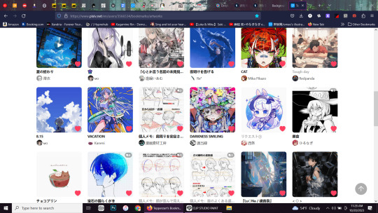
It’s wild to consider how much affects a finished artwork.
Thats true.... if you consider it like that, it's like we're all sharing our lives with each other when we cross-reference. :)
No way, I can’t say it’s weird at all to go through mangas~~ Whole comics must be even harder to make because not only does every panel have to do the job of conveying its own idea but then they have to fit into the composition of the whole page too! It’s a lot to balance all at once! The use of black, white, and greyscale is also a totally different skill from color pieces so there’s a lot that can be learned from mangaka.
Yeah. As someone who wants to be a comic artist as well as illustrator, I feel like it's important to know my references. I feel like I learned a lot by my experience. I listed the pros and cons and good points of the art by series. I almost thought about making youtube videos or something on my findings but script writing is not my forte lmao.
I definitely refer to Sugisaki’s all the time~ I absolutely adore her style, clothes, lines, all of it but also her paneling is out of this world; every page feels like a carefully laid out work of art!
I feel that so hard. Ive also done that so many times. I definitely have my bitter disillusions with sugisaki nowadays, but I can't deny how much she directly inspired my artistic journey. I've thought many times about how each panel feels like a finished piece all on its own, and how I wished I could do that. Getting swept up in her manga feels like a delicious spring breeze where anything can happen. I remember when I did her pro-con list for dnangel, there were sooo many pros that it went off the page. Some of the cons were funny though. She never shows feet and avoids drawing shoes as much as possible. lmao.
Sorry about your art block D: That ain’t a fun place to be in. I hope you’ll be able to get out of it soon!
Thank you. yeah, me too.
And that pic (and 22k others) will be waiting for you~
H-hey!!
Yooo I’m feeling the creepy vibes! That’s the kind of sight that would make me freeze on the spot. A still silhouette with shiny eyes turned my way. @@ I like the effect of the rim light a lot, especilaly how the thickest part is at the top, so even when I look at the rest of the pic, my eyes are still guided back along the lines to that strongest contrast. Your second piece had a lot of references in comparison! :o The goblin quilt worked out though LOL. I see the influence of the low saturation piece the strongest (Can’t stop staring at his gloves. The lighting and colors on them are so cool!!) There’s more of you finding unique value even in chibis for a rendered illustration! Thanks for showing both of these! ^^
>w<! Thank you so much for the kind analysis. You even made me look harder at my old pieces and appreciate them! I wasn't too happy with how either of them came out, but it warms my heart to see that there are actually good features on them. Either way, I'm happy I shared if just because I think sharing processes is super interesting!
I thought the solid green + lighter orange outlines on the bushes was a cool effect so I tried the same here. Similar color palette too~
I love seeing your process at the bottom with the reference picture. I can definitely see the inspiration. The greens and that strong wind are very prevalent. It's so interesting how the mood in both pieces are different but complimentary. Is it hard getting the shades of colors you want with watercolors? I find it's hard to get a consistent color because I never mix enough of the color I want. Do you have that problem, or do you find ways around it?
Gaah I do have an old pinterest account I should make it useful orz With all the fashion on that site it WOULD be perfect for outfits…! Thank you so much for the suggestion and link!! I’m already seeing some really cool stuff in that board… (So nice of them to put the… genre? style!! below it because I’m learning some neat ones lol)
no prob ^^ Yeah I like using pintrest cause I can make different boards for my different story ideas/characters, and it will recommend me similar stuff. Makes my brain not have to do too much thinkie.
Saito is so wise <3 His correction videos teach me so much.
Yeah! he's good! I really appreciate his videos. I try to pace them out because I feel like there's SOOOO much knowledge chock full in each video that my brain is overheated after watching just one or two! He comes across as such a dedicated teacher. It's nice to see tips straight from a japanese anime artist in the industry. It's honestly rare content. Apparently he started out drawing yugioh monster cards, too! What a legend.
(Who says “collecting materials is troublesome” to him? NO collecting materials is TOO fun!! xD That’s how we end up with thousands!!)
EXACTLY!! I want to know who said that too. Maybe we can make them sort my 20,000+ files for me, as punishment. then they'll have a taste of real troublesome hell xD
Thank you again, Tepperz!! I skimmed through the tutorials you sent and I know they’re going to help a lot. The klecon one is so thorough!! (And the lesson on digital color mixing much needed @@ Who knew yellow and purple did that…)
Not a problem at all. I love sharing resources. I know you didn't really ask for color theory but I had to throw that one in because it's my favorite tutorial. It's so, so thorough, like you said. I'm glad I saved it too cause apparently the artist who made that tutorial isn't a very good person(!?) and has since taken down their tutorial after a bunch of name changes, but that doesn't mean we can't learn from them. Another hidden gem in that folder is a photoshop file of Kwacy's work. I feel like I learned a lot because it's so interesting seeing how a professional layers their art and effects. Really breaking it down, you know? I have no idea if it'll help you as much, but I haven't seen many other tutorial psd files like that and I think it's really somethin'.
I don’t have much on gestures after all, dang! Just a bit? >< And here’s the contents of my composition/background tutorial folder! (And if you’re okay with this kind of sharing, I included the book Framed Ink, which has been changing my world lately for odd perspectives and using backgrounds to shape the composition. If not please ignore that! ^^;) DRIVE
YOOOO thank you for all the tutorials! There's a lot of good info here!! I'm definitely gonna hoard these resources once my internet stops acting goofy. And sick! I've been meaning to read framed ink, so thank you! Yeah, I'm not a stickler for rules. Some of the resources I sent you were also behind a few paywalls. But artist friends should help each other and share resources. I believe in that. I like the youtube videos you sent too. Im actually excited to draw along while the videos play. What books do you have of his?
Hey, having them on the canvas means they’re all exactly where you need them~ So many times I accidentally close out of a picture and have to open up the folders and find it again~
god... can you imagine me doing that, my folders being what they are? If something's lost, it's LOST, bro..... lmao
Yeah!! I love the versatility of gouache! Transparent or opaque when you need it– I say that but omg does it take a while for me to get used to that opacity.
Oh for sure, i bet going from watercolor to gouache is a huge whiplash. The opaqueness is really what separates it. That makes a lot of sense.
How are you liking yours btw??
Yanno, I've only played with mine a couple of times, but it's really intimidating. They're so thick that it's hard to paint with them unless you water them down, but if you water them down then they lose that opacity and the texture becomes unstable. The blue here is gouache, so you can see what I mean. I mean, it's fine, but it's not exactly the smooth one color matte I was looking for.
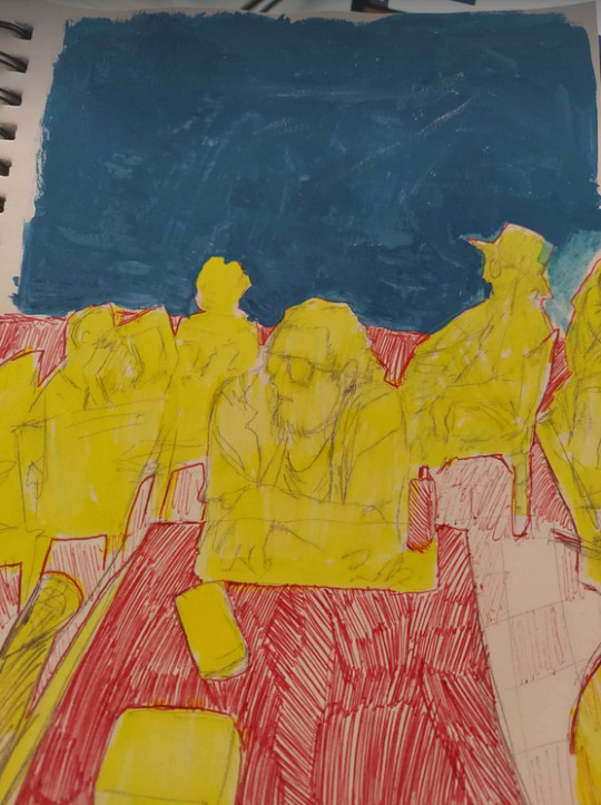
I have a hard time figuring out how to use them properly. Is it better to water the whole container slightly before use? I just dont know. I can say though that as far as using them for watercolors though, they're interesting. You can get a really wide array of colors off a single dip of gouache. Ive only tried the one color so far though.
[Personal time~ My grandma taught me how to use oils when she started going blind and gave me her paints. I painted one canvas for a friend and decided I really really preferred watercolor haha. But I’m glad for the experience! Still can’t identify oils by sight to save my life xD]
You grandma taught you? That's so sweet and wholesome. What a great bonding experience. My grandma was really artistic too. I don't blame you for not liking oils as much though, they really are tough. Not to mention they take a looooong time to dry. I'm not really that patient. I did a cute oil a while ago of kirby that's still drying, but the whole time I couldn't help but feel digital would be way easier xD I feel like I also enjoy watercolors a lot more. What brand do you use? I got these nice winsdor and newtons but for some reason I still gravitate to those basic oval ones. I've never tried the ones in a tube though. They're expensive so I've never committed :')
It’s my pleasure! Your responses are interesting and your links are definitely helpful! ^o^
I feel the same way about you!! :D
How did you learn to draw so well? Like was it from classes or a book on fundamentals or just trial and error?
//// thanks for the kind question!
I guarantee you I would have improved faster if I’d taken a class, but I hope some of the materials I’ve used over the years can be of use to you too:
Andrew Loomis’ books - I never made it past the first chapters, but those had some great advice.
Youtube - Proko’s bean method. Figure drawing references will greatly improve anatomy and “drawing what you see”. It’s boring imo, so doing just 5-10 minutes a day can keep one from burning out while still seeing improvement. Speed painting videos are a nice way to relax and study.
Will Terrell’s People Drawing series - He’s a humble man with personal advice for artists. I watch his videos when I feel discouraged or lost.
Art, art, art - Whenever I see an artwork that I like, I figure out exactly what pleases me: line thickness, nose shape, finger positions, composition, the way the hair bends in the wind, etc. Then I try to incorporate that specific characteristic into my own art.
I have growing folders of (I’m a bit embarrassed) almost 8,000 pictures, organized by characteristics, for the sole purpose of studying their prettiness. Sometimes we don’t need a tutorial to spell everything out, just an example can help us envision our own works’ potential. Also, staring at pictures is a relaxing way to study too!
And of course, trial and error~ I don’t post my sad, failed paintings or all the weird sketches I make, but they exist and teach a lot!
39 notes
·
View notes
Note
Its hard to say what your signature style is because my first reaction would be facial features and eye shape, but your art is recognizable without seeing the head so it would also have to be by your color usage/design consistencies well. I guess it depends on what medium its supposed to look like? The traditional(pencil)looking stuff has softer edges, really good highlights, and overall light/shadow usage and the digital stuff has fairly consistent body shapes/poses and fairly strong colors
Oh hey thank you so much for such a well-thought out response! That’s actually a comforting to know that somehow my art is recognizable; it has been my fear that it’s so generic-looking you can’t tell it apart. I do tend to use stronger colors, I guess because of too much exposure to anime so I end up mimicking their coloring style. (Speaking of, I should really study painting; I believe that will help my art improve by a lot.)
With my black-and-white/greyscale art I had intended to study values (but got sidetracked oof) so it's good to hear about the highlights, light and shadow usage.
Goodness I really should go back studying anatomy. Poses are one of my weaknesses.
Anyway thank you again! Now at least I have an idea what strikes people when they see my stuff.
4 notes
·
View notes
Text
Coloring in grey scale
So, hey, this is somewhat of a tutorial for those curious about some of my coloring and blending. I made this especially for anyone younger than me and is exploring digital art, but this is also for others who are curious about what I do. I love reading other artist’s comments and looking at their WIPs, so why not.
Another reminder: if you’re looking for my artwork, please follow @rainbow-illness and not this blog. All of my finished stuff goes there; usually, my works in progress (WIPs) or Angry Doodle Corner go here. Sometimes I use this blog to repost my art, but that is my official art blog, no this one. Not unless you like nonsensical posting and metal, then have at it. If you have any questions, don’t be afraid to hit me up, I love talking about art.
So I can’t always sit down and talk about my processes and how I go about doing them, but I was able to sit down and take some screencaps while I was working on my iPad Pro. Using the iPad is actually my first choice to draw on because of the convenience of carrying it around like a sketchbook, whereas my laptop isn’t always easy to carry around--it’s a big laptop. While I use my iPad, I also like to go back and correct things, recolor, re-proportion, or spend more time privately working on a drawing. I have my iPad with me, all the time, so I’m out in places usually like Starbucks doing this. I also struggle with pretty bad PTSD and agoraphobia, so having my iPad out with my headphones on gives me an excuse to put my mind elsewhere to calm down. My family just usually looks at me and goes “oh, she’s working on her art again”; I did this as a kid, too, only with sketchbooks.
I do not have a Cintiq either, though I would absolutely love one. This laptop is capable of using a stylus, but I think I need a better one to do it with. All I’m using is a cheap Wacom Bamboo tablet that I’ve had for five years, that’s it. Everything I’ve done on this blog has been on a small surface. So if you’re just dabbling into art, don’t beat yourself up for having the small stuff, I’ve worked with small stuff and still do. The only thing I have that’s not small is, well, the space and processor on my laptop are much faster than any other laptop I’ve owned, bought especially for graphic design classes and my artwork.
So, that being said lemme just forewarn some of you guys. My artwork is all done in two to three layers! Yes, you read that right! Why? When I was 16, I didn’t have a Wacom tablet to mess with, so I had to use a mouse and learned from there. When I turned 18, I got my first Wacom tablet while working my first official job and the family computer didn’t have a good processor. So when I got my first official laptop, it was basic and not made to run anything beyond the web browser and such, it could barely handle Photoshop. It did, however, run Paint Tool SAI with no issue (which is why I still prefer it over anything I use), it just couldn’t handle more than five layers. After losing my drawings constantly and not being able to do anything in the prized software I’ve been eyeing since my Sophmore year of high school, I found a workaround with it.
And that’s what I’m going to write about here. With that in mind, no, you do not have to limit your layers! I’ve taken traditional art classes so my first instinct is to literally paint over my stuff like I would on a canvas. If you don’t want to do that, you don’t have to! Yes, I am nuts.
That being said, let's do this.
If you haven’t taken traditional art classes, that’s cool! I’m going to be using some art terms you haven’t heard of, but you definitely will when you take your first ever drawing class. These terms are foreground, value, negative space, contour, and weighted line (I’ve seen it called line weight too). For the more experienced art students who are likely groaning over that stupid contour practice from that book “Drawing on the Right Side of the Brain”, I’m sorry, guys. Newbies, you are going to know this.
And you are going to hate it. While I still hate it and, yeah, my eyes are rolling into my skull right now just even talking about it, there are some useful practices in here that I... actually use. Who would have thought? At least we’re not talking about still lives.
Anyway, here’s what I’M going to say that some art teachers will not tell you but I want anyone to read this to know:
- Do not obsess over your drawing to look exactly like your reference. Just don’t. Forget this completely, worry about it later or don’t even worry about it at all. This is your style, your interpretation.
- Digital art is hard. Art is hard! Practice makes perfect and you learn over time just by studying (looking at) other pieces of art. It took me like well over 10 years to find my own little niche and I’m still playing around with coloring styles. I have a lot.
- If you’re just starting to draw with a tablet of any kind, play around with it. My first official program was a cheaper version of Paint Shop Pro and when I first got it when I was 14, I sat around and experimented on layers to see what it would look like. Explore!
- When you start drawing figures or faces, try not to think of it as, well, face or a figure. Reduce it to basic shapes, like squares, triangles, and circles.
Greyscale can establish light source, value, scale, and negative space.
I don’t always use greyscale for my art, but when I do, I appreciate it because it makes my life easier. For example, Alphonse Mucha’s pieces here from his “Slav Epic”.
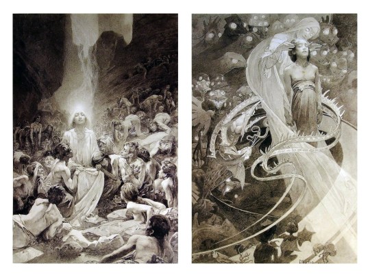
Chances are, you’ve seen Mucha’s art nouveau on prints, fanart, fabrics, and all of that. But Mucha did so much more and he is a huge influence on me for a reason. By the greyscale we see here, we can see foreground/subject with each illustration. Mucha is using value (that’s shadow) to emphasize this, in addition to negative space (background) to draw you in, just by using black and white. Notice how the other subjects don’t have such a powerful contrast and light source versus the other, especially the woman on the left. Mucha made his art pop by his understanding of contrast.
For this first part of this entry, I’m going to be using Papa Emeritus II from “Ghost”... who is a good example of how to draw faces, too. Huh. Regardless of what drawing program you’re using, keep your opacity low, at 50%.
Simplicity at its finest
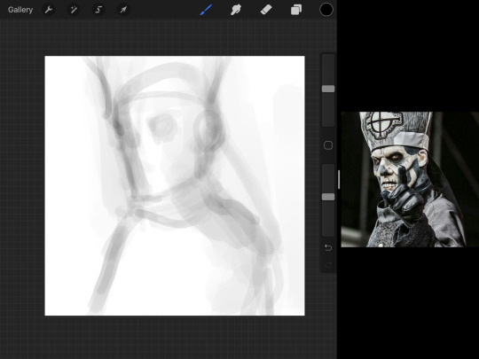
Instead of focusing a lot on Emeritus’ face, I’m going to focus on the negative space behind him. I’m using this to define his figure. This is a good picture because of the stark contrast, though, it’s a little tricky because it is really contrasted and you can’t see where the light source really is. But that is okay! I am going in and just using this negative space, the contour of his head and torso. Before I even think of a face, I want to softly go in and use black (or grey) to fill up that negative space. Keep it simple and work your way up.
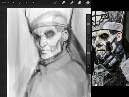
After I lightly fill in the negative space around him, I can start lightly going in and establish his face by blocks of shadow. And this is why Emeritus II is such a good example for this kind of work. I don’t usually start going in and drawing eyes, I rely on the shadows of the face to see where their eyes, ears, lips, and such lie.
Here’s another example (though, it’s old):
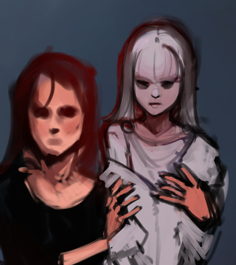
This is in my maroon style underpaint, which is what I post most of the time. For their faces, I just used basically eye sockets to start working on their faces, like Papa Emeritus II down below. Again, this dude is a great example.
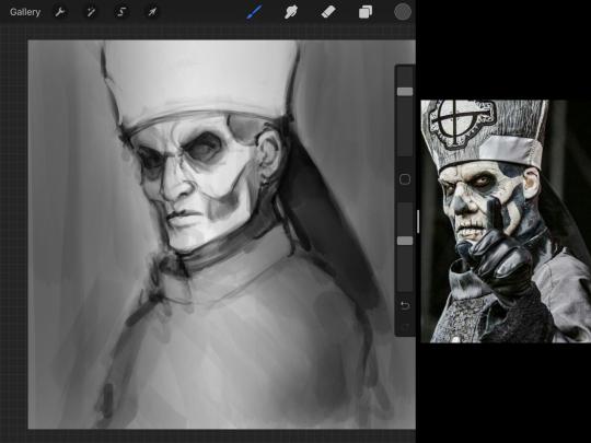
Here is where it may get a little funky. I created a new layer and set that layer to Multiply, still keeping that opacity low. Since I have no light source and I just want to create a really dramatic lighting, I made a vignette with a simple airbrush tool.
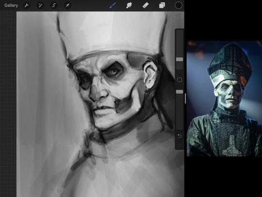
With that little vignette, you can create a new layer (unless you’re me, I just merge it down because of that constant fear of nonexistent software crashing) and I’m using the color pick tool to go back and forth to start using greys to really get into Emeritus’ face, especially his wrinkles. I’m painting over it constantly, switching back and forth between a paintbrush tool and color pick tool to blend. Again, keep your opacity low... unless you’re me and you’re feeling adventurous. You’ll also notice here that I have more than one photo reference. I use several for a lot of my art, so I encourage you to do the same. I had no idea what his jaw looked like, so I grabbed a second photo. Now that I have a better idea of where his hat ends on his forehead and how his nose looks, I start doing a weighted line.
Weighted line and Contour
Now is the dreaded talk. Of contour.

Welcome to Drawing I hell. This cursed image is from the book “How to Draw on the Right Side of the Brain” and if your teacher does not talk about this in your first drawing class, I am going to eat my hat... I have a hat lying around here somewhere. ANYWAY, the contour line exercise is basically you just using a neverending line for a drawing. I don’t know who drew this (and tbh, thanks a lot for every single boring assignment I’ve done in drawing classes), but this guy used contour lines for his drawing. I’m having war flashbacks over here, but I managed to find an art teacher’s page talking about different types of contour. My god, they are evolving.
Going back to our dear friend Papa Emeritus II, I used weighted line to start adding in little shadows to his face. Weighted line goes hand in hand with contour; it is a great technique to not only add details, but add little bits of shadows.

This is a simple example; the thicker line is adding to the shadow of the apple, giving it value!
Papa Emeritus II is such a good reference... I used him as inspiration for King Melwas here.
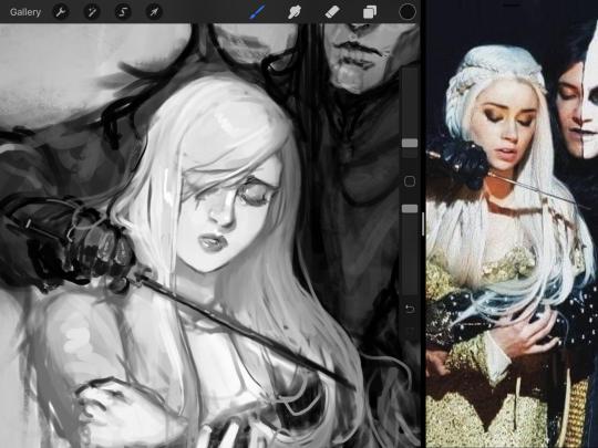
Gwenhwyfar is also a good example of weighted line. Gwen is essentially a very, very pale character. In contrast to Melwas, who is in darker clothing, Gwen is soft, she is the focal point in this drawing. For the little pieces of her hair, the corner of her lips, eyelashes, and her fingertips, I used a weighted line to establish these things, otherwise, Gwen is so pale, she’ll easily be washed out completely.
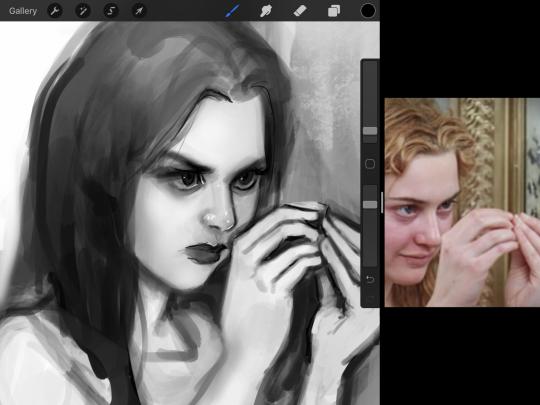
This drawing of Alice, which I’m still messing around with, is another example of how effective a weighted line can be with depth. The lines I added into her face, eyelashes, creases, hair, and fingers add those little details since everything I’ve done before like Papa Emeritus II was so soft with a low opacity on the brush settings.
Layer masks and curves
There are two ways you can color greyscale images.
You can do this by going into Layer > Adjustment Layer > Curves (this is how it looks like in Procreate).
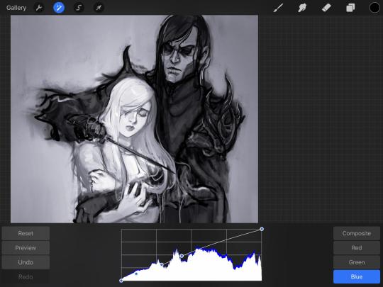
This gives you a neat ol’ base color! I am playing around in the blues, adding soft hues of blue in their figures and the white in this picture can either turn blue, cream, or even green. You don’t have to use Blue, you can use any of the other colors. For me, I’m always drawn to blues. Another cool thing to play around with is Color Balance, which is underneath the same function as Curves.
But if you don’t have any of these, you can add a new layer, and do Multiply.
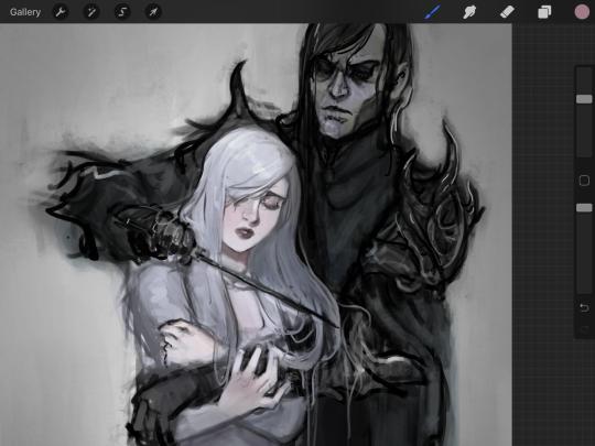
The only drawback to this, of course, is how destaturated (the lack of color) it looks. And yes, that’s an issue you will have and I did run into this while doing this. How I combat this is using additional layer masks. Believe it or not, Alice here was once at a grey scale, looking even more desaturated than Gwen.
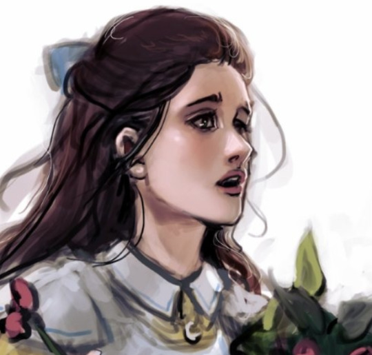
For Alice’s face, I went in and use:
- Soft Light because she needed more peach and roses in her skin. Omri’s original drawing gave her a light rose blush so I wanted to do the same.
- Overlay to mask out the black lines from the greyscale I had.
- Lighten which I used to make her lips pinker, her apron’s shadows lighter, and parts of her hair brown.
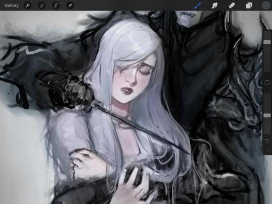
The same went for Gwen, who is, again, very pale. But while she’s supposed to be pale, I didn’t wash her out completely. To add more saturation, I used a combination of Soft Light over my Multiply layer and Overlay to start working at the highlights on her hair, nose, and shoulder.
This little walkthrough isn’t as visual as I like, but with limited software like Fire Alpaca, GIMP, or Paint Tool SAI that don’t have the abilities of Photoshop in terms of color correction and playing around with colors, I really encourage you, readers, to play around with these tools. Using the color picker back and forth, especially after using layer masks, gives you an ability to mix and blend colors. The reason why I work with greyscale or a maroon under paint is that you can create brilliant colors and make a new palette; the trick is to constantly mess around with them. I never go in and flat out color anything, with the exception of things like “angry doodle corner” which is basically what I call my lazy drawings, drawings where I’m just honestly goofing off with.
So in summation...! Or me trying to summarize this.
Experiment and explore with layer masks and adjustments. Whoever says that using these tools isn’t real art, they’re wrong. And please don’t ever be afraid of using references of any sort!�� Alphonse Mucha is saved ten times over on this computer.
#my art#tutorial#i think#an attempt was made#digital art#procreate#ipad drawing#ipad pro#Alice madness returns#alice liddell#american mcgee's alice#alice asylum
8 notes
·
View notes
Text
so heres the long super paper mario post
strap in for why super paper mario is fucking bizarre and why that’s pretty much awesome
gonna be a good amounts of spoilers, so if you’re on desktop then hit that read more, and if your on mobile, then here’s your punishment for using this god awful app
super paper mario is a game that is incredibly difficult to put into words, but it leaves such a powerful, lasting impression on me and i can’t come to say anything first other than I love it so much, and if you havent played the game, please just go do it now, even if you have to pirate or emulate or something, just let yourself play this game. It’s one of those games that I really feel I can just recommend to anybody
it’s difficult to think of where to start with dissecting this thing so i’ll just start with the art since lookin at things is pretty easy
ART/WORLD DESIGN
every world in SPM is completely unique, not just in what type of environment, but it’s art style, and this is premised with the fact that none of these worlds are capable of existing together and are completely separate, and NOT part of a cohesive universe (LOOKIN AT YOU ODYSSEY I STILL THINK YOU LOOK STUPID)
The hub and the first 2 worlds are mostly just slight variants on the same general style of simplistic shapes and colors, with world 1 delving into more linework type aesthetics, and 2 focusing more on impressions and silhouettes,
world 3 changes this completely with what is obviously an 8 bit kind of style, but instead of jarring over sized pixels, the world is composed of detailed tiles arranged to look like pixel art that imply a more real world, and not a gamey one,
world 4 focuses on patterns and big patches of color to give the impression of the vast emptiness of both space and the surface of a barren planet, before giving you the “Whoa Zone”, with a striking mix of wire frame and futuristic UI style to it
world 5 takes the idea of nature being crude and simplistic and humanity being sharp, angular, and extreme and flips that on its head, with humanity and the space they occupy being these absolute memes with no sense of depth, and the plant life existing in a system of clean cut caves with futuristic technology and elegant historic values
world 6 simplifies a kind of colored Japanese painting aesthetic, down to the funny cylindrical cloud clusters and brushstroke trees
world 7 depicts what is essentially hell (yes there’s hell in this game keep your pants on) as a squarish blur of bright greens and warm reds and purples, and depicts heaven as fluffy land of clouds and Greek temples
and lastly, world 8 is inverted greyscale, where light is black and darkness is white, its simplistic and striking and i couldn’t think of a better style for the final area of a game so focused on the concept of light and dark
MUSIC
I’ll just try and keep it simple, the musics fucking cash money
The game makes great use of motifs when it needs to, where specific themes and instruments are used in other songs to suggest relationships and put battles and travels into perspective
And when it ISNT doing that, it’s just fucking funky stuff, with a weird trend of BOING and PLOP and SPLISH noises in the percussion because fuck you i guess
There’s a lot of good songs that do lots of interesting things, any of the like 5 final battle songs are great things to point to, but i’ll just go ahead and say the main theme of world 8 “Castle Bleck” is one of my favorites that isn’t super highly rated. It brings in the types of instruments that have been associated with the villain the entire game, but also throws in 2 very important things; a sudden triumphant burst of almost JRPG styled chiptune that pushes away the constantly building tension, which is then followed by the sound of a clock ticking, which is a musical motif only present in the songs “Memory” and “Promise” which is played whenever the memories of the player’s little guide thing and the main villain’s past lives together are alluded to. This one song holds a lot of weight, as well as simply being a fucking cool song.
GAMEPLAY
This is, sadly, the one place I’ll not mince any words and say the gameplay is not amazing by any standard, it’s pretty much a classic mario game if it had RPG stats, items, and random abilities granted through the character and partner systems. The 3D flipping mechanic is nothing astounding, though it is very interesting to see how worlds are constructed
One of the biggest flaws people will mark the game for in its gameplay is that it’s tedious, and while I have to agree, that’s because I’ve already played the game before, and the tedium only comes from not being completely invested in the experience anymore. I’ll get some specific examples in a bit, but there’s a few cases of “tedium” that i believe are 100% intentional and drive the story in an interesting way
STORY/WRITING/GAME DESIGN
Thats a fuckin broad section, but its pretty much everything else i have to say on the game, and where the most spoilers and random praise is gonna be
I’m not actually gonna talk about the whole story, more just the strong parts of it, under the assumption you’ve already played it or understand a story as simple as “villain wants to destroy world, hero wants that to not happen”
The writing and characters are just flawless, everyone is fun to be around, especially the bad guys, who you see more antics of than your own party. There’s goofy running plotlines about O’chunks and mimi essentially getting grounded and being forced to write essays about why they fucked up at beating mario, and big stinky brother dimentio teasting and bullying them and sneaking them out to do his bidding when The big Count Bleck is away
The game is full of referential humor to not just mario itself but all kinds of games, there’s skeletons in hell who are clearly just Marios from the mainline games who died in stupid ways, there’s an actual dragon quest turn based boss battle in hell too, and chapter 3 has an otaku villain who tried to get with peach in a simulated visual novel
but the humor exists not just in references, but in simple good scenarios, with things like “Having a game show in a bathroom when everyone's life is at stake” and “locating an ancient manuscript to use as toilet paper” or “flying through black holes to find a convenience store” and things of that nature
It also interacts with the players emotions in many interesting ways, one of the more lauded being chapter 2-3, where mario is forced into working off a massive debt of fictional money, and is required to do hard, boring labor. There isn’t anyway to avoid doing both the hitting a block 100 times and the running on a treadmill for a few minutes thing, but the constant feeling of “there has to be a faster way to do this” drives the player to prod around, find the secrets, and slowly discover how to break the system wide open and get to the end, and i love it for that
This entire game is some sort of bait and switch, to put it simply, while it’s already a bit of a departure from both mario itself and the paper series, the first 5 worlds are pretty fucking tame stuff, other than the void, which is a giant black and purple spot that sits in the sky, always, every single world has the void growing in its sky, and it does grow, every chapter it gets bigger and bigger and takes up the sky, but where this truly culminates into the “switch” part is chapter 6, which starts itself by presenting you with the most TEDIUS sounding chapter possible, fight 100 enemies in a row, and nothing else, and for 25 straight fights, that is all it is, so you’ve locked yourself into it at this point, you know whats up, but the void in the background begins to grow to the point of being the entire fucking background, and every enemy you face speaks as if they know they’re all going to die, and by the 30th fight, one of the villains comes to stall for time as the void completely swallows the world, and the party is sent back to the hub. When they decide to go back in to world 6, its empty, the entire world is a white void with a single black line making up the ground, and colorless destroyed structures occasionally peaking out of the ground.
and you walk on this white void for so long and you just feel nothing but regret and fear and no matter how fast you make yourself go you feel like you’ll never find anything, but you do eventually get your plot item and escape
then, Dimentio, one of the villains you’ve seen the least of, appears in the hub world, the safest place in the universe, and kills mario
he just fucking kills him
he puts mario in a box and fills the box with explosions and mario fucking dies and goes to hell because fuck you mario
then you go through all of chapter 7 just to escape hell (called the Underwhere cus how could we possibly be allowed to take hell seriously) and join up with your full party before confronting the final world, which i’ve already stated i just love the design off
the game just takes the comfortable ride you’re on and throws it into the fucking sun and burns you alive and i love it so much, even the very end of the game doesnt let up, where the main villain is overtaken by that absolute madman Dimentio (Whose name is a play on both Dimension and dementia), who clearly was powerful enough to have done the whole “ending of the world” himself, but did it this way for the theatrics of it
there’s a lot i could still say about the game, but this post is absolute rambling and its 2 in the morning but as usual, i just wanted to shit my thoughts onto the internet to people could maybe learn somethin about either the game or me and how i think and look at and respond to stuff, and as always, anybody who read this whole thing is cool and i love you a whole heck of a lot
87 notes
·
View notes
Text
Week 6: I Took It Easy This Week Because I Was Very Stressed
As the heading entails, I tried to take it a little easier this week with my workload because I ended up burnt out by the end of last week because I got overwhelmed by school and work assignments and lack of sleep. There was a lot of major projects due last week unfortunately. I still got a lot done though, just not as much as the previous weeks. Anyways, onto this week’s progress check up! (This time with less words and more pictures! Still a long post though, sorry!)
Visual Development
After reviewing my character turn arounds again, I realized a problem with Apolaki’s color design/palette. His skin was too close in value to part of his hair that it’s a little hard to see the separation between the two parts. This is made more visible when in greyscale. I ended up changing the value of the darkest part of his hair so that it no longer blends in with his skin. (V1 is the original, V2 is the new one.)


Script
Once again, we are back with another update on my script. We are now on version 3.3 woo! With this version, I did mostly edits around Apolaki’s dialogue and character. I tried to make him less mean and more of this smug prankster who really cares about his sister. Some examples being that I removed the line where he’s gloating and laughing that he won after Mayari gets struck in the eye. Most of the major dialogue changes were made in the Tagalog version of the script, in order to make it more modern. (Major thanks to Apolaki and Mayari’s voice actors for the help!)
Araw at Gabi: English Script v3.3 / Tagalog Script V3.3
Recordings & Voice Actors
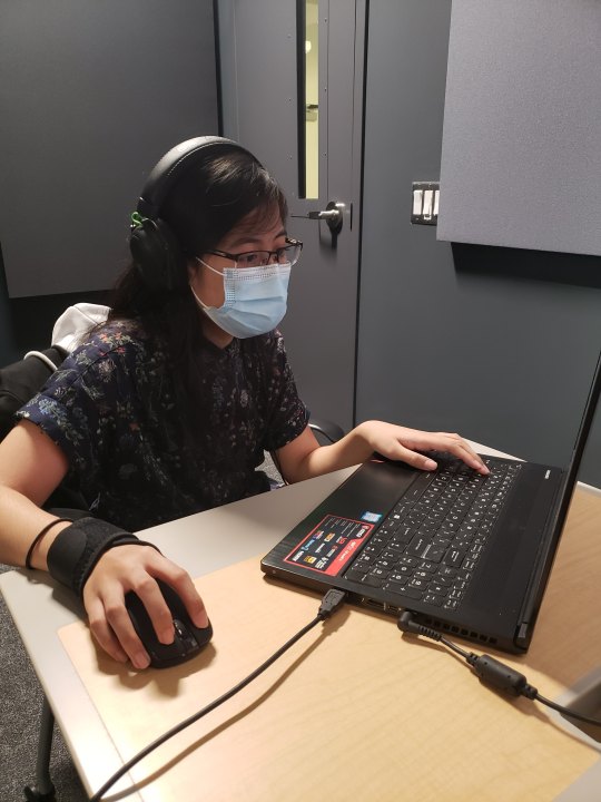
On Wednesday I got to record the dialogue for Apolaki and Mayari. I struggled a lot with my words when I was trying to explain and convey what I was looking for with each line, but I think I did okay. (Big thanks to Molly for helping to record and direct as we were working with Mayari’s voice actor!) Overall, I think the recording sessions went really well and I had a lot of fun. Hopefully, I don’t need to call them back to do more recordings. I have Apolaki’s lines and have ben reviewing the recordings. I’m currently waiting for Mayari’s lines to be sent over to me, so I should have them by Sunday at the latest. In other news, I got to see and experience the new ACM Media Center at Sinclair. We got to use this really nice sound proofed room. It was really cool! Here’s a picture my friend took of me as we were recording his lines for Apolaki. lol
Sequence/Shot Breakdown & Production Schedule Overview
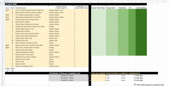
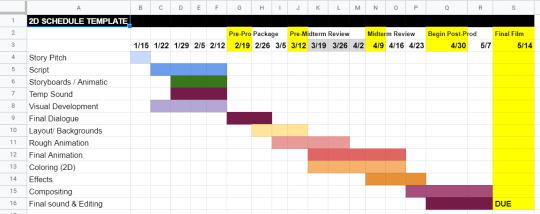
I finally got to a place where I wasn’t so overwhelmed by the spreadsheet, and since I’m in the more finalized stage of the animatic, it was a lot easier to fill out. I’ll probably still be making changes to it as production progresses but I’m glad I’m at a point where I’m more gaining more confidence to plan out the rest of my production schedule. (I’m sorry if the images are hard to see. There’s a lot of shots because of the numerous camera changes due to the action scenes and reaction shots.)
Here’s a link for a better look at the spreadsheet: Production Schedule
Animatic
I almost forgot to put that I edited the animatic! It’s still under the process of editing but we’re so close to finalizing! Just waiting on Mayari’s voice lines, and the addition of just 1 or 2 more reaction shots. What I have of the edits as of right now are the addition of sequence and shot numbers, Apolaki’s recorded lines added in, fixed timing of some shots, and changes to Apolaki’s mad expressions to smug to match the new lines and delivery of the voice actor. (Sorry if the English captions are too fast, the Tagalog lines are generally shorter.)
Araw at Gabi: Animatic 3rd Pass w/ Apolaki
Music
I have a composer on hand for the film, but as of right now I’ve mostly been doing a lot of research as to what I want for my film. I’m still on the fence about mainly using traditional Philippine instruments or not. (If I don’t go with this idea, I will opt out for more modern concert instruments instead.) Traditional instruments can be hard since a lot of music and sounds commonly associated with the Philippines are due to the colonization by the Spaniards or the Americans. Another issue that comes into play is that I want to do a thing that the show, Steven Universe, does with its music, where each character is represented by an instrument.
Examples: Steven Universe Music Analysis / Sardonyx’s Theme (Pearl + Garnet) / Sugilite’s Theme (Garnet + Amethyst)
In Steven Universe, Pearl is represented with a piano while Garnet is represented with a synth bass. In Sardonyx’s theme (Sardonyx is a fusion between Garnet and Pearl), you can hear that the music is a mainly a duet between piano and synth bass, accompanied but percussion. Same can be heard in Sugilite’s theme, where this time it’s Amethyst (drums) and Garnet (synth bass).
For my film, my idea is that Mayari would be represented by a bamboo flute due to her soft-spoken nature. (Bamboo instruments known to be more traditional instruments in the Philippines.) I’m still deciding on Apolaki’s representative instrument but for as of right now, I have him as the kulintang, which are like these horizontal gongs, laid out like a line of drums. I think this instruments matches his more brash personality.
Examples: Bamboo Flute / Kulintang / Modern Flute + Kulintang
Other research I did: Inspirations
Closing Notes
By the end of the week, I realized I spent a lot of time on Apolaki’s character. I know I said I took it easy this week, and this post kind of contradicts that from the looks of it, but I swear a lot of these things we’re quick and not physically/mentally draining, so I still stand by my original statement lol. I also got a lot more sleep this week! Woo! I am very thankful to everyone who has helped me or expressed excitement/interest towards my film! I hope when the film is completed, that you all enjoy it and it’s thanks to all of you that I am able to continue working on my film!
Anyways, time to sleep, good night! :]
0 notes
Text
Art Process
Someone asked me for my process and how I do things. I thought I’d used the latest painting I made as an example, since I was compulsively saving each step of the way and thus have neat snapshots on how things go.
I use Photoshop CC. I used to use Corel Painter, but there are tools in Photoshop that I use all the time for correcting mistakes, which don't exist in Painter (at least the 2012 version.) My brushset can be found here. I spend 90% of my time using the square brush. To have it display properly, you’ll need to grab the little bottom right corner triangle and expand the little brush-window until things look like this:

I typically start off by blocking in big blobby, noodly shapes in greyscale and start sketching/rendering that up with more and more detail. This is all done with the plan that I will add color later via blending modes. By working in greyscale first, I can roughly figure out my values/shading without also having to worry about color at the same time. The old masters used to do something similar with oil painting by creating a grisaille first and adding washes of color later.
Rest of process is under the cut as it is a long post!
To add color my usual choices for blending modes are Multiply layer first right over the greyscale with an Overlay layer on top of that to stop things from getting too dark. I also use Overlay to do a bit of lighting adjustment too if I feel things would look better a bit brighter or darker. I try to also keep warm vs cool colors in mind at this point as well. You’ll notice that Tiergan’s pectorals, face, and the shoulder closest to the light are a bit brighter and warmer - while things get subtly darker and cooler as you get lower down his torso. Things look really funky and weird in this stage, but you just have to trust in the process and know it will gradually get less fugly.

Speaking of blending modes - I love the fuck out of them and I feel like they are an extremely powerful tool in your toolkit. Other blending modes I tend to use sometimes are Saturation (to knock things back if I made the colors too over-saturated using Overlay), Color (for color adjustment like the name suggests), Lighten (to affect only lighter values while leaving darker ones alone), Darken (tweak only darker values while leaving the lighter ones alone, Screen (great for glows), Linear Dodge (extremely situational, but can be neat for rim-lights, magic effects, and LIGHT SABERS if you put the blending mode on your brush).
Once I am satisfied with the color, I flatten everything and resume painting from there in full color, continuing to render and polish everything up, adding in all the details. I tend to do this by making new layers and painting on top instead of directly on my flattened layer. Sometimes I’ll have two or more extra layers set to Normal to paint different things. The reason I do this is so if I don’t like how I’ve rendered things, I can erase parts of it or just nuke it all back to a clean slate - without destroying the base foundation I’ve created. I use a mix of Normal layers and layers with blending modes to render depending on what I need. Sometimes further along in the painting, I’ll realise I want to make things even brighter/darker and push the values more - so I’ll do something like add n Overlay or Multiply layer to do that, then add a Normal layer on top of all of that to keep painting in color. (And then flatten everything again when I start getting antsy about there being too many layers.)

You’ll notice above I realised that I forgot Tiergan’s hair and that he was looking super bald the more I rendered, so I just added it in on its own separate ‘hair’ layer. At the same time, I probably had another layer right beneath it that was just for rendering out all the skin details.
I always try to work as non-destructively as possible. This is also why I have so many versions of the same file and can show you past snapshots of what I was doing - every time I’m about to make a major decision, I save the file as a whole new copy of itself before continuing. Other ways I try to work non-destructively is to use Layer Masks instead of actually erasing things unless I am POSITIVE I want something gone and never want to bring it back.
If my character is on a separate layer from my background (which usually is the case, but not what I did this time around) - I abuse the shit out of Clipping Mask layers to paint only on my character. In fact, I used clipping masks on the ‘Hair’ layer I mentioned earlier to paint only on the hair when I wanted to add lights and shadows to it without risking fucking up the surrounding areas. The shadow cast by the hair onto the skin I did on a different layer just beneath the Hair layer.
Note: If you’re reading this and your first question is “What the heck is a Layer Mask/Clipping mask?” - then HOLY SHIT NUGGETS MY FREN, READ THIS AND FEEL YOUR MIND BEING BLOWN.
When I feel like I'm finished, I more often than not do a final pass of lighting/color adjustments and some finishing touches that would be tougher to do earlier in the process (like scars!) either with blending modes (to push or dial back lights/shadows, adjust colors/saturation) or slap a gradient map on top of everything as an adjustment layer set to low opacity to kinda help harmonize all the colors. It’s a little easier for me to try and bring everything together once all the information is there on the canvas and I just need to tie stuff together.
As for how I blend - almost all my brushes are set to change opacity depending on pen-pressure. Thus when blending values/colors, I just use the eyedropper tool to choose a color/value I want and use light brush-strokes to blend. When I REALLY want something to be soft, I use a big ole fuzzy airbrush-type brush and very, very lightly put down a stroke or two - but I do this very sparingly and try to avoid relying on fuzzy-brushes to blend as it can very quickly lead to your paintings looking like mashed potatoes. Making sure you have a nice mix of hard crisp edges and soft ones will make your work feel nicer.
And that’s it! I hope it was helpful!
131 notes
·
View notes
Note
Hey naf! I was just wondering why you dislike red/blue color representations? Is it just because its overdone or are there other reasons? I'm working on a story and was considering using either red and blue or orange and blue (bc complimentary colors). Thanks for your time and I hope you have a great day!
A couple reasons!
1) yes it’s overdone! I’m tired of it LOL
2) it’s garish, red and blue are colors that come across very strongly to our eyes, so when they’re pure RBG red and blue, it actually kind of hurts to look at
3) blue in and of itself, is actually quite a tricky color to use. Because it’s closer to the ultraviolent spectrum, is often substituted as a “darker” color, but this isn’t quite right. If using pure RBG, they’re actually the same value (somewhere like a 50% grey), so the contrast is really not as strong as we might perceive it to be
here is pure red/blue desaturated on the computer:

this is actually a legit problem in design, since some people are 100% color blind and can only rely on value differences to discern between shapes used in composition
The obvious fix is to darken one of the colors, which usually falls on blue, because again, for people who can see color, blue is closer to UV which feels more natural to us as “dark”

4) but what about a color scheme where you specifically want red to be darker? This is where blue becomes a problem again

for people who CAN see color, blue still reads as dark! Yes the greyscale works fine, but the color version gives a very different feeling that isn’t quite what we want. A good fix for this– if you want to keep red– is to go cyan or teal

it still “feels” like red and blue(ish), but cyan is a much “brighter” color in the spectrum of visible light
In your case, both Yellow and Blue, or Orange and Blue, actually both work great since yellow and orange tend to be weaker colors and won’t fight as hard with blue. Orange and Teal, as a color scheme, is used a LOT (if not overused) in the movie and video game industry, but for good reason. It gives the same feeling of “warm vs cool” that red/blue does, but isn’t as garish and unreliable
Red /blue is not inherently a bad color combination, but recognizing the weaknesses and disadvantages is what will help you use it correctly when designing!
90 notes
·
View notes
Text
jeweledbranchofhourai replied to your post “There are many things about drawing and writing, tips and tricks, that...”
a lot of professionals use greyscale shading and it looks AMAZING but it's soooo hard to pull off
“and the weird thing about “said” is that it’s more of a filler word, in that when we read it we tend to gloss over it?? it doesn’t stand out too much as compared to other synonyms, but it’s true you don’t wanna keep saying “said said said” 100% of the time
… that being said (hehe), i feel you – i keep looking at nice tutorials and stuff and honestly i’m just trying out what feels right to me :O maybe in order to create your own boundaries it’d be best to think about what exactly it is you want in a piece (feel-wise)?
i myself have stopped during colored lineart and switched back to black bc i feel it gels well with my current style, but who knows when i’ll change it again lol?? anyways, sorry for the rant!!
-
late to respond sorry D:
with the word said...i hadn’t really thought about it like that but its true because when a writer is only using descriptive synonyms i get kind of annoyed, i only truly value ‘said’ when its not there haha
Yes!! thats a great way to put it!! looking at it from “what do i want to convey” rather than “what looks/sounds the best” (which is so vague to begin with lol) is the way to go
like i see so many character design “NEVER do this” posts and its like?? i could literally bring up 500 exceptions to this rule that worked well with what it was trying to convey, like you said about the gray scale though...it might be that it’s hard to pull off and those “NEVER do this” posts are more about “know the rules before you break them”??? hm.
good on you, I just stopped coloring my line-art because it was a pain in the butt >:(
(ps i think the black lineart looks really awesome and im still not over that kaguya with the mountains in the bg, its so atmospheric ahhh)
3 notes
·
View notes
Photo
Samsung Galaxy S9 Plus deep dive If you’re looking at the current crop of phones, it can be tough to figure out what you should worry about and what’s totally normal. Today, we’re going to do something a little different in our ongoing quest to make sure our readers are armed with the knowledge they need to truly understand a product and where it fits in the market. Like we did in our Best of Android series, Android Authority is now putting major flagship phones through their paces — collecting a huge amount of data in the process. While Let’s take a dive in Lake Samsung for a moment, and see exactly what we’re dealing with for both the Samsung Galaxy S9 and Galaxy S9 Plus. If you’re curious about our methods, be sure to check out how we test each phone. How good is the screen, and how do we know? When we talk about what makes a screen look good, there’s a lot of misinformation floating around. It’s a complicated subject with no one right answer, so it can be hard to stay interested. At the end of the day, all anyone cares about is “how good is this screen, anyway?” The answer to that question relies not just on how technically capable the screen is, but also the environment in which you use it. Consequently, certain measurements will only tell you so much — s0me are more important in certain situations. Bright light will often overpower the image on your smartphone. Ever watch TV with a lot of glare on the screen? Looks like hot garbage, right? In that situation, the best screen in the world won’t look all that great if it doesn’t have a similarly bright screen. Size Pixel density (PPI) Subpixel density Display type Resolution Subpixel layout Samsung Galaxy S9 5.8" diag. 570 285 (red, blue) 570 (green) AMOLED 2960x1440 Diamond PenTile Samsung Galaxy S9 Plus 6.2" diag. 529 264.5 (red, blue) 529 (green) AMOLED 2960x1440 Diamond PenTile In that light (rimshot), we need better ways of thinking about display performance than getting hung up on things like contrast ratio, black levels, and pixel density. Those are easy numbers to understand, but they don’t really give you a good idea of how good the screen looks — at least not completely. What most review sites neglect are measurements like gamma, which I’ll let my colleague Rob explain to you. How does the screen on the Samsung Galaxy S9 and Galaxy S9 Plus look? It depends on the mode you select. So how does the screen on the Samsung Galaxy S9 and Galaxy S9 Plus look? It depends on the mode you select. Out of the box, the software defaults to what’s called “Adaptive mode,” which uses a wide color gamut (DCI-P3) with 8-bit depth, and leans on tasteful discretions of white point inaccuracy to achieve higher brightness. Consequently, the screen looks quite vibrant, though professional photographers may notice some minor gaps in color values if they’re really looking for it. We found the most accurate mode to be “AMOLED Cinema,” which has near-perfect white balance, great color accuracy, and decent greyscale performance on both the S9 and S9 Plus. Effective pixel density will vary in certain situations based on the Diamond PenTile subpixel layout, but you shouldn’t be able to tell at normal viewing distances. In layman’s terms: you’re gonna love both displays. They’re excellent as far as smartphone screens go. The measurements: greyscale When we plot gamma, we’re looking for a grey line that fits very closely with its target (yellow) without any wild swings away from that line. When you see a spike or trough in a gamma plot, it means the luminance value measured is either too bright or too dark for what it should be. This means you may see some banding or false coloration in the image requiring that value. There isn’t really much in the way of gamma errors to talk about here though. That spike in the low end can be attributed to noise in the samples collected by our colorimeter, so you can ignore it. It’s not the empirical evidence of “black crush” that you may have read about online. The brighter errors are a little interesting, but again, these are so unbelievably tiny it’s unlikely to destroy your immersion in a movie. You’re watching on a phone, after all. The S9 Plus has very good gamma in Adaptive mode, but suffers from blue color error in whites, color problems. Colors are a little shifted in Adaptive mode, but that’s not all that surprising, since the display has a slightly more blue image than what you’d expect from your TV or computer monitor. For example, the white point should normally sit at 6500K, but on the Samsung Galaxy S9 and S9 Plus, it’s around 7280K. In the cinema mode, that number is 6501K, which is virtually perfect. Android Authority has never seen a phone that has a “warmer” display than 6500K (D65 for short). Cinema mode on the Samsung Galaxy S9 Plus suffers from some green balance issues, but it has solid gamma performance and improved color performance. To be honest, I don’t think many people will want to switch off Adaptive mode. The other modes will look a little strange in day-to-day use. Purists, however, will probably appreciate the color and greyscale improvements afforded by the AMOLED Cinema mode. You can skip the “Basic” mode altogether, as it really seems like it’s only there to satisfy reviewers using a very specific scoring criteria based on Rec. 709 standards. Purists will appreciate the color and greyscale improvements afforded by the AMOLED Cinema mode. Color performance As far as color error goes, an error under 1 (Delta E2000) is considered invisible to most people, though professional display calibrators sometimes use a less-strict tolerance of 3. If you’re looking for what constitutes a “bad” value here, color error isn’t really a huge deal until the measure exceeds 5. The Galaxy S9 and Galaxy S9 Plus both offer a host of display modes with different color gamut targets. None are truly “better” than the others, but I recommend sticking with the Adaptive and Cinema modes, as those are generally the most pleasing to the eye. Adaptive AMOLED Cinema Basic AMOLED Photo Colorspace target DCI-P3 DCI-P3 sRGB/Rec. 709 AdobeRGB The Samsung Galaxy S9 is excellent at color reproduction, boasting a Delta E2000 of 3.61 in Adaptive mode, and 1.52 in Cinema mode. That’s fantastic. You’re not going to find a more color-accurate display on the market. The Samsung Galaxy S9 targets a colorspace called DCI-P3 in its Adaptive and Cinema modes. Basic colors are a little shifted in Adaptive mode, but aren’t too bad. Adaptive mode holds fairly well to the DCI-P3 gamut, though its oversaturation in some areas leads to some strange color error. In Cinema mode, color accuracy is exceptionally good. In Cinema mode, color saturations are very close to ideal with the Samsung Galaxy S9. The S9 fares a bit better in this department than the S9 Plus, but both displays are exceptional in the world of smartphones. The display of the S9 Plus is merely “extremely good” instead of “excellent,” and you’re extremely unlikely to see the differences between them. With a color shift of 3.5 in Adaptive mode, and 2.1 in Cinema mode, only the most trained eyes will see errors on the worse-performing Samsung Galaxy S9 Plus. However, some colors are more accurate than others. Skin tones in Adaptive mode are near spot-on, but white shades appear a bit too blue. In Cinema mode, you may notice a bit of a green pall. It’s not really a big problem, but it’s something to note. Like the S9, the S9 Plus uses a DCI-P3 color gamut for both Cinema and Adaptive modes Colors are relatively accurate in Adaptive mode, with a few exceptions. Color accuracy is very good in Cinema mode. Adaptive mode has some color shift in saturation sweeps, Cinema mode tightens this up somewhat. Performance in sunlight Both the Samsung Galaxy S9 and Galaxy S9 Plus alter their screen performance modes in the presence of bright light. When in the presence of overpowering direct sunlight, the screens will push their max brightness to a hair under 500cd/m2, while altering the gamma to accommodate dimmer greyscale values being overpowered by ambient light. In short, the “Adaptive” mode is truly that: adaptive. The software boosts brightness and flattens gamma a bit to boost visibility in daylight. Because I’m not able to make a perfect re-creation of sunlight that alters the output of the display but doesn’t hit the screen at all, I’m not comfortable recording exact results here. However, I should note that in our ventures outdoors, the screen never had any issues keeping up with the ambient light. Related Articles We asked, you told us: Huawei P20 Pro vs Galaxy S9 Plus The Huawei P20 Pro launch gave us a triple camera and it was not just a gimmick in the race to do something different. The P20 Pro surprised many by delivering one of the best … Samsung Galaxy S9 vs iPhone X: Camera shootout https://youtu.be/578FTcGMoSE The Samsung Galaxy S9 has hit the streets and now everyone is trying to figure out if it lives up to all the hype. No matter which Android phone comes out, its biggest competitor is … The audio performance is as good as it gets on a smartphone Here too, we’re looking for errors more than we’re hunting for “good” performance. I should point out that the audio performance of the phone itself is based on tech that’s near-perfect for analog devices. By that I mean: most of the errors present in current devices are small enough to be imperceptible to humans. When we find something to talk about, it’s almost always a cause for concern. However, that’s not the case here — all the flaws I found are inaudible at worst. The Samsung Galaxy S9 Plus even landed on SoundGuys’ list of best smartphones for audio. Let’s look at frequency response. Because the phone acts as both digital-to-analog converter (DAC) and amplifier, the ideal test result here is a nice, even emphasis of every potential frequency at the exact same power. That’s pretty much what we see here, even though there’s a little bit of tailoff at the upper and lower ends. This kind of result isn’t exactly perfect, but it is perceptually perfect. The slight deviations are far gentler than a human could possibly perceive. In order for an error to be noticeable, you’re typically looking for a deviation of plus or minus 2.5dB, so all’s good on the Samsung Galaxy S9 Plus and the S9. The S9 and S9 Plus work exactly as intended, without affecting your music negatively in an audible manner. If you’re worried about that line dropping off considerably at more than 40kHz, you should know humans can only really hear up to 22kHz at maximum when they’re children, so you can’t really hear the limits suffered by the Samsung Galaxy S9 Plus when you’re a late teen or adult. If you can, the fault likely lies with the file you’re listening to, or your connection. Speaking of perceptual limits, the Samsung Galaxy S9 Plus also has some modes to help out users of varying ages with audio. Many of these modes simply limit the upper reach of the output frequencies and tastefully bump bass and a few other target notes. The Galaxy S9's audio flaws are inaudible at worst. You can test this out yourself. Try listening to the below sound file. It’s “only” 20kHz, but most of you shouldn’t be able to hear it. If you can’t, any frequency higher than that will be inaudible to you, so a phone outputting sound at higher frequencies just isn’t something you’ll notice. In fact, some (like the S9) also build in filters to cut these frequencies off if you enable it in the settings by entering your age. On that note, I should go out of my way to point out that pretty much all the audio content you consume will never really exceed 44.1kHz/16-bit, or “CD quality.” While there are higher sample rates and greater bit depths (32-bit/384kHz) supported by the Samsung Galaxy S9 and S9 Plus: we don’t test for the most extreme of these because there’s no reason to. With that in mind, our test files are 96kHz/24-bit to give each phone a fair shot, but without getting too crazy in our hunt for intermodulation distortion. Total Harmonic Distortion (THD) and noise floor are also nothing to write home about, though that’s not to say it’s perfect. At a level with peaks under -100dB, you’d have to really crank your tunes to hear any audible junk signal. As boring as this deep dive is turning out to be, it’s kinda good to know there’s really not any issues to report, right? Frequency Response Noise THD Dynamic Range Speaker volume Intermodulation Distortion Samsung Galaxy S9 -0.11 / +0.02dB -99.8dBA 0.0089% 99.3dB 79.8dB 0.0038% Samsung Galaxy S9+ -0.11 / +0.02dB -100.5dBA 0.0022% 98.5dB 80.4dB 0.0039% Google Pixel 2 XL -0.03 / +0.26dB -101.4dBA 0.0021% 101.4dB 74.4dB 0.036% The Samsung Galaxy S9 and S9 Plus are near-perfect when it comes to audio. The speakers themselves are a little perplexing, but we’ve never really come across smartphone drivers that we’d actually consider “good” by any stretch. While the speakers on the Samsung Galaxy S9 Plus were able to reach 80dB at one meter, the quality is fairly disappointing compared to the front-facing options of the Pixel 2 XL and Razer Phone. We suggest using the Atmos mode with a good set of headphones. This is an awful lot of words to prove that yes, the Samsung Galaxy S9 and S9 Plus are near-perfect when it comes to audio. I like to show my work, sue me. How’s the battery life on the Samsung Galaxy S9 and S9 Plus? As it’s a little hyper-powered and not much about the batteries has changed since the Galaxy S8 and S8 Plus (still 3,000 and 3,500 mAh), it’s not hard to see why the S9’s battery is a little lackluster. However, it’s still solidly in the middle of the pack of flagship devices. While there was some hubbub about Samsung leaving the stock resolution setting at FHD+, the battery life improvements offered by that setting are notable. Mixed use test (mins) WiFi browsing test (mins) Video playback test (mins) Samsung Galaxy S9 (FHD) 386 524 676 Samsung Galaxy S9 (WQHD+) 371 515 621 Samsung Galaxy S9 Plus (FHD) 440 596 693 Samsung Galaxy S9 Plus (WQHD+) 338 564 684 Editor’s note: the gaming test was intentionally left off, as there was a flaw found with the methodology (not just our own). This article will be updated to reflect our new findings once they come in. Charging Like many other flagships, the Samsung Galaxy S9 and S9 Plus offer fast wired charging through the stock charger. While you could also get the wireless charger online, most will elect to not spend any additional cash. If you use the standard charger, you can expect to juice up your phone pretty quickly, and even get a usable charge in short order. Battery capacity 15 min charge 30 min charge 60 min charge mAh/min Charge to full Samsung Galaxy S9 3000mAh 18% 37% 78% ~31.25 98 min Samsung Galaxy S9 Plus 3500mAh 19% 37% 77% ~35.7 96 min OnePlus 5T 3300mAh 30% 60% 90% ~35.9 92 min Google Pixel 2 XL 3520mAh 16% 31% 64% ~23.5 150 min Huawei Mate 10 Pro 4000mAh 31% 59% 91% ~44 91 min Obviously, your mileage may vary based on your outlets, but on the whole you can expect to get a full charge in under 100 minutes. Not too shabby compared to other flagships on the market, rivaled only by the OnePlus 5T, Huawei Mate 10 Pro, and Moto Z2 Force. It’s not the fastest charge in the West, but there’s nothing to complain about here. Web browsing By running these phones through an app with a set cycle of websites, we can compare the battery life of each phone under the same circumstances. We also set the phones to the same brightness (double-checked with our meter, of course), so peak brightness isn’t a variable. In our tests, we found the Samsung Galaxy S9 and S9 Plus were about average at browsing the web, but performed a hair worse with 4K rendering enabled. It’s not really a surprise, but it’s worth noting. Video By playing a handful of clips on a loop, we can get a better idea at how well the phones can binge video content when that’s all they’re doing. The big batteries of the S9 and S9 Plus allow you to chug HD content for 676 and 693 minutes, respectively. When you’re using the WQHD+ mode, those numbers drop to 621 and 684. Not a huge difference, but worthy of testing. While not the best result we’ve seen in the last year, it places the Samsung Galaxy S9 and S9 Plus solidly ahead of the Pixel 2 and its XL counterpart. Only the LG V30 and lower-specced phones beat these handsets on our HD test. Mixed use Our very own Gary Sims coded a brilliant mixed-use app, combining a variety of basic smartphone use cases in a way that reflects a more realistic mix of your normal day-to-day actions. In this test, the Samsung Galaxy S9 and S9 Plus performed brilliantly, at least when in the FHD+ mode. Maybe it’s just the added load on the internals of the phone when WQHD+ is enabled, but that battery life tanks when it’s enabled. In our tests, it clipped the life of the S9 Plus from 440 minutes to 338, though the S9’s life was only clipped by 15 minutes off of a 386 minute total. After several re-runs we’re not quite sure why this is the case. Considering the results are right in line with many of the other flagships we examined in 2017’s Best of Android testing — we’re not too worried. How good is the Qualcomm Snapdragon 845? As expected, the first phones with the latest flagship Qualcomm chip blaze through benchmarks. As of the time of publishing, this is one of the best phones you can buy if you absolutely need the most powerful handset on the market. AnTuTu Basemark OS JetStream Geekbench 4 (Single core) Geekbench 4 (Multi-core) 3DMark Overall Samsung Galaxy S9 261982 4206 82.99 2426 7956 4601 Samsung Galaxy S9+ 266559 4289 77.315 2144 8116 4672 Google Pixel 2 XL 163403 3223 62.03 1888 6234 3621 OnePlus 5T 180396 3585 63.067 1959 6706 2919 As you can see, the Qualcomm Snapdragon 845 is a beast of a chip, even more impressive when compared to the other flagships on the market. It screams past the Snapdragon 835, and while it may be overpowered for what it’s supposed to do, it’s nice to know your phone can handle difficult tasks now that Fortnite and PUBG can be played on your phone, right? As far as pitfalls go, there really isn’t much to talk about with either the S9 or the S9 Plus. However, this is the first set of devices we’ve tested with this processor outside the Qualcomm reference device. It’s entirely possible that these results aren’t representative of what we will find in other phones coming out soon. How good is Samsung’s Camera? Accurately placing camera performance is getting trickier and trickier with computational photography altering the landscape more and more. While we can run these units through the lab, more and more phones are adding modes to gain capabilities the hardware shouldn’t be able to have — or make photos appear much better than they are. Because of this, there’s no “perfect” result in our labs, just measurements that reveal the strengths and weaknesses of the camera. Here we’ll discuss the gross capabilities of the camera modules, leaving the additional features for the main review. Camera sensor size Pixel size Aperture Hyperfocal distance Resolution Focal length Samsung Galaxy S9 1/2.5" 1.4µm ƒ/1.5 ƒ/2.4 ~4.2 feet (ƒ/1.5) ~2.5 feet (ƒ/2.4) 12MP 26mm (35mm eq.) Samsung Galaxy S9 Plus (wide) 1/2.55" 1.4µm ƒ/1.5 ƒ/2.4 ~4.1 feet (ƒ/1.5) ~2.5 feet (ƒ/2.4) 12MP 26mm (35mm eq.) Samsung Galaxy S9 Plus (telephoto) 1/3.6" 1 µm ƒ/1.5 ƒ/2.4 ~13.25 feet (ƒ/1.5) ~8.3 feet (ƒ/2.4) 12MP 52mm (35mm eq.) Unlike the S9, the S9 Plus uses two sensors, each 12MP, though the “wide” camera uses a much bigger sensor with bigger pixels. For best results, use that lens. I say this because the telephoto lens on the S9 Plus uses a math trick to achieve a “longer” focal length at the expense of sharpness. You’ll definitely notice a video and stills quality reduction by about one third. There's no perfect result in our photography lab, just measurements that reveal the strengths and weaknesses of the camera. Use the widest aperture Unless you’re taking photos at high noon, I suggest using the f/1.5 aperture setting almost always. The advantages offered by a wider aperture with a sensor size so small will outweigh most of the benefits of a narrower one in most situations. In dim situations, more light will hit the sensor (making less noisy shots), and you can get some blurred backgrounds naturally if you stand close enough to your subject. Unfortunately, that can only be achieved if your subject is within four feet of the S9 and S9 Plus’s wide lens. With the narrower f/2.4 aperture, that number shrinks to just about two feet. That’s because the hyperfocal distance — the closest a subject can be in focus while the camera is focused at infinity — is unbelievably short. For the best results in portraits, you will want to use the Samsung Galaxy S9’s depth of field simulator. Test shot level Noise Auto ISO setting ƒ/1.5 20 lux 1.7% 400 Daylight 0.668% 50 ƒ/2.4 21 lux 1.93% 1000 Daylight 0.672% 50 If you’re apt to take photos in a bar or restaurant, you should use the f/1.5 aperture always. Not only does it collect more light than the f/2.4 setting, but it also allows your camera to use a lower sensitivity. Lower sensitivity means less noise, and less noise means more detail — given the camera’s super-aggressive noise reduction. Sharp as a tack When we measure stills quality, the generally accepted reading taken by image processing experts is line widths per picture height (LW/PH), calculated in several different ways by computers. We use an equation called MTF50, which is most resistant to shot noise. You don’t really need to understand every little detail here, but you should know that for a 12MP shot, a sharpness of over 2000 LW/PH is considered to be a good readout. Center sharpness Part-way sharpness Corner sharpness Chromatic aberration (corner) Overshoot average ƒ/1.5 3382.8 2585 1600.5 0.6846px 15.46% ƒ/2.4 3567.7 2780.9 1553.7 0.8223px 15.46% Much like the Samsung Galaxy Note 8, the sharpness of the S9’s camera unit sails past 2800LW/PH after you correct for the image processing gaming that readout a bit, so you shouldn’t notice any deficiency with that at all. In video shooting, we also recorded a sharpness of 1500 line pairs per picture height, which is right in line with the best smartphone cameras out there at the time of publishing. This is more than capable enough to handle amateur videos, vlogs, and personal clips. As always, you may want a dedicated camera for professional work, especially if depth of field is important to your scene. However, because of the physical limitations of the sensor, the S9 and S9 Plus both lean heavily on software oversharpening. This works by finding edges in photos and selectively increasing contrast. While you probably won’t notice anything wrong, sometimes this can make shadows and gradients look a little unnatural. Otherwise, it’s a pretty benign imperfection. Though the software enhancement is at the upper end of what we’d consider reasonable (15.46 percent), any lack of detail is more likely to be from the phones’s noise reduction algorithm. You can see this especially when you compare its shots to that of iPhone X. Lines and edges are often extremely pronounced, even if Samsung’s scene and exposure level shouldn’t normally let that happen. While nobody’s really going to care all that much, it’s good to know that you aren’t likely to lose any major details. On the other hand, minor details stand a great chance of getting destroyed by the Samsung S9 and S9 Plus’s aggressive noise reduction algorithm. You can see what I mean in the video above. Notice how blotchy the photos taken indoors look in comparison to the Pixel 2 — that’s largely due to the noise reduction. Aggressive noise reduction algorithms have a habit of mistakenly averaging out minor details and replacing it with a nice, even blotch. It may annoy you, or it may not; it’s just a characteristic of Samsung’s image processing software. If you don’t go hunting for flaws in every shot, you won’t really notice much of a difference — especially if all you’re going to do is post a snap to Instagram or Facebook (which compress the absolute Dickens out of the files anyway). Related: Huawei P20 Hybrid Zoom explained Color and noise performance Colors are right around where they should be, with more prominent errors found in the alternate modes of the camera’s filter settings. While a more neutral look is boring to most, it’s good to know both phones’ cameras are able to take relatively accurate photos, especially when you decide to alter them through the use of an app like Instagram or (my personal favorite) Lightroom CC. The S9 holds a slight edge, with a ΔC00 (saturation corrected) error of 3.19 to the S9 Plus’s 3.2. However, an error difference that small will be imperceptible and is likely just the result of sample variation. Samsung’s Galaxy S9 and S9 Plus boast decent—if slightly oversaturated—colors. Even in the basic shooting modes, the camera oversaturates colors a bit to give a little pop to your snaps. Honestly, this is found with nearly every camera on the market; there’s nothing to worry about when you see that 113.3 percent saturation reading. If you want to change this, you can always post-process using a camera app. Samsung's noise reduction algorithm removes some detail, but the software oversharpening sometimes makes it easier to see finer details. Noise is kept in check, though both the Samsung Galaxy S9 and S9 Plus destroy a little data in the name of noise reduction in low light settings. As mentioned above, Samsung’s reduction algorithm removes some detail, but the software oversharpening sometimes makes it easier to see finer details, too. Final thoughts Our deep dive testing reinforces the feeling that both the Samsung Galaxy S9 and S9 Plus are great phones, sitting atop the market as of their release. Their weaknesses are generally relegated to features rather than capabilities, but there’s always room for improvement. These phones have excellent displays, processors, and audio performance, but the rest of their hardware is merely “very good.” Camera performance Battery Life Recharge time Processor performance Display performance Audio performance Samsung Galaxy S9 Very good Very good Good Excellent Excellent Excellent Samsung Galaxy S9 Plus Very good Very good Good Excellent Excellent Excellent By the numbers, these are great phones for a huge segment of people. They do a lot of things extremely well and almost nothing poorly. The Samsung Galaxy S9 and S9 Plus only fall short to the Google Pixel 2 XL and Huawei P20 Pro in terms of camera performance. Beyond that, it tops every category but audio and battery life, where they don’t fall short by much. Only the Huawei P20 Pro stands much of a chance at beating these phones from a pure hardware perspective, but availability and price will severely impact its success. The Google Pixel 2 is already showing its age against the better-equipped Samsung Galaxy S9 and S9 Plus in the processor department, though its camera module is better by the numbers and software. Of course, this review will become outdated as time goes on and new phones are released. When that happens, check back and we’ll discuss it! , via Android Authority http://bit.ly/2qVaYKv
0 notes
Text
Colour in Photoshop: top tricks
This image is part of an ongoing personal project called Hong Kong Heroes. Its purpose is to celebrate the unsung heroes of Hong Kong culture, many of whom are disappearing or possibly no longer exist as I remember them.
For this project, I’ve experimented with ways of taking greyscale compositional sketches into full colour to represent this city of vibrancy and high contrast. Knowing your intentions before starting a project is a good way to maintain consistency, and here I want to invoke a sense of nostalgia in the viewer, represented by the muted colour.
59 free Photoshop actions
Because they’re personal icons, drawn from my teenage memories, a lot of research is required before starting each image and all manner of things can distract you from your initial intent. Being selective with your reference and having a good idea of what the basic palette will be is a good way to keep everything on track.
This image features lion dancers who perform during festivals and celebrations. These festivals are a hive of chaotic activity, but since the objective for this project is to put the characters centre stage, I chose to focus on the dancers’ faces, framing them in areas of calm among the chaos to show their concentration and focus.
For this image I’ve made use of various Photoshop effects to create a piece that’s both colourful and harmonious.
01. Deciding on a composition
The dancers and the scene are established
I always start with basic compositional thumbnails before moving on to a more detailed sketch. At this point I already know that I want a lively scene, with the faces of the dancers framed by calm. So I try to establish a rhythm that keeps the eyes moving, ending with them resting upon the faces.
02. Blocking in the values
The composition is finalised in black and white
Once I’m happy with the rough sketch, I separate the elements into their own layers and start blocking in the basic values. I do a rough lighting pass using a Levels adjustment layer, which I mask and paint into. This helps me to check the overall composition and value structure before I move to colour, and I use it for reference later on when I get into lighting.
03. Taking the first steps into colour
An undercoat of subtle colours is put down
A technique I like to use when initially switching to colour is a Gradient Map Adjustment layer. Here I’ve changed 25 per cent to a light yellow and 75 per cent to a pale blue, but I’ve kept the black and white as is. The colours are subtle, but because this is still just an underpainting, I find it gives the paint something to grip onto.
04. Using Color layer blending modes
Blues are allowed to peep through the shadows
I then start applying colour to characters on a layer set to Color in the blending modes. I’m painting with Pen Pressure so that some of the blues from the Gradient Map show through in the shadows, giving this initial colour pass a bit of variety.
05. Google Dodge layers add vibrancy
Bold colours are laid down
I start painting on a Color Dodge layer to punch up the colours. This affects the values dramatically, so it’s important to be careful or be prepared to knock things back later on, as I eventually do. I want to keep the lighting as diffuse as possible.
06. Painting the background
The background is created with the help of photo textures
For the background I use a combination of photo textures and painting. I then duplicate the Gradient Map I made earlier for the characters and apply it to the background. I do this to maintain a uniform colour temperature throughout the image, so that all the elements feel like they’re in the same scene.
07. Actual painting – it’s unavoidable
Time to crack out the brushes and start painting for real
There’s only so much that layers modes can do and eventually I have to start painting for real. I use the Eyedropper to sample from the canvas and adjust the hues slightly to maintain a colour relationship. I give the characters some form by adding some loose occlusion shadow, but I’m not adding directional light and shadow just yet.
08. Wrangling colours
The palette is brought under control
There are a lot of colours going on now, after applying photos to the background. I normally only use photos for texturing, so I wrangle my palette back using a Gradient Adjustment layer over the top set to a low Opacity on the Hard Light blending mode.
09. Checking the read
More colours are introduced to separate the characters
I initially wanted the character and lion costumes to blend into each other, but after stepping back I decide that this detracts too much from the characters and the overall read of the image. To separate them from the lion, I shift their shirts to a black-grey tone of similar value, again using a layer set to Color mode.
10. Separating planes with atmosphere
Textures help give the image depth
I’m keen to add a bit more depth to the image. It’s crucial to consider clear front, middle and background planes to create a sense of space, so I add joss sticks as foreground elements and use smoke to help separate the planes and add atmosphere.
11. Direct lighting
Lighting helps to direct the viewer’s attention
I start my direct lighting by creating a darkened Hue/ Saturation adjustment layer and mask in some of the areas in shadow. I then use a layer set to Color Dodge to paint in some areas of direct light on the faces. A window of light just hitting the side of the lion’s face should be enough to draw the eye.
12. Adjusting the composition
A banner element brings the composition under control
At this point in the painting process I find that the diagonal lines of the background lead the eyes off the page. I need a compositional element that will bring the eye back into the scene. My solution is to add a celebratory banner and some fringes to the lion costume, which gives the whole composition more movement.
13. Unifying the colours
Colours are muted for a nostalgic look
For the image to feel nostalgic, the colours need to be less vibrant. The answer is to mute the colours and add some colour harmony, so I slap on a sepia photo filter (Edit>Adjustments> Photo Filter). This unifies the colours, knocking back the blues and greens to leave a warm, nostalgic palette that ties in with my aim of recreating a scene from my memories of Hong Kong.
14. Ending with a bang
Firecrackers finish off the image
I prefer to leave any visual effects to the very end, so to finish the image off I give the image a final bit of sparkle and pizzazz. I add some magic firecracker dragonflies that help lead the eye around the image and add a sense of celebration.
This article was originally published in ImagineFX magazine issue 142. Buy it here.
Related articles:
Adobe is working on a voice-controlled Photoshop
Get creative with Photoshop Blend Modes
The ultimate guide to compositing images in Photoshop
This post comes from the RSS feed of CreativeBlog, you can find more here!
The post Colour in Photoshop: top tricks appeared first on Brenda Gilliam.
from Brenda Gilliam http://brendagilliam.com/colour-in-photoshop-top-tricks/
0 notes