#color creativity
Explore tagged Tumblr posts
Text
COLOURS in DESCRIPTION
colour is the lifeblood of a scene. here are ways not to over-use it.
Red: cardinal, coral, crimson, flaming, maroon, rose, wine, brick red, burgundy, carmine, cerise, cherry, chestnut, claret, copper, dahlia, fuschia, garnet, geranium, infrared, magenta, puce, ruby, russet, rust, salmon, sanguine, scarlet, tition, vermilion, roseate, rubicund, ruddy, rubescent, florid
Orange: apricot, tangerine, merigold, cider, ginger, bronze, cantaloupe orange, clay, honey, marmalade orange, amber
Yellow: blond, chrome, cream, gold, ivory, lemon, saffron, tawny, xanthous, sandy
Green: grassy, leafy, verdant, emerald, aquamarine, chartreuse, fir, forest green, jade, lime, malachite, mossy, pea green, pine, sage, sea green, verdigris, willow, spinach green, viridian
Blue: azure, beryl, cerulean, cobalt, indigo, navy, royal blue, sapphire, teal, turquoise, ultramarine
Purple: violet, indigo, lavender, lilac, mauve, periwinkle, plum, violet, amethyst, heliotrope, mulberry, orchid, pomegranate purple, wine, amaranthine, perse, violaceous, reddish-blue
#writing#creative writing#writers on tumblr#writeblr#writerscommunity#writers and poets#writing inspiration#writing advice#writing ideas#writing tumblr#character description#description#colors#colorful#scenery
9K notes
·
View notes
Text

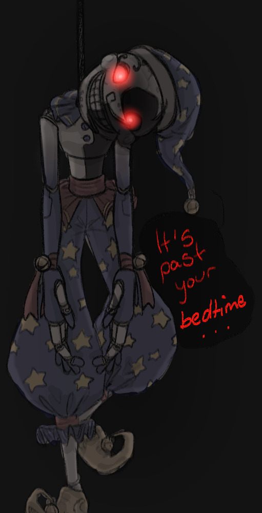
first time drawing the Biblically Accurate Boys TM was a few days ago and i just forgot to post them so here you go
#literally like the first thing i've drawn and colored and put actually effort into in like weeks#creativity is not liking me rn#xandraws#fnaf#fnaf sb#fnaf security breach#security breach#fnaf sun#sun fnaf#fnaf moon#moon fnaf#dca sun#sun dca#dca moon#moon dca#fnaf dca#dca fnaf#dca fandom#does this go in that tag because they're biblically accurate or. question mark. is fine whatever i'm proud of these so throws them at you
2K notes
·
View notes
Text
Word Alternatives: Colours
BLACK atramentous, charcoal, coal, crow, darksomeness, denigration, duskiness, ebony, funereal, jet, inkiness, melanism, melanotic, midnight, niello, obsidian, pitch, raven, sable, singe, sloe, smirch, smoke, sombrous, soot, swarthiness, swartness, tar
BLUE aquamarine, azure, berylline, cerulean, cerulescent, cyan, cyanosis, cyanotic, electric blue, ice-blue, indigo, lividity, midnight, navy, Oxford blue, pavonian, pavonine, peacock blue, robin's egg blue, royal blue, sapphire, turquoise, ultramarine
BROWN adust, auburn, beige, biscuit, braise, bay, bronze, brune, brunette, buff, burnt umber, burnt sienna, caramel, castaneous, chestnut, chocolate, cinnamon, cocoa, coffee, drab, dun, embrown, fawn, grege, hazel, henna, infuscation, khaki, mushroom, ochre, paper bag, pumpernickel, raw sienna, raw umber, roan, rubiginous, rufous, russet, rust, scorch, seal, sepia, sorrel, suntan, sunburn, tan, taupe, toast, umber, walnut
GRAY ashiness, canescence, cinereous, cineritious, dullness, ecru, fuscous, glaucescence, greige, grisaille, gunmetal, hoar, iron, lead, mousiness, oyster, pewter, slatiness, smokiness, steel, taupe
GREEN aerugo, aestival, avocado, beryl, chartreuse, chloremia, chlorophyll, chlorosis, chlorotic, emerald, foliaged, glaucescence, grass, greensickness, ivy, jade, loden green, holly, olivaceous, olive, patina, patinate, pea-green, smaragdine, springlike, verdancy, verdantness, verdigris, verdure, vernal, virescence, viridescence, viridity
ORANGE apricot, cantaloupe, carotene, carroty, ochreous, ochroid, pumpkin, saffron, tangerine, terracotta, Titian
PINK carnation, coral, coralline, flesh-pink, incarnadine, peach, primrose, roseate, rosy, salmon
PURPLE amethystine, aubergine, bruise, empurple, fuchsia, lavender, lilac, lividity, magenta, mauve, mulberry, orchid, pansy, plum, puce, purpure, purpureous, raisin, violaceous, violet
RED beet, blowzy, cardinal, carmine, carnation, carnelian, cerise, cherry, copper, crimson, damask, encrimson, erubescence, erythema, erythematous, erythrism, erythroderma, ferruginous, fire, floridity, floridness, flushing, gules, hectic, henna, incarnadine, infrared, laky, lateritious, lobster, lurid, magenta, mantling, maroon, miniate, port, puce, raddle, rose, rosiness, rouge, rubefaction, rubicundity, rubor, rubricity, ruby, ruddiness, rufescence, rufosity, russet, rust, sanguine, scarlet, stammel, vermeil, vermilion, vinaceous
YELLOW aureateness, auric, aurify, banana, begild, bilious, biliousness, cadmium, canary, chartreuse, citreous, citrine, citron, engild, fallowness, flavescent, flaxen, fulvous, gildedness, gilt, goldenness, honey, icteric, icterus, jaundice, lemon, lutescent, luteous, luteolous, mustard, ochroid, old gold, primrose yellow, saffron, sallowness, sandy, straw, sulfur, topaz, xanthism, xanthochroism, xanthoderma
WHITE achromatic, alabaster, albescent, albinic, besnow, blanch, bleach, bone, calcimine, chalk, cream, cretaceous, eggshell, etiolate, ghastly, ivory, lactescent, lily, lime, milk, pearl, sheet, swan, sheep, fleece, flour, foam, marmoreal, niveous, paper, pearl, phantom, silver, snow, driven snow, tallow, teeth, wax, wool
VARIEGATION (diversity of colors) spectrum, rainbow, iris, chameleon, leopard, jaguar, cheetah, ocelot, zebra, barber pole, candy cane, Dalmatian, firedog, peacock, butterfly, mother-of-pearl, nacre, tortoise shell, opal, kaleidoscope, stained glass, serpentine, calico cat, marble, mackerel sky, confetti, crazy quilt, patchwork quilt, shot silk, moire, watered silk, marbled paper, Joseph's coat, harlequin, tapestry; bar code, checkerboard
variegation, multicolor; parti-color; medley or mixture of colors, spectrum, rainbow of colors, riot of color; polychrome, polychromatism; dichromatism, trichromatism; dichroism, trichroism
iridescence, iridization, irisation, opalescence, nacreousness, pearliness, chatoyancy, play of colors or light; light show; moire pattern, tabby; burelé or burelage
spottiness, maculation, freckliness, speckliness, mottledness, mottlement, dappleness, dappledness, stippledness, spottedness, dottedness; fleck, speck, speckle; freckle; spot, dot, polka dot, macula, macule, blotch, splotch, patch, splash; mottle, dapple; brindle; stipple, stippling, pointillism, pointillage
check, checker, checks, checking, checkerboard, chessboard; plaid, tartan; checker-work, variegated pattern, harlequin, colors in patches, crazy-work, patchwork; parquet, parquetry, marquetry, mosaic, tesserae, tessellation; crazy-paving; hound's tooth; inlay, damascene
stripe, striping, candy-stripe, pinstripe; barber pole; streak, streaking; striation, striature, stria; striola, striga; crack, craze, crackle, reticulation; bar, band, belt, list
mottled, motley; pied, piebald, skewbald, pinto; dappled, dapple; calico; marbled; clouded; salt-and-pepper
Source: The Concise Roget's International Thesaurus, Revised & Updated (6th Edition) More: Writing Notes & References ⚜ Writing Resources PDFs
#words#colour#writeblr#writing reference#spilled ink#dark academia#literature#writers on tumblr#writing prompt#poets on tumblr#color#poetry#writing inspiration#creative writing#langblr#linguistics#writing ideas#light academia#lit#writing resources
1K notes
·
View notes
Text

Caramel Apple Pie Macarons
#caramel apple#apple#apple pie#macarons#red#color#autumn#thanksgiving#creative#sandwich#french#american#fusion#recipe#cinnamon#caramel#almond meal#almond#nuts#buttercream#almond flour#barleyandsage
2K notes
·
View notes
Text

Cooking up an older Clervie outfit design so I don't have to keep drawing her looking like her child self but Long
#genshin impact#clervie#ngl i have so many thoughts about an older clrv's design but at the same time artistically im not that creative </3#mostly tried to make her look more like a direct contrast to arlecchino's design (which was already present but we ignore that)#cause arle's design is mostly very sharp and angular while i'd imagine clervie's being much more rounded out and softer#like they are the round vs pointy cat meme in human form#the hair was really tricky cause on one hand much like everyone else we dont really keep the same hairstyle our entire lives#butttttt at the same time idk i feel like her long hair flowing down (and her headband) are very recognizable parts of her#so i decided to not change much (also cause i dont trust myself making multiple drastic changes without changing their identity too much)#also halfways through coloring I realized she's kinda giving crucabena outfit wise but we ignore that </3#anyways clervie would def be a support/healer character if actually playable (leaning more towards buffer support imo)#ITS A MASSIVE 50/50 IF SHE WOULD BE A HYDRO OR ANEMO USER but i decided hydro for the time being cause it compliments HOTH's dpses more#aka Arlecchino Lyney and partially Freminet since if i remember correctly he's more physical based but cryo nonetheless#i just really like the idea of Clervie's passive being along the lines of boosting stats/dmg if there's HOTH members present in a team#anyways sorry for the text wall I just really need to be kicked out of the kitchen#i am UNDERCOOKING the food#character design is not my passion </3
2K notes
·
View notes
Text
Enhance Your Kid's Color Sense with These Fun Activities! 🎨🌈

Want to boost your child's color sense? Check out these engaging activities that will spark their creativity and develop their understanding of colors. 🎨🌈 Discover effective techniques, games, and crafts that will make learning colors a blast for your little one! 🔍
Learn more here: 📚
#preschool#childcare#teacher#color sense#color creativity#learning through play#art activities#preschool fun#parenting tips
1 note
·
View note
Text
1966 💭

#shhhhtttt its a creative process#the beatles#paul mccartney#john lennon#beatles#george harrison#beatles fanart#ringo starr#beatles art#the beatles fanart#art#digital illustration#digital art#musician#pop music#music group#my art <3#yellow submarine#illustration#colors#etc etc
1K notes
·
View notes
Text
I think 90% of my gripes with how modern anime looks comes down to flat color design/palettes.
Non-cohesive, washed-out color palettes can destroy lineart quality. I see this all the time when comparing an anime's lineart/layout to its colored/post-processed final product and it's heartbreaking. Compare this pre-color vs. final frame from Dungeon Meshi's OP.
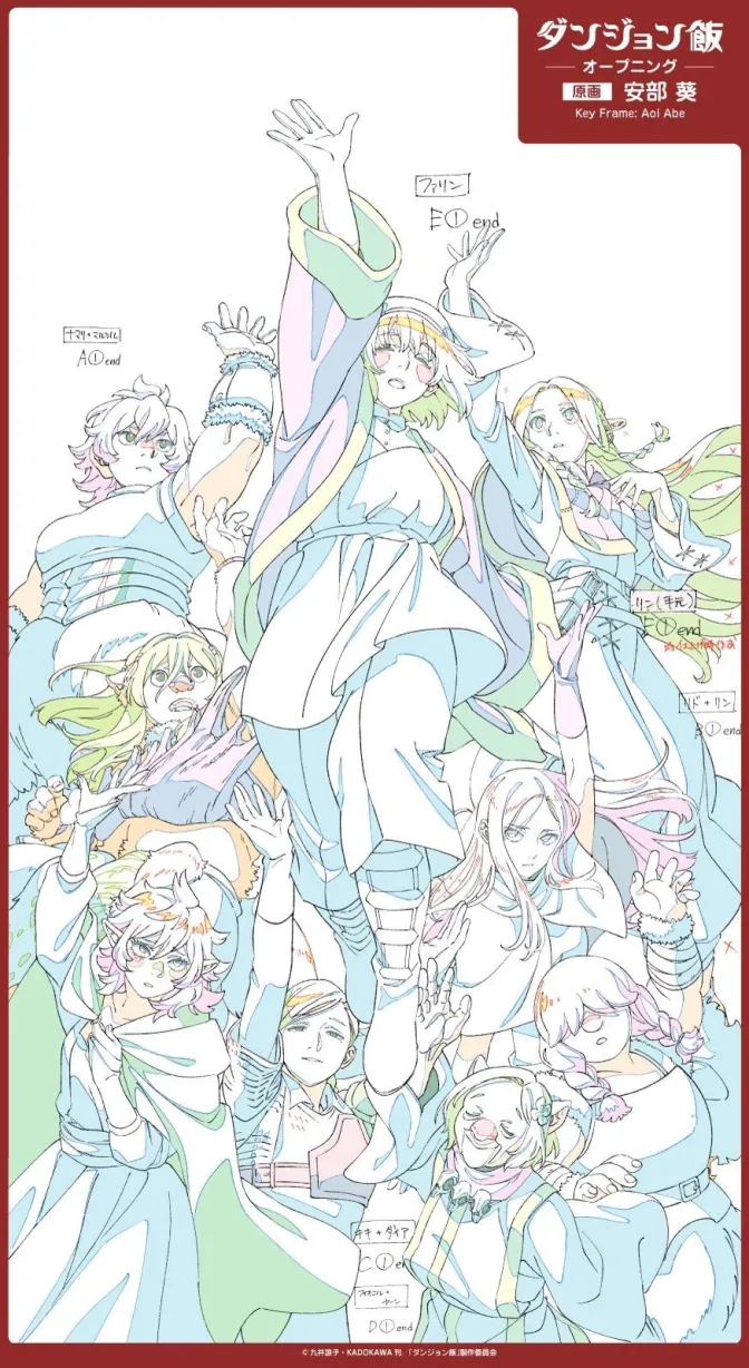
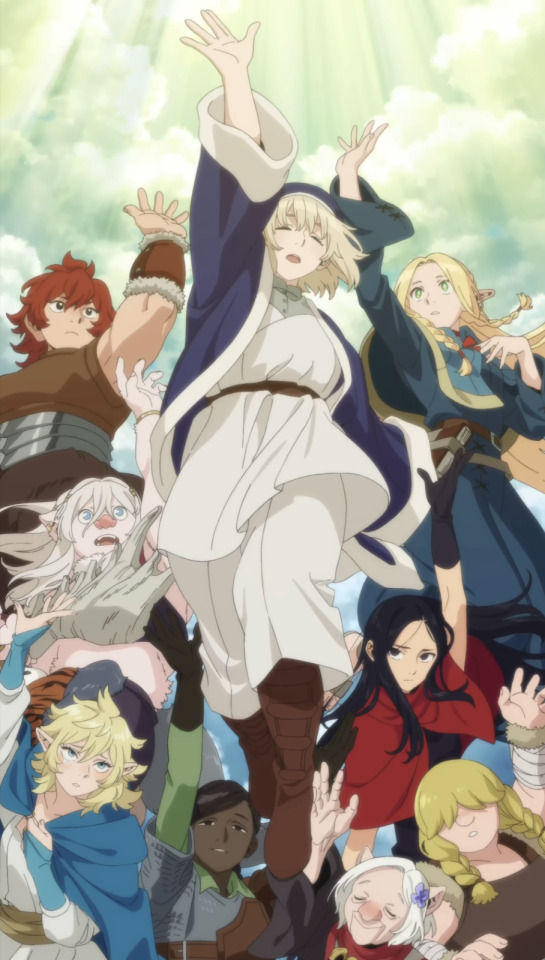
So much sharpness and detail and weight gets washed out and flattened by 'meh' color design. I LOVE the flow and thickness and shadows in the fabrics on the left. The white against pastel really brings it out. Check out all the detail in their hair, the highlights in Rin's, the different hues to denote hair color, the blue tint in the clothes' shadows, and how all of that just gets... lost. It works, but it's not particularly good and does a disservice to the line-artist.
I'm using Dungeon Meshi as an example not because it's bad, I'm just especially disappointed because this is Studio Trigger we're talking about. The character animation is fantastic, but the color design is usually much more exciting. We're not seeing Trigger at their full potential, so I'm focusing on them.
Here's a very quick and messy color correct. Not meant to be taken seriously, just to provide comparison to see why colors can feel "washed out." Top is edit, bottom is original.
You can really see how desaturated and "white fluorescent lighting" the original color palettes are.
[Remember: the easiest way to make your colors more lively is to choose a warm or cool tint. From there, you can play around with bringing out complementary colors for a cohesive palette (I warmed Marcille's skintone and hair but made sure to bring out her deep blue clothes). Avoid using too many blend mode layers; hand-picking colors will really help you build your innate color sense and find a color style. Try using saturated colors in unexpected places! If you're coloring a night scene, try using deep blues or greens or magentas. You see these deep colors used all the time in older anime because they couldn't rely on a lightness scale to make colors darker, they had to use darker paints with specific hues. Don't overthink it, simpler is better!]
#not art#dungeon meshi#rant#i'm someone who can get obsessive over colors in my own art#will stare at the screen adjusting hues/saturation for hours#luckily i've gotten faster at color picking#but yeah modern anime's color design is saddening to me. the general trend leans towards white/grey desaturated palettes#simply because they're easier to pick digitally#this is not the colorists fault mind you. the anime industry's problems are also labor problems. artists are severely underpaid#and overworked. colorists literally aren't paid enough to do their best#there isn't a “creative drought” in the anime industry. this trend is widespread across studios purely BECAUSE it's not up to individuals#until work conditions improve anime will unfortunately continue to miss its fullest potential visually#don't even GET ME STARTED ON THE USE OF POST-PROCESSING FILTERS AND LIGHTING IN ANIME THOUGH#SOMEONE HOLD ME BACK. I HATE LENS FLARES I HATE GRADIENT SHADING I HATE CHROMATIC ABBERATION AND BLUR
2K notes
·
View notes
Text
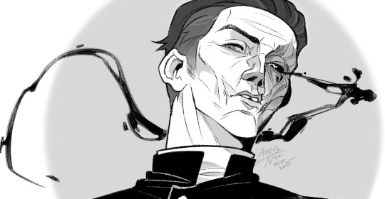

Father.
------- Inspired by @astudyincontrasts wonderful Priest!Silco fanfiction that you all should read here
#digital art#art#artists on tumblr#silco#arcane#fanart#silco arcane#i omitted the eyepatch i know#I did draw it!!!#I just like his fucked up face too much not to show it#anyway i might color this one day#Priest!Silco#all these talented writers fuel my creativity i swear
377 notes
·
View notes
Text
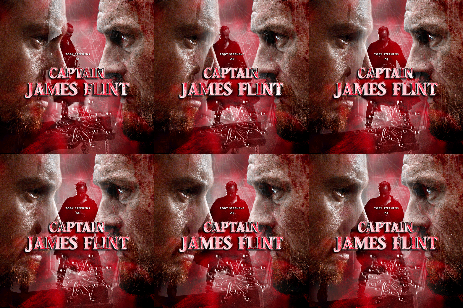

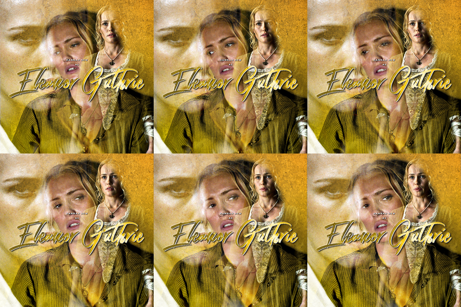
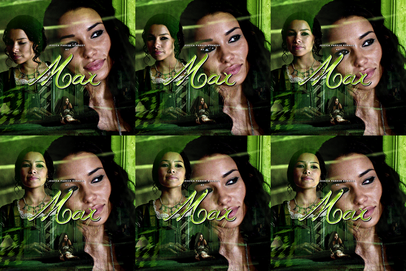
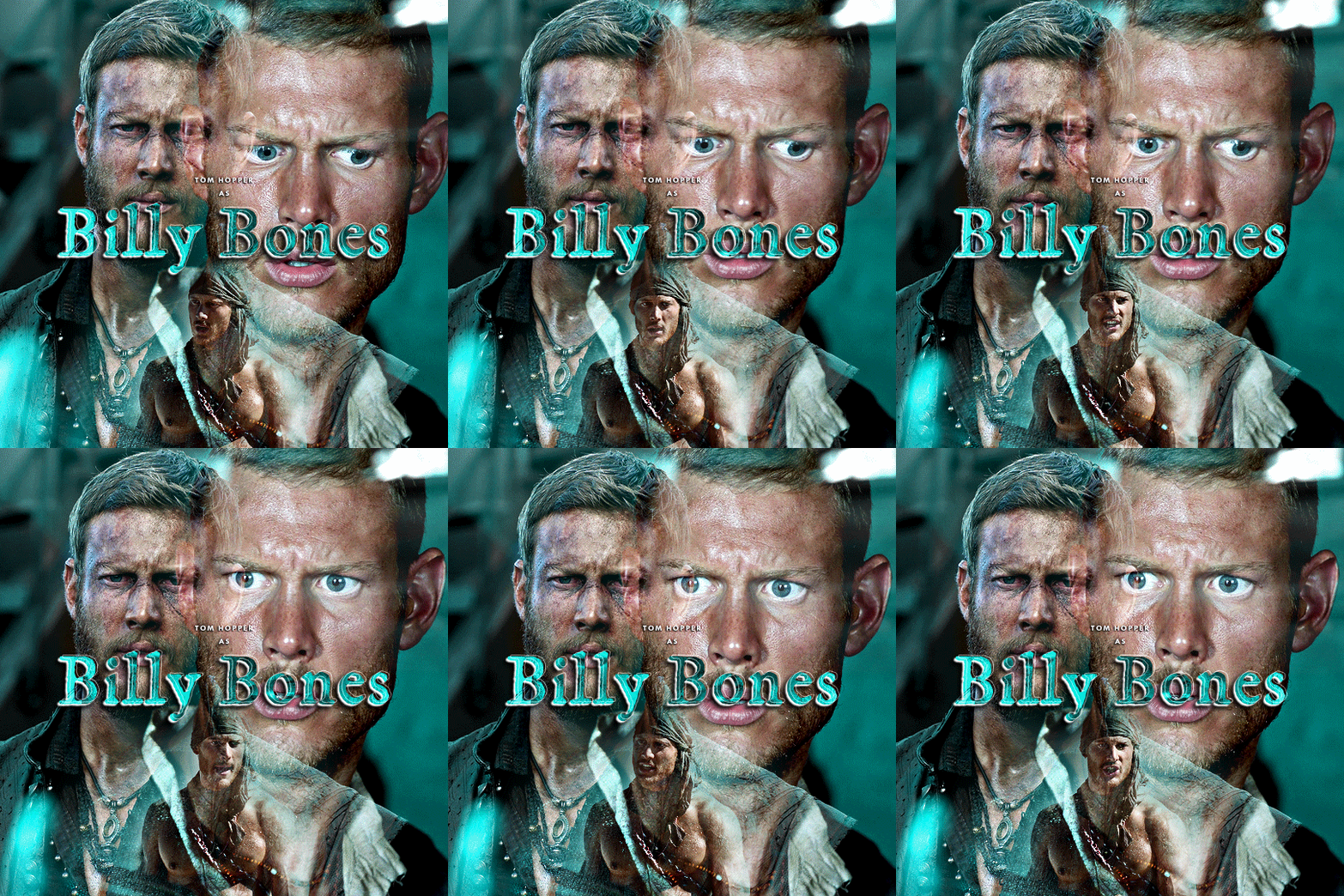

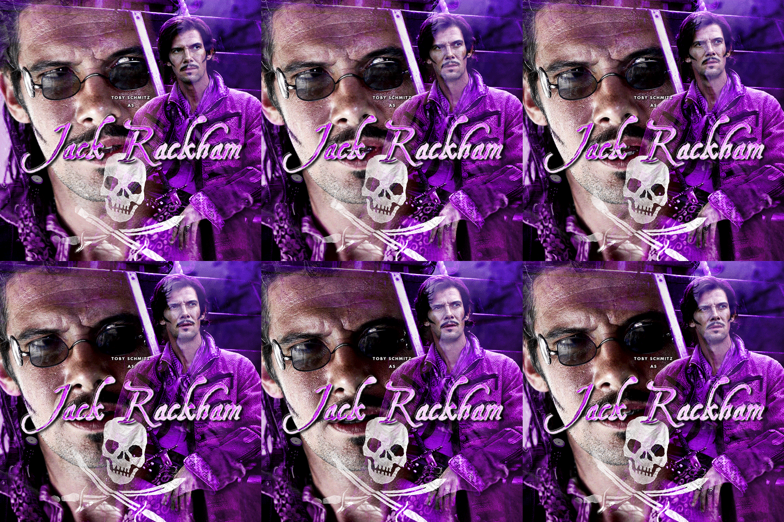

10 YEARS OF BLACK SAILS (2014–2017) – Created by Jonathan E. Steinberg & Robert Levine
#black sails#gifs*#blacksailsedit#cinemapix#dailyflicks#useroptional#cinematv#chewieblog#userbbelcher#perioddramaedit#tvarchive#rainbowgifs#usergif#userkraina#tuserhan#tusereliza#userveronika#userrobin#usersjoy#userhann#creativity left after the the two first gifs#also i know i messed up the billing order#hannah’s name comes before luke’s in the opening credits#but i’m not changing the colors of the gifs just so i can swap them so let’s deal with it okay?
877 notes
·
View notes
Photo

~ Orange and Gray ~
666 notes
·
View notes
Text
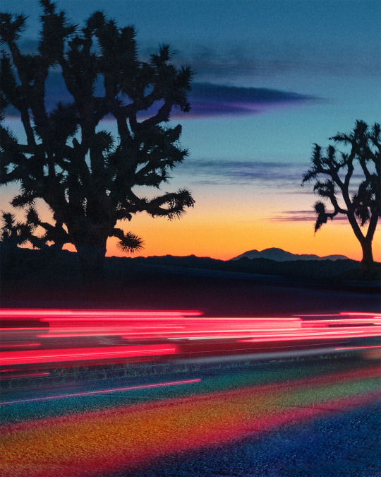
It's been a while since I have done a creative night edit like this. These are actual light trails from passing cars going through Joshua Tree National Park in the evening. I took multiple shots with long shutter speeds to capture the movement of the taillights, blended the images, and then edited them with color.
#long exposure#slow shutter#joshua tree#joshua tree national park#mojave desert#light trails#night photography#colorful#adobe photoshop#photoshop#creative photography#creative editing#california#desert
432 notes
·
View notes
Text
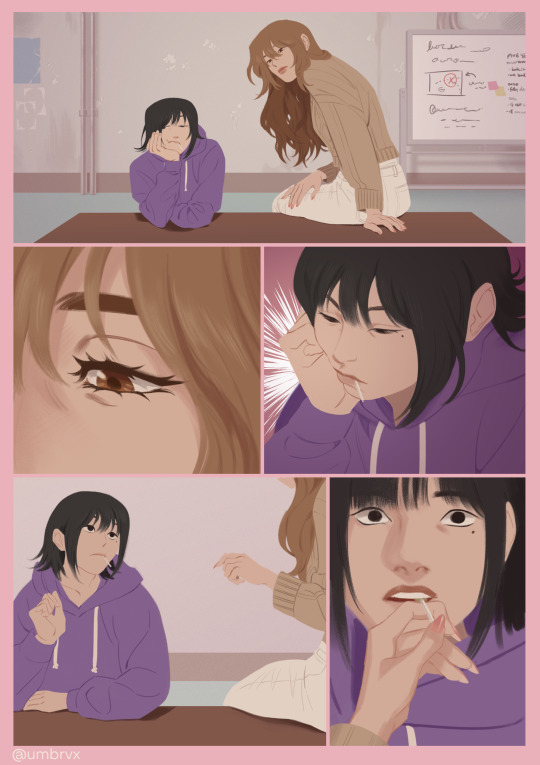
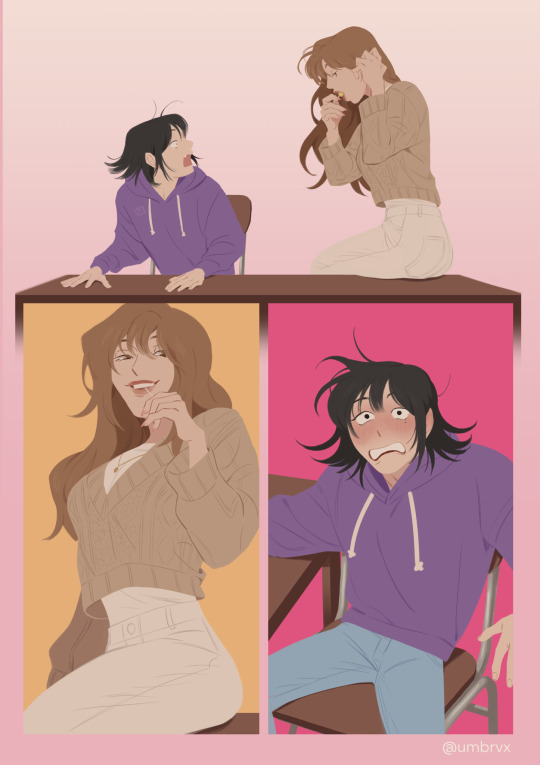
🍭
#omniscient reader's viewpoint#orv#han sooyoung#yoo sangah#sangsoo#AGHHHH FINALLY FINISHED A WIP [tearing my shirt off]#was this an excuse to draw more ysa? yes. Also.yuri#lesbian oomf in progress commentary on this was: 1 giving detailed input on what color ysas manicure should be#and 2 others requesting she have 2 nails be short next time LOLL#‘how does she have a manicure in the apocalypse’ by being a cuntress#school has been beating my ass creatively but i need#Todraw more orv BADLY!!!!!#im always itching to draw kdj in particular but i wanna draw more girlies first bc ive been rlly wanting to#heres hoping i can have solid ideas <o>__<o>#oh side note theres 2 easter eggs in here btw LOL. not necessarily orv related easter eggs just sillies
2K notes
·
View notes
Text
Today's gender is 'vintage' music artists posters
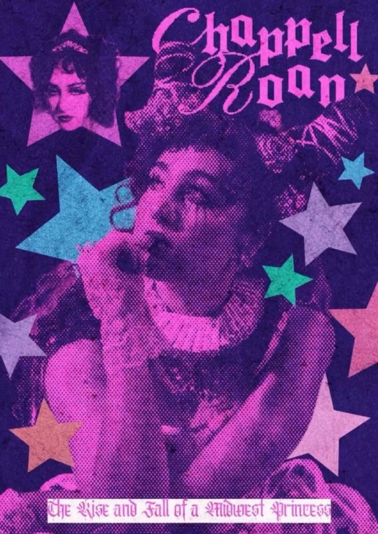
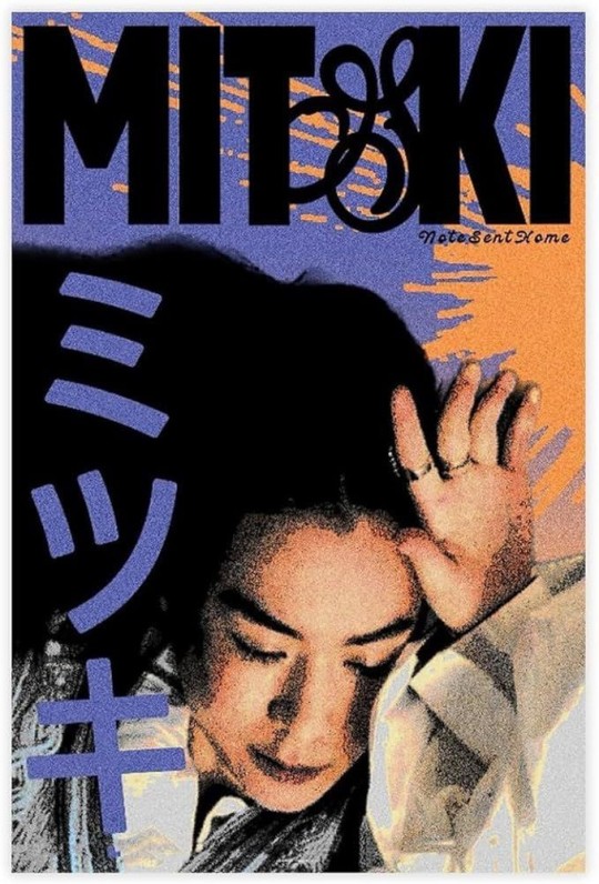
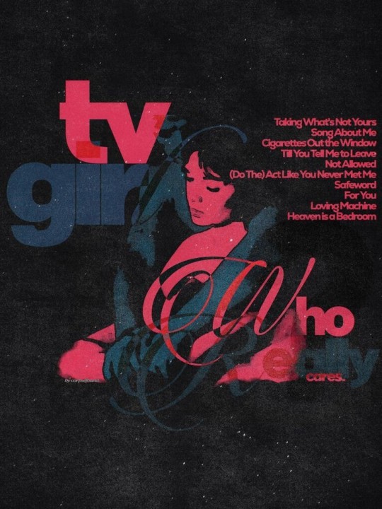
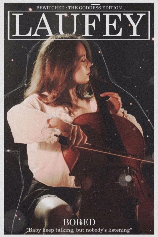
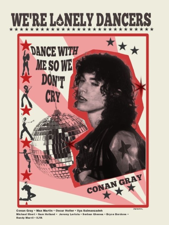
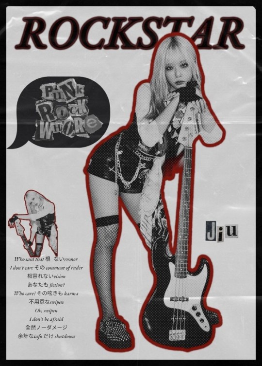
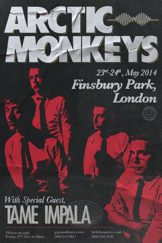

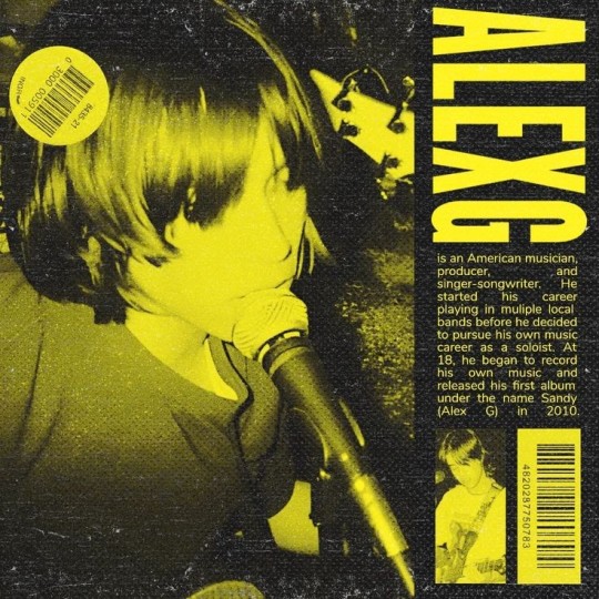
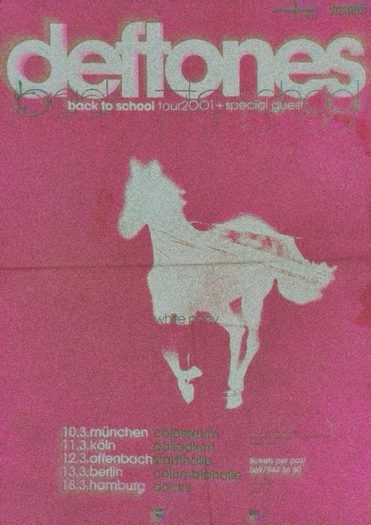
#people are so creative with these things I can't#EVEN IF IT'S SOMEONE I DON'T KNOW IT STILL HITS HARRDDD#love the Chappell Roan and Arctic Monkeys one#ALSO THE CONAN GRAY ONE??? AHHHHHRAA#music#music artists#music artwork#music aesthetic#music posters#band posters#chappell roan#mitski#tv girl#laufey#conan gray#mf it's GRAY. GREY IS THE FUCKING COLOR#or... hue??#dreamcatcher jiu#jiu#arctic monkeys#hozier#alex g#deftones
372 notes
·
View notes
Text
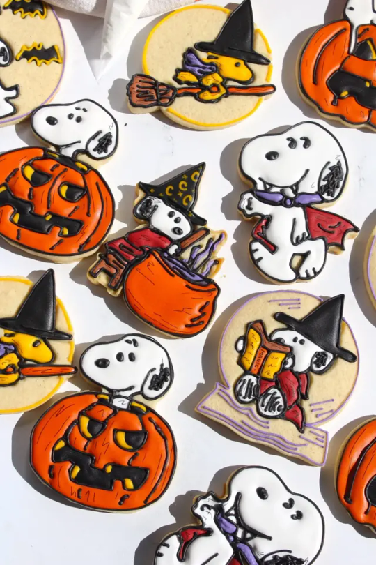
Snoopy Halloween Sugar Cookies
#snoopy#peanuts comic#halloween#sugar cookies#cookies#baking#charlie brown#woodstock#kids#creative#icing#color#orange#recipe#autumn#tv inspired#comics inspired#film inspired#royal icing#thesqueakymixer
995 notes
·
View notes