#color adjustments
Explore tagged Tumblr posts
Text
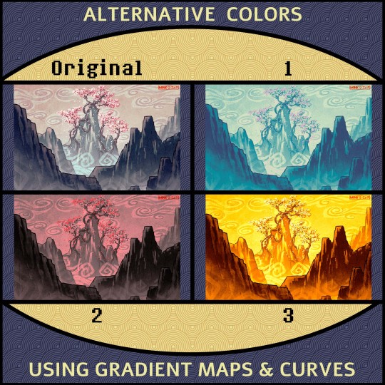
Alternative Color Versions of my artwork “Overgrowth” Which one is your favorite?
6 notes
·
View notes
Text

i HAVE been working on this ive just been fighting it for my fucking life but i think ive finally got it to the point i can work on finishing ��
#wyll ravengard#my art#wips#bg3#i'm assuming it's a law in faerun that bards have to dress like that#at one point i was like i bet i could finish all the class swaps before veilguard comes out. lol. lmao even#the colors look WACK on mobile tho so maybe some more adjustments are needed before painting 😔
3K notes
·
View notes
Text


eons-old angelic being receives carabiner from local dyke (not clickbait)
#guys…. my dykes…. i love them#butchnatural#ty to my roommate for color adjustment help <3 yay#cas carabiner origin story#spn#supernatural#destiel#castiel#dean winchester#illustration#comic#artists on tumblr#artwork#lesbian#d art
3K notes
·
View notes
Text
IT'S FINALLY FUCKING DONE. I'M FINALLY FREE
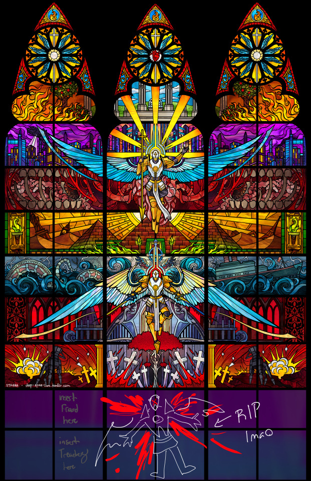
UNTIL FRAUD COMES OUT
Tumblr shrinks it down pretty bad so please. please. I am begging you. look at the full sized image and zoom in. This art piece made my friends worried for my mental health I need someone to witness the amount of detail and effort I put into this
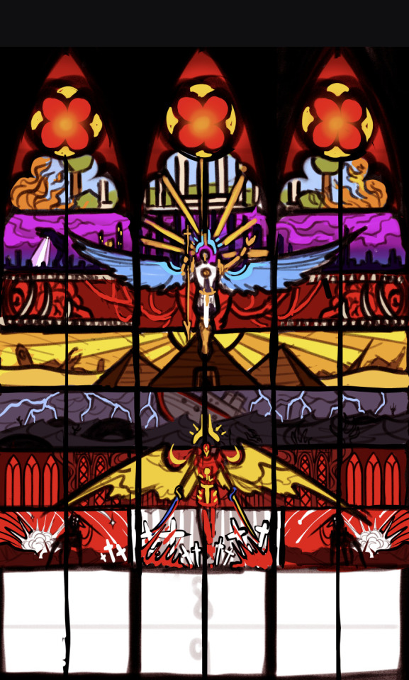
also the original sketch under the cut bc I think comparing them is really funny
#my art#ultrakill#stained glass art#gabriel ultrakill#this is one of those art pieces that made me feel like i had a parasitic fungus controlling my brain#one of those art pieces that's gonna require recovery time. i feel like a demon was just expelled from my body#i need to go eat an apple or stand in a river for a little while#i already said it but please. please zoom in on the full sized version#i love this game so much#i just hope i don't hate this by the time its finished lmao#im probably gonna have to adjust the color balance a bit when fraud/treachery come out but i'll cross that bridge when i get to it
6K notes
·
View notes
Text
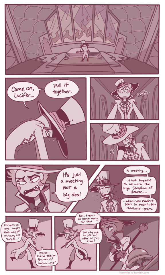
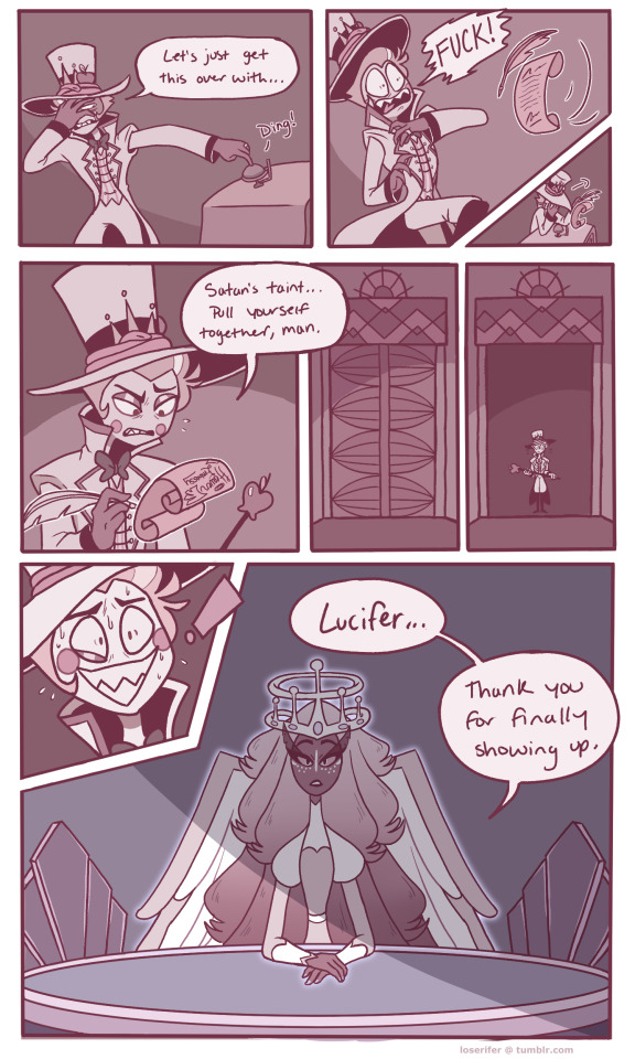
short comic im working on about lucifer's meeting with heaven because i love seeing him suffer >:)
Page 1-2/?
Next
reblogs are appreciated! :D
#hazbin hotel#lucifer morningstar#hazbin hotel sera#fanart#hazbin hotel fanart#comic#hazbin hotel comic#rays art#(edit: some colors were showing up different on my tablet#so i adjusted them)
4K notes
·
View notes
Text

[Day 359]
Let the show begin
#dddaily4sherin#pearlescentmoon#geminitay#grian#goodtimeswithscar#hgcz roleswapverse#hgcz spoilers#my art#hermitblr#trafficblr#can you tell we're obsessed#i would adjust the colors more but i ran out of time </3
2K notes
·
View notes
Text

something something giant isopod sharing is caring pass the detritus
inprnt
#giant isopod#marine biology#artists on tumblr#inprnt#I tried coming up with a pun but nothing popped up#cackLES#there's also another print up on inprnt that I'm waiting to post when I have other stuff settled 👀#technically inprnt is getting to see stuff a little earlier haha#also been noticing how my process has changed haha it's interesting#like I'll spend waaaaaay more time now nitpicking/adjusting colors which is fine#but like before when I was still in old process mindset I'd get frustrated and think the colors weren't coming out right#when what I needed was to spend more time figuring it out
8K notes
·
View notes
Text
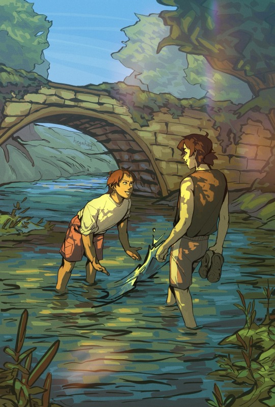
☀️🏞️🌿☁️
#learned a lot abt colors on this one#and by that I mean I had to use adjustment sliders 5 million times after I finished 😐#klance#Voltron#vld#Keith kogane#Lance McClain#my art
2K notes
·
View notes
Text
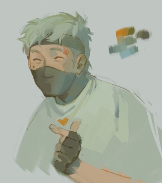
<3
#my art#ethoslab#don’t have much of a reason for this one lol just trying to figure out interesting colors without any filters/curve adjustments etc#also giving him the tall person slouch
2K notes
·
View notes
Text
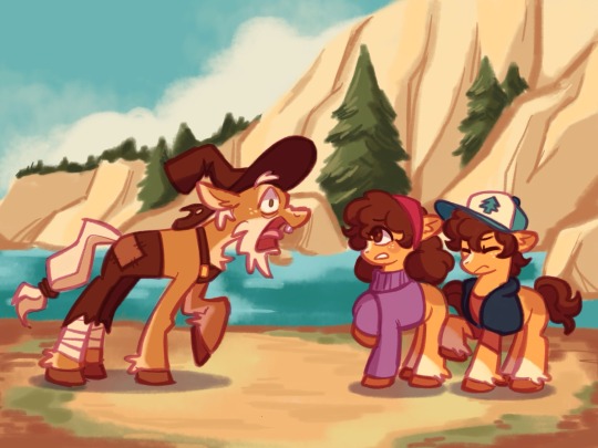
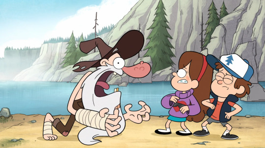
screenshot redraw !!
(s1e02, the legend of the gobblewonker)
#the colors always look funny when i transfer my art to my phone#ive tried to adjust for it but no matter what i do it looks like i put some kind of instagram filter on it#oh well#mlp x gf au#gravity falls#dipper pines#mabel pines#fiddleford mcgucket#my little pony#mlp#crossover#redraw#screenshot redraw#my art
1K notes
·
View notes
Text


Mark Ryden x Paul Frank “Meat Purse”
#didnt find Sources for these but wanted to put em next to each other too sorry#theyve gotta be from the same place but the first one looks more like. color-adjusted idk should i have tried to make them match
4K notes
·
View notes
Text

Alternative Color Versions of my artwork “Adrietty”, fan art of both Arrietty and the singer Adriana Figueroa. Which one is your favorite?
3 notes
·
View notes
Text


la seine x terzomega 🤍🖤✨ + bonus 'black swan' colors
#my art#a monster in paris#the band ghost#terzomega#terzo x omega#omega3#digital art#crossover#monster in paris#guys. guys the fucking COLOR change to adjust to the lighting? was insane. my god. very tricky to figure out. had to manually go at it#it was worth it though
624 notes
·
View notes
Text
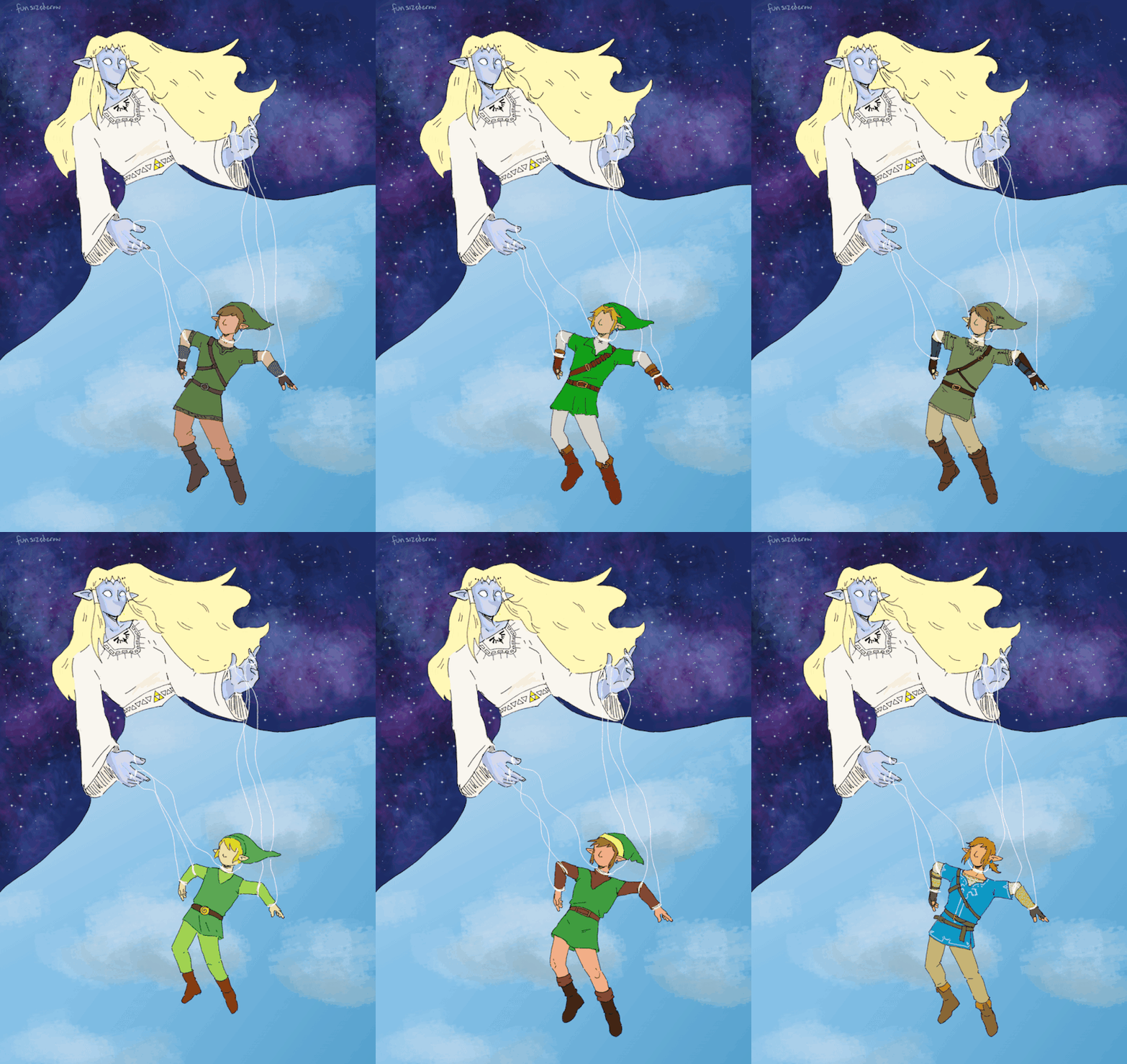
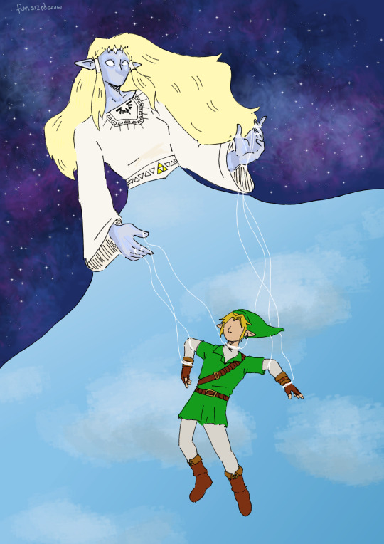
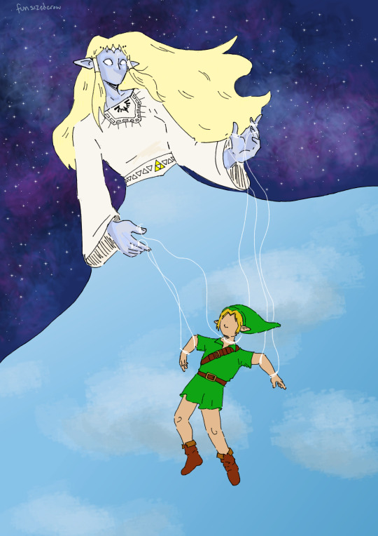
Link is Hylia's specialist little boy (this is not a good thing for him)
(stills under the cut)



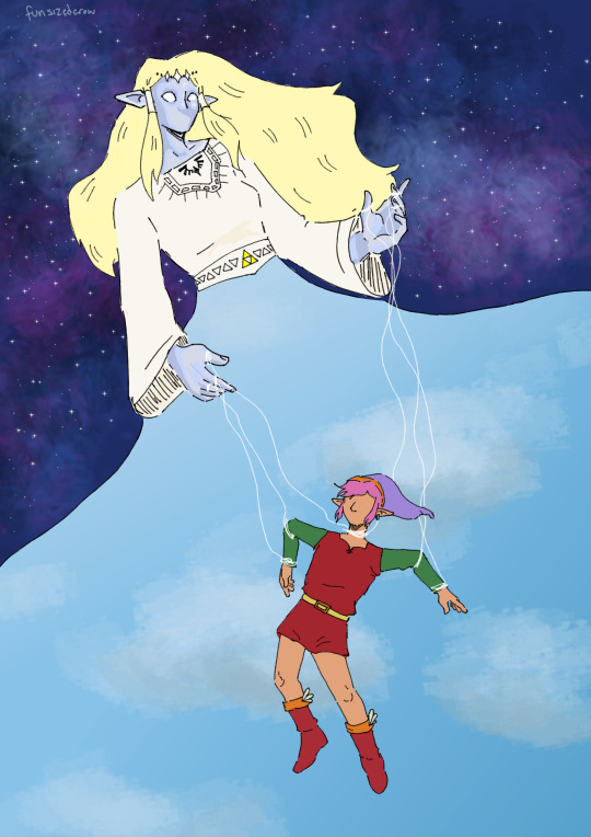
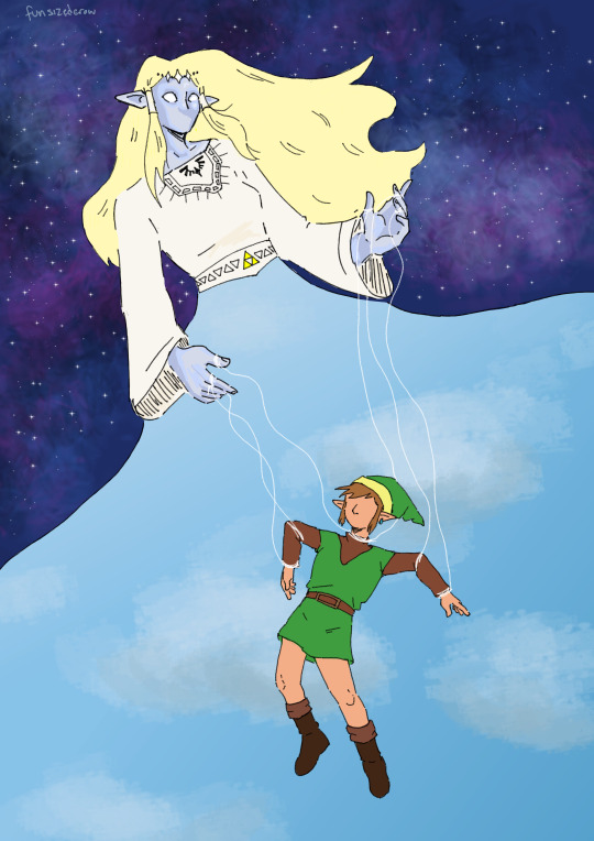
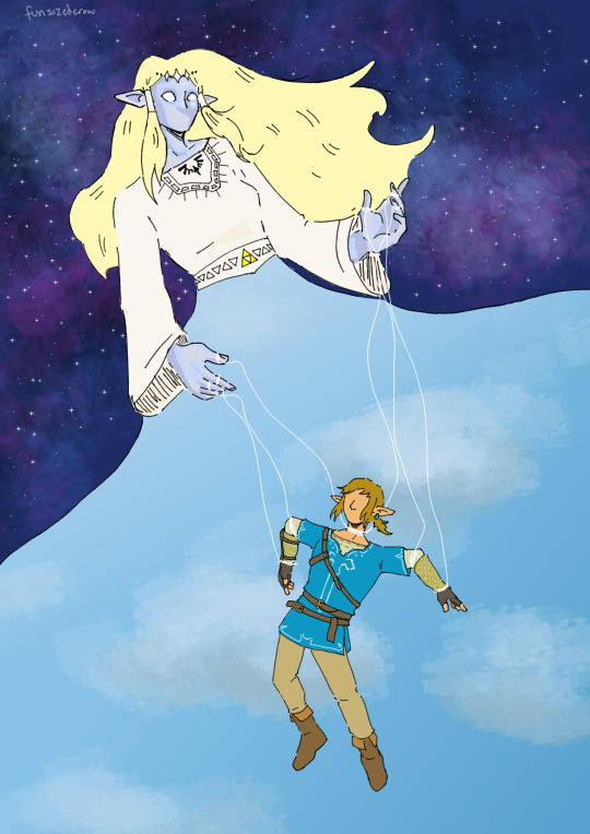
#screw you tumblr gif size limit btw. i had to compress it to get it to work but its fine. luckily its not super detailed.#next time i do something like this im doing pixel art. tiny canvas. this was a lot of fun though :)#my art#the legend of zelda#loz#link loz#artists on tumblr#gif warning#legend of zelda#tloz#tloz fanart#wind waker#loz fanart#twilight princess#a link to the past#botw#breath of the wild#ocarina of time#skyward sword#had a lot of fun designing hylia btw <3 took ideas from skyward sword game + manga and also the goddess statues from both botw and ss#need to make designs of the golden goddesses next....#color picked a lot of the colors and then adjusted them but. all of the games are so saturated except for twilight princess it is so funny.#it literally looked like he was in black and white compared to them.#sorry to the links that i did not draw. i was not drawing any more than i had to. 8 was already a lot this took me forever#(two weeks. not that long actually but long enough)
723 notes
·
View notes
Text
I think 90% of my gripes with how modern anime looks comes down to flat color design/palettes.
Non-cohesive, washed-out color palettes can destroy lineart quality. I see this all the time when comparing an anime's lineart/layout to its colored/post-processed final product and it's heartbreaking. Compare this pre-color vs. final frame from Dungeon Meshi's OP.
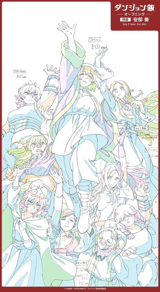
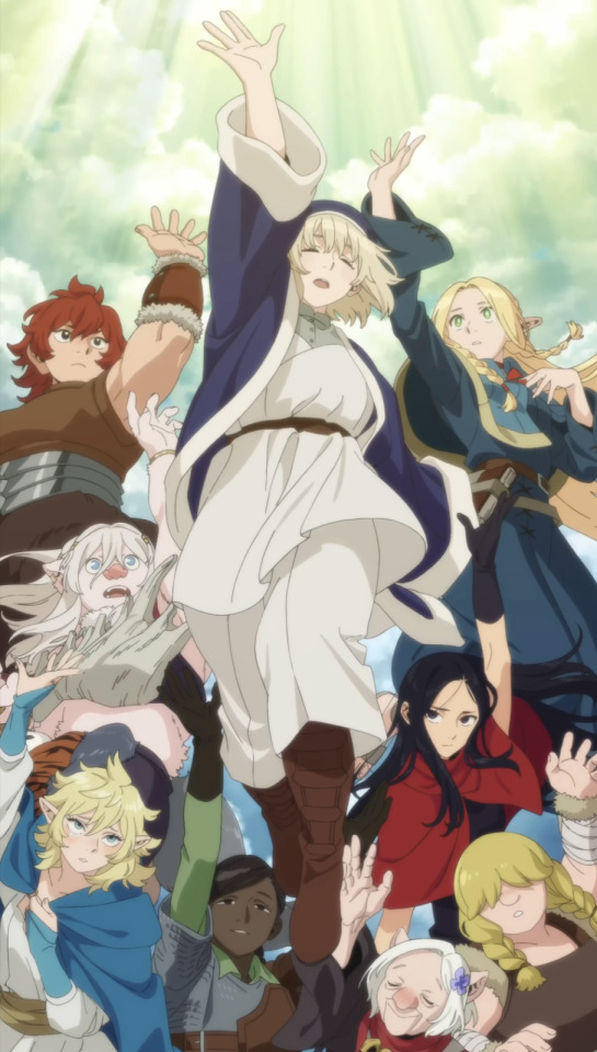
So much sharpness and detail and weight gets washed out and flattened by 'meh' color design. I LOVE the flow and thickness and shadows in the fabrics on the left. The white against pastel really brings it out. Check out all the detail in their hair, the highlights in Rin's, the different hues to denote hair color, the blue tint in the clothes' shadows, and how all of that just gets... lost. It works, but it's not particularly good and does a disservice to the line-artist.
I'm using Dungeon Meshi as an example not because it's bad, I'm just especially disappointed because this is Studio Trigger we're talking about. The character animation is fantastic, but the color design is usually much more exciting. We're not seeing Trigger at their full potential, so I'm focusing on them.
Here's a very quick and messy color correct. Not meant to be taken seriously, just to provide comparison to see why colors can feel "washed out." Top is edit, bottom is original.
You can really see how desaturated and "white fluorescent lighting" the original color palettes are.
[Remember: the easiest way to make your colors more lively is to choose a warm or cool tint. From there, you can play around with bringing out complementary colors for a cohesive palette (I warmed Marcille's skintone and hair but made sure to bring out her deep blue clothes). Avoid using too many blend mode layers; hand-picking colors will really help you build your innate color sense and find a color style. Try using saturated colors in unexpected places! If you're coloring a night scene, try using deep blues or greens or magentas. You see these deep colors used all the time in older anime because they couldn't rely on a lightness scale to make colors darker, they had to use darker paints with specific hues. Don't overthink it, simpler is better!]
#not art#dungeon meshi#rant#i'm someone who can get obsessive over colors in my own art#will stare at the screen adjusting hues/saturation for hours#luckily i've gotten faster at color picking#but yeah modern anime's color design is saddening to me. the general trend leans towards white/grey desaturated palettes#simply because they're easier to pick digitally#this is not the colorists fault mind you. the anime industry's problems are also labor problems. artists are severely underpaid#and overworked. colorists literally aren't paid enough to do their best#there isn't a “creative drought” in the anime industry. this trend is widespread across studios purely BECAUSE it's not up to individuals#until work conditions improve anime will unfortunately continue to miss its fullest potential visually#don't even GET ME STARTED ON THE USE OF POST-PROCESSING FILTERS AND LIGHTING IN ANIME THOUGH#SOMEONE HOLD ME BACK. I HATE LENS FLARES I HATE GRADIENT SHADING I HATE CHROMATIC ABBERATION AND BLUR
2K notes
·
View notes
Text


boo! old woman jumpscare
greyscale vers below!


#marshdoodles#isat#in stars and time#cw drinking#cw blood#<- just to be safe#people really seemed to like my odile hurt sprite redraw huh 😊😊😊😊#im so glad 😊😊😊#that redraw in particular kicked my ASS btw#ohhh my god why did i decide to change the pose. i think it turned out really good tho so w#also slipped in some personal hcs for how craft would look in color? i need to explore those ideas more#they don’t really translate too well with odile’s craft style#anyways!!! odile!!! she’s so much more fun to draw than i expected#i love drawing her hair so much… so shaped…#did have to adjust her palette a little tho (i think i only changed the book color and the gems)#overall just really happy with my design for her teehees#enjoy the old woman I Suppose
1K notes
·
View notes