#gradient maps
Explore tagged Tumblr posts
Text
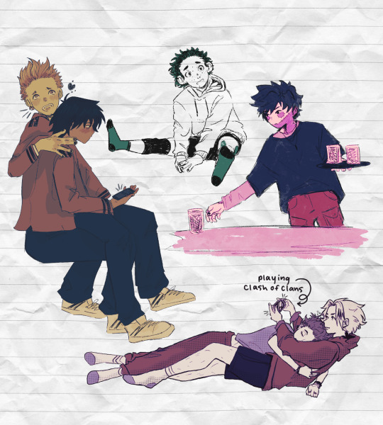
Little late doodles this week
#bnha#bnha fanart#hitoshi shinsou#shinkami#shinkami art#denki kaminari#aizawa shouta#teen aizawa#aizawa#erasermic#eraserhead#teen erasermic#present mic#teen present mic#yamada hizashi#dabi#mha dabi#dabi is a shity server#the league needs their side hustles#deku#izuku midoriya#shinkami baised on me and my bf#gradient maps#dekus just there to fill the space#days doodles
285 notes
·
View notes
Text
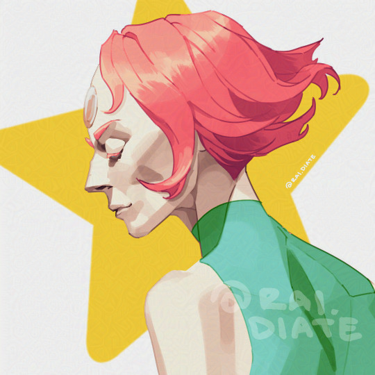
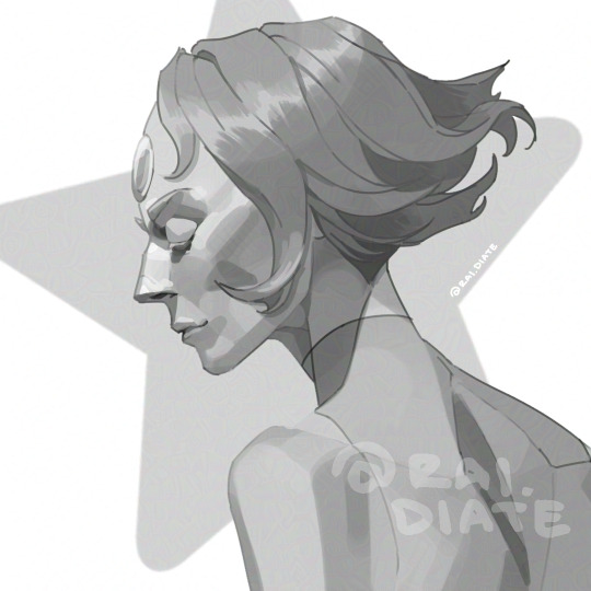
Pearl
#greyscale to colour#greyscale portrait#greyscale study#gradient maps#steven universe#steven universe fanart#su#pearl#pearl fanart#cartoon network fanart#art#digital art
73 notes
·
View notes
Text
magnus archives themed gradient map set for clip studio paint there are fifteen gradients in this set, one for each fear :] i couldn't name them after the actual fears because csp advises against even using fanart at all for asset store thumbnails/example images, but i tried to make the names as obvious as i could!
my other stuff

94 notes
·
View notes
Text

I woke up yesterday at 4 am to work on him then came back home after a lecture and worked on him again 😭 I’m happy with how he turned out I think
(Close up)

#digital art#artists on tumblr#fanart#procreate#jeffrey woods#jeff the killer#creepypasta#slenderman#slender mansion#digital drawing#digital illustration#digital painting#gradient maps#go to sleep#bro I am like tweaking out#tumblr fyp#queer#valentines day#i used a reference#challengers#dude I need someone to desperately yap to but I’m not cool enough to talk to anyone I think#i feel like im going insane
41 notes
·
View notes
Text


So I gradient mapped the girl because I'm avoiding getting ready for school tomorrow 🙅🙅
(the girl is feralnette from @bigfatbreak )
My favourite is probably the first, sixth and the last one 🙏🙏
59 notes
·
View notes
Note
hello! what program do you use to put gradient maps over png gifs?
Hello, I use Photopea entirely to edit. You can do this either by right clicking on whatever layer / folder and selecting Blending Options > Gradient overlay. Or, more simply, to apply to all layers beneath it, select gradient map from the little menu that comes up upon clicking the half-filled circle at the bottom right.
There's also this site you could use? Hope this helps you out!
26 notes
·
View notes
Text

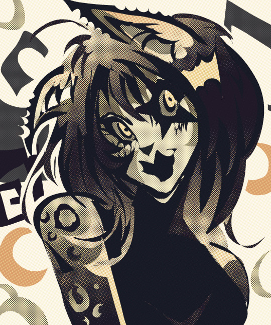

Random girl. I can't live without gradient maps now
#art#artists on tumblr#artwork#anthro#original art#small artist#original character#digital artist#oc artist#digital drawing#furry cat#furry#furry art#furry illustration#furry headshot#sfw furry#krita#krita art#anthro cat#furry character#furry comms open#furry commissions#bright colors#own art#art style#gradient maps#art blog#pop art#uhhhhh#whatever
29 notes
·
View notes
Photo

Alduin BurningCity
Thank you for supporting me! Don't be shy to interact, I'm happy to chat with you (^_~) Media: Digital 2D Program used: ArtStudio Pro Want to buy a print? Click here! My Links: My Carrd Instagram Artstation Tumblr DeviantArt
#Alduin#Skyrim#TES V#TES V: Skyrim#The Elder Scrolls#The Elder Scrolls V#The Elder Scrolls V: Skyrim#TES Skyrim#dragon#dragon art#big lizard#dragon god#not Akatosh#colorful#gradient maps#vibrant#gradient#bright
34 notes
·
View notes
Text

Bugs…
#shitpost#pokemon#doodle#fanart#i love this#pokémon#digital art#trainer red#weedle#caterpie#butterfree#metapod#pikachu#top view#trees#gradient maps
13 notes
·
View notes
Text
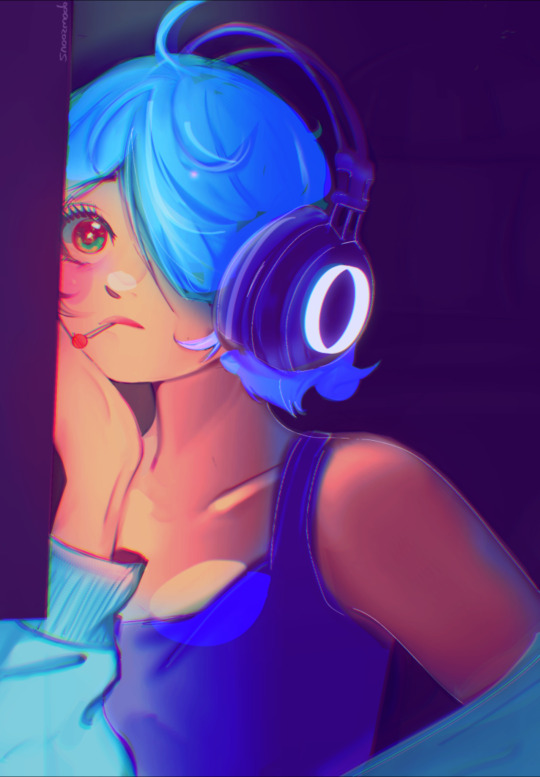

👾So I tried Gradient Maps, Didnt like it lol, BUT THE COLOR SCHEME IS BETTER!!
Another 3 Year Difference tho!!
#digital art#digital illustration#portrait#procreate#artwork#digital art is hard#anime art#character design#digital artist#gamer girl#cat headphones#emo hair#chronically online#my ocs <3#anime#anime artist#gradient maps#ibis paint x#art progress#artists on tumblr#Spotify
4 notes
·
View notes
Text
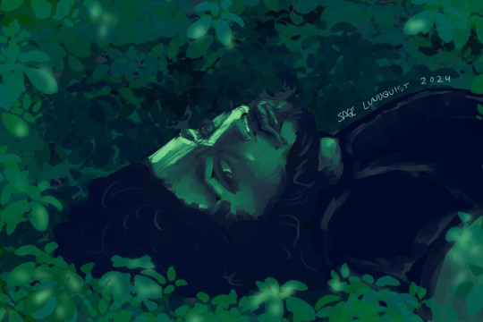
Portrait of my boyfriend from an exercise I did today. Fighting my perfectionism by setting a 20 minute timer and doing a rough and dirty portrait with grayscale values (then using a gradient map for fun) (okay to rb)
[Image ID: a digital art portrait of a young man laying on his back, head turned halfway toward the camera. You see him from the chest up. He has strong features, shoulder length curly dark hair, and a short beard. His expression is calm and watchful. The background is simple leaf shapes, with some leaves in front of him, like you're looking at him through a heavily wooded area. The portrait is entirely in shades of green.]
#my artwork#listen not to be sappy but he's so pretty right. like im not the only one that thinks this#portrait#art exercise#timed drawing#gradient maps#clip studio paint
9 notes
·
View notes
Text

Gradient maps are kinda fun
#bnha#bnha fanart#Mha#mha fanart#aizawa#aizawa shouta#eraserhead#erasermic#present mic#yamada hizashi#teen aizawa#teen present mic#procreate#gradient maps#days doodles
109 notes
·
View notes
Text

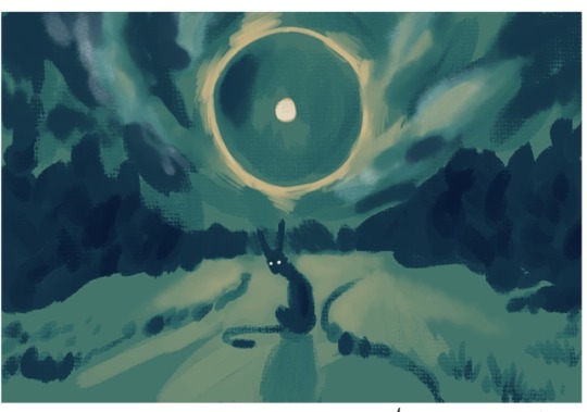
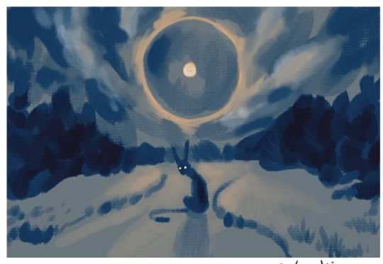


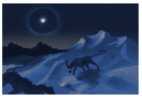

Some value and color studies for a future piece, featuring Ibexinious
Also if anyone wants a link to the gradient maps used I’ll happily provide
#my art#digital art#art#csp#ominous#winter#wintercore#moon dog#paraselene#gradient maps#speculative biology#fantasy creature#oc art#Ibexinious
10 notes
·
View notes
Text

Sketched this yesterday in anticipation of new D. Gray Man chapter coming out today. (As of posting this don't know if it's come out yet because haven't checked/read)
I should do work like this more often, faster sketches that get to the point and overall composition across where don't get crippled by perfectionism over every single detail and discouraged before moving to next step (like, does lineart REALLY need to be 1000% percent perfect with all the little details before starting to plan out lighting???). Been starting to try something similar in 3D (coloring/adding shaders to sculpts while still working on them to get me more excited over process) and it really seems to work so want to implement that mindset into 2D also to get me more motivated which in term lets me make more & better art faster.
(If you click the "keep reading" you get to see the process timelapse)
Here's a Procreate timelapse because why not? I really enjoy watching people's process & suspect other do too.
18 notes
·
View notes
Text
Felix Graham de vanily you little peacock


Gradient maps are so freaking fun, unfairly so
#i freaking love felix#felix fathom#felix graham de vanily#miraculous ladybug#fanart#miraculous#miraculous fanart#duusu#my baby#my sanity#its gona#my art#my artwork#felix <33333#silly little guy#colour gradients#gradient maps#clip paint studio
48 notes
·
View notes
Text

Alternative Color Versions of my artwork “Adrietty”, fan art of both Arrietty and the singer Adriana Figueroa. Which one is your favorite?
3 notes
·
View notes