#clear: both; text-align: center;
Explore tagged Tumblr posts
Visit Tumblr Blog
Explore Tumblr blogs with no restrictions, modern design and the best experience.
Last Seen Tumblr Blogs


Fun Fact
Post activity is at the highest at 4:00 pm EDT; notes peak at 10:00 pm EDT.
Text

#separator#clear: both; text-align: center;#Argentina busca retomar la exportación de carne bovina a Japón <p></p><div class= style=><a hre#en la localidad de Joaquín Gorina perteneciente al partido bonaerense de La Plata#con el objetivo de fortalecer las políticas de apertura comercial de Argentina al mundo.<p></p><p><br /></p><p>Cabe recordar que Japón es u#por lo que la actividad estuvo centrada en afianzar el vínculo comercial y de amistad entre ambos países y fortalecer la confianza hacia to#Fernando Vilella#y el embajador de Japón en nuestro país#Yamauchi Hiroshi#visitaron la planta de procesamiento#que abarca troceado#envasado al vacío y empaquetado; la planta Gorina Energía#donde un biodigestor genera 1#5 mega watts de electricidad para consumo industrial#y permite una mejora sustancial en el tratamiento de aguas y efluentes del establecimiento; la obra del centro logístico enteramente roboti#que proyectan culminar en los próximos meses#y con la cual proyectan aumentar la producción entre un 30% y 50% al permitir un almacenaje exponencialmente mayor al actual.</p><p><br /><#el vicepresidente del Senasa#Sergio Roberts; el subsecretario de Bioindustrias#Biotecnologías e Innovación#Pablo Nardone; el presidente del Consorcio de Exportadores ABC#Mario Ravettino; el titular de la empresa#Claudio Rodríguez y demás representantes.</p><p><br /></p><p>Mientras que por la comitiva japonesa estuvieron el Jefe de la Sección Económi#Maeda Shinji; el Agregado Agrícola#Yamaji Takuya; la asesora Sujikawa Aki#y el secretario Hayashi Genta.</p><p><br /></p><p>Fuente:<br /><a href="https://www.argentina.gob.ar/noticias/el-gobierno-nacional-busca-re
0 notes
Note
hi... don't know if you're the person to ask but do you have any tips for like. edit composition. (????) thar makes no sense . i apologize

i’m probably not the right person but fear not i’ll say some bullshit anyway. obligatory preface but i have never taken a graphic design class in my life so take everything i say with a grain of salt, or several, because idk what the fuck i’m doing
a good thing to keep in mind when editing is your focal point—that is to say, whatever it is you wanted people to be focused on. in most cases it’s probably going to be a character, but you might also have text or something else as your focal point. after you’ve picked your focal point, find ways to emphasize it—people usually do this with stroke (outlines) or with things behind the character like splatters, laces, etc. it should be relatively easy to spot a focal point in most people’s edits, even if they didn’t knowingly pick one. if your edits look janky, you probably ended up with too many things your brain is trying to focus on at once—try simplifying it or making one part pop out more than the other! this also comes into play with text. using my pinned as an example:


(still frames so they’re easier to see) you can see that len and rin are the focal points of this image because they’re outlined and because they’re in front of the text. the text is in the back because i deemed it less important than the characters—i mean, you can read my url without the image anyway.
also, sizing is a pretty big thing in composition. your brain looks at the biggest part of an image first—this is the concept behind newspaper headlines! your brain looks at the big text first, then at the smaller. you can see this reflected in my current header (displayed below, in case i change it at a later date) where “canarysage” is bigger than “resources for editors” because I wanted you to see “canarysage” first

how you align your elements is important to. generally speaking, you’ll want to keep everything pretty centered, but, as with anything, you can break this rule for the sake of creativity. when you’re making things like this directory graphic:
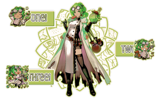
it’s cool to do a zig-zag sort of pattern. when making something like this, it’s probably better to do from left to right—that’s the way english-speakers (and speakers of several other languages) read things so that’s how your brain automatically goes. you should also position whatever you want to be read first near the top—in this case, the part that says “one” is in the top left, because that’s where most people’s eyes will go automatically. you can also see the central art is the focal point because of the outlines and the shapes behind it. the buttons are kept separate because they’re a solid color instead of the pattern used on the background shape—and the text stands out because it’s outlined in black, unlike the rest, and it has a pattern. if you use patterned text, outline it so it’s clearly seen and read.
you can also avoid centering things to make your edit more ‘dynamic’ (idk if that’s the right word) like i did with this header:

both eirika and the text are off center, which makes it look more interesting. also, they’re aligned differently—eirika is aligned to the right while the text is aligned to the left. this helps it seem less empty and is more fun visually
if you’re doing an edit with an even number of characters (like a ship edit) you’ll want to keep any one character out of the center, as this makes them the focal point and can kind of shunt the other off to the side. unless you’re doing matching graphics, in which case you should keep one centered, so it’s clear which is the “main” one in each piece of the set.
sizing is also important in terms of literally how small or big your edit is. headers tend to be pretty large (tumblr uses a 16:9 ratio, and twitter uses a 3:1) but things like icons or stamps are pretty small. especially with stamps, you’ll want to make your character pretty large in the stamp so they’re more easily seen. tumblr icons show up on your dashboard as 128x128, which is pretty small, so you’ll want to make sure your icon is easily discernible from that size.
also, i dont think this is necessarily a hard and fast rule, but when you’re making icons and you have to crop out a portion of the character’s head—crop out the top of the head, not the chin. i can’t tell you WHY i think this is a rule or even if anyone agrees with me, but it’s something to keep in mind. here’s an example of the two different kinds of cropping:


cropping the chin out just looks goofy, idk
since rentry graphics are just sort of dependent on the user, there’s no real hard and fast rules to composing them. just keep in mind whatever your focal point is and try to keep people’s attention on it, whether by adding random shit or outlining or whatever.
same thing with replycons, really. i like to keep my replycons semi-simple, but if you’re doing a collage-type of replycon, it’s better to keep the collage in the background for the most part, except for one or two focal pieces:

you can see that most of the collage pieces are behind rin except for the flower stickers, which are off to the corner so they don’t detract from her. the stripey-line things help a lot, too, as they lead your eye to the main part of the reply icon even without being centered—the main part being the character, of course
with moodboards or stimboards, it’s best to keep your character in the exact center—unless you have two, in which case keep them both in the middle so they’re easier to see. there’s no hard and fast rules with moodboards, but i like to keep images with similar composition near but not directly beside each other

the top middle and bottom middle of this one are both pretty minimalistic, so i kept them adjacent from but not beside each other. as for the rest of it… well i just kind of did whatever
if you’re doing a moodboard or stimboard with two kinds of themes then it’s best to do a checkerboard type of pattern

you can see that here. the pattern is food-art-food-art-ena-art-food-art-food. like a checkerboard, except ena’s in the middle
i’m being so for real i don’t understand composition at all. it’s really best to just do whatever looks best to you personally and see what happens. i hope this is helpful-ish!
yours truly, canarysage
#world’s least helpful editor tries to run a resource blog: canarysage in a nutshell#you can find a lot of resources on composition if you look it up where smarter people explain things better#but i just sort of. do whatever#ʚɞ — tips.
28 notes
·
View notes
Text
How to Spot Fake Panerai Luminor: A Comprehensive Guide
The Panerai Luminor is a symbol of luxury, precision, and Italian craftsmanship. As one of the most sought-after luxury watches in the world, it has unfortunately become a target for counterfeiters. If you're considering purchasing a Panerai Luminor—whether new or pre-owned—it’s crucial to know how to distinguish between a genuine piece and a fake. In this guide, we’ll explore the key features to look for when trying to spot a fake Panerai Luminor, ensuring you make a wise investment in your timepiece.
1. Examine the Dial
The dial of the Panerai Luminor is one of its most distinctive features. Here are some points to consider:
Logo Placement: The Panerai logo should be perfectly aligned and centered on the dial. Any misalignment or inconsistency is a red flag.
Font Quality: The font used for the numbers and markers should be crisp and clear. Counterfeit watches often have poorly printed text.
Sub-dials and Markers: Look for the correct number of sub-dials and their size. Fakes may have uneven or poorly sized markers.
2. Inspect the Case Back
The case back of a genuine Panerai Luminor is engraved with specific details that are often absent or poorly executed on counterfeit models. Pay attention to:
Engravings: Genuine Panerai watches have precise engravings, including the model number and the Panerai name. Check for any signs of wear or poor quality.
Material: Authentic Panerai watches are made from high-quality materials. A heavy, solid feel is a good sign.
3. Assess the Weight
One of the easiest ways to spot a fake Panerai Luminor is by its weight. Genuine Panerai watches are made from premium materials, which contribute to their heft. If the watch feels unusually light, it may be a counterfeit. Always compare the weight to the specifications provided by Panerai.
4. Check the Movement
The movement of a watch is its heart. Panerai uses high-quality Swiss movements, and any inconsistencies here can indicate a fake. If possible, have the movement inspected by a professional. Look for:
Sweeping Seconds Hand: The seconds hand of a genuine Panerai moves smoothly, not in a ticking motion.
Movement Markings: Check for clear markings on the movement, which should include the Panerai logo and specific model details.
5. Examine the Strap
The strap of the Panerai Luminor is designed with both style and durability in mind. When checking the strap, consider:
Material Quality: Genuine Panerai straps are made from high-quality leather or rubber, while fakes often use inferior materials.
Stitching: The stitching should be even and precise. Any loose threads or uneven stitching is a sign of a counterfeit.
6. Verify the Serial Number
Every genuine Panerai watch has a unique serial number. Ensure that the serial number is present and matches the paperwork that comes with the watch. Counterfeit watches may have serial numbers that are either missing or do not correspond with the brand’s records.
7. Purchase from Reputable Sources
When buying a Panerai Luminor, always ensure that you purchase from a reputable source. At Luxe Replica Watche, we specialize in high-quality replica watches that closely resemble the originals, ensuring you receive the best value for your investment. Always check reviews and ratings before making a purchase.
Conclusion
Spotting a fake Panerai Luminor requires careful attention to detail, but with the right knowledge, you can avoid costly mistakes. Always remember to check the dial, case back, weight, movement, strap, and serial number. If in doubt, consult with a professional or purchase from a trusted retailer like Luxe Replica Watche. Your watch is not just a timepiece; it’s an investment in luxury and style.
2 notes
·
View notes
Note
Do you like omegaverse?
A secret, third option!
(Cut for length and nsfw text)
As a fandom phenomenon:
I did read the original J2 fics that kicked off this whole trend some years back
It's been interesting to see how it's evolved over the years. I was in SPN fandom back when it first became popular, and then I wasn't really in fandom and didn't read omegaverse for years
Take into account that is one person's perspective from the fandoms I was personally in, I have not done a widespread review of all things omegaverse
(I actually just checked the Journal of Transformative Works for an article on omegaverse as a trend, and didn't find one for the term omegaverse or by searching alpha AND beta AND omega, which is a little surprising to me)
In any case
Early days: cis male alpha/cis male omega pairings. The omega would have a self-lubricating asshole and smell irresistible to the alpha when they went into heat. Mentions of cis female omegas, but the focus was usually on the m/m pairing. Mentions of female alphas, but usually cis female alphas that milked the omega cis male's dick with a super pussy that like, locked down or something in a reverse of knotting. Sometimes cis male omegas could get impregnated and sometimes they were infertile and just had heats
Current trends: I've noticed way more intersex omegas. Alphas going into rut in addition to omega heats #itsequality. Mating bites. Family units as packs. Sometimes, psychic bonds come with mating bites and/or packs. Inability to physically leave someone you've just mated with. A lot more variety in how irresistible the heat/rut smell is and exactly what someone may want during their cycle, e.g., omegas going into "I want to nurse and cuddle my baby" mode instead of sex mode, alphas fighting each other to blow off steam. Alongside that, variety in how intense a heat/rut is, on a scale of mildly annoying/distracting but manageable to removing someone's higher brain functions and leaving only instinct. More omega/omega or alpha/alpha pairings. The concept of transitioning, where someone can go from alpha to omega, etc.
I think betas have remained mostly the same throughout, although I do remember something where betas had a kind of "glue the pack together" function in a newer fic rather than just being "regular humans" as in older fics
In wider culture:
The omegaverse lawsuit
Omegaverse fucking with AI datasets
This shit is hilarious and I genuinely hope we never stop
Common critiques:
1, Omegaverse is just reinventing sexism minus the women / it's so sexist that it's managed to remove women from a story about sexism
2, It's codifying top/bottom into gender
Honestly? Maybe sometimes? But it really depends on the story, and there are a lot of different versions out there, so I find this reductive
The one (1) omegaverse fic I wrote aligned both alphas and omegas more closely with the queer community than the sexism allegory while making it clear that they were also their own thing
Also, omegaverse started out as an excuse to write weird, kinky porn. A lot of it still centers around weird, kinky porn
Sometimes your hindbrain wants what it wants, "your kink is not my kink & that's ok", and you aren't trying to unpack the full implications of a world where this is real
Or, you want to put these bitches into a situation, and an omegaverse where character A benefits as an alpha and character B suffers as an omega is just an interesting situation
Like. I generally think it's whatever
Slash fandom has also been accused of sexism and gay fetishism in a variety of ways that are not exclusive to omegaverse, and I am keeping that can of worms firmly closed right now lmao
Weird sex and sex mechanics:
I love when people get weird with it. Omegaverse did not invent this, like I'm sure there were some 1950s sci-fi writers creating man-made alien pussy beyond our comprehension
Ovigonopods of Love: a Strange Horizons short story from 2001, featuring underwater bug sex involving three different sexes and metamorphosis, on the subject of weird sex that definitely predates omegaverse
My issue with og omegaverse, and part of the reason I didn't read it for such a long time, is that it doesn't get weird enough
Listen. Uh. Gonna talk about scat here, but listen.
If your asshole self-lubricates, you are unavoidably gonna shit yourself. Especially if you're getting your ass stretched by a knot and stuffed with an industrial amount of jizz for days on end. Some people can suspend their disbelief when reading omegaverse involving self-lubricating assholes, and godspeed, but I personally cannot
I think if you're going to imply ass babies, you may as well go all the way and give the guy a cloaca ¯\_(ツ)_/¯
That being said, I do like intersex omegas for much the same reason. I can wrap my brain around it. I know where the babies are coming from, and I'm not reading through a fic and trying to blank out the horror of some poor guy pushing a baby out of his ass
I'm not even opposed to anal knotting! I've read an alpha/alpha fic like that and an alpha/omega fic. If an asshole can take a fist with proper lube and stretching, it can take a knot, and I accept that. It's the self-lubricating and days of fucking during a heat that get me
Story development:
One thing I don't like about omegaverse is when it's used as an excuse to throw the ship into intense feelings and fucking without doing any of the work to show me why this ship works
(And I don't mean PWPs, there are some good omegaverse PWPs in the same way there are some good sex pollen ones, or aliens/gods/demons/fairies/magic made them do it)
BUT. You cannot have two characters who maybe didn't even like or know each other suddenly be in love because they shared a heat and rut and now they're mated. I just won't buy it, but I won't buy this in soulmate AUs or any other kind of fic, either
What happens after the heat/rut induced fucking? Are they stuck together because of a mating bite? Is this for societal reasons or because it physically hurts to leave, or both? Or do they separate immediately after? Is it weird when they meet again? How? Did they have a relationship before this? How does it change that? How does it change their relationship with other people, especially if this is in the pack bonds version of omegaverse?
Worldbuilding:
If it goes beyond a PWP, I do have questions
From an evolutionary standpoint, why are there alphas, betas, and omegas? Can betas have babies with each other, or are omegas the only ones who can get pregnant?
If betas are infertile, their evolutionary role could be to protect and provide for alphas and omegas when they would otherwise be vulnerable in heat/rut and when they're carrying and raising children
But if betas are infertile, why are there male and female betas?
If betas can have babies, it's possible that alphas and omegas have more babies and that there is an evolutionary tradeoff between that and between your heat/rut making you more vulnerable and the time and energy costs in having more children, which could lead to the two different modes of human reproduction
Either way......why does your society have a binary man/woman gender system rather than a ternary alpha/beta/omega gender system?
Possibly because you can't tell someone's designation by looking at them and because people hide their scent, and maybe also because most people are betas with alphas and omegas being in the minority
On a similar note, how common/rare are male omegas and female alphas? Have you basically reached a point where there is no sexual dimorphism? What is the reason for this?
Where did the terms alpha, beta, and omega even come from? They honestly sound really formal to me, and the one (1) omegaverse fic I wrote differentiated between these as more modern terms and the terms people used to use, which in modern times were more widely considered slurs
In conclusion, do I like omegaverse?
4 notes
·
View notes
Text
The Power of Pillar Pages for SEO Growth
In the ever-evolving world of digital marketing, one strategy has proven to be a game-changer for driving organic traffic and improving search engine rankings—pillar pages. Whether you’re running a blog, an e-commerce website, or a corporate site, understanding and leveraging pillar pages can significantly enhance your SEO strategy. But what exactly are pillar pages, and why are they so powerful for SEO growth?
What is a Pillar Page?
A pillar page is a comprehensive piece of content that serves as the central hub for a specific topic. It provides a broad overview of a subject and links out to more detailed, related content—often called cluster content or subtopics. Think of a pillar page as the foundation of a content cluster that connects various related blog posts or pages, all internally linked together.
For example, a digital marketing website might have a pillar page on "Content Marketing" that links to subtopics such as blog writing, email marketing, content strategy, and social media content. Each of these subtopics is covered in detail on its own page, and all link back to the pillar page.
Why Pillar Pages Matter for SEO
Search engines, especially Google, favor structured, topic-based content. Pillar pages help organize your content in a logical way that signals to search engines that you are an authority on a particular subject. Here’s how they help drive SEO growth:
1. Improved Site Structure and Crawlability
Search engines use bots to crawl and index content. A well-structured site with pillar pages makes it easier for these bots to understand your site’s hierarchy and topic relevance. With all related content internally linked, search engines can efficiently crawl and index multiple pages at once, improving your chances of ranking.
2. Keyword Optimization
Pillar pages allow you to target a broad keyword or topic, while subtopic pages focus on long-tail keywords. This multi-layered approach boosts your chances of appearing in various types of search queries, from general to very specific, broadening your organic reach.
3. Authority and Relevance
When all your content around a topic is interlinked and centered around a main pillar, it sends strong signals of authority and topical relevance to search engines. This can help you rank higher not only for your main keyword but also for related searches and semantic variations.
4. Enhanced User Experience
Pillar pages also improve user navigation. Visitors can find comprehensive information about a topic in one place and easily explore related content. This increases dwell time, reduces bounce rates, and signals content value to search engines.
Creating an Effective Pillar Page
Building a high-performing pillar page requires a strategic approach. Here are some best practices:
Choose a broad topic that is central to your niche and can be broken down into subtopics.
Conduct keyword research to identify high-volume keywords for both the main topic and supporting content.
Create in-depth, valuable content on the pillar page that gives an overview but leaves room for deeper dives via linked cluster content.
Use clear, internal linking to connect cluster pages to the pillar and vice versa.
Optimize for on-page SEO—title tags, headers, meta descriptions, image alt text, and URL structure should all align with your main keyword.
Update regularly to keep the content fresh and relevant, especially as your topic evolves over time.
Final Thoughts
In today’s SEO landscape, content organization and topical authority matter more than ever. Pillar pages offer a proven method to enhance both. They don’t just improve SEO—they create a better user experience, help establish your brand as an expert, and lay a foundation for scalable content growth.
If you’re serious about climbing the search rankings, it’s time to build your pillar content strategy. Start with one core topic, build out your cluster content, and watch as your organic traffic begins to rise.

#seo agency in kolkata#digital marketing agency in kolkata#digital marketing services#design#digitalgrowthmedia
0 notes
Text
Key Differences for Enhanced Document Clarity
Document Formatting Services: Q & A Tutorial
1. What are the document format rules?
Document format rules typically include using clear headings and subheadings, consistent font styles and sizes, proper margins, and appropriate line spacing. Ensure correct grammar and punctuation, use bullet points or numbered lists for clarity, and include a title page if necessary. Always follow any specific guidelines provided for the document, such as citation styles or required sections.
2. What are the 4 types of file formatting?
The four common types of file formatting include: 1. **Text Files** (e.g., .txt, .csv): Plain text without special formatting. 2. **Document Files** (e.g., .docx, .pdf): Rich text with formatting options. 3. **Image Files** (e.g., .jpg, .png): Visual data with various compression methods. 4. **Audio/Video Files** (e.g., .mp3, .mp4): Multimedia formats for sound and video content.
3. What is font formatting?
Font formatting refers to the visual appearance and style of text in a document. This includes attributes like font type (e.g., Arial, Times New Roman), size, color, boldness, italics, underline, and alignment. It enhances readability and helps convey tone or emphasis in written content. Proper font formatting is essential in both print and digital media.
4. How many types of text formatting are in MS Word?
In MS Word, there are several types of text formatting options, including bold, italic, underline, strikethrough, font size, font color, highlighting, text alignment (left, center, right, justified), bullet points, numbering, and indentation. Additionally, you can apply styles, change cases, and add text effects. Overall, there are numerous formatting options to customize text appearance.
5. What is the difference between formatting and editing toolbar?
The formatting toolbar primarily includes options for changing the appearance of text, such as font style, size, color, and alignment. In contrast, the editing toolbar typically contains tools for actions like cut, copy, paste, undo, and redo, focusing on modifying the content itself rather than its presentation. Both toolbars enhance document creation but serve different purposes.

Visit: VS Website See: VS Portfolio
0 notes
Text
Mobile UI Design

Mobile UI (User Interface) design plays a critical role in the success of any mobile application. A well-designed UI enhances usability, accessibility, and the overall user experience. In this blog post, we'll explore the essentials of mobile UI design and how developers and designers can collaborate to build intuitive and visually pleasing apps.
What is Mobile UI Design?
Mobile UI design is the process of designing graphical and interactive elements of a mobile application, such as buttons, icons, typography, navigation, and layout. The goal is to ensure users can easily interact with the app and achieve their goals without confusion or frustration.
Principles of Good Mobile UI Design
Simplicity: Keep the interface clean and uncluttered to avoid overwhelming users.
Consistency: Maintain uniformity in colors, fonts, and component styles throughout the app.
Feedback: Provide immediate responses to user actions like button clicks or form submissions.
Accessibility: Design for all users, including those with disabilities. Use readable fonts, contrast, and screen reader support.
Intuitive Navigation: Make sure users can easily find their way around the app using clear icons and menus.
Popular Tools for Mobile UI Design
Figma: Collaborative interface design tool popular for mobile UI and prototypes.
Adobe XD: Used for designing and prototyping user experiences for web and mobile apps.
Sketch: Mac-only vector design tool great for UI/UX design.
InVision: Helps with creating interactive mockups and wireframes.
Mobile UI Design Tips
Design for different screen sizes and resolutions (responsive design).
Use a grid system to align elements consistently.
Prioritize touch-friendly elements (big enough buttons with enough spacing).
Stick to platform guidelines (Material Design for Android, Human Interface Guidelines for iOS).
Include microinteractions to make the app feel alive and responsive.
Common UI Components in Mobile Apps
Navigation Bar
Bottom Tab Bar
Buttons and Icons
Sliders and Switches
Cards and Lists
Modals and Dialogs
Example: A Simple UI Layout in Flutter
import 'package:flutter/material.dart'; void main() => runApp(MyApp()); class MyApp extends StatelessWidget { @override Widget build(BuildContext context) { return MaterialApp( home: Scaffold( appBar: AppBar(title: Text('Simple UI')), body: Center( child: ElevatedButton( onPressed: () {}, child: Text('Click Me'), ), ), ), ); } }
Testing and Improving UI
Use tools like Firebase Analytics to track user interactions.
Perform user testing with real users to identify pain points.
Iterate based on feedback and usage data.
Conclusion
Designing a mobile UI is more than just making an app look pretty—it's about creating a seamless, engaging, and efficient experience for the user. By following core design principles, using the right tools, and focusing on the user, you can build mobile interfaces that stand out in both form and function.
0 notes
Text
706 MANNS HARBOR DRIVE Listing Site: https://ift.tt/B6QqfOs Property Site:… https://ift.tt/KdBey06 706 MANNS HARBOR DRIVE Listing Site: https://ift.tt/B6QqfOs Property Site: https://ift.tt/40dJoKl 706 MANNS HARBOR DRIVE APOLLO BEACH, FL 33572 $1,175,000, 4 bed, 3.00 bath, 2,526 SF, MLS# TB8368692 706 Manns Harbor Blvd in Apollo Beach is a custom-built 4-bedroom, 3-bath home with over 2,500 square feet of living space in the gated waterfront community of Mirabay. This home sits on a beautifully landscaped lot with mature palms, exterior uplighting, custom curbing surrounding the entire perimeter, and a fully fenced backyard. The outdoor space was professionally graded with a bobcat and includes irrigation, fresh sod, a sump pump, french drain system, and a custom-built pool and spa with screened lanai. The pool is equipped with gas heat, travertine decking, fire and water bowls, in floor cleaning system and panoramic screen upgrade. The outdoor kitchen makes entertaining easy, and gutters on all 4 sides of the home have been added for convenience. Inside, you’ll find polished porcelain tile throughout the home, soaring 24-foot ceilings in the main living area, coffered ceilings in the dining room, office, and master bedroom, 8’ doors, and floor-to-ceiling wood kitchen cabinets for excellent storage. The kitchen features a large quartz island that seats up to eight, high-end appliances, a newly installed pot filler, and clear views out to the Wolf Creek Nature Preserve. The open layout offers views of the preserve and pond from the living room, primary suite, and one of the guest bedrooms, which includes a full ensuite bath with lanai access. The primary bathroom features a large walk-through shower with multiple showerheads, separate vanities, and a deep soaking tub. All window treatments throughout the home are high quality and already in place. Motorized shades can be found in the great room and master bedroom. The home also comes equipped with a Google whole-home sound system and full security system. Located in Mirabay, residents enjoy access to year-round heated pools, a 24-hour fitness center, tennis, pickleball, basketball, parks, playgrounds, a cafe, and an outfitter’s lounge. Kayaks, paddleboards, and canoes are available for resident use, and golf carts are welcome throughout the neighborhood, including to the Mirabay shops. With easy access to I-75 and the Sunshine Skyway, this home offers both privacy and convenience. Built with attention to detail and loaded with upgrades, this is one of the most well-appointed homes in the community. 3 full bath For more information, please contact: Shawna Calvert Align Right Realty [email protected] You can also text 172654 to 46835 Search All Listings: https://ift.tt/35imtnv AGENT SOCIAL ——————– Website: https://ift.tt/Ccr8LtX Showcase: https://ift.tt/w58AaMN Facebook: https://ift.tt/ldP50tx Instagram: https://ift.tt/mZW2ksv Twitter: https://twitter.com/ShawnaCalvert LinkedIn: https://ift.tt/tH5AqON Pinterest: https://ift.tt/OMSaNUu YouTube: https://www.youtube.com/@Shawnainparadise COMPANY SOCIAL ——————– Website: https://ift.tt/65GJMg1 Facebook: https://ift.tt/ZKA7d3Y Twitter: https://twitter.com/alignrightrealt?lang=en LinkedIn: https://ift.tt/l8VthJ0 YouTube: https://www.youtube.com/channel/UCJgtjS8PQiLXLMC3yIDqSnw via Shawna Calvert Realtor Align Right Realty https://www.youtube.com/channel/UCidsEJ85xGsZJnZiWvhpqXA April 09, 2025 at 11:56PM via Shawna Calvert Realtor Align Right Realty https://ift.tt/6argeSf April 10, 2025 at 01:41AM
0 notes
Text
706 MANNS HARBOR DRIVE Listing Site: https://ift.tt/B6QqfOs Property Site:… https://ift.tt/mC8Qzro 706 MANNS HARBOR DRIVE Listing Site: https://ift.tt/B6QqfOs Property Site: https://ift.tt/40dJoKl 706 MANNS HARBOR DRIVE APOLLO BEACH, FL 33572 $1,175,000, 4 bed, 3.00 bath, 2,526 SF, MLS# TB8368692 706 Manns Harbor Blvd in Apollo Beach is a custom-built 4-bedroom, 3-bath home with over 2,500 square feet of living space in the gated waterfront community of Mirabay. This home sits on a beautifully landscaped lot with mature palms, exterior uplighting, custom curbing surrounding the entire perimeter, and a fully fenced backyard. The outdoor space was professionally graded with a bobcat and includes irrigation, fresh sod, a sump pump, french drain system, and a custom-built pool and spa with screened lanai. The pool is equipped with gas heat, travertine decking, fire and water bowls, in floor cleaning system and panoramic screen upgrade. The outdoor kitchen makes entertaining easy, and gutters on all 4 sides of the home have been added for convenience. Inside, you’ll find polished porcelain tile throughout the home, soaring 24-foot ceilings in the main living area, coffered ceilings in the dining room, office, and master bedroom, 8’ doors, and floor-to-ceiling wood kitchen cabinets for excellent storage. The kitchen features a large quartz island that seats up to eight, high-end appliances, a newly installed pot filler, and clear views out to the Wolf Creek Nature Preserve. The open layout offers views of the preserve and pond from the living room, primary suite, and one of the guest bedrooms, which includes a full ensuite bath with lanai access. The primary bathroom features a large walk-through shower with multiple showerheads, separate vanities, and a deep soaking tub. All window treatments throughout the home are high quality and already in place. Motorized shades can be found in the great room and master bedroom. The home also comes equipped with a Google whole-home sound system and full security system. Located in Mirabay, residents enjoy access to year-round heated pools, a 24-hour fitness center, tennis, pickleball, basketball, parks, playgrounds, a cafe, and an outfitter’s lounge. Kayaks, paddleboards, and canoes are available for resident use, and golf carts are welcome throughout the neighborhood, including to the Mirabay shops. With easy access to I-75 and the Sunshine Skyway, this home offers both privacy and convenience. Built with attention to detail and loaded with upgrades, this is one of the most well-appointed homes in the community. 3 full bath For more information, please contact: Shawna Calvert Align Right Realty [email protected] You can also text 172654 to 46835 Search All Listings: https://ift.tt/35imtnv AGENT SOCIAL ——————– Website: https://ift.tt/Ccr8LtX Showcase: https://ift.tt/w58AaMN Facebook: https://ift.tt/ldP50tx Instagram: https://ift.tt/mZW2ksv Twitter: https://twitter.com/ShawnaCalvert LinkedIn: https://ift.tt/tH5AqON Pinterest: https://ift.tt/OMSaNUu YouTube: https://www.youtube.com/@Shawnainparadise COMPANY SOCIAL ——————– Website: https://ift.tt/65GJMg1 Facebook: https://ift.tt/ZKA7d3Y Twitter: https://twitter.com/alignrightrealt?lang=en LinkedIn: https://ift.tt/l8VthJ0 YouTube: https://www.youtube.com/channel/UCJgtjS8PQiLXLMC3yIDqSnw via Shawna Calvert Realtor Align Right Realty https://www.youtube.com/channel/UCidsEJ85xGsZJnZiWvhpqXA April 09, 2025 at 11:56PM via Shawna Calvert Realtor Align Right Realty https://ift.tt/u4dOHbn April 10, 2025 at 01:41AM
0 notes
Text
706 MANNS HARBOR DRIVE Listing Site: https://ift.tt/B6QqfOs Property Site:… https://ift.tt/5i2qhZ3 706 MANNS HARBOR DRIVE Listing Site: https://ift.tt/B6QqfOs Property Site: https://ift.tt/40dJoKl 706 MANNS HARBOR DRIVE APOLLO BEACH, FL 33572 $1,175,000, 4 bed, 3.00 bath, 2,526 SF, MLS# TB8368692 706 Manns Harbor Blvd in Apollo Beach is a custom-built 4-bedroom, 3-bath home with over 2,500 square feet of living space in the gated waterfront community of Mirabay. This home sits on a beautifully landscaped lot with mature palms, exterior uplighting, custom curbing surrounding the entire perimeter, and a fully fenced backyard. The outdoor space was professionally graded with a bobcat and includes irrigation, fresh sod, a sump pump, french drain system, and a custom-built pool and spa with screened lanai. The pool is equipped with gas heat, travertine decking, fire and water bowls, in floor cleaning system and panoramic screen upgrade. The outdoor kitchen makes entertaining easy, and gutters on all 4 sides of the home have been added for convenience. Inside, you’ll find polished porcelain tile throughout the home, soaring 24-foot ceilings in the main living area, coffered ceilings in the dining room, office, and master bedroom, 8’ doors, and floor-to-ceiling wood kitchen cabinets for excellent storage. The kitchen features a large quartz island that seats up to eight, high-end appliances, a newly installed pot filler, and clear views out to the Wolf Creek Nature Preserve. The open layout offers views of the preserve and pond from the living room, primary suite, and one of the guest bedrooms, which includes a full ensuite bath with lanai access. The primary bathroom features a large walk-through shower with multiple showerheads, separate vanities, and a deep soaking tub. All window treatments throughout the home are high quality and already in place. Motorized shades can be found in the great room and master bedroom. The home also comes equipped with a Google whole-home sound system and full security system. Located in Mirabay, residents enjoy access to year-round heated pools, a 24-hour fitness center, tennis, pickleball, basketball, parks, playgrounds, a cafe, and an outfitter’s lounge. Kayaks, paddleboards, and canoes are available for resident use, and golf carts are welcome throughout the neighborhood, including to the Mirabay shops. With easy access to I-75 and the Sunshine Skyway, this home offers both privacy and convenience. Built with attention to detail and loaded with upgrades, this is one of the most well-appointed homes in the community. 3 full bath For more information, please contact: Shawna Calvert Align Right Realty [email protected] You can also text 172654 to 46835 Search All Listings: https://ift.tt/35imtnv AGENT SOCIAL ——————– Website: https://ift.tt/Ccr8LtX Showcase: https://ift.tt/w58AaMN Facebook: https://ift.tt/ldP50tx Instagram: https://ift.tt/mZW2ksv Twitter: https://twitter.com/ShawnaCalvert LinkedIn: https://ift.tt/tH5AqON Pinterest: https://ift.tt/OMSaNUu YouTube: https://www.youtube.com/@Shawnainparadise COMPANY SOCIAL ——————– Website: https://ift.tt/65GJMg1 Facebook: https://ift.tt/ZKA7d3Y Twitter: https://twitter.com/alignrightrealt?lang=en LinkedIn: https://ift.tt/l8VthJ0 YouTube: https://www.youtube.com/channel/UCJgtjS8PQiLXLMC3yIDqSnw via Shawna Calvert Realtor Align Right Realty https://www.youtube.com/channel/UCidsEJ85xGsZJnZiWvhpqXA April 09, 2025 at 11:56PM via Shawna Calvert Realtor Align Right Realty https://ift.tt/cRx0HlA April 10, 2025 at 01:41AM
0 notes
Text
706 MANNS HARBOR DRIVE Listing Site: https://ift.tt/B6QqfOs Property Site:… https://ift.tt/9TlGf3A 706 MANNS HARBOR DRIVE Listing Site: https://ift.tt/B6QqfOs Property Site: https://ift.tt/40dJoKl 706 MANNS HARBOR DRIVE APOLLO BEACH, FL 33572 $1,175,000, 4 bed, 3.00 bath, 2,526 SF, MLS# TB8368692 706 Manns Harbor Blvd in Apollo Beach is a custom-built 4-bedroom, 3-bath home with over 2,500 square feet of living space in the gated waterfront community of Mirabay. This home sits on a beautifully landscaped lot with mature palms, exterior uplighting, custom curbing surrounding the entire perimeter, and a fully fenced backyard. The outdoor space was professionally graded with a bobcat and includes irrigation, fresh sod, a sump pump, french drain system, and a custom-built pool and spa with screened lanai. The pool is equipped with gas heat, travertine decking, fire and water bowls, in floor cleaning system and panoramic screen upgrade. The outdoor kitchen makes entertaining easy, and gutters on all 4 sides of the home have been added for convenience. Inside, you’ll find polished porcelain tile throughout the home, soaring 24-foot ceilings in the main living area, coffered ceilings in the dining room, office, and master bedroom, 8’ doors, and floor-to-ceiling wood kitchen cabinets for excellent storage. The kitchen features a large quartz island that seats up to eight, high-end appliances, a newly installed pot filler, and clear views out to the Wolf Creek Nature Preserve. The open layout offers views of the preserve and pond from the living room, primary suite, and one of the guest bedrooms, which includes a full ensuite bath with lanai access. The primary bathroom features a large walk-through shower with multiple showerheads, separate vanities, and a deep soaking tub. All window treatments throughout the home are high quality and already in place. Motorized shades can be found in the great room and master bedroom. The home also comes equipped with a Google whole-home sound system and full security system. Located in Mirabay, residents enjoy access to year-round heated pools, a 24-hour fitness center, tennis, pickleball, basketball, parks, playgrounds, a cafe, and an outfitter’s lounge. Kayaks, paddleboards, and canoes are available for resident use, and golf carts are welcome throughout the neighborhood, including to the Mirabay shops. With easy access to I-75 and the Sunshine Skyway, this home offers both privacy and convenience. Built with attention to detail and loaded with upgrades, this is one of the most well-appointed homes in the community. 3 full bath For more information, please contact: Shawna Calvert Align Right Realty [email protected] You can also text 172654 to 46835 Search All Listings: https://ift.tt/35imtnv AGENT SOCIAL ——————– Website: https://ift.tt/Ccr8LtX Showcase: https://ift.tt/w58AaMN Facebook: https://ift.tt/ldP50tx Instagram: https://ift.tt/mZW2ksv Twitter: https://twitter.com/ShawnaCalvert LinkedIn: https://ift.tt/tH5AqON Pinterest: https://ift.tt/OMSaNUu YouTube: https://www.youtube.com/@Shawnainparadise COMPANY SOCIAL ——————– Website: https://ift.tt/65GJMg1 Facebook: https://ift.tt/ZKA7d3Y Twitter: https://twitter.com/alignrightrealt?lang=en LinkedIn: https://ift.tt/l8VthJ0 YouTube: https://www.youtube.com/channel/UCJgtjS8PQiLXLMC3yIDqSnw via Shawna Calvert Realtor Align Right Realty https://www.youtube.com/channel/UCidsEJ85xGsZJnZiWvhpqXA April 09, 2025 at 11:56PM via Shawna Calvert Realtor Align Right Realty https://ift.tt/0Iedv78 April 10, 2025 at 01:41AM
0 notes
Text

#separator#clear: both; text-align: center;#El INTA desarrolla un queso que ayuda a reducir el colesterol <p></p><div class= style=><a href#por porción. Es un desarrollo del INTA y de la empresa cordobesa Lácteos Capilla del Señor S. A.#en línea con la tendencia mundial hacia una alimentación más saludable.<p></p><p><br /></p><p>En la actualidad#existe una tendencia mundial hacia una alimentación más saludable por lo que los consumidores demandan cada vez más productos naturales y f#un equipo de especialistas del Instituto de Tecnología de Alimentos (ITA) del INTA desarrolló la tecnología que incorpora los fitoesteroles#compuestos de origen vegetal#ayudan a reducir los niveles de colesterol total y del LDL#conocido como colesterol malo#en el consumidor”.</p><p><br /></p><p>Está demostrado que la ingesta diaria de 2 gramos de fitoesteroles libres#en el marco de una dieta equilibrada y de estilos de vida saludables#contribuyen a una reducción de entre el 7 y el 10 % de los niveles de colesterol. Estas cantidades se logran al consumir dos porciones de 3#los tocoferoles −antioxidantes−#también de origen vegetal#ejercen un efecto protector sobre los demás nutrientes del alimento a la vez que una porción aporta un 30 % de los requerimientos diarios d#en el sentido de que queríamos diferenciarnos del mercado. Creo que estuvo en nuestro ADN hacer productos más saludables#porque consumir un queso ya de por sí es saludable”.</p><p><br /></p><p>Y agregó que “así fue cómo empezamos haciendo la muzzarella light e#que están patentados y que aportan elementos para reducir el colesterol#como fue el Port Salut y la muzarella light con fitoesteroles#que son compuestos de origen vegetal que ayudan a reducir los niveles de colesterol total y del LDL#conocido como colesterol malo en el consumidor#a los que también le sumamos antioxidantes naturales”.</p><p><br /></p><p>Adriana Descalzo −investigadora del INTA y una de las especialist#que es un queso de pasta blanda de alta humedad#consumido habitualmente en distintos momentos del día y en diversas preparaciones culinarias#pudiendo utilizarse en preparaciones frías o calientes”.</p><p><br /></p><p>En la Argentina existen pocos alimentos con fitoesteroles y el#2 porciones de este queso funcional aportan los 2 gramos de fitoesteroles necesarios para ayudar a reducir los niveles de colesterol del or#además#la mitad de la dosis diaria recomendada de vitamina E en su forma activa#el alfa-tocoferol.</p><p><br /></p><p><b>Quesos certificados</b></p><p><br /></p><p>Este queso cuenta con una certificación IRAM de BPM Sel
0 notes
Text
youtube
706 MANNS HARBOR DRIVE Listing Site: https://ift.tt/B6QqfOs Property Site: https://ift.tt/40dJoKl 706 MANNS HARBOR DRIVE APOLLO BEACH, FL 33572 $1,175,000, 4 bed, 3.00 bath, 2,526 SF, MLS# TB8368692 706 Manns Harbor Blvd in Apollo Beach is a custom-built 4-bedroom, 3-bath home with over 2,500 square feet of living space in the gated waterfront community of Mirabay. This home sits on a beautifully landscaped lot with mature palms, exterior uplighting, custom curbing surrounding the entire perimeter, and a fully fenced backyard. The outdoor space was professionally graded with a bobcat and includes irrigation, fresh sod, a sump pump, french drain system, and a custom-built pool and spa with screened lanai. The pool is equipped with gas heat, travertine decking, fire and water bowls, in floor cleaning system and panoramic screen upgrade. The outdoor kitchen makes entertaining easy, and gutters on all 4 sides of the home have been added for convenience. Inside, you'll find polished porcelain tile throughout the home, soaring 24-foot ceilings in the main living area, coffered ceilings in the dining room, office, and master bedroom, 8' doors, and floor-to-ceiling wood kitchen cabinets for excellent storage. The kitchen features a large quartz island that seats up to eight, high-end appliances, a newly installed pot filler, and clear views out to the Wolf Creek Nature Preserve. The open layout offers views of the preserve and pond from the living room, primary suite, and one of the guest bedrooms, which includes a full ensuite bath with lanai access. The primary bathroom features a large walk-through shower with multiple showerheads, separate vanities, and a deep soaking tub. All window treatments throughout the home are high quality and already in place. Motorized shades can be found in the great room and master bedroom. The home also comes equipped with a Google whole-home sound system and full security system. Located in Mirabay, residents enjoy access to year-round heated pools, a 24-hour fitness center, tennis, pickleball, basketball, parks, playgrounds, a cafe, and an outfitter’s lounge. Kayaks, paddleboards, and canoes are available for resident use, and golf carts are welcome throughout the neighborhood, including to the Mirabay shops. With easy access to I-75 and the Sunshine Skyway, this home offers both privacy and convenience. Built with attention to detail and loaded with upgrades, this is one of the most well-appointed homes in the community. 3 full bath For more information, please contact: Shawna Calvert Align Right Realty [email protected] You can also text 172654 to 46835 Search All Listings: https://ift.tt/35imtnv AGENT SOCIAL -------------------- Website: https://ift.tt/Ccr8LtX Showcase: https://ift.tt/w58AaMN Facebook: https://ift.tt/ldP50tx Instagram: https://ift.tt/mZW2ksv Twitter: https://twitter.com/ShawnaCalvert LinkedIn: https://ift.tt/tH5AqON Pinterest: https://ift.tt/OMSaNUu YouTube: https://www.youtube.com/@Shawnainparadise COMPANY SOCIAL -------------------- Website: https://ift.tt/65GJMg1 Facebook: https://ift.tt/ZKA7d3Y Twitter: https://twitter.com/alignrightrealt?lang=en LinkedIn: https://ift.tt/l8VthJ0 YouTube: https://www.youtube.com/channel/UCJgtjS8PQiLXLMC3yIDqSnw via Shawna Calvert Realtor Align Right Realty https://www.youtube.com/channel/UCidsEJ85xGsZJnZiWvhpqXA April 09, 2025 at 11:56PM
#luxuryrealestate#luxurylifestyle#customhomes#dreamhomes#waterfrontproperty#realestateflorida#paradisehomes#apollobeach#renovatedhomes#Youtube
0 notes
Text

Week Six
Reflection
I also printed out all my poster designs too so that I can show these during feedback.
Final feedback received was that I needed to really think back to what my original and most important idea of connection I wanted to communicate through my poster. Not simply focusing on what represented the obvious and almost replicated the same stereotypical image of a "Rock Shop", I needed to make my final decision to what design best represented Rock Shop that allowed connection across people and musicians of all musical genres.
So, my lecturer suggested the design on the very left bottom row, the sans serif typeface, oval shapes and textural background. This we both believed wasn't the obvious, but because the phrase "We All Speak Music" was being the main element and eye catching through colour, overlapping and interaction with some of the shapes, it really grounded the whole poster with the idea to everyone's belonging to the shop best.
But I will still need to make changes to create clear hierarchy (making the "We Are" as large as the "Music", moving text so it is correctly center aligned and moving and resizing some ovals.
1 note
·
View note
Text
Como fazer um theme em tableless.
Começaremos do zero, por tanto, apague tudo.
Vamos começar com o básico do nosso HTML, o head.
Coloque o seguinte código:
<!DOCTYPE html PUBLIC "-//W3C//DTD XHTML 1.0 Strict//EN" "http://www.w3.org/TR/xhtml1/DTD/xhtml1-strict.dtd"> <html xmlns="http://www.w3.org/1999/xhtml"> <head profile="http://gmpg.org/xfn/11">
Agora vamos adicionar o título que ficará na "aba" do navegador. Você pode colocar ele automático ...
<title>{title}</title>
Ou pode trocar {title} por uma frase que você goste, se preferir. Agora vamos pro CSS. Vou explicar o básico do tableless aqui, você pode adicionar complementos para personalização, que você quiser. Adicione o seguinte código para configurar o geral do body:
<style> body { background-image: url('LINK DO BG'); /*Background do theme*/ font-size: 10px; font-family: Tahoma; text-align: justify; color: #COR DA FONTE; }
Agora vamos colocar o style que configura a "página". Ele que vai dar origem ao layout da sidebar e dos posts.
/* layout */ #page { /*** linha VERTICAL do layout ***/ width: 860px; /*largura para a "página" */ background-image: url('URLDAIMAGEM'); /*Imagem de fundo que desce de maneira vertical dando continuação aos posts e sidebar*/ background-repeat: repeat-y; /*quer dizer que se repetirá apenas na vertical*/ margin-left: auto; /*se ajustará de acordo com a tela*/ margin-right: auto; }
Agora vamos colocar a parte do banner! Adicione ao seu CSS:
#header { /*** Topo do layout! ***/ background: url('URL DO BANNER') no-repeat top center; /*ficará no centro, no topo e não se repetirá*/ width: 860px; /*largura da imagem*/ height: 300px; /*altura da imagem*/ }
ATENÇÃO: AS DIMENSÕES DE WIDTH E HEIGHT TÊM QUE SER AS MESMAS DO BANNER QUE VOCÊ FEZ!
Agora vamos configurar as dimensões da sidebar, a largura, o espaço entre a direita e o posicionamento. Adicione:
#sidebar { /*** Sidebar é a coluna do perfil do layout ***/ width: 270px; /*ou a largura que você escolher*/ color: #COR DA FONTE; font-family: Tahoma; font-size: 10px; text-align: justify; padding: 0px; /* espaço do texto entre a width imposta */ float: left; /*alinhado a esquerda*/ margin-top: -10px; /*ajuste para a direita, esquerda e para baixo*/ }
Agora vamos fazer o mesmo com os posts:
#content { /*** conteudo dos posts e das paginas ***/ width: 590px; text-align: justify; margin-top: -10px; padding-left: 0px; float: right; /*alinhado à direita*/ }
Agora o rodapé, aqui vai ficar a imagem que dá origem ao rodapé, e o posicionamento dele:
#footer { /*** imagem rodapé do layout ***/ background-image: url('http://imagem.jpg'); /*Imagem do rodapé da página*/ background-position: bottom; /*posição para baixo*/ width: 779px; /*largura da imagem*/ height: 30px; /*altura da imagem*/ clear: both !important; /*quer dizer que não importa o tamanho dos posts e sidebar, sempre aparecerá abaixo deles de maneira alinhada, é crucial para deixar que a imagem apareça!*/}
O básico do tableless está pronto. Finalize o css com...
</style>
Agora vamos pro body, que é o corpo do nosso layout.
Primeiro vamos pro banner e depois a sidebar. Adicione:
<body>
<center>
<div id="page">
<div id="header"></div>
<div id="sidebar">
<!– CONTEUDO DO PERFIL –>
Tudo sobre você aqui<br>
Tudo sobre você aqui<br>
Tudo sobre você aqui<br>
<!– FIM DO CONTEUDO –>
</div>
Coloque no "conteúdo do perfil" o que você quer que apareça na sidebar. Ex: Moderadores, parcerias, etc.
Agora vamos fazer a parte dos posts, o content.
Coloque:
<div id="content"> <!– CONTEUDO DO POST E PAGINAS –>
COLOQUE AS TAGS AQUI!
<!– FIM DO CONTEUDO –>
</div>
No "coloque as tags aqui" você coloca as tags dos posts, esse é o básico delas, o CSS delas é você quem faz (se elas não funcionarem, vocês podem baixá-las no madly luv):
{block:Posts}
<!--TEXTOs-->
{block:Text}
{block:Title}<a href="{Permalink}" class="title">{Title}</a>{/block:Title}
<div>{Body}</div>
{/block:Text}
<!--PERGUNTAS E MENSAGENS-->
{block:Answer}
<strong>{Asker}</strong> perguntou: {Question}<br /><br />
Resposta: {Answer}<br />
{/block:Answer}
<!--LINKS-->
{block:Link}
<a href="{URL}">{Name}</a>
{block:Description}{Description}{/block:Description}
{block:Link}
<!--FOTOS-->
{block:Photo}
<center>{LinkOpenTag}<img src="{PhotoURL-500}" title="{PhotoAlt}" />{LinkCloseTag}</center><br />
{block:Caption}{Caption}{/block:Caption}<br />
{/block:Photo}
<!--FRASES-->
{block:Quote}
<h3><big>"</big> {Quote} "</h3>
{block:Source}— {Source}{/block:Source}
{/block:Quote}
<!--DIALOGOS-->
{block:Chat}
{block:Title}<a href="{Permalink}">{Title}</a>{/block:Title}
<table>
{block:Lines}
<tr>
{block:Label}<td class="name">{Label}</td>{block:Label}
<td class="words">{Line}</td>
</tr>
{/block:Lines}
</table><br />
{/block:Chat}
<!--MUSICAS-->
{block:Audio}
<div style="float:right; margin-top: 6px;"><i>Música ouvida {PlayCount} vezes</i> {block:ExternalAudio}(<a href="{ExternalAudioURL}">download!</a>){/block:ExternalAudio}</div>
<center>{AudioPlayerWhite}</centeR>
{block:Caption}{Caption}{/block:Caption}<br />
{/block:Audio}
<!--VIDEOS-->
{block:Video}
<center>{Video-500}</center>
{block:Caption}{Caption}{/block:Caption}<br />
{/block:Video}
Em {DayOfMonth}-{MonthNumberWithZero}-{Year} às {12Hour}:{Minutes}{AmPm}
{block:RebloggedFrom} via <a href="{ReblogParentURL}">{ReblogParentName}</a> por <a href="{ReblogRootURL}">{ReblogRootName}</a>{/block:RebloggedFrom}
{block:NoteCount}<a href="{Permalink}">{NoteCount}</a>{/block:NoteCount}
{block:ContentSource}<a href="{SourceURL}" target=blank><b>Source</b></a>{/block:ContentSource}
<a href="http://tmv.proto.jp/reblog.php?post_url={Permalink};">Reblog this!</a>
{block:HasTags}Tags: {block:Tags} <a href="{TagURL}">{Tag}</a>, {/block:Tags}{/block:HasTags}</a>
{block:PostNotes}<br />{PostNotes}{/block:PostNotes}
{/block:Posts}
Agora o rodapé:
<div id="footer"></div>
Vamos finalizar o theme com:
</div>
</center>
COLOQUE AQUI O IFRAME, SE QUISER.
</body>
</html>
Bem, esse é o básico, do básico. O resto é com vocês. Espero ter ajudado. Beijos ;*
0 notes
Text
Creating a Cohesive Brand Identity: Essential Elements and Best Practices

A strong brand identity is essential for businesses to stand out in a competitive market. It goes beyond just a logo—it encompasses colors, typography, messaging, and overall brand personality. A well-crafted brand identity enhances brand recognition, builds trust with customers, and differentiates a business from competitors. Here’s how you can create a cohesive brand identity that resonates with your audience.
1. Define Your Brand’s Core Values and Mission
Before designing any visual elements, it’s crucial to establish your brand’s core values, mission, and vision. These foundational aspects will shape how your brand communicates with its audience and influence every branding decision. A clear mission statement defines what your brand stands for, while core values help guide business practices and customer interactions.
For example, a sustainable fashion brand may have core values centered around environmental responsibility, ethical sourcing, and transparency. Defining these principles ensures that all branding elements align with the overall business vision.
2. Develop a Memorable Logo
Your logo is the face of your brand. It should be simple, versatile, and reflective of your brand’s personality. Whether using minimalist designs, bold typography, or meaningful symbols, ensure that your logo aligns with your overall identity.
Consider companies like Apple or Nike—both have simple yet iconic logos that are instantly recognizable. A well-designed logo should work in various sizes and across different platforms, from business cards to digital advertisements.
3. Choose a Consistent Color Palette
Colors play a psychological role in branding. Selecting a consistent color scheme enhances brand recognition and sets the mood for your audience. For example:
Blue conveys trust and professionalism (used by brands like Facebook and PayPal).
Red evokes excitement and urgency (used by brands like Coca-Cola and YouTube).
Green is associated with nature, health, and sustainability (used by brands like Whole Foods and Starbucks).
Stick to a primary color palette with complementary shades that can be used across your website, social media, packaging, and promotional materials.
4. Typography and Fonts Matter
Typography should reflect your brand’s tone and personality. Using a primary font for headlines and a secondary font for body text ensures consistency across all marketing materials. Choose fonts that are readable and adaptable across different devices.
For instance, luxury brands often use serif fonts for a classic, sophisticated look, while tech companies may opt for modern, sans-serif fonts that emphasize simplicity and innovation.
5. Craft a Unique Brand Voice and Messaging
Your brand voice should be clear, consistent, and aligned with your audience’s expectations. Whether formal, friendly, or playful, your messaging should remain cohesive across all platforms, including websites, social media, and advertisements.
For example, a legal firm may use a professional and authoritative tone, while a lifestyle brand may prefer a conversational and friendly approach. Define a brand voice that reflects your identity and use it consistently in all communication.
6. Create Engaging Visual Content
Brand identity isn’t just about logos and colors; it also includes images, graphics, and videos. Consistent use of visual elements strengthens your brand’s storytelling and appeal. High-quality images, infographics, and videos help enhance engagement and reinforce your brand’s message.
For example, a travel company can use breathtaking landscape images, while a fitness brand can showcase dynamic workout visuals to connect with its audience emotionally.
7. Maintain Consistency Across All Touchpoints
From your website and social media to packaging and email marketing, every interaction should reflect your brand identity. Consistency builds trust and makes your brand easily recognizable.
Imagine visiting a company’s Instagram page with a bright, playful aesthetic, only to find their website in a dull, corporate style—it creates confusion and weakens brand perception. Consistency in tone, design, and messaging ensures a seamless brand experience.
8. Leverage Brand Guidelines
To ensure uniformity, create brand guidelines that define logo usage, color codes, typography rules, and tone of voice. These guidelines help maintain a professional and cohesive identity across all marketing efforts.
A comprehensive brand style guide should include:
Logo variations and how they should (or shouldn’t) be used
Primary and secondary color palettes with HEX and RGB codes
Typography styles and recommended font pairings
Imagery guidelines (types of photos, filters, and compositions)
Brand voice examples and tone of communication
9. Adapt and Evolve Over Time
Brands should remain flexible to changing trends and consumer expectations. Periodically assess your branding strategy and update elements to keep your brand fresh and relevant.
For example, major brands like Pepsi and Google have undergone multiple logo evolutions to stay modern while maintaining core identity elements. A brand refresh, when done strategically, can help companies stay aligned with current market trends and audience preferences.
10. Utilize Professional Design Services
For a polished and high-quality brand identity, consider working with branding experts. WizHope offers professional design solutions to help businesses create a compelling and cohesive brand identity. Expert designers can refine your visual identity, ensuring it aligns with industry best practices and brand positioning.
Conclusion
A cohesive brand identity fosters recognition, trust, and customer loyalty. By focusing on core values, visual consistency, and strong messaging, businesses can establish a powerful brand presence that stands the test of time.
Building a successful brand identity requires strategy, creativity, and consistency. Whether you’re a startup looking to make an impact or an established business refining your branding, following these best practices will help you create a strong, memorable identity.
Need expert guidance in crafting your brand identity? Visit WizHope for tailored branding solutions!
#digital marketing#emailmarketing#seo services#digital marketing services#social media marketing#seo#ppc#seong gi hun#digital marketing company
0 notes