#world’s least helpful editor tries to run a resource blog: canarysage in a nutshell
Explore tagged Tumblr posts
Visit Tumblr Blog
Explore Tumblr blogs with no restrictions, modern design and the best experience.
Last Seen Tumblr Blogs


Fun Fact
China blocked Tumblr because of pornography and censorship problems in 2013.
Note
hi... don't know if you're the person to ask but do you have any tips for like. edit composition. (????) thar makes no sense . i apologize

i’m probably not the right person but fear not i’ll say some bullshit anyway. obligatory preface but i have never taken a graphic design class in my life so take everything i say with a grain of salt, or several, because idk what the fuck i’m doing
a good thing to keep in mind when editing is your focal point—that is to say, whatever it is you wanted people to be focused on. in most cases it’s probably going to be a character, but you might also have text or something else as your focal point. after you’ve picked your focal point, find ways to emphasize it—people usually do this with stroke (outlines) or with things behind the character like splatters, laces, etc. it should be relatively easy to spot a focal point in most people’s edits, even if they didn’t knowingly pick one. if your edits look janky, you probably ended up with too many things your brain is trying to focus on at once—try simplifying it or making one part pop out more than the other! this also comes into play with text. using my pinned as an example:


(still frames so they’re easier to see) you can see that len and rin are the focal points of this image because they’re outlined and because they’re in front of the text. the text is in the back because i deemed it less important than the characters—i mean, you can read my url without the image anyway.
also, sizing is a pretty big thing in composition. your brain looks at the biggest part of an image first—this is the concept behind newspaper headlines! your brain looks at the big text first, then at the smaller. you can see this reflected in my current header (displayed below, in case i change it at a later date) where “canarysage” is bigger than “resources for editors” because I wanted you to see “canarysage” first

how you align your elements is important to. generally speaking, you’ll want to keep everything pretty centered, but, as with anything, you can break this rule for the sake of creativity. when you’re making things like this directory graphic:
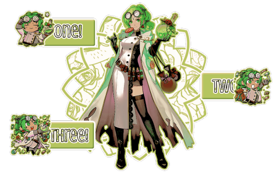
it’s cool to do a zig-zag sort of pattern. when making something like this, it’s probably better to do from left to right—that’s the way english-speakers (and speakers of several other languages) read things so that’s how your brain automatically goes. you should also position whatever you want to be read first near the top—in this case, the part that says “one” is in the top left, because that’s where most people’s eyes will go automatically. you can also see the central art is the focal point because of the outlines and the shapes behind it. the buttons are kept separate because they’re a solid color instead of the pattern used on the background shape—and the text stands out because it’s outlined in black, unlike the rest, and it has a pattern. if you use patterned text, outline it so it’s clearly seen and read.
you can also avoid centering things to make your edit more ‘dynamic’ (idk if that’s the right word) like i did with this header:
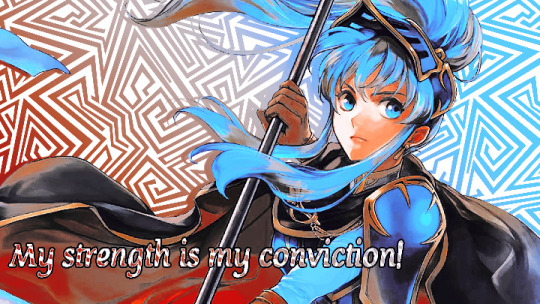
both eirika and the text are off center, which makes it look more interesting. also, they’re aligned differently—eirika is aligned to the right while the text is aligned to the left. this helps it seem less empty and is more fun visually
if you’re doing an edit with an even number of characters (like a ship edit) you’ll want to keep any one character out of the center, as this makes them the focal point and can kind of shunt the other off to the side. unless you’re doing matching graphics, in which case you should keep one centered, so it’s clear which is the “main” one in each piece of the set.
sizing is also important in terms of literally how small or big your edit is. headers tend to be pretty large (tumblr uses a 16:9 ratio, and twitter uses a 3:1) but things like icons or stamps are pretty small. especially with stamps, you’ll want to make your character pretty large in the stamp so they’re more easily seen. tumblr icons show up on your dashboard as 128x128, which is pretty small, so you’ll want to make sure your icon is easily discernible from that size.
also, i dont think this is necessarily a hard and fast rule, but when you’re making icons and you have to crop out a portion of the character’s head—crop out the top of the head, not the chin. i can’t tell you WHY i think this is a rule or even if anyone agrees with me, but it’s something to keep in mind. here’s an example of the two different kinds of cropping:


cropping the chin out just looks goofy, idk
since rentry graphics are just sort of dependent on the user, there’s no real hard and fast rules to composing them. just keep in mind whatever your focal point is and try to keep people’s attention on it, whether by adding random shit or outlining or whatever.
same thing with replycons, really. i like to keep my replycons semi-simple, but if you’re doing a collage-type of replycon, it’s better to keep the collage in the background for the most part, except for one or two focal pieces:

you can see that most of the collage pieces are behind rin except for the flower stickers, which are off to the corner so they don’t detract from her. the stripey-line things help a lot, too, as they lead your eye to the main part of the reply icon even without being centered—the main part being the character, of course
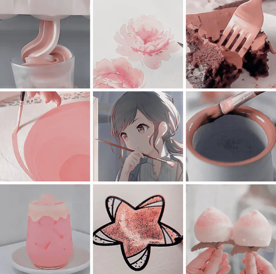
with moodboards or stimboards, it’s best to keep your character in the exact center—unless you have two, in which case keep them both in the middle so they’re easier to see. there’s no hard and fast rules with moodboards, but i like to keep images with similar composition near but not directly beside each other
the top middle and bottom middle of this one are both pretty minimalistic, so i kept them adjacent from but not beside each other. as for the rest of it… well i just kind of did whatever
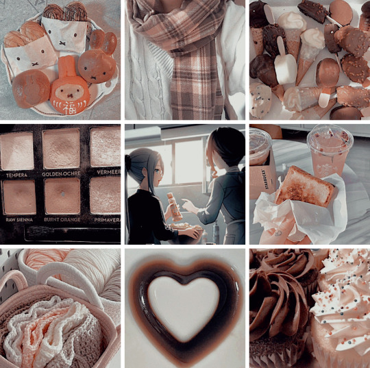
if you’re doing a moodboard or stimboard with two kinds of themes then it’s best to do a checkerboard type of pattern
you can see that here. the pattern is food-art-food-art-ena-art-food-art-food. like a checkerboard, except ena’s in the middle
i’m being so for real i don’t understand composition at all. it’s really best to just do whatever looks best to you personally and see what happens. i hope this is helpful-ish!
yours truly, canarysage
#world’s least helpful editor tries to run a resource blog: canarysage in a nutshell#you can find a lot of resources on composition if you look it up where smarter people explain things better#but i just sort of. do whatever#ʚɞ — tips.
28 notes
·
View notes