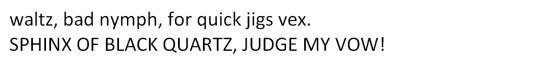
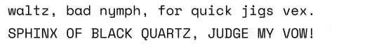
#calibri
Explore tagged Tumblr posts
Visit Tumblr Blog
Explore Tumblr blogs with no restrictions, modern design and the best experience.
Last Seen Tumblr Blogs


Fun Fact
After the announcement of the deal with Yahoo!, there were 170K signatures of unhappy Tumblr users petitioning to prevent the sale in 2013.
Text
calibri :)
i think i got the major ones
22K notes
·
View notes
Text
Calibri doesn't receive enough hate for being an ugly font fr
#my fav is Helvetica for its geometry#and Lexend and GT Eesti and Futura and other fonts that remind me of žurnalnaja rublennaja#calibri is like comic sans. very quirky but not sth you should ever use on an essay or serious document#so idk why tf Microsoft decided to make it a default font. ew#calibri#calibri hate#typography
10 notes
·
View notes
Text

#creepypasta#slenderverse#blessed be the wicked#blessed be the memes#punch blessed be the wicked#the tyrant#the beldam#jingles#calibri#Clarke
19 notes
·
View notes
Text
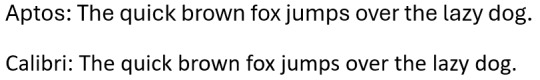
I noticed recently the default font in Microsoft Office has changed to Aptos from Calibri. I decided to do a test and they seem to look pretty much the same in terms of design, but Aptos takes up more space. Either the person who developed it's eyes are going, or they want you to be able to do less when you get a "Write 3 pages" assignment.
I even found an article that Microsoft put out about the process of developing five new fonts and picking the best one for the new default. IDK why I am even sharing this. It is something that distracted me when preparing for my exams so now you have to hear about it too.
RIP Calibri, you served us well from the death of Times New Roman in the late 2000s to now.
45 notes
·
View notes
Text
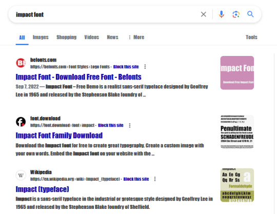


So, apparently if you search a common font name font name on Google, Google will change its display font to that font?!
wait a minute
ohno
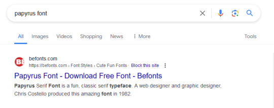
oh thank GOD
#fonts#font#web design#google#search engines#calibri#impact font#georgia font#papyrus#papyrus font#what and I can't emphasize this enough the fuck
14 notes
·
View notes
Text

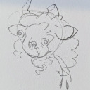
A biiitt more about Calibri incase anyone were to struggle with his general clothing
#sans#artists on tumblr#oc info#sans au#sans oc#undertale#calibri#calibri!sans#hes gotten a pair of wings#hes a hummingbird#so cool#look#artist#small artist
16 notes
·
View notes
Text
I love seeing people pissed off that Microsoft finally switched from Calibri to Aptos as the default font, because it truly proves that people will be mad about anything.
Like if you tell me you love calibri. You're a liar. If you're telling me you had an OPINION on calibri at all, you're a liar. You're lying if you say you have even THOUGHT about calibri ONCE in the past 6 months.
I'm a graphic designer. My job every day is fonts and I haven't thought about calibri for MONTHS.
25 notes
·
View notes
Text
ROUND 1 - YELLOW GROUP
Propaganda under the cut.
Calibri: "Calibri looks like Arial but slightly better, softer, and also slightly smaller. According to reddit user u/big_macaroons on r/etymology, its name is "derived from the word "caliper," which refers to a measuring instrument that can be used to take precise measurements. The name was chosen to reflect the font's clean and precise design, which is meant to be highly legible and readable at small sizes." And who doesn't trust someone with an username like that? Probably true. I love Calibri <3"
Space Mono: "funny name (play on monospace) that makes it sound like a sci-fi disease. cute little dot in 0's. the coolest M."
28 notes
·
View notes
Text
My microsoft word finally updated to the new default font and I hate it. I manually change it back to calibri every time. The new font makes me angry and just looks weird.
11 notes
·
View notes
Text


It’s been a while since I’ve drawn me and Bud’s ( @scrambledmeggys UF Sans) fankids. I’m really happy with how it turned out and how cute we all look.
#undertale#underfell#underfell sans#Bud#sona#my sona#fankids#Tahoma#Roman#Calibri#Courier#art#my art#scrambledmeggys#kuroshiro101
69 notes
·
View notes
Text
systober day 7 — an older alter!

This is Calibri! We found him about three years ago, fairly soon after system discovery, but we suspect he’s been around since high school. Not the oldest in the sys by far but he’s a classic <3
(Also just to note I haven’t been doing every day, I’m pretty busy and tired so I’m only going to be doing the days I have energy and stuff! This is still super fun anyway)
4 notes
·
View notes
Text
#basic bitch font battle#polls#tumblr polls#poll#only polls#tumblr poll#tunblr#tumble polls#comic sans#calibri#times new roman#fonts#basic bitch#font poll
17 notes
·
View notes
Text
Aptos is replacing Calibri after 15 years on the throne as Microsoft Office’s default font. It’s “bold, well-defined, directive, and constrained” (i.e. easier to read) and “embodies professionalism,” which its predecessor lacked.
If Calibri is a casual dot com era t-shirt, Aptos is a business casual, wrinkle-free, fitted button-up.
That’s 15 years of company after company using Calibri as its default body font within its brand guidelines. It‘s been a matter of convenience. Even if employees never read the brand guide, they’d be “on-brand” in their communications and quickly thrown-together sales pitches via Word and PowerPoint featuring masterful displays of clipart. But those days are over.
From 1993-2007, Times New Roman was Microsoft’s default, and it was reflected throughout brand collateral, but now, it’s the epitome of outdated.
How long until Calibri is thrown in the box of unused fonts and brands build their strategy around Aptos?
The reality is they’ve already started.
2 notes
·
View notes
Text


If anyone is curious, heres Void human (along with more doodles)!
The 2nd picture is the first drawing of Human Void (along with Calibri, another sans OC of mine being human but ive just sort off forgotten about him)
#sans#void#oc info#artists on tumblr#paper#sans au#sans oc#void sans#human#undertale#underverse#undertale au#Calibri
7 notes
·
View notes