#but you can't click on the image to see it larger when I do that
Explore tagged Tumblr posts
Note
I'm loving the animal reference repository!! Such a fantastic resource and I can't wait to use some of these photos for studies or painting reference. I was just wondering, is there a way to download the photos from the website? On one hand I can imagine you disabled this purposefully to prevent AI scraping or other unwanted use. But at the same time it can be handy for people to have high res photos to work with, and I personally like to have my reference photos in the photoshop file next to my drawing. (Also I was one of the people who asked about contributing photos. I honestly think the first 3 points you mentioned could be worked around quite easily. However the 4th (workload) is one I can't argue against of course. I'll see if I can make a small donation and if you ever do open up contributions... I'll be happy to share!!)
Yes! I want people to be able to save images, and you can! But Squarespace's image gallery setup makes it a pain to do. I've actually got a page on the site showing how to do that - do I need to make it more prominent?
The important thing to know is that when you click on a single image, it opens in a "lightbox" display, which for complicated web reasons won't let you save files directly from it. Saving has to be done when viewing the larger gallery page (the species page with all the images).
On mobile:
In gallery view, tap and hold on the image again you’re interested in saving. Tap “Save to Photos” to save it to your phone.
This will not work if you are viewing a single image full-screen on mobile. If viewing the image full-screen you can take a screenshot, but the resulting image will be lower resolution than if you saved it from the gallery view.
How this looks will vary on Android devices, but I've had friends confirm the pathing is pretty much the same even if the layout is a little different.

On desktop:
In gallery view, right click on the image you want to save and click on the “Save Image As” option.
This will not work if you are viewing a single shot full-screen in lightbox mode. If viewing a photo full-screen you can take a screenshot, but the resulting file will be lower resolution than if you saved it from the gallery view.

This worked when I set the site up, shoot me a note if it's broken since then.
The gallery pages allow me to mass-upload files so I don't have to do individual photo uploads, and they're more responsive on mobile... but this is the downside to that ease of use on the back-end.
103 notes
·
View notes
Text
Thoroughfare
Warnings: 18+ NSFW, smut, fluff, angst, daddy kink


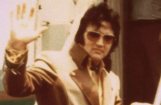


"I'll find you."
Those were the last words Elvis had spoken to you as you made your way down the Santa Monica courthouse steps.
With cameras flashing and the fluttering of people weaving their way into a heavy crowd that rumbled in the base of your ear.
Life had never felt so deafening before. You can only hear the clicks of your heels against the cement. Eyes wide as you search for your car and struggle to meander your way through the crowd of paps.
Elvis, noticing your perturbed demeanor, immediately weaves a thick hand with your smaller one. The rough pad of his thumb, worn by years of guitar use among other things, circles itself against your knuckles.
The world settles into calmness once more when he squeezes your hand and says so softly only you can catch it, "I love you, sweetheart."
To see Elvis, to really, truly see him, was to hear the world sing around you.
────────
The next time you saw him was in Calabasas around midnight in the winter.
The buzz of LA traffic had settled some, and throughout your house, there was a warm quiet.
You were in your living room reading, embers from your fireplace dancing in your peripheral when a knock pulled you from your book.
Making your way over towards the entryway, you placed your book atop the shelf of your fireplace and slid the cover of peephole over.
It was Elvis.
You opened the door hesitantly, your eyes instantly meeting his heavy ones.
"Elvis?" You stepped back, opening the door wider. "What're you doing here?"
He was dressed in a white floor-length coat, baby blue dress shirt, black pants, and leather boots.
Elvis looked back at his car on the street before taking a step towards you.
"Can I come in?"
────────
It begins with gentle touches and tickled strokes to your skin or across your knuckles as you sit beside him at your couch.
His thighs are spread, and both hands rest on the tops of his dark pants.
There's a mark of his being that you suddenly remember. One that'd dwindled away with the years you hadn't seen him and one that seemed to settle into fabrics and textures of the room.
It was heavy and fortuitously reminded you of that great and suffocating presence he'd carried in the prime of this career.
There was an older feeling to it now. Resembling that of a paternal figure demanding respect of age.
He's been worn by it.
It reminds you of the way he'd basically raised you. Fathered you into existence.
And he meets your soft eyes so contritely.
He, your divorced husband, father, and penitent God all in one.
The image of him tainted with age and hurt.
Dark bags weigh under his sleepy eyes, white and grey specks trickle throughout his black hair and down into his sideburns, his hands are still rough – not at all softened by the earned cushioning of his life, and he's much larger now, much heavier around his middle.
"Elvis..." You start, tracing the skin of your thumb with the tip of your French tipped nail.
The words won't come out no matter how hard you try. His name brings a quiet and choked sob to your throat.
The fireplace crackles behind you, and your silk pyjamas suddenly feel as though they've begun to mesh with your skin.
"Why'd you come here, Elvis?" You finally manage through a quiet and shaky voice.
He doesn't respond for a moment, still running the pad of his thumb up and down the fabric of the arm of the couch.
You pray that he heard you. That you don't have to swallow the part of yourself grasping and sobbing for him to hold you and make it all go away back down.
"Wanted to see you." He breaks the heavy silence.
Your heart clenches in your chest, and a memory of him plays in your mind.
'Don't do that.'
You want to say. You want to tell him to get out. To leave your home and never come back. To pretend he never knew you.
You can't escape him. You try to reach into your memory to settle in nostalgia of your past, and it's surrounded by him.
Winters and autumn spent in Aspen and Colorado and Summers and springs spent in Memphis and California.
It hurts you so horribly that you don't think you can survive it. The heavy pain of everything you'd gone through with him.
Your naivety is long gone.
But you can't bear the words.
Tears well in your eyes.
The silence serves as enough for both of you.
Elvis gingerly moves his hand from the arm of the couch to hesitantly rest atop your thigh.
He moves carefully and skillfully, as if calming a wounded animal – somewhere beneath it all, thats what this is.
Gently, he circles his thumb over the soft skin of your thigh.
Your eyes are glued to his hand and how it dwarfs your leg – forgetting how much larger he's always been.
His rings glimmer under the lamp light when he squeezes your thigh comfortingly.
You can't bring yourself to look away as your knees slowly part, and you settle deeper into the couch.
Elvis brings his other hand up to cup your jaw, leading you towards him as he presses a line of kisses from the back of your ear, down to your jaw, and to the skin of your neck.
There's nothing you can focus on between the heat of him and the blood rushing in your ears.
"E-Elvis–" you try, shivering under his touch.
"Mhm," he hums against your skin, "M'here," he soothes, pulling a moan from your lips.
His sideburns tickle your skin.
You try to steady yourself by holding the wrist of his hand atop your thigh, but you only tremble in wake of it all.
"Why're you shakin'?" Elvis whispers softly, pressing another kiss to back of your ear, "S'just me," his hand slips from your thigh to rest between your legs, cupping your cunt through your pj shorts in his hand, "S'just Elvis, baby."
You whimper through a choked swallow, letting your chin rest in his hand as your eyes focus on his wrist between the soft insides of your thighs.
The bridge of his nose grazes the line of your jaw, and almost immediately, you're turning your head in his hand to meet him in a messy and sloppy kiss.
Elvis runs his tongue along the roof of your mouth with a shameless moan, and you shiver.
He pulls back from the kiss, pressing a peck to your wet lips before sitting back in his seat on the couch.
Propping his elbow up on the arm rest of the couch, he rests his temple against his hand.
You stare at one another for a moment, and you bashfully bask in the attention.
You jump when Elvis' thumb circles your clit through your panties and he offers a lax chuckle in response.
────────
You don't remember exactly how the two of you end up on the carpeted floor of your bedroom – between large hands grasping, squeezing, biting, and tickling at your skin and clashing teeth, it remains a sensual blur.
Elvis is knelt behind you on the floor, the both of you still dressed save for his cock pulled out of the top of his pants and your pj shorts pulled down to your knees and panties held to the side by one of his large hands.
"Daddy missed you." He says softly as he sinks into you – and the weight of him against you makes you sob.
"Cant," a cry rolls up your throat, and Elvis is quick to soothe the watery tone of your voice.
"M'here," he sinks deeper into you in the same breath, and you drop your head between your shoulder blades at the deepness of it.
A large ringed hand wraps around your jaw, keeping your head upright.
The heat of his thrusts paired with the weight of him, stomach to your back, makes your knees weak.
His arm wrapped around your middle lifts you some, keeping you upright.
"Daddy," you pout tearfully, voice breaking into a whine when he circles his hips, stretching the walls of your cunt.
Elvis shushes you again, kissing at the plush of your hot cheek. "He's gotcha." he coos.
You're so tired. So exhausted and worn on the seemingly endless worry of him.
How could he not see how tired you are. How mentally exhausted your mind is through the weight of the divorce and the constant hospital scares and calls from Lisa in the middle of the night.
He doesn't know how fragile he is.
Your husband, father, and God. Once thought to be invincible, swayed by the heavy weight of the world.
It terrifies you.
Sometimes, you wish he'd just come in the middle of the night and take you back to his bedroom in Graceland. Back where time stops and everything seems perfect.
He'd take care of you.
"Where'd you go, honey?" Elvis turns your head to the side and meets your tired eyes.
His thick brows furrow as he runs the pad of his thumb over your jaw gently.
"Elvis," You try, readjusting yourself on your knees, "M'really tired." The end of your voice tapers off into a choked wobble and Elvis coos along with your soft cry.
He doesn’t say anything as he drops his forehead to yours before pulling back to place a kiss at your hairline, "Need someone to take care of you?" He asks softly, stroking your cheek gently.
You nod, closing your eyes as you break into choked sobs, dropping your head between your shoulders and staring into the carpet, blurred by your hot tears.
Elvis runs his hand over the top of your head, gently massaging the skin of your scalp.
He covers you with his body, pulling his hand from your hair to weave with your own, the other balled into a fist, knuckles pressed into the carpet.
The girth of his cock stretches you so deliciously that it sends tingles throughout your thighs and to the tips of your toes.
Elvis uncurls his fist to hold the base of your neck, the cool metal of his rings, sending a chill down your arms, keeping you steady as he pumps into you.
His groans spur you on, making you go lightheaded. You mentally thank him for holding you up, your arms almost weak under him.
He's gotten heavier in the last few years, and it urges a submissive calmness in you, one that reminds you of the protective nature he holds you to.
"Y'okay?" He whispers softly through a kiss to your cheek.
You turn your head to meet his gaze through lidded eyes.
Raven bangs are slicked to his forehead with sweat, brows furrowed, and plush lips swollen.
Instead of answering, you bring a hand up to rest on his cheek, stroking the soft of his flushed skin and tip of his sideburn.
They've gotten longer since you'd seen him.
You meet his lips in a soft kiss, one that reserves decorum for the intimacy of the two of you woven with one another.
You don't know where you end and he begins.
"Are you okay?" You whisper against his lips, pulling away to press your forehead to his.
He nods, giving you a gentle thrust that has you gasping softly.
There's a moment that follows where you feel as though you're one in the same. As though he's in your thoughts as you take the weight of him and the stretch of his cock against your walls.
As you rock back into him, the two of you pant at one another, swallowing eachothers moans and whines through the space between you.
Elvis thrusts into you once and then twice before slipping out of you and rutting the veiny length of his cock up and down the soaked folds of your cunt.
It's a new feeling and something he hasn't done before, so vulgar in nature that you're half tempted to pry and tease him about who taught him that at his ripe age of forty but before you're able to, he's pulling the weight of himself off of you and falling back to rest on his haunches behind you.
It's quiet for a moment that strays too long that you begin to grow shy under his gaze. You lift both of your legs up in an attempt to cover yourself with your socked feet only for him to catch both your ankles in one large hand and press them down to the carpet again.
The action makes you whine, shaking your hips some.
Elvis takes mercy on you as he holds your panties back to the side and licks a long stripe up the folds of your pussy.
"Oh fuck," you gasp, reaching a hand back in search for his hair but you unexpectedly meet his hand as he weaves your fingers together with his.
His nose bumps and pushes against the lip of your cunt so well you almost sob, dropping your head down to the carpet as you rest on your forearm.
The new position allows him better access, and he moans into your heat as his tongue sinks into you deeper.
Pulling back from your cunt, a string of drool attached to his lips, he coos "Good girl."
He squeezes your hand softly as he nods his head back into you, tracing and circling his tongue past the swollen lips of your pussy.
Elvis pulls back again, and using his free hand, spreads the lips of your cunt.
You're vulnerable under the exposure, keeping your eyes closed.
He moves behind you, dropping his hand from your cunt and untangling your hand from his own before spreading the cheeks of your ass and pressing a soft kiss to your puckered hole.
You breathe shakily against the skin of your forearm, shivering when he sinks his cock back into you with a hearty groan.
"Elvis, haaa" your nails dig into the tufts of carpet.
He hums behind you, pulling the globes of your ass cheeks apart to watch as the veiny girth of his cock stretches your tight hole.
You coo for him again, reaching for him and failing to grasp ahold of any part of him.
Elvis notices your struggle – always so attentive to you – and pulls out of you before gently leading you to lay down on your back.
Gathering your ankles in one hand, he pushes your thighs up to your chest.
"There we go," he hums, sinking into you again while letting your legs fall to either of his shoulders.
The pressure meshed with the intimacy of it all brings tears pooling to your eyes. You choke back a watery moan as you call for him in the hot air of your bedroom.
"M'right here, sweetheart," he says softly, resorting to slow and gentle thrusts into your heat as he brings you into a kiss.
The veins of his cock run along your gummy walls and has you digging your nails into his wrists that lead to balled fists pressed into your carpeted floor.
"Daddy," you try, sobbing against his plush lips.
You meet his lidded blue eyes, heavy lashes stroking his soft cheeks.
He's battling something in his mind.
"Come home to me, baby." He gives you another thrust that has your back arching, your breasts pressing flush to his chest. His cool necklace sends a chill down your spine.
"I can't." You pant, trying to advert your eyes as you look between the two of your bodies where you meet, watching the slow stroke of his heavy cock.
Elvis guides his hand to your chin, holding your gaze, "Yes, you can. I'll take care of you."
You lean into his hand.
And for a soft and quick moment, you imagine you're back at Graceland, on the mistletoe red carpet.
"C'mon, sweetheart." Elvis' voice drops so quietly you almost miss it, the weight of a tearful sob heavy on his tongue.
Instead, you bring him into another kiss, weaving your fingers through his thick hair.
"Take care of me, please," you sob woefully.
Elvis nods, dropping his head to watch his cock pump into you.
"Harder," you whine, circling your thumb over the pulse point of his wrist. His bracelets rock and jangle with his movements.
"Daddy's givin' you all he has."
His cock pulses against your walls and you tighten against him.
"M'gonna cum," you cry, letting out a choked whimper.
Elvis hums above you, "Yeah, m'gettin' there, honey."
When you cum, you pull at him and he lets you. His stomach rests against you and he maneuvers to push one of your legs outward as he thrusts a couple more times into your cunt.
When he cums, it's far more primal – more filled with teeth and groans and hair in your face.
He presses his lips to yours in a sloppy kiss, and it's filled with sorrow and quietude.
Elvis had always told you the two of you would go out that way. With teeth clashing and bites and moans. With a quiet understanding that neither of you wanted it to end.
────────
Elvis spends the next few hours tending to you.
Poor wounded animal, comforted by its devourer.
Washing your hair in your shower and cupping your jaw to bring you into a gentle kiss ever so often.
You realize somewhere when your head's under the water and Elvis' hands are over your body, that he doesn't know how to say goodbye. He never has, having grown up with getting his every way since he'd turned nineteen.
He's leaving you with lasting parts and memories. The only way he knows how.
Later that night, the two of you lay in your bed with Elvis behind you and his arm under your head.
He strokes the tips of his fingers over your scalp in the quiet of the room.
The clock on your wall reads 2:15am.
The silence is comforting.
You turn over to tuck yourself against him, and he welcomes you, pulling you closer to him.
The fan hums, and Elvis presses a kiss to the top of your head ever so often, stroking a hand up and down the length of your arm.
"Don't leave," you say.
"M'not goin' anywhere," He says back softly.
The warm hum of his breathing and gentle clink of his jewelry lulls you to sleep.
────────
When you get the call on August 16th at 5 p.m., you hear the world pause, and time seems endless and all in the same, inescapable.
Everything's so quiet. You can't hear anything. The silence is defeaning.
You're lying on the carpeted floor of your bedroom.
When you close your eyes, he's there with you.
"I'll find you." You whisper.
#elvis presley x reader#elvis x reader#elvis presley#elvis#big daddy elvis#big daddy elvis x reader#elvis 70s#70s elvis
107 notes
·
View notes
Text
A Scam... Tutorial?
I was watching Photoshop tutorials and YouTube recommended this video to me.

And I was already skeptical. Clarity is an extremely powerful and useful adjustment in Lightroom and Photoshop and I could not think of a reason why anyone would recommend *not* using it to the extent they were using ALL CAPS.
But I was curious if there was a new technique I was unaware of. It's impossible to know everything regarding Photoshop and I learn new stuff all the time.
So I gave the video a chance.
youtube
To quote my late father... what a crock of shit.
I have seen a few scam videos in my time, but I cannot think of ever seeing a digital art tutorial scam. I found myself angry and a strongly worded comment just flew out of my brain.

I continued...
"First, no one should use clarity and texture at 100%. And I think showing the effects at 100%, as if that is a normal workflow, is highly misleading. You are creating a problem that does not exist and then offering a solution to it. And then you are using a provocative title to attract clicks. Not to mention you may be convincing beginners to abandon clarity and texture altogether when it is one of Camera Raw/Lightroom's most powerful tools. People should absolutely use clarity and texture. That is a crazy thing to tell people.
Second, high pass sharpening is… old school. It works but it can create a lot of nasty artifacts if overdone. (Personally I find it too crunchy and prefer smart sharpen on a smart object so it is non destructive). Clarity and texture are much more modern approaches to help bring out detail and I find they actually produce *fewer* artifacts than typical sharpening filters/techniques. And if you have trouble with clarity or texture adjustments in the bokeh areas, then use a local adjustment that doesn't affect those areas. You can even do a separate clarity and texture layer and use the opacity slider and the blend if and masking just like you did with the high pass. Why are you acting like you can only make a global clarity adjustment?
Essentially you are giving a worst case scenario of a clarity/texture adjustment just so you can make your technique seem like it is orders of magnitude better.
And what is even more infuriating is that you can do clarity/texture AND you can do high pass sharpening *together*. Why are you acting like it is one or the other?
I'm so confused by your motivations. Did you invent this clarity problem just so you could make a click bait-y title so you can then sell your little panel thing? And then you used an old school sharpening technique that many have abandoned so it seems like you have secret knowledge that was lost? And I could argue it isn't even a better solution. It's just a different way to achieve similar, if not worse results.
This is like if you put a pound of sugar in lemonade and then said, "Wow, this is way too sweet! You should try my superior lemonade that has a normal amount of high fructose corn syrup."
Lastly, if clarity and texture (set at a reasonable amount) aren't enough to produce sharp, detailed results, then it might be worth considering your actual photography techniques. Modern photography with modern sensors and lenses should be able to produce extremely sharp results without having to juice the hell out of sharpening filters in software. 20% clarity and texture (if that) plus a little bit of smart sharpen is usually more than enough to bring out detail in almost all of my photos and I have never been accused of having soft images.
So, if you are getting soft results, you might need to adjust how you are capturing your images. Are you using a very small aperture like f/22 on that macro image? That could be a diffraction issue. Perhaps it would be better to use a larger aperture at the lens's sweet spot and then do a focus stack.
I mean, I can't think of any other reason a person would need to do 100% clarity and texture unless they completely bungled the actual photography or were still using a kit lens.
I'm sorry but this video is a mess."
Let's look a little closer at what he did to his example.
He started with this.

Then he applied clarity & texture to MAXIMUM. Which, again, is like adding a pound of sugar to lemonade.
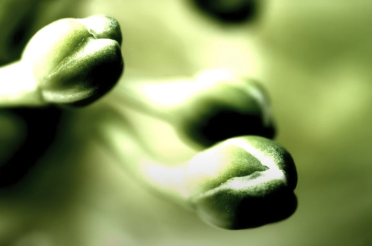
And by golly, it looks pretty bad!
Then he used his secret ancient high pass technique to get this.
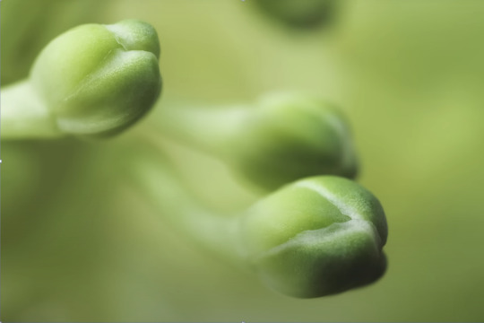
Which looks a hell of a lot like the unsharpened image to me. And the high pass sharpening is probably only visible when zoomed in to 100% on the full resolution image.
Which is one of the issues with this technique. It isn't even noticeable on social media—the place where the majority of photos are viewed these days.
And then after showing you this groundbreaking effect that does almost nothing, he tries to sell you his Photoshop panel.

Yes, that' looks intuitive. Just hit the blue checkmark to do... something?
And what is this green eyeball with a crescent moon inside?

Only $50!

And if you want to know what the purple X button does, you need to pay another $15 for the tutorial on how to use it.

Neat.
Just to prove this is all a scam I'd like to show you an example of my own.
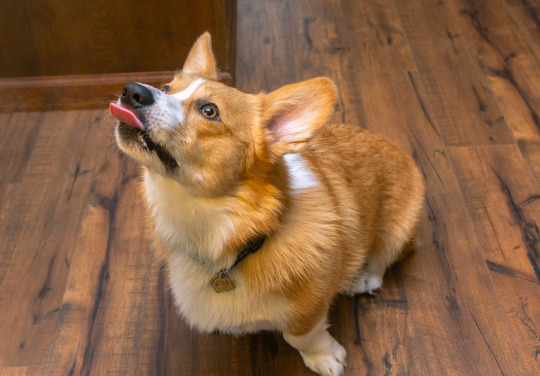
Here is a picture of Otis with no clarity, texture, or sharpening applied.
And here is a reasonable amount of sugar. I set the clarity and texture to where I felt they looked best.
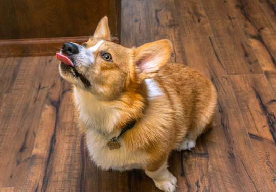
Wow, that looks better. Not only that, you can actually see the difference at social media resolutions!
Now let's add a pound of sugar. MAXIMUM CLARITY GO!
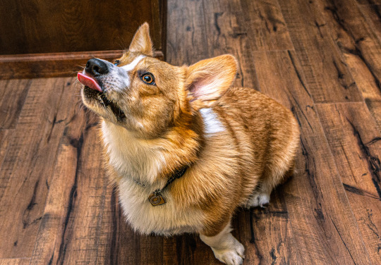
Yep, that looks a bit rough. Because no one does this ever.
And now let's see his high pass sharpening technique.
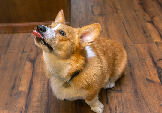
Barely a difference on social media.
Okay, let's try zooming in 200%. Maybe that will give the high pass sharpening the victory.
Normal...

Reasonable clarity & texture...
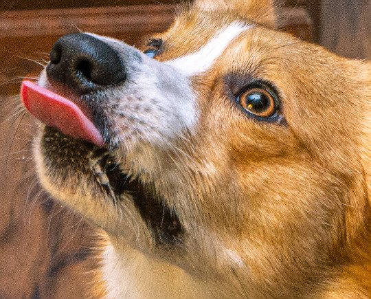
FULL BEANS CLARITY & TEXTURE!
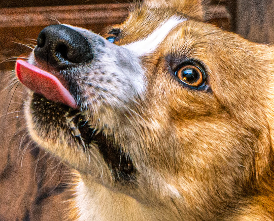
High pass...

Just as I said, the high pass introduces crunchy sharpening artifacts.
I can't speak for anyone else, but I much prefer the subtle clarity and texture. Perhaps the details in the eyeballs aren't quite as crispy, but in the version that isn't zoomed in, I don't think you feel like the image is soft and the normal clarity and texture adjustment added contrast and actually noticeable detail to the image.
In the end, except for the pound of sugar, these are all subtle adjustments and other photographers might be the only ones who would ever notice. The original Otis picture was probably fine to most people. So disparaging the clarity slider was even more unnecessary.
Why does this matter?
Being a beginner at photography is frustrating. There are so many resources to choose from and it's very difficult to know who is competent and who you can trust. If someone just starting out was recommended this video they could be easily be convinced it is legit. And it could set them back in their progress because they think useful tools will actually make their photos worse. They will waste a lot of time doing a time consuming old school technique in Photoshop when they probably never needed to even leave Lightroom in the first place. They could move two sliders to get similar or better results and it would only take literal seconds.
Time is valuable to a lot of people. And he seems intent on wasting everyone's time. And what sucks is that I have no real way of exposing this dude on a scale that would do anything.
I also just really hate the idea that educational content is being used to scam people.
This is some PragerU shit right here.
68 notes
·
View notes
Text
I hate to do this, and it's a long shot I know, but things are getting desperate and it seems like I'm going to be waiting WAY longer than I should be for something that's fairly urgent.
I'm a disabled trans man living in the UK. Recently I was found to have severe anemia, and came up with my FIT test (gastrointestinal cancer screening) a few months ago, and was referred for a colonoscopy to find out the cause, since it looks like I'm having a slow but constant bleed through my GI tract. However, my referral has been awaiting review for over three months now. I'm not even on the waiting list, I'm waiting for someone to decide if I need to be on the waiting list. Since then I've started having GI symptoms such as pain, intermittent loss of appetite, etc. as well as my anemia worsening significantly.
This is of course pretty urgent, but it looks like I'll be waiting months longer once I finally get on the waiting list too. I really have no choice but to get it done through a private hospital, because of the time sensitive nature of, you know, potentially having cancer. I managed to put some money away out of the backpay I got from PIP, but it's not enough.
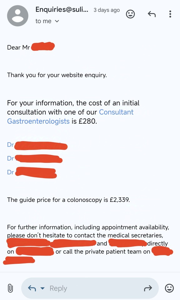
[ID: A screenshot of an email that's says:
Dear Mr (name blocked out in red),
Thank you for your website inquiry. For your information, the cost of an initial consultation with one of our consultant gastroenterologists is £280."
It then lists the names of 3 doctors as links, all blocked out in red. The email continues,
"The guide price for a colonoscopy is £2,339. For further information, including appointment availability, please don't hesitate to contact the medical secretaries (followed by three names redacted in red) directly on (phone number redacted in red) or call the private patient team on (phone number redacted in red). End ID]
Currently I have around £1,400 stashed away from PIP backpay I got after they royally fucked things up (however I may need to dip into this at points if I find myself struggling). Together the consultation plus the colonoscopy will cost £2,619, which leaves me about £1220 behind. I know I'm most likely not going to get that much from this, but I honestly have no choice but to try my luck here. I really don't know what else I can do.
I really don't like asking for money from people for nothing, but I have a Ko-fi store where I sell handmade screen printed patches, and I'll be adding more designs to it over the coming weeks when I have the time and energy to make new screens. I'm also offering commissions for custom band patches! (Due to Kofi's TOS I can't officially offer patches for bands without their permission.). Below are a few examples of my work:
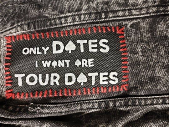
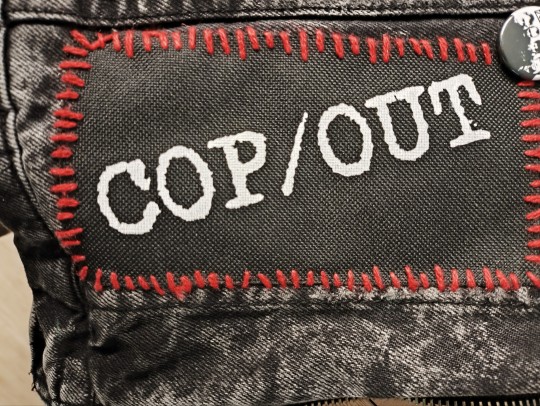
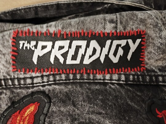
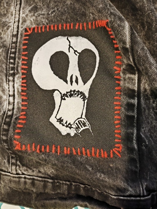
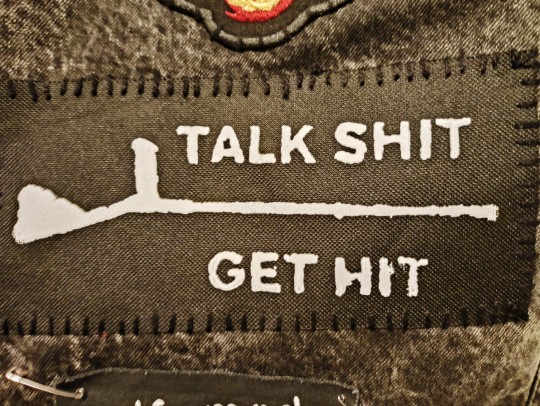
[ID: 5 images of patches printed in white on black fabric, all sewn onto a worn looking black denim jacket. All are sewn on roughly in red floss, aside from the last one. The first says "only dates I want are tour dates". The words "dates" and "tour dates" are larger than the other text. All of the letter As are replaced with spade symbols. The second is the logo of the band Cop/Out, which is the band name with rough, jagged edges. The third is the logo for The Prodigy, which is the band name in sharp. Zig-zagging letters. The fourth is the logo for the band Subhumans, a stylised skull shouting into a microphone. The fourth is the horizontal silhouette of a crutch. With the words "Talk shit" above it and "get hit" below it. Unlike the rest it is sewn on in black, and the edge of an embroidered back patch is visible just above it. End ID]
I know a lot of people aren't doing well financially right now, and that there are people in far, far more dire situations who probably need your help far more than I do, but I would appreciate any purchases of patches or help you can offer so, so much. Even just sharing the post would be enormously appreciated.
Current progress:
£115/£1220
And of course as pet tax, here's Cynder :)
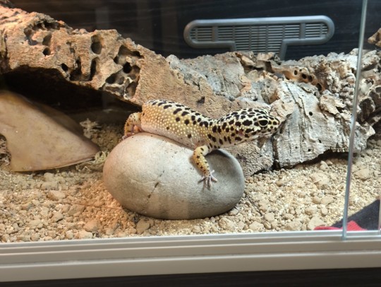
[ID: A photo of a female wild type leopard gecko laying spread out on a smooth rounded rock in a glass fronted tank. Her head is sideways and raised, looking at the camera with one eye. She looks relaxed and curious. Behind her a large piece of thick tree bark and a plastic cave can be seen. End ID]
#cripplepunk#cripple punk#actually disabled#physically disabled#physical disability#disability#donation post#colonoscopy#mutual aid#described
46 notes
·
View notes
Text
how i (try to) make my text readable
so as a lifelong glasses wearer north of 25, i cannot see shit! I love the look of text on screenshots, but also i have spent a nonzero amount of time squinting at pale text on a busy background and thought "i cannot fucking read that."
there are lots of ways to do this. my method is not perfect. I am constantly tweaking things to try and make the text more readable. if you have suggestions about making the text more readable, please share!
Step One: Open the screenshot in your photo editor
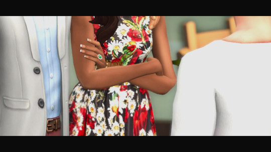
I start with a screenshot and a script. I use Gimp, a free and open-source photo editor, and I pretty much only use it to put captions on my screenshots, so please do not ask me how to actually edit pictures, I do not know. also, please do not ask me how to do this in any photo editor, i prefer to use this one because it is free, ad-free one that I can own legally and download safely.
open-source software RULES, btw.
Step One: Add a text layer with your dialogue

I use the text tool to add the dialogue to the image, copying and pasting from my script. This is not legible. My eyes hurt. I cannot read that, so I can't tell if I've made any typos.
Step Two: Add a black background to the text.
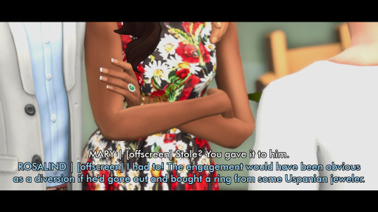
In, Gimp: Right click text layer > "Alpha to Selection." In the top menu, Selection > Grow > 3 pixels. Top menu: Layer > New Layer. (I name the new layer "Text BG ##") Use the bucket tool to fill the selection on the new later.
There's probably a shortcut to doing this in other photo editors (hell, might be a shortcut in Gimp.)
Step Three: Blur the background

In Gimp: Top Menu > Effect > Blur > Gaussian Blur. This may be a step backward in terms of readability, but I like how it looks. Let's try a few other things to help the reader, shall we?
Step Four: Drop Shadow
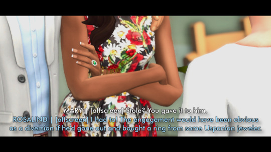
In Gimp: Top Menu > Light & Shadow > Drop Shadow. Makes the text stand out a bit more. Still not particularly readable, especially the blue on blue on the left side of the image.
Step Five: Gradient layer
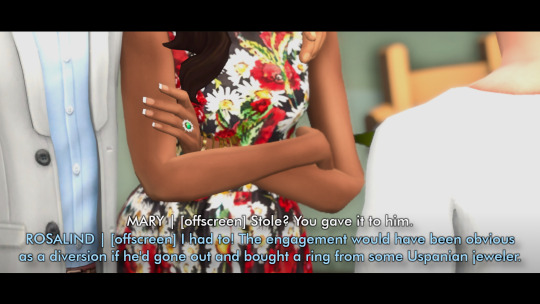
Create a new layer underneath the Text BG, and then add a transparent gradient over the entire image.
This is step is slightly more involved, so I'll just link you to a guide instead of explaining myself: "How to create a gradient transparency in GIMP."
Step Six: Further Tweaks

I still wasn't satisfied with the readability of the text. I duplicated the gradient layer to create a darker background underneath the text. I also repeated the drop shadow step on the Text BG layer. You could also make the text larger or bolder, change font colors, grow the selection by 4 or 5 pixels instead of 3, or skip the blurring step. I change my method frequently to try to get the best look for each individual image, and I don't always do a perfect job.
This is an area where I constantly innovate. I want people to be able to actually read my text, so I try not to let myself be satisfied with "good enough." When I take screenshots, I try to do it with an eye for compositions that give me a nice, blank space on the bottom for text, ex.
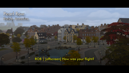


132 notes
·
View notes
Note
Heyy, I’ve been reading your wonderful one piece works for a while — and I couldn’t stop wondering how are you actually doing those magnificent headers?
Like… hello? The great quality, with additional 3D-alike details I could catch by my eyes? I got only Ibis Paint X on mobile, since I’m only a young man that literally two months ago went on a life-time ‘adventure’ of living alone in a small apartment.
In short — I got no money to pay for additional graphics/drawing programs, not yet at least
Hello!
Thank you! I'm glad you enjoy my writing - I'm curious to know what's your favorite piece / part? Also I'm so happy you like my headers? Makes it feel worth it to spend time on them! :D
I have excellent news for you, I used a mix of Canva and Photopea. They're both FREE!
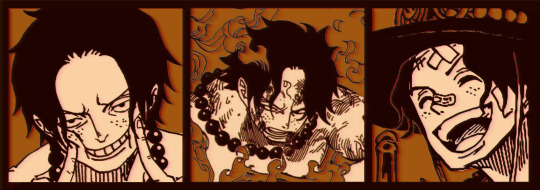
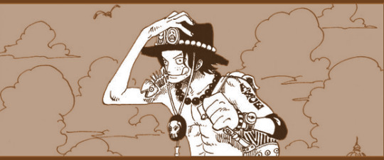
I'll be explaining the process for making these two kinda? The full tutorial is below the cut, to be courteous to the other folks, hope you don't mind?
Though I am hearing that Canva has given people some grief. But Photopea is just *chefs kiss*
If you've ever used photoshop, Photopea is essentially a free photoshop, and it even has the automation tools! An absolute lifesaver when you have multiple layers you want to export (but that's for larger projects not this)
I'm going to assume you have basic knowledge of layers in digital drawing programs for this. If anything isn't clear: ask me, I'll clarify!
//-------------------------------------------------
My General Process is:
Search for official art / images
bring it into canva / photopea
crop / arrange images to match the dimensions
select a thematic color that is associated with the character
separate the foreground from the background
mess around and test things until they work
//--------------------------------------------------
Given "Louder than Words" is the latest one I've made, I'll start with the process for it.

Dimensions: 3000 x 1055 px dpi: 96
//-------------------------------------------
Let's Get Crackin'
Alright let's grab some official art so we're not using any fanart without the artist's permission
I try to pick images that feel relevant enough to what I'm trying to make. For example: the image for the Matching banner shows the ASCE tattoo which is super important in that fic
2. Let's arrange them onto a banner where each individual image has the same/similar dimensions to the rest
That's probably part of why you like these. To a certain extent they have similar dimensions, so they have a uniformity that's pleasing to the eye! (It's not perfect because I threw perfectionism to the wind because this is tumblr not my portfolio) Tip: if you have 3 images and only 2 that have similar dimensions, and the 3rd one can't be cropped logically: but the one that's a different aspect ratio in the middle!
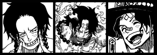
3. lets arrange them in such a way that the borders all feel like they're the same/equal width/thickness
you might find that you have to shrink some images for this, that's fine.
ALTERNATIVELY: if you're going with one image crop it so it's just the relevant info and it matches the dimensions (3000 x 1055 px)
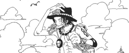
We have our base! Now let's add some color, and direct the viewer's eye together!
4. pick out a color that you think matches your character / vibe - that color is going to be your background Given I'm making an Ace banner: orange is the color I'm going with
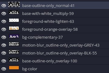
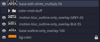
I went and named my layers for this lol. The numbers represent the opacity, and they aren't important. I just kept changing the opacity until I liked the way things looks. But here's the secret to the 3D feel:
Motionblur (+ moving it about)
Separating the foreground and background and dulling out the background.
I'm going to show you my process so you can see the effects, but first let's give you some quick skills:
//------------------------------------
SKILLS / THINGS I THINK ARE HELPFUL
//------- Select Similar
magic wand -> select something -> right-click -> select similar This works best when you have high contrast images (like manga panels that are black and white). You can select the black or the white areas. Depending on what works better for you. TIP! Invert selections with ctrl + i Say you know that you want to select everything but Ace's face in the second panel. Select his face with the magic wand then ctrl + i, and that's the only thing NOT selected

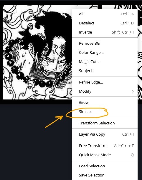


TIP!!!!!!!!!!!!!!! Please, please, please, duplicate your original image and work on the duplicate layer. This helps you SO much. !!!!!!!!!!!!!!!!! TIP! Check your selection tolerance! This could be why too little, or too much is being selected.

//------- The Move Tool
Shortcut key: v While the move tool is active, you can nudge the stuff on whatever layer with your arrow keys Shift + arrow key = 10 px move (generally)
//------- Layer Locking
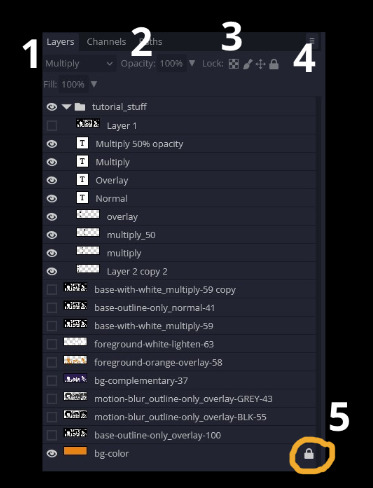
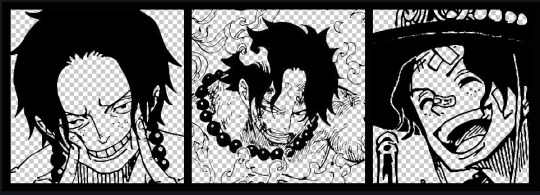
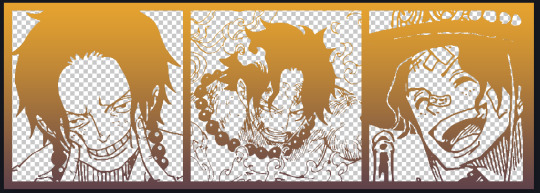
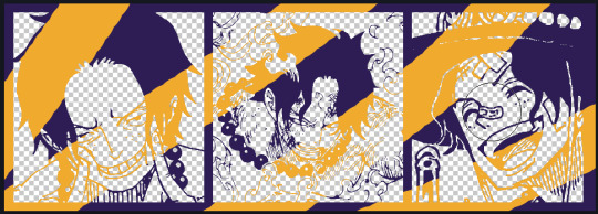
1- Layer Blending Mode (see Overlay vs Multiply vs Normal) for how this can affect results) 2- Opacity: how see through it is / isn't 3- Lock Transparency (it's the little checker board) 4- Lock Layer (looks like a lock) 5- Lock icon that appears when anything on the layer has been locked More on 3 Lock Transparency: You can only paint on / modify what's on that layer. You CANNOT add anything to any area that is already transparent Here's a demo of what you can do with this power:
Here's the original Image - notice how it's just the lineart with a transparent background.
It's powerful: abuse it
//------- Overlay vs Multiply vs Normal
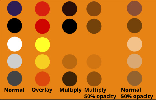
I think seeing this is the best way to visualize how different modes can affect the color.
//--------------------------------
Back to the Tutorial
!!I IMPORTANT NOTE !!
Please play around with the opacity slider to figure out what opacity works best for you on the multiple different layers we're about to make / work with. It's up to your own style to figure this out. Next: please feel free to not follow all of it. Add more layers, add less layers, take the base principles and go wild! :D
5. Separate the lineart from the background and save it as a new layer 6. Duplicate it and set it to overlay, or set it to overlay immediately
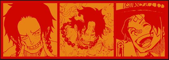
7. Duplicate that lineart layer twice and set the blending mode to overlay 8. lock transparency on the top one and change it to be a dark grey 9. Apply motion blur to both:
Main menu bar -> Filter -> Motion Blur I made it so that the grey layer was blurrier than the black layer
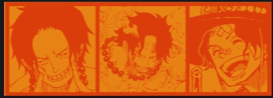
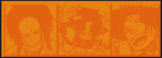
10. More them around a little to give it a "3D effect" as you called it.
It creates shadows under the lines - I was aiming for an effect similar to chromatic aberration (chromatic aberration is a valid way to add punch to your stuff too!)
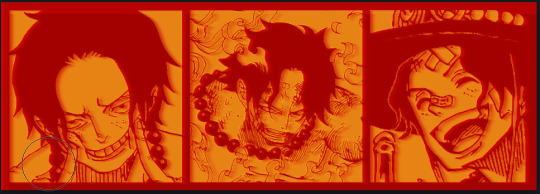
So this is what things look like now - painful, but let's keep going
11. Duplicate the ORIGINAL / BASE lineart layer, that you DID not apply motion blur to -> set the blend mode to multiply (reduce opacity for it to actually take effect)
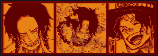
okay that's less painful here's what the layers look like right now:
let's bring more focus to Ace's face, and push the background farther away:
12. Use the magic wand tool to quickly select large areas of the faces / focal area / foreground and the lasso tool to refine things
TIP! Hold shift + click -> add to selection Hold Alt + click -> subtract from selection
13. On a new layer with blending mode -> lighten, fill that selection to be white

If you look at it, you'll notice that it is ALREADY starting to draw our attention to his face, but the background is kinda aggressive, so let's dim that down
TIP! Right-click on the gradient tool to find the paint-bucket tool

TIP! Sample All Layers: Turning this option off makes it so that you only work with the content on THAT specific layer. Turning it on makes it so that it is working while taking all other layers into consideration.
14. ctrl + click on the "white foreground" layer to select the contents of that specific layer (pink thing is your mouse)
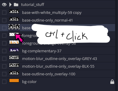
15. ctrl + i to invert selection and ON A NEW LAYER (layer mode -> multiply) fill that with a complementary color

16. I did one last thing where I took the original base (before we separated the lineart) and added it to the very top and played with the opacity to get something less in your face (layer blend mode was set to NORMAL)

And that's it!
More considerations that I take:
I want the banner to be "thin" or not square, so it doesn't take up too much screen real estate on people's devices
I don't want readers having to scroll too much to get to my writing (which is the whole point of the post, let's not waste their time making them look for things)
I want the banner content to be relevant enough?
ie: with Matching: I wanted the ASCE tattoo to be visible. With matching I wanted Ace to not look too happy in some of them.
I'm also trying to avoid spoilers, I hated getting things spoiled, so I'm trying to be careful that the images I pick don't spoil anything really.
Congrats on starting life on your own! I did that whole living by myself thing too! Tip: keep the pantry stocked with lentils, beans, pastas, baking essentials, rice. They really come in a clutch when you're hungry.
#photopea resources#photopea psd#tutorial#tutorials#tumblr banner#photoshop#photoshop tutorial#digital art#fuck adobe#adobe photoshop
29 notes
·
View notes
Text
The Algorithm is AI Art
Last year, I used DALL-E to create a series of images for a digital tarot card deck I was making for my personal use. When I shared some of those images here on my blog, I got a massive amount of push back and even threats in my inbox. I'm still putting my thoughts together on that experience but it did make me realize that most people don't seem to realize they're supporting the AI art they hate so much - to the tune of millions and even billions of dollars per year depending on the platform - almost everyday through the algorithms they use.
So if you genuinely hate AI art, I'm here to tell you that you've got to do what you can to get rid of and not use the algorithms in your life. That kind of support is more materially complicit with AI's intrusion on art than someone making a few images for themself ever could be.
Yes It's Possible
For many platforms, especially when they're accessed on desktop, it is possible to greatly reduce your contact with the algorithm. I use browser extensions to cut out the AI curated feeds on YouTube, Facebook, and Reddit. I mostly use Instagram on desktop to answer messages.
I generally do not use Instagram, Facebook, and other apps that do not allow users to control their feed on mobile. I know Instagram is mobile only - when I use it on mobile, I download it, upload what I want, then delete the app again.
I am considering cutting these out entirely again once this phase of my experiment for a zine I'm writing is over because honestly, they're not worth it, but that's a different post...
I also really recommend either making a separate email account or getting ruthlessly organized in your current one, so that you can sign up for artist's newsletters and other forms of human centered curation. RSS readers like Feedly can also be a good alternative.
The point here isn't perfection - the point is doing what you can. Not because it will change companies - but because it's better for you and the artists you care about.
Why?
Algorithms in these spaces determine who's work gets shown and more importantly - who gets paid enough to continue making their art.
AI has consistently been shown to reproduce and even exaggerate biases already present in society. This video by Ann Reardon of How to Cook That talks about YouTube's lack of transparency about the potential for a sexist bias in YouTube's algorithm and shows that in the top views at least, there's a clear slant toward male creators. The only woman in the top 10 does not show her face in her videos - unlike most of the men in the top 10. This discrepancy is even larger the further down the list you go.
Who gets shown is who gets paid enough to keep making their content/art. Less pay means people can afford to put out less content/art and can't scale - meaning less diversity in content/art.
What art gets shown influences what inspires new art and content to be made. You are seeing art directly shaped by AI everyday - and more than that - by continuing to click on what it serves up to you, you support it.
This AI influence on real world art has become so normalized that people consider it as natural a force of nature as wind. It's not. This was designed - and it can be redesigned.
I want to be careful not to overstate the influence of a click either - your clicking on something you choose is not a form of activism. Your clicks cannot retrain the algorithm at scale. A lot of people have the misconception that you can train "your" algorithm but what the algorithm on your feeds is doing is actually comparing your clicks to it's database of similar user profiles and their behaviors to decide what to suggest to you. Your clicks don't retrain the AI as a whole, they just match you with a different user type.
The real reason I think those concerned about AI in art need to find ways to take control of their feeds is because it ensures you're able to support a diverse array of creators through your views and it ensures that what you're taking your inspiration from isn't what the AI decides is worthy of attention.
I realize there are those who are reading this who either might not have been old enough to remember or even weren't born when YouTube basically took your Subscriptions off the front page. It used to be they would pop up at the top of the front page. Then it got knocked down on the front page. When it got shoved into it's own sidebar link and then that link progressively minimized through redesigns - there was actually an outcry about it.
People warned that this would lead to a watering down effect, where smaller channels didn't get the chance to grow like already established ones would. Creators of marginalized identities saw their views drop dramatically. Similar things happened when Facebook and Instagram fully took away a user's ability to have a chronological feed (this was possible in the early days). I know of more than a few creators who fully had to step away from their work because of the change over. I miss their art.
And then the outcry petered out. The companies didn't lose users over it so nothing changed. Eventually people got used to it and the protests went away. These companies now know they're "too big to fail" and can ignore user outcry until people acclimate the new normal that serves them. This normal serves them because it does actually increase engagement and keeps you on the platform for longer - which means less time spent on your own creative activities, yet another way they impact what art gets made.
TL;DR: if you hate AI's impact on artists and their employment opportunities, take control of your feeds. Make your own. Choose what you click. Take back your time and make more art.
32 notes
·
View notes
Text
A Swiftly Tilting Planet, Chapter 6 The lightning with its rapid wrath
(THIS PROJECT IS SPOILER FREE! No spoilers past the chapter you click on. Curious what I'm doing here? Read this post! For the link index for the Time Quintet, read this one! Like what you see? Send me a Ko-Fi.)
In which I don't know whether to keep the same character tags on these posts, or unique ones.
Charles thanks Meg for the info, and tells Gaudior about it, and how Mrs. O'Keefe must be descended from the author. Gaudior thinks that word makes generations sound like falling.(1) Charles asks to go to 1865.
They make to travel, but there's an Echthroi attack on the wind again, but Gaudior manages to snatch Charles back after he falls off. Charles is worried they might be in the wrong time, but Gaudior says it's more important to go where they're sent on their charged mission than it is to try to control where they go just to look at the things they want to look at. He points to the fact that Charles is still himself and not Within anyone here as proof that his meddling drew the Echthroi and may have compromised the mission. Still, when Charles asks what he should do, Gaudior asks the wind, and guides Charles to where he's supposed to be.
And where Charles ends up is Within another young man, Brandon Llawcae. He's meeting with a young woman, Zylle, who is heavily pregnant. Charles resists integrating, focused too much on why they're in pilgrim times, as he can tell from their language pattern, and what they could possibly learn here, but Gaudior tells him to let go.
Zylle wants Brandon to gather some herbs that her husband fears will have her labeled a witch if found out. Zylle, however, knows that Brandon can keep a secret, since he has a gift of Seeing that the town also can't know about. Zylle knows because her brother Maddok(2) was Brandon's best friend until the settlement got larger, he felt less welcome, and he had more work to do anyway. Brandon and Maddok both miss each other, but will always be friends.
At any rate, Zylle suggests Brandon can tell her what he Sees in reflective surfaces, even as he used to tell Maddok. Brandon says Ritchie, his brother and Zylle's husband, is afraid of the images, even though back in Wales it might be seen as a gift, too.
The last vision Brandon saw was of here (the star watching rock), and a young man (Madoc) who looked a lot like Maddok, but not, somehow. Zylle recognizes her ancestor from description. They finish gathering the herbs, and she lays them out on the rock, and sings under the moonlight to imbue them to give her an easy birthing. The song tells of "blue from a distant eye" coming to save them, and is reminiscent of the song Madoc and Reschal sang.
When they're done, Zylle doesn't take the flowers, saying she wouldn't want the midwife, Goody Adams, to see them when she gives birth tomorrow. On the walk back, she and Brandon talk about how the natives are scorned in the community, and Zylle's people's legend about her ancestor from across the sea. She wonders if her son will be allowed to know her side of his heritage.(3)
They pass by a brook, and at first Brandon sees Zylle with a baby in her arms, with blue eyes with gold behind them. Then, the vision changes: a man, prideful and dark and cruel. Brandon startles out of the vision, and Zylle asks what he saw, so he tells her. She doesn't know what to make of it, but it doesn't sound good. Brandon says before his people got scared of his pictures, they were all good, and now this. Zylle asks to tell her father about this one, he's good at interpreting such things, and Brandon consents.
They get back to the family cabin at the settlement, and go to bed. When Brandon wakes, racist Goody Adams is already there, ordering Goody Llawcae (Brandon's mother) about to prepare for the birth. Goody Llawcae tells Brandon to tend his chores instead of arguing with Goody Adams. He does so, but when he's done, his mother just sends him and Ritchie to help their father instead of helping with the birth (and arguing with Goody Adams). Brandon is mad about it, but Ritchie says, despite her manner, there's been so much less death in childbirth since Goody Adams came.
Eventually they split off to finish their chores, and when Brandon returns again, he sees another vision of a mother and child, like Zylle but somehow not, in a hot country with different clothes than he's used to.(4) He hears a real cry from inside the cabin, which startles him out of the vision, and Goody Llawcae tells him to get his father, to see the child.
After Goody Adams leaves, the whole family gathers around Zylle in the bed she shares with Ritchie. She says Bran's eyes are blue, and should stay that way, if Brandon doesn't mind them using his name. He agrees, honoured. Richard prays, and says Zylle blesses their family by being in it.
As Brandon sets about his evening chores, Maddok comes to see them, and ask if it would be all right for his family to come see the baby. Brandon assures him it is, no matter what anyone else in town says. Maddok also carries a warning, that the town is brewing with talk of witchcraft, especially after Zylle shed no tears while giving birth. He simply asks Brandon to take care of Zylle and protect her and the child.
Zylle's family comes to see her, and after they leave, Brandon is restless, so he's awake to hear his parents telling Ritchie that one of the women passed along a warning, the same one we heard from Maddok. The family is already marked as different, and Zillo told them Brandon had another vision.
At this, Brandon storms out into the main space, and accuses Zylle (still sleeping) of telling them. Richard says no, Brandon said Zylle could tell Zillo, and it was Zillo who told them. Brandon is ashamed of his visions, because his parents wish he didn't have them. Richard feels bad about his son not feeling he could trust his own parents, but says Brandon can't talk about his visions with anyone outside the family right now, with the witchcraft accusations brewing. Then, Richard tells Brandon to go back to bed.
The next evening, Davey Higgins comes by to say that Pastor Mortmain told him he's no longer allowed to be Brandon's friend, because Zylle is bad luck for the village. Davey knows it's nonsense, and asks what Brandon's pictures say. Brandon, feeling guilty, tells him he's too old for such childish nonsense, and walks away.
Maddok comes around to tell Brandon Maddok has been assigned to watch over him. Brandon is afraid, and Maddok wishes it would rain. His weather sense only feels thunder, no rain.
The Llawcae evening prayers are as much about asking for rain as for their faith.
The other children in the settlement won't talk to Brandon anymore, either.
The next evening, Pastor Mortmain comes with his son Duthbert and Goodman Higgins. They ask to see Zylle, to determine if she is Christian or not, to their satisfaction. Zylle had retired, but gets up again and comes to talk to them. She says she accepted Ritchie's beliefs when she married him, but contrary to Pastor Mortmain's interjection, Christianity is not incompatible with her people's beliefs because "Jesus of Nazareth sings the true song."(5)
Pastor Mortmain is horrified at the implication that Jesus sings, but Zylle asks if they don't sing hymns at church. He says that's different, and she doesn't understand. Zylle says that the scripture says God loves everyone, so he must love her people the same as the white people.
Higgins tells her not to blaspheme, but Mortmain cuts to the chase and asks her why she's stopping the rain. She says "our"(6) crops suffer just the same as anyone else's. Duthbert asks her about the cat, but she says her cat doesn't help her fly any more than Pastor Mortmain's, though she says only the most holy of people are granted the ability to fly which undermines her case to the men.
Eventually, Pastor Mortmain says he believes her to be a witch, and that she must die for it, but they will meet in church to decide together. Richard Llawcae asks Goodman Higgins if he really thinks the PotW are evil, but Pastor Mortmain says he's been informed of the stories and finds it uncompelling to suggest they were harmless.
Soon thereafter, a baby dies in the settlement. It's a normal death, as much as any child death can be considered normal, but it's all the pastor needs to convict Zylle. He summons an expert witchfinder, and the town seems to revel in the process. It makes Brandon sick. Even Davey taunts that he could tell Pastor Mortmain that Brandon is a witch, too, if he wanted to, though he backs down when Brandon stares at him after he says it.
Richard and Ritchie refuse to mount a gallows to hang Zylle, even though it means they'll likely be accused too. Richard says another carpenter(6) would not have done it in his place, and he'll follow that one. So, without the expert, the rest of the village assemble a crude one.
Maddok comes again, to ask Brandon to go visit Zillo, who asks Brandon to look for visions about what's to come. Brandon hesitates, given his father's attitudes, but proceeds. He sees the village and the lake as it used to be, and he sees it start to rain. Zillo teaches him "some words"(7) that can be used to save Zylle.
The next day, the men bring Zylle up to be hanged, and when Maddok whispers to him, Brandon recites the rune. At the lightning line, lightning strikes the church, setting it ablaze instantly, and the natives emerge from the forest en masse. Ritchie manages to convince them that, because of Brandon's phrasing, clearly the church was hit as an act of God, because Pastor Mortmain tried to kill an innocent woman. The pastor tells them to stop the natives, and Ritchie shouts, asking why they should show more compassion than Mortmain, but Zylle asks him to remember his own compassion.
Ritchie frees Zylle and they return to Goody Llawcae, who gives Zylle back her baby. Brandon watches his family turn their backs on the church and return to their cabin. As the villagers try weakly to put out the flames, it starts to rain, saving them the trouble. The PotW stand watch as all the people of the settlement returnn to their cabins, and only then leave.
The horror was over, but nothing would ever be the same again.(8)
Brandon and Maddok return to the Llawcae cabin.(9) Ritchie is still angry, but his father hopes it doesn't turn to bitterness, as anger can be spent in time. Ritchie asks where Brandon learned those words, and Brandon admits, it was from Zillo. Zillo, for his part, just says Brandon's a good boy. Richard admits the ways of God are mysterious, but he doesn't need to understand to accept.
As Brandon tries to sleep, he hears Ritchie say he can't live in the settlement anymore, and he and Zylle and the baby will go live back in Wales. Brandon's world is bleak after they leave. One day some time after, Maddok approaches Brandon and says they should be brothers, Zillo is willing to perform the ceremony, and it would unite their peoples. Brandon likes that plan.
=====
(1) I'm sure this is just a very normal thing where, expressions get interpreted differently by people from outside your own culture, you know? But it also feels like L'Engle trying a little too hard to put some clever wordplay in unless it's setting something up specifically to do with a fall of some sort. Do you think it might be setting something up? (2) Not another one! Well, one can suppose that this one's descended from the other, given they're in the same place and later in the timeline. (3) I have some real complicated feelings about the implications of, y'know, all this and all that happens in this whole book about it. It's hard to go into detail about, but, I have Indigenous ancestry, and, literally the forced integration of my ancestors and my people was so brutally effective, families were literally torn apart between the people who wanted to fight for recognition, and the people who believed it was shameful to the family to even suggest they were native, a fight that only finally took place in my parents' and my generations. It's a whole thing and I'd forgotten how much parallel there was in this book. And seeing L'Engle write it but from such a white perspective… I'm probably not having as much grace for the story as I could give it but it also hurts to see her try so hard but still stab a painful spot. Intent only goes so far sometimes. (4) Ancestry playing such a part in the story, who and where do you think this is? (5) Aside from me getting itchy every time L'Engle puts words in the mouth of this tribe she isn't even making clear if she made up or not, framing the truth of the universe as a song and making it known that Jesus was definitely part of it… I'm sure L'Engle had the best and most Christ-like of intentions, but it's so pushy in a way I got real uncomfortable with over the years. (6) Jesus, both literally and as an expression of my frustration. I have such big complicated feelings about this whole chapter, the way it treats the witch hunt era, the way it keeps invoking Jesus, the whole Indigenous thing… This just makes me real tired. (7) The rune, clearly. (8) Isn't that ever the way. (9) And by the way, did you catch that Llawcae is nonsense Welsh and just a letter jumble of Wallace, instead of Charles this time?
#madeleine l'engle#time quintet#a swiftly tilting planet#meg murry#charles wallace murry#gaudior#zylle llawcae#brandon llawcae#ritchie llawcae#richard llawcae#goody llawcae#maddok (ttq)#zillo (ttq)#davey higgins#pastor mortmain#duthbert mortmain (ttq 1600s)#goodman higgins
2 notes
·
View notes
Note
hello! while i was looking at blaseball stuff, i came across the documents for your oc constitution. i wanted to tell you that i had a lot of fun looking through it !!! i found the mixed media elements ( like the social media posts n stuff ) really creative and nice. the only thing i wonder is ... an object camp is like a roleplaying group, right? how do you. find? object camps
i know that for some roleplaying communities, there are hubs where people post ads for their campaigns. do you know if theres a centralized community like that for object shows? i want to try making object characters of my own but i do Not know how to get into this sorry
howdy! first of all, thank you so much for checking out constitution! i had so much fun making entries for it and it absolutely touches my heart to hear someone enjoyin readin that stuff.
as for what an object camp is, it's not a roleplaying group! like. object roleplaying groups exist, i'm sure, but an object camp is very specifically a competition in which all those social media posts n written segments are entries, written for specific challenges, finished by a specific challenge, and done to be able to win advantages that allow you to stay in the competition. it's more like survivor/total drama than a roleplay, because while you're storytelling you're also voting out your fellow contestants and making alliances and playing tokens!
if that still sounds up your alley... while i'm sure there's centralized locations for object shows, that's not really where i go to find camps. i just find them through word of mouth! there's a gorgeous little tight-knit community that's part of the much larger Greater Object Community, and that's where i call home. after being invited by my friends to join one camp (the wiki camp 2), i found camp gnc 2 and other wonderful object camps through clicking on links in the ad channels and my friends telling me what they were signing up for. so you'll need one in signups to start.
fortunately... my dear friend of @ecto-hazard has one in signups right now! it's called lab camp and signups are open for like two more days so if you wanna get a character in, or just spectate one before you try one out for yourself, join there if you're 18+! (a lotta these camps are for adults, not because they're nsfw but just because it's a way of curating the space.) if you can't come up with a character before the deadline, it's still a great way to see what other people are submitting and ask them how they come up with object characters while they're fresh in everyone's memory. and it'll be a great place to meet people who might go on to host the next great object camp themself! (i'm working on one...)
finally, as for making object characters of your own, you can just do that! my little thing Stray Pixel (strixel) existed for a whole year as "object character i thought would be a fun concept" before i applied it for a camp. and then it didn't get in, and i applied it for another (blaseball-themed) camp and got in! omg you should totally join the RIV server too since you're like me- an object fan and a blaseball fan. you'll definitely meet like-minded people there. (this one's 15+!)
whether you join these or not, i'll be sure to post updates n stuff on camps i find that are public and things that get me excited. and i'm happy to answer any more questions u have about object camps or the community! i'm literally movin across the country because of someone i met in an object camp. these things rock. theyre such a great unique way to storytell on a deadline (good for adhd). i hope you either find a great camp or just have a lot of fun making object characters. and when you do, please tell me about 'em! making object characters ROCKS. any of my awesome friends or anyone else who's cool, PLEASE PLEASE PLEASE show off your awesome objects, whether or not they're applied to somethin. i dont wanna say "reblog this" but like i think you cant put images in the replies... so... one way or another show anon (and me!) ur object ocs i am Begging
2 notes
·
View notes
Text
Chapter 22 - Part 2
Lest you've lost your way, click here to progress (regress?) back to Part 1.
...Okay, now I'm officially worried.
Meanwhile, back in the Real World™️ (shout-out to my buddy @kantochampred!):
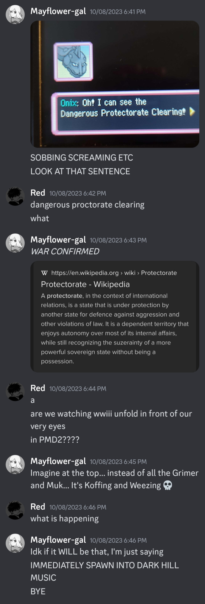
Alright, I'm about to go off on a small side tangent here but I promise it's worth it-
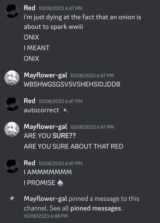
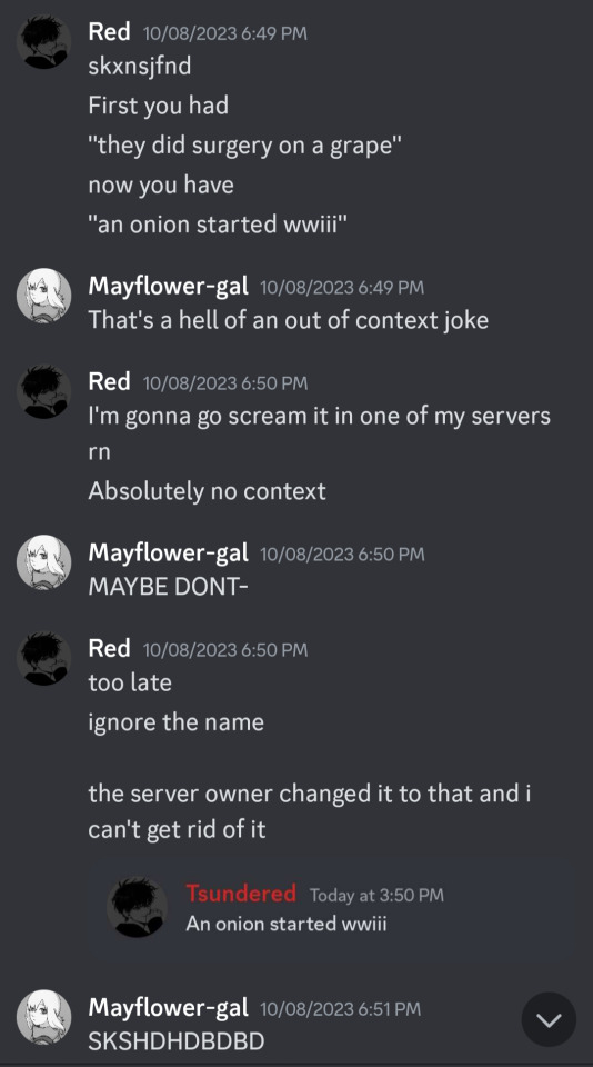
(Sorry to post your sins on main, Red 😔)
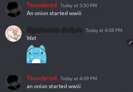
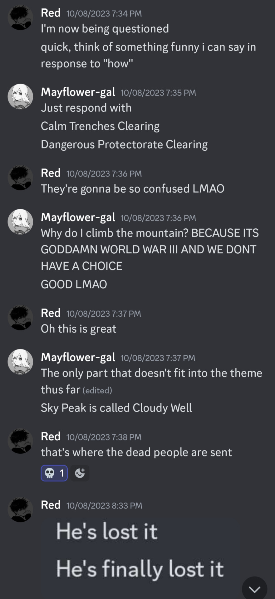
(Why Do I Climb the Mountain? is a reference btw)
LMAO OKAY thank you for bearing with me, now back to the main show:
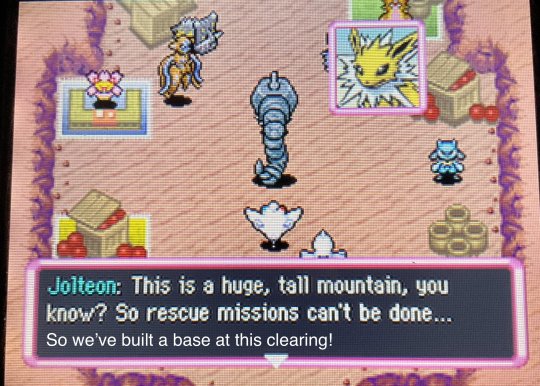
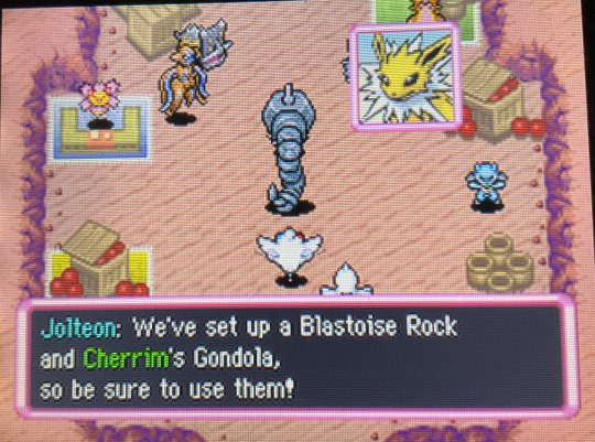
Good job, neither of those two things is correct!
...Okay, Cherrim has replaced Drifblim, yes, but. Imagine this tiny seed holding Teresa and Andrea by their little stubby hands while riding the wind down the mountain.
I had to look up a walkthrough to identify that little Riolu to the right. Normally, that's an Exeggcute! (And the backup for Team Frontier, apparently).
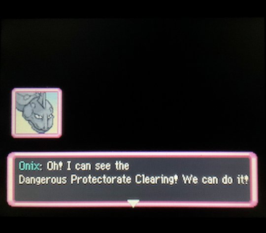
The Third Station Pass was dubbed Great Turn, while the clearing was called:
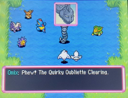
Admittedly, I had no idea what an "oubliette" was, so I did a quick search and...
Wait a minute, are you freaking kidding me-
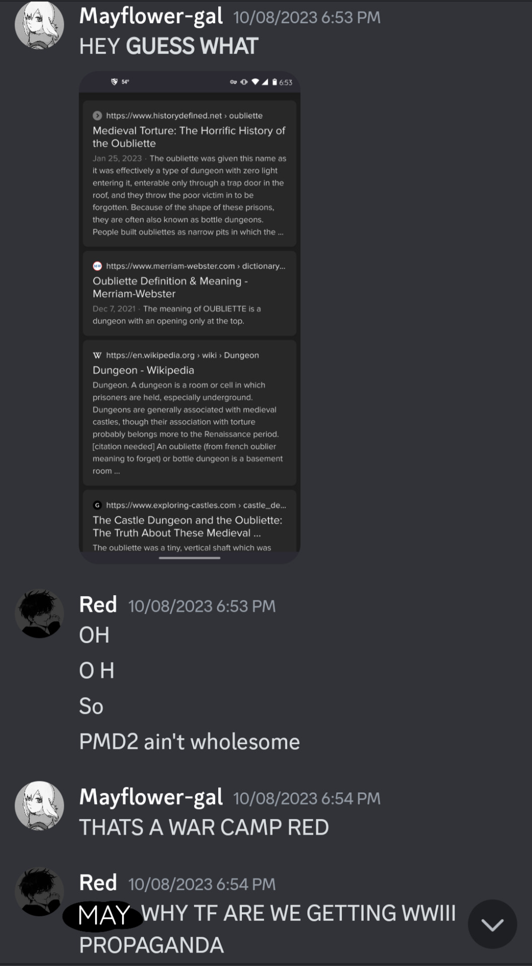
WE ARE STARRING IN A WAR DRAMA AAAAAAAAAAAA-
(Apologies for the small text at the start, let me know if I need to add an image description!)
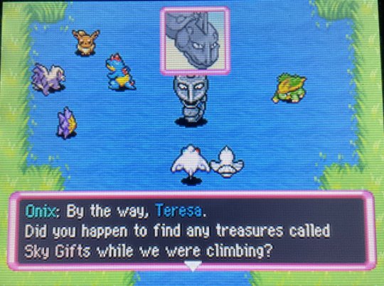
...No >:l
The only reason I left this in is because this happened:
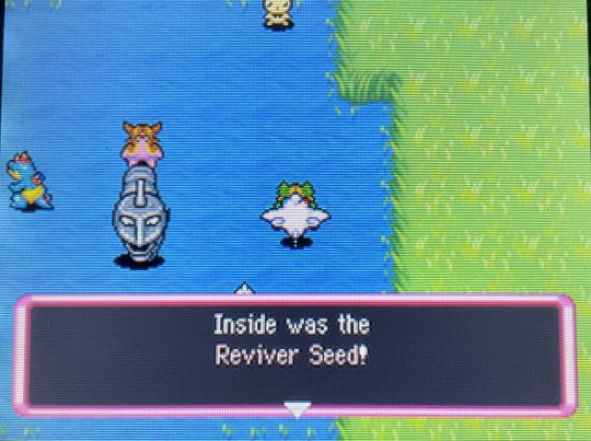
Oh my God yes PLEASE-
So fun fact, I actually did a dry run of the first few dungeons before doing it for real and taking photos. And the first time around, this gift was an Escape Orb? Which isn't bad, but I would 100% take the Reviver Seed over that any day.
The 4th Station Pass was named Sad Peninsula. (Florida? Dat you?) And the 4th Station Clearing? See below.
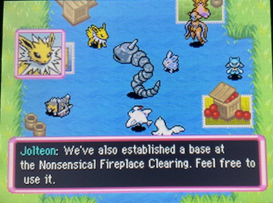
But then!
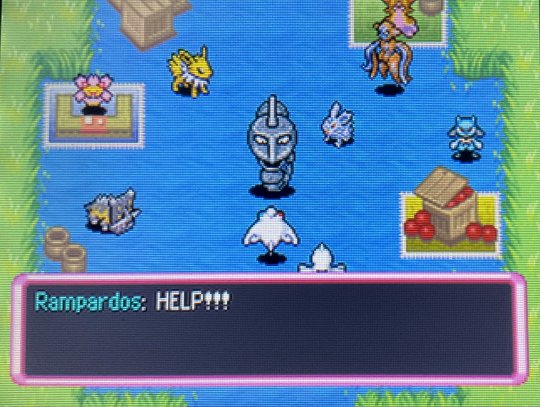
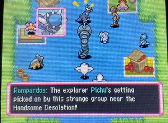
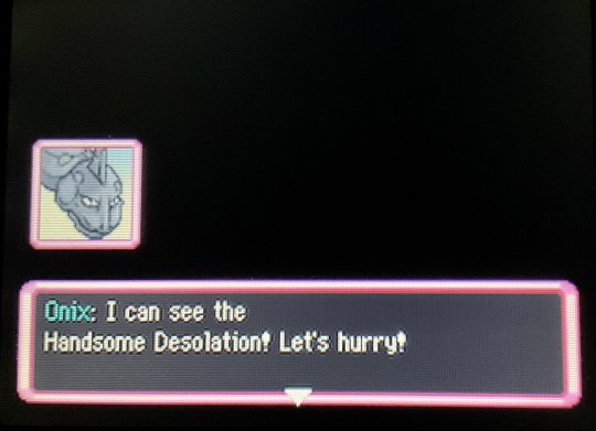
(Handsome Desolation? Is this where the handsome men in uniform... perish?! 😓)
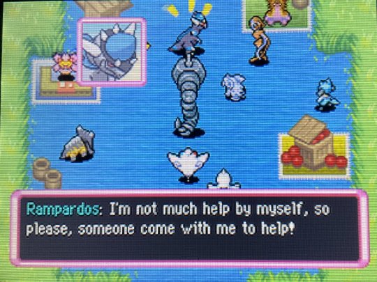
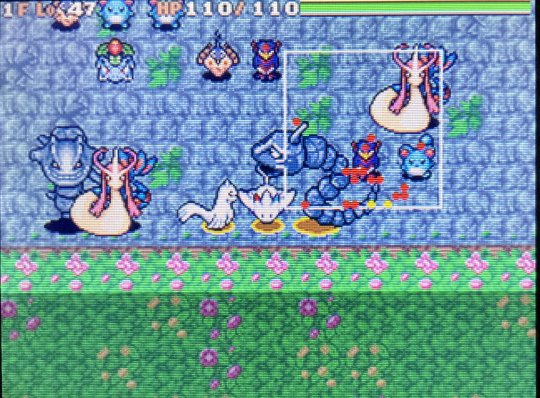
I feel like a large, prehistoric rock dino should be enough to scare most things, but I guess taking the even larger rock snake as backup can't hurt.
So we go through the 5th Station Pass, Sandy Way... (Only one letter different from Sandy Bay.)
I. Don't remember why I took a picture of this. The downfalls of not immediately composing posts after the playthrough...
But yeah, those giant two-room dungeons with guaranteed MH's and a huge mass of enemies in the other room aside is definitely a theme and I hate it.
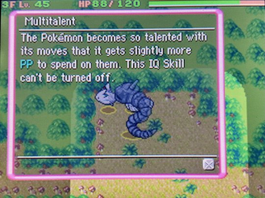
Andrea consumed enough Gummis to obtain this IQ skill, which is awesome since Max Elixirs are so hard to come by.
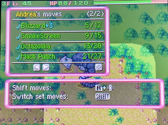
Look at this!! I'm pretty sure Blizzard only had 7 PP before! Yee haw!
I wonder which Pokémon are the ones bothering Sneasel Pichu?
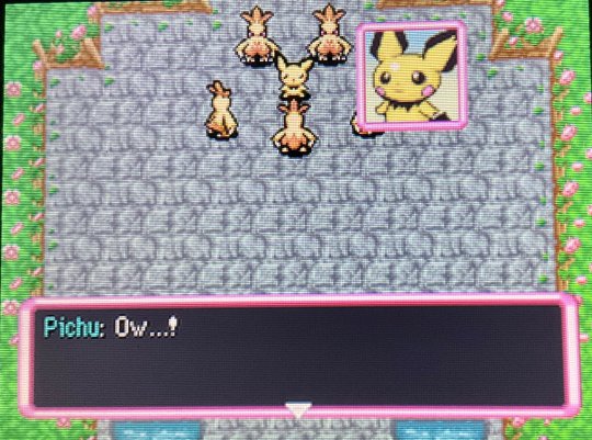
OH NOOO!! I'm imagining this grisly scene where all these Combusken are just pecking Pichu to death.
Team Frontier happens to beat us to the punch:
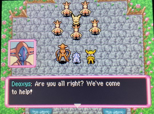
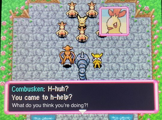
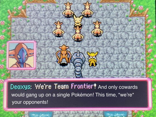
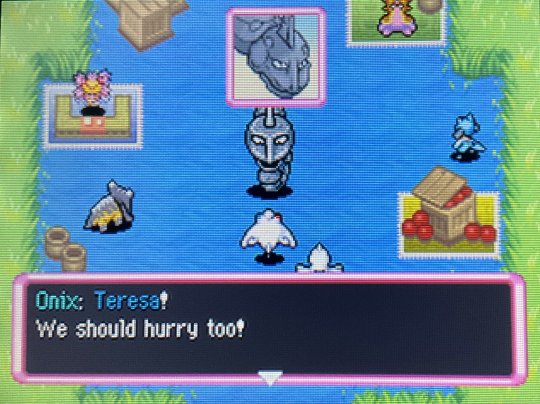
I love that Onix is so big that she blocks Nidoran F.
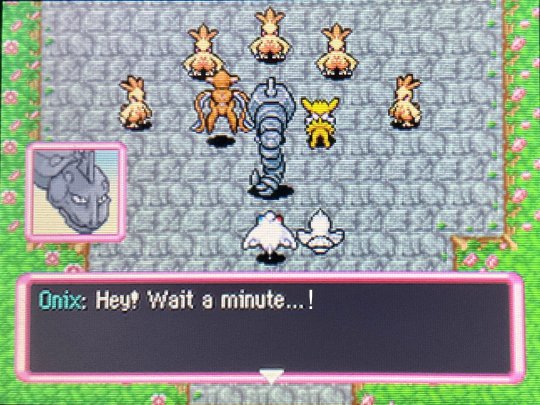
Like all territorial encroachments in Mystery Dungeon, everyone just jumps right into the fray without listening to anyone 🙄
Honestly, all of Team Frontier was pretty based. Jolteon had an ability that allowed him to attack twice in a row (I think because the weather was different?) and he consistently used X-Scissor. Nidoran F had Sesimic Toss (55 damage) and Ice Beam. Deoxys had Attack Order, Seed Flare, Rock Wrecker(!), and Swift, the last hitting for 120 damage on a critical. Combined with Teresa's Chatter (when we finally got there, because you start off a ways from everyone), they didn't stay up for much longer.
Also Jolteon shielded me when Teresa got low on HP 🥺️
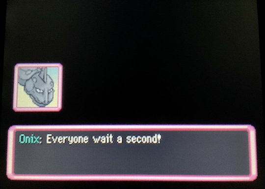
"SIT DOWN FOR TWO SECONDS AND LISTEN TO ME FOR ONCE IN YOUR LIFE, I SWEAR TO ARCEUS!"
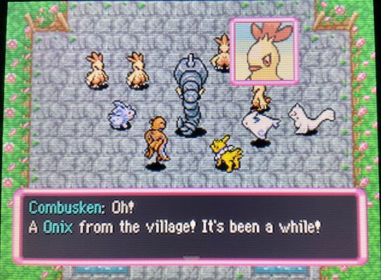
"We owe you..." -> Yet another line from this game that never made any sense to me. (Unless it was sarcasm ig?)
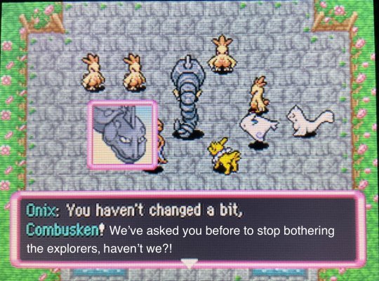
💀You what
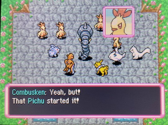
Hey, speaking of... I know Onix is huge and all, but have y'all seen Pichu since the fight started...?
(Beep boop, click here to advance to Part 3)
13 notes
·
View notes
Text
Hi, before I explain my post, I want to say something important.
• What you see my blog has become a major overhaul. And despite the changes, I decided that my 2nd account will be now my artwork blog with a secret twist.
⚠️NEW RULE! (W/ BIGGER TEXT!)⚠️
⚠️ SO PLEASE DO NOT SHARE MY 2nd ACCOUNT TO EVERYONE! THIS SECRECY BLOG OF MINE IS FOR CLOSES FRIENDS ONLY!⚠️
• AND FOR MY CLOSES FRIENDS, DON’T REBLOG IT. INSTEAD, JUST COPY MY LINK AND PASTE IT ON YOUR TUMBLR POST! JUST BE SURE THE IMAGE WILL BE REMOVED AND THE ONLY LEFT WAS THE TEXT.
⚠️ SHARING LINKS, LIKE POSTS, REBLOG POSTS, STEALING MY SNAPSHOT PHOTOS/RECORDED VIDEOS/ARTWORKS (a.k.a. ART THIEVES) OR PLAGIARIZING FROM UNKNOWN TUMBLR STRANGERS WILL IMMEDIATELY BE BLOCKED, RIGHT AWAY!⚠️
😡 WHATEVER YOU DO, DO NOT EVER LIKED & REBLOG MY SECRET POST! THIS IS FOR MY SECRET FRIENDS ONLY, NOT YOU! 😡

Okay? Capiche? Make sense? Good, now back to the post…↓
#Onthisday: Sept 21st, 2014
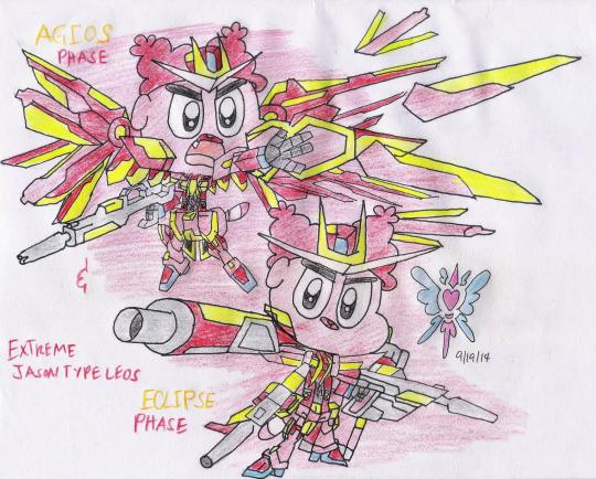
Title: Jason's Phases
Well, I'm ran out of ideas for this day. So, you'll meet Jason's other Extreme armors (Normal & Combat Phase), someday. But now, I decided to skip, and I'll introduced to you his two Extreme armor phases. 🐶🤖
Extreme Jason type Leos Agios Phase Based on the real: Extreme Gundam type Leos Agios Phase [CLICK ME!]
Info:
• An Assault configuration developed from Strike Freedom Spot/Murumo. Equipped with this Armor Pack, the Type Leos bears a striking resemblance to Spot’s Strike Freedom armor, both in terms of its wings' structure and its remote weapons, which even mirrors the Freedom's own 8 Super DRAGOON Pods.
Armament(s):
• Beam Sabers The unit's standard close combat armaments. The beam sabers presumably have an high output, allowing them to slice a mobile suit in half. Leos has also been seen combining the two sabers together to form a larger beam sword for greater cutting power.
• Long Beam Rifle The unit's standard long ranged armament, which can hold up to several shots and can adjust its power output when necessary. At higher outputs, the rifle's beam shots produce a sparkling trail.
• Shield The unit were equipped with an standard shield and it was used to defend itself against vulcan fire and missile attacks.
• Agios Funnels Developed from Strike Freedom Spot’s/Murumo’s Super DRAGOON Pods, this remote controlled weaponry were equipped on the wings of the suit. When deployed, Leos uses his thoughts to guide the funnels to attack its opponents using specialized beam guns. In Extreme Evolution, the Agios Funnels can instantly warp in the immediate vicinity of a targeted foe when deployed, dramatically increasing their potential. They can also form a temporary barrier, group together to fire larger beams or overload circuits, momentarily stunning the target. Additionally, the funnels themselves can combine together to form a large sword called Sacred Sword and slash targets with their bladed edges.
Special Feature(s):
• Extreme Evolution A new system integrated into the Extreme Jason’s frame that draws out the true power of the phases. When used with the Agios, it causes the wings, the chest and skirt armor to glow. The wings themselves can now be deployed and give off a sparkling effect similar to the Freedom Spot's/Murumo's HiMAT wings. The beam rifle's shots also possess a similar property as well. Lastly, the Agios Funnels' power is fully developed, gaining the ability to teleport and group together for a multitude of purposes.
Extreme Jason type Leos Eclipse Phase Based on the real: Extreme Gundam Type Leos Eclipse Phase [CLICK ME!]
Info:
• Extreme Jason Type Leos Eclipse Phase was developed from the data of Wing Pocoyo. On this configuration, the shoulders of the unit were slightly modified and equipped with various long ranged weaponry. It also gained new system ability for the Extreme Jason Type Leos called Burst Mode, which allows it to amplify the weapon's firepower. The initial downside however is that the unit can't be used for close combat.
• Being a long ranged unit, the Eclipse Phase is equipped with two Variable Psycho Rifles, which can fire beam shots, two Blaster Cannons, Eclipse Clusters and Carnage Strikers, the last two of which are available in Extreme Evolution. It is also armed with a jamming system that allows it to disrupt incoming missile blasts by destroying its targeting signal.
Armament(s):
• Variable Psycho Rifle Specialized beam rifles developed for the Eclipse Phase, which is developed from the Wing Zero Pocoyo's Twin Buster Rifle. While the rifles are capable of firing regular beam shots, they can also be combined into a configuration called Cross Buster for even more power.
• Blaster Cannon Equipped on both shoulders, they are powerful beam cannons that pivot towards the front.
• Missile Pod Located just above the hips, they can be fired while the Extreme Jason's hands are still carrying the Variable Psycho Rifles, effectively functioning as the CIWS or head vulcans found in traditional. In Extreme Evolution, the machine carries an infinite supply of them.
• Carnage Striker/Eclipse Cluster The artillery pack located on the back. This multi-purpose weapon has two identical shapes, but wildly different functions and weapons. The left one, the Eclipse Cluster, can be deployed as a micro missile salvo to bombard enemies. The right one, the Carnage Striker, unfolds into an extremely powerful long range beam cannon. It can also fire off a mobile black hole sphere which discharges a large explosion, stunning any mobile suits caught in the blast. Only available in Extreme Evolution.
Special Feature(s):
• Extreme Evolution A new system integrated into the Extreme Jason's frame that draws out the full power of the phases. When used for the Eclipse Phase, the components not only glow, but it also adds new weapons, the Carnage Striker and Eclipse Cluster, onto its back which possesses many of the same weapons as the Carnage Phase.
Jason Watterson, Jr. (Gumball OC) - owned by Estar99 (dA) Armors (Gundam EXA) - Gundam Series © Bandai Namco Filmworks/SUNRISE, Sotsu
2 notes
·
View notes
Text
Festive Makeover: iFoto's Free PFP Maker Brings Christmas Joy to Your Profile
When the holiday season rolls around, everything changes—our homes glow with twinkling lights, the air is filled with the scent of pine, and the spirit of togetherness is palpable. It's a time to reconnect, share joy, and spread Christmas cheer. Why not let that cheer shine through your social media profile, too? With iFoto's Free PFP Maker, you can deck out your profile picture in festive attire without even leaving the warmth of your home. Let's explore how this simple tool can help you spread the Christmas spirit online.
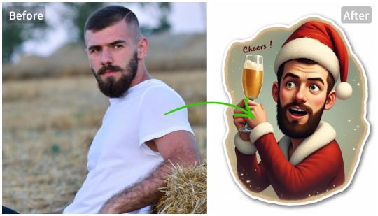
Have you ever wondered how magical it would be if your social media profile could mirror the festive decorations that fill our physical spaces? iFoto's Free PFP Maker offers a fun and easy way to do just that. It's not about showing off or making a statement—it's about sharing a piece of the holiday happiness with everyone you connect with online.
Imagine scrolling through your feed and seeing profile pictures that capture the essence of Christmas. Snow-covered landscapes, reindeer in the snow, and Christmas trees with all the trimmings. This is what iFoto's Free PFP Maker brings to the table. It's not merely an image; it's a smile, a nod, a warm wish to all who see it. But how does it work?
You take a regular photo, something that's maybe a bit... well, ordinary. You upload it to iFoto, and suddenly, it's like opening a door to a winter wonderland. The magic happens in a few taps or clicks, turning your everyday photo into something that tells a story of joy and festivity. And the best part? It's completely free!
Now, you might be thinking, "Isn't it just for show?" But here's the thing: It's so much more than that. Your profile picture is the first thing people see when they interact with you online. It's a small window into who you are. So, why not let it reflect the season of giving, the season of joy?
But let's get real for a moment. In a world where it sometimes feels like we're all just floating in a sea of digital noise, isn't it nice to see something that brings a touch of humanity back? iFoto's Free PFP Maker isn't just about changing your profile picture; it's about making a connection. It's about showing that you're part of something larger, that you're not just another profile in the crowd.
So, how do you get started? It's simple. You hop on iFoto, choose the Free PFP Maker feature, and let your creativity loose. Whether you're a seasoned photo editor or someone who's never touched a filter, iFoto makes it easy. They've got templates galore, filters to fit any style, and all the festive flair you could want. Plus, you're in control—your transformation is as subtle or as bold as you want it to be.
I've tried it myself, and let me tell you, it's addictive. One moment you're looking at your regular ol' picture, and the next, you're festive and fabulous, ready to take on the social media world. It's like getting a mini-makeover for your online presence—and who doesn't love a little spruce-up now and then?
Let's also talk about the broader impact. When you update your profile with a festive twist, you're not just changing your look; you're contributing to a digital tapestry of holiday cheer. It's like a gentle reminder to others that, amidst all the hustle and bustle, there's a community out there celebrating together, even from afar.
I've seen it happen—people comment on the new look, share their own transformations, and it creates a ripple effect of joy. It's like passing a Secret Santa gift, not knowing who'll get it next, but knowing that it's bringing a bit of happiness to someone, somewhere.
In a time when many of us can't be with our loved ones, these little acts of sharing festivity matter. They say a picture is worth a thousand words, so what do these pictures say? They say, "I'm here, I'm thinking of you, and I wish you the merriest of Christmases.
And that's the beauty of iFoto's Free PFP Maker. It's not just a tool; it's a bridge. A bridge to a season of joy, of family, of togetherness. It doesn't matter if you're miles apart or sitting next to each other on the couch—it's a reminder that we're all part of one big, festive family.
So, why not give it a try? Embrace the season, bring some Christmas magic to your profile, and spread a little cheer. After all, isn't that what the holidays are all about? With iFoto's Free PFP Maker, it's easier than ever.
#iFoto#PFP#PFPmaker#ProfilePictureMaker#portraits#linkedinphoto#producthunt#ResumePhoto#linkedin#VisaPhoto#ProfilePicture#driverphoto#AIportrait#AIphoto#portrait#profilepic#Christmas#Christmas2024
0 notes
Text
literally the worst computer yap sesh you will read dear fucking god
hey guys today I am back from twitter because OH MY GOD ITS A CESSPOOL ALL IT IS IS YEAH YEAH YEAH YEAH YEAH YEHAS YEHAY HEAY YEHA YEHA YEHA YEAH YEAH YEAH YEAH YEAH oh hey look my computers on ANYWAYS twitter is hell and Tumblr is also hell but less in a way.
with that out of the way, I am currently fiddling with my old computer from 2017. its a windows 10 dell laptop Inspiron something. all you gotta know is its older than 2017 and it has a keypad. also it sucks ass. the processor is uhhhhhh i7 7th generation which is *opens google* pretty good???? thats according to google. in my experience, it sucks. it could also be the hard drive. im 99% sure its the disk drive and sitting around collecting dust for about a year and then being crammed with windows updates did not do very good for it. so it takes about ten minutes to boot and using any application without lag is abysmal. I was hoping to get the laptop traded for a sexy MacBook or something in 2022 but my mom was all "mimimimimi you already have a laptop" my sister in christ thats exactly the problem, and to this day im typing this "essay" or whatever the fuck on an iMac. yes its an intel based yes I love it yes it just works and does Mac stuff but other than that its still a Mac at the end of the day so no 32 bit games no plugging in my Nintendo switch and extracting all of the screenshots which a lot of the features that windows can do but Mac can't I can personally live without.
I just updated the windows laptop I was talking about and by the nine its all fired up. and when I say that I mean
it sits there, calling to me.
but im writing rn so it can scream faster. also this yap sesh is sponsored by Clop. when I airdropped this image to myself, it had the .heic file type. but with clop, it was instantly converted to a jpeg and automatically spoon fed to my clipboard. get 0% off your next download if you clitoris the link! (its free)[but its Mac exclusive heheheha eat shit windows losers]
I should prolly check to see how the laptop is whirling. and yep it still takes over 10 seconds to open the settings and I tried to open google chrome (first mistake) and the window is still pure white (nvm it just came on as I wrote this but picture the time it took to write from "and yep" and "nvm" and add 20 seconds and thats how long google chrome took to open. what do I do with this computer?
I opened it in the first place to try to install linux mint. but thats hard and when I opened disk utility there were 5 partitions no larger than a gigabyte. no idea what thats all about. I goggled it and it says it partitions after every update? which is fucking stupid and all these partitons have 100% free space this is actual fucking bloatware what the fuck time to wipe
update: I can't wipe it I right click and it only shows "help" and thats it. this is only on all the portions and one of them is 15 gb holy moly! also I dont feel like writing anymore so im just gonna post this ok by
1 note
·
View note
Note
D20: 6
(Also, what do you mean you can't add photos on anon?)
// on mobile I just cant add images. its weird. Frieae was toying around with Valert's camera. Her totally-not-crush was fast asleep upstairs, and frieae wanted to take some pictures with her camera before she woke up again. She was running around the house, taking pictures of whatever came up to her. the trash can, couch, TV, a picture of the outside, a cool bug she saw... Then she had an idea. What if she took a picture of herself? Valert would no doubt love that! So she turned the camera around, pointing it at herself. she heard a faint click as one of her paws unbeknowingly turned on the shrink setting on the camera, but paid it no mind. Cameras are supposed to make clicking noises, right? She pointed it at herself, smiled, and pressed the photo button. Suddenly, a loud flash emerged from the camera as frieae was enveloped into it. She shook her head, clearing the rather odd feeling in her body, before she began to notice something... odd. The table, normally around half her height, was rapidly growing taller. she looked at the table, curious as to how it came that a table suddenly began to get larger. Hopefully it wouldnt break anything - or worse, wake val up. She walked closer to it, seeing the wood slowly shifting upwards as she looked the camera over. Maybe she accidentally took a picture of the table with the growth setting on... She then noticed the setting. shrink. "O.o oh. o.O" was all that came out of her mouth as she looked around further, realising what exactly was happening. The table at this point already loomed over her head, the troll being only around 2 feet tall and still shrinking. She thought about what to do as panic engulfed her. she had seen how small things can get when she took a picture of Jadiz a few months ago. Maybe she would have to reach the tabletop. That is a reasonably visible place, and from there she can call for val's help when she wakes up. For that, however, she would have to reach the table, and at this point it was too far away for her to jump up in one go. However, the chair was still attainable. as she jumped, grabbing ahold of the bottom side of the chair. Pulling herself up, she noticed she was still shrinking, finding the top part of the table out of reach even when standing on the chair due to her continued shrinking. So instead she had to be nimble if she wanted to reach the table. She turned around and began to run towards the back of the chair, jumping against it and, in a suprisingly smart move, pushing herself away from it to try and give her some extra height. she thanked Valert quietly for demanding she keep the chairs tucked in well, as she grabbed ahold of the table edge. Pulling herself up, the small mutant collapsed, lying down flat as the shrinking stopped at a height of only two inches tall. She looekd up and around the table. "O.o well... it could have gone worse, right? o.O" she said quietly, more to herself then to anyone else, as she walked up to the edge of the table and sat down to wait for valert. Of course, as she can grow naturally, she could just grow back to her normal size in an instant, but that thought didn't even cross her mind.
0 notes
Text
Fundamentals 1: Week 11
17th May
In today's fundamentals class we are learning how to make end papers with tessellation patterns! End papers will be a part of our children's book project as they'll be our first and last spread in the book. First off we briefly discussed some handy shortcuts which are: Command + 2 = Lock (lock an object in place) Command + 2 + Option = Unlock
We get straight into work by opening up an A4 landscape file in Illustrator. Toby instructs us to create a black box and draw a design inside of it. He decided to draw a crane and, being quite inspired, I decided to draw the same thing. This box and design had to be quite small on the page so that it would be easier to work with when it comes to making the pattern.

Next we opened up our swatches palette and were told to drag the image (with both the box and drawing selected or even grouped together) and let it go on top of the swatches palette. We could see that an icon of the drawing was added to the collection of swatches (can kinda see it in the image below).

Next we drew a random blob shape on the art board and made sure to have all of the handles on the anchor points either horizontal or vertical. We made sure the object has a fill (could be any colour) and no stroke.


After this was all ready to go we simple had the fill selected and then clicked on our pattern swatch in the swatches palette. As you can see below the blob's fill is now a repeated pattern of our drawing. Cool!
What we could do once filling the blob with our pattern was double click on the pattern in the swatches palette to open the pattern options palette. This is a full menu of all the adjustments we can make to the pattern (excluding colour). Toby showed us that we could also adjust the pattern while in the pattern options mode (we might want to change the angle that it's facing, make it larger or smaller, etc.). You can see this below in the right image.

Next we decided that we wanted to try make the pattern with a different shape, which for this task was a hexagon. All we had to do was use the hexagon ellipse tool to draw up a hexagon roughly the same size as the square. We then held down option, clicked and dragged the crane drawing across to create a copy of it which we then placed on the hexagon (seen below). Toby also suggested we make a frame for the hexagon, which we could do by using Command + C to copy the hexagon and then using Shift + Command + V to paste it in place. After this we made it have no fill, a white stroke, and also downsized it to something that looked nice.
Using the same process as before, we dragged the hexagon and drawing over to the swatches palette to create a new pattern swatch. I then created a copy of my original blob outline and filled it with the new hexagon pattern. As you can see below it looks different because the hexagons are only line up in rows like the square patter was. We can go into the patterns options palette and choose to have the pattern "Hex By Row" which makes the hexagons slot in together.

We learnt that we can also adjust the colours of the pattern while in the patterns options mode. Below you can see that I made a nice yellow-orange gradient for the bird and changed the frame of the hexagon to a thin yellow line. It almost reminded me of the mockingjay badge from the Hunger Games.

The last thing Toby wanted us to have a look at was fixed patterns. With the patterns we had in our blobs, we could move the patterns around within the shape without the shape moving - meaning they weren't fixed in place with the shape. If we wanted to have the pattern fixed onto the shape we can select the object, go to the object menu, go to "Expand", make sure "Fill" is ticked and then hit Ok. This will then have the pattern fixed in place on the shape, so if the shape is moved the pattern moves with it. The image below shows the difference in the preview mode (outline mode? I can't remember what it's called) between the blob that does not have the pattern fixed in place (on the left) vs the one on the right which does. The excessive amount of pattern shows that the pattern is completely covering the shape (or can be seen as underneath the shape) so that there are no gaps, and all of the pattern is attached and moves with the shape.

That was everything we learnt in our class today! I had fun learning about these as I've definitely tried to make a pattern in the past without all of this knowledge and failed miserably because it felt too complicated. This class provided some great tips and shortcuts that I'll certainly use in the future, especially while making this children's book!
0 notes
Photo


Frostwish: Honestly, I think my relationship to her is a recognizing nod in the Tearoom.
#Disney Fairies#Pixie Hollow#art answers#answer#Frostwish#thank you for the questions!#I missed this#also I know I just posted this as an actual ask-response#but you can't click on the image to see it larger when I do that#so now it makes sense why other ask blogs take photos of the asks and use them in their posts rather than replying#my eyes have been opened
7 notes
·
View notes