#but this is very loosely inspired by the renaissance era
Explore tagged Tumblr posts
Text
pretending i am a costume designer for my jegulily fantasy au fic instead of writing it
lily evans:

she would start in light pastels and as the story continues her color palette gets darker. green because that’s her color. also she would EAT IT UP in a snood.
regulus black:

he usually keeps it pretty simple to maintain practicality and avoid drawing access attention to himself. last one would be more of a ceremonial dress.
james potter:

you can’t put james potter in a historical au and not put him in leather. it’s just physically impossible actually.
remus and sirius:

they are both cardinals so this is what their vestments look like. but also i found this photo and it is actually perfectly their vibe (like do i even need to say who is who) so this is what they would dress like when they aren’t being cardinally. remus would also walk with a wooden cane.

might make a part two with more characters soon ;)
#jegulily fantasy au#jegulily#is this historically accurate?#probably not!#but this is very loosely inspired by the renaissance era#so it’s mostly just for the vibes#i am not trying to pretend i know a lot about fashion history#i just love pretty clothes#and one of my dream jobs would be a costume designer for movies or tv shows#soooo i’m just pretending to design costumes for them like this isn’t going to be simply words on a screen lmao
29 notes
·
View notes
Text
Previous Versions of Frozen (Rewrite)
The development of Frozen is famously known to be messy and obscure. Messy, because of the many last-minute changes made even months before the film released. Obscure, because the many versions there were before the final film are kept secret, with only slight tidbits being released and shown, leaving the previous stories being up to one's own imagination.
In my previous attempt to uncover the previous versions of Frozen, there was a lot of information left out or unknown to me at the time, and even some things I got wrong. Thus, I wanted to do a more in depth look at the possible previous Frozen stories, and update any misinformation.
Feel free to comment sources if there is something I missed.
Part 1 - Before Frozen
As everyone knows, Frozen was first considered to be an adaptation of Hans Christian Anderson’s The Snow Queen. However, over the development of the film, the creative team had decided that it would no longer be an adaptation, as at this point, they were just inspired by the fairy-tale and some of its themes – a Snow Queen, an Evil Mirror, an Act of True Love, and a Frozen Heart. Everything else was left alone, with only fan interpretations of what else could’ve been used, but never officially stated.
Before Frozen was even considered, there were couple attempts at adapting The Snow Queen. A common mistake made by many fans is incorrectly assigning concept art, songs, and story ideas from earlier adaptions of The Snow Queen. However, these versions are not actually Frozen, but completely different stories and attempts to adapt the fairy-tale.
The Biography Attempt -- 1937 – 1942
The first attempt at adapting the Snow Queen was to include the story in a bio-pic of Hans Christian Anderson. The Snow Queen was one of the stories that were going to be told in this bio-pic, alongside his other famous works. The rocky development for this bio-pic began in 1937, and ended in 1942 when the USA entered World War II, as Disney shifted into time on War Propaganda, officially halting the production of this project.
The first completed concept of the Snow Queen segment specifically was coined by Mary Goodrich in 1938, a researcher, who wanted to explore the theme of regeneration through faith. It was very faithful to the original tale, and was actually fully complete. However, Norwegian-born researcher Karl Berggrav dismissed the story. He said that while it was a technically good film, with the story being well-written and had no loose ends, it was boring and uninspired.
"This story rounds off everything nicely and ties up loose ends, but it is very uninteresting and just fades out into nothing, or worse than nothing, banality. It is hard to make good animation out of it.” - Karl Berggrav, The Art of Frozen, pg. 10
Walt Disney himself attempted to adapt the story in 1940, but as a live action and animated film. Hans Christian Anderson everyday life would be filmed in live action, while his stories were to be animated. This was going to be a co-production with Samuel Goldwyn and his new studio Samuel Goldwyn Productions, where they would film the live-action sequences.
The Snow Queen -- 1990 – 2006
There were multiple attempts at adapting The Snow Queen during the renaissance era and after. Harvey Fierstein took a chance to pitch an idea for The Snow Queen, but it was shot down. Even Glen Keane attempted to try his hand at an adaption, but just couldn’t find a way to turn the Snow Queen into the sort of fully realized character.
Then, a new team took on the adaptation in 2000. The main idea that the creative team wanted to have was to omit the Trolls and the mirror, trying to explore different ways for Kai to be abducted by the Snow Queen. There was one version of Kai wanting to impress Erica (Gerda's first name change) by joining a whaling ship. The Snow Queen was often shown in artwork riding an orca all over the sea.
There were other versions that followed this initial premise with more comical side characters, ranging from penguins to walruses to, of course, Snowmen. The strangest outline for this version was how Greta (another name change for Gerda) was a devious gold digger, leading Kai to marry the Snow Queen instead.
The Snow Queen was described as a 'Taming of the Shrew" type character, who had a frozen heart that needed to be melted away by the warm and loving Kai.
I love The Taming of the Shrew idea. Take Martha Stewart. She’s tough, smart — a worthy adversary. If she were a doormat of a woman, no one would go after her. -Michael Eisner, Disney War
The artwork for this version was considered to be beautiful and inspiring, but the narrative was simply not compelling enough. Thus, the story was ultimately scrapped and shelved.
The below concepts are often mistaken for early ideas for Frozen, often named early designs for Anna, Kristoff, and Elsa - however, they are actually from the 2000-2003 version of The Snow Queen, while others are from even earlier versions, and are featuring completely different characters.
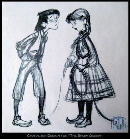
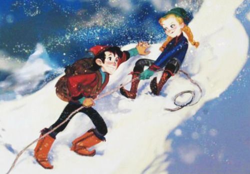
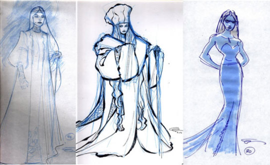
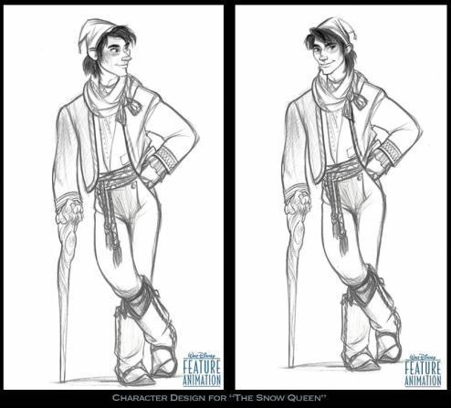
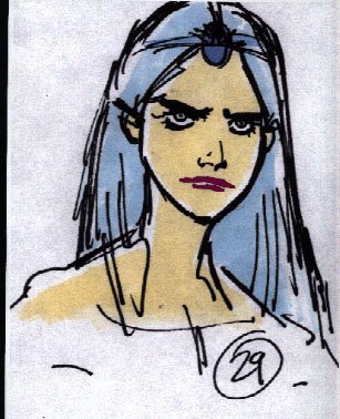
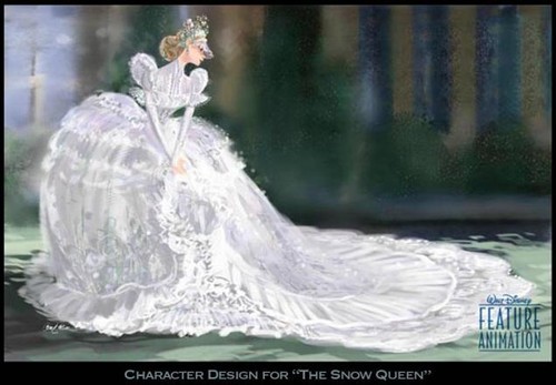
The project was later brought back in 2006, but not for animation - but instead as a stage musical for Tokyo DisneySea at thier Broadway Music Theater. It was going to be directed by Amon Miyamoto, written by John Weidman and Glenn Slater and Alan Menken writing the music. However, it was also scrapped.
The reason I bring this version up, is because a song penned by Slater and Menken is often pushed as early love song that Kristoff was supposed to sing. However, it was not a Kristoff song at all. Love Can't be Denied was a song that was written for this stage musical, with no real details about who it was written for or its purpose in the plot.
youtube
There are many reasons claimed why, but it is often contributed to Disney wanting the Snow Queen Adaptation to be a film, not a stage show. Menken was even reported to try his hand at making it an animated musical, but it never went through.
For years, (Disney had been) working on “The Snow Queen,” first as a stage piece, and then as an animated film, but that got shelved. Clearly, animated films are big commitments and it takes a lot for Disney to greenlight one. - Alan Meken, Jim Hill Media
Part 2 - Previous Versions of Frozen
After John Lasseter was given the reigns of Disney Animation Studios after the Disney merger with Pixar, he wanted to try and adapt this story again. Lasseter convinced his old friend Chris Buck to come back to the studio, and try his hands at another Snow Queen Musical film. Thus, the development of Frozen officially began.
"I pitched several ideas to John, and ‘The Snow Queen’ was one that he'd been interested in for a while. I pitched a musical version of it that he seemed excited by. So we started developing that project. This was back in 2008, around September.” - Chris Buck, The Art of Frozen, pg. 11
Starting 2008, Frozen went through a few versions before Jennifer Lee, Robert Lopez, and Kristen Anderson-Lopez entered the production in 2012. While Jennifer Lee was aware of the project while she was working on Wreck-it-Ralph, as the company typically has round-tables for their animated featured where all of their writers can give notes, she was not officially brought on as writer and then later as director, until 2012.
Both of these versions featured the introduction of Anna and Kristoff as replacements for Gerda and Kai, as adults instead of children. However, there were a few different ideas for The Snow Queen character that would prove to be the biggest obstacle.
Anna and the Snow Queen 2008-2010
The first version of Frozen was called Anna and the Snow Queen. There seems to have been a couple attempts at perfecting this story, none of which really made it to the final cut, due to the difficulty of making the Snow Queen character compelling. This version was meant to have hand-drawn animation at first.
Anna and the Snow Queen is very obscure, and not much exists for its early story ideas other than a few ideas sources from interviews and concept art by Claire Keane.
The Snow Queen Character (she was given the name Elsa at this stage) was based off of Bette Midler (some sources say that she was also meant to be her voice actress) She would take on a very Diva persona, and was of course a villain. Anna at this time was depicted as 'up-tight', and often was shown as some sort of secretary or assistant to the Snow Queen.
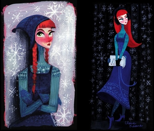
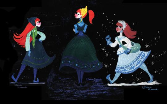
Kristen Bell was cast as Anna before anyone else had joined the team, after she had initially auditioned for the role of Rapunzel for Tangled. Josh Gad was cast a little after, however the Olaf he was voicing was a very different character, much like Anna.
"I was originally involved in the project when it was a 2D effort and it was called Anna and the Snow Queen, and it was completely different. Completely different. Megan Mullally was playing Elsa and it wasn’t really about sisterhood at all. I think it had more to do with the source material of Hans Christian Andersen’s story. When I did that version, Olaf was a different character entirely." - Josh Gad, MSN Entertainment
What the story for this version is often conflicting. Anna goes to the Snow Queen to have her heart frozen after she is dumped at the alter, releasing Elsa from an ice prison. The below concept art by Claire Keane shows Anna as a bride looking for the Snow Queen, supporting this interpretation.

However, other artwork by Keane suggests that Anna is possibly working for the Snow Queen as an assistant of some kind, as shown in the concepts below, and is also supported by the 'up-tight' secretary Anna concepts. It is possible, however, that after going to the Snow Queen to freeze her heart, she ends up working for her. You can also see the Bette Midler inspirations in some of Elsa's character designs.

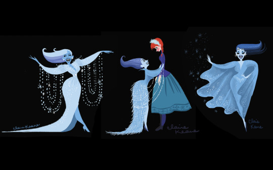
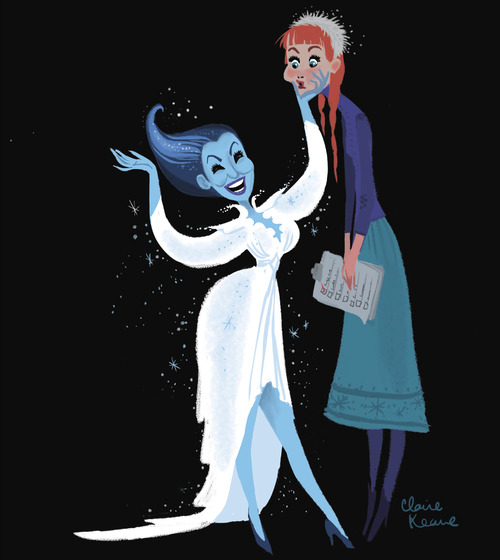

After this period, Anna and The Snow Queen was actually shelved for around one year in 2010, before being brought back in 2011 and renamed to Frozen. It was also around this time that the idea for it to be hand drawn was scrapped, with the film shifting to 3D animation.
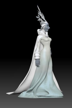
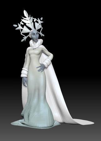
It was seemingly brought back with a story about a prophecy that says that Arendelle would be destroyed by a "Ruler with a Frozen Heart." The characters in the story would assume that this was Elsa, the self-proclaimed Snow Queen (Anna and Elsa were not royalty at this time, nor were they sisters) only for it to be revealed that it was Hans (possibly named Admiral Westergaard).
Frozen was to open with a prophecy that "a ruler with a frozen heart will bring destruction to the kingdom of Arendelle." We're then introduced to Anna, our pure-hearted heroine, and Elsa, an unrelated evil Snow Queen. We learn Elsa is a scorned woman; she was stood up at the altar on her wedding day and froze her own heart so she would never love again. Both Elsa and the audience assume she's the villain from the prophecy. Fast-forward to the final act: Elsa creates an army of snow monsters to attack our heroes while Kristoff has "a Han Solo moment" and comes to help Anna. To halt Elsa's attacking army, the two-faced Prince Hans (Admiral Westergaard) triggers a massive avalanche—not caring that the avalanche also puts Anna, Elsa, and all of Arendelle in jeopardy. Anna realizes Elsa is their only hope, so she convinces her to use her powers to save the kingdom. The twist is that the prophecy from the beginning is actually not about Elsa, but about Hans—he's the one with a metaphorical frozen heart because he's an unfeeling sociopath. Elsa's heart is then unfrozen allowing her to love again. - Peter Del Vecho, Entertainment Weekly
This is also supported with what Santino Fontana says in his interview with Paul Wontorek. He claims that he was hired and paid for his lines in 2011, way before Jennifer Lee was officially involved with the project in 2012, and just after Frozen was brought back from its year hold.
This puts into perspective any claims about Jennifer Lee basing Hans' character after her ex-husband, or that Hans was originally meant to be a good guy until they needed a new villain to replace Elsa. Hans was always meant to be the real villain of Frozen and was seemingly created as soon as Anna and the Snow Queen became Frozen.
The Story of Sisters -- 2011-2012
During one of the round-table sessions, in which Jennifer Lee was involved in but was still not working on Frozen, someone within the session suggested that Anna and Elsa should be sisters. This was the first major breakthrough that helped shape the story.


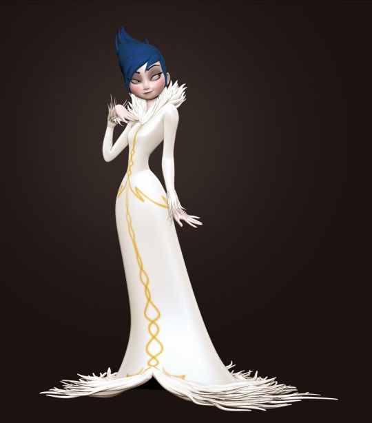

This famous version of Elsa (onionElsa!) is meant to be based off of Amy Winehouse. It is unclear when Elsa's backstory transitioned from being that of a woman who was dumped at the altar, and being the more tragic villain that was forced to hide her magic.
Regardless, it was explained that this Elsa had ran away from her kingdom, and later on kidnapped Anna away from her wedding with Admiral Westergaard, trying to freeze her heart so that Anna would understand how she felt. It ended in the same way, however, with Hans being revealed as the true villain and Elsa getting a redemption.


It was also around this time that Anna's character was also getting a much needed re-working. Anna's 'up-tight' personality was removed with the help of Kristen Bell, who always had issues with Anna’s characterization. She pushed for Anna to be more quirky and awkward, with a strong desire for love and companionship. Idina Menzel was also brought on at this time, where the two actresses prepared a song (Wind Beneath my Wings) to see how their voices would match up.
This deleted scene below showcases this version of Elsa, voiced by Idina Menzel.
youtube
"We did a version where the Snow Queen was the villain, but we wanted to end with them reunited, and it was very hard to redeem her at the end. We decided on an adventure about two people who initially misunderstand each other; it allows for the bonding at the end.” - Peter Del Vecho, The Art of Frozen pg. 12
Jennifer Lee started on the project after all of this was already established, and tried to work out quite a few things with the story. Robert Lopez and Kristen Anderson-Lopez also came onto the project, and tried to write a few songs for this version - although, they didn't really like the story all too much.
One of the songs we know from this version was We Know Better. Interestingly, this is actually not the full song. It is supposed to end with Elsa's turn to becoming ‘evil’, and Anna becoming her 'up-tight' persona. This was omitted with a lot of earlier scenes of Elsa's evil nature (with the exception of the above clip) because the creative team wanted to try and distance Elsa away from this persona.
youtube
Another deleted song was called Cool With Me. @stitchkingdom saw a concert where Kristen and Bobby Lopez performed some deleted songs, some of which were never performed anywhere. Cool with Me was a song that came before Life's Too Short, and has details about Elsa kidnapping Anna and wanting her to feel her own pain.
The next breakthrough for the story was when the Lopezes wrote Let it Go. John Lasseter had often made notes about delving deeper with Elsa's character asking why she is a villain. Jennifer Lee also pushed for more depth when she was writing Elsa. However, Let it Go was the trigger that helped se things in motion for a new version of Frozen.
“The minute we heard the song for the first time, I knew that I had to rewrite the whole movie.” - Jennifer Lee
Now, Elsa was being completely re-written as a sympathetic character - no more villainous tendencies, no more intentionally cruel stunts. Elsa was made into a tragic character who was forced to hide who she was, and only wanted to protect Anna and her kingdom from her powers.
Olaf was also re-written at around this time, going from an obnoxious side-kick of Elsa's to a more innocent companion that would represent the love between the sisters.
The newest version of the story was a mash-up of the original prophesy version talked about above, but with new elements. This included a story about Anna feeling less than Elsa, and feeling like nothing more than a spare. Elsa was of course changed to her new sympathetic character, and runs away from Arendelle from fear rather than being angry at anyone.
The Duke of Weselton was also theoretically introduced at this stage, but not as a red herring to Hans, but instead as a care taker to the sisters after their parents passed away. Hans was also supposed to gift Anna a special snow globe that had some kind of thematic importance.
The following songs and scenes are some of the ideas from this version of Frozen.
youtube
youtube
youtube
youtube
youtube
At this point, the creative team was pretty confident that they had the story planned it out and it was ready to go. However, the team had decided that they were still having issues with the plot.
The Final Months - 2013
From February to June of 2013, there were extensive rewrites done to the film before having a test screening with both a family audience and adult audience.
One of the elements that were changed was the prophecy. After so many years, this story element was finally dropped. Then, Hans' sociopathy was explored more extensively by Jennifer Lee, and a character twist was pushed by John Lasseter to make his villainy more iconic.
Anna's feelings about being a spare was removed, as the creative team wanted to focus more on Anna wanting to find love rather than trying to prove herself (she was sounding a bit too much like Hans). The Duke was changed to being his current self.
Kristoff was actually changed as well, making him a bit more kind. However, when his character was changed is not clear, but we do know that Johnathan Groff pushed for him to be a bit more kind as well.
Some of the songs were also removed and replaced with the current versions we know and love today.
Conclusion
Frozen’s 10th Anniversary is coming up (here or passed depending on when this is read) making it a perfect time to talk about the journey Frozen went on throughout the years. It’s amazing to look back at all the attempts and stories, and see where Frozen ended up. It’s because of all these attempts, successes, failures, and hard-working people that we were able to get the Frozen that we have today.
Happy Frozen 10!
Sources:
The Art of Frozen by Charles Solomon
Disney War by James B. Stewart
Disney's 'Frozen,' Formerly 'The Snow Queen,' Will Be CG Rather Than Hand-Drawn by Russ Fischer for Slash Film
Countdown to Disney's Frozen by Jill Hill for Jill Hill Media
Lost Media Wiki - Frozen
Frozen Original Ending Revealed - James Hibberd, Entertainment Weekly
Show People With Paul Wontorek Interview: Santino Fontana on "Act One," "Frozen" & More
Interview: Frozen's Josh Gad MSN Entertainment
Scriptnotes, Ep 128: Frozen with Jennifer Lee
Exploring the Songs of "Frozen" with Kristen Anderson-Lopez '94
Kristen Bell Explains How She Became Anna in 'Frozen' | The Watch | The Ringer
#Frozen#Elsa#Anna#Hans#Prince Hans#Queen Elsa#Princess Anna#hans westergaard#Kristoff#kristoff bjorgman#Olaf#Sven#greatqueenanna/analysis#frozen 10th anniversary#frozen10#Youtube
155 notes
·
View notes
Note
hello, my dearest! yes, it me again! *kneels and heavy sigh* I must know my beautiful Rhaenyra fashion. she was recorded in Fire and Blood to dress very lavish in colors, and have a lot of jewerly.
and I keep thinking of her wearing Valerian braiding, and gold hair jewelry in her braids, and beautiful silks, and pearls—- AHHHH. the show did her dirty!!
Emma is a gem, and gorgeous! And they deserved to be dressed in full on Rhaenyra attire. I even imagine Targaryen women wearing facial jewelry, like back in old Valyria, nose piercings.
She is Westeros’ It Girl, where is the luxury??? THE GAWDY BAD BITCHERY OF IT ALL???
Although I absolutely adore the wedding head piece she wore, but her dress….. I just knowwww, traditional wedding attire for Targaryens are so much more. Especially since Targaryens’ culture takes inspiration from the Byzantine empire, and Mongolian culture, and another culture!
You should’ve been in the costume department for show, we have been FAILED.
I can also imagine her in comfort furs. Especially when she would be pregnant, mamas needs to be comfy, and still serve cunt.
Yes justice for Rhaenyra 🫡 (also again with the immaculate timelines for the real life eras I gave to these time periods but this is just spitballing for fun)
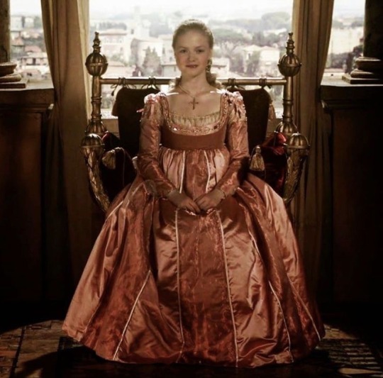
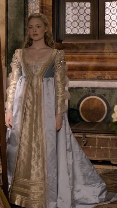

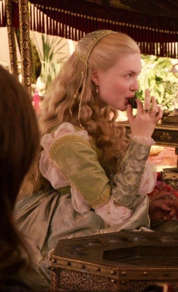
Baby Rhae my Renaissance beloved. Very light colors, she doesn’t always wear red quite yet, she likes to dress in a rainbow of the finest silks merchants have to offer. A high waist and gowns that are not super tight or defined gives her a more youthful look. In my head she likes to match with Ali so they both wear similar gowns, though Rhae’s are noticeably more grand. In her youth her hair was long and loose, covered with a cap during casual situations, braided and looped and covered with netting and pearls during balls/feasts/tourneys
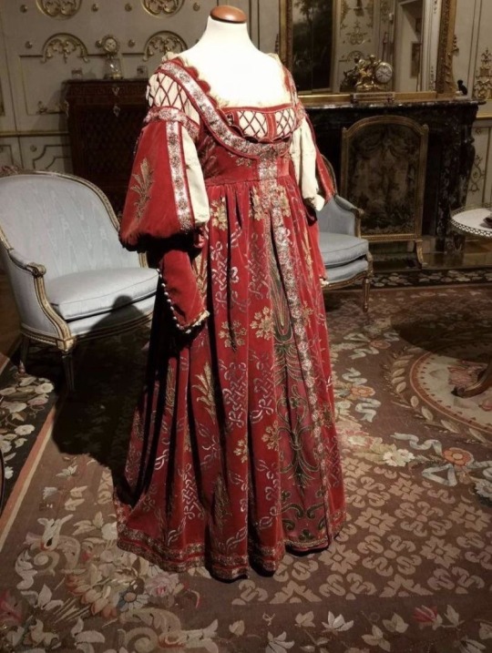
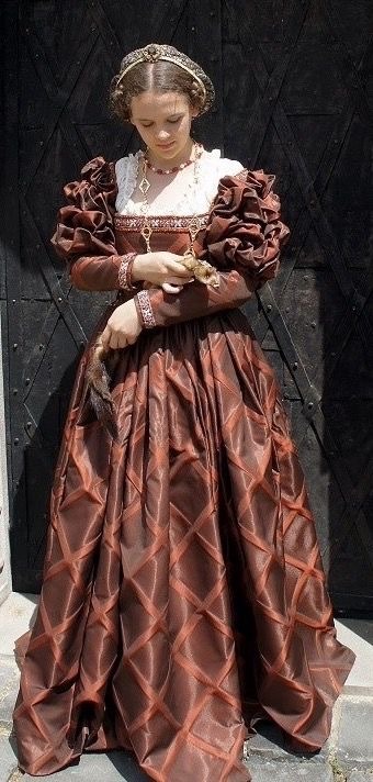
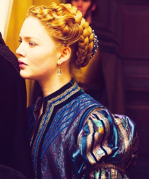
Freshly married Rhae starts wearing a lot more red, trying to really cement her claim as her fathers true heir. She still sometimes wears the gowns she used to match with Ali, however they’re more fitting to a married women, with dark colors and being slightly more fitted to her figure. Her hair is now up too, becoming for a married princess, but she still likes it to be rolled and braided, still covered with pretty things. She’s in a middle ground between childhood and womanhood
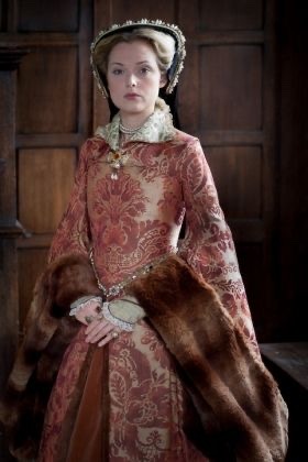
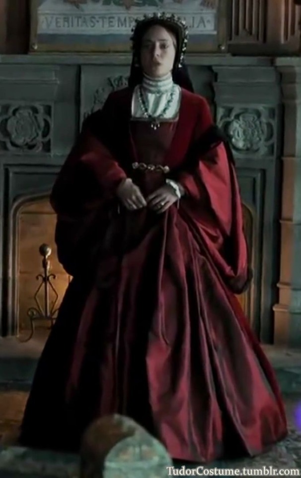

War time Rhae is when she starts becoming very “maegor with teats” she only wears red and black, loathing the color green. Her gowns are now high necked and long sleeved, stern and serious and fitting for a mourning mother. Her hair is often hidden by a hood and veil, but underneath its tightly braided and practical. No longer any signs of the youth she once was
#asoiaf#asoiaf hair and clothing#Rhae plus the cycle of targ doom makes me SICK#ur alive in my head bbg
115 notes
·
View notes
Text
An extremely fast-and-loose analysis of several TBD characters’ outfits (Croissant, Timekeeper, String Gummy) ft. Steampunk and Her Weird Cousins. take all of this with a grain of salt bc it’s just written off the cuff lol
⏳ Croissant is in a getup typical of ladies in sci-fi and especially mechanic-y types - half-zipped coveralls tied at the waist, and a tank top (grease and sweat optional). Doesn’t look one bit out-of-place in our era, which means it’s very suitable for our Croissy - an engineering student in the late 2010s/early 2020s. There’s a fun hint of steampunk in her design with the brass goggles, of course, which doubles as a spot of foreshadowing. Her Timecraft, though, is a special case! It’s a Renaissance Era-inspired, Da Vincian flying machine - this would be considered ‘clockpunk’.
⏳Timekeeper is steampunk. You all know what steampunk is. Top hat, monocle, puffy shirt sleeves, an embroiderer, various gears and gizmos - all retrofuturistically Victorian things. Overall a lovely design that makes people go batshit bonkers, and rightfully so. Their costumes tend to combine masculine and feminine articles quite succinctly, which I adore for them. Nonbinary slay.
⏳ Ruler of the Ephemeral Flow also draws a lot of steampunk, but also bleeds past that into other aesthetics - there’s kind of an early 1900s theme with the Ruined Future characters that I’ll touch on in a bit. In a lot of ways, it resembles a military uniform, with the jacket and cloak. The skirt-over-trousers look was fairly popular with Victorian women (well, skirt cage in this particular case), and two out of three of Teek’s outfits include it! I’d also like to point out a particular feature - the 19th century weeping veil, worn during periods of mourning; in this case, donned when Timekeeper is at their absolute lowest. Whoever designed these characters deserves a raise and a handjob. Moving on.
⏳ Timeless Love is pink. I fucking love pink. I don’t have many thoughts on it though but it fucks. Fantastic.
⏳ Director Croissant is decopunk - dieselpunk’s contemporary, but brighter and shinier bedfellow. (We’ll talk about dieselpunk in a bit.) Decopunk is based in the early-mid 20th century, much like dieselpunk, simply from a more optimistic perspective - because as we all know, nothing bad ever happens in the early 20th century. Symmetry, straight lines, smooth patterns, rich metal accents, admiration for crisp modernity and the beauty of machinery. The Future is Bright! Tech & invention will change our lives for the better! Art deco! Expressionism! et cetera. The cloak and chain makes her resemble a military commander, with her new leadership position.
⏳ The patterns on her outfit are smooth and geometric - diamond-shaped buttons, swooping arches on her cap, all decked out in gold and steel. It’s… a fittingly ironic aesthetic for a character whose invention unwittingly destroyed the world, straining to keep up her once-genuine mask of idealistic optimism. It also foils her nicely with String Gummy, whose gruff exterior belies a genuine sense of hope.
⏳ String Gummy is a dieselpunk - likewise based in the early 20th century, but darker, grittier and more pessimistic. Baggy military uniform-esque pants, gas mask, tiki skull motif, shaved haircut, metal prosthetic, and a Big Ass Rifle. In a similar vein, his skill + Smile Detector’s green glow resembles that of radium dial clocks, which is…. um. uh. Concerning. I don’t think pastries can get cancer or anything but but but but
⏳ Detective String Gummy (his “dashing uniform” as he describes it) is also rooted in dieselpunk - the archetype of the film noir detective. He’s more colorful and more unambiguously heroic, and - I was going to say “less depressive” than most examples of said archetype, but this is String we’re talking about, so the bar is lower than a Dutch conga line. Still tough as nails, gritty and relentless, but not without his softer spots.
20 notes
·
View notes
Text
New OC for Expats, let's go!
Ok, this wasn't even that hard! I was in the shower, and came up with a character sketch for my movie-star OC for Expats. What do you think? (Any similarities to real people, living or dead, are purely incidental).
Meet Elliot James. He is a Hollywood actor who got his start as a child star, but came to prominence when he appeared in a fantasy epic loosely based on events in early Medieval Britain, where he played a sweet, heroic squire who saved the day, but ended up giving his life in the process. Afterwards, he became a household name and in demand for everyone's epic or period piece anywhere, and while this was certainly very nice, it was somewhat disappointing to be typecast, so he tried to seek out other roles -- in indie films, horror movies, and genre cinema.
In rapid succession in his early 20's, he played a sick WWI veteran in a period piece with a plot like Flowers of Mordor, a prince in the medieval French history franchise Les Rois Maudits, a young Louis XIV, King Francis in a movie about Mary Queen of Scots (ok, yes, a lot of Frenchness here), and Nikolai Rostov in War and Peace. He also played Pip in Great Expectations, and Link in a cinema franchise of Legend of Zelda, and was one of the brothers in a multi-season Regency-era show similar to Bridgerton. He came to see his period piece and fantasy work as a "Jury duty" of sorts, but did it to please the fans and because he had some difficulty saying no. In the end, however, he put his foot down, and instead of taking the role of Jim Hawkins in Treasure Island, which he was all but being bribed to do, he insisted on auditioning for Blind Pew and Israel Hands.
Why does he get typecast playing young literary and historic characters, you may ask? Well, this is because after age 20, he looks like he essentially stopped aging. He is also short and slightly built, and looks like he stepped off a renaissance painting. He has striking hazel eyes that look like liquid gold, and naturally curly dark blonde hair.
In terms of personal history, he hails from South Dakota, from a long line of ranchers and early settlers to the area of Swedish and German extraction. (Hello, inspiration from Mr. Nisilë's white heritage). His mother raised him and his sister alone, and he has a very loving, down-to-earth and supportive family of origin. However, work as a child actor gave him a lifelong hair-pulling habit, to the point of trichotillomania at times, and he is completely unable to grow a beard of his own as a result.
In his personal life, he gets together with a fan named Marina who is an immigrant from Ukraine and has both Ukranian and Russian heritage. They connect over his upcoming work on War and Peace, and impending trip to Eastern Europe to film it. (This is obviously well before the present day). During his (very ample) free time, Elliot enjoys collecting and listening to vinyl records, attending live concerts, traveling as incognito as he realistically can with his distinctive looks, and watching off-off-Broadway plays (or whatever the LA analog is for this). Ironically, he has never been in a play himself, except for a school play at a very young age.
With his girlfriend and later wife, he is a total sweetheart, and his mental illness helps him understand hers. He is also a complete and utter goofball, slightly disorganized in his household and self care, and unassuming and slightly awkward whenever the cameras are off. The weirder the topic of conversation with him, the better.
His partner, Marina, works as a medical malpractice lawyer who defends doctors, and has a crazy, domineering mother who both loves and dislikes Elliot, and belittles his work behind his back, comparing him to old Soviet actors who she thinks are the true greats. However, she has no qualms about accepting gifts and financial assistance from him. (Guess who this is based on, haha).
Elliot never went to college himself, but he paid for the college education of his sister and Marina's law education. The only thing he asked for in return was that Marina and his sister share the particularly interesting things they learned whenever they could.
What do you think?
@konartiste @emmanuellececchi
11 notes
·
View notes
Text

F&B A Surfeit of Rulers
GRRM is playing loose with his inspirations here – this is very much 18th century, post-print revolution, not Medieval or even Renaissance. On the one hand, the history nerd in me is objecting that it doesn't make sense outside of the social and technological developments of that era (growth in the circulablity of texts, the increase of literacy, and the change in sexual mores and moral instruction). On the other hand, it's just too delicious not to include in your fantasy story. I mean, if real history is the raw material you're building your imaginary world from, not using things like Fanny Hill and Moll Flanders is inexcusably leaving the best ingredients on the table.
4 notes
·
View notes
Text
I went to the ren fair recently, which got me interested in the specific historical inspirations of common “Renaissance Festival” clothes and consequently bugged my sister about her research so hard that it made us miss our turn
One common outfit you see (thanks to Amazon) is this modern take on the kirtle


On the left: Amazon. On the right: a recreation of what people actually wore. You can see how we have the same basic concept with a very different execution. This is what you would call a kirtle.
Another common ren fair look is the outer-wear stays. Always with the un-collared billowy undershirt.


I want to draw attention to the lacing. Stands to reason that costumers now would use contemporary lacing rather than that of previous eras. But check out even the romantic depictions of clothing from the 1870’s below this. No grommets. That’s just pure fabric baby.
Very few renaissance era women ever wore anything exactly like the ren fair corsets. For one thing, cross lacing wasn’t common, and metal grommets were not accessible to normal clothing makers. For another, structured stays (or “bodies”) were underwear, not outerwear. (Apparently something more popular with English peasants than French peasants, who didn’t use them.)

Left: stays (underwear). Right: jumps (outerwear)
Stays are boned. Jumps are not. Stays/bodies were pretty expensive due to the craftsmanship, and a poor person would have budget for a single pair. You can imagine this investment was not as popular with women who did hard physical labor. Jumps got really popular in the mid-1700’s and largely replaced stays in working class fashion.
A brief history lesson: clothes are ephemeral; we lose them as they are worn out, cut down, repurposed, and thrown away. Before modern anthropology and modern record keeping, it was difficult for anyone to know what anyone else looked like in the past or even a country away. Words used to refer to one kind of garment kept being used even as that garment changed in structure and purpose over time. Even after paper became common enough for printing art, it wore out fast and art was lost. References were hard to get.
What we think of as “peasant garb” is actually the product of a game of telephone that travels back from Romantic Revival art, and many of those (urban) artists got their idea of what rural peasants wore from opera costumes. The costumers working at the opera were not going out to the country side to take notes on what farmers actually wore, nor did they want to. Opera is show biz, you want it to be evocative, but not ordinary. Their costumes would have been based on what urban folks were wearing, with extra little touches like a shepherds crook to make it look “rural”.
Below: some mid-to-late 1800’s artistic depictions of peasants wearing improbably nice fabrics/clothes (probably a reflection of opera costumes). The painting of the peasant girl on the right is wearing more-or-less jumps.


You can see how the romantic art depictions of unstructured vests eventually inspired the “medieval revival” styles of the 1960’s/1970’s which lives on in the ren fair. Not only the neckline of the vest, but the style of undershirt with an open neck and billowy sleeves.
Compare (unstructured, laced, outerwear):

Nobody wore that in the 1400’s or 1500’s, but they wore things that looked similar at a glance. When 1960’s artists went back looking for early modern/medieval styles to replicate, they mostly had a hodge podge of this art to reference and extrapolate from.
The fact that a historical laced kirtle with an over skirt looks a lot like stays worn on the outside, probably made this confusing for artists. Undershirts of the 1500’s were collared and high necked, however, with tighter sleeves.(Below, 1500’s kirtle)

Ironically the upper class of the 1500’s does have something similar to “peasant” costume, but the visual effect is achieved with a loose chemise and a U-necked bodice that fastens in the front with hooks.
One last example of 1800’s romanticism, this time depicting a contemporary girl. Looks familiar, right? We’re back at the ren fair, if you take the bonnet off.

It does look similar to what was being worn in the 1800’s. Here’s a cartoon showing a working class woman in the 1870’s.
TLDR; what we think of as “Renaissance” or even “medieval” peasant garb is actually a remix of the working class clothes from the 1800’s, with some confused memories of the kirtle from older art thrown in.
Structured stays? 1500’s. The blousy no-collar undershirt? 1700’s. The cross lacing? 1800’s.
Anyway. This image of peasants has always been costume & fantasy. That’s why I think it’s kind of fun that it reaches a terminus in the anachronism and fantasy of a Renaissance Festival.

Analysis of clothing by Kenna Libes in this painting depicting colonial women in the late 1700’s. Not really related to what I’m talking about, but an interesting spot between two eras.
it's funny although a little exasperating how artists designing "princess" or medieval-esque gowns really do not understand how those types of clothes are constructed. We're all so used to modern day garments that are like... all sewn together in one layer of cloth, nobody seems to realize all of the bits and pieces were actually attached in layers.
So like look at this mid-1400's fit:
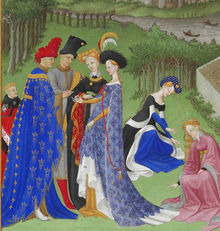

to get the effect of that orange gown, you've got
chemise next to the skin like a slip (not visible here) (sometimes you let a bit of this show at the neckline) (the point is not to sweat into your nice clothes and ruin them)
kirtle, or undergown. (your basic dress, acceptable to be seen by other people) this is the puffing bits visible at the elbow, cleavage, and slashed sleeve. It's a whole ass dress in there. Square neckline usually. In the left picture it's probably the mustard yellow layer on the standing figure.
coat, or gown. This is the orange diamond pattern part. It's also the bit of darker color visible in the V of the neckline.
surcoat, or sleeveless overgown. THIS is the yellow tapestry print. In the left picture it's the long printed blue dress on the standing figure
if you want to get really fancy you can add basically a kerchief or netting over the bare neck/shoulders. It can be tucked into the neckline or it can sit on top. That's called a partlet.
the best I can tell you is that they were technically in a mini-ice-age during this era. Still looks hot as balls though.
Coats and surcoats are really more for rich people though, normal folks will be wearing this look:
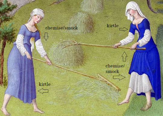
tbh I have a trapeze dress from target that looks exactly like that pale blue one. ye olden t-shirt dress.
so now look here:
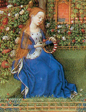
(this is a princess btw) both pieces are made of the same blue material so it looks as if it's all one dress, but it's not. The sleeves you're seeing are part of the gown/coat, and the ermine fur lined section on top is a sideless overgown/surcoat. You can tell she's rich as fuck because she's got MORE of that fur on the inside of the surcoat hem.
okay so now look at these guys.
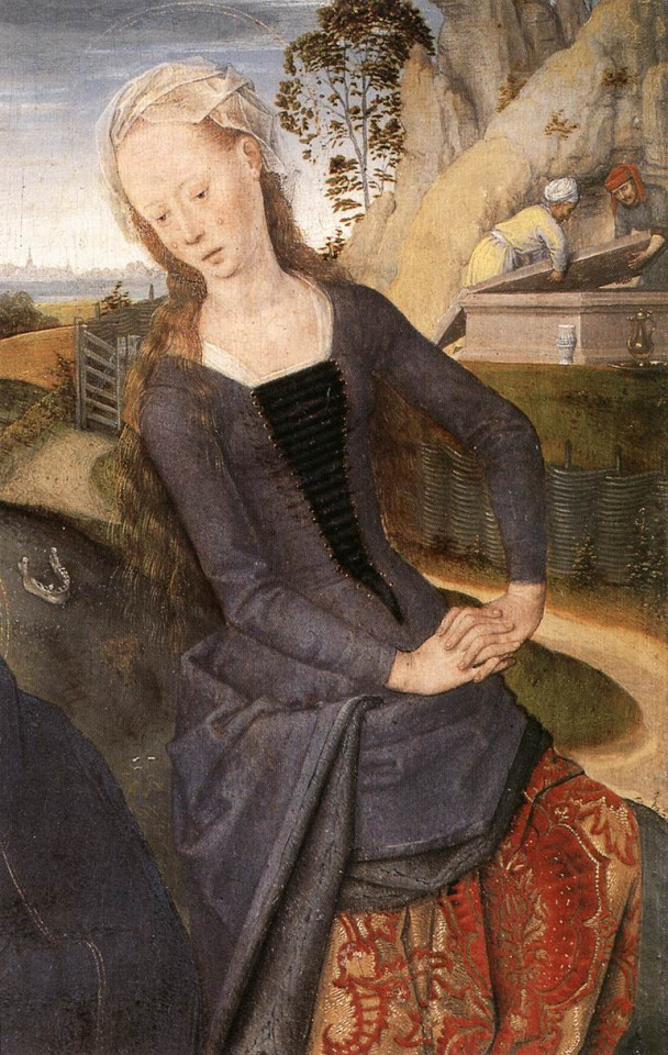
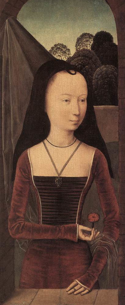
Left image (that's Mary Magdelene by the way) you can see the white bottom layer peeking out at the neckline. That's a white chemise (you know, underwear). The black cloth you see behind her chest lacing is a triangular panel pinned there to Look Cool tm. We can call that bit the stomacher. Over the white underwear is the kirtle (undergown) in red patterned velvet, and over the kirtle is a gown in black. Right image is the same basic idea--you can see the base kirtle layer with a red gown laced over it. She may or may not have a stomacher behind her lacing, but I'm guessing not.
I've kind of lost the plot now and I'm just showing you images, sorry. IN CONCLUSION:
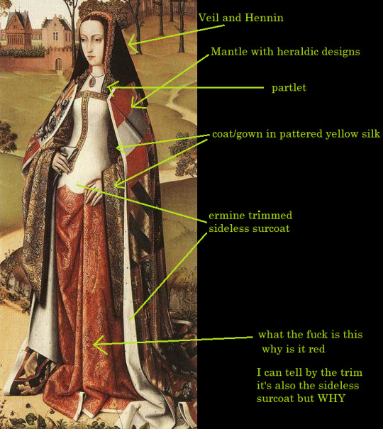
you can tell she's a queen because she's got bits I don't even know the NAMES of in this thing. Is that white bit a vest? Is she wearing a vest OVER her sideless surcoat? Girl you do not need this many layers!
24K notes
·
View notes
Note
As part of Operation Distract Moon-Floret
What inspires Sage's fashion choices in your art of him? I really like a lot of his outfits.
AWAWA Thank u!! Fashion design is actually a minor hyper fixation of mine, so his clothing is a kind of marriage between a few different styles
- 80s popular fashion to invoke the kind of neon cyberpunk metropolis I fashioned New Asteria off of
- Recession-era punk fashion to reflect his poor scrappy upbringing on Luna (its all the clothing he had that fit pre-Compact!)
- Renaissance fes anachronism bc A) he's a fantasy nerd B) I'm typically a fantasy artist and its what I like to draw
Normally I either draw him in *very loose* clothing or tight compression tanks because I think his Autism makes it so he doesn't like a lot of cloth touching his arms and legs. If you want my Sage Lookbook, here's his Pinterest board!
1 note
·
View note
Text
padmé’s summer meadow outfit:

here are the others:
my favorite padmé amidala outfits
wedding outfit
parade outfit
geonosis outfit
funeral outfit
battle outfit
tatooine peasant disguise
this outfit is yet another beautiful design by the talented Trisha Biggar, who worked on her outfits throughout the trilogy.
the relaxed style shows padmé’s more romantic side. the loose, golden dress is less inspired by the Asian, emporial feel of the first movie and uses many different inspirations that I will talk about!

these are the original concept designs done by the amazing Iain McCaig. obviously, the middle style ended up having the most impact on the final design, though the first hairstyle is somewhat represented, as well as the headband in the third sketch.

the material of the dress is mostly embroidery, tulle, and chiffon. the pictures above represent the chiffon portion, made popular in the 1850s and up. originally, it was made from silk, but changed over time to nylon and eventually polyester. this design is most likely the most recent polyester.it is her skirts and her cape-like feature that are chiffon.

the top pictures in this section represent the previously mentioned tulle throughout padmé’s dress. tulle, named after a city in france, was made popular in the 18th century and commonly used for veils, gowns, ballet costumes. the flowy look of this fabric helps to create the beautiful and light piece.
the next materials, pictured above, are the embroidered flowers. although I said there is not such an Asian influence, embroidery was invented in China during the early 5th century. from there, it diffused to all over the world, and now is associated with many different eras and cultures. however, because of the expensive cost of red thread, embroidered roses, like the ones on padmè’s dress, became more popular in the 12th century.

the top pictures of this section show the design known as embroidered tulle, which is a combination of said materials, which are explained and represented above. silk tulle was typical used when also using embroidery, creating a more smooth, heavy look compared to the light, previous tulle. this style, although not explicitly used, can be glanced at in both the bodice and the skirt.
here is a closer look:

the softer, more relaxed corset used in the costume design of padmé’s dress is less rigid and curve-setting than the typical corset of the early times, showing that it is a blend of many different styles, eras, and concepts, blending together in a very effective way. above are typical renaissance corsets. despite their obvious differences, these corsets can be shown to inspire the ribbon used throughout the piece.
(although I said corset, the term bodice would be more correct, because of the less rigid frame)

padmé’s dress can also be seen to be inspired by art. the paintings to the left, done by Gustav Klint, have inspired the colors of the design, with the golds and other bright colors also showing a somewhat embroidered look. the paintings to the right, known as “pre-raphaelites”, clearly display the flowing, loose look of the dress, while also paying homage to medieval fashion.

now on to the hairstyle! exciting!
the two buns on padmè’s head, wrapped in a gold structure, most closely resemble medieval crispinettes, at the top of the picture. used in the 13th and 14th century, these Goldman cages were very, VERY popular, with many different styles. however, thy were usually used to keep all the hair back, so the loose hairstyle of padmè is not entirely medieval.
the second inspiration could be said to be a renaissance influence. the half-up, half-down hairstyle, altough never popular in the style of padmè’s hair, was used throughout these years, with loose braids and loose ribbons.
finally, the last influence: Ozma, from the Wizard of Oz series. now, I read these as a child (and I loved them and highly recommend), but those unfamiliar, she is the magical princess of Oz. Her hair can directly corespond with padmè’s, with the two flowed too the side and the loose, excess hair. not to mention the eerily similar headband and gown, pictured in the left hand corner.

now, I can’t talk THIS much about two buns and NOT talk about the Queen herself, Princess Leia. with their matching brown hair and similar buns, the mother-daughter combination does put a smile on my face. not to mention, both dresses are somewhat iconic.

finally, I go into the romantic aspect of the look. the scene in which padmé wears this outfit is clearly love-fueled, and the outfit is not to be overlooked helping this. her influences (the renaissance, medieval times, artwork) can all be clearly tied with romance, and the end look of this design does not stray away from it, creating yet another breathtaking and lovely look for Natalie Portman to rock.
𝙞𝙛 𝙮𝙤𝙪 𝙬𝙖𝙣𝙩 𝙩𝙤 𝙜𝙚𝙩 𝙣𝙤𝙩𝙞𝙛𝙞𝙚𝙙 𝙛𝙤𝙧 𝙩𝙝𝙚𝙨𝙚 𝙩𝙮𝙥𝙚𝙨 𝙤𝙛 𝙥𝙤𝙨𝙩𝙨, 𝙡𝙚𝙩 𝙢𝙚 𝙠𝙣𝙤𝙬! 𝙩𝙝𝙖𝙣𝙠𝙨 𝙛𝙤𝙧 𝙧𝙚𝙖𝙙𝙞𝙣𝙜! 𝙨𝙩𝙖𝙮 𝙜𝙤𝙡𝙙𝙚𝙣 𝙡𝙤𝙫𝙚𝙡𝙞𝙚𝙨!
#padme amidala#star wars prequels#star wars#padme’s costumes#star wars padme#padme skywalker#padme deserved better#padme naberrie#padme aesthetic#padme x anakin#anakin x padme#anidala#padmeisqueen#anakin skywalker#skyberrie#padmé amidala#padmé skywalker#anakin x padmé#padmé naberrie#padmé
374 notes
·
View notes
Note
One thing I forgot to mention, but I think it's good to add. You also can't blame Beau Brummell for men's suits being tailored. Tailoring started in medieval era as a profession for making padded armor and in 14th century tailors started applying their techniques in everyday clothing making it possible to have smooth fitted clothing. This gave a birth to the late Medieval structured girdle, worn by men and women. Tailoring got more elaborate during the Renaissance and by Elizabethan era clothing was extremely structured. Here's examples of men and women's fashion from 1590s Britain showing how extremely tailored and structured the clothing of the upper class was.


Baroque fashion in 17th century was still structured but not as heavily as in the Elizabethan era, but there was a major change in 1680s, around the same time three piece suit gained it's beginning. It was also brought fourth by Orientalism, but it was instead for women's fashion. And that is mantua. Mantua was at first a women's casual dress (later in 18th century becoming very formal) adapted from banyan, which was a negligee used by men and women and inspired by kimono. It was very loose and fitted only with a belt and/or pins. It was not structured at all, but was instead used with stays which became the separate structured undergarment. Tailoring was a male dominated field (comes all the way from origins of tailors and they started as armorers), but new field was born, mantua makers, which was female dominated field and did not use the typical tailoring techniques. Mantuas were at first only fitted to the waist with belt and pins when dressing it like seen in the first picture of an early 1680s mantua. Quickly though small the pleats started to be stitched. This gave birth to the construction technique of drapery, in which the drapery was fitted to the body and then stitched, instead of measuring the body and making the lines and cuts on flat fabric. From mantua the new profession of dressmakers would develop many different kinds of Rococo dresses for example robe a la francaise and robe a la anglaise. By the end of 18th century structured dresses disappeared completely from women's fashion and the undergarments would do all the structuring.


This is how tailoring became associated with men's fashion. It was not in Regency era and definitely not done by Beau Brummell. 18th century suits were tailored, they were just looser and less structured in style than Regency suits or especially doublets that came before them. But they were still structured and made with tailoring techniques. The Orientalist styles that were born in late 17th century did highlight even in construction the differences in men and women's fashion, and the new shift that would happen a hundred years later after the French Revolution highlighted that separation even more, by leaning in men's fashion towards more structuring and in women's fashion towards less structuring and lighter more flowing fabrics. And sure Beau Brummell was known for very finely tailored fashionable clothing, and I'm sure he did play a part in making highly tailored clothes fashionable for men, but he did not invent it, and it was part of a much longer and bigger process than him.
https://www.tumblr.com/thebaconsandwichofregret/189924928150/comepraisetheinfanta-thebaconsandwichofregret
whenever i see people rbing the op without the additions i die a little inside so i thought you should have a go at debunking it 🫠
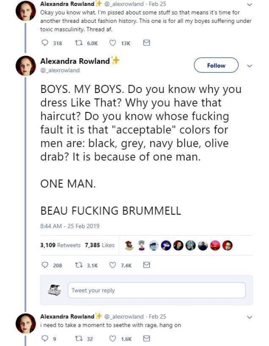


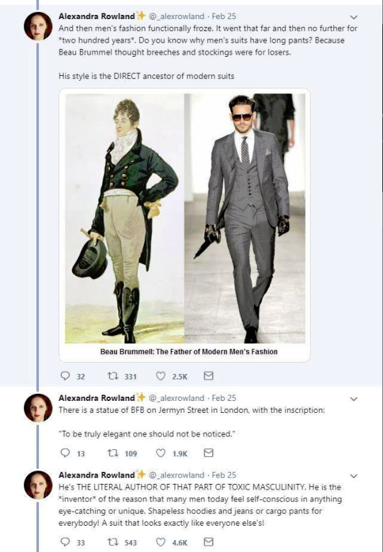
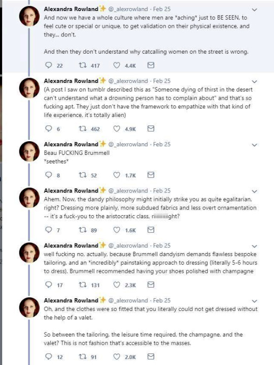
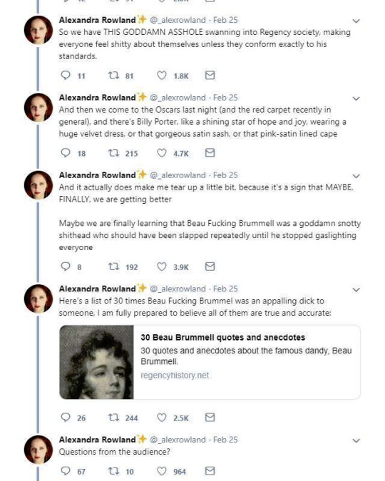
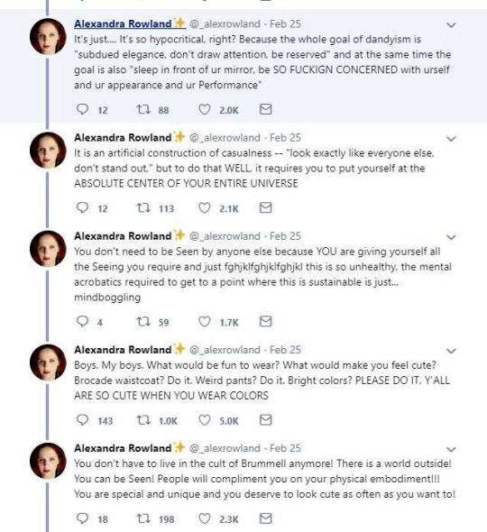
So these are the tweets from the post. I had blissfully not come across it before. This is one of the weirdest takes I have ever seen. It's amazing to see these fashion history takes that are so boldly and confidently wrong and inaccurate.
It's honestly hilariously ignorant to think that a massive cultural and societal shift that took couple of centuries, was all because one guy. It's so reductive and even goes to the great man territory to pick one person to blame for something like this that really had much more broad and complex reasons than "a guy did it". It's stressed in this tread that Beau Brummell was not noble or a gentile and "just some guy", so how would he singlehandedly change the fashions and concept of masculinity of the whole western world? He was a London socialite, it's not like most of his contemporaries in continential Europe knew about him. Like maybe the French, but does anyone really believe people in Eastern-Europe or Nordic countries or in the Mediterranean knew about? Not to mention places like US. Yet everyone dressed like that in his lifetime, so how could his influence reach so far so quickly? Not even kings and queens could so directly and massively shift the fashions. So in the face of it the whole claim is ridiculous, but it's also full of inaccuracies.
The shift from Rococo fashion to regency fashion was extremely stark and quick in both men and women's fashion, but it happened during 1780s and 1790s, before Beau Brummell became a well known figure in the London society (he was born in 1778 and became well-known in the society after his military career, during which he befriended the Prince of Wales, around the end of 1790s). Here's first an example from 1780s and then from 1793-94 and 1797.

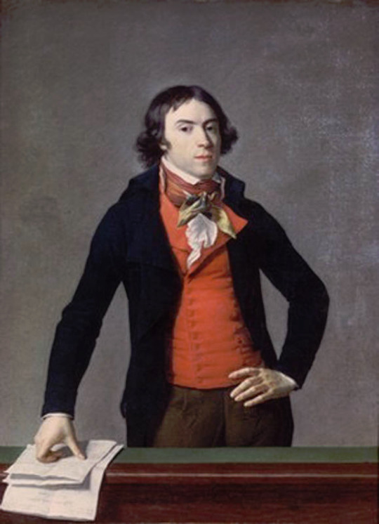

The one from 1780s still has some rococo elements like the wig, but it's already much more toned down and the coat is already turning from frock coat to a tail coat. It's an example of the more casual men's countryside dress from the period. The court dress was still quite elaborate, though also toned down from the 1770s. But there's a big shift when it comes to the examples from 1790s. They are unmistakably Regency fashion. All of these example are French too. I'm sure these people had no idea and gained no influence from an unknown middle class English officer. So what did actually happen? Well, I'm pretty sure the French Revolution in 1789 had a little bigger impact on the European society and fashion than Beau Brummell.
I'm not going to go too deep into this, since I'm working on an in depth post about the masculinity and fashion in the modern era and I go into detail about how the French Revolution had a massive part in shaping them. But the short version is that the French revolutionaries rejected the elaborate fashions of the Rococo French nobility (in both men and women's fashion) as those over the top fashions stood as symbols of the excess wealth of the nobility and the extreme wealth gap between then and the rest of the people. This is also why the high fashion was getting toned down thorough the 1780s before the Revolution. The anger towards the ruling class was mounting at the time and it encouraged the nobility to down down and try to act a little more palatable in their aesthetics to maybe appease the angry people without doing any actual change to address the wealth gap and the centralized power.
The revolutionaries looked for ideal masculinity and femininity elsewhere then. To contrast themselves against the ruling class, they looked to the antiquity and it's simplicity as well as the peasantry and the country gentleman fashion. Romanticism was the driving force behind the artistic expression of the Revolution. It weaved nationalism to the class struggle that was at the core of the revolutionary movement. So the Revolution was not just the working class and peasantry against the ruling class, but the French People against the nobility. This is when physical labour, militarism, dominance and leadership, really became intrinsically attached to masculinity, as the ideal man of the revolutionaries was a working peasant, who with military power took the the power back to the people from the nobility. The democracy would not last long, but it's not a mistake that only men could vote under the new democracy after the Revolution was won. It's also not a mistake that even when the post-Revolution France eventually abolished slavery (but not without some push-back first and a couple of slave revolts to force their hands) they did not give most people of color rights to vote. Since colonialism whiteness had become intrinsic part of masculinity and femininity, which was part of the dehumanization of everyone else, and the new form of masculinity and femininity born out of the Revolution did not contest that. In fact the Enlightenment philosophy that had laid the ground work for the Revolution and the Romantic movement and it's nationalism that were driving force in it, in no way contested colonialism or it's white supremacy. Which is why the power in the new democracy went to the (mostly) white men.
These elements were in the new men's fashion too. Nationalism, the idealization of militarism and antiquity seen as the origins of democracy made it and especially Antique Rome perfect inspiration for the Revolutionary France. The short hairstyle was inspired from the Roman fashion seen in statues. The fashionable tail coat was influenced by military uniforms and the short jackets of the working class. The long trousers also came from working class dress. Here's examples of the revolutionary fashion from first 1792 and then around 1790.
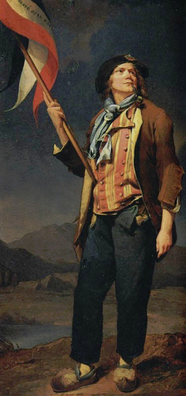
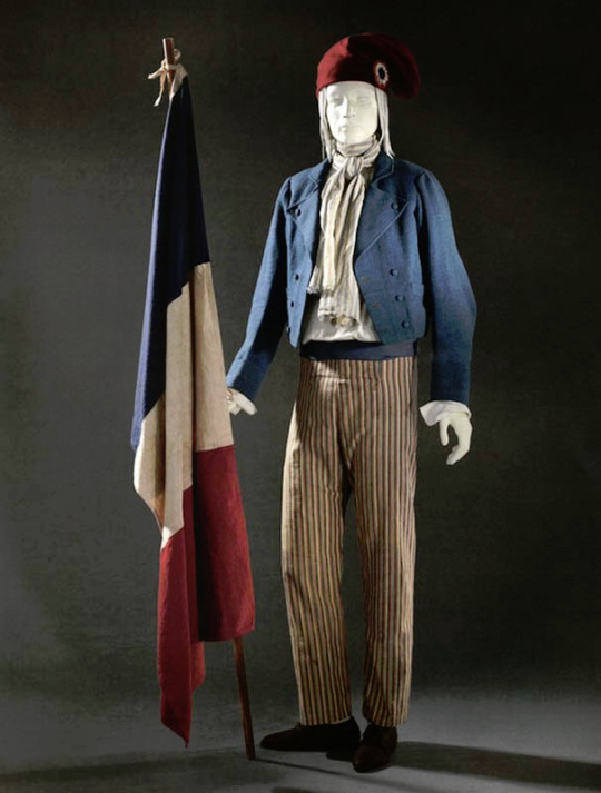
To be very clear, the revolutionaries were not a single entity with single ideology. They were collection of movements, who were united in their shared desire to overthrow the ruling class and establish some sort of democracy. But inside the movement were much more radical movements than what eventually ended in power after the French nobility. Socialists, abolitionists, feminists, slaves and others also fought for the Revolution and there was a lot of internal struggle too. Romantic movement was also very varied and contained extremely nationalistic elements as well as outright socialist elements.
Beyond the direct and stark effect the French Revolution had in especially France, but everywhere in the western world, the 18th century fashion was never as extreme as in France. If you put the most elaborate French court fashions of mid 1700s and Beau Brummell's style next to each other the difference is certainly massive, but fashion for men as well as women was always much more restrained and somber in England. Here's an English example from 1755-65 and for comparison a French example from 1755.

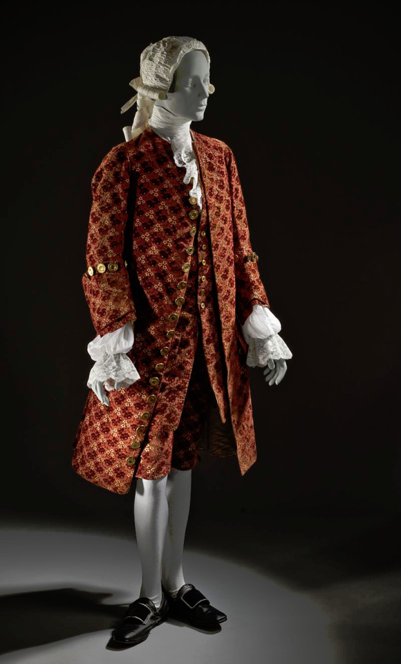
In fact as the tensions were rising in France the upper class begun to adopt the more toned down English styles. After the Revolution the new Republican styles would spread to Britain too. In Britain though Romanticism had a more pronounced effect as it stayed firmly monarchist. Therefore the English fashion was especially influenced by the styles worn by country side gentlemen.
There's another claim in the thread that fully fails to understand the broad implications of fashion and societal gender and how these things change and evolve. It's the claim that Beau Brummell created the modern men's suit and he's the reason the suit has long trousers. We already went through how long trousers got into men's fashion and it was not him. But the writer is not wrong in saying that Beau Brummell's outfit in this picture is a direct ancestor of modern men's suit. It is.

But you know what else is a direct ancestor of men's suit? This.
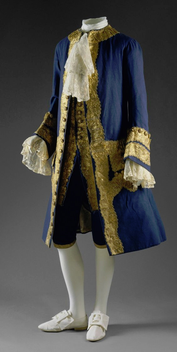
The modern three piece suit has it roots as far as in late 17th century. Before suit men wore doublets, which style resembled women's fashion much closer than the suits would after it (as seen in these examples from 1630s). However the distinction between men and women's fashion had started to grow much earlier. A big shift that happened during the 16th century was that men stopped wearing skirts. Men and women wore the same garments for centuries before that. The styles and silhouettes for men and women had some differences (the skirts were often shorter for men for example) but they were parallel to each other. I wrote a whole very long post about how skirts stopped being acceptable for men. In it I write about how the shift in men's fashion was part of the large shift from feudalism to colonialism and capitalism, that needed a new hierarchy to justify the new system after the previous divinely justified feudal hierarchy was no longer an option. The new hierarchy was white supremacist patriarchy and therefore needed a clearer distinction between white men and white woman, that would also help distinct white people from the racialised people.
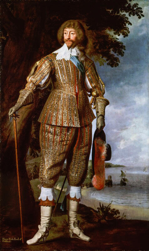
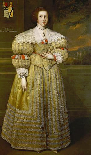
But such fundamental changes in the societal structure and culture are long processes. The process was continuing in the latter half of the 17th century, when Orientalism first became very popular. Orientalism is the dehumanization and fetishization of Asia and North-Africa, and it was born as the European colonial project was properly getting going in Asia. Colonialism in Asia and North-Africa took a little different form. I suspect it was because it was not that long ago, when Europeans had felt inferior to many of the peoples and empires in Asia and North-Africa, which they had always had much closer relationships with than the rest of Africa and certainly the Americas. I think that's why Orientalism is such a mix of coveting Asian and North-African cultures and bodies in a very fetishistic ways, while also demeaning and diminishing them. Nevertheless, Orientalism had a huge impact on European fashion in late 17th century. Both the way men and women's clothing was made after that to this day was strongly impacted by Orientalism. The coat and waistcoat combination was an adaptation of Turkish fashion. The three piece suit became popular in 1670s and fully took over men's fashion in 1680s (an example from 1687). The cravat was also adopted around the same time to men's wear from a light cavalry mercenary army in the Habsburgian Empire known as the Croats or Cravats. They were mainly Croatian, which to Western European was almost "Oriental" due to their proximity to Asia and Turkey in particular, and therefore the popularization of cravats as a fashion item was also influenced by Orientalism.
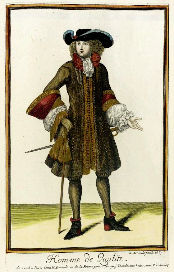
The Regency three piece suit also has all the same elements as the suit 150 years earlier, the individual pieces had just evolved into different different cuts. The three piece suit in fact still has the same elements to this day, they have just kept evolving.
My point is not to in any way deny Beau Brummell's influence on Regency fashion. He was the most influential fashion icon for men in his era after all. I hope this just made it very clear that these bigger changes are not about individual people but much larger shifts and movements in society and culture. His actual influence was popularizing some of the English countryside styles mentioned before in the fashionable London society, making extremely elaborate cravats into the fashionable items of the day and becoming the image of the English dandy.
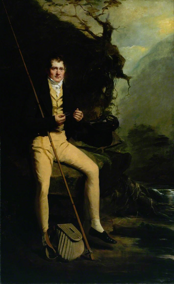
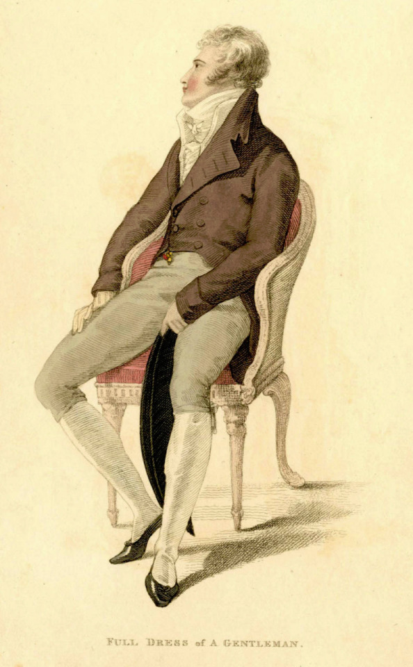
The picture of him above shows him the typical English countryside suit with dark blue tail coat, white cravat and light pantaloons with polished hessian boots. He helped to make the outfit and pantaloons in general fashionable. Breeches would stay as the formal leg wear for some a decade still, till young fashionable men would start to use black or gray pantaloons in formal events too. Pantaloons were very fitted, but the trousers, that were fashionably quite narrow at the time, but looser, really came into the casual fashion in 1810s. As seen before their roots come from the working class fashion that was first popularized in the French Revolution, but they had been very informal and while they were still not quite as formal to be able to use in a formal event, they became acceptable in more casual events. Beau Brummell is credited for inventing or at least popularizing pants that have strap to go under the foot in order to keep them straight. Here's first a painting from of a gentleman in a very country style emphasized by the setting. Then a illustration from 1810 of a full formal dress with breeches and a fashion plate from 1817 of day wear with trousers.

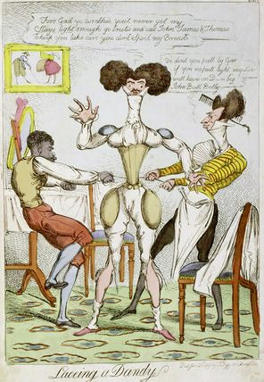
The thread also misses what dandy really was. Dandy was the embodiment of the middle class social mobility of the modern era. He was the "self-made man", the fashionable middle class and the new celebrity of a post-feudal era. He dressed in refined fashionable countryside middle class clothing and was celebrated for his style and refinement, not for his birth. Ironically though, there was a distinct reactionary quality to the Regency dandy. After all dandy did not embody social equality, but mobility. He was the ideal man of the capitalist hierarchy. A bit of dilemma for the dandy was that being extremely fashionable was central to the dandy, but after the French revolution being too fashionable and too concerned about looks had been associated with the aristocracy and was now therefore unmanly. Which is why dandy quickly came to be seen as effeminate. There is a lot of satiric cartoons from the time period that make fun of dandies and their preoccupation with fashion and looks. Here's couple from around 1810s.
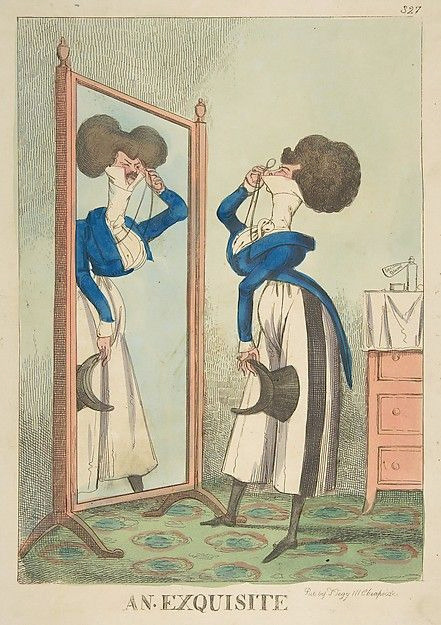
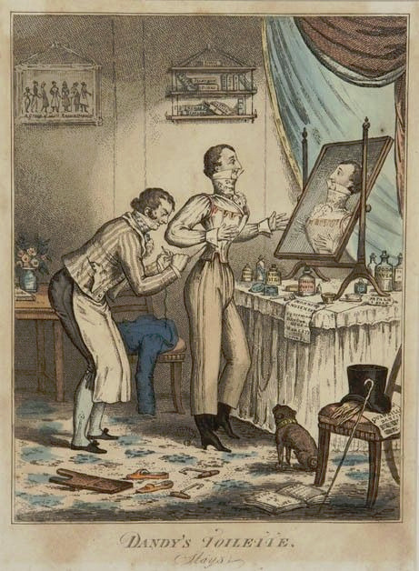
In conclusion it's pretty ridiculous to say modern men's fashion was all created by one guy. The real reason why men's formal suit (and to be clear more colorful and elaborate styles have come and gone from men's informal fashion during that time) has been what it is for more than hundred years is because much bigger changes, like capitalism, colonialism, Orientalism and white supremacist patriarchy.
684 notes
·
View notes
Text
So I Finally Watched Goncharov (1973) - WHAT NOW?
First off, congratulations on breaking out the Laserdisc player. Or low-quality MP4 rip or whatever. I hope you enjoyed what is arguably one of the best (and low-key queerest) mafia thrillers of all time.
BUT RIGHT, what do you watch now that you’ve whetted your whistle for weird semi-gay mob violence? Well, here’s a list of eight recommendations (why 8? I couldn’t think of ten that were quite good enough, that’s why) to get you going.
8. AKAGI, 2015.
Underground gambling, incredible intensity, betting your own blood on mahjong... this one’s heavy on the gambling terminology, and can be a little hard to follow if you don’t know about the game, but it’s worth it.
7. UN ASONTO DE PLATA Y PLOMO, 1988
“An Affair of Silver and Lead” is one of the best proto-narcocorridas out there. A borderline rock opera (with a gloriously copyright-infringing soundtrack), Un Asonto took a look at Scarface and said “yeah, but what if we play how awesome being a gangster is straight?” Compared to Goncharov it’s devoid of nuance, but the cinematography and violence is beautiful, and the characters are brilliant. If you aren’t cheering after watching Fuego Caliente gets his ass handed to him by Diego De La Montoya, check your pulse.
6. WELCOME TO WABASH, 1992
Despite the small town Indiana setting, this gets very dark, very intense, and very weird very quickly. Interesting for many reasons, not the least of which is because it blew a hole in the “war on drugs” rhetoric of the era (one of many reasons it didn’t get a wide release). Wet Charlie’s story is a hell of a tearjerker, and the background “we can’t call it a romance but it’s totally a romance” between Jen and Big Linda is a remarkably heartwarming thread in a movie that ends with 80% of the cast dead.
(Jen and Big Linda survive. That’s not a spoiler, you find that out in the first scene, thank you nonlinear storytelling.)
5. BURIED IN MUD, BURIED IN BLOOD, 1960
If Goncharov had more beatniks... it wouldn’t be this, but it’d be kinda close. A knee-jerk gritty backhand-response to the stylish heist movies of the era, BIMBIB is a tale of desperate thieves trying to unload a stolen Renaissance painting before they get fingered - or worse, before the bill for everything they used to steal the painting comes due. Spoiler: SHIT GOES BAD QUICKLY. Might have been partial inspiration for Guy Ritchie’s later work. Fair warning: If you’re allergic to bongos, watch it with the subtitles on and sound off. And no, the title makes no sense, but the studio insisted on using it.
4. SHOOT THE SHAGGY DOG, 2002
A bargain-bin treasure, STSD was a direct to video release that should have at least gotten an arthouse release. Half the actors are wooden and overly stoic, the sets are obviously sub-zero-budget, the cinematography is a joke, but the plot will keep you on the edge of your seat, and the few good actors - notably Chaim Wallace’s turn as Frankie - have enough gravitas to pull the rest along. “Gang wars are always brutal, kid. When the other gang’s the police, that doesn’t change anything.” Goosebumps, every time.
3. THE GODFATHER, PART 2, 1974
I mean, if you’re gonna watch Goncharov, you might as well, right?
2. ÖFEKLI KAPLAN VE SONSUZ GüN, 1989
It’s TURKISH GONCHAROV! I’m not actually kidding. “The Furious Tiger and the Endless Day” started out as a remake of Goncharov, before the director took it hard in another direction. Hence why the Goncharov expy, Avci, dies halfway through the movie, and the equivalent of our favorite ice-pick wielding “little guy”, Demirci, is the one to tie up the loose ends with his own flavor of brutality. If you’re of a certain age, you might have seen part of it already - it got shared on Kazaa and Limewire a lot, usually with filenames that suggested it was porn. Not GOOD, but surreal as hell, especially if you’ve just watched the actual Goncharov.
1. FACE EATERS FROM DIMENSION X, 1990
Don’t let the B-movie title dissuade you. Once you get past the Troma-typical gorn and sex, you’re left with a remarkably tight crime story about warring families, the inevitable breakdown of diplomacy, and a stinging rebuke of the concept of the Nash Equilibrium. Also the titular Face Eaters are freaky as hell and I want one as a plush toy.
#Goncharov#Goncharev#I don't know why you keep spelling it as Goncharev#There was ONE VHS release that misspelled it#Plus I guess one of the two teaser posters#It's Goncharov dammit#movie recommendations#Feedback is welcome
13 notes
·
View notes
Text
Beware Of Massive Nightgowns, Part II: Lucille and Comparison
Part 1
So, I've already done a bit of analysis on Lucille's robe and nightgown vis a vis the Aesthetic Dress/Artistic Reform movement of the 1890s-early 1900s. Here is that post for background. But in summary: her robe in particular reflects a niche trend at the time for loose, unstructured tea gowns that drew inspiration from elements of Italian Renaissance clothing.
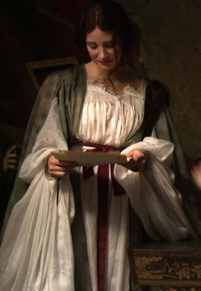
(Lucille's robe and nightgown. Finding good full-length still shots of this costume is HARD. But I think this one gives a decent impression of what's going on.)
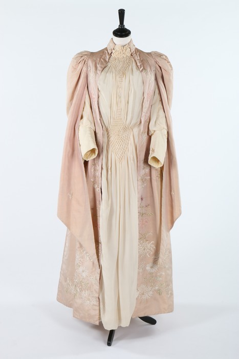
(Tea gown c. 1890. Kerry Taylor Auctions. I wanted to pick an image I hadn't shared before, and the split sleeves seemed very Murder Robe-esque. This one doesn't have the watteau back, but the ones I shared in the previous post did.)
Once again, there's very little resemblance to anything really worn for sleeping or lounging in the actual eras of her adulthood. Or her mother's, for that matter. Like Edith's nightgown, it seems to be a blending of historical trends from different types of clothing to best help convey things about the character in those moments. Which...yeah, that's exactly what costuming period film is. And if done correctly, you end up with something lush and artistic that's still grounded in historical reality.
I just. I really love these costumes, guys.
Interestingly, I've found some Victwardian nightgowns that do look a bit more sheer and/or low-cut:
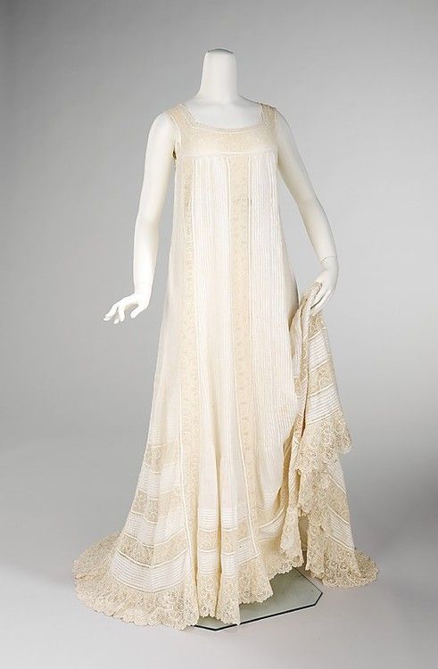
(Nightgown, c. 1905. Met Museum.)
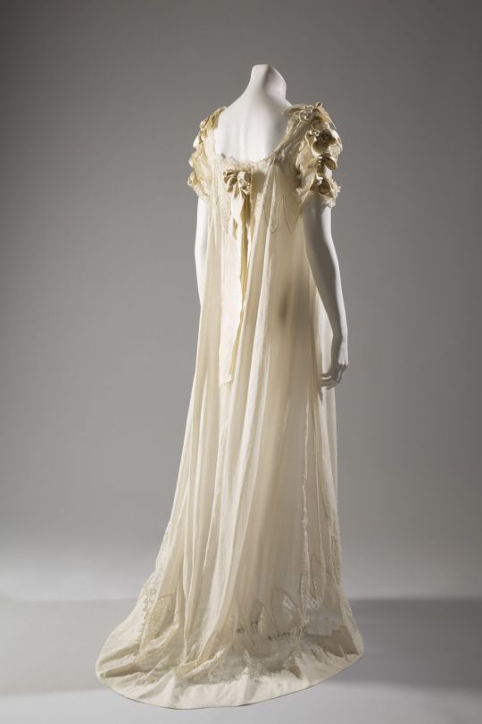
(Nightgown c. 1900. FIT Museum. Elle.com says this was part of a bridal trousseau, and that was a common context for more revealing nightwear. I'm not sure I trust their research standards, but that does fit with my theory that the Murder Nightgown is Lucille's sexy lingerie if it's true. Warrants further investigation.)
Which goes along with the idea that the robe/nightgown set is the most "modern" outfit we ever see Lucille in. All the historical callbacks are from the 1890s-early 1900s, decades after her usual Natural Form day gowns. And yet, as I said before, they're revival styles from those eras. Simultaneously the newest looks we've seen on the character, and the oldest clothing influences in the entire movie.
As the costumer said repeatedly, this outfit represents the gloves- or rather, corset -coming off for Lucille. She's not holding anything back, and the full depth of her...Whole Deal is on display. It also reflects the Gothic Revival architecture of the house even more completely than her daywear. There's very little of the 19th or early 20th century left in her visually at this point- she IS the house, and they are both creatures of the past. If Edith's nightgown represents her leaving her familiar world behind, Lucille's shows that she's completely in her element.
I also feel like Edith's nightgown makes her look younger and more vulnerable, while Lucille's doesn't really have that effect. Kate Hawley mentioned that they had multiple versions of Edith's nightgown with different sleeve sizes, to make her look smaller and more overwhelmed as the plot takes its toll on her.
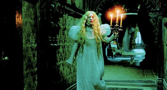
(Probably helped by the fact that you see her wear an almost identical nightgown as a child, and then a much more subdued one as an adult in Buffalo.)
Lucille, on the other hand, has all the volume lower down on her sleeves and the hems of her nightgown and robe, which to me makes her look even more imposing. They're also relatively sleek-looking garments, especially when they're not in motion- streamlined volume to Edith's huge puffed sleeves and ruffles.
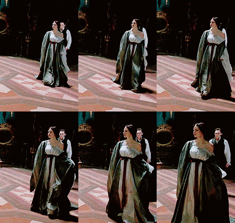
(GIF by @anneboleyns. Seriously, stills of this ensemble full-view are impossible to find.)
Also note that her hair, while more Down than we've ever seen it before, is still at least braided in these scenes while Edith's is completely unbound. Which I feel sort of adds to the visual of her as predator and Edith as prey.
Tangent: This movie uses women's hairstyles for storytelling in a really effective way- note that Edith's hair is even up during the sex scene, underscoring that as a moment of confidence, maturity, and control for her. You can do cool things like that when you're not allergic to hairpins, Hollywood! WHAT A CONCEPT.
In conclusion, both nightgowns are fascinating to explore vis a vis actual history, and do a wonderful job of combining period reality with artistic storytelling. But that's true of basically all the costumes in this movie, so. Yeah.
Which one do you like better? They're both gorgeous, but I'd love to hear how many people are Team Butterfly vs. Team Murder Sleeves!
#crimson peak#gifs#long post#costumes#costuming#historical costuming#movie costuming#lucille sharpe#edith cushing
221 notes
·
View notes
Text
History of Chinese standing collars (part 3: post republican era)
Quick recap: I was debating with myself whether “Mandarin collar” should be a thing because standing collars throughout Chinese history looked different. I went through the Ming and Qing dynasties in part 1 and the republican era in part 2, now I’ll look at what comes after that. I numbered the styles in parts 1 and 2 but they’re only guidelines so you don’t have to remember anything.
So in this post we’ve kind of reached the end of the era where fashion consisted of a single silhouette in any given year and all hell ran loose. I’m having a lot of difficulties classifying things as Chinese or Western because the distinction is really blurred, and I also ran into problems explaining why certain historical European things looked so similar to Chinese ones so there will also be a lot of confusion.
1950s & 60s Chinese application
Summary of 1950s fashion, mainland and others.
Because of the communist victory in the Civil War, fashion in the mainland was different to other (capitalist) areas populated by the Chinese diaspora such as Hong Kong, Macau, Taiwan etc.. Let’s look at capitalist area fashion first; I’ll be referring to Hong Kong because Hong Kong was the center of cheongsam making at the time.
Collars on 50s Hong Kong cheongsam grew taller on the basis of collar style 10 but retained the rounded, tapering edge, resulting in a v shape gap down the middle that weirdly recalls collar style 6 from part 1 and part 2. It’s basically completely identical to collar style 6 but stiffened and extremely form fitting. It’s usually closed with one pankou at the base but because of westernization, 50s cheongsam often had no visible pankou----everything is closed with snap buttons, zippers or hooks and eyes/bars. An important aspect of collars of 50s and 60s Hong Kong cheongsam is that they left out the binding around the neck. All cheongsam prior to this point were bound around the exterior edge, the side closure, the slits and the collar seam (on the bodice not the collar), 50s cheongsam collars purposefully neglected the binding at the collar seam for some reasons. This makes the collar look like it’s one continuous piece of fabric with the bodice, which it isn’t. A lot of modern representation of cheongsam or any Chinese inspired clothing (in video games, books and anime etc.) do this, even if the character is from before the 1950s. It REALLY bugs me. If you are an artist or writer and designing costumes for Chinese characters prior to the 50s, please include binding/trimmings on all three seams, it’s an easy way to bump up historical accuracy. With that said, completely plain collars without any binding or trim was actually the most common. Let’s call this collar style 13.
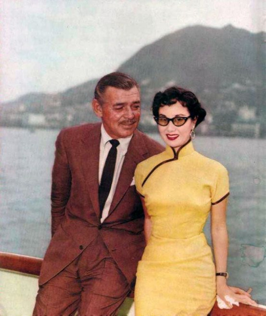
Source here
1954 photograph of Li Lihua and Clark Gable. Collar style 13 with stiffening and no collar seam binding. You can see how firm and neck hugging the collar is, contrary to a lot of modern cheongsam collars which are saggy and loose.
The popularity of collar style 13 continued into the 60s. When the cheongsam fell out of popularity, it ceased to exist as well.
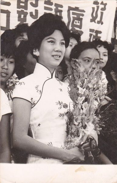
Source here
60s cheongsam with collar style 13. I’m really not a fan of the nude/light lipstick trend of the 60s, like, as a person with no lip color definition it makes me look like a potato.
Now moving on to mainland collars. In the 1950s, cheongsam with the 40s collar style 12 were still occasionally seen, but the fashionable collar shape also became taller and was similar to the Hong Kong collar style 13. Interestingly, some 50s mainland cheongsam retained the binding around the collar seam, making them look more “traditional” in a sense. However, collars both with and without collar seam binding existed and it was just a matter of personal preference.
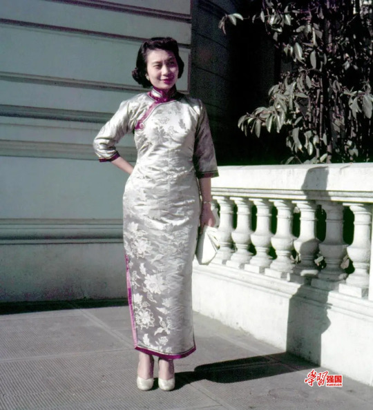
Source here
1950s photograph of a mainland lady in cheongsam. The collar is taller and closes with one button, much like Hong Kong collars of the era, but the neck binding is present.
Aoku robe collars from the 1940s onward mostly had the 40s style low collar, although in the 50s and 60s they rose in height very slightly.

Source here
1964 poster showing a girl in aoku, the robe has a low, rounded collar.
However, garments with a standing collar became worn a lot less frequently in the 50s and 60s in both mainland and non-mainland areas, since a lot of people adopted Western fashion.
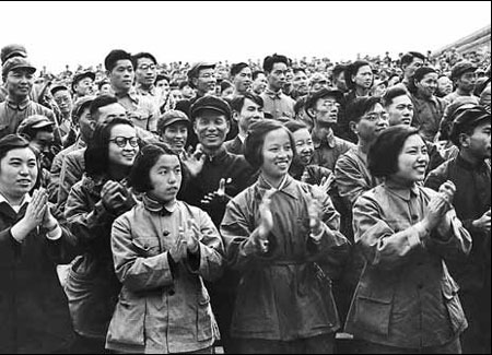
Source here
1950s photograph of a group of mainland people wearing jackets of Western construction. Some of them seem to be wearing informal military jackets, commonly known as “Mao suit” or “Zhongshan suit” nowadays, with folded collars.
Source here
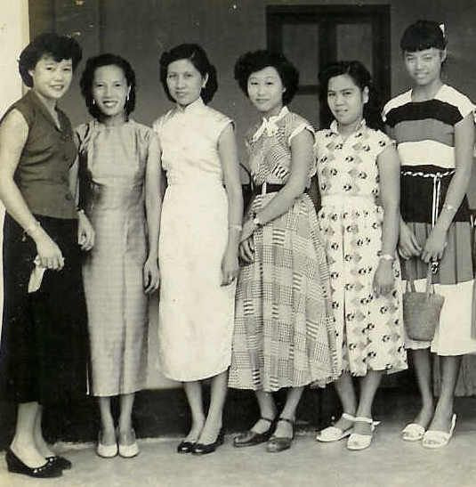
1950s photograph of some women in Malaysia, some in cheongsam and some in Western New Look dresses.
Western application
I think it’s also quite important to discuss how Chinese standing collars were perceived by Western designers, because the Western fashion industry does hold a lot more power globally and also reverse influenced Chinese collar designs in the post 1960s era. So, in the 1950s and 60s Western designers thought cheongsam was really cool and produced a lot of affordable sewing patterns for their versions of cheongsam. I think this is also because pre-1950s cheongsam didn’t use the Western construction method and patterns needed to be individually drafted so it was difficult to make mass produced sewing patterns. From all the sewing patterns I have seen personally, the super tall standing collar popular in Hong Kong was not really appreciated by Western designers at all?? Western cheongsam sewing patterns all had the very low 1940s style collar, combined with an hourglass silhouette New Look bodice and skirt, looking rather anachronistic. These collars also didn’t have binding/trim around the collar seam, in line with fashionable Hong Kong cheongsam of the day.

Source here
1950s Advance sewing pattern for cheongsam. The collar is low and has rectangular edges, something about a decade out of fashion in Hong Kong and Shanghai. No collar seam binding.
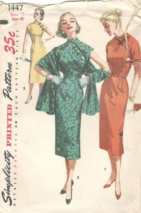
Source here
1950s Simplicity sewing pattern for cheongsam. Likewise with super low 1940s collars. Collarless cheongsam died in China in the mid 1920s, yet it lives on in the imagination of Western designers. By the way, the frog closures with a quatrefoil shape are not Chinese, I’m gonna write another post about this. I love the look in the middle it’s very glam.
1970s and later
The post 1960s era is what ultimately created the confusion around standing collars nowadays. Around this time Western and Chinese fashions started to merge and become one, and garments made completely in the historical Chinese method were more and more difficult to come by; Western construction techniques reigned supreme.
From the 70s onward, most “Chinese collars” had the 40s rounded edge shape but were either medium low or medium height. The lack of collar seam binding persisted into the current day, which is something I kind of lament because without this binding collars easily read as Renaissance doublet... (more on that later)
I usually avoid calling any standing collars from the 1970s onward Chinese/Mandarin because 1) standing collars were never a uniquely Chinese thing to begin with 2) since cheongsam was no longer fashionable among actual Chinese people, designers who made cheongsam pulled all kinds of shenanigans without any historical precedent whatsoever. Also, since clothes with structured/stiffened standing collars stopped being a staple in the average Western person’s wardrobe, white people started calling everything with the most remote hint of a standing collar Chinese to further stir the pot, emboldened by the cultural appropriation craze of the 60s and 70s. Ok that’s very loaded, but it’s true that in the 60s and 70s there was a lot of Western clothing designs that took inspiration from other cultures without permission. Westerners could totally design and wear Chinese style clothing given that the intention is respectful and they know about the garment in question, but a lot of times the accuracy of the designs leaves much to be desired. There was also a lot of Orientalist inspiration in the 10s and 20s but the borrowing back then wasn’t so... literal. When I look at so called cheongsam sewing patterns from the 70s onward, I sometimes seriously have trouble identifying if something is meant to be Chinese, Vietnamese, Japanese, Polynesian or any other region/culture...
I’ll just find pictures of Chinese inspired clothing from the 70s onward with a “Mandarin collar” label and point out their source of inspiration.
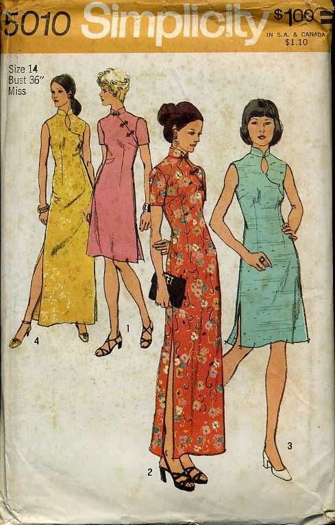
Source here
1972 Simplicity sewing pattern for cheongsam. It’s the same Western collar from the 50s and 60s just slightly taller. Oh and the closures used on the two designs in the middle are again likely not pankou. After the 60s, this neck design with a oval shape keyhole cutout became quite common and that persisted to the current day. Don’t know what the purpose of that was, just because you show 5 square centimeters more skin doesn’t mean your cheongsam is sexier?
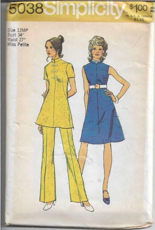
Source here
The description of this 70s Simplicity pattern says “Mandarin collar” but the source of inspiration is obviously Japanese military/school uniforms, AGAIN. The collar’s height and rectangular edges, combined with the placement of buttons above the waist on the bodice, everything about this reads as Japanese. The frog closures on the left are once again European and not Chinese pankou (sheesh I really need to make this other post). The original designer probably meant for it to be Japanese but the seller mistakenly labelled it a Mandarin collar design.
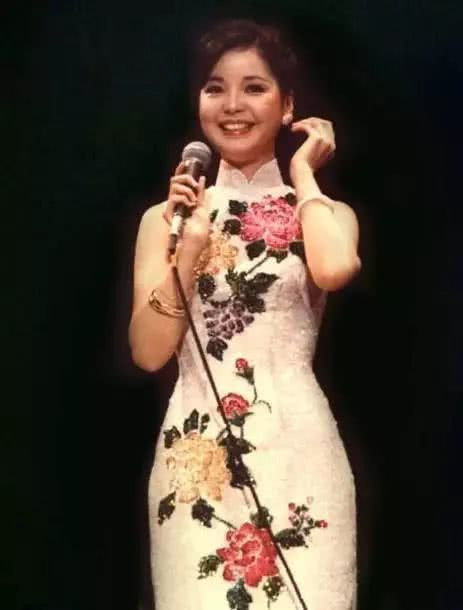
Source here
70s Teresa Teng (rest in power legend) in a theatrical cheongsam with a similar collar, either a stretched version of the 40s collar or a shrunk version of the 50s/60s one.
Source here
Google search result for “Mandarin collar dress”. Same Western low collar from the 70s. A new problem with modern mass produced cheongsam is that the collar oftentimes doesn’t fit the wearer and appears too baggy. Or maybe it’s not mass production, just that people nowadays are very unaccustomed to wearing tight fitting standing collars so they assume there needs to be some extra space? As someone who wears stiff standing collars on a regular basis I have to say it actually isn’t uncomfortable at all and elongates your neck a lot better. This is what most cheongsam collars nowadays look like, even the self proclaimed “traditional” ones, they literally originated from 1950s/60s Western sewing pattern companies’ interpretation of contemporary Chinese cheongsam collars.
Source here
Baidu search result for “Mandarin collar suit”. This, is, literally, almost a replica Japanese uniform. The seller is also using the tag Zhongshan suit lmao (I’ve explained in my 1950s mainland post what a Zhongshan suit is not supposed to look like), delusion is not a fragrance I guess. Why is it so hard to let Japan be Japan and China be China??
Conclusion & afterthought
Another thing I need to mention is that standing collars are by no means unique to Chinese historical dress; they were also widely used in European historical fashion, long before standing collars became worn with uniforms of “Mandarins” or Chinese officials, which further proves my point that “Mandarin collar” is not a valid term. Also, standing collars in Europe have always been stiffened/structured, whereas Chinese collars only started to become stiffened around the 1890s, possibly due to European influence as well. For example, the 1950s collar with rounded edges and no collar seam binding reads as European Renaissance doublet very easily. To be fair though, a lot of the collar shapes seen in early 20th century Chinese womenswear had been done before in European Renaissance fashion and during that time period in China only the OG Ming Dynasty collar mentioned in part 1 was used sooooooo
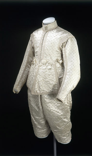
Source here
1630-40 English doublet. The collar looks mighty similar to 1930s Chinese women’s ones. I know next to nothing about Renaissance fashion so I’m not sure how it’s constructed, but it proves the point that collars like these were not a uniquely Chinese phenomenon.
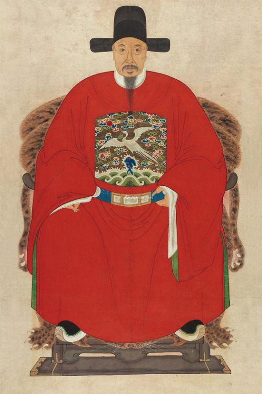
Source here
Meanwhile the Mandarins in China. He’s wearing a crossover collar robe underneath a round collar robe, no standing collar here.
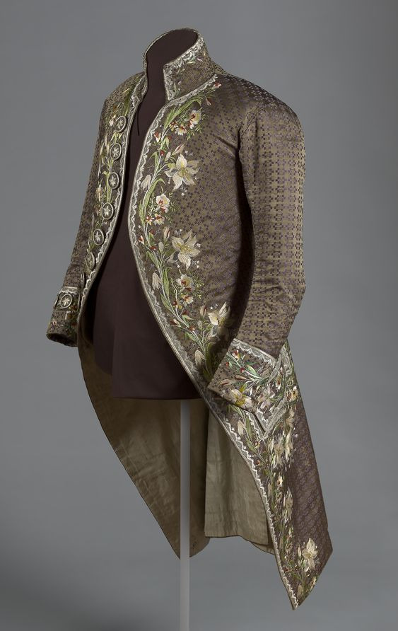
Source here
1780s French men’s coat with a standing collar.
Standing collars were also commonly used in Victorian and Edwardian women’s everyday fashion without any connection to China whatsoever.
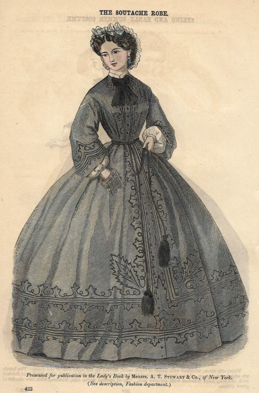
Source here
1860s fashion plate for a gown with a low standing shirt collar peeking underneath.
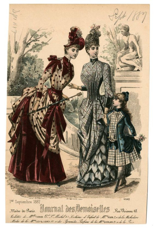
Source here
1887 fashion plate from the Journal des Demoiselles. Bustle gowns with standing collars.
Bonus rant
I have come to the actual point of this series of posts, to answer the question: should “Mandarin collar” be a thing? In which case I’m gonna have to go with no. In the three posts I made on the topic I categorized a total of 13 collar styles, each distinct from each other and some being inspired by Western clothing, and showed that the use of the term “Mandarin collar” nowadays is very vague and ambiguous. I don’t understand why people in the fashion industry give my ancestors all the credits for a design feature as basic and common as a standing collar... Maybe it’s a marketing gimmick like how Sternhalma (a German board game) is advertised in the US as “Chinese checkers”?? Or maybe it shows that a lot of fashion designers lack a basic understanding of historical fashion? Either way it makes no sense. I think the concept is also slightly offensive since it simply ignores the diversity of actual historical Chinese standing collar designs, kind of reinforcing the racist stereotype that non-white fashion histories are static and never changing.
If I do have to pick a most traditional/iconic style of Chinese standing collar, I would go with either the original Ming Dynasty soft collar with metal buttons or the 1940s short collar with collar seam binding used on aoku, cheongsam, changshan and magua. In the mainland Chinese countryside, the 1940s style collar was preserved and actually still made today, but in the post-Mao era it became increasingly seen by the mainland population as 土 (a derogatory term for Chinese folk stuff meaning tacky or cringy) compared to the exciting new Western fashions being imported at the time. As a result, more traditional items of clothing like aoku for women, changshan and magua for men were neglected in favor of more westernized cheongsam designs, leading to some cursed contraptions.
Maybe this is a hot take, I personally really don’t vibe with the concept of 土 because it’s very loaded and usually the gateway drug to massive internalized racism. I’ve heard so many people bash aoku and magua constructed in the historical method and put post-60s Western inspired cheongsam on a pedestal even though the former is grounded in history and the latter is an Orientalist mess. There is nothing wrong with making aoqun, aoku, magua, changshan, cheongsam or any other historical item of clothing in the historically accurate method, they’re charming in their own ways and don’t need to be “modified”. In my opinion, the puckering under the armpits caused by the lack of a shoulder seam and the rounded shoulders are what makes historical Chinese clothing beautiful to begin with :3 I think there’s something inherently modern and authentic in the pedantic, antiquarian pursuit of historical clothing, like you know how whenever a revival happens it actually brings something new to the table? It’s not problematic to wear modern cheongsam designs per se, it’s just important to keep in mind that it doesn’t have much to do with actual Chinese history and represents more of the status quo of Chinese fashion nowadays.
Ok I’m going off the collar track but it’s time to finish this post. Thank you for reading, and as I mentioned, the next post will be about Chinese pankou. I’m almost finished with that one as well and I’m really excited with what I have planned next :D
199 notes
·
View notes
Note
Artist ask meme! 6. Anything that might inspire you subconsciously (i.e. this horse wasn't supposed to look like the Last Unicorn but I see it) 7. A medium of art you don't work in but appreciate 19. Favorite inanimate objects to draw (food, nature, etc.) 30. What piece of yours do you think is underrated
ahhh thank you for sending this! sorry it too me so long to answer orz
6. Anything that might inspire you subconsciously (i.e. this horse wasn't supposed to look like the Last Unicorn but I see it)
I realized about 2-3 years ago that my childhood raised on Disney movies actually really influences my art. I like clean, crisp lines and large, expressive eyes. I also think I draw hair/fur in a way that is at least somewhat reminiscent of Disney, especially the Disney Renaissance era of art.
7. A medium of art you don't work in but appreciate
I mean, i dearly love many art media that I don't actively work in, and I've at least tried my hand at most of the ones I know of! However, what comes to mind is definitely ceramics/pottery/clay. I LOVE the look of clay sculptures and hand-thrown bowls/vases/plates/mugs/etc, but I just have never gotten much chance to practice with it.
19. Favorite inanimate objects to draw (food, nature, etc.)
Do skeletons count as inanimate objects? I love drawing skeletons. If not, I really like rainforest foliage, like ferns and creeping vines, especially when I'm working straight to ink. It's really fun and easy to just throw my pen down and make some loose pointy shapes and wind up with something that looks like a densely grown jungle.
30. What piece of yours do you think is underrated
I'm honestly still very proud of this Inktober 2018 drawing, which I have taken to calling "Lifeblood." It's really different from my usual, but I'm very happy with it, and I plan to eventually frame and hang it on a wall somewhere. It features OCs from a story I'm probably never going to write, but still think about from time to time.

2 notes
·
View notes
Text
Ranking Cinderella Adaptations
https://ift.tt/eA8V8J
A dream is a wish your heart makes, and if your wish is to see countless takes on the beloved fairy tale of Cinderella, then consider your dreams having come true many times over—including this year, with a new Cinderella by way of Amazon Studios. This latest adaptation seems to have combined qualities of many of its predecessors: it’s playfully anachronistic and eschews the traditional Disney or Rodgers & Hammerstein songs in favor of a tracklist of modern pop covers; it also engages with Cinderella’s career aspirations beyond fitting her foot into a glass slipper.
But this Cinderella owes everything to the other soot-stained girls, animated and otherwise, who wished with all their hearts for decades before her. How does the new adaptation compare to the modern fairy tales, animated classics, and another fairy tale riff with an outstanding Stephen Sondheim tune? Check out our ranking of Cinderella adaptations, from worst to best.
10. A Cinderella Story (2004)
This cult classic is a clever retelling, with peak early-aughts casting of Hilary Duff and Chad Michael Murray as the star-crossed, Cyrano de Bergerac-inspired lovers: Sam toils away at her late father’s Southern California diner, under the heel of a delightful Jennifer Coolidge as her vain stepmother, while Austin is the closest thing to high school royalty as the quarterback with a sensitive side. Regina King as the longtime diner employee-turned-metaphorical fairy godmother who gets Sam to the homecoming masquerade dance is the other key bit of casting, but you’d have to really be a fan of the “fairy tales in high school” subgenre to get on board. Plus, the stable of derivative direct-to-video sequels makes the sparkle wear off with each new, formulaic installment released.
9. Cinderella (2021)
Kay Cannon’s (Pitch Perfect) progressive plot urging entrepreneurial dressmaker Ella (Camilla Cabello), her bitterly materialistic stepmother (Idina Menzel), and other original female characters to choose themselves over the supposed security of marriage is not quite enough to balance the cringey modern soundtrack and anachronistic witticisms. It’s too bad, because this Cinderella puts forth ambitious ideas, and any production with Billy Porter as the fairy godmother should be nothing but fabulous. Compared to most of her predecessors, this Cinderella is a distinctively fresh role model for the next generation of kids, but adults won’t find much magic in her story.
8. Ella Enchanted (2004)
This is a tough one, because the source material—that is, Gail Carson Levine’s 1997 middle grade novel—is unquestionably one of the very best Cinderella adaptations: Ella’s curse of obedience is an apt commentary on manipulating young girls into giving up their agency under the guise of people-pleasing. But the film—despite its adorable, baby-faced stars Anne Hathaway and Hugh Dancy—overcomplicates an already daring plot with a throne-stealing subplot (that Cary Elwes, as the unnecessary evil uncle, can’t save) and an unforgivably cheesy cover of Queen’s “Somebody to Love.” Hathaway’s voice is sweeter than Nicholas Galitzine’s rendition in the new Cinderella, but the giants dressed in early-aughts miniskirts strain even the most loose definitions of fantasy. Despite all that, it (mostly) sells Ella struggling against abuses of her obedience in a way that’s still more revelatory than many straight adaptations. Still, you’ve got plenty of better movie choices; forget this adaptation and just read the book.
7. Rodgers & Hammerstein’s Cinderella (1965)
Richard Rodgers and Oscar Hammerstein II originally wrote their classic musical for television broadcast instead of the stage, though it has found its way to the latter. CBS’ second TV production (following the original 1957 version starring Julie Andrews) introduced a bright-eyed Lesley Ann Warren (a.k.a. Miss Scarlet from Clue) as Cinderella, and unlike its predecessor was able to be recorded in color. Between the vivid hues, Warren’s expressive acting, and the array of sets, it all contributed to the feeling of watching a taped performance—an incredibly charming one, at that. But the effect does come off as overwrought at times, making it the lowest of the three specifically Rodgers & Hammerstein adaptations on the list.
6. Cinderella (2015)
While visually Kenneth Branagh’s live-action adaptation of the animated Disney classic hews so closely to its source material that it feels like a lost opportunity to be more original, there are some sly plot tweaks. Lily James’ Ella is not hopelessly naïve about her abusive home situation, yet manages to keep up the mantra of “have courage and be kind” through even the worst mistreatment. Streamlining the classic songs to score strengthens the plot, with Ella’s rare occasion of singing being what ultimately saves her. Fans of the blue dress and romantic vibe will have much to swoon over, even if they’re not surprised.
5. Into the Woods (2014)
Or, then, what if I am? / What a Prince would envision? / But then how can you know / Who you are til you know / What you want? Which I don’t… Anna Kendrick brings us a relatably existential Cinderella in this movie adaptation of Stephen Sondheim’s musical about various fairy tale characters who wind up with questionably happy ever afters—including Cinderella, who decides “not to decide,” then ends up with a philandering Prince. It’s not a complete Cinderella story, but it’s a more memorable performance in a handful of scenes than entire movies have attempted.
4. Rodgers & Hammerstein’s Cinderella (1957)
Despite only surviving in black-and-white form, CBS’ original TV broadcast shines thanks to its star: Julie Andrews, then performing My Fair Lady on Broadway, who makes this Cinderella both an amalgamation of her then-current and future roles and a performance all its own. You can see glimmers of her comic talents as Maria in The Sound of Music—this Cinderella also has more wit than other versions—but it’s her voice that elevates Rodgers & Hammerstein’s adaptation of Charles Perrault’s fairy tale into something timeless.
3. Cinderella (1950)
Few Cinderella adaptations have achieved the same sweeping sense of sheer romance in the Disney animated classic: the painted backgrounds, the dreamy sequences reflected in soap bubbles and sparkling through the palace gardens, the surprisingly high emotional stakes that make the resolution all the sweeter. And while it’s become a common Disney trope, the requisite scene in which the stepsisters cruelly rip apart Cinderella’s dress adds a layer of wickedness not present in the Rodgers & Hammerstein adaptations, nor successfully recreated in any of the live-action versions. The same goes for the goofy mice singing “Cinderelly, Cinderelly”—every subsequent CGI mouse lacks the warmth that goes into a believable animal companion. That said, the animated movie’s legacy is somewhat marred by its direct-to-video sequels of diminishing returns, though you also have to give them props for pulling an Avengers: Endgame 12 years earlier with Cinderella 3: A Twist in Time.
2. Rodgers & Hammerstein’s Cinderella (1997)
For many of us, Disney’s animated Cinderella was a childhood classic, but The Wonderful World of Disney’s ‘90s production was the first time the story truly felt magical. Rodgers & Hammerstein’s songs were updated with contemporary beats, bridging the forty years between the first broadcast and this version: “Impossible” is one of the best songs from the show, but it hasn’t been truly sung until Whitney Houston is belting it out to a starry-eyed Brandy. The production’s effortlessly diverse casting—Whoopi Goldberg as the queen, Paolo Montalban as the prince, Bernadette Peters as the stepmother—only amplifies the universal nature of the story. Almost twenty-five years later, this adaptation still feels like the television event it was when it premiered.
1. Ever After: A Cinderella Story (1998)
A truly successful adaptation is one that doesn’t have to feel beholden to its source material. By opening with the Brothers Grimm explaining the inspiration behind their own interpretation of Cinderella, Ever After rewrites all of the familiar themes into a historical fiction—specifically, Renaissance-era France—context. Danielle’s (Drew Barrymore) misfortune as an orphan servant girl is so believable thanks to the cruelty of her stepmother’s (Anjelica Huston, a legend) abuse, but so is her determination and ingenuity to rise above her station. While Disney’s animated Cinderella is romantic, Ever After is a romance: Danielle disguises herself as a comtesse in order to spend time with Prince Henry (Dougray Scott), and they develop an actual relationship, complete with rejection once her subterfuge is revealed. Plus, Leonardo da Vinci is there for comic relief and an unintentional fairy godmother assist! If you want your Cinderella story with a compelling feminist arc but you’re also burnt out on the songs, this is your happily ever after.
cnx.cmd.push(function() { cnx({ playerId: "106e33c0-3911-473c-b599-b1426db57530", }).render("0270c398a82f44f49c23c16122516796"); });
Cinderella will begin streaming on Amazon Video on September 3rd.
The post Ranking Cinderella Adaptations appeared first on Den of Geek.
from Den of Geek https://ift.tt/3n39lZU
7 notes
·
View notes
Text
Statuesque Pt. 3
Alright it’s getting a little more interesting...things are changing.
Lemme know what you’re thinking in the comments pretty please?
tw: blood mention
Previous Parts Found Here
---
Geralt blinked awake unexpectedly. He hadn’t been paying attention and therefore hadn’t seen Jaskier approach.
“Hello?” the curator practically sang, waving his hand in front of the demon’s sensitive eyes. “You awake in there?”
“Hmm.”
“Oh, good. I have questions.”
“Hmm.”
“Very eloquent tonight, I see, Geralt. Charming, as usual.”
“Did you summon me...intentionally?”
“Yes. And I’m sure it won’t be the last time, either. Now, like I said, I have some questions for you, if you don’t mind.”
“You bled for me,” the statue murmured. The statue’s only untethered hand reached out to grasp Jaskier’s. Geralt brought it to his mouth and pressed a burning, slow kiss to the scabbed tip of the human’s finger. When Jaskier pulled it away, mesmerized and blushing wildly, the wound was closed completely. Only a thin line remained where he’d pricked himself with the letter opener from his desk. “I will gladly answer your questions, Jaskier.”
Geralt heard Jaskier’s heart stutter when he said the mortal’s name and couldn’t help but smirk. Perfect.
“So, I was wondering, what’s...what’s your favorite color? I mean you’ve been alive for centuries and you’ve been in some of the most impressive churches and museums in the world, right? So what painting is your favorite? What’s your favorite color? Why do you like it so much?”
Geralt blinked. That...that wasn’t the line of questioning he’d been expecting at all. He thought Jaskier would be like the rest, curious about the afterlife. Hungry for power. Hungry for forbidden and cursed knowledge. Not - Not a demon statue’s favorite color. He frowned a little, confused as to how he should answer. Jaskier turned back to his desk and began to sort some papers, humming an unfamiliar tune very quietly as he did so.
“Hmm?”
“Take your time to answer; I woke you up first-thing after I clocked in. I figured you needed to sort through a lifetime of experience, so I planned to give you a minute to think it over. We have all night to talk, Geralt. I didn’t mean to be overwhelming and I apologize if that was too many questions at once.”
“You woke me up first-thing?” Geralt asked, feeling dumb for the first time in a millennia. He ignored the rest of the curator’s monologue, focusing only on that one detail. We have all night. He’d given Geralt all night to speak and observe and be alive.
“Of course!” The bright-eyed mortal turned to face him. “I wouldn’t want to miss a solitary minute of your company! If you ever don’t want me to wake you up again, let me know. Otherwise I rather intended to keep you company on a regular basis.”
“Oh…”
Hmm. Fuck. The only decent human being in a fucking century and I manage to befriend him of all people. Goddamnit.
“Blue. My favorite color is probably blue, like water.”
Water, and definitely not the shade of your accursedly bright irises.
“Excellent,” Jaskier beamed. “Mine is green, but yellow is a close second. I’m a sucker for a Van Gogh; his yellows are inspired.”
“The style is fascinating but I’m partial to a Monet,” Geralt argued, smiling softly. More softly than he’d intended. More softly than his planned seduction called for. Don’t lose your touch, now. You can get out of here. You can be free.
“So, is there any way to break your curse? Do your chains have a key?”
“Yes and no,” Geralt lied.
“Alright, shoot.” Jaskier’s arms were crossed over his chest and his butt was pressing against the edge of the desk as he leaned back against it. He looked adorable and so intent. Curious but not greedy.
“Would you believe me if I told you that Heaven and Hell invented True Love’s Kiss?”
“I might.”
“Well you should. The only way to be free of the curse is true love’s kiss. Second, no. These chains are meant to keep me from leaving the pedestal.”
“Too bad,” Jaskier sighed. “I’d hoped to show you around the rest of the museum. Maybe take you for coffee.”
“Coffee?”
“Yeah. Can you like...eat and drink?”
“It will disappear when I turn to stone.”
“I’ll bring you some coffee tomorrow, then.”
Geralt felt something strange knock loose in his chest. Something warm and soft that seemed determined to bloom and spread as he watched Jaskier finish sorting his papers. It had reached his fingers and toes by the time they finished discussing impressionism and moved on to Jaskier’s favorite books and Geralt’s favorite eras of history.
“The Renaissance really was lovely,” he insisted. “But I wasn’t necessarily on board for the entire Enlightenment process. The art wasn’t nearly as good.”
“Jurassic Park is a fucking classic,” Jaskier explained a few long and interesting minutes later, “Jeff Goldblum is one fine piece of Daddy.”
Geralt didn’t need many context clues to understand what that meant.
The night passed happily and before it seemed entirely possible, that gut-sinking feeling appeared once again. “Fuck. See you tomorrow night, Jaskier.”
“Talk to you tomorrow, Geralt,” the curator tucked a stray white hair back behind the statue’s ear and smiled softly. “I’ll miss you in the meantime.”
Will you? Geralt wanted to ask, honestly curious about the answer. Something odd was happening. Something that was veering him far from the course of his original plan. Will you miss me? Will you think of me in the daylight hours and wish I was there with you? Will I be wishing to be with you? Do I hunger for the sun again, Jaskier?
Geralt steeled himself and let the stone take him over completely. He had to free himself. Lying about the kiss was the first and easiest step.
The rest, he realized with a strange and nearly alien twinge of guilt, would be harder.
#statuesque pt 3#geraskier ficlet#geraskier fic#geraskier#geralt x jaskier#museum curator jaskier#geraskier museum au#statue geralt#demon geralt#evil geralt#for now#soft jaskier#eager jaskier#curious jaskier#angst with a happy ending#geraskier fluff#bouncey's endless au collection
113 notes
·
View notes