#but if desktop then you can go to the little &. symbol on the bottom for a link to the theme download!
Explore tagged Tumblr posts
Note
Hello! So I was wondering about something with your Twitch Livestreams. This’ll probably sound silly but I noticed you had an icon that displayed song titles for the music being played and wanted to know how you did that? I’ve been looking all over and so far have found nothing for it. Thank you in advance if you’re able to respond!
It's the banner used by COTL to display happenings in the Cult!

Here's the banner:

When I have the banner in my stream overlay, (above all other layers) I add spotify or my personal desktop music as screenshare, shrink the visible screen to just fit around the player portion that displays the name + artist, and then put it over the banner so it's easy to read.

(For Streamlabs) To put your music player over the image, go to capture image and select whatever music player you use (I use spotify or my desktop) Select new source, (might have to click the tab at bottom of the window), select music player. THEN hold down 'ALT' as you select the captured screen, and you can crop the window that way around the player, then drag over the banner or whatever image you use.) This tutorial shows with a webcam but it works with everything.


As for my streams, I took the banner and drew symbols around it so it's a little more animated whenever I have my 'break' or 'starting soon' screen up. It's not what I used for displaying music, but if anyone wants to use that here it is!

816 notes
·
View notes
Note
hiii! i’m new to tumblr and i wanted to ask how do you change the color of the words in your bio + add that cute little button? i wanted to personalize mine and your profile is sooo cutee!! this is also my first ask ever haha
Hi! Welcome to tumblr 🩷 By default, tumblr allows you to change text to preset colors using their editing feature when you select text, but there are ways to use your own colors as well; any color you could possibly want. I'll explain below. (Disclaimer though, all of this applies to desktop; I'm not an avid mobile user, so it might work differently through the app.)
Custom Color Method One
So basically, if you click this ─

─ you can choose colors from the list below.

But, personally, I like to use custom colors, and this is possible to add in one of two ways through the HTML editor. Typically, when editing a full body of text, I will use this external editor to pre-format. It allows you to change the color of your text and convert it into HTML format so it can easily be copy/pasted, among other things.
So, for example, say I have this text I want to post, but first I want to add some colors and other formatting to it:
A queen must listen to all. The highborn and the low, the strong and the weak, the noble and the venal. One voice may speak you false, but in many there is always truth to be found.
What I will do is open the editor and paste or type the text there, and edit it as I wish. So, it comes out looking like this in the editor:

You cannot copy/paste this directly from the editor into tumblr without losing the color; it will not be preserved. The way to get the color to stay is to switch the rich text editor to HTML by clicking the gear icon in the top corner and changing the editor type, as such:


To get the right HTML code for your text, it should appear in the box at the bottom of your editor; when you are satisfied with how it looks in the editor, click "get code" to generate the HTML code, then click "copy to clipboard" below and it will copy your HTML. Then, paste it into tumblr's HTML editor and click "preview" to make sure it looks correct.
The order of steps should look like this:


And that should be it! There is a shortcut to doing this without an external editor, too, but I don't recommend doing it with super long text as it's just easier to do it in the editor past a certain point.
Custom Color Method Two
For the shortcut, you'll have to select the text you want colored individually, and change them to tumblr's default red color. (It has to be red because it's the only one that uses an HTML color code instead of a pre-defined class value, which basically means it's just easier to change the color code in the red to the color code you want.)
So, I would type my text directly into tumblr's Rich Text editor (or the preview window of the HTML editor) and highlight the first line I want colored, and turn it the default red, like this:
A queen must listen to all. The highborn and the low, the strong and the weak, the noble and the venal. One voice may speak you false, but in many there is always truth to be found.
Then, I would go into the HTML editor and find the color code, which should look like this:

What you need to do is change the "#ff4930" to the color code of your choice. You can find the right code for the color you want using this site if you need to. The color code must be six digits long, and it must have the "#" in front of it in the editor or else it will not register as a color. So, if I, in this example, replace the color code of this red with the code for the pink color I want, it would look like this:

And then, since I want a different color for the other line, I would repeat the process and plug in the new color. It's simple, but it works best with shorter texts.
Custom Symbols
Now, as for the button, I'm assuming you mean the little star symbol to the left in my pinned post (unless I'm mistaken)?

This is actually a lot easier to do, as all you have to do is copy/paste the characters into the text. It's just a unicode or HTML symbol, like an emoji. There are lists here and here that you can copy them directly from and paste where you want them. I'm sure there are keyboard shortcuts on desktop to access a lot of these, but I'm not practiced with them and mostly I prefer to just copy/paste. And if you want the fancy looking text, those are actually just symbols, too! You can type your text into a generator like this one and then click the "font" you want to copy and it will convert it into the symbols for you.
I think that about covers it! Please lmk if there's anything else I can help you with! Hope you enjoy your time here 🩷
10 notes
·
View notes
Note
How do you color your font? It's not something that is available on Tumblr?
hiii!! no, it's not something that tumblr offers, and it's quite tricky tbh you can only do in your desktop tumblr web, but i'll try to explain.
okey, so first i select the colours from the images i got from pinterest in a colour picker web (my go to is this one). you can select just one, or two, to make a gradient, and then go to this web.
this is what you see:

you write down the hex code of the first colour on the #FF0000 of the line number 3 and also on the red square, and the hex code of the second colour in line number 4 and also the green square. if you only want one colour, you put the same hex code in both parts.
then you write the sentence you want to have coloured on the little bar in the white part on the right bottom, next to the red/green squares, and click on the word run. in the other bar you're going to get an html code. copy that.
the last step is the following: you go to your tumblr desktop web, and hit new post. when you click in the settings symbol on the right top of the post - while editing your post - you'll see a 'text editor' tool. it should say 'rich text' and you have to change it to 'html'. you paste your html code from the other web, and then turn it to 'rich text' again. and it should be done!
i don't know if i was clear enough about it, but hope it helps <33

8 notes
·
View notes
Note
Uzi, how exactly is your search going?
*Uzi gets done rummaging through an apartment, the latest of several in its hallway. N has also exited one of the other rooms.*
Uzi: “Still nothing. You?”
N: “No, not really.”
Uzi: [[Frustration.MP3]] “Ugh, there’s GOT to be something in these rooms!”
N: “Well, J said things like this take time. Sometimes what you’re looking for is doing its best at hiding.”
Uzi: “N, this isn’t hunting— how does that relate to what we’re doing now!?”
N: “Quite a bit. Sure, what we’re looking for isn’t running for their lives… …but whatever was up with your mom was probably something Jenson didn’t want anyone finding out about.”
J: “Are you two done talking? Your conversation is so unprofessional it makes me want to download malware.”
Uzi: “BITE ME!” *steps into J’s face, pointing at her* “You’re not helping!”
J: “Because I know how unproductive your wild goose chase is.”
N: “J! We barely defeated Doll at prom, and she almost killed V! What if she shows up again!?”
J: *skeptical* “And you think the answers to that can be found here?”
Uzi: “Well it’s the only place that’s come up that could have them, you brainwa–!”
Bee: *from inside another room* “Uh, guys? I might have found something…”
*The three follow the yellow HD’s voice into the room, where they find a skeleton dressed in a black garment that, much like most of the furnishings in this bunker, looked like it came right out of the Victorian era. On the wall next to what was likely a teenage girl was a recharging bay.
*And laying on the floor next to both was an inactive Disassembly Drone.
It looked… older than whatever model N and J were. It had the “stilt” legs indicative of being a female model, but they were more… boxy than conical in shape. Ditto with the forearms, though they were more like rectangular prisms. Its hair was black and styled into twintails, each secured with a hair band at the lower end. And it was clothed in the uniform of a JCJenson technician, though the name tag was missing.*
Bee: “Uh, guys, girls. That’s not what I was talking about.”
*The three drones then looked to see Bumblebee standing by and gesturing to a computer terminal built into the wall. It was smaller than him, though that was expected given that this place was built for human habitation specifically, and it was on a password screen. A bunch of post-it notes were plastered on the wall next to the monitor.*
Bee: “The password’s on the post-it note. I-I think whoever owned this was forgetful, or very secluded.”
Uzi: *groans* “Finally!” *walks over* “Let’s get to the bottom of whatever the heck is up with this place.”
*The purple-haired shifter typed in the password, which was just “1235711” which she found a little amusing (at least it wasn’t “1111”). Once she hit the enter key, the computer screen displayed the message “Welcome, JamesElliott” above a buffering symbol.*
J: “You realize this person likely wasn’t part of the company stru–?”
Uzi: “Shut.”
*The monitor screen immediately went to this “James’” desktop screen.
*…And it was an absolute mess, cluttered with all sorts of files and programs.*
J: *eyelights hollow* “Uh…” *inhales while cringing* “Sweet corporate…”
Uzi: *eyelights also hollow, moreso in surprise* “Holy shi– WE’VE HIT THE JACKPOT!”
*As Uzi starts cackling like a maniac at this and doing her best to shake the taller Bumblebee in excitement, N moves over to the offline Murder Drone on the floor. He rolled it/her over so it/she was laying on their/her back.*
N: *to J* “Looks like an Alpha-1 model… You think we can use this one for spare parts, boss?”
*The pigtailed disassembler looked over to her younger sibling, only to freeze up upon laying eyelights on the inactive, older drone.
*The drone looked familiar to J.
*Too familiar.*
8 notes
·
View notes
Note
Same anon here—no worries at all! I’ll try and explain how to the readmore, since it’s changed with recent tumblr updates. When you go to create a text post, if you’re on mobile touch the screen where you want to write and type something (can be just a letter, but you have to have something written for it to worm unfortunately). You should see a little tool bar should pop up at the bottom of your text editor. On the far right, there’s a symbol that kinda looks like a hamburger with two straight lines across, and a squiggle between them. Click on that. A readmore break should appear under your text. Anything you put under that line will then be under the readmore section, and you can drag it around like you would photos or gifs to change where you want it to go. If you’re on desktop, it’s exactly the same procedure but instead of the toolbar being at the bottom, it’s right next to where you type. Hope this helps!
Honestly anon, thank you so much! I've just been testing it and it works! I have a few stories saved that I haven't quite finished yet, most long, and I'm now able to use that little symbol! I'll be using that from now on thanks to you. There was just a sliiiiight mess up on my end 😬 I tested it on some random letters, and when I pressed what I thought was save, was actually post! 🤦♀️ I can be a real idiot sometimes 😂 oh well, I'll learn to use it better, and thank you again, this has really helped 🤗💚
2 notes
·
View notes
Note
replies don't have good enough formatting options so here we are
the important search bar is at the top right of the screen. (screenshot is mobile, it's the same place on desktop, just a wider screen.)
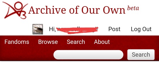
you'll put whatever you're looking for here. for instance, let's say i'm looking for pokemon fanfics. i'll type pokemon into the search bar.
a list of works matching your search term will pop up. here's one that i'm using as an example. the important parts are directly under the title and author.
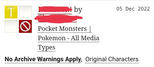
you can click on the title to read the fic itself, or the author to see their other fics. below that is the fandom, and below the fandom are other tags. you can click on any of these to be taken to a new page only including works tagged with that fandom or those tags. i'm going to the pokemon fandom, for now.
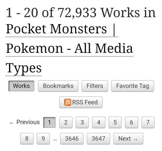
there's a lot of important stuff right at the top here. one thing i'd recommend doing is hitting the favorite tag button if you think you'll be looking for this fandom/ship/tag a lot. that adds it to a favorites list on the home screen of ao3 for quick access.
next you can select filters to start narrowing down what you want. this part is optional, so if you're satisfied here you don't need to keep reading!
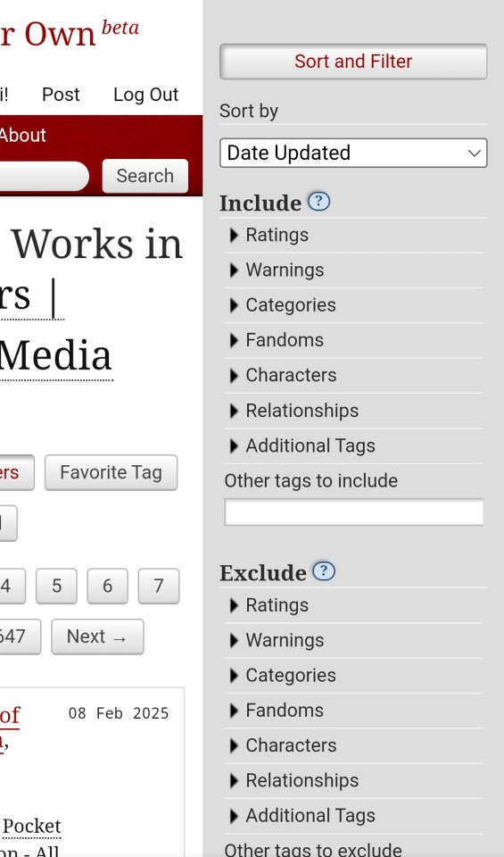
a bar like this pops out on the right side of the screen. this looks like a lot, but don't get overwhelmed. you can use as many or as few filters as you want!
some of my most used filters:
sort by: people all have different preferences here, so try out some different ones and see what you like! my most commonly used are kudos (descending) to find popular works, and date updated to find recently posted works.
ratings: this is the rating of the fic, including G (general audiences), T (teen+), M (mature audiences), and E (explicit). these are very subjective so some fics might not be rated the way you'd think, but think of it as similar to TV ratings - G is for everyone, T is like PG13, M is recommended for 18+, and E is the same as M, but can contain explicit sex scenes or heavy gore/violence. if you want to search for a specific rating, use the include > rating search, or if you want to search for multiple ratings (like fics both G and T rated), use exclude > rating to exclude the ones you don't want.
categories: these are special tags for any relationships in the fics. gen includes no romantic relationships. m/m, m/f, and f/f are relationships between two men, a man and a woman, and two women, respectively. multi is for multiple relationships (or ones including more than two people) and other is often used for relationships with things like aliens or monsters, or when the author just doesn't know what tag fits. same as above, use include if you just want one kind, or exclude if you want multiple but not all of them.
characters and relationships: these will list characters and relationships in whatever tag you're searching, starting from the most works with that tag. again, include if you want just one, or exclude if you want multiple but not all.
completion status: towards the bottom of the menu, you can use this to filter for only complete works, only incomplete works, or any works.
language: ao3 supports a lot of different languages! if you want to filter only for fics in a language you can read, you can use this.
you can of course play around with other filters and see what they do - you're not gonna break anything!
the quick info square

this little box at the top left of a fic contains lots of useful information! from left to right and top to bottom:
rating: the rating of the fic (as discussed above). the yellow T shown here is a fic rated teen
category: also as defined above. the venus (♀️) symbol means F/F. ♂️ is M/M, both together is M/F, multiple colored squares is Multi, and ⚧️ is Other. a green circle with a dot in the middle means Gen
warnings: refers to ao3's warning system. this fic (blank square) is using the "no archive warnings apply" tag. an orange exclamation point and a question mark means the fic has the "creator chose not to use archive warnings" tag - this means the fic may or may not contain any ao3 warnings. a red exclamation point means the author has selected one or more warnings for their fic. you should always read the tags on a fic to decide if you'd be comfortable with it before you read it, but especially if you see an exclamation point here!
completion status: a red circle with a slash through it means an incomplete work, and a green check mark means a complete work
final notes
make sure to read the tags! you're responsible for what you read on ao3, and the tags help you make an informed decision
relationship tags with an & (like "character A & character B") are platonic relationships, while ones with a / ("character A/character B") are romantic and/or sexual. (this is not always followed, but most people use it.)
if a fic is tagged with some variation of "dead dove", "dead dove: do not eat", or "DD:DNE", it's especially important to read tags before engaging! this means the author believes their fic may be especially upsetting for certain audiences and wants to make sure no one reads it who would be upset by it.
be sure to leave kudos and comments! you can leave kudos once per work, and comment as many times as you like (even on individual chapters if you want). authors love getting these notifications, and many of them will reply to you if you want to talk about their work!
you can also add fics to your bookmarks if you want to read them again, or subscribe to get email notifications when they're updated. you can even download them as an ebook to read offline!
i hope this was helpful and i'm sorry it's so long;;; i know ao3 can be confusing at first, but you'll get the hang of it the more you use it! my favorite part of ao3 is how easy it is to filter for different works and go back to my favorite tags right from the home page. i hope you enjoy ao3!!
How do I use Ao3? I've just gone to the site for the first time and there's so many search boxes and I'm so confused.
-
15 notes
·
View notes
Note
is there a way to make a thread tracker on discord?
hi! we have had a post about thread trackers on our to do list for a hot minute, and we'll get to something more robust when we're able, but in the meantime i thought i'd give you a quick overview on my personal preferred way of thread tracking on discord -- so see below the cut for how to use your discord mentions as a thread tracker!
a mention is when any user @'s your username on discord. this will highlight the message, as well as give a little red bubble in the channel name and the server's icon. but what you may not know is that discord also keeps a list of every post you've been mentioned in for easy reference!
there are, of course, pros and cons of using this method. the biggest pro and the reason it's my preferred method is that it does it automatically, instead of you having to go into a thread tracker you've made and update it yourself. the cons are that if you don't delete unwanted messages out of there regularly -- including when anyone uses the reply function on one of your messages -- it can get messy quick. also, the mentions tab will only store posts that have been made in regular channels for 7 days, and posts that have been made in threads will go away if the thread auto-archives (usually after 24 hours of inactivity). it also does rely on making sure your partner tags you every time they reply, or you can use a tupper to tag yourself (if you tag yourself in a normal message, it won't show in your inbox, but if you use a tupper to send the message then it will).
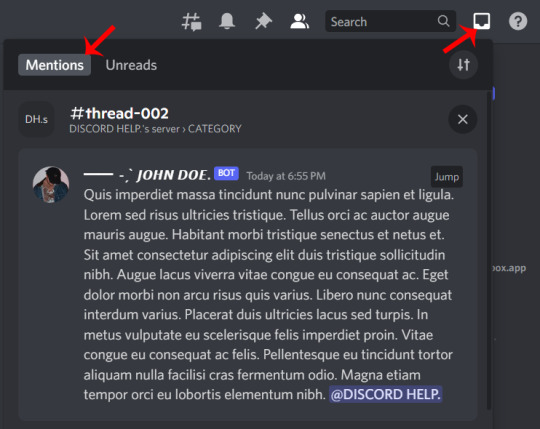
to find your mentions on desktop, click the little inbox just to the right of the search bar, then change the tab from unread to mentions.
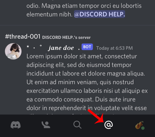
in the mobile app, you can find it by clicking the @ symbol next to your user icon at the bottom of the screen.
some other handy features:
by clicking the X in the top right of each mention on desktop, or tapping and holding on mobile, it'll let you delete each mention from your inbox. i like to delete ones i've already replied to (and other mentions i receive that aren't thread-related) to keep the inbox nice and tidy!
if you hover over the mention on desktop and click the jump button, or simply tap the mention on mobile, it'll automatically bring you to the right channel and server where your thread is!
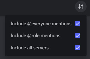
if you click the icon that looks like some lines with indicators on them, it lets you filter your mentions like so: (if you uncheck “include all servers” it’ll only show mentions from the server you’re currently in)
another reason i like to use this feature to track my threads is once i've finished all my replies and cleared out my inbox this message always makes me feel very accomplished :)

82 notes
·
View notes
Note
Hey, I saw how you made questionnaires and wanted to know now to do that too (looks cool) Pls, show me!😄
sure thing!!
so there's actually two different methods on creating polls on desktop vs mobile, and I think it should also be made clear that I use Chrome on a PC, so if it's a different method on Macs/Safari/Firefox/etc, other people are welcome to correct me or add on to this post.
But essentially: if you're on mobile, you're gonna wanna click on the "Create New Post" button on the bottom toolbar, which should look like a blue box with a pencil in it. Once there, you're gonna wanna look to the bottom right corner for a symbol that looks like this:

the one I've circled in red. After you tap that, it's gonna provide you with a blank poll for you to fill in to your pleasure. add a goofy title, fill in at least two answers, and you're all set to go!
Desktop, on the other hand, has an extra step. Because polls are an add-on to text posts, rather than their own category, you're gonna wanna click here first:

and then, once you get a popup, you're gonna notice a popup in the top right corner. It's either going to encourage you to "try a shiny new post editor", if you haven't enabled it yet, or it's going to show a switch that you can enable or disable

to enable the option to create polls, you're going to want to turn this option off. Legacy Editor means you're using the old format, and polls are only supported by the new format.

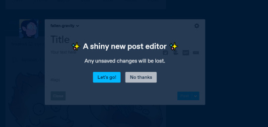
Once you hit "Let's go!", you'll be presented with another blank text post with a colored toolbar of options to edit your post.

and the poll option should be the three little orange lines, right next to the pink camera, and all you'll have to do is follow the same simple steps! make up a title, give your poll some options, and voila! you have created your very own #TumblrPoll
8 notes
·
View notes
Text
some tips for writing blogs, especially those who are just starting out. these are some things that works for me and may or may not work for others.
how to add a read more link on mobile
type :readmore: on a free space, then hit the enter or return button
personally i think they’re very helpful because it lessens the space you take up in your dash, and might encourage more people to rb
+ you can also add this on a spot where it gives a sort of cliffhanger, essentially making people want to ‘read more’
headers, banners, and dividers
though not necessary, it’s good to have a title for your work. make sure it’s bold and doesn’t blend in with your notes (aka pairing, warnings, etc.). this also helps when someone wants to look up one of your works in your search bar
i don’t really make banners or covers for my works. but some good apps that i know of would be picsart and canva. if you’re looking for ideas, i definitely recommend going into canva
wondering how to make those really small, thin dividers? you can make them using picsart! to make a divider hit tools > free crop > brush > size (adjust it to your preference > then draw a line along the edge of your photo > save
using the divider you just saved, go back to picsart and edit it again > draw option > hit rainbow square at the bottom left corner > hit suction/droplet symbol right below the check mark > color in the white spots bc for some reason picsart glitches and makes dividers look white-ish
new blog? just opened an account?
this is gonna sound really frustrating. but... tumblr needs to check if you’re a bot or not. what does this mean? it’s likely that your first few posts won’t show up on the search bar. you may not even get to edit your header/pfp yet ://
this happened to me and there was no visibility on my account at ALL. what helped me get ‘verified’ is that i followed a LOT of accounts, liked a bunch of posts, made some posts here and there. now that lets tumblr know you’re not a bot
visibility
the tumblr tagging system usually only allows the first 5 tags in your post to show up. so, what can do you about this? only use FIVE or less tags in your post. wait about 15 minutes or more until you can add some more tags in your post, and they usually all show up like that
another important thing about using tags is not to generalize! especially if you’re using a popular tag. but also don’t specify it too much where barely anyone looks it up. for example, if you’re writing a gn piece about oikawa, i recommend you use the tags such as: oikawa x reader, haikyuu x reader, oikawa x gn!reader, haikyuu headcanons, etc
a good rule of thumb is to use character x reader tags first, then leave the full name or fandom tag last
FOR NSFW: tumblr doesn’t let any tags with nsfw show up. so, give your nsfw works another tag. maybe #namegetspicy idk, you figure it out
FOR WARNINGS: especially if you’re a dark content creator, i highly encourage you to add tw:xyz tags. if you already have a warning note at the top then that’s great. but even better for readers who prefer to actually block these tags that way they never get to see it
another important thing to note is that people have different timezones. it helps if you rb your work at a different time of the day, in case people missed it! (icymi) i’ve noticed that reblogging helps to make your post show up in the tags
interaction + feedback
first and foremost, you are not obligated to write for your followers, and neither are your followers obligated to interact with you. remember that everyone has their own individual lives, and they have their own things to do— so do you, too.
make friends! become mutuals with other writers, visit their ask box. i know it can be daunting having to initiate these things, but you might just turn out to have fun! you can’t expect people to interact with you if you’re not interacting (back). it’s... kind of a two way thing yk? no need to be afraid to interact with other writers. oh, and rb other writers works!
pspsps join tag games or do ask games. it’s fun and very interactive
it never hurts to ask for feedback. i usually do this in a more subtle way because i don’t really expect a full on analysis on my works. maybe a little, is this okay? or feedback appreciated. sometimes it takes a little bit of coaxing for the silent readers
formatting your posts and blog
i generally put in the title at the top in big, bold letters
then comes the header/divider. helps to make the post more... visually appealing ig?
it’s important to add warnings (if any) and the pairing. the audience is not all female, and it might be a little frustrating for male readers having to find out its an x fem reader piece like halfway through your fic
if you have multiple works posted, it’s really really helpful to have a navigation page!
you can organize the posts you make with tags! for example, if you’re shitposting, you can use a specific tag for that. if you have a nsfw related post (ESPECIALLY when your blog is open to the general audience) please make a tag for it
themes + colors
if you have a color in mind but don’t know which direction to go from there, i recommend looking up color + aesthetic
looking to use the same color? download a name color app that’ll give you a hex code for any color you want to use. then, you can type in that hex code for when you’re choosing a color for your tumblr bio
wondering how to make your header image small like mine? just choose a photo for your header and turn off the stretch image option
want to use a different text color that tumblr doesn’t offer? it’s not as complicated as you think. you’ll have to go on a desktop to do this and do some html (but trust me, it’s not very difficult). look up “HTML noob but trying my best - how to use colored text on desktop”
^^ i don’t have the link for the color text tutorial so you can try looking it up
how to make an aesthetic navi and masterlist
step 1: decide a theme! if you’re stuck, think about a character + color/season/mood or look up “[insert] aesthetic” to find some inspiration. or you can try looking at other blogs too
step 2: find a color scheme! it’s easier if you choose fewer colors. if you want to use the same color for both divider and text, download a color name app in order to get the hex code of that color.
step 3: add categories to your navi! most navigation pages include a link to masterlist, about/byi, and rules. your navi should have a title that indicates that it’s... a navigation page. you can add thin colored dividers with the same color to make it easier for followers to navigate
step 4: you can choose to create a ‘cover’ or a picture for your navigation and masterlist! again, i recommend you use the canva app as a starting point
extra: search up emoticon symbols to spice up your titles!
reminder for you as a writer
you’re not obligated to do any of these things. i’ve noticed that we tend to build pressure on ourselves when it comes to content and interaction. remember, this !! is !! for !! fun !! when you realize that it’s no longer fun, then know that it’s time to take a break. and there’s nothing wrong with a bit of self care.
^^ c/p from this post lol
at the end of the day, follower count and interaction doesn’t define you. again for the love of beings, you’re here on your own accord.
will be adding more if needed/asked.
1K notes
·
View notes
Text
So I'm not disagreeing with op on this, just pointing one thing out: technically, you CAN follow a reblog chain.
IF AND ONLY IF the person who put #prev or whatever variant on their post has an actual 100% full on blog, THAT YOU CAN ACCESS (some people make it so that you can only see their blogs from the dashboard). Not the tumblr.com/[blognamehere] nonsense.
Step by step below the readmore because this gets image-heavy, TL;DR you gotta click the link that follows the "reblogged from" or the reblog symbol ON SOMEONE'S DESKTOP BLOG. This doesn't work for mobile, sadly, and it seems like less and less people have a personal blog page instead of the little popout bubble that has become normalized.
Here's an example, pulled from my blog:

see this super cute snoopy? Let's pretend I put a "prev tags" bullshit on my post (I didn't and I don't, the amount of pain-in-the-ass this is makes it rude as fuck)
So, say you wanna see the tags of the person I reblogged from. We're gonna go click on THIS LINK HERE:

that teeny tiny little link at the bottom of the post (depending on the theme of your blog this may look different for a given post, or be an unnecessary step altogether) will take you to the post's page on the blog.

below this segment of the page is a list of all the notes all jumbled together, it's a bit nuts. BUT! What we want is this link, right here:

If you click on the blog name there, IT WILL TAKE YOU TO THE POST on the previous blog.
---
"But Void! what about themes that don't have that series of clicks?"
Let's go to my friend's blog, then, using the same post that I reblogged from them:

Surprising me, it was a bit easier to follow the chain here! clicking on the name up at the top there:

Actually does what we want it to in taking you to the post that AutumnGracy reblogged!
It's still a pain in the ass, though! Don't do the "prev tags" nonsense!
Reminder that there are currently no workarounds to following a reblog chain back.
"Prev tags" is not going to work. It was always inconvenient and controversial, but it is now impossible.
If someone brings up the "click the empty space next to it" thing, they are mistaken. Here's an example:
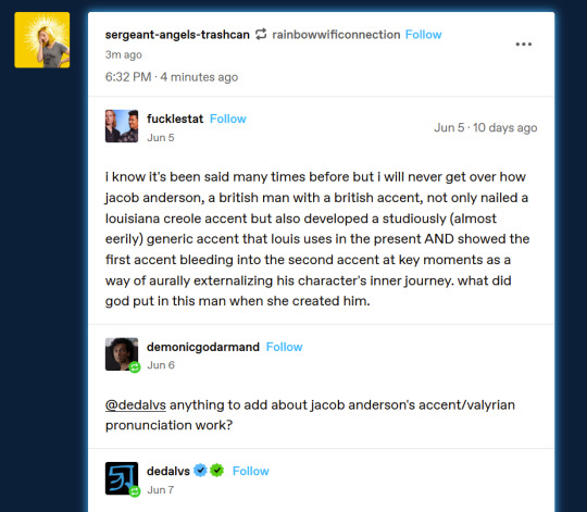
If I click "sergeant-angels-trashcan" I will go to the top of that blog. If I click the white space below the username, I will go to this post on that blog.
If I click fucklestat, I will go to the top of that blog. If I click the white space next to that username, I will go to this post, at that specific comment, on that blog. This is how we avoid additional comments we don't want, like when you have three people in a row that were just tagging another person or going 'omg this' and you want to cut back on
(That doesn't apply to this specific post, where the dedalvs addition is actually super cool, but the fact that I have multiple reblogs in a single post was important for the example.)
However, if sergeant-angels-trashcan were to tag this as "prev tags," with no additional information, then the reading is "sarge appreciates the tags from rainbowwificonnection. I need to find this post on that person's blog.
Previously, I would click on their name up here, and it would take me to that exact post on their blog:

It does not do that anymore.
Like the other 'click on the username' situations, it takes me to the top of this person's blog. However, clicking the white space above, below, or next to them will take me to Sarge's post, not rainbowwificonnection's.
Can I open up the notes and dig through the tags? Sure, maybe. If it's a post that's gone viral, though, and it's a few days out of date, it will be next to impossible to find the specific post and specific tags. Could I go to their post and scroll down until I find the post? Sure, if this isn't a queued post, and the post is from the last day or two instead of a few weeks. Remember, searches don't work consistently on this site.
And beyond that, if the previous person has reblogged a post multiple times, you can't be sure you've found the correct one.
"Prev tags" only has meaning to the person you reblogged from, unless you copy the tags out and include them in the body of the post or into your tags with "<< prev tags" as an indicator.
So yeah. Stop using prev tags. They've gone from inconvenient to downright impossible.
#echoes#resources#please don't use the “prev tags” tag or any variant of it#just share your thoughts in your own words#its ok i promise
1K notes
·
View notes
Text
Add Alt Text To Your Posts!!!! Here's how!!!!
The ability to alt tag your photo's or gifs has been around for a while and yet it is still not common place on tumblr which is a shame. Adding Alt text is important for people who use screen readers such as blind and visually impaired people (and others!). Unfortunately, it's not something I was even aware you could do till recently as on desktop it is a bit hidden. Here's how you can do it and make your posts more accessible!
For Desktop
To add alt text to your post you must have the new BETA editor on. This is why many people, such as myself, were not aware of it's existence as many still use the normal editor.
To add alt text you go to the 3 dots in the corner of the editor
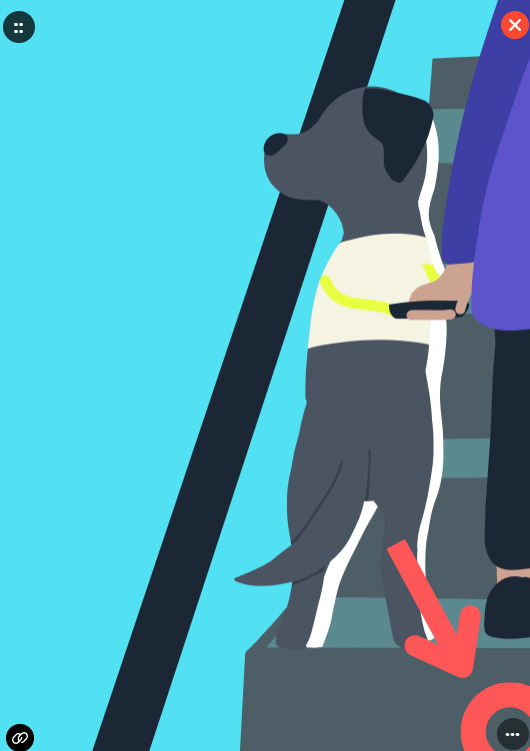
Which will bring up this menu where you click on 'Update Image Description' which will bring up a pop-up text box where you can add alt text.

Top tip: If it's text heavy image and you don't have access to copy and paste the text, there are image to text converters available online to save you the typing!
For Android/IOS
This is a lot simpler as it the function is already available as standard.
First off once again go to the 3 little dots in the corner next to the pallet symbol and click on add alt text.

I am aware that alt text doesn't always work with screen readers but hopefully the more people that do it, the better the function will get
[ IMAGE DESCRIPTIONS:
1)An outline of a black labrador guide dog on an escalator. It shows a picture of the tumblr editor button with an arrow pointing towards the symbol of 3 dots in the bottom right corner
2) An image of an open menu with a faded 'Image options' and 'Update image description' button enabled
3) Screenshot of a mobile with a darkened picture of a yellow goldador 'Reggie' with a red collar and lead looking at the camera panting in a autumnal wood. It is in the tumblr editor with the Image options menu open with the item of 'add alt text' being visible ]
#It's actually a coincidence the last image I did was of a guide dog I swear#Reggie is a good boy yes#I really wish they would add the functionality to open the alt text similar to twitter so it can also act as an image description#which can be suitable for a lot of images#anyway im gonna do the annoying crosstagging which I hate cause y'all need to get better at this#miraculous ladybug#mcyt#star wars#the dragon prince#stranger things#twitter#pokemon#mcu#the witcher#warrior cats#cottagecore#anime#bnha#sk8 the infinity#spn#ahh those were the days (i hated but loved)#interview with the vampire#good omens#actually neurodiverse#actually autistic#dnp#helluva boss#fuck what fandoms aren't dead idk#bbc melin#that never dies
4 notes
·
View notes
Text
IT manager made my life a misery so we auto-insulted him hundreds of times a day.
TL;DR at bottom
This happened a few years ago. And by few I mean a lot. I was student in the mid 80's and I got a job for the summer working for a major electronics company; it was low skill boring grunt work but it was a foot in the door and paid good money.
I worked in the IT department next to a very noisy room filled with very wide dot matrix printers that buzzed and chattered all day long. It was the central printer room for the VAX system that we used back then. One of my jobs was to take the huge fan-fold printout (each stack was about 2x1 feet and about a foot high) and separate it into individual print jobs, lay them out on a table for people to pick up and also to refill the printer with new paper. The noise drove me nuts so I closed the door. The IT manager found out and insisted that the door stay open so that I could hear when a printer was out of paper, the printer gave out a series of beeps when the paper had run out. Lets just call him Dick because a) his name was Richard and b) he really was a Dick. A real petty tyrant.
In a nearby room was Bob. Bob was an an odd guy, he was an absolute hippy, a relic from the 60s. Bob was a slacker, he appeared to do the minimum work necessary to stay employed but he was also a genius, a hobby electronics experimenter, proper old-school coder (COBOL and FORTRAN), radio amateur, he wrote for electronics magazines, designed and built his own computers, radios and hifi gear, he would happily fix any electronics you brought him and refused payment and he was the go-to person for almost anyone in the company with a technical problem. The odder the problem the better he liked it. Senior engineers would come down to Bob with a question and go away with an answer, sometimes he was seconded to a project to consult and on more than one occasion co-authored a technical paper and was named on a patent or two. Most of the time Bob didn't want any recognition or fuss but usually you got to hear through the grapevine that it was his work. He liked his little room and liked to be his own boss.
I liked Bob, he was a genuinely nice guy, he had a lot of power in the company through a lot of favours but he never wielded it. He was always helpful to anyone who asked from MD to summer students like me, in fact he really liked students and often mentored us when we had a problem or just taught us how to work the system.
I told Bob about the noise in passing. Bob went away and designed a remote Out Of Paper system that would indicate a paper outage on a light-board where I sat. He didn't have to but Bob liked a problem to work on. Dick rejected it out of hand. I resigned myself to a summer of noise but Bob just quietly turned to a new solution.
Bob proposed an improvement to the printing system to Dick. The print header was a line of hash symbols, the print job name, the user name of the person who printed it and another line of hash symbols. Sometimes you could pick up on the Hash symbols sometimes not. It was hit or miss.
Bob had experimented with a mix of text and ASCII block characters and came up with a distinctive 'song' that the printers could make by printing apparent gibberish. Based on his amateur radio experience he theorised that even someone untutored in Morse can recognise a Morse code phrase very quickly and the ear picks up on the phrase even when not actively listening and so someone could pick up on a distinctive tune or rhythm. He ran a test and it worked. Dick could see the benefits and so authorised Bob to code it into the standard print footer.
In production I could hear the end of every print job as the printer changed it's random screeching buzz to the distinctive sounds and I pulled them off the printer as they finished instead of the finished paper stack speeding up the print job process and reducing the wait time for those waiting on the job. Dick was nominated for an innovation award (about £200 bonus) and accepted without acknowledging Bob. Bob didn't care and neither did I, after my ear had tuned in Bob gave me a Morse alphabet and just smiled at me. He had coded symbols for 2 lines at the end of the print that sounded like "FUKDIK" in morse code. It didn't reduce the noise but it made it bearable that every print job was an insult. It also made me happy that there were a few radio amateurs in the company who all know Morse they all knew Bob so I guess he told them. When they came to the print pick up point you could see some of them catch the phrase and smile. Sometimes it the petty revenges that mean the most.
I rejoined the company after I graduated 3 years later. Bob had medically retired after a massive heart attack and died shortly after, Dick had moved on and we were beginning to move to the massive computing power of desktop 386 pcs with local printers instead of the VAX system but I went down to the print room one day to hear "FUKDIK" over and over.
It made me so so happy. I may have shed a little tear at that moment in memory of Bob.
TL;DR
I worked next to a noisy printer room, the manager would not allow me to close the door or use noise reducing measures so a colleague coded an insult to the manager in the sound of the end of print block.
Source: reddit.com/r/pettyrevenge
35 notes
·
View notes
Note
hiii! ^^ I'm really new to Tumblr and wanted to know how you make the dividers for your masterlist post? like the line with the symbol in the middle.
I'm not sure what programs to use or dimensions, yadda yadda.
thank you!
Hi! Before we start, I need to mention that it has been a long time since I made these and I've tried to make this as complete as possible BUT I use photoshop by clicking around until it freezes so be warned there might be some shortcuts or something I don't know about lol!
I'm using Photoshop 2020 but I have friends who use Photopea in desktop browsers and say it works just as well!! I've used it once or twice and most of the features are similar to Photoshop so hopefully you'll be able to figure it out from there.
Canvas Size: 2048 x 164
Rectangle Size: 1028.50 x 80.50
Okay, so first you want to draw your rectangle using the rectangle tool in the bottom left, as I've already done. The size of this doesn't matter, just do whatever looks right.

To make sure your rectangle is centered, You can create a background layer, shift + click both layers, click the select tool at the top left of the toolbar, then click this button at the top to center your top layer on the vertical axis. (When I create my background layer, I give it some sort of color so I can see what I'm doing and make sure the program doesn't mess something up because it's empty.)

Next, go to File > Place Embedded > and select your icon. I'm using Cat icon by Icons8. Center it on your canvas by ctrl + clicking it and your colored bg layer, then follow the steps as you did above.

Once your icon is sized the way you like it, take the eraser tool and size it until it fits around your icon. Click once behind the icon, creating a rounded edge on both ends of the rectangle.
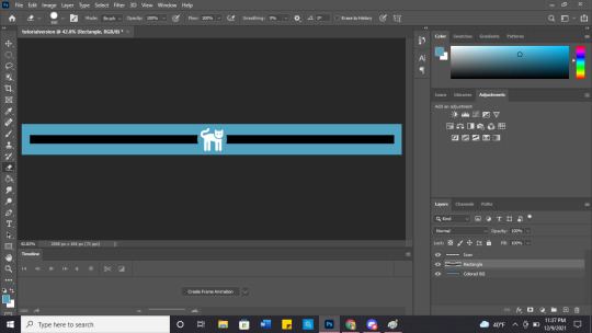
Next, chose a gradient you think fits the character, and create two layers - one above the rectangle and another above the icon. (I create one gradient and then copy that layer so I can ensure they're identical.) Finally, make those into clipping masks and you're good to go! (Both the 'duplicate' and 'make into clipping mask' options appear when you right click on a layer!)
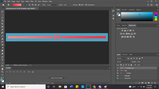
Don't forget to make your colored bg invisible and save as .png so the background it transparent!

You can also get a little fancy and play with shadows or put anything in the middle!


(gif credit: gifgenshin on twitter)
Let me know how they turn out! Good luck with your blog!
14 notes
·
View notes
Note
VICTORY! To all who open up jsons to squint at their guts and figure out why no work: go get an IDE. It's a thing that programmers use to actually MAKE mods, but ignore all that: it color-codes the mod and shows you a list of what's broken. I'm never using Notepad again.
Buuuuuut it's a little intimidating to get going with, because there's a fuckton of stuff you don't actually need for json-fixing. Here's a step-by-step, with pictures, because I already waded through all this shit and I'd rather you have a bridge.
"QUICK START" GUIDE WITH BONUS BLATHERING
There's different programs for the various OS, so get whatever the Wiki says. I'm on Windows, so I have Visual Studio. --The wiki says get Visual Studio 2017, I have 2019, I just checked it with 2022. It doesn't matter what you get unless you're writing code. You need an account for the non-latest versions, so do whatever
Download, install, and when it hurls far too many options of what "workloads" you want, just get the ".NET desktop development" one:

Now, you can right-click a json, click "Open With", and you'll see the option for Visual Studio (hereafter referred to as VS for laziness's sake). BUT, even better, you can right-click inside a folder and open the whole damn thing in VS. This is MUCH better for navigating around instead of opening each file individually from Windows Explorer:
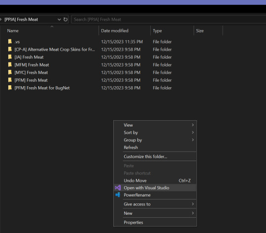
Might be that the first time you do this, you'll get a mostly blank program with the folder name unhelpfully hovering at the top, unclickable and useless. Click "View" up top, and then "Solution Explorer":

Then you'll actually see the folders/files. Open one of your misbehaving jsons and marvel at the color-coding. Open the Error List via the View menu or finding the warning symbols at the bottom:

Et voila! VS should look something like this, and you're ready to feel the sweet sweet relief of never searching for an errant comma again:
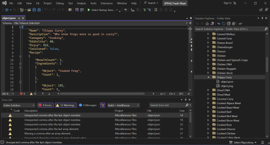
hey, when you were poking around the PPJA files, particularly Fresh meat, did any of the changes, uh, make your DNA Synthesizer disappear?
FASCINATING question! No, but I’m delighted to find a new way it might break. I’d love to take a peek. What pokings have you done? The ones I’ve listed or others?
#stardew valley#stardew valley mods#smapi#modding help#instructions#ppja#ppja fresh meat#ide#visual studio#how to fix mods
4 notes
·
View notes
Photo
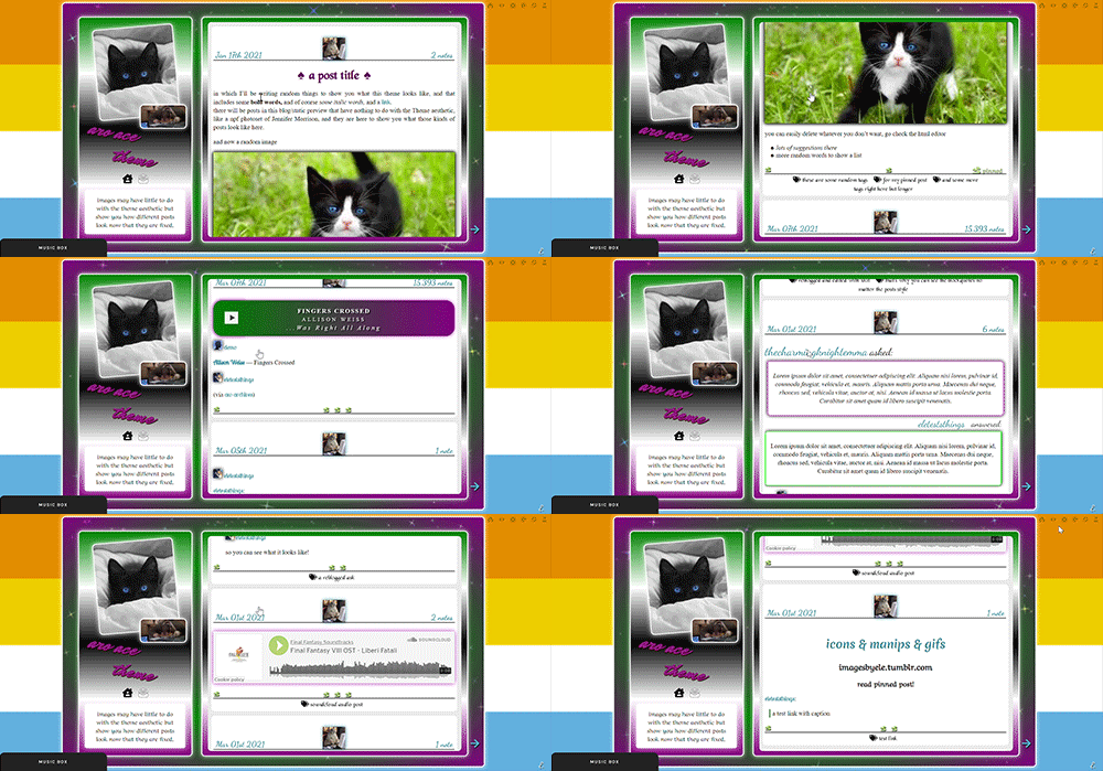
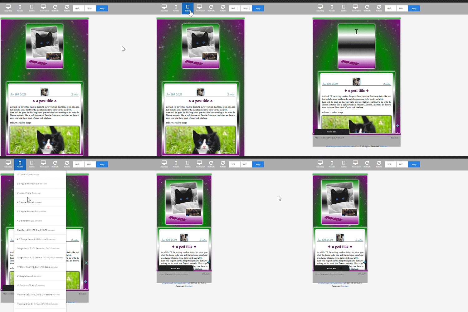

the theme I don’t know how to describe because it has too many things featured in it and it will take a year or
aro-ace theme!
note that you are allowed to use the theme for whatever you want, change all colors, images (you want to make it a marvel thing? go for it! It’s personal and you want to use other flag colors? go pick those rainbow colors!), but my inspiration was, well, not having seen aro-ace themes before and wanting to make one. I didn’t upload background images but you have the option. Feel free to edit as you please, just don’t remove the credit or claim it’s yours!
as always in the source you’ll find the link to the post with static preview, code and instructions/extra credits.
theme is contained, responsive, super customizable. It’s free! But as always consider donating to my ko-fi as this was a lot <3 like or reblog if you use! (or just if you like it, if you want to!)
this post will have: what you can edit from custom page, the widgets/scripts used with credits and some explanations. Asterisks * next to something will indicate that more about it will be said in the linked post. I’d apologize for the length but it’s due to how many things I added to the theme and that you should know about.
now, what can you edit from your customization page:
-nearly every font and its color and size, so that if a font is by default bigger than others you can easily reduce the size. There is a select menu for the body font with all the fonts present in this blog, so you know what they are and can type the one you want for other eleents. I think I only left a couple to be edited from the editor, like your quotes posts if you reblog them a lot. This includes h2 as it’s what you use as ‘big font’ in your posts and h3 in case you want to personalize it and use it for something on purpose, as it has to be added to the html of the post.
-one of the new things:I used a gradient for the backgrounds of the big container, the sidebar and the posts container, but also of tumblr’s default music player (latter done initially following @octomoosey‘s tutorial then messed with by me hence no album art). See static preview posts. You can type the colors straight from the costomization page like this:
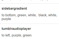
if you want one solid color you can just write, for example: black, black as it needs at least two. To bottom/To left/to top/to right change the direction. The only thing you need to edit from the html is if you want to go from linear-gradient (like you see in the sidebar) to radial-gradient (like in the big container which has green in the center and purple on the outside) and vice versa, if you want.
-you can also upload background images of the sidebar, container and bigcontainer and select the optional blending with the colors, which can be none and you only see the images or something like screen or hard-color and check the results (bigcontainer as an overlay gif on Screen now) -more typing: you can paste the symbol or the symbol code for the list items and the decorations around the post title, right now both being spades. *
-you can upload up to five background images if you enable the ‘changing background’ function otherwise only the first one counts. They will change when you refresh the page, thanks to @lmthemes
-you can turn on and off the music box (player3 by @glenthemes ), and if it’s enabled you can add two songs from the customization page (or go to the html editor and up it to four before it can get messy as it shows on hover), typing url, author, url of the album art, and song title. You already have We Are Golden by Mika as an example (takes a second to start due to the recording, watch out not to get scared if there is silence and then the first note)*
-optional searchbar in the sidebar with optional suggestions when you click on it (if you want them though you’ll need to go to the editor to type links and names, but you can turn it off and just keep the searchbar, like I said) also by glenthemes’ tutorials.
-the separator between text posts image is also optional and if turned on, you can also turn on and off whether the image is the avatair/portrait of the person who made the post, with a link to the original if it’s a reblog, or if you want the image to be one you upload yourself, 50x50px and it should resize to fit in (also with a link, in this case to the post itself so you can open it from the top of the page). One is the toggle button ifshowtinyimage, and the other is ‘tinyimageisthesource’, if you turn that off you upload the image yourself. If you add a source to your posts, it will appear among the permalinks regardless.
more under read more!
-besides all normal colors and borders you can pick the color of the border/glow/shadow (call it as you want) of three different categories, or turn it off: the mainglow for big elements like containers and sidebar and sidebar images, the audios glow for players like spotify, regular one or soundcloud. Finally the images shadow when inside your posts. The latter is set on inherit because it means that if an image is also a link like your tiny-image it will be of the same color of your links and change on hover. That is something you can only change on the editor by searching for color:inherit and change it to what you want, if you don’t want to turn it off.
-askbox colors have been changed with @eggdesign‘s tricks! look for ask_form in the editor and try changing the number of filter there to see more effects. Also the askbox never shrink, a fix by @whateverhtml -pinned post has a little banner, styled like permalinks.
-you can pick a color for top-info which are the date and notes. I left it empty because it automatically gets the default links color but you can pick it yourself.
-turn on and off unnested captions looks for textposts and for all other posts (as people who use xkit to edit previous posts will get blockquotes anyway and may not like the final result) thanks to @annasthms code. -blockquotes are of alternating colors, by @bychloethemes. You can obviously choose the same color if you want them to just have the one. You can also select the type of blockquote, if a solid line or dots or dashes. -you can choose if your smaller sidebar image, sidebarimg2, is an image you’ll upload or if it’s your avatar/portrait by toggling it on and off. If you don’t want sidebar images and you don’t upload any, there are instructions on top of the html to delete the border so you only see the sidebar bg. (basically just delete their box-shadow) -speaking of which, your title will wrap around the second image like in the preview. If that doesn’t work for you you can try changing sizes and font or by going to the editor and changing the margin-top so it’s out of the sidebar image’s reach and can be a “straight line” again (in case it doesn’t fit and the long title is cut in the wrong place)
-you can turn on and off a copy link of the post button on the far left of your permalinks bar, so people can copy the permalink from dash - also by glenthemes.
-navigation links have two alternating colors, odd links right now are black, even links are white, and their hovers are the opposite of that. You can make them all of the same color, in which case you’ll need to look for .navilink a:hover and change the hover color for both. If you have custom pages and enable the link to show it will be automatically added. To change the cat icons just search for ‘cat’ and replace as pleased. To change the ask icon because maybe you don’t have them enabled look for ‘envelope’ with your ctrl + f. You can type urls and titles of navi links from the custom page, the first two are automatically home and ask, there are three more under the description. All icons from font-awesome have a black border so the white ones don’t disappear on light backgrounds, you can change that looking for .fas
-you can select post-sizes: 400, 450, 500, 540. Whether the sidebar is next to the container or on top will depend on your post size and the screen width as at some point they may not fit. They always do fit on desktop though, and on screens that are smaller than 800px the sidebar is assumed to be on top and will have a max height of 300px (but you can scroll down). I couldn’t make the bigcontainer get bigger for giant screens as I can’t calculate the right size in which all post-sizes + sidebar will look good.
-lightboxes show images with a glow too. Speaking of which you get lightboxes as always, pxu photoset fix and video resizing fix all by @shythemes and with the bychloethemes fix. npf photosets fix by glenthemes. No href.li addition from tumblr when you add a link to a post by @magnusthemes.
-soundcloud player is minimal and its play button is the same color of your permalinks icons thanks to shythemes tutorial. spotify is also minimal, instructions to change it are there.
-tumblr controls are small and semi-transparent until you hover, also dark regardless, followed painthemes tutorial.
-chats are styled like imessages by ncrthlanes now deactivated, submit posts have at least the submitter’s url recognizable, reblogged asks also get a background for the answer as well as borders, link posts are styled as much as a link-post can be styled.
-there are already links and similar things written to be an example in your customization page but in any case you get instructions in the editor and everything is divided in sections as much as possible. Also I’m here for any questions.
#asexuality#aromance#aroace#lgbt#aro-ace#themes#free themes#free resources#evansyhelp#dailyresources#rp themes#rph theme#rpc#main theme#lgbtqia#dustyresources#onlyresources#completeresources#my themes#tumblr theme#rp theme#theme 08#mine
60 notes
·
View notes
Note
Would you mind writing a fic or ficlet about dani x jamie wedding? Your recent atonement au was brilliant✌🏾👏🏾
don’t mind if i do! thank you so much, as well. i really, really hope you like this. it should be noted that it takes place in an AU where everything is the same, save for Dani’s sacrifice.
..
It’s a Tuesday when the news breaks. Dani is going through their mail in the back office, flipping through the junk mail and weekly savings coupons, and she pauses when she gets to the newspaper. Unfolds it carefully on the desk in front of the desktop. Blinks down at it thoughtfully.
“Huh,” she breathes, reading over the headline—bold, black letters saying words she’d never actually thought she would read.
It’s not that she hadn’t known—or even been a part—of the fight against the laws and the courts keeping so many people apart from one another. People like her and Jamie, like some of their friends, like everyone in the pulsing crowd parading across Burlington every June. There’s a ring on her finger, yes. One that’s been there for the last seventeen years, and a bundle of documents tucked in their safe at home declaring their civil union but…
Huh.
In a sort of dreamy daze, Dani gets to her feet, tucking the newspaper under her arm, and goes out into the shop. Jamie is sitting in the chair by the window, a book open on her lap. They’ve only been open for an hour and, with all their orders filled for the week, there’s precious little to do but sit around and enjoy the sunny September day.
There’s no reason to be nervous, not really, but the sight of Jamie has never failed to make Dani’s heart sing in tone and pitch too fevered to make her feel anything less than woefully in love. Even twenty-three years later.
Dani bites her lip and drifts over, closer, toying with her necklace—diamond, in the shape of an infinity symbol, the bottom shaped with the same hands, crown, and heart that adorn the ring on her left finger. A ten-year anniversary present that she’s worn every day for the last thirteen years.
Jamie looks up as she gets nearer, her smile as dazzling as the light shimmering on her graying hair, pulled away from her face for the day. She looks a little confused, and Dani knows it’s because they know one another far too well. There isn’t any way that Jamie can’t read her body language or read what is likely a very anxious expression on her face.
“Hey,” Dani greets, trying to sound collected. “Um…”
Jamie closes her book and frowns. “You alright?” she asks, always so concerned. So ready to jump to Dani’s defense.
Dani nods. “Yes. Perfect, actually, I just wanted to…” She trails off. Thinks it over. Finally, she says, “I know I’ve already...done this, but…” and then she gently lowers herself to one knee, setting the newspaper down on the ground so she can grab Jamie’s hands in her own.
“Dani, what are you—?” Jamie begins, but Dani cuts her off.
Says, “Jay, will you marry me?”
A sputtered laugh is the first response she gets. Then a, “We’re already—”
But Dani shakes her head. “No, I mean...I know we are, but...Would you want to...do it legally?”
“Legally?” Jamie asks, dumfounded.
Dani pulls one of her hands away from Jamie’s and picks up the newspaper, handing it over. She watches as Jamie opens it and looks it over, silent for what seems like forever. And then she looks up, all watery eyes and tearful smile and nods, the wrinkles around her eyes and mouth crinkling in that beautiful way they do.
In an instant, she’s out of her chair and kneeling on the floor, too. She wraps her arms around Dani’s neck, trembling in her arms as she tucks her face into Dani’s shoulder. She can feel the warmth of Jamie’s tears as they land on her neck and slip down her skin and into the fabric of her blouse.
“Is that a yes or…?” she jokes and Jamie pulls away, clutching her close the way she did all those years ago with that first proposal, standing there in the kitchen as the world shifted beneath their feet.
“It’s a yes,” Jamie says. “Of course it’s a yes.” She leans in and presses a quick kiss to Dani’s mouth. “That good enough for you?”
Dani gives a breathy laugh, cupping Jamie’s face and brushing away some of her tears. “Yeah,” she says. “That’s enough for me.”
They stay there together, kneeling on the floor, for a long while—hugging and kissing and marveling at the distance they’ve crossed together over the years. The life they’ve built.
_________
There’s an inn in Warren, just an hour away, that they decide on and Henry flies in from California. Owen flies in from Paris. Flora, expecting her second child, sends her congratulations via her uncle and Miles calls them both from Los Angeles. Their most important friends make the drive, but the only real thing that matters is this:
Their fourteen-year-old daughter, Jack, serving as Maid of Honor to them both.
She insists on wearing an old dress of Dani’s, the one—she’s told—her mother wore that afternoon three years before she was born when she proposed. When her other mother said yes. It’s a little big on her, still growing and just as scrawny as Jamie, but she doesn’t stop grinning the whole time. Doesn’t stop sweeping in to hug her parents, squeeze them tightly and happily.
There are some traditions they allow for. Others that they break. They refuse to spend the night before apart, because they’ve been married, really, for so long already. There’s hardly a point to willful separation. The ceremony is just that: a ceremony. A chance to do things they hadn’t had the option to do almost two decades before. And, importantly, it’s for the legal document they’ll sign at the end, that they’ll file and keep a copy of and have for the rest of their lives.
Dani buys an actual wedding dress for the occasion, wanting to take advantage of the opportunity to have the real wedding they’ve been denied so far. And even though Jamie had been there when she’d picked it out, tried it on, and bought it, the sight of Dani wearing it as she comes down the aisle on Jack’s arm is almost too much for her to take.
When they’re standing there in front of the white arch covered with flowers they’d both picked out together—in front of the officiant and their daughter and their friends—Dani smiles, trying not to cry and says, “I love you.”
The ceremony hasn’t even really started yet, but already Owen is dabbing his eyes with a handkerchief, Henry is giving them a proud, beaming smile, and their daughter—
And Jack is sitting in the front row crying and smiling and holding Owen’s hands, watching her mothers as they are finally, finally given this simple, monumental privilege.
The cool, October breeze whispers through Jamie’s graying hair and she’s still the most beautiful thing Dani has ever seen.
“I love you, too,” she says. “Now shut up and marry me already, will ya’?”
..
#dani x jamie#dani/jamie#damie#damie fic#damie prompt#the haunting of bly manor#thobm#damie wedding!#woo#and a...#child.#wow wow
46 notes
·
View notes