#but also I have better reference images for character study
Explore tagged Tumblr posts
Visit Tumblr Blog
Explore Tumblr blogs with no restrictions, modern design and the best experience.
Last Seen Tumblr Blogs


Fun Fact
Forty percent of Tumblr users are between the ages of 18 to 25.
Note
Hello! I think I'm doing this right but if not, I'm so sorry:
What do you think Silco would do if he found out, years later/during Act 2, that a fling he had when he was alot younger and dumber, resulted in him having a Son/Gender neutral child living in Piltover?
(how this is discovered can be completely up to you)
Would the angst of them being a Piltovian(?) citizen permanently leave their relationship undefined or would he push away his hatred of Piltover and try and meet them?
Better yet, how would Jinx react to this?
Just a bit of potential angst to spice things up I guess haha.
Thank you!
Thank you for this amazing prompt, anon! It's one of my favorite ones I've ever received! Why does writing angst soothe me? It doesn't make sense.
Summer's Ghost
Masterlist | AO3 link
Rating: Mature
Tags: Silco, original female character, original child character, angst, depression, reference to character death, character study
Word count: 2.7k
Beta reader: @juniper-sunny
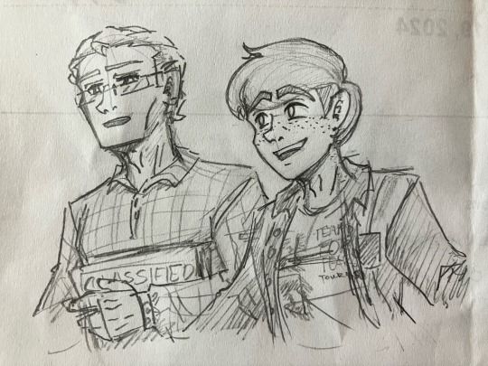
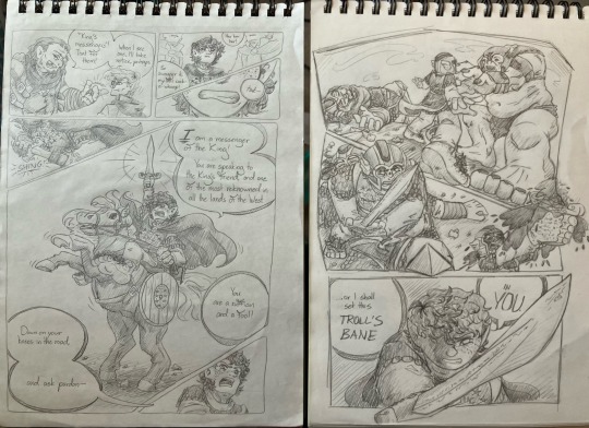
Silco receives a curious letter from a Piltie boy claiming to be his son. Spurred by lingering bitterness and unresolved anger, Silco visits Topside for answers and to finally speak his mind to the woman who left him so many years ago.

Dear Mr. Silco,
I'm not exactly sure how even to begin this letter, so I’ll start with the part that is most relevant to you:
I am your son.
I know, I didn't believe it at first either. But if you keep reading, I can tell you how that happened.
My mother was a brilliant woman, born and raised here in Piltover. She was the top of her class and an artist. My grandparents tell me that, in her university days, she had a bit of a rebellious streak. She ran away from home to live in the Undercity. Over the course of a summer there, she met a man. And fell in love.
You probably know more about how the rest of this story goes than me.
After that summer, my mom had a change of heart. She returned home with a new bundle in tow: me. And while she never told me, I assume she left the Undercity in order to raise me here.
But you probably don’t care about all that. You just want to know why I’m writing to you.
Well, first off: I'm not asking for money. My mom (and grandparents) provided for me and I have a comfortable life here in Piltover.
I don't want anything from you. Not really. I wrote because… well… My mother died recently. It's actually how I found out about you. My birth was a closely guarded secret and it was only when I was cleaning her stuff out after her death that I learned. She had a box of things from her time with you: a diary, some photographs, a bracelet. I thought you might want them.
I don’t know what your relationship with my mother was like or how it ended, but this seemed like something she would want me to do. If I crossed a line, I’m sorry.
I've attached her obituary. It has her final resting place. If you want to collect the box, I've left it on her grave. If you haven’t taken it by next week, I’ll assume you want nothing to do with it. And that’s okay, too.
Sincerely,
M.
P.S I also included a photo for proof. You can hold onto it. I already made myself a copy.

When finally Silco lifts his eyes from the letter, it's with slightly parted lips and inward curling eyebrows. Visions of memories long ago flick across his mind’s eye unbidden, released like water from a dam.
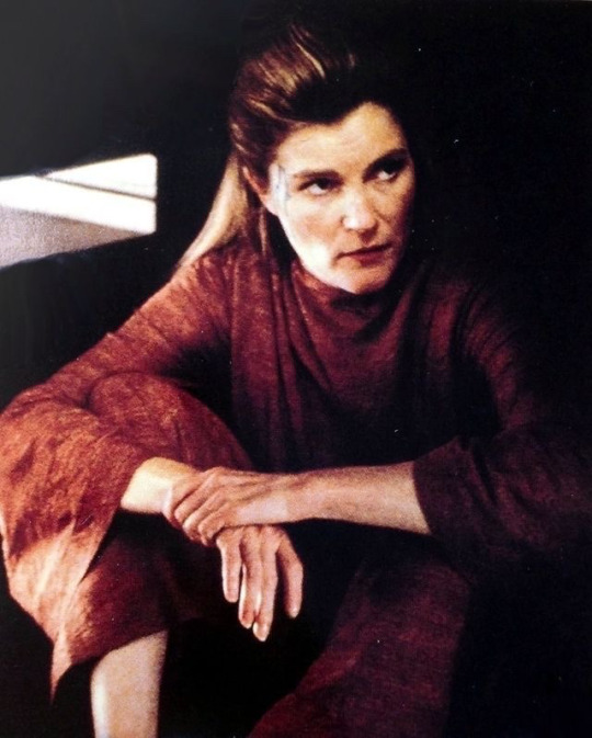
Setting the letter down, he retrieves the other effects in the pneumatic tube. Fingers tremble as they pull out a small photograph. It's worn around the edges and the ink has faded significantly, but the image is unmistakable: it's him in his early twenties, standing next to the woman who left him.
He remembers that summer clearly, the memories vivid and the feelings so strong it could power a Hexgate. He remembers the late nights talking, the sound of her laugh, the way she was always sketching in her notebook. He remembers the first time they kissed, followed quickly by the first time they made love.
Silco’s lips press into a thin line, something bitter bubbling within him.
He remembers his desperation when he ran through the Lanes, searching for her. He remembers how he couldn’t sleep for days, worried something had happened. That someone had taken her. Or worse. He remembers crying so hard that he could feel it in his teeth, his cheekbones feeling as if someone was pressing their thumbs to them with the aim of crushing them. He remembers drinking.
And drinking.
And drinking.
Drinking to cope.
Drinking to forget.
Drinking to wash down the bitter taste of the knowledge that he had let someone get so close to him so quickly, only for them to rip his heart out and slash it to pieces. And to add insult to injury—
My mother was a brilliant woman, born and raised here in Piltover.
He stares at that word again.
Piltover
Hand shaking violently, he picks up the pneumatic tube and hurls it across the room. It breaks on impact as it hits the office door, glass shards flying through the air.
Of course.
Who else could chew him up and spit him out? Who else but a Piltie? His home—his life—nothing more than a tourist attraction to her, a vacation away from her cushy, privileged life.
How could he have been so blind?
How could he have been so stupid?
He can feel his heart rate rising, chest heaving as his breathing grows unsteady. Good eye fluttering closed, he puts one hand out, signaling himself to stop.
Slow down.
Breathe.
He takes one long inhale through his nose, holding it for a moment before blowing it out his mouth through pursed lips. When he opens his eyes, his jaw is set, decision made.
He snatches the letter, photo, and newspaper clipping off the desk, shoves them into his coat pocket, and walks out the door.
As far as final resting places go, this certainly is one of the more luxurious ones. Even in death, Topsiders can’t help but preen and self-aggrandize, if not with their bodies, their tombs. Each gravestone seems to be attempting to outdo the next, growing larger and more gaudy in size as Silco walks down the rows of graves. Subconsciously, his nostrils flare and his mouth twitches into a snarl.
When he finds her name among the dead, he’s surprised to see not a tombstone but rather a park bench. Constructed out of blue pearl granite and polished to a brilliant shine, her name, date of birth, and date of death are carved into the back. The soil around the bench looks freshly turned over and the carved letters barely have any dust or dirt accumulated in them. Studying the dates, it would seem M did not lie; she had died two weeks ago.
And there—sitting on one end of the bench, waiting for him—is the box.
His chin lifts as his mismatched eyes scan his surroundings, looking over his shoulder, his ears alert and listening for any signs of other visitors. Certain no one is nearby or within eavesdropping distance, he turns his attention back to the bench.
He could just take the box and go. There’s no need for him to linger here. But as he stands staring at her name—carved with such finality into that unmoving stone—he can’t bring himself to leave.
And yet, it’s odd, addressing a bench. On his way over, he had envisioned himself spitting on a tombstone with great satisfaction. But now, as he’s faced with something as welcoming as a bench in a beautifully maintained cemetery, he feels stuck. Any anger that had been boiling in his abdomen before has simmered down, upended by the unexpected appearance of his former lover’s grave.
Reaching into his pocket, he retrieves the photograph. After propping it up on the bench, he addresses the woman who lies six feet underground.
“You…” He can’t even bring himself to say her name, both hands balled into fists in his coat pockets. “You’ve been here this entire time.”
Both eyes roll as he realizes the error of his statement.
“Not here, but in Piltover.” He brings one hand up to pinch the bridge of his nose, good eye squeezed shut. “I searched for you for weeks. I didn’t sleep. I didn’t eat. I thought someone had taken you. I thought you had—”
Died.
Well.
It’s accurate now, isn’t it?
“Typical Topsider,” he spits out, one hand gesturing as if throwing something away, like the way she had thrown him away, “You come to my home, promising a bright and brilliant future, but all you do is leave destruction in your wake.”
He steps back, pulls his head back, and spits onto the freshly dug soil.
“Disgusting,” he snarls. “And to think, I had lov—”
He pauses, unable to finish the word.
He was young. He was ignorant. That was not love he felt for her. Nor adoration. That was infatuation; merely a young man’s naive idea of what love was.
What that was—it was Not Love.
Silco pulls his fingers through his hair, collecting himself.
“Why?” His hand curls into a fist again. His tone is bitter, full of anger, growing in volume. “I don’t care why you left; I know exactly why you left.”
As he continues to speak, his concerns about being overheard are overcome by the thundering emotions swelling inside him, churning and bubbling after years of dormancy. “You didn’t want your son to grow up to be a street urchin like his sumprat father. No… all I want to know is…”
His next words are bellowed out, the sound coming from deep within his lungs, each word punctuated with a pregnant pause, as if he means to put his entire body into every syllable.
“Why. Didn’t. You. Tell. Me?”
There’s a flurry of wings as nearby birds take flight, spooked by the sudden noise.
Silco’s good eye flutters closed again and he takes long, deep breaths, recentering himself. His hand comes up, forefinger pressing to his sternum. There’s a desperation to his voice now, a yearning. Mourning something he didn’t even know he had until a few hours ago.
“I had a right to know.” He opens his good eye, staring at the photograph. Staring at her. “He is my son. He is my blood. How could you have kept him from me for so many years?”
He gathers himself, eyes casting to the ground.
He had so much more he wanted to say. Years of anguish, torment. But now that he’s here, he’s forgotten them all.
He feels empty.
Finally, he slumps down on the bench, next to the box. It remains untouched beside him. He sits with his shoulders sagging forward, both elbows resting on his knees, hands clasped together as his head hangs low.
It’s quiet in the cemetery.
He turns his face toward the photograph, addressing the woman in it with a whisper of a voice. “All I wanted was for you to be okay. For you to live a good life.” He lifts his head toward the great, open sky of the City of Progress, free from smoke and fissure gasses and ash. “And I suppose I got what I wanted.”
He hangs his head once more, speaking to the ground at his feet.
“You just did it without me.”
A stiff breeze blows through, tugging at his coat. He makes no move to bundle himself up further, letting the chill air surround him, seeping into his bones.
He sits.
And remembers.
After a few moments, he hears movement. Ears prickling and head whipping up, he spots a boy walking between some nearby tombstones. He looks to be a teenager, fifteen—maybe sixteen—years of age. The boy pauses at one of the graves, looking at it silently, his hands shoved into his pockets. After a moment, his eyes lift and meet Silco’s.
Silco meets his gaze, unblinking. The boy doesn’t seem at all fazed by Silco’s corrupted eye, giving him a small, polite nod. Silco nods in return before tearing his eyes away.
Ocean green and volcanic orange eyes pause on the small wooden box on the bench.
Mahogany. Expertly crafted. Like the bench, it’s beautiful in its simplicity. Unbidden, Silco’s throat bobs as he reaches for the box and gingerly places it on his lap.
After taking a deep breath, he lifts the lid.
The first thing he sees is a bracelet. Black in color and made of thin strips of leather with small circular charms along the strings, it’s plain and modest. The surface of the leather looks almost brittle, worn around its edges from frequent use.
Underneath, there’s a stack of photos. Lifting them, he recognizes the first as one he had taken. The late woman stands laughing beside The Last Drop’s jukebox, Felicia grinning widely next to her. Vander can be seen in the corner, caught mid-sentence as he speaks with whom Silco can only assume is Benzo. Setting down that photo, Silco’s eyebrows lift when he sees the next one.
He doesn’t remember this photo being taken at all, which is curious given the fact he’s the one and only subject of the photo. Silco—sporting long hair tied back in a low bun—sits at the bar, pouring over his notebook. His right arm is wrapped in strips of off-white fabric and in his hand is a pencil, which hovers over the page, posed to write.
Silco remembers this night.
It was the night Felicia told him and Vander she was pregnant with Violet. It was the night everything changed.
Funny, how the night he learns of one pregnancy happens to also be the night his lover leaves him because of hers.
He hums, continuing to study the photograph.
He had forgotten what he looked like at that age, so used to seeing his marred reflection in the mirror. So used to covering half of his face with foundation just to regain some semblance of normalcy.
Silco’s about to look through the rest of the box when he sees movement out of his periphery. Quickly, he shuts the box and looks up to see the boy from before, standing in front of him.
“Sorry,” he says, voice quiet. “I didn’t mean to startle you.”
“You didn’t,” Silco replies simply. His good eyebrow lifts in silent question.
“Is it okay if…” The boy gestures to the empty spot on the bench.
Silco stands, hand offering the seat, the box neatly tucked under his arm.
“Oh, you didn’t have to leave,” the boy says, scooting over to leave some room. “I just wanted to sit for a little bit.”
Silco eyes him for a moment, then, against his better judgement, sits back down. The mahogany box feels heavy in his lap. The boy’s eyes look at it briefly before looking out into the rest of the cemetery.
The pair sit in silence, the only sound the rustle of the leaves as the wind rushes through the nearby trees. Silco’s hand covers the box, fingers idly smoothing over the carving of a rose on the lid.
He doesn’t know why he does it, compelled by a nagging curiosity, but Silco breaks the silence.
“Do you have family here?”
The boy nods. “My grandpa.”
Silco hums.
Silence falls between them again.
“Do you?” the boy asks, eyes lifting to meet Silco’s.
Silco’s lips press together, the tip of his chipped tooth catching the inside of his mouth a little.
“In a sense.”
The boy sighs. “At least it’s a pretty nice view.”
Silco follows his gaze.
“It is.”
“Well, except for that.”
The boy points to a large tombstone made of porcelain with gold accents all along its edges. Every inch of it seems to be covered in some sort of design, painted in blue. But the patterns come across as less elegant and more like visual noise; the eye given nowhere to rest, the senses overwhelmed by all the complicated shapes and textures.
Laughing, the boy makes a retching noise. “It’s so ugly.”
Silco’s lips pull into a smirk, head tilting.
“There’s no accounting for taste.”
“Yup.”
The boy abruptly gets to his feet, seemingly satisfied. Turning to Silco, he puts his hand out in offering.
“I’m Marlow, by the way.”
“Marlow.” Silco takes his hand and shakes it. “Nice to meet you.”
The boy nods, seemingly out of words. After offering a small smile, he turns on his heel, heading for the gates.
Silco continues to sit on the bench, thumb rubbing absentmindedly on the box’s carvings. After a moment, his eyes widen and he reaches into his coat pocket for the letter, eyes darting down to the bottom.
M.
He looks up to find the boy has disappeared. He lets a short chuckle out of his nose as he shakes his head, rising to his feet.
After one final look at his ex-lover’s grave, he starts his trek back home.
He has a feeling this won’t be the last time he visits this cemetery.
And it won’t be the last he’s seen of that boy.

Taglist: @averagecrastinator @mazikomo @writingmysanity @insult-2-injury @ariaud @jennrosefx @ins0mniac-whack @steponmesilco @sherwood-forests @leave-me-alone-silco @givemebeansnow @aeryntheofficial @dreamyonahill @lostbunn @whatisafandom @violet-19999 @juicboxd @sageandberries-png @sirenofzaun @blissfulip @mutedwordz @fly-like-egyptian-musk @jennithejester @mrsdelirium @witheringblooddemon
Join my taglist!
#silcoitus#silcoitus writing#arcane silco#silco#silco fanfic#arcane#arcane fanfic#silco arcane#silco my beloved#angst#silco angst
63 notes
·
View notes
Note
Top 5 pictures of Janeway? this is not me trying to pass the work of collecting references for drawing onto someone else. no, it is a gift to have an excuse to present your top 5 pictures of Janeway (or Kate Mulgrew)
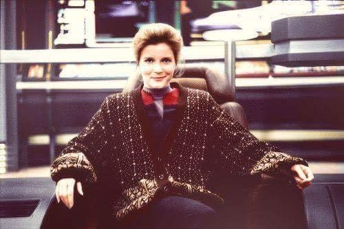
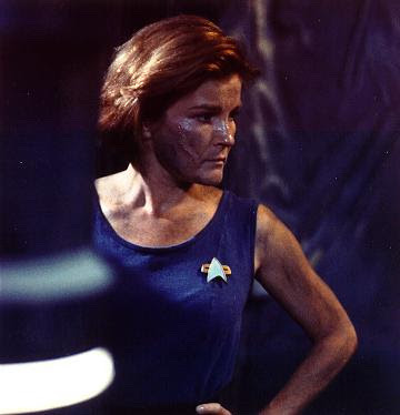

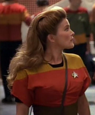
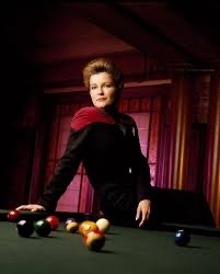
What an astonishingly difficult question to answer. I decided to limit myself to only the pics saved on my phone because otherwise I'd be here all night
Bonus pic (because of course):
#this post self destructed 3 times while I was deliberating#a real shame I don't have any white suit photos saved weird#went over the limit my bad. luckily I'm on mobile and limited to 10#thanks for the gift!#but also I have better reference images for character study#lmk if you're interested in those#I couldn't not add that last one apparently it's my brand#every day is threshold day
89 notes
·
View notes
Text
ikevil - tips on how to draw william rex
next: harrison ->
what better way to start this than with our beautiful lord rex? I hope I make sense with this guide oml
introduction: you know how you want to draw your favorite characters, but don't know where to start? you know, those characters with ridiculously difficult designs?
this is for ikevil. hope this helps
(there is no tracing whatsoever in this. this was all done by hand. analyzing anothers' artstyle is NOT a form of art stealing. people naturally learn from observing others. imitation is the highest form of flattery. this is not meant to disrespect natsume lemon in any way.) disclaimer, I am not a professional artist. these are not set in stone. these are just tips.
section 1 - observation
finding important traits

my writing sucks. let me sum it up for you
thin, angular features. thin nose, sharp eyebrows, elf sharp ears
his face is quite long. the chin is not completely sharp, it is more blunt.
william has an earring on his left ear.
large forehead to plant a kiss on
his smile is :>
his eyebrows are in a ] shape (I don't know how to describe it)
section 2 - study
imitating the original sprite


this is the part that gets tricky.
it helps me learn better because it translates the reference into something I can understand. it's also so I don't forget anything (so many accessories...)
I crudely slapped the colors from the original onto my imitation to save time 😭😭
let's break down his design.
hair
monstrosity. aesthetically pleasing to look at. but drawing it? hell. I have color-coded it into pieces here:


magenta: back hair. very spiky and a bit long. it's a bit poofy on top (at least on the main sprite)
red: extends outwards. try to have the part dangling down cover the end of the hairline.
yellow: think of it like a little extension from the green section. just dangling down a bit.
green: make it dramatic
blue: similar to red, but smaller and on the other side. tucked behind green.
2. eyes


his eyes are in a parallelogram shape. the slant is similar for both ends.
outer corners extend upwards.
they're not opened very wide.
almost everything is sharp. very little curves.
his pupils are a bit larger than slits.
the inner corners are lowered significantly.
3. clothing
I only did a bust but still


underneath that outer collar is the same dress shirt you see in the sprite below. don't forget about it.
the cravat (???) is crinkled by the outer chain
I was obviously too lazy but remember to draw the pattern of the outer collar


all these accents have a rope-like texture
the chain mainly consists of triangles, but they rotate... I could not be bothered to go through that pain
accessories in the third image


section 3 - personal application
applying all these tips to my own artstyle


this was arguably the most painful part of the process. I got artstyle envy because of the study, so I had to hide the study 😭😭
I hope I portrayed him accurately
got a lazy with the clothes... but I make up for it in coloring. eugh trust the process
final comparison

I still like the study better but my artstyle is fine too 🤧
◇◇◇◇◇◇◇◇◇◇
taglist!!
@bakersgrief @floydsteeth @tako-cafe @rubia8 @xxoomiii
@sh0jun @noxinara @g0dwat3r @sapphire-323 @lycemagee
@citrusmornings @drachonia
please let me know if you'd like to be added or removed!! or if you'd just like to be tagged for this series
#ikemen villains#ikevil#william rex#ikevil william#ikevil fanart#ikemen villains fanart#ikevil cast drawing guide#rouletmecook
66 notes
·
View notes
Text
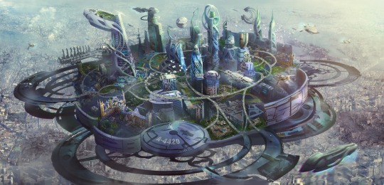
Technoverse - A guide for interaction roleplay and insert wise.
This was EXTREMELY requested
This blog exceeds to help newcomers to my AU environment. This blog will be updated over time if I see fit to change how this works interacts with itself. This blogs images will be updated over time if I find more suitable matches.
Photos have been found through Pinterest and art station. I will try and credit the source if I can.
This is an AU inspired by Rise of the Teenage Mutant Ninja Turtles. This is a free to join au. Major canon characters are prohibited from being claimed. Villains are up to discussion.
This is a isn't the backstory post of the turtles but the world they live in.
THIS AU CONTAINS TOPICS OF RACISM, ILLEGAL SUBSTANCES AND ACTIONS, AND VIOLENCE. Though I've done my best to try and make it as friendly as possible. This AU is a 16+ story due to these warnings.
Current AU time
25 years after the ROTTMNT movie.
AU Theme
Cyberpunk dystopia
Fantasy
Dark fantasy
Major city settings within AU
New York, Hong Kong, Tokyo, Seoul, London
City Summary
After the integration of Yokai as independent civilians and free citizens world wide, and with the collaboration of their technology as well as krang salvage, a new system of buildings and interlinks have been created to accommodate citizens. Buildings stacked overhead that pierce the clouds, the old world was left to turn into slums and poor living areas on ground zero. Due to permanent clouds caused by pollution and overhead cities, these major empires are in a permanent state of darkness. Neon signs often light these cities to create a spectacular aroura of lights and designs. Though with a permanent overcast comes with a cost, as rain clouds mix with polluted smog to create a toxic like rain that causes many illnesses. It's common among every citizen to keep an oxygen mask at all times in case of rain.
City main inspiration and reference: Altered Carbon


Major cities as listed above are unique as floating SSC (Solar System Cosmopolis) Cities cover most of the dense populated area. These floating cities serve as purpose as secured homing for politicians, celebrities, and mostly the rich. Though they are also engineered mega labs founded by Barron Draxum and Donatello Hamato. They serve to bring back and study extinct species, cultivate cures for major diseases, and help improve on already futuristic technology. They spin very slowly and resemble that of a solar system. Hense the nickname.
These cities are held afloat by a self sustainable gravity generator that uses the gravity of a man made miniature star; created by Donatello Hamato (age 20).
Main inspiration from CMD Studios recent project!!!
Hidden cities
These main cities are focused world points for another reason. They rest above other hidden cities in which they have their own theme and setting.
New Yorks hidden city belongs to Big Mama, a spider Yokai who deals in illegal gambling and the distribution of illegal mystic items. NY Hidden city remains as a hub for traveling species of Yokai from all around the world.
Hong Kongs hidden city belongs to [REDACTED TBA]- A Dragon Yokai who deals in illegal sales of mystic items and krang salvage from the old battle.
This hidden city is less developed than the others, as most accomodation plans have been denied to preserve its pristine buildings and history. This hidden city resembles deep mountain caverns with buildings built into the sides. Common mystical creatures from Chinese mythology live within this city and rarely travel. Humans are not allowed.
Main inspiration by David Noren!
London's hidden city belongs to [REDACTED TBA] A plant like fairy Yokai who often helps with creating forged ID's to help Yokai find a better place to live. She also is known to sell potions that aren't approved by the hidden cities overlords and FDA.
This hidden city has developed slowly over time, but due to quick overgrowth of plants and trees. Most buildings have been built into large glowing trees that hang over the city in beautiful rainbow colors. The ground is a great hub for growing fruits and herbs for medicines. The Yokai in this hidden city are spirits from English folklore. They have spread over different cities over time.
Main inspiration found on Thin blue line on Pinterest!
Seouls hidden city belongs to [REDACTED] a Polar Bear Yokai who deals in illegal weapon distribution and species trafficking.
This hidden city is up to date and mostly in an indoor environment due to this hidden city being within a freezing temperature climate. More artic themed Yokai live within, but this hidden city is popular as a summar retreat by humans and other Yokai looking to stay cool for the summer. But this hidden city isn't as welcoming to humans as the others.
Main inspiration by Annabale Siconolfi!
Tokyos hidden city belongs to Yeosobai. A jellyfish Yokai who deals with handles most black markets and distribution of illegal substances.
This hidden city is completely underwater. Surrounded on a deep voided ocean under Japan, pod cities have been added to accommodate air breathing citizens, though most buildings were air tight even before. This hidden city is also a large hub for tourists due to its underwater appeal. This city distributes most seafood around the county. Known for its large amount of attractions and adult clubs, it's also a very crime ridden city.
This is also where Current Donatello resides.
Main inspiration creator unknown
Human and Yokai stances
With the sudden booming population of mutants and Yokai integrating into human society, of course tensions and protests by humans were bound to happen. A world they were so used to was building into something unknown before their very eyes after all. And so, tensions between species rose.
Humans with a deep dislike towards other species either hide their hate, or become extremists. Often getting tag as cultists as over years hate crimes toward Yokai and mutants became a world wide situation. Yokai were often kidnapped from their homes to be found barley recognizable by their attackers. Yokai would retaliate, and after much tension, civil wars broke out. Protests for safer living for both species were in demand, and so most governments integrated an artificial intelligence police force that contained mostly droids to prevent race picking. Most countries have adapted this form of law enforcement.
Cultists are still a major problem though their numbers have thinned.
The term Mutant has become a word to target Yokai and mutants in a hateful way, and this word soon became outdated. All non humans are now under the identification of Yokai. This includes mixed races between the two.
It's common for Yokai and humans relationships! Often by now the first generations of Yokai and humans hybrid children are born!
There are even schools for these rare breeds as they are still being studied as a new species.
It is illegal for most countries to have discrimination between species. No Yokai only or human only living spaces, restaurants, or shops.
Though within most slums there is a secret rule to separate the species as mostly disgrunted humans and Yokai live here.
And now we're here!
I want my character to join the au, but I don't know what's allowed!
This part of the blog aims to help you adapt your character into this new universe.
What should my character wear?!
It's really up to you! Most humans and Yokai wear mostly cyberpunk themed clothing! Often I find Pinterest as a source of inspiration. I think your character would fit better if it comes from a certain part of the world. Armor and glowing clothes are welcome and encouraged! Get creative!
I want my character to have cool robotic limbs and mods in their body! Is this allowed?
Yep! And encouraged! This is a futuristic setting! So modifications to the body aren't uncommon!
Can my characters have cool unique weapons?
Of course! And I'd love to see them!! 🔥🔥🔥
Do I have to ask before joining this AU?
Nope! But I'd love to see/read your creation! Or see that you're inspired to join!
Does my character have to be human?
Nope! Any species welcome!
Can my character already know personally main characters?
That's up for discussion. Current time Donatello isn't open to being known nor talkative to strangers. I'd like it if you didnt. He's playing dead unlike the rest of his brothers. Leo's up for discussion but with Mikey and Raph, they are more social and I can see them having multiple friends. Leo's treated more as a police officer and doesn't have a lot of friends due to his work.
Can my character work for the main boss Yokai of the hidden city.
Yes! I'd like you to stay close to what they do in terms of how they run things!
Can I claim ships with these characters?
NO.
Claiming ships with only your characters and main cast is prohibited. That's why Y/N is created as a medium for all 18+ participants that want to ship their characters with main cast. Ships are fun and welcome! But you cannot claim it as a you only ship.
Thank you for reading what I have for now! More to be added!
58 notes
·
View notes
Note
abt this post SPILL SOME LORE? 👁👁
OHOHOHOHOHO
Unfortunately it’s this AU
OKAY so right now I’m working on some character study pages that have like,, little images that kinda show how these idiots act and backstory stuff.
Bear with me 💀 so like,, the current shitass on the record player being rapidly spun around in my mind is this fucker

Unfortunately.
So what I got so far is like,, he’s half earth pony and was raised by his earth pony parent- resulting in him not really being the strongest flier growing up. He got better tho. I think. (Also referencing how Meg wasn’t originally a flier) To kinda reference the whole miner thing that Meg used to be, I was thinking that this Meg grew up on a rock farm or something similar. Whatever would be the equivalent of an energon miner.
As for how he got the cutiemark of a sword in the magical friendship horse land? I was thinking that he fought off a fucking timberwolf or something by himself 💀💀
Also no idea what his horse name would be
#Ask#AU ask#mlp tfp au#tfp#crossover#tfp Megatron#Megatron#mlp au#my little pony friendship is magic#my little pony#transformers#transformers prime#tfp au#character ask#pony au#maccadams#maccadam#spit takes
123 notes
·
View notes
Note
Do you have any advice on how to get over lack of skill? I want to do the Astarion Lestate trend but I don't think my skills are ready for it. I have references pictures of Astarion pulled up when I'm working, and even have the game launched so I can turn him if I need to (mostly for the attempts I did at his hair) but everytime I tweaked something or started over nothing looked right. I keep getting frustrated 😭
Hi anon- Sorry this took me a while to get to, i hope you and others can still find this useful! While the basic advise to get over 'lack of skill' is PRACTICE, PRACTICE, PRACTICE! i hope this will help you knowig where to get started with that!
I'm going to put my teacher pants back on, this might be a bit long so buckle up- I'll go over a few areas:
Primitive Shapes
How to Use References
Delete your work (hear me out)
--------------------------------------
Primitive Shapes:
This is your foundation. Everything starts with this, and while you may find it boring to think of your art in terms of cubes and spheres- i kid you not it will help elevate your work.
If/when you are stuggling to draw a complicated pose, or a specific perspective, refering back to the form in these basic shapes can really help to simplify your process and help you problem solve.
A chill/silly watch for a more in depth discussion on what i mean / how this can help - Give Pikat's 'Draw boxes (correctly) to improve your art' a watch. They also mention this in the video but @/Uncomfortable on youtube also has some great fundermental videos.
-------------------------------------
How to use references.
Okay so references are great 10/10 very useful. But, unless you know WHAT to study from a reference, they can sometimes fall flat of their usefullness.
Anatomy studies are something a lot of us will be recommended as artists, but actually knowing what to pay attention to can boost your confidence in your work. Start with a goal, what do you want to get out of this sketch session? Do you want to get better at understanding the 3D form of a specific part of anatomy? Better at poses? Try to narrow down your learning each session to make it less overwhelming.
In this i'll focus on understanding the form so, lets start with a reference. Linking back to Primitives again, start off by braking down your anatomy into forms. Sketching over the top of your references is totally fine. But make sure you are doing so critically, otherwise it may look like a flat/unnatural trace and you're not really learning from it. Via the first sketch you can see where the primitive shapes fall on the body - think of it like a ball-jointed-doll, hips, knees, shoulders ect are ball socketed whereas arms, legs ect can be made up of tubes. (See the first image, when sketching your tubes, sketch your contour lines too- this can help determind how clothing / hair will fall over the body, and can help you understand the 3D Form.)
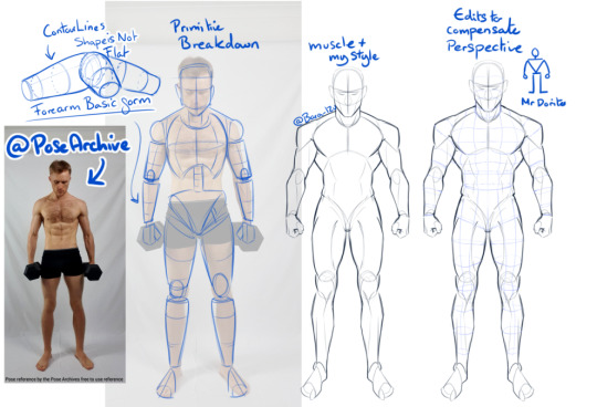
A BIG IMPORTANT SIDE NOTE - When using photo references, do be very aware that they may be distorted due to the height of the camera, or camera focal length - (you can see in my sketch i had to edit the torso and head because the reference was a little top heavy)
A few artists/books for some extra reading / reference : - Andrew Loomis (OG for body proportions, books are a little outdated but fundermentals are still useful), - Tenten云画画 (his stylised anatomy breakdowns are very interesting to me) - Anatomy Essentials (I've had this book for years, it covers lots of areas, is a bit complex though, i myself should reread it again 😅
Also, if you can't find a reference for a specific pose, don't be afraid to use 3D programs! Anatomy 360, DesignDoll, Clip Studio, Magic Poser - all nifty options~
SO taking when we've learnt from the primitive forms, you can now try applying that to the Lestrat Picture. (which, granted is a complicated pose, as it also has forshortening and an odd top down perspetive of the bottom character- so don't panic if you don't get it the first time!)
-------------------------------------
Final points- Delete your art (hear me out)
What i mean by this is, sometimes reworking the same face over and over again can bog your down. It can make it very difficult to actually see whats wrong. So, get rid of it and start again. (hide the layer/use a different piece of paper, please don't actually bin it (yet))
Next, redraw it. Use what you've learned the first time, and redraw it from scratch. (in this case, that might be just specifically the head, or the hair, or the eyes ect - you don't have to bin the whole thing, but sometimes it can really help give you a new perspective)
Once you've done this, unhide your original, compare, this may help you understand what you were doing wrong the first time. Or if there are areas of one that you like- its an opportunity to combine them as you see fit! :)
On a side note for Astarion's Hair, the lovely @mistercrowbar actually posted a breakdown yesterday! (i use p much the same method so-)
I HOPE this was of some use- do feel free to ask any questions if you've got them! i'll try to answer in a more timely manner next time 😅
95 notes
·
View notes
Text
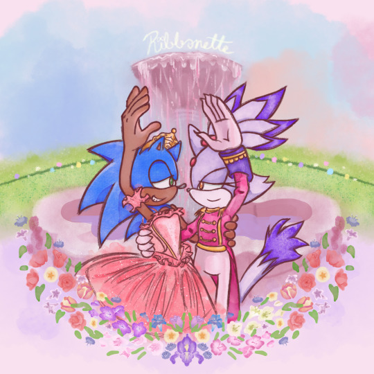
Tribute to one of my favorite movies of all time + the franchise that has me in a death grip 💖
a bit late for Christmas but at least Valentine's day is around the corner ^^;;
Process below if that interests you:
AS I SAID EARLIER, I had been working on this piece as early as December of 2021 😱!!!
This was the original sketch! I was inspired after learning about Blaze's own design inspiration coming from Takarazuka theater, as well as it being the Nutcracker season so this film was in bouncing around in my head.
and this was allllll the way back in 2021 ^^; I had put the idea to paper to capture the image in my head immediately. But the idea in my head was extravagant and beautiful and would certainly take time to complete, as well as the patience and skill to work with watercolor 😔 I've certainly done my share of watercolor, both physical and digital, but I still feel like my physical watercolor work is a fluke, and I was still a novice digital artist at the time of this sketch.
In short, I wasn't confident my skill could live up to the vision.
So I would put this on the back burner. It wouldn't be ready in time for Christmas, and I could use this as an opportunity to hone that digital art experience so it could be ready next year!
2 Years Later...
It's December 5th. Fuck it. Let's crack this open again, I tell myself.
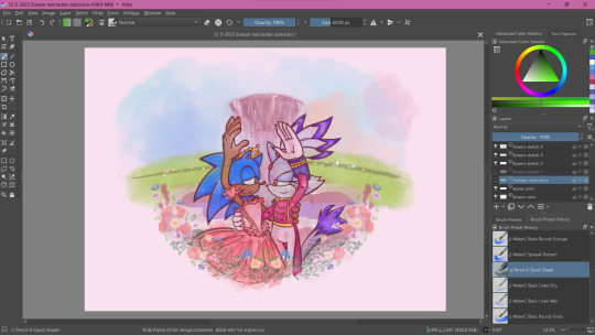
SO starting with the line art, it's actually 2 different brushes layered over one another.
I also changed Sonic's expression to be more love struck-looking, because I'm a sucker for romance.
The image on the left is a watercolor line brush, while the right is a pencil brush. The reason I wanted a water color look was because I thought it would make the illustration look dreamy and fantastical, and I wanted that to extend to the line art as well. However, my usual lines on traditional usually veer more towards thick and cartoony from years of studying the Sonic art style, so I really felt like I was working against myself here. I had also asked friends for their input and they preferred the lines on the right as well. If my followers actually do read these blog posts, I'd love if you could comment which line art style you prefer drawing or looking at.
The happy medium was to just combine the 2. Here's a better look at that:
I like it! I think it combines the solid line with the rustic water color grain. Best of both worlds :]
For the actual painting, The most notable thing I can say is that getting the right pastel-y color was VERY difficult to achieve for someone like me who often loves to use bright and saturated colors in her art. I feel like I really set myself up to do one of those "evil art style" or "opposite art style" challenges I've been seeing around. I had to repaint Sonic at one paint because the blue of his fur was WAY too saturated for the style I was going for:
I started with painting Sonic and Blaze in first and then working on the background. I think that's probably the backwards way of doing it but one of the perks of digital art is you can do stuff any order you want when you have layers.
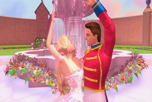
The background wasn't actually as difficult as I thought it would be. I wasn't going for any difficult perspective, and I was using a reference so that could be it. I'm usually averse to backgrounds but I really wanna tackle more of my weak points in art. I actually had way more fun than I was expecting, painting the sky and adding texture to the grass. I think I had the most fun rendering the water coming from the fountain (which you can't even see too well anyway, lol).
Funny enough, I had just about finished painting the characters and background by early January. So why am I posting this in February?
The Flowers...
In case you don't know. I love flowers. I love looking at them, I love learning about flower languages, I love drawing them. so seeing that my reference image showed flowers circling the fountain, I was excited! I was already having more fun than I expected to be having (working against my usual style, rendering a background), so how could this be a pain in the ass?
Well, I am my own worst enemy 😞I couldn't exactly identify each flower offhand from this screenshot alone. The texture of the flowers is kinda grainy, since I don't think the animators were expecting viewers to look too closely at the set piece to use as reference for my lovingly crafted crossover fanart. If anyone has this in high quality though, please tell me.
(I think I actually got this reference from a tumblr post but I can't find it on my blog for the life of me nor can I find it in the tags I'm so sorry)
I'm a huge stickler for details so I really wanted to be as "accurate" as possible in my illustration. I can hardly identify some of these flowers with confidence. I think there are roses in there? or tulips? I'm not sure if those yellow flowers are roses or some kinda petunia or if I'm way off.
I'm sure these details won't matter to most viewers but it was EATING AWAY AT ME. Eventually I decided to try drawing in flowers that might look similar to the ones in the reference. Or some based on their flower languages. I was certainly overthinking it ;;;; It led me to going "fuck it" and just throwing in whatever I wanted. There are no irises visible in that screenshot but I made it the centerpiece of the flower ring. Who give a shit.

I made some guides for me to follow: The blue ring was so I could make sure the flowers make a half circular border around Sonic and Blaze. I was envisioning how it could look as like an icon or sticker or something, which is why it's framed this way. then the second guide is the sketch of the flowers I made. I always do line art and I'm not great at just improvising with color to paper, or color to screen in this case.
The rest of this process is then just working on each flower piece by piece (with the help of the mirror tool of course) with varying degrees of detail. Some flowers are more abstract than others, and I had debated if that would look jarring and disrupted any kind of harmony I was trying to maintain with the style parameters I set for myself. And then I decided I was overthinking it once again which is why this was taking me nearly 2 months to complete.
At some point during this process, my wifi went out for a whole week! Of course, I could still work on this illustration offline, but I had a lot of tabs open with a bunch of reference images on there (plus I like to listen to music while I draw otherwise I lose focus and I had neglected to download a varied selection on my phone or laptop 😭 Learn from my mistakes).
The most tedious of this process was making each set of gladioluses a unique color.
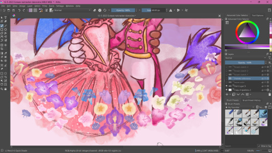
Was it worth it? You tell me! I think they're pretty, at least.
Along the way, I repainted the grass because it wasn't symmetrical (It didn't need to be but I had been using the mirror tool for a lot at this point and it was bugging me). I made other little final adjustments, like color adjusting the leaves on the flowers, lowering the flower ring border, and so on.
Ultimately, I'm extremely satisfied with the final product. I had my heart set on doing something like this for a long time. I had so much fun just experimenting throwing on color or not worrying about technical stuff. Of course, I did do what I usually do and overthink it at some points, but I'm working on it!
I've wanted to do an extremely indulgent AU illustration and other drawings for a Sonic x The Nutcracker story for a long while. I will be totally honest, I'm still a little embarrassed to share stuff like this, even after years of posting fan art online. It feels like the more self indulgent something is, the more people might judge me for it ^^; But I wanna practice what I preach and kill the thing inside me that cringes at my harmless attempts at joy and whimsy.
I would love to do some more drawings for this AU, but maybe post them around December when it would be more seasonally appropriate. I hope you'll stick around for it!
If you read this whole thing to the end, thank you. Whether you follow my blog or not, I hope you have a lovely day :3💝
#Barbie in the Nutcracker#Sonic the Hedgehog#Blaze the Cat#Sonaze#Jess's Digital Odyssey#Sorry for not posting frequently it may happen again
81 notes
·
View notes
Note
Hello Mara, i follow you for a while and i saw lots of your fanarts of narutaru, i became interested in it and a few weeks ago i decided to finally read it. Honestly, i loved it, (even if the ending was kind of sudden) and now its one of my favorites mangas.
I wanted to ask whats your thoughts on narutaru, and what made you like it. Its not a popular manga so its so hard so find others opinios and analysis, so i decided to ask you since its the reason i decided to read it.
hi anonymous, i just got power back from the storm; trees smashed several places around me;

if you asked me several years ago i could give you a better answer but present-day-me is fairly far removed from really having much passion for narutaru except holding on-to some memories of what i think i liked about it: it was a series i found very early back on maybe / b/ or /a/ on 4chan, likely in a thread about dark manga, and narutaru would be mentioned as coming across as some childish pokemon-esque comic that then turns really depressing--and i always remembered it being referred to as exactly shadow star narutaru, so i always remembered it as shadow star and associated it with the goofy little star guy--but i could never make myself read it because it was insanely boring and the art was incredibly lame, at the time; then in my self-harm spiral i read it (easily over a decade later) and i fell in love with it, because i thought that: it was a series utterly and completely empty and exhibited a real evil at its core that had no pretense to it or strive to be that, just that it was--like there is a permeable funk or mold crept through the architecture of narutaru more obviously shown through all the characters wrapt around some dumb moody issue (akira is the case study here), but shadow star never seemed something 'evil' because of those story-beats that are paint-by-numbers in misery-porn; take, for example akira explaining the connection with the shadow dragon, and how empty of a thing they seem and how their 'link' is like a vampiric one where a draining of the soul must occur and drain out through the human and into the queer little dragon thing when at perfect unity between the two, and how akira is nervously at complete resistance to letting this happen because (though she thinks she wants to die) there is something repulsive about having that precious self occult away into a moronic wall-eyed lump of clay ensof; then hiroko, my favorite, named as a shell heap and a good foil to akira because she is willing to completely drain off into oni and undergoes this malignant 'truth' there there:s an unreality to her life and her needing to keep living and her needing to be warped by unrealities that have been hammered down into strange forms of parent and friend and enemy and such-and-such; and, foil to it all are the latter characters who have completely been devoured by the shadow star, and sheol itself--all not really portrayed with a heavy dilemma or mood or misery, but a just-so attitude that "this is all completely empty, and that is completely fine;" it is a story not-so evil because of some subversion of good or resistance to good, but an evil because there is absolutely nothing inside of narutaru. if it seems a house it is only hiding decrepit flooring and rotting structural support, and if it seems even that then it is even less-than. plus, although i'd never watched an episode of the anime, it has a really nice ED theme that i liked to listen to during a breakup.
i was put off talking about it for some time because, may-be because of those surface Miseries, it seemed to invite "shared misery," sometimes over the self-harm, but also the 'infamous' censored rape-murder volume, and it felt like the last thing i wanted to invite into my life were other people sharing a love with me over images of rape and messages about how beautiful it was--something about all that felt rotten and against the shadow star, that there is something i just dislike about placing grace onto 'antithesis' of what is commonly good (rape bad? no, rape beautiful!) and that (and what i still like about narutaru) is its found-grace in an absence of values either good or evil--as from primordial churning chaos before something were, there were enough grace for creation to come-from, and for it to return-to;

but i might also just be a contrarian and don't like seeing myself in other people. didn:t go to church yesterday and just drove around with my mom; take care.
25 notes
·
View notes
Note
Hey so I'm also an artist and a gainer and I was wandering do u have any tips on drawing fat men
Well, it's all about shapes - at least to me. Keep the shapes connected in the right way, with the right volume, and heaviness. That's what I try to focus on. Fat goes over the top of regular anatomy, so learning how that works first can really help.
What I did was just draw whatever and I learned as I drew more of it. It's all about trial and error, learning and evolving and recognising what you want to improve, rather than being discouraged by "this looks bad". Don't compare yourself to others, only yourself.
But, as with anything to do with art, collect inspiration, collect a huge amount of references. Print out your favourite artworks from other artists, smack 'em through a holepunch and keep em together with a treasury tag. Never be afraid to use yourself for a reference picture either. If you cant find something, just save the time instead of mindlessly scrolling image results on your search engine of choice. Especially since you're a gainer, you can use your own body to study how any niche angle or pose might look with your body type.
To add onto this, of course it'll vary from style to style but exaggerate your shapes, (coming back to the shapes thing) for example, I'll use this artwork of my DND guy that I recently did:

See how the shapes of certain parts aren't necessarily more muscled or fatter? The feet and hands for instance, they look better and read clearer if you exaggerate them a bit, and I already set the hands and feet on the 3D reference model I used to almost maximum. You can do this with heads to an extent as well, but it could make the character's proportions feel off. That part is a balancing act and you can find basic proportion guides for the body online to help with that. But - the thickness of the arms and legs and even the neck pulls the figure further from realistic proportions and more into a cartoony illustrative look. I could go on for ages about this but that's the basic gist of it.
One thing I think is exceptionally under-represented in art advice that I've seen in my time is DON'T UNDERESTIMATE THE POWER OF HAVING ARTIST FRIENDS! Learn from each other, talk about stuff, gather and share resources amongst yourselves, etc etc. You learn more when in groups, that's why school isn't one-on-one.
These are just some tips off the top of my head, there's always more out there and I'm sure one of these things won't work for you and others will, but make the leap like you've done here and ask other artists too. Lots of people would be willing to give some advice to help you get going, and you asking will also benefit others who might be too shy to ask so even if you don't take my advice, you can be happy that you've pulled it out of me for others to see at least XD
20 notes
·
View notes
Text
Webcomics at Day 100 #2: Penny Arcade


Pages read: 11/18/1998 – 8/20/1999 & 4/13/2009 – 8/19/2009 (including accompanying blog posts); about 180 pages
Reason for selection: Penny Arcade is important. The Gamer Webcomic is kind of the archetypical webcomic, and Penny Arcade is its most famous example. But PA has crossed over into the world of mainstream gaming and nerd culture enough that it’s transcended just webcomics, hosting major gaming conventions, pioneering the medium of TTRPG actual play, and running a successful charity. Their projects are known by people who don’t read the comic itself, and they’ve arguably played a role in normalizing video games as a hobby in broader culture.
Current status: Has updated three times a week pretty consistently throughout its entire run. In 2024 the two main characters are still wearing the same shirts they wore in 1998.
Content warnings: misogyny, sexual humor, general period typical humor including slurs


Overall thoughts: Penny Arcade relies so much on references to real-time video games and nerd culture moments that it doesn’t read well as an archive. I enjoyed the 2009 comics more than the 1998-9 comics simply because I understood a lot of the 2009 cultural references while the 90s ones go right over my head. Without that context, reading it feels like sitting on a bus behind two guys who are having a loud and opinionated conversation about their own lives. Playing the same games and running in the same circles as the creators is near essential to enjoy the work.
Penny Arcade doesn’t do anything with the webcomics medium that wouldn’t be possible in print – they primarily make three-panel strips with text and still images, and since 2002, these have been accompanied by blog commentary from one of the creators. Despite or because of this, Jerry Holkins and Mike Krahulik are the platonic ideal of Guys Who Make Webcomics. Cishet white men in their early twenties (when PA began) who didn’t have any formal training in comics or any previous notoriety, but who had internet access in its early days, a sarcastic sense of humor, and strong opinions that they really liked to share. The first few years of strips have their text written in Comic Sans, and an early strip (‘A VERY Special Penny Arcade!’ February 17, 1999) features Mike (‘in character’ as Gabe) proposing to his then-girlfriend Kara.
These early strips are far better preserved than the average 90s webcomic, and I do think that reading the full archive would be a fascinating case study of how the PA brand was built, and more broadly how a creator develops their skills and grows their audience. The art style has become more exaggerated and distinctive over the years, and the lettering looks like a published comic book. Even though there’s no narrative to the strip itself, there’s this classic American Dream, come-from-nothing narrative to the first decade of the comic’s history that I think is compelling to a lot of people, especially to gamers in the 2000s when gaming is still an often ridiculed hobby.


Capturing this, there’s scholarship on the economics of webcomics that discuss Penny Arcade and how its creators managed to turn the comic into a well-paying day job. I hate thinking about money and can’t stand economics as a discipline so I didn’t read these, but I did read Bryanne Miller’s 2007 Master’s thesis ‘Making “Cents” of Subcultural Capital: The Preservation of Authenticity and Credibility in Penny Arcade Subculture,’ a really fascinating exploration which includes interviews with fans talking about their experiences with the comic and community. According to this, PA fans see themselves as a subculture within a subculture, a particular flavor of grassroots gamer who is skeptical of major games companies and journalism. To them, Holkins and Krahulik are the witty spokespeople for their underdog gamer sect fighting against the mainstream.
The thesis also delves into the major controversies PA has been involved in, where they’ve picked fights with more powerful celebrities, as well as their open resistance to advertising even while participating in it. It also discusses Child’s Play, PA’s official charity, set up with the explicit purpose of changing the public perception of gamers at a time where the ‘video games cause violence’ panic was at its height in mainstream media. I don’t know how calculated vs truthful PA’s image of being against corporations and commercialization is, but I have to give them some credit. PA accepts donations and sells merchandise but is entirely free to read, and always has been. This is in contrast to PvP, another popular gaming webcomic of the 2000s, which has fully paywalled its archive.
Finally, ‘two gamers on a couch’ may be PA’s main mode, but it’s not their only mode. In June 2009 they posted the first pages of Lookouts, a fantasy woodland survival adventure, and Automata, a 1920s noir with artificial intelligence. These are formatted more like comic book pages, with distinct art styles, and both of their first pages are effective at establishing their worlds, which are immediately intriguing and honestly both feel like great settings for TTRPG campaigns. Comparing these to a 1999 strip gives me a lot of hope for how much I could improve at writing and analysis in ten years. Also, ‘No Heart, No Soul, No Service’ is a great line.


Relevance to Homestuck: Without Penny Arcade, Homestuck might not exist – the first MS Paint Adventure, Jailbreak, was originally hosted on the PA forums (as was early Sweet Bro and Hella Jeff). The formal ties go further - Penny Arcade is one of around fifty webcomics linked from MS Paint Adventures beneath the heading ‘No Shortage of Good Websites,’ and Andrew Hussie announced in July that their PA fanart will be featured in the upcoming PA book The Splendid Magic of Penny Arcade. I also found this gem in a forum thread from March (s_o is Andrew Hussie) and while I don’t think this directly incited Homestuck, it was definitely prophetic.

Penny Arcade’s writing style, where the writers use unnecessarily obscure and archaic words to suggest intelligence paired with a tone of aggression and self-superior humor, likely influenced Homestuck given that Hussie was a regular, popular user of their forums. I see GameBro magazine as in part a parody of PA’s blog posts and their ‘gamers against mainstream gaming’ perspectives. I wonder if anyone has ever made something like Dave’s GameBro review blog but for Penny Arcade.
Continue reading? I will definitely read more from a ‘learning about internet history’ perspective, but I won’t read this for enjoyment. To be honest, I see enough gamers yelling on the internet without specifically seeking it out in webcomic form. I do think I'll read the short form narrative comics, like Automata, that the creators have made.

#webcomics 100#penny arcade#this projects gonna. Its gonna end with me getting into 13 webcomics isnt it#chrono
33 notes
·
View notes
Note
just discovered your blog couple of days ago AND IM IN SHOOK i havent in my life seen such gut wrenchingly amazing anatomy my jaw is on the ground LIKE REALLY your doffy is my EVERYTHING DAMN idk if you shared it somewhere but can i ask you to wield us the secret knowledge of what resources you mostly used for studying anatomy?? cause im really curious your stuff is literally gold omfg
Thank you so much! There's way better anatomy artists out there but i'm happy that people like what i'm doing!
And hmm that's a question with several answers so i'm just gonna give a list on what helped me the most!
Also i'm just a hobby artist so keep that in mind when reading! I have no idea what professionals do lmao.
1: Don't be afraid to find you own way of learning! Everyone process information differently and if you feel a certain way helps you learn then use it!
2: Don't just look at people with defined muscles! Look at people with very different body shapes and sizes. Human anatomy for artists is a site i often use! (lots of tasteful nudity in the link, be aware)
3: Practice your muscle memory as much as your sight! By tracing anatomy, you'll be able to feel what is actually going on in the image!
This is a big one because i recently discovered that i'm the kind of person that learns by feeling the movement of what i'm looking at.
Now i'm able to pick up on little details that i otherwise wouldn't have seen! And i (usually) get my drawings right immediately, without needing to do this before. :)
If you ever struggle pin-pointing what is wrong with your drawing, try this out and see if it works! Hopefully you'll go "AH so that's how it's supposed to look like."
4: Look at videos and photos of people wrestling and MMA fighting (or any other marial arts. Great way of learning how physics work. And dancers too!!
5: Pay attention to how skin reacts! By that i mean do weird movements in the mirror and see how your skin moves and stretches.
6: When using a reference make sure it's right beside your canvas. Then dart your eyes quickly back and forth and see what part of your drawing looks different from what you're looking at!
7. No matter how much you think "I understand how this muscle work now" there will always be at least one photo of a person that makes you go "What??" because muscles are fucked up and can look way differently in certain angles.
8: If you can't find a good reference take a photo of yourself in the mirror. It doesn't matter if you don't look like the character you're drawing, as long as it gives you some idea how it should look, it's fine!
There's way more but these are the main things i keep in mind when drawing anatomy!
56 notes
·
View notes
Text
Fanfiction masterlist
Hey! I'm Blackbird, She/Her, and I'm a Ghost fic-writer and artist! I write texts in Russian and then translate them into English. If you are ready to use an automatic translator, here is my main account with all my works. For everyone else, I made this masterlist with my translations.

The Third Advent [ru] [en]
Summary: After Papa Emeritus III was deposed and killed by his fellow believers, he laid in a coffin for five years. But nothing in the world lasts forever, not even death. After returning from the dead, Papa intends to take revenge on everyone who betrayed him. It's time to check the common statement that revenge is sweet.
Tags: Gen, Action/Adventure, Revenge, Resurrection, Violence, Hurt/Comfort, Character Death, Mysticism, Friendship, Romance, Character Study, Graphic Depictions Of Violence
Majesty [ru] [en]
Summary: Just two words: a glove kink. If you don’t have it yet, now you will. Yes, THOSE gloves.
Tags: Papa Emeritus III x fem!Reader, Smut, 18+, priest kink, hand kink, glove kink, petting, foreplay, soft dom
Pleasures of Hell [ru] [en]
Summary: Papa Emeritus has decided to give you a little lesson in arithmetic. It promises to be a long night.
Tags: Papa Emeritus III x fem!Reader, Smut, 18+, Heartbeat Kink, Cunnilingus, Petting, Oral Sex, Dirty Talk, Manual stimulation, Mention of sexual trauma
Hide and Seek [ru] [en]
Summary: Something about Terzo's irresponsible attitude to work meetings. The fic is dedicated to the kink "silent sex".
Tags: Papa Emeritus III x fem!Reader, PWP, smut, oral sex, silent sex, church sex, toe flirting, Papa is a little bit a dominant bitch but it won't be for long))
The stars go out at dawn [ru] [en]
Summary: This fic is written under the impression of the song by Spiritual Front 'Choose Death'. Please listen to it, it's just amazing.
Tags: Papa Emeritus III x Cirice, 18+, Angst, Loss, Farwell, Implied/Referenced Character Death, Love, Foreplay, Petting, Manual stimulation, Mention of Religion
Black Mass (In Freestyle) [ru] [en]
Summary: While researching materials on sexual magic, I came across what is known as “energy pumping”. Never has a ficwriter gotten better carte blanche on the justifiable use of the “orgasm control” kink. So… satanic sex instructor Terzo Emeritus at your service!
Tags: Papa Emeritus III x fem!Reader, PWP, smut, Vaginal Sex, Penis In Vagina Sex, Nipple Play, Begging, Orgasm Control, Cunnilingus, Oral Sex, Soft Dom, Manual stimulation, Foreplay, Overstimulation, Mention of Religion
Herodias [ru] [en]
Summary: These are musings inspired by looking at one particular music magazine cover. Warning: a realistic description of a severed head.
In a Kingdom by the Sea [ru] [en]
Summary: What if we imagine that Terzo was not only a Papa, but also a papa...?
Analytics
I also write analytical notes. It's important to me to not only fantasize, but to research the character!
Encyclopedia of Terzo
Thanks to the research of concerned fans, there is quite a lot of material about Terzo's personally. It occurred to me to collect them in one post for those who want to get acquainted with the canonical image of Terzo. This catalogue uses materials from two users, Cityofmeliora's and myself. You can use them for fanfiction or just for your own amusement.
Papa Emeritus III: The analysis of mythological references [ru] [en]
This analysis is based on the Prologue to Meliora written by Peter Bebergal. At first glance, this text may seem like a set of nonconnected paragraphs, as well as the music video "From the Pinnacle to the Pit" can be considered as a simple cutting of scenes from old movies. But together these two materials can shed light on the mythology of the Meliora Era and the story of Papa Emeritus III - his origin, background and motives. Let's try to understand how it happened that in the image of Papa combined three mythological characters: Prometheus, Icarus and Lucifer.
Some possible sources of inspiration for Meliora design [ru] [en]

It is known that when creating Meliora, Tobias Forge was inspired by the movie "Metropolis" and the art deco style of the 1920-30s. Here I want to share my findings of some borrowed elements in the third era.
I am always interested to hear your feedback and love to debate. If you have something you'd like to say, please leave comments. It helps to keep writing!
Also, here is my fanart archive.
#masterlist#papa emeritus iii#terzo#the band ghost#ghost#papa emeritus#papa emeritus 3#papa emeritus lll#ghost fanart#ghost band#ghost bc#ghost fanfiction#terzo emeritus#terzo fanfiction#my fics#terzo x reader#papa emeritus iii x reader#ghost band fic#ghost fanfic
50 notes
·
View notes
Note
Hi!
I really like what you draw, I like how you draw your character.
Looking for an art style, I wanted to ask you. How did you find it?
Hope my question doesn't bother you... 😓
Have a nice day!
Hi!!
First of all, thank you for your kind words! I’m really happy that you enjoy my art :)
Great question! I think there’s always a lot of confusion when individuals are trying to discover their own styles (I’m often confused myself) but hopefully by sharing my experiences, it can make things a little more manageable for you.
I really think that my style now is a conglomeration of everything I’ve so far been interested in. And I’ll try to explain what I mean. When I was really little, I would draw things like “The PowerPuff Girls” or other shows like that because their character designs were simple and easy for me to draw. It wasn’t until I was around 10-11 when I started reading some Pokémon manga/comics (called “Pokémon Special” in English) I found at my local library. I really liked the style of these comics, so I would copy the way they drew eyes and such. My art began to get slightly more complex, and I began to move away from drawing simplistic cartoon bodies to more anatomically founded figures. These Pokémon comics are honestly the major foundation of my style.


Here’s some examples of what the comics looked like.⬆️
I was also obsessed with the Megaman EXE television show around the same time, along with this one comic featuring Megaman X. You would probably agree with me that the Pokémon comics and Megaman share a very similar style (at least, in terms of character design and structure.)


For years, I drew exclusively in a style very similar to the images you see above (albeit, I was still pretty young so my drawings weren’t nearly as good.) When I turned 13, I started watching Inuyasha, and again, my style shifted. I was largely inspired by how they drew hair in Inuyasha, especially the poofy bangs Inuyasha and Kagome have (the two characters in the image below.)

I started meshing those kinds of hairstyles with the Pokémon/Megaman styled bodies. Keep in mind that as I was doing this, I was drawing A LOT. Nearly everyday, during class, whatever. Because of that, I started to grasp a better understanding of what character design features I liked best and so on. However, my major flaw that I wish I realized sooner was that I hardly drew from reference. Please please please use photo references or other artworks you enjoy for poses or expressions because it really does improve your art! (Don’t blatantly copy and claim them as your own though, that will earn you a shadow ban from the art world.😵💫)
Fast forward to this year. I recently started getting into manga by Adachi Mitsuru because I fell in love with his retro comic style. Some of my favorite works of his are Touch and Cross Game, feel free to check them out! Anyways, I’ve been studying his art and what makes it appealing to me, and I found that I like the simplicity along with great dynamic poses. So I look at those panels that showcase those aspects the best, and try to redraw them! The first few drawings always look terrible, but after a bit, you begin to understand what you were missing the first time, and slowly you improve. Here are some panels from Cross Game to help you get a taste of what the art is like.

For me, it took years to develop my own style, and it will probably be the same for you. It doesn’t come easy, and although it sucks to admit, your art will look bad to you for the first few years after starting to draw. But know that each time you draw, your body memorizes the way it moves whenever you draw an arm, a hand, whatever, and it learns. Because of this, be sure to draw referencing styles that YOU like. That way, your body becomes slowly accustomed to a better way to draw hands that you enjoy, rather than getting stuck and not improving. And don’t be afraid to experiment with different styles! I try to draw out of my comfort zone, and that’s where I feel I learn the most.
I hope this post was helpful and provided good tips. Of course, you shouldn’t feel the need to watch/read all the shows and books I’ve referenced here because at the end of the day, you’re looking to forge your own style, not replicate mine. Find what shows and comics you love, and then ask yourself “Why do I find this appealing? What about the style is speaking to me?” And then draw those aspects/designs you enjoy. Just draw. Things will start to come together after that. :)
Bonne chance!
#art#art advice#art style#artists on tumblr#wakfu#cross game#inuyasha#megaman#pokémon special#pokespe
26 notes
·
View notes
Text
COMMISSIONS OPEN!!
Heya! Wanna throw money at me to make me draw something?? Well, for just $20 an hour, now you can!
Read below for price estimates and FAQs, and if you’re interested, please email me at [email protected] to get started!
PRICING INFO
Because I’m too lazy to come up with complicated price structures, I’ll just be charging a flat rate of $20/hour for any work I do on the art piece. The clock starts when I pick up the pencil or digital stylus and ends when I put it down.
This does mean that prices will vary, depending on how time-consuming each art piece is, but I can give you some rough estimates.
Upper Body Sketch: Approx. 30 min = $10 for one
It takes me about half an hour to draw a bust or upper body sketch. This time can be shortened if I’m already familiar with the character design, or lengthened if I’m drawing an unfamiliar character or doing some weird perspective stuff.
Every additional figure would probably take another half an hour, adding about $10 each.
Full-Body Sketch: Approx. 1 hour = $20 for one
Drawing an entire figure is a little harder than just drawing the upper body, so this one might take longer. Again, this time can be shortened or lengthened depending on my familiarity with the character, how complex the design is, and whether I’m doing any complicated posing or perspective.
Adding additional figures can take anywhere from 30 minutes to 1 hour, adding $10-$20 each.
Animals: Approx. 1.5 hrs = $30 for one
Animals are not my strong suit, though I have gotten better at drawing them over time! However, the extra time studying reference photos and trying to get the anatomy correct can stack up quickly, so you’ll want to be aware of that if you’re commissioning something with an animal involved.
Posters: Minumum 3 hrs = approx. $60
Posters take a little extra time—and usually some trial and error—to plan the layout in a dynamic way. They also take up an entire sketchbook page and tend to include multiple people and some extreme perspective to add visual appeal. You can expect a poster to take about three hours minimum to complete.
Multi-Panel Comics: Minimum 4 hrs a page = $80
Drawing a comic big enough to cover an entire sketchbook page can take me anywhere from 4 to 6 hours of work. If drawing a long-form comic, I will probably divide the work over several days. Brainstorming will happen on the first day, when I’ll plan out how many panels I’ll need for the comic, and then I’ll get in contact with you to tell you an estimated price before I proceed.
Digital Coloring: Minimum 1.5 hrs = add approx. $30
Coloring things digitally takes about double the time it would to sketch; I’ve noticed it takes around two hours to color a simple image, with another hour added for each figure involved. This first image took me about an hour and a half to outline and color, while the second took about five hours.
Add to Redbubble Shop: Subject to Redbubble Pricing
If your commissioned artwork is Lord of the Rings-related, I can put it into my Redbubble shop, where you can have it printed on stickers, t-shirts, journals, mugs, and lots of other products! I won’t charge any extra fee, but you will have to pay whatever price Redbubble asks. Full disclosure: I receive only 10% of the profit from Redbubble sales; the rest goes to the website to cover manufacturing and shipping costs.
FAQ
No NSFW
No nudity or sexual content
Canon ships only
Will draw gore/injuries
Will draw OCs (please provide references)
Will draw for other fandoms (please provide references)
The artist reserves the right to reject any commission without disclosing the reason
The artist will give price and progress updates over the course of the process
You, the commissioner, have the right to terminate the project at any time and for any reason
If the project is terminated halfway, you will be charged for the artist’s time, but the artist might give a discount for incomplete work
Payment will be calculated at the end of the project and rendered using PayPal
Once again, if you’re interested, please email me at [email protected]!
#art commissions#commissions open#my art#HEY GUYS WANNA HELP ME RECOVER FROM A $700 MECHANIC BILL I HAD LAST MONTH?? 8-D#oh and also i wanna get back into art lol#gotta get the ball rolling somehow#love y’all; thanks for your patience on my hiatus 💚
36 notes
·
View notes
Text
i've spent nearly 47 hours over the last ten days drawing nothing but kiana (and hov)
yeah.
anyways, since I've had about enough of drawing Kiana for the rest of my life (/hj) I'm gonna put a pause on this project; but I'll turn it from a sprint into a marathon and try and work on it occasionally instead of all at once
I want to draw other things again x-x
Close-ups of the drawings below, as well as the reference image set, and some other misc. thoughts
.
Portraits drawn from imagination
Started the process by trying to draw Kiana's head from imagination; then after each drawing I'd pause, look at some references, see what mistakes I made, then put away the references and drew from imagination (and referring to previous drawings) again. I also took breaks at two points to practice drawing eyes & hair before going back to drawing Kiana
For the last 4 portraits, I'd draw a head from imagination as a warm-up to a drawing session, and then do another head much later on instead of doing it immediately. Around halfway through this "phase" I started the other phases at random points, and finished this portion of the process in the first ~10-15 hours of drawing time. The rest of the time was split across the other exercises
Also I gave her an angry expression because I felt it was the easiest for me to do from memory since I've drawn HoV more than just "Kiana" herself. I also used a boring level 3/4 view without much perspective because it forced me to really make sure I was doing everything accurately and with care.
Basically my thinking was that if I could make a boring level 3/4 portrait look good enough, then I'd have no trouble getting it to look good in other perspectives. That seemed to be true when I got to the stage where I was doing expression practice and had to deal with more head tilt and other perspectives, lol
.
Studies of still images from screenshots of gameplay, character art, and stills from animated shorts
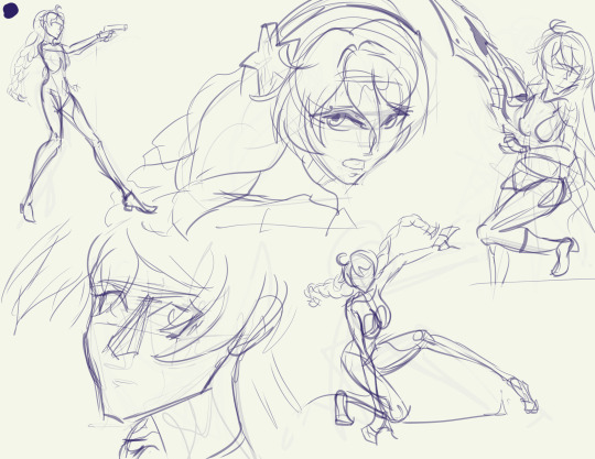
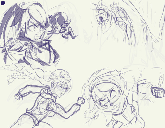
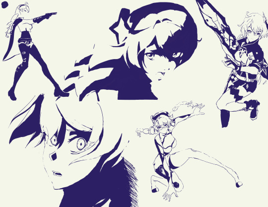
Did rough sketches first, then drew with solid color over the sketches on a separate layer. not much else to say here, lol
.
Full-bodies
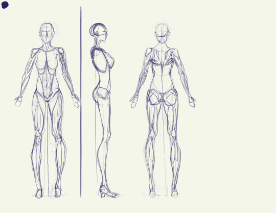
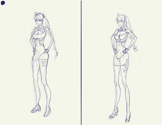
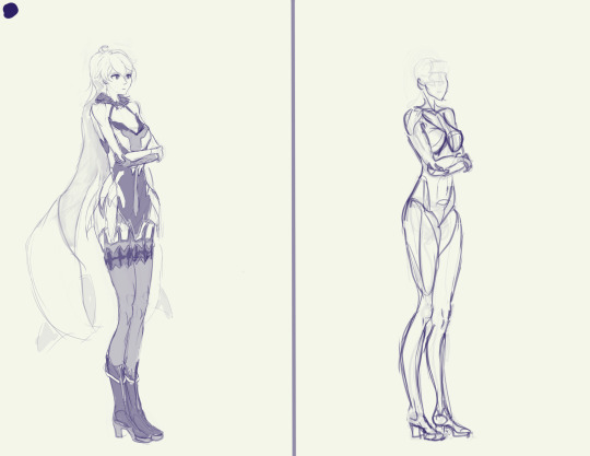
Started with an anatomy model loosely based on the proportions of Kiana's in-game model, and then two attempts at doing full-body drawings from imagination before realizing that it's bloody insane to try and do that much detail from imagination and I have much better things to do with my life than that x-x
.
Color studies
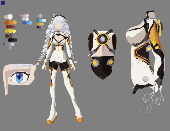
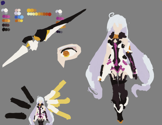
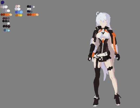
yaaaay color! yippee!
.
Action sketches/"gesture" drawings
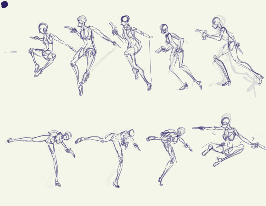
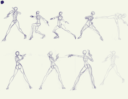
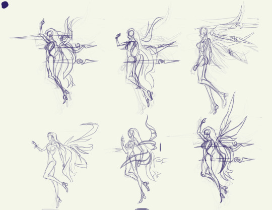
"Gesture" is in quotes because I was way too slow with these for it to really count as proper gesture drawing, imo. But the intention was to start with gesture, and I got closer to that as I went on.
It's way too tempting to start adding detail so I had to metaphysically slap myself with a frying pan to keep myself from getting derailed by that >.>
To get references for this, I did screen recording of gameplay on the PC with OBS studios, then used DaVinci Resolve to play back the recordings.
On PC, when using the mouse controls you can hold the camera fairly still when doing an attack sequence, making it awesome for getting unique angles. For instance, when I recorded Void Drifter's attacks, I was able to get at least 4 different PoVs of her attacks: from the left, the right, behind & above, and in front & below.
Unfortunately, though, it was a bit of a hassle to get good recordings because I had to go into an actual combat stage to record it instead of being able to use an empty testing stage.
With DaVinci Resolve I could "split" clips to make cuts in the timeline that let me easily mark the spots where different attack sequences started, and I could also easily play it in .5x speed to help me figure out how the animations were going from one set of frames to another.
Plus if you close the program after saving, when you open it up again it remembers which frame you were last on and takes you straight there, making it easy to continue from one day to another.
I used White Comet, Herrscher of the Void, and Void Drifter attack animations here, but I also did recordings of Knight Moonbeam and Herrscher of Flamescion, and I might give those a try someday.
.
Facial expressions practice
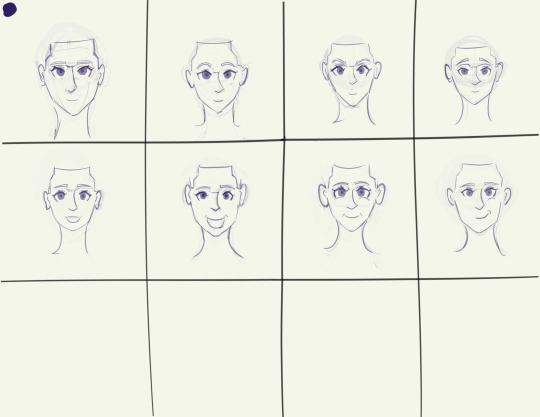
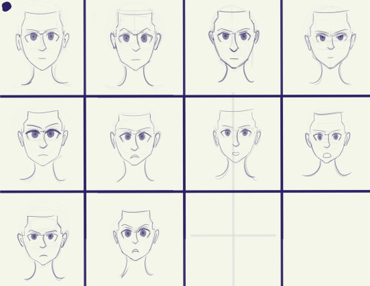
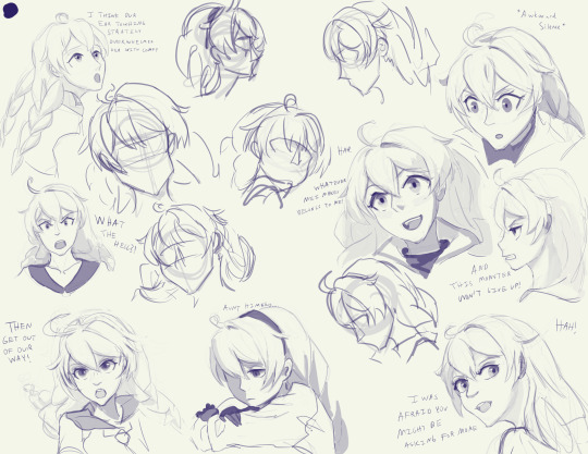
Started with the set of rough sketches (first image), then did some expression practice from imagination (second and third images) to try and get used to how the proportions of the face change slightly with movement of the eyebrows/eyelids/jaw, since the shape of the eyes and mouth is especially important when doing stylized faces (like the anime style that HI3rd uses)
Then this morning I started working through the original rough sketches and developing them one-by-one, getting through 8 before I decided to call it quits and wrap up the project for now
So the facial expression practice pretty much the culmination of all my practice. All the practice with proportions, the contours & forms of the hair, monochromatic shading, line quality, shape design, etc.
This was also one of the few times I've ever taken stylized references and actually adapted them to some extent instead of directly copying them!
This is especially noticeable in the hair, where I used a more standard style for the hair, in contrast with the variety of hairstyles and shapes used in the various manga references (i.e. black-and-white Escape from Nagazora Kiana's messy hair vs the neat and solid hair in the colored Gratitude Arc, AE Invasion, and Moon Shadow Kiana)
.
Reference images
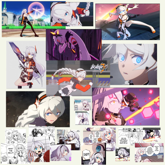
#kiana kaslana#herrscher of the void#never doing this again /j#for real though this was honestly pretty amazing practice#I've long struggled with blending my traditional art skills with my digital art aspirations#i have literally hundreds of hours of studio time drawing with charcoal and paper but nowhere near as much time drawing digitally#basically if you give me a photo of a real person or a live model I'd do better than if I were drawing an anime or game character#I think I learned a lot about working from stylized references while still using my realistic-human anatomy knowledge#I was having trouble with that when doing some studies of Sushang (hsr ver) the other day and this was directly inspired by that struggle#honkai impact 3rd#honkai 3rd#hi3rd#honkai fanart#honkai impact#this practice was meant to address that!
30 notes
·
View notes
Text
hockey art tag game!! ^_^ hello @wehaveagathering thank you for the tag!! <3
rules: post your first ever hockey art, your latest hockey art, and your favorite hockey art. then tag three hockey artists
tagging artists first because um. gestures at the keep reading below? im shy hello ^_^
@puckpocketed
@stillfertile
@oensible
any other artists that see this!! please tag me i beg of you i would love to get to know other hockey artists! if you already did it tag me who care. i care! :)
lot of yapping because i love yapping, sticking this under a cut ^_^ did you know tumblr changed their image limit from 10 to 30?
as a forewarning a lot of these images are hella compressed because i pulled them directly from posts, maybe consider peeking at the original linked posts to see them in marginally better quality ^_^
first hockey art

i never posted this one! i thought blackwood and kahkonen looked vaguely kiki and bouba esque respectively which is REALLY funny because the name mackenzie blackwood is more bouba than kaapo kahkonen which is an incredibly kiki name
now that i sound sufficiently deranged.
which of these shapes is be named kiki and which is named bouba?

the kiki/bouba effect was a study about our association with sound and shape, in which people associated "kiki" with a spiky shape and "bouba" with a round shape. (wikipedia, image also comes from wikipedia)
this was from when i was first dipping my toes into hockey and had the hardest time telling players apart! the drawing, not the kiki/bouba effect . you can imagine what two men with similar hair color, eye color, and hair styles on the same team playing the same position was like for me. the biggest part of why i didnt post this was because it was incredibly embarrassing at the time . now i can freely admit i dont know any of the eastern conference and people will think im funny ^_^
first hockey art on this blog
mostly because i think its a fun bit of trivia, the goalie portraits for the teams i started out rooting for! (sharks edition and kraken edition)


i posted these the first game of their corresponding teams after i finished them! the completion order is less straight forward because i was actively jumping between all 4 drawings (3 kraken goalie portraits + 1 portrait of 2 shark goalies) when one of them got too hard :)
i dont remember the exact order beyond grubi being the last i finished LMAO something about drawing him just does not agree with my hands
theyre all a lil ugly to me now but thats the fun of knowing how you started <3
i remember also wanting to draw pwhl minnesotas goalies but not knowing at the time how to find nearlyyy enough references to feel confident to go through with it! (i was looking them up on search engine images HAHAHAHA)
good ol pwhl min ^_^ leave out a fire extinguisher for em will you all, one hell of a trashfire on their hands right now
^ this joke was written BEFORE the whole firing of 3 coaches pwhl min are we okay??????
latest hockey art
...at time of posting mostly because i take a long time to get tag games done...! hello from my drafts everypony ^_^
i lie to myself ft. devin cooley and joey daccord!
a fun fact is that despite animating a bit ive actually never made an animatic before! ^_^
one of the challenges of animating is that you have to draw the same character over and over without making big changes and how to keep doing it consistently
one of the challenges of drawing real people is that you need to figure how to simplify a person to their most basic shapes and proportions . even if you have a realistic style you gotta wrangle the underlying bones to it and it is harddd takin that step back from the human person to make em a cartoon .
so you can imagine the how it goes animating real people
i actually wouldve loved addin more motion and frames but experienced some minor limitations:
i do my drawings in an art program and stitch them together afterwards, which means i dont have a sense of the speed of everything . you can kind of see that problem around the 0:19-0:20 mark because i straight up did not consider time when i wrote a really long winded sign in the background LOL the unused frame for this was also a time issue, i tossed in an establishing shot because i didnt consider the fact that there isnt time for an establishing shot
time and motivation . the longer something takes the less i want to work on it . would you believe well over half of this was taken up by like . being stumped on 2 or 3 frames HAHAHA
doing animation in an art program not made for art is really cumbersome actually. i do most of my work in one layer so you can imagine how it feels to suddenly have to keep track of tens of layers (sprites, backgrounds, foreground elements, captions) , i merged certain layers (white blocks under lineart for readability and closed captions over the lineart are all one layer) so its difficult to actually go back and add anything. or alter anything! closed captions from 0:13-0:15 is inaccurate but i cant alter them without literally erasing it from the layer which is scary
despite the fact that anything involving moving pictures kills me crazy style, im INCREDIBLY proud that this is done and this animatic is like my own child. shout out to the reblogs on the post for pointing out jokes or talkin that they like it, yall inflate my ego <3
at some point i stopped using reference images which is really funny to ME because i actually have the hardest time drawin a devin cooley that LOOKS like a devin cooley . get simplified . theres like. a handful of players i feel comfortable drawing without reference? if you ever want to learn how to draw someone, animate them ^_^
favorite hockey art
frantically scrolling through my art tag... not because i dont like any of my art (my drawings are all awesome would you believe) but because i dont even remember what ive drawn LMAOO
we dont mind more than just one art right ^_^ (like ive not been doing that already LOL
the doodles


i habe something to contribute / i shoot the puck / devin cooley eating joey daccords hair
the most important aspect of my own art is whether or not it makes me giggle . if it doesnt make me cry laugh then is it really goin on the fridge?
something i do feel proud of is balancing expression and likeness ^_^ its way easier knocking that balance with fictional characters as opposed to people with actual physical faces . simplifying them into what is essentially a poorly drawn cat meme is more of a beast than realistic portraits would you believe .
i think my favorite subject to do this with would be buoy actually! theyre a mascot, IDK why it should be a surprise that fae takes easily to being simplified and drawn cartoonishly
i do NOT know what emotion i shoot the puck is supposed to evoke.
really fun observin my freakish little drawings developing more of their own style over time (compare my first gubbi drawing to my latest tomas tatar thursday) (again, latest at the time of writing) and the simplification definitely feels way more intentional ^_^
the funnier half of simplifying is that the simpler it gets the more complex it gets? like more dramatic perspective in barkov and tkachuk in the cup or buoys weird pose with tomas tatar with the dynamo pardubice jersey. id mention shading but i actually have a grudge against shading relative to art advice ("just add shading" is NOT the one size fits all advice we treat it like ITS NOT!!!!)


the nicer stuff
do i hear a break down on individual pieces?

jan rutta picking up mackenzie blackwoods helmet
i think i made it planny clear on the original post but i really truly love the composition of this shot. ruttas hand picking up mackblacks helmet? between the legs? CRAZY.
the refs stance was wild by the way. legs so far apart theyre naming the ice between em an ocean. so on.
i remember the original shot being so striking to me because of the contrast between the cold and warm, the hard and the soft fleshy bits which was something i really wanted to exaggerate with colors
yall can probably tell i dont take my references SUPER literally but for some reason in this one i asked myself if it was deceitful to be messin with colors to get a vibe, to which i asked myself WHAT was i going on about
anyways. intentionally made everything but jan ruttas hand way bluer . i guess mackenzie blackwoods helmet is also warm? but the focus is the hand more than anything hahaha this is also why i did the most complex coloring for it
also another point of interest! included the chromatic aberration (the red/blue 3d effect) mostly because the legs on the right side were blending into each other . but its a really interesting effect to observe in actual recording! :) im not a fan of pressing my face up to a moving picture unfortunately </3

sidney crosby with evgeni malkins helmet
ok ok okay can i be honest . that stray line next to the penguins head has bothered me ever since the day after i posted this. now YOU cant unsee it. no problem ^_^
if you look at the original post, this one has been a wild redraw because i was making up a whole new angle of an existing pose LOL. then again i dont do redraws super often so i guess its not really ridiculous but.
actually now that i think about it i was making up the angle (albeit less) with the bobrovsky stigmata drawing (though its worth noting that i referenced this gifset of the save that was less of a severe change than the original tweet) and ignoring foreground elements for the kiss redraw (theres a big ol hockey stick covering jordan eberles head IIRC?) and the mackenzie blackwood holding his partners head redraws (i was absolutely NOT drawing the audience LMAO)
but the gesture was easy enough to capture but the anatomy had me by the NECK. the THROAT. the SCRUFF!!! it still looks plenty wonky to me but IMO gesture trumps accuracy . someone in the notes tagged it with this:

to which i throw my hands up in celebration and say hallelujah he has been accepted by penguins fans he will survive the winter

kraken goalies as animals
i really like drawing animals . i really like drawing armor .
more detailed breakdown on the post LOL i just really liked this and its super different from the usual stuff i post
i havent even mentioned all my sacrilegious drawings... my art is so awesome and cool its so hard picking a favorite...
and some final notes
if you made it to the end of this one jesus christ um. hello ^_^ even i wasnt writin this in one sittin.
honest to god if this post showed you anythin i love talking about my process and thoughts behind my works and if you wanted to ever ask hi hit me up ? ask box open? dms open? i can buy you dinner or a very shiny fruit from the market?
28 notes
·
View notes