#but I want to be able to be painterly SO BAD
Explore tagged Tumblr posts
Visit Tumblr Blog
Explore Tumblr blogs with no restrictions, modern design and the best experience.
Last Seen Tumblr Blogs


Fun Fact
The KCSC sent more than 20K requests to delete posts related to prostitution and porn to Tumblr from January to June 2017.
Text

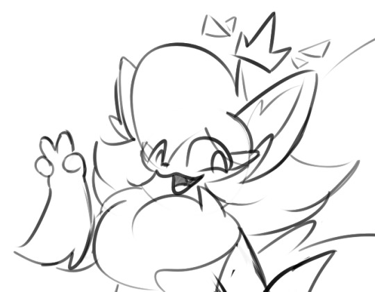
#I think my art style best fits thick line art simple character drawings#but I want to be able to be painterly SO BAD#but no matter how hard I try it NEVER turns out good 😭😭#I like this tho#wisteria art#off game#off game fanart#off fanart#you can never make me shade 👎#I LOVE this pose btw#I didn’t use a reference 😌 so I suffered a lot#but it still turned out ok!#yippee!!
18 notes
·
View notes
Text
happy tsukkiyama day to those who celebrate 🌙⛰️✨
like this art? it's a print, here! | like what i do? support me on ko-fi!
i'm so bad with dates i didn't even realize today's numbers were 11 and 12 ASKSKS (also i missed POCKY DAY? man, i had an idea for a doodle for that but oh well. i'll still draw it fdgfdhd)
i almost panicked about not having any art for tskym day bc cmon.... they're my boys........ but thankfully i had a deadline to finish some art prints last week and now here we are pftt
the process for this one is a little different from what i'd consider my usual way of drawing. i usually do lineart, flat colors, rendering, and yadda yadda, but maybe it's because i've been doing a lot of painterly disco elysium art lately that i decided to just paint over the scaled-up thumbnail and see where it takes me! (you can see in the timelapse me struggling over cleanly inking tsukki's face before i went 'screw this' LOL)
drawing this was pretty fun! i always wanted to try out my painterly style outside of disco elysium fanart and now i've done it! (well, done it again, bc i've kind of tried it for kghn day too pftt)
there is still something very charming abt the thumbnail in my humble onion, i don't think i was able to retain the exact silent tenderness in tsukki's face from the thumbnail in the final thing but oh well, c'est la vie dghdj (also me drawing yammers with visible nostrils jumpscare [this is only funny to me ASKSK])
#haikyuu#haikyuu!!#tsukishima kei#yamaguchi tadashi#tsukkiyama#tsukiyama#sunnysidedraws#sunnysideball#described#id in alt text
881 notes
·
View notes
Text
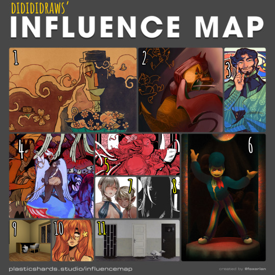
my tablet is currently halfway across the country for repairs (my brother's the most tech-savvy in my family and asking him to take a look at it was cheaper than taking it to a shop) so i haven't been able to draw lately. i've made a bunch of traditional sketches in the meantime, but none of them are presentable enough to post here, so i decided to take a trip down memory lane and fill out one of foxorian's influence maps!
below the cut are the names of the artists featured here, as well as a little bit of director's commentary on how they've influenced me :]
yugo limbo (website, tumblr, twitter) - some time last year, i realized something profoundly unnerving: i actually... don't like the art in smile for me's original release all that much? that's not to say it's bad, just that there isn't a whole lot about it outside of maybe its architecture that stands out to me. which is REALLY WEIRD, considering i wrote a whole retrospective about how much this game means to me. art-wise, however, it was only after smile for me's release that yugo limbo's art evolved in a way that really resonated with me; i love how textured everything is, i love the way they simplify clothing folds and the way that skin wrinkles around the joints, i love their love for puppets; all of those things ended up worming their way into my art style and tastes one way or another, and i couldn't be happier!! it didn't feel right to leave smile for me out of the equation entirely, though, so i chose a piece that was both related to that game and that i felt reflected a lot of what i love about yugo's more recent art.
echobsilly (twitter, tumblr) - oh god, speaking of yugo limbo - god. i fucking love echo's art so much i have no idea how to even do it justice in writing. like many people i first found him through his smile for me/limbolane fanart and animations - and those are some of his best work, don't get me wrong, but i really wanted to include one of his original designs to make a point that he's just fuckin great at art in general. character design, facial expressions, body language, composition, LIGHTING... he makes it all just. so so so gorgeous. i always liked "painterly" art styles for lack of a better word, but i think his art is what first pushed me to embrace that more in my digital art. i also like how he talks about dr. habit like he's his dead wife. i'm very proud to call him a friend these days :]
japhers (tumblr, twitter, instagram) - i first found japhers' art in high school and he very quickly became a HUUUUUGE influence on my taste in character and costume design. one of the big reasons i never fully bought into the idea that men's fashion is inherently harder to design is bc so much of his art is already dedicated to exploring fashion Without the restrictions of a gender binary in place which is to say that he's really good at drawing buff dudes in frilly outfits. i also think he gave me more confidence to draw more intricate costumes without having to worry about super dainty and clean lineart, bc a lot of his art looks like it's kinda been carved/rendered out of sketches, and it is Gorgeous.
moe suppe (website, tumblr, cohost) - another artist i found in high school, albeit originally from a long-gone instagram account. his art is what kickstarted my desire to have some Roughness in my art, some Texture. it may not have stuck to my lineart, but it Definitely stuck to my rendering. it helped that i was going through a pretty big angel/demon phase at the time, which meant i was pretty immediately drawn in by his delightfully weird worldbuilding. i should probably read fear not now that it's an actual serial...
val wise (website, itch.io, twitter, instagram) - a more recent influence, but a pretty significant one nonetheless. i featured the cover of délicatesse here because it was the first thing from him that i had ever read, but in general his grasp on the human body really blows me away given how deceptively simple his style looks at first glance, especially his faces. the way fat and hair sits on her bodies, and how much it varies from character to character... it's beautiful without being So glamorous that it feels untouchable. his costume design is also great. i recommend his comics for low fantasy/ursula k. le guin fans who are Dying to see more fat characters in leading roles. i also just found out that i am of two hearts is free on itch.io, so i'll be treating myself to that over spring break.
partycoffin (tumblr, twitter) - if you have known me for any amount of time at all then this should not come as a surprise to you. i actually wasn't going to include partycoffin in this map at first, because while welcome home has inspired me in Many creative pursuits, i didn't think visual art was one of them? i definitely picked up some of clown's love for dramatic lighting and thinner lines with just a smidge of well-placed hatching subconsciously, though.
ryoko kui - probably the most recent artist featured here? anyways i have a confession to make: i have yet to read dungeon meshi. i just know that when i saw a post compiling a bunch of ryoko kui's sketches from her daydream hour series, i was so overwhelmed with this feeling of, like… "oh, yeah, these capture almost everything i love about women as flesh and blood people. when i draw women this is the kind of beauty that i want people to see in them." of course, ryoko kui is a great character designer in general, but something about her women specifically really speak to me. the earthier color palettes and rendering also do a lot to endear her art to me.
shuzo oshimi - specifically his art in blood on the tracks. something that really stood out to me in that series was whenever the shadows would get really intense, and you'd get these big blocks of black with just the faintest bit of hatching to soften out some of their edges. it was always very effective in creating this sense of claustrophobia. i really want to keep incorporating that in my more intense pieces!
person918x (tumblr, instagram) - i don't work with 3d art often and i don't see myself doing so any time soon, but the composition of person918x's pieces is something i take a lot of inspiration of. i also love his sequential art, as someone who does a lot of dream journaling it's sick to see the exact Vibe of a dream be put to (digital) canvas. i also firmly believe that he's one of the only people out there who knows what he's doing when it comes to using generative AI in art.
oops i made this list too long so now i have to put the last two artists in a new block.
10. meatgiri (twitter, instagram) - definitely the artist i've known about the longest out of this selection. i think i've been following her since…. oh god. since i was in middle school. way before she was meatgiri, even. i think her influence probably shows up the least in my art, but there are definitely some characteristics that stuck with me for a very long time (the lil block of black accompanied by one or two lines for shading on the neck, the looser lineart making it really easy to incorporate soft curves and sharp edges, the Eyes, etc etc.) i chose this drawing of her oc juniper bc i thought it was both reflective of her current art And a good embodiment of a lot of things i wanted to emulate from her art as a young'un.
11. dragan bibin (website, instagram) - specifically his 'deimos' series. much like with person918x, it's his compositions that really stand out to me the most, and you probably know by now that i'm a sucker for high contrast. i find it interesting though that he uses high contrast to obscure more than he does to highlight... helps a lot with giving the deimos paintings that air of Quiet Unease. another thing i want to incorporate in my horror-adjacent art! manmade environments gone wrong!
#not art#influence map#artists on tumblr#yugo limbo#echobsilly#japhers#moe suppe#val wise#partycoffin#ryoko kui#shuzo oshimi#person918x#meatgiri#dragan bibin
26 notes
·
View notes
Text

T o T i bought an s6 lite so i could draw on the go / not have to heave all my giant laptop/tablet components out every time i want to doodle and i like it to far! Hated all the apps until i tried Infinite Painter :o Maybe i'll be able to offer painterly style sketches soon for those who can't afford my regular slots c:
also love how big the files turn out to be from such a tiny screen LOL
anyway, here is a bad digone sketch from me trying to figure out the program
#ffxiv#digone#here is a sketch! i'll probably do more secret blob posts too because its so much easier to just whip out the tablet >:3c
11 notes
·
View notes
Text
.
#im here once again wishing my art skills were greater then what they are right now which is dookie#I wanna be able to draw this character that I've had in my mind since well#middle school like freaking what#2008 maybe 2009#it's been more than 10 years since I've thought of this character/ story and still my art skills are so limited#I know im 100% self taught and I'm doing my best but-#I feel like I'm so behind people younger then me have such amazing skills and mine just suck#i wish I could take classes but honestly they don't have what I want#i wish my style was more painterly like actual characters design artist#but I also know i worked hard for my current style#i just wanna draw her so bad but I know if I try she's not gonna look anything remotely like I want#like at all#......but I still wanna try#im just so afraid I'll mess that character up and I've put so many years into her#and I can't even draw females#im just so ugh#i hate my art so much some times#i wish i knew how to draw in a comic book style that way I don't have to color#but once again im so limited by my knowledge which is still nothing#vent#txt.
1 note
·
View note
Text
Kett’s 2022 Art Retrospective
I have definitely drawn things this year. I wanna show it to you!! Let’s take a look back together!
This is a long post! Separated month by month. If you wanna join me, just keep reading!
January
This January I have decided Kett should wear something, at least one time, just so they could feel it and gauge if they liked it or not.

They did not quite like it.
February
During the middle of January, I caught covid and felt miserable. So I wasn’t really feeling it in regards to drawing. I still did some experimentation, however and doodled up a little comic sort of thing

Abstrakett was initially developed as a form of representing myself even if I fell into a particularly bad slump. I was in a particularly bad slump in February, and I believe this was a form of rejecting it.
It didn’t quite work, because I hadn’t drawn much else for this month. And I didn’t draw the next month, either.
April
For April I decided to become bunny

I also took TWO commissions during this month, and worked on some personal projects, such as an alphabet for a language in my setting
Looks like I was back in full swing. Let’s not lose the momentum.
June
Looks like I lost the momentum. I may have not drawn in May.
For June, however, I put this out:

This is a drawing I’m still happy with. A little bit of playing around with perspective! I like this drawing so much in fact that I have made it the background for my website after I finally committed to redesigning it!
July
July is an important month for amateurish internet artists like myself, it’s the month during which Art Fight takes place. And this year I beat my record for submissions during the event, at an astounding... five.
And I believe this is my absolute fave submission for this year’s Art Fight, featuring @wytchwoods‘ character, Maggie. It is certainly the most experimental, at least, and I’m happy with the result.

Of course, this was also the month I smooched @floralope.
I also took a commission this month. So THAT was definitely one of my most productive months this year.
August
My month. I didn’t really do much, but I started drawing Kett with shinier eyes. I simply started to like the look.
September
Wasn’t a very good month for full colored drawings, but I did sketch a bunch, with a particular focus on Teal.

I love my little four-eared creature. I want to make a game that stars them. Hopefully I’ll be able to.

For now, they’re just a cute design.
October
🎃🎃🎃 SPOOKY MONTH 🎃🎃🎃
I am usually not passionate about Halloween at all, but I felt like I had to try something new this year. So I designed Ghost Kett!

I am REALLY happy with how they turned out, so much so I did PLENTY of doodles of them over October.

They do not care much about your privacy, but they’ll ask before possessing you.
November
Was a HUGE month for me

It’s when the Total Fluff Eclipse struck.
I also.

Cried like a little bitch soft boy.
It’s good for you!
December
Oh hey, it’s December right now. The year is almost over. I don’t know if I’ll still draw anything this year, but I know what I have already done.
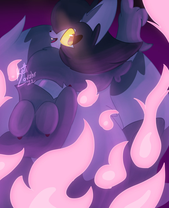
And honestly? Pretty satisfied with it. I haven’t done such painterly work in a few years but this blows any such work I have done out of the water. Probably the best thing I put out this year.
Hopefully much more to come in 2023.
And that’s a wrap!
I’d like to believe my output has taken a hit ever since I started working. Taking a good look at it, however, it’s easy to see that’s not the case. I have drawn a lot and put out work I am satisfied with. I have been a little harder on myself than I should.
My mood has definitely skyrocketed over the end of the year for whatever reason, and it shows through with my latest piece. I tried to go past the comfort zone I dug myself into and got something I’m proud of off of it.
If you’re still reading through, thanks a bunch for sticking around! I hope you’ll continue checking in on whatever I put out over the coming year, and I hope I’ll continue drawing and sharing it for the foreseeable future.
It was definitely fun taking a brief look over some of what I’ve done, maybe you should do the same? ;)
#talkett#kettarts#skettch#OC:Kett Lovahr#OC:Teal Haden#retrospective#artists on tumblr#raccat#atrean#beyond atrea#cat#floralope
19 notes
·
View notes
Text
How to compete against AI: Future-Proofing your Art Career Part 2
This article was originally published on ChristopherCant.com
This is part 2 of my series about AI art, and future-proofing your art career.
Part 1 was an overall look at what the potential threat of AI art might be to the working artist, and an overview of the different solutions an artist might use in order to continue a sustainable income in an uncertain future. If you haven't read it, it's over here.
After writing that article, I wanted to look a bit deeper into alternative solutions, and figure out a list of ways to make myself a more competitive artist in a world that can generate cheap, high-quality imagery in seconds. This is as much a letter to myself as it is to anybody else.
We've all heard the comments that AI is a tool, and that artists should just adapt and use our artistic skills to paint over AI outputs - but I don’t think many of us would be happy with that.
We became artists because we have a personal vision, and enjoy creating - I expect few of us would find joy in handing over our creativity and vision to something else, and relegate ourselves to cleaning up what it makes. In that situation, it seems more to me like we are the tool, and the AI is the artist.
So let's dive into the many ways to remain competitive, without resorting to giving up the most enjoyable part of an art career to a robot!
Compete against AI by being yourself
AI is only your competition if you try to match it and beat it at its own game. Instead, concentrate on doing your own thing, and become something that AI will never be able to imitate.
Become yourself
Stop chasing the big freelance gigs in the hopes of getting hired. Stop trying to make your art look like the Blizzard art style, a Magic the Gathering card, or League of Legends splash art. These styles are sought solely by companies looking for art to help sell their products, and they are the things that the AI art is learning to make. In all honesty, I think these companies will bite at the chance to replace 90% of their artists with AI and reduce their expenses drastically; I just think they are going to try to transition to that as quietly as they can, so they don’t get a mob after them.
Now is the time to chase YOU, to dive into your own vision. When AI is churning out masses of the same stuff, you should be creating the things you love. Of course, still learn your fundamentals - good art is still good art, and a good idea can still be undermined by bad execution.
Developing a distinct, recognizable style is key to standing out as an artist, and will become even more important.

My work - more over on my Artstation
Developing a style isn’t so much about finding some obscure trick that clicks with your tastes, or about learning from the right sources, or purposefully doing something a little bit unorthodox in your work to make it stand out. It’s more about removing all of the expectations about what your work ‘should’ be, and unburying what it really, truly is that you like to make. Underneath all of the expectations that your work should have dynamic perspectives, that it shouldn’t be just black and white, or should have painterly yet controlled brushstrokes, or that you should be a master at male, female, and all other forms of anatomy.
Beneath all of that is what you actually like to make. Don’t try to do things with your art to make yourself purposefully stand out - just figure out if there are things like colour palettes, compositions, or subject matters that appeal to you more than others. Embrace the things that appeal to you most and reject that which doesn’t appeal to you; you’ll make the art that really matters to you, and standing out will just be a byproduct of this process.
Experiment and explore
AI is able to generate a large number of variations of a piece, but it can be challenging for AI to come up with truly original, creative ideas. An artist can set themselves apart by focusing on creating new, unique pieces of art that push the boundaries and introduce new ideas.
Try out different mediums and techniques, explore completely unrelated disciplines and incorporate what you learn into your art, integrate your own personal history into your work, try out telling personal stories with your pieces. These are things that AI will struggle to imitate.
Use randomness, chance and improvisation to your advantage - so called ‘happy accidents’. These don’t exist in the same fashion in AI art; though you can certainly find mistakes and random noise, there is a distinct and recognisable pattern to it. It’s not truly chance, like the happy accidents you or I might find in our works.
Taking that further, art that is heavily abstract or non-objective in nature can be challenging for AI to recreate because it lacks the ability to understand the emotional or conceptual elements of the work. If you enjoy abstraction to any degree, try out leaning into it and see how it affects your art and its reception.

A landscape by Victoria Rose Park, a successful abstract artist
In a similar vein, humor, satire, and irony is also a struggle for AI; it’ll never be on the cutting edge of comedy, because it lacks the ability to understand the nuances of human humor and irony. If it suits you to include comedic aspects into your work, that's one way AI will really struggle to compete.
Build a strong personal brand
Building your personal brand is important for any artist in this day and age, as it helps to establish an artist's reputation and reach potential buyers and collectors. In the AI age, it’ll be more important than ever.
Use social media platforms, a personal website, and other online platforms to showcase your work, connect with your audience and build a community around your art.
Include a bio on your website that lets people get to know you, and highlights your personal background, influences, and the themes and concepts in your work.
Create a strong and publicly broadcasted narrative around your art, such as a backstory, or the process behind the work.
Create blog posts and youtube videos that share your thoughts about your work - about anything at all. Just by saying what you think about things, you’ll be building rapport with people. Hell, you’re getting to know me better just by reading this very blog post!
Importantly, be as authentic and true to yourself as you can be. People can tell when someone is being honest and sharing with them, and most will appreciate it, and want to support your openness.
Compete against AI by showing your humanity
I mentioned this in part 1 of this series, that one of the key advantages of human-made art is the unique, personal touch that it has, by virtue of being made by an unique individual with their own experiences and perspective. AI will struggle to imitate this authentically, and people will often be able to feel the difference.
So let’s play into that.
Incorporate evidence that your art was made by hand.
This can be done in many ways, such as fingerprints, brushstrokes, or other marks that indicate ‘humanity’. This is obviously already present in most traditional mediums like oil painting and watercolor, but can also be purposefully included in digital art as well. If your digital painting style is very smooth and clean, you might want to roughen it up slightly, to let more evidence of your hand show through in the finished result.
To go even further, things like mixed media, collage and paper cutouts are currently impossible to replicate with artificial intelligence.
Personalise all of your products.
If you sell merchandise and products, find a way to make them more personable. Sign everything, hand embellish your prints with some gold leaf or a personal stamp, include a thank you note with each purchase, that sort of thing.
AI Art is focused on creating quantity, and lacks soul; focus instead on creating a high quality human-experience. Create the very best work you can, present it the most human way you can, and sell it in the most personal way you can.
Record and share your creative process.
When you sit down to create, record it on video. It doesn't have to be particularly high-quality or professional, just good enough to demonstrate that you handcraft the things you make. If you are a traditional artist, set up your smartphone or a camera to record; if you are a digital artist, use a screen recorder while you paint. Clip Studio Paint, Procreate and Krita all have recording built-in.
Turn those recordings into videos, put them on social media, display them in your gallery alongside your artwork, think of the finished piece and the process footage as one and the same product. If you can, narrate the footage and talk about why you made the decisions you did, where your inspirations come from, if you are happy or disappointed with the end result - anything you can talk about at all will help the audience connect to your work, when most of the art they see has no voice behind it at all.
Not only is this one way to help audience connect with your artwork, it’s also proof of your process, which might matter to some art consumers. This might become especially important to digital artists, as there are very few ways to differentiate a finished digital painting from one generated by AI, except for a proof of process.
Compete against AI through diversifying
AI art is fairly one-dimensional, and still requires people to actually facilitate it and turn it into a product or make it part of something bigger. It certainly can’t compete with a multi-talented person.
Diversify within your Art
AI can’t yet integrate different art disciplines together, such as music, performing arts, theater etc into a single experience. This requires a human, so it’s the perfect way to set your work apart.
Incorporate multiple mediums such as painting, sculpture, printmaking, photography, and digital media into your work, creating a unique and layered approach to your art that is difficult for AI to replicate.
Take it further and create multisensory, interactive and performance-based art that incorporates movement, sound, and audience participation.
This would create a unique and unreproducible experience that AI wouldn't be able to match.
Diversify outside of your art
Combine your art skills with other complementary skills, you may be able to create projects that make you stand out from the pack, without even having to utilise AI at all, and without having to compete with those that do.
Digital tools are becoming much easier to use year-on-year, and allow a single person to achieve much more by themselves than ever before.
Web design, programming, social media, video editing, music production, writing; the list goes on.
Find a way to combine your art with other skills to produce something new, something that even other people aren’t doing, let alone AI.
I’m diversifying by learning to write, learning web design and SEO and then combining those skills into educational and entertaining websites that as far as I can tell, no one else has built yet. See if you can combine skills in interesting ways and create something new.
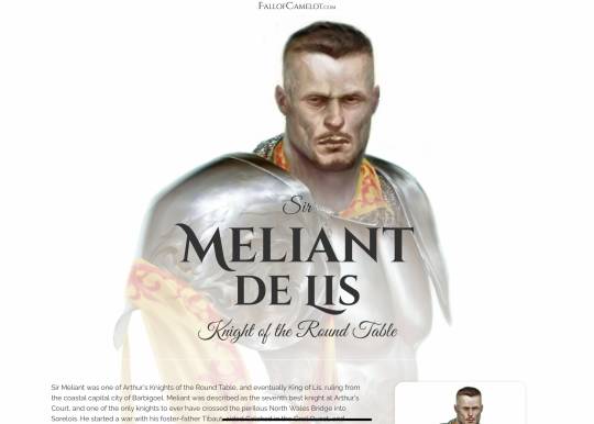
My current website-in-progress, FallofCamelot.com, a site about the Arthurian legends
Diversify your income sources
This isn’t exactly competing with AI art so much as it is sidestepping it, but still deserves to be mentioned.
There are many ways to earn an income as an artist, outside of freelancing and commissions, and many will be completely unaffected by AI.
Teaching is one such method. Even if AI art somehow took over 100% of art sales (don’t worry, it won’t) people would still want to learn how to paint for fun, and these people will want someone to teach them.
In fact, as more people get their hands on things like iPads and more people from third-world countries connect to the global art community through the internet, the number of people looking to learn art seems to go up and up each year.
Teaching is something that many working artists should be doing anyway; we have some responsibility to pass on what we know to the next generation of upcoming artists, so that they can create even more amazing things than our generation did. Where would we be without the previous generation of artists inspiring us to live as creatives?
You should also consider selling your own merchandise. As automation comes along and threatens our very jobs, it also presents opportunities, as it makes it easier for each of us to create and sell prints, books, games and other merchandise. These are things I want to go further into, but I’ll do it in the next part of my AI series.
Compete against AI through engaging directly with people
People don’t want to buy art, they want to buy a small piece of the artist, so to speak. Most people definitely don’t want to buy soulless art that has no artist behind it at all.
So let people get to know you. Selling your art is as much about selling yourself as it is your creations.
Your motivations, what it is you are trying to accomplish and why it’s important, how your work represents the things you believe in; communicate these things to people and it will endear them to you. When a person hears something they resonate with, they want to support it, and to help it grow.
Engage with your audience through livestreaming and video
Whatever social media platform you prefer using to share your work and talk to the people that like it, you should be able to find a way to livestream. This is the best way to build a relationship with people online; to let them see you, to hear you, live. They can ask you questions, and see you respond in real-time. It’s human, and it will help you build a relationship with people.
Livestreaming on Twitch was the activity that brought me my core audience. My art was probably what got their attention initially, but it was the stream that kept them around. I try to let my personality out as much as I can on stream, and it’s rewarded me with a small band of loyal supporters and close friends.
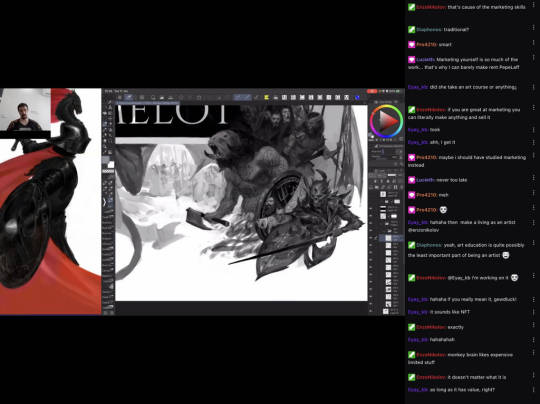
My Twitch channel
Whether it’s Instagram, YouTube, Twitch, or any other social media platform you use to communicate with your followers, you’ll be able to find a way to livestream.
Recorded video can also be used to achieve the same thing, as long as it is not too scripted and impersonal; you want to let yourself shine through, and show people who you really are.
Sell your art face-to-face
Conventions and galleries attract people that like art, but who want much more than that. They could just buy art online, but instead they want to go to it in-person, to be there themselves. They want to see the art with their own eyes, to meet the artist, to talk with them about the art. AI art simply doesn’t satisfy any of these criteria at all - but you can.
So make prints and other merchandise of your art, and be prepared to dive into the world of face-to-face sales. There are artists today who make six-figures annually from these sorts of events, and this won't be impacted by AI art much, if at all.
Create art for specific people and locations
Your local businesses, bars and cafes, social venues and public spaces; AI art can’t connect authentically with the spirit of any of these places. Even if AI could somehow paint art straight onto walls, it still lacks the ability to understand the context of the location. It isn’t able to understand why certain ideas, phrases, imagery or memes are important to a certain place, and the people who go there.
Murals and graffiti immediately fall into this category, but it also goes much further: each local business has its own culture, each district, each town, city and country. My birthplace of the Falkland Islands has immediate connection with penguins, sheep, the words ‘kelper’ and ‘benny’, Margaret Thatcher, Argentina, looking beautiful in photos yet windy beyond belief in person, etc; a massive list that only people who are really familiar with the place will fully appreciate, and only artists who understand the Falklands will fully be able to cater to them as an audience.

The Falkland Islands - if I ever need it, I have a market here
Wherever you are, there is bound to be some distinct culture nearby that you’ll be able to appeal to as an artist, and people that will support you for it.
And that’s everything I can offer you today!
If you’re here at the end of the article, you probably realise that there are many things you’re going to have to try in order to figure out what will suit you, what will actually work for you, and ultimately what you are willing to do to create a stable art career in an increasingly uncertain era.
I wish you luck figuring out your journey. If you want to talk about it, drop me a comment. I’ll see you next time (which, by the way, will be about why AI doesn’t have to be the enemy.)
This article was originally published on ChristopherCant.com
3 notes
·
View notes
Note
7, 10, 15, 16 for the artist ask game
7- Favorite works of all time, excluding your own?
This is really hard to pinpoint because I am bad at looking at names. But I tend to lean towards going "oughough oogabooga" over painterly styled art with fantasy/horror/religious aspects!
10- What's the one thing that inspired you to make drawing your consistent hobby?
One of my brothers! He was really into art and skill kinda is, but because I wanted to be closer to him I taught myself how to draw! I had a period where I stopped (bullying) but thanks to my middle school art teacher I was able to get back into hobby!
15- Biggest Artist Pet Peeve?
Ooooohohohooho I have two.
People who insist that to be a 'true' artist you can't use references for like poses and stuff. I've seen professional artists fully admit to just tracing models for things they don't know how to draw.
People who insist that you have to be open to critiques on all of your work. Which, no, no you don't. Even more of a peeve when people will critique and then throw a fit if the artist politely thanks them but says they weren't looking for critiques.
16- What's the most daunting part of your process? Ex, planning, sketching, lineart, rendering, etc.
Mmmm probably sketching? Only because my brain will psyche me out of "oh it doesn't look like how you mentally planned it" so I often ditch drawings in the early stages.
2 notes
·
View notes
Text
Ranking : Gus Van Sant (1952-present)

I was somewhat familiar with Gus Van Sant prior into taking the deep dive through his catalog, but he was certainly a man that I thought I had a handle on. I knew he had more than a few amazing films under his belt, but the recent years had not been kind to him (see the shot taken at him in Jay and Silent Bob Strike Back). I knew that he was from the Pacific Northwest (Oregon specifically), and his coming of age in an area that embraces weirdos and outsiders had an impact on him as a human and as a creator. I knew that films like Milk and Good Will Hunting had taken Van Sant to the highest heights, while the collective panning of films like Psycho and Last Days served as valleys in a career full of glorious peaks.
What I came to discover, however, was a man with genuine creative integrity, and lots of it. I found a director who understood his characters and actors on a human level, and shared them with viewers in ways that helped rich connections develop. I saw a director who was not afraid to make those that society often considers outcasts the emotionally rich and important centers of his narratives. I watched Gus Van Sant present, explore, develop and refine his style over deeply independent and infamously studio-driven projects, giving all experiences as much care and attention as he was able. I saw films I was familiar with find placement behind films I was new to, I discovered that his recent creative years have not been as kind to him as the first two-thirds of his career, and I can see that there still may be a bit of a smolder left in his creative fire.
Ranking directors is a labor of love, but by no means do I consider myself the definitive professional on film canon. I enjoyed all of the Gus Van Sant films I watched on some level, and as always, for those brave enough to interact, I’d be curious to see where you would make adjustments to the list. But enough introduction talk, let’s get into what you folks came for!

17. Restless (2011) There are things about Restless that I want to love without judgement. First and foremost, Mia Wasikowska is an absolute treasure who shines in this performance from the earlier portion of her career. The portrayal of Hiroshi is one of the more subtle, substanced and interesting ways of using a ghost within the film framework. As minor a thing as it may be to the casual moviegoer, some of this film’s technical aspects are astounding, specifically the costuming and the lighting choices. Where the film distracts me, and therefore drops in these rankings, is where it takes the YA approach to the romantic drama, with a healthy dose of manic pixie dream girl energy thrown in for good measure. When it comes to displaying romance on-screen, be it teenage or otherwise, there are no expectations, even for a director with a distinct style. Where my issues arise are in the way that death is handled in this film… while I do understand that not every film has to be a distinct statement for a director (especially a film written by another individual), Gus Van Sant had already established a very mature approach to the subject of death, and the way that death and the manic pixie dream girl aspects are intertwined feels more on the amateur side than I am comfortable with for a Gus Van Sant film. Maybe giving the impossibly troubled young man a muse with an expiration date as his way to find the best version of himself is a stroke of genius that provides a gateway for deep commentary on the concept of the manic pixie dream girl, but the film is so approachable and not the type to bare teeth (be it satirically or otherwise) that I doubt there is any subtext to its intention. For that reason, this film finds itself on the bottom half of the Van Sant canon.
16. Don't Worry, He Won't Get Far on Foot (2018) After the critical and box office disappointment that was The Sea of Trees, director Gus Van Sant had quite the hill to climb with his next film, and with his adaptation of Don’t Worry, He Won’t Get Far on Foot, it seemed he was able to right those respective ships. Strangely, the film failed to connect with me, and as far as I can tell, it seems to be the victim of an “all sizzle, no steak” scenario. The film is certainly a showcase of a very diverse cast, and based on both the flashback-based and group therapy approach to the story, there are a wealth of opportunities to create memorable moments. Unfortunately, and perhaps due to an oversight on my end, I failed to find enough substance during my viewing of the film to prop up the parade of moments. What it felt like I was left with, sadly, was a Simple Jack-level approach to conveying a paraplegic-centered story, which undercut the fact that the film is actually telling the true story of cartoonist, artist and musician John Callahan. That’s not to say that the film doesn’t have it’s positive aspects, such as the John Callahan illustrations and the animated versions of his work, but those positive aspects feel sparse in comparison to how much the film relishes in what feels like Oscar bait. If nothing else, see this film for Jonah Hill, because it took me much longer than it should have to recognize him, partly due to his impressive weight loss and partly due to how dedicated he is to achieving the film’s period look.

15. The Sea of Trees (2015) Death is no stranger in the films of Gus Van Sant, but I don’t feel that it would be bold to state The Sea of Trees deals with death in the most direct manner. For those that subscribe to grief having stages, this film accounts for all of them in some way, shape or form during the course of the narrative as we watch Arthur Brennan fall apart and rediscover himself in the wake of losing Joan Brennan, his wife. Placing the film in Aokigahara (aka the "Japanese suicide forest") not only gives the film a sense of natural beauty, but a foreboding sense of dread and despair as well. The core cast is as strong as any found in a Van Sant film, with Matthew McConaughey, Ken Watanabe and Naomi Watts all turning in solid performances. Sadly, the film falters in one very core aspect : sympathy for the protagonist. I found myself feeling very bad for Joan Brennan as I watched her arc, and despite knowing nothing about Watanabe’s character portrayal of Takumi Nakamura, I found myself sympathetic to him based solely on what he was emoting. Arthur Brennan, however, is interesting in all the wrong ways… he is extremely cold and purposefully flat when introduced, the moments we share with the Brennans only seem to show Arthur finding joy at the expense of Joan’s pride, his view of the loss of his wife (and his world view in general) seem to be extremely self-centered, and when he does show heroic attributes they are rooted solely in self-preservation. Perhaps if Van Sant had not already made such eloquent reflections on death via The Death Trilogy and Paranoid Park, The Sea of Trees could have been seen in a different light, but when you set such a high bar for your work, returning to stereotypical storytelling can feel flat and uninspired.
14. Last Days (2005) Last Days is a film with a weird energy and aura surrounding it… in some ways, it feels like the most performative film not only of the Death Trilogy, but out of the entire Gus Van Sant catalog. At the risk of using too negative an adjective, it also feels the most exploitive, though neither of these observations are necessarily meant to be a knock against the film. The Death Trilogy could not help but be exploitive at its root, as each film was inspired by an infamous death event, and with Michael Pitt’s Blake meant to be an avatar for Kurt Cobain, it would be simple to take the film at face value for some sort of glamourized and idealized fictional retelling of his tragic final moments, not to mention a few stylistic nods to iconic Cobain-related imagery. What that viewer would be missing, in my opinion, is a film looking to make some familiar points on outsider culture (specifically alternative rock and roll counterculture and addict culture) minus all the glamour and shine. While Blake’s house is grand, it’s decrepit and in a state of disrepair… despite it being isolated, expected and unexpected guests arrive constantly, not to mention an intrusive ringing phone that connects Blake to outworld obligations… Blake has a number of people living with him, but he almost never interacts with them. Michael Pitt is done up to look so similar to Kurt Cobain that much of the narrative background is implied, and what we are left with is the Death Trilogy style implemented and fused onto a loose leaf narrative with just enough structure to let the supporting actors have isolated memorable moments while we watch Pitt’s Blake decay in the ways that many of us Cobain fans ruminated on in the wake of his sudden and tragic death at the height of his tortured popularity.

13. Gerry (2002) At the risk of sounding cliché, Gerry may be the most fascinating film in Gus Van Sant’s canon. It marks a clear and definitive break in convention from a director that seemingly never cared too much for convention anyway. Multiple aspects of this film make it extremely unique : both characters referring to one another by the same name (though Gerry eventually evolves into an all-purpose non-specific descriptor), a seemingly absent narrative, a shared goal between the characters literally referred to as “the thing” in order to purposely keep viewers in the dark and, perhaps most importantly, a deliberately methodical pacing that pushes even seasoned film lovers to the limits of their patience. The film is beautiful, and that is a fact that cannot be denied… the painterly shot compositions of our characters in the isolated desert, the unfathomably long tracking shots that pull us deeper off the beaten path and the sonic stillness (due to a largely absent score that is replaced with the sounds of nature) either commit you fully to the experiment or come off as massively pretentious. To view the film through that secondary lens, however, is to miss the point of it all. Once it is understood that Gerry marked the entry point for Gus Van Sant’s Death Trilogy, you began to realize that Van Sant, in tandem with Matt Damon and Casey Affleck, are giving us an understanding of how we should view the trilogy, and how open-minded we should be in processing what is given to us, like some early high-concept version of what Quentin Dupieux would later go on to master in a more abstract manner.
12. Mala Noche (1985) It’s fitting that this was a feature-length debut from a driven and working director, as it has a very distinct look and feel to it that immediately lets you know you’re dealing with an innate storyteller and someone who has spent time observing the human condition. In terms of visual and narrative balance, Gus Van Sant utilizes what feels like a mix of John Cassavetes and Jack Kerouac, respectively. Van Sant’s use of titles in the film is striking, specifically in terms of the handwritten opening credits and the Dr. Pepper ad copy used to subtitle the Spanish language dialogue. Focusing so heavily on immigration and homosexuality in 1985 is a bold choice, especially as neither group had yet to benefit (even if only minimally) from the onset of politically correct culture policing. While the film was more than likely shot in black and white due to budgetary constraints, the infusion of somewhat modern elements (for the time) gives it a youthful and forward-thinking energy. Having a film of this nature lean so heavily on multilingual and multicultural elements is refreshing, and even more impactful when examined under the boorish and (at times) tone deaf application that humanizes these elements. For all of these aspects of the film, however, when examined at the pure narrative foundation, what we find is a story about how love can blind us from the reality we inhabit, and how we often choose to ignore the obvious when romance and romanticism enters the picture.
11. Psycho (1998) Of all the films in the Van Sant catalog, perhaps the bravest, boldest and most baffling entry is his nearly shot for shot remake of the iconic Alfred Hitchcock thriller and cinematic game changer Psycho. Remakes were certainly not a new or unheard of practice at the time of the Van Sant Psycho release, but most directors opt to put significant twists or updates into their retelling of most remakes, and most films chosen do not hold the lofty stature and position that Psycho does when it comes to remakes. Van Sant’s approach not only made viewers keenly aware of just how direct the homage was, but in some places, modern touches were added in very subtle ways to make the movie more palatable for modern audiences, including more salacious references to sexuality, sound design choices in both the diegetic and symbolic realm, and even an update or two to iconic scenes meant to make us much more uneasy with the Vince Vaughn portrayal of Norman Bates. The actors cast were all famous and respected enough to keep the film’s timeless feeling in-tact, even if the remake could be taken as its own weird and warped project. Personally, I’ve always loved this remake, and taken it as an experiment on the highest commercial level, and a signal to all that Van Sant (at the time) was done with the traditional approach to filmmaking and concepting.
10. Paranoid Park (2007) While many movies centered around skateboarding spend their time and design budget trying to make the outsider nature of the practice look “cool”, Paranoid Park spends its time making sure that the isolation, deep focus and rebellious attitude that come with skateboarding were more authentic than they were appealing. High school is already a very taxing and polarizing section of juvenile development, and based on your perception at the time, the weight that the world unloads on you can feel wholly unbearable. Perhaps this is what makes Paranoid Park such a tense film… that natural teenage angst is already imprinted into the film (and amplified due to the casting of relative unknowns), but Gus Van Sant’s signature use of alternative film stocks, obscure soundtrack and expressive, layered sound design but you square in Alex’s head from the opening moments. As the narrative unfolds, we realize that Alex is not only dealing with standard-issue teen stress, but has unwillingly found himself involved in the type of events that change an individual’s world. This film plays well as the first film post-Death Trilogy, as it deals with the gravity of mortality head-on much like the aforementioned three films, but does so from an adaptive stance rather than one based on true events. If you’re a fan of skater flicks, movies with strong teen acting, or little-known Gus Van Sant gems, then Paranoid Park is a gem waiting for discovery.
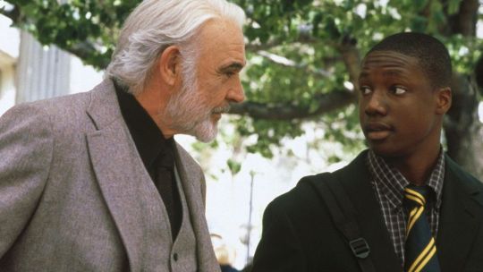
9. Finding Forrester (2000) Gus Van Sant has always had a way with stories that dive below the surface of the human experience and condition, so it makes sense that his attempt at a New York-based movie about people living in “the hood” would cover an array of topics with masterful subtlety, specifically the topics of race relations, generational gaps and the blurry line between education and exploitation. The casting on this film is extremely strong… then newcomer Rob Brown gives a riveting and dynamic lead performance, it’d be harder to cast a more perfect curmudgeon than Sean Connery, and appearances by F. Murray Abraham, Anna Paquin, Busta Rhymes and a Matt Damon cameo all stand out. Speaking of Damon, Finding Forrester shares a similar energy to Good Will Hunting, but the proximity of release ultimately held Finding Forrester from finding its proper audience (no pun intended). I wish I had more to say about this film outside of my personal feelings and connections to the story (which I will save for a dedicated deep dive in the future), but Finding Forrester is one of those films that has no trouble speaking for itself.
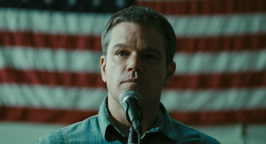
8. Promised Land (2012) As of the point that this blog post was created, this film stands as the last of the great Van Sant creations. There is something about the Gus Van Sant approach to filmmaking that works best with “salt of the Earth” types, and with Promised Land being centered around the practice of fracking, much of that down-home nature is immediately baked into the story. Speaking of the story, the film was co-written by the characters who ended up being the protagonist and antagonist of the picture, respectfully, which created an electric main dynamic that served as the spine for many other strong dynamics present in the film. In terms of the cinematography, much of Van Sant’s bold approaches and stylistic shifts are absent, save for a few beautiful bird’s eye view perspective shots that give you a real idea of what rural America looks like. Van Sant is no stranger to stacked casts, but he gets some truly top notch names to take part in this affair, and true to the clout behind these names, the performances are as stellar as they are believable and natural. The film also touched a nerve with the actual oil industry due to some of its comments on fracking, despite it not having the reach or success of other Van Sant films. While possibly an indicator that Van Sant would be making a stylistic shift, Promised Land still manages to capture what makes Van Sant his best self in terms of not only presenting real people, but topical and important situations.
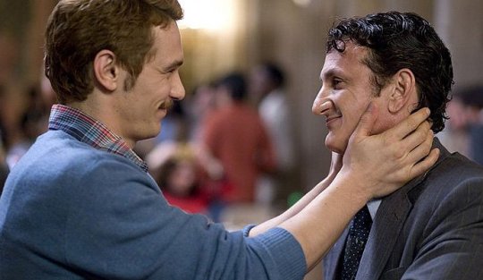
7. Milk (2008) Gus Van Sant is clearly no stranger to having representation for the gay community in his films, so it makes sense that one of the hallmark films in his canon would center around gay rights activist and politician Harvey Milk. Much like JFK crystalized Oliver Stone, or Spike Lee was raised to another echelon by Malcolm X, Van Sant found a second round of Academy Award-level validation via this biopic while solidifying himself as a creative who could go back and forth effortlessly between big budget studio films and independent projects. With Sean Penn giving one of his signature chameleon-like performances and leading the pack, this Van Sant production is filled with tons of burgeoning talent who have since gone on to make names for themselves in the industry, including the likes of Emile Hirsch, Diego Luna, James Franco, Alison Pill and others, plus a standout performance from Josh Brolin (who also depicted George W. Bush in the same year for the aforementioned Stone). While it may not be the most technically marveling film of Van Sant’s career, it is clearly one of his most important, and the way that it handles the messages it intends to share is as confident as it is even-keeled, which is important for a film that could have easily become a soapbox for espousing personal beliefs and political agendas.
6. Even Cowgirls Get the Blues (1993) This Gus Van Sant adaptation of the famed author Tom Robbins novel shares the same creative energy of films like Fear and Loathing in Las Vegas, Natural Born Killers, Harold and Maude and so on in the sense that it is a very expressive film with a very specific idea it is looking to present. Where the aforementioned films explored ideas of free love taken to the extreme, the toxicity of media, love without judgement and so on (respectively), Even Cowgirls Get the Blues puts femininity and identity outside of the male gaze squarely in its crosshairs. Uma Thurman takes on the role of Sissy with wide-eyed zeal, floating through a series of hitchhiker-based adventures until her reluctant visit to the Rubber Road Ranch helps her find the missing piece of her puzzle. Seeing a bizarre, star-studded tale of a woman finding her agency sounds like it would work on the surface, but from what I could find, the film failed to make a connection with audiences and is considered a commercial and critical failure (which is probably why it was the toughest film to track down on this list). That being said, I’m a sucker for films that catch a bad rap, especially when the combination of such a unique director and visionary author are the foundation of it, because it makes me curious about why I find connection where others did not… who knows, maybe it was those extremely distracting rubber thumbs (the only real knock I can make on the film), or maybe the Tom Robbins style is tough to transfer from page to screen, but for my money’s worth, I can see the vision.
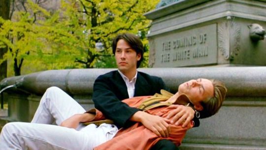
5. My Own Private Idaho (1991) Somewhere within the intersection of films like Midnight Cowboy and Fight Club lies My Own Private Idaho, an extremely personal and nuanced film that covers many topics with depth and an ease that comes with wisdom and experience. For example, when it comes to views on identity, we get two rich narratives that could easily both be their own film : Mike (portrayed by River Phoenix) is going through a crisis of identity based on a sordid history with his mother and absentee father that makes his search for love transform into a life of hustling as a way to find momentary intimacy; meanwhile, Keanu Reeves (who plays Scott) is an entitled young man awaiting an inheritance that decides to spend the time until it happens “slumming” with those many would consider the outcasts of society, much like the “tourists” spoken of by Edward Norton’s narrator in Fight Club. The struggle with masculinity in the face of homosexuality is all over this film, from its multiple male on male connections to the very toxic manner that the core group interacts with one another, when they are not grieving or putting their livelihood in danger via petty crimes. In terms of Van Sant style, the film is one of his most innovative (outside of the film holding the top spot) in terms of looks, with its unique range of colorful title cards, the pinhole vision that Mike uses on his road, or even the standout magazine rack sequence. The film is also a perfect follow-up to Drugstore Cowboy, and could easily double feature with it to this day. As someone not wholly familiar with Shakespeare’s Henry plays, I did not catch that My Own Private Idaho was an adaptation, so I will not only have to revisit it with that familiarity in tow, but I will have to take a look into James Franco’s re-cut, My Own Private River, as well.
4. Elephant (2003) Based solely on the nature and definition of a trilogy, a second film can make or break things. Gerry and Last Days share similarities in how quiet and isolated they are, so it makes sense that Elephant, part two of Van Sant’s Death Trilogy, would in many ways be the meat of the trilogy sandwich in terms of style and thematic substance. Elephant operates on several distinct levels based on Van Sant’s observations of the world going into the new millennium, as the film allowed him a foundation for both experimentation and examination by proxy. While the long takes and vast amount of distance traveled during said takes was present in all three films of the trilogy, Van Sant made a concentrated effort to make the shots look and feel similar to that of video games like the later Grand Theft Auto entries, hence a number of the shots being positionally locked during travel (often times a few feet behind the character at the center of that moment’s focus). There are ramp-downs of the frame rate to punctuate certain moments, and quite often the camera is thrown on a tripod and allowed to take in the array of high schoolers living their standard life. It is this mundane world-building aspect that not only gives the viewer a rapid but deep look into a handful of character’s lives, but it gives you a sense of the school’s social hierarchy while forcing you to reflect on where you once stood within it. Per the film’s clever title, the elephant in the room eventually appears in the form of Eric and Alex, the pair of school shooters meant to reflect the Columbine Massacre perpetrators. While school shootings weren’t an unknown phenomenon going into the 2000’s, Elephant became prophetic in its vision by releasing right before the numbers started rising at an alarming rate on these incidents. In that sense, Elephant holds the dual distinction of not only being one of Van Sant’s best films, but one of his most important. I will soon be looking into the 1989 Elephant film as well.
3. Drugstore Cowboy (1989) The power of Drugstore Cowboy as a modern-day narrative tragedy about the epidemic of prescription drugs, the dark allure of crime and the oddball way that broken people find solace in one another is immediately evident to anyone who has had the pleasure to see Gus Van Sant’s studio directorial debut. Where the film really stands out however, in my opinion, is the way that Van Sant is able to achieve his major studio look while deeply applying a very artistic and personal aesthetic to the cinematography and editing. The traditional looks are interspersed with the use of different film stocks, subtle blends of animation and flashes of stylistic edits that were almost certainly an inspiration for Darren Aronofsky’s “hip-hop editing” style. Add to this an incredibly intuitive and expressive core cast driven by the chemistry between Matt Dillon and Kelly Lynch (and a very early Heather Graham supporting appearance), plus a strong appearance by the always memorable Max Perlich, a fiery James Remar performance and an iconic cameo from William S. Burroughs. The jazz-influenced score not only makes key scenes livelier, but it is a symbolic statement on the drug use depicted in the film, while simultaneously playing counter to the soundtrack choices. Period, point-blank, Drugstore Cowboy is the kind of film that surely put the world on notice, and was a clear signal of the magnificent work that would follow.
2. Good Will Hunting (1997) If held up to the standards of what people consider to be good (or even classic) film, Good Will Hunting more than holds up to scrutiny. Visually there are a small handful of flourishes, and having Elliot Smith’s music accompany Will’s painful but enlightening journey has only become more of a bittersweet sting as the years go by. In terms of performances, everyone brought their A+ game to the table, be it the leading performances of Matt Damon, Robin Williams or Stellan Skarsgård, the supporting performances of Ben Affleck or Minnie Driver, or even the engaging nature of Cole Hauser and repeat scene stealer Casey Affleck. After a flurry of dedicated fandom viewings in the years following this film’s release, a very long period away from the film where I had leagues of personal growth, and a revisitation for this set of rankings, what I have discovered is that Good Will Hunting presents a wish fulfillment fantasy that was nearly incapable of being a reality in the pre-internet age for anyone other than a character like Will : an undiscovered genius with a degree from the school of hard knocks. In a world where people often wish they had the correct answer to every question, the looks and personality to be a social magnet, and the ability to back up any tough talk with stone hands, Will Hunting stood as an idealized example you wished you could peel off the screen and have some beers with. As the internet has invaded our lives, however, most everyone has turned into a keyboard version of Will Hunting, looking for fights online when not having briefly intimate Google sessions to flex our supposed knowledge. Much like Will, many people find that the knowledge minus the wisdom of worldly experience and vulnerability leaves you a shell of a person filled to the eyeballs with regret, and perhaps that is why this film only gets better as the years go by, and remains among the best of the Van Sant creations.
1. To Die For (1995) For the longest time, I avoided To Die For simply because I was not a fan of Nicole Kidman… the vast majority of her roles held no interest to me prior to To Die For (it took Eyes Wide Shut for me to really start paying attention to her), and because she was so key to the film, there was never a sense of urgency about seeing it. As time went by, however, I started to hear rumblings that To Die For may have been a bit ahead of its time, to the point that technology and social practices have caught up to some of the ideas presented in the film. I finally watched it for this ranking set, and man, I really missed the boat on this one. Plain and simple, this film is pure genius on every level. The presentation starts off documentary-esque, which not only allows for expedited distribution of backstory information, but immediately gives you an idea for the personalities of our key characters. Kidman’s portrayal of Suzanne stood as the textbook example for what has become commonly known as sociopathy, with her blind desire for fame and respect leading to a wake of human destruction. In terms of narrative pacing, the film proceeds like a match dropped at the endpoint of a long gasoline trail, slowly drifting towards the eventually point that everything blows up and damage must be assessed while blame and accountability must be handled, resulting in a truly powerful ending more than deserving of the heavy lifting that precedes it. The 24-hour news cycle was on the horizon in 1995, daytime talk shows and MTv’s The Real World had not shifted into the reality TV landscape that we know today, and while a few high profile cases such as the Menendez Brothers and Pamela Smart trial (the loose inspiration for this film) had happened, the bombshell and watershed trail that was the O.J. Simpson murder case was hot on the heels of To Die For’s release (the same month, actually). Stylistically, the film also bears striking resemblance to an updated version of Sunset Boulevard, be it knowingly or not. Long story short, the best films not only comment on the times in which they are created, but gain relevance as time passes, and To Die For handled both of these things phenomenally.
#ChiefDoomsday#DOOMonFILM#GusVanSant#MalaNoche#DrugstoreCowboy#MyOwnPrivateIdaho#EvenCowgirlsGetTheBlues#ToDieFor#GoodWillHunting#Psycho#FindingForrester#Gerry#Elephant#LastDays#ParanoidPark#Milk#Restless#PromisedLand#TheSeaOfTrees#DontWorryHeWontGetFarOnFoot
22 notes
·
View notes
Text
My makeup basics:
Makeup can really be broken down into four subheadings --
FACE, EYES, LIPS, BROWS
I've found face makeup to be the most important to grownups, because everyone wants flawless-looking, even skin (especially as we age). But personally, I am having the most fun with eye makeup. So, really it's all about what you want to emphasize and what kind of makeup products excite you the most (I have a friend who could care less about eyeshadow but has probably 50 lipsticks -- to each their own!). That said, I think YouTube is still a plethora of amazing information. I've gone on SO many tutorial spirals. I love learning different techniques and seeing how people apply products. It's crazy fun.
MY HOLY GRAIL PRODUCTS: (which, honestly, take or leave all this advice, makeup is totally subjective and whatever works for you might not work for me and vice versa but there are tons of popular products and I use a fair amount of them):
FACE:
— Start with a moisturizer. I use just daily cerave. It’s cheap and helps your skin stay hydrated which is the most important thing before applying makeup!!!
-- Dr. Jart BB cream. I love that it's a buildable coverage, and it comes in two shades (fair/medium and medium/dark), and it really melts into the skin, especially on top of a moisturizer. Shockingly blendable.
-- Armani Luminous Silk Foundation. If you're looking for a splurge foundation -- this is it. I had it once and will never be able to afford it again, but if I could... I'd definitely add it to my regular rotation for full face of makeup.
-- Beauty Blender. I have tried SO many other knock offs. Just regular damn sponges. Nothing blends quite as well as a damp beauty blender. I don't know why or what's so magical about it, but it is.
-- Tarte Shape Tape Concealer. This is another beloved product. I have tried many other concealers and always come back to this one. Apparently the ELF camo concealer is a cheaper dupe but I have yet to try it.
-- Laura Mercier Translucent Setting Powder. Can be loose or compact. But this was a thing I didn't even realize I needed until I started watching tutorials and was like... why does my foundation look gross and theirs look so smooth? It's because they set it with powder. Apparently you HAVE to do that. Nyx has an excellent less expensive one, but this particular one is magic.
-- NARS Blush in ORGASM. This is a universally flattering blush in a sort of peachy gold. My mom said she hated it because it is "too glittery" but when I put it on her she was obsessed with how youthful it made her skin, and how she glowed. I’ve been wearing it for the last decade.
-- Anastasia Beverly Hills Glow Palette. If you're not into highlighter, no worries, but if you're into trying it out... this palette cannot be beat. Four shades of glowy perfection.
-- BRUSHES: A large powder brush, a medium blush brush, a small highlighter brush.
EYES:
-- MAC paint pot in PAINTERLY. This is what I use as my eye primer. I know a lot of people who just use concealer. It basically functions the same. But this stuff makes sure my eyeshadow stays put and doesn't crease, even if I'm out dancing and sweating. I’m a loyalist.
-- Stila Liquid Eyeliner or NYX Liquid Eyeliner. Both are felt tip markers and SUPER easy to learn how to use. I am now a winged liner PRO. If you're more into pencil, nothing beats the Yves Saint Laurent or NARS pencils. Makeup Forever is okay in a bind.
-- My two favorite neutral palettes (which is what everyone should start with) are the Charlotte Tillbury Pillow Talk and Urban Decay Naked Palettes. They have a wide range of colors for all skin tones and blend really well. Both shimmers and mattes.
-- Mascara is buyers preference. I love a thick voluminous lash, while I know others prefer a long lash. For voluminous recs -- Dior Blackout or Benefit Bad Gal Lash are my two faves.
-- BRUSHES: Crease brush, medium application brush, fluffy blending brush, flat liner brush
LIPS:
-- My favorite lipsticks are from NARS, MAC, KVD, and FENTY. I love the way matte lipsticks look, but they're sort of out of fashion now. Satin and gloss have come back into trend.
-- A neutral lip pencil will go well with any lipstick. Except red. Always get a red pencil for a red lip.
-- Don't forget a pencil sharpener!
-- BRUSHES: A lip brush. This is a thing, and it actually makes application so much easier, especially when using matte lipsticks.
BROWS:
-- This is the one thing that evades me. They are a mystery to me.
-- Everyone else's holy grail product is Anastasia Beverly Hills Dip Brow
Believe it or not, that is my bare bare minimum of what I need when I’m doing my makeup. Everything else is just gravy. I use all these products every day when doing my makeup looks. Now that you have your makeup and your tools... how the hell do you apply all this stuff?
This website is a really good place to start for beginners — it’s a solid compilation of some big name YouTube MUAs (Jaclyn Hill, Michelle Pham, Raye Raye, etc) and some beginners basics tutorials. I highly recommend searching for a beauty guru with the same skin tone/hair color as yourself because it’s easier to imagine how colors will look on your own face.
Other resources —
The Makeup Chair https://m.youtube.com/user/TheMakeupChair (they have an especially informative video about finding out what eye shape you have, and it totally changed my eyeshadow application game!)
Sephora https://m.youtube.com/user/sephora/videos (which focuses most on reviewing products but also has helpful tutorials, and I enjoy learning about new makeup trends from the store that carries the biggest brands)
Tati https://m.youtube.com/user/GlamLifeGuru/videos (does a lot of product reviews as well but focuses on drug store brands and lower price point makeup, she’s kind of bitchy but fun to watch)
And then last but def not least. Vogue’s YouTube has an amazing makeup series of celebrities just putting on their own makeup called Beauty Secrets. It is so much fun to watch and I’ve learned so much from just watching people go through their own routines and what they enjoy.
Okay. I think that’s probably MORE than enough to start you off with hahah. Let me know if you have any questions, concerns, thoughts. I’m more than happy to chat makeup products or techniques any time.
Tagging: @bloody-shadow666
21 notes
·
View notes
Photo
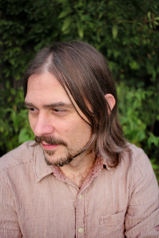
Beautiful Day: The Don Hertzfeldt Q&A.
In which the singular creator of It’s Such a Beautiful Day and the World of Tomorrow trilogy answers 57 questions put to him by the Letterboxd community, about death, gills, snacks, back flips, the best time of day to watch a movie, and the sick pleasure of emotionally destroying people.
Since his first animated outings in the 1990s, filmmaker Don Hertzfeldt has had a way of staring deeply into humanity’s soul via a humble stick figure, and his skill at blending existential questions with situational humor breeds intense reactions. To browse Letterboxd reviews of Hertzfeldt’s animated works is to meet film lovers at a rare, collective gathering point: heaping great piles of love for films that do “the exact opposite of helping with depression”.
There’s something optimistically anti-feel-good in Hertzfeldt’s works; a bleak view of the future, and a frank appreciation of death’s inevitability, that makes viewers urgently want to fix the way they’re living right now. “I’ve built a lot of my life philosophy on the messages of this film,” writes Misty, of his acclaimed It’s Such a Beautiful Day. “It has kicked my ass completely,” writes Dirk of the first, Oscar-nominated World of Tomorrow instalment, “making me angry at myself for letting trivial stuff take over things I love and making me happy I have so very, very much in my life to enjoy and be grateful for.”
The filmmaker’s magic lies as much in the process as the content: “Hertzfeldt is able to make every moment count,” writes Artpig, of the second WoT instalment, The Burden of Other People’s Thoughts, “every line of dialogue, every moment of silence, every note of music, every line of animation.” The World of Tomorrow films, says animation expert Toussaint Egan in our Letterboxd Show animation episode, are “some of the best science fiction films, period”.
And his timing. Oh, his timing. Just as the northern hemisphere days were turning cold, and the drawn-out misery of the pandemic was really taking hold all over again, Hertzfeldt tweeted:
WORLD OF TOMORROW EPISODE THREE everywhere october 9 5pm est 🚀
— don hertzfeldt (@donhertzfeldt)
October 8, 2020
And like that, World of Tomorrow Three: The Absent Destinations of David Prime was ours, an overnight gift to the quarantined and bereaved-weary, on Vimeo for all to rent or own. The gifts, they keep coming: a master list of movies that have their fingerprints on the World of Tomorrow universe, and now, in recognition of our community’s love for his films—and in his signature lower-case—the answers to questions asked in an exclusive Letterboxd Q&A.
To make things easier for Don, we grouped similar questions (and have noted which members asked what). Read on for more than you ever thought you might get to know about Hertzfeldt’s process, brain, heart and influences.
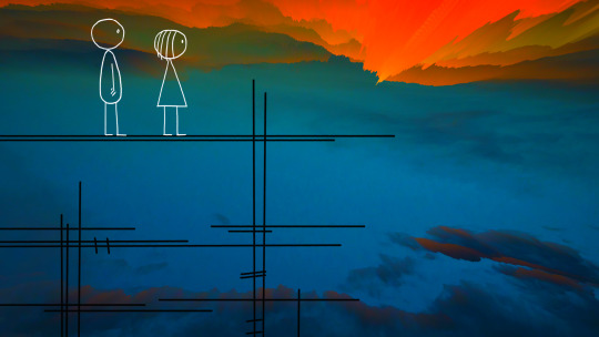
Filmmaker Don Hertzfeldt.
From “holograms that yell at you!” to the stunning colors, textures and folds of the blue mountains, to attributes David progressively deletes to make room for memories, would you please give us an insight into World of Tomorrow Three’s world-building process? —Letterboxd in the grand scheme of the series, episodes one and two still felt like baby steps to me. episode three was my first chance to really start blowing things up and exploring this universe. when i’m writing, i don’t want to worry about going over the top or think about structure or meaning or really much of anything yet. writing is playtime, it should be fun and messy. i want to go over the top. there is no top. i don’t want to start thinking too much until i’m rewriting and sorting through it all. thinking too much too soon can get in the way, like being too aware of when you’re trying to fall asleep. when you write a diary entry or a text to a friend, there’s no self-consciousness or creative blocks, you just write. it’s casual and fluid and automatic. but if you’re asked to write a term paper or a screenplay, suddenly all those lights turn off. it can be paralyzing. it’s hard to get to that place of truly not caring what anyone thinks and approach all forms of writing just as freely as writing those immediate thoughts in your diary. but that’s what i try to do.
When you start writing a new piece, do you usually start with a plot idea, a thematic idea, one uniform philosophical notion, or a little bit of each? —Kodiak J. Sanders, Trenz, Mr. Tables i don’t think i ever write in a straight line. i’ll jot down a hundred stray ideas over time, and one day i’ll sit down and see what connections might be made out of them. i really want this scene to be in the movie, so how do i get there? this is a good line, how can i get a character to say it? so the actual story usually only starts to reveal itself when i sit down to logic all these bits and pieces out. hey, in order to connect this strange idea to that strange idea, suddenly there is a very interesting third scene.
I’m astounded by how much the animation and the visuals improve with each instalment of World of Tomorrow. What have you done differently for each one? —Aske Lund, Cringetacular the characters needed to physically perform a lot more in episodes two and three so there were more demands put on the animation. when emily 4 dances or david staggers up a mountain, those sorts of scenes were animated in “ones”, which means doing 24 drawings per second versus my usual twelve. it’s still all 2D hand animation, just more of a classic disney approach that gives the movement a smoother look and a little more room for nuance. and obviously it takes a lot more work. but i hesitate to call such things improvements because i’m not sure i like the idea of different techniques being thought of as good or bad. it’s just another way of doing things. it really depends, sometimes super limited animation can be more effective.
Likewise, Part Three’s sound design is incredible. What conditions did you create it in, and what are all those sounds, and how do you have such an incredible command of the cut-to-silence trick?! —Letterboxd thanks, the sound design is always my favorite thing to do. other than julia’s lines, it’s easy to forget that all the animation starts with dead silence. obviously there’s no sound coming from a live-action set. so adding sound and music to everything, usually pretty late in production, is when all the stuff i’ve been working on suddenly starts to feel like an actual movie. this is not a future that works very well—particularly david’s, which predates everything else we’ve seen so far by a century or two—so you’re hearing a lot of creaky old hard drives booting up, electric distortions, and bent circuits from broken toys.
Emily and Emily Prime in a still from ‘World of Tomorrow’ (2015).
World of Tomorrow used to fill me with existential dread, but now with the current state of the world it’s become more and more comforting in a strange way. Do you feel that at all as you make new episodes? —mariano gg i wish that were possible but when i’m making something i’m usually so close to it i’m unable to see anything but all the things i need to fix.
Can you talk a little bit about sourcing the photo-realistic images for the backgrounds in Part Three? —Jack Moulton most of the environments were 2D images i built in photoshop, usually starting from close-up photos of different textures (like sandstone), all sort of reshaped and puzzle-pieced into something new. an easy to see example was david’s cockpit, which was cobbled together from all sorts of different old aircraft engine and machine parts. the trick in building and lighting these locations was always figuring out where the line was drawn in making these places realistic, but not too realistic for minimal characters to inhabit. i kept landing on a sort of painterly looking middle ground.
If the cloning process in World of Tomorrow existed right now, would you go through that process and create clones of yourself to prolong your life? —tim probably not, that process doesn’t seem to work so well.
If you were put into the world you’ve created, would you buy gills? —Lauren Torres i tend to avoid putting my head under because i almost always get water in my ears so i guess i wouldn’t need them. gills also seem like they’d be a real nuisance to keep clean.
What does love mean, and why do your characters go through so much effort to find it? —Andrew Michalko oh man.
In this year of years, what do you hope people will understand about death and its inevitability (or is it all there on the screen, and if so, that’s okay too)? —Letterboxd understanding death and its inevitability is maybe the most valuable thing a person can do for themselves.
Was the absence of Emily Prime in Part Three a practical decision [Don’s then-four-year-old niece Winona provided Emily’s voice] or an intentional departure from the first two films? —Michael it was both. i couldn’t find a way to fit her in naturally and i also felt like the series needed to start growing in other directions and not rest on the past. episode two had also been really difficult to write, it was so reliant on winona’s recordings, and it felt like the dam was really broken when i was finally able to write without any restrictions this time.
In a series like World of Tomorrow, where you headed in a direction that is a lot more plot-driven than your previous work, how far in advance do you plan? Did you always know this was in David’s past, or are these stories told one at a time? —Ryan Welch, Kodiak J. Sanders, julius, Alex Leon i could tell early on that this wasn’t a story like it’s such a beautiful day with a clear beginning, middle and end, but a much wilder thing that could continue to grow. the openness of it is still what makes it so interesting to me. i have all sorts of notes for the next episodes but if i already knew what would happen in episode nine i think that would take a lot of the air out of the tires and i’d start to feel like i was just connecting the boring dots. while writing, i’ve also had to be aware that there someday might be an episode nine so i can’t go wrecking the timelines before i get there.
What were the rocks and the gas pump that Emily fell in love with meant to represent? —Ekaneff she was learning how to love, and like all of us, in her youth she gravitated to a bunch of individuals that were wrong for her.
Aside from the ability to release more frequently, is there something about the episodic structure that you prefer/appreciate, as opposed to creating one larger feature-length film? —SiddFinch1 there’s just more freedom. the traditional running time of a feature film, 90 to 120 minutes, is a totally arbitrary number.
Have you ever considered writing a World of Tomorrow book or graphic novel? —Jay Smith the earliest ideas for world of tomorrow were sloshing around in a graphic novel called the end of the world that came out in 2013. but i don’t have any talent or much confidence in making another book like that. it’s a different world. when i look at someone like chris ware and then look at something like the end of the world, it’s like, “wow, baby made a mess”.
A page from Don Hertzfeldt’s graphic novel, ‘The End of the World’ (2013).
What attracted you to the unique style [of minimalist stick figures]? Is there a sense of intimacy that you feel you can achieve with this simplicity? —Evan Whitford when i was little, before i wanted to make movies i wanted to be a newspaper cartoonist. i think my drawings today might have more in common with newspaper comics than the sort of characters you usually see in animation. comic-strip panels were always composed in a very reserved way because they were generally intended to be skimmed. you needed to be able to read the strip in five seconds so you could be off to read the sports pages and obituaries. the comics pages were also under constant size and space restrictions. so they were minimal by design and the artists reduced their characters to only their most essential parts. there was no room for fussing. charles schulz said “i only draw what’s necessary”. and that’s actually incredibly hard to do. you’re accomplishing so much more with so much less.
i’ve also found that if there’s a scene that’s not playing right and bothering me, most of the time it’s because my composition was too cluttered. i almost always find myself removing things from the frame and trying to pare it down to only what’s necessary. very rarely do i ever think ‘i need to add more stuff in here’. because this shot is only five seconds long and i want you to be looking over here when this moment happens and this character says something, and if you’re distracted by this other flickering junk i put in the corner it’s going to throw everything off.
Animation-aside, which creative medium do you resonate with the most? —Bronkdan music.
How much did you pull from real-life experiences to make It’s Such A Beautiful Day, if any? What research did you conduct into memory? —Gunnar Sizemore, David Sigura, Micah Smith whenever i got a little stuck writing it’s such a beautiful day, i’d go back and reread my journal and pull more things out of it. dreams, conversations, small scenes. reading the journal now, it seems like i stole something from it every few pages. i also heavily researched neurological problems. it’s never said in the movie what exactly’s going on with bill, but i needed there to be a real diagnosis to base the medical writing on. so all the things he’s going through are real treatments or symptoms based on an actual condition. i didn’t want to ever come out and say, “he’s got terminal brain clouds”, or whatever in the movie, because then it becomes a “brain-cloud movie”, and that’s too easy for the audience to compartmentalize and distance themselves from… “brain clouds are so rare, that will never happen to me”. but not being told exactly what’s wrong with bill might help make the story more relatable and universal.
In what ways have you kept your mind fresh creatively? How do you keep yourself from slipping into complacency? —Watchmoviez, Drew’s reviews most creative blocks or stagnation come from anxiety, second-guessing and doubt. over the years i’ve learned to just sort of calm down and trust myself more. it’s like the old aesop fable: when you stop thrashing around in the water, the water becomes clearer and you can see more. if a scene isn’t working right, i can more easily chill out about it these days and trust that i’ll eventually figure it out—because i’ve figured these sorts of things out a hundred times before and i know by now that i’m not the sort of person who’s just going to allow a scene that isn’t working to remain in the movie. there’s a little more panic about that sort of thing when you’re young: “oh no, the movie sucks right now, will it always suck?!” i’ve reached the point where i know that i will not let it suck. and that sort of thinking allows all the movie gears to turn more easily.
Do you have a specific thematic, emotional or other miscellaneous motive in mind when including classical music pieces? —James Y. Lee when i’m listening to music and suddenly the right piece arrives, it’s usually blindingly obvious to me: there’s just no doubt this needs to be in the movie somehow. it’s like the idea has always existed and i’ve just finally uncovered it. it’s the same with writing. when the right thing floats along, it is striking and obvious and into the pile of notes it goes.
How much of your animation style lends itself to experimentation, such as discovering new tricks and pretty shots, that is then discarded if you learn it doesn’t work as intended? —Adam, Jacob i think i’m always experimenting. i figure if it doesn’t work, at least i’ve learned something.
What is the strangest compliment or critique you’ve gotten personally or of your work? —Elliot Taylor i’ve always remembered this one. i am so proud of you came out a couple years after everything will be ok. it was a continuation of that story, so it was basically the first time i had ever made a sequel. and everything will be ok had done really well when it came out. it won sundance and got all these great reviews. so i am so proud of you comes out and i remember reading this review that says, “everything will be ok was probably my favorite animated short of all time. it honestly changed my life. it was funny, sad, beautiful and just so wonderful. everything will be ok, boy did i love it. incredible. two thumbs up. truly, best thing ever. wow. so, unfortunately, its sequel, i am so proud of you, just feels like more of the same.”
A still image from ‘It’s Such a Beautiful Day’ (2012).
Are there any pieces of fiction that have influenced your work that we probably wouldn’t think of? —Gyani Wasp, Mikolaj Perzyna, Aaron McMillan, Harrison, Axel, Cringetacular, The25centman, Hunter Guidry one thing that pops to mind is the phantom tollbooth. my favorite children’s books were the ones with all the fun metaphors and clever wordplay. when i was plotting out episode two i wanted to lean into that, where visiting different sections of emily’s brain would be like milo visiting the land of math, the land of letters, the land of sound, with different looks and logic to it. so we had the bog of realism, glimmers of hope, broken memories, the logic center, and all the stuff in triangle land and square land. i guess that’s a lot but i wish there had been a bit more.
How did your friends and family respond to the “my anus is bleeding” part of Rejected? —Alex Tatterson they were pretty used to me by then.
Do you know of the work of David Firth, the internet animator? His work is also surreal and has dark humor, but more sinister than whimsical. Would you ever consider making an animation in the realm of horror in future? —KEVIИ HДWKIИS i’m afraid i don’t know him. i’d love to make a horror movie. from a certain point of view though maybe it could be argued that most everything i’ve made is a sort of horror movie?
My first tattoo is of Billy from Billy’s Balloon hanging from his ankle and it was the best decision I’ve ever made. How do you feel about people having your work tattooed and do you have any ink from other creatives that have meant something to you? —Elias it really fucking enrages me when people get my stuff tattooed on them. no just kidding. mostly i feel embarrassed but i’m glad you haven’t changed your mind about it yet. sometimes i wonder how many people have.
Have you ever thought about directing live action? —Abeer, Noah Thompson yes.
Is there an update on your feature film Antarctica? —Rylan California it’s one of many things swirling around.
Will you do a remake of Robocop and why not next year? —Simon no, because robocop is already sort of perfect.
Do you ever see yourself directing a large studio film? Or working with a large team to make something with a higher budget, maybe through a crowd-funded project? Or do you just strongly prefer working on your own? —Vteyshev, Monotone Duck sure. i’ve never preferred working on my own at all. it was usually just the only way to ever get anything made. i haven’t had the funding to pay a big crew, or really much of a crew at all. there’s the old saying: you can make something good, you can make it fast, and you can make it cheap, but you can only pick two. if you make it good and fast it won’t be cheap, if you make it cheap and fast it won’t be good, etc. so my only route in hoping to make something good and cheap has been to totally forget about making it fast.
What did you find digital animation added or took away from your work, and what did those changes do for your storytelling? Will you continue using the digital medium when/if you decide to move on from the World of Tomorrow project? —Alec Lai, Slipkornbizkit, Aldo digital just sped everything up. it’s still one person drawing everything, so we need to remember that speed is relative here, but i felt like i went from riding a bicycle to driving a car. there are many pleasant, wonderful things about riding a bicycle but you’re not going to get anywhere very quickly. and i’m not in my 20s anymore, in fact my 20s and 30s were mostly entirely devoured by making movies in what was maybe the slowest way possible. so these days i am appreciating the speed of digital.
If you could have a conversation with any filmmaker, dead or alive, who would it be and why? —ToBeHonest, Cringetacular if i could resurrect one of my heroes from the dead i think i would feel terrible wasting his time forcing him to have a conversation with me. he might also just sit there, covered with graveyard dirt, screaming in horror.
What is the best time of day to watch a movie? —Sammy night. i always feel a little nuts coming out of a movie and the sun is still up.
What’s your all-time favorite science-fiction film, and why? —Letterboxd 2001. because come on.
What is your favorite of Julia Potts’ films, and why? —Letterboxd i like the one with the severed foot.
Are there any animated films that you felt had a profound impact on you as a child? —Sprizzle probably fantasia. and ray harryhausen stuff. whenever there was a sunday-afternoon movie on TV, my brother and i learned that if in the opening titles there was a credit for “special effects” we should keep watching because we might eventually see something cool.
Which one of your movies is your personal favorite? —Jakob Böwer, RodrigoJerez i don’t know. sometimes it’s the newest one because it’s usually the one with the most experience behind it and therefore feels like it has the fewest mistakes. but then over time i realize they’re all riddled with mistakes. of the it’s such a beautiful day pieces, i think my favorite has always been i am so proud of you. and then i’ll see reviews that say “clearly the second chapter is the weakest one”, and i’ll think, man you guys don’t know what you’re talking about.
One of Don’s layout sketches for ‘I Am So Proud of You’ (2008).
What’s your favorite Pixar film? —Jordan inside out.
What film would you want to be the last one you watch before you die? —Gavin honestly if i’m in the process of dying i hope i won’t be watching movies at all.
Do you have faith in humanity? —Connor Kriechbaum not often.
What is something that worries you about where humankind is headed? —Felix_Bouchard social media.
What is the most valuable thing you have ever lost? How often do you think about it? —Siminup well now i’m getting sad.
Can you do a back flip, mister Don? —Doug maybe with the help of a catapult.
What is your take on the after life? What do you think happens to us when we die? —Luisdecoss i guess that it’s probably a lot like our memory of what the year 1823 was like.
Do you want anything from McDonald’s? —Andrew Rhyne only if i’m in an airport and desperate.
What’s your favorite meal or snack? —Pfitzerone, Evan lately in quarantine i’ve been discovering this particular breakfast burrito.
How’s your quarantine life, Don? —Ivan Arcena it’s okay thanks. eating lots of breakfast burritos.
Hi! I can’t believe you’re going to read this. I am currently filled with an unparalleled amount of joy, wow. This is a long shot but here I go. I’m 17 and your (self-proclaimed) biggest fan. I’ve seen It's Such a Beautiful Day eight times now and every single time I pick up on more details. I’ve watched a few of your interviews and in the AFS one about Rejected you said that the louder you play a movie, the funnier it is. On my seventh watch of It’s Such a Beautiful Day I hooked my laptop up to three huge speakers and I must say—you were so, so right. I made a video essay about the movie. Lol, I’m not sure if this will get to you but Michael Jordan once said something about missing shots or not taking shots or maybe about tequila, I am unsure but I know it was important. Thanks MJ. Not you, Mr Jackson. I’m sorry Ms. Jackson…
I actually do have a question, sorry about the rambling. Every single time I watch the guy at the payphone flip his pencil and go “fantastic, fantastic” I cry. And I think what really does it for me is that “we’ll finally have our day”. Earlier in the movie, Bill’s co-worker talks about how all of time is happening at once. So what I constantly ask myself is if the guy at the payphone is simultaneously having his day and waiting for it. And I’m no longer speaking to that one specific example or even to the movie as a whole but I guess I’m wondering if the idea of all events happening at once comforts you?
In Slaughterhouse Five, Kurt Vonnegut writes: “The most important thing I learned on Tralfamadore was that when a person dies he only appears to die. He is still very much alive in the past, so it is very silly for people to cry at his funeral. All moments past, present and future, always have existed, always will exist.” When I read this I immediately thought about your movie. I think the idea of all of time happening at once makes all of life feel less important but more special. You know? Anyway, I suppose I’d just like to know what inspired the lines about time in the office scene. This isn’t much of a question, more an incoherent ramble but thank you so, so much for all you’ve done. I feel so incredibly inspired and so deeply moved by your work and I know that so many people in this comment section and around the world would agree. I can’t believe I’ve been given the opportunity to ask something. It really is such a beautiful day. :) —Eli Osei (co-signed by Vooder) that old guy at the payphone was someone i saw at the laundromat once and he borrowed my pencil and the whole thing just played out like in the movie. i just thought it was such a perfect little scene that i’d just witnessed. anyway, the idea of time being a landscape and everything taking place “at once” just came straight out of a science magazine. i don’t know how, but apparently it’s been more or less proven to be true? we perceive time in one direction, but the past and the future are always all around us. think of it as though we’re driving our car through a landscape. even though the mountains we saw ten minutes ago are behind us now, it doesn’t mean those mountains have ceased to exist. they’ve only ceased to exist from our point of view. we’ve only just driven past them. the mountains, like your childhood, are still going on back there. anyway, i had never heard of that before and thought it needed to be in a movie.
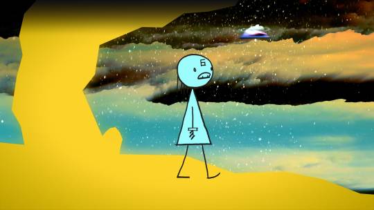
A still from ‘World of Tomorrow Episode Two: The Burden of Other People’s Thoughts’ (2017).
Are you a fan of Kurt Vonnegut by any chance? It may be coincidental, but I love how you both utilize science-fiction settings and concepts like being “unstuck from time/memory” to explore the human condition. I feel his writing and your animation are both capable of making me laugh wholeheartedly one minute and weeping genuine, sorrowful tears the next. —Vooder i’m embarrassed to say i’ve never read him and i’m told on a regular basis that i should. that all started after i am so proud of you came out with those discussions about time being a landscape. but i almost only ever read non-fiction. it’s a long story. but now i’m almost afraid to ever read vonnegut after all these years of build-up.
Hey Don, this is really cool. I don’t have as much of a question, more of a comment. It’s Such A Beautiful Day has gotten me through a lot of hard times, being in middle school sucks, I think everyone knows that: and your movie has made life just a wee bit better for me. It also gave me the inspiration and motivation to finish my first feature! Thanks lots. Love from Indiana —Blood Mountain: Experimental Cinema <3 hey thank you. yeah middle school was pretty much the deepest pit of hell. there’s this old saying, “if you find yourself in hell, keep going”. and i’ve never understood that saying. “keep going”, because, i guess, you can always just go deeper into hell?
Hi! Has the vitreous humour in your eyes started to deteriorate and have you experienced floaters within your eyeballs? If not, that’s okay. Just remember it’s part of life, so don’t get scared when it happens! Just keep moving on! But if you do have them, follow-up question: Do you think it’s funny that the body of vitreous fluid that allows your sight to be clear is called the vitreous humour, and when it detaches it’s anything but humorous? I find that pretty humorous myself, in, like, an ironic way. —Clbert1 i actually blew a blood vessel in my eye a couple weeks ago and the whole thing turned bright blood red. it didn’t hurt or anything, i just walked into the room all disgusting and my girlfriend was like, “what the fuck?!” and then the next day i had further weird eye problems. i just went to the eye doctor yesterday. i think i will be fine but i was thinking, wouldn’t it be like the most heavy metal thing ever for my biography if i just suddenly went BLIND? “and then in 2020, HE WENT BLIND.”
Will Intro ever be released to the general public outside of theater screenings? —Melissa okay yes you’ve talked me into it. on that note, i noticed that the poster of intro used on letterboxd is a weird fake and i’m not sure where it came from. someone just used a picture from rejected. if fake posters are to be made i would prefer it if they used a picture from raiders of the lost ark or something.
Do you have plans to combine the World of Tomorrow shorts into one feature-length film à la It’s Such a Beautiful Day? —David Sigura, Sam Stewart, An_Person no, it’s going to be much longer than a feature-length.
Will we ever get a ‘Hertzfeldt 4K Collection’? Or at least a Blu-ray with It’s Such a Beautiful Day and all episodes of World of Tomorrow? —Teebin, HippityHoppity there is actually already a blu-ray for it’s such a beautiful day. up next we’ll do some sort of world of tomorrow blu-ray of the first three episodes. but 4k is too many k’s. you don’t need that many k’s.
Would you ever consider comprising an OST album of all the songs you used and mixed from your films? —PhiloDemon i don’t think so. i read that for many years cat stevens resisted releasing his original songs from harold and maude on any records because he thought they were more special if you could only ever hear them in the movie. i like that.
Do you get a sick kind of pleasure from emotionally destroying people with your movies? —MaxT26 yep.
What’s been your ongoing experience of the outpouring of joy and love of your work? —Henry gratitude. how sad for me if, after all this work, nobody was watching at all.
Related content
Don’s invaluable Twitter thread about “old-school animation camera stuff”
A Few of the Fingerprints on the World of Tomorrow Universe: a list of influences curated for Letterboxd by Don Hertzfeldt
Modest Heroes: the Letterboxd Showdown for indie animation
The Drawn Cinema: Analena’s list of rough animation, pencil textures, watercolor effects, dynamic brushes and other poetic artistry.
Beloved Indie Animation: a list by Gui
Animated Sci-Fi and Fantasy: an extensive list by Stonefolk
‘World of Tomorrow Three: The Absent Destinations of David Prime’ is available now through Bitter Films on Vimeo.
#don hertfeldt#world of tomorrow#it's such a beautiful day#animation#hand-drawn#hand drawn animation#2d animation#animated film#animated short#emily prime#david prime#science fiction#sci fi animation#animated sci fi#letterboxd
15 notes
·
View notes
Note
Hey there :) I was just wondering, I've always wanted to draw, but my hands are always trembling and it makes everything I do look sketchy and bad. Do you think I could still draw good stuff one day ? I would like to know an actual artist's opinion, someone else would just tell "You can do anything you want if you put your heart into it !" or some anime bullshit like that. I'd just like a realistic advice.
If your hands trembling is a medical condition that you’ve had analyzed by a doctor and affects other things in your life, then you’re probably not going to be able to train yourself out of that. But that kind of depends on the nature of the condition...I wouldn’t know any specifics of that.
But honestly my advice is still, if you WANT to draw, then go ahead and do it. It may or may not look “good,” but honestly, it looking good is not a requirement for art unless it’s specifically for a client that’s paying for skill.
Also, clean lines are not necessary for “good” artwork...you might find a rough shading or painterly style that takes some advantage of unsteady lines to work in your favor. So if you want to draw, do it! With some work you may find something that works with your ability, and even if it’s not great, that doesn’t mean you shouldn’t do it.
71 notes
·
View notes
Photo


I redid my Commission Info because the last one looked pretty bad hahaha
For more info, please go to my commission page or keep reading. Reblogs are highly appreciated. Thank you so much. ❤
CHIBI
TINY Chibi (example 1, 2, 3, 4, 5) = $8 (each additional character is +$4, 2000 x 2000 px)
These styles have always been the more popular choice and are definitely the most fun to make. Sizes are usually 2100x2800 px in 300 dpi, and can either have a transparent or simple bg with no extra charges.
==========================================================
SIMPLE
Bust (SAMPLES) = $25 (additional character +$12.5, 800 x 800 px)
Thigh Up (SAMPLES) = $50 (additional character +$25, 1500 x 2120 px)
Full Body (SAMPLES) = $60 (additional character +$30, 2480 x 3507 px)
These can be with transparent or simple backgrounds for no charge, BUT a more complex background can be applied and additional charges will depend on complexity starting at $45
==========================================================
SKETCHY SCENES (SAMPLES) = $50 (3507 x 2480 px)
This is a relatively new style that focuses more on composition and atmosphere, and will definitely include a background in a more painterly style. Depending on the scene, some body parts may be out of view, and there is the choice of making it monochrome instead.
==========================================================
Few important things to remember:
~ Once I reply to your commission request, it means you’ll get a slot. So please don’t automatically assume that I’ll be doing your commission even if I haven’t accepted or denied your commission.
~ I accept payment through Paypal, so when I reply, please let me know what your paypal email address is so I’ll be able to recognize your payment. Mine is [email protected] ~ I will not start until you’ve paid in full, or at least paid half. This is a precaution I’d like to take since I’ve experienced being commissioned but never being paid one too many times. :(
~ When I DO start, I’ll be sending you wips in stages (sketches, linearts, base colors) and if you feel like something needs to be changed, please don’t hesitate to let me know. :) ~ Please be detailed as you possibly can in explaining your commission. ~ I give the commissioner the right to post/use the finished piece for personal use. ~ I reserve the right to use these commissions as additions to my personal portfolio, and commission samples in the future. ~ I reserve the right to decline your commission for any reason.
What I WILL draw:
OCs or Fanart
Couples
Light gore
Characters from text description THOUGH this will take a lot more time to finish. If possible, please gather as much reference as possible for faces, clothing, body type, etc.
What I WON’T draw:
Extreme gore
Porn
Anthros or Mechas (I don’t trust my skills with either just yet)
Anything discriminating or otherwise fueled by hate
SLOTS:
Slots will be unlimited until further notice.
===================================================
Once you’re decided on what you want, you can use this template for easy expression. (Or not, depends on you. :))
Character reference/s: [Info about the character/s you’d like me to draw. A link to an image reference will be extremely helpful. ]
Style Choice: [ Tiny Chibi / Tall Chibi / Bust / Thigh Up / Full Body ]
Background: [ Transparent / Other ]
Additional details: [Details you’d like to include such as poses, expressions, situations, DEADLINES, etc.]
Then simply message me here, or email @ [email protected], or leave it as a note on DeviantArt.
= = = = = = = = =
So that’s about it. Feel free to drop questions in my inbox. :)
#commissions open#good omens fanart#thomas sanders fanart#into the spider verse fanart#dbh fanart#heads and tails#eddie#spidergwen#merwill#dbh#detroit become human#my art#commission info#commission#virgil sanders#logan sanders#dbh connor#will graham#spideypool#miles morales
61 notes
·
View notes
Note
I found you through your Lucio's comic, but I really loved your lineless mood practices and I wish you could show how you choose the colors for it/ how you do those? It's so pretty and I need to learn about it...
TLDR : I cant tldr this, but here’s muriel’s process if you wantI’m so sorry for taking so much time to answer, I wanted to provide as much details into my thought-process as I could but… I can’t?
I’m someone who works a loooot on instinct, so there’s not really anything I can provide that’s practical :/.I’d only be repeating what has already been said (work with references/get out of comfort zone, practice makes perfect T_T…). But I can share the process of Muriel’s picture (which a lot people appreciated despite it being BAD [sorry but it’s the truth lol])
Also lastly, I’m a student and I’m still young, my stuff is faaaar from the ultimate goal!!! not like i’d ever pretend it to be, but just to be sure you check out actual professional artists!I try my best to do small pieces that follow the kind of thing Snatti does for example, it’s “simple” and effective. I personally try to do quick studies with the aim of doing something similar ;v; (ill never show them tho ahah nopenope).
Not all of the things I can say about Muriel’s pic goes into your question in specific, but I hope it can help! Also I’m french hope the terms translate well in english
- First thing I can say goes into composition : there’s a veeeery quick grid that highlights the rule of third! The subject of the piece (Muriel + Innana (rip) + The Heart of the Forest) is placed on one of the third because it “fits well”. It looks harmonious? You can always play with that rule if you wish to convey other feelings tho (squish a character on one third while another fills the other two for example, another with the same idea would be a characted on the top left dominating over another who stands on the bottom right, classic!). I didn’t have much in mind beyond just getting used to Procreate so there’s not much thinking beyond just having the pic look nice.You can check out the Lucio comic again and normally, you’ll see that the rule of third is almost always there!
- Next I put a main color as background + fill it with some others to have the general mood.Best advice I can give there is to avoid as much as possible layer effects if you want to improve faster on colors (otherwise have fun!), it’s just personnal experience, but being able to find the colors yourself on not rely on layer effects like multiply or overlay to make things blend together well is important, it helps for everything, i have friends who often work with limited color palettes and oh boi their sense of colors is so amazing they create beautiful things.I picked green (on the yellowy side because green green is meh) as the main color! But forests are very varied and you can do whatever you want! There is some bits of blue here and there too just to bring variety and avoid just saturating the pic with green (tho it still ends ups like that lol)
Thus far all the moody pics I made had a main color, so even the brown trees go towards the green side (thus end up on the yellow/orange range in the color wheel), it helps keeping things harmonized and further the ‘mood’ c:. I think.
- I lied tho, I still use layer effects for those kind of painterly pics, but at the end of them! Finishing touches! Multiply with dark green on the edge just to help the eye focus on the subject + hard light for the rays of lights uvu. There’s also an overlay overall to help blend things together because ya, I still struggle with colors.If you work with Photoshop, there’s A TON of post-production stuff you can do! Curves, Levels, effects! Check out tutorials or just experiment with them yourself, they make miracles.
- Lastly, have fun!! Ya obvious, I hate studies too TuT, so mash it up with stuff you enjoy! You don’t like backgrounds? But what if you could put your apprentice having tea time with Nadia at the end of it?? Struggling with male anatomy?? Me too man, but what wouldn’t I do to put Lucio’s face on them pecs?? Just find what works with you my dude!!
- EDIT : I can say something about the beginning too! I work almost always with masses, big silhouettes for everything thumbnaily-like (like, post-it sized on the screen), just to get a feel of the overall piece and composition, it helps A TON, both for making poses and just having the general feel of the piece work great, only afterward will I zoom in with and make another layer on which i draw the details.
MURIEL VID HERE
22 notes
·
View notes
Text
Toilet-Bound Hanako-Kun and the Power of Visuals
Unique animation and background art can be selling points when it pertains to whether an individual decides to watch a new series. Although great story writing and characters can create an amazing series, it is difficult to know these two qualities without first watching the anime itself (as well as reading the light novel or manga). The easiest way to impress a person into watching a show without any prior knowledge is to have an interesting art style. This sort of technique is used in more than just Japanese animation, but also in other countries such as The United States with Spider-Man: Into the Spider-Verse and Loving Vincent. Spider-Man: Into the Spider-Verse brings a comic book to life by using frames and onomatopoeia words, while Loving Vincent was hand-painted using stop-motion. With these concepts, movies that would have been a simple crossover and a documentary would be dull and not cause more people to watch and marvel at what is to come. The anime and manga of Toilet-Bound Hanako-Kun do just that; the animation and background art draws people in to enjoy what is to come.
Figure 1 Persichetti, Ramsey, Rothman, “Spiderman: Into the Spider-Verse”
Figure 2 Kobiela, Welchman, "Loving Vincent"
The Impact of Visuals
As with other art forms, anime has its general groups where you can expect a certain art style to go along with the concept; seinen (mature themes) are often done with more darker schemes and muted styles, shounen (aimed at boys) is brighter and smoother, hentai (animated porn) focuses on exposure and shojo (aimed at girls) is bubbly and sparkly. While there are these general groups, there are subgroups that contain their own styles, and even then, there are always exceptions. As mentioned before, Toilet-Bound Hanako-Kun is one of these exceptions.
As stated on Mangakalot, Toilet-Bound Hanako-Kun is a shounen that includes comedy, supernatural, and school life themes. With these themes, the first thought would be to compare this to shows such as Noragami and Natsume's Book of Friends. Both Noragami and Natsume's Book of Friends are stereotypical looking anime with thin lines, dry colors, and standard scenery. While these shows are impressive with their storytelling and inclusive to supernatural myths, the amount of uniqueness and creatively put into the art style does not instantly draw the viewers in.
Figure 3 Tamura, "Noragami"
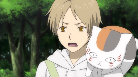
Figure 4 Miyake, "Natsume's Book of Friends"
Although I can go on and describe Toilet-Bound Hanako-Kun’s animation and background, James Beckett from AnimeNewsNetwork summaries it perfectly: “The environments feel hand-crafted, like they were plucked out of an especially evocative picture-book, and the way the show uses overlays of comic panels to break up some of the gags and establishing shots makes everything even more painterly.” This kind of exceptional work is common with the producers and directors of the show. As reported from AnimeNewsNetwork, Studio Lerche employed director Masaomi Andō, writer Yasuhiro Nakanishi, character designer Mayuka Itou, and animation producer Yūji Higa. Both Masaomi Andō and Yūji Higa have previously collaborated for a child-like show, Hakumei and Mikochi. With this team, they would go forward to produce another amazing series.
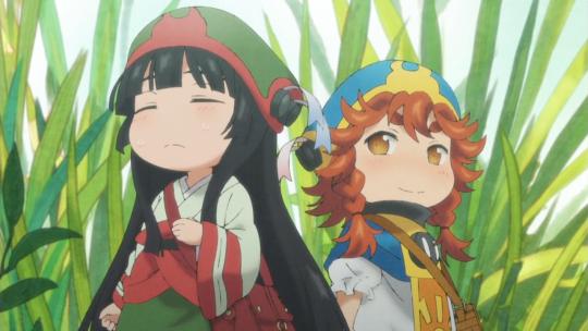
Figure 5 Andou, "Hakumei and Mikochi"
There are three important factors that go into making Toilet-Bound Hanako-Kun series’ art special: manga frames, vibrant colors, and creative lighting.
Manga Frames
When discussing this subject, it is important to remember its origins. When reading manga, the frames and panels are outlined boxes stacked against each other that contain drawings and words. This concept is common across manga and comics alike but employing this type of style of boxes containing drawings is not common in anime. As referenced at the beginning, the American movie Spider-Man: Into the Spider-verse uses the same notion with it being a parody towards superhero comic books. Toilet-Bound Hanako-Kun does this in a similar fashion with its manga-inspired animation.
(Below will be images for this example) Episode 6 of Toilet-Bound Hanako-Kun features many examples of manga frames, but for this example, we are focusing on a screencap from time 3:42. The screencap has two visual planes, in the background is an open book with a red page reading “Future” while in the foreground is Yashiro Nene’s, the main character, face being shown within white manga-panel borders. This image shows an interesting way to convey Yashiro talking while still being able to see what she was talking about on-screen. This scene is comparative to the one drawn in the manga. In the manga, the panel that has the book and “Future” is read first, then the next frame has Yashiro talking about what she is looking at. The way the producers decided to adapt to this scene is interesting; they were able to see the original concept and impact, but also integrated the feeling of being able to still see the first image while also continuing to read/watch on.
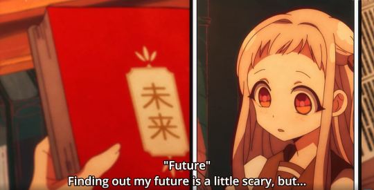
Figure 6 Andou, "Toilet-Bound Hanako-Kun" Ep 6
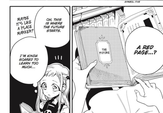
Figure 7 Aida, "Toilet-Bound Hanako-Kun" Chp 11
Vibrant Colors
Different anime may use color schemes to enhance themes, specific events, or symbolism. Color is everywhere in anime, and it is important for the animators to place certain colors in places to bring meaning or impact to the watchers. A popular example of this is in JoJo’s Bizarre Adventure where the color scheme inverts at random yet important times during the episodes, which brings about the weird and unique flare that this series holds. A series does not need wild color changes to be recognizable.
The very first noticeable feature of Toilet-Bound Hanako-Kun is how bright and lively the art looks. James Beckett’s description that this show looks like a picture book is accurate in this sense. Children’s books often have bold and contrasting colors to allow for easy viewing and longer attention spans. Rachel Pancare wrote a Sciencing article title, “How Do Bright Colors Appeal to Kids?” which states, “Bright colors catch young children's eyes because they help kids to distinguish objects from one another in their field of vision. Children spend more time looking at bright colors as opposed to looking at muted shades or pastels.” While this is true, some of the tones and circumstances within the show are not child-friendly, and even then, the coloration and art style are still able to bring the fear that is needed.
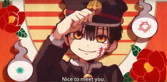
Figure 8 Andou, "Toilet-Bound Hanako-Kun" Ep 1
Figure 9 Andou, "Toilet-Bound Hanako-Kun" Ep 1
Creative Lighting
Lighting can be used in many different forms; it is used to brighten a landscape, a special character or object, or to create a certain atmosphere. In the average anime, lighting may not be diverse but may be only used to brighten the landscape so that the viewers can watch. There would be no major variation or casting that would change the mood of the scene. At times, there is seemingly no direct light source, but just everything is filled with brightness by either the sun, indoor lights, or for no reason. If the setting is at night, a streetlight may light up a character but that is seemingly the only option. Incredible anime typically takes a dive into using light sources and shadows dynamically, especially when there is a dramatic scene or an object that needs to be emphasized.
Toilet-Bound Hanako-Kun possesses the traits of having various light sources and accurately placed shadows, but there is another layer that is added. An integral part of the art style is that light can take a variety of shapes, but usually hexagonal. The pictures below demonstrate this; a light that emanates from the lamps and the lenses flare are hexagons, providing a creative change other than the usual faded circle of light surrounding an object. The other light sources are the light blue, glowing gems and the sunlight from the window. These two light sources provide the rest of the scene to be lit but within proportion to how bright the source is. Shadows are used accurately as well, causing darkness on the two character’s backs as well as slopping downward on the stall doors. These small additions can contribute greatly to the finished product and can transform how a scene is seen and the feelings that are derived from it.
Figure 10 Andou, "Toilet-Bound Hanako-Kun" Ep 6
Figure 11 Andou, "Toilet-Bound Hanako-Kun" Ep 1
Conclusion
The three essential components to Toilet-Bound Hanako-Kun are creative lighting, vibrant colors, and manga frames. Analyzing and discovering what goes into a series can improve your experience and create a deeper devotion to the content. With this being said, not all shows that have the typical animation style and dull background are bad, but that they need to be analyzed in other areas and be appreciated in those. Toilet-Bound Hanako-Kun deserves praise and attention for its art style, and studios should look after this show and put forth the effort to make more series like this.
When considering what new series, you may watch or if you would want to stop watching a series, stop and think for a moment, “Does this art style impress me? Was the effort of the animators shown?” If the answers to the questions is “yes,” then I recommend that you follow through and continue watching that series. While storytelling and character development are important aspects to a show, there is more to the story than that. So, take a minute, turn the volume off on your favorite anime and watch—does the art tell a story? Does it make you laugh, scared, sad, or any emotion? Looking out for these feelings is important, and so is analyzing why this show may look so wonderful, because the smallest details matter the most, and it shows the dedication and love the creators have for the series.
4 notes
·
View notes
Text
February 12th-February 18th, 2020 Reader Favorites Archive
The archive for the Reader Favorites chat that occurred from February 12th, 2020 to February 18th, 2020. The chat focused on the following question:
When applicable, what about a creator’s art might convince you to check out their comic?
carcarchu
I like a wide range of art styles so it's hard to pinpoint specifics but if an artist is able to draw very attractive looking characters (recognizable character designs, outfits that don't look like they came out of 2004 gap catalogue, characters that can still be recognized even when they change their hair style) then i find that very appealing. beyond that how well an artist can integrate the characters with the actual space they exist in is something i find very important as well. a bunch of floating heads can only carry a series so far. if the artist can make the characters feel like they properly exist in the space i think it can really elevate the series although in practice this is something very difficult to do.
Deo101 [Millennium]
For me, honestly some art styles are very inspiring to me and that will sometimes get me to read just because I want to see the art more and learn from it. Things like textures, colors, character design... It can draw me in just by exciting me as a learning opportunity
chalcara
For me art‘s the hook and story the line. Come for the art, stay for the story, you know?
Funnily I‘m looking less for pretty art and more for good visual story telling. I want the art to show whats going on without having to rely on dialogue.
Cronaj (Whispers of the Past)
I'm honestly very picky about art styles when it comes to comics, and that's a personal issue It has some to do with art styles being attractive to me, but honestly, the most important aspects of a creator's style to me are (1) consistency of style and anatomy, (2) level of completion, and (3) clear communication of what's happening. When it comes to whether or not I check out the comic initially, the main things that come into play with the promotional materials, covers, and/or thumbnails are contrast of the image and cleanness of the rendering. Of course, obviously, my personal tastes play into it. (I tend to like semi-realistic styles, sort of anime-ish but with a twist, or painted styles that may resemble concept art.) But honestly, probably more important than grabbing me initially to begin reading is readership retention. And that's where the 3 qualities I look for come into play: (1) Consistency of style and anatomy: This is probably the most important part for me as a reader. If I can't tell who is who because the characters change appearance from panel to panel, I'm ducking out, because that affects the clarity of storytelling. I also cringe everytime I see a particularly egregious anatomy error. I know what people look like. I see them every day. If I feel pain from looking at an artist's work, I'm not sticking around. (To be fair, everyone makes some kind of anatomy mistakes, but really it's if the anatomy mistakes are really awful to me and aren't as a result of a deliberate style CHOICE. Keyword, C H O I C E.) (2) Level of completion: This really just means that if it looks like the artist rushed through the panels or they were being lazy, I feel like their comic isn't worth my time. I mean, if an artist themselves doesn't care about their work, why should I?(edited)
. (3) Clear communication of what's happening: Once again clarity of storytelling is absolutely essential. If the composition of a large portion of the panels don't clearly show the actions of the characters, I can't follow the story. Aaaaaand as a bonus: Please, please, for the love of all powers that be, please, make your fonts legible. If I can't read the comic without squinting because your text is too tiny or hard to read, I'm not going to try. I have bad eyesight as it is. Take pity on your readers. I'm not going to suffer for your work. I have dropped far too many comics to count because the creator didn't care enough to make sure that the font was legible. And this applies to both desktop view, mobile view, scrolling format, and page to page format. Just.... Make your fonts big and clear.(edited)
sssfrs (JOE IS DEAD)
That's interesting to think about how recognizable characters are when their hair style changes. I might try to use that as a character building exercise
Deo101 [Millennium]
Solid excercise: can you tell them all apart when they're bald and naked?
Cronaj (Whispers of the Past)
OoooooooOOOOOOOOOOHHHH
I
Might partake that challenge
Deo101 [Millennium]
Also it's really fun to draw characters in all sorts of hair and clothes so idk what id do if I couldn't tell them apart when doing that!!! That's like 40% of my art!
Cronaj (Whispers of the Past)
This just convinces me more and more to do AU art
Deo101 [Millennium]
Yeah aus are another 20% of what i draw LOL
Look im drawing the comic most of the time so I wish to partake in non canon things the rest
carcarchu
@sssfrs (JOE IS DEAD) i've read series before where the character gets a hair cut / dyes it and i'm like WHO ARE YOU? IS THIS A NEW CHARACTER?
Deo101 [Millennium]
Oh another good excercise is drawing your Characters in many different styles and seeing if they remain unique when not in yours.
Cronaj (Whispers of the Past)
I want to do all of this
This is stuff I hardly ever have time for
So I am extra attracted to it
Also, there IS a time later in the comic where a certain character's hair gets partially burned off
And then he cuts it pretty short to get rid of the singed edges
And I feel like his hair is like 80% of his character design
So I'm just a little scared about that
Deo101 [Millennium]
Also, @Cronaj (Whispers of the Past) , I am unsure what you mean by "readership retention" with something that makes you interested in a comic, could you explain?(edited)
Cronaj (Whispers of the Past)
By readership retention, I mean aspects of the art that decide whether I'll continue reading past the first few pages
(obviously story comes into play as well, but I won't pretend that the art in the first few pages of a comic don't contribute)
Deo101 [Millennium]
Oh okay, I thought you meant like how many readers have unfollowed or something
Cronaj (Whispers of the Past)
Nah
More like, "oh cool! Your cover and blurb seem interesting. Lemme check out the comic!"
And then after reading the first few pages/chapter:
"ah... Not for me." Or "Nice, I'll keep reading!"
Deo101 [Millennium]
Gotcha
Capitania do Azar
Ohh I don't feel like dissing particular artsyle choices, but I know a few aren't for me. I'm no big fan of ultra realistic, hyper detailed stuff you usually see in super hero comics (other genres pick that style too sometimes and I still don't really appreciate). I particularly like artstyles that are distinct and recognizable, I have a hard time with stuff from different authors that just looks... Like a carbon copy (sometimes, the style being referenced is waaay too obvious and that is always a big no for me) Good use of color is key. Give me some good values too. I want colors to make sense and I am very tired of pink. I also appreciate consistency. If you give me artwork with a more paintery style but then the comic is cellshaded, that might tip me off. But not necessarily (tho I appreciate inner consistency inside the comic itself). Rushed stuff, like mentioned above, is also not a good look, but only insofar as it distracts me from what's happening in the story. Consistency is a very important word here, because I love seeing a common line that is able to take in all the differences that are necessary in character design and backgrounds, but also make me believe that they all could live in the same world.
Oh! And also: if the artstyle involves using lineart, I am really fond of sharp, clear lines with weight variation
sagaholmgaard
I'm curious about what you guys mean with consistency- do you guys not like if an artist's art style changes over the several years it might take to make a finished webcomic? Is it that it peeves you when the backgrounds are done in, say, a painterly style while the characters are done with lineart? Is it when the artists makes ordinary illustration work in a completely different style from their comic pages? (This is genuine curiosity I hope no one's feeling attacked rn ^^)
carcarchu
i personally really like seeing an artist's skills improve and evolve over the many years it takes to draw a series
even at the expense of a more "consistent" final product
sagaholmgaard
Yeah me too, it's one thing i really like about webcomics
chalcara
Can‘t talk about the others, but I get thrown off when one page is sprite comic, the next painterly, third cell-shaded without having a in-story-reasons for those style changes, like flashbacks or pov-changes. But more commonly, the issue’s the classic „comic‘s usually coloured, but oops, this time you only get the pencils because I had no time to update“. If that happens too often and/or doesn‘t get fixed for the archive I just lose investment in the comic.
Art evolution is natural, both in webcomic and published work with a dedicated artist.
Ah, that‘s another source of inconsistency - people switching colourists or even artists around. Once in a while is fine, but if it happens every month or so, I tend to get annoyed by it. It‘s actually why I killed my first webcomic twenty years ago; it was a collaberation and life kept getting in the way forcing me to switch colourists every five pages or so.
carcarchu
oh actually i have read a webcomic where they changed artist's 18 chapters in. i really fell in love with the magical and dark tone of the original artist and was engrossed in the world that they set up. they had a painterly style and it really set the atmosphere of the entire series but then the new artist had a super clean and cutesy art style and the sudden tonal shift really threw me off. in the long run the new artist was actually extremely consistent and better at actually releasing long chapters and very good quality chapters and the writing actually improved too because of it but it was never able to recapture what it was that i really loved about the original art style. also the new artist changed the character designs a little so the heroine was no longer even recognizable as the same person
since it was relatively early in the series i definitely would have preferred if they just got the new artist to actually redraw the first 18 chapters in the new style just so the change wouldnt be so incredibly jarring
chalcara
Any harsh breaks like that will cause some people to break away from the comic, I found. I dumped one of my favourite-for-years comic because the creator got bored by their main character and completely sidelined her in favour of a group of minor characters I had absolutely no interest in.
Didn‘t mean the comic got worse - by all accounts its still beloved by quite a sizable audience - it just wasn‘t for me anymore.
sagaholmgaard
Ahh that I can relate to. I get super attached to the main character and usually have a hard time getting into any spinoffs with the rest of the cast, even if I want to (and im a hypocrite because i also want to make spinoffs for ever side character in my own comic LOL) i guess if the style changed a LOT from page to page that would throw me off too. that feels like the artist is trying to experiment, maybe making sort comedic comic strips would be more acceptable then? Every style would at least be contained to one strip at least
DanitheCarutor
That's... actually a really good question. I don't really go for a specific aesthetic. Sometimes what's going on in the thumbnail attracts me, or it could be the use of color, the style, a character design. I'll check out a comic with just about any art style. I guess maybe if I have an idea of what the creator is going for with their art? Like, the art may have a lot of kinks, but maybe being able to tell what style they're trying to go for makes me want to check out their work? Honestly, I don't have a really strong art bias, as long as the comic is readable I'll go for almost anything. Maybe I won't check something out if the style looks extremely uninspired... like if it were the most generic, based off Japanese cartoons, style ever then I might give it a pass. But even then I do sometimes check it out anyway, so I really don't know! This question is surprisingly hard to answer! To give my last quip about last week's topic, since I don't want to derail the current one. I feel the creator's personal life is no one's business. I understand if they're a legit bad person, but digging into a creator's life to see if they qualify to be supported is... I dunno. This mindset makes me feel that if someone who liked my work ever tried to get to know me, they would be doing it solely to see if I'm good enough for them, which feels really invasive and predatory. I fully understand most people can't just enjoy something, that's how the world is, it just kinda sucks sometimes. The world kind sucks sometimes. Alright! I'm doing with giving my final thoughts on that subject.(edited)
Deo101 [Millennium]
The question is specifically about what draws you to art, rather than what turns you away so if you don't want to rag on any art styles that's not what it was asking for I think! Though yes it's very closely related (and it's not bad to say what you don't like)
Eilidh (Lady Changeling)
I definitely am more likely to read a comic that has a distinctive style - no particular style preferences, really. Interesting use of colour/value is definitely a bonus. But as long as it's engaging and the composition is good/readable, I don't really mind whether the art is "good" or not.
DanitheCarutor
@Deo101 [Millennium] I wasn't trying to rag on anything. I couldn't specify what about someone's art would draw me to their comic, it was easier to the one thing that might not, but I still said that I may be drawn in regardless. Sorry if I came off like a douchebag, totally not my intention. <_<'
Deo101 [Millennium]
No I know, someone earlier said "I don't feel like dissi g particular styles" I'll be honest I was typing my post as you were and so I didn't even read yours til after I said something(edited)
Just kind of a general thing! Feels like it went to what turns us away instead of what draws us in so just kinda a reminder of the op
sagaholmgaard
Readability is definitely important for me to want to continue following a comic, but what about the art that makes me want to read something...? I definitely have a preference toward cartoony styles overall. A solid character design will make me wanna check out a comic. If the main character has a recognizable silhouette and interesting shape language. I also love really bold lineart, especially if it's used to create shadow and contrast. Interesting color schemes too. I think how the background is drawn can really make me want to read something as well. I know BGs aren't people's favorite thing to draw but to me if the setting looks very well though out and designed, that definitely motivates me to check something out. And awe-inspiring sceneries are always hella cool! I read a lot of things outside of my artistic preferences though, but I think these are the things that might make me pick something up based only on the art itself.
keii4ii
I think I tend to find more appeal in certain compositions, which is a more subtle aspect of style. I am a major sucker for evocative use of backshots/ not-showing-the-(whole)-face, for one thing. Compositions that make full use of the three dimensional space around the figure(s) is another (this doesn't necessarily mean putting a lot of stuff around the character; you can have a mostly empty space and still make it feel very 3D).
(I hope both of those things show in my own works... I just love those things soooo much )
Deo101 [Millennium]
Oh I LOVE when a panel like... Cuts a face. Something about it makes me lose my mind every time
DanitheCarutor
@Deo101 [Millennium] Ooh! Lol sorry about that! I was so caught up with off computer stuff that I didn't notice anything else typing while I was. I haven't read the whole conversation yet, but I can see how it would turn to that. "What draws you in" is a hard topic to stay on. At least I imagine it would be since it's hard for me to talk about.
Ah! I admit I really like shots focused on scale, specifically ones were you can feel how tiny the MC is compared to what the camera is focused on. Does that make sense? Like the panel shows this ginormous thing, and it has the MC in it to show how massive it really is. That's awesome when done right.
Deo101 [Millennium]
Tiny little person. Yes. Very good
DanitheCarutor
Tiny people in giant worlds are the best!
keii4ii
I love those too!
DanitheCarutor
Oh, also this isn't a webcomic, but I've been interested in reading Vinland Saga after seeing this page on Twitter.(edited)
Something about extremely hideous expressions on semi-realistic faces jives with me.
FeatherNotes(Krispy)
What draws me in easiest is the design aspect of characters, environment and the webcomic title! It's a bit of a turn off when the title doesn't look polished. That's one of the main draws for me is an intriguingly designed logo with a catchy name that follows through their chosen aesthetic. I've seen many comics that stand apart from the title image they chose and it's a bit jarring to see! Great examples of wonderful execution of these aesthetics are BlackOut City, O'Sarilho, Sink Your HookTeeth and Shadrunners(obvs there are many more) I have to agree with @sagaholmgaard about backgrounds! There are quite a few creators who avoid them and stick to simple colours and gradients that just dont keep me in the comic- though my fave genres include a lot of world building, so BGs in a romance may not be emphasized as much. Lastly, dynamic character design!! I love a wonderfully crafted cast that allows me to read the characters easily no matter what setting or outfit they're in. Also it's really random but i do love an artist who can draw really good shoes?? That is always a draw in for me (edited)
Capitania do Azar
Oh I meant it in the way that if you spend a lot of time experimenting with different styles and techniques, you'll never be good at any of them. Style and approach changing over time is, imo, inevitable and good :) @sagaholmgaard(edited)
@@FeatherNotes(Krispy) I constantly think my logo looks like crap next to other webcomics', so thank you (edited)
DanitheCarutor
Oh god, @FeatherNotes(Krispy). Titles and logos are legit my weakest point, that part of the comic creation process is the worst! I have this cosmic-horror/fantasy comic I've been developing since 2005, and it took me till just last year to come up with a decent title. It'll probably take another 14 years to come up with a passable logo. Lmao!
FeatherNotes(Krispy)
It is really hard! Because that image/logo and name represents the body of work so firmly, its also got to stand strong with what it's representing and stand up to other titles too! Basically, i like to think of something that will help generate top results when i search on google for the title, which to me helps it stand on its own on the web, and sound catchy enough for pitches in person! I don't want to steer the convo away too much from the prompt, but there is definitely more to discuss about titles and their chosen aesthetics
varethane
@DanitheCarutor have you read Golden Kamuy? If you love hilariously hideous expressions in manga, it seems like it may be your jam lol
(it's also set in a specific historical period and contains a lot of really interesting material about the time/place it takes place in)
Also I feel like I have never, even one time in my life, come up with a good title for anything-- both Chirault and Wychwood are placeholder titles that I used just to kinda name the story for myself, which I initially intended to change when something better came along, and then nothing ever did
LadyLazuli (Phantomarine)
I know I'm generally drawn into a comic if it's just... generally a visual feast? And it doesn't even have to be a beautiful feast - just... a feast! A super intriguing artstyle, beautiful or not, is something for my brain to pick apart and enjoy. Detailed backgrounds, intricate costumes, fascinating presentation/layout... all the way to crazy expressions and fun asides, and even some gory or scary bits to make me go EEK. Basically, if I'm reading it, and my hand is twitching with the prospect of drawing fan art, then I'm in for good.
DanitheCarutor
@FeatherNotes(Krispy) Urg that is such a nightmare! And there are only so many different styles you can do for a logo, and so many variations of words, it's like how there aren't any truly original stories anymore. I got lucky with the title for my current comic, it's the most generic thing ever, but fits in a tongue-in-cheek way. @varethane I've never heard of it, but the face compilations I'm seeing are intriguing! Man, I love stupid facial expressions.
Capitania do Azar
@varethane golden kamuy, I see you are a fellow of taste as well
varethane
(I love it so much)
Capitania do Azar
@DanitheCarutor oh idk about the "only so many things you can do with logos", I've seen amazing things in this world, if there's a limit I'm not seeing it
varethane
(I can always tell exactly when I was binging it because there's a big chunk of my phone's photo gallery that's all screencaps of Asirpa making dumb faces)
Capitania do Azar
@varethane guys shooting each other in the woods? I'm always in for that
DanitheCarutor
@Capitania do Azar Lol I guess? I can't see how you can have an infinite number of designs for writing, while still trying to keep it vaguely readable. But I really don't like lettering, so my imagination is hardcore lacking in that department.
Capitania do Azar
Lettering and logo design are their own fields of expertise, it's ok
meek
Hmm I'm similar to a lot of previous responses where I can't pinpoint a specific style or trend of art work that draws me in because the styles of comics I read differ incredibly. That being said, there are some things that I do look for to keep me coming back: 1) Consistency of style/anatomy: unless there's a specific reason for the general art style to change (not including semi-deformed or chibi versions of characters), I appreciate characters staying proportionate or just otherwise consistent throughout the comic. And art evolution isn't something that's at odds with consistency, it can actually help that by making characters more distinct and easier to distinguish from each other. 2) Potential for art evolution: Almost the opposite of the previous point lmao but if I find a new comic and I see the latest page is of a much higher skill level than the first page, I'm immediately hooked. I want to see the journey. And I want to see how far that journey goes, even past the point where the art "gets good". There's at least one comic that I can think of where once it hit the style that it wanted to, the art has stayed consistent for the past several years but so much so it's almost plateaued and become stagnant. It's still good art, by all means! But I want to see it grow and evolve more. 3) Good panel/speech layout: Okay it's not quite art in the same sense but someone else mentioned this above and I think it's important too? There are so many comics I can think of that I couldn't read or I dropped off at a point because reading was a chore, either because of giant or unsightly speech bubbles, tiny or ill-fitting font, a combination of the two, etc. Sure, graphic design and layout is a skillset completely different from pure illustration, but it's one worth knowing because otherwise you could do a disservice to your art and your story.
Cronaj (Whispers of the Past)
@meek Seriously, the text is so important to me, and I consider it a large part of page layout and design
meek
Agreed!! It's something that bothers me with printed comics all the time. I've tried to read so many "classic" graphic novels and I just.. I can't get past the giant text boxes with small font with miniscule kerning and ESPECIALLY if they then add color to it. Please, keep in mind your readers with reading difficulties But to turn this into a positive One of my favorite things that also helps make a comic feel more personal is when the creator turns their handwriting into a font or otherwise have FUN with the speech bubbles
Cronaj (Whispers of the Past)
YES. As someone with bad eyesight, typography is one of my favorite aspects of finishing a comic page.
Deo101 [Millennium]
It also is super important for me with ADHD, reading is hard enough as is! so bubble layout and clarity can really bring the whole thing together and elevate a comic
Eightfish (Puppeteer)
I tried that but got the feedback that my text is hard to read and the way i format my speech bubbles is distracting (: But some people have said they really like it so ¯\_(ツ)_/¯ Though I do think I could have done better with the font. I have good eyesight and bad handwriting do I think i have a much easier time reading weird text than many. Since you guys care so much about text, would you mind taking a quick glance at my comic and telling me how readable it is? It'd be nice getting feedback from random people as opposed to only my readers who felt strongly enough to leave a comment unprompted
meek
Oh man I have this specific panel in mind from some early 2006 Avengers comic of like.. what not to do Basically it was a bright yellow text box with this white/light blue font. It was just. It was a nightmare to read Oh sure!! Definitely send me a link
Cronaj (Whispers of the Past)
Yep! Send me a link too! I'd love to help you out
I also have a good typography book to recommend if you're interested. I can drop it into #art_resources(edited)
Eightfish (Puppeteer)
Here is link: https://www.webtoons.comen/challenge/puppeteer/list?title_no=290620
Thanks for taking the time to give me critique!
Cronaj (Whispers of the Past)
The link's not working, but I can probably find it on Webtoon
Eightfish (Puppeteer)
And I think i dould find a typography book interesting, so yes please do send the link
Sorry, i think the link is missing a slash
Did we both delete the link
Deo101 [Millennium]
did we both delete a
yah
i got it
Eightfish (Puppeteer)
Lol
Deo101 [Millennium]
https://www.webtoons.com/en/challenge/puppeteer/list?title_no=290620
Eightfish (Puppeteer)
Thanks
Cronaj (Whispers of the Past)
I found it
(The font is a bit small on mobile, but the font is fine?)
Eightfish (Puppeteer)
Wait can we move to shop talk?
FeatherNotes(Krispy)
(maybe we can have this discussion on shop talk channel? )
Cronaj (Whispers of the Past)
Sure
FeatherNotes(Krispy)
OH LOL
DanitheCarutor
@Capitania do Azar Oh god, they so are! I envy anyone who enjoys that craft, I'm a lot better than I was, but lettering is still so hard. ;v; At least the fancy stuff is hard, regular speechbubble lettering is easy as long as my hand cooperates.
Cronaj (Whispers of the Past)
There's a book I had to read for a web design course I took, and it is seriously a life saver
It put text in a whole new perspective
DanitheCarutor
I do all my lettering traditionally, but maybe that book would be helpful, I legit hate doing it no matter what medium I use. (sorry for continuing to derail the channel.)
Capitania do Azar
@DanitheCarutor i used a website that converts handwriting to fonts + font forge for tweaks to get personalised fonts
DanitheCarutor
I used to type bubbles out, and I've thought about it for my current comic but I mix up words and letters really bad, and I forget to add words entirely while typing. It wouldn't be so bad if my brain saw the mistakes while rereading everything, although sometimes it takes a couple days or another set of eyes for me to actually see them. When I write the bubbles in with a pen I make a lot less mistakes since it takes more effort to write out each letter, also my brain can keep better track of the ones I do make. I feel like that's an excuse that makes no sense.
Deo101 [Millennium]
no it totally makes sense
snuffysam (Super Galaxy Knights)
I can't say I'm ever especially drawn in by art? Besides the sense of "it looks like a lighthearted action story and I like lighthearted action stories", not much catches my eye. Though, I will drop a comic if I'm put off by the art. Like I can forgive if some things look janky at the start of the comic, but if that jankiness doesn't improve over time, I'll drop the comic. I'll also drop the comic if the character designs are bad (i.e. indistinguishable from each other, or in rare cases just too gross to look at). But again, I can't exactly say "good character designs draw me into the comic" because a lot of comic banners/thumbnails don't really show off full character designs.
chalcara
Varied bodytypes are catnip for me. And I like comics with expressive characters over comics that limit expressiveness to keep the characters pretty.
Eightfish (Puppeteer)
Oh, definitely agree with that second part. Comics where it looks like everyone has had a ton of Botox is a huge pet peeve of mine
Like, eyebrows are not the only part of the face that can move.
Do more
renieplayerone
Yeah i agree with the janky art thought. I think it helps me follow through the jank if i see that the later pages, the artist has shown growth, and i dont want to force anyone into a "gotta redraw it" loop if thats not something they want (of course everyone has their reasons and theyre also valid af) Ill tend to be more forgiving about the jank if i know its someones first webcomic or first comic in general, because you cant learn how to make comics without actually sitting down and making the dang thing. So yeah, the jank can be a double edged sword(edited)
What super draws me in is comics with a great sense of color. While i love anything vibrant, if the softer watercolors are done well, they're chefs kiss. Prime example of that is Stand Still Stay Silent
mariah (rainy day dreams)
I've been thinking about this question all week and I think I finally boiled my answer down to something short, sweet, and to the point. It's gotta be some kind of spooky and some kind of cute I have a pretty broad range of art styles I like and I definitely also read stuff that doesn't fall under those categories, but I think my favorite stories or artists are some blend of those two things. I don't really have a preference between color and greyscale. Like I definitely love a good color feast comic, but if you know how to use your grey tones or even just black and white well it's just as good for me. Maybe that's also just me trying to justify being mostly a greyscale artist to myself TuT
FeatherNotes(Krispy)
@mariah (rainy day dreams) devils candy would def be up your alley then!
mariah (rainy day dreams)
Devil's candy v good
renieplayerone
Devils Candy is amazing
mariah (rainy day dreams)
I love to combination of cute monsters and action also.
DanitheCarutor
@renieplayerone I'm not sure if it fits totally with your preference, but if you're looking for watercolor Lost Honey is gorgeous! https://www.losthoney.com/
mariah (rainy day dreams)
Lost Honey is another great comic great to look at, really interesting world
DanitheCarutor
It's one of my faves! ;v; There is another comic that was half watercolor half digital that I used to love reading (if I remember right pages set in the current time were digital, and backstory stuff was in watercolor.), but it has been discontinued for years now. It was called Toilet Genie/D00R, a comic about a genie who was locked in a public toilet and was awakened by a pug that got thrown out by her owners. It was so pretty, with such an interesting style!
mariah (rainy day dreams)
Oh wow I haven't thought about that comic in 5 years! X'D I didn't read much of it, because I don't think there was much of it available at the time, but yeah, that one was also very pretty (edited)
renieplayerone
Oh those colors are really pretty!!
DanitheCarutor
Right? Lost Honey is total eye candy. @mariah (rainy day dreams) Yeah, it's sad the creator never got to finish it. I think about it every so often since it's one of the extremely rare (semi)watercolor webcomics out there.
Also I'm extra attached to traditional mediums since I work in a traditional medium myself.
mariah (rainy day dreams)
Same. Got that ink wash/watercolor bias.
Eilidh (Lady Changeling)
My current comic is marker shaded but I so want to do something with ink wash after this one...
DanitheCarutor
Yeah, right now I'm working with color pencils since they're cheap but I want to give gouache or acrylic a try for my next project, depending on which story I do.
Kabocha
Hm, the question is... a lil' challenging to answer. I think in a lot of cases, the art isn't necessarily what gets me, but when it does -- Sometimes it's when someone uses a resource I like/made and I can go "OOOH! I know that thing you used!" Screentones are another one that gets my attention pretty quick. Sparkles... And probably effective spot color use. As much as I enjoy many full color webcomics, there are many that get tiring to try to read for one reason or another (usually it's either a font or a saturation issue - too many similarly saturated colors near one another gets tiring to read). Also, soft coloring. Oooh, just... when the art feels like it ought to be printed on those soft-touch covers... Yeah, that gets my attention. ...and watercolor/inkwash, too. ... okay that's a lot of things that grab my attention, but tl;dr: oh hey look at all that cool stuff that people can do!
mariah (rainy day dreams)
That was part of what was so hard for me thinking about this question cuz really, a lot of things get my attention X') and the more I thought about it the more I was like "I like when a comic is like X, but oh also Y is great and I do really enjoy Z as well!" I just ... like so many things. But I think that's better than being really picky. I've meet some folks that are super picky about art and basically only like one style and I'm just like... you're missing out on so many amazing things!
Kabocha
Right? And heck, even in some comics where the style would normally be unappealing (to me), there's just something about the art and the aesthetic that clicks to make it all work together for that project.(edited)
I do think, though, that there's always going to be a special place in my heart for greyscale or screentoned comics. There's just something about art that knows how to effectively make use of shading and contrast to make their work... well, work for me.
kayotics
Art is probably the first thing that draws me in to read a comic. The top, top tier thing that gets me to pay attention to a comic is really strong inks. I love inking, and unusual inking styles. To those who know me, that's probably incredibly unsurprising. I also love really angular styles. Some other stuff I gravitate towards: cartoony styles, expressive faces, and kind of ugly characters. I enjoy seeing characters that might be described as plain or are drawn in a bit of an ugly way. The last thing that draws me in? Hands. If an art style pays attention to hands, then I'm all for it.
mariah (rainy day dreams)
Does a comic have characters with big, crooked, toothy grins? I'm down for the count X'D https://media.tenor.com/images/618576ebcc4f6d2a12438624be77c54f/tenor.gif
varethane
oh hey, did someone mention webcomics done in ink wash/marker?
Chirault was that!
1367 pages of..... ink with greyscale marker..........
FeatherNotes(Krispy)
honestly blows me away that you toned it traditionally like, all of GJS is inked trad, but to ink AND tone in marker is just.....damn
sssfrs (JOE IS DEAD)
I love ugly characters
RebelVampire
When it comes to art, I'd say there are about four factors that will draw me in. First, readability. Can I visually follow wtf is going on in the comic? I have no interest in the visuals if I can't understand what action characters are taking. So the first point is always for if that is true. Second, character distinguishability. Can I tell one character from another? I am notoriously bad even in real life at being able to tell people apart, so when reading for fun, it's super important to me that I don't have to put a lot of effort into telling characters apart (exceptions for identical twins, of course). Third, personal appeal. Do I think the art is pretty or cute? Like, obviously this is subjective so I can't really put into words why I'd find one style appealing and the other not. But ya know, I like stuff I think is pretty to look at. Fourth, backgrounds. If a creator puts a lot of effort into their background scenery, I'm very sold on it. I love beautiful backgrounds, and the effort put into them give me an overall better impression of the comic as a whole. Since it takes some real passion to take care with backgrounds. All this being said, I'm not much of a stickler for art. If a comic is well-written enough, they can fail all these points and I'll still read it. This is just a list of what aspects have to be in the art for it to draw me in.
Eightfish (Puppeteer)
My points are pretty much the same as Rebel's, with the addition of a few things: I adore comics with dramatic facial expressions and consistently excellent anatomy. Also, if the art style is unique? If I feel like I've never seen someone draw that way before? That's ++. So good. I've read comics where I thought the art was good but the story was mediocre, but I've never read a comic where the art met all my points (and Rebel's), where it made me go, "holy fuck," audibly, and then had the story disappoint. Comics where the art made me go "holy fuck" audibly: Excecutioner's Academy: The art is so pointy and colorful and detailed and weird. It's full of personality and life and so are the characters. Warning: hiatus comic ): https://tapas.io/series/Ex-Ac Ava's Demon: You guys know about Ava's Demon, right? With original music and animations ending every chapter, this might be the most effortful comic I've ever seen. https://www.avasdemon.com/pages.php#2611 Sfeer Theory: Everyone looks so different from each other, it's fantastic. Some characters are not conventionally beautiful, yet they're still so appealing. And backgrounds! And a thought-out and unique magic system! https://sfeertheory.com/comic/01-00/ Electric Bones: Backgrounds! Banter! http://electricbonescomic.com/index.php/comic/page-001/ I also loved Prague Race, but unfortunately it was cancelled ):
If anyone else has recommendations for comics with amazing art, I'd love to hear them!
Cap’n Lee (Flowerlark Studios)
For me, it just has to be an art style I like to attract my attention. I generally like realistic art, stylised art, or pretty much any style that hasn’t been done to death (like generic anime art; much as I love manga, I’m really tired of the over-saturation of bland and soulless anime-inspired art). Pretty much anything unique and well executed will grab my attention. I especially like greyscale and limited palettes.(edited)
And just to clarify, I do like anime-style art when it has expression and/or skill behind it; just not when it looks generic and manufactured. Overall, though, it’s the writing that’s ultimately the most important thing to me in a comic, so I’ll enjoy comics for their writing even if I’m not a fan of the art.
#ctparchive#comics#webcomics#indie comics#comic chat#comic discussion#comic tea party#ctp#reader favorites
1 note
·
View note