#but I think these three simple screenshots convey what we all know is there
Explore tagged Tumblr posts
Text
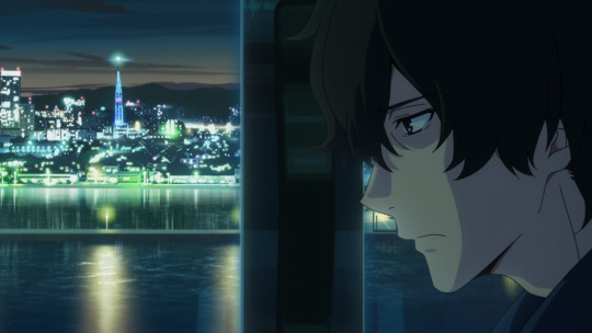
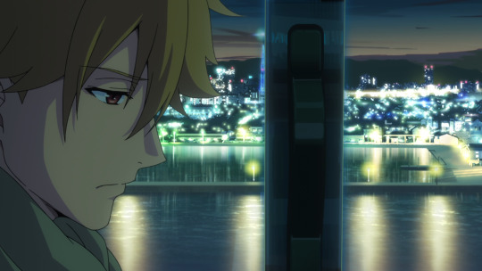

You're going to follow through on that false relationship, bearing the weight of your sin?
It won't be a false relationship. This time, we're gonna be a real family
_______
Kazuki and Rei are fucking deeply in love with each other and Buddy Daddies is, in part, about them both not only realizing this but coming to terms with it. There's absolutely nothing you can do to convince me otherwise
#the homoeroticism of it all#there are so many scenes I wanted to include in this post including both of the balcony scenes and Rei's birthday drive home#but I think these three simple screenshots convey what we all know is there#they're just pals being bros and don't know how to speak into being that they somehow bro'd their way into a relationship#headcanon Kazuki being a bisexual polyam boy#and Rei not being remotely interested in anyone until his big gay Oh moment with Kazuki#also fuck I wanna write the shit out of some of the gaps in episode 11 bc damn there's some meaty Kazuki/Rei moments in that#anyway Kazuki/Rei own part of my soul now#buddy daddies#kazuki kurusu#kurusu kazuki#suwa rei#rei suwa#kazuki x rei#rei papa#kazuki papa#kazurei
265 notes
·
View notes
Note
hello, i just want you to know that you were one of the few artists my 11-year-old ayayui-rotted brain clung to!!!
now, 8 years later, i'm back in tumblr and i checked out the ayayui tag AND I SQUEALED WITH JOY when i saw you!!!
thank you so much for the wonderful art. (to this day i cannot get that seggsy ayayui basketball art you drew lol)
I wish I can tell you how much your message means to me, this made me a little teary eyed
trigger warning: depression talk below
8 years ago was just about 1 year before my depression peaked, and also the last time I heavily pushed out art before I stopped almost completely. I can tell you exactly because I started therapy at the end of 2020, and before that it took me almost 3 years to admit to myself that I need help. I wasn't ever in danger of unaliving myself but those were still some dark times. My diary from those years is so sad, that I can't bear to read it. But I still vividly remember one very personal entry that I want to share with you to convey to you what you did for me (and past me) today with that message
---
(this is paraphrased + translated)
December 2019
I haven't picked up a pen or a brush in what feels like forever and I don't know if I ever will again. I feel like a failure. My art looks like crap compared to others. It's messy and simple and you can tell i just wanted to get it finally done at one point. I bet no one uses that much references as I am. I want to delete it all. I don't even want to call myself an artist when I look at my stuff, that's just embarrassing. It looks so much better in my head, but my hand can't replicate what my mind sees.
Maybe it's a good thing Mom and Dad talked me out of studying art. My portfolio is cringe. I don't even know if this current degree is going anywhere, I haven't studied in a while either, I'll probably fail my exams. Whatever, I'll try next semester again.
I told people online that "I'm back" like a 100 times already, but no one cares anymore. That's the internet, if you stop pushing out content, you'll become irrelevant. Can't blame them. That's life I guess. I want to draw but I can't, it's not fun anymore. I'm not creative anymore. Where did it all go? Why do I feel so tired all the time? Maybe I'm just lazy. Even this entry almost took up all of my energy for today.
I slept 12 hours and I'm still tired.
---
A bit melodramatic but that's how I essentially felt like all the time, thinking about my art just made me spiral even more. I did receive some supportive and loving messages during those years and I have every one of them screenshotted and saved on my computer, but back then they were only able to pull me out for a very short time before I slipped into my black hole again. I had little bursts of creativity here and there but nothing compared to how it was before. Most of it I didn't even post because I ended up hating it.
I had my very last therapy appointment about three months ago and even though I'm in a much better place now, I'm still coming to terms with closing that chapter from my life. Something about your message made me very sentimental today - in a good way.
Thank you for liking my art 8 years ago. Thank you so much for still recognizing and remembering me 8 years later (!!!) and thank you for taking some time out of your day to message me! This truly made my whole month already, and we only have 2nd of July!
(about that seggsy basketball art, I reposted it a while ago - even though every fiber of my being cringed so hard 😂)
18 notes
·
View notes
Text
time to rant about how i think the dance in emma (2020) is way more effective than in p&p (2005)
let me explain (buckle up this is long)
“they feel like they’re the only ones in the room/they only see each other”
p&p (2005) tells it to you right away and then shows it to you
emma (2020) there’s a whole fucking journey to get to it
in p&p, it starts with this:
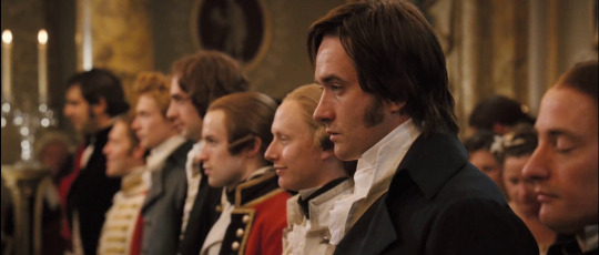
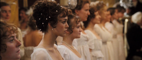
there’s a boy, there’s a girl
the camera follows them one at the time until they meet in the middle during the dance

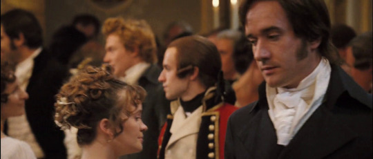
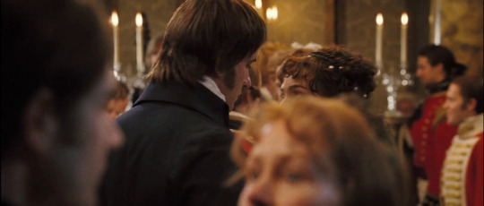
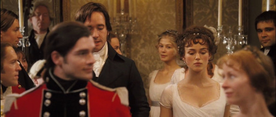
the conversation heats up, they stop stopped dancing. effective.
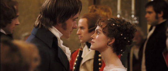
then, they start dancing again
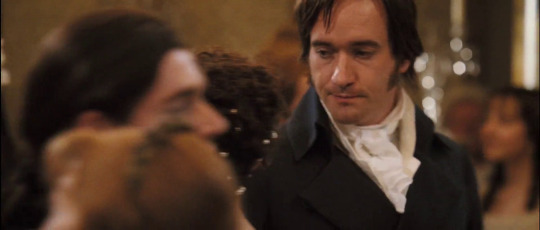
it’s the last shot you see before it cuts to this:
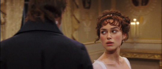
then they’re dancing alone in a room bla bla bla until it ends we all know how this goes
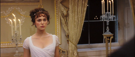
and then it cuts to this

the fucking cuts: - it inexplicably cuts to other shots that are not continuous with the last shot you just saw. why. i have no clue. it doesn’t really add anything. you’d think it’s like a quick reminder that oh they’re not alone in the room, but having watched it again, i don’t get that vibe. i just get “they’re alone, now they’re not” and there’s no explanation for it other than you know they’re gonna hook up and this was meant to be a moment. there’s no loud noise that brings them back that could explain this kind of cut, there’s nothing. - i would have wanted a smoother transition. maybe digitally remove people one by one, or use one of those secret cuts for one shots when people block the camera by walking in front of it to then, again, smoothly see that oh people were here but now they’re not but you’ve been here the whole time you didn’t have to fuck off somewhere in another room to be alone. it happened all organically. - really fucking irritated about it. i really like SEEING them alone in a room, but it feels a bit patronizing in a way, as if they weren’t able to convey it or were too lazy to show this feeling in other ways
it’s kind of ordinary? - having seen emma, i can’t find anything spectacular about the way this was filmed. it’s just the camera playing ping pong from the same spot, then the camera circles them. i love the flow this has because you get the horizontal match of ping pong at the start (as it reflects their discussion -- very nice) and then, once they’re alone, it starts flowing and moving more freely. fucking wonderful. but you could also do that with any other scene and it would lose this meaning because there’s nothing else that makes it special. - and because of that, it doesn’t seem to be much visual storytelling happening, and by that i mean if you were to only look at the screenshots or watch it without audio, it doesn’t give you much to go on. two people dance and seem to talk, they stop, they look angry at each other, then they’re alone in a room dancing again. the dialogue and the music basically provides most of the storytelling in this scene, which, you know, it’s perfectly fine, but you’d think a scene that has this much impact would have a bit more? - all you get are three images from the same pov: her alone, him alone, them together. do i want more? no, it’s perfect the way it is. HoweverTM:
they actually visually tell you they’re alone before they show you they feel like they’re alone in the room - the filming already preps you for the big moment. they only focus on them. that’s it. that’s the whole scene pre-alone scene. they focus so hard on the characters that you already know they feel like they’re alone; they’re having a heated conversation in public during the middle of a dance. they already feel like they’re alone. otherwise, what’s the purpose of it all? if i can assume this from the context and how it was shot, why do i need another reminder? why both? why not just one of them?
dumb complaint, but the opening shot... - it gives you zero context. a good thing about it is that they show mr darcy first as to say hey this doesn’t happen often, this is special, buckle up. but then again, it starts with a somewhat close up and they never go in or out until they’re in the room on their own. there’s no perspective to it. i’ll call myself out and say it’s a really stupid thing to be upset about because, for example, if i wanted to show someone feeling lonely, you could fill a frame with their face and show there’s nothing else but them, EXCEPT the most effective way to show this would be a wide shot where they are indeed alone or in a corner. both are GREAT it depends on the context of the scene, of course, but my point is, why not just take the opportunity you have. you can open with one wide shot and never come back to it. at least you’re acknowledging this isn’t just about them. (it IS just about them, but since we already KNOW this by looking at the scene before it cuts, them being alone doesn’t have as much of an impact as it could)
it’s stupid how much i used to LOVE this scene and now i can’t even find anything to ramble on. it’s the same two things. it’s not like i have much to talk about.
so now there’s emma who just fucking went for it and annihilated p&p’s dance
there’s a context shot. this is it. you’re not meant to spot them, you’re meant to know they’re going to dance with lots of people surrounded by lots of people. this is important for later on.

now you get introduced to two important angles (hell yeah)
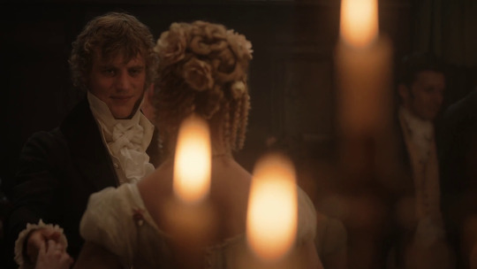
this voyeuristic candle pov that makes me want to fucking nut. this is my favourite pov. it’s meant to be her point of view, but as you’ll see in later shots from this angle, the meaning also doubles as OUR pov, like we’re intruding and watching from afar. i think this is very efficient because you get variety, personal interpretation, and depth. depth as in you’re behind the candles and they’re in front, you ask? no! the most important aspect is the horizon line!! they become the horizon line, and the people we barely make out in the back become just shadows in the background, and therefore, unimportant. you don’t need to make them leave the room to make it seem like they’re alone.
and then there’s this one, his point of view, but still not an over the shoulder look, so it’s still as if we’re looking from the side, but we’re not intruding as much, because this just sets the tone, they haven’t even begun dancing. there’s no need for two of these candle shots. the horizon line & background people thing still applies to this, but in a less dramatic and obvious way.

then we cut to this:


the smartest thing about this is that
1. you’re still intruding
2. the camera faces the side of the room with the most people (take note of the band)
3. in the second shot, it feels very intimate even though they’re surrounded by people so much so they block us from fully seeing them
then we get the first part which is only filmed this way once. (again, as an introduction to give you context.)
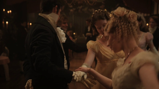


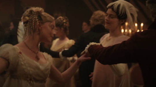
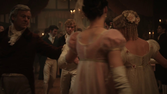


there’s a few important things here
the movement because they don’t insist on focusing on them at first to give you the vibe in the room, you get a lot of people moving in front and behind the two we’re kind of supposed to be focusing on. i think this is brilliant. it makes you want them to be alone, but they’re not there yet. you have to wait for them.
the lookTM even though the camera moves often and the shots change, we see him looking in her direction whenever he can. it’s so SIMPLE and it adds to two aspects: 1. the whole voyeurism thing; you’re catching him do this, it’s not meant to be a focus point 2. they’re slowly starting to show signs that they’ll feel like they’re alone in the room. the whole “staring at someone and being so enthralled by them it feels like it’s just the two of you”
now we get a subtle change. the camera switches sides and faces the other way. there were five visible musicians and we don’t see them anymore. remember when i said i would have liked for p&p to slowly remove people from the room? THIS is how you can do it, and all that was done was filming from the other side of the room. not only that, but there are only two couples next to them from this angle, unlike the other where there were three or four i can’t remember.
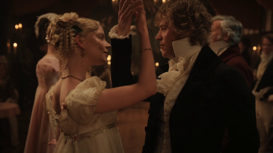
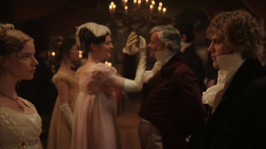

this is a nice way of controlling the crowd. are there more people in the background? we don’t know because we get a couple hiding them from us, keeping yet again a low people count, and then we get our two idiots literally blocking everyone from us and them

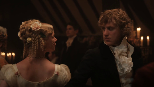


this has the exact same intensity as when darcy and lizzie are dancing in that empty room and yet. you get the effect of an empty room without having to vacant the whole place down.
this is also when it starts to get real romantic up in here. up until the twirling, there were a significant amount of people in the shots, but now, you’ll start seeing less and less (with one exception) of them. doing it gradually builds up great tension and makes you feel like you’re part of it.


it takes up until now to have our first close ups. the neat thing about it is they’re doing the same moves that first introduced the concept of them blocking out people in the room. filming like this (from the outside in) also induces the feeling of blocking out people
then we get a surprise midsection shot:
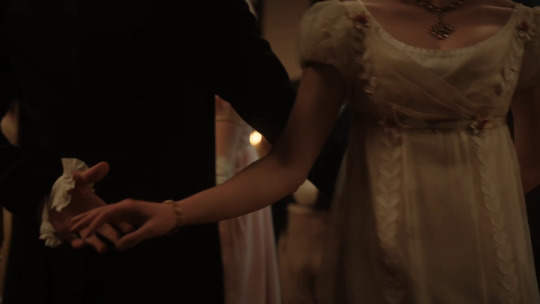
i thought about this a lot because it has the same vibe as the cut in p&p, but the thing is,
all the previous shots were from head to waist and the face close ups. there were NO close ups NO focus on anything specific. it’s kind of the visualization of “what happens under the covers” and i don’t know about you but......
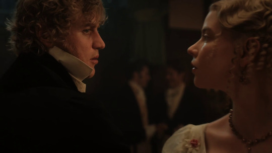
bedroom eyes much??
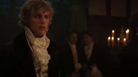
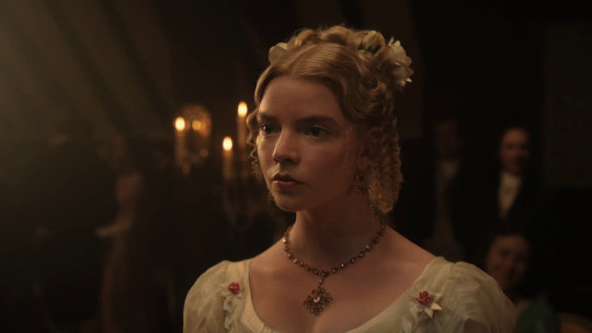
they still are in the room, people are STILL dancing, we still SEE them in the background, but the camera focuses on the two. they’re simple shots in theory, but along with the whole journey you’ve just been through, it means so much more. these close ups are more important than they should be. the more they dance the closer they get, the more isolated they feel.
now there’s this part which i ADORE. she advances to him, but in a way, since it’s not a typical over the shoulder view, it feels like she’s coming toward us too. it’s done so slowly too, almost hesitantly, and the next shot of her back preps you for the next big moment.
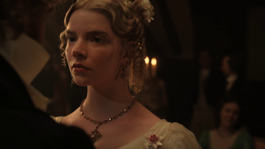

before it happens though, there’s a quick throwback to the fact that there’s still people. autumn de wilde really said i got you bitch they’re not alone. it’s a weird thing, i’ll tell you, but i kind of adore it. it’s like getting cold water thrown in your face because we forgot.
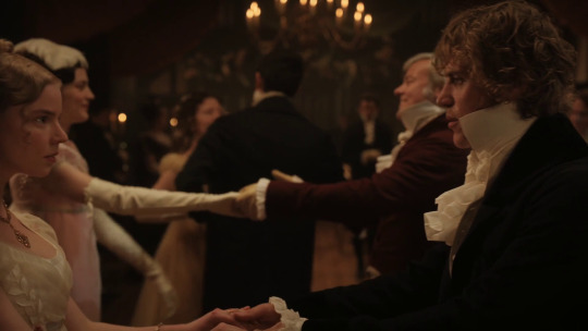


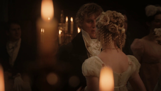
i would have gifed this part but i’m lazy. their dancing come to a stop. just like how it did in p&p (before it CUT) and emma just yeets away from him in that last shot to continue dancing, like she too forgot herself like what just happened to us with that cold water shot. (the next shots prove he too has been splashed in the face and it’s not a one sided thing, or something WE looked too much into)

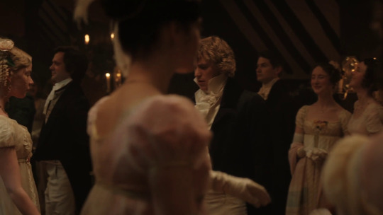
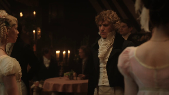
having yeeted away to take their place to dance again, the camera pans over to them. it follows them. like they were trying to escape all this and what just happened was clearly private.

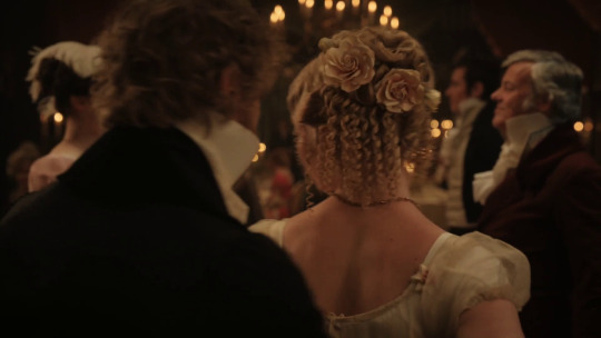
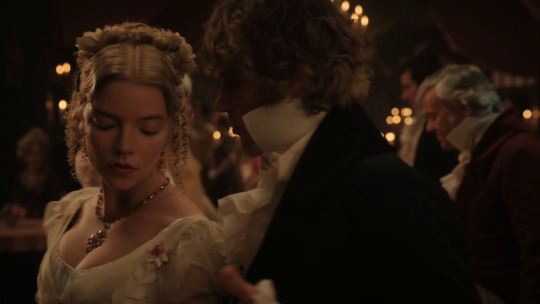


and then the shots become more like they were at the start. wider. there’s people in frame again. but then they twirl to stop in front of the camera, blocking them again. they know.
and then you see why they stopped. if you look closely in the background, they danced on their own. this isn’t part of it. nobody’s dancing, they’re still in position, waiting. these two just went off on their own.
because they feel like they’re the only ones there.

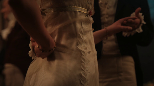
it cuts to her dress again, them holding hands again. we’ve been prepped for this, but this time, knowing they weren’t MEANT to do this, it feels much worse.


and they retract, because that’s that. what more can you do.

and then it ends here. it’s too late, and you don’t need another reminder they weren’t alone.
it doesn’t matter anymore.
515 notes
·
View notes
Text
Why Compassionate Actions Matter (Yes, Yours Too.)
I’ve been thinking a lot lately about communication. Communication and human interaction are both things I think of a lot, actually. The most recent thing I wondered about is why so many people seem to not care about the things their supposed friends do.
For example, I’m in a server with my 5 friends, all of whom are also my roommates. There have been a lot of times that I’ve posted my art or some short stories to the #share channel and then waited and waited and gotten no response at all.
It made me wonder, do none of them care?
I know that all of these people generally care about each other and each other’s happiness. They’re all fairly compassionate toward others. So why do they seem to ignore every effort I make to reach out and share the things I do? Why do none of them ever do the same? It’s not that I expect anyone to applaud me and tell me how good my art is or how compelling my writing is - I just wanted to be seen.
Feeling invisible has always been a struggle for me, being raised in a household where I was in “the forgotten child” role. So, in my friendships, this is a sore spot for me. It tends to make me move on after a while if my friends don’t ever seem to see me. This is also why I usually only have one or two best friends - people who feel the way I do about compassionate action.
What Is “Compassionate Action”?
When I say “compassionate action,” I’m talking about doing or saying things that don’t directly benefit you or that you may do purely to benefit someone else. It’s not an official term or anything, just an apt way to describe what I need to. This doesn’t have to be charity work or groveling or kissing up to someone. It could be as simple as letting someone know their message has been seen - sending a heart in the chat to let someone know you see their work and you appreciate it.
Compassionate action is what draws me to the best friends I do have. My boyfriend is someone who I can always count on to be supportive and give positive words no matter what I do. I do the same for him. If I draw a picture, he always responds to it, saying, honestly, that he likes it! If I get really excited about a formula I created for a spreadsheet and I send him a screenshot, even if he doesn’t know what he’s looking at, he’s really excited for me!
Why Is “Compassionate Action” So Hard to Come By?
Many of us, no doubt, have had similar experiences in regard to feeling ignored or unimportant to our friends. But, surely, our friends do care about us, right?
The answer is yes, in most cases. But, somehow, that makes the lack of response to the things we love seem even more confusing. So, this is where I began thinking the other day:
Why do people who care seem so uninterested or unwilling to interact with things their friends love?
I talked with my boyfriend about this the other day to parse out why this is happening. It’s something we’ve both experienced a lot in different friend groups over the years.
So, we sat down together - over call, since we’re in an LDR - and we talked about it. We tried to figure out why we both feel this way and others seem not to. For both of us, it’s important to us that our friends are happy. Even if one of my hydrologist friends posted some table he made, that he was really proud of, about stream flow data - something I’m only moderately interested in - I would make an effort to read and understand it and then give excited feedback. It’s not that I’m as passionate about stream flow information as he is, but I would be really happy to see his excitement and satisfaction with his own work. My boyfriend is of the same opinion.
But then, if our friends value our happiness, which we know they do, why don’t they ever give positive feedback about things we’re excited about? We talked over possible reasons for a little while before we finally found one that made complete sense - one that consistently fit the bill for all of the friends that we’d had who never gave us “compassionate action.”
Your Actions Matter
The result we came up with is that most of these people were dealing with depression or self esteem issues. They feel that their opinions don’t have value - won’t make a difference. They think that it isn’t important if they respond because, “Why would sending a heart matter? If I send a heart and don’t respond with an in depth review of how cool the thing is, my friend will just think I’m an ass for not saying more. It’s better if I just pretend I didn’t see it.”
My boyfriend and I both have had some pretty life-changing experiences where other people’s compassion, shown in small actions of recognition and solidarity, have kept us alive or changed our entire day for the better. We’ve learned through our experiences in suffering that those actions make all the difference, and we’ve put that philosophy to work in our own lives. However-
not everyone has realized that this is true for them too.
If you have depression, anxiety, or you’ve grown up in an abusive home, you might feel like your actions don’t matter. You might think this doesn’t apply to you - that you’re the exception and that your friends don’t care what you think.
You’re wrong.
The people around you, even people you don’t know very well, they care about the things you say. It doesn’t matter if you’re depressed or anxious, or an outcast, or kind of weird. It doesn’t matter if you’ve never spoken to them or if you’re best friends.
The things you say make a difference.
The sooner you realize that your opinions and your words have value - have POWER - the sooner you will begin to improve the connections you have with friends.
I grew up feeling like my opinion was worthless and that I should never give it, even when people asked for it. To me, it was obvious that they were only asking because they wanted me to feel included. I look back now and I see that that’s not true. The same way you desire to be seen by others, they desire to be seen by you. One such way that you can make other people feel seen is by showing them that you have put consideration into what they’ve done. You have formed an opinion on it.
When your friend shows you a drawing they’ve made or they sing you a song they’re working on, more often than not, they are not looking to just show off. They are begging for recognition and are asking to be seen by someone they care about (that’s you!). Give them that. Tell them what you think! Get excited for them!
It’s Not as Complicated as You Think
Not really the kind of art you’re interested in? It doesn’t matter. “Wow, you really put a lot of work into this!” That sentence is a huGE compliment. You are showing them that you find value in what they did and that you see how hard they worked.
Did your friend sing you a song they’re working on and they’re a little bit tone deaf? That’s okay! You don’t have to lie about how you feel to be compassionate. “You show so much emotion in your singing!” Those words will fill a singer’s heart with joy. Not everyone sings to sing perfectly, but to convey their feelings and connect with people. That would make their day!
Is your friend a weirdo like me who enjoys creating spreadsheets? “Holy shit, that must have taken forever!!” Those kinds of words are so so validating. It’s okay if you don’t know what you’re looking at. It’s okay if you don’t want to try reading the data in the spreadsheet. What matters to me is that you have taken the three seconds to look at it and form an opinion about me and what I’ve done, even if that opinion is just seeing that I have put a lot of time and effort into something.
No matter what your friends show you, there is a way to show them that you see them and care about them being happy. You don’t have to lie or compliment the work itself, you don’t have to open up your bleeding heart and write a poem about the beauty of their creation.
You just have to show that you see them.
If you struggle to feel that your words have value, I urge you to take a moment and think of the times you’ve tried to share something with someone and gotten no response. I urge you to consider how the tiniest acts of compassion by other people have gotten you through the day. Please know that your words have the same weight.
I can HEAR you thinking that you’re different and YOU’RE NOT.
Everyone! I repeat! Everyone! Has an impact! With their words!
Depressed people, anxious people, people who were abused, people with trauma, people with disorders, people with disabilities, people who have a hard time finding words, people who feel like they have no talent, people who don’t know anything about the topic their friend is telling them about, people who are young, people who are old, people who haven’t left their room in 3 days, people who haven’t sat down to breathe in 3 days, people who have forgotten to reach out in a while, people who have been self isolating because they’re sad, people who have scared away friends from their past, people who have left friends from their past, people who aren’t very fluent in the language their friend speaks, people who know their friends in person, people who know their friends online, people who are suicidal, people who think they’re not as good as their friends,
Everyone’s actions matter, especially yours.
#ghostpost#actuallyadhd#actuallyaustism#actually autistic#spoonie#disabled#depression#depressed#anxiety#mental illness#chronic illness#lgbt#lgbtq#lgbtqia#ace#queer#psychology#communication#friendship#positive#positivity#inspiration#healing#trauma#abuse#recovery#abuse recovery#ldr#discord#adhd
44 notes
·
View notes
Note
I know you say that the Adam stuff in v3 was a good example of visual storytelling in rwby, do you think there is anything else, in your opinion
Yes! Let’s praise poor RWBY for once lol
I’m sure there’s a lot that I could choose from but that would require me combing back through old content to jog those memories. So let’s stick to Volume 7. Overall, I quite enjoyed the JNOR vs. Neo fight. There are plot convenience issues (the stupidity of having the group carry the relic around instead of putting it in the vault) and choreography issues (I’ve heard a number of complaints about the slow-mo and how Jaune and Oscar don’t integrate well with Ren and Nora), but the fight does a good job of conveying a lot of information visually. It’s one of the few moments in the volume where I felt like RT was successfully a) using the medium to its advantage and b) achieving more than one thing in a single scene.
Warning: Here be lots of screenshots.
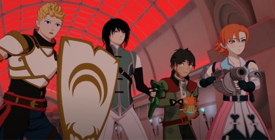
First, I want to acknowledge that lately RT has been demonstrating a talent for horror-esque writing. RWBY obviously isn’t in the horror genre, but via the Apathy we saw that RT can crank up the creep factor when they choose to. This scene does something similar (though admittedly much more subtly) and it starts with the opening shot of the destroyed guards.
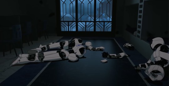
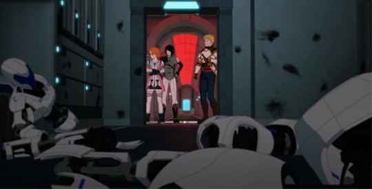
It’s a simple thing, but note how dark the room is, especially compared to the hallway outside. This is supposed to be a terrifying moment. The team has just arrived looking for Oscar and have instead found a disaster zone. There are scorch marks on the walls. The guards aren’t just lying powered down, they’ve been hacked to pieces. Though AIs without aura or souls, they’re designed to look like people and at first glance it definitely seems like we’ve got three bodies decorating the bedroom. Nora’s panicked cries tell us how bad the situation is, but we get that loud and clear from these visuals first. Also note how, despite being lighter, the hallway is dominated by a very deep red. I’d actually say to a certain extent this is a mistake - the pink/reds of the environment make it easy for Neo and Nora, with their predominantly pink costumes, to blend in too well during the fight - but in regards to color associations we get some nice shots throughout that convey danger and high emotions.
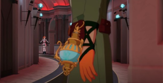
When “Oscar” comes on the scene we know, instantaneously, that it’s not Oscar. Not just because we as the audience know that Neo is off doing something nefarious, but because via the language of film/television that’s not how you re-introduce an established character. You don’t hide their face like that unless you’re about to reveal something - like the fact that that’s not really them. This is also the first of a number of medium closeups on the relic, putting emphasis on it first because someone currently holds it who should not have it, and then as a means of reminding the viewer what this fight is about.
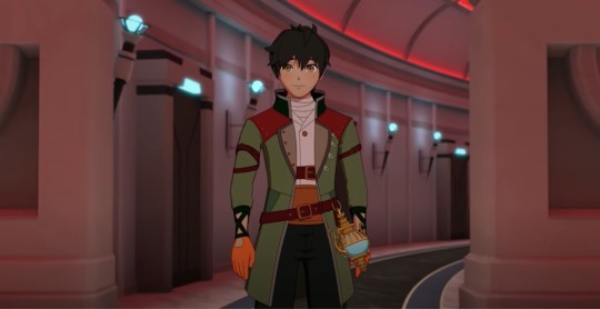
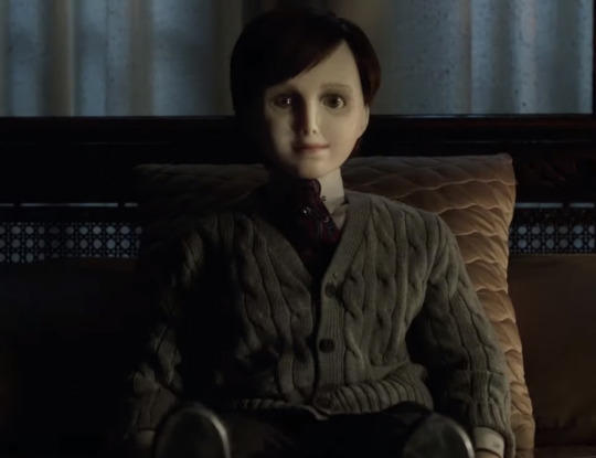
Via some great attention to detail, we see again the clear wrongness about this “Oscar.” That’s not how Oscar stands. That’s not how Oscar smiles. More than just animating him differently, this shot pulls from those subtle horror tropes. He has the dead-eyed look of a doll or a supernatural being that immediately makes the viewer (if not Nora) go, “Wait...” It helps that Oscar is a short boy with dark hair. Put him in different clothes and he could play any number of possessed kids.

With Neo’s deception revealed, we get what the fandom knows is not good visual storytelling. AKA, Oscar charging down the whole length of the hallway while Neo just stands there and lets herself get hit. I don’t need to re-hash how stupid that was. What I like a lot more is the subtleties in how she communicates given that, obviously, Neo can’t rely on any dialogue. Coming out of the hit she immediately has her umbrella leveled at the group and pulls out the blade to communicate, “Yes. I’m taking you on.” The neat choice though is that she brings the umbrella down to do it. She takes her weapon off the group, if only for a moment. Jaune has just gotten done insisting that she should give up because it’s four to one. The blade says, “I’m taking you on” but lowering her umbrella likewise says, “I’m so confident about taking you on I’ll even make myself vulnerable for a second.”
Which retroactively makes her getting hit like that even stupider but it’s fine we’re moving on.
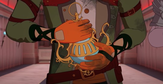
During this time we also get a lot of insight into Oscar. Check out how utterly bedraggled he is, showing us how tough the initial fight with Neo was and how lucky he is to have escaped. He clutches the relic close to his chest and stares, scared, at the rest of the team. Oscar hasn’t reached a point yet where he instinctively draws his weapon and prepares to defend himself (indeed, he didn’t even have his weapon out during that initial encounter. That’s one hell of a rookie mistake). He’s still a terrified kid who hopes he won’t have to fight at all, literally hiding behind more powerful friends. This is all great characterization, the only problem is consistency. Nothing about Oscar has been consistent. One moment he’s holding his own against Lionheart and insisting he fight Hazel. The next he’s getting his ass kicked by Neo and cowering at the prospect of more. One moment he’s positively done in by these fights, horrified, scared, unsure of himself. The next he’s confronting the general of a kingdom with all the wisdom of Ozpin. This guy:
and this guy:
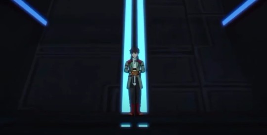
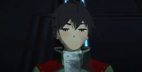
Exist about fifteen minutes apart. Because though RWBY is great at visual storytelling within each scene, they don’t keep it consistent from one scene to the next. Which is why Oscar is (accurately, imo) animated as an inexperienced kid in Scene #1 and then inexplicably becomes a wise old mentor in Scene #2. Not because anything occurred between Scene #1 and Scene #2 to create that change (let alone such an extreme change), but only because the show suddenly wanted Ironwood to look like an unhinged character. How do you achieve that? Not by having the guy he’s talking to act as winded, wild, and emotional as him, but by having Oscar speak calmly, rationally, softly, sounding oh-so-persuasive so you don’t listen to the actual words he says and how nonsensical they are (you’re as bad as Salem). Instead, you pay attention only to the visuals (Ironwood looks crazier than Oscar so he must be wrong). Ironwood is a great example of how RT sometimes tries to get visual storytelling to outweigh basic logic/what’s been said on screen.
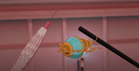
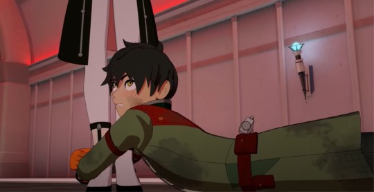
Anyway, I’m getting off track. The fight begins and I do still love how Oscar is depicted here, even if it doesn’t align with what we get later. The moment that umbrella and cane cross was great because who doesn’t love visual symmetry? Oscar grabbing Neo is wonderfully in character because he’s barely trained! He’s a kid! He’s flying by the seat of his pants and going with whatever vaguely successful act pops into his head. The absurdity of, “I’m just going to grab her” is tempered by Oscar’s furiously determined expression as well as Neo’s brief look of shock. It works up until they realize what Oscar grabbed was just a copy.
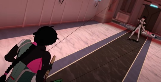
I mentioned early that JNOR often doesn’t work well as a team, unless it’s specifically in the context of Jaune giving orders and the others executing them. Oscar and his lack of integration is obviously exempt from this, being the newbie both to fighting and this particular team’s dynamics, but Ren, Nora, and Jaune have no excuse. The first half of this fight is a good example of what I mean. We see Nora attack. She’s tossed aside. Then Ren attacks. He’s slammed into the wall. Oscar attacks (umbrella vs. cane) and it’s only at the last second that Jaune arrives with his shield to stave off a blow that would fell him too. Why is everyone taking turns here? They know none of them can beat Neo one-on-one and Jaune just said that their victory lies in it being four-to-one. So why separate out all the attacks? Arguably we can read this as a major flaw of JNOR’s and visual setup for something they’ll have to overcome later. In reality though I highly doubt this was deliberate on RT’s part, leaving this as bad visual storytelling (in that it makes the characters look stupid) as opposed to good visual storytelling (JNOR will realize this flaw and work to correct it).
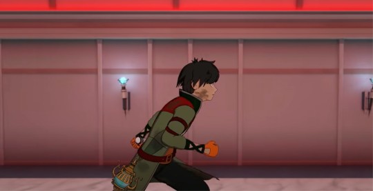

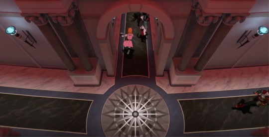
After Neo disappears we get a chase through the hallway that does a great job of showing us precisely how weaker Oscar is compared to his teammates. He doesn’t have their stamina, breathing heavily and falling further and further behind. At one point (screenshot #2) he arrives just in time to find the team turning back in the direction he’s just come, showing not only how he can’t physically keep up, but also his place in this team/the group. He’s literally not with them. Anyone who has followed my blog knows my thoughts on how the group has treated Oscar and if (again) I were inclined to think that RT was aware of that treatment and working to integrate it into the show with the intent to resolve it, this would be another great detail. As it is, I think Oscar as a character is just continually going to get the short end of the stick. In particular, the crane shot shows us exactly how far behind Oscar is. The others charge ahead without him, not caring where he is or if he can keep up. Which leads to this.
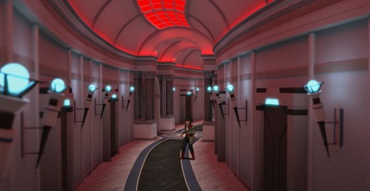
Oscar rounds another corner and they’re gone. Nowhere to be seen. If anyone had the thought, “He’s not that far behind. It’s not as bad as you’re making it out to be,” Ren, Nora, and Jaune were clearly moving fast enough to round another corner and leave Oscar stranded. Here those subtle horror elements come back into play, particularly the maze-like design of the corridors. The only unique marker we get is the info board, otherwise it’s all identical hallways, housing a killer, with Oscar now left alone in it. The long shot makes him look small and emphasizes his isolation.
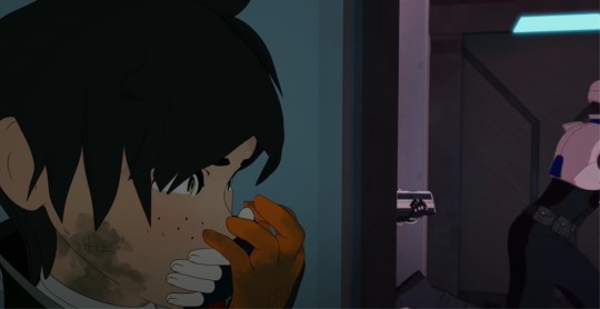
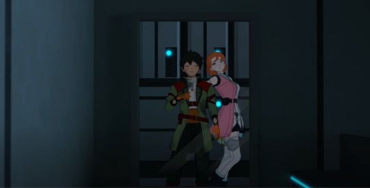
Then he’s attacked and it’s suitably scary. The hand over his mouth. The dark room again. We only get the briefest glimpse of Neo-as-Nora before she attacks, but that one second is another excellent moment of animation. Nora has never sauntered away like that. Even the quickest look in an action-driven scene is enough for the viewer to go, “Nope. Not Nora.”
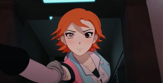
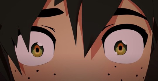
The attack itself is the one moment where I think the slow-mo serves a good purpose. We might know (via that quick shot, how characters act (Nora is unlikely to pull Oscar aside like that) and expectations for how a story functions) that that’s not Nora, but Oscar doesn’t know that. The slow-mo gives us - and him - the chance to focus on Neo’s eyes changing, that stomach-dropping moment of realization, and we see Oscar’s horrified shock in the close up on his own eyes. Though RWBY doesn’t always grapple with the emotional implications of every encounter, I think it’s worth noting that this can really mess someone up. Oscar thought he was safe with an ally and had the rug pulled out from under him. He will now forever have the image of Nora attacking him, regardless of the fact that it was really “Nora.” Jaune likewise exclaims in horrified surprise when “Nora” charges him down the hallway. The ability to turn into someone else is an advantage that Neo knows how to use to its fullest. Not just in regards to spying, but how to unsettle your opponent too.
Waiting for the day she turns into Pyrrha ngl.
We see that same work when she encounters Ren. Admittedly, I’m torn on this one. If only because I agree with others when they ask, “Doesn’t Ren spar with Nora all the time? He should be able to hit her.” The context of “Barely trained kid thought he was with a friend and then watches said ‘friend’ attack him” is not the same thing as, “Much more experienced fighter realizes the moment ‘Nora’ rounds the corner with an umbrella that that’s not her, has no doubt hit her numerous times in the past during training, yet for some reason can’t bring himself to hit her now.” It... doesn’t quite work. Here, I think RT does a good job of showing us Ren’s distress, it’s just that this is paired with a very bad job of establishing what that distress is and why it exists. This is what we needed to hear about during the party conversation. If Ren and Nora had actually talked rather than just kissing, we might have understood why Ren is suddenly incapacitated here when “Nora” looks at him sadly.
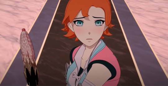
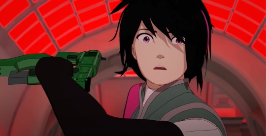
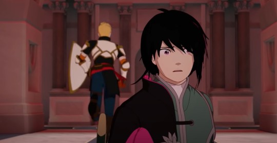
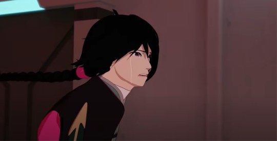
As said though, the emotion of the scene is great even if we don’t quite know where it came from. Neo’s pitiful look, Ren freezing in shock (check out the red there too), his dumbfounded expression as he just sits in the middle of a battle, and when we come back to him we see the tear tracks. Overall, this scene does a great job of incorporating lots of information beyond “Team JNOR is fighting Neo for the relic.” We just need to connect that information better to what came before this scene (Ren) and what comes after (Oscar).
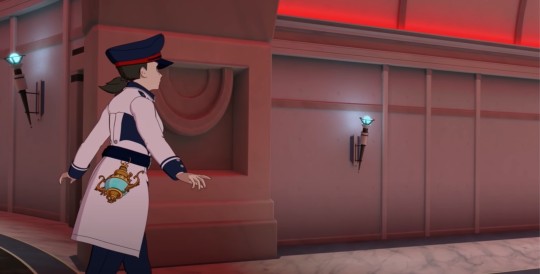
Finally, Neo slams into the other guards and transforms again. I love this final shot of her, both for how she moves and the implications of the transformation itself. Meaning, Neo is a professional. She had a job and she did it. Once the relic was in her possession and she had an escape route, she took it. Neo doesn’t get distracted by taking revenge - these are some of the people we fought against when Roman died - or trying to take them out to please Cinder, or even just going after them because she’s Evil. Neo is focused, no unnecessary actions taken, and that, just as much as her semblance and skill, is what makes her dangerous.
19 notes
·
View notes
Text
— rocket.
+ genre and warnings :: med student namjoon + med student reader, not that this drabble contains an overwhelming amount of references to med school but allow me to be self indulgent for a little while, fluff, yoongi is namjoon’s annoying best friend but wbk
+ notes :: idk if you guys have seen that reddit post that’s been going around about this guy talking about his girlfriend washing his hair for the first time but it was really cute and he sounded so happy and in love and it reminded me a lot of joon, so i decided to write this!
+ side notes :: i can’t find the actual screenshot/post i’m talking about but if i do, i’ll try to add a link later to post it on my blog :’). also i swear yoongi isn’t a pothead okay

Yoongi can’t say he immediately noticed the pep in Namjoon’s step as soon as the taller boy walked into the café, but what he does notice is the dimpled grin and starry eyed gaze that grace his features throughout their conversation. And while Yoongi considers himself to be relatively attractive, he doubts the literal heart eyes being thrown his way are for him.
“Joon? Namjoon? Joon, are you good?” Yoongi asks, a dark eyebrow raised above his left eye. It takes three calls of his name for the younger boy to wake from his trance, looking up at Yoongi with that same, longing smile.
“Yeah,” he sighs, something reminiscent of a lovelorn cartoon prince when he rests his elbow on the table and his chin in the palm of his hand, “I’m good.”
Yoongi shifts a bit in his seat, but Namjoon’s eyes don’t follow; his brown irises stay trained center ahead of him. Yoongi turns his head to the right, looking for the object of Namjoon’s gaze, but is met only with the chipped, brown wood of the café’s booth.
Slowly, Yoongi leans forward, eyebrows pinched and lips pursed, “Joon, are you stoned right now?”
“What? No, I’m not high, Yoon, what the fuck?”
Yoongi simply shrugs, leaning back into the leather seat, “I don’t know, yesterday you were so stressed about your acrobatic salt cycle samples—”
“—it’s acetylsalicylic acid.”
“—and now you look mellow as fuck. Just thought maybe you rolled a good joint or something—not that I’m judging, of course, you could probably use some—”
“I didn’t smoke anything, hyung, Christ,” Namjoon sighs.
“Wouldn’t be so bad if you did. Seriously, sometimes you need a good—”
“Do you know what the half life of cannabis is? Up to ten days, Yoongi. That means that ten days—”
“—From after the time you smoke half of the weed could still be in your body,” Yoongi recites monotonously, “I know, Joon.”
Namjoon retreats with a satisfied grin, met with an unenthusiastic roll of Yoongi’s eyes. “Well, then what’s got your head in the clouds?”
Namjoon shifts in his seat now, pulling his hands off of the table into his lap. Yoongi’s suspicious brow is heightened again when he sees the faint blush dust over his friend’s cheek.
“_______ and I showered together last night,” he finally blurts.
“Oh, so you got laid—”
“—no, no, it wasn’t like that, nothing sexual happened,” he clarifies, continuing, the red on his cheek becoming more prominent with every word that spills out of his mouth, “She washed my hair. I know, that sounds dumb, but it was so... surreal?”
Yoongi should have suspected you had something to do with cheek to cheek grin on Namjoon’s face. Namjoon didn’t talk about his private life often; their conversations revolving around school, work, a mutual love for music, and occasional plans to get beers together.
Rarely ever did the younger delve into his personal life; never about his familial life, but Namjoon didn’t need to say it for Yoongi to hear it.
So, instead of giving him the side eye and sarcastic comments one Jeon Jeongguk would be on the receiving end of at the topic of his girlfriend, Yoongi nods, and encourages Namjoon to continue.
“I don’t know how to explain it, it was so—just, nice and relaxing, hyung. We don’t usually shower together, but this time we did and I was about to grab the shampoo myself, but then she took it from me and just did it herself. It felt so good, I felt like I was floating—like all the bullshit from school and home just melted away. I was beginning to think the stress was just going to perpetuate throughout midterms, you know? But last night she just hummed and washed my hair for like five minutes and I felt like it was all gone.”
Yoongi doesn’t stop the small smile from growing on his face; and he doubts Namjoon understands the depths of his newfound romantic bliss.
“It’s crazy, all she did was wash my hair, but I’m so happy? She was so gentle and she did it like it was normal, like an every day thing between two people—I swear, I almost cried right there. It was just… I don’t know, it just felt good. Made me happy.”
Yoongi chuckles into his words, “You really love her, don’t you?”
“Yeah… I think I do.”

Three days later, Namjoon finds himself alone on your bed, stomach to the mattress, ignoring the nomenclature review in front of him in favor of aimlessly looking around your room.
He notices things he hadn’t before. The small strip of images of the two of you in a clear mason jar, amongst other photos of you and your friends. The pens and pencils that the adjacent jar; two pencils stick out to him—they’re unsharpened, completely untouched, actually—and at the top, below the metal that holds the eraser at your initials and his.
When he looked over to your closet, he wasn’t surprised to find two of his hoodies, and his missing rugby shirt with the university’s crest embedded in the sleeve; what surprised him was that they were all next to each other, separated only by a hanger with your belts from the rest of your clothing. They were reserved, like they were special amongst the other fabric in your closet.
He notices the way his sweats and pajamas have their own drawer to themselves in your dresser, the way your fridge is stocked with a few of those probiotic smoothies you hate but he loves, the way his baseball cap sits among your other headwear like they just belong. Like Namjoon belongs.
Lost in his thoughts, he doesn’t register the sound of the door closing, or your footsteps growing louder; doesn’t register any sounds of you coming home until you’re shaking your bag off of your elbow.
“Hey, Joon,” you greet, and something about the way you don’t make a point of him being in your bed makes his stomach flutter.
“Hi,” he smiles, a stupidly fond look in his eyes as he watches you unpack the contents of your purse and shimmy your sweater off of your shoulders.
He shifts to sit upwards on the mattress, long legs dangling off the edge of your bed. He eyes your silhouette, admiring the hollows and convexes of your figure while you take off your earrings, and the tiny, silver ring on your index finger.
When you’re finished you greet him for a second time, walking to the center edge of the mattress. Namjoon lets you perch your weight on his thighs, mindlessly securing both arms around your waist while your fingers crawl up the nape of neck and into his scalp.
“Your hair’s dry,” you comment, tilting your head to press your lips against his softly, “You didn’t shower yet?”
He shakes his head, craning his neck downwards to tuck the cold tip of his nose into your collar, and mumbles faint words into your skin, “Was waiting for you.”
“Yeah?” your syllables come out in chuckles, laughter heightened as Namjoon tickles his eyelashes against your skin, and rake your fingers through his hair gently, “That gonna be a regular thing, now?”
“Wouldn’t mind,” he confesses, words hardly audible in the cook of your neck. He tries his hand at tickling you again, but this time, you move out of his reach, standing to your own two feet, a single hand extended forward.
“Well then, come on. I bought two new loofahs today.”
He follows with a smile, giggling all the way to the shower. He relishes in the feeling of your fingertips against his scalp, doesn’t bat an eye as you mold his hair into a bubbly mohawk with far too much shampoo. It’s so mundane, so simple, yet so intimate, and it fills him to the brim with emotions he can’t hope to convey with words.
And when you’re finished rinsing his hair, you take your body wash on the ball of his new loofah and scrub away at his back, down his shoulders, across his torso; eventually, you abandon the sponge all together in favor of making his body sudsy with your own pressed against his, Namjoon can’t stop the tears falling from his eyes.
He realizes it must look bizarre to you, to be crying amongst the giggling and bubble beards, but he can’t help himself.
“Joon? Baby, what’s wrong?”
“Nothing, nothing,” he assures you, sniffling away anymore tears that threaten to fall, “You’re just… I don’t know. You make me happy, love.”
“You make me happy, too, Joon,” you reply with a smile.
You spend nearly five minutes like that, your arms wrapped around each other with water pouring over your naked skin. With every shallow kiss you press into his chest, Namjoon feels his heart physically swell; and it’s on the tenth, quiet press of your lips to skin that he lets himself let go.
“I love you,” he finally confesses, with wet hair stuck to his forehead, and teary eyes.
“I know, baby,” you smile, kissing his chin, then on your tippie toes, his lips, “I love you more.”
#bts smut#bts reactions#bts fake texts#bts college au#bts x reader#namjoon scenarios#namjoon smut#namjoon reaction#namjoon x reader#namjoon x you#bts x you#jungkook scenarios#jungkook x reader#yoongi scenarios#yoongi x reader#yoongi smut#jungkook smut
1K notes
·
View notes
Text
Precure Day 151
Episode: Yes! Precure 5 03 - “Who’s the Precure of Effervescence?” Date watched: 3 October 2019 Original air date: 18 February 2007 Screenshots: https://imgur.com/a/wUrfDcF Project info and master list of posts: http://tinyurl.com/PCDabout
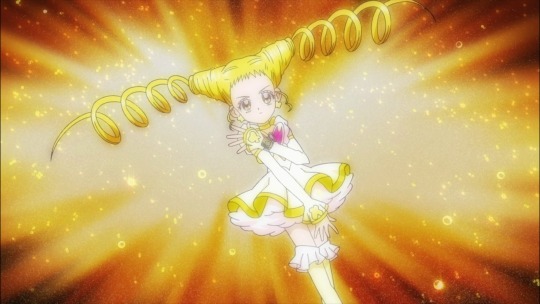
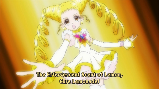
If you like drinking games, watch this episode and take a shot every time they say the word “effervescent” or variations and report back to me. Cure Lemonade’s title and role call describe her as “はじける” (hajikeru) which every translator to ever touch this show has seemed to agree translates best as “effervescent”, an uncommon word which can either mean bubbly (in the context of beverages) or lively and appealing, when talking about people. To reinforce my point, here’s every English sub I could get my hands on:
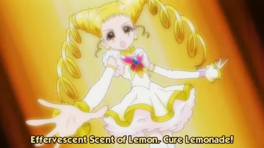
First off, here is the Arienai fansub from around 2007, the first ones to ever translate this episode to English and thus establish the use of the word “effervescent.”
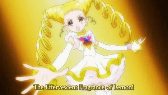
Following Arienai’s disbandment, in 2009 TV-Nihon took up the task of subbing and I know from talking with him that their translator was very aware of the Areinai sub, and also pretty new to translating, so he probably took heavy inspiration from their choice.
Lastly, here is the version used by Pretty Cure Splash Subs in 2014, although they admit that they took the Arienai scripts for the earlier episodes and just tweaked them a tad.
Amusingly, “bubbly” in the sense of personality is a pretty good synonym. I can only assume that they keep coming back to “effervescent” because within the narrative, Nozomi and Rin are confused when Coco tells them there’s a Precure of “hajikeru” so they chose a less common word to convey that better. It feels a little clunky to read but what can you do. Anyway, enough about one word, what’s this episode about?
The Plot
Urara is auditioning for a show and the interviewers quiz her about her school life, since she seems upbeat. She’s unwilling to admit that she spends most of her time at school alone, and she can’t talk about seeing two upperclassmen turn into Precure, so she lies and says everything is great.
At school, Rin catches a Pinky with Coco, this time using a trumpet. He then explains that the two of them are the cures of hope and passion, and they still need to find the cures of intelligence, tranquility, and effervescence. (1 shot!)
Over in Nightmare Corporate HQ, Bunbee tells Girinma he’s not performing up to standards, so he bring in the next consultant, a portly man named Gamao.
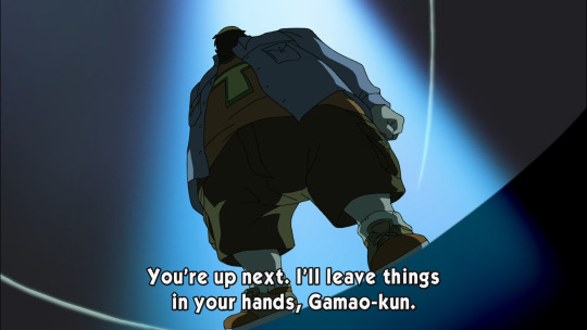
After school, Nozomi takes Coco home with her as a fairy, gives him a cream puff (the signature food of this show) and turns on the television. When her dad sits up from sleeping on the couch she quickly tries to hide Coco and distract her dad by pointing out Urara on the TV, saying she knows her.
The next day during lunch, Nozomi and Rin see Urara sitting alone and goes over to talk to her, saying she can ask them anything. So, Urara comes right out and asks what Precure is, causing the two girls to fumble for an answer before running off when the bell rings for the end of lunch. However, Nozomi comes back to retrieve her left-behind bento and decides to skip class and take Urara on a tour of the school grounds. When Rin and Coco find out about this they’re upset and they run off to find her, but Urara seems to be having a great time with Nozomi.

They get to the auditorium and Urara comments that she will stand on that stage someday! At this point, Nozomi declares that the two of them are good friends and reveals that she is a Pretty Cure, and don’t tell Rin. Well of course who should barge into the theater at that moment than Rin, with Coco on her heels, angry at Nozomi for cutting class and generally being a bad influence on the underclassman. But before Rin and Coco can properly chew her out, Gamao reveals himself and demands that they hand over the Dream Collet. Nozomi and Rin transform, urging Urara to run away, which she hesitates to do. Eventually she gets out, but she trips in the hallway, and after some introspection, decides to turn around and run back to help the two girls who protected her. Her strong feelings summon a yellow butterfly, allowing her to transform into Cure Lemonade! She unleashes her special attack, Precure Lemonade Flash, which takes the form of a flock of butterflies divebombing the Kowaina, freeing Dream and Rouge and allowing them to defeat the monster. Gamao runs off, complaining that he won’t get paid for this, and the auditorium resets to normal.
Outside, the girls remark that Urara is the perfect fit for the Cure of Effervescence, and Coco says he’ll fill her in on all the details after she and Nozomi serve detention for skipping class. However, the episode ends on a happy note, as the three new friends agree to work together from now on.
The Analysis
What I like about these shows with a larger roster of Cures is that it allows each girl to have their own reason for fighting. While all three girls so far have done it to protect someone, the motivation behind that protection has varied. Nozomi wants to help Coco revive his homeland. Rin wants to protect her oldest friend, Nozomi. Urara wants to save her newest friends, especially Nozomi, who saw that she was lonely and made it a point to spend time with her. Becoming a Precure ties directly into a personal problem in each of their lives, and that’s..... magical.
Urara in particular may hit close to home for some people, because achieving your dream can sometimes isolate you. Since Urara was always rehearsing or going to auditions, she didn’t have the time to make friends at school, and she was hurting for it. Nozomi was the first person to take notice of her, beyond simply being a celebrity. Nozomi saw a new student who seemed kinda lonely, and decided to show her a good time. The fact that she’s an aspiring celebrity is a side note for Nozomi, a cool thing to tell her parents, but it’s not why she approached her. They clicked in their first meeting and Nozomi decided she’d make a good friend. Then, when they were friends, Nozomi decided to tell her about Precure and their fight against Nightmare. Sure, it’s partly because Nozomi has little filter, but also she saw someone she could confide in. Unlike the other three members of the team, she didn’t pick out Urara as a good candidate to be a cure, Urara earned her spot purely of her own will. She literally ran away from the fight, but her concern for the others and desire to face her fears brought her back.
There’s a recurring trope in the team-building shows that I don’t like, though, which is that the existing heroines somehow find themselves conveniently disabled or unable to fight, making room for the new girl to swoop in, transform for the first time, and save the day. In the two-girl shows, if both of them got tied up, they had to use their wits to escape. I don’t mind it happening once or twice but it seems to be the only way the writers ever know how to introduce a new character is by making the other ones into jobbers.
On the villain side of things, we get to see a little more of Nightmare, which is always fun. Their HQ is a giant office building with devil horns!
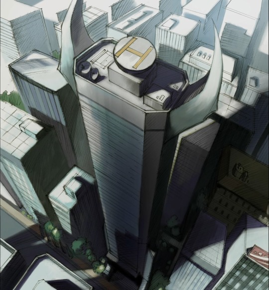
You kind of have to wonder if this is just in the middle of downtown or if the other buildings are all in some ~evil dimension~. Also, we find out what happens to under-performers at Nightmare.... they get dropped down a shaft. Seems like kind of a hostile work environment but it’s great for setting the tone.
While I’m discussing Nightmare, let’s talk about Gamao in particular. Gama means “toad”, which is why Gamao is a toad. SHOCKING. Anyway, unlike the go-getter Girinma, Gamao is very simple-minded: he wants to get the Dream Collet so he can get paid, and isn’t interested in wasting time laying traps or listening to the girls’ life stories. He’s portrayed as a very portly man, looking kind of sloppy in his human form, not at all up to the normal appearance standards of a corporation. he wears cargo shorts, a t-shirt (it actually has a giant T on it), and an unbuttoned button-down shirt. Everybody else in the company wears a suit. Nightmare must be pretty desperate for employees if they let him work for them. Also, we now have a bee, a mantis, and a wasp, so let’s lay out the motif of Nightmare. All of them are animals that prey on butterflies, which of course are the motif of the cures. It’s a very clever pattern that I hadn’t even noticed until it was pointed out to me the other day.
This episode shows us very clearly what Karen must have seen during the first episode, when the auditorium magically restores itself after the battle. (check the gallery) It’s never explained how this happens in most shows, but it’s a constant so at least they allude to it. Indeed, their battle does not go entirely unnoticed this time, since even though they’re indoors, the commotion of the fight causes the students in Karen and Komachi’s class to turn their heads and wonder what’s going on. Karen is going to check it out, but Komachi stops her because they’re in the middle of class. I really like how proactive they are in trying to solve the mystery and very soon their time will come.
I think that about does it for my thoughts this time. Next time, what’s that minty smell? Look forward to it!
Pink Precure Catchphrase Count: 1 kettei!
15 notes
·
View notes
Text
Inspiration Research Part 1
There are so many music videos I like, or I think were executed really well in one way or another, so I’m going to start listing them with some of my thoughts about why they’re good and how they could relate to this project. Splitting this up into more than one part because... there are a lot.
Study Me: Zutomayo
https://www.youtube.com/watch?v=Atvsg_zogxo
This is one of my all-time favorite music videos in terms of visual aesthetic. The dark blues and neon pink/green/purple are so electric, and this video is a huge inspiration for me as far as color palette and vibes. The sequence from around 2:46-4:20 has a tinted/limited color palette that I want to emulate, especially the single-tone shading that’s just a solid, contrasting color with the rest of the character.

The saturated blue and pink are really cool and striking together, but for my own project I want to use a warmer purple/yellow/orange/pink combination. I also like the brief shots that use super bright line colors. I want to do something like this but with pink lines.
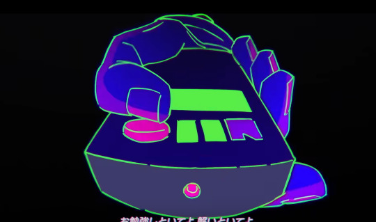
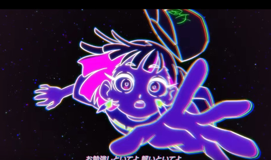
I like the style of editing, how things progress in time with the song and follow the mood, but also how the sequence of shots feels organic almost like it was pieced together instead of created for the song. This could work well for a video with a more literal storyline like I want to have.
There are a lot of holds and shots without character animation, but what is fully animated is REALLY dynamic. I think most of the animation is on threes, with a 3D or computer generated background that’s moving on ones. I don’t mind this look; I actually think a lower frame rate looks really cool, and also means I’ll have an easier job animating. Especially for a music video, where the bpm is already not going to match up perfectly with however many frames I animate on, I think it’ll be pretty forgiving if I decide to animate on threes. I’m a big fan of the character design and art style in general of this video (I think I included a screenshot or two from the video in my character design moodboard). The anime-style facial features and exaggerated limbs are really expressive. The main character is pretty simple, though I’ll probably make my character designs even simpler to avoid giving myself unnecessary work.
As You Like It: Eve
https://www.youtube.com/watch?v=nROvY9uiYYk
Another one of my favorite videos. Very different from the vibe I want for my project, but there’s a lot that inspires me in terms of how the animation is influenced by the music. The timing in this video is impeccable. It’s made up of short, kinda abstract clips that work together to convey the meaning of the song’s lyrics AND how the music feels: a little bit rough, and jumpy. This makes it easier for almost every movement to happen on a beat. It’s really hard to separate the music and the video since they both feel the same, which is definitely one of the things I admire most about this one. I want to try to have as much connection with the timing of the music as I can in my project. That might be harder to work in if I have a more structured plot with realistic actions, but I’m sure I can find a balance. Syncing things up to music is really fun for me and very satisfying to watch, so I think it will be worth it.
Night is Faint: Eve
https://www.youtube.com/watch?v=9Y0_CVX1hok
I discovered this one recently, and it’s the music video for another Eve song. Again, the visuals and style of animation work extremely well with the vibe of the music. The vocals and chords are slower, while the drums have a ton of motion. This is translated into shots that are almost all stationary or have little primary action, with really energetic secondary action or some constantly moving detail. I also like how (in some shots, not all) the actual linework isn’t very complex. Like the previous Eve video, everything follows the beat, but it feels less rigid, more organic in this one. The art style is more rounded, and the animation itself is a lot more consistent and fluid.
Levitating: Dua Lipa
https://www.youtube.com/watch?v=N000qglmmY0
There’s not a TON of animation in the video but I like the one shot at 0:35 where there are multiple closeup shots in frames going across the screen. I think this could be a neat way to introduce multiple pieces of information (visual or conceptual) quickly. Kind of comic-book style panels done with editing.
Ghost: Mystery Skulls
https://www.youtube.com/watch?v=YlEb3L1PIco
This is just a classic. It’s such a good inspiration for any story-driven, cartoon style animated music video. The timing is really on point, and in my opinion this animation has a good balance between believable action and staying on the beat. The fact that something in the scene is always changing or moving to the rhythm makes the world feel very connected and contained within the structure of the song. I’ve already talked about timing for some of the other videos, so for this one I guess I’ll focus on storytelling. I know I want to have a linear plot, so the communication of ideas in my project will probably be more similar to Ghost than to the previous examples, which have a lot more abstract imagery. Ignoring the fact that there are sequals to Ghost that continue the story, this first video is very self-contained. Characters are introduced, we learn something about them, then they have conflict that gets resolved. Even though a more complicated emotional story is implied, it’s not absolutely necessary to know it in order to understand the plot as a physical sequence of events. It also uses tropes to give the audience expectations about what’s going to happen, that can be either used to save time communicating ideas, or subverted. By assuming the audience is already familiar with, for example, the concept of a haunted house, or the Scooby Doo franchise, there’s a lot less necessary setup.
0 notes
Text
A Treatise on the Mediums of Magic Story Conveyance
I have returned with a Treatise to start off the new year! It’s good to be back. I’ve been quiet for a while, but the wait is over. I’ve graduated from Texas A&M University.
This time, I’ve brought a little bit of a different type of article for yall. Normally, I focus on Character Development or Story Progression. But today I’m going to talk about something just as important, if not- dare I say it- more so. The conveyance of the Magic Story is just as important as the story itself. What’s the point of having a great story if no one’s around to enjoy it? How a story is conveyed is vital to the survival and value of the story itself. So today, I’m doing to talk about the different mediums of Magic Story’s conveyance.
Gather `Round! It’s Story Telling Time!
Introduction
Magic: The Gathering brings people together. Cliché, I know. But it’s true. It gathers people around to play a game. And in some cases, it gathers people around to talk about the characters in said game. That’s the nice thing about Magic. You don’t have to pick and choose. Recently there has been a lot of effort to marry the story with the cards. I think it’s really showing. These days, whenever the topic of Liliana comes up (and around me, it comes up a lot) lots of people, regardless of their gender, know her only for her looks. But when they see “Oath of Liliana” or “Liliana, Death’s Majesty” or “Dramatic Reversal”, they start to wonder. Inevitably, someone makes the mistake of saying something along the lines of: “Did she change her dress?” “What’s she doing in the desert?” “What’s that thing on her head?” “Wait, is she a good guy?”
*shakes head*
The poor fools never see it coming... Their innocent little question reveals a passion that usually ends with people coming over to my place to play Commander or with them wanting to ask and learn more about the other characters and the other worlds. Most of the time, it’s both. So let’s talk, then, about that fun stuff that brings us all together beyond just the gameplay itself. Let’s talk about the mediums of Magic Story conveyance.
The Art
The biggest way for the masses to receive the Magic Story is through the art. It’s literally a single glance’s worth of effort and the information it conveys is expressed in ways that our human brains have mastered recognizing throughout our existence. They say that a picture is worth a thousand words and I think that it’s a true statement. Our brains are literally hardwired to take a single glance at something and assess its threat potential. Imagine two glances. Imagine how much you can learn while hold that glance, captured onto a piece of cardboard, and holding it in your hand for several minutes at a time. It’s basic psychology. Art is the quickest form of information distribution possible.
I’ll try and stay on topic and only discuss Story, but we have to at least acknowledge the truth: Brand Recognition Is A Thing. And Art, obviously, is key to that. Tell me honestly. Who can forget the brand of Shaving Cream Dotson used in Jurrasic Park (the first one) to ship the dinosaur embryos? I can’t. Shoot, I use it two to three times a week. But enough of that. Returning to the subject.
Let’s take a moment to illustrate the value of art in Story Distribution. When you look at the following image, what do you learn about the Magic Story?
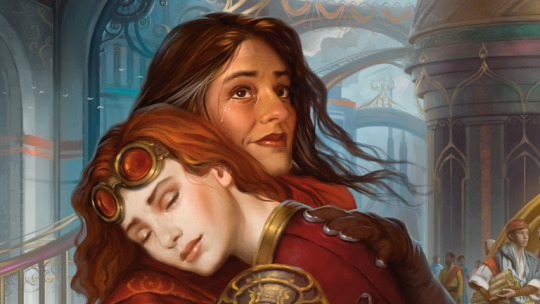
Chandra is involved in the act of hugging someone
The expression on Chandra’s face is one we rarely see in other art, indicating that whoever this person is, that they’re privy to the deeper and more intimate parts of Chandra’s life.
Judging from the appearances, the person Chandra is hugging is in an age range that would place her in the approximate age range of what we expect Chandra’s mother to be.
This older person has tears rolling down her face, but her expression is not one clearly indicative of anger or sadness or pain- all of which have very recognizable features.
Judging from the art alone, and these four features by themselves, a casual observer could easily come to the conclusion that these two are possibly mother and daughter reunited. From the art alone. Yes, there are other things it can be. But this exercise is meant to illustrate the value of art in Story Telling. No matter your perspective, you would be hard pressed to argue that this image doesn’t evoke the words “loved one” and “reunion”.
The Flavor Text
Another big player in Story Distribution is “Flavor Text”. “Flavor Text” is a term that has been appropriated by gaming culture as a whole. Every game that I’ve played that involves a sentence or two of story revelation on a card refers to that little blurb as “Flavor Text”. Agricola. Terraforming Mars. Arkham Horror. So many games that use small bits of text that reveal story information call them “Flavor Text”. So it should come as no surprise to any of you when I say that Flavor Text is one of the biggest means of story distribution. If you were to take the entirety of the Shadows over Innistrad and Eldritch Moon flavor texts, you would be able to read a story almost as detailed as someone who actually read the weekly releases.
To say that Flavor Text plays a big role in Story Distribution would be an understatement. While the art is unavoidable because it occupies half of the card itself, the text box occupies the other half, where you would find the Flavor Text. A clever scheme that makes it practically impossible to play Magic without getting at least SOME exposure to the story itself.
As before, let’s do an exercise to illustrate the value of Flavor Text. Look at this screenshot of the Flavor Text. What do you learn?

Whoever this text is referring to is involved in an embrace, in a hug.
The term “their” implies that there are two people involved in this reference, as opposed to a single person hugging a non-person entity. This isn’t definite, as there are circumstances where the term might be interpreted differently. But to a casual observer, the term “their” used in this context, would lead the casual observer to believe there are two or more people involved in whatever it is that is being reference by this text.
Whoever, or whatever, it is that is embracing has been separated from the embraced by great lengths of time
Whoever, or whatever, it is that is embracing has been separated from the embraced by enormous spans of space, or even dimensions.
The embrace involved in whatever this text is referring to is one of great intensity and possibly emotion.
The term “collapse” implies that there were barriers or walls constructed between the relationship of the two.
This flavor text alone gives us an understanding of: “At least two things are hugging. These two things have been separated by time and distance for a long time. They’ve met up at last.” I find it hard to believe anything could imagine themselves successfully arguing with me on at least that much.
The Card Names
Naturally, names also play a vital role in Story Distribution. Names are the words by which people refer to cards to one another. Sometimes, even parts of names can be enough to depict to another player what card is being referred to. Let’s illustrate. Pay attention what comes to mind when you read the following names?


You know exactly what I’m talking about. The fact that there have been several versions of Liliana doesn’t matter. The fact is that by simply saying: “Lili”, every single person I know who has played Magic for any amount of time knows that I am referring to Liliana of the Veil in particular. I concede that you can argue that’s just bias because of who I am. But the truth still applies to all the other words. In Commander, I literally only need to say the word “Path” and they know to start looking for a Basic Land. I can see my friend Austin reeling at the very mention of the word “Delver”.
Why is that? Here’s why. Because humans categorize things along lines of thought. Tags and labels, just as on Tumblr, define how humans remember things. You ever heard the meme that jokes that people can remember all the Kanto Region Pokemon better than the Periodic Table? There are SOOOOO many reasons. Pokémon names have memories, and art, and behavior, and sound, and so many more labels to attach to it. How are people supposed to remember the Atomic number of Francium when they’ve never even seen it? Just numbers and letters.
But in Magic, the name of a card carries with it so much information. Let me give you a painful one here.

How many memories of Magic Story came to mind? The image of Sorin umaking Avacyn, an expression of pain on his face. Those thoughts then lead into the memory that Sorin created Avacyn. That Avacyn went mad. That Emrakul is to blame for the loss of so much we loved. And so much more. All the battles you’ve played when your plans get ruined by a well timed Anguished Unmaking come to mind. The times when you top-decked it when you needed it most. ALL OF THESE MEMORIES....
I brought these back to you with two simple words.
Names are powerful entities. Let’s illustrate now using a Magic Card, to recall the value of names as methods of Story Distribution.

The definition of the term “Cathartic” is: an attribute that induces catharsis. “Catharsis” is defined as: “A release of emotional tension after an overwhelming vicarious experience, resulting in the purging or purification of the emotions.”
The definition of the term “Reunion” is defined as the act of “Reunite”, a term which is defined as: “To unite again”.
You cannot, I don’t care how stubborn you are, argue to me that this title doesn’t express that some kind of emotional reunion is happening.
Story Spotlights
Another way that the cards themselves can carry story heavy relevance cards is by the Story Spotlights. The Planeswalker sigil I used as the introductory image to this article.

In my opinion, it wasn’t until Ixalan that they truly started nailing the Story Spotlights correctly. Early on, they made mistakes believing that only Rares could have the Spotlight. They fixed that in Amonkhet. But I don’t feel like they finally nailed it until Ixalan. If I were to take all five of the Story Spotlights, I should see all the beats of the story. If rumors I’ve heard are true, that they’re going to start putting numbers on the Story Spotlights, then that’ll be a snipe-shot direct into everything a Story Spotlight needs. Even as it is, it’s doing a great job. Wizards, or at the very least Rosewater, has talked about how Cathartic Reunion should have been a Story Spotlight. But that was during a time when the idea was young and unexplored. But, if they could go back, I’m certain they would mark it as one.
Official Literature
Then of course we come at last to the most direct medium of story telling that Magic currently employs, their official literature. These days, that refers to the Short Stories they produce every Wednesday for most of the year. Here, we receive all the juicy little nuggets our fandom loves to talk, share, discuss, and rave about. I mean... their official literature is....like...Literally. Telling. Stories. So... yeah. It counts as a story telling medium.
Conclusion
Thank you all for reading. I hope you enjoyed it. If you did, hit that “Like” button for me. For more from me at Story Telling Time, hit that “Follow” button. Feel free to open up discussion on the reposts. Hit up my inbox. Or just shoot me a chat. I’m happy to interact with yall.
If yall would like for me to tag you in future Treatises, let me know in the “Replies” section and I’ll add you to my Mention List. Unless told otherwise, I’ll use the current Mention List and any requests I get in all my future Treatises.
If you’ve been tagged, it’s because you’ve been tagged before or have requested to be tagged. Please let me know if you’d like me to remove your tag from the list.
@askkrenko @foilmountain @vorthosthewillis @vorthosjay @actualborossoldier @unexpected-phyrexian @nantukohunk @gatewatch-central @sarkhan-vol @sheoldredsecrets @flavoracle @kytheon-hero-of-akros @chelsea-beleren-vess @hopelessly-vorthosian @magic--the--memeing @mtgfan @the-gitgud-toad @jori-en-ruin-diver @yawgmoth-lord-of-sin @bobstropajo @obi-one-drop @odric-master-swagtician @zomburai @baldore-of-the-boros @klarel25 @brandnewera @brandychan @animar-smol-of-elephants @commandtower-solring-go @commandtower @hereitsallalright @ecurps @iamafireplace @mazes-end @augur-of-colas @avacyntheangelofhope @wizardsmagic @elspethknighterrant @arkouchie @god-pharaoh-greg @teanecromancer @jedimb @luckystampede @hanzo-kirishima @kreetn @death-burst @livefromtheloam @perpetuallyfallingover @shorewall @kefnut-the-threski @thescorpiongod @the-nerdy-necromancer @pepperapb
See yall next time!
#treatise#premiere article#special issue#mtg#magic story#storytellingtime#story telling time#premiere issue
44 notes
·
View notes
Text
August: 3rd Week
Topics:-
Animation
Research for Background Score
Research for Editing
I am continuing to work on Animation, it’s taking me longer than I thought. Drawing each frame is difficult and time consuming. Initially, when I started with it, I used to draw each frame again and again, this was difficult as I couldn’t draw the exact same thing again. However, recently I figured out that I can copy paste individual sections of my work from previous frames onto next frames. This has helped me a lot.
youtube
Our animation starts with a tree. It looks like the camera is moving up and zooming in on the sun and then when it zooms out, it’s not a sun anymore, it is the DANAV’s head. We have shown it this way for two reasons, A) it looks very aesthetic and B) We wanted to make a distinctive feature for Danav, and showing that his hair/head is as bright as the sun, we are creating a distinction for him.
Our next scene shows DANAV and a boy walking towards the jungle. To create an illusion of forwarding movement, I took aid from many distinctive elements. First of all, I learned through a YouTube tutorial how to show walking human figures in animation. Drawing the whole figures was a little difficult for me, so I drew their silhouettes, so that emphasis on DANAV’s hair/head and his magical staff can be seen. Also, the silhouettes seemed visually pleasing in our animation and they made sense because we are showing night time. To make the figures seem moving forward, I reduced their size as they moved forward. To do this I drew a whole image of both the figures and then cut and copy pasted it as per the size requirements.
Second thing that I did for creating an illusion of movement was, increasing the size of trees on both sides. I drew them once and then copy pasted and adjusted size all along the frames. Hence, the combination of decreasing size of figures and increasing size of background (trees), created an illusion of forwarding movement.
I have tried to keep minimal movement in our next shot, as our previous shot was movement heavy, so to balance them both. In this Shot, the DANAV makes a few leaves hang in the air, with the help of his magical staff, while the boy jumps to get them. This shot portrays the magical powers of DANAV and his playtime with the kid.
I sketched a full side view of DANAV once and then only played around with his hand and his staff, to create an illusion of his hands moving around. For the kid, I watched a flipaclip related tutorial on YouTube. It taught how to make a cupcake (personified) jump. Below is the link for the same.
youtube
I used this and made my character jump in the air. Below is the video of my work.
youtube
Research for Background Score for Editing our trailers.
My teammates and I have also started researching about different types of background score to use for our trailers. We send links of music in our WhatsApp group.
Our trailer will require songs of many different paces and tension levels. For instance, the happy shots (children playing) will require something simple yet chilling and the corridor shot (vertigo + Dutch), firehose shot, etc, will require high tension music to enhance them.
We are also thinking about creepy versions of lullabies as background score in our trailers. This is because our story revolves around kids sleeping (or rather not sleeping) at night time. Hence, we feel that lullabies are going to be a good option to work upon.
There are two lullabies that we are currently considering using, a) creepy version of twinkle twinkle little star b) Ring-a-ring O’ roses.
Research for Editing
I have started researching trailer editing tutorials online. While doing this, I came across a site called, Film Editing Pro. They have both free and paid courses for cinematic editing. They have an entire section dedicated to editing trailers. I took their free course named ‘Trailer Editing 101’
They had three different videos -
Video 1 was called “Trailer editing 101: Secrets of the Craft”
This video focused on two things,
1) how to cut a trailer with style
2) How to edit professional montages
The thing that stood out for me here was montage editing. I didn’t know this much work went into editing montage. It said that montges should have focus travel i.e. if in the first scene, the movement on screen happens from left to middle, then in the second scene the focus point should move from middle to right. This will create harmony in montages.
Video 2 was about how sound affects trailers. The thing that stood out for me here was the use of SFX to make things so much more impactful and powerful. I did use a few SFX in my AS project but I believe that a dark psychological thriller’s trailer would require much more SFX to convey to the audience what we want.
In the third video, they just deconstructed a pre-existing trailer for us in terms of narration of story, montages, Background score, music, sound and SFX. This was really helpful and inspiring.
I also read their E-Book on 50 film editing tips you must know. Below are the points that I found most relevant and hope to work upon when I edit my trailers.
If the pace is too fast, people get lost and if it’s too slow, they get bored - keep appropriate pace.
Using reaction shots - they don’t have to just tell what the character is feeling but they have to make sure that the viewers feel the same way.
Compress time to prevent boredom.
Use of match cuts for both videos and audios.
First rough cut, then refine.
Cut on movement (match on action).
Using insert shots.
Watch an actor’s eyes to know when to cut.
Using jump cuts
Cut when the viewer is distracted.
Fades to black, start new scenes, cross dissolves indicate passing of time
Vary Camera angle between similar shots by at least 45 degrees.
Use dissolves on heads and tails of audio to prevent popping.
Dip music and sound effects under dialogue.
Don’t use cheesy VFX
Time your music editing for maximum impact.
Make sure your audio levels aren’t peaking.
Use audio to transition scenes
Use sound design to shape moments and build and release tension.
Customize and use keyboard shortcuts
Organize your work source material
Zoom in on the timeline.
Use multiple camera angles and shots with fast cutting to build intensity and impact.
Vary your pacing and sound levels to create contrasts.
Fake camera movement when necessary (Like creating vertigo effect, which I mentioned in my previous blog)
Use cross cutting to build intensity.
Carefully sync your sound and music to the picture.
(screenshot of mail, pdf, etc)
I also studied a checklist for trailer editing given by them, below is the link for the same.
https://www.filmeditingpro.com/trailer-editing-checklist
Below is the link for film editing pro’s trailer section webpage:
https://www.filmeditingpro.com/how-to-edit-a-movie-trailer/
0 notes
Text
[170811] Some Consolidated Kyungsoo-related Fan Accounts from The War Fansign
@hello_apriler/64bcb26595b14a2
I asked Kyungsoo what kind of pet that he raised. He said it is toy poodle, their name is Mogmool (먹물/Ink) and Hoochoo (훗추/Pepper). Mogmool is 1 year old, a black toy poodle; Hoochoo is 7 months old, a grey toy poodle. (Later “Mongmool Hoochoo” was trending on Twitter)
@hello_apriler
A fan gave Chanyeol a sparkling magic wand and Chanyeol played it with Kyungsoo. He seems to enjoy it and so bight, so cute.
@DoMelocoton
Kyungsoo played with an Ice Cream punch toy (if you pressed down the button, the Ice Cream will fly away) with Chanyeol, and Chanyeol attacked him with a bubble soap gun.
@sehun_1223
Kyungsoo, Chanyeol and Jongin went to washroom together.
@MoncherDo
Kyungsoo held and played with a soap bubble toy and another toy that looked like an ice cream that will fly off when you click/press on it.
@sehun_1223
Chanyeol attacked Kyungsoo with a soap bubble toy but then Kyungsoo kicked him and then Chanyeol collapsed.
@dyohyun9293
When Kyungsoo was doing his ment, the boys went “Almokyung, Almokyung” (it means unpredictable Kyungsoo).
@dyohyun9293
Chanyeol said if Kyungsoo kept a brown poodle, it would probably be called Deonjang (soy bean paste).
@dyohyun9293
Sehun said Mongmool and ViVi took a photo together before and he will upload the picture! Then Sehun asked Kyungsoo hyung if he can upload it and Kyungsoo approved it. The fans below said thank you. (In the end Sehun posted it on his Instagram and “Mongmool ViVi” was trending on Twitter)
@05BH06
I asked why he’s been hanging out so well with Chanyeol recently. Kyungsoo say that’s because Chanyeol keep playing with him, so it appears that way. My hand is injured and when we had eye contact, I smiled and said, “Kyungsoo, don’t get injured.” Kyungsoo then looked at my hand and said, “I hope your wound wouldn’t hurt anymore.”
@s2ninis20114
Kyungsoo personally explained how to easily do the trick he always does with his hands/fingers.
@Only_k_s/@dyo_right_
The boys were saying “I love you (saranghae)” one by one. Kyungsoo: I love you. Bakehyun: I think it has been a while I heard Kyungsoo saying I love you.
@Dearcloi/@Only_k_s/@s__sh9412
Kyungsoo is the the cutest thing in the universe, seeing him between Chanyeol and Jongin but not paying attention to their games. He commented that the weather this morning was really nice, that on nights like these when the dust levels are low (level 9), it’s good to visit a playground or go on a walk in the park or by Han River with your loves ones. He also said “Be careful and not catch cold. Have a yummy dinner and thank you!”
@xoxo_elephant
I said to Kyungsoo “Kyungsoo-ya, you got many schedules lately so it must be hard. You seem to lose weight too”, so he asked, “I lost weight?” and I answered, “You seem to have lost a lot, your face got slimmer.” He said, “I did not do that on purpose, but seems that I got thinner.” Don’t lose weight, Kyungsoo.
@hello_apriler
Sehun sat down after finishing his ment, when it was Kyungsoo’s turn, he kept talking to Kyungsoo. Like when Kyungsoo said “Today’s weather is nice so go to Han River~” then Sehun talked to him “Let’s go together! What will you do after this?”
@neri_1227/@xiu2_xiu2
Kyungsoo said he’d like to take a walk if there was time today, so Sehun asked what he was doing after this (since Kyungsoo didn’t hear it so it was left unanswered). Kyungsoo has two more schedules and he’d come to the fansign from another thing too.
@hello_apriler/@neri_1227
Kyungsoo talked about his pets because so many people were curious. He said he’s keeping two and when EXO-L said “cute~” he asked why that was cute haha. They’re toy poodles and he named one Ink because it’s black and one Pepper because it’s grey. When he bought the grey one home, the members competed to name it. Baekhyun suggested Dust. Junmyeon then said the other should be called Fine, so when put together, it will mean “Fine Dust”.
@gr__tee
Sehun sat down after finishing with ment and while Kyungsoo was speaking, Sehun lowered his head and said into the mic, “Hyung have you eaten? What are you going to do after this end?” He was asking questions like this, it was really cute.
@veritas_9401
When Kyungsoo said he is raising toy poodles, there were a lot of applause and cheers, but he got puzzled and asked “why?” with a heart shaped smile.
@o_sehuni
I was asking Kyungsoo about the Gallaktang (baby octopus and beef rib stew) he mentioned liking during Cultwo radio show. Kyungsoo shared the restaurant’s name but not its address. I’m a little lost, Kyungsoo shared that the restaurant is at Nonhyeon-dong.
@zzyuuuxx
But you know, talking with Kyungsoo in person, his way of speaking was a lot sweeter and softer than we’ve heard.. I’m not sure how to word this, but his voice is still ringing in my ears.. It was his usual soothing and proper way of talking, but his natural voice is somehow very different.
@pooky_04
OP had Kyungsoo write: Will feel that you’re pretty after looking at you in detail, will feel that you’re cute after looking at you over a longer time. You are like this too!
@sehunin_0412
When I had finished getting Kyungsoo’s sign and wanted to move to the side, I don’t know where should I go so I asked where should I go? Kyungsoo heard it so he asked me where am I going. I then replied, “I’m going to get water” (imitating Kyungsoo in <Knowing Bros>) and Kyungsoo laughed.
@exogy0408
Me: Oppa, what pet are you raising? Kyungsoo: I have a toy poodle. Me: Please draw it. Me: Isn’t this white? Kyungsoo: It’s black.
@dyo_right_
A friend of mine went to the fansign and told him that her friend was a huge fan of his and requested a doodle on the photocard. She also asked how his shoulder muscle pain was doing but he was so absorbed in doodling that he didn’t reply haha. She asked about three times before he said “Yes..? Yes. I’m okay!” So cute ha..
@do_xoxo0112
OP requested Kyungsoo a doodle on the photocard, Do Kyungsoo emmmmmm…
@Loralie_0118
A friend of mine who’s in Korea got into today’s fansign, managed to get Kyungsoo’s autograph for me, and even conveyed my messages to him, so I’ll think this is considered half a fan account.
Because everything was very last minute, and there wasn’t enough time, I didn’t manage to buy him any present and only managed to deliver a small note to him, to which he secretly received. I believe he’ll definitely read it. He’ll then know, how much we love him. The screenshots include: - my conversation with the friend that went on my behalf. She shared that Kyungsoo is very kind and the best person. He was listening to her intently as she spoke. He’s very sincere and very cute. - the note that I wrote to Kyungsoo, telling him that there are many Kyungsoo cfans who really love him. That we hope he will put himself first in everything that he do. We will lay the red carpet for him so he just needs to go ahead to pursue whatever he wants.
My silly piglet, mummy’s (referring to herself) name is so simple and you still could have gotten it wrong. I really could laugh myself to death because of you. Kyungsoo-ah, you are the best and no one else is better than you. We’ll meet in Autumn, I love you.
Conversation between friend who attended the fansign and OP
OP: Also, the paragraph below, could you help me write it on a small piece of paper and pass it to him OP: (message in hangul, will be separately translated) Friend: To write on a note Friend: It may be confiscated Friend: But I'll try OP: Ok! OP: I've previously seen other fans who hid it. Friend: Yup OP: And they succeeded Friend: They were pretty strict with the checks the last round Friend: (Notes) were all torn up. OP: If you don't succeed, just convey the message that cfans love him OP: Just 1 statement will do Friend: Ok OP: Come back and tell me how he looks like OP: You're going to see him upclose OP: Please help me praise him more OP: He likes being praised OP: If you have a chance tomorrow, ask Kyungsoo what breed of dog he's raising Friend: 1 minute Friend: I doubt I can ask him that much Friend: I think he's the first one OP: Yes, I hope the SM staff wouldn't stop you OP: Just have him help me write Peter Pan will do Friend: Ok OP: Just thinking about him writing my name OP: I feel like crying Friend: I'm thinking about how to speak mandarin to him Friend: (sends across autograph) OP: Ahhhhhhhhhhhhhhh OP: What did he write OP: Did he write wrongly OP: My name is so simple he wrote it wrongly... OP: My silly piglet Friend: He initially wrote your name wrongly as I wrote it on my arm and he saw it in the opposite direction. When I told him, he replied, "어?그랬구나" "Oh, it's like this", so he crossed what he wrote and re-write it again. OP: Ahhhhhhhh so cute OP: (crying emoji) OP: I am (going) crazy now. I'm in heaven Friend: And below he wrote, "Always your Peter Pan" OP: So silly, my piglet OP: Still "Oh?" (referring to his reaction when he wrote her name wrongly) OP: I want him to draw a piglet for me Friend: I forgot ㅠㅠㅠ Because your name was written wrongly, so that took up some time, but I did convey the message that you wanted me to tell him OP: Did you manage to pass him the note! Friend: Yes. I secretly pushed it to him. He took it slowly by his side in his direction. His hand was moving bit by bit. OP: Ahhhhhhhhhh my baby did he read it OP: Did he open it? OP: (anticipating emoji) Friend: Exactly if he read it, I'm not sure. But since he got it, I believe he will read it. I feel, I feel he was really sincere to me. OP: He has always been like this.... OP: Did you tell him to take care of his health. The second of this year will be challenging, and that cfans love him Friend: I told him everything. I told him that he has many cfans and he even repeated that again in Korean in a doubtful questioning tone. OP: I'm running to the neighbourhood park to cry now OP: Why was he using a doubtful tone?? Friend: So he asked me, "ah, so there's many fan? in China?" I answered yes and since he was writing and his head was bowed, I couldn't see his expression but his tone sounded pleased/touched. OP: I'm dead. Really. I'm dead. I'm f*cking dead. I'm wailing. Friend: I also conveyed about asking him to sleep well, eat well, to put himself first and to pursue whatever he wants to do. OP: wuuuuuuu (crying expression) I have a visual (of what her friend just described) OP: That he is writing my name seriously. He's looking at my name seriously and writing it. OP: I can't take it anymore. My heart has stopped. Friend: All things aside, I really want to say this. I feel that he was really very sincere to me. My other friends also said the same. The moment I went up, he looked me in the eye, his expression seemingly to take in my face, wanting to commit to memory, nodding to me. He didn't speak much, I did most of the talking, but he's really earnest. OP: (crying emoji) OP: Help me call an ambulance OP: Send me directly to the crematorium Friend: He only just wrote your name wrong ㅠㅠ he's really cute really sincere Friend: His face is really small. But his eyes are extremely?! big?! OP: He must be handsome in real life OP: When would I be able to see him that upclose Friend: His eyes were huge. Extremely huge. Really huge. Because he was looking at me so intently, I really find his eyes really huge. Friend: Anyway, he's really very earnest, when I was talking, he was listening to me intently, unlike the rest. I think he's the kindest amongst all of them today, really good. I think he's the best today.
OP's note to Kyungsoo
With the recent comeback and the dance practices, it must be very tough. Dont get sick, don't get hurt. If you feel unwell, please visit the doctors. If somewhere is hurting, be sure to voice it out instead of shouldering it alone. I love you a alot. From head to toe. Besides my father, I love you the most in the world. The most handsome, my ideal type. Also, there are many of your cfans here. More than you can imagine and we will keep doing our best to support you. We will lay the red carpet (for you) and we will work hard to give you even more/better. Go ahead and brave forward with no regrets. I hope you get to eat whatever you like to eat and do whatever you wish to do. As long as you're healthy, safe and blissful. No matter what, I will be supporting you. Love you.
Edited/Added:
@dyo_right_
Kyungsoo is signing and when Chanyeol was waiting for the next fan to come, he was staring at Kyungsoo intently, not looking away at all.
@Sabor_a_DO
Today, Chanyeol kept showing toys to Kyungsoo, so each time Kyungsoo is done signing with one, he will turn and look at the toys. After he was done with all the signing, he actually went through and touch all the toys, and even held the toy that made noise to the side of his ears.
@icontact_JD/@icemilk_tea
When they were role-playing and Kyungsoo was acting like an outlaw police, even when he hasn't done anything, Chanyeol already started running to the backstage, then Kyungsoo used his fingers to do a "the end" pose while slicing it across Chanyeol's waist level.
@xiu2_xiu2
Chanyeol was teasing Kyungsoo a lot, so Kyungsoo used a bottle to fight back, Chanyeol held his tummy and let out a "ah" and pretended to have been taken down ㅋㅋㅋ after sitting back down, Chanyeol continued to attack Kyungsoo with the soap bubble toy, so Kyungsoo followed suit, stood up and used this knee to attack Chanyeol from top down, this is totally re-enactment of what happens in the dorm.
@sehun_1223
After playing around with Chanyeol for a while, Kyungsoo knelt and bowed before heading to the washroom. Chanyeol used a mini fan and soap bubbles toy and kept spraying the bubbles at Kyungsoo and even after returning from the washroom, Chanyeol is still spraying the bubbles at Kyungsoo.
@ice_xiu0326
Back story: It seemed like Chanyeol and Kyungsoo were playing around alot after finishing with the signing and according to those who were in the venue, it should be that Chanyeol kept spaying bubbles at Kyungsoo's face, and even paired it with a mini fan (to make it work better), so Kyungsoo returned the attacks by using bottle, his arm or his knee to hit Chanyeol back.
Conversation during the fansign (in enclosed in tweet): Chanyeol: Very good very good~ Keep it coming~ Keep it coming~ Junmyeon: As expected of Kyungsoo Jongdae: Don't be alarmed everyone, this is daily life for us in the dorm~
@mana_chen
(🇯🇵 represents in Japanese) Me: May I ask what you’re raising? Kyungsoo: Toy poodle. Kyungsoo: Black and....silver white ✌🏻 (2 of them) Me: 2 of them! What’s their names? Kyungsoo 🇯🇵 : The black one is...Mogmool (in Korean), the grey one is Pepper (in Korean)! Me: Boys or girls? Kyungsoo: Girls Me: Both also? Kyungsoo: Yes Kyungsoo 🇯🇵 : ✌🏻 (2 of them) How do you say that in Japanese? Me: Ah? Er, the meaning? 「にひき」(2 in Japanese) 暻秀🇯🇵:にひき…にひき!Thank you (Time was up) Me: Thank you~ (On the post-in below, Kyungsoo had handwritten the names of his two puppies, “Mogmool Pepper”
@BDGZ_9293
Me: Do you know Kyungsoo’s expression? Kyungsoo: (pointing to the penguin) It’s this, it’s this. Me: Yes, can you please draw it for me? He conscientiously followed and drew. I didn’t expect him to have drawn the eyebrow. And the best part of Kyungsoo was that whatever I said, he listened to every words with a really sweet expression and replied to it...Warm-hearted Doh is the best ㅠㅠㅠㅠㅜㅠㅠㅠㅠㅠㅠㅠㅠㅠㅠㅠㅠㅠㅠㅠㅠㅠㅠㅠㅠㅠㅠㅠㅠㅠㅠㅠㅠㅠㅠ"
@Just_For都暻秀应援站
OP's friend went to the fansign yesterday, and gave Kyungsoo the support item - a kittendyo handfan - from fansite J (@Just_For都暻秀应援站), and told him it's a cfan fansite, his fansite, Kyungsoo was very pleased as he accepted the handfan, really happy, I really wanted Kyungsoo to know that there are many in China that really like him.
@matuannai
My friends help convey the news of my marriage.He gave me my blessing. Thank you.
Message from Kyungsoo: "Wish you have a pretty baby"
Cr: The War Fansign, sources as quoted above (2017.08.11) Chi Trans: weibo @都暻秀吧_DohkyungsooBar, @Nacho_都暻秀资源博, @來一杯嘟嘟加点邊白, @大眼嘟企鹅, @ChocoHun_吴世勋资源博, @Moitie, @灿嘟糖果贩卖机, @nakedplanet Eng Trans: twitter @serenadyo, @kyeongsew, @doyeolove_aya, @dyostined, @swevenode, @exonyeondan, @chocohun94, @DeeDotOhDot, @enthralleddd, tumblr @fydk-translations Fan Account Consolidation & In partnership with: IG @channel930112
127 notes
·
View notes
Text
Organizational Structures Reflection
Project 1: Overview This month’s class covered motion design in detail. There were two major projects worked on regarding our chosen city. The first project was the dynamic vision board. This assignment required us to conduct research regarding motion graphics, history, and trends and apply it to our static vision board from last month’s class. Static into motion was the focus. The project details were pretty broad and general with only the time limit of 30 seconds being a major factor. It was very challenging to figure out how to tell the story of most or all of the vision boards elements within such a short time limit. What helped the process was completing research on the process of motion graphics and then creating storyboards. This allowed me to flesh out all of my ideas and figure how they’d worked together given the 30 second time limit. The text Animated Storytelling we were assigned to read this month also gave great insight on the process from conception to final deliverable.
Project 1: Process The screenshots below highlight the initial draft completed of the storyboards and narrative.

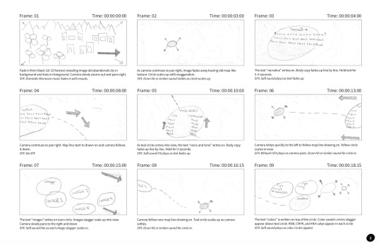
Revisions were completed and the final story was fleshed out. The screenshots below highlight the revisions of the story and the additional research completed.
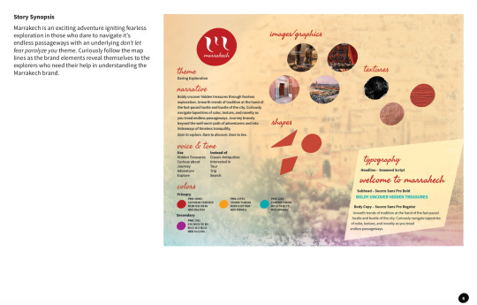
The screenshots below are frames from the final dynamic vision board.







YouTube Link: https://youtu.be/Ynlmh2Snjxg
Connecting, Synthesizing & Transforming Correctly timing the text shown throughout the video benefited from research. Taylor emphasizes as a rule of thumb you need to be able to read text three times out loud at a regular pace (Taylor, 2018). Due to the time limitations of the video, this meant that the text shown on the screen should be short and to the point. Aldredge discusses that when working with text in video, you’ll need to make sure the text isn’t obstructing the image behind it (Aldredge, 2018). As a result, I edited the narrative copy and typography section in order to maximize the time limits of those sections while keeping the text on a legible background that didn’t interfere with itself or the background. Utilizing this principle, the text retained maximum legibility and readability normal pace.
Problem Solving The design problem was to position the city of Marrakech so the audience would see themselves as explorers instead of tourists. The work solved the problem by placing the audience in the shoes of an explorer. The motion piece features a map for exploration, map lines, location stops, and local imagery. Using these elements transforms the audience from mere voyeurs of a series of information bits into true explorers who are exploring this motion map and discovering new treasures around every corner.
Innovative Thinking Against similar videos in this style, this animation utilizes movement either by zoom and pan camera moves throughout enhanced by sound effects and background music. Vossen concludes that sound effects should be used to enhance motion graphics (Vossen, n.d.). Combining camera moves and transitions with sound effects throughout the video keep the viewer engaged while providing a novel experience.
Project 2: Overview The second project this month was a motion piece marketing the chosen. The project offered the opportunity to work with several different motion styles including kinetic typography, cinemagraph, 2.5D parallax imagery, animatic, motion poster, and general motion graphic. The decision was made to use the 2.5D parallax motion style. In this style, the background image usually moves more slowly than images in the foreground, creating the illusion of depth and immersion (Techopedia, n.d.). This depth pulls the viewer that much more into the narrative which allows them to more intimately engage with the brand. Sherbin discusses how the parallax motion style technique is immersive. Sherbin also discusses how using layers gives your viewer the feeling that they’re moving through the page in 3D (Sherbin, 2013). In the case of this motion graphics piece, it is the screen that the viewer is moving through instead of a web page. This style accentuates the authentic depth and intimacy needed to resonate with the target audience, which is millennials. Due to time constraints, only one motion piece was able to be completed. The parallax motion style can easily be transformed into a series of motion pieces.
The story the motion piece will convey to the audience is that of daring exploration. As an explorer in Marrakech, there is adventure around every corner. Marrakech is an exciting adventure igniting fearless exploration in those who dare to navigate its endless passageways with an underlying don’t let fear paralyze you theme.
Project 2: Process The screenshots below highlight the storyboards for this motion piece.
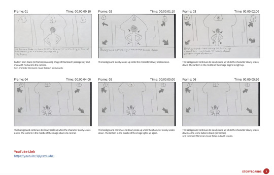
The screenshots below are frames from the final 2.5D parallax motion piece.

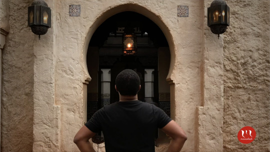

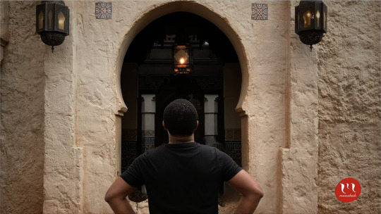
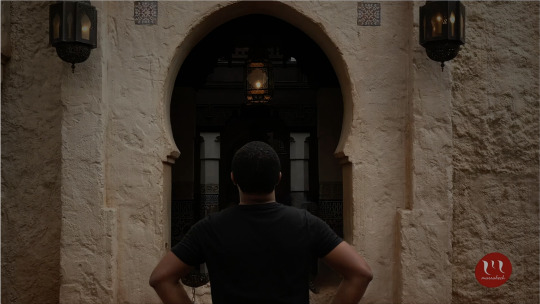
YouTube Link: https://youtu.be/Q6jrxmLkdWI
Connecting, Synthesizing & Transforming The researched used to arrive at the design conclusion was to explore the different motion styles presented. The motion styles included kinetic typography, cinemagraph, 2.5D parallax imagery, animatic, motion poster, and general motion graphic. After reviewing all of the styles, 2.5D parallax imagery was chosen to be the motion style for this project. The parallax motion style was selected because it introduces depth into a static image which further engages and immerses the viewer into the narrative. The narrative speaks to daring exploration. The depth really allows the viewer to experience the exploration in an intimate way.
Problem Solving The design problem the motion piece is attempting to solve is to allow the viewer to identify themselves as an explorer in Marrakech and not just a tourist. The motion piece solves this problem by showing a man boldly and confidently ready to daringly explore the unknown passageway he is standing in front of. Because of this, after watching the parallax video, the viewer has an intimate view of what it will be like once they are in that place in Marrakech ready to experience their own adventure and daring exploration.
Innovative Thinking The approach the motion takes is innovative because the secondary motion was introduced through the blinking light of the central lantern. Adding the secondary motion extends the depth of the motion piece beyond simple parallax motion and into a more complex, visually interesting, and defining narrative. Driving innovation in this motion piece using secondary motion will resonate with the audience as it further extends the tone and personality of the city of Marrakech, which is dramatic, exciting, and energetic.
Audio Identity The established brand audio identity has been used to further excite and dramatize the brand’s tone and personality. The music provides an upbeat, melodic backdrop which allows the visuals to be curiously and playfully explored. Using the brand audio in this way helps to create a connection between the feel of the music and message in the visuals.
Acquiring Competencies Throughout this month I leveled up my skillset and confidence using After Effects. By storyboarding the motion piece prior to jumping into After Effects, I was able to conceptualize easy methods of building the projects and Pre-Comping certain elements to make the animation cleaner, smoother, and more engaging. The elements I pre-comped included the text writing effect for the headlines in Project 1 and the ending screen elements in Project 1. I also learned how to animate in Photoshop to produce parallax image animation. I continued learning how to research topics deeply traditional books and Internet sources. I am also continuing to become better at managing my time. I still procrastinate concerning certain assignments but I do it a lot less now. I contribute this to having so many assignments due at once that I am unable to wait until the minute to get everything completed. This has also brought my weekly stress level down consistently.
My Experience In Organization Structures This class proved to be challenging. I associate this with the amount of research needed to be completed in order to make logical and sound design decisions. Graduate-level research for design work continues to prove difficult with certain specific subjects such as 2.5D parallax effect. There were a lot of resources available regarding using 2.5D parallax in web design but very few sources discussing its use in video production.
I also had a difficult time keeping my story journal. I didn’t start it until Week 3. Once I started it, it was fairly easy to keep but the assignment requirements introduced additional work that made it pretty cumbersome. I am grateful that I did not have to learn After Effects during this month because I don’t know how I would have done that and keep up with all of the assignments.
Overall, I feel like my time wasn’t well spent in this class over the month. I would have liked more time to work on the second project. Perhaps splitting the time between the two main projects equally would have provided me sufficient time to get everything done unto perfection. From here, I plan to continue mastering After Effects, 2D, and 3D motion graphic design so that I can offer better creative execution on both graduate and work-related projects.
References Aldredge, J. (2018, April 04). 5 Things You Should Consider When Adding Text to Video. Retrieved from https://www.premiumbeat.com/blog/5-considerations-adding-text-video/
Pettiford, B. (Photographer). (2019, March 1). Bernard at the Moroccon Pavillion, Epcot [photograph]. Orlando, FL.
Sherbin, M. (2013, December 09). The Ups and Downs of Parallax Design for Content Marketing. Retrieved from https://contentmarketinginstitute.com/2013/10/visual-content-potential-pitfalls-parallax-design/
Taylor, A. (2018, June 28). Taylor, A. (2018, May 01). The benefits of storyboards. Retrieved from https://www.lynda.com/After-Effects-tutorials/benefits-storyboards/625942/734737-4.html
Vossen, C. (n.d.). The importance of audio in video. Retrieved from https://www.522productions.com/the-importance-of-audio-in-video
What is Parallax Scrolling? - Definition from Techopedia. (n.d.). Retrieved from https://www.techopedia.com/definition/29141/parallax-scrolling
0 notes
Text
TF-IDF: Can It Really Help Your SEO? via @ab80
Like many other concepts in SEO, TF-IDF it a topic that is much debated. First, you read about it being a silver bullet to rank your content on Google. Then, immediately, you hear that TF-IDF is so old-school that it isn’t worth any effort. The truth usually lies somewhere in the middle. This post will explore why you shouldn’t expect TF-IDF to substitute a comprehensive optimization strategy and what the true benefits are of using it for SEO.
TF-IDF: What Kind of Beast Is That?
For a human brain, it doesn’t take any math to tell what my article is about. It’s about TF-IDF, right? But when relevancy is evaluated (and, most importantly, compared for several articles) by a machine, we need a numeric representation to see that:
Article A is about TF-IDF (as opposed to, say, link building).
Article A is more about TF-IDF than article B.
Could we simply count the number of times our keyword, TF-IDF, appears in each document? No, thus we obviously ignore the size of the documents. Could we compare the count of our keyword to the total number of words? This is what we call keyword density – a widely used content optimization metric of the past. But relying on keyword density makes me think that the word “to be” (not “TF-IDF”) is the most prominent one in this article. Is there a way to adjust my calculations for the fact that some words appear more frequently in speech in general? This is where TF-IDF comes into play, letting us see how “TF-IDF” use frequency in this article compares to its average use frequency across other documents on the Web. Thus, we’re able to pay less attention to all the commonly used words and distinguish a very specific topic for a particular piece of content. The formula for my calculations looks like this: Or, to put it simply (disclaimer: I’m purposefully oversimplifying here for the sake of conveying the basic idea), we’re taking:
Term Frequency = (count of the term) / (total word count in the document)
Inverse Document Frequency = log (number of docs) / (docs containing keyword)
When multiplied by Inverse Document Frequency, Term Frequency gets lower for commonly used words and higher for unique topic-identifying terms. Back to our example, the verb “to be” is used in each and every article in English. But very few articles mention “TF-IDF”, “keywords”, “content” and other important subtopics I’m covering in my article. So, TF-IDF for these terms gets higher and… voila! The machine knows what my article is about. Generally, TF-IDF is used when we need a machine to identify topics of a huge set of documents. For instance, it’s widely applied in recommender systems in digital libraries.
Is Google Using TF-IDF as a Ranking Signal?
The short answer is “no.” TF-IDF is referred to in a number of Google Patents as something that the search engine may use for stop words removal, which is to get rid of all the function words within a search query and in page content: But using this exact mechanism for identifying and comparing relevancy is very unlikely. Simply because being an example of a lexical search mechanism, TF-IDF is unable to look beyond keywords. The model considers keywords as strings of characters and cannot identify semantic relations between them, as opposed to semantic search models most probably used by Google. In other words, TF-IDF itself is not a ranking signal that determines your page’s position. There’s no expected TF-IDF value you need to match for each keyword in your content. And you’d better run from anyone trying to convince you otherwise.
Semantic Search & Co-Occurrences
So, Google has moved to semantic search, trying to match the meaning of a search query to topically relevant content, as opposed to matching query keywords to the same keywords on pages. In practice, this means that instead of counting keywords themselves, Google started counting co-occurrences, using the surrounding context to understand their meaning. For example, let’s say you encounter the following sentences and you have no idea what a trout is:
Trout is rich in omega-3 fatty acids.
Trout has tender flesh and a mild, somewhat nutty flavor.
When choosing trout we pay attention to a clear red-orange color.
And you also encounter the following. I assume that most of the readers know what a salmon is:
Salmon is a popular type of fish in Western cuisine, which goes well with white wine.
Tender salmon meat can be added to pasta.
Salmon skin is super nutrient-dense, so keep it why you cook.
The fact that trout occurs with words like omega-3, flesh, and pasta might suggest that trout is a sort of edible fish similar in some way to salmon. Based on this simple understanding of context, Google is able to build an elaborate system of word vectors, further used to understand user queries and content relevance. And though I’m not saying you and I should try reverse-engineering the whole vector system, giving more relevancy signals by enriching your content with more co-occurrences seems only logical (and, as several case studies show, really influences Google rankings).
How Can TF-IDF Help Your SEO?
Finding co-occurring terms is exactly where TF-IDF comes into play. Sure, we don’t have access to every webpage, as Google does. But why would we need those? To get a whole list of co-occurrence ideas, it is perfectly enough to look at a bunch of pages (say 20 to 30). And the beauty is that using TF-IDF isn’t rocket science. All you have to do fits in three simple steps.
1. Write Your Content
I’m not urging you to make TF-IDF the purpose of your piece of content. In the end, unnatural writing simply won’t convert even if the page ranks high and brings in the needed traffic. So, first of all, you sit down and write about whatever it is that you have on your content plan.
2. Plug in a TF-IDF Tool
Most of the tools I’ve seen work pretty similarly. You enter a URL and the keywords you want to optimize it for. The tool then checks pages that rank on Google for that keyword, parses their content, calculates TF-IDF for all the terms it finds and compares your content stats to those of your competitors. With basic tools, like Seobility, you will get a single-keyword list. If you’re using SEO PowerSuite’s WebSite Auditor, Ryte or Text Tools, you will also have a list of key phrases (or N-grams, if you like a taint of science), which is definitely more informative. (Disclosure: I work for SEO PowerSuite.)
3. Enrich Your Content with TF-IDF Co-Occurrence Suggestions
Some of the phrases will simply be synonymous with what you already have in your content. If appropriate, try using them along the way. Some of the phrases will point out the new topics, which haven’t crossed your mind yet. Sift through the ideas and think of ways to use them in your content (without getting obsessed about them).
TF-IDF for Keyword Research
A little bonus tip. Picking up the most widely used terms from your competitors’ content might also spur new ideas into your keyword research and content planning, especially when you feel the need for out-of-the-box thinking and inspiration.
Conclusion
Many a time, you’ll see TF-IDF used as clickbait – articles either promising the formula to be “Google algorithm reverse-engineered” or “busting the myth of TF-IDF”. But I encourage you to take things for what they are and use the opportunities TF-IDF optimization gives. Without betting your entire SEO campaign on it. More Resources:
Image Credits Featured Image: Created by author, October 2019 All screenshots taken by author, October 2019
https://www.businesscreatorplus.com/tf-idf-can-it-really-help-your-seo-via-ab80/
0 notes
Text
The best and worst April Fools’ jokes from around the web
The tech world sure does love a good prank.
While some sat out on April Fools’, a number of big tech companies embraced the opportunity to waste time this way.
So without any further ado, here are the April Fools’ pranks from around the web:
The good
1) Google Tulip
youtube
Google Tulip, in my humble opinion, is Google’s best April Fools’ joke this year. It’s a product that lets you communicate with tulips (they’re making progress with cacti, which just want to be left alone, it would appear).
The premise itself is par for the course on April Fools’ day — the perfect mix of mildly plausible and “but why?” — but a few of the comedic touches on the video really make this prank shine.
If the bit at the :54 mark doesn’t tickle you, then I fully respect your opinion but we are very different people and I doubt we could ever be real friends.
2) Shutterstock stock IRL
youtube
This happens to be one of my favorite April Fools’ jokes from a tech company this year. Shutterstock is unveiling ‘plans’ to build the world’s largest physical library, called stock IRL, which would host “shelves upon shelves upon shelves” of stock photos, watermarked videos and music tracks.
Best line: “Because sometimes innovation means moving backwards.”
Sometimes, the idea itself can be an obvious prank as long as it’s executed well. It doesn’t hurt that Shutterstock does a pretty solid job marketing its actual product here, either.
3) Spotify Discocover Weekly
Spotify’s April fools prank is pretty good tho pic.twitter.com/yTSdvzJdtS
— Christopher Mims (@mims) April 1, 2019
This one is elegant and delightful. Spotify has transformed your Discover Weekly playlist to feature disco hits, or disco takes on non-disco hits. I’ve been listening to mine this morning and it’s solid. Oh, and the playlist is called Discocover Weekly.
Lovely.
4) Duolingo Push
youtube
The best way to learn a language is to practice every day. So Duolingo is introducing a more effective way to remind you with Duolingo Push.
“We’re taking push notifications out of your phone and into the real world! Duo the Owl will literally show up to remind you to practice. It’s the green-glove treatment you’ve always wanted.”
5) Google Maps Snake
If this is a prank, it’s an incredibly generous and sweet prank that never hurt anyone. Google has put the classic Snakes game into the Google Maps app, for both iOS and Android, as well as on a standalone site for folks who don’t have the app.
It’s fun and simple and makes me wonder why this nostalgic little Easter Egg can’t live in the Google Maps app forever and for always.
(I died for that ^^ screenshot. You’re welcome.)
6) ProductHunt IPO
ProductHunt joked that it’s going public simply as a result of peer pressure. It also highlighted some of the April Fools’ pranks coming through on its own platform, including a SideDoor into college admission and a monstrous USB hub.
7) Waymo Pet
youtube
It’s exactly what you think it is. Waymo Pet is an autonomous car service exclusively for pets. The real beauty in this April Fools’ joke is in the details — the idea of Waymo employees overthinking the interior of a car based on the type of pet that may be riding in it is relatively humorous.
Best line: “Research shows us that cats love laser pointers.”
The not so good
1) Adobe Capture
Adobe wonders what would happen if designers could spark a memory through the smell of a particular ad or logo. Heralding the arrival of this hellscape is Adobe Capture, which uses Adobe Scent-sei technology to give users the ability to capture scents in the real world (through the camera?) and preview scents via the phone’s charging port.
Don’t shoot the messenger. It gets both better and worse from here.
2) General Cat-A-List
General Catalyst has spruced up their landing page with loads of cat gifs, powered by Giphy. Yes, General Catalyst is an investor in Giphy.
“We took this process seriously. To best convey that we sit at the cutting edge of all things new, bright and shiny, we spitballed our way through design-thinking sessions and administered Rorschach tests across the firm. We concluded that our brand should land at the intersection of tech + fun. What could illustrate tech-enabled fun better than the cat gif?”
3) Google Files Screen Cleaner:
youtube
Google is adding a new Screen Cleaner feature to the Files app. To clean it from the inside out. According to the video, the features uses “a smudge detector API” to identify imperfections, along with” geometric dirt models” and a “haptic micromovement generator” to sh-sh-shake it off.
And because they already committed, the team at Google decided to double down and say that the Screen Cleaner also uses micro vibrations to create a non-stick shield around your phone. Cause why not?
4) NVIDIA GeForce RTX R.O.N.
youtube
The NVIDIA GeForce RON AI personal assistant, as the name might suggest, is a classic case of too many pranky ideas coming to fruition at once.
The Echo-like device (but also with a holographic display, for some reason) offers in-game coaching (insults), a rage converter (which translates your screamed profanities into words of encouragement for your inept teammates), and the Troll Destroyer (using internet-sourced facts to take down trolls on forums). Those are just a few of the features of the RON AI personal assistant, which feels a bit too bonkers to be funny.
“A” for effort, though.
5) 1Password
1Password just went for it today with the introduction of the 1Password Password Book, which is just a journal where you write down your passwords.
The landing page touts the book’s features, vacillating between pros and cons like “It’s Super Private” and “You can share your passwords.” Of course, analog password storage isn’t the worst way to store your passwords, especially if those passwords are strong in the first place and you’re keeping your Password Book in a safe place.
Alas, the Password Book is just a prank.
6) OnePlus Warp Car
The OnePlus #WarpCar is coming. Are you ready to say goodbye to gasoline? #NeverSettle
— OnePlus (@oneplus) April 1, 2019
For years, rumors swirled that Apple might be working on a car. For April Fools’, the smartphone newcomer OnePlus teased an upcoming electric vehicle called the OnePlus Warp.
Shrug.
7) Razr Ping
youtube
Gaming hardware company Razr took some inspiration from Apex Legends, the hottest new game on the market. Razr Ping hypothetically lets people ping real-world objects with their smartphone, similar to the non-verbal comms system in Apex Legends.
Low-key, though, that comms system may very well be the exemplar for other games and even non-gaming platforms. Just not in the way Razr imagines here, obviously.
8) Roblox Console
I’m not entirely sure what Roblox is doing here with the introduction of the first Roblox gaming console, offering “a new way to make your dreams a reality in stunning, 8K ultra-high definition graphics and at greater than 120 frames per second.”
“Deep underground in a secret laboratory, our engineers developed a groundbreaking processor that could distill imagination into a concentrated source of infinite energy,” reads the blog post. “That energy is what fuels the unbelievable technology in Robox.”
If it’s supposed to be funny, I don’t get it.
9) Roku PressPaws Remote
youtube
According to Roku, 72 percent of their users said they thought their dogs would enjoy TV more if they could control what’s on. Thus, the PressPaws Remote.
“This paws-specific remote could be a huge untapped market for us,” says Lloyd Klarke, director of product management for the Roku Pet Division. The remote has shortcut buttons shaped like paws, because the buttons are the only real barrier between a dog’s ability to master the TV remote.
10) SodastreamME
youtube
And then there’s such a thing as trying too hard. Sodastream presents the SodasteamME, which was built in partnership with astronaut Scott Kelly and allows folks to power their Sodastream with their own burps.
We may never know why.
11) Stack Overflow
StackOverflow also went for a simple prank, taking the entire website back to the early days o the internet, complete with Comic Sans typeface. It’s jarring. You can check it out here.
12) Tinder Height Verification Badge
Introducing the thing you never asked for, but definitely always wanted—Tinder Height Verification. Coming soon. Read more about it here: https://t.co/8MER0L1U6W pic.twitter.com/hZ507zSoic
— Tinder (@Tinder) March 29, 2019
It’s funny because it’s true? On March 29, Tinder teased a new Height Verification Badge (HVB), which would force users to verify their age by taking a photo of themselves standing next to any commercial building. Remember, this is three full days before April 1.
The blog post has at least one typo, and some questionable language. (Exhibit A: “Did it ever occur to you that honesty is what separates humans from sinister monsters? Of course not.”) There is also, however, some hint of truth. (Exhibit B: “Only 14.5% of the U.S. male population is actually 6’ and beyond. So, we’re expecting to see a huge decline in the 80% of males on Tinder who are claiming that they are well over 6 feet.”)
For a minute, we couldn’t decide if it was real or not. But Tinder has confirmed that this is an April Fools’ prank.
13) T-Mobile Phone BoothE
youtube
If you’re still here, we’re done. T-Mobile’s sacrificial lamb in this blood bath of a ‘holiday’ is the T-Mobile Phone BoothE, which is a soundproof phone booth.
Of note: T-Mobile CEO John Legere was an active participant in this prank, which raises concerns, but then again that’s sort of his style.
Via Jordan Crook https://techcrunch.com
0 notes
Text
The best and worst April Fools’ jokes from around the web
The tech world sure does love a good prank.
While some sat out on April Fools’, a number of big tech companies embraced the opportunity to waste time this way.
So without any further ado, here are the April Fools’ pranks from around the web:
The good
1) Google Tulip
youtube
Google Tulip, in my humble opinion, is Google’s best April Fools’ joke this year. It’s a product that lets you communicate with tulips (they’re making progress with cacti, which just want to be left alone, it would appear).
The premise itself is par for the course on April Fools’ day — the perfect mix of mildly plausible and “but why?” — but a few of the comedic touches on the video really make this prank shine.
If the bit at the :54 mark doesn’t tickle you, then I fully respect your opinion but we are very different people and I doubt we could ever be real friends.
2) Shutterstock stock IRL
youtube
This happens to be one of my favorite April Fools’ jokes from a tech company this year. Shutterstock is unveiling ‘plans’ to build the world’s largest physical library, called stock IRL, which would host “shelves upon shelves upon shelves” of stock photos, watermarked videos and music tracks.
Best line: “Because sometimes innovation means moving backwards.”
Sometimes, the idea itself can be an obvious prank as long as it’s executed well. It doesn’t hurt that Shutterstock does a pretty solid job marketing its actual product here, either.
3) Spotify Discocover Weekly
Spotify’s April fools prank is pretty good tho pic.twitter.com/yTSdvzJdtS
— Christopher Mims (@mims) April 1, 2019
This one is elegant and delightful. Spotify has transformed your Discover Weekly playlist to feature disco hits, or disco takes on non-disco hits. I’ve been listening to mine this morning and it’s solid. Oh, and the playlist is called Discocover Weekly.
Lovely.
4) Duolingo Push
youtube
The best way to learn a language is to practice every day. So Duolingo is introducing a more effective way to remind you with Duolingo Push.
“We’re taking push notifications out of your phone and into the real world! Duo the Owl will literally show up to remind you to practice. It’s the green-glove treatment you’ve always wanted.”
5) Google Maps Snake
If this is a prank, it’s an incredibly generous and sweet prank that never hurt anyone. Google has put the classic Snakes game into the Google Maps app, for both iOS and Android, as well as on a standalone site for folks who don’t have the app.
It’s fun and simple and makes me wonder why this nostalgic little Easter Egg can’t live in the Google Maps app forever and for always.
(I died for that ^^ screenshot. You’re welcome.)
6) ProductHunt IPO
ProductHunt joked that it’s going public simply as a result of peer pressure. It also highlighted some of the April Fools’ pranks coming through on its own platform, including a SideDoor into college admission and a monstrous USB hub.
7) Waymo Pet
youtube
It’s exactly what you think it is. Waymo Pet is an autonomous car service exclusively for pets. The real beauty in this April Fools’ joke is in the details — the idea of Waymo employees overthinking the interior of a car based on the type of pet that may be riding in it is relatively humorous.
Best line: “Research shows us that cats love laser pointers.”
The not so good
1) Adobe Capture
Adobe wonders what would happen if designers could spark a memory through the smell of a particular ad or logo. Heralding the arrival of this hellscape is Adobe Capture, which uses Adobe Scent-sei technology to give users the ability to capture scents in the real world (through the camera?) and preview scents via the phone’s charging port.
Don’t shoot the messenger. It gets both better and worse from here.
2) General Cat-A-List
General Catalyst has spruced up their landing page with loads of cat gifs, powered by Giphy. Yes, General Catalyst is an investor in Giphy.
“We took this process seriously. To best convey that we sit at the cutting edge of all things new, bright and shiny, we spitballed our way through design-thinking sessions and administered Rorschach tests across the firm. We concluded that our brand should land at the intersection of tech + fun. What could illustrate tech-enabled fun better than the cat gif?”
3) Google Files Screen Cleaner:
youtube
Google is adding a new Screen Cleaner feature to the Files app. To clean it from the inside out. According to the video, the features uses “a smudge detector API” to identify imperfections, along with” geometric dirt models” and a “haptic micromovement generator” to sh-sh-shake it off.
And because they already committed, the team at Google decided to double down and say that the Screen Cleaner also uses micro vibrations to create a non-stick shield around your phone. Cause why not?
4) NVIDIA GeForce RTX R.O.N.
youtube
The NVIDIA GeForce RON AI personal assistant, as the name might suggest, is a classic case of too many pranky ideas coming to fruition at once.
The Echo-like device (but also with a holographic display, for some reason) offers in-game coaching (insults), a rage converter (which translates your screamed profanities into words of encouragement for your inept teammates), and the Troll Destroyer (using internet-sourced facts to take down trolls on forums). Those are just a few of the features of the RON AI personal assistant, which feels a bit too bonkers to be funny.
“A” for effort, though.
5) 1Password
1Password just went for it today with the introduction of the 1Password Password Book, which is just a journal where you write down your passwords.
The landing page touts the book’s features, vacillating between pros and cons like “It’s Super Private” and “You can share your passwords.” Of course, analog password storage isn’t the worst way to store your passwords, especially if those passwords are strong in the first place and you’re keeping your Password Book in a safe place.
Alas, the Password Book is just a prank.
6) OnePlus Warp Car
The OnePlus #WarpCar is coming. Are you ready to say goodbye to gasoline? #NeverSettle
— OnePlus (@oneplus) April 1, 2019
For years, rumors swirled that Apple might be working on a car. For April Fools’, the smartphone newcomer OnePlus teased an upcoming electric vehicle called the OnePlus Warp.
Shrug.
7) Razr Ping
youtube
Gaming hardware company Razr took some inspiration from Apex Legends, the hottest new game on the market. Razr Ping hypothetically lets people ping real-world objects with their smartphone, similar to the non-verbal comms system in Apex Legends.
Low-key, though, that comms system may very well be the exemplar for other games and even non-gaming platforms. Just not in the way Razr imagines here, obviously.
8) Roblox Console
I’m not entirely sure what Roblox is doing here with the introduction of the first Roblox gaming console, offering “a new way to make your dreams a reality in stunning, 8K ultra-high definition graphics and at greater than 120 frames per second.”
“Deep underground in a secret laboratory, our engineers developed a groundbreaking processor that could distill imagination into a concentrated source of infinite energy,” reads the blog post. “That energy is what fuels the unbelievable technology in Robox.”
If it’s supposed to be funny, I don’t get it.
9) Roku PressPaws Remote
youtube
According to Roku, 72 percent of their users said they thought their dogs would enjoy TV more if they could control what’s on. Thus, the PressPaws Remote.
“This paws-specific remote could be a huge untapped market for us,” says Lloyd Klarke, director of product management for the Roku Pet Division. The remote has shortcut buttons shaped like paws, because the buttons are the only real barrier between a dog’s ability to master the TV remote.
10) SodastreamME
youtube
And then there’s such a thing as trying too hard. Sodastream presents the SodasteamME, which was built in partnership with astronaut Scott Kelly and allows folks to power their Sodastream with their own burps.
We may never know why.
11) Stack Overflow
StackOverflow also went for a simple prank, taking the entire website back to the early days o the internet, complete with Comic Sans typeface. It’s jarring. You can check it out here.
12) Tinder Height Verification Badge
Introducing the thing you never asked for, but definitely always wanted—Tinder Height Verification. Coming soon. Read more about it here: https://t.co/8MER0L1U6W pic.twitter.com/hZ507zSoic
— Tinder (@Tinder) March 29, 2019
It’s funny because it’s true? On March 29, Tinder teased a new Height Verification Badge (HVB), which would force users to verify their age by taking a photo of themselves standing next to any commercial building. Remember, this is three full days before April 1.
The blog post has at least one typo, and some questionable language. (Exhibit A: “Did it ever occur to you that honesty is what separates humans from sinister monsters? Of course not.”) There is also, however, some hint of truth. (Exhibit B: “Only 14.5% of the U.S. male population is actually 6’ and beyond. So, we’re expecting to see a huge decline in the 80% of males on Tinder who are claiming that they are well over 6 feet.”)
For a minute, we couldn’t decide if it was real or not. But Tinder has confirmed that this is an April Fools’ prank.
13) T-Mobile Phone BoothE
youtube
If you’re still here, we’re done. T-Mobile’s sacrificial lamb in this blood bath of a ‘holiday’ is the T-Mobile Phone BoothE, which is a soundproof phone booth.
Of note: T-Mobile CEO John Legere was an active participant in this prank, which raises concerns, but then again that’s sort of his style.
source https://techcrunch.com/2019/04/01/the-best-and-worst-april-fools-jokes-from-the-tech-world-2019/
0 notes
Text
Generate Customers 24/7 with “The Advertising and Marketing Flywheel”
http://ihustledaily.org?p=720059 “What’s your favorite advertising secret of all time?” It became a simple question. but I didn’t have an answer. My mind shuffled via previous campaigns like a deck of cards. The seconds passed like minutes, as I regarded examples I had considered. besides the fact that children, none of the advertising and marketing campaigns from our SaaS company, our competitors or outdoor industries stood out. every so often, I’m invited to talk on podcasts. I’m accustomed to answering questions on website positioning, content material advertising and constructing advertising and marketing teams. besides the fact that children, during this selected moment, i used to be drawing an embarrassing blank: What variety of CMO doesn’t sustain with advertising campaign tendencies?! Slowly, the reason behind my mind failure dawned on me: I’m now not a “advertising campaigns man,” I’m a “advertising techniques guy.” I contemplated naming some random crusade for the sake of getting a solution, but that would were dishonest. So, I risked coming throughout as boring and said I didn’t have one. however, I’ve because realized my indifference towards advertising and marketing campaigns deserves an explanation: Why I shifted substances far from one-off advertising and marketing campaigns after I all started working as Ahrefs’ CMO, i used to be a advertising and marketing crew of one committed to accomplishing the consequences of many. when you consider that cloning myself wasn’t an alternative, I spent a while studying options. happily, weekly invitations landed in my Inbox to: Run co-promotions with fellow SaaS groups. companion with bloggers to supply content. vicinity adverts within trade journals. Sponsor business conferences. take part in “search engine optimization industry awards” contests. I tried all of them. except for the “web optimization business awards.” Thanks guys, however we’re doing simply pleasant with out your validation. although, I quickly realized these one-off campaigns only produced transient spikes in traffic, leads and sales. Doubling my results would have required doubling my efforts — a nightmare for a “lazy marketer” like myself. FYI: The conclusions drawn from the customary study have been disproven. I used to be caught in a cycle of receiving the immediate gratification of small beneficial properties in trade for the delayed gratification of constant and perpetual streams of new leads. Each advertising campaign I participated in took way more than what I was willing to put in: A repeatable advertising gadget that could convey expanding returns. So, I decided to ditch the advertising campaigns and go HAM on content material and search engine marketing. Ahrefs would “walk its talk” by means of devoting nearly all of our advertising and marketing substances into growing articles that would rank in Google for all kinds of issues that our advantage valued clientele were searching for. There were moments when I believed progress were gradual, however I stuck with it. things best began to creep on-up 6 months in and absolutely blew up after 2 years of challenging work: In case you’re an in astute marketer, you can be rolling your eyes at the sight of my screenshot. I do know — web page traffic isn't indicative of genuine success. despite the fact, blog content happens to be Ahrefs’ 2nd biggest customer acquisition channel. There are two factors for this: Our content ranks extremely in Google for a ton of searches highly involving what our product does. every article is “a sales web page” in conceal that suggests readers the way to solve the difficulty they were searching for with the support of our product. Our content material marketing strategy is a slightly simplified and a little refined version of what I’ve heard marketer Rand Fishkin describe as the advertising Flywheel. With that referred to, I are looking to be clear: constructing a reputable weblog that drives a whole lot search traffic to your business isn’t effortless. You may even question your sanity as you be aware few results in alternate for tremendous effort, all over the early days. however, you'll, at last, reach a tipping aspect if you stick to it. This method is called “The marketing Flywheel” as a result of as soon as “the wheel” begins spinning, it continues with minimal effort. You can even make the wheel spin sooner if you choose to accomplish that! The theory got here across my radar about 6 years in the past. I stumbled across a video via Rand Fishkin and was hooked. Ahrefs’ advertising Flywheel right here’s how our running a blog method works: Examine what customers are searching for in Google, as involving a problem we resolve. Yep, we use our personal web optimization toolkit for this. Submit an editorial on the way to remedy the particular problem, whereas demonstrating our product as the most effective solution. Promote that article unless it starts ranking on Google for the topic. Receive a perpetual circulation of guests from Google; all of whom may additionally, probably, develop into clients after studying about our product. Get pleasure from observe-of-mouth publicity, as our “informed” consumers inform others how our product solved their complications. Lather, rinse and repeat. A single article, that took us any place from 10 to twenty hours to provide, can convey dozens to a whole lot of capabilities shoppers each month — indefinitely. perpetually executing upon this 6-step method will deliver constant streams of leads on autopilot. Assuming you have positioned your product or service as the most suitable solution, a good portion of leads will then become valued clientele. right here’s an excessive illustration of an editorial from the burden loss industry: In keeping with Ahrefs, this one article receives greater than 170K guests from Google every month. That’s virtually 2M visitors for the duration of three hundred and sixty five days — from a single article about belly fat! think about what number of additional shoppers they would get if their article featured a specific fitness product! You wish to hear some thing even crazier? That’s now not even their most time-honored article; this one attracts greater than 400K guests monthly, according to Ahrefs: That’s nearly 5M friends per yr, and who is aware of how many purchasers! Evaluate this compounding ROI to the finite ROI of 1-off campaigns — print advertisements, podcast interviews and backed podcasts — and the question of where to invest the vast majority of your elements turns into a no brainer. Here's why we labored so challenging to grow Ahrefs’ blog from 15K to 250K visits monthly, from Google on my own, over the past four years. we've created our personal “advertising and marketing Flywheel” throughout the aggregate of search engine optimisation, content material advertising, customer education, and strategic product plugs. The cool thing is you don’t want a huge advertising and marketing crew to duplicate these outcomes. The outcomes depicted on the graph above have been achieved through no more than 3 individuals working on our weblog at any given time. It’s not rocket science, but it’s also no longer easy Ready to create your own perpetual advertising Flywheel? While there isn't any greater method for “lazy entrepreneurs,” I ought to caution you: The theory is simple in idea, however difficult in execution. Writing educational content that showcases your items and capabilities is convenient. A a great deal extra difficult assignment is to make these articles rank on the proper of Google for any valuable search queries In different words, you should learn some search engine marketing. happily, there is not any scarcity of online substances for discovering the fundamentals. The respectable news? It doesn’t take an awful lot education to benefit some “handy wins.” Chances are high, most of your competitors haven't any clue about search engine marketing. Even implementing very fundamental steps will, doubtless, come up with a robust competitive talents. Does your marketing crew count on one-off advertising campaigns, or are you constructing a perpetual advertising and marketing Flywheel? If no longer, what’s the largest aspect maintaining you lower back from getting begun? Please tell me in the comments beneath. "Just Go!" Don't Stop.
0 notes