#but I only realized when I had already finished the lineart
Explore tagged Tumblr posts
Text

Nazgûl over Minas Tirith
#my art#nazgûl#pippin#beregond#the witchking of angmar#khamul#lord of the rings#minas tirith#i know i gave Pippin shoes and I know that's wrong#but I only realized when I had already finished the lineart#so theres nothing I can do now#except maybe turn this into a metaphor for him feeling sort of confined and uncomfortable in Minas Tirith?#watercolour painting
13 notes
·
View notes
Text
I am deeply touched that so many people enjoyed my little animation of Technoblade. I genuinely didn’t think that my post would get spread much, if at all, so thank you from the bottom of my heart for reblogging it and giving me such kind words.
While Procreate does include a playback feature, unfortunately the playback for how I animated this is 45 minutes long and well beyond the capacities of tumblr’s compression and limits. And since I don’t yet have a YouTube channel to host such a lengthy video, the best I can to is provide this quick and dirty breakdown of my process.
I animate the roughs in procreate and you can see that I am VERY loose with my initial pass. I often forget if I’m drawing him with 4 or 5 fingers, I changed his outfit halfway through the animation from a draping cape to a coat, and proportions fly all around. The most important aspect of this initial pass is just to get the timing and movement right.
I then do a second cleanup pass. It is not shown here, but this is what the lineart will eventually be based on. This pass is to refine the art and solidify it. Fix anatomy issues, those finger and clothing issues, and just generally work on sticking closer to the model I had chosen for my reference.
Then I do the lineart pass. I did this in Procreate Dreams by importing the animation as a video, lowering the opacity to 50%, and using it as a guide for the lineart. Here I refine the animation further and clean up any lingering problems.
Finally once the inking is done I color the animation. In Dreams I realized that groups are a godsend for this process. Every color was its own separate layer. But once I finished a layer I could group it together and Dreams treats it like it’s own singular track on the timeline. Then once I finished another color I would group those together with the group I already finished. And then again and again and so on until eventually I only had one layer for all the lineart and color. But if I ever needed to fix anything I could expand those groups and go directly to the frame in question. It’s a really handy feature!
Because he looks out the window at one point I wanted to have the light cast shadows on him. So I colored all the frames before and after the window in a darkened pallet, and the frames where he is at the window in the actual colors. Then I animated a shadow layer that I placed over those frames where he’s at the window at 30%.
For the background I drew an extra wide scene in Procreate and imported it into Dreams. I included an outside, and inside, and three curtains. Two closed, one open. With all of this in Dreams I then added the camera move, and a warp effect on the open curtain to make it seem like it was pulled open quickly. It was surprisingly easy to do!
As a final touch I added a reddish tint to the end when he goes full crazy.
If anyone has any questions about the animation process, or about Dreams or anything, please feel free to ask and I’ll do my best to answer as I can.
Again, thank you for enjoying this animation. I’m deeply touched by the response.
As an added bonus, here’s my 3 favorite smear frames!

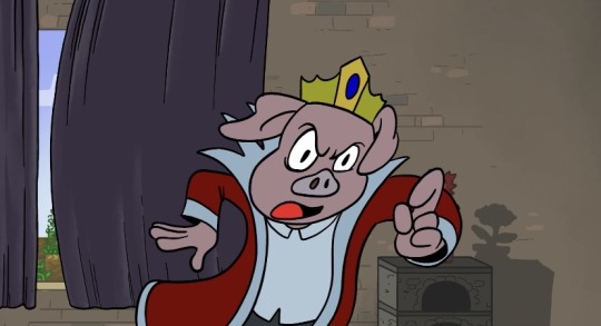
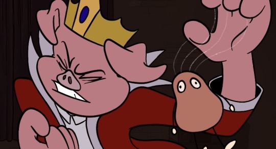
#procreate dreams#procreate#animation#2d animation#procreate animation#hand drawn animation#dreams#technoblade never dies#technoblade#Minecraft#mcyt
196 notes
·
View notes
Text

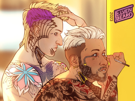
Morning Routine
"Can I borrow your eyeliner?" Kerry asked, causing V to pause a moment.
"Yeah, sure thing," he then said and handed him the pencil.
"What?" Kerry looked at him with eyes slighly narrowed, but smiling still.
"No, nothin'," V shrugged, looking at their reflection in the mirror, side-by-side, getting ready to head out, as if it was the most normal, natural thing already, "But... I think it's the first time I have someone over to ask me that."
Kerry chuckled.
"Well, better get used to it."
lkdadjfdlljdfasdflökdf it's finally done and I have so. many. feels.
First of all... I started this ages ago, as a funny little doodle idea for the morning after Boat Drinks. In my HC they go to V's apartment after the end of the yacht trip. Then halfway through the lineart I realized "I'll have to draw Vince's vanilla tattoos again..." which I really didn't want to, so I put it on hold and went to design his custom tattoos I had wanted to give him for so long anyways. Then when that was finally done, my graphics tablet acted up and I physically couldn't finish the drawing even though I had time. Then so much work stress and prep for the con happened inbetween and yeh... it's been a journey and a half to get here, but I'm very happy to have arrived and how it all turned out xD
Then also... my feels ;___; Vince has had a variety of relationships in the past, but either they never got serious enough for his partners to even end up staying the night, or they weren't as alternative in the way to dress and present themselves as he is. He was always the odd one out in one way or another, in his relationships, in past jobs, the one that either had to try to fit in or accept that he never would. So, it's something super minor really, but Kerry asking to borrow some of his makeup is a surprisingly huge deal for him in that moment, catching him off guard. Another instance of "you just get me" that they keep having with each other over and over again which makes them click so well and so fast. Like, Vince doesn't give a damn about what other people think about him anymore, dresses and presents himself however he wants and feels like. But Kerry makes him feel "normal" in the sense that he can just be himself authentically by not fitting in. He also has his quirks and an outwardly loud appearance and personality and all that, they just match so well, even though at first glance they don’t seem to... I know I'm rambling and only making half sense but I just love them lots, okay? xD Thanks for coming to my TED talk!
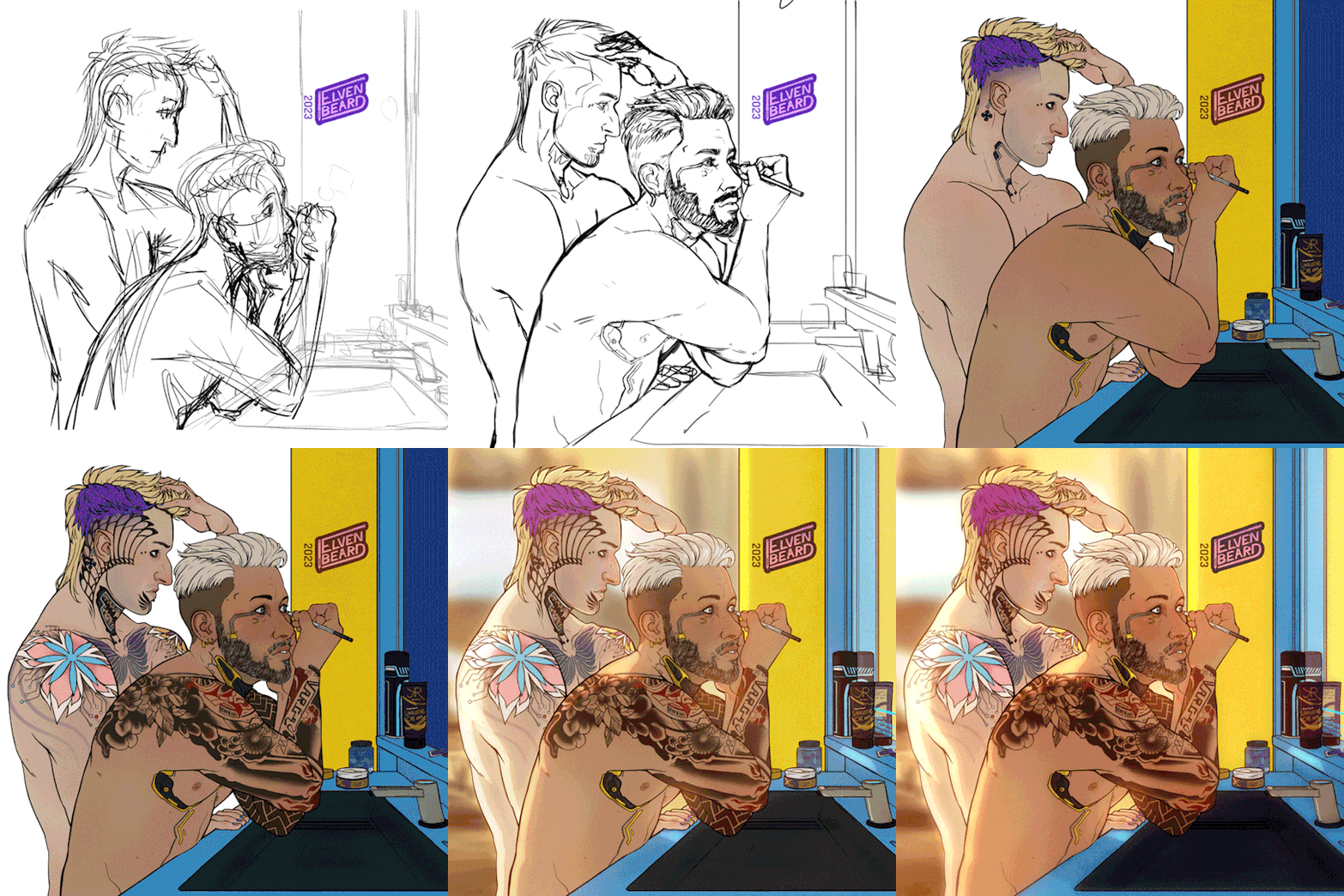
Since you've read this far, here's a short process gif as a treat:
#cyberpunk 2077#cp2077#cyberpunk 2077 fanart#kerry eurodyne x v#kerry eurodyne#male v cyberpunk#cyberpunk v#cb2077 fanart#eurovyne#kerry x v#shippy saturday#otp: to bad decisions#vincent ezaki#art by me
327 notes
·
View notes
Text
ok! webcomic update! previously, i said that i'm considering on making two chapters before i release it - im scratching that idea off. tho i keep jumping back to do some linearts and a few coloring for parts that i'm sure i won't change, i finally also finished the sketch/mapping as a whole for the whole script draft i wrote for chapter 1.
as i kept on mapping and sketching everything out, especially near the end, i realized that the chapter length is easily at least two times the size of what i initially expected of a standard chapter length??? LMAO so i'm technically already working on two chapters worth of story length all along, it's just that since it's chapter 1 that its longer. if i stack these long pages together, the canvas height would at least be around 115K pixels 🤣😭🤣😭
im so extra for this shit, bc this chapter is just me essentially setting everything up (=planting seeds) and getting a grasp on the webcomic creation workflow & most of the canon characters. but i love being extra for my ocs! ueueueue you will understand when you read it.
this will also be the most i've drawn tsuna and reborn(butter this one's for you 🫵), ever. so besides oc withdrawal, i am also having cute girls withdrawal, the only one keeping me alive in these trying times is my girlie kyoko-chan. if you notice her panels are extra well-done...umm...uhhhh....i love cute girls 🫶🥰✨
my alternative is to just add another segment in the end, as some form of preview on what to expect next chapter. it should be no more than another 7K pixels, it's alr so long, this is nothing at this point 🤣
in terms of art improvement, i must say that they really are not kidding when they say if you keep drawing comics your art will improve. i keep noticing things idk how to draw (=i'll need to study how to) and i'm also being forced to draw characters in angles/poses i was too much of a coward to draw before and also! things i didn't give too many shits about to draw before, including mob characters and backgrounds (that i can't 3d my way out of).
honestly, at some point in the future, i should make a custom brush for namichuu student mobs, because goddamn! it's a pain!
it's also nice that i get to also technically do manga panel redraws by doing this! i find that doing redraws of anime screenshots/manga panels is good practice for how effectively im able to eyeball & figure out poses from references.
lastly for the updated estimate of the release! the latest i could finish it if i really take my time would be by christmas (this would be my og deadline if i had planned to release two standard-length chapters). though, i'd release it earlier if I finish earlier, of course.
and im not rlly beating myself up for not making my own personal deadline, i'll just think about it like this "deadlines are a social construct, its not like i'll lose my irl job for not finishing my personal webcomic 🤣🤣🤣" lmaoosjdfhjsf pls im already so depressed the past few days & im isolating, i don't want to add more to it. and having tunnel vision on the grind to make this is actually a good distraction from nasty thoughts. also took a break today from making it, that's why im able to drop by a few ppl's notifs 🫶
#einproject#i will sleep early today too and start early this sunday#im taking care of myself#physical health debuff mental health debuff family drama debuff etc debuff (bc tmi...)#these debuffs won't stop me from releasing ch1 im that desperate 😤😤😤
9 notes
·
View notes
Text
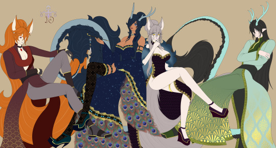
Finally done! Didn't help that I was working during the day, so I barely had any energy to work on this in the free time that I had XD
Wall of text below (>x<)
This thing went through quite a few changes actually... the first idea was to draw my two mains in my two favorite games... I was gonna draw Stelle as a fox from the beginning. But I was first thinking of drawing Kaeya as a peacock. Then I got the idea to draw their husbands on a different canvas to upload separately. And since I was first gonna draw Dan Heng and Zhongli on that second canvas, I thought of making both ladies into foxes. Then I realized that since I'm doing my Star Rail OTP, I should do my Genshin OTP as well. So I decided to switch out Zhongli for Childe. But then I thought that Childe fit far better as a fox. So I decided to make Kaeya a dragon instead. I finished drawing the ladies when I thought to put the husbands on the same canvas. Their poses were already finalized and I had managed to draw each ship facing their partner despite drawing the ladies and husbands on different canvases XD So yeah... that's the long story of how it turned out like this (>x<)
I just love them enough to put down all this time on this <3 I do have another sketch with these designs... but I need to get working on other stuff... so we'll see if I ever get that one finished XD Maybe as only lineart... because the colouring took forever since I had to wrestle with patterns... ^^'
#genshin impact#honkai star rail#star rail#fanart#digital art#chaeya#danstelle#kaeya alberich#dragon kaeya#femkae#female kaeya#childe tartagalia#fox childe#stelle#fox stelle#dan heng#dragon dan heng
38 notes
·
View notes
Text
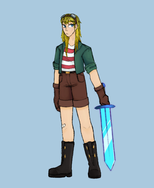
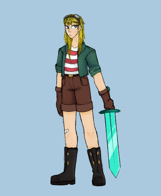

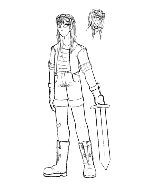
a false i started when the crossover was happening and only finished today lol
i like had sketched it out already, and for some reason i felt like coloring today so ¯\_(ツ)_/¯ also i gave her a normal diamond sword first and then realized it should probably be enchanted so i included both versions. then there’s a picture without the shading, and then the lineart with an added bonus of a tiny empires!false sketch! i think that’s there cuz i was originally gonna have fullbodies of both of them? to like compare them? but i can’t remember now lol
also!! i added an id in the alt text, but it’s the first time i’ve done one so i hope i did ok!
#hermitcraft#falsesymmetry#should i even tag as empires? idk#hermitcraft x empires#hermitpires#hermpires#ig i’ll just go with those???? tagging stuff is the worsttttt i never know what to tag stuff as :(#ESPECIALLY ON INSTAGRAM#anyway i like how this turned out :)
67 notes
·
View notes
Note
The finishing of this fanfic has left me with some pretty mixed emotions. On the one hand, I dont want it to end. It's such an incredible piece of work and even though I finally committed to reading it a few weeks ago, it already feels like such a significant part of my life. On the other hand, I'm a little glad that it's over. FAR from the sense it was bad (I'll steal your liver if thats how you interpret it) but moreso in the sense that it was like a good crying session. It's something that a lot of us (or I assume a lot of us) typically want to avoid even though we know its good for us, and satisfying after the fact. It's like catharsis in a way. Endings aren't always a great feeling in the moment, but it's something that we can look back on with a fondness.
I'm so glad I found this work. I'm being completely serious when I say that this fanfic, and the other content you make, has changed my life for the better. Its helped me reconnect with that love I have for creativity after nearly a decade of not making anything even though I wanted to. It's helped pulled me out of a few ruts of depression. It's helped me realize that I'm not actually emotionally stunted (per my own conclusions) and be more willing to cry instead of burying those feelings. In the past I would just, kill these kinda thoughts before they got far because of how much I wanted to avoid crying. Much less actually writing them down, or express them to someone else. But now, I've been crying the whole time I write this, and for the first time in, I think ever, I'm okay with that. I know we don't actually know each other, but you've genuinely helped me become a better person with the things you make. Thank you so much for everything you've done Sofie. hey look! I got your name right!
But enough about me. I feel like it's getting indulgent at this point. (I've gotten dehydrated with how much ive cried writing this and from what I can tell, you cry a lot more than I do. So go drink some water first, and then) I wanna hear your thoughts. What are your thoughts and feelings about your work being finished? Do you have plans to take a break from creative endevors for a while, or are you gonna keep going? Are you going to be expanding more on this and other au's, different fanworks or move into something completely your own? Whatever the case may be, I'm excited to see what more you are going to come up with!
From the bottom of my heart, and on behalf of everyone else, Thank you for everything.
It's so surreal to have posted that final chapter. I finished the first draft almost 100 days ago exactly, and I spent a number of days after completing it kind of adrift. I'd go to my computer every morning like I had during the month prior and sit down, ready to write, only to remember that I was actually supposed to be taking a break before I made the final edits. It didn't click in my head that I had actually done it… until a couple weeks later when it hit me like a truck that I had an entire completed manuscript sitting in my Google Docs. I think I was making myself lunch at that moment, and I had to bolt to lie down on the floor and put my legs up against the wall because I was ready to pass out at the realization.
This feels pretty similar. For me, The Present is a Gift— the main fanfic, at least— was finished in mid-January. But the process of uploading it and agonizing over what people thought of every passing update wouldn't be formally done until about 3 months later. It still hasn't clicked in my head that I won't be posting a new update once Tuesday rolls around.
On the subject of taking a break— I've actually been taking a break, at least partway! I've barely written anything after I finished TPiaG's first draft, and I haven't drawn much “serious” art, for lack of a better word, since I started my blog. I've still been making things, yes, but scattered oneshots and sketchy pieces without solid lineart are not my typical fare. I'm usually a lot more “exact” with what I make— words fail me here— I hope I'm not being too vague! I might take a brief break as I finish up the winter semester, but that would be less a break from creating and more of an “OH MY WORD I NEED TO FOCUS ON NOTHING BUT PASSING THESE COURSES” kinda thing.
TPiaG (along with its derivative AUs) is still very much a living project to me— there's a lot more stories the characters have in them, even if I struggle to envision a full-on sequel. I'm absolutely going to answer the asks relating to it that I've received over the months along with any I continue to receive, and if I get any ideas for comics or oneshots here and there, I'll make them. As for what's officially next up on the Sincerely Sofie menu, I'm planning to make a visual novel that's a lot more meaty than the last one I made. I'm not sure if it will be original or based on TPiaG— but a visual novel is the medium I'm planning on!
I'm so overwhelmed by your kindness. I truly don't have any words. This project started off as something private to help distract me from a depressive episode and to process trauma, and it's become so much more. I'm so glad it was able to help you. Catharsis was the keyword for TPiaG— I wanted it to uproot difficult emotions and help people start to heal from them, but I never dreamed it would really help anyone but myself. So to hear it was able to provide you with that is unbelievably meaningful to me.
I gave myself the goal somewhat recently to let myself cry whenever the urge strikes me. I used to go months without crying, and whenever I did shed tears, it was alone in my room while muffling the few sounds I accidentally let slip. I'm a natural crybaby, but I had schooled myself into thinking for a number of reasons that it was bad to cry— that it was selfish, or attention-seeking, or weak— so I've been trying to reclaim my teary-eyed identity. It's been difficult, but it's so freeing to let myself feel things fully. All of this is to say: let the tears fall. I've helped more people by crying than my stoicism ever did.
Thanks again. I can't properly word my gratitude, but know that it's overwhelming :,>
6 notes
·
View notes
Text
✨Weekly Progress #32-33✨
It's been an emotionally tough two weeks. Much (if not all) of what I've been planning hasn't been going well ^^;;
Weekly Progress #32
Posted devlogs
Worked on Outlines
Finished Punk BL Part 1 Outline
Finished SFB sprite lineart
Concepted + outlined VF project
Wrote 2.1k+ words for VF
Sketched VF sprite
Weekly Progress #33
Wrote 2k+ words for VF
Finished 1 VF sprite
Flat colored other VF sprite 4/5 outfits
Finished Punk BL Part 2-3 outline skeleton
Designed 1/4 LIs for Buggy BL
Wrote 6k+ words for Punk BL
Finished Buggy BL outline skeleton

When 2024 started, I had some goals and plans for my devwork this year. I hoped to start developing commercial games. I didn't expect all of my plans to work, but I also didn't expect none of it to work the way I planned.
So while I said to myself, "Welp, that just means I gotta replan and make a new schedule for 2025!" it was still difficult for me to hype myself up for that.
I planned to join Velox Fabula 2 to cheer myself up, but despite writing over 4k words and completing a sprite... my willpower simply disappeared and I gave up completing the project.
I might finish it in the future, but the stars misaligned this time.


It is a Quick Transmigration, multi-lifetime story between two people. The story was planned to be vignettes of moments between the two characters, but I realized I wanted something more and the scope was already too big for a small jam like VF2.
Punk BL Game
That's not the title, I have no idea what the title will be. I hope an epiphany will hit me soon because idk how to tag my posts otherwise. Or I'll have to go back and edit a lot of posts.
It's a rather big and ambitious idea. This will be a turn based battle/hybrid VN with some dating sim elements. I wish I had a single word to describe it. Perhaps I'll have to do some more researching for similar games.
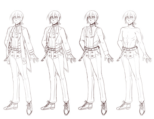
The story is about Silver, whose been ordered to defeat the gangsters who run Lucidus City. If he falls in love with one of his rivals, well, that'll depend on you...
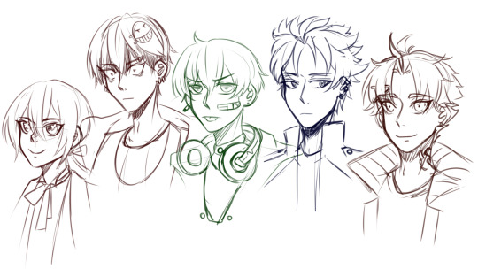
(did I post this image before? I feel like I have, but I can't find it on my own blog LOL...)
The story is split into four parts (currently); writing for ith as come so naturally that I did 4k on Friday night. These are sketches for the main characters of the first part. The MC, Silver. The "love interests" (once again, I hesitate to call them so because they won't get traditional romance routes. I'm still unsure if they'll get actual romantic endings) for part 1 are: Drayton, Gordan (Danny), Caleb, and Evan.
Any guesses to who the yandere in this story will be.
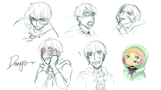
(Just some expressions I picture him making throughout the story)
Buggy BL Game
The other untitled BL game I've been daydreaming about. Thanks to discussion with some friends, the basic concept is: a bunch of bugs get stuck in a death game, similar to the idea of Kodoku.

I only have the base outline and one of the LIs designs finished. Meet Butterfly, one of the more uncooperative love interests you get to meet in the death game.
Actually, all of the love interests are quite uncooperative...
I haven't finished developing the rules and stakes of the death game yet, but I know for a fact that variable control will be essential to this game. I have a bad feeling future!Pumpkin will be ambitious and try a system where who you let die early in the game will affect later trials of the game...
Other than that, I'll be finishing a few owed artworks this week before I dive into rescheduling my long term gamedev goals for 2025 and beyond.
#devlog#visual novel#vnlink#indiedev#vndev#punkbl#buggybl#by the way I'm afraid of bugs#but they're fascinating design inspirations#even if they made me scream in horror once
6 notes
·
View notes
Text
Hello! I've been doing some long, hard thinking about my current commission offerings.
TL;DR:
I am doing away with my "standard" menu (headshot/halfbody/fullbody/etc.) in favor of more experimental work.
Effective June 1, my commissions will close completely, including the waitlist.
If you want any of my current offerings, please let me know before then. You will be added to a final waitlist queue, with payment only required once I get to you.
If you're currently on my waitlist, or are interested in what's next, please see the bottom of this post. Once the final orders are complete, I will focus on relaunching.
Below is a more elaborate explainer of why I'm doing this, and what I'll be doing next.
Introduction
Essentially, commissions have worn on me more and more as time goes on (which may be tangible if you ordered one recently and it took months). Part of me wondered if I was burned out on art in general, or it was just becoming less of a hobby for me, but that sentiment didn't feel quite right. After all, I could still get grabbed by a picture idea every now and again, which I would then crank out in one evening.
Was there some sort of difference between the pictures I could hammer out quickly vs. the ones I couldn't? Well, I wouldn't make a post about an investigation without already having a prime suspect.
My Art Style
When I first started drawing aliased, it was to quickly crank out panels for my forum adventures, mostly because I was using GIMP and didn't know anything about brush settings. I was way too frustrated with anti-aliased lines and how little I could make them look how I liked, so I retreated into something completely different.
It worked for a while, but as I became more comfortable with the style, I developed bad, perfectionistic habits (something I've already mentioned being A Problem I Have). I would tweak lineart at the pixel level, just because some stray bump or two bugged the hell out of me. I consider this one of the reasons my art output has slowed down.
Trying to embrace a "perfectly inconsistent," or "consistently imperfect" look as "my style" just created its own irony. For example, I will deliberately draw patterns and textures by hand, because it sticks out too strongly otherwise if I just paste it in. You can bump into this quickly enough by scrolling through my various character references.
I would love a world where all my OC references feel "current," but as it stands, I'm finding it increasingly hard to work on the remaining characters I want to draw while commissions are also an obligation. Taking a break from aliased character art commissions in order to work on aliased character art references is...just doing more of the same? It isn't a break.
In order to create breaks that actually feel like breaks, I have to compromise. ONE of these has to go home and change. My personal art gets priority here, and I still very much want my OCs to look consistent in their reference art, so...I need to find a more efficient way to draw for money that keeps my dysfunctional brain entertained.
The Long, Slow Realization
Back when I used GIMP, I tried the chalk brush on a whim and ended up quite liking it. The rough look helped me ignore what I would consider "imperfections" otherwise. However, perhaps because I had a comic or character references I wanted to keep consistent, I mostly considered it a fun oddity and nothing more.
More falling dominoes that would eventually lead to this post were my experimental style offerings that I introduced last year (at the time, I just offered it because I thought people may be interested in art that looked relatively unique), Art Fight (having to agonizingly obey "finished not perfect" because of the event deadline), and other gift art I did around this time (the reasoning being, it's gift art, they wouldn't mind if I used it to experiment).
Now that I use CSP and am no longer bound by webcomic obligations, I've been experimenting more with brush settings. Wouldn't you know it, most of my modern art of my original stories is no longer aliased. I go "off-model" deliberately, fuck around with layer settings and effects, and enjoy creating pieces just because I saw a cool tutorial, brush, or program I wanted to try. These are the types of pictures I mentioned I could crank out in one evening. Maybe they're not "formal," but I feel like they're the most "me."
With all this new experience swirling around in my head, I finally realized: Why am I not selling art I actually find fun to draw?!
The New Offerings
Currently, I'm leaning toward one style of illustration only, cheaper than the experimental style I offer presently, and "rougher" as a result. I want something equivalent to my '22 Art Fight output; something flashy, unique, and most importantly, quick to do.
The specifics are what I intend to figure out while I work through the queue. Here are some thoughts already rotating around in my brain:
Should I offer price "tiers" that roughly equate a level of "polish" (equivalent to sketch/flats/shading) or just go with one-price-fits-all?
Should I still offer sketches as a cheap alternative, or is that too confusing with my Ko-fi already sort of being that?
Should I offer specific pricing for bust/halfbody/fullbody/etc., or was that another symptom of why I had commission burnout before, and should be avoided?
Should I eschew all of the above and just offer one thing at one price (e.g. "give me $50 and I'll draw your OC" with no other choices for the buyer), or is that too intimidating?
And so on. The last option is currently what I'm vibing with the most, but it's definitely the most daring idea of the bunch, too. (& If you have any thoughts on this, let me know! I have so much more thinking to do.)
The Old Offerings (But New)
When I reopen, I would like to have as few options as possible. However, I have considered the possibility that an old offering would speak to me and I would add it to the new menu again. Here are some thoughts on those:
Icons have a pretty high chance of coming back.
I've always liked drawing faces and headshots the most. If I decide not to bring back headshot sketches, I could just roll it back into "icons" and instead offer colored sketchy headshots. This would be similar to the headshots I did for Art Fight, but...with colors.
Half/fullbodies would depend on how the new style goes.
This is elaborating on what I said in the previous section. While I'm sure my core audience (i.e., you) will be fine with a potentially spontaneous angle to my commissions, buyers I'm less familiar with might not be. I want to try "one price fits all," but if someone gives me shit about me drawing a bust when they were anticipating a fullbody, I might have to add options to specify this.
Regardless, the style would still be "experimental" either way--the composition is what's important about it (which is also why I feel like I can get away with one single price). If anything, I feel like forcing myself into the little boxes of "halfbody" and "fullbody" was partially what was stifling me. Like, when do I ever consciously decide to draw a halfbody of an OC? I don't. It feels very arbitrary, and I'd like to distance from it.
MOST IMPORTANTLY: Character design is NEVER coming back!
I deeply appreciate those that did want a brand spanking new OC from me, but I've never considered myself to have a terribly strong design sense. They just kind of ended up being extra nervewracking to do because I had to design a character on top of drawing a fullbody. I will still take the final requests for these, but this is your absolute last chance for a Jovian Twelve™ Brand Original the Character.
What if I'm Already on Your Waitlist?
You don't have to do anything! I will get to you when I get to you. After June 1, I will close the waitlist, and whoever is on there will be able to have one of my old commission types, as promised. You can change your request anytime as long as I'm not currently drawing it!
Reminder that my waitlist is NOT "first come, first served;" I order it based on the complexity of what's wanted. Because of my slow pace, I didn't want to keep someone waiting forever when all they want is three sketch headshots, you know? This is a heads up that if you change your request, your position in the list may change as well.
I have no ETA when the current waitlist will be completed, given that currently, fullbodies are taking me months. Sorry :( Just another reason I'm making this post!!
What if I Want the NEW Style?
I will accept up to five (5) waitlist slots that want to "test drive" the potential new commission style, placed after the "traditional" queue is all cleared out. (So, you'd be waiting extra long.) If you're interested in this, get in touch! I will offer them to you at a lower rate than what I'm expecting to charge for the real deal, as thanks.
If you're already on the waitlist for something else, and want to test the new style instead, let me know! Just be aware this would bring you to the bottom of the queue as described above (but it WOULD give me one less commission I'd have to go through to get to the new stuff, WINK).
In the chance I get no takers the entire time it takes me to go through the waitlist, then the first five commissions I do in the new style will just have to be "test slots" instead.
Final Word
I know these long posts might not be terribly interesting to anyone that's not me, but I find it therapeutic to scrawl my thoughts out in text. Additionally, I'm over 30 years old and conclusions are still the hardest part in writing an essay. I can feel my writing style begin to devolve the closer I am to the end...
Uhhh.
Thanks for reading, and understanding?! See you soon, maybe?! Get in touch if you want to discuss Commissions From Me?? ��� Cool.
#text#commission#why do i type huge essays like this? what's wrong with me#at least that's off my chest now I GUESS
20 notes
·
View notes
Text
doing this 'cause I'm already experiencing art withdrawal from my hiatus I've forced onto myself with light encouragement from my friends so here we go
also I realize "game" likely implies some schmo is supposed to be like "please answer #69!" but fuck you I go by my own rules and have fun with it too
LMAO so this computer is only about a year old, a while ago my other computer literally shit itself and died so I used to have paint tool SAI on there but now on this one I legit only have the one I actually use which is FireAlpaca
Forward, but left is easier than right
I used to have this warriors self-insert OC when I was REAL YOUNG named Moonfeather that I still hold near and dear to my heart but haven't made art of in literal years and don't have a concrete design for. yes she was special, yes she could turn into a dragon (???) But if you mean ideas I currently use, Ray's been around since I was 10 so
EDITH LOL drawing little kid her is easy as fuck 'cause she looks almost exactly like kid-Gray but current/teen her is so aids 'cause she has all that dragon shit going on + her hair is complicated
literally I post everything online (that I can ( ͡° ͜ʖ ͡°)) because I need validation there is not a single piece of digital art that I've made that hasn't been posted on the internet (for the most part ( ͡° ͜ʖ ͡°))
my own goddamn trauma. literally half the time I look at an arc a character just had and went "yo the way snarky like came back in a new form with blue reminds me of how my current cat acts exactly like the one I lost" and then I mental boom
gouache (spelling?), that shit's so pretty
literally just made a video about this lmao, the Animals PMV. RIP
if it's a finished piece in the form of a png I name it the piece's title, if it's a WIP art program file I name the file something like "ass" and move on
hoodies.. or scarves. belts are fun too
music or podcasts. sometimes vcs
face/expressions, I fucking LOVE drawing expressions SO MUCH
lotta them undertale/deltarune fanartists are fucking amazing but I've never been into that fandom. Also my husband is super into FNF mods and those are neat too
the little fucking ocean wiggles on fantasy maps y'know the ones
my house/desk lol
fuck idk. the shit I've trained myself to get good at is the shit I've really cared about, however my least favorite part of a piece is lineart
dear god no I HAVE to separate food from that shit, I have enough food anxiety as it is. I watch videos while I eat
not a whole lot actually, I don't distinctly remember doing so pretty much ever
literally fucking none actually. like I legit scoured my art and animation for this shit and couldn't find ANYTTHING. I adore drawing characters so much and anytime I have to draw something inanimate that's not directly clothing -on- the character or weapons it makes me want to kick a baby. broken glass is fun tho I guess???
hands. not that it's easier for me but I like how expressive I can be with em
tybaxel is so fucking amazing but that's like my only answer, not that I don't like other people's art that doesn't look like mine either but that's literally the only example I could think of because I don't keep track of this sorta thing, if it looks pretty I follow. that's my philosophy
lol
not sure what this means actually so no
only rarely for like purposes of poses or perspective. almost all the time my reference window is just a wow screenshot
nothing is coming to me off the top of my head but I have noticed characters or concepts I thought of before I found certain media crops up in said media anyway. like Detective looks very Lackadaisy and I'm not tryna say I'm salty about it I think it's neat actually
any piece with amab characters whose design includes being shirtless. like bro, tree is just chillin'
sometimes I scribble cool/dramatic expressions before drawing but only occasionally
i helped paint a mural in my hometown :D
vivzie's creations, a lot of the character designs are too spiky/thin for me but I understand the stylistic choice
LITERALLY the one I JUST posted based off the song Mama by My Chemical Romance I'm literally in love with it and I don't think anybody saw it fucking rip
anyway yeah fuck it I just felt like doing that lmfao
Weirdly Specific Artist Ask Game
Didn't see a lot of artist ask games, wanted to make a silly one.
(I wrote this while sick out of my mind last year and it's been collecting dust in my drafts, I might as well let it run free) 1. Art programs you have but don't use
2. Is it easier to draw someone facing left or right (or forward even)
3. What ideas come from when you were little
4. Fav character/subject that's a bitch to draw
5. Estimate of how much of your art you post online vs. the art you keep for yourself
6. Anything that might inspire you subconsciously (i.e. this horse wasn't supposed to look like the Last Unicorn but I see it)
7. A medium of art you don't work in but appreciate
8. What's an old project idea that you've lost interest in
9. What are your file name conventions
10. Favorite piece of clothing to draw
11. Do you listen to anything while drawing? If so, what
12. Easiest part of body to draw
13. A creator who you admire but whose work isn't your thing
14. Any favorite motifs
15. *Where* do you draw (don't drop your ip address this just means do you doodle at a park or smth)
16. Something you are good at but don't really have fun doing
17. Do you eat/drink when drawing? if so, what
18. An estimate of how much art supplies you've broken
19. Favorite inanimate objects to draw (food, nature, etc.)
20. Something everyone else finds hard to draw but you enjoy
21. Art styles nothing like your own but you like anyways
22. What physical exercises do you do before drawing, if any
23. Do you use different layer modes
24. Do your references include stock images
25. Something your art has been compared to that you were NOT inspired by
26. What's a piece that got a wildly different interpretation from what you intended
27. Do you warm up before getting to the good stuff? If so, what is it you draw to warm up with
28. Any art events you have participated in the past (like zines)
29. Media you love, but doesn't inspire you artistically
30. What piece of yours do you think is underrated
34K notes
·
View notes
Text
Starchild

2022/03
Something from March, figured after the Brigthest Star upload I should follow up with this one xd This is Astra, Wildfanqs other Sona/Mascot and very much associated with the Stars. This one is a bit of a doozy too work-wise because first off - I only used two inks for the whole piece which were "perle noire" & "diabolo menthe" by Herbin (srsly if you like working with inks I can recommend herbin inks to the moon and back they are such a joy to work with) which I think is worth pointing out. Secondly, when I drew her I had a temp ref by Fanq where the ears were missing and me not realizing something might be off drew her without ears. Now, that is a wee bit of a problem for me as a traditional artist. Or at least it seemed like it. I neither really wanted to leave the piece as is, redo it, or draw the ears on separate paper and glue them on because it's watercolour paper it's thick, it would've been distracting and very noticeable. Soooo... I figured I could try to draw in the ears in on the already finished work and if everything goes to hell I will have to redo it anyway. I thought, since the paper is thick I might be able to remove the top layers a bit to get a lighter surface and remove some of the colour and linework because anytime I line a sketch and do the first linework layer going over it with a rubber always takes off some pigment hence why I do multiple lineart steps and I figured.. Same difference right? Just with more stakes. But it worked as expected, I really carefully took off part of the piece where the ears would go with eraser friction and then had to work the raw surface with a bit of water first to get it even, after I drew in the ears and carefully applied colour for the ears - since the surface was still a bit rough I had to be mindful of bleeding, but otherwise it worked out rather well all things considered. Which means good to know that I can do stuff like that with watercolour works, but also I hope I don't have too it was nerve wrecking when I started it XDDD
#Havethetouchart#artists of tumblr#for-others#gifts#traditional art#ink#metallic-watercolour#anthro#anthro art#furry#furry art#drawing#illutration#art#wildfanq#havethetouch
0 notes
Text
When I was pricing my commissions, something that helped me was actually more about my labor then what other people wanted to buy, surprisingly.
I started with prices ridiculously low. Like, most artists would say they were way too low. Like, 10 dollars for a colored piece, low.
And while for lineart I felt fine, every time I finished a colored piece? I felt exhausted, tired, sad, and like I worked way too hard for way too little money. It felt like I was being scammed even though I'M the one who set the prices. I was miserable.
So I changed my prices. My current commission prices are;
6$ lineart
20$ colour
(+6$ each additional character)
At this level, when I complete a piece, I feel satisfied and comfortable, and proud of myself. The money feels like a reasonable amount to receive for the work I did. The lineart price didn't even change (it was about 6 dollars before) but changing the price of coloring made a huge difference in feeling like I made a fair exchange.
Character pricing is sort of similar. I used to charge like, a multiplier for characters- this meant that instead of a static number for each one, it was just the price of the itnitial peice multiplied by the characters. But that was way, way too expensive. And I realized that the only phase where the number of characters even made a difference was lineart- if I'm coloring the whole page, I'm already going over all of it in color already- so different characters might mean more colors or different ones, but it doesn't feel like an increase in effort for me personally. So it would be unfair to charge more for something that felt so...nothing? Whereass for lineart it feels like a bigger difference. So now, as you can see in my prices above, I just charge the lineart price of 6$ again for each character.
When you're selling something, you have to remember it's an EXCHANGE, it's supposed to be fair both ways. The customer gets art they enjoy, and YOU get an amount of money that makes it worth it. It's supposed to be beneficial for you, too, when you get the paycheck. It's not supposed to feel like you're draining yourself- ideally you and the customer should both be equally happy with what you got out of it!!
So I would stop and think about, like, the minimum/lowest possible amount of money you would need to get for different kinds of art to feel like you were fairly compensated. Then, start there- at that minimum price. If too many people are ordering commissions at once at those prices and you're getting overwhelmed, then that means you have high demand and you can raise the prices a little to even things out (which will also slow the rate of orders).
But try not to lower your prices below that minimum threshold!! If you're not getting buyers, you can try advertising or campaigning harder, or maybe just working on learning new techniques you can use so you can improve your art in general, but don't sell yourself short!! People don't always have spending money and you might not have a big audience, but you shouldn't overwork yourself- and charging too low IS overworking yourself. It's a kind of self harm. Find another way to redirect.
Right now I'm getting ready to launch my own advertising thingy for saving up for @/dashcon-two (check it out if you haven't!! Very poggers) , and I haven't finished it yet (I'm drawing ads and making plans) but I'm gonna try and get that started once my sickness is out of the way fully so I can start saving up. If you want/need to get more comissions then you're getting, and you can't lower your prices any further, then you should start working on promoting them or networking- maybe you can team up with other artists and promo each other!
I'd also start working on a terms and conditions. People don't really talk about it, but having a terms and conditions is really important, and I wish I already had written mine when I started. You don't need to hire a lawyer- don't worry about that!- but you should research what sort of things to say and include in the terms for a commission. You can also use the terms and conditions of other artists for reference :D!!!
Would you guys be interested in commissions? If yes, how much should I charge.

10 notes
·
View notes
Photo
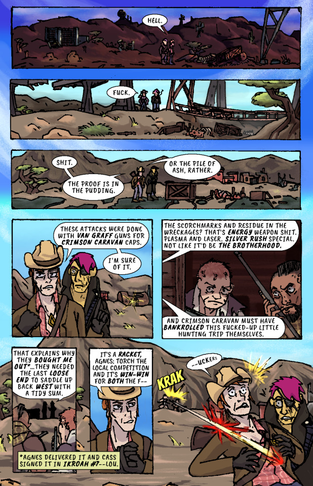
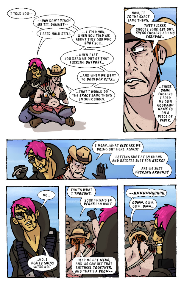
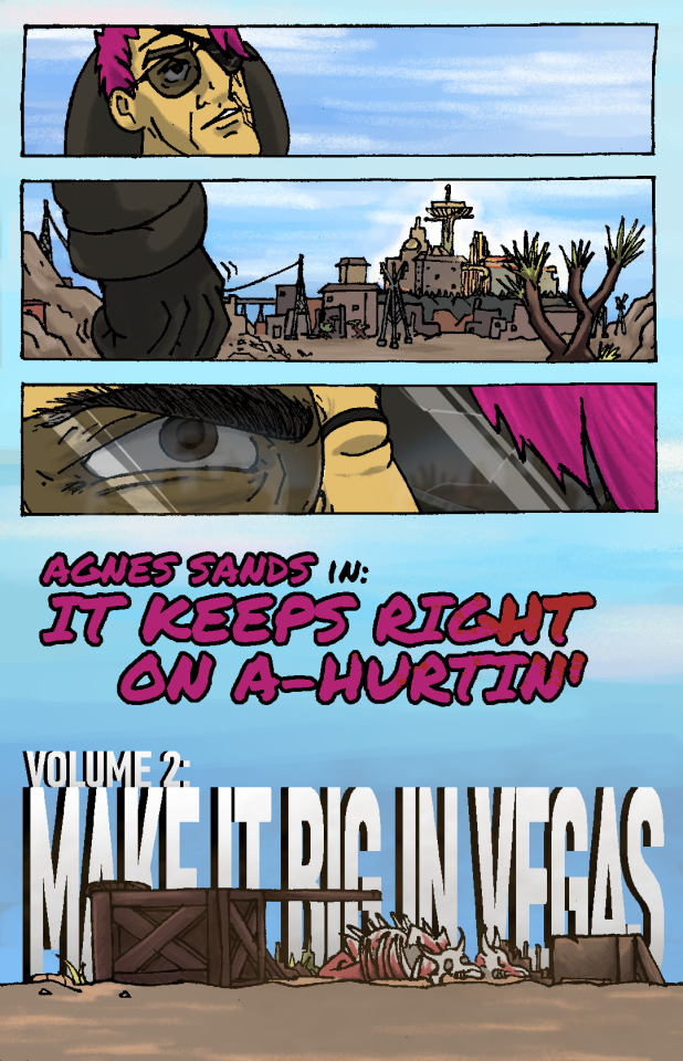
Whiskey river, take my mind, don't let her memory torture me. Whiskey river, don't run dry, you're all I got, take care of me. —“Whiskey River,” Shotgun Willie (1973)
It Keeps Right On a-Hurtin’ #15 - Vegas Outskirts
Collaborative Issue! Guest Colorist: @malpaislegate / @socksual-innuendos
Archive Links
«« First | « Previous || Next » | Last »»
Read IKROAH on Archive of Our Own
Notes / Original Pencils / Transcript:
Notes:
MAN that’s gotta hurt!! Volume 2 kicks off with a bang, literally if you count the gunshot and honorifically if you count Socks’ knockout color job on this issue. Look at those lovingly rendered bullet wounds!! Muah!!!
It’s been a relief having a month off from the comic as I handled a bunch of other things but there’s a lot to look forward to in Volume 2, as you can probably tell from that very forboding fist clench at the end there. Will Agnes and Cass get the revenge they’re looking for? Can they make it big in Vegas? Will it keep right on a-hurtin’? Find out next ish as Cass leads Agnes to meet the first of their new “friends.”
Original Pencils:
The pencils for this issue are like an autopsy report of all the things that can go wrong with your art if you don’t plan ahead and pay attention. Listen, friend, to my tale of woe, and learn from my mistakes so they don’t become yours!
First, you can see a lot of places where there’s floating objects, empty backgrounds, and incomplete heads. Part of this is because I always intended to just copy and paste repeated elements across each panel instead of drawing them multiple times, but other times I was forced to just because of my lack of planning. The top three panels on page two, for example, required me to draw the background I’d use for them on a separate page.
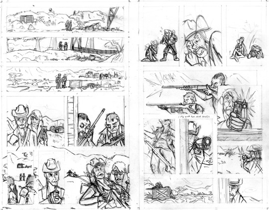
Second, you can probably tell that I actually had to flip the two raiders around in the final lineart because I forgot to keep the hands their were holding their guns in consistent—and since I couldn’t flip the middle panel on the second page without ruining the composition, I decided to flip all of their other appearances so that they’d be lefties. I doubt you even can seamlessly wield those particular guns left-handed.
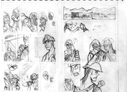
Third, the size of the cart that Agnes and Cass are kneeling behind changes CONSTANTLY and is dramatically oversized from the third page onward. After inking these pages, it took a lot of work to correct the inks and shrink that cart in each panel, but fortunately it came out looking good.
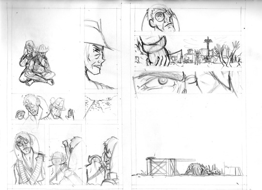
And finally, I completely redrew the second panel on the fifth page because it wasn’t until I had already handed he pages off to my colorist that I realized having a second profile shot of Cass so soon after a first one was just...redundant and lazy-looking. So I went back to my sketchbook and whipped up a much more unique, striking angle (I also just wasn’t satisfied with the quality of my art on that panel, so I’m very glad I redrew it). But again, my failure to plan ahead bit me in the ass and my redraw attempt wound up taking up a lot more space than I thought it would, so after inking it I had to basically surgically remove it from the other inks.
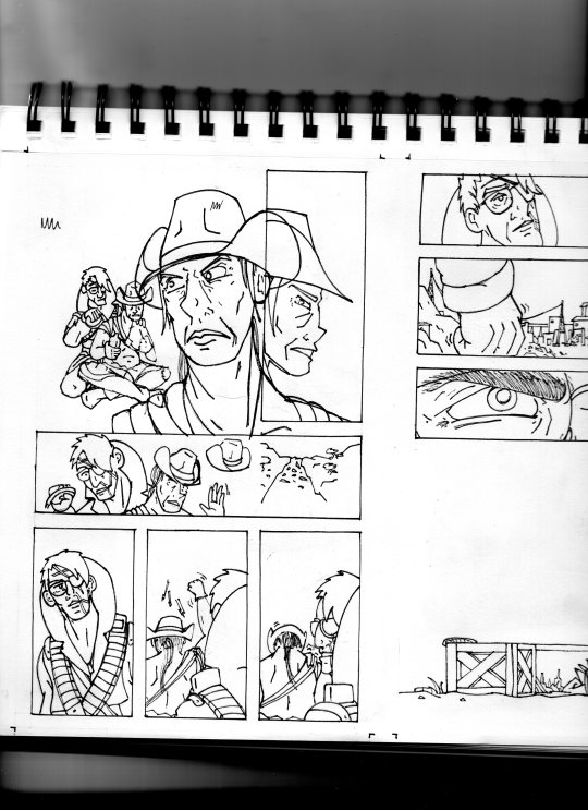
I’ll be honest with you folks: part of the reason that I work in such simple, thick, high-contrast lineart is because it’s very easy to make corrections and adjustments with stuff you could technically color in Microsoft Paint.
Transcript:
EXT. SOMEWHERE IN THE MOJAVE, morning. AGNES SANDS and ROSE OF SHARON CASSIDY stand over the wreckage of a caravan, scattered over a dirt road.
CASS: Hell.
EXT. SOMEWHERE ELSE IN THE MOJAVE, midday. Looking over a second wrecked caravan, at the bottom of a ditch.
CASS: Fuck.
EXT. PRE-WAR HIGHWAY OUTSIDE OF VEGAS, mid-afternoon. AGNES and CASS survey a third wrecked caravan.
CASS: Shit. The proof is in the pudding. Or the pile of ash, rather. These attacks were done with Van Graff guns for Crimson Caravan caps. I'm sure of it.
As CASS explains her theory to AGNES, a short distance from the caravan two RAIDERS peer at the two of them from inside a barn at a ruined farmstead. They have snake-bite tattoos on the sides of their shaved heads and are holding rifles.
CASS: The scorchmarks and residue in the wreckages? That's energy weapon shit. Plasma and laser. Silver Rush special. Not like it'd be the Brotherhood. And Crimson Caravan must have bankrolled this fucked-up little hunting trip themselves.
The RAIDERS move out from the barn, sneaking up on two passers-by who’ve stopped at the caravan wreckage.
CASS: That explains why they bought me out...they needed the last loose end to saddle up back west with a tidy sum.
(NOTE: *Agnes delivered it and Cass signed it in IKROAH #7—Lou.)
CASS: It's a racket, Agnes: torch the local competition and it's win-win for both the f—
SFX: KRAK
A gunshot rips out from one of the RAIDERS’ rifles and sears across CASS’ shoulder.
CASS (gasping): —uckers.
CASS slumps down beneath the overturned caravan wagon on the road, clutching her shot shoulder.
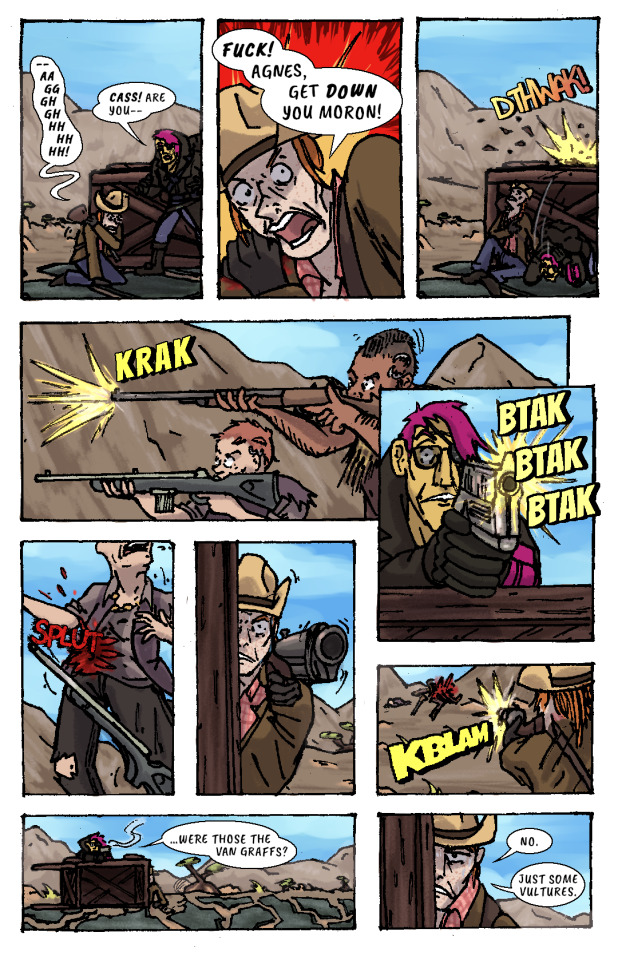
CASS: —Aaggghghhhhhhh.
AGNES: Cass! Are you—
CASS: Fuck! Agnes, get down you moron!
AGNES ducks behind the cover of the wooden caravan wagon just as another gunshot splinters the top lip of it.
SFX: DTHWAK!
The RAIDERS advance on CASS and AGNES’ position, firing at them from off the road.
SFX: KRAK
AGNES leans over the top of the wagon with her pistol, returning fire.
SFX: BTAK BTAK BTAK
AGNES lands a shot right in one of the RAIDERS’ guts, and she drops her weapon and falls down.
SFX: SPLUT
CASS, leaning out the side of the wagon, takes as careful of aim as she can with her shotgun by holding it with her good arm. Trembling, she fires, connecting with the other RAIDER.
SFX: KBLAM
The would-have-been RAIDERS are dead.
AGNES: ...were those the Van Graffs?
CASS: No. Just some vultures.
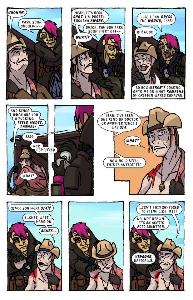
CASS leans back behind cover to sit against the bottom of the overturned wagon again, wincing from her shoulder injury.
CASS: Ugghhn.
AGNES (slipping off duffel bag): Cass, your shoulder—
CASS: Yeah, it's been shot. I'm pretty fucking aware.
AGNES (unzipping bag): Quick, can you take your shirt off—
CASS: What!?
AGNES: —so I can dress the wound, Cass!
CASS: Oh! Good! So you weren't coming onto me on what remains of Griffin Wares Caravan.
CASS starts removing her shirt while AGNES produces a bottle of something from her duffel bag, and dampens a rag with its contents.
CASS: And since when are you a fucking field medic, anyway?
AGNES: 2269. NCR Certified.
CASS: What?
AGES: Yeah. I've been one kind of doctor or another since I was six.
CASS: What?
AGNES: Now hold still, this is antiseptic.
CASS: Since you were six!? I...shit, wait, hang on, Agnes—
AGNES pressess the rag onto CASS’ shoulder wound, and CASS winces instinctively. But, confusingly, there isn’t any pain.
CASS: ...isn't this supposed to sting like hell?
AGNES: No, not really. It's an acetic acid solution. Vinegar, basically.
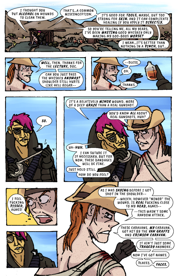
AGNES begins cleaning the wound with the rag.
CASS: I thought you put alcohol on wounds to clean them.
AGNES: That's...a common misconception. It's good for tools, maybe, but too strong for skin. And it can complicate healing if you apply it directly.
CASS: So you're telling me, all my years, I've been wasting good whiskey only making my boo-boos worse?
AGNES: I mean...it's better than nothing in a pinch, but...
CASS: Well, then. Thanks for the lecture, doc. Can you just pass the whiskey anyway? Shoulder still hurts like hell regar—
AGNES hands her the whiskey bottle. She’d already gotten it out.
CASS: —dless. Oh. Thanks.
AGNES unspools a roll of bandages in her hands, then begins wrapping it over CASS’ shoulder and across her chest..
AGNES: So. It's a relatively minor wound, more of a deep graze than a real gunshot.
CASS: You'd know all about real gunshots, huh?
AGNES (unfazed): Uh-huh. I can suture it if necessary, but for now, these bandages will be fine. Just hold still. How do you feel?
CASS: I feel fucking pissed, Agnes!
AGNES recoils, taken aback slightly.
CASS: As I was saying before I got shot in the shoulder—which, however "minor" the wound, is real fucking close to my head, Agnes—this wasn't some random attack. These caravans, my caravan, got hit by the Van Graffs and Crimson Caravan. It ain't just some tragedy anymore. Now I've got names. Places. Faces.
AGNES resumes bandaging CASS.
CASS: I told you—ow! Don't pinch my tit, dammit—
AGNES: I said hold still.
CASS: —I told you, when you told me about this guy who shot you...when I let you drag me out of that fucking outpost...and when we went to Boulder City...that I would do the exact same thing in your shoes. Now, it is the exact same thing. This fucker shoots your eye out, these fuckers ash my caravan...these same fuckers I sold my own goddamn name to on a piece of paper. I mean...what else are we doing out here, Agnes? Getting shot at by Khans and Raiders just for kicks? Are we just fucking around?
AGNES finishes bandaging CASS, then leans back, pensive.
AGNES: No...no, I really guess we’re not.
CASS: That's what I thought. Your friend in Vegas can wait. Help me get mine, and we can get that shitheel together, and that's a prom—
CASS raises her arm to shake her fist as she speaks, straining her shoulder injury.
CASS: —mmmmmmghhhh. Ooww, oww, oww, oww...
CASS grabs her shoulder in pain while AGNES looks off in the distance and stands up. She looks out towards the horizon—towards VEGAS, and the pre-war casinos and hotels that still gleam and glitter in blinding sunlight.
Her fist clenches. Her brow furrows. Her body tenses, all over, staring at that city, that place.
The caravan wreckage remains alone on the highway, brahmin bones long picked clean by scavengers.
AGNES SANDS IN: IT KEEPS RIGHT ON A HURTIN’
VOLUME 2: MAKE IT BIG IN VEGAS
178 notes
·
View notes
Text
Process Breakdown: Starfall
Since I got some positive responses to my question on process stuff I’m gonna do a behind the scenes breakdown for my most recent piece to help people see the process I use and how I problem solve. I didn’t plan to do this initially so I won’t have a ton of process shots but I did save a handful. There’s a few scattered hyperlinks to other pieces I reference too. Just a warning this is mostly train of thought so it’s super verbose.
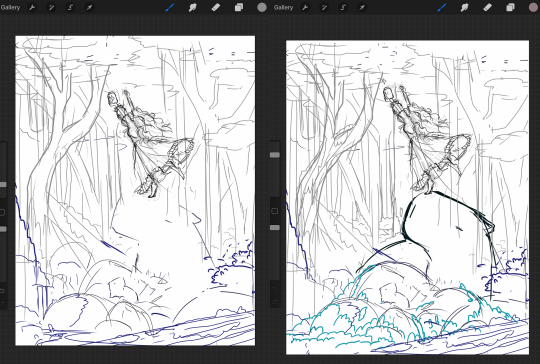
So base sketches were mostly focused around me defining the shape of the girl since she was the focal point and building the environment around her. Going in the things I knew I wanted were a girl precariously balanced on top of a massive capybara catching a falling star, while surrounded by smaller sleeping capybaras on rocks. I layered out a general forest scene surrounding it but didn’t really commit to much in the sketches. Messed with the angles of the large capybara a few times to make it feel less flat and more 3D in the space, used a lot of reference photos of capybaras and sorta simplified them to what I thought was cute/ what stood out to me as their defining features.

Skipping ahead a solid amount is midway through the initial lineart, with some areas just colored in to define them as separate. Initially this piece was supposed to be in a similar style as my “Stratosphere Dreaming” art, with a single uniform line thickness, bright colors, and no gradient shading at all, but I realized pretty soon after I finished the lineart and started coloring that I had done what I tend to do a lot and made it too complex to pull off successfully in that style so I had to pivot to using gradient shading and other non-cell style techniques (though you can see a lot of those methods still in the coloring of the girl). This caused an even bigger challenge as I was drawing on a large canvas with high DPI in Procreate which resulted in me having a cumulative 50 layers to work with at any given time (hell).
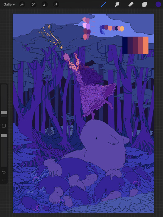
Now once I made that rendering style pivot is when the really hard part began, and why on top of my persistent arm injuries this took me about two months to finally finish.
1.) I had an extremely difficult time trying to figure out the color pallet for the piece. I had an idea of the values and general colors I wanted (you can see some pallets and random base color tests in the image above) but I just couldn’t get them to look right and I became extremely more aggravated as I kept trying new and different things. My biggest mental block was feeling like I was stuck trying to make the initial pallet idea work, but eventually I was able to bump it to a slightly adjacent pallet and it worked far better. Essentially a lot of angry experimenting and testing.
2.) I made the piece too complex for its own good when it came to the foliage and scene. After finding success with a very specific way to render foliage in one of my favorite pieces I started to use it as my standard, but that standard started to show cracks when I had foliage heavy scenes like in my Hollow Knight piece from last year. The rendering style became insanely too time consuming, and incredibly distracting when used in abundance, taking away from the focal point. I knew this but I still attempted to use the same style to render the foreground foliage MULTIPLE times in increasing states of frustration until I stepped back, evaluated it wasn’t working, and tested out a very similar style with the same effect but that I could throw together twice as fast without the aggressive distraction and minuscule details that were irrelevant in the scheme of the art. This frustration in the rendering not working was only exacerbated by the color pallet indecision making a lot of the attempts just look bad both color and style wise.

Due to the limited layers I had to finish rendering out the girl very early and merge her together to free up layer space, and couldn’t keep my lineart layers as separate as I would have liked to allow for quick line color swaps. She ended up being a key point in defining the rest of the color pallet of the piece. The dress shape was indeed inspired by the Lirika Matoshi strawberry dress, but with my own twist.
Once I got a more solid color pallet down the rest started to come a lot easier and I was able to begin filling stuff in and doing general color adjustments to make the backgrounds darker and give it more depth. I don’t have any more process shots beyond the initial color pallet exploration unfortunately, but the last hurdle I hit was at the very end once I was doing final touch ups. I found that with the only light source/ lighter color being the falling star that it washed out a lot of the rest of the pieces and made the details I spend so much time on feel unnoticed. I found though that adding the bright orange stardust specks into the trees, the girls hair, and falling from the star itself gave the last bit of color I think it needed without completely destroying the atmosphere. Originally (you may see it in some of the process shots) there were going to be jars with stars already in them illuminating the bottom of the piece, but after multiple trial and error iterations it just didn’t work out and ended up taking the focal point away from the girl and the star too much so I scrapped it.
Finally once I got everything done I made a copy of the entire art file to save as a backup, then with one of the copies merged all the layers together. Once all merged I made a copy of the fully merged layer, and went and adjusted the entire layer copy using a Gaussian Blur, reduced the opacity of the blurred layer to a super low percent, and put it on top of the original merged layer. This gave it that ethereal sort of feel that is difficult to notice unless you zoom in but really helps soften the piece and make it more dreamlike overall. Then I merged that blur layer down, and turned on about a 3% noise layer on it all to give it a bit of texture.

But that’s enough rambling from me, hope this helps give a bit of background to my process and decision making and it wasn’t just a wall of random musings.
My last piece of advice is if you’re looking to do art professionally, do commissions, or make a lot of pieces in a short period of time I would highly advise against directly copying techniques I use. Because while I’m always working to improve I do only do this as a hobby rn so I have the luxury of being able to invest a lot of time, energy, and details into higher complexity pieces that would take way too long in a professional environment. I can put a lot of time into making a single piece exactly as I want it since I’m not reliant on art as my sole income. As I improve I can make things faster, but it’s still an overall slow process and I just end up moving my quality standards up with any level of improvement anyway. Use stuff I do as inspiration but I cannot stress enough to learn as many shortcuts as possible (I’m still struggling with this myself).
If y’all have any questions about bits feel free to dm, if I do something like this again I’ll try to get better screenshots during the process n try to be less verbose.
52 notes
·
View notes
Text
Madness draws: Behind the Scenes of the latest Farin&Bela pencil drawing.
Aka the one that’s also my icon, even when that was a big risk to take because normally I start hating the photos I have once drawn, especially if I have failed miserably. This is how the drawing itself turned out:
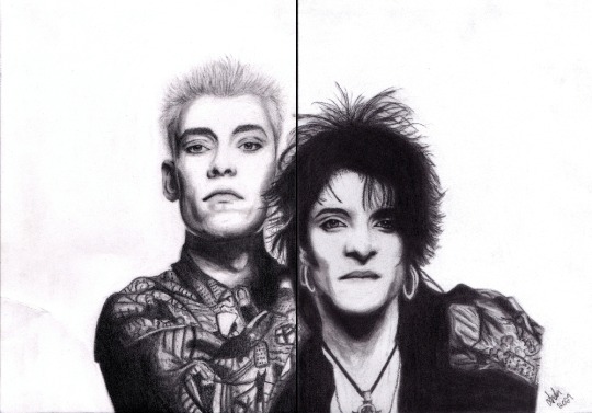
ATTENTION: The original post about that drawing, with better image, behind this link.
This post is solely about the process itself with lots of pictures and also plenty of gifs, because I promised to do one if people would like to see that and I got some comments saying that they’re looking forward for that. So, here’s now that post!
For starters I have to apologize for the terrible quality that is the photos. I used my phone camera only and never thought about posting them, I just took them as a reference for myself and to show the progress to a friend and only after finishing the drawing I noticed that the angle of the camera causes a huge impact on the perspective of the drawing, so I sometimes might have done useless work when I thought some perspective was wrong when it was actually the photo that was wrong and not my work! I mean, take a look at these photos of the finished piece:

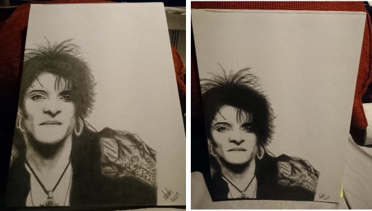
You see that? I realized this when I took maybe the second photo of the Farin sheet and looked at it and couldn’t believe my eyes because I didn’t remember drawing his torsto THAT small! And then I looked at the drawing and was like “wtf???” because it looked nothing like in the photo and then it hit me...
Also, another thing that I learn was that I might need to pay more attention to the perspective of the whole thing also because when I draw, I sit at the table so I am constantly seeing the drawing from my perspective instead of looking at it from above so that’s probably also going to affect the way I draw. I try to keep that in mind in the future so I can avoid redrawing things again and again just because my perspective is different than the reference photo’s.
Also the giant forehead of Farin’s in the photo on the right might have caused me to laugh a bit too much but anyway, let’s continue~ Or more like: let’s start for real this time.
Here’s the reference photo to y’all:

What I did in photoshop was to draw a line between them to see how I can divide the photo on two A4 papers. I had been thinking about this photo for some time already because it’s one of my favorites (but now I just feel cringy looking at it after I have drawn it... goddamnit!), and I got this idea that I could try drawing it on two papers in case I fuck up so I can start over or try again without having to do twice the work! Which was actually a good decision because this was the first version of Farin:

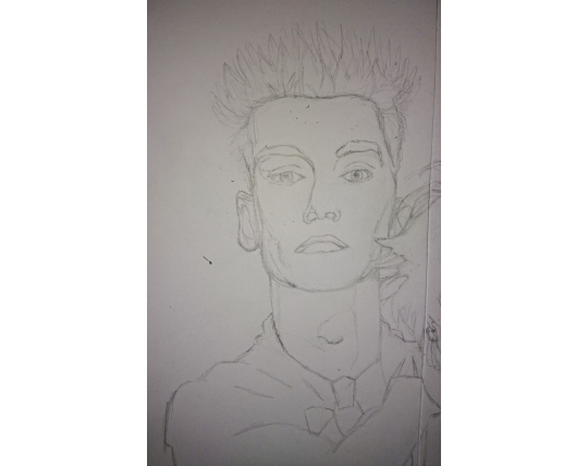
And it was awful. I also realized I had never drawn Farin’s face from he front. I have drawn him before from the side a few times but maybe once it came out actually good so that was why I decided to do the 2 paper method - because I knew it was not going to be an easy job! Bela is relatively easy to draw so I knew already that I would not have too many problems with that one.
I struggled with Farin’s eyes the most, at first.
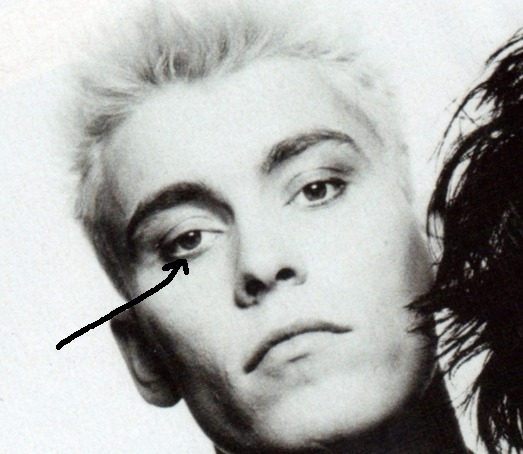
It took me a while to figure out how to do that white line in his lower lid. Keep in mind that this was my first face portrait in over 10 years so I was very, very rusty and I just didn’t remember how to draw like anything anymore. (The photo is tilted because Bela’s face is a bit tilted and my hand can’t draw anything that is not straight [lol] so I have to rotate the photo in order to even draw the sketch of Bela’s eyes.)
So I took my sketchbook and tried to do some eyes...
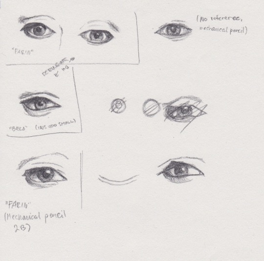
I was still struggling so much here until I remembered about blending. And I didn’t have my hopes high but grabbed the eyeshadow applicators (my fave tool for blending) anyway, and switched to my other sketchbook in case the paper was the issue and:

Blending. It was all about blending! So with that in mind, I realized I can continue and I don’t need to do these in my old way, everything doesn’t have to have a lineart done but some of the job is done not with the pencils but with the eraser.
Anyhow, the previous Farin looked really bad and was too big as well so I just discarded that and started a new sheet because the old lines were not coming off properly anymore. I don’t remember if this is the old face or new but I think this might still be the old one:
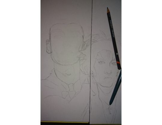
Yes it definitely is the old because look at those lines! This is the new sheet:

And in the photo you can see one of my pencils - I use Derwent Graphic pencils, it’s a 12 pencil set with very soft pencils, starting with H, F and HB and ending to 9B. With this one I used F, HB, B, 2B, 5B, 7B and 9B. The white pencil is actually my new love aka the eraser pencil Koh-I-Noor Hardmuth. It’s amazing, I recommend! I just didn’t order 10 new ones this other day. I actually used about 1,5 full eraser pencils on this drawing alone so that’s why 10.
Here’s a “little” gif of the process on Farin:
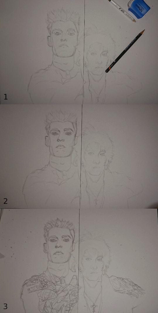
I felt crazy when I went for the shirt, and I felt like I was going crazy MEANWHILE drawing it but in the end I did it and I’m super proud of it!

Below is the reference photo, it was pain in the ass to follow all those lines with my eyes and try to find what was I drawing and where was I but I think I did good. That was a fun challenge.

Okay so, when I was done with the new lineart, I decided to go for the shading and blending because that’s what really makes the drawings to pop. I started with the left (his right, my left) side of Farin’s face because I’m right-handed, and in the first photo I had done just the left (right) eye and mouth and nose, but in the second there’s also the other eye done already:

Keep in mind this was not the last time I drew the eyes. Not even close.
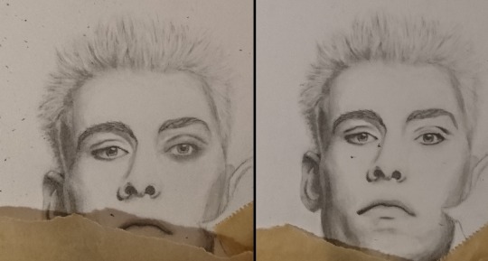
Something was off with the right (left) eye so I had to do that one again and I noticed that when you blend but haven’t erased and cleaned it yet, it looks like a black eye :DDD So here’s the before and after images of that cleaning. (Cleaning = I draw, blend, erase, draw and blend more when needed and then erase again, and repeat this as many times as I need until it starts to look ready to my eye.)
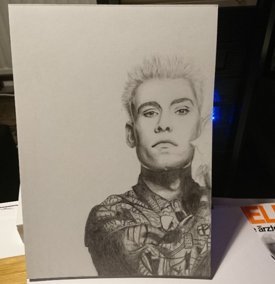
So here Farin was “finished” but if you still remember the final piece or compare it to it, you might notice it looks quite different. And you’re right. But more about that later, because at this point I started to work on Bela.

It actually started really well - I also had to do the whole lineart again because it did not match the size of “finished” Farin. I don’t remember if this is the first or second eye but when I had drawn his eye for the first time, I noticed it was not in line with Farin so I had to redraw it. A gif of the progress:
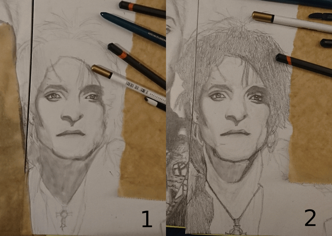
What’s that brown paper I’m using, you may ask? Well I noticed that people have some sort of paper on top of their art to keep it from smudging and I have no clue what that is so here’s my poor artist recommendation: baking paper! I tested it and it works (if you just remember to keep it under your hand, that is...) so that is, in fact, baking paper! :DD
I have drawn Bela’s face a few times before and he’s just so much easier to draw. In fact I used 4-5 days on Farin but I managed to start and finish (this version of) Bela just in one day. And that means that out of 12 hours (because I literally used the whole day for drawing) I used maybe like... 5h or something on Bela. That’s how much easier he really is to draw.
I don’t know wtf is wrong with Farin’s face but he’s extremely difficult to draw and I’m not the only one who has been saying this. I guess he just looks so regular but still unique enough to be difficult to draw. Bela then again has features that are very unique and very... caricature-like? I mean that just by drawing his nose or chin you can make a comic book Bela look exactly like himself, and with more realistic style his eyes already do a lot, but Farin’s really the opposite. My comic book version of Farin is literally the most basic version I can draw, it’s how I draw those characters and the only thing that makes him look himself is the hair, and his nose in a side profile. So I think that’s why it’s so difficult to draw him because he doesn’t look too regular but still regular enough to make is a very challenging task to do properly.
So yeah, the same day as I started working on Bela, I was also “finished” with the drawing:

Also look at how different it looks like from this perspective:
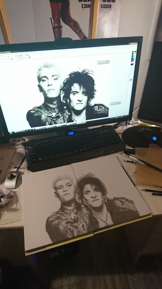
With the reference photo open in photoshop and I don’t understand how Bela looks more like himself in my drawing than in the photo. Also when I showed the WIP to my brother, he said that I somehow had succeeded at making Farin look more like Farin than what he does in the photo even. It’s weird.
But we were still far from finished. I was going to use the fixative on this soon but it just kept snowing the whole week so I couldn’t so every time I walked past the drawings, I stopped to fix this and that. For days I kept telling myself “I’m done, I can’t do more than this, I can’t do better than this.” and considered the drawing finished but still kept fixing things. Every time I was “done” with the other drawing, I saw something to fix in the other one and once that was done, I felt like the first one wasn’t as good and had to fix something from it too. And that led to a cycle where the other drawing was always better than the other and the worse one needed to be fixed. In the end I was hating the whole process and myself and my skills and I was already ready to abandon this whole thing and call it a day and never ever show it to anyone “because I cannot draw”. The photo above, here’s a list of things I redrew after that:
Bela’s eyes, the right (left) one at least twice.
Bela’s nose.
Bela’s mouth a couple of times.
Farin’s eyes x588045028520
And a list of things I kept fixing and fixing:
Bela’s chin.
Bela’s neck shadows.
Bela’s hairline.
Farin’s whole face was tilted so I tried to fix that.
Farin’s face was too wide, which meant also partially redrawing the ear.
Farin’s hair was too long and wide too.
Farin’s nose.
Farin’s mouth might be the only thing I drew only once and I’m actually still extremely proud of how it came to be. I did the lips solely with blending so that was super exciting to notice how I can use it for drawing and don’t need the pencils for everything!
During Bela’s eyes and nose and mouth especially I was hating myself so much and I felt like I was taking the risk of ruining the whole thing and a few times I was certain that was what I had just done too, until I somehow was able to save it again. But because of that, I wasn’t able to make Bela’s mouth any lighter anymore, the color wasn’t just coming off the paper so had to use what was there and make it look like it’s how it’s supposed to be, too.
Here’s a gif about those changes on Bela - the first one has the old eyes and nose, the others have minor changed on the nose and mouth:
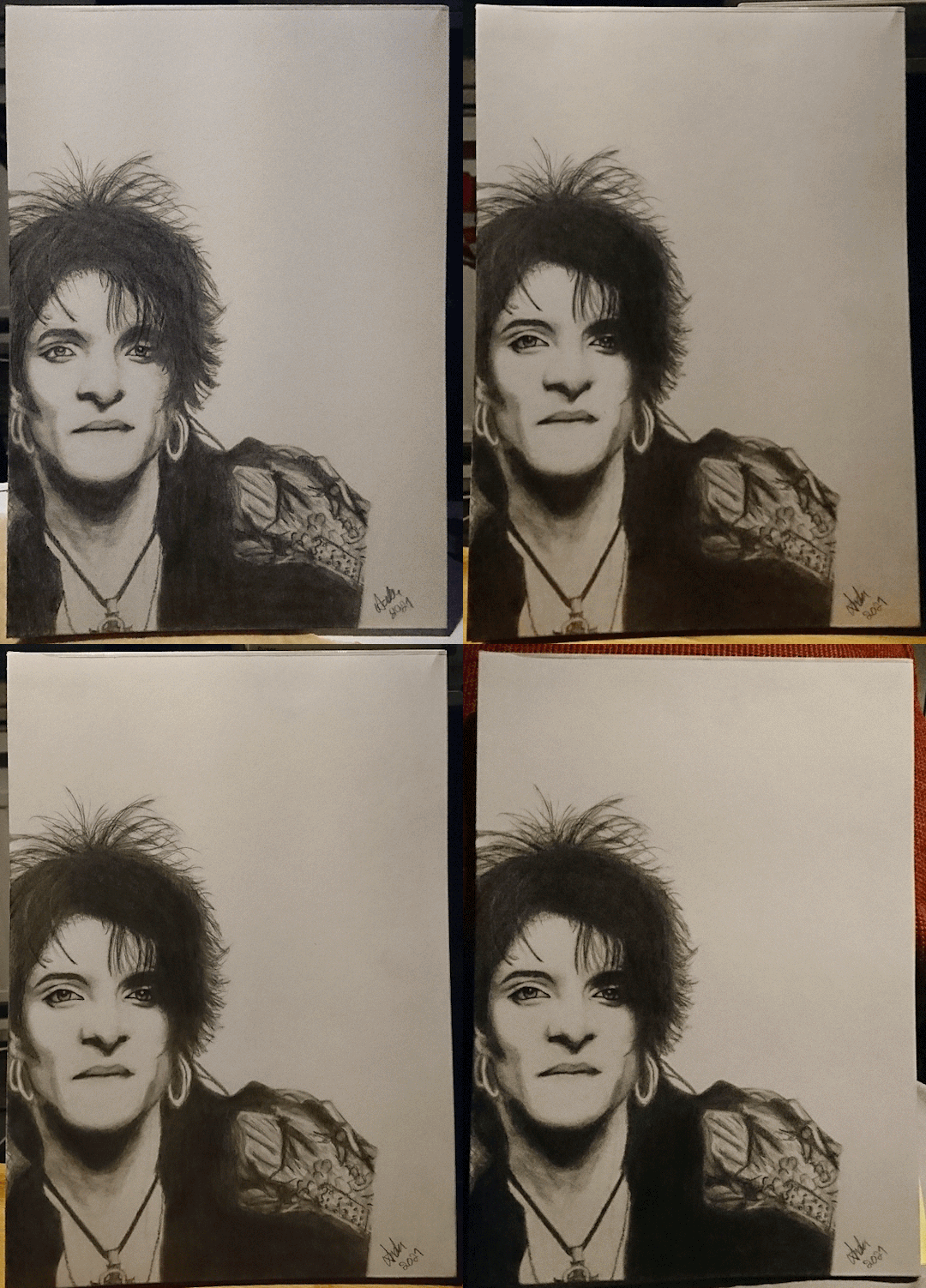
(The blacks probably don’t get any blacker in reality, I did add more color to it all the time but mainly it’s just the lighting and my phone camera changing the brightness.)
I did the final details on his nose without even using the reference photo anymore. The photo didn’t seem to make any sense anymore at all so I was just using my mechanical pencil and the blending tool and eraser to make is look better. To my eye it looked more like a very flat nose with a big tip of the nose and he doesn’t have a flat nose and I tried to get rid of that illusion. I still feel like it makes him look bit weird but I’m not entirely sure how. Maybe it was because of my improvisation, idk...
So, Bela was then finally finished for the last time. In the Farin piece his left (right) eye had been bugging me the whole time and I didn’t want to touch it but still I felt like I have to do something about it because it was bugging me way too much. I then figured I could draw the eye line by line and take a photo of it each time to see if it looks right already or not, maybe I could then avoid doing all the phases before I was sure what to think about it. I mean, now the only way to see if it was correct was to draw e.g. an eye from start to finish, I couldn’t see from just the lineart or unblended eye if it was in the right spot etc. And here’s that progress on a gif:
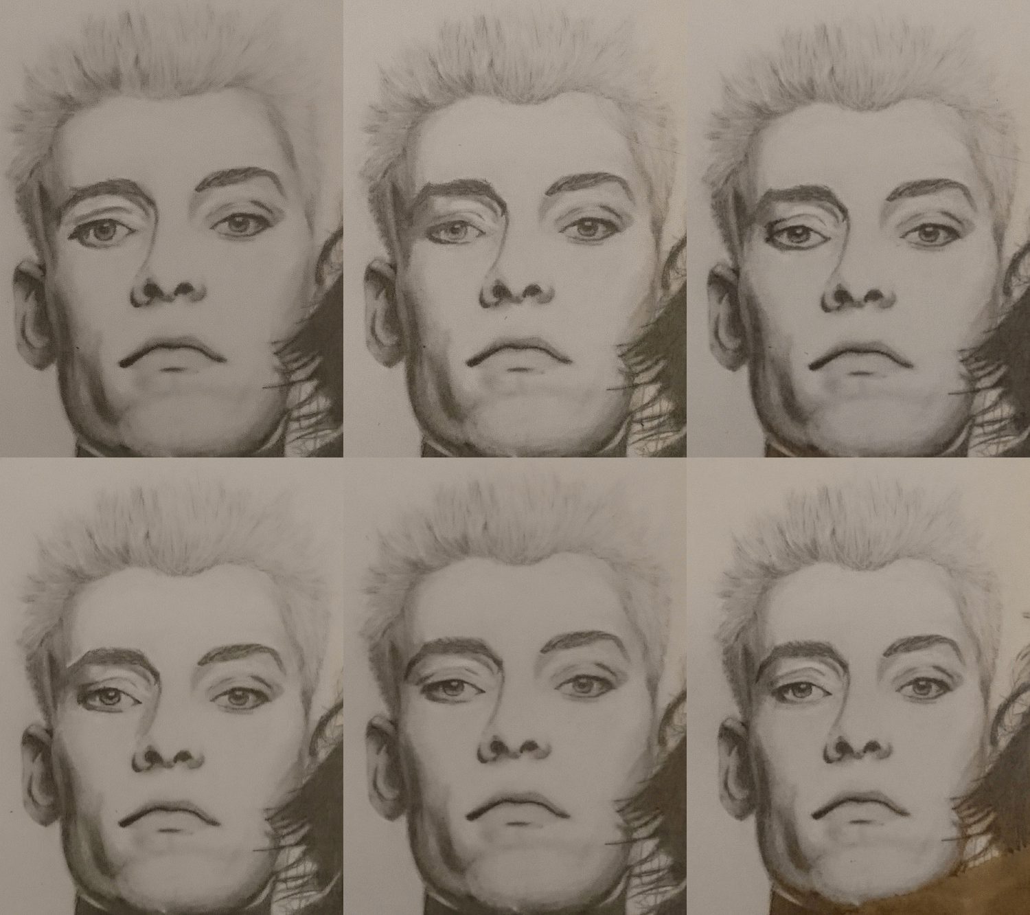
The gif about only the eye would look so nice if Tumblr didn’t make the gifs so HUGE - this one is actually only 300px or 400px or something:
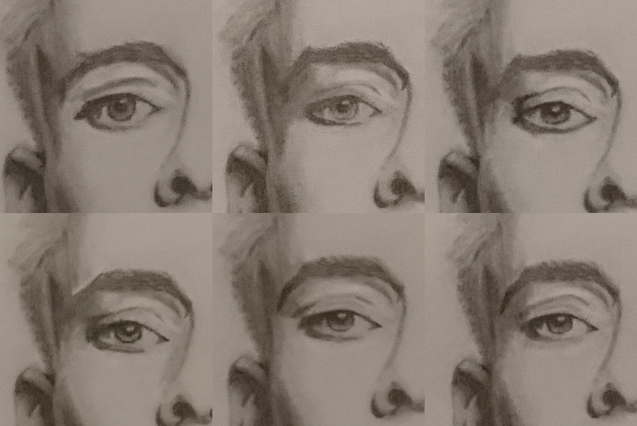
Apparently I also wasn’t happy with the other eye because:
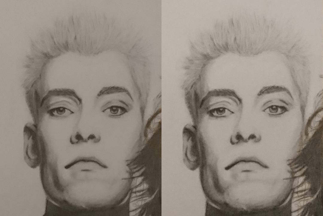
But good thing is: I really enjoy drawing eyes. I love seeing them to “come alive”, my favorite part was to eraser a bit of the color on the iris to make them look like they are actually shiny! It feels like something so small to do and yet it makes a huge impact on the drawing!
And here’s yet another gif of the whole Farin sheet with all of the changes, including the last changes that made his head narrower, and less tilted and more in line. Look at the left side of his head especially to see that:
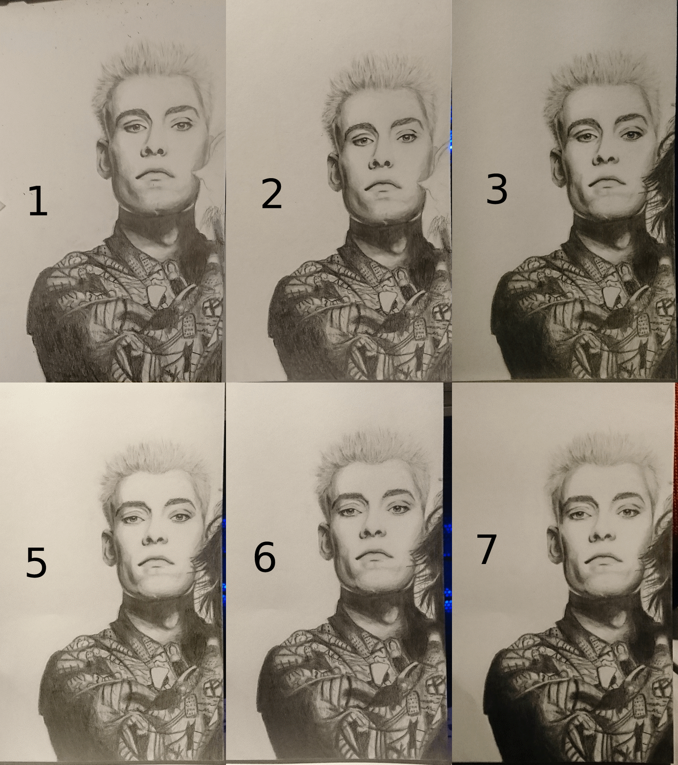
I can also see his nose changing between the first few photos. I keep forgetting about that but yeah, I also fixed that a little at some point.
And last but not least, the whole drawing in some sort of a timelapse gif:
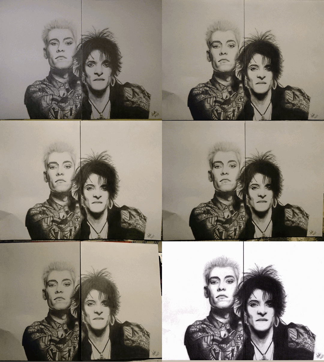
Last two are the same but just a photo and the scan of the finished drawing. I still keep seeing things I would do differently but no can do, I already used fixative on it, also to keep myself from obsessing with it any more :D And to use it as a study of some sort. I have never been able to draw a perfect pencil drawing and this isn’t one either. I probably never can draw perfect drawings from references.
I do enjoy the whole shading and blending process, so much so that when I was editing these photos, I just wanted to start drawing something so bad but I also figured that I start to lose motivation when I get to the point where everything should be finished but I just can’t make it perfect. Like the current WIP I have, all I should do is to get the proportions and perspective and the lines of their faces correctly and I would be ready but it feels more like a superpower some people possess and I’m not one of those. I don’t know what is it but I just feel that I cannot see. I don’t know how to explain it, but I can’t see what I try to do and somehow keep drawing everything the wrong way. Just like in this post’s drawing too. There’s still things that are wrong and I know what it is but I don’t know how to solve it. My hands just don’t listen to me and they can’t do what I think they should. I also think the reason I cannot draw perfect copies of photos is because you can always see my “handprint” in them. If I copy a photo, it will look like a photo and not like a drawing made by me. So I believe that in my drawing there’s always a part of me visible and I’m not entirely sure if it’s a good thing or not. On bad days it’s not a good thing, obviously. On good days? Well I guess it’s good then because it just means I have my own style which I really should appreciate. But I wish I had my style only when I want it to be visible, but I can’t control it. Just like I cannot write text by hand that would look like it was written with a computer, so I guess I should just try to get used to it, no matter how much it’d bug me sometimes.
14 notes
·
View notes
Photo




Amazons by Fade31415
[image: two sets of fanart featuring Amazon characters from DC. the first is whole body shots, the second is faces. they feature Io, Phillipus, Diana of Themyscira, Artemis of Bana Mighdall, Donna Troy, and Grace Choi. Io is wearing her comic outfit -- blacksmith apron, light loincloth/tunic thing on her lower half, boots, gloves, a headband, and no shirt. she is broad and wide and has short brown hair.
Phillipus is wearing her gold-colored armor and a red cape and red headband. she has long hair in dreadlocks and a slight but muscular build. Diana is wearing her wonder woman outfit she wore to fight medousa, sans the helmet, so she has the greek armored skirt thing instead of her usual underpants. she is tall and broad shouldered and broad shouldered and muscular. next to her is artemis of bana mighdall, who is around the same height (only slightly shorter than wonder woman), wearing a black outfit and white jacket with the sleeves rolled up, holding a sword. She has her hair tied back in a long ponytail. next to her is Donna Troy in her starry outfit that is black with silver boots and a silver belt. next to the other amazons she seems small but she’s 5′9″. finally is Grace choi, who is 7 feet tall and very buff, the largest of the bunch. she has reddish hair and is wearing a red crop top and black pants. she has tattoos on her upper arms and abdomen.
next there are close ups of the six women’s faces. end image]
end image, begin commentary
had a pretty autistic overwhelmy day so mostly just drew lineart and finished this
Recently I read through Greg Rucka's New Earth Wonder Woman Run...
Felt the need to draw some Amazons.
misc design decisions:
Io: Io got to keep her comic outfit. She felt way more naked than I thought she would drawing her in that outfit but id already finished lineart by time i realized that. oops. Io also got broadened up a little just to distinguish her from the other amazons more -- she was supposed to be big according to the back of the book notes but i wanted my other amazons to be bigger than they were in comics so...
Phillipus: phillipus actually got to keep her design in the comics. she’s wearing one of the many outfits she appeared in, I think this one being her down to business outfit.
Wonder Woman: Wonder Woman’s body type was changed slightly since I drew her last. she’s a hair more bottom heavy and her arms are a little leaner to better distinguish her from Grace. she’s wearing the outfit she wore to kill medousa (sans helmet) because i REALLY liked it. that said I can see why it was a one off because that plate skirt was a pain in the ass to draw.
Artemis: Artemis is drawn with the outfit she was given in the concept art in the back of the book because she changed her outfit every scene in the book and I didn’t want to find out which one was most artemis-y.
Donna: Donna doesn’t appear in this series (except at the way end when she’s trying to convince wonder woman to help her punch the universe ending threat in the face) but I drew her anyway because she’s an amazon and I like her. She has the same body type and face I gave her when drawing her in comparison to the other teen titans. Poor thing looks tiny smushed between Artemis and Grace but shes’ 5′9″ like she is in canon I swear
Grace: Grace also didn’t appear in this series but I love her so. She’s drawn pretty much how I always draw her, giant and buff. She really threw off the scale in this image XD Normally wonder woman would look tall and Donna would look average height, now Grace looks tall, everyone but donna and phillipus look average, and donna looks short :P
#dc fanart#amazons#wonder woman#diana of themyscira#dc comics#grace choi#donna troy#artemis of bana mighdall#phillipus#io#my art
26 notes
·
View notes