#briefclub
Explore tagged Tumblr posts
Text
Clothes are supposed to be neutral.


I believe in inclusive clothing, without any label separating who gets to wear what.
In this brief, I visualised that vision through a genderless clothing line, where you can get formal garment, party flashy clothing, to comfy stuff. All of them are available from size 2xs - 6xl.
As previous posts, this brief is from briefclub on ig, WeWear.
#Winih's portfolio#Winih's logo#Winih's graphic design#graphic design#clothing line#briefclub#briefclub on instagram#briefclub on ig#inclusive clothing
3 notes
·
View notes
Text

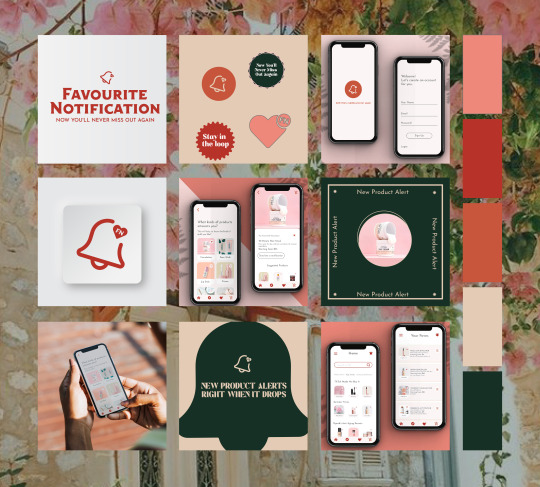
Who doesn't love a good notification? With Favourite Notification, you can get notified when your favorite beauty product has been restocked or dropped. You're guaranteed to love this notification app!
#branding#designbrief#designchallenge#graphicdesigninspo#creativechallenge#creativitychallenge#100daysofdesign#branddesign#brandinspo#moodboard#moodboardinspo#briefclub#thecreativebesties#branddesigner#socialmedia#socialmediadesign#thebriefbank#webdesign#artbrand#business logo#graphicdesigner#ui design#mobile app
1 note
·
View note
Text
THE BAGEL SHACK — BY: @callmejulesdesign ⠀ Via: @briefclub ⠀ — Submit your own...
THE BAGEL SHACK — BY: @callmejulesdesign ⠀ Via: @briefclub ⠀ — Submit your own…
THE BAGEL SHACK — BY: @callmejulesdesign ⠀ Via: @briefclub ⠀ — Submit your own work today on: » thedailytemple.com ⠀ — Discover all our temples: @brandingtemple @logostemple @thetempleacademy ⠀ — ⠀ #briefclub #designbrief #branding #packagingdesign #icondesign #illustration #graphicdesign #logo #logodesigns #logoinspirations #visualidentity #adobe #adobephotoshop #adobeillustrator #mockup #design…

View On WordPress
#adobe#adobeillustrator#adobephotoshop#branding#brandingtemple#briefclub#design#designbrief#graphicdesign#icondesign #illustration#logo#logodesigns#logoinspirations#mockup#packagingdesign#visualidentity
0 notes
Text

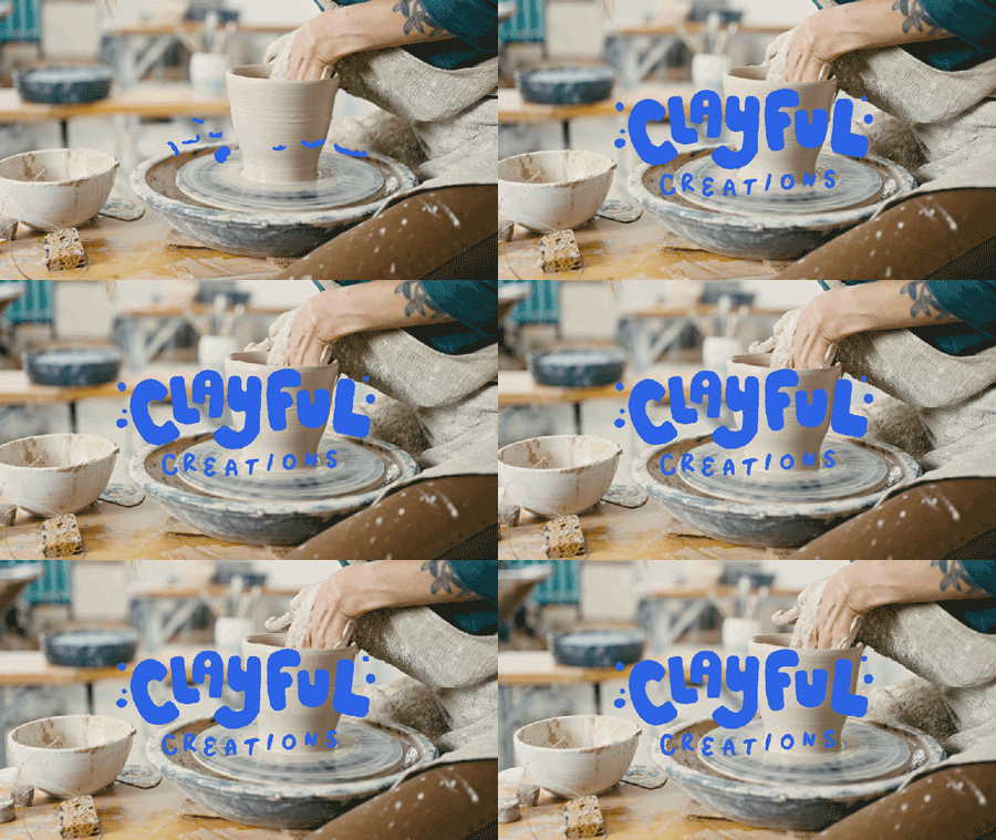
This week's free time was spent working on a fun and quirky brand called "Clayful Creations" - based on a brief by @briefclub on Instagram. Sharing the logo animation created using Procreate on Saturday night while watching Ghosts (BBC). Will share more about the brand soon, but feel free to drop by my Instagram to have a look!
2 notes
·
View notes
Text


DRIPD PACKAGING + STICKERS
•
•
•
DRIPD is a wall paint brand that require a logo and packaging design.
I've been inspired to create a brand loosely based on the CMYK color model, that has a young air to it. I wanted it to appeal to millennials and generation Z, who enjoy things that have a bald and funny side to them. The logo has 2 big components:
1 - the paint roller in the middle
2- the dripping/drooping writing
•
•
•
The packaging is pretty simple, putting emphasis on the "drip" part of the brand. The names of the paints are unique, as they are meant for a younger audience. I've made 3 types of paint cans ( spray, big can and middle-sized can ), a a mailer box and 3 stickers.
•
•
•
This brief was created by @briefclub on instagram. #thebriefclub #TBCdripd
4 notes
·
View notes
Text


these are some practice designs that I made from @briefclub on Instagram. I'm really happy with them so I want to include them in my portfolio.
0 notes
Text
Sometimes, we have to breathe... and talk.


This is a brief from briefclub on IG.
I took a break before making this, and I have to be honest, it felt so good. I had a great time designing the logo on this brief.
As someone who was in the psychology academy field, this was something of a personal vision on a therapy practice office - well, more one the basic branding side. I wanted something that has a calming, gentle effect. Something that's eye-catching but doesn't really cause any eye strain. Through this first visions, I try to translate it through minimum color palette, with enough contrast when they're used together.
The tagline, "breathe and talk," comes from a personal and friends experience. Sometimes we just have to keep breathing and talk about these things that's affecting us. It's also something that I've learned: that sometimes in a therapy session, you can just be. You can breathe it out, you can sit until you're ready to talk.
But of course, sometimes we need something more than that. And that's okay.
A note on the last photo, I noticed there are some therapy and/or meditating places that have cafe and eatery too. I think that's a fantastic concept, business-wise and human-wise. Because, hungry after a session? Need to replenish your water intake after crying? No worries, we have a place for you, just a few steps away.
Amazing.
#winih's logo#winih's graphic design#winih's portfolio#design brief#graphic design#logo#briefclub on instagram#briefclub on ig#briefclub
1 note
·
View note
Text
When we can be who we are, our souls are at home


This is another brief from briefclub on IG.
I made this at early June, and this is my vision on a real estate company who create a safe housing complex for everyone with marginalized identity. To make it even better, it's a children and elderly friendly space, as it has a daycare center, playground, communal park, and it only takes a few minutes drive/commute to reach the local national park where you can trek around or relax and enjoy yourself with a couple of companions.
The goal of this design is to create a welcoming atmosphere, which I tried to implement through the warm color palette and picture hues.
To be frank, I struggled on the logo. To me, it felt more like a camping / glamping situation rather than a housing business logo at first. But I like how it all turned out. It has that emphasize on the nature part, and a little symmetrical play.
On another note, I'd like to play around with more geometric shapes in the future to create logo in this type of industry. There's a lot of room to grow from here.
#winih's portfolio#winih's logo#winih's graphic design#graphic design#briefclub#briefclub on instagram#briefclub on ig#design brief
1 note
·
View note
Text
Techno to Rock n Roll, all in one fest!


A three-days music festival where you can feel serene, lost in the atmosphere of great performances and companies.
This is my take on briefclub's brief on Instagram, Serenity Fest. I found this brief challenging and fun at the same time. Through this brief, I was reminded how important it is to have a clear vision of design style that's going to be used. Once it's settled, it's good to go.
Before starting, I only had a logo design in mind. As I tried to design the poster, I realized I don't really have a solid vision on what kind of style I'm going to use.
This was where I paused and regroup with my notebook. Once the final layout is drawn and I decided on some cutout style, it was truly fun to create.
Lesson learned!
#Winih's portfolio#Winih's logo#Winih's graphic design#graphic design#briefclub#briefclub on instagram#briefclub on ig#design brief
0 notes
Text
Fresh cookies while strolling around? Give me a dozen of those, please.


This was definitely another great brief from briefclub. I love exploring this style through fnb products.
I feel like fnb market is always full of competition, and from my observation indie products/brands are having a harder time staying afloat compared to long established franchise. Therefore, I think logo, overall branding and vibe are incredibly important.
While designing this, I asked myself, "How to make this cookie brand stand out without going astray from their niche?"
In this post, I also included the color palette used both in the logo and the loyalty card, and an early sketch of the logo.
#Winih's portfolio#Winih's logo#Winih's graphic design#graphic design#logo#cookies logo#briefclub#briefclub on ig#briefclub on instagram
0 notes
Text
A dance studio for everyone.
We mean it.
You need a space to practice, but doesn't really have a budget to rent a proper dance studio? Worry a little less, because Harmony in Motion is here!


Story time 😗
Back when I was in the first grade of high school, I was in a dance team for a basketball competition. But the thing is, our team didn't have enough money to rent a dance studio as many times as we want. Hence, this whole studio concept was based on an idea "what if there's a dance studio that has a program to help students and lower-class group use this space?"
This Harmony in Motion brief is by briefclub on instagram, and this is my take on it. I designed the program concept, logo, posters, and merch as seen in this post.
#Winih's portfolio#Winih's graphic design#Winih's logo#briefclub#briefclub on instagram#briefclub on ig#dance studio#harmony in motion#design brief
1 note
·
View note
Text
Canned Kombucha for this summer, anyone?


Kombrew, a canned kombucha, is a brief made by briefclub on Instagram.
This was my first time designing a logo and mockup. It was such a fun experience exploring what this brand could be!
#Winih's portfolio#Winih's logo#briefclub on ig#briefclub on instagram#briefclub#fnb branding#beverage branding#komucha#canned kombucha#kombrew#Winih's graphic design#graphic design#logo#branding
1 note
·
View note
Text
More of Fresh Tarte for #theglowandgrowclub #branding #brandingdesign #brandin...
More of Fresh Tarte for #theglowandgrowclub #branding #brandingdesign #brandin…
More of Fresh Tarte for #theglowandgrowclub #branding #brandingdesign #brandinspiration #briefclub #thebriefclub #thebriefbabes #passionproject #graphicdesign #designinspiration #logosai Source

View On WordPress
#branding#brandingdesign#brandinspiration#briefclub#designinspiration#graphicdesign#logosai#passionproject#thebriefbabes#thebriefclub#theglowandgrowclub
1 note
·
View note
Text

DRIPD LOGO VARIANTS
•
•
•
DRIPD is a wall paint brand that require a logo and packaging design.
I've been inspired to create a brand loosely based on the CMYK color model, that has a young air to it. I wanted it to appeal to millennials and generation Z, who enjoy things that have a bald and funny side to them. The logo has 2 big components:
1 - the paint roller in the middle
2- the dripping/drooping writing
•
•
•
The packaging is pretty simple, putting emphasis on the "drip" part of the brand. The names of the paints are unique, as they are meant for a younger audience. I've made 3 types of paint cans ( spray, big can and middle-sized can ), a a mailer box and 3 stickers.
•
•
•
This brief was created by @briefclub on instagram. #thebriefclub #TBCdripd
1 note
·
View note
Text
Coco Crunch Display & text font de chez @pangram.pangram
—————————- Abonnes...
Coco Crunch Display & text font de chez @pangram.pangram —————————- Abonnes…
Coco Crunch 🥣🍫🍓 Display & text font de chez @pangram.pangram
—————————- ✔️ Abonnes toi pour voir plus de truc cool ! —————————- @briefclub #thebriefclub #TBCcococrunch #creativeglowchallenge #logoinspiration #logo #graphicdesign #branding #logomania #webdesigner #webdesign #logomaniachallenge #packagingdesign #logochallenge #packaging #typography #graphicdesigner #brandingdesign #restaurant…

View On WordPress
#branding#brandingdesign#creativeglowchallenge#food#graphicdesign#graphicdesigner#identitychallenge#logo#logochallenge#logoinspiration#logomania#logomaniachallenge#packaging#packagingdesign#pangrampangram#restaurant#TBCcococrunch#thebriefclub#typography#webdesign#webdesigner#webdesigninspiration
0 notes
Text
︎ Don’t Be Afraid to Express Yourself • W.I.P. for @briefclub’s new weekly bri...
︎ Don’t Be Afraid to Express Yourself • W.I.P. for @briefclub’s new weekly bri…
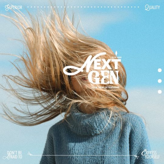
✳︎ Don’t Be Afraid to Express Yourself 🌈 • W.I.P. for @briefclub’s new weekly brief #tbcnextgenhair 💇🏻♀️ . ✨ Next Gen ✨ is a high-quality hair extension company with a mission to provide luscious, voluminous 100% natural hair extensions of all styles & color for any individual wanting to change up their look & express themselves — whenever they want❣️ . Business card concepts (possibly more?) on…

View On WordPress
#branddesigners#brandidentitydesign#branding#brandphotography#colourpalettes#digitalcontent#freelancedesigner#graphicdesignerlife#graphicdesignersclub#hairbrand#hairextensions#lajollacove#logodesigners#logodesignersclub#northparksandiego#passionproject#practice#productphotography#sandiegodesigner#sandiegoliving#tbcnextgenhair#thebriefclub#theglowandgrowclub#typography#weeklybrief#welovetype
0 notes