#brent noll
Explore tagged Tumblr posts
Text
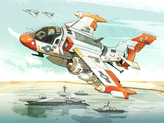
S-3 Viking Submarine Hunter
46 notes
·
View notes
Note
Hello! I was wondering if you had a higher quality version of this image?

I found this on the ToA fandom wiki and it seems to contain some kind of diagram for Draal's arm, but the quality is atrocious, do you possibly know of a higher quality version that I could find for better reading of the diagram?
There isn't higher quality of his arm online officially buuuut:

Somebody did send me a really good scan of it for art reference a few years back. Alas Brent Noll didn't include it with his uploads though we did get a ton of other interesting stuff so it balances out.
113 notes
·
View notes
Text
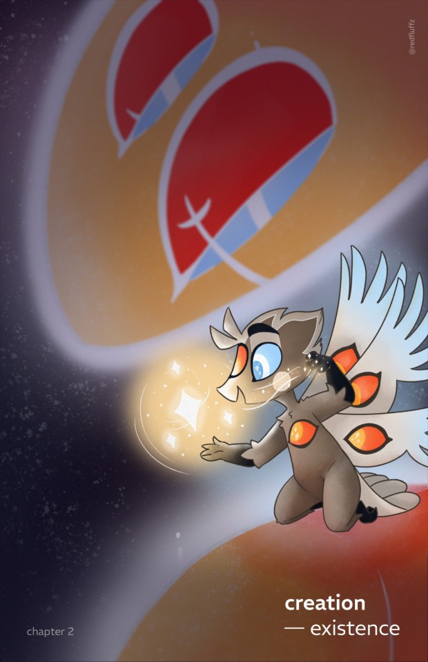
So today i watched some videos from
and guys it helped so much creating this cover :D
I'm really happy of the result. :) Now i need to color all the pages. Haha ...
#See ya in hell when i'm done#cause when i'm done#i'm probably dead#but worth it#hazbin hotel#hazbin hotel heaven#hazbin hotel lucifer#hazbin hotel god#hazbin hotel fanfiction#hazbin hotel headcanon#creation existence
28 notes
·
View notes
Note
What/who are some inspirations for your art style ?
I absolutely love styles like yours !! But aren't sure how to start studying it without accidentally outright copying the way someone else draws.
Hello! Thank you for the question :)
I definitely developed my style growing up by looking at classic Disney artists such as Milt Khal, and was very inspired by both Jin Kim and Cory Loftis who are both animation artists working today. Go check them out!
These days I don't think about style at all and just draw the way I like to draw-- though some of my most recent obsessions/inspirations are @galoogamelady here on Tumblr and My2k on Instagram/Bluesky. I love how they both capture specificity in character and acting and have incredible draftsmanship. They actually make me insane and anytime I see their art I start foaming at the mouth like a rabid dog
Studying styles that excite you and make you feel inspired is honestly one of the best ways to grow your skills! What you do in your sketchbook is for you, and there's nothing wrong with study as long as you aren't claiming an exact copy of someone else's work is yours. I do personal studies of artists I like every so often and I always learn a lot whenever I do. Keep it fun for yourself, and you'll keep drawing!!
I would also say that while "Style" FEELS super important if you are early on in your art journey, great drawing comes from a solid understanding of fundamentals. The more you understand what you like about the work of others and do your best to study and apply it in your own, the more growth you'll see that is specific to YOU and your own personal style and taste.
BaM Animation on Youtube is a great place to learn some fundementals about basic western-feeling animation/comic style art in a fun and digestible. I can think of more resources to look at if you like, feel free to DM me or ask again.
Best of luck!
3 notes
·
View notes
Text
youtube
Rick and Morty vehicle artist Brent Noll talks about the process of drawing cars.
7 notes
·
View notes
Text
Major Study Proposal Research #2: A dive into games.
For my pitch idea in relation to the upcoming Major Studies assignment, I had been wanting to create a concept of an upcoming game. I have taken a look at a plethora of video game catalogues, which involve a variety of potential styles to take forward with. While studying certain products, I had envision a style of narrative that I wanted to take forward with into my production: The 'first person' storyline perspective was something of interest to me.
The Last of Us (2013) was a game product that focused the perspective of its main characters as the 'pinnacle' of gameplay; the story fixates on the lives of Joel and Ellie, and how their relationship bloomed as many values are explored throughout both their character arcs.
This kind of gameplay allows its players a chance to connect to the characters in a more meaningful way - a way which ensures that they are even more immersed in the environment of which revolves around said characters, thus giving a more insightful approach to the aspects of 'world-building' that the game establishes within itself.
In relation to realistic gaming graphics, this also brings out the best of its high resolution elements; the often over-the-shoulder gameplay involved throughout not only brings focus on seeing through the lens of its characters, but also makes it easier for the game's audience to engage with the environment which surrounds said characters. Nashville Film Institute (NFI) states that the purpose of using over-the-shoulder shots is to "scene more dynamic", as well as offer a "connection or a level of intimacy to the viewer, specifically when two or more characters are having a conversation" (NFI, 2024). With the game revolving around its two main characters, this use of shot works best.
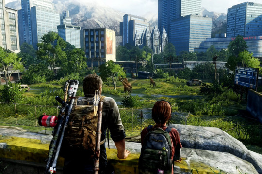
Fig 1.: The Last of Us (2013)
From this refreshing viewpoint, The Last of Us left me mesmerised with its overgrown environments and spurts of nature. While I ran through the potential ideas of what my pitch product would be, I wanted to get started on establishing possible environment settings.
To hone my artistic skills, I want ahead to start a new canvas and painted a forest environment. One tip I took while on this course was from freelance background painter Milica Mastelica, who heeds beginners on the risk of over-detailing; "achieve the most with the least amount of brushstrokes" (2023). She also points out to prioritise the biggest shapes first before branching out any relevant details.
I followed Mastelica's advice and stuck to adding a bit of detail to the objects in the front, as opposed to the solid shapes kept simple at the back.

This is mainly just to help me settle with my new brush pack, provided by my tutor. The specific plant brushes allow me to shortcut certain fauna and so enables me to have more time to focus on shaping up the trees all around.
Additionally, I wanted to try some colouring in Photoshop. Since my first assignment, I have stuck to colouring advice from BAM animation’s environment artist Brent Noll in discussing the theories behind colour combinations and tones; colours within art featuring 'cool' tones and 'warm' undertones can tell a viewer of how an area is "safe, healthy and living" (Noll, 2023).
That said, I also wanted to play around with painting a scenery with bright daylight. Regarding the advice provided to me, I experimented with both cool and warm tones in my piece to see what colours would work well together.

Granted, this could still use some improvement and perhaps more testing of perspectives, though this piece helped me consider if I would like to take the 3D route of a game idea at all - the fictional style within this work appears nice, as well as the simplified forms behind the foreground. This will be something I would need to apply more research in.
Sources:
BaM Animation (2023) Painting Backgrounds for TV Animation! Photoshop. 14 Jun 2023. Available at: https://www.youtube.com/watch?v=MKtcsF5IUF0 (Accessed: 26 April 2024).
Mastelica, M. (2024) Instagram. Available at: https://www.instagram.com/milicamastelica/ (Accessed: 26 April 2024).
Nashville Film Institute (2024) Over The Shoulder Shot. Available at: https://www.nfi.edu/over-the-shoulder-shot/ (Accessed: 20 April 2024).
Naughty Dog, Iron Galaxy (2013) The Last of Us [Video game]. Available at: https://www.playstation.com/en-gb/games/the-last-of-us-part-i/ (Accessed: 16 April 2024).
0 notes
Text
Creating Concepts:
Project 4: Light and Shadow
After briefly exploring the character design I wanted to include in this project, I swapped to focusing on the environment design for this concept. This task was challenging for me, as I was stumped as to where I should start planning my 3D background. So, I looked into a few artist channels on YouTube and came across some useful tips in creating an effective and strong background for art.
Nach Rubel posted a tutorial about composition, explaining how he creates complex pieces by deconstructing his work into priorities followed through in a simple order; he advises to start the design with big shapes, while focusing on values - the mid ground tone comes first. Rubel explains he uses references and key themes (desert, ruins, etc.) to produce unique designs for his compositions.
youtube
Rubel states that for a composition to come together, the relationship between the main shapes in the environment needs to firstly be established. Methods like rule of thirds can be used to create an easy flow for the viewer's eyes towards a focal point in a composition.
Additionally, BAM animation, a channel dedicated to teaching viewers about the industry standards of animation, also explains the significance of values determining information within environment design. Visual development artist and guest of BAM animation video Allison Perry advised to prioritise values over hue for the purpose of clarity within a composition; greyscaling can fix any wrong choice of colour, as well as help establish a focal point onto an important object within an environment.
youtube
Brent Noll of BAM animation also explains the method of 'atmospheric perspective', which is an artistic illusion from our perception of objects appearing 'faded' from far away, due to natural dust and moisture 'obscuring' its image. Noll explains that its useful for separating objects within a background to focus a viewer's attention to whatever is important. In typical compositions, these atmospheric objects lack detail and saturation to help connect the environment as a 'framing device'; this corresponds to Rubel's method in leaving out focus of objects that are further away from the view of his environment.
Overall, this is the main safe advice that all artists use regarding environment. Any details from far away or aside from a focal point is left out, to ensure the viewer reads information of the composition better and know exactly what the focal point is within the piece.
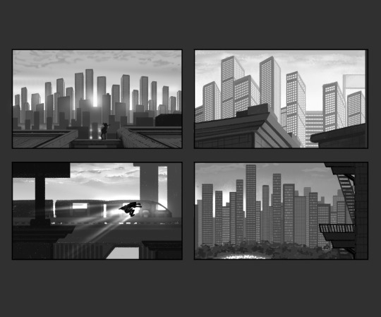
With these artists' methods and the mood boards I provided for myself beforehand, I went ahead and produced some thumbnail work to experiment with my environment piece, including spacing and values. I took reference from the Spider-Man (2018-2023) films in adding specks of light within the building blocks, as well as the gradient values between the sky and city. I applied the spacing of buildings I studied from the environment of Mirror's Edge (2008), and decided to add a few details showing the aging of my city as seen from Stray (2022). This practice was to help me improve my skills in shading, as I mostly struggled with my values in previous works.
Since I only had a week to explore this, I ended up picking the most simple but readable composition among the four; granted it was not so refined, but I was able to alter that when I refined the angle through modelling in Maya.
Sources:
BaM Animation (2023) Painting Backgrounds for TV Animation! Photoshop. 14 June 2023. Available at: https://www.youtube.com/watch?v=MKtcsF5IUF0 (Accessed: 17 January 2024).
BlueTwelve Studio (2022) Stray [Video game]. Publisher OR Available at: https://store.steampowered.com/app/1332010/Stray/ (Accessed: 17 January 2024).
DICE (2008) Mirror's Edge [Video game]. Available at: https://store.steampowered.com/app/17410/Mirrors_Edge/ (Accessed: 17 January 2024).
Nach Rubel (2020) Easy way to create a thumbnail for concept art. 28 December 2020. Available at: https://www.youtube.com/watch?v=REyYFLSxqTE (Accessed: 17 January 2024).
Spider-Man: Across the Spider-Verse (2023) Directed by J. Dos Santos [Feature film]. Culver City, LA: Sony Pictures Releasing.
Spider-Man: Into the Spider-Verse (2018) Directed by J. Dos Santos [Feature film]. Culver City, LA: Sony Pictures Releasing.
1 note
·
View note
Text

~ BRENT NOLL ~
Brent Noll is an animation production artist who specialises in prop and background design. He has a youtube account named BAM Animation.
•NOTES•
He loved watching cartoons and drew very well as a kid
He worked with many companies ans studios, one company was StarMap, where he designed characters in the classic Hana Barbara style.
After watching Beauty and the Beast as a kid, Noll was infatuated with the creation of the film, and wanted to draw like an animator

•ART ANALYSIS•
Various art styles mainly cartoony
character, background and prop art
cell and smooth shading
able to adapt to different styles
bold colours
0 notes
Photo
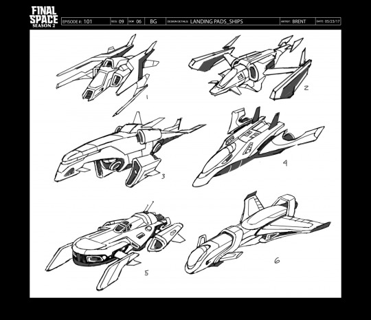
From: Chapter 11: “The Toro Regatta”, Season 2
By: Brent Noll
Source: https://brentnoll.com/project/3d-models/
20 notes
·
View notes
Photo
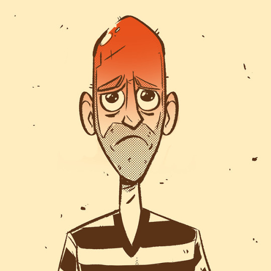
This is Why Brent wears a hat!
12 notes
·
View notes
Text

Art of the boys at @bamanimation! Good stream today!!! 🎉
#bam animation#maximus pauson#brent noll#cartoon#illustration#my art#digital art#procreate#character design#drawing
0 notes
Video
tumblr
Here’s a break down of my animation process. This all took about 12 hours to complete. (not including designing the character) This is a demo for my 2d animation class which im teaching this fall. I made it in Adobe animate CC and drew the background in Photoshop.
#2d animation#animation#pencil test#artists on tumblr#cartoon#brent noll#character design#background design#adobe anima
153 notes
·
View notes
Text
Nomura Design Path
Apologises for the slight delay on this, health issues cannot be helped. Storyboards from Just Add Water will be crossposted tomorrow.
While there is a solitary addition in the artbook where her human form has swepy bangs instead of a fringe and wearing gloves, we're fairly lucky in that there's a fair amount of Nomura's concepts are online! This one by Headless Studios is the earliest so it's unknown if she was a hit the ground running after being redesigned from The Crooked Man or there was anything else prior.
Her weapon choice being swords seemed to settle fairly early though and were basic katana at the time. Her hair style, limbs, belt and horns appear to have been the biggest back and forth until settling on a combination.
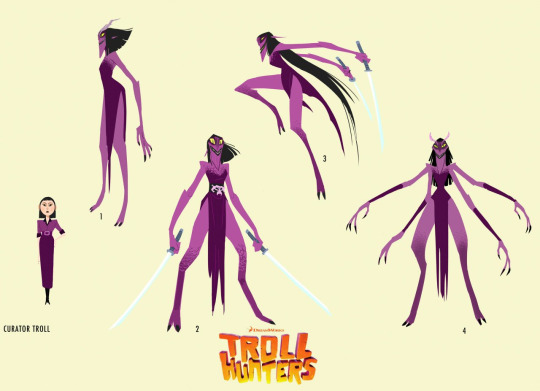
[Source]
We also have this beefy slide that appeared at the 2016 Annie Awards, where Trollhunters won best Character Design, that contains two additional expressions too.

[Source]
And one extra from the official instagram for luck.
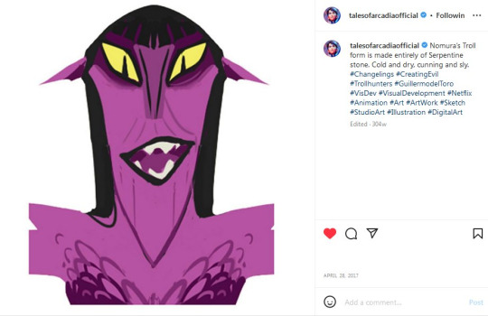
[Source]
In addition thanks to Rustam Hasanov, Trollhunters' Art Director, we have a maquette of her! This is a video with a turnaround.
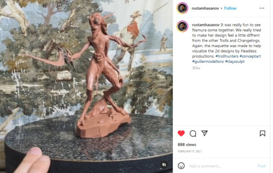
[Source]
But wait you might be thinking, she has the khopesh already here so where did those come from? Well thanks to Brent Noll we can answer that one! Below shows Headless Studios with the updated Nomura design holding one of her fabled weapons. From this he created a full break down including angles, perfect for evil perspective needs.

[Source] Will need to scroll down a bit there's no direct link.
In addition to that, Jessica Bulinski has both a Nomura paint over of the changeling herself, a good look at her weaponry and a full process of how exactly it lights up. Because the eye glow is an effect it's not shown here meaning you can see the base colour easier.
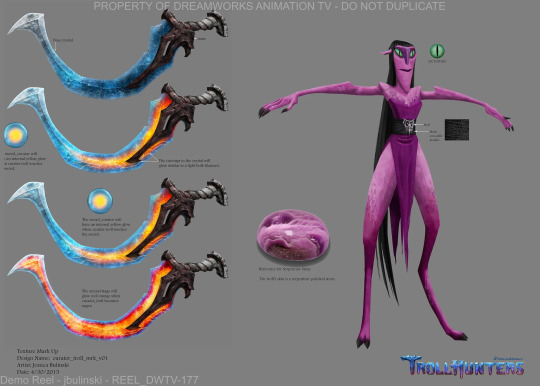
[Source] Will need to scroll down a bit there's no direct link.
Enjoy the chaotic gremlin/Curator Troll! All previous design threads now have titles too to make them easier to spot, debating making a specific tag.
She's awful and we love her for it.

#Trollhunters#Tales of Arcadia#Rise of the Titans#Vis Dev: Headless Studios#Vis Dev: Rustam Hasanov#Vis Dev: Brent Noll#Vis Dev: Jessica Bulinski
76 notes
·
View notes
Note
aaahh hi, i've been a follower for some time now and wanted to spill the beans to say that your art is a great key motivator and inspiration for me. you and a few other artists are the reasons why I got back into drawing and pursuing animation as a career. I'm also gonna start going digital with my art and I would like to ask what app you currently use for your art and how you do your art( i.e. pro tablet, ipad etc.). thank you very much! your art brings me much joy, take care!
Waahh messages like these are really what keep me going, im glad to one of the few that push you back into that art groove, its a pleasure and one of the many reasons why i persue art as a passion 💕 its a pleasure :']
As for what tools i use, recently ive upgraded to an ipad pro + apple pencil, the art program i use is procreate, which doubles as both an art and animation app, and can be finnicky to use at first compared to other programs, but becomes smooth sailing once you get used to it, it also costs 10$, but there are free alternatives! For example, as a beginner I used medibang paint, which is a pretty great app to start off, but this is just my recommendation/the programs im familiar with! There are plenty more choices before you jump straight into buying procreate, the choice is yours :]
In case you're looking for good art sources as well for art/animation tutorials, here are some channels i recommend:
49 notes
·
View notes
Note
Hi! I just wanted to say that if you didn't already know of them, I found BaM Animation on YouTube to be a great resource!
Thank you for sharing this great resource with me! <3
- Al
46 notes
·
View notes
Text
Rick and Morty - S4E10 “Star Mort Rickturn of the Jerri” Podcast Summary/Breakdown
I said I’d keep doing these breakdowns if people were interested, but I was also waiting for a podcast that gave some good analysis/trivia on the characters and writing process. And what better podcast to summarize than the one about the season finale? I recommend watching it yourself if you have time.
(Link to full podcast video here!)
The interviewed staff this time are Erica Hayes (director), Anne Lane (writer), Brent Noll (lead prop designer), Steve Levy (associate producer)
The way episodes get scheduled/made is that the writers try to break as many stories as possible and see what sticks within the production time they are given. If they have to rewrite an episode a lot it can possibly get pushed to later in the season than they originally intended
This episode wasn’t necessarily always going to be the season finale during the early writing process, although it was always intended to be in the latter half of the season
Star Wars is so big in our culture that there is seemingly an obligation to trope it, which the writers are kind of exasperated about, so that led to the type of referential humor in this episode
Justin Roiland was the one who wanted Rick’s internal organs to be partially cybernetic/synthetic, and it wasn’t initially in the storyboards. It’s also meant to show that Rick’s enhanced and able to take more punishment than a regular human
The placeholder music for the Phoenixperson VS Rick fight was heavy metal, which made it feel almost DBZ-ish, but they toned it down once the actual track had to be composed because they wanted to focus on the brutality of the fight
The writers try to never force characters/plotlines to come back early, and their idea is that characters should only be brought back when it’s the right/optimal time to use them
They’ve been discussing whether or not Beth is a clone in the writers room since early in Season 4
Anne Lane points out how the show—and, in a way, its take on continuity and its own internal canon—seems to be predicated on “nothing matters”, a viewpoint often shared by Rick, but that philosophy is constantly called into question and shown as not true by characters such as Morty, because things do matter to them on a personal and emotional level. Family matters, their experiences matter, humanity matters. If this was the “Rick” show, it would probably be entirely episodic, but a canon exists regardless because no matter how much Rick tries to deny it, he himself is also human and cannot help feeling human emotions.
The invisible garbage truck gag was originally going to be a part of the main episode as a culmination of Morty and Summer’s plotline. It was planned to get teleported onto the Federation ship, driven by Jerry, and brutally crush guards into a gory pulp while they couldn’t even see what was killing them. The gag was cut because it didn’t help the story enough, but everyone was still really attached to the concept, so it got moved to the post-credits scene instead
The original episode title they came up with was “Star Mort: Bethisode 2: Ricktack of the Clones”. They chose a different Star Wars title to riff on since this version was obviously too spoilery
Space Beth’s spaceship was intentionally designed to look like Rick’s spaceship, as he originally built it for her when he sent her off into space and she’s been making upgrades to it ever since
The Gromflomites’ insectoid ship designs weren’t created until season 2 despite the species originating since the pilot
The interviewed staff are absolutely aware of the fans who idolize Rick, and they believe that viewpoint has become less popular in the fandom as the show went on due to the show increasingly highlighting Rick’s flaws and making it clear how terrible he truly is. Pickle Rick and Dr. Wong’s speech was brought up as an example
The writers didn’t actually go into Season 4 planning “this is the season where Rick is taken down a peg”. It was more of an organic result of the writing as they broke the story for all the episodes, as well as coming from an interest in telling stories about Rick that focused on the side of him that he doesn’t want expressed, rather than focusing on the “badass smartest man in the universe” schtick that we’re already familiar with
They were still aiming to be consistent with depicting Rick’s character in Season 4 as someone who, following Beth taking control of the family back in the Season 3 finale, is trying to not “rock the boat” too much while still attempting to find ways to get away with what he did in the past. They were basically looking at Rick as someone struggling to find his place in his family and the universe this season
Despite the huge episode order and having 60 episodes left to go, they don’t really plan ahead or focus their energy further than a season-by-season basis (10 episodes at a time). So they probably don’t have any massive character arcs set in stone this far in advance, they mostly play it by ear
Rick and Morty is an incredibly difficult show to make from an animation standpoint compared to other adult/”edgy” cartoons due to how high-concept and ambitious its environments, characters, and camera shots are. It’s especially stressful because they said that they reached a point recently where they juggled 3 seasons at once, which has never happened in the show before.
They try to cope with the high demands of the animation by reusing background characters and environments whenever possible. They try not to reuse background characters that got dialogue and then got killed off, though, for the sake of continuity. They also try not to use stock aliens that have gotten recycled too much in past episodes.
A lot of the gun assets are reused throughout the show. The weird organic bug-gun Beth used in this episode was a new design, and it apparently gave Brent Noll a lot of difficulty in the prop design phase
A caller asked what Roiland and Harmon were referring to in a past interview which heavily implied there was a Season 4 post-credits scene which would lead into Season 5, and all of the interviewed staff were confused (since no such scene exists and they don’t recall any from development) and came up with different theories about what they might have been talking about. They also point out that most post-credits scenes are written as jokes and that the only real plot-related one was the Tammy and Birdperson one back in Season 3’s premiere episode. They prefer to keep implied future plot elements within the episode itself. “They’re not like Marvel post-credits scenes.”
The Wrangler jeans joke came pretty late in the process and wasn’t an actual paid advertisement. It was given to the Gromflomite ship as its weakness because the Gromflomites are very corporate and they were already parodying the Death Star trope so they wanted it to feel hackneyed
The Zeus fistfight and the Phoenixperson fight weren’t meant to be parallels to each other despite how brutal they were in episodes released back-to-back. Initially the planet-fucking episode was placed earlier in the season so it was mostly a coincidence. Also, the Zeus fight was meant to be more of “a dick measuring contest between two idiots” rather than anything impressive or epic
The reason Beth turned the clone decision back onto Rick is that she realized the choice he gave her was, once again, him stepping back from the responsibility to care about his daughter. So Beth attempted to force Rick to choose for once in his life whether or not he wanted her around, and he failed to commit to even that, which was the cowardly action needed for Beth to move on from her father’s emotional neglect.
Steve Levy dismisses the allegations that only the first and last episodes of the season advanced the plot, as the staff consider character growth to also be part of the canon and something that is advanced throughout this season (using Morty’s character as an example). They also have pointed out that they’ve done canon-heavy episodes in the middle of past seasons before, such as the Ricklantis Mixup in Season 3, and it was only by coincidence that Season 4 had the major lore episodes be the bookends.
They also point out that some episodes that fans consider “filler” can be called back to later, retroactively making them important to the canon, so there’s always an implied level of continuity going on unless they explicitly call out an episode as non-canon (like the story train episode)
The interviewed staff don’t know when Season 5 is coming out, but they do believe it will be sooner than past seasonal gaps
Many of them are currently working on Season 5, and some of them are even working on Season 6
Erica Hayes is currently working on a different show because the board artists/directors are usually first in the process, meaning they wrap up work first and have to find other work in the meantime. She’s wrapped on Season 5 and expects to be back for Season 6 once the scripts are ready
And that’s it! Hope this was comprehensive enough for y’all to enjoy. (And now, I wait for Season 5′s podcasts.)
11 notes
·
View notes