#maximus pauson
Explore tagged Tumblr posts
Text

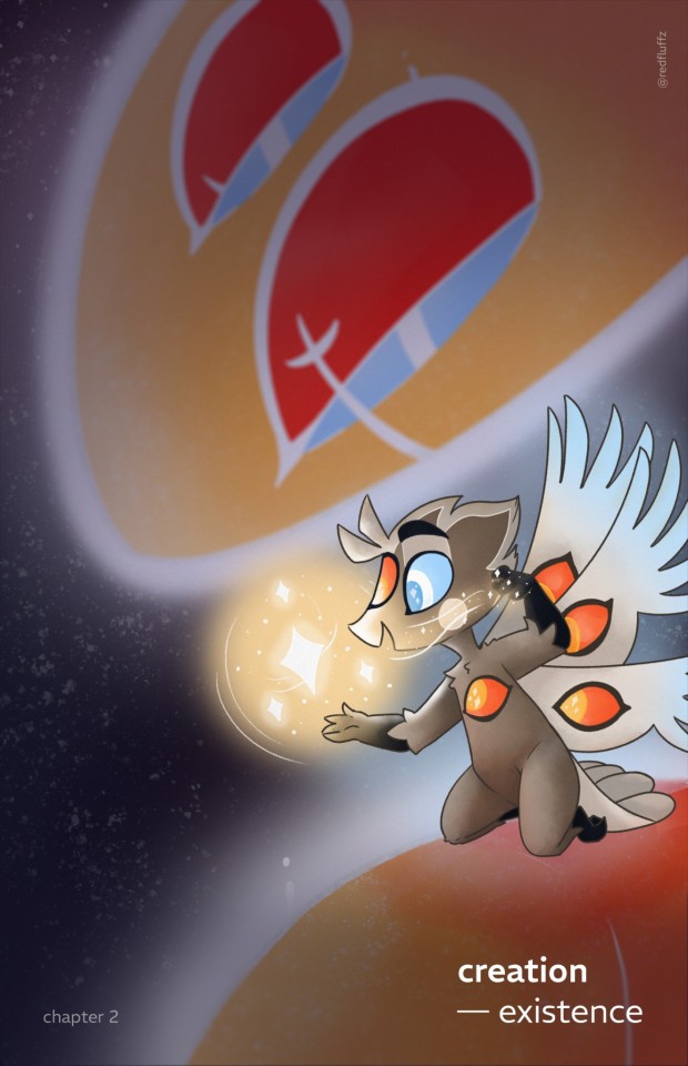
So today i watched some videos from
and guys it helped so much creating this cover :D
I'm really happy of the result. :) Now i need to color all the pages. Haha ...
#See ya in hell when i'm done#cause when i'm done#i'm probably dead#but worth it#hazbin hotel#hazbin hotel heaven#hazbin hotel lucifer#hazbin hotel god#hazbin hotel fanfiction#hazbin hotel headcanon#creation existence
28 notes
·
View notes
Note
What/who are some inspirations for your art style ?
I absolutely love styles like yours !! But aren't sure how to start studying it without accidentally outright copying the way someone else draws.
Hello! Thank you for the question :)
I definitely developed my style growing up by looking at classic Disney artists such as Milt Khal, and was very inspired by both Jin Kim and Cory Loftis who are both animation artists working today. Go check them out!
These days I don't think about style at all and just draw the way I like to draw-- though some of my most recent obsessions/inspirations are @galoogamelady here on Tumblr and My2k on Instagram/Bluesky. I love how they both capture specificity in character and acting and have incredible draftsmanship. They actually make me insane and anytime I see their art I start foaming at the mouth like a rabid dog
Studying styles that excite you and make you feel inspired is honestly one of the best ways to grow your skills! What you do in your sketchbook is for you, and there's nothing wrong with study as long as you aren't claiming an exact copy of someone else's work is yours. I do personal studies of artists I like every so often and I always learn a lot whenever I do. Keep it fun for yourself, and you'll keep drawing!!
I would also say that while "Style" FEELS super important if you are early on in your art journey, great drawing comes from a solid understanding of fundamentals. The more you understand what you like about the work of others and do your best to study and apply it in your own, the more growth you'll see that is specific to YOU and your own personal style and taste.
BaM Animation on Youtube is a great place to learn some fundementals about basic western-feeling animation/comic style art in a fun and digestible. I can think of more resources to look at if you like, feel free to DM me or ask again.
Best of luck!
3 notes
·
View notes
Text
youtube
How Shows Like Rick and Morty Are Animated (ft. BaM Animation) by Zaid A
A video essay on how Rick and Morty is animated. Featuring Maximus Pauson, a character designer and artist for Rick and Morty.
0 notes
Text
Concept Art:
Development Project 2: Light and Shadow
At this point in time, I am now at the stage where I focus on the environment design of Light and Shadow, as well as how to integrate both my character and the 3D city world together.
youtube
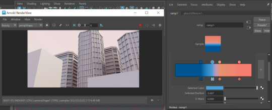
Yone Santana posted a video exploring the different ways of lighting up an environment to create an 'exterior' lighting through Maya's Arnold feature, which allows users a whole variety of different controls of lighting their stage up; I could manipulate the exposure of my light, the intensity as well as the choice of, and amount of, colours I want in my lights. This feature was available to me through adding a sky dome or physical skylight.

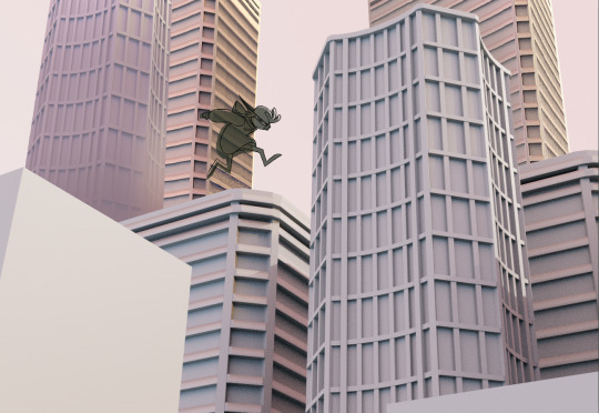
In regards to the main purpose of the project's 'light and shadow' theme, I also added in a strong directional light to mimick a 'daylight' hour in my setting, then rotated it to make it appear as the foreground is exposed to the intense lighting compared to the background buildings, which are instead hit by the 'sunlight' from behind.

This distinction of shading between the foreground and background was me applying what I learnt from BaM animation's video of significance in values of environment, which visual development artists Allison Perry discussed how certain shades of value can set up a stage for the main focal point of the environment - in this case being the two basic cubes in front of the camera.

Yone Santana also showed how users can create further advanced sky dome light through its gradient feature, were one can choose and control what colours can represent the shade in an environment as well as the light. I had a colour palette in mind to compliment the relationship of the city foregrounds and backgrounds, as well as what I envisioned my cityscape character to resemble; the chosen colours were orange and blue.

Maximus Pauson of BaM Animation explains how colours can indicate the mood of a scene; certain colours signify warnings to viewers, such as red and orange evoking a sense of danger. Darker colours like blue can appear mysterious, but depending on the saturation, the shade can be unwelcoming, thus making an environment appear "harsh and unforgiving". Generally, most environments use a palette of specific colours that would 'harmonise' with each other, such as triadic, analogous and complementary colours - orange and blue are such examples of complementary colours.


Granted, it is a subtle palette of oranges and blues within this Arnold lighting, though I would have decided to saturate these colours in a 2D software during its editing anyways. Prior to the past blogpost, I also implemented dynamic silhouette over my 3D piece to plan out how Kenz would be travelling on the foregrounds of this composition.

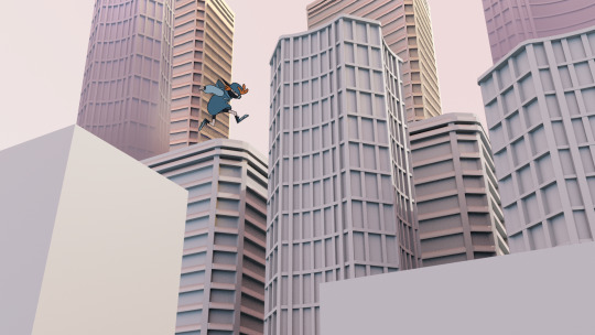
To compliment and symbolise the environment's colours of orange and blue hues, I also applied them to Kenz's colour scheme, which seems to suit him a lot and make him feel more belonging in this place, despite the obvious difference of 2D and 3D fields.

The lighter, orange tones could create a fast-paced, dangerous environment for my cityscape, whereas the blues of greyish tones can further indicate how urban life can seem uninhabitable. However, my character is able to adapt in the city, as I imagine him as a quick and wary individual. This is why I have decided to choose these two colours for both my environment and character design.
In my next and final blogpost, I will find a way to properly mix these two fields together and present a strong piece that overall offers a unique approach of style in visual development.
Sources:
BaM Animation (2023) Painting Backgrounds for TV Animation! Photoshop. 14 June 2023. Available at: https://www.youtube.com/watch?v=MKtcsF5IUF0 (Accessed: 17 January 2024).
yone santana (2016) Maya 2017 - Exterior Lighting in Arnold. 30 November 2016. Available at: https://www.youtube.com/watch?v=K3QNbkyEe4I (Accessed: 17 January 2024).
0 notes
Video
youtube
Do you Want to know the SECRETS of the animation and drawing?!?! I started a channel with my friend Max (we both are artists on Rick and Morty) where we help people get better at drawing. Come watch, chill out, laugh and learn on my new youtube series BAM Animation!
#cartoon#tutorial#drawing tutorial#brent noll#rick and morty#background design#character design#maximus pauson
35 notes
·
View notes
Text

Art of the boys at @bamanimation! Good stream today!!! 🎉
#bam animation#maximus pauson#brent noll#cartoon#illustration#my art#digital art#procreate#character design#drawing
0 notes
Photo

My design and turnaround of Pickle Rick. Color By Corey Booth...its been a really weird experience for me to see a drawing I did become meme’d to oblivion. It was hard to design tho...So I’m proud
#Pickle Rick#rick and morty#maximus julius pauson#Character Design#justin roiland#dan harmon#turnaround#model sheet
598 notes
·
View notes
Note
aaahh hi, i've been a follower for some time now and wanted to spill the beans to say that your art is a great key motivator and inspiration for me. you and a few other artists are the reasons why I got back into drawing and pursuing animation as a career. I'm also gonna start going digital with my art and I would like to ask what app you currently use for your art and how you do your art( i.e. pro tablet, ipad etc.). thank you very much! your art brings me much joy, take care!
Waahh messages like these are really what keep me going, im glad to one of the few that push you back into that art groove, its a pleasure and one of the many reasons why i persue art as a passion 💕 its a pleasure :']
As for what tools i use, recently ive upgraded to an ipad pro + apple pencil, the art program i use is procreate, which doubles as both an art and animation app, and can be finnicky to use at first compared to other programs, but becomes smooth sailing once you get used to it, it also costs 10$, but there are free alternatives! For example, as a beginner I used medibang paint, which is a pretty great app to start off, but this is just my recommendation/the programs im familiar with! There are plenty more choices before you jump straight into buying procreate, the choice is yours :]
In case you're looking for good art sources as well for art/animation tutorials, here are some channels i recommend:
49 notes
·
View notes
Text


Disenchantment characters designs by Maximus Julius Pauson (art_of_maximus)
#I love all those Steamland citizens designs#disenchantment#steamland#disenchanted#character concept#character design
56 notes
·
View notes
Note
Hi! I just wanted to say that if you didn't already know of them, I found BaM Animation on YouTube to be a great resource!
Thank you for sharing this great resource with me! <3
- Al
46 notes
·
View notes
Link
A very good simple breakdown on why commission prices should be higher on Tumblr. [Also known as more than 2-5$ for a fullbody+color]. Also has examples of union rates/An invoice sheet to use. Basically; Charge for your time. By the Hour and the amount of work it takes - be paid for your experience and practice in your abilities.
#[not mlp]#[Seeing low commission prices always makes me sad legit]#[You are all worth much more than that 10$ with a 3$ charge from paypal so 7$ for art]
7 notes
·
View notes
Note
He’s the first art YouTuber I recommend to people. The other two (and these ones cross over with animation processes, but I’ve found that comics and animation cross over a lot. You need the same understanding of position framing and emotion for the both of them.) are BaM animation and Toniko Pantoja’s YouTube accounts.
https://www.youtube.com/channel/UC4Qvpti1dS1KKC7PLyLl__g
https://www.youtube.com/channel/UCRTRqkhrehrY9hJJcLVUeRQ
Do you have any tips for drawing limbs (arms/ legs) at a different angle for perspective? (Idk if I explained good)
I don't actually have a good way to explain how I know to do them. I think about arms and legs as weird paper towel rolls attached to the joints of the figure im drawing. So whenever i draw them at weird angles I just think about them like that.
I would suggest watching Ethan Becker's art videos on youtube though, those helped me a lot.
95 notes
·
View notes
Photo


Property of Adult Swim. Any press or reposting requests must be directed to Adult Swim for approval.
Some of the stuff I painted from Rick and Morty Season 3, Episode 7 “The RIcklantis Mixup”.. aka “Tales From The Citadel”… Check out more on my website www.CoreyBooth.com
The is my favorite episode of the series as far as story telling and the only that has given me goosebumps.. I LOVED being able to paint the amazing Cowboy Morty and the Disintegrating Rick.
My friend Jack Cusumano painted the Morty Float and Jules Itzkoff painted the BG in the title card.
The WHOLE Rick and Morty crew CRUSHED IT again and I’m super honored to have a hand in this episode in particular.
Are you guys ready for some EVIL MORTY!? Who saw it coming??
Color Supervisors: Jason Boesch, Phil Vose
Character Designers: Maximus Pauson, Elisa Phillips, Justin Noel, Kendra Melton
Prop Designers: Kyle Capps, Brent Noll, Allen Tam
#Rick And Morty#Season 3#Episode 7#The Ricklantis Mixup#Tales from the Citadel#Evil Morty#Atlantis baby!!!#Cowboy Morty#Aww Geez#Cop Rick and Morty
1K notes
·
View notes
Photo


Dumping a bunch of Pickle Rick concept art from last night’s Rick and Morty episode. My design lead Maximus Pauson eventually streamlined the design to be much more simple, but it was fun coming up with as many concepts as possible. Also I don’t know why I drew a centaur as an option??
2K notes
·
View notes
Link
Hey guys! Our live stream is up to watch with @maximusjpauson @brent-tumbles ! Go like share and subscribe and watch out for the full interview with these two in a few weeks! Thanks again for joining us Max and Brent! Go check out their YouTube channel as well @bamanimation !
15 notes
·
View notes
Photo


Here’s some of my color work from Morty’s Mindblowers!
Character Designers: Truth Tortoise & the Neil Gaiman dude - Kendra Melton
Beebo - Maximus Julius Pauson & Elisa Phillips
Gobo - Carlos Ortega
Property of Adult Swim. Any press or reposting requests must be directed to Adult Swim for approval.
#rick and morty#rick and morty season 3#mortys mindblowers#truth tortoise#beebo#gobo#color key#color styling#ericomega#ericomegaart#egomega
201 notes
·
View notes