#blurred lights
Explore tagged Tumblr posts
Text
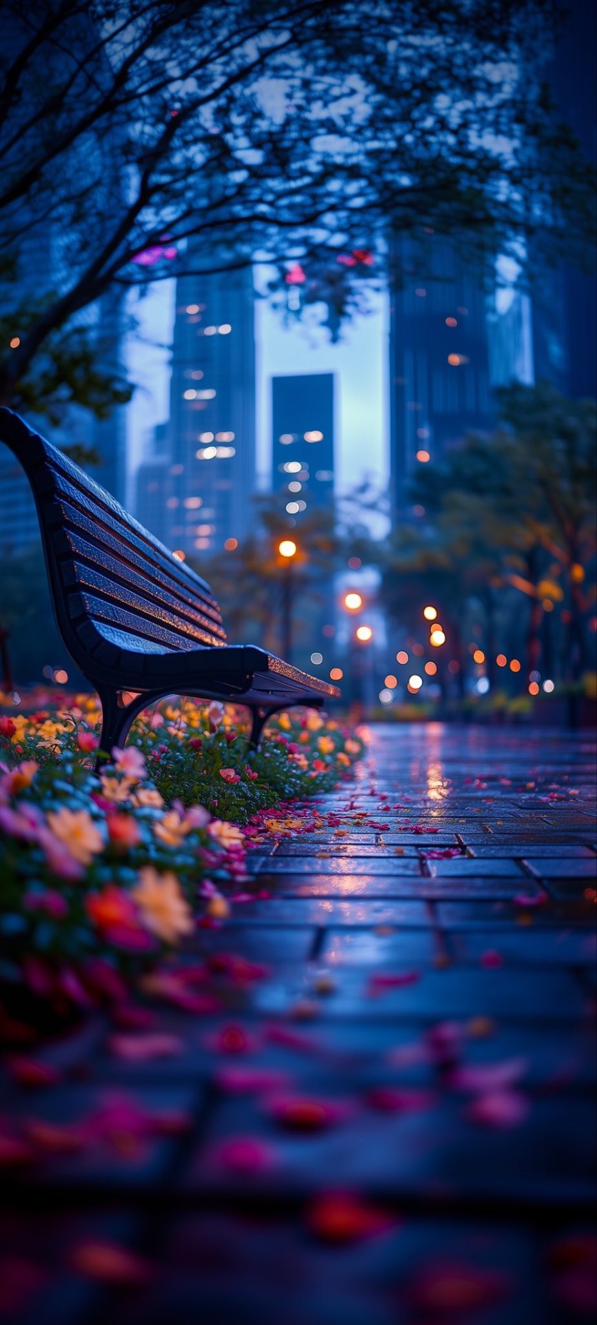
source: @piitures
9 notes
·
View notes
Text
Blurred Lights | Oeil
2 notes
·
View notes
Text
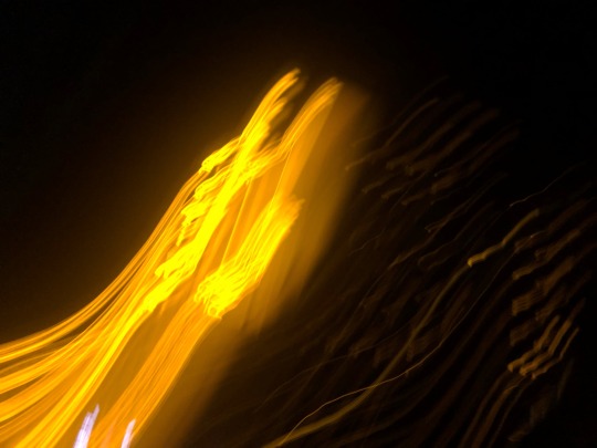
falling back in love with the idea of you
#original photography on tumblr#newpost#grunge aesthetic#2014 tumblr#nighttime aesthetic#blurred lights#falling apart#falling to pieces#lana del rey#blog post#my photos#tumblr stuff
0 notes
Text


#I think mc deserves some glitter pens#I know Polaroids don’t produce blurs and light like this but shhh we don’t think ab that#may redraw cover image but I just wanted to post#mcs photo gallery#my dear hatchet man#my dear hatchet man game#my dear hatchet man alan#mdhm#mdhm fanart#mdhm alan#alan orion#mdhm erika#erika vivián ramos#stu cassidy#mdhm stu#my dear hatchet man mc#fanart#art
2K notes
·
View notes
Text


look at them. they're in love.
#all my love to batcii for making me fall in love with this type of sunlight lighting in art. one day i will manage it the way sas does#ive been actively working on this since august 2024#ive had the desire to draw it since march 2022#not a single other art has taken me this goddamn long its genuinely been eating away my brain#ive looked at it so long i cant even figure out which parts i like and dislike anymore its all blurred together in my head#hp#jegulus#marauders#jegulus fanart#regulus black#james potter#james x regulus#regulus x james#james potter fanart#regulus black fanart#Marauders fanart#Mine#My art#*
907 notes
·
View notes
Text
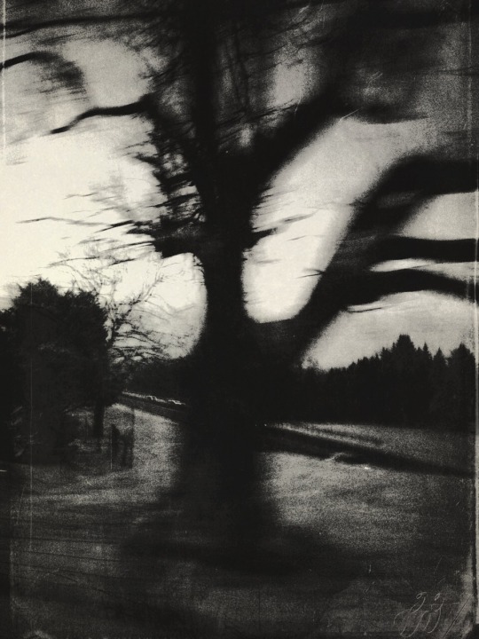
© Lía Serrano
//
#Lia Serrano#photographers on tumblr#original photographers#artists on tumblr#artwork#black and white photography#artistic photography#bwphotography#motion blur#dark nature#nature photography#dark photography#dark aesthetic#visual arts#lights and shadows#photo art#digital photography#pictorialism#haunting#1k notes
1K notes
·
View notes
Text
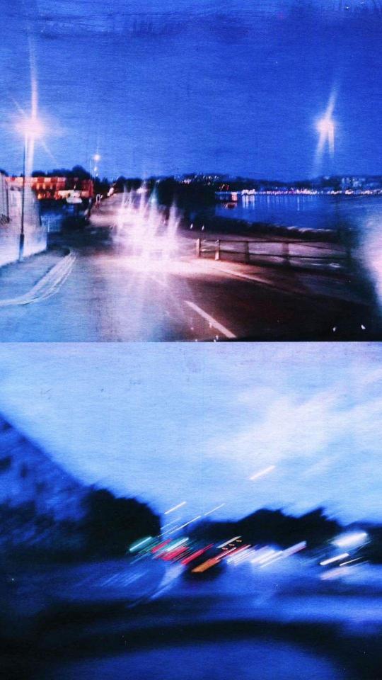
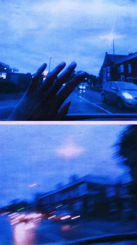
Romanticise night drive
#janasojka#jana sojka#art#artists on tumblr#nature#england#uk#kendal#contemporary#botanical#Night drive#Blue#blurred#Pink#streets lights#Lights#streetview#Red#Hand#mixedmedia#polish artist
514 notes
·
View notes
Text
I think 90% of my gripes with how modern anime looks comes down to flat color design/palettes.
Non-cohesive, washed-out color palettes can destroy lineart quality. I see this all the time when comparing an anime's lineart/layout to its colored/post-processed final product and it's heartbreaking. Compare this pre-color vs. final frame from Dungeon Meshi's OP.
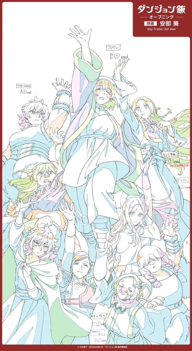
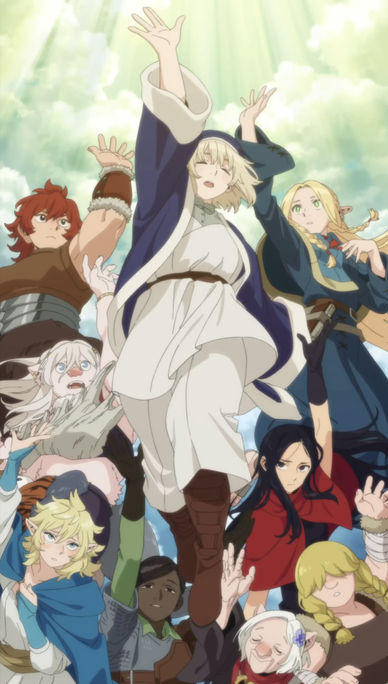
So much sharpness and detail and weight gets washed out and flattened by 'meh' color design. I LOVE the flow and thickness and shadows in the fabrics on the left. The white against pastel really brings it out. Check out all the detail in their hair, the highlights in Rin's, the different hues to denote hair color, the blue tint in the clothes' shadows, and how all of that just gets... lost. It works, but it's not particularly good and does a disservice to the line-artist.
I'm using Dungeon Meshi as an example not because it's bad, I'm just especially disappointed because this is Studio Trigger we're talking about. The character animation is fantastic, but the color design is usually much more exciting. We're not seeing Trigger at their full potential, so I'm focusing on them.
Here's a very quick and messy color correct. Not meant to be taken seriously, just to provide comparison to see why colors can feel "washed out." Top is edit, bottom is original.
You can really see how desaturated and "white fluorescent lighting" the original color palettes are.
[Remember: the easiest way to make your colors more lively is to choose a warm or cool tint. From there, you can play around with bringing out complementary colors for a cohesive palette (I warmed Marcille's skintone and hair but made sure to bring out her deep blue clothes). Avoid using too many blend mode layers; hand-picking colors will really help you build your innate color sense and find a color style. Try using saturated colors in unexpected places! If you're coloring a night scene, try using deep blues or greens or magentas. You see these deep colors used all the time in older anime because they couldn't rely on a lightness scale to make colors darker, they had to use darker paints with specific hues. Don't overthink it, simpler is better!]
#not art#dungeon meshi#rant#i'm someone who can get obsessive over colors in my own art#will stare at the screen adjusting hues/saturation for hours#luckily i've gotten faster at color picking#but yeah modern anime's color design is saddening to me. the general trend leans towards white/grey desaturated palettes#simply because they're easier to pick digitally#this is not the colorists fault mind you. the anime industry's problems are also labor problems. artists are severely underpaid#and overworked. colorists literally aren't paid enough to do their best#there isn't a “creative drought” in the anime industry. this trend is widespread across studios purely BECAUSE it's not up to individuals#until work conditions improve anime will unfortunately continue to miss its fullest potential visually#don't even GET ME STARTED ON THE USE OF POST-PROCESSING FILTERS AND LIGHTING IN ANIME THOUGH#SOMEONE HOLD ME BACK. I HATE LENS FLARES I HATE GRADIENT SHADING I HATE CHROMATIC ABBERATION AND BLUR
2K notes
·
View notes
Text
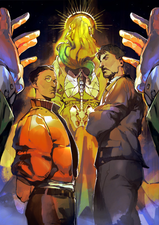
the gods of harrier dubois.
[ you exceed the divine, faithless, oh faithless. don't you know a turned back can be two things? i'll never ask which you are - a dismissal, or an invitation to follow.]
prints (all proceeds go towards purchasing e-sims for Gazans and helping re-locate Palestinian refugees)
#blustering effigy and sweet smoke inhalant#burnished light and disco-blurred haze#revachol sings in strings of you. i let her drag me along without complaint#disco elysium#harrier du bois#jean vicquemare#kim kitsuragi#dolores dei#dora ingerlund#stillindigo art#all words are mine. so is the art
2K notes
·
View notes
Photo
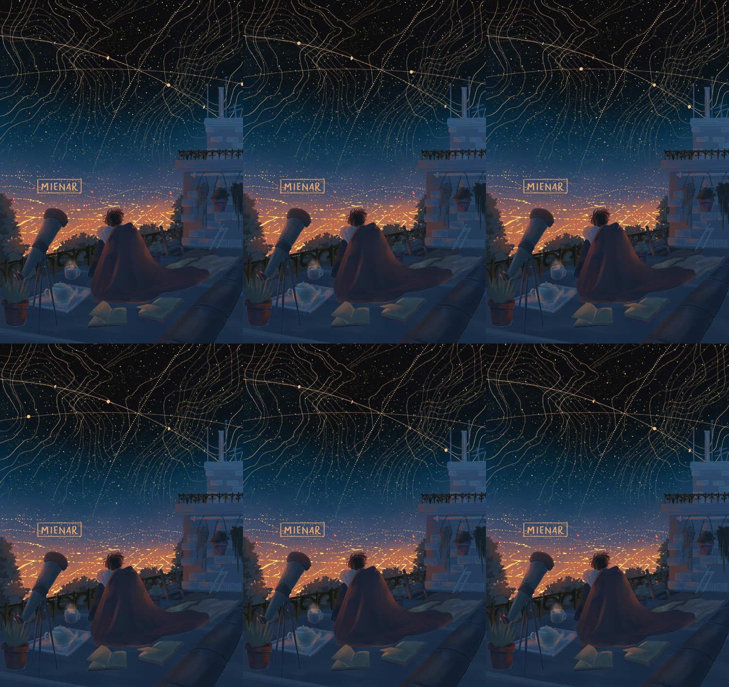
remnants of where we have been
instagram | shop | commission info
#artists on tumblr#animated illustration#animated gif#digital art#2d animation#environment art#environment illustration#backgrounds#background illustration#art backgrounds#night sky#constellation#cozy#myillust#hellooo! just wanted to drop by and share this piece with you!#there were a combination of ideas here: i wanted to do a glowing cityscape of its city lights and have it softly blur into the night sky#the title is also a big description for this i guess - 'remnants of where we have been' is like how the city lights were where humans were#the clutter around the character shows the remnants or the past of what they did#the map-like contours of the skies are like where the stars have travelled#idk i guess it's something that i think about often and it makes my heart ache sometimes;;#anyways! i really hope you'll like this! thank you so much for reading through this if you have and for your support as always c':
6K notes
·
View notes
Text
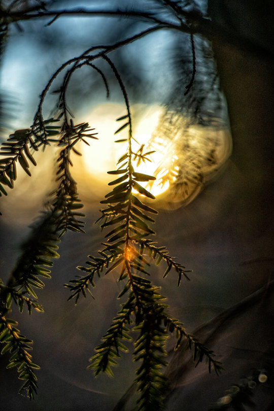
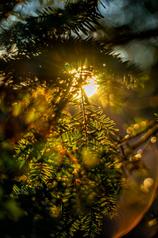
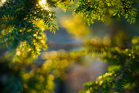
Winter Sun Yashica Yashinon 5.5cm f/1.8 Sony A7
#winter#sun#original photographers#photographers on tumblr#original photography#bokeh#light#winter light#winter sun#hemlock#hemlock trees#evergreen#blur#close up#close up photography#contemplative#contemplative photography#vintage lens#vintage lens photography#yashica#yashinon#sony alpha#Guy Biechele
381 notes
·
View notes
Text
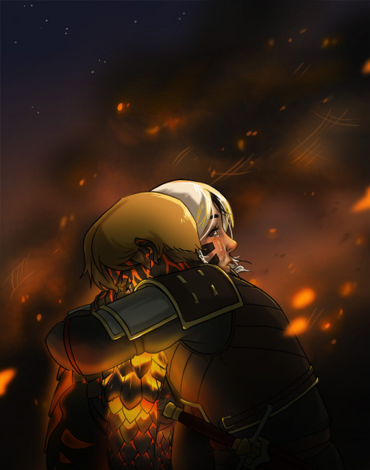
a heart of cinder cannot burn, a heart in ashes cannot break
so that trailer was super rude amirite
#GUESS WHAT I HATE#if you said 'object source lighting' you are correct#brrp bup BRRRRRP!! you've won a new toaster oven!!#at least this is better than last time i think even with the mad rush to get it out before s7#gaussian blur covers a multitude of sins lmao#the dragon prince#soren#claudia#kradogsarts
277 notes
·
View notes
Text
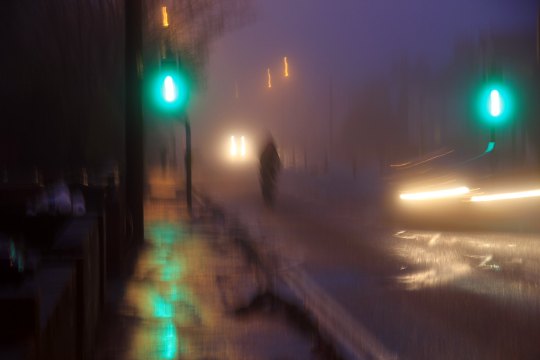
december 29, 2010
#flickr#2010#street lights#street#rain#motion blur#found photography#old web#webcore#search term: morning
346 notes
·
View notes
Text

skytober day 9 - constellation
i was so happy, i cried
#bonus points if you can recognize the pose references#tried to use motion and radial blurring to communicate motion but idk i think i used too much. too bad!!#skykid#skycotl#sky cotl#sky children of the light#sky children fanart#skytober
310 notes
·
View notes
Text

Listening to Ado sing is a religious experience
Also happy pride! Snuck some bi flag colors in here for the occasion 🌈
(no reposts; reblogs appreciated)
#my art#artists on tumblr#digital art#fanart#one piece#uta one piece#ado#pride#idk how to feel about this one tbh#but it was a very self indulgent painting btwn all the other stuff im working on#anyway the inspo is that ive always loved looking at concert photography#with the crazy lighting and colors#so i had to try it myself!#and im so late to this convo BUT#LETS TALK ABOUT ADO AS UTA#if (sort of) evil why voice so good#tot musica / where the wind blows / world's continuation are my favs#psa pls click for quality#tumblr im begging u to stop blurring everything
431 notes
·
View notes
Text
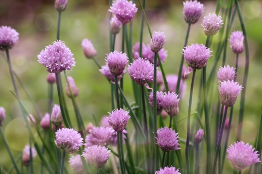
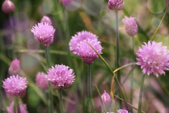
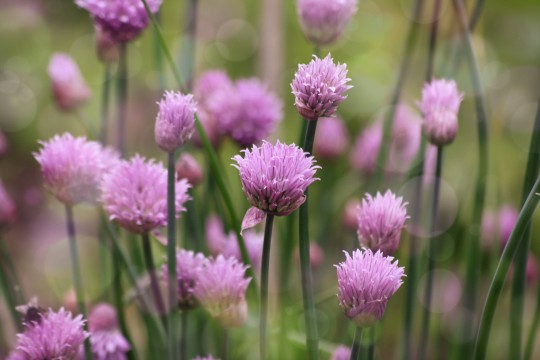
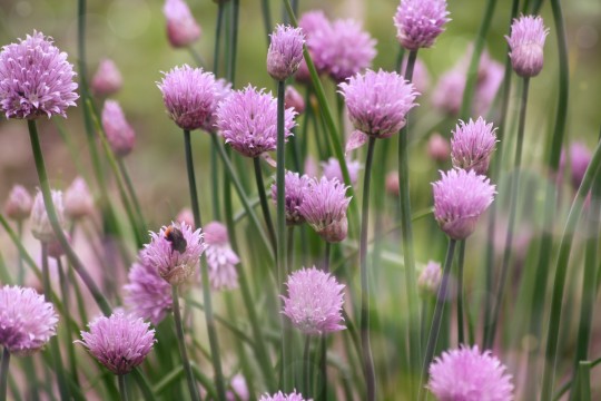
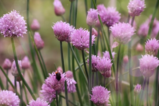
#my photos#photograph#photooftheday#picture#photoshoot#photo#photography#photographer#photoshop#flowers#pink#pink flowers#pink aesthetic#pink blog#pink moodboard#pink coquette#pastel#hot pink#light pink#baby pink#nature animals#nature photography#nature aesthetic#nature images#nature lovers#landscape#bokeh#bokeh and blur#blossoms#bokeh photography
476 notes
·
View notes