#blues art tag :0
Explore tagged Tumblr posts
Text

Songbird
#current wip#sort of#I looked at it way too long and had to just post#kaveh#genshin kaveh#genshin impact#fanart#Genshin impact fanart#kaveh fanart#gi kaveh#art#artwork#artists on tumblr#blues art tag :0
55 notes
·
View notes
Text
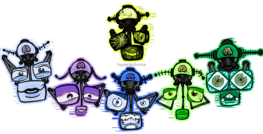
the thinkerrrrrrrrssss

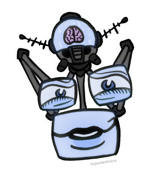
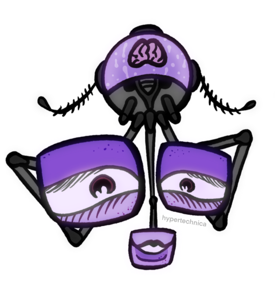
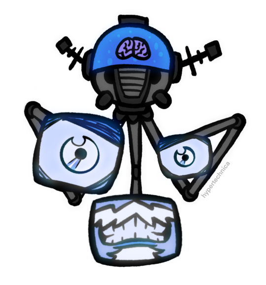
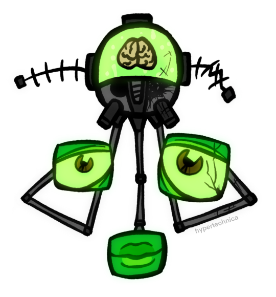

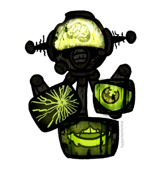
#someone make them less hard to draw PLEASE#fnv#fallout new vegas#fallout nv#old world blues#fnv old world blues#fallout new vegas dlc#the think tank#dr 0#dr dala#dr klein#dr mobius#dr 8#dr borous#objectum#techum#robots#robot art#character design#my art#there’s too many ways to write their names bear with me#doctor 0#doctor dala#doctor klein#doctor mobius#doctor 8#doctor borous#tell me if this doesn’t belong in the -um tags i just think it’d appeal to that demographic (me. i#i’m the demographic.)
303 notes
·
View notes
Text
The Think Tank Random Headcanon List
Two people asked for this so that means it happening 👍 your welcome, most if not all of these r prewar/brain tank
-this one’s pretty supported in canon but think Dala likes fashion and dressing up🫶. I love giving her a fun little outfit
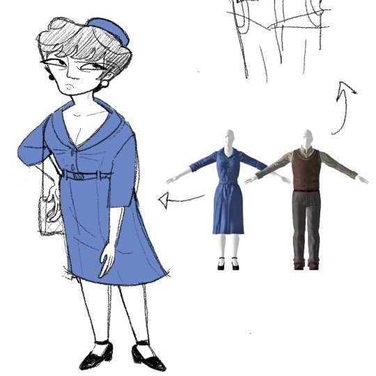
Yay
-0 had back pains pre brain tank. Also a lot of fatigue. The certified professional sleeper. When he’s working on projects in his home he tends to do it lying on the floor.
-this one’s basically canon but 8 has arithmomania. I say basically canon bc things in his house in Higgs often come in sets of 8, as well as his house being the 8th house despite there not BEING 8 houses. I think this would also extend to counting to 8 on his fingers when he’s nervous and such.
-tied in I also believe 8 has ocd. Borous has bpd.
-Dala was pretty reserved growing up, as she grew up/especially in the looped personality she became for lack of better terms “bolder and more flirty” as compensation for having been so withdrawn previously.
-I am wishy washy with a lot of gender headcanons for characters, my brain kinda just goes well idk if they’re trans but they’re not Not trans. However I do feel quite definitively that Dala is nb transfem, and Mobius and 0 are trans men.
-I think all of their names have some tie to the names they had pre recursion loop. Canonically both Klein’s name and his prewar last name start with K. I think the other’s names have similar ties.
-on that note, I think Borous’s old name (/just his family in general) has Painfully Russian origins. It makes his McCarthyism thing so hilariously ironic
-I think 8 is Canadian, but he only lived there pre annexation of Canada, he was working at big MT and living at Higgs once it happened.
-0’s old last name used to be “O’something” and people still used to call him Dr. O then and he still hated it. Doomed fate
-re: Mobius being trans, i think his first name was Edward. He named himself after Dr. Morbius from the movie The Forbidden Planet
-Klein is a big wine guy, like obvious there’s wine bottles strewn about his house, but I mean like. He’s the kind of guy to just know things about every kind of wine.
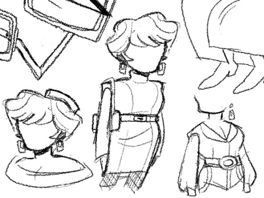
-Klein is probably the best dressed after Dala, I think he just tries to be professional for the most part. 0 thinks he’s fashionable but he isn’t. Already mentioned but Mobius dresses like an old lighthouse keeper. Cableknit sweater and the works. I think he’d also like antique pipes
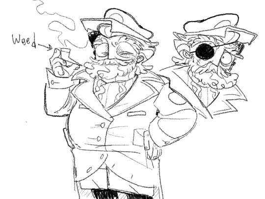
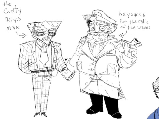
I’m probably gonna alter the Klein outfit but yeah you get the idea. Doodles
-I feel SO STRONGLY ABOUT THIS. But 0 and Borous went to high school together. 0’s one line mentioning Borous in high school was just way too telling.
-Klein and Mobius need reading glasses. Dala used to need glasses, didn’t wear them throughout her childhood until like college, and then switched to contacts after college
-The think tank are all very close and got along much better prewar than they do at the time of the game. They kinda Jean-Paul Sartre No Exit’d themselves and their personalities are stuck in an endless loop. To say the least they started getting on each other’s nerves after 200 years. But this is to say they didn’t still bicker or anything prewar
-8 never really liked talking much. Possibly having selective mutism. This was mostly fine for him because pre brain tank you have facial expressions and hands and hand gestures that kinda make up for not talking at times. After the brain tanks he was kind just. Forced to talk to relay information. His speech was extremely awkward and stilted, which combined with the above head canon is why Dala made that comment about how they light him better now that his voice modulator is broken.
-they all have autism of some flavor tbh. To me. In my autistic mind.
-dead animal ment.// but I feel like Borous was that kid who like poked at dead squirrels and shit as a kid. It frames the Gabe and cyberdog thing well lol
-I’m an 8/0 head so I think they worked together a lot. Even if it’s not on the same project they would just do thinks at the same time together.
-the mentats on Klein’s bedside table are Mobius’s
-0 used to be a super big fan of House and RobCo when he was in high school. Obviously that is no longer true
-0 excels at making robots that are smaller. He doesn’t want to acknowledge this though. Muggy and his walking eyes (w/ wild wasteland) are both pretty small but they work well. The larger scale securitrons he’s tried to make obviously. Do not.
-I think the lounge music theme for the radio was a collective choice, but I feel like Dala especially likes music like that.
-Klein and Mobius used to play games like chess or checkers or card games “outside” in Higgs old person style.
-post brain tank one (woah) Klein has fleeting feelings of missing someone or something he can’t recognize. Any memories tying it to an image of a person he doesn’t quite remember. His brain just doesn’t connect that it’s Mobius and he usually just pushes the feeling down whenever it happens lol
If I think of more I’ll add them.
#thedamtalkingtag#insanity#my art#fnv old world blues#old world blues#fnv owb#think tank#doctor dala#doctor mobius#doctor klein#doctor 0#doctor 8#doctor borous#fallout#fallout new vegas#new vegas#fallout new vegas art#fallout new vegas fanart#I forgot there was art in this while making the tags lol
93 notes
·
View notes
Text
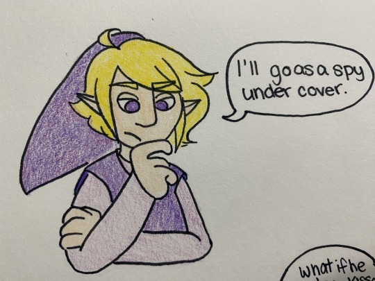


in this AU they actually know how to ~communicate~
#ill stop making simpsons references when they stop being so damn funny#four swords#four swords manga#four swords adventures#loz#legend of Zelda#vio link#blue link#green link#red link#vidow#implied lol#i did this instead of working on my wips 👍#art tag#also you can tell i put 0 effort into this#consistent art? Yeah right!
240 notes
·
View notes
Text
i made a thing

my friend told me to draw them iceskating so here we are
i couldnt be arsed to do a background raugh. also the dress blue is wearing is was inspired by the dress pink addison was wearing in that cool aurora borealis snowgrave MAP here (GO WATCH IT ITS SO COOL AND AURORA BOREALIS IS A BANGER). idk not my best work i feel like the anatomy looks a bit stiff but i might as well post it bc tumblr nice and wont bully me. im happy with the colour choices tho (i actually swatched the colours to see how they would look next to eachother instead of winging it for once wow). also i spend like all yesterday afternoon working on this and when i was finished i left the file open in case i wanted to do a bg and then MY WHOLE ASS COMPUTER RESET IT HAS NEVER DONE THAT BEFORE WTF. thank fuck krita has an autosave feature but if it didnt i would jump into oncoming traffic.
sketch below the cut bc why not i already have it
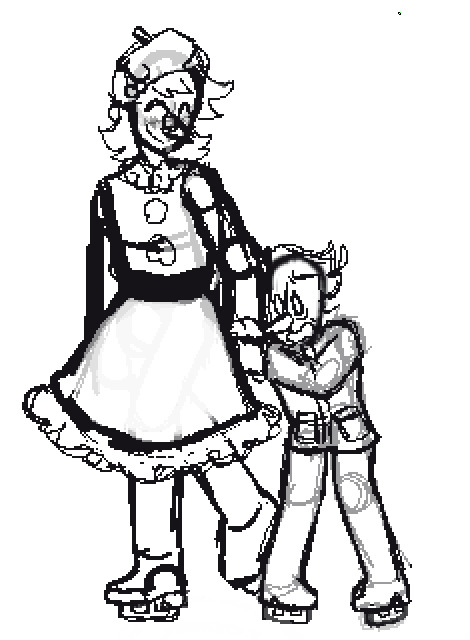
i made addispams coat longer cus it was bugging me
#whhy do i always sound so dead when i post art wtf#idk im tired i just wanna post it and gooo#rendering was a massive pain in the ass for some reason (idk why its normally pretty fun)#also i promise that the colours look brighter on my drawing tablet im not just shit at drawing#edit holy shit you guys i was confused why this had literally 0 notes I FORGOT THE FANDOM TAGS OOPS#deltarune#spamton#addispam#blue addison#spamblue#welp that was a bit silly of me oops#pixel art#< ill add that that for good measure
48 notes
·
View notes
Text


nezha in the ffxiv nezha lord's attire outfit :')
#ffxiv#final fantasy 14#nezha#i like the blue accents..#told myself i would take a break from drawing nz/fsyy stuff but did not anticipate that ff would have nezha content :0#art tag
158 notes
·
View notes
Note
hello jess beloved..... made a little thing for phantom pain bc i saw this pose reference and immediately i think of jiejie and dain hehe
jiejie's pov? ;D

.............rin?? (。_°)☆
KSNE39E3VKVNVKNVRIK RIN WHAT THE FCK I THOUGHT THIS WAS GOING TO BE ONE OF OUR USUAL INTERACTIONS HOLD UP WHY IS THERE AN IMAGE OH SHIT IT'S FAN ART RIN WHAT IS THE MEANING OF THIS?? I LOVE IT SO MUCH BUT RIN?? RIN??!!
*clears throat* Thank you so much for your fan art of Phantom Pain!! I rlly appreciate it, and my comments are in the tags <3
#RIN GET OVER HERE BEFORE I LOVINGLY TACKLE YOU#you were right about the pose fitting dainsleif and lucille (my name for demon! reader). i love that it fits dain as a broken darling <3#his smile. his lil blush. his downward gaze. the way he fully leans into lucille's touch. the feathers all around him!!#i like the red tint you used for the feathers. details. and background gradient. smth smth color symbolism and yandere vibes <3#fun fact for those reading the tags:: rin told me the flowers are roses and cherry blossoms with a red/blue tint#god i just love how you colored it!! you did such a good job at balancing the reds + blues and now i'm curious if you associated red with#lucille?? bc if you did. it would add another layer to the fact that this fan art is mostly red :0#moving on. i adore the accessories for lucille!! i love details like that and i think it rlly adds to your interpretation of her character#in my imagination she always wears jewelry so i was nodding at the 'bracelets' on both wrists AND IS THAT A RING ON HER RIGHT HAND?? <3#i love the snake 'bracelet' mixed with the flowers. religious imagery lesgo!! oh no dain is falling for lucille's temptation--#but it's fine right?? i mean look at dainsleif now he's happy happy!! the same hands that brutally kill angels/sinners hold his#face with so much warmth and gentleness. so is it a sin for him to believe in his tragic fate??#fnfkfnkfrfnkfrnk once again thank you so much. this rlly made my night :'3#asks#feedback#fan art#meimeimeirin
8 notes
·
View notes
Note
keri :) could u assign me some niigo cards pls? doesnt have to fit a specific theme, just vibes based /nf

I could just assign u all water themed cards and I'd be done /silly but I have limited myself to two cards per character... that was very hard pls be proud of me i deserve a medal /silly
Not gonna post it but ur kanade pfp obviously. But also this


Bonus idk if u meant untrained but if untrained then:


Image limit killed me but her newest card untrained also /silly
#asks#kota tag#does thay work? :0#u have calm but also support8ve vibes to me#warm and creative. i like when theres a lot of things there to like. represent how well versed u are and how u have many amazing ideas#also beautoful art. may be why i had to choose between 5 ena cards for u#also blue is ur color totally#but also this like gentle pink. like sunrise reflected in ocean waves
5 notes
·
View notes
Text

normalest guy around <3
#carlo#<= giuseppe's papa <3#art tag#always kind of envisioned him as a young-ish single parent but i think he looks way too young here. i'll figure it out.#anyways. got the broad strokes down. blonde hair blue eyes. giuseppe 0 takes after his mother a lot <3#not coping well with grief and taking it out on giuseppe 1. not that he was father of the year to begin with but y'know.#working on a project focusing on giuseppe's backstory so i gotta have a design for him <= guy who's constantly working on oc projects voice#i Will get at least one (1) part of it done and released. God Willing <3
6 notes
·
View notes
Text
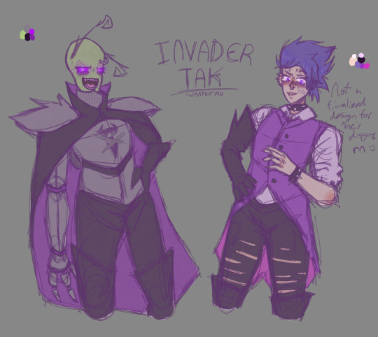
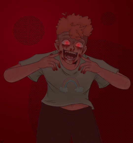
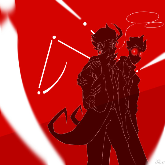
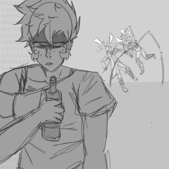
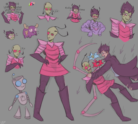
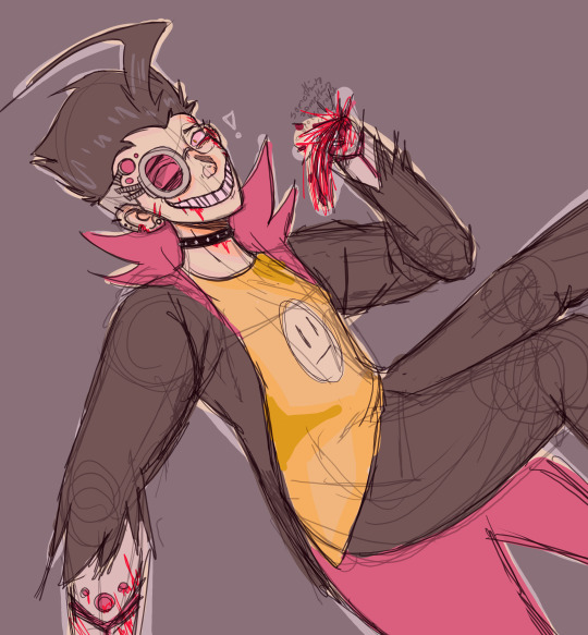
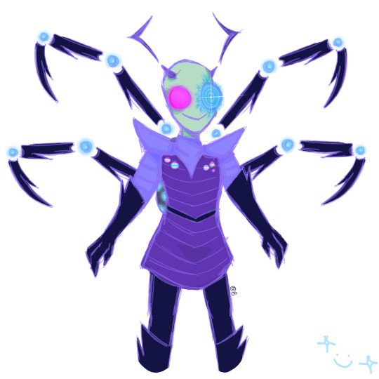
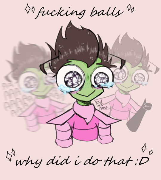
arting is not working so have some of my iz art from the last few months :>
#iz#zim#dib#tak#keef#gaz#gir#minimoose#fucking hell how many characters did i draw in this#pilot dib#tw blood#that tak art is the first designs ive made for an au :0#goofy guy with the blue PAK is an oc of mine#tw alcohol#i just realized that one#the very red piece is inspired by bamsara's fics bc they're my life ;-;#some of these are very unfinished i have no motivation#okay ill calm down with the tags now lmao#if you see me sign my work as OB (The Omni Bomber) it's still me i swear it's just an older signature that i used for a while#okay fr im done now
22 notes
·
View notes
Text

Blue Mood lately....
#pixel art#artist on tumblr#pixelart#my art#aesthetic#blue#bro i have 0 thoughts what else do u tag stuff here#8bit#i see that one a lot does it work
70 notes
·
View notes
Text

Wait 🖐️😔 theydontloveulikeiloveu 🫷🙂↕️🫸
#arcane#viktor arcane#viktor fanart#arcane fanart#arcane art#digital art#art wip#artists on tumblr#fanart#sketch#hes stuck in my head helppppp#blues art tag :0
21 notes
·
View notes
Text

Finished it! ^^ also thank you too @pistachboi for the color ideas ^^
#art#artwork#digital art#oc art#original art#artists on tumblr#creature#creature art#creature concept#blue#art tumblr#art tag#procreate#:p#:0#my art owo
3 notes
·
View notes
Text
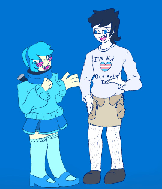
They get their estrogen together <3
#JSBSJASVISSBKDCNRIFBFICBDK OKAY I GOT INTO MSA LIKE YESTERDAY AND FINISHED THIS IN A SINGLE SITTING TODAT#THAT IS LIKE BIZARRE. AND DOESN'T HAPPEN FOR ME#THE BRAINROT IS REAL FOR BOTH OF THESE THINGS SO I'M SHOVING THEM TOGETHER#Also it helps that when I first saw Vivi I was like :0 Holy shit that's June#I was originally gonna draw June in clothing more similar to Vivi's but I was like Ehhh what about casual and then this happened#The shirt is blatantly a lie but she got it back when one of her friends came out to her when she didn't know she was trans#(pick like any hs cast member you want as the person who came out to her they're all trans)#But then didn't feel wanna waste a good shirt so she still wears it. regularly.#Also her skirt is intentionally on backwards#I've never drawn June in any greater form that a notebook doodle vut I will be definitely be doing this again if for no other reason than#how much I enjoyed doing the clothing#vivi yukino#june egbert#mystery skulls#(<- Is that the right tag? Idk.)#homestuck#may i plz have an art tag#Like look at my you need to understand how much I relate them to eachother. Blue gals. Magical super strong dog is a major character.#One has a bat one has a hammer. Glasses. Dead friend(s).#Okay that's all I can think of off the top of my head and I'm sure I'll remember more later but please understand me here#I've literally never interacted with the msa fandom before plspls pleaseeeee tell me if I did any of the tagging wrong if I did ^^'
27 notes
·
View notes
Text

LETS GOOOO<333333
Burgr King Date


LETS GO LESBIANSSS
#reblog#other's art#dreamberry#dream#blue#fem!blue#fem!dream#blueberry#inhaaaale#AAAAAAAA SO CUUUUUTE#i love love love love LOVE your fem versions omggg#LOOK AT THIIIS IT'S SO ADORABLEEE *sobs*#i'm sorry but you can't draw blue so well i legit!!!! wanna steal this sweet sweet gremlin#burger queens<333#side note but i really like your coloring/shading!!! it's so soft and pleasing to look at >:0#the burger looks so gooood how dare you draw it so delicious hhh >:'Dc#and that expression....such a sweet silly bean :'Dc <3333#glitchy i am shaking you rn THANK YOU FOR TAGGING ME#in this MASTERPIECE#muah muah op i am cherishing this beautiful piece just gosh#amazing art<3333
315 notes
·
View notes
Text
New Desktop Dash, No Bueno
Okay so, new dash layout on desktop.
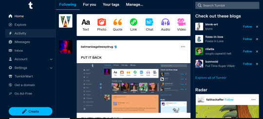
As seems to be a common reaction: not a fan.
Let's talk about some of the issues:
1. Really visually cluttered
The new sidebar crowds out the dashboard content and the bright blue popup notifications (now at the side AND top) and create-post bar pull your eyes in different directions. There is no space for the eye to rest on anymore - it's all noise. The end result is that everything flattens - there's no focal point anymore.
It's also pretty overwhelming - even for someone like me - so I can't imagine it would be very user-friendly to someone who was photosensitive or struggled with visual overload (especially when paired with the high-contrast 'true blue' default site palette and animated icons for the changes-on-tumblr/staff-picks/trending buttons).
2. The activity pop-up now covers dashboard content
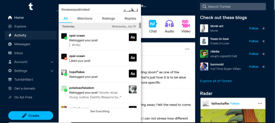
This is really bad from a usability standpoint. In the old layout the activity pop-up used to drop down over the recommended blogs sidebar. Now it actively gets in the way of looking at core content. The dash is why we are here, burying it like this is baffling.
The search bar now drops down over the recommended blogs banner instead, but where the old design had non-critical space on each side of the dashboard to visually allow both features to pop in, this new layout is way worse for efficiency. And for what? Having a rarely-used former drop-down menu now permanently active? The old banner with quick-links for the key use-features (notes, messages, askbox) made much more design sense.
It also means that the activity pop-up gets now completely covered by the blog pop-up that opens when you click the notification, so double demerit there. 0/10.
3. It's harder to navigate to the activity page, and the new page-stretch means you can't see new notes without scrolling down
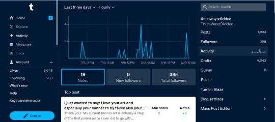
That first bit is kind of a nitpick but cramming the 'See everything' link down at the bottom of a browser window isn't a great navigation choice. (Again, the visual signifiers and eye-direction in this new design are incredibly poor.)
That the main activity page now requires you to scroll to even see the top note due to the new display ratio is really egregious. It makes another key site feature just slightly less convenient and accessible in a very irritating way. Bad choice.
4. The new ratio pushes the Radar and Main Sponsored slot completely off-screen
This one is directed the tumblr staff: that's also a bad choice, guys. That's your main ad-slot for people loading into Tumblr so hiding it is going to hurt both your ad-impressions and your ability to promote the ad-free option. The new layout ratio also means that the in-dash ads are going to be a lot more invasively screen-filling - and let's be real most users will either add-block or leave before purchasing ad-free. I have no idea what the new layout is trying to achieve but if ad optimisation is the goal then this ain't it, chief.
To be honest I cannot comprehend the rationale for this change. I guess it's visually a bit more like Twitter... but that site is currently being demolished from the inside by poor management decisions so maybe it's not the best aesthetic to be aping.
Well then, what do?
Okay so, new dash bad. And so, in true Tumblr spirit: we complain. However, to get results we must deploy the art of kvetching productively.
If you want the old dash back (or at least, a better new-dash design that corrects some of these big weaknesses) what you should do is head over to https://www.tumblr.com/support and lodge a feedback ticket pointing out the problems. The more users who do that, the more likely you are to see an effective response.
Remember, tagging @staff and @support in posts won't fix this. There's no guarantee they'll see it among the notes barrage.
Also: please don't be rude or abusive when you lodge tickets. Whoever is manning those blogs and inboxes probably isn't the person who forced through this change. Save an intern, be polite.
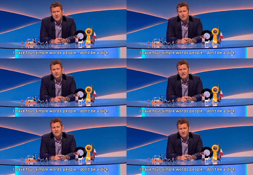
Go forth in disgruntlement to keep this hellhole a hellhome.
#tumblr#tumblr problems#new dashboard#yes it's bad#but there is a way#I've already lodged tickets about it
1K notes
·
View notes