#basic structure of an HTML
Explore tagged Tumblr posts
Text
HTML Tutorial for Beginners: Understanding the Basic Structure with Examples
This tutorial will guide you through the basic structure of an HTML document, break down its essential elements, and provide examples to help you grasp the fundamentals.
0 notes
Text
learned that my job will just let you go on LinkedIn and learn whatever kind of classes u want so I'm learning more HTML today while I have downtime
#I think it's meant as a 'use this for job enhancement only' so hopefully they don't squint too hard here#But I'm learning a lot in this basic HTML class that I thought I would know a lot about already#All of my HTML knowledge is from playing sandbox in neopets layouts and not in a hugely structured way#So seeing it like this is cool. I didn't realize why strong and b tags are used differently#I didn't realize it was a screenreader thing. The teacher is nice she's like tsk tsk don't be lazy#Don't use b when you mean strong don't use i when you mean em#I like this. Want to learn more#Want to apply this to my wedsite
1 note
·
View note
Text
i know this means absolutely nothing to most people but basically all of the little web game things I've made recently (angels in automata, hex plant growing game, d.a.n.m.a.k.u., life music, sudoku land, the metroidvania style map editor, etc etc etc) are all entirely self-contained individual client-side html files that can be downloaded and run offline and have literally no libraries or frameworks or dependencies, because i'm an insane woman who enjoys hand coding my input handling and display code from scratch in vanilla js and having it all live in one single html file with the game logic and the page structure and the page style all just living and loving together side by side in a universal format that can be run by any web browser on any devixe. i'll even include image files as base64 data-uri strings just to keep every single asset inside the one file.
26K notes
·
View notes
Text
Website update
Hi there owo
Small update about my gallery website. I'd say it's... 90% done. XD
All the basic structure is done and now I have to add a few artistic details (images, stamps, gifs, dolls, changing some fonts...)
I wanted to add some hidden pages but... I'm unsure what to add o_O
So I guess I will leave it for a future page renovation u¬~¬
Once it's finished I'll make it public and I'll happily accept suggestions or ideas for the content :D
Also I have no coding experience apart from this website. I know the basics of html and css but I have no idea of javascript. If there's any mistake I'd also be glad to know. It's part of the reason why it's taking me so long ue.e
I'll be updating it each time I post drawings so that the gallery it's up to date.
Sneak peak~

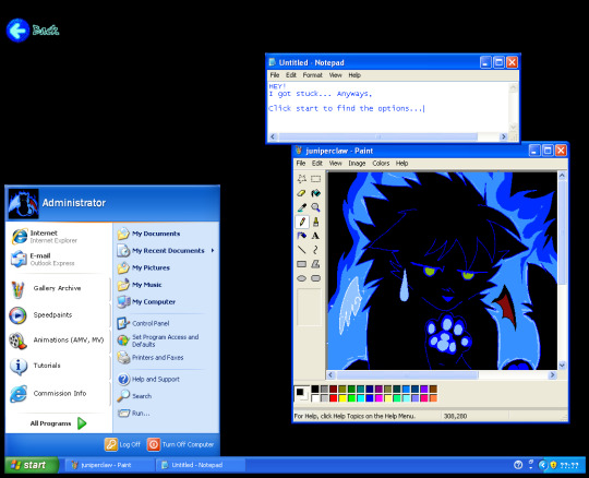
65 notes
·
View notes
Note
Hi Kristi! I'm sure youve already had similar asks but I cannot for the life of me find them. I was wondering how you learned code for your IFs and in general. Did you start with interactive fiction or did you already have an introduction to coding previously? Thanks
Long story short, I took a template (I have a few linked on my itch.io page; I personally used the one from @/cerberus-writes), analyzed it and customized it based on what I understood. It was a lot of trial and error, with a ton of Google searches, but I was so determined to make it my own and stop using Choicescript (which yes, is what I started out with) that I pushed through any difficulties.
To be quite honest, I don't think I could do something like that again, but hey, this goes to show that if you put your mind to something, it can happen.
I've answered a few other asks like this (this is probably my most in depth response to it), but I usually just say that you need to play around with things. If you need more structure, you can always do (free) courses on CodeAcademy or The Odin Project but those mostly show you the basics of the HTML/CSS language, and not necessarily how to construct something you're happy with.
88 notes
·
View notes
Text
A structured way to learn JavaScript.
I came across a post on Twitter that I thought would be helpful to share with those who are struggling to find a structured way to learn Javascript on their own. Personally, I wish I had access to this information when I first started learning in January. However, I am grateful for my learning journey so far, as I have covered most topics, albeit in a less structured manner.
N/B: Not everyone learns in the same way; it's important to find what works for you. This is a guide, not a rulebook.
EASY
What is JavaScript and its role in web development?
Brief history and evolution of JavaScript.
Basic syntax and structure of JavaScript code.
Understanding variables, constants, and their declaration.
Data types: numbers, strings, boolean, and null/undefined.
Arithmetic, assignment, comparison, and logical operators.
Combining operators to create expressions.
Conditional statements (if, else if, else) for decision making.
Loops (for, while) for repetitive tasks. - Switch statements for multiple conditional cases.
MEDIUM
Defining functions, including parameters and return values.
Function scope, closures, and their practical applications.
Creating and manipulating arrays.
Working with objects, properties, and methods.
Iterating through arrays and objects.Understanding the Document Object Model (DOM).
Selecting and modifying HTML elements with JavaScript.Handling events (click, submit, etc.) with event listeners.
Using try-catch blocks to handle exceptions.
Common error types and debugging techniques.
HARD
Callback functions and their limitations.
Dealing with asynchronous operations, such as AJAX requests.
Promises for handling asynchronous operations.
Async/await for cleaner asynchronous code.
Arrow functions for concise function syntax.
Template literals for flexible string interpolation.
Destructuring for unpacking values from arrays and objects.
Spread/rest operators.
Design Patterns.
Writing unit tests with testing frameworks.
Code optimization techniques.
That's it I guess!
873 notes
·
View notes
Text
Edgaring time!
Tutorial on how to make your own responsive Edgar :D I will try to explain it in really basic terms, like you’ve never touched a puter (which if you’re making this… I’m sure you’ve touched plenty of computers amirite??? EL APLAUSO SEÑOOOREEES).
If you have some experience I tried to highlight the most important things so you won’t have to read everything, this is literally building a website but easier.
I will only show how to make him move like this:

Disclaimer: I’m a yapper.
Choosing an engine First of all you’ll need something that will allow you to display a responsive background, I used LivelyWallpaper since it’s free and open-source (we love open-source).
Choosing an IDE Next is having any IDE to make some silly code! (Unless you can rawdog code… Which would be honestly impressive and you need to slide in my DMs and we will make out) I use Visual Studio!!!
So now that we have those two things we just need to set up the structure we will use.
Project structure
We will now create our project, which I will call “Edgar”, we will include some things inside as follows:
Edgar
img (folder that will contain images) - thumbnail.png (I literally just have a png of his face :]) - [some svgs…]
face.js (script that will make him interactive)
index.html (script that structures his face!)
LivelyInfo,json (script that LivelyWallpaper uses to display your new wallpaper)
style.css (script we will use to paint him!)
All of those scripts are just literally like a “.txt” file but instead of “.txt” we use “.js”, “.html”, etc… You know? We just write stuff and tell the puter it’s in “.{language}”, nothing fancy.
index.html
Basically the way you build his silly little face! Here’s the code:
<!doctype html> <html> <head> <meta charset="utf-8"> <title>Face!</title> <link rel = "stylesheet" type = "text/css" href = "style.css"> </head> <body> <div class="area"> <div class="face"> <div class="eyes"> <div class="eyeR"></div> <div class="eyeL"></div> </div> <div class="mouth"></div> </div> </div> <script src="face.js"></script> </body> </html>
Ok so now some of you will be thinking “Why would you use eyeR and eyeL? Just use eye!“ and you’d be right but I’m a dummy who couldn’t handle making two different instances of the same object and altering it… It’s scary but if you can do it, please please please teach me ;0;!!!
Area comes in handy to the caress function we will implement in the next module (script)! It encapsulates face.
Face just contains the elements inside, trust me it made sense but i can’t remember why…
Eyes contains each different eye, probably here because I wanted to reuse code and it did not work out and when I kept going I was too scared to restructure it.
EyeR/EyeL are the eyes! We will paint them in the “.css”.
Mouth, like the eyeR/eyeL, will be used in the “.css”.
face.js
Here I will only show how to make it so he feels you mouse on top of him! Too ashamed of how I coded the kisses… Believe me, it’s not pretty at all and so sooo repetitive…
// ######################### // ## CONSTANTS ## // ######################### const area = document.querySelector('.area'); const face = document.querySelector('.face'); const mouth = document.querySelector('.mouth'); const eyeL = document.querySelector('.eyeL'); const eyeR = document.querySelector('.eyeR'); // ######################### // ## CARESS HIM ## // ######################### // When the mouse enters the area the face will follow the mouse area.addEventListener('mousemove', (event) => { const rect = area.getBoundingClientRect(); const x = event.clientX - rect.left; const y = event.clientY - rect.top; face.style.left = `${x}px`; face.style.top = `${y}px`; }); // When the mouse leaves the area the face will return to the original position area.addEventListener('mouseout', () => { face.style.left = '50%'; face.style.top = '50%'; });
God bless my past self for explaining it so well, but tbf it’s really simple,,
style.css
body { padding: 0; margin: 0; background: #c9c368; overflow: hidden; } .area { width: 55vh; height: 55vh; position: absolute; top: 50%; left: 50%; transform: translate(-50%,-50%); background: transparent; display: flex; } .face { width: 55vh; height: 55vh; position: absolute; top: 50%; left: 50%; transform: translate(-50%,-50%); background: transparent; display: flex; justify-content: center; align-items: center; transition: 0.5s ease-out; } .mouth { width: 75vh; height: 70vh; position: absolute; bottom: 5vh; background: transparent; border-radius: 100%; border: 1vh solid #000; border-color: transparent transparent black transparent; pointer-events: none; animation: mouth-sad 3s 420s forwards step-end; } .face:hover .mouth { animation: mouth-happy 0.5s forwards; } .eyes { position: relative; bottom: 27%; display: flex; } .eyes .eyeR { position: relative; width: 13vh; height: 13vh; display: block; background: black; margin-right: 11vh; border-radius: 50%; transition: 1s ease } .face:hover .eyeR { transform: translateY(10vh); border-radius: 20px 100% 20px 100%; } .eyes .eyeL { position: relative; width: 13vh; height: 13vh; display: block; background: black; margin-left: 11vh; border-radius: 50%; transition: 1s ease; } .face:hover .eyeL { transform: translateY(10vh); border-radius: 100% 20px 100% 20px; } @keyframes mouth-happy { 0% { background-color: transparent; height: 70vh; width: 75vh; } 100% { border-radius: 0 0 25% 25%; transform: translateY(-10vh); } } @keyframes mouth-sad { 12.5%{ height: 35vh; width: 67vh; } 25% { height: 10vh; width: 60vh; } 37.5% { width: 53vh; border-radius: 0%; border-bottom-color: black; } 50% { width: 60vh; height: 10vh; transform: translateY(11vh); border-radius: 100%; border-color: black transparent transparent transparent; } 62.5% { width: 64vh; height: 20vh; transform: translateY(21vh); } 75% { width: 69vh; height: 40vh; transform: translateY(41vh); } 87.5% { width: 75vh; height: 70vh; transform: translateY(71vh); } 100% { width: 77vh; height: 90vh; border-color: black transparent transparent transparent; transform: translateY(91vh); } }
I didn’t show it but this also makes it so if you don’t pay attention to him he will get sad (mouth-sad, tried to make it as accurate to the movie as possible, that’s why it’s choppy!)
The .hover is what makes him go like a creature when you hover over him, if you want to change it just… Change it! If you’d rather him always have the same expression, delete it!
Anyway, lots of easy stuff, lots of code that I didn’t reuse and I probably should’ve (the eyes!!! Can someone please tell me a way I can just… Mirror the other or something…? There must be a way!!!) So now this is when we do a thinking exercise in which you think about me as like someone who is kind of dumb and take some pity on me.
LivelyInfo.json
{ "AppVersion": "1.0.0.0", "Title": "Edgar", "Thumbnail": "img/thumbnail.png", "Preview": "thumbnail.png", "Desc": "It's me!.", "Author": "Champagne?", "License": "", "Type": 1, "FileName": "index.html" }
Easy stuff!!!
Conclusion
This could've been a project on git but i'm not ready and we're already finished. I'm curious about how this will be seen on mobile and PC,,, i'm not one to post here.
Sorry if I rambled too much or if i didn't explain something good enough! If you have any doubts please don't hesitate to ask.
And if you add any functionality to my code or see improvements please please please tell me, or make your own post!
98 notes
·
View notes
Text
Nobody needs another TTRPG taxonomy but I made one anyway
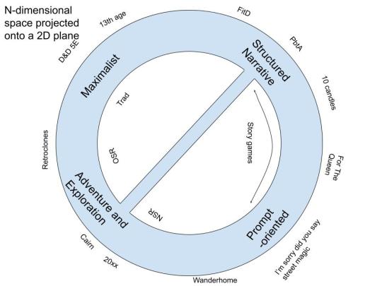
Posted here: https://seedlinggames.com/blogging/discourse/game_taxonomy_part_1_v_1.html I have a second blog post that is going to explain the small diagonal line, but basically it's that I think there is influence between those two camps that people don't seem to talk about much, probably due to internet discourse reasons
A million people have already done this - I'm kind of assuming you have vaguely absorbed the existing Internet discussions, and are familiar with terms like OSR, Story Games, etc. If you haven't, run away now and save yourself. But Six Cultures Of Play is probably a prerequisite to understand what I'm talking about, or at least what I'm complaining about.
I will try to, as much as possible, only discuss games that I have played. A lot of taxonomies seem to be written by someone who clearly likes one type of game a lot more than the others. For instance, I will not be discussing LARP because I don't have any relevant experience. I'm also not claiming that I am discussing the complete set of all games that exist, but I think I have played enough of them propose a taxonomy. If you're curious, I have an approximately complete list of games I've played or run here.
What is a TTRPG?
First we're going to have to look at everyone's other least favourite subject of conversation.
TTRPGs have 2 or more people taking on the following 3 roles:
A player, who is responsible for one or more characters who are the protagonists of the story.
A GM, who is responsible for the remainder of the story, such as providing additional characters and other aspects of the environment that the main players exist in. To do so they might determine the outcome of uncertain events or interpret rules agreed upon by the table.
An author, who provides additional, reusable material without being present. I'm using the term "author" for a lack of a better one, but it includes game books, blog posts, maps, drawings, or even fixed principles transmitted orally from game group to game group. These serve to facilitate or even replace GMing, as well as to introduce new ideas to the table without someone being physically present.
The same person often takes on different roles at different times, sometimes in the same game.
If you have only one of these roles, you are probably writing a book, doing improv, or some other activity. Which is of course totally fine.
This isn't the only definition you could come up with, but I think most people would agree it isn't totally wrong, and it's a lens that I'll be using to discuss the game taxonomy.
Maximalist Games
Apparently "maximalist" means something specific in art but I am not educated in such things and might be using the word wrong.
Characteristics of a maximalist game:
The three roles: clearly present and distinct, with the GM and author each taking on a large responsibility for the game experience.
Modularity: Semi-modular: There is a main game system which is designed to be extended by other modules, but these modules cannot be used with other games easily. A game book is typically not a self-contained experience and games are usually open-ended in duration.
Rules: A lengthy, complex ruleset with subsystems for resolving different parts of the game that are likely to come up, primarily oriented around the success or failure of an action and its consequences.
Characters: The complex game mechanics provide an opportunity for players to develop a distinct character before playing them, defined by game mechanics. Character and player motivations are usually aligned.
Narrative structure: Campaigns usually follow conventional narrative structure, but this is driven primarily by the GM, or by adventure modules, which define an outline of the narrative.
Who makes them: Often require more resources to create and thus are made by corporations, but that is changing.
Relationship to other media: While often inspired by fantasy novels, their larger budget and longer history has allowed some of them to develop their own genre conventions distinct from other media, and in some cases have inspired movies and books.
Solo games: Rare, due to the prominent role of the GM.
"Trad" games are a subset of these but a) I hate that word and b) I think the genre, starting especially with 4E and other inspired games, have gone in some very different directions. It roughly corresponds to "Fight D&D" in the Between Two Cairns taxonomy, but some games in this category involve no fighting at all.
Narrative Mechanics Games
The three roles: Blur the lines between GM and player more freely.
Modularity: Usually not very. Each game is made to create a specific experience, and the blurring of GM and player roles makes adding external content more complicated.
Rules: Focused on resolving problems in the context of narrative structures. Rules may facilitate pacing, allow for storytelling outside of linear time, allow players to temporarily take on a GM-like role, and allow for players to work together to create conflict between their characters.
Characters: Mechanics facilitate creating characters according to genre conventions with defined relationships to other characters and to NPCs. Player and character motivations are often not aligned.
Narrative structure: Rules are designed to support conventional narrative structures and genre conventions.
Who makes them: The focused scope of these games mean that they are often made by individuals rather than corporations, but there is a trend towards some of them being made by mid-sized organizations. Long development cycles may be needed to provide a polished experience, leading to some amount of professionalization.
Relationship to other media: Usually strongly inspired by other media, allowing you to create stories similar to movies, books, TV shows, etc.
Solo games: Rare, with Ironsworn as a notable exception.
Some "story games" fall into this, but I think "story games" has split into two meaningfully distinct categories. I've met enough people who only like one of the two categories. I think they are perceived as more similar than they are because there's less internet drama about the difference between them.
Prompt-based storytelling
The three roles: Blur the lines between the GM, player and author, with the GM often being absent.
Modularity: Usually self-contained experiences with limited modularity.
Rules: Often entirely forego mechanics for failure or success; mechanics tend to be minimal and about making suggestions regarding the story to tell, with the written text sometimes acting primarily as a GM or even player who is not present.
Characters: Character creation is usually a minor to nonexistent part of the game, with characters being defined by decisions made at the table. In some cases, all characters are already predefined. Characters are usually defined in words rather than numbers. Player and character motivations are rarely aligned.
Narrative structure: Stories often forego conventional narrative structures, and are focused around exploring relationships, ideas, or experiences. If a narrative structure is defined, it is usually in the form of a defined endpoint, with the purpose of the game being to explore how the characters get there.
Who makes them: Leans heavily towards DIY or single creators. Often comes in formats other than books.
Relationship to other media: Inspiration comes less from established genres and more from life experiences. Genre fiction is less likely to be an inspiration.
Solo games: Very common, due to the reduced role of the GM.
Adventure/exploration games
The three roles: Blur the lines between GM and author, both at the table and culturally.
Modularity: Are highly modular: not only are supplements and adventures often interchangeable, but are often not tied to specific systems.
Rules: Have relatively short rulesets focused on generating situations (on the GM side) and resolving danger (on the player side).
Characters: Characters are mostly created organically in play through interactions with the environment, including the tools at their disposal. Random generation is common. Character and player motivations are usually aligned.
Narrative structure: Campaigns often do not follow a typical narrative structure, aside from perhaps an escalation in danger, scope and/or strangeness.
Who makes them: Their modular nature means that they are often created in a DIY manner, through zines, blog posts, and informal discussions, though mid-size companies are also prevalent.
Relationship to other media: Inspiration from other media is often mostly vibes-based, with genre fiction, folklore, and even musical genres and political movements (for better or worse) being prominent. It doesn't seek to emulate the characters or narrative structure of other genres.
Solo games: Relatively common, usually provided by an additional module that may be specific and general-purpose, often focused on a GM emulator known as an "oracle."
"OSR" games are a subset of these, but a good number of these also make many OSR people very angry. It roughly corresponds to "Door D&D", but dungeon crawling is not inherent to this genre.
Other ways of looking at these categories
You could also map these on axes:
distinct GM/player/writer role vs combined roles: maximalist vs prompt-based at opposite ends of this spectrum
Highly self-contained vs highly modular: narrative vs adventure/exploration
Strong genre conventions vs naturalistic approach: maximalist/narrative vs adventure/exploration/prompt based
Resembles a D&D vs does not really resemble a D&D: maximalist/adventure/exploration vs narrative/prompt based
for symmetry I want to put another axis for maximalist/prompt based but I can't think of anything they have in common. Oh well.
But I also don't think this is a complete enumeration of all possible types of games either - this is some kind of n-dimensional space that has only 4 blobs on it
The part of the taxonomy blog post where you realize this is actually just me going on about my own preferences this entire time
I've played and enjoyed all 4 types of games, but putting this together has helped me figure something out - why it is that I like both the NSR side of OSR games and like the "super weird" story games. And why I don't seem to be the only one, even though these are often talked about as opposites. Because if you split story games into two genres, the similarities between prompt-based games and adventure/exploration games comes out.
55 notes
·
View notes
Text





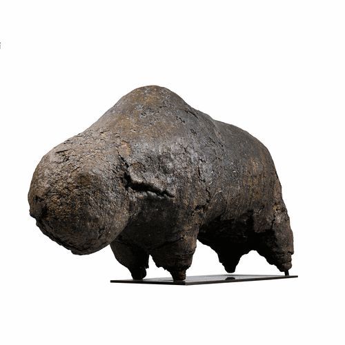

A BOLI is an abstract figure kept in a shrine belonging to a secret Bamana men's association. It is believed to be the embodiment of the spiritual powers of the society. These powers underlie the ability of the association to maintain social control. Today, the Kono society has lost its influence in most Bamana communities due to the conversion of Bamana to Islam.
The basic form of this boli resembles a highly simplified cow. It is composed of a wooden core over-modeled with materials such as mud, eggs, chewed kola nuts, sacrificial blood, urine, honey, beer, vegetable fiber, and cow dung. The use of blood, excrement, and urine reflects the belief that these organic substances possess extremely potent spiritual powers.
Sotheby's catalogue note: "Catalogue Note
Upon first inspection this power object, known as a boli (plural boliw) impresses with its seemingly ‘elementary’ form, a shape achieved by the gradual accumulation of material around a wood core. In 1933 an image of a ‘boli du kono’ [the Kònò secret society, which was custodian of the boli] appeared in the Surrealist magazine Minotaure; it was described by the author and ethnographer Michel Leiris as "one of those bizarre shapes […] in the form of a pig, always in nougat brown." The form of the boli and its dense, cracked surface, suggestive of some primordial landscape, resonated with the Surrealist love of ‘fetishes’ and objects which were generally considered grotesque or bizarre, and the boli published in Minotaure soon became "the centre of an enthusiasm for Primitivism" (Colleyn, ‘ Images, signes, fétiches. À propos de l'art bamana (Mali)’, Cahiers d’études africaines, No. 195, 2009, p. 22).
If one engages with the boli beyond its seemingly ‘primitive’ appearance an object which possesses an immensely complicated cosmological significance is revealed. The boli is both a symbol of the universe and a receptacle for the forces that animate the universe, and it serves as an intermediary which permits communication with the ancestor or supernatural power whose force permeates it. As a repository of enormous spiritual power, or nyama, the boli would be viewed with a mixture of awe and fear. As the most essential instrument of communication between earthly mortals and the supernatural powers that control nyama, boliw were "an important part of the Bamana judicial structure, inanimate objects to which the Bamana community entrusts its decision making."
https://www.sothebys.com/.../literati.../lot.2919.html
111 notes
·
View notes
Text
This is THE single largest milestone in my entire 7 year game programming career.
I don't think I've ever gone over my history with moving platforms before, but basically. Back in my sophomore year of highschool I had a programming class! I hadn't chosen to take it, but the class I wanted got cut so I got this instead. And I already knew how to program, and the teacher was chill so I was like "can I like just work on whatever?" and she said sure. The rest of the class was doing an online html+css class.
Anyway I was like "yo I have an entire class period to program! I am gonna make a game!" That game was the first version of ThreeEye, and it's scope was very small. My plan was some like 8 levels, and the only mechanics were movement, spikes, and moving platforms. Spikes were extremely easy.
But there are no words for the difficulties I faced trying to impliment moving platforms.
I spent... Every. Single. Class period.
For. A. Semester.
Trying get them working.
I tried making the game in Gamemaker and Godot.
In Gamemaker I had a strange issue with the player sorta hovering above the platform, instead of cleanly moving on top of it. And also sinking a pixel inside of the platform when moving up. I never fixed it.
I then tried Godot, and I continued to struggle.
Oh I struggled, I struggled and struggled and struggled.
And was it worth it? No.
I found the bug, and it was caused by my refusal to actually read documentation and instead follow tutorials. The tutorial I was reading had the arguments for a 'move_and_slide_with_snap` function out of order.
So I fixed the bug.
And immediately found another bug that was even more dramatic and hard to debug.
And I quit.
I quit game dev for 2 years, and never looked back. At that point almost all I had done was watch tutorials and ineffectively debug. And I was so hyper focused on fixing this ONE issue that I never grew. I burnt out and I declared that programming wasn't for me.
2 years later I discovered a video of someone making a game without a game engine, but in C. And I thought it looked fun. So I decided that I would try programming again, but I wouldn't focus on trying to FINISH something. I would program as a hobby, and try to enjoy the act itself.
And I got that spark back, and now, 2 and a half years later. I solved moving platforms with the following 2 lines of code.

And it's not these lines specifically, my skills as a programmer and EVERYTHING surrounding these two lines is what brought me here. My code structure was good enough, such that actually implementing the moving platforms took 5 minutes. I copy and pasted some code, cut some stuff out, and added the above lines.
I know I am technically a better programmer than when I first faced this challenge, but after having actually beat it. I feel like I have made it further than I ever had before.
Also that means this game is also further along in progress then anything else I've made before.
Yippie!
160 notes
·
View notes
Text
No-Google (fan)fic writing, Part 5: Obsidian
Storytime
In terms of how long I’ve been using Obsidian, well. Currently, a little more than a week ^^ And I’ll be honest, I’ll probably only use it for writing fic sporadically, because it’s proprietary software and I prefer Open Source (and I also love LaTeX too much, but that’s a different question).
The reason why I decided to give it a try in terms of writing fic was that I’ve been talking with others about moving to Markdown, Obsidian is Markdown-based and I’d been playing around with it in a different context for a while already. So, out of curiosity, I decided I’d try to write a story in Obsidian and see if it could live up to my demands.
Word/Google docs versus Obsidian
Again, Word and Obsidian do not work in the same way. If anything else I have described here so far can be compared to the way Obsidian works, it’s Zettelkasten. The same principle of “one note for one idea/scene/thought” also applies to Obsidian. Also like Zettelkasten, Obsidian relies heavily on connecting these notes by way of links, using tags to categorise/find specific notes and it also has the same feature of using folders for collecting “sub-notes”, which can be used for structuring in the same way the virtual desk is used in Zettelkasten. Actually, I would say that the main difference between those two is that Obsidian uses Markdown and a folder-with-subfolders structure, whereas Zettelkasten has its own file format and relies on XML behind the scenes.
Cost
The personal use version of Obsidian is free, so technically +1 for that. However, Obsidian is not Open Source. It is not free in the same way Writer, LaTeX, Zettelkasten and Markdown (= many MD editors) are free, the code behind it is proprietary. This does not have any impact on the cost, at least not at present, but there is a chance that at some point, the developers might choose to charge for private use of it. I think it’s unlikely, but. Just so you know.
File formats
Unlike Word, however, Obsidian relies on Markdown as its file format and stores every “note” as a separate .md-file in a folder. The “notebook” where all notes are collected is called a “vault” and it’s just one big folder with lots of subfolders. In other words, even if the software is proprietary, the files can be read and used without needing Obsidian itself. Which is really great, because again, it means you have plain text .md-files with your ideas, scenes and stories, and they wil be readable even if Obsidian as an app disappears.
+1 for that!
Features
What you need Obsidian for is the features. And of those, there are many. I’ll save words and say, read about Markdown features like bold, italics etc. here, but I really do want to talk about other features Obsidian offers that plain Markdown with an editor does not.
Firstly, an important feature that I talk about a lot is the export function. AO3 needs either HTML or RTF, fanfiction.net ODT or DOC(X). Obsidian can export to all of these, provided you install the Pandoc plugin. This is not the same as installing Pandoc on your computer; you need to install the plugin in Obsidian itself to use it. But as long as you do, you can export to whatever you like.
+1
Another feature very important for me when I tried Obsidian was whether outcommenting would work (again, I’ve talked about this here). Basically, what that means is that parts of the text are not exported when you export the rest of the note – such as comments to yourself, notes on what you still need to write in a scene or simply – as I use it frequently – stuff you wrote and don’t want to delete, even it doesn’t fit anymore. Much to my delight, it works in Obsidian as well, again because it’s Markdown and it works in Markdown. [text you want outcommented]: # will do the trick.
+1
Lastly, another plugin I would recommend is Smart Typography. It “[c]onverts quotes to curly quotes, dashes to em dashes and periods to ellipses”, as the description says, and that’s really useful if you use a regular keyboard layout to write, where you get the standard ' and ".
+1
Installing both the Pandoc and Smart Typography plugins is easy. Open the Obsidian vault settings (the little wheel you can see in the left lower corner, to the right of “example”, which is the name of the vault), Third-party plugins (which you need to enable) and then browse Community plugins by name and install and enable them. Done.

Now for the most important part: putting together a story.
If you want one big vault containing all of your stories, you need to create “folders” for every story and then store the single notes for that story in that folder. Personally, I prefer to have one vault per story, because I find it a lot easier to focus on working on one story at a time if I don’t have several other stories in the same vault. This, I want to note, is different to how I used Zettelkasten, where I generally had one big Zettelkasten containing all of my stories for a specific fandom. I don’t know why that’s different with Obsidian, it’s just that way.
In any case, the following examples are for when you have one story per vault. In this case, I’ve decided that I’m going to write a story involving the POVs of three different characters. I’m going to keep their respective pieces sorted by character, so I always know who’s talking right now. Every scene where that character is the main narrator gets its own note within the respective character folder.

This, in theory, is no different than what I do with regular Markdown. What is very useful in Obsidian, however, is that Obsidian offers the possibility to “embed” notes in other notes.
And that, in turn, means that just like with Zettelkasten, you can use one note to put together the whole story and move around scenes without ever having to worry that you’ll accidentally delete and lose texts while copypasting.
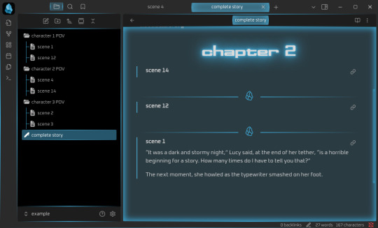
It works like this: [[name of note]] establishes a link from one note to another (useful if you want to connect different ideas). If you add ! before the brackets, like so: ![[name of note]], it means that the whole text of the linked note will now be embedded in the note with the link. Which will give you this:

And, because you’ve installed the Pandoc plugin, this will now allow you to export the note named “complete story” to HTML, ODT or whatever, and all of the linked notes will be exported into that file. You need to change the order of scenes or move one scene from chapter 1 to chapter 2? Just delete ![[name of note]] in chapter 1 and put it in chapter 2. You can also insert horizontal rules, by the way, which I have done here. These will also be exported.
If you need your story structured in chapters rather than as a whole, the process is analogue: one note per chapter, where you !-link all the scenes that belong to the chapter in question. Then, if you want it as a whole, create a note where you !-link the notes for the single chapters, done. Export at your leisure.
Embeds are hands down in my opinion the best feature Obsidian has. They offer a distinct benefit over other Markdown editors like Ghostwriter, KATE or Notepad++, because Markdown, other than LaTeX, does not come with a feature that would make it easy to include “child files” in a “parent Markdown” file that only includes the header and the child files in the order in which they should appear in the final output document. Thus, none of the three editors I like to use for Markdown can show me the whole story if I decide to create a separate file for each of the scenes, and that is really annoying, because it means that I’m back to cutting and pasting pieces of text from one part of my Markdown document to another. Which in turn increases the probability that I will lose something, and well. See Zettelkasten as to how I feel about that.
So that is definitely an extremely useful feature deserving a big +1 because like with Zettelkasten, it means you can move the order of your chapters and scenes around without running the risk of losing the actual text.
Interface
Something I find quite enjoyable is that there are a lot of “skins” made by the community that can be applied to Obsidian. This is important to me because, as the previous instalments have probably shown, I’m a big fan of simple, clean, customisable interfaces. I’ve tried several of the community-made skins already, and my current favourite is Cyber Glow – but there are also others I’ve found quite nice.
Again, skins can be installed via the wheel/settings button, and just to show it, the below is the vault from above with Cyber Glow enabled.
Syncing
One of the big benefits of Obsidian is that it comes with a syncing service. Yes, you don’t need anything else, you can just create an Obsidian account and your notes will be synced across your devices, even on mobile devices. And file versioning is an option (I’ll get to that in due time). And that is really great, because it’s a one-in-all solution.
If you don’t need or want that, you don’t have to sign up for it. You can also continue syncing your Obsidian vaults with your preferred service (Dropbox, OneDrive, GIT, USB etc.). But you can and it’s at least nice to have the option. Downside: sync is a paid-for service, starting at 4$/month for 1GB of storage. Which isn’t a lot generally, except you’re writing plain-text/Markdown, so your files are Kb-tiny in most cases, and it takes a lot of Kb-sized files to fill up 1GB.
Personally, I will say that I’d much rather pay 4$ a month and know that my stories are not going to be scraped for AI, but it’s really a decision everyone has to make for themselves. Just remember – if you aren’t paying for the product, you are the product.
Ease of use for Word/Google doc-users
It’s not intuitive in the same way as moving from Word to LibreOffice Writer is. At least having a look at some Markdown guides (linked over there) is important if you are going to use Obsidian. But as I wrote there already, Markdown takes you about half an hour to learn, if you don’t know it already. And yes, you’ll have to wrap your brain around the concept of “one note = one thought/scene/idea” as well, but honestly? In terms of cost-benefit ratio, Obsidian is probably one of the most rewarding transitions you could make if you’re looking to get away from Word/Google docs. My only gripe with it is really that it’s proprietary software, but otherwise? Definitely recommended.
Read No-Google (fan)fic writing, Part 1: LibreOffice Writer
Read No-Google (fan)fic writing, Part 2: Zettelkasten
Read No-Google (fan)fic writing, Part 3: LaTeχ
Read No-Google (fan)fic writing, Part 4: Markdown
#degoogle#no-google (fan)fic writing#fanfiction#fic writing#fanfic writing#degoogle your fics#degoogle your writing#software recommendations#resources#obsidian
9 notes
·
View notes
Text
introduction. hi :)
hello!!
i wanted to document my process of learning to code :) it's something i've always been interested in, but never got to, because i felt like it would take too much time to become good. well, the time will pass anyways, i need a project to stay sane. i have adhd, so it's somewhat of a developing hyperfixation / special interest for me.
i was using sololearn to learn, before i got paywalled :/ -- now i'm using freecodecamp and will probably also use codeacademy. on freecodecamp, i'm doing the certified full stack developer program which will (from my understanding) teach me to code front-end / client side as well back-end. i knew some HTML to begin with, but so far i've finished the basics of HTML mini-course and am on to structural HTML. After the full HTML topic, the course teaches me CSS, Java, Back-End Javascript and Python.
LONG STORY SHORT!! let's be friends, because i love doing this. also i need help. and advice. so much of it. m


#codeblr#studyblr#programming#coding#web development#web developing#progblr#backend development#frontend#frontenddevelopment#html#html css#java#javascript#python#fullstackdevelopment#computer science#stem#stemblr#introduction#looking for moots#mutuals#looking for mutuals
10 notes
·
View notes
Text
daily clicks for palestine
5/15/25
hello ! i am officially back from my semi hiatus :)
i've been rethinking a lot about my relationship to social media now that i'm transitioning more into, like, Real Adult Life. even though i've been mostly off mainstream social media since like 2021, i've still been noticing that i wasn't getting what i wanted out of using tumblr the way i was.
so i took a lil break, deleted it off my phone, and now i want to go back to using this as a Blog! i want to post more often and with more of a blog-y structure -- partially inspired by my lovely fiancee @childballad58, partially bc i realized that was basically what i wanted to do with my neocities, but i dont have the attention rn to dedicate to learning html at that level. so why not use my micro blogging account! hello !!
i will still, like, reblog stuff the way i used to, but i am also trying to dramatically reduce screen time on here. i will see things if u send them to me but it might be a while. uhh yeah thats it! life after college rules and i'm very happy w the habits i'm building. sorry if a lot of this is extraneous, i have a lot of irls on here and it felt like an update would be nice :) hi to all my friends of all types i've missed seeing u in my puter. mwah.
10 notes
·
View notes
Note
Hello! Out of curiosity, did you use a specific neocities template for the new website archive or was it completely by-hand? It’s gorgeous. If you did use a template, would you be willing to share it? I have a similar project I’d like to migrate out of a google doc and this format would be so helpful, but /only/ if that’s alright with you.
Hi there! I initially started from scratch but as I continued I realized I basically wanted a documentation site, and was pointed to a template through a site builder called Astro! Specifically, I use a template called Starlight. I've done a fair bit of customization on it, and it requires some knowledge in the usual website fare if you want customization (CSS, HTML, Java), but you can definitely use the base templates and make your docs in markdown (most of the site is structured on .md and .mdx files). It's quite beginner friendly! My only experience before this was customizing my blog themes.
It's just a site builder though, you'll need to host it elsewhere. I chose to host on Neocities (for the fandom of it all), but it seems to be a bit more integrated with Netlify.
https://astro.build/
https://starlight.astro.build/
14 notes
·
View notes
Text
I really wish I can finish the website before the year ends because I'm so hyped to show you all qwq
I'm working very hard for it to look as 2000 and edgy as I can >:D
Though I have to say, before starting the website I had no idea about html, css or javascript, so there might be mistakes... Ue_e)
Luckily I have a "beta tester" TT w TT
I'm also trying to add details and some hidden stuff too. The page itself is supposed to be a gallery archive in case anything happens to this account or just to have a better organized gallery. But I've made it a little bit interactive to make it more fun~
I don't want to spoil much so I won't post much about it yet, but I try to work on it as soon as I can.
I'd say right now it's at least 50% completed. All the basic structure is done, I'm now adding complementary pages and then I'll go for the details and decoration.
48 notes
·
View notes
Note
Hi! I’m absolutely in love with the look of your carrd and was wondering how you customized it :) I’m new to the site and how to use it and stuff
Thank you! If you're not familiar at all with the site and want a really introductory crash course this post explains the basics of building elements on a site better than I could
Honestly I have not done anything fancy I really just slapped some elements on there and played around with the appearance settings until I liked it, even the grid background is something you can add within carrd. This page is just a text element (the header), buttons element, and some containers broken into columns so I could add the text and images next to each other. the only slightly weird thing is the "about" title with the little icons is actually an embedded HTML element which is only available with the pro plan features and I used it to add the font awesome icons (font awesome my beloved). There are lots of settings for adding borders, drop shadows, etc to different elements and stuff. My gallery page is just a gallery element I added a bunch of pics to as well. I would like to try doing more interesting stuff with carrd at some point but if you're fine with the structural elements being relatively basic I think there's a good amount of aesthetic customization you can do that's built in
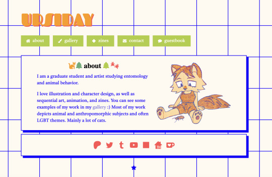
#the guestbook is also an html embed from 123guestbook#ask#anonymous#I would love to make a real site or neocities or something also but I have minimal coding skills and it's not worth the time sink for me#so I use carrd for now
142 notes
·
View notes