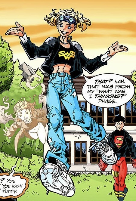
#atla designs analysis
Explore tagged Tumblr posts
Visit Tumblr Blog
Explore Tumblr blogs with no restrictions, modern design and the best experience.
Last Seen Tumblr Blogs


Fun Fact
Tumblr Inc. is using 66 technologies for its website.
Note
Hello, Dema here!
First off—I have fallen desperately in love with your artworks. You have a very particular style, strong and fluid all the same, and I can't help but admire the way you draw and how you approach character design.
And talking about character design...
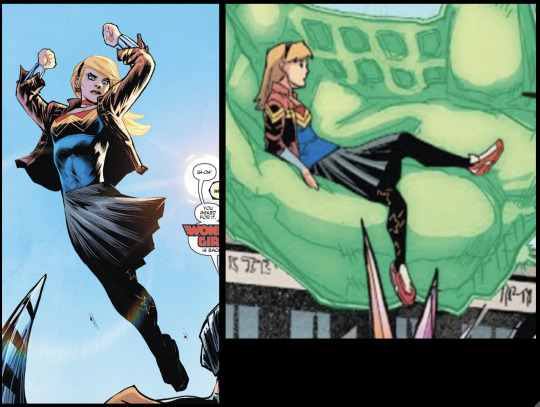
I saw your post about Zuko's bold design in S1 when compared to what we got in S3 and—as much as I love S3-Zuko—I completely agree with you. Something I've always loved about Zuko in S1 is just how striking he was, how much of a presence he had, even when he was being tossed around by a twelve-year-old. That being said, I love Zuko, I love him in armor and pointy shoes and with a ponytail, and I loved your alternative design for him.
What do you think about his S2 character design? How does it flow with the story beats and his overall character arc? Much has been said about the Hair-Growth-Means-Character-Growth (and I find it interesting, also, that he cut his hair again before joining the Gaang), but I'd like to know your opinion on how that translates to character design and how the decisions made in the show could be either good or bad in that regard.
Sorry about the long ask! I've just been thinking about this a lot, lately, and would like to know what you think. Hope you have a good day ❤️
AAAA Dema hii!!! I'm so happy I got a message from you, I didn't expect it!!
I'm super glad to hear, I'll wear it as a badge of honour and I must tell you that I also love your art, you wonderfully do volume and the shading done through a contrast of sharp and soft areas! Super solid anatomy too and I'd be lying if I said I didn't look up to your art!
Yess the character designs in the show actually are rather strong, I like a good balance between memorable and functional. Zuko is just *chef kiss* but, considering just how many appearance changes he goes through, some are bound to be weaker than the starting one. That said, I'm gonna go through a few of his S2 looks and make this reply long, ha!
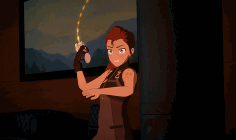
The starting one when he ends up huddling with uncle Iroh with other poor refugees, fits extremely well for the narrative at the moment. It's actually one of my least liked looks for him, and that's great!! It's precisely how it should be, because he's also arguably at one of his two lowest moral points in the story - he basically lost almost all hope, no clear goal, nothing to fight for, he's desperate precisely because of the lack of orientation and thus his morals degrade and sink veeery low. He gets on my nerves so goddamn much in this period LMAO I want to beat him up, he looks like a recovering drug addict... annoying, entitled whiny jerk stealing food and anything shiny for his uncle, but even then he just does not cross the moral event horizon. Excellent characterization. He just looks atrocious and it's great because it fits this low point.

Next he gets the standard boyish square of a hair, no notes here...
But theeeen, he arrives at one of my favourite looks of his, and it's not just because the clothes fit him very nicely (I've seen fandom say they look too big for him which, maybe?? But it doesn't look like he's swimming in them to me) And a thing I've noticed which, maybe it was just an accident on design part but I'm not sure considering they colour coded the entire cave scene; in this part his clothes match the shape of Katara's, first one in bottom then the one in top. The collar is the same haf-circle design but I don't know, maybe there was a limited pool of clothes designs guide which they cycled through. Or, he really is meant to come close but miss Katara by a beat, like sine and cosine chasing each other.

But besides this outfit fitting the inconspicuous Earth Kingdom customer service persona, it also (perhaps inadvertently) does this VERY cool thing:

It makes his shape look closed off and guarded, supposedly non-threatening. It's most visible in his fight against Jet, whose shape is open and goes in many directions like an aggressive star. But then look at what Zuko's shape does:

When he attacks, it opens up to reveal the hidden aspect, again the aggressive star shape shows up! The same thing happens in "Zuko alone" episode but I think it's most clearly visible in this fight against Jet because here he has a direct contrast and comparing with Jet. I think this is an example where the outfit, whose similar design exists irl, overlaps with a great visual metaphor and enhances the narrative at that moment in story. He's still that combative firebender but he has to keep that aspect concealed most of the time. Plus it just looks badass as hell!!

Animators really knocked it out of the park with many frames. I think Jun was too early and missed his better hairstyle, but Katara was just in time.
I agree it's super funny how his hair in the Beach is awfully long, covers his face to an uncomfortable degree and then he apparently shortens it before joining the Gaang, insane behaviour Truly an "I'm so angry and depressed I won't show my face nor be capable of seeing anything because there's nothing nice to see in my life" look...
I guess all his appearances in S2 cover his mental states, but only one of them is extremely Extra (the tea server, doesn't even take the apron off and goes to fight) and I don't see any spot where a similar tier design could be shoved in, narratively speaking. So all in all, S2 did as much as S2 could have. More tea server arc please though, the Guru episode really feels like it skipped 800 km of plot and everything that happened in it is so crammed and pretty sus in terms of character behaviour.
#Thank you for the ask!!#I just rambled and I'm sure I didn't cover everything like I was supposed to#zuko#atla designs analysis#my art
177 notes
·
View notes
Text
youtube
comment excerpt:
While his theme sounds composed through and through, like the music is really going for full destruction mode, Azulas theme sounds more as if the music tries to be on one side some kind of a melody an on the other side disturbing. Like a musician who doesn't really know whats disharmonic or not — her song is built around an augmented triad where every note has the same space between them. While Saxophonist John Coltrane earned the status of a legend using this augmented triad while playing pieces of greatest difficulty like "Giant Steps" or "Lazy Bird" and sounding melodic at it, Azulas composition sounds really like a melody lost inside this great complexity. The lack of a melodic sense describes Azulas lack of a reliable moral compass. (Also the rather sweet sounding instruments in Azulas song like a celesta, or a glockenspiel peeking through the noise tell about a lost and hurt young girl) When you know how to play your instrument technically perfect, you won't automatically get a harmonic sense. And the Masterminds of Coltrane or Firelord Ozai used their own senses to make themselves stand up against the rest. They surrounded themselves by technically perfect people and projected their vision of sound (or the fire nation) into them, so that they were on their side. - GeorgKallenbach
#atla#ozai#azula#fire fam#character#analysis#music#sound#sound design#design#vision of sound#music theory a little
15 notes
·
View notes
Text
@zuko-always-lies
It's giving Azulon and his little eugenics experiment. I mean this is more or less canon for the Fire Sibs, wouldn't you say?
A modern AU fic with this as the premise would certainly not be unreasonable, imo. Someone should write that.
#interesting#designer babies#eugenics#ivf#avatar#atla#atla meta#azulon#fire nation royal family#fic ideas#my analysis
16K notes
·
View notes
Text
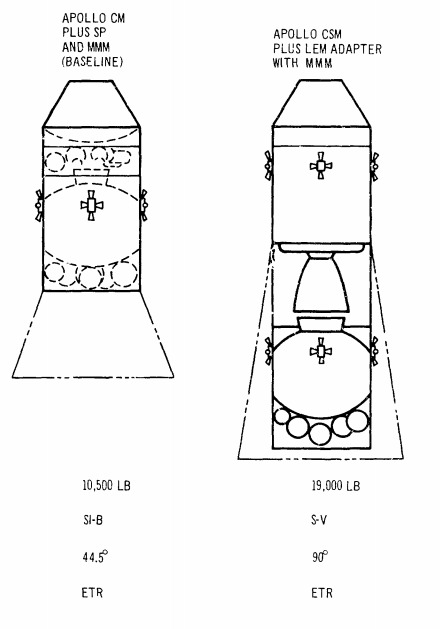
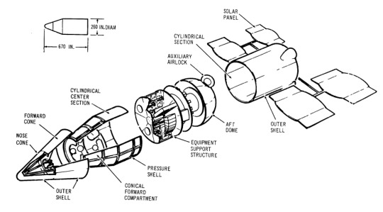
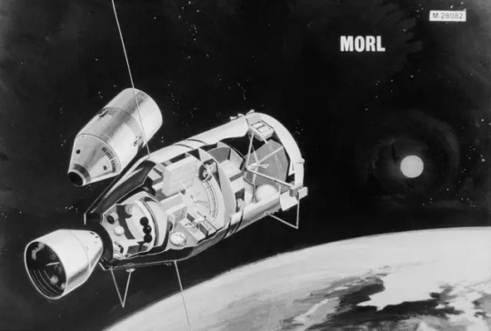
Cancelled Missions/Station: Manned Orbital Research Laboratory (MORL)

This was a study initiated in 1962 for space stations designs using the Gemini Spacecraft and later on the Apollo CSM. Boeing and Douglas received Phase I contracts in June 1964.


MORL/S-IVB Concept
"A 5 metric ton 'dry' space station, launched by Saturn IB, with Gemini or Apollo being used for crew rotation. The 6.5 meter diameter and 12.6 meter long station included a docking adapter, hangar section, airlock, and a dual-place centrifuge. Douglas was selected by NASA LaRC for further Phase 2 and 3 studies in 1963 to 1966. Although MORL was NASA's 'baseline station' during this period, it was dropped by the late 1960's in preference to the more capable station that would become Skylab.


Different docking concepts studied.
The Manned Orbital Research Laboratory was the brainchild of Carl M Houson and Allen C. Gilbert, two engineers at Douglas. In 1963 they proposed a Mini Space Station using existing hardware, to be launched by 1965. A Titan II or Atlas would be launched with a payload of control system, docking adapter and hangar module. The visiting crew would use the payload to transform the empty fuel tank of the last stage of the rocket into pressurized habitat (a so-called 'wet' space station). Provisions were available for 4 astronauts for a 100 day stay. Crew members would arrive two at a time aboard Gemini spacecraft. Equipment included a two-place centrifuge for the astronauts to readapt to gravity before their return to earth.

An early MORL concert. Artwork by Gordon Phillips.


In June 1964 Boeing and Douglas received Phase I contracts for further refinement of MORL station designs. The recommended concept was now for a 13.5 metric ton 'dry' space station, launched by Saturn IB, with Gemini or Apollo being used for crew rotation. The 6.5 meter diameter and 12.6 meter long station included a docking adapter, Hangar section, airlock, and a dual-place centrifuge.

"Medium-sized orbiting lab is this Manned Orbital Research Laboratory (MORL) developed for NASA's Langley Lab by Douglas Missiles & Spacecraft Division. The lab which weighs about 35,000 pounds, could maintain 3 to 6 men in orbit for a year.
Orbiting Stations: Stopovers to Space Travel by Irwin Stambler, G.P. Putnam's Sons, 1965."
Douglas was selected by NASA LaRC for further Phase 2 and 3 studies in 1963 to 1966. The major system elements of the baseline that emerged included:
A 660-cm-diameter laboratory launched by the Saturn IB into a 370-km orbit inclined at 28.72 degrees to the equator
A Saturn IB launched Apollo logistics vehicle, consisting of a modified Apollo command module, a service pack for rendezvous and re-entry propulsion, and a multi-mission module for cargo, experiments, laboratory facility modification, or a spacecraft excursion propulsion system.
Supporting ground systems.

MORL Phase IIb examined the utilization of the MORL for space research in the 1970s. Subcontractors included:
Eclipse-Pioneer Division of Bendix, stabilization and control
Federal Systems Division of IBM, communications, data management, and ground support systems
Hamilton Standard Division of the United Aircraft Corporation, environmental control/life support
Stanford Research Institute, priority analysis of space- related objectives
Bissett-Berman, oceanography
Marine Advisors, oceanography
Aero Services, cartography and photogrammetry
Marquardt, orientation propulsion
TRW, main engine propulsion.
The original MORL program envisioned one or two Saturn IB and three Titan II launches. Crew would be 6 to 9 Astronauts. After each Gemini docked to the MORL at the nose of the adapter, the crew would shut down the Gemini systems, put the spacecraft into hibernation, and transfer by EVA to the MORL airlock. The Gemini would then be moved by a small manipulator to side of the station to clear docking adapter for arrival of the next crew."

"Docking was to have 3 ports, all Nose Dock config, with spacecraft modifications totaling +405 lbs over the baseline Gemini spacecraft (structure beef-up, dock provisions, added retro-rockets, batteries, a data link for rendezvous, temp. control equip. for long-term, unoccupied Gemini storage on-orbit and removal of R&D instruments)."
"Later concepts including docking a Saturn-IB launched space telescope to MORL. At 4 meter diameter and 15 meter long, this would be the same size as the later Hubble Space Telescope. The crew would have to make EVA's to recover the film from the camera.
In 1965 Robert Sohn, head of the Technical Requirements Staff, TRW Space Technology Laboratories, proposed a detailed plan for early manned flight to Mars using MORL. The enlarged MORL-derived mission module would house six to eight men and be hurled on a Mars flyby by a single Saturn MLV-V-1 launch. MORL-derived Mars mission modules cropped up in other Douglas Mars studies until superseded by the 10-m diameter Planetary Mission Module in 1969.

MORL/Space Telescope
Why was MORL never launched ?
NASA had a need for a Space Station and MORL was little, easy and cheap. But NASA had more ambitious plans, embodied in the Apollo Applications Orbital Workshop (later called Skylab)."
-information from astronautix.com: link
source, source, source
NARA: 6375661, S66-17592
Posted on Flickr by Numbers Station: link
#Manned Orbital Research Laboratory#MORL#Space Station#Gemini#Gemini Program#Project Gemini#Apollo CSM Block II#Apollo Program#Saturn IB#Saturn I#S-IV#S-IVB#Apollo Applications Program#Cancelled#Study#1962#June#1965#my post
40 notes
·
View notes
Text
tbh ursa and azula are more alike in personality as was mentioned in the comments imo :)
similarities between ursa and azula
“Often father and daughter look down on mother (woman) together. They exchange meaningful glances when she misses a point. They agree that she is not bright as they are, cannot reason as they do. This collusion does not save the daughter from the mother’s fate.” this quote is like driving me crazy cause...

azula looks exactly like ursa (except her eye colour is closer to ozai's) she's literally a mini ursa. oh my god im foaming at the mouth they definitely did this on purpose bro - zuko looks like ozai but has ursa's personality; azula looks like ursa but has ozai's personality...
525 notes
·
View notes
Text
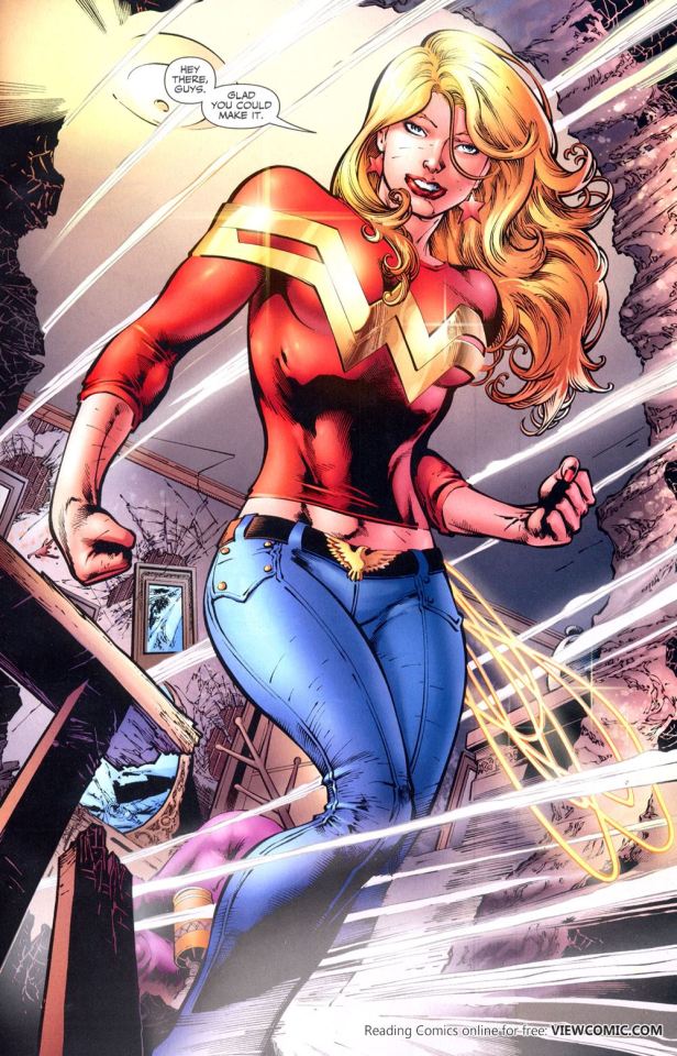
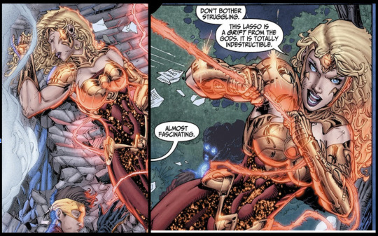
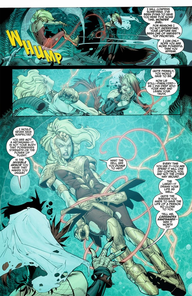
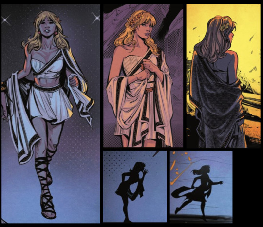
My personal Analysis and Rating of Cassie Sandsmark's hero outfits
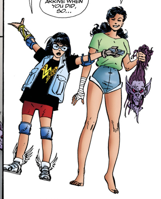
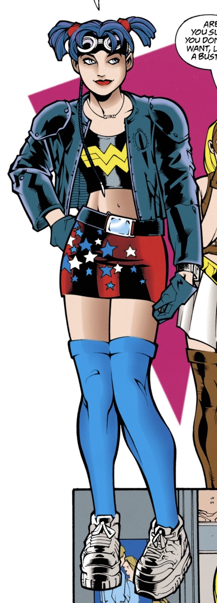
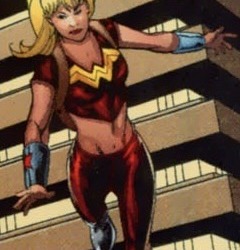
Cassandra Sandsmark's first "official" hero outfit first appears in Wonder Woman Volume 2 #111
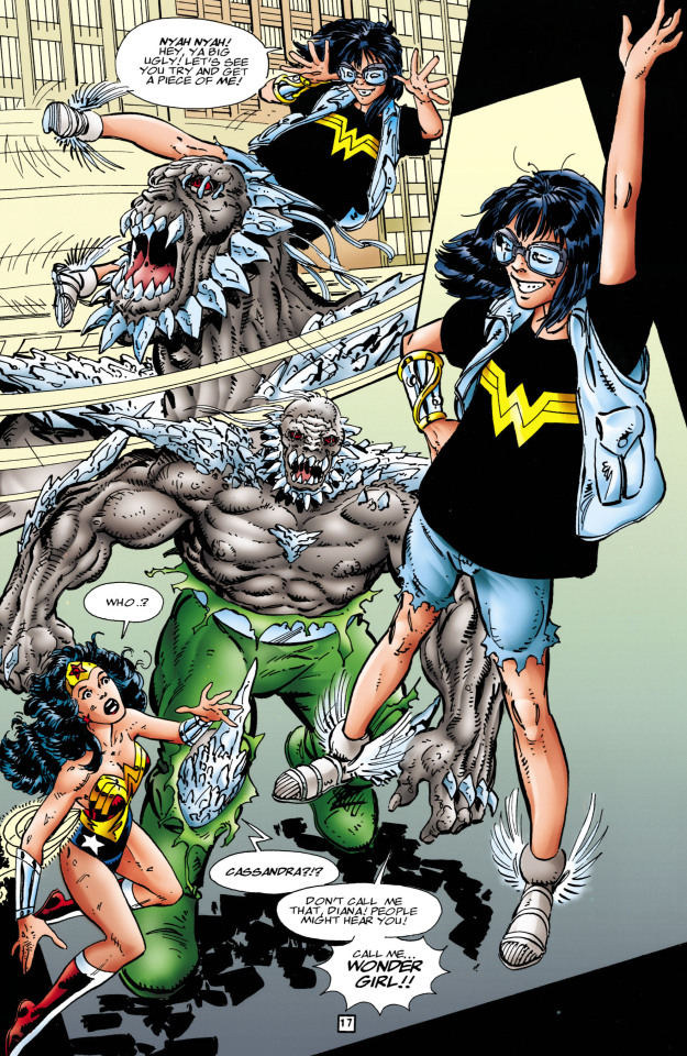
This look was created by someone called Anna Maria and it's just basically the shirt, shorts and vest Cassie was wearing when Diana is first in trouble and Cassie decides she's just going to go and help her as wonder girl. Along with what are just her regular clothes is some more practical choices such as goggles to protect her eyes she also wears them when skateboarding. The goggles also have another use which is to keep the wig she also wears in place. The wig actually is a call back to a wig Diana wore when someone else was being Wonder Woman. Cassie also wears the sandals of Hermes which grant her flight. The last piece to this makeshift ensemble Is the gauntlet of atlas which enhances her strength by ten and also helps to heal the wearer. I personally think this is on the way to a decent design for Cassie at the time. She has no powers at the time and while it isn't necessarily visually pleasing it works.
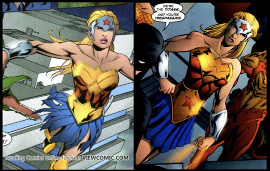
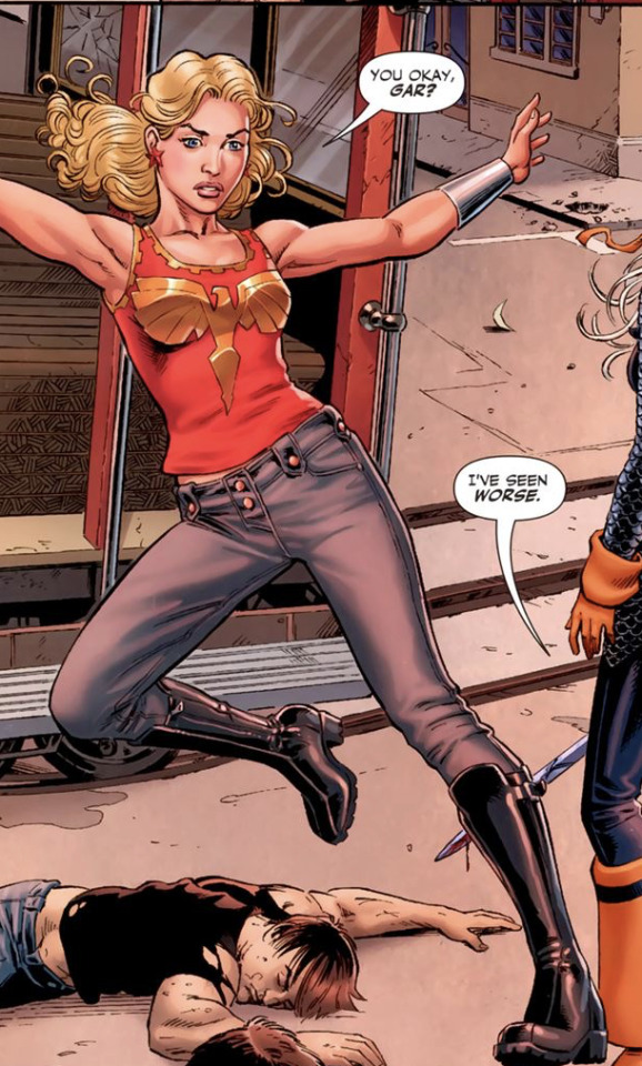
I would rate this just under her next choice of costume which first appears in Wonder Woman Volume 2 #113
This outfit has all the same gear as the last one ( Hermes's sandals, Diana's old wig, Cassies goggles and the gauntlet of Atlas) However she also has some new gear such as some elbow pads and kneepads I think we can safely assume she also wears these when skateboarding. Next are the Grey gloves, In WW V2 113 she starts off with two grey gloves but one gets disintegrated / badly hurt along with her hand. Her hand is later healed by the gauntlet of Atlas (it's been a while so I'm not totally clear on the details). In later iterations of the same outfit she replaces the gloves In young justice they appear as blue while in the Wonder Woman comics they usually appear as red.
In The main part of her outfit We see a shirt much like the one in her other costume but this one has a gold or red G ( the color really changes from comic to comic in what could be a printing error) I personally prefer The red G as it looks almost drawn on. I think the G looking draw on signifies just how early Cassie is in the hero game because she most definitely made the shirt herself. Cassie also wears some red shorts but these are tighter to the body almost resembling some short leggings or biker shorts. I think the shorts being closer to the body is just so much smarter because they are just far less likely to rip or get caught on something. I do wish they were made of a more thick material like jeans though because it creates almost more of a barrier.
The last change in this particular outfit is her vest , This vest is less worn and ripped than the first one proving it's an entirely different vest all together. I wish the vest had more pockets so Cassie could carry more things with her even if she doesn't bring them into battle all the time. In the Wonder Woman comics I think she holds a music player in them but I think it would be so smart if she also held bandages or first aid of some sort in there as well.
Later on she replaces the vest with an almost leather looking jacket in which case I still hold firm on wishing for her to have more pockets. I think at the point she replaces her vest she also removes her elbow pads but I can't say for sure.
Overall I think this is the best design Cassie could have made at the time and really speaks to how tactful she was at the time. I firmly believe that the safety precautions were more for her mother's benefit than her own though I don't think that it was a conscious choice. From how much of her gear comes from skateboarding really speaks to how careful Helena Sandsmark is because I don't believe Cassie went out and chose to pick up gear to protect herself when skateboarding. The elbow pads and Kneepads are one thing but the goggles just scream overprotective.
Its totally possible that Cassie consciously chose to add things to her costume so she was less likely to get hurt but I personally think she was just in the habit of taking extra precautions to protect herself solely for her moms benefit. Helena was so so reluctant to have Cassie be wonder girl and be a hero maybe unconsciously Cassie thought this might make her mom feel better about her being a hero.
Next is from the Sins of Youth event, Particularly Young Justice sins of youth # 1
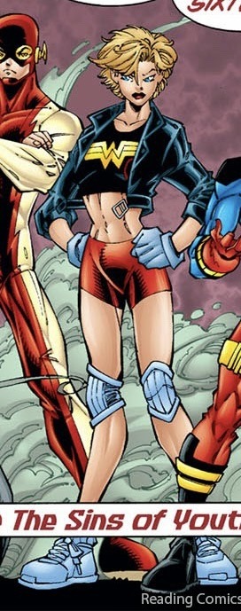
Now this isn't Necessarily a different Outfit but since she doesn't have the Wig or goggles I Chose to include it. I don't love this Design on older Cassie. I could handle the kind of scrappily put together look on Cassie when she was younger but when she's older she's completely outgrown the costume and at a certain point the same design becomes childish and lazy. Since she didn't choose this as an older version of herself I will let it slide though
This next one comes from Sins of youth: Wondergirls
Now Cassie just switched outfits with Diana and I have to say, it's not that bad. While I wouldn't personally put an older Cassie in a complete replica of the Wonder Woman costume I love the idea of it being a main inspiration. Also I totally love a buff Cassie. If I was to redesign her and I couldn't change the main suit, or the boots I would totally give her earrings, a weapon of some sort, I would also elongate the cuff things and personally I would give her somewhat longer hair that was tied up in a ponytail or braid of some sort. If I was to totally redesign this hero suit though I would add some layers or at least some more muted colors.
Overall I don't actually hate this design and while it could definitely be better it could most definitely be worse.
The next hero suit is also from Sins of youth: Wondergirls
Now hear me out I actually adore the idea of Cassie in some sort of a body suit. I wouldn't necessarily put her in Donna's old suit as again it just screams lazy but I love the vibe I get from it. Now I don't know why but something about this suit just feels a bit off, I'm not at all sure what it is but something is most definitely missing. If I was to redo this I think ideally I would give her a weapon, do a deeper and darker red like a mix between wine red and the red in the current suit, like a deep scarlet or something. I would also lose the gold W belt because of its weird cut and replace it with more of a bronze or a rose gold belt, Actually replace the gold necklace with a bronze as well. As for the boots I don't know what to do with the boots because I hate the boots over pants look.
There is just something missing no matter what I try to think of to redesign it while still keeping the general outline of the suit and I just don't know what it is.
Overall I don't hate this suit it just needs minor tweaks as well as adding that thing that's just missing.
Next is a One-Issue hero outfit that Cassie helps her dream up in Wonder Woman Volume 2 #153
I think its important to clear up a misconception I've heard before, Im not sure where I first heard it but Its a misconception where Cassie says she hates wearing skirts. First of all No hate on anyone who said this I think it genuinely is just a misunderstanding, Cassie in this issue doesn't say she hates wearing skirts what she says is something about her mom would hate this outfit's miniskirt. Cassie has worn a skirt at least once before in cannon, Way before Teen Titans volume three. From my recollection it was in one of the Wonder Woman comics in a storyline where her mom follows a fake merlin somewhere because she's in love with Jason Blood and wants to exchange her soul for his or something. I think Cassie wore some tights or pants or something under the skirt but I'm not totally sure.
Now that I have cleared that up I hate certain aspects of this outfit and like others. Starting with the hair at this point in time I love the way she styled her hair with the ponytails and the goggles but I absolutely hate the color on her and the weird little Anakin Skywalker braid absolutely needs to go. Next the top half of the costume ( jacket, necklace and shirt). I think the shininess of the shirt is a bit odd but I love the black with the gold Wonder Woman symbol. A crucial part of at least Cassies starting designs is how at least one piece of it is Wonder Woman merch.
I think a lot of people forget that Cassie is a Wonder Woman fan who gets to meet her idol who she admires and later on becomes her pupil and sister. I think we as a fandom don't acknowledge that quite enough but I digress.
Back to the outfit, I love the jacket but I don't know how much I like it in a hero outfit. I love the armored shoulders but the cut of it looks like it's just about to fall off of her and I don't think at this point in time Cassie would prioritize fashion over function. I think if the sleeves gathered or suctioned in some way to her arm like maybe an elastic cuff it would be great.
As for the necklace I love it but I don't know how smart it would be for battle someone could grab on to it and if it didn't break it could end up choking or harming her in some way. As far as the gloves go I wish they were a similar cut to her previous gloves because again they just seem like they are about to fall off.
For the bottom half of the outfit I love how functional sneakers are except for the laces which could come untied easily, but I digress. I hate the unfunctionality of the skirt I adore the big chunky belt as well as the pattern and color of the skirt but I wish the skirt was shorts instead. It looks like a really tight skirt that would restrict movement and for a hero that fights with their body only I just hate it. I know that Cassie at this point mainly punches her way through problems but the ability and choice to be able to kick is always a good one. I don't hate the socks but I wish they were slightly shorter just as I wish that the skirt was shorts and the shorts were like literally half an inch to an inch longer.
Overall this outfit is great as an outfit but not as a hero costume as far as functionality goes but it really does have some strong starting ideas.
The next hero costume has two versions which I will talk about separately the first version of this costume first appears in Wonder Woman Volume 2 #153
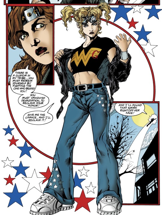
Now I love the hair and goggles but I do wish the hair was a bit more tied up instead of free but I have no other note on the hair as for the jacket I love the look of it and it adds so much to the outfit but again it looks like its about to fall off. I adore a cropped shirt moment for Cassie as it shows she's becoming more and more confident in her own abilities and really growing into her own, though I could be reading into it too much.
This is the first costume we see her cuff things being added to the equation instead of the cuff of atlas or just bare wrists. I really do think the cuff arm band things are such an important part of an amazon warriors design and it's really so important to me and a huge step forward in Cassie's hero identity and skills. I love, love, love her belt as well as her jeans with the little stars. The nondescriptness of the belt draws attention to the stars on her pants much more than it would if the belt were patterned instead though I do wish the pant were baggy and the proper length instead of being cuffed and too long. I think the pants being to long could be asking for trouble when fighting, if the pants become uncuffed then she could trip or get seriously injured by an enemy. I know Cassie usually flies and punches but it's just not smart to rely on that solely, a good design should work whether she is flying or not. Finally for the shoes I can't really tell if these shoes are laced ones or not but if they aren't then they could be velcro which I just like more as they are less of a tripping risk.
The next version of the design comes from Young justice but I forgot to write down which issue number
The main differences in this one are the belt and necklace. In the Young Justice version she wears the wondergirl necklace she wore in Wonder Woman V2 #153 and I think thats just a fun little tie in but I think as far as function goes I still have complaints with it. As far as to what I prefer in the version I definitely like the jacket a bit more but I do wish it stopped or cuffed right before what seems to be her amazon bracelet things. I adore how neat her hair looks because there's like no risk to it falling into her face with is very smart for usability. However I definitely prefer the colors in the Wonder Woman Design Overall I prefer the wonder woman version but its definitely not a bad design
This next outfit has two versions again but I'll try to keep it more brief The first design is from Young Justice #35
Hair: I wish it was tied up It seems like it would just blow in her face when she flies
Necklace: I don't know why its gold now and honestly I can't tell if I'm a fan of the change or not
Shirt: love the craftiness being brought back in with the gold W and red G, It seems like it accounts for a lot of movement too which I love for her. It again shows she's becoming more confident and I honesty think that's great. It also doesn't regress her design by making her look younger and I think that's honestly due to the cut of the shirt, if it was a t-shirt I think I would hate how casual it looks.
Arm band things: Always a win to have these out and ready to use in the design I especially love that they aren't at risk of being covered and are instead proudly displayed
Pants and belt: love how nondescript the belt is and I actually like the red for the pants it almost shouts back to donna's all red suit and I think that's just fun
shoes: the shoes are literally untied here like kill me now. girl please tie your shoes or a least tuck in the laces
Additional notes: I miss the goggles and while I like the overall design I think just doing small things could elevate it to the next level
The other version of the design: Wonder Woman V2 # 166
Hair: Its tied up! I love that. Also the goggles ugh it's just such a win. I couldn't design the hair better myself
Necklace: same notes as the other design except for this version I definitely prefer gold. I am still worried about the unnecessary harm the necklace could cause though
Shirt: I think I might like the plain gold W better than the W and G. I love the maneuverability she has and how the cut of the shirt actually reflects her age, It doesn't age her and it doesn't make her look childish either and that's honestly so refreshing.
Arm Bands: The arm bands are out, accessible and I'm loving it.
Pants: while I will mourn the loss of the belt it's probably smarter to lose it, if you've ever been sitting down and just felt the belt you were wearing start to dig into your stomach you know what I mean.
Shoes: I don't think she's losing the laces anytime soon but at least they're tied
additional notes: I prefer this design over the young justice design again and honestly I couldn't have designed her outfit better. Side note, In the dialogue where she and robin first show up robin remarks how he misses her "old black wig wearing quiet self" to which she replies "hey I gotta be me" and I really love them remarking on her growth in such a playful manner its honestly great.
This next design has two designs again and I'll once again keep it short. The first design is from Young Justice 49
Hair: The goggles make a comeback and while I would normally complain that her hair isn't tied back the long bits are out of her face and I guess its okay ( a small part of me still complains and wants back the goggles with the ponytail but I guess its okay)
Arm Bands: Arm bands are out, accessible and shining. I couldn't ask for more as far as they're concerned
Shirt: I love the singular logo but the big zipper track and zipper loop are a bit odd, I don't really get why exactly they are there or at least why the big loop thing is there, I can live with the zipper track
Pants: I have no new notes on the pants
Shoes: Finally the shoes don't have laces! They don't seem to have to much of a heel either but if she wanted to be taller I kind of wish she wore some slight platforms or something instead
Additional notes: I know this is a well loved design and I actually have very little complaints.
Second version of design: Wonder Woman V2 186
Hair: Get this girl a headband or give her goggles back or something, is styled lovely but it is all in her face
Shirt: I prefer this shirt over the other one, it still has the word zipper but this time its less obvious and that's honestly so much better
Cuffs and pants: no new notes
Shoes: I think these are boots also but they have less of a heel which I definitely enjoy better
Additional notes: This outfit is basically the same cut wise I mean the pants are lower but the shirt is at basically the same length just on a more realistic body type. I prefer the hair aspect of young justices version but outfit wise I'm all for this version. Overall it's really classy. it looks like an actual hero outfit while keeping Cassie's regular clothes/ merch apparel items aspect.
The next one is from Titans/ Young justice graduation
Now this one seems to be a combination of The young justice and Wonder woman outfit from last time but Cassies hair is kind of braided out of her face and she now has earrings, in my opinion this is the better design of the two previous versions
Next we venture into Teen Titans territory, this next design is from Teen Titans Volume 3 #2
In my opinion this is just such a huge downgrade, It is worth mentioning that in the Wonder Woman version of this outfit the pants are red jeans and she has red star earrings in. Im just so not a fan of this design and honestly it's probably one of the worst designs for Cassie . I don't know how much more I could stress that this is such a downgrade and I hate it.
This is the first glimpse we see of evil older Cassie this next design comes to us via Teen titans Volume 3 #17
I hate this design this once again is basically bottom of the barrel. The gold boots, The huge belt and top gold breast piece, the weird tiara and that ugly blue skirt as far as future adult Cassie's go this is the worst.
The next design first appears in Teen Titans V3 #34
Now the gold breast plate thing is weird, especially in the areas it covers. but if it was just a bird the rest of this design wouldn't be that bad. the jewelery is nice as is the arm bands. I can't really think of anything else nice to say other than that I'm happy the jeans are back, I love that she has a weapon now. but design wise its still bad but its at least a step in the right direction.
Next is the final evil Cassie design ( Teen Titans Volume 3 #51)
I actually love this version, its now occurring to me that the headpiece might be meant to allude to old greek helmets but its not very well executed so its hard to tell, I honestly think the blue was thrown me off in the last evil Cassie design. This isn't how I would design a future Cassie but it could be worse. Its still on the low scale for me but its not that bad
Next is Teen Titans Volume 3 #65
I wish her hair was pulled back but this is honestly one of the better designs of the teen titans vol 3 for Cassie, I love that she has her lasso I wish she had stars somewhere on her outfit but its alright I also really like the belt I think its a fun little thing. Personally something is missing from the shirt for me but I can move past it.
Her Final Teen Titans design first shows in Teen Titans Volume 3 #88
Now I hate the boots over pants moment that we're having again, I wish her pants were baggier and I desperately want more star details. It looks like her hair is in some sort of half up, half down style which keeps the hair out of her face mostly. I think the design could be worse but I'm still not wowed by it
Next comes honestly one of my favorite designs (Wonder Woman Volume 3 #28)
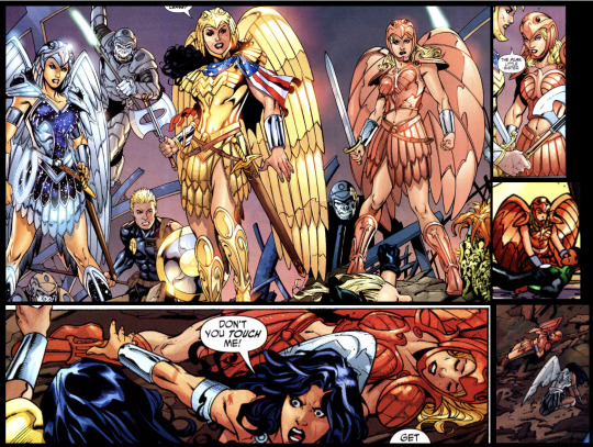
Now I would only change one thing about this and It is I would cover her midsection, like have her be fully covered the way Donna and Diana are . Now listen Cassie may be knocked unconscious for some of these but just look at the design. Her armor design is so different from everyone's but it also mirrors Diana's in a way that is simply breathtaking. I could rant on and on about this armor design but I would mostly just be repeating how much I love it.
Next is sadly the N52 version of things and while I personally wouldn't choose a lot of the decisions that were made some of the designs aren't that bad
Teen Titans Volume 4 #1
I love the hood and lasso in this costume as well as the little stars hidden in the fabric where the shadows fall. If this were for a different character I would honestly be all over it and as it stands it's honestly not that bad. I mean the hood is just gorgeous even though I'm not quite sure how the construction of it works, and I love the way the lasso drapes on her even though I'm not sure how she gets it off to use.
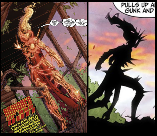
Next is the semi-armored version of the first N52 suit from TT V4 #5
I love the armored look on Cassie she honestly suits armor so well and I kind of wish this was her permanent N52 look, or at least in Teen Titans V4
Next is something that was called like her armor within or something I wasn't really paying attention (TT v4 #8)
This armor is funky and oversized, even though her hair is tied up which I love it just doesn't look good. It has the potential to look good but it genuinely looks so bad.
Also from the same issue of teen titans comes this look:

This doesn't even look anything at all like her previous suits in any capacity and I think it's supposed to look cool because it's supposed to be all glowy or whatever. I think that the teen titan writers should have just stoped designing some of the characters at some point.
Teen Titans Volume 4 #12
Again if this was any other character I would be all over this design because the silhouette and overall design of it is just gorgeous but for my girl Cassie Sandsmark I kind of hate it. It just seems really out of character despite how gorgeous the design is.
Next is her second main Teen Titans V4 design
Something is just missing from this design and I think its that there's nothing interesting going on for the bottom half of the suit, The top is alright its not great and I'm still not a huge fan but it could definitely be worse.
Next is the dreaded Young Justice Volume 2 and onward design
I hate basically everything about this design except for the hair which I honestly think could be better. The midi skirt over the leggings just makes her look so young and I hate the reintroduction of that blue into her design I really can't stand this design and every time I look at it I want to cry.
This next one isn't a hero suit but I think we all deserve a good thing after having to look at the YJ Vol 2 monstrosity
Trial of the Amazons: Wonder girl
I just love this outfit on her I mean just look at the silhouette. I honestly think everyone should read trial of the amazons just to see Cassie get to play detective again it's honestly one of my favorite DC storylines in a while even though it gets a lot of hate.
#cassie sandsmark#teen titans 2003#yj98#young just us#tt03#wonder girl#young justice 2019#dc comics#cassandra sandsmark#Wonder Woman vol.2#Wonder Woman vol.3#help what do i tag this#I stayed up way too late doing this
35 notes
·
View notes
Text
Separately, the DOJ accused two Russian employees of RT, the Russian state-owned media outlet, of a nearly $10 million scheme to create and distribute content to U.S. audiences while keeping the connection to Russia hidden.
RT worked with an online content creation company in Tennessee, which was directed to contract with U.S. social media influencers to distribute its content on social media platforms including, TikTok, X, Instagram and YouTube. Since November, the company posted more than 2,000 videos that received more than 16 million views on YouTube, according to the indictment.
United States intelligence and security officials have been warning for months about Russia’s efforts to interfere in the 2024 election, specifically to undermine the Democratic presidential nominee, exploit social divisions, sow distrust in democratic institutions and to erode support for Ukraine.
The U.S. has provided arms to Ukraine to support its war following Russia's invasion in 2022.
“Russia remains the most active foreign threat to our elections,” Director of National Intelligence Avril Haines told senators in May at a briefing about election risks.
This is not the first time the U.S. has taken action against those behind the Doppelganger influence campaign.
In March, the U.S. Treasury sanctioned Social Design Agency and Structura, as well as their founders, for a network of fake accounts and phony news websites, saying they carried out the campaign "at the direction of the Russian Presidential Administration."
A report released on Tuesday by social network analysis company Graphika documents a cross-platform influence operation linked to the Chinese government with the aim of influencing online discourse ahead of the November 5 elections.
The operation has relied on "spamouflage" to spread misleading or false information, adopting faux American accounts to sow division through anti-government narratives and posts on divisive topics such as the Israel-Hamas conflict, gun control, and racial inequality.
Using ATLAS, its proprietary platform for real-time intelligence and data analysis, Graphika identified 15 such accounts on X (formerly Twitter) and one on TikTok. Mimicking both U.S. nationals and advocacy groups, these accounts have taken aim at both major political parties and called into question the legitimacy of the U.S. electoral process.
They exhibited certain patterns, including the use of U.S.-related hashtags like #American, and presented themselves as U.S. voters who "love America" but feel alienated by issues ranging from abortion to U.S. support for the war in Ukraine.
One X post from June 2023 stated: "Although I am an American, I am extremely opposed to NATO and the behavior of the U.S. government in war. I think soldiers should protect their own country's people and territory from being violated, and should not initiate wars on their own initiative." The post was accompanied by an image depicting NATO's expansion in Europe.
Not to say "I told you so" but I've been saying this for months. Social engineers are hard at work trying to influence the outcome of the election in November. It is very likely happening on a larger scale than we know of. Take everything you read online with a grain of salt between now and November.
#politics#us politics#it's the 'internet research agency' all over again#news#us news#2024 election#op
38 notes
·
View notes
Text
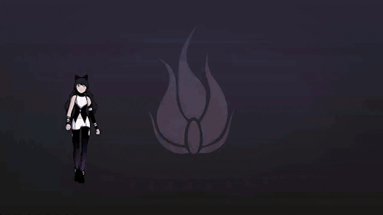
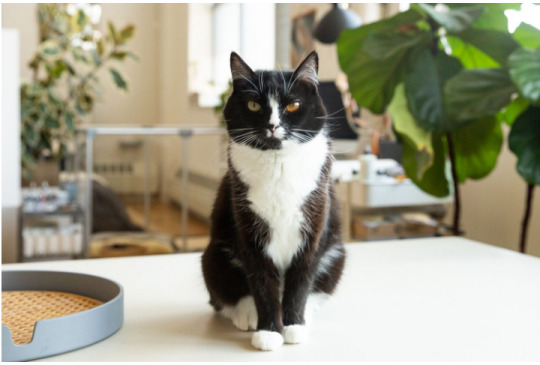
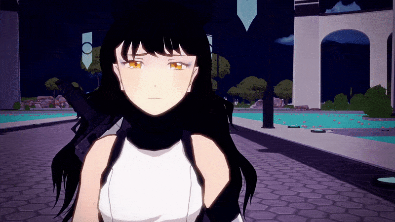
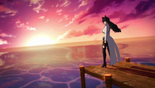
Blake Belladonna's Design
This is a quick appreciation of our Cat Girl's design. Its objective is to offer a short analysis by incorporating elements of other metas. Ideally, the end result will be something similar to Yang's post. Finally, this is the final piece of my mid-summer Blake meta spree :) So, enjoy!
JUST ANOTHER CAT GIRL?
Blake's design plays with the idea of "cat girl". Cat girls are common in anime and mangas, but are often overly sexualized. In particular, cat ears are usually presented as an overly cute trait and sometimes a fetish.
RWBY takes this idea and subverts it in 2 ways.
Blake's ears are initially hidden, so that her affinity with cats gets highlighted through other aesthetical elements:
Gambol Shroud's ribbon resembles a cat's tail and it being a whip may reference the infamous cat o' nine tails
She decorates her eyes with cat eye makeup
She is able to make copies of herself, which get jokingly referred to as copycats
In Mistral she wears leg boots, which bring to mind Puss in Boots
In Atlas she wears a catsuit
Blake's cat trait becomes a core part of her identity, which is explored on a double level:
It represents her faunus heritage, which makes her different from humans and discriminated
It is a symbol of Blake's troubled past and of her involvement with the White Fang
So, Blake covers her cat ears to run from both society and herself. Just like a scaredy cat ;)
As you see, with some limitations and worldbuilding, Blake manages to be a cat girl with much depth to her. Still, there is more to her cat design.
FROM CALICO TO TUXEDO
Let's juxtapose Blake's initial concept art with her final design:


What changes is the cat used as the main inspiration.
In the initial concept art it is the calico cat (tricolor cat):
In the final character design it is the tuxedo cat (bicolor cat):
Why the change? Let's explain it by highlighting one similarity (1) and one difference (2) between the two kitties.
1- Both cats are called after a type of cloth:
Calico is a fabric, which originates in India (the set of the Jungle Book - Blake's secondary allusion) and is famous for its colorful printed patterns. I wouldn't be surprised if Blake's clothes in the concept art were meant to be calico made.
Tuxedo is a formal wear, which consists of a black suit over a white shirt and a bow tie. Well, Blake's final design is a revisitation of the traditional tuxedo with a shorter jacket and a bow worn in the hair, instead than as a tie.
The idea of "cloth" is heavily used in Blake's design, which may be one of the reasons why the tuxedo is eventually chosen. This kitty, thus, offers a pretty poignant metaphor.
It all starts with Gambol Shroud, where shroud means a piece of cloth that conceals or protects:
Here come two thoughts:
Blake's bow is her shroud which is why it resembles her weapon’s ribbon (same color and similar material). The bow is the ears, while the ribbon is the tail. Together they complement Blake’s cat design.
Some tuxedo cats are called tuxedo masks because it is as if a black mask covers their whole faces. It is easy to see how this concept fits Blake, who conceals herself thanks to a little piece of fabric.
Basically, Blakes's bow is her tuxedo tie, which is worn as a mask.
2- The two cats differ when it comes to their color:
The calico is a tricolor cat, which is mostly known as having a white coat with some orange and black patches
The tuxedo is a bicolor cat, which has white and black fur
These two color patterns are another reason why Blake has been characterized as a tuxedo instead than a calico. As a matter of fact the black and white dychotomy fits our beautiful faunus girl more.
WHITE AND BLACK = BEAUTY AND BEAST
In old English, Blake's name means both black and white. As a result, she is linked to both colors, which tie with her light and shadow motif:
Blake is associated to the twilight because it is where light and shadow meet. What's more, her musical theme is built on this duality. She starts in the shadows and climbs her way up towards the light.
Well, Light and Shadow are linked to two Jungian Archetypes:
The Light is the persona, so what is shown to others
The Shadow is what is repressed, so the hidden parts
And these two archetypes are explored in The Beauty and The Beast:
The Beauty is the light - she is beautiful, lovable and accepted
The Beast is the shadow - he is ferocious, scary and misunderstood
So, Blake's own allusion can be read as the integration of beauty and beast, light and shadow, so that a new unit (a new individual) is born. This is also Blake's arc in a nutshell. She starts as a shadow because she hides herself, but with time she steps into the light and shows the world who she is.
In other words, Blake's Beauty and Beast allusion is referenced in her appearence not only in her nature as a faunus, but in her color scheme too. She is both beauty and beast, light and shadow, white and black.
This is also why these two colors are incorporated in respectively Sun and Ilia.
Sun is white, as he leads Blake towards the light:
Ilia is black, as she forces Blake to face her own shadows:
Through them Blake integrates her shadows and stops hiding:

This is why her design changes in Mistral in two notables ways:
She gives up her bow once and for all
She wears a white jacket over a black top
These two details mirror Blake's inner journey. She learns to show herself more, so her ears get to be out in the open and the light (white) surfaces. In Beacon, instead, the ears are concealed and Blake is wrapped in shadows (black).
Ironically, this means Blake's design loses the core traits of her tuxedo cat inspiration. As a matter of fact she has no bow tie anymore and the color pattern is inverted, which doesn't work. Why this choice? It is because Blake is going from Beast (black + cat) to Beauty (white + individual). Symbolically, this happens as she shows her faunus trait more openly:

She grows more beautiful (human) as she openly embraces her beast side (cat).
GOLD, BLUE AND PURPLE = HOT, COLD AND JUST RIGHT
The shift from calico to tuxedo brings some consequences to Blake and Yang's complementary designs.
Let's compare the bees exploratory ideas:


As people have noticed, Blake and Yang are aesthetically and symbolically linked since early on.
Here, we have:
Blake with one gold eye and one blue eye
Yang with a blue bandana
This chromatic choice ties into Yang's allusion and design. As a matter of fact our Goldilocks uses colors to represent the too hot, too cold and just right. Specifically:
red/orange is the too hot
blue/green is the too cold
purple (blue + red) is the just right
So, in the picture above Yang's looks play with the dychotomy between too hot and too cold. This same duality is mirrored in Blake:
She is both too hot (gold eye) and too cold (blue eye)
She wears much gold in general (Yang's main color)
The idea is clear. Blake is Yang's hot and cold. In particular, she brings some needed blue in Yang's life. She helps Goldilocks cool down and become more balanced. Similarly, Blake proudly wears Yang's golden tones, as she has to grow more like her Golden Beauty.
So, how have these ideas evolved in Blake’s final design?
Blake has gained a strong association with purple, which makes her Yang's just right
Blake's color scheme has ditched gold in favor of silver, which makes her and Yang complementary
Blake's link to purple is interesting because this color calls back to her family and to the surname Belladonna (beautiful woman in Italian). In other words, it is connected to both Ghira's legacy and her Beauty side. So, it is not a surprise that Blake grows more purple in each arc:

She is slowly blooming into Yang's just right by reconciling with her legacy and by becoming a person worthy of our golden girl.
This transformation is highlighted also by Blake integrating some gold into her:
In both her Vale and Atlas's designs Blake is linked to silver, so that she can complete Yang's gold. Still, in Mistral she has some gold details because this is the arc where she integrates her missing parts. This integration ends with Adam's death and Blake's rebirth:
So, Blake's design tells a story of inner growth, which leads her to stand beside Yang as an equal:
Blake: She's not protecting me, Adam. And I'm not protecting her. We're protecting each other.
This theme is important for Blake's Cat Girl archetype. Cat Girls, thus, are often reduced to love interests, but Blake's arc is a deconstruction of this idea. What would happen if the male partner of a Cat Girl is abusive? Blake explores this concept and tells a story of liberation and development, which ends with a reconstruction of the trope. Our Cat Girl ends up in a happy relationship, but not as a shallow prize. Rather as a winner.
BEASTS, LIONS AND WOLVES
In conclusion, Blake's design alludes to the Beauty and Beast on three levels:
Society= Blake is both human (beauty) and animal (beast)
Couple = Blake and Yang are drawn as complementary
Individual = Blake is both white (light) and black (shadow)
Still, this is not the only fairy tale our Cat Girl ties into thanks to her animal features. Here come three examples.
Blake is Bagheera's daughter and a small panther (a cat) in the Jungle Book
Blake is a Scaredy Cat to Lioneheart's Cowardly Lion. Except that of course the cat is braver than the lion
Blake is Ruby's black beast in team RWBY's LRRH team allusion
This last reference is foreshadowed since Red Like Roses:

Black the beast descends from shadows.
After all, the Beowolves appear when Blake's line comes up.
Moreover, Blake's secondary allusions all come together to strongly link our Black Shadow to wolves. In the Jungle Book, Mowgli is raised by wolves, just like Blake grows up in the White Fang. The name of the group itself calls back to wolves, as it references the title of Jack London's book about a half-dog half-wolf, who fights to be accepted by humans.
Finally, it turns out Blake is not the only Cat, who turns out to be a Wolf:
In short, Blake's design lets her freely move between allusions and references. Not only that, but it is crafted to add depth and thematic resonance to her character and her arc. Not bad for just another Cat Girl, uh?
#rwby#blake belladonna#rwby meta#my meta#yang xiaolong#bumbleby#character design#once upon an allusion
220 notes
·
View notes
Note
First i want to say that i love your rwby analysys, but i just discovered your blog, so can you explain to me why you hate Ozpin so much? Like, every minor thing he does and says must have some malicious intention behind it, but everything Salem does is part of a big plan that means that she's not actually evil?
ooh it’s been a while since we had one of these! 1. i think perhaps a closer read of my salem analysis is called for, because you’ll notice that i am, er, not shy about noting that salem is evil and this is in fact a central tenet of my reading of the narrative; i just don’t think she’s a one-note genocidal lunatic and it is extremely obvious that the narrative is heading in a "the brothers were and are wrong, and salem wants them gone" direction; 2. oz is second in my heart only to salem and cinder, which sort of speaks for itself in terms of "this character did bad things!" not being remotely a bad thing in my book, 3. and speaking of cinder, i get exactly as cranky about uwuified fanon sad wet rag ozpin who’s never done a thing wrong as i do uwufied fanon poor wittle cindy who doesn’t want to hurt people but salem makes her do it for exactly the same reason, which is that it strips out everything that makes these characters narratively and emotionally compelling in favor of mashing them into gutless marshmallow pod people for the sake of… i don’t know, making them neat and bland and easily digestible, i guess? uwu?
4. this is an ozlem house
5. i don’t think ozma has ever acted with malicious intention; rather, he’s been coerced into this situation where his faith in his god, his intense desire to do the right thing, and his terror of what will happen if he fails or disobeys—in combination with a divine curse that is literally designed to prevent him from being able to change or break free, because he has a reflection of himself monitoring his thoughts and actions all the time—are at war with his true desire (he wants to be with salem) and his conscience (he knows that salem was right about what is necessary to fulfill his task, that uniting the whole world under one creed is impossible except by genocidal conquest, and he cannot bring himself to do it because it’s wrong). he’s trying very hard to do the right thing in a situation where he genuinely believes his only options are to commit genocide for his god or sacrifice the whole world for his love and he is desperate to figure out a third option that does not end with "rocks fall everybody dies;" thence the lies and manipulation and all the miserable moral sacrifices he’s ever made.
6. the reason this is an ozlem house, in the sense that my reading of the narrative in its entirety is predicated on the ozlem reconciliation, is that salem and ozma are two sides of a coin: she is doing terrible things in pursuit of a world where the gods aren’t holding a knife to remnant’s throat and he has done terrible things for the sake of the same. their conflict isn’t evil-vs-good, but apostate-vs-zealot; salem believes the gods can and must be defied and ozma believes her defiance is doomed to failure. salem tells him that in order to unite the world he needs to spread his word and crush all who deny him; as the king of vale, ozma uses the divine relic of destruction to lay waste to not only his enemies but even his own allies, thus he forges the vytal accords that established the united global order in which the story takes place. he’s a better person than she is—because she’s been living in exile for thousands of years and her capacity for caring about other people has withered away to almost nothing as a consequence—but they are in every sense equals.
7. the narrative is overtly not on ozpin’s side? he has a whole atonement arc about it in atlas—& this is why i made the comparison to uwuified fanon cinder earlier, because the framing with regard to ozpin is very emphatically clear that he does a lot of things that are not good, and are in fact pretty sinister and in some cases (amber, pyrrha) outright evil, and he has to make the choice and put in real meaningful effort to be better. i don’t think there’s anything to be gained from ignoring what is plainly in the text of the story, especially when rwby is categorically disinterested in sorting its characters into neat little good-or-bad boxes. there’s no such thing as pure evil—that’s been the explicit textual conceit since volume one—and the implied converse is that there’s no such thing as pure good, either. (which is a conceit that ozlem exemplifies.)
8. i threw a fucking PARTY when we found out salem razed vale, i get the vapors every time i think about what sort of narrative escalation we can expect in V10 given that something as huge as razing vale can happen off screen to set the stakes for vacuo. not that i don’t also adore characters who are good or who (like oz in v7-8) grow and change to become better, because i do, but i really can’t emphasize enough how much i Do Not hate fictional characters on the basis of them doing awful things. what i want from a character is for them to be interesting, which ozpin is. what you’re perceiving as me hating on him is me dissecting him under a microscope because i love him to bits.
9. the ozlem screeds will continue until morale improves
32 notes
·
View notes
Text


This isn’t a commentary on intelligence, it’s about environmental surroundings.
As a person who grew up in Texas, we don’t have grass, we have concrete. Statically speaking, Leo wouldn’t have eaten grass. Also he’s smart (Did college math equations at age 8).
For Calypso, she was immortal in her childhood so I feel grass wouldn’t affect her in the slightest and she’d just go on with her day.
This joke looked like a nice time to draw how I headcanon Calypso to look.
1. I feel like she ties flowers into her hair and braids her hair in different styles since one of her pass times is weaving
2. I gave her vitiligo since I saw that people already headcanoned her to have it. Idk the og reason but my interpretation is that it makes her face look like a bunch of islands.
3. Calypso’s mom isn’t clear but with the consistency of it being tied to the ocean and Calypso’s dad canonically being Atlas, I thought to myself “What’s the sky and sea if not islands inbetween?” And Gods do love their ironic punishments. (I definetly need more practice on that part of the design)
4. I gave Calypso a Polynesian look as more diversity seems to be being added to the live action remake. Additionally, Polynesian translating to “Many” and “Islands” in Greek.
(If there are any Polynesian viewers, if I got anything wrong or if there’s a way to make the design more accurate, I’d love to know)
I tried putting symbolism in the flowers Calypso has in her hair but ended up messing with the coloring.
(I do want to put insert some butterfly weed in a future design)
Still on hiatus cause of stupid life stuff. But this keeps my brain occupied. I got 3 word docs of analysis.
#Percy Jackson#percy jackon and the olympians#calypso#leo valdez#caleo#yes this is my new hyperfixation#it’s the psychological analysis potential for me#also calypso reminds me of lapis lazuli
11 notes
·
View notes
Text
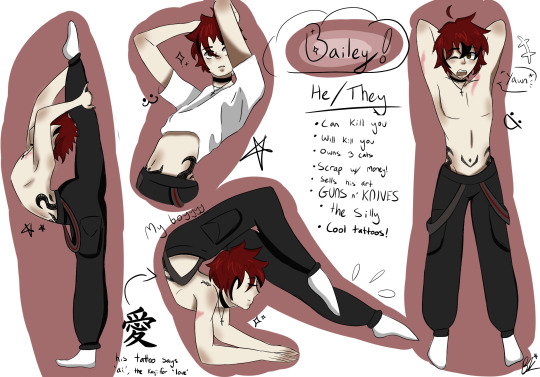
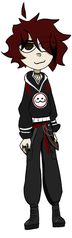
“Hello. My name is Bailey…. What? My last name? Unnecessary. Not to mention, unimportant. Get to the Point already, What do you want?”

“Facts about me, I guess.” -19 years old
-He/They
-Demiboy
-Uranic
-taken by Pebble (@candy-for-the-win) and Toniø (@toniolovesfish)
-5’4
-Born January 9th
matching with @nyuclearic 😋
ANONS:
🟠 anon
💖 anon


OOC:
Hi everyone! So this is my OC account for Bailey, My Ramshackle OC (HEAVILY based on myself) and you can ask him anything! His voice claim is Zuko from ATLA with hints of Wanderer and Xiao from Genshin Impact mixed in! A few ground rules: -please use he/him or they/them pronouns when referring to him
-No NSFW to mod, I am a MINOR - suggestive is allowed for Bailey, as he is not.
-if you take inspo from my art, please tag me so I can see!
-I do take recommendations/suggestions for art and lore.
-please do not disrespect me or use my OC without permission
-he will be a little rude/sarcastic at times, but that’s just his character! I’m not tryna disrespect anyone.
-Remember that he is based off and run by a REAL PERSON.
-have fun!!
Boundaries for asks: No serious NSFW
Comfortable with most anything! Cuddles, hugs, high-fives, idk just anything!
Bailey is clingy (as long as you can get him to warm up to you) so have fun w/ that :3
Extra info: Singing Voice Claims here Some Bailey and Jay (@trimalchiooframshackle) lore here Info on Bailey’s past here and here Art refs here Compilation of random Bailey facts: Here!
Genshin selfship analysis here!
Genshin self-insert designs here!


#ramshackle#oc#oc art#my ocs#oc rp#roleplay#ramshackle bailey#ramshackle oc#zeddyzi#ramshackle fanart#masterpost#yippee#!!
37 notes
·
View notes
Note
NO CAUSE THIS BLOG IS A GODSEND.
Like me? I don't hate Aang. Or at least I'm trying not to, because it feels weird to me (personally) to hate a child, when he's just the product of some REALLY SKEWED WRITING.
But EVERY TIME I SEE AN ANALYSIS ON ATLA AND HOW AANG REALLY JUST. Was not it. It gets a little harder to not be a hater (I do my best though) AND I HAVE TO SAY. I absolutely adore how open you are with just. Hating him. Like I'm not even being sarcastic, it's just really refreshing to see someone so willing to express their pure, unfiltered opinion on a character. Especially now, where most people are concerned with impressions, or like offending people, it's just like a splash of cold water(in a good way, I love cold water) to see someone be so clear and unafraid to just. Hate on him (IN A GOOD WAY).
Along with the fact that so many people like to act like Aang is a perfect child, or that he's "only 12 so he doesn't know any better". I can't stand it when people excuse their favourite characters' flaws in favour of only seeing a perfect character.
Coz like. Do you really like a character if you're not seeing them/accepting them fully? Like, they're your favourite. But are you really appreciating them if you're not accepting criticism of them? Because then you're actively rejecting their flaws, which are still a part of that character. You're rejecting an entire aspect of their character. Which I feel is like. Chopping the character in half. It's not real appreciation, if that makes sense??
SORRY THIS GOT A LITTLE LONG, I GOT KIND OF AGITATED. BUT WHAT I MEANT TO SAY IS THAT I LOVE THAT YOU HATE ON AANG EVEN IF I DON'T HATE ON HIM.
I really hope I didn't come off as offensive (or rambly), because I REALLY DO MEAN THIS IS A GOOD WAY
First, I just want to say, it's totally alright to hate a FICTIONAL child (ask a few parents how they felt about Caillou. Go ahead. Prepare to hear some thoughts...). The thing about hating fictional children is that you're not hating on an actual flesh and blood human. You're hating a construct created by adults who should know better (especially in this case). You're hating tropes and traits and maybe even character design . That is not the same as hating a person, no matter what Aang stans try to tell you. You don't have to hate Aang, but you don't have to feel bad if you do hate him, either.
I will never stop voicing my opinion because strangers on the internet don't like it. It's a cartoon. It has no bearing on anyone's life (except maybe Bryke, I guess? ). I'm still having fun revisiting the show, and talking about it on this site (and only this site), but that's all it is. A fun way to waste time. Anyone who is personally offended by my not liking Aang (or Mai, or Azula, or any other character we disagree on), has a personal problem. An internal problem. One I hope they can recognize and grow from before they encounter people with different opinions in the wild.
45 notes
·
View notes
Text
Excerpt from this story from Inside Climate News:
Many existing marine protected areas might be something like screen doors on a submarine, at least as far as their impact on ocean conservation.
A new study finds that only a third of the world’s largest marine protected areas (MPAs) currently implement meaningful conservation measures.
Increasingly, marine conservation is the art of separating humans from parts of the ocean. More often than not, marine protected areas, swaths of the sea that are set aside and managed to preserve sea life and its habitats, are the flagship models for government efforts to accomplish this.
However, a recent analysis published in Conservation Letters revealed alarming inadequacies in the effectiveness of the world’s largest MPAs. The study, conducted by an international group of researchers spearheaded by the Marine Conservation Institute in Seattle, Washington, focused on the largest 100 MPAs in the world, which together encompass over 7 percent of the world’s ocean area.
“There are 18,000 MPAs, but a hundred of them make up 90 percent of the area,” said Beth Pike, director of the Marine Protection Atlas and the study’s lead author. “These are the big needle movers.”
Pike and her colleagues found only a third of these MPAs’ total expanse to be under high or full protection—just 2.6 percent of the global ocean footprint. They found another third of these MPAs’ territories allowed for destructive activities, such as mining and industrial fishing, making them inherently incompatible with conservation. Additionally, another quarter of the protected area they analyzed were deemed “paper parks,” meaning that while these ocean spaces had been officially proposed or designated as MPAs, they had yet to implement any subsequent conservation measures. For example, over 60 percent of the OSPAR MPA network, which jointly covers roughly 7 percent of the Northeast Atlantic Ocean, appears to have benefited from no protection activities aside from its listing as a protected area.
These findings stand in stark contrast with the agreement by 188 governments to protect 30 percent of the world’s lands and waters by 2030—the 30×30 initiative—in the Kunming-Montreal Global Biodiversity Framework adopted during the United Nations Biodiversity Conference (COP15), in December 2022.
13 notes
·
View notes
Text
One Piece chapter 1119 Review and Analysis

Confronting Wano’s lingering prejudices in the cover story is a pleasant surprise. I wasn’t sure there’d be a way to do it in the near-wordless cover stories, but Oda’s taking it on anyway. This choice helps retroactively justify the slow start to the story because of the contrast it creates with all the people heaping praise and assistance on them in the early installments. I did have, looking at this, a thought about Wano’s culture. Some comments are quick to call out the country’s citizens for not learning from the monster they created in Orochi by blaming blood instead of individual, and I myself was pretty hard on Hiyori on that point back when the arc ended. But we have to remember, the purge of the Kurozumis happened when Orochi was a child, and the man died at 54. So have these kids learned from what happened to Orochi? Hell no, they weren’t around for that. Even Hiyori wouldn’t have seen the events Orochi lashed out over. And yes, there may be older people alive who witnessed the full cause and effect, they might be forgiven for not passing that down fully to their kids considering what’s been happening to them for the past 20 years. You have to solve issues of life and death before people are able to ease their focus toward social problems. Hopefully Wano is now at the point where they can start doing that.

Mars’s “defeat” on the sea below is something I think could have been choreographed more clearly. Like, the concept works, but it’s spread over so many pages that it looks more like Bonney, Sanji and Franky push Luffy into Mars for an extended struggle before he flies away. Given that the final push seems to be Luffy fully inflating, what was the point of what the others were doing? I think this should have been something more like the launch of a cannonball, where the three hit Luffy simultaneously back near the ship and he flies out and hits Mars full force, carrying the launching power of their attacks. You could still fit the back and forth around using Haki into that in roughly the same number of panels, and the motions of it would actually make sense. Turning things that seem like the should be quick hits int physics-defying pushing struggles is nonsense when the anime does it to draw out scenes, and it’s nonsense when Oda does it too.
But luckily, this one kinda awkward clash actually isn’t the finale of the arc just yet. The Sunny’s group is being held up, presumably by Nusjuro, and the other Elders aren’t giving up yet.

I’m worried by Atlas’s moment though. That thought to Lilith about York’s monitoring feels really ominous for her survival chances. Are all the good Vegapunks really going to die together on Egghead? I wonder if Atlas and Lilith will work together to take York out of the World Government’s hands as well, ending them all in a blaze of glory. That would be a sad; they’re fun characters, and I really like Atlas’s design. Normally with Oda you wouldn’t worry about this kind of thing, but with Shakka and Pythagoras gone and Edison implied to be down and out as well, it’s starting to feel more likely.

And don’t think I didn’t notice his lack of fear about hitting the water after. It doesn’t outright confirm anything – we’ve seen a lot of Devil Fruit users make big risky jumps over open sea in the past – but it’s definitely an interesting addition to the evidence.
(Also the concern about the spat-out Cipher Pol agents “dying on impact” is pretty funny considering they’re only here after surviving the even bigger fall from the Labophase basement, but I guess the Marines on the ships wouldn’t know that.)

There’s the mystery of what makes the time right for EMET now, presumably the same thing Roger was “too early” for, but putting toegether the dots, what was it that made it seem like the time could be right 200 years ago. Have there been multiple opportunities to do whatever the One Piece was intended to do, and all we’re seeing is the one that works?
As ready as I am to see Elbaf, I’m also not going to complain about Egghead taking the extra few chapters it needs to totally put a bow on things. A climax for the remaining Vegapunks. The big escape for the Sunny’s group. A final smackdown on Saturn for all he put Kuma and Bonney through and the definitive last word of the broadcast are going to be worth it in the long run. Will the Elders be allowed to achieve their objectives of capturing Punk Records and the Mother Flame, or will Atlas/Lilith/Stussy perform one final, sacrificial act of sabotage and make it so everyone loses?
With break week nigh again, I’m going to drop volume 2 of my rewrite project at some point in the next seven days, either when spoilers would normally hit or when the official release would be on a chapter week.
Reminder that you can read this review and more on my Wordpress.
12 notes
·
View notes
Note
Hi....if you don't mind me asking, who are your top 7 favorite romantic relationship's couples in books/ manga/ anime/movies/tv series (can be canon or non-canon) and your top 7 favorite characters ever from any media? Why do you love them? Sorry if you've answered this question before......Thanks....
Hi!!! It’s no problem at all I love to talk about ships <3333
1) Lawlight from Death Note

what can I say about this ship that hasn’t been said? They make me genuinely insane and they hit in ways… I’ve been obsessed with and have actively shipped them for over half my life lol. They are my ultimate OTP. I don’t even really care for e2l pairings personally but lawlight to me is just Different and those that get it get it
2) Kataang from Avatar: The Last Airbender

Literally they were the first ship I ever shipped. I’ve shipped this pairing since I was like 8 years old. They are very near and dear to my heart and they are so cute and perfect together and they spark so much joy and I am SO EXCITED for the movie!!!!
3) Byler from Stranger Things

I am obsessed with this ship. I love them so much and I am rooting for their endgame in the final season! I love the analysis the byler shippers come up with and they’re genuinely such a fun ship to me
4) Eremika from Attack On Titan

This ship makes me rabid I’m serious. I spiraled so bad after I finished AOT and devoured like 20 fics to cope. They ruined my life etc but I love it
5) Nezushi from No.6

I don’t like the anime much (because it rlly cuts so much of the story) but the manga and the novels are amazing! I love the story overall and the characters individually so the fact there’s a canon gay relationship is such a bonus
6) Blackswan (Jacob x Bella) from Twilight

Stephenie Meyer will pay for her crimes lmao we were legitimately robbed of their endgame and idc what anyone says. Team Jacob till the day I die fr
7) Quimbry/Quil x Embry from Twilight (me and my friends decided on the ship name lol)
I don’t have a gif cuz these characters are so minor they hardly appear but do I ship the hell out of them? Yes! Are they canon? Hell no! Should they be? Yeah and that’s why I’ve written over 100k for fanfic for them on my ao3 lol
As for favorite characters, I gotta rlly think on this
🤔🤔🤔
My favorite character of all time is Light Yagami from Death Note. I fucking LOVE his character so much. I just love everything about him. The way he’s written, the nuance, his whole aesthetic. It’s so *chefs kiss* and I have so many thoughts about him. I am NOT one of those death note “fans” that hates Light or drags his character lol. I am a Light enjoyer unapologetically and he imo is one of the best villains of ALL TIME
Another character I love immensely is Carl Grimes from The Walking Dead comic book. Not the show cuz the show is trash! I used to relate so much to Carl growing up bc I read the comic book as a teen. He’s forever cemented as one of my favorite characters of all time. Also I love the character design and how he’s kind of an anti hero
I also love Ellie Williams from The Last of Us 1 and 2 for the same reason. She reminds me a lot of Carl in the “anti hero” sense. She’s also such a badass. Love those video games !!!!
I also love Eren Yeager from Attack on Titan. Can you tell I like morally questionable characters? Lol. Eren was always and will always remain my favorite character in AOT. He’s kind of crazy but I like it lol and I kind of relate 🤣
Aang from ATLA is also one of my favorite characters. He’s got a sick character design, I love the way he’s written and he’s genuinely a huge comfort character to me. His character arc makes me cry it’s so well done and I love his personality. His character makes me very happy :)
Lastly I think another fav character is Will Byers from Stranger Things. I relate heavily HEAVILY with him. Not only that he’s an artist like me, or his personality which is similar to me as well, but also his upbringing with an abusive father and lastly the fact he’s canonically a gay guy like me makes me feel very represented in the show. He’s my favorite in the entire cast of characters. Love him to death and Noah Schnapp was such a perfect cast and he acts his ass off every second of screen time
Thanks for sending me questions!! :) I love talking about ships and characters this was fun!
17 notes
·
View notes
Note
are there any mega man side characters you think deserve a little more love/screen time?
hi! sorry for responding a few days late.
absolutely though!
for the classic series: definitely more emphasis on bass. he’s only been playable a couple times, and is a really cool character that could make a great rival or just another guy to play as if they’d add him more. you could argue he’s more of an antagonist or an anti hero than a side character but i’d still consider him one since he reappears multiple times. i could argue the same for protoman, but at least he gets more screen time.
x series: the navigators that were present for like. X5 and almost nowhere else. signas and douglas were used a couple times then completely traded in which sucks. dynamo would be nice to see more as well, great design but he’s only in two games.
zero series: an update on cerveau would be nice. he helped zero a ton and was just sort of cast aside after the mmz games. i’ve seen people theorize that he is fleuve from ZX, but i don’t know if i agree with that.
ZX: literally like, everybody. prometheus and pandora are my favourite bosses franchise wide, and they have the potential but weren’t given the game time to actually expand on it unfortunately. i plan on writing an analysis on them soon! however, i don’t think i’d count them as side characters when they’re purely antagonists (although justified in their actions to a degree).
more emphasis on the ZXA mega men (aeolus, thetis, atlas, and siarnaq) would be nice. they’re sort of antagonists too, but they had developed character traits and backstories so i’d consider them side characters as well. i love all four of them and would love to see them get more love.
battle network: raika and search man were really cool, wish i could have seen them more. lan’s friends also deserved more screen time and character development. mick was only in BN6 yet had more development than any of lan’s ACDC friends
star force: i’ve only played the first game and some of the second, so bear with me here. but pat/rey and gemini were really cool characters and i wish they had re-appeared. pat really made me love SF1 so it sucks he’s only in that game.
not sure about legends, still need to play it.
sorry for such a long post!! i feel like the star force and ZXA characters get the least amount of attention, so i’d say they’re the most underrated.
#thank you for the ask i really love answering questions#mega man classic#mega man#mega man zero#mmx#rockman#classic megaman#megaman#mega man zx#mega man x#mega man battle network#mmbn#mega man star force#mmsf#mmzxa#mmzx#mmz
19 notes
·
View notes