#artemest
Explore tagged Tumblr posts
Text
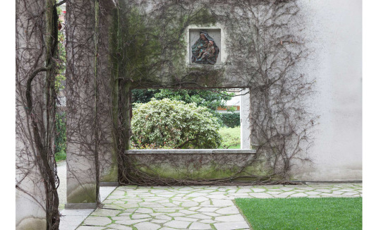
Design Delights, what to see at Fuori Salone Milan Design Week 2024
Fuori Salone Design Week is a colorful celebration of creation that takes place in the busy streets of Milan, where history meets innovation. You will be really taken aback by the dazzling exhibitions and installations that offered a glimpse into the future of design as we started to explore this creative extravaganza. Неделя дизайна Fuori Salone – это, больше чем красочный праздник творчества,…
View On WordPress
#2024#appartment#armani#artemest#bagni misteriosi#best installations#casa#casa ornella#cini boeri#cortile della seta#creative#fuori salone 2024#furniture#gaetano pesce#home#innovation#inspiration#legacy#loro piana#luxury#maison#milan design week#mvp#porsce#prada#rossana orlandi#show#starck#villa#what to see
0 notes
Text


Karim Rashid
Es uno de esos diseñadores que ha transformado el mundo con un enfoque completamente único. Su trabajo se caracteriza por su estética futurista, llena de formas orgánicas y colores brillantes, que parecen casi salidas de una película de ciencia ficción. Para él, el diseñoes la búsqueda de crear experiencias y atmósferas sensoriales donde la tecnología juega un papel fundamental. Rashid no solo diseña productos, sino también ambientes y espacios que nos invitan a interactuar de una forma nueva y emocionante. Uno de sus productos más populares, Bikini Lounger, ejemplifica su enfoque de crear objetos que van más allá de lo funcional, transformando el espacio y la percepción.
En la actualidad, sigue siendo una figura clave en el diseño contemporáneo, marcando tendencias que impactan cómo pensamos y vivimos los espacios. Su trabajo ha influenciado un montón de generaciones de diseñadores, poniendo siempre en el centro de todo la conexión entre lo humano y lo tecnológico.
Rashid, K. (2009). Design Your Self. Rizzoli. "Karim Rashid: the man who wants to design everything" (2017). The Guardian.
Puro Diseño. (2021). Karim Rashid y el uso explosivo del color. Capacitaciones. https://capacitaciones.purodiseno.lat/actualidad/karim-rashid-y-el-uso-explosivo-del-color/
Artemest. (n.d.). Karim Rashid collection. Artemest. https://artemest.com/es-es/collections/karim-rashid
0 notes
Text


Artemest L’Originale Gold and Amber Crystal Anemone Perfume Bottle
0 notes
Text
Some of the top luxury furniture brands and where you can find them
When it comes to luxury furniture, there are several brands and retailers that stand out for their quality, design, and craftsmanship. Here are some of the top luxury furniture brands and where you can find them:
1st Dibs: Known for vintage and pre-owned furniture and decor, 1st Dibs offers unique pieces such as the iconic Egg Chair and Victorian dining tables.
Kelly Wearstler: This brand merges luxury with design expertise, offering items like the Superluxe Dichotomy Table. Prices typically start in the four-digit range and can go above $10,000.
Armani Casa: Armani Casa brings the brand's sartorial elegance to home goods, offering high-quality home decor that reflects the Armani world.
Moda Operandi Home: Known for luxury fashion, Moda Operandi also offers a home section with chic home accessories, dining settings, and more.
Novogratz: With several #1 best-selling items on Amazon, Novogratz offers luxury quality products at accessible prices.
Hooker Furniture: Available on Amazon, Hooker Furniture has a range of high-rated pieces for every room, with a mix of traditional and modern styles.
Mr. Porter Home: The sister company of Net-A-Porter, Mr. Porter Home offers a selection of luxury home goods, including diningware, home accessories, and more.
West Elm: A household name, West Elm offers modern and Scandinavian-style luxury home goods that are both stylish and functional.
Tov Furniture: Tov Furniture, found on Amazon, offers playful and timeless furniture with a mid-range luxury price point.
RH (Restoration Hardware): A trusted name in home goods, RH continues to provide high-quality furniture for those looking to furnish a grand space.
Perigold: Offering a diverse range of aesthetics, Perigold is a source of luxury furniture that can add a touch of excitement to any home.
Artemest: Known for contemporary Italian design, Artemest carries works that are functional and artistic, making it a favorite among industry insiders.
Nathan James: If you prefer wooden home goods, Nathan James offers highly rated products that are both practical and stylish.
Knoll: Collaborating with renowned architects and designers, Knoll creates expertly crafted pieces, especially for office spaces.
2Modern: Carrying pieces from iconic brands like FLOS, 2Modern offers a collection of contemporary coffee tables, living room essentials, and outdoor furniture.
Christopher Knight Home: Known for classic home design, Christopher Knight Home offers luxury at an affordable price point.
These brands represent a mix of high-end design and functionality, catering to those who seek luxury in their home furnishings. Whether you're looking for a statement piece or a complete overhaul of your living space, these retailers and brands offer a wide range of options to choose from.
0 notes
Text
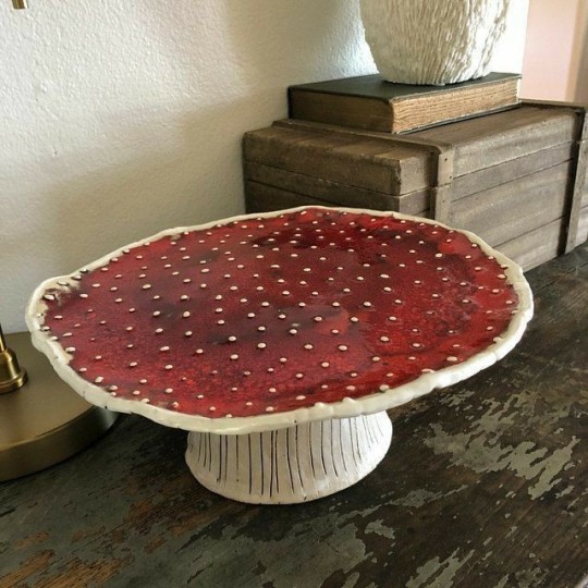
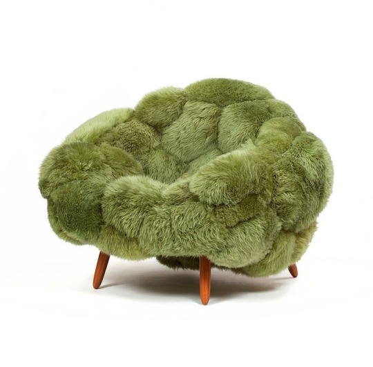
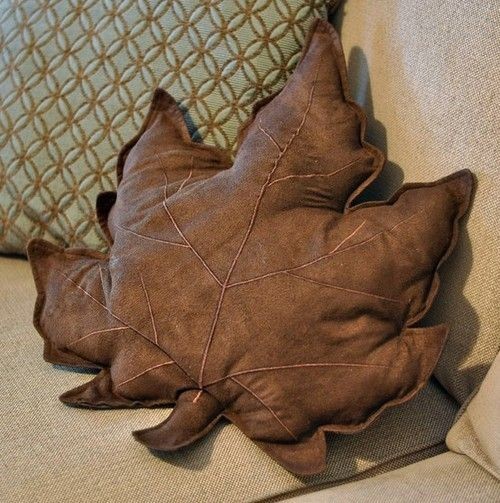
This is all art! Please credit!
mushroom display tray by Ceramictales (Valentina Fadeeva)
Bolotas Armchair Pistachio by Carpenter’s Workshop Gallery
maple leaf pillow - shared too many times, source unknown
Beautiful mushroom cushions by Fungimaa
tree ring rug sold by heine, discontinued
Magnolia armchair sold by artemest
moss/scenery rugs by alexandrakehayoglou
Cute Mushroom Table And Stool - Resin - For Fall sold by Apolo
D.I.Y Rock Pillows by Laura Crawford

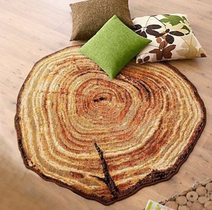

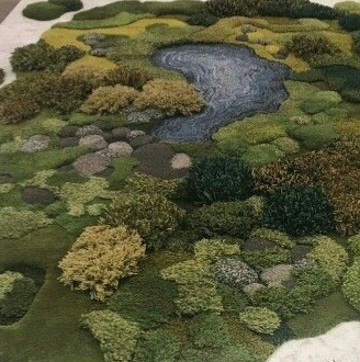
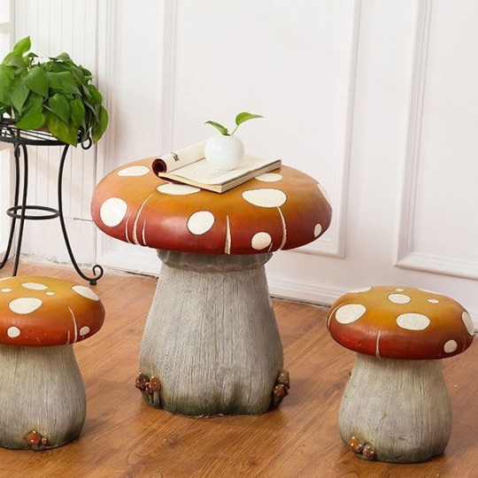

...it's all coming together.
#i want all this shit too but don't just repost people's artwork without credit!!#furniture and sculptures are art too!#want
5K notes
·
View notes
Text

Darlene Molnar house, Washington, US, for Artemest Magazine
0 notes
Link
0 notes
Text
Six interior designers style rooms at L'Appartamento in Milan
Six interior design studios, including Kingston Lafferty Design and T.ZED Architects, have overhauled a room at the 1930s L’Appartamento for commerce platform Artemest at Milan design week. The designers each used furniture, lighting and art from the brands, designers and artists represented on the Artemest platform to showcase their own style in a room at the apartment in Milan’s 5Vie district…

View On WordPress
0 notes
Photo

Welcome to the NYC @artemest pop up where luxury Italian craftsmanship meets creativity in contemporary design. Loved the painterly Morandi inspired ceramics of @sonia_pedrazzini ! More in stories to come #artemest #italiancraftsmanship #madeinitaly https://www.instagram.com/p/BqIXe5KndXK/?utm_source=ig_tumblr_share&igshid=1scd4bxbfsteg
10 notes
·
View notes
Link
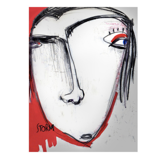
#rugs#designrugs#design#italiandesign#artemest#handtufting#handtufted#manifacture#benedetta bartolucci#silvia di piazza#redville#distortion#collezione redville
1 note
·
View note
Photo

Senato Hotel Milano, settembre 2021
0 notes
Photo


RR126 Radiofonografo — Achille and Pier Giacomo Castiglioni for Brionvega (1965)
Here’s another one for the wish list. Brionvega reissued the RR126 Radiofonografo (now the RR226). It’s always great when companies restore or reissue classics like this. Anyway, it’s now available in walnut, orange, red and white. I’d get one in walnut if I had $24,390 (AUD) to spare! I love how ridiculously happy it looks! ^_^
Image source: Archiproducts, Artemest, Archiexpo, Yellowtrace
#mid century#mid centruy modern#Vinyl#turntable#Retro#retro furniture#Retro Electronics#vintage#vintage furniture#vintage electronics#60s#60s furniture#60s design#Industrial Design#design#furniture design#records#Record Collection#record player#brionvega#interior design#interior decorating#interior decor#interiors#eames era
66 notes
·
View notes
Text

Fossil Charm | Anthozoa Seaweeds Vase by Wanda Fiscina - Artemest
14 notes
·
View notes
Text
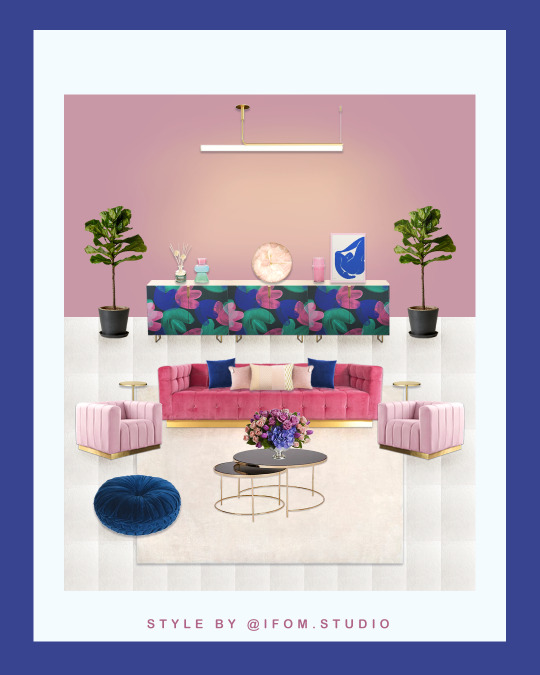
How To Style Vibrant Multicolor Abstract, Tulip Floral Pattern Art Print Into Home Decor?
How To Style Vibrant Multicolor Abstract, Tulip Floral Pattern Art Print Into Home Decor?
Vibrant Acrylic Painting Layered Tulips Floral Pattern Multi Colors Green Pink Blue Large Brush Art Print STYLE 1 ARTEMEST l’Opificio Degrade 4 Pink Jacquard CushionAANTHROPOLOGY Rose Quartz Agate Wall ClockTROUVA Lulu Blush Diamond Cushion Designed by Ondine AshTROUVA Neon Pink Recycled Glass Vase Designed by Urban Nature CultureTROUVA Nu Blue Print Designed by PSTR StudioTROUVA Pink Droplet…
View On WordPress
#abstract#acrylic painting#art print#beach towel#blue#chair#clock#coaster#coffee table#credenza#cushion#duvet cover#expressive arts#floral pattern#furniture#green#hand drawing#home decor#how to style#infrontofmi#iphone case#lamp#laptop sleeve#mat#multicolor#online shopping#pillow#pink#rectangular pillow#society6
3 notes
·
View notes
Photo

Route cart design by @nove.3 ready to go ……..thank to @artemest . . . #enricopellizzoni #italia #brianza #saperfare #cuoio #design #contract #chair #design #living #home #designlovers #furniture #interiordesign #interiors #handmade #luxury #interiordecor #designer #restaurant #style #luxuryliving #luxuryvilla #villalife #amazingplace #lakecomo (presso Enrico Pellizzoni) https://www.instagram.com/p/CSKazaOg7xi/?utm_medium=tumblr
#enricopellizzoni#italia#brianza#saperfare#cuoio#design#contract#chair#living#home#designlovers#furniture#interiordesign#interiors#handmade#luxury#interiordecor#designer#restaurant#style#luxuryliving#luxuryvilla#villalife#amazingplace#lakecomo
2 notes
·
View notes
