#architype project
Explore tagged Tumblr posts
Visit Tumblr Blog
Explore Tumblr blogs with no restrictions, modern design and the best experience.
Last Seen Tumblr Blogs


Fun Fact
US Tumblr user growth rate is estimated to slow down to 4.1%.
Text

The incident
Event log Day: 349 Subject ID: A008 Status: Post-exposure to Archframe prototype Subject A008 displayed elevated aggression levels following prolonged exposure to the Archframe prototype. Blood tests performed at 16:22 revealed a significant spike in cortisol levels (245% above baseline), suggesting a heightened stress response. Despite verbal commands and remote detachment attempts, Subject A008 refused to disengage from the Archframe. At 19:34, the security team initiated a manual extraction protocol, forcibly removing A008 from the biosuit. The process resulted in minor lacerations along the interface points where the Archframe’s cables had integrated with the subject’s neuro-linkage nodes. Immediate medical intervention was provided. Post-extraction: Subject A008 exhibited no further aggressive behavior, with vitals returning to normal levels. The subject retired to sleep at 22:43. Event log Day: 350 Subject ID: A008 Incident: Aggression escalation, violent interaction with Subject A149 At 03:12, security cameras recorded Subject A008 engaging in a violent assault on Subject A149 within A149‘s cell. Subject A008 was observed repeatedly biting and masticating A149, displaying a complete dissociation from prior behavior. Security intervened at 03:15, but despite efforts, Subject A149 sustained critical injuries and entered a coma shortly after the incident due to Subject A008's venom. Blood tests taken from A008 immediately after the incident showed a continued elevation in cortisol and the presence of unidentified neurochemical markers. A008 was sedated and returned to isolation. An emergency partition was erected to prevent direct interaction between A008 and the research team. Medical and psychological evaluations are ongoing. A008 has not responded coherently to any stimuli or questioning. Further investigation into the Archframe’s potential neurological impacts is underway. Event log Day: 483 Subject IDs: A008, A149 Status Update: Post-recovery and continued isolation protocols Subject A149 has regained consciousness and is in stable condition following extensive rehabilitation. Neurological damage appears minimal, though further tests are required to assess long-term effects. Subject A008 remains under close observation and has been prohibited from interacting with the Archframe or any related exosuit technologies unless under direct surveillance by an armed medical team. Aggression monitoring continues via regular blood tests, though no significant incidents have been reported since Day 350.
#transentienceuniverse#8illionsart#architype project#backstory#lore#story#artists on tumblr#digital illustration#illustration#alien#my art#original art#scifi#scifiart#art#short story#original story#stories#storytelling#writing#science fiction#science fiction art#oc lore#worldbuilding#oc writing#oc#oc art#ocs#my ocs#original character
23 notes
·
View notes
Text
"richie couldnt handle that hes jusst an uwu special boy" SHUT UP. THAT IS A PERVERT. THAT IS MY BEAUTIFUL PERVERT SON AND I HATE YOU. HE LOOKS AT THE MOST DISGUSTING PORN YOU COULD IMAGINE.
#goes for ruth too but shes less mischaracterized as much as just. completely ignored#but he is BITCHY and GROSS.#projecting onto a character is fine but it can start to be annoying when it explicitly contradicts canon like that#especially when its something that gives him more depth . cmon.#its not even flanderization anymore. i think some of you just want character architypes and nothing else. so much so that youll take more#complex characters and break them down into simple things that they BARELY ARE
6 notes
·
View notes
Text


Our new Modernism Beyond Metro-Land guidebook features many architects, working in a variety of styles and materials. Walter Segal’s work is unique among them for its focus on self building and use of timber. The borough of Lewisham was the first place to embrace his ideas, which have subsequently spread around the suburbs and beyond.
After a number of years designing small projects such as houses, flats and offices, largely in brick, Segal began to explore timber construction with a temporary annexe whilst his house in Highgate was being rebuilt, devising a self build system using widely available and low cost materials, in standard units. He saw how anybody could use the system to construct their own homes, and via the anarchist writer and architect Colin Ward, found a sympathetic reception at Lewisham Borough Council. They eventually allowed him some land to start building in Forest Hill, constructing 7 homes in what would be named Segal Close.
Other houses were built in Ormanton Road and Longton Avenue, Sydenham and Elstree Hill, Ravensbourne, all using the Segal method and producing houses built with timber frames and infill panels. Another plot of land was given over for self building in Honor Oak Park, where 13 two-storey timber houses were completed in 1986, and the street named Walter’s Way.
The borough’s own architects department also took inspiration from Segal's ideas, with the scheme at Brockley Park, next to Segal Close, designed by Geoffrey Wigfall, using mono pitched homes built in brick and finished with timber cladding and grass roofs. Some of the houses feature “pods” at the front, to be used for extra living or storage space, and the estate is grouped around a large green space.
Segal passed away in 1985 but his ideas persisted with self build projects appearing all around the capital's suburbs, with collaborator Jon Broome continuing the philosophy with his own practice Architype. Self-built projects can be found at Headway Gardens in Walthamstow, Parish Gardens in Greenwich, Eridge Green Close in Bromley and opposite Segal Close in Brockley Park, as well as at many other sites around the suburbs. Walter Segal’s self-build houses will have an extended section in our Modernism Beyond Metroland guidebook, now at 94% of its crowdfunding total. Get your copy here https://unbound.com/books/modernism-beyond-metro-land/
42 notes
·
View notes
Note
wish-upon-the-universe: hai. in minds and time. staring at you real hard. please. give information. mirabelle mind.... bonnie mind.... euphrasie? the king? ...loop?
okay hi its morning my brain is almost kind of functional. i dont have like. All of the details figured out but i know the idea is that you go through the parties minds and Maybe the kings. no timeloops in this one!!!! siffrin is finally free!
on the topic of loop: theyre an architype! which is an ability in the second game where you can summon an aspect of yourself to help you out. except, unlike psy canon, loop kinda just hangs around i think? sif gets frustrated with them sometimes but theyre also like.... genuinely helpful. i also think psyfrin has a sort of systemy thing going on (bias bias bias) and in the final level the loop architype is replaced by mal du pays.
i wrote!!! vague notes before bed for mira and bonnies minds so ill detail them out now.
miras mind is a house that expands infinitely upwards. the levels of the house have small changes as you go on until you realize the location is entirely different than the one you started in. it really plays up this idea of feeling stagnant while not really being that way at all. shes represented as a flower that blooms as time goes on, but near the end of the level something would cause the doubt to rush back to her and shed shut back in.
the boss at the end of the level would be very change god-ish. they wear her friends faces and tell her that they dont really care as much as she thinks. the boss necessitates standing still for periods of time where other fights might require you to dodge. while helping her fight this amalgamation of doubt, you (as siffrin) also remind her that youre literally right here!!! fighting with her! and she finally realizes that her friends would never talk to her that way. blows up fake god with mind.
its always raining in bonnies mind. despite the world being built of food that looks almost perfect, everything is washed away by the rain. bonnie themself is represented through a ravenous wolf who tears through the space but never eats any of the meals that theyve clearly made. you find one of those cocktail umbrellas at some point and walk through the level with them. it turns out that all of the food is missing an ingredient, something the rain took away.
as you find these, the rain recedes in those areas until eventually it stops. its still a bit gloomy, but the sky is clear. the boss of this level is bonnie themself. they dont want help, they dont need you to fix them, they hate you for caring so much!!!! just stop it already!!!!!!!!!!! when you beat them (its not really combat so much as stalling them), they become less of a wolf and more of a dog.
isas boss would be mannequin inspired because i physically cant stop making him have shit like that going on. odiles would be the familytale. it like projects stories that you have to play along with to defeat.
#in stars and time spoilers#in stars and time#isat#isat spoilers#basil answers#asks#wish-upon-the-universe#isat au#in minds and time
31 notes
·
View notes
Text
Sarah's aunt visited a couple weeks back, and as is tradition we watched a combination of movies with "red" in the title and vaguely classic movies.
Red Notice was a very fun, twist-filled Lupin-esque heists-and-adventure-archaeology sort of deal. It's not, like, clever or anything, but it had some fun action sequences and never got boring and we thoroughly enjoyed it.
We then watched The Comedy of Terrors mainly on the strength of me contending that I like Vincent Price, though afterwards I realized I'm not really sure what else I've seen him in. A bit slow-moving at the start, but it has a good cast and the climactic sequence was very fun and had some good jokes. No Arsenic and Old Lace but I'm happy to have watched it.
Red 2 was a fun spy action film with a bit more actual coherence than Red Notice. Anthony Hopkins does a really fun job.
And now, without Sarah's aunt, we watched Spirited Away: Live On Stage, the recording of the Japanese Spirited Away stage play. It was very well done; very close to the original in terms of script with a few added songs, but really great puppetry, stage transformations, and clever transitions to represent the spirit world convincingly without excessive use of projected special effects. I'd definitely recommend it. (Also makes me think about how Spirited Away is and isn't like common portal fantasy architypes and how that relates to gameable structures.)
8 notes
·
View notes
Text
Intervention + Interpretation - Research
Here are a few typography examples that I find visually striking, unique, and inspiring.
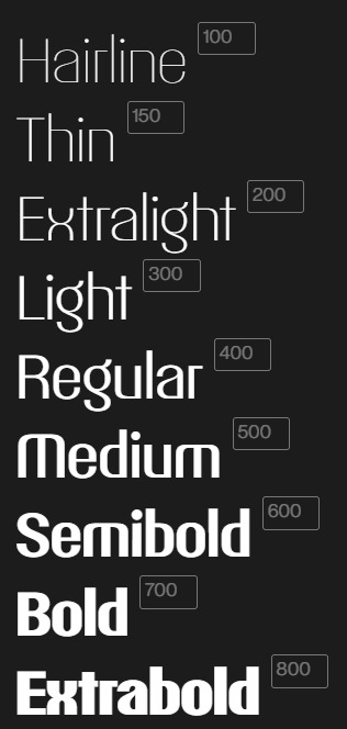
Pangram - Talisman Font
I appreciate the sleek minimalism and symmetrical design of this font. The subtle details in letters like e, c, o, and x showcase how small, thoughtful adjustments can make a significant impact.
Bold
Geometric
Versatile

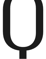


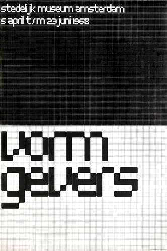
Architype Stedelijk
Architype Stedelijk is part of the Crouwel collection. A set of typefaces created in close collaboration with Wim Crouwel, following his agreement with The Foundry in 1996 to create digital fonts from his experimental alphabets.
Crouwel created a rigid grid system across the poster of 57 vertical by 41 horizontal lines, forming the basis for the construction of the letterforms. Although all hand drawn, the resulting typeface had a machine-made appearance.
Bold
Striking
Mechanical


My Name Is Wendy - Blackjack font
The Blackjack font showcases deconstructed letterforms that merge technological and vintage aesthetics. It exudes energy and spontaneity, with each letter's unpredictable design coming together cohesively in the overall style. I appreciate how the irregularity of the individual characters creates a unique yet harmonious effect.
Playful
Irregular
Expressive
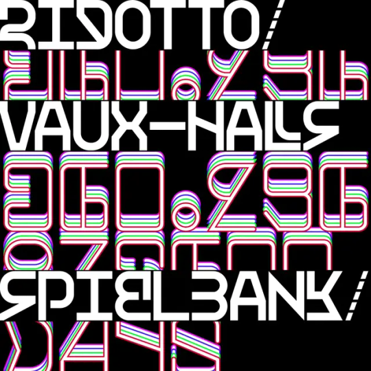
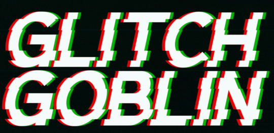
I admire these two fonts for their use of glitching, a characteristic often associated with flaws and low quality, yet here it is harnessed to create abstract and compelling letterforms. I’m particularly drawn to the concept of taking complete letterforms and distorting or manipulating them to form something entirely new and cohesive.
Distorted
Chaotic
Futuristic
Dystopian
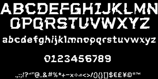
Glitch Goblin
U-Haul Logo
The Haul logo font is modern and clean, featuring sans-serif characteristics that emphasise simplicity and readability. Its geometric gives it a contemporary feel. This logo inspires me with its bold, minimal modular style, reflecting the fonts I’ve been experimenting with. Its emphasis on readability aligns perfectly with the project brief's key considerations.
Bold
Clean
Straightforward

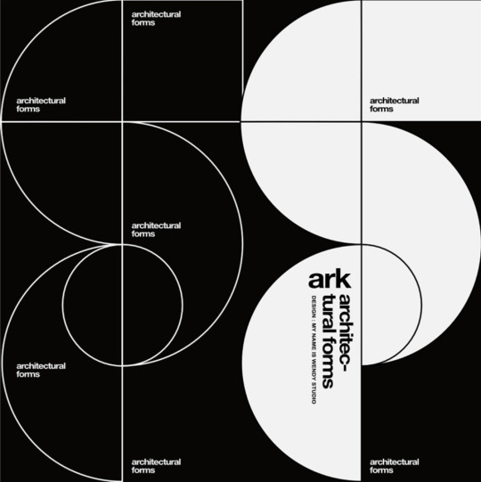
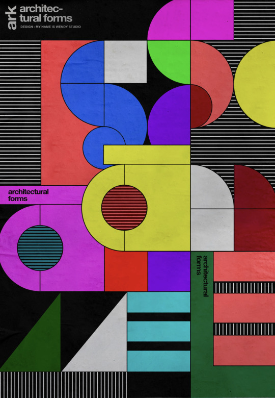
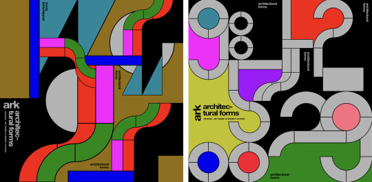
My Name Is Wendy - Ark Font
"Ark" is a series of four visuals that blend architecture and construction through shapes and letters. I admire the clean geometric forms and how they interlock with each other, paired effectively with bright, solid colours.
Angular
Condensed
Industrial
Futura
Futura, designed by Paul Renner in 1927, is a modular sans-serif font that remains influential nearly a century later. Reflecting the Bauhaus emphasis on functional design and simplicity, it features geometric shapes and clean, precise lines. Its tall ascenders, extending beyond the height of uppercase characters, give the typeface a distinctive, elegant style. This unique balance of modernity and readability helped Futura become widely used in advertising, TV, and film. Despite its simplicity and versatility, its low x-height can make it challenging to read in long-form text.
When exploring modular typefaces, I often gravitated toward more complex and abstract designs. However, I found it valuable to examine timeless examples like this one, as they helped me better understand the core design principles and gain inspiration for what makes a font both unique and memorable.
Precise
Functional
Timeless


Massimo Vignelli
Listening to the legendary designer Massimo Vignelli on Design Matters with Debbie Millman offered valuable insight and inspiration. Massimo believed that if you can design one thing, you can design anything, as all design is grounded in the same principles and disciplines.
He famously worked with only four typefaces: Garamond, Bodoni, Century Expanded, and Helvetica. While this might seem restrictive to some, he argued these fonts exemplify elegance, impact, and legibility as the finest examples of serif and sans-serif design. Rejecting "trendy" aesthetics, Massimo championed timeless design.
This conversation provided a deeper understanding of Massimo's design philosophy and sparked reflection on my own font design—challenging me to make it more impactful and unique.


PP🅐F (no date) Talisman Compact - A Powerful versatile font - Free to Try Font – Pangram Pangram Foundry. Available at: https://pangrampangram.com/products/talisman-compact (Accessed: 23 October 2024).
Architype Stedelijk (2020) The Foundry Types. Available at: https://www.thefoundrytypes.com/fonts/architype-stedelijk/ (Accessed: 24 October 2024).
‘Not too exotic, workable and original’: My Name is Wendy on its latest typeface, Blackjack (no date) It’s Nice That. Available at: https://www.itsnicethat.com/articles/my-name-is-wendy-blackjack-graphic-design-301120 (Accessed: 24 October 2024).
Sudezine, GGBotNet, Fonts, B. A., Typefactory, DavidLibeau, Graphicsauceco, JoannaVu, CloutierFontes, Ffeeaarr, Wepfont and Maknastudio
Sudezine, GGBotNet, Fonts, B. A., Typefactory, DavidLibeau, Graphicsauceco, JoannaVu, CloutierFontes, Ffeeaarr, Wepfont and Maknastudio (no date) Glitch Fonts, fontspace. Available at: https://www.fontspace.com/category/glitch (Accessed: 24 October 2024).
U-Haul Logo (no date) U-Haul Logo and symbol, meaning, history, PNG, brand. Available at: https://1000logos.net/u-haul-logo/ (Accessed: 24 October 2024).
Studio, M.N. is W. (no date) Ark, Behance. Available at: https://www.behance.net/gallery/210425983/Ark (Accessed: 25 October 2024).
Keung, L. (2020) All About the Futura Font and Its History: Envato Tuts+, Design & Illustration Envato Tuts+. Envato Tuts. Available at: https://design.tutsplus.com/articles/all-about-futura-font-and-its-history--cms-35382 (Accessed: 8 November 2024).
Century Expanded (no date) T26 Type Foundry. Available at: https://www.t26.com/fonts/10119-Century-Expanded- (Accessed: 27 November 2024).
TYPE·01/09/2022 and Type (2022) The Story Of The World’s Most Famous Font: Helvetica, Design & Paper. Available at: https://www.designandpaper.com/the-story-of-the-worlds-most-famous-font-helvetica/ (Accessed: 27 November 2024).
Farnbeyond (2019) Typographic Design Poster Series - 003 Bodoni Typeface: Far’n’Beyond, FarnBeyond | Design Print Digital. Available at: https://www.designprintdigital.com/blog/typography/typographic-poster-series-003-bodoni/ (Accessed: 27 November 2024).
Millman, D. (2010) ‘Massimo Vignelli’, Design Matters, Design Observer, September. Available at: https://designobserver.com (Accessed: 27 November 2024).
Millman, D. (2015) ‘Michael Bierut’, Design Matters, Design Observer, November. Available at: https://designobserver.com (Accessed: 27 November 2024).
Massimo Vignelli (2016) Olnick Spanu. Available at: https://olnickspanu.com/contributors/massimo-vignelli/ (Accessed: 27 November 2024).
1 note
·
View note
Video
youtube
Fox Host’s Walz Attack Backfires BIG TIME
COMMENTARY:
The leading edge of the Green New Deal is the fan based of Taylor Swift, the fan base of Beyounce and Mark Cuban's DEI/ZenBusiness performance technology that is being driven by Biden;Harris Build Back Better capital budget. That's the story you need to get out. In 1956, we were all living, globally, in a Yellow Submarine in a 20.000 Leagues Under the Sea kind of way, Eisenhower proposed to transform that Yellow Submarine into Starship America with his 1956 Presidential Platform,. We Have almost completed Stage 2 of that transformaion process with the completion of Reagan's New Federalism, which is providing the social, material and legislative infrastructure pushing the DEI performace cultures of the production companies of Taylor Swift and Beyounce, This is waht the Studion v SAG negotiations were all about: the Quality Assurance buiness model of Mark Cuban's resume, beginning with Indiana Univerity, and the Green New Deal. One of the mistakes Marx made about large system performace was to scoff at England as a nation of shop keepers. Eisenhower's transformation outcomes included making America a nation of self-actualizing entrepreneirus is a pursuit of happiness kind of way, George Bailey and Amos and Andy were Eisenhower's architype for the community banking emphais of Nixon's banking and securities policies. Reagan understood exactly what Eisenhower's intentions were with his bddget because Governors were at the heart of the new States Rights model of Reagan.s New Federalism. Reagan was going to take credit for everything that came before him and win a Nobel Pricze for eisther Polcitical Science or Economics, which would have been a monument to the social engieering of Eisenhower's brain trust at Columbia before he became POTUS. The New Federalism was never implemented by the any Republican White House because of Project 2025, In contrast, the Democrats bought in completely to the New Federalism because, if Carter had been re=elected, Stuart Eizensdt would have created the critical mass necessary to laundh the paradigm shift to the Green New Deal, Eisenstdt was sitting on the bridge of Starship America and the next step was to mobilize America like after Pearl Harbor and invent the Green New Deal. Eisenstadt was a cunt hair away from that critical mass when he had to pack up and hand the keys to the Reagan people And, if Reagan had seriously foucused on keeping his campaign promise like Nixon had, we would have achived the Starship Capitalism of 2001:A Spce Odyssey by 2001. If you replace Pan Am with SpaceX, that squandered 40 years because of the cunti hair of Project 2025, Biden/Harris have been making up for lost time with Build Back Better and Mark Cuban is leading the way into Starship America.
0 notes
Text
Photo Album: Inspiration
I initially was hesitant to begin this project. I have been debating all week as to what I should choose as a unifying idea for this album. Most of the pictures on my phone are just physique update pictures to analyze and better tweak my training. And eventually I looked at that silly little Bagon figure on my desk and felt a little spark of inspiration.

I want this album to be a collection of items that I hold dearly and represent stories that have helped shape me and more importantly who I aim to be. I've gone on this ramble in regards to my little Bagon before. Bagon can not fly. It if not in his genes. But Bagon, similarly to one of my favorite bodybuilders Tom Platz, refuses to be a victim to it's genetics. Bagon threw itself off a cliff day after day, until he willed his genes to change, and he grew into this powerful flying dragon. It may be a simple metamorphosis story told over and over again, but the time in my life that I really needed to here this. I played with my Salamence(Bagon's evolved dragon form) and would retreat to him as everything in my life changed. And for a five year old kids whos whole world was ever changing, having that pillar of strength gave me hope. I want to go through that metamorphosis as well and hopefully become that strong person who can over come the impossible.

These two games were the vessels I used to get through this time of change. I would run away and hide in these worlds. I had no control over the outside, but here I was a hero. I was challenged and I had to get better. I got to learn, I got to over come the challenges, I got to be the hero. These games were all I thought about and all I wanted to do. Not as much because they were fun, but more so because they made me feel safe.

Broly on the other hand is almost the opposite of Bagon. Brolly was born a fighter, a monster even. His strength is incomprehensible and was a danger, so he was outcast. Even when he was found he was forced to fight and was seen as nothing but a sort of Neanderthal, a tool to help those around him. But if you look under the hood Broly is a soft and gentle giant, another typical architype. But he snaps when others force him to, less out of rage, but more so out of lack of control. I have non epileptic seizures that are caused by a glitch in which an over abundance of stress. I remember being told I wouldn't be able to do anything because of this condition due to the fear of those around my that I would "snap". But I got through it, and like Broly, I found my way of control over this through training, both physical and mental.

This was my first protein tub I bought on my training journey. I am in pretty dang good shape now, but back then I remember being that fat kid with seizures who couldn't go outside because of that disease. I shut off from the world. I thought. I analyzed. I learned. And I trained. I did this on repeat. I had nowhere else to go. No one else to go to. But I could train. Training was the only thing that I could do to feel anything. I cherish this tub because it reminds me of that kid. What he went through and what he did for me so I could be ok. I'm proud of him, and this tub is just a nice reminder of him.

This pen's story is not yet finished. I have created several pieces of animation that I am proud of yes, but I feel that it is only the beginning. I want to keep learning and improving everything behind my animation projects, especially the science and scripting. I love it, it feels like when I first began training, I have a new challenge with limitless opportunities to learn and improve, and I am excited, inspired even, to create more and finish this story.
0 notes
Text
You know what scares me about this Bowuigi phenomena?
What if an executive actually picks up on it? what if illumination besides you know what let's do this? Bowser as a show of his character switches his affections to Luigi and they're just as demeaning toxic masterbatory and horrifying as they naturally would be because his feelings towards Peach- very much are illustrated throughout the movie - Are to be a reflection of himself
He idealizes her and figures capturing her will somehow give him all the things about her he admires at least half of which are projection
If that's his character that doesn't really change if he switches his targets to a human male and it be even more terrifying because we know he's already abused the Luigi
I guess what really hits me is this idea that Luigi being the equivalent of some sort of date therapist. Who's going to help Bowser realize his feelings for peach are false and then instant solution is oh he's gay and thus he's in love with Luigi and thus that's going to fix everything
That's not fixing everything. That's doing the same thing
Only kind of worse, because he hasn't actually come into his own and his own realization and consideration. He's just decided that he's going to expand targets to whatever romantically or emotionally gives him that high or low or "I think love is more like heroin" for him than it is crack
Or perhaps more like pot
I actually think I disagree with one of my favorite bowser X peach post. the 1 where it's pointed out that he knew what he was doing when he sacrificed the people at the reception
It's not even that he's interested in conquering princess peach period he basically spells out in his motivation when he starts attacking Mario
For all of his The word exuberance he doesn't like himself or at the very least is deeply insecure and unhappy
So he constantly seeks something in order to make that stop or make him happy
But because of how messed up he is all he can do is destroy what he appreciates period. It's an interesting deconstruction and reconstruction of the archetype of the dragon. Not the you know secondary villain to the boss who's going to kill everything. More the despotic destructive force that seeks to tear out the gates kidnap our women etc etc
If anything the human motives and sympathies and needs make him all the worse because you know he's not gonna stop because he doesn't have to. Humans need each other in order to be our strongest
Dragons kind of don't or at the very least they're strong enough that they can be absolutely monstrous. The only thing that they suffer is their misery when they don't have what they were trying to claim. pity about everybody else. only not. because they only care about themselves
This is why I've always probably had a problem with male characters who get enormous amounts of narrative and in character sympathy while at the same time being such destructive loons i.e. Wolverine
The only thing that changed is then they would make sure that they'd always stopped short of being too destructive to the audience sentiment. they've never suffered the negative consequences that make their lack of prudence a flaw. They constantly got to act as a sort of escape hatch for repressed desire. Not just for the audience but in character.
I'm particularly thinking Jean grey admittedly I'm talking ninety's x men animated I did not follow the comics and I am sorry if I'm mis representing how he would spend written over time
It's certainly by 2006 gotten that sensitive mail uh over right and now he's this cool a** bisexual rebel
But you know always a responsible dad at all times and never actually killed anything and loved nature and what have you
Og
Bowser is in some ways a deconstruction/reconstruction off of that and that isn't done in a way to save that Wolverine is bad so much as hey this sentiment in and of itself is worth re-examining how it would actually work and what it would actually mean and why and how it can become absolutely toxic and monstrous
Again there are so many aspects there that could be better but at the same time considering that I've been following RWBY for about a decade... I've seen what happens when someone tries to go dramatically deep when they're deliberately just not equipped or they're dealing with a story and set up that probably would work best if they just did it simple clean and to the damn point
Pov: Bowser se "confunde" de habitación "otra vez" cuando va a secuestrar a peach.
105 notes
·
View notes
Text
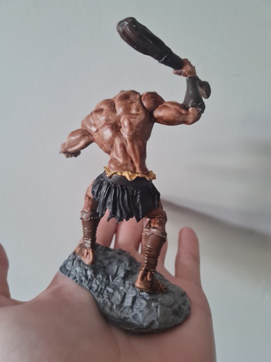
I bought this model months ago as I loved the sculpt and thought painting it would be fun and to use in Dungeons and Dragons. I started by doing simple techniques and used a contrast paint to get a skin effect and used a bit too much so I stripped the paint with terpintine. I redid the model this time I build up layers of a skin color by thinning the paint but not the pigment with a special inert paint base.
The model name is a Formorian. I didnt know this till I researched irish folklore and how it tied to the project. Formorians have a interesting lore as them and the Tuatha dé Danann are the original advisary story in Irish folklore. Think of the Formorians as the Titans architype to the Tuatha dé Olymians architype. They are discribed as sea raiders, giants and monsturous creatures. Said to have been driven back into the sea by several epic battles.
Pagan peoples would have told these stories and fables as they celebrated the 8 different festivals throughout the cyclical year.


2 notes
·
View notes
Photo

Commander Eight: Suited up [Archframe]
General The conception of the Archframes originated from the Architype Project Initiative (AP). These highly engineered exosuits, enhanced with biomechanical attributes, eliminate the need for modern-day spacesuits and life support systems by integrating all necessary survival systems within themselves. Archframes are capable of keeping their operators oxygenated and nourished, even during spacewalks, making them indispensable for deep-space exploration and planetary expeditions. The Architype Project developed multiple types of Archframes primarily for the transgenic Architypes, each model sharing fundamental functions while allowing for specialized modifications. As an Architype, individuals could enhance their Archframes with additional physical modifications (MODs) designed to serve specific operational needs-, ranging from auxiliary manipulators to integrated laser attachments for precision work. In total, only thirty prototypes were manufactured with permanently installed non-biological MODs, making these particular Archframes distinct from standard models. Only five of them were equipped with special neurological links to their operators, one of which belongs to Architype 008. Eight‘s Archframe The Archframe of Architype 008 is one of only five highly specialized prototypes built by AP, equipped with a wide array of MODs and functionalities. Among all Archframes, Eight’s is especially notable for its sleek and distinct design, tailored to her preferences. Given that Architypes spent prolonged periods inside their Archframes during missions, some (such as Eight) requested personalized designs that reflected their individuality. Having served for years in AP’s design sector before volunteering to the spacefaring division, Eight had significant influence over the visual and functional aspects of her Archframe. While some design elements may not appear strictly necessary, AP‘s Archframe engineers ensured full functionality without compromising efficiency, resulting in a uniquely reliable exoskeleton. Like all standard Archframes, Eight’s suit is equipped with two auxiliary arms, an integrated bionetic visor, and an Archlink. However, its primary design prioritizes strength and endurance over agility. Built for heavy lifting and transportation, Eight’s Archframe compensates for reduced mobility with its additional limbs, allowing her to navigate even the most challenging environments effectively. All core functions remain consistent with standard models: - It provides Eight with sustained nutrients and oxygen, eliminating the need for external supplies. - It operates efficiently across various planetary conditions and extreme environments. - It is fully sealed, featuring chemical-resistant films that render the suit sterile and impervious to microbial contamination. - It is self-sufficient, requiring minimal maintenance unless damaged. What sets Eight’s Archframe apart, however, is its advanced biological integration. A fully symbiotic link Unlike conventional Archframes, which merely simulate physiological and psychological synchronization through the Archlink, Eight’s frame is able to form a direct biological connection to her nervous system through bionetic implants in her body. This means her suit is not just an extension of her body-, it feels as natural as if it were her own flesh. This depth of control provides an unparalleled sense of immersion, allowing her to experience sensations as though they originated from her own body. Most Architypes, having only operated standard models, would be unaware of how profound this difference is. However, this enhancement comes with a cost: The intensified sensory feedback makes Eight far more susceptible to psychological strain and hormonal instability. The suit’s dopamine-triggering effects can lead to dependency and addiction, similar to how certain stimuli create habitual behaviors-, and the enhanced strength and responsiveness blur the line between her own body and the exosuit, making it easy for her to lose awareness of her actual physical limitations. While this makes her an incredibly efficient operator, it also poses a significant mental challenge. Over time, Eight has learned to manage these effects, but prolonged use remains risky. Why was such a Prototype created? The answer is simple: for science. The Architype Project initiative prioritized pushing technological and biological boundaries, making Eight an invaluable subject for research. AP took measured risks to develop a suit that fully integrates with a human nervous system, studying its long-term effects on operators. The project's security measures evolved to address Archframe-related incidents, ensuring that even such extreme modifications were implemented responsibly and professionally. Now stranded in the Ember Galaxy, Eight continues to rely on her Archframe for protection during missions and simple quality-of-life utilities. Due to its symbiotic nature, many who encounter her perceive her as an alien with two skins or even bodies, fascinated by the seamless fusion between human and machine. Today, her Archframe is as familiar to her as ordinary clothing, and though she has adapted to its drawbacks, the benefits far outweigh the risks. In addition, the Archframe allows her to express a part of herself that she would otherwise keep hidden. At times, she simply wants to punch something without consequences to feel the impact, the resistance, yet remain unpained. Or run as fast as a cheetah to feel the wind rush along her face, and the weightlessness of her limbs carrying her across the land. This way, the suit provides an outlet for her frustrations and desires, granting her a rare sense of satisfaction and relief.
#aliens of ember#8illionsart#artists on tumblr#transentienceuniverse#my art#alien#original art#scifi#digital illustration#illustration#sci fi#speculative fiction#spec evo#science fiction#alien oc#art#original character#character design#originalcharacter#original characters#tentacles#robot oc#robots#robot#robot art#machine#sci fi and fantasy#mecha#cyborgs#posthumanism
28 notes
·
View notes
Text
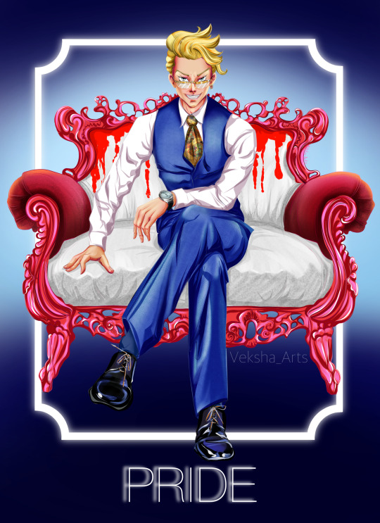
New project is started! Yay!
“Tokyo Revengers” characters are soooo architypical! While watching anime I always noticed each characters features. And I like antagonists so much!
So, I thought: “Hm… they are bad-bad guys… Let’s draw them as 7 deadly sins!”
And… ta-daaaa! Here it is the first one: deadly sin “PRIDE” as bad-ass Kisaki. Ohhh… I love him and I hate him )))
#tokyo revengers#tokrev#tokrevfanart#kisaki tetta#bad guy#deadly sins#sin pride#tokyo manji gang#anime fan art
13 notes
·
View notes
Text
Ten ways in which architecture is addressing climate change
To honour Earth Day, we've rounded up 10 ways architects are reshaping the built environment to benefit both people and the planet.
Architecture has a large environmental impact, with the built environment accounting for 40 per cent of the UK's carbon emissions in 2019, according to the UK Green Building Council.
With a 2018 United Nations report warning that humanity now has less than 10 years to slow down global warming, the architecture industry is one of many to have been forced to reassess the ways in which it works.
From reducing waste and maximising urban greenery to collaboration and lobbying for change, solutions to reduce pressure on the planet are now taking centre stage.
Read on for 10 ways in which architects can contribute to a healthier planet:
Building with timber
Wood has been used to build structures throughout history. However, there has been a recent resurgence in its popularity as a construction material, due to its sustainability credentials and improvements in engineered timbers such as cross-laminated timber (CLT).
One of the biggest benefits of building with timber is that it can sequester large amounts of carbon from the atmosphere and store it within a building for as long as it stands. This can help achieve carbon-negative buildings by offsetting the carbon emissions generated through construction and operation.
It is for this reason that 3XN will use wood as the primary material in its extension for Hotel GSH in Bornholm (above) while Feilden Clegg Bradley Studios will use CLT for an office in London.
Going carbon-neutral
Making buildings carbon-neutral or, better still, carbon-negative architecture is a key concern for many architects today.
The terminology around this push is confusing but, generally speaking, a net carbon-neutral building is one that does not contribute any CO2 to the atmosphere over its lifetime, taking into account its construction, the materials used to build it plus the resources required to run it and decommission it.
A carbon-negative building is one that removes more carbon from the atmosphere than it emits over its lifetime, including the operational carbon generated by the heat and power the building consumes as well as the embodied carbon released by the extraction, manufacture and transportation of construction materials.
Confusingly, the term "carbon positive" is also used to describe the same thing as "carbon negative".
Examples of carbon-neutral architecture include Mikhail Riches' housing project in York that will utilise air-source heat pumps and solar panels to reduce emissions when complete.
Carbon negative buildings include Snøhetta's Powerhouse Telemark office (above), which will generate enough surplus energy during its operation to more than compensate for both the operational and embedded carbon emitted over its lifetime.
Rewilding
Rewilding has seen a surge of interest recently as people realise that natural ecosystems are disappearing, taking with them the biodiversity that supports life on earth.
Rewilding is an approach to restoring ecosystems that let nature get on with the work itself with minimum human interference.
For architects, this offers the opportunity to take biodiversity into account both when landscaping their projects and when choosing materials, to ensure their extraction and manufacture do not lead to the depletion of natural resources.
Projects that support rewilding include architect Carl Turner's DUT18 creative retreat in the Cotswolds region of England, which will sit in a partially rewilded landscape.
Writing for Dezeen last year, architect Christina Monteiro called for a strategy to rewild cities both to increase biodiversity and to improve the health and wellbeing of citizens.
Meeting Passivhaus standards
Since its origin in the 1990s, the Passivhaus energy performance standard has become one of the best-known ways to create sustainable architecture.
Awarded by the non-profit organisation the Passivhaus Trust, the standard encourages buildings that have high levels of insulation and airtightness so that they require minimal artificial heating and cooling.
Mikhail Riches and Cathy Hawley won the RIBA Stirling Prize in 2019 with its high-density Goldsmith Street social housing scheme (above) after designing it to meet Passivhaus standards. The win was celebrated widely, with London studio Architype stating the win "puts Passivhaus in the spotlight – exactly where it needs to stay".
Speaking to Dezeen, Sophie Cole of Mikhail Riches said that Passivhaus design can also provide "a great basis for [zero-carbon architecture] because Passivhaus already really reduces that energy requirement".
Reversible design
Reversible architecture ensures entire buildings can be deconstructed at the end of their life and their components reused meaning no components go to waste.
Adam Strudwick of Perkins and Will described this to Dezeen as making "every building as a kind of DIY store for the next project".
Recent examples include Triodos Bank by RAU Architects and Ex Interiors (above), a "large scale, 100 per cent wooden, remountable office building" and a pavilion built by Overtreders W and Bureau SLA made from reusable construction materials.
BakerBrown Studio recently turned heads with its proposal to build a reusable pavilion for the Glyndebourne opera house using timber, mycelium and discarded champagne corks and seafood shells, all of which are reusable, recyclable or biodegradable.
Creating reversible architecture aligns with the aims of a circular economy – a closed-loop system where all materials are reused to eliminate any waste. Creating buildings that can be dissembled means that their components can be reused on other projects.
Encore Heureux, a studio that built a pavilion from reclaimed doors, said the idea is that "one person's waste becomes another's resources".
Non-extractive architecture
Non-extractive architecture is a term coined by Italian research studio Space Caviar to express the idea that buildings should not exploit the planet or people.
"Non-extractive architecture questions the assumption that building must inevitably cause some kind of irreversible damage or depletion somewhere – preferably somewhere else – and the best we can do as architects is limit the damage done," explained Space Caviar co-founder Joseph Grima in an interview with Dezeen.
The idea is expanded upon in a manifesto written by Space Caviar that calls on architects to design buildings that do not deplete the earth's natural resources.
An exhibition alongside the manifesto is currently being held at cultural foundation V–A–C in Venice and Grima is joining Dezeen later today to further expand on the ideals of non-extractive architecture.
Biomimicry
Another way in which architecture could help combat climate change is by making use of biomimicry, an approach that emulates natural systems such as coral reefs (above).
This can lead to extremely efficient structures that minimise the use of materials as well as potentially replicating beneficial processes such as the way plants use photosynthesis to turn atmospheric carbon into cellulose and other compounds.
According to architect Michael Pawlyn, entire cities could help stop climate change by removing carbon from the atmosphere by mimicking the process of bio-mineralisation, by which lifeforms such as micro-organisms in the sea turn carbon into limestone and other carbon-rich minerals.
"We need to find ways of using materials that take carbon out of the atmosphere," he told Dezeen. "Can we learn from biology to design a built environment that has a net positive impact?"
Restorative architecture
Restorative architecture, also known as regenerative architecture, refers to structures that have a positive impact on the environment.
Biomimetic architect Pawyln cites this as a key way that architects can help tackle the multiple environmental challenges of today, believing that architecture that "just mitigates negatives" is not going far enough.
His studio, Exploration Architecture, has demonstrated these ideals through The Sahara Forest Project in Qatar (above) – a seawater-cooled greenhouse that replicates a Namibian fog-basking beetle's physiology to harvest fresh water in the desert. Any excess water it makes is used to revegetate the surrounding landscape.
Retrofitting
Retrofitting, or upgrading, is typically carried out to improve the energy efficiency and thermal performance of a building, reducing its dependence on heating and cooling, or to update a structure that may otherwise be torn down.
By prioritising the improvement of existing building stock over demolition, architects can keep materials – and the embodied carbon they contain – in use for longer, delaying the additional emissions produced by demolition.
Last month French architects Lacaton & Vassal, who are key exponents of retrofitting, won this year's Pritzker Prize for Architecture for their "commitment to a restorative architecture".
Other exponents include Sarah Wigglesworth, who proved the value of retrofit in the recent overhaul of her straw bale house in London (above), which has resulted in a 62 per cent reduction of its annual carbon dioxide emissions.
Elsewhere, architect Piers Taylor retrofitted his own off-grid home by upgrading all of its external fabric to meet Passivhaus standards in response to improvements in technology.
Establishing climate action groups
Architects are also addressing the impact of the built environment on the planet through grassroots initiatives such as climate action groups, in which they can raise awareness and share knowledge about climate change.
At the forefront of the industry is Architects Declare, which a group of Stirling Prize-winning architecture firms launched to call on all UK architects to adopt a "shift in behaviour". It has a growing network of signatories across the world that collaborate through virtual events.
Another example is the UK-based group Architects Climate Action Network (ACAN), which is lobbying for more demanding legislation in the UK.
It recently launched a campaign demanding embodied carbon regulation and founded a student-focused arm that is helping combat climate negligent teaching in architecture schools.
The post Ten ways in which architecture is addressing climate change appeared first on Dezeen.
6 notes
·
View notes
Text


Examples of commercial Passivhaus projects courtesy of Architype. Presentation by Rebecca Robinson during Muthbusting Passivhaus for ACAN.
#architecture student#ACAN#Commercial applications of Passivhaus principles#research#designing for Carbon neutral architecture
2 notes
·
View notes
Text
Module - Research Project
I’ve written up a first draft for my essay. Although only about half of the planned segments are here, what I’ve written here provides a base upon which I can continue to develop my essay. I hope to add more to these two introductory segments in future drafts.
Introduction
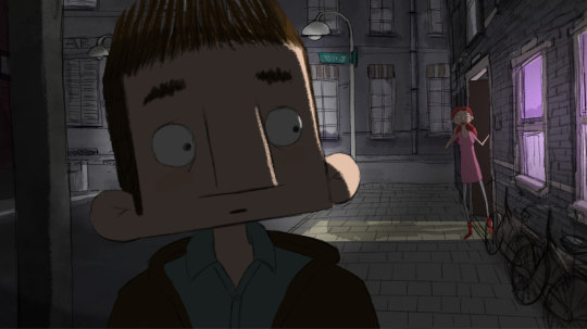
Figure 1. Screenshot taken from short film Mind My Mind (Floor Adams, 2019).
Entertainment has come in all shapes and sizes throughout the course of human history, across many different mediums, and throughout these countless stories we have seen countless different characters, reflecting the endless number of different viewpoints and lived experiences people have experienced throughout history. The experiences of people throughout history have been reflected and preserved through the artwork and characters through which they express themselves. In many ways, these fictional worlds and the characters that inhabit them are a reflection of the real world, and the experiences we as a people have observed and lived through ourselves. However, many of the most popular and well-known pieces of media, animated or otherwise, have failed to accurately represent many aspects of the human condition, with many groups of people not having been represented very much, or at least not very well, within popular culture. One group that has commonly been underrepresented or misrepresented within popular media, especially in animation, until recently are people on the autism spectrum (Kerrie Pressman, 2020). Autism, or Autism Spectrum Disorder (A.S.D.), is a neurodevelopmental condition that, broadly speaking, affects social skills and how one interacts with the world (J. Chaiken, 2020). Autism can affect people in a plethora of different ways and does not affect everyone the same way. On the rare occasion when autistic people are represented in media, they are often portrayed in ways that fall back on old stereotypes, viewpoints popularised in movies such as Rain Man (1988) that have proliferated and spread for decades, providing only a limited view of the experiences of autistic people. With a greater focus now a days on improving and refining the representation that marginalised groups get in media in general, more superlative work is being done, particularly in animation, to increase awareness of, and improve representations of, autistic people as whole and the wide array of lived experience they live through as a group (Kristen Lopez, 2020). The research compiled for this essay covers a range of different elements to autism and the way in which it is depicted in media through the characters who portray these elements, including the strong connection between people who have autism and the medium of animation. This essay will discuss the impact of animation on those who view it, and how these pieces of art help shape and form the views of our viewers, the responsibility this gives us as animators and the techniques people us to shape autistic characters that move beyond stereotypes, that have a depth to them that help them express something meaningful about the experiences of autistic people. We will be examining the portrayals of autistic people from the past, how these portrayals have developed over the decades, and the impact these different representations have had, and could in future have, on the audiences who watch these pieces of media, as well as the developing role animation specifically has in these developments (Carla Simone Engel & Elizabeth Sheppard, 2020).
Portrayals of Autism from the Past

Figure 2. Screenshot of Raymond and Charlie Babbitt from the film Rain Man (Barry Levinson, 1988).
For many decades after the first diagnosis of autism, autistic people remained virtually invisible within mainstream media (Jay McCarthy, 2018), given social pressures of the past to hide neurodivergent people from the public to allow the families to “save face” amongst their peers. They virtually did not exist in media at all, in keeping with the general attitudes and discrimination toward mental and physical conditions of the time. However, with the improvement of diagnosis methods helping to diagnose autistic people at earlier ages, came more opportunities for representation in media. One of the first well known pieces of film to depict an autistic person at all, and as a main character no less, was the movie Rain Man (1988) (McCarthy, J. 2018). The movie depicts the growing relationship between estranged brothers Charlie and Raymond “Rain Man” Babbitts, played by Dustin Hoffman. Raymond Babbitts is an autistic savant who has lived in a shared care home since Charlie was little. The movie was hugely successful when it released, becoming one of the first immensely popular, Oscar nominated movies to feature an autistic character as a main character, though not played by an autistic actor. While the movie was heavily praised following its release, the movie’s reputation and legacy has become a lot more complicated over the decades (McCarthy, J. 2018). Many of the different traits and misconceptions of autism that have permeated throughout media originated with Dustin Hoffman’s performance here as Rain Man, mainly the misconceptions that all autistic people are autistic savants, and many of the character’s idiosyncratic traits being reused again and again for autistic characters throughout the past few decades. These qualities first depicted in this film have proliferated to such an extent that many autistic people struggle to escape the assumptions that they should fit the characteristics and savant abilities of Rain Man’s titular character (Pressman, K. 2020). While some care was taken by the producers and Dustin Hoffman to consult autistic people on the making of the movie, Hoffman basing his performance off of the mannerisms of Kim Peek, the character traits of Raymond Babbitt became so common place as to be stereotypical. Rain Man was meant to be one depiction of one autistic character, it should have been the first step towards a diverse array of autistic characters, but instead became the only basis for virtually all depictions seen in media for a number of decades (McCarthy, J. 2018). The negative impact of stereotypes can be seen readily in a study compiled by research published by SpringerLink. Stereotypical, negative depictions of autism via fictional characters, such as animated works, can greatly impact the way people view autistic people, creating negative associations that can led to social rejection and isolation (Engel, C.S. & Sheppard, E. 2020) These misconceptions are often ingrained during childhood, and can even persist through to adulthood. When autism is depicted in media, these representations often fit a certain mould, failing to depict the true diversity of people who are on the autism spectrum. Particularly, the most common depiction of autistic people in media are white, male, verbal children, with the stereotypical mannerisms that come with architypes of autistic people. Many people on the autism spectrum, mainly women, L.G.B.T.Q.+ people, people of colour and non-verbal autistic people are given even less representation in media than other autistic people (Lopez, K. 2020).
3 notes
·
View notes
Text
How sustainable is Corten steel?
The industrial heritage of this site inspired the exterior cladding, which departs from Architype’s natural finish. Corten offers a contemporary response to the site’s history, which weathers to a vibrant orange patina.
Is corten steel sustainable? Yes, the duration of corten steel sustainability is more than 10 years.
The surface of Corten develops to a stable rust-like appearance with no maintenance required. By allowing the steel to rust, it forms a protective coating that slows corrosion in the future. Corten steel has an 8-fold higher corrosion resistance performance than ordinary steel. As a result, it is used 8 times longer than common steel. No need to spray anti-rust paint. Common steel must be sprayed with antifouling paint when used, and again after 20 years if still used, and after 40 years if still used. Corten steel can be used without any painting or surface treatment for 80 years. More than 100 years. Due to its long lifespan, corten steel saves raw materials, reduces reconstruction, painting, and secondary pollution, and requires no maintenance. In addition to being made from pre-and post-consumer recycled steel, Corten is 100% recyclable. Moreover, the warm rusty color and changing color tone with time are very compatible with other building materials. We prefer bare concrete, reclaimed wood, exposed brick structures, etc.
Corten steel was primarily used at Bridge in the early days. Eventually, it expanded to railways, containers, vehicles, power plants, and steel structures, and is now used widely for architectural decoration and beautifying art. Applications are becoming more and more widespread and popular. In the future, weathering steel will become an indispensable building material as its cost decreases. Recycled corten steel can be used for many purposes like building, construction, etc.
Architecture and landscaping often use corten steel, also known as weathering steel. With its weathered look, it is strong, durable, and timeless. Corten steel Sustainability is corrosion-resistant, tensile-strength steel. The genericized name COR-TEN steel, trademarked by U.S. Steel in 1993, has become the brand name commonly used to describe weathered steel, even if it isn’t COR-TEN steel. Originally, it was used to make railroad cars more durable.
The use of weathered steel has fascinated architects and designers, rapidly becoming one of the most popular materials used in architecture, especially in landscape architecture. This material doesn’t require painting and is virtually maintenance-free. This simplifies the design process and streamlines projects. All types of products can be designed using this material, including benches, planters, bike racks, and barriers. As a result of its versatility, designers are turning to this as a solution more and more. Corten steel, because of its unique maturation/oxidation process, is considered a “live” material. Colors can change over time based on the shape of the object, the location in which it is installed, and the weathering cycles it undergoes. In spite of the fact that this oxide “leak” is a natural process, it can stain certain surfaces, such as concrete. It generally takes 12-18 months for oxidation to reach maturity. As a result, the topical rusting doesn’t penetrate the steel, allowing it to naturally build a layer of protection against corrosion. The coating prevents most weathering effects (including rain, sleet, and snow) as well as atmospheric corrosion.
The anti-washout treatment reduces the loss of oxide and, therefore, the staining of certain surfaces. It will not completely prevent the loss, but will significantly reduce the oxide leak, giving the product a darker appearance and finish than matured corten steel. The anti-washout treatment is standard on seating products but can be applied to all Corten products upon request. A factory-applied treatment that prevents approximately 95% – 99% of oxide leaks, giving the product a darker appearance and finish.
Steel with increased resistance to atmospheric corrosion was in high demand in 1930s Industrial America. This steel would be ideal for railway heavy haulage carriages and steel bridges that are notoriously difficult to maintain. Thus, US Steel’s scientists discovered weathering steel, which they promptly trademarked and named Corten. Corten is named after two of its key characteristics: corrosion resistance and tensile strength. It is extremely strong and light (sheets are manufactured at a standard thickness of 14 inches).
Instead of being an intended feature of this discovery, the rust-like patina was a by-product. Even though Corten is still used industrially (construction of containers is a great example), it is best known for use in buildings and public spaceshitects, who admire the uniqueness of each section after the oxidation process is complete, and the natural evolution which renders conventional environmentally harmful maintenance, such as painting, unnecessary.
Corten is a steel alloy, which means it is ‘mixed’ with chromium, copper, silicon, and phosphorus during the manufacturing process. The amount of these elements influence the mechanical properties of the resulting weathering steel, which is reflected in the different grades of Corten, which will be discussed further in this article. Unalloyed steels have a porous oxide top layer that holds moisture, resulting in rust. Eventually, this rust layer will flake off, exposing a new oxide layer to rust. Eventually, the steel will rust through as this process is repeated. Even though Corten is not rustproof, the chemical reaction of the alloying elements to meteorological conditions prevents corrosion by forming a protective rust-colored oxide layer over the steel. This protective layer, called a patina, prevents deeper rust penetration after weathering is complete. Patina’s orange-brown color comes from the copper content of the alloy mix, which is usually around 5%. Weathering is heavily dependent on meteorological conditions, so it is impossible to determine how long it will take. Generally, the process takes six months. It may take 2-3 years for the protective patina to form in rural environments free of pollutants, but it will form very quickly in marine environments.
Click here to know more about is Article : https://cortensteeltube.com/how-sustainable-is-corten-steel/
#Cortensteel #CortenSteelSheets #CortenSteelPlates #design #architecture #interiordesign #steel #gardendesign #rust #sculpture #metal #welding
0 notes