#aos movie 4
Explore tagged Tumblr posts
Text
The fact that we almost certainly wouldn't get a fourth AOS movie until 2026, combined with the conveniently similar ten-year gap without connecting screen content between the end of TOS and The Motion Picture, gives AOS the chance to do the funniest thing and surprise everyone by just going straight into their TMP era after only about six hours of material
#star trek#star trek tos#star trek aos#star trek the motion picture#star trek aos 4#the movie that will likely never be#i mean tos did not have anything filmed leading up to tmp that filled in that gap#so it would be very similar and appropriate#don't know if i'd be ready for that angst though
362 notes
·
View notes
Text
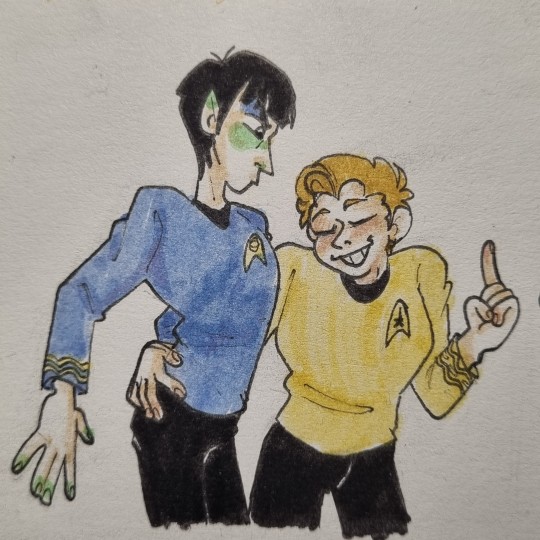
Guess who finished tos (again).
Also please ignore the ugly hand and focus on the good one.
I keep forgetting to take a picture of the sketch.
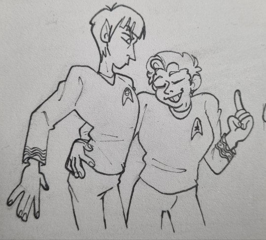

Do you guys like seeing these unfinished pictures?
#its me i finished it#ive technically only watched seasons 1 and 2 before and only a couple of episodes from season 3#but now ive seen it all#next year ill start with the movies (which ive seen tge first 4 of tgem and tge aos)#whatever#uhura should have been in the final episode tbh#i miss her#anyway#star trek#star trek tos#star trek the original series#spock#s'chn t'gai spock#kirk#james t kirk#james kirk#jim kirk#captain kirk#spirk#spock/kirk#fanart#art
105 notes
·
View notes
Text
So, two and a half hours of Winona pregnant having cravings I guess.

#we'll never have aos4#give us star trek 4 pls#star trek#star trek aos#jim kirk#james t kirk#new movie
28 notes
·
View notes
Text

By Jay Stobie on Twitter
#4 points#star trek#star trek meme#star trek twitter#star trek discovery#star trek aos#star trek the original series#star trek movies#deep space nine#ds9#tng#picard#voyager
135 notes
·
View notes
Text
This is how I look whenever Hikaru Sulu is on screen:

#Like yes baby give me those 4 seconds of glory#star trek#tos#aos#any Sulu actually#star trek movies#hikaru sulu#sulu
2 notes
·
View notes
Text
i’ve started to dream about movie trailers of movies that don’t exist
6 notes
·
View notes
Text
EXACTLY!
Ao Bing doesnt feel as important as he should be. He deserved better.
Even if they realy wanted him as a villain, make him the final boss, his death just made him look like such a weak and unimportant character.

It was moments like this where i really thought that Ao Bing and Yunxiang could have teamed up to fight Ao Guang cause it feels like most of Ao Bing's ambition to kill Yunxiang comes from the past lives situation and wanting, what, validation from his dad? Wanting to prove he isn't completely pathetic and weak?
Yunxiang and Ao Bing could have really connected over their fathers' disappointment in them and Ao Guang making everyone suffer, and sought a life where they didn't have to continue the cycle of violence and improving upon their past mistakes
This is where I think Nezha Reborn kinda lacks. It doesn't have the same emotional impact as say, Nezha 2019 or the 1979 movie. There's emotional moments in the movie but doesn't hit the same way due to the direction they chose. It feels like they tried to do a little too much and thus didn't focus their attention on some key aspects that would have improved the overall movie.
(I do think it's interesting that it has sort of the opposite theme of Nezha 2019. Whereas the latter was focusing on changing one's destiny, this one follows fulfilling a prewritten destiny.)
#they did too much#examples of being yunxiang powering up big#he literally did it too many times#it's less impressive after 4 or 5 times#also it would have been interesting if yunxiang and nezha could have actually talked face to face? but that's. optional#i still liked the overall movie though#anyway make nezha and ao bing friends 2k22 that is a threat#nezha#nezha reborn#li yunxiang#ao bing#new gods#ao guang
162 notes
·
View notes
Text
Every Starfleet Uniform Ranked By How Annoying The Sleeve Is To Sew, Part 1
The Star Trek designers appear to be allergic to a normal-ass armscye, so I've broken down which sleeves are the most time-consuming and annoying to put in, starting from the easiest sleeve.
TOS Minidress:
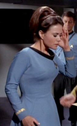
A normal raglan sleeve, which is easier to sew then a set-in sleeve when it comes down to it. Quick and easy.
2. "The Cage":
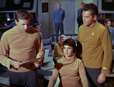
A regular human armscye, set-in sleeves, a thin shoulder pad. They are made of velvet, which is notoriously slippery under the machine and requires hand basting, but they're a straight one piece sleeve which is going to take less time to place then a shaped two piece sleeve.
3. Original Movies-Era:
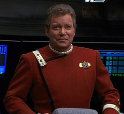

Both the movie uniforms have normal tailored two piece sleeves. Nothing weird. A tailored sleeve is going to be hand basted (maybe a few times) and include a shoulder pad and sleeve head, so despite being normal they do take longer than the more relaxed armscyes in our list.
4. AOS:
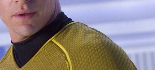

These guys aren't too bad, but they have a double row of satin trim that echoes the zipper in the TOS uniforms (cute!) that would be a little tricky to work with. They also gain difficulty points because they're stretch which I personally hate working with.
5. Strange New Worlds:
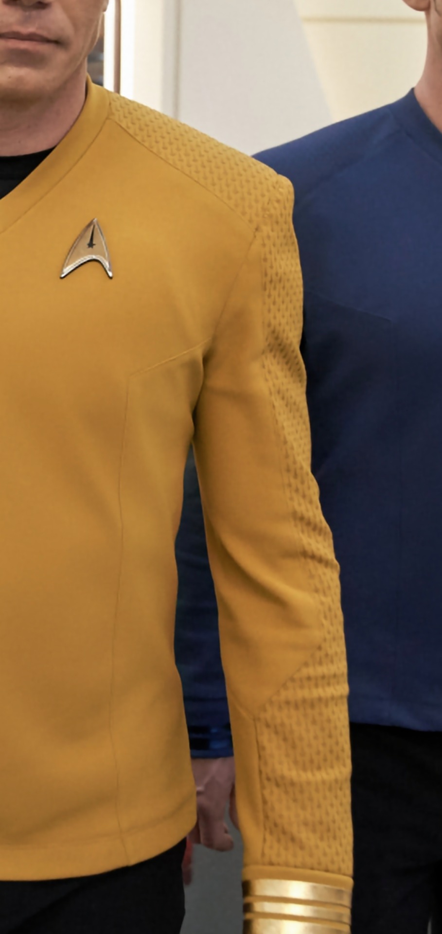
These are interesting because they echo both the raglan sleeve in the TOS uniforms and the piecing that starts in the TNG uniforms. Gains difficulty points for having two points of pattern matching and being a THREE piece sleeve (plus a cuff) with all those corners to navigate. AND it's a stretch fabric, AND I'd bet anything that the printed fabric sticks to the machine. Better break out that Teflon foot!
Part 2
1K notes
·
View notes
Text
Not that I'll believe this movie is actually happening until I am in a theatre watching it and not a second sooner, but how are we feeling about the new screenwriter for AOS 4 being part of the writing team for the last four seasons of Supernatural?
Is the Enterprise about to go to...Superhell?
#star trek#star trek aos#star trek aos 4#supernatural#steve yockey#i haven't seen a single episode of supernatural but from everything i hear i don't think i want to#i'd love to be optimistic but i'm still team “better ending on Beyond than a bad 4th movie sendoff”
60 notes
·
View notes
Text
I think for Star Trek 4 (AOS) they should just remake TMP because think about it the ending for Beyond sets up such a good jumping point for a TMP remake. Like yeah, they're on their whole 5 year deep space mission thing, and in the beginning Kirk was considering becoming a Vice Admiral, and Spock was thinking of going to New Vulcan, but it all gets resolved in the end or does it? What if after the 5 year mision, Spock does run away to New Vulcan to do Kohlinar, and Kirk takes the Vice Admiral position at Yorktown. Like it's literally the perfect setup for a TMP remake, and I'm honestly curious about how they're going to change it to fit the AOS character.
Plus Chris Pine is older now, so we don't need to see him getting beaten up in every movie anymore, just let him be old man vice admiral, and let him wear glasses too. And I think we deserve to see Zachary Quinto in that cunty getting back with my divorced husband Vulcan robes. But all in all this is actually a thinly veiled desire of mine to see Karl Urban in the fuck ass Disco outfit with the necklace and beard Bones wore.
242 notes
·
View notes
Text
#trekkie polls#star trek#star trek poll#poll#tng#star trek the next generation#snw#ds9#tos#star trek deep space nine#strange new worlds#picard#discovery#star trek discovery#prodigy#star trek prodigy#ent#enterprise#star trek enterprise#tas#star trek the animated series#aos#star trek the alternate original series#star trek the original series#I’m going to be so annoyed if I made a mistake and have to redo this poll
374 notes
·
View notes
Text
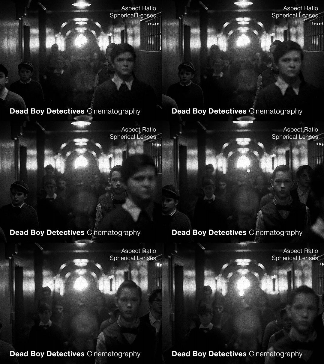
Part 2 — this time with a focus on the flashbacks
(Check out the first post for some background info that will be useful)
When we’re looking at the cinematography of any piece, once we’ve established what the norm is (which is the use of anamorphic lenses, as per the last post) we can then look to see where it diverges. As far as I can tell, the only part of Dead Boy Detectives that doesn’t use an anamorphic lens is Edwin’s flashback scene.
Now this is particularly interesting since not only is it filmed with a spherical lens, but it also is the only scene with a different aspect ratio, and the only scene in black and white. Everything about this scene is glaringly different. The easy and obvious reason is that it sets this scene apart as something important to pay attention to, as well as emphasizing the difference in the time period. But I want to highlight how exactly it does this since it is quite clever.
It also raises the question: Why not film Charles’ flashback scenes differently?
Like last time, let’s start with a review of history and technical information.
What is an aspect ratio?
This is just the ratio of the width to height of the frame. 1:1 is a square, whereas 2:1 is a rectangle twice as wide as it is high. In film, aspect ratios are usually listed as a ratio of x:1, so you get common formats like 1.85:1 and 2.39:1 (the second being a super-widescreen format, i.e. a long rectangle). Other common ratios are listed with different numbers, like 4:3 and 16:9. Any time I write an aspect ratio with other numbers, I’ll also list it at least once with the x:1 format so you can compare things easily.
What are some common aspect ratios and what have the standards been across the past 100+ years of film and television history?
Brief history of aspect ratios in Film
The original silent films were mostly filmed in 4:3 (1.33:1). This aspect ratio persisted until the late 20s/early 30s when the Academy Ratio, 1.375:1, was introduced and somewhat standardized (at least in the USA) until the 50s. Then, widescreen became pretty popular and was used to draw audiences to the theaters. At this point, we get tons of variation in aspect ratios in films. But, for American theaters, common projections are 1.85:1 (which became super common) and 2.40:1 or 2.39:1, whereas in some European theaters, 1.66:1 is a more common ratio.
Some other common ratios deal particularly with 70mm film:
Standard 70mm film is usually 2.2:1. However, using anamorphic lenses will create a higher aspect ratio, and unless using a specific format common in the 50s and 60s (Todd-AO), this wasn’t often the aspect ratio that viewers would see. (The Sound of Music was shot with Todd-AO in 2.2:1, but until recently, most people only saw the general release in 35mm, which had a different aspect ratio)
IMAX, which is 1.43:1 (if IMAX is shot on film and not digital, it uses 70mm film)
Brief history of aspect ratios in Television
Pretty much all televisions until around the 1990s-2000s used 4:3, and broadcasters would show content in that aspect ratio. If a movie was broadcast over TV, sometimes there would be letterboxing (black bars), but pan-and-scan was common, where they would crop the movie to the 4:3 ratio, and pan around to wherever the action was happening. Starting in the 90s, widescreen televisions started to gain traction, and the 16:9 (1.77:1) format prevailed, and TV broadcasting had some more wiggle room for aspect ratio.
**Side note: Computers are often at this ratio, so if you watch older TV shows on your laptop, you’ll probably see pillarboxing (black columns on the sides), whereas newer movies are often shot with higher aspect ratios so they have letterboxing (black bars on the top and bottom)**
A note on widescreen
Movies are usually considered widescreen if they’re any higher than 4:3 (or 1.33:1). However, because of the aspect ratio of modern TVs and computers, and the even higher aspect ratios of most smartphones in landscape mode, a lot of people (especially younger generations) won’t consider things “widescreen” until they’ve got a much higher aspect ratio.
Streaming and Aspect Ratios
A weird effect of streaming services, and in particular Netflix, was the rise of a new standard in aspect ratios, 2:1. It’s used in shows like Stranger Things. It’s widescreen enough that it feels cinematic but it displays well on lots of devices. There’s minimal letterboxing (or none) on your phone, and more letterboxing on your computer and TV, but not enough to seem like you��re watching a movie instead of a show.
Netflix (and Amazon) really like this aspect ratio. In 2017, one of the production requirement documents from Netflix stated that any aspect ratio greater than 2:1 had to be subject to further approval (though now they state “Aspect ratio choices should be discussed with Netflix for approval”). It’s become increasingly common, and these companies have a pretty set standard for 1.9:1 and 2:1. If we see those ratios on a streaming show it isn’t always a creative choice, similar to the way older TV shows were required to be in 4:3.
A brief reminder about lens types with some extra bits about the timeline.
That 2.39:1 aspect ratio that movies use? That’s the standard for anamorphic lenses (discussed in Part 1). Anamorphic technology was developed around 1915 (for military reasons), but wasn’t used for films until 1927, and didn’t become commonly used until the 50s.
So, with that, let’s look at Dead Boy Detectives.
Aspect Ratio
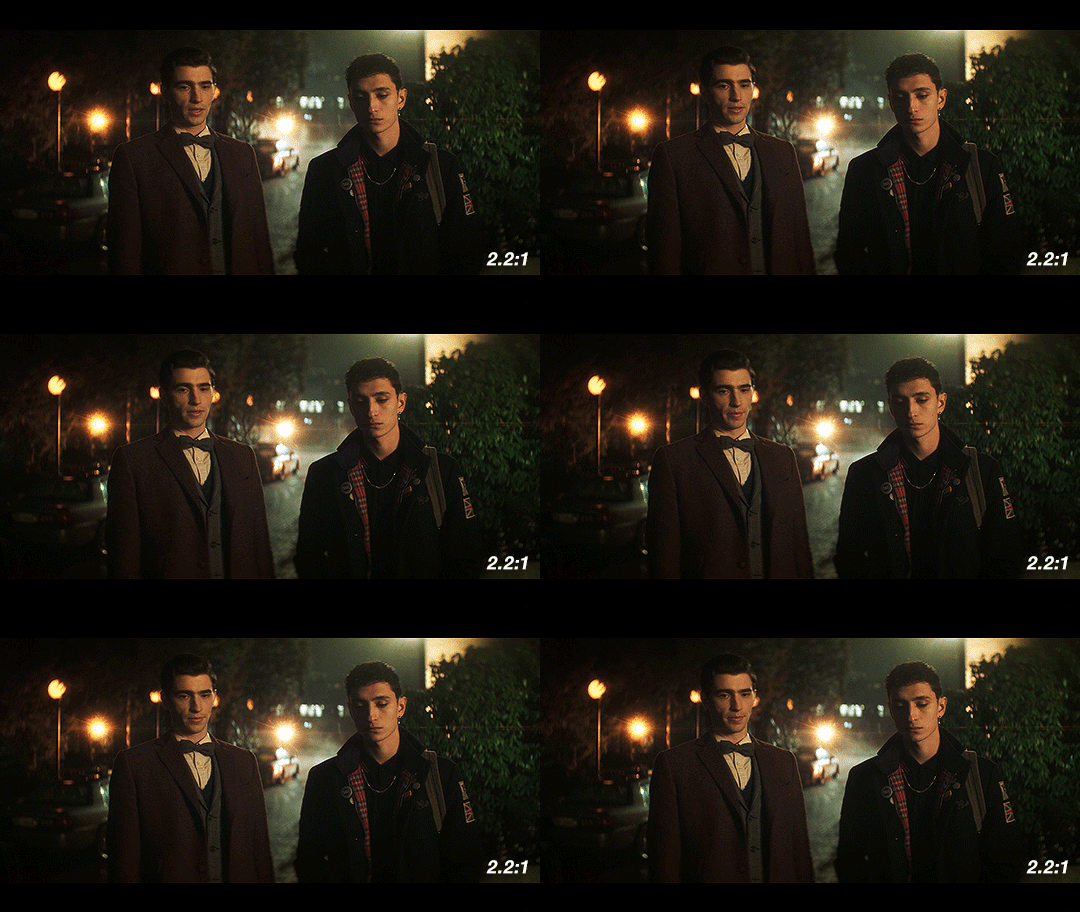
The whole show is shot with anamorphic lenses, but instead of a 2.39:1 ratio, they use a 2.2:1 ratio. This is a really interesting choice since it is an uncommon ratio. It’s more widescreen than Netflix shows (they started shooting before being acquired by Netflix though so we can ignore any impact Netflix may have had on this decision) but not quite the widescreen that anamorphic lenses typically use.
Movies and shows can use almost any aspect ratio today, but it is still common to stick to the standards. When they choose something else, it’s not because of technical limitations, but because of a creative choice.
The one caveat I have is that Doom Patrol used 2.2:1, so it’s possible that HBO and DC originally just chose this for continuity between the two, before the show was shifted over to Netflix and the Sandman universe. But for this post, I’m going to assume that they were sort of starting from scratch when choosing the look.
If we consider what a 2.2:1 ratio has been used for, and what viewers have been “trained” to associate it with, we end up with Todd-AO 70mm prints and a few others from the 50s and 60s. It’s the kind of aspect ratio you don’t see often unless you’re lucky enough to live near a theater with a 70mm film projector. There are a few notable movies shot in this aspect ratio: Lawrence of Arabia and 2001: A Space Odyssey. Some more recent movies that used 2.2:1 include Dunkirk, Tomorrowland, Nope, and the non-IMAX parts of Oppenheimer. It’s also occasionally used in recent TV, but not a ton, and not with many popular shows.
This is an aspect ratio used by large-format, high-budget movies. As mentioned in the previous post, anamorphic lenses are associated with a romanticized notion of “cinema” and this aspect ratio only serves to further that, associating Dead Boy Detectives with the limited pool of content made in this aspect ratio. It may be a TV show, but it’s being shot like a movie.
Another really interesting point that follows up on the previous post is the idea of using cinematography to enhance the sense of the supernatural and separate the characters from the normalcy of the real world. The aspect ratio is a bit unnatural too, which serves to complement and augment this.
Let’s briefly look at what the show would look like in different aspect ratios. As a baseline, this is the 2.2:1 aspect ratio that the show is in:
If they had gone for a 2.39:1, a very typical aspect ratio for the kind of lenses they’re using, it would look like this:
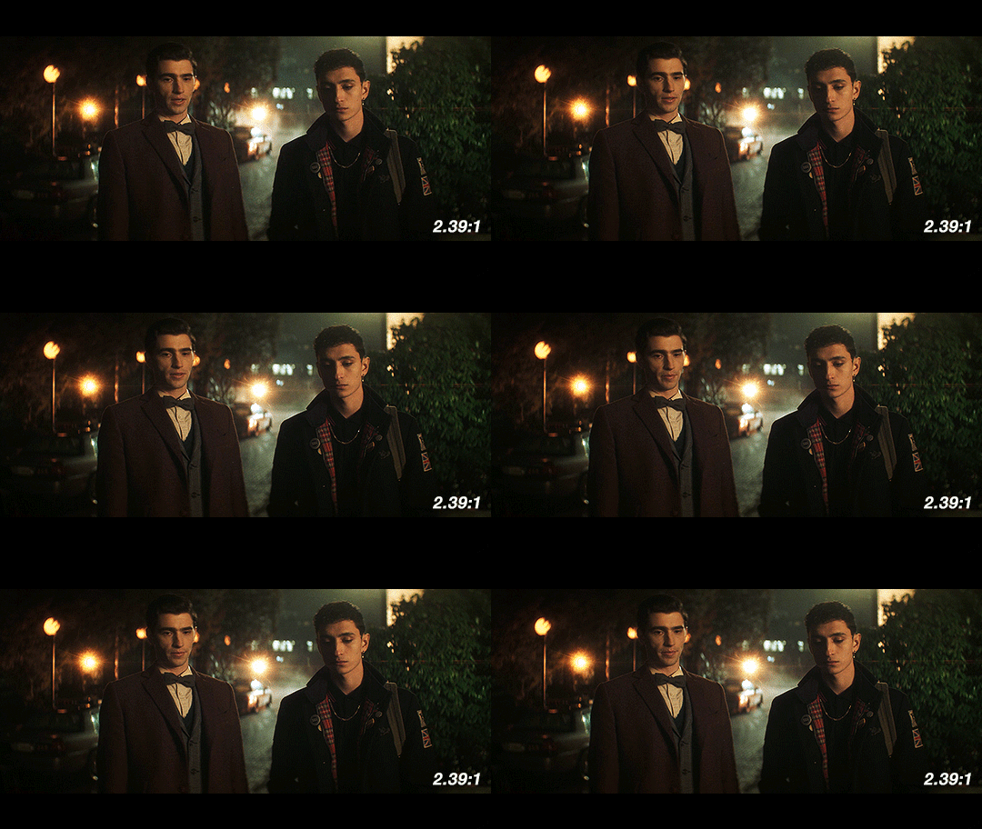
When we see things shot with anamorphic lenses, we’re used to seeing it in a frame like this one. Especially in shots like this with the dramatic lens flares, this is going to look and feel familiar to people who watch a lot of movies. It has more of that Star Trek (2009) look, and feels kind of glossy and polished.
Next up, we have 2:1, the aspect ratio popularized by Netflix. It’s a reasonable possibility that if this show had been produced by Netflix from the very beginning, this is what it would look like.
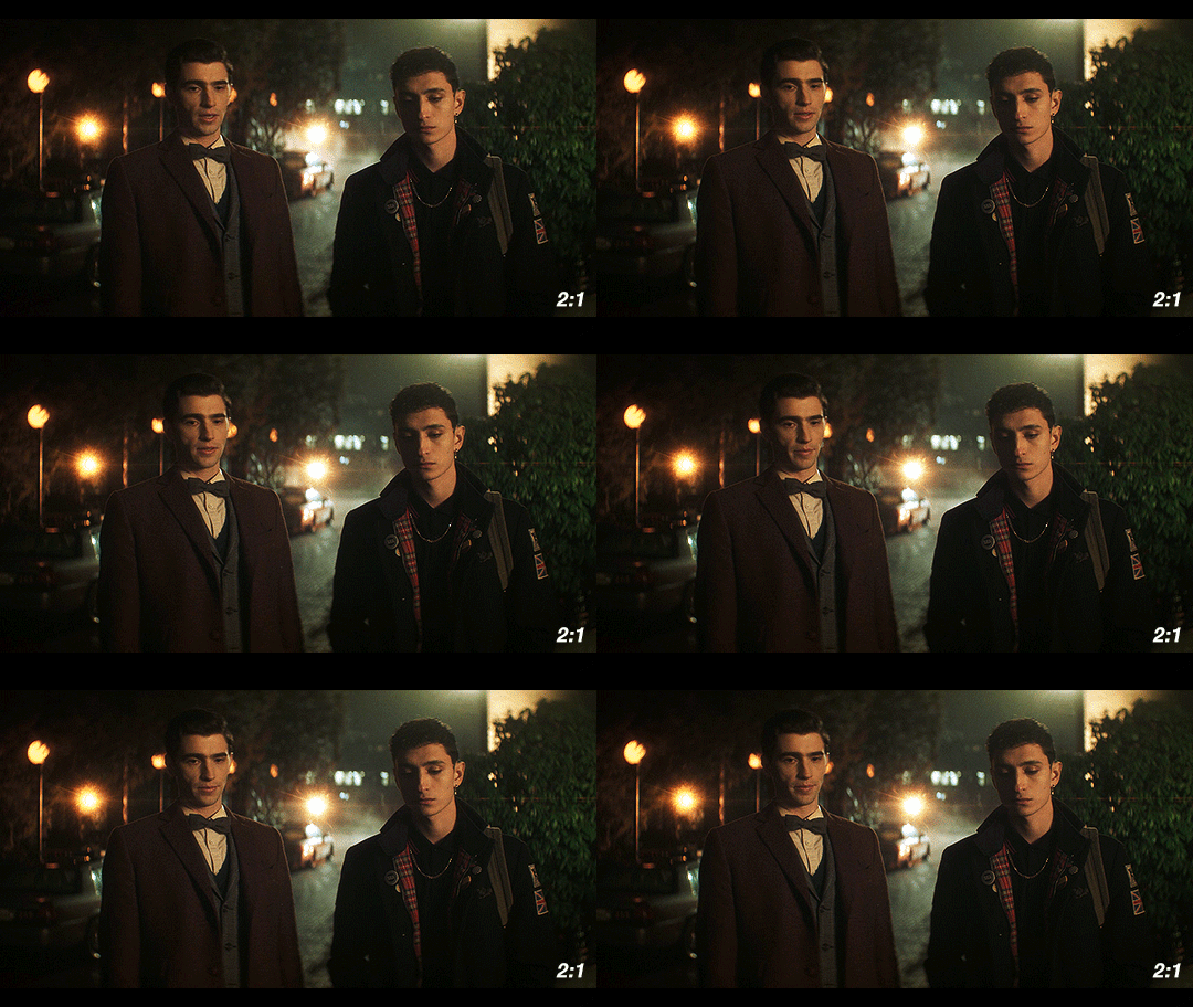
Over the past few years, this has become the “streaming platform” aspect ratio. With the extra vertical height, it’s got some extra space to breathe. We would get less of the background and more of the characters, especially since Dead Boy Detectives favors centered shots of single characters over group shots like this one.
Finally, I’ve got the scene in 1.85:1, a ubiquitous film aspect ratio, yet one that is not used often on TV.
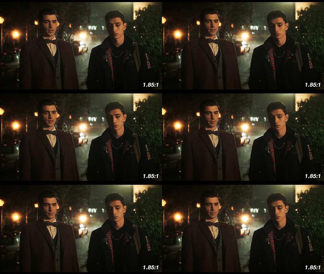
This is considered to be standard widescreen and it’s a great aspect ratio. Given how many creative decisions in this show were made to emphasize the supernatural, this could have been another good option as an aspect ratio, since we’re not used to seeing TV shows like this. However, they’re using anamorphic lenses so this would have required a lot of cropping. Because of how the anamorphic lenses work, this would also necessitate a lot of additional attention during the shoot. If they had gone with 1.85:1, we likely would have gotten a show shot on sphericals instead.
So what about Edwin’s flashback?
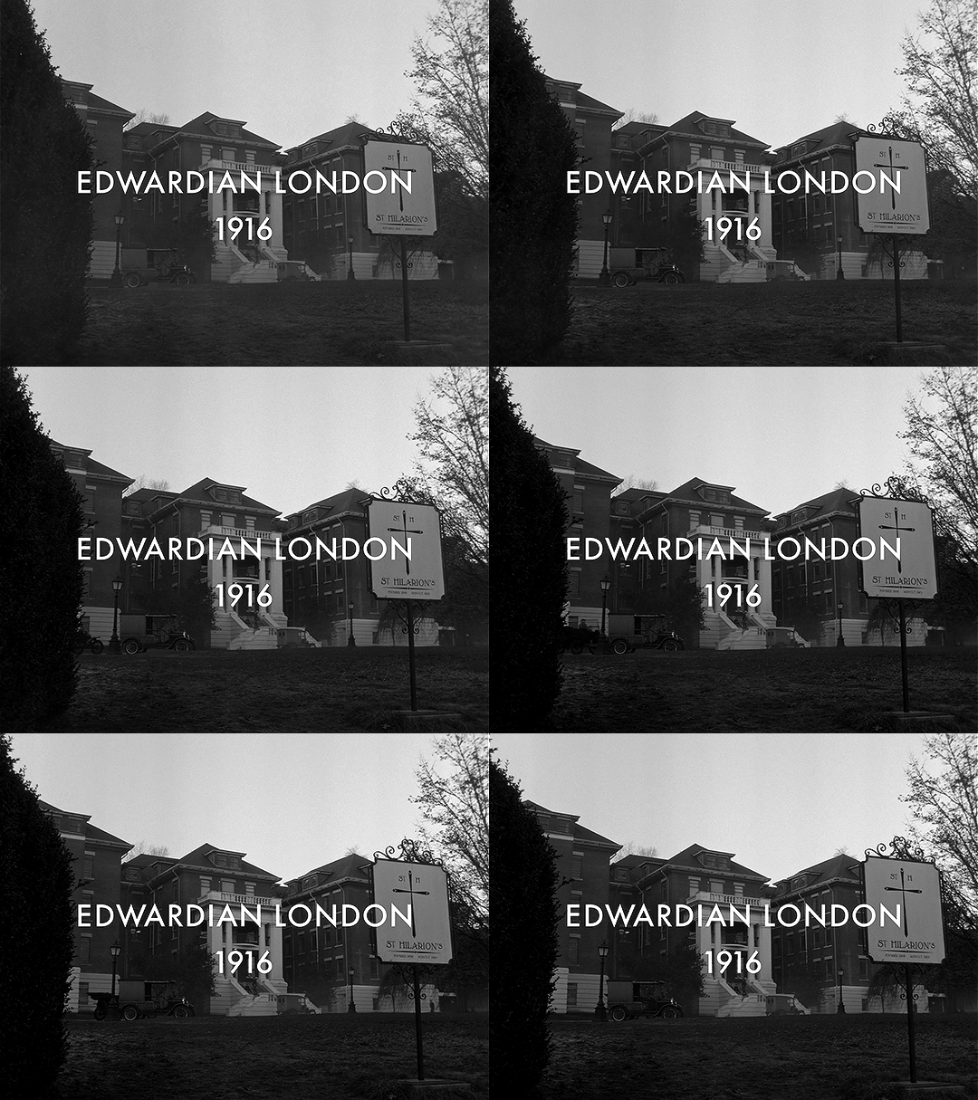
This section is shot in 4:3 (1.33:1). It’s the only part shot in a different aspect ratio. Sure, changing the aspect ratio forces us to acknowledge the difference in time period, but why exactly does it work so well?
Remember the history part? 4:3 was used for most of the early silent films. If we are to consider the “historical accuracy” of shooting the different time periods in this show, anamorphic lenses and 2.2:1 make sense for the present-day parts and Charles’ flashback.
But in 1916, widescreen cinema wasn’t a thing. If Edwin had ever been to see a movie while alive, it would have been in 4:3. The first time he would have ever gotten to see something in widescreen (if we assume he watches any movies at all) would be after he escaped Hell.
Using this aspect ratio is not just a vague decision that a lower aspect ratio and black & white looks older. It is, like many other aspects of the show, historically informed. They could have used the academy ratio here, but they didn’t. They used 4:3.
Not only does the aspect ratio switch for this scene, but also the height of the image changes.
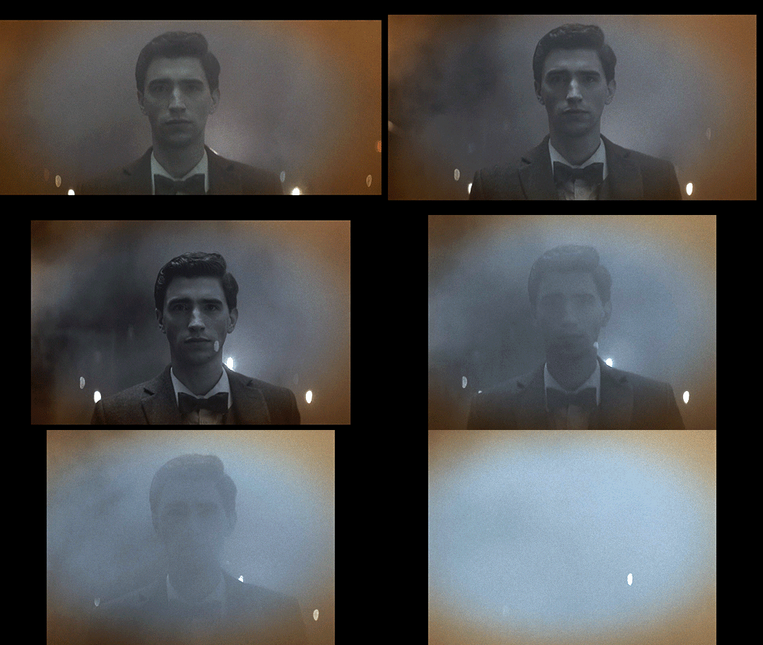
This transition also sort of mimics the breathing effect of anamorphic lenses:
Something you may not know about how Netflix usually works is that regardless of the aspect ratio of the picture, the video file you see is part of a larger container, which is usually 16:9 (1.77:1). The black bars on top and bottom are part of the file, as shown in this screenshot of how it looks when you load up some screencaps in photoshop.
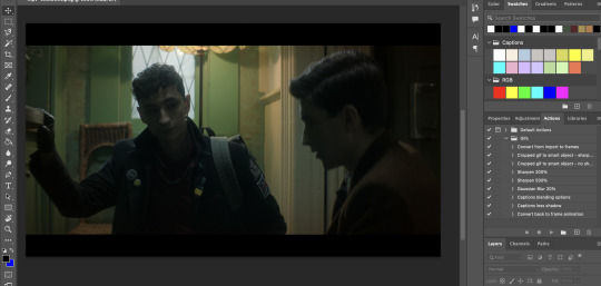
If you make gifs, edits, or are otherwise just used to having video files you are probably familiar with this. The Dead Boy Detectives files have letterboxing that is cropped out whenever people make fan content with it, whereas if you have a file for an independent movie, it usually does not have those black bars. Those black bars being part of the file make this transition possible.
We don’t usually realize that the container extends beyond the picture. For all we know, that’s the edge of the frame. But then it changes and forces us to reconsider what we previously thought to be true. Breaking out of what we think to be the image height is jarring, especially considering that this is the only time it happens (other than the brief flashbacks to the same footage later in the show).
Here’s a mockup of what it would look like if they kept the same image height, and just moved from 2.2:1 to 4:3 without expanding vertically. I find that it doesn’t have quite the same effect.
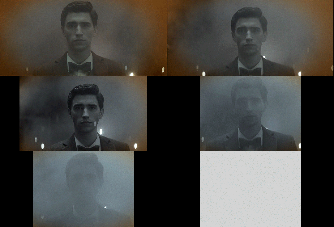
This would look so cool if it was being shown at a movie theater on a huge widescreen, but we’re not watching this show in theaters. We’re watching it on screens where this would make it look small; what they do instead retains the feel of watching something big and cinematic.
So back to the actual transition:

In breaking out of the perceived container, it’s as if it were breaking the fourth wall, an acknowledgment of the video’s format and its true container. This story is addressed to the audience in a way that the rest of the show is not, and it uses the aspect ratio to let us know that.
Spherical Lens
(I would highly recommend you read pt 1 if you haven’t already)
Edwin’s flashback is not only the sole scene with its own aspect ratio, it’s also the only scene shot with a spherical lens. Like the aspect ratio, this is a historically informed choice. Anamorphic lenses technically existed during the last year or two of Edwin’s life, but movies were not being shot on them.
How do we know that a spherical lens is being used, and how does this affect the show?
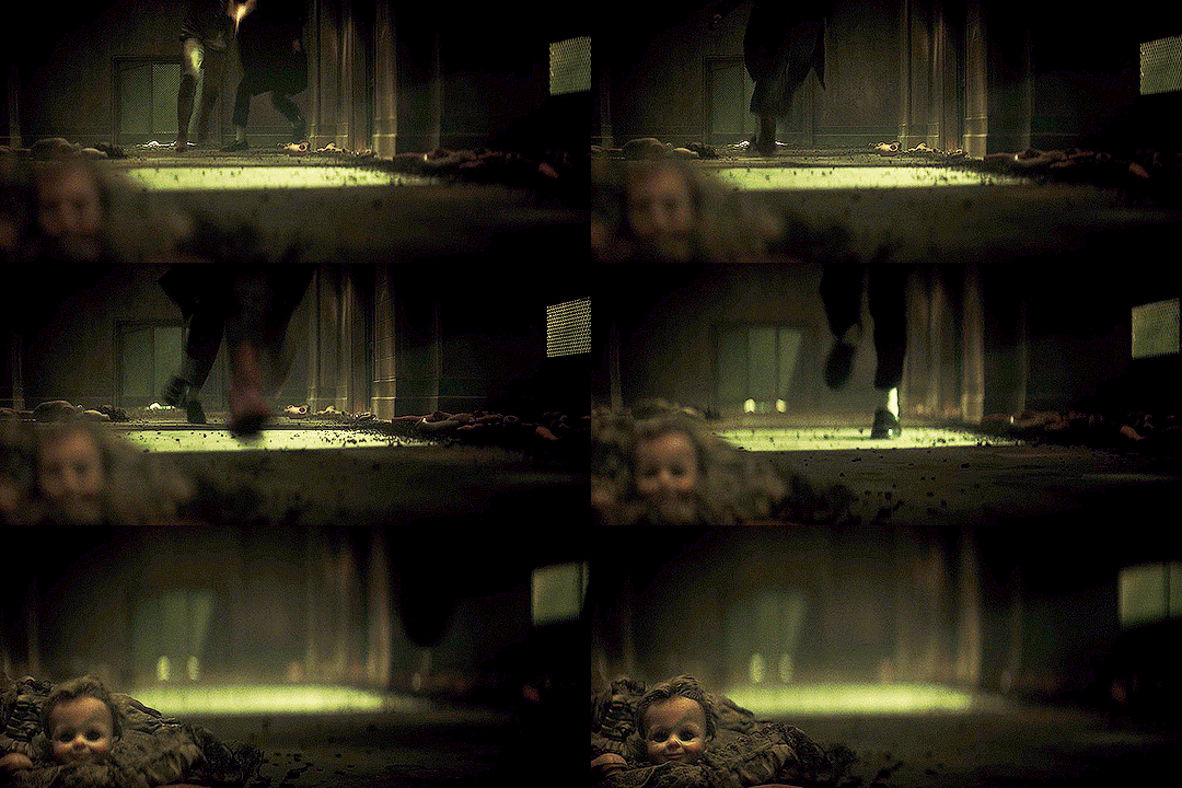
One of the quickest ways to identify the lens is to look at the shapes of the bokeh. There’s not much bokeh in the flashback, so I apologize for the intensity of my first example. But here, look behind Edwin’s head, where the lights from above reflect on the wet basement floor. They’re all circles, instead of the ovals that we get with the anamorphics.
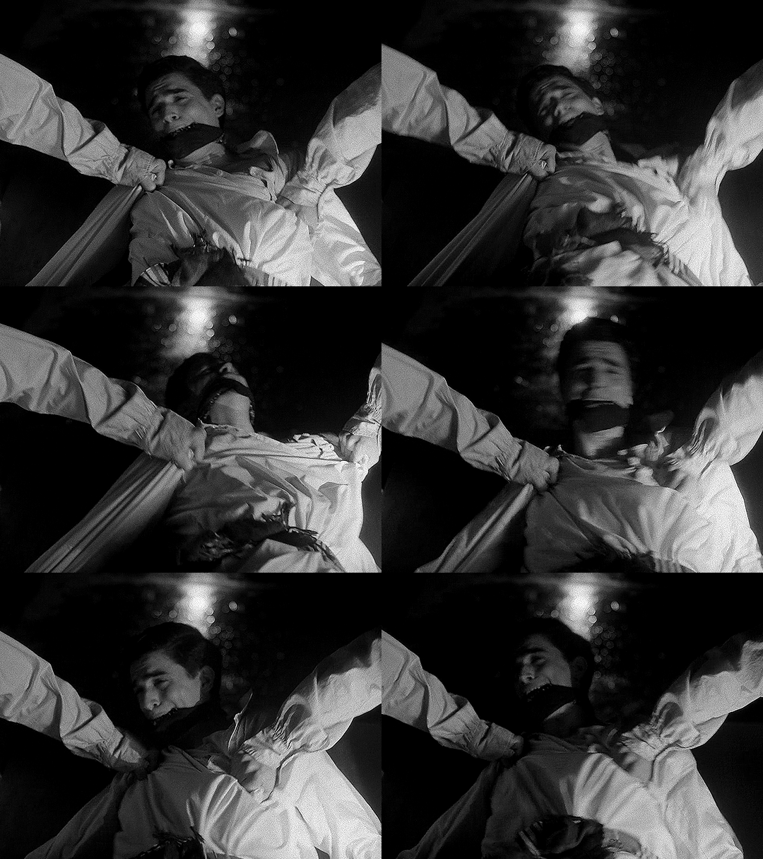
The lens flares are also really different. Remember that the anamorphic lens flares are horizontal lines. Spherical lenses don’t do that, but they can produce lots of different kinds of lens flares. In this shot, the flashlight pointed at the lens lets off lines in lots of directions, kind of like sun rays.
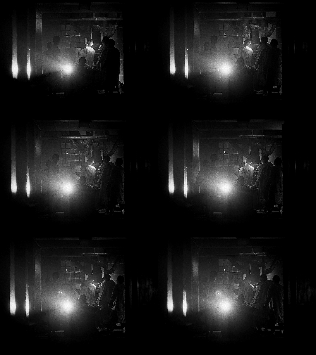
This shot has another cool flare, in much more detail this time:
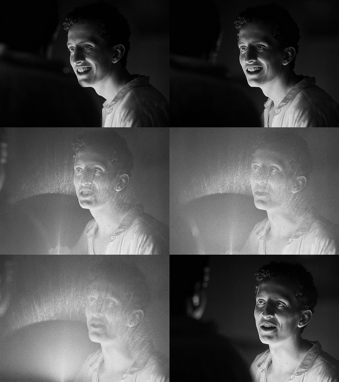
The next shot shows us more of the circular bokeh and another kind of lens flare.
For the bokeh, look at the lights on the ceiling as well as the corners of the out-of-focus architectural details (the semi-arches).
The lens flare here is the bouncing, blurry circle near the middle, as well as the brighter shape near the center bottom.
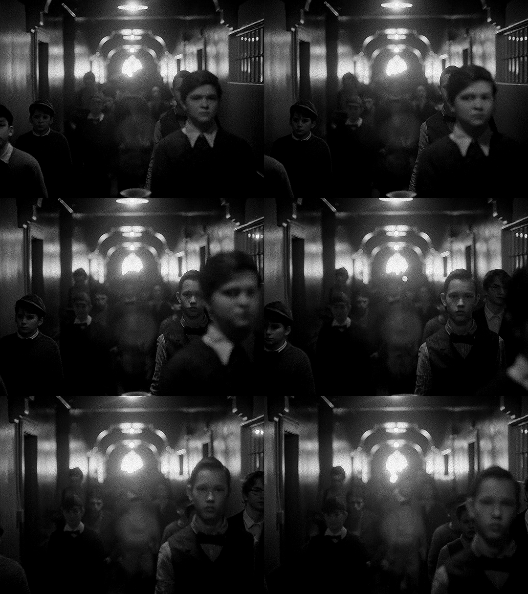
We can then look at the things that are not different, but absent when using the spherical lens: barrel distortion and focus falloff.
In this example, look at the windows in the background, as well as Edwin’s chair. An anamorphic lens would distort the vertical lines, bending them into a gentle fisheye. It would also make that chair and the lines of the window frames a bit blurry, as they’re close to the edges of the frame. Instead, the lines are straight and clear throughout the whole shot.
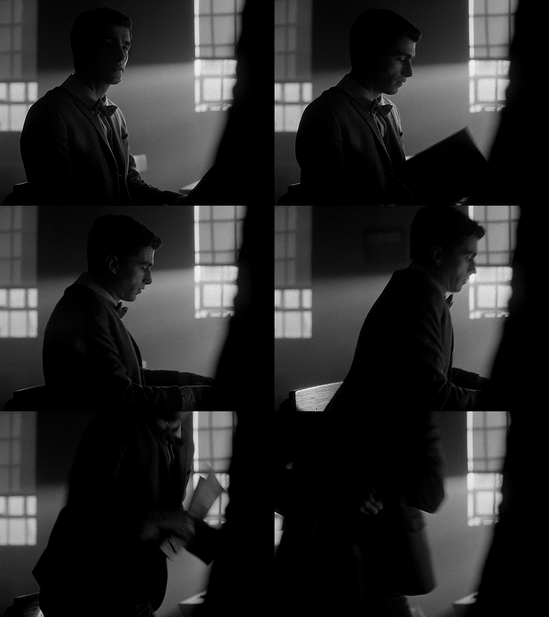
In this next example, not only do we get a great view of the lack of focus falloff, with clear lines throughout the shot, but we can see more of the difference in perspective and distortion of lines.
You may notice that the windows and doors are not perfectly straight up and down. But is this barrel distortion? If there was barrel distortion, the walls would curve back towards the center of the frame at the top.
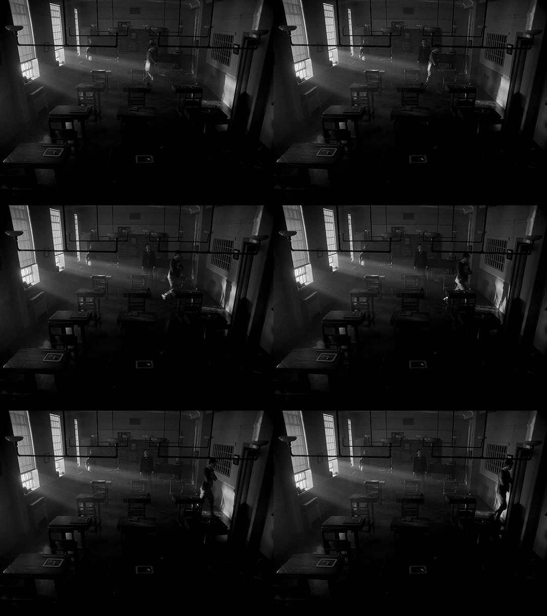
Spherical lenses are often the ‘default’ lens. They’re wonderful and used in a lot of media because they are neutral. They distort less, thus representing the world closer to how it actually is. If we consider the anamorphic lenses in the rest of the show being used to enhance the sense of supernatural and story, changing to a spherical lens enhances the sharp reality. This is Edwin, alive.
The image breaks out of its perceived container, reaching out to the audience, and then changes the lens to be more ‘real.’ In these two changes, not only do we have a more historically accurate image, but it's as if the creators are issuing a warning to us. Maybe the demon isn’t real, but bullies are. Kids can be cruel. Classmates hurt their queer peers. This is not fantasy, and this is as true in 1916 as it is today.
Using a spherical lens in this instance, juxtaposed to the rest of the show, is a dramatic shift to make, as it alters just about everything in the image. In using a less distorted picture, for this, we are reminded of reality and life and the mundane.
On Charles’ Flashback (and an experiment)
Edwin’s flashback got the Cinematography Treatment™ but what about Charles’ flashback? It’s shot with the same aspect ratio and lens as the rest of the show. From the perspective of historical accuracy, this is fine. It’s a scene that could have been shot in 1989, cinematographically speaking. The reason I suspect that it wasn’t given any stand-out look is because, unlike Edwin’s flashback, Charles’ flashback scenes are closely tied to the present-day plot. They aren’t just scenes of Charles remembering things, they are a direct result of the Night Nurse’s “memory magic.”
Maybe changing something here would separate us too much from the plot. Both flashbacks (in episodes 4 and 7) are induced for a specific purpose related to other present-day characters. It wouldn’t make as much sense to have them be standalones.
However, if I were simultaneously the showrunner, screenwriter, and cinematographer, I would give Charles a standalone flashback scene. In that flashback scene, here’s how I would shoot it:
There would be a much deeper depth of field/smaller aperture than the rest of the show, so the background would be more in focus.
There would be harder, less-diffused lighting. This would also impact the coloring, and I’d maybe add some more saturated lights.
I’d try to make an argument to shoot that scene on film (and then argue to do Edwin’s on film too).
There would be a different aspect ratio; 2.2:1 isn’t out of the realm of possibility for the 80s, but it wasn’t common, and it wouldn’t have the kind of impact I’m searching for if it didn’t change.
There are three different aspect ratios I would choose between, and the lens would change depending on my pick.
I’ve made some mock-ups for how these would look, though I cannot adjust things like bokeh and depth of focus, and I can only do so much with the lighting.
2.39:1 with anamorphic lenses (specifically Panavision lenses) This is a super standard widescreen, with a popular lens from the time. We don’t have lens info for the rest of the show, but I think they’re using Panavision anamorphics anyway so the lens may not be a change. Big, blockbuster action movies from the 80s would often be shot in this (perhaps most relevantly, Ghostbusters), and it’s a style that kind of faded in popularity in the 90s and 2000s, so it can have more of a retro look, especially if shot on film. One downside to this would be the aspect ratio change would not be as dramatic.
Movies from the 80s shot with this combo: Raiders of the Lost Ark (and other Indiana Jones movies), Star Wars: Episode V - The Empire Strikes Back (as well as Episode 4, which came out in the 70s. Episode 6 used the same ratio and did use anamorphic lenses, but not Panavision), Ghostbusters
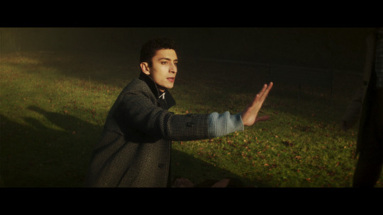
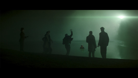
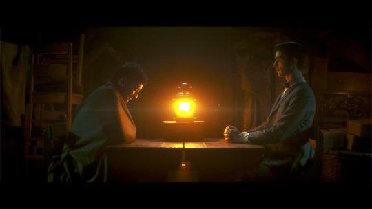
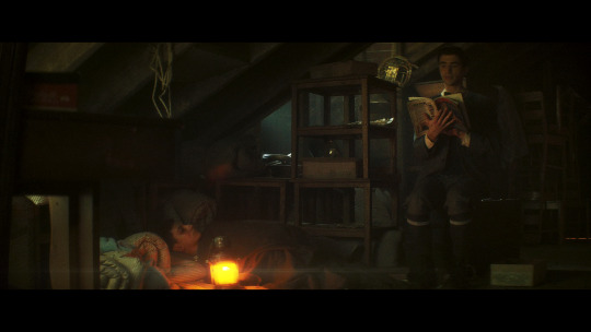
1.85:1 and spherical lenses. This is also ‘widescreen,’ but the advantage of using this aspect ratio is that we could get another dramatic breaking of the image container, just like in Edwin’s flashback. It’s an incredibly common setup, so it’s not really unique, but it would look different from the rest of the show. Given how pervasive ultra-widescreen still is today, I think a lower aspect ratio would also ramp up the ‘nostalgia’ factor a bit. Using a spherical lens we’d end up with the same sense of stark reality that we get for Edwin’s flashback as well (the warning that kids are cruel, but this time to people of color), and I like the idea of that as a parallel.
Movies from the 80s shot with this combo: Back to the Future, Dirty Dancing, The Princess Bride, An American Werewolf in London, Clue, Another Country
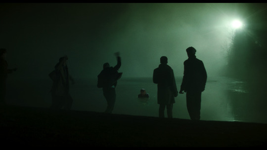
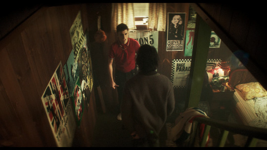
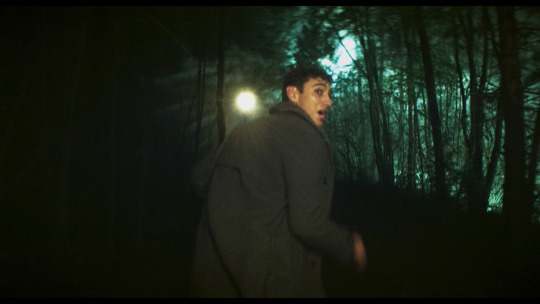
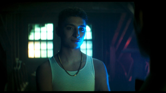
1.66:1 and spherical lenses. This is a ratio that was used widely across Europe, but has never been a common ratio in the USA. However, by the 80s, filmmakers were going for a more widescreen look so it was fading from popularity everywhere. The 80s liked widescreen, so it’s maybe not the best pick for making a scene look “80s”. However, my main motivation for this ratio is that my personal picks for the most Edwin-coded and most Charles-coded queer films are both 80s films shot with a 1.66:1 ratio. We would also get the same benefits from using the spherical lens as I mentioned in the 1.85:1 section.
Movies from the 80s shot with this combo: Maurice, My Beautiful Laundrette, Law of Desire (La ley del deseo), and an honorable mention to Chungking Express, a 90s film that really exemplifies the kind of look I'm going for here
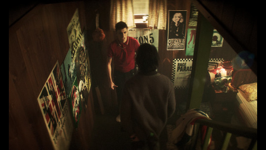
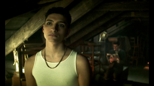
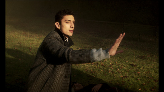
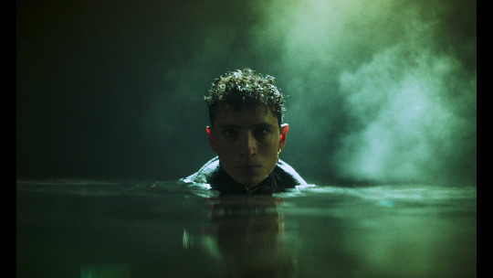
Giving Charles’ flashback a special treatment would probably do a lot to more firmly establish his character as a co-protagonist rather than a deuteragonist, which is definitely not the case but does seem to be how some people view him.
With the impact of the spherical lens and aspect ratio in Edwin’s flashback, the final two options for Charles flashback would be the closest in terms of echoing Edwin’s flashback, and would probably provide the most gravity and sense of crushing reality to the scene.
Setting a single scene (or two scenes) aside like this, with a unique aspect ratio, lens, and color grading (which I didn’t explore much for the Charles flashback), makes us consider a scene more independently from the rest of the show. Edwin’s flashback is a striking moment with a very different look, and that’s deeply memorable. It comes together to push how tragic and unjust Edwin’s story is.
—————
This concludes the planned portion of my cinematography analysis. I had a ton of fun researching and writing this (and making all the graphics) and I hope you all find this interesting/helpful/informative :)
Finally, I want to give another name drop to the cinematographers, Marc Laliberté, Craig Powell, and Pierre Gill. They’ve really nailed it from the very first episode to the last, and there’s so much intention and thought given to every aspect of how they shoot this.
#dead boy detectives#dbda meta#dbda#edwin payne#charles rowland#cinematography#dead boy detectives analysis#cinematography analysis#mygifs#dbdagifs
282 notes
·
View notes
Text
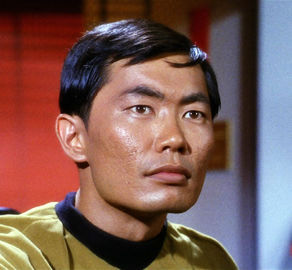
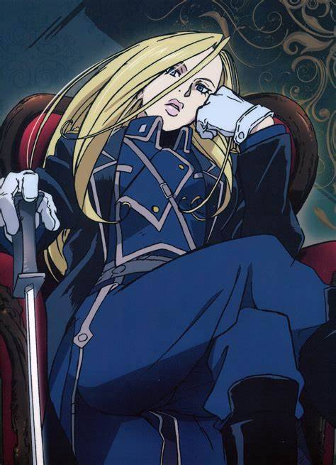
Sword gays showdown, round 4 of bracket two
Propaganda:
For Hikaru Sulu:
1) Okay, first off: Which version am I submitting? Prime timeline (TOS) or Kelvin timeline (AOS, also known as the reboot movies if you're not in the fandom)? The answer is both. Prime Sulu has the more iconic fencing scenes (and is also said to have other sword related abilities) while Kelvin Sulu is canonically gay. Specifically as a tribute to George Takei btw who played prime Sulu in TOS and is famously gay and an LGBT+ rights activist among other causes. The picture provided is prime Sulu but if you've only watched AOS, feel free to vote for him anyway.
I'm not gonna link any videos here since that would probably exceed the scope of the propaganda section but clips should be pretty easy to find. And if you can't, just trust me: The TOS fencing scenes are amazing. The AOS one is probably fine too but it's been ages since I've watched it and I forgot it even existed so it can't have been THAT memorable.
Fun fact: George Takei initially didn't know how to fence and didn't find out he'd have to until pretty late and started taking fencing lessons only three weeks before the filming of that episode (The Naked Time) and apparently "became so out-of-control and boisterous that he had to be separated from the rest of the production personnel, for their own safety" which, in context of what the episode is about, is just absolutely amazing. Truly iconic.
Anyway, considering Star Trek is an important part of queer history (I'm only half joking) you need to vote for Sulu, we all know George Takei is an icon, make the right choice here.
2) When they got hit with the drunk virus he took his shirt off and started challenging people to duels. Iconic
3) This bitch got the outer space disease that makes you silly, and revealed they were gung ho for fencing, and brought out their sabre to just. Swashbuckle. Goes "/oh my/," and is clearly gay and played by a gay actor
For Olivier:
She is only female general in her nation, and guards the northern border. She fights with a sword even though there are other people with guns. Olivier is unmarried despite being older (not sure how old exactly, but she is a general, and that takes time). To the best of my knowledge she shows no interest in anyone, thus making it possible to interpret her as aromantic and asexual, or as a lesbian. The bit where Mustang offers to take her on a date and she threatens to eat so much she will bankrupt him is funny.
#sword gays showdown#hikaru sulu#star trek#star trek aos#star trek tos#olivier mira armstrong#fullmetal alchemist#fullmetal alchemist brotherhood
158 notes
·
View notes
Text
They w h a t ?
So it turns out the plot of that unmade Star Trek 4 with Chris Hemsworth was...


...a George Kirk transporter duplicate.
Trekmovie source
324 notes
·
View notes
Text
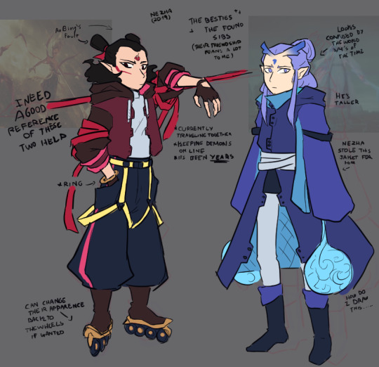
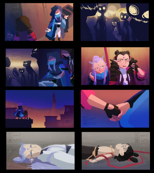


Something I wanted to try and do that I've been working on these past few days.
Some months(? ago I watched Nezha(2019) and after listening to FightSong like... a thousand times I was plagued with ✨thoughts✨! Wanted to try to do something like a "fake" project of sorts...
Some more thoughts about this under read more~
Explaining a bit more in depth of the idea because it's been plagging my mind for some time now (it's been marinating there and every time I listened to that song it would just gain more flavor).
Post-movie, canon divergence I guess?? Maybe?? Does it counts as an AU?? idk. The main points are that
1: Ao Bing technically betrayed his family and I was wondering if he would ever try to go back with them (would they or his father even allowed), I'm guessing not. I'm taking the path of him never going back home.
2: Nezha, after years have passed and people around him passed away (I guess), decides to try and use his other form (the one where he??? looks like a teen??? even when he's like three in the movie??? deities are confusing sometimes tbh). He's been practicing his control over this form, so far it's good. Sometimes he will revert back to the child-like one too.
3: It's been CENTURIES. Things changed, the place where they live would be closer to a modern-time city.
4: They don't allineate with anything. Like, no heaven, no dragons no demons. They go around doing what they believe would be right.
I am so willing to find a way to do a short animation with the song if this recieves enough attention. When would it be done or how clean would it look is another thing... But I would like to try if you guys are interested!
Also I should do this with other thoughts I have too. I have too many...
#Nezha#nezha 2019#Ao Bing#ouuhhh#idk what else to tag this with#don't tag as ship#please.#my art#digital art#fan art#asadraws#fakeprojects
571 notes
·
View notes
Text
LGBTQ+ Disabled Characters Showdown Round 4, Wave 1, Poll 5


A character being totally canon LGBTQ+ and disabled was not required to be in this competition. Please check qualifications and propaganda before asking why a character is included.
Check out the other polls in this wave and round here.
Tougou Mimori-Yuuki Yuuna is a Hero
Qualifications:
her legs are paralyzed for a long time and even after she regains leg movement she still likely has some form of ptsd due to her experiences (she also clearly shows signs of some other kind of mental illness but that isn't explicitly stated by canon), she also canonically has a crush on her best friend and has an extremely homoerotic relationship with her other best friend
She is canonically sapphic and a wheelchair user.
Propaganda:
she's so amazing, like she's the mom friend, the tech wiz, she pretended to be a vigilante one time, she tried to destroy the world, she's a history buff, she's stubborn, she had amnesia, she prefers her last name even with her closest friends, she's a total goofball, she loves to cook and bribes her friends with snacks
Are you a fan of magical girls? Of magical girls who would like to kiss other magical girls, perhaps? Well then. #togosweep
The qualifications and propaganda paragraphs correspond, @melodemonica is the first submitter.
S’chn T’gai Spock-Star Trek
Qualifications:
He is canonically dyslexic, and commonly interpreted as autistic. I do not think I have to tell you why I think he qualifies as LGBTQ+.
Propaganda:
He started it all! Spirk was the birth of slash fiction and fandom itself. Autistic, dyslexic, gay-- what can't he do?
Anything Else?:
THIS APPLIES ONLY TO THE ORIGINAL SERIES VERSION OF SPOCK. NOT THE SPOCK FROM THE JJ ABRAMS MOVIES OR THE NEW ITERATION OF SPOCK FROM STRANGE NEW WORLDS. Discovery Spock does count as TOS Spock in my mind, though. AOS & SNW Spock are some of the least gay characters I have ever seen, and it is quite sad.
Submitted by @convenient-plot-device
Check out some additional propaganda for Spock here and also here.
#polls#poll#disability#disabled characters#lgbtq#lgbtq characters#id in alt text#lgbtq dcs round 4#lgbtq dcs r4 wave 1#togo mimori#yuuki yuuna is a hero#s’chn t’gai spock#spock#star trek tos#star trek
28 notes
·
View notes