#anyway i give up here it is in 720p instead
Explore tagged Tumblr posts
Text
240521 | Zhang Linghe London Vlog
#张凌赫#zhang linghe#zhang ling he#weibo#translated#240521#i've spent over a day trying to upload this in 1080p but t got stuck uploading every time#even though it was a good 100mb under the limit???#anyway i give up here it is in 720p instead#i could've spent more time translating nevermind
10 notes
·
View notes
Text
Open letter to @youtube
Hi youtube people!
I like to watch youtube videos in 720p, on all my devices, and with any network speed.
Sadly I can't just select it and have it be my default anymore, because the geniuses at your offices have come up with a "way better" system that I can only imagine was pitched like this:
"Hey boss, I have an Idea for you: You know that handy list of available resolutions we have for each video where people can select a resolution and have it more or less be their default whenever possible?"
"Of course I do Dennis, it's a very useful and simple tool that causes no problems and is easy to use."
"Exactly! We can't just let our users have nice things, can we? How about we give them four options instead:
-"Auto (recommended)", which is enabled by default, where they have no control whatsoever and we can randomly change the resolution whenever the internet speed changes by half a percent,
-"Higher picture quality", which is like Auto but instead we will always automatically select the highest quality available even on screens that have way less pixels than the selected quality requires,
-"Data saver", which is like Auto but instead it randomly switches between 360p,240p and 144p,
-or "Advanced", which are exactly what we had before but instead it takes one more click to select your desired quality!
Also, and here's the best part, while you CAN choose to set a default quality in your settings, you can only choose between the first three options, thus making this feature incredibly useless!"
"Dennis, you're a genius! This is what humanity needs!"
Okay. Humorous jest aside, this is basically my main issue (if not the only one) with youtube right now. I don't care about the lost dislikes, I don't even care that much about the fact that comment sections tend to be more or less unmoderated.
Honestly, even the four option system would be great and awesome. WOULD BE. If it was optional.
Many people know the rule "A feature that you can't turn off is a bug." All that I'd need, all that I ask for is this:
Let us set a specific quality as a default. Let me be able to automatically watch every video in 720p. Let us set a default quality by giving us the Advanced Settings as an option there too.
Or, maybe even better, let us customize our own Auto function (maybe even named "Custom", idk).
Let me be able to say "I'd like the highest possible quality in the range 720p-240p".
Let people say "I want a quality that adapts to the network strength, but nothing below 360p" (except in cases where the original video was already 240p or 144p obviously).
It would not be witchcraft, just a sliding scale with two slidable knobs for upper and lower limit, a drop-down-menu (or maybe an icon that rotates between the possible options here) to choose between "highest possible, within selected range" (your Higher picture quality basically), "saving data, within selected range" (your data saver, basically) or "best quality that would keep the playback fluid with the current network speed, within selected range" (your Auto (recommended), basically).
Actually, even better, keep everything as it is but add the upper and lower limit, that would be enough. Just two opt-in sliding scales, one labelled "Upper limit" and one labelled "lower limit", above or below the list of quality options.
Simple and OPTIONAL. It's offering the user an easy way to control something they can control anyways, while being optional and letting people who don't understand what those numbers mean (are those the reason for the change in the first place? I can't think of any other good reason that doesn't ultimately amount to "We can't just let our users have nice things, can we?") keep their three simple options.
It's probably not hard to code either. You're one of the world's biggest software companies, you probably have some capable people who could implement this. Heck, even I could probably code it, just give me a laptop, the current code responsible for the quality selection, access to stackexchange and two weeks, I could do it for free.
I'm sure I'm not the only one annoyed by that change that happened almost a year ago, and I tried to adjust but it still annoys me, and the fact that it's relatively simple to fix this bug in many different ways is disappointing me.
To quote everyone's parents ever (though I do genuinely mean it): "I'm not mad, just disappointed"
You can ignore me, and you most likely will, but still I write this open letter to you in the hopes that you will consider it.
Sincerely,
Me
2 notes
·
View notes
Note
do you have any tips on how to make HQ gifs? i followed a bunch of tutorial but specially on twitter is just look sorry to say this word but very sh*tty you are one of the blogs i followed so maybe i can ask you but i’m too shy to come off anon
fghjkjhgfdsdfghj alright let’s try a linked-filled tutorial
when giffing for either sns, imo it comes down to a few basics:
getting the source video in the best possible resolution
your video player (highly recommend potplayer but it’s only compatible with windows)
size limits - the thing about file size is that both sites will distort them even if you follow the keep-it-down-as-much-as-possible rule of thumb *stares at tmblr’s garbage .gifv default display* anyway, my current width settings are at 900px for twtr & 250/400/540px for tmblr
sharpening - the Difference this makes, ugh (a big fan of rubyredwisp’s glossy sharpen action over the years. you can also explore vapoursynth if you’re willing to deal with some light coding/wanna create a .gif output without going through ps... fair warning, it’s greedy on ram)
attaching a guide with screenshots but it’ll probably be long so imma keep that under the cut
(click on the in-line images to enlarge them)
first, i open the video i want. in trusty ol’ potplayer, taking screencaps is simply pressing ctrl+g (in case you prefer taking clips, it’s alt+c)
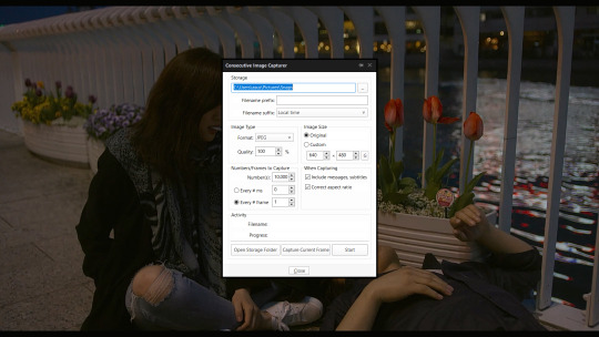
as you can see, the caps i got from that are 1080p
listen, a lot of folk would say 720p is fine but we’re not settlers in the age of 4k and up. as long as your disk space/internet can handle, use the ~best resolution available~
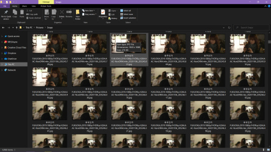
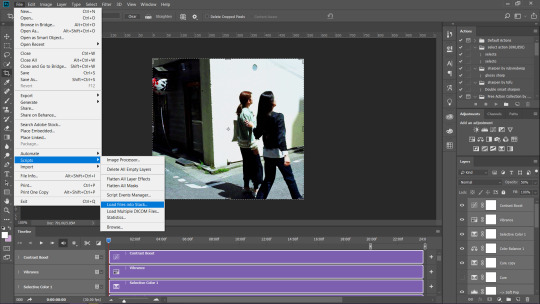
open photoshop. there are two ways (importing video frames to layers and loading files into stack) but in my experience, the latter yields preferable results so that’s the method we’ll follow here
the routine i’m used to is to load all the caps from that scene and trim from there but idk about your practice ymmv
don’t forget to select all your layers* before pressing “convert video timeline.” we’ll need the frames first so click that three box/timeline button on the lower left corner, make frames and reverse frames


previous frame extraction step and cropping+resizing are interchangeable. both arrive at the same result. sometimes, i’d like to see the individual frames first before cropping but doing the reverse is often lighter on your ps
[tip: make use of crop ratio. that pair of numbers would help you maintain the shape of the gif instead of eyeballing using the move tool later on. 1:1 is a square, 2:1 is a rectangle, and so on and so forth]


set the frame timing. i like consistency so i keep my gifs running at 4s unless i can’t help it. a lil’ math is involved in order to divide frame time (0.07 for 60f/0.1 for 40f/0.13 for 30f/0.2 for 20f) though keep in mind the number of frames contribute to the gif size
you’re probably wondering why i kept this twtr gif a few pixels above the 900px width i said earlier. after sharpening the smart object* - the reason why i had all the layers selected from the beginning - i slightly resize further using the canvas. this extra step would give you clean gif borders
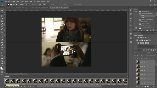
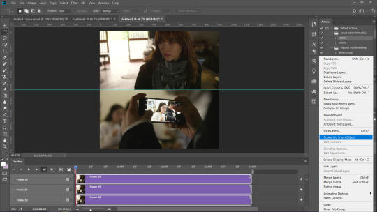

once all that is finished, you’re free to do/not do colouring
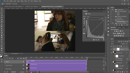
the simplest trick i learned recently from @waegashi-tofu is using curves to balance out your gif (use the white dropper for the portion that should be the brightest, the black dropper for the darkest area; you can make separate layers to easily discern the change made by the two) play around with opacity of that curve layer/s
leave it at that or if you’re overthinking all the time like me, colour further™


remember to double check the end marker of the video timeline. we’ve arrived at the last step where you’re now ready to save (alt+ctrl+shift+s)
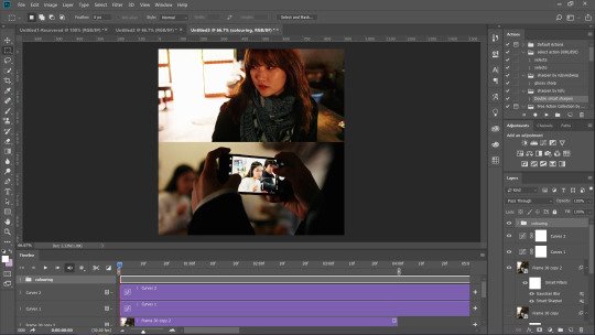
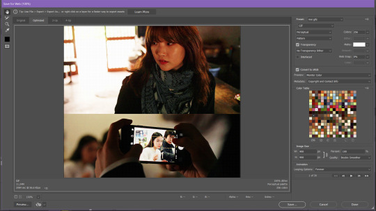
and we’re done! ᓚᘏᗢ
#heylo nonny i hope my process is concise and non-shitty lmfao#don't be shy next time and tell me if this tutorial was helpful or confusing#featuring more sodammie pining just because#miss bookshop keeper from fukuoka matches her well#tmblr has its bonkers set of rules and some gifs i thought would be fine look like hell when uploaded#twtr won't stop you unless you exceed 2000px but#k-fans are crazy for doing 1000px and up#then again they whitewash theirs so i guess taking out colours help them in that regard#anon reply#ps*
37 notes
·
View notes
Text
» 𝐆𝐈𝐅 𝐈𝐂𝐎𝐍𝐒 𝐓𝐔𝐓𝐎𝐑𝐈𝐀𝐋 𝐁𝐘 𝐑𝐄𝐏𝐋𝐀𝐘𝐆𝐈𝐅𝐒 !


hi folks! i’ve gotten a few messages on how i make my gifs, on what tutorials i used, etc. so i decided to make my own (since i didn’t use one) in hopes of helping a few people get their footing on how to make gif icons from scratch! this tutorial has been made with the assumption that you have prior knowledge of using photoshop (e.g. like smart filters), but please don’t be afraid to ask me any questions if you need anything explained or you’re a lil confused. however, do bare in mind that i am no photoshop genius, and have never become more advanced than what i required for my needs. anyways, without further ado, the tutorial on how you can make something like the above can be found below the cut. please like or reblog if you found this useful in any way!
some starting tips:
gif icon making, or gif making in general can be strenuous. do not give up if it doesn’t look like you want it to the first time! it’ll take time to find what you like.
don’t compare your gif icons to other’s, which i’m guilty of, but your gif icons are unique and lovely in their own way and you should view them as such!
♡
i am using a macbook, with a mac operating system and adobe photoshop 2020. keep in mind that this is the way i make my own gif icons, and i’m just sharing what i know so this may not be the best/easiest way to go about things, like you can probably include scripts that save it for you, etc. but i prefer having more control over to process.
♡
screenshots will be distorted, for easier viewing i’ve added a link that will take you to the full size image.
♡
before anything, a high quality gif comes from a high quality video. when downloading your content, make sure it's either 720p or 1080p resolution.
♡
step 1: open up your .mp4 file
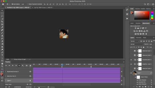
open it up as if you are opening any other file on photoshop. no need to import video frames to layers or anything of the sort. i find that way better for making gifs for gif sets instead of like 100+ gif icons. your photoshop should look like the image below.
this works best with shorter video files of around 1-3 minutes.
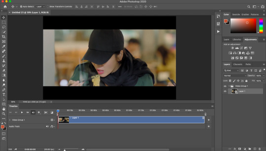
step 2: find your faceclaim
your video should now be open in photoshop as a video timeline, keep this the way it is, you’ll be able to move along the video to the next gif. using the timeline layers (see:layer 1), you can slide along until you find your faceclaim.
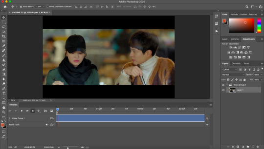
*extra info for those that don’t know. to extend your layer and make it easier to find your faceclaim, you can use the slider down below which looks like this:

this will essentially space the frames out more, if that makes sense?
step 3: select your gif focus and crop
use the rectangular marquee tool (circled in red) and select the area of your gif icon.
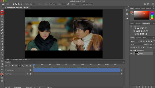
following this, use the crop tool (again, circled in red) to cut out the rest of the area. you are now left with a square.
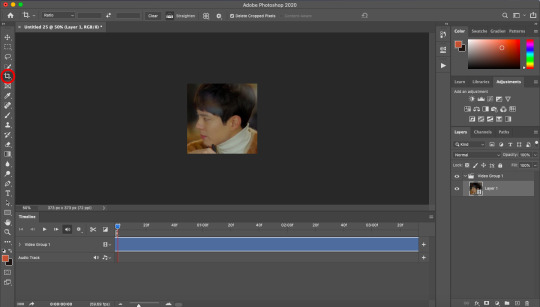
step 4: select the length/frames of your gif
this step can be done pretty much anywhere between step 2 and step 7, depending on your preference. anyway, use the slider (red arrow pointing to it) to decide where you want your gif to end.

then, bring the end of your video timeline (red arrow pointing to it) to where your animation slider is. your video timeline should now look something like this:

the space in between the lil sliders will only includes what will be in your gif.
step 5: resize
using image size, resize your gif to whatever size you wish. i prefer 80px.
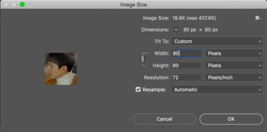
following this, it should say that your file is going to be converted into a smart object, click okay. (i can’t show the pop up since i got rid of it).
yet, now that you’re looking at your gif icon, you’ve realised you don’t really like the placement of it. simply cmd/ctrl+t to go to free transform. i moved it a tiny lil bit to the left.

as you can see, the rest of the video area is still there. you can now transform it to your liking. this will be useful when you want to change the area again.
step 5: add sharpen settings
you now have an icon, you can sharpen it to your liking.

i use smart sharpen and gaussian blur. i tend to have them in this order.
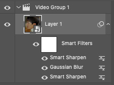
you can change the opacity of each smart filter to your liking. i won’t be sharing my exact sharpen settings (not that they’re hard to figure out), as i’d like them to stay unique to me, but do play around with this and see what you like the most (the key is less is more).
the trick here is to include the sharpen>blur>sharpen filters, which will give a sharpened appearance without overdoing it, and make your gif icon a lil smoother as well due to the blur.
**also, you may see the lil video group 1 in my layers there (and in your own too), this isn’t really necessary and is more of a pain in the ass that anything. if you have this, you can get rid of it by right clicking on it and ungrouping layers.
step 6: add your colouring
my colouring is a mixture of psds i’ve interchanged for years and i have lost the originals so do not intend on sharing. do look around at psds or make your own colourings that suit your tastes.

BE MINDFUL OF WHITEWASHING!!! if you are giffing people of colour, use colourings that do not make them into a white sheet or a gray mess. i see this constantly as if it isn’t 2020.
adjust! adjust! adjust! your colouring will not always work on different people or different scenes. adjust your levels, saturation, selective colour, brightness, etc to make sure the colouring works for your previous gif, as well as your next one.
even you can see here that my layers are mess because i adjust constantly.
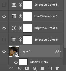
step 7: save for web
now that you’ve made your icon all pretty, save it for web and it should look like this:

step 8 (optional): speed
if you like your gif icons slower, you now have to upload the gif file into photoshop again. this will take you to the frame timeline. you can change the speed of your gif to whatever you want, and save again.
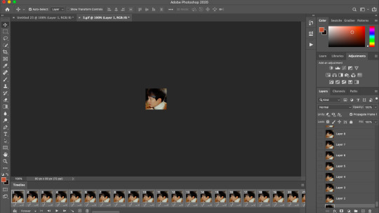
and there you have it, your is gif icon complete.

step 9: making more!
instead of going through this whole cropping process again, you can continue to move along the video timeline to different frames of your faceclaim, and making the next gif with just the exact sharpening settings, colouring, etc. this will make it super easy to make more gif icons in less time.
this can be done by simplying moving your animation timeline.
again you can use cmd/ctrl+t to adjust your gif placement. of course, this doesn’t always work, and you may need to revert back to your original video to crop the area again. an example of this is if you need a bigger or smaller area for the gif.
i just made this gif in a few seconds.

action
i use my own script to crop and have included the rest all in one action file. i did a lil digging and found this gif icon making action (resizes to 80px) that does essentially the same thing with no script. this will make it already 10x easier to make an icon. you can then make your sharpening into an action and you’ll basically have most of the job done for you in one click.
tips:
make things into actions! for example, i cut down a lil on the speed changing process by making actions that change the speed for me.
save your actions! you never know when you’ll lose them
you might get tired of looking at your gif icons after a while, they might even start to look ugly but that’s most likely because you’ve been looking at them for too long, so don’t feel discouraged!
crop close to the face, this is important! what in the fresh hell am i supposed to be seeing in a 70px gif icon if its so far away, or in general tbh
anddd that's about it! i hope you find this useful! again, if there are any questions, feel free to im me or send in a message and i'll do my best to help!
#rph#rpc#gif icons#gif icons tutorial#gif icon tutorial#i hope this is explained well im ...#i tried to be as thorough as possible to like make sure it all comes together
218 notes
·
View notes
Text
How I encode videos for YouTube and archival
Hello everyone! This post is going to describe the way in which I export and encode my video work to send it over the Internet and archive it. I’ll be talking about everything I’ve discovered over the past 10 years of research on the topic, and I’ll be mentioning some of the pitfalls to avoid falling into.
There’s a tremendous amount of misguided information out there, and while I’m not going to claim I know everything there is to know on this subject, I would like to think that I’ve spent long enough researching various issues to speak about my own little setup that I’ve got going on... it’s kind of elaborate and complex, but it works great for me.
(UPDATE 2020/12/09: added, corrected, & elaborated on a few things.)
First rule, the most golden of them all!
There should only ever be one compression step: the one YouTube does. In practice, there will be at least two, because you can’t send a mathematically-lossless file to YouTube... but you can send one that’s extremely close, and perceptually pristine.
The gist of it: none of your working files should be compressed if you can help it, and if they need to be, they should be as little as possible. (Because let’s face it, it’s pretty tricky to keep hours of game footage around in lossless form, let alone recording them as such in the first place.)
This means that any AVC files should be full (0-255) range, 4:4:4 YUV, if possible. If you use footage that’s recorded with, like, OBS, it’s theoretically possible to punch in a lossless mode for x264, and even a RGB mode, but last I checked, neither were compatible with Vegas Pro. You may have better luck with other video editors.
Make sure that the brightness levels and that the colors match what you should be seeing. This is something you should be doing at every single step of the way throughout your entire process. Always keep this in mind. Lagom.nl’s LCD calibration section has quite a few useful things you can use to make sure.
If you’re able to, set a GOP length / max keyframe range of 1 second in the encoder of your footage. Modern video codecs suck in video editors because they use all sorts of compression tricks which are great for video playback, but not so efficient with the ways video editors access and request video frames. (These formats are meant to be played forwards, and requesting frames in any other order, as NLEs do, has far-reaching implications that hurt performance.)
Setting the max keyframe range to 1 second will mildly hurt compressability of that working footage but it will greatly limit the performance impact you’ll be putting your video editor’s decoder through.
A working file is a lossless file!
I’ve been using utvideo as my lossless codec of choice. (Remember, codec means encoder/decoder.) It compresses much like FLAC or ZIP files do: losslessly. And not just perceptual losslessness, but a mathematical one: what comes in will be exactly what comes out, bit for bit.
Download it here: https://github.com/umezawatakeshi/utvideo/releases
It’s an AVI VFW codec. In this instance, VFW means Video for Windows, and it’s just the... sort of universal API that any Windows program can call for. And AVI is the container, just like how MP4 and MKV are containers. MP4 as a file is not a video format, it’s a container. MPEG-4 AVC (aka H.264) is the video format specification you’re thinking of when you say “MP4″.
Here’s a typical AVI VFW window, you might have seen one in the wild already.
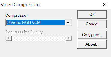
In apps that expose this setting, you can hit “configure” and set the prediction mode of utvideo to “median” to get some more efficient compression at the cost of slower decoding, but in practice this isn’t a problem.
Things to watch out for:
Any and all apps involved must support OpenDML AVIs. The original AVI spec is 2GB max only. This fixes that limitation. That’s normal, but make sure your apps support that. The OpenDML spec is from the mid-90s, so usually it’s not a problem. But for example, the SFM doesn’t support it.
The files WILL be very large. But they won’t be as large as they’d be if you had a truly uncompressed AVI.
SSDs are recommended within the bounds of reasonability, especially NVMe ones. 1080p30 should be within reach of traditional HDDs though.
utvideo will naturally perform better on CGI content rather than real-life footage and I would not recommend it at all for real-life footage, especially since you’re gonna get that in already-compressed form anyway. Do not convert your camera’s AVC/HEVC files to utvideo, it’s pointless. (Unless you were to do it as a proxy but still, kinda weird)
If you’re feeling adventurous, try out the YUV modes! They work great for matte passes, since those are often just luma-masks, so you don’t care about chroma subsampling.
If you don’t care about utvideo or don’t want to do AVIs for whatever reason, you could go the way of image sequences, but you’ll then be getting the OS-level overhead that comes with having dozens of thousands of files being accessed, etc.
They’re a valid option though. (Just not an efficient one in most cases.)
Some of my working files aren’t lossless...
Unfortunately we don’t all have 10 TB of storage in our computers. If you’re using compressed files as a source, make sure they get decoded properly by your video editing software. Make sure the colors, contrast, etc. match what you see in your “ground truth” player of choice. Make sure your “ground truth” player of choice really does represent the ground truth. Check with other devices if you can. You want to cross-reference to make sure.
One common thing that a lot of software screws up is BT.601 & BT.709 mixups. (It’s reds becoming a bit more orange.)
Ultimately you want your compressed footage to appear cohesive with your RGB footage. It should not have different ranges, different colors, etc.
For reasons that I don’t fully understand myself, 99% of AVC/H.264 video is “limited range”. That means that internally it’s actually squeezed into 16-235 as opposed to the original starting 0-255 (which is full range). And a limited range video gets decoded back to 0-255 anyway.
Sony/Magix Vegas Pro will decode limited range video properly but it will NOT expand it back to full 0-255 range, so it will appear with grayish blacks and dimmer whites. You can go into the “Levels” Effects tab to apply a preset that fixes this.
Exporting your video.
A lot of video editors out there are going to “render” your video (that is to say, calculate and render what the frames of your video look like) and encode it at the same time with whatever’s bundled in the software.
Do not ever do this with Vegas Pro. Do not ever rely on the integrated AVC encoders of Vegas Pro. They expect full range input, and encode AVC video as if it were full range (yeah), so if you want normal looking video, you have to apply a Levels preset to squeeze it into 16-235 levels, but it’s... god, honestly, just save yourself the headache and don’t use them.
Instead, export a LOSSLESS AVI out of Vegas. (using utvideo!)
But you may be able to skip this step altogether if you use Adobe Media Encoder, or software that can interface directly with it.
Okay, what do I do with this lossless AVI?
Option 1: Adobe Media Encoder.
Premiere and AE integrate directly with Adobe Media Encoder. It’s good; it doesn’t mix up BT.601/709, for example. In this case, you won’t have to export an AVI, you should be able to export “straight from the software”.
However, the integrated AVC/HEVC encoders that Adobe has licensed (from MainConcept, I believe) aren’t at the top of their game. Even cranking up the bitrate super high won’t reach the level of pristine that you’d expect (it keeps on not really allocating bits to flatter parts of the image to make them fully clean), and they don’t expose a CRF mode (more on that later), so, technically, you could still go with something better.
But what I’m getting at is, it’s not wrong to go with AME. Just crank up the bitrate though. (Try to reach 0.3 bits per pixel.) Here’s my quick rough quick guideline of Adobe Media Encoder settings:
H.264/AVC (faster encode but far from the most efficient compression one can have)
Switch from Hardware to Software encoding (unless you’re really in a hurry... but if you’re gonna be using Hardware encoding you might as well switch to H.265/HEVC, see below.)
Set the profile to High (you may not be able to do this without the above)
Bitrate to... VBR 1-pass, 30mbps for 1080p, 90mbps for 4K. Set the maximum to x2. +50% to both target and max if fps = 60.
“Maximum Render Quality” doesn’t need to be ticked, this only affects scaling. Only tick it if you are changing the final resolution of the video during this encoder step (e.g. 1080p source to be encoded as 720p)
If using H.265/HEVC (smaller file size, better for using same file as archive)
Probably stick with hardware encoding due to how slow software encoding is.
Stick to Main profile & Main tier.
If hardware: quality: Highest (slowest)
If software: quality: Higher.
4K: set Level to 5.2, 60mbps
1440p: set Level to 5.1, 40mbps
1080p: keep Level to 5.0, 25mbps
If 60fps instead of 24/30: +50% to bitrate. In which case you might have to go up to Level 6.2, but this might cause local playback issues; more on "Levels” way further down the post.
Keep in mind however that hardware encoders are far less efficient in terms of compression, but boy howdy are they super fast. This is why they become kind of worth it when it comes to H.265/HEVC. Still won’t produce the kind of super pristine result I’d want, but acceptable for the vast majority of YouTube cases.
Option 2: other encoding GUIs...
Find software of your choice that integrates the x264 encoder, which is state-of-the-art. (Again, x264 is one encoder for the H.264/AVC codec specification. Just making sure there’s no confusion here.)
Handbrake is one common choice, but honestly, I haven’t used it enough to vouch for it. I don’t know if the settings it exposes are giving you proper control over the whole BT601/709 mess. It has some UI/UX choices which I find really questionable too.
If you’re feeling like a command-line masochist, you could try using ffmpeg, but be ready to pour over the documentation. (I haven’t managed to find out how to do the BT.709 conversion well in there yet.)
Personally, I use MeGUI, because it runs through Avisynth (a frameserver), which allows me to do some cool preprocessing and override some of the default behaviour that other encoder interfaces would do. It empowers you to get into the nitty gritty of things, with lots of plugins and scripts you can install, like this one:
http://avisynth.nl/index.php/Dither_tools (grab it)
Once you’re in MeGUI, and it has finished updating its modules, you gotta hit CTRL+R to open the automated script creator. Select your input, hit “File Indexer” (not “One Click Encoder”), then just hit “Queue” so that Avisynth’s internal thingamajigs start indexing your AVI file. Once that’s done, you’ll be greeted with a video player and a template script.
In the script, all you need to add is this at the bottom:
dither_convert_rgb_to_yuv(matrix="709",output="YV12",mode=7)
This will perform the proper colorspace conversion, AND it does so with dithering! It’s the only software I know of which can do it with dithering!! I kid you not! Mode 7 means it’s doing it using a noise distribution that scales better and doesn’t create weird patterns when resizing the video (I would know, I’ve tried them all).
Your script should look like this, just 3 lines
LoadPlugin("D:\(path to megui, etc)\LSMASHSource.dll")
LWLibavVideoSource("F:\yourvideo.avi")
dither_convert_rgb_to_yuv(matrix="709",output="YV12",mode=7)
The colors WILL look messed up in the preview window but that’s normal. It’s one more example of how you should always be wary when you see an issue. Sometimes you don’t know what is misbehaving, and at which stage. Always try to troubleshoot at every step along the way, otherwise you will be chasing red herrings. Anyway...
Now, back in the main MeGUI window, we’ve got our first line complete (AviSynth script), the “Video Output” path should be autofilled, now we’re gonna touch the third line: “Encoder settings”. Make sure x264 is selected and hit “config” on the right.
Tick “show advanced settings.”

Set the encoding mode to “Const. Quality” (that’s CRF, constant rate factor). Instead of being encoded with a fixed bitrate, and then achieving variable quality with that amount of bits available, CRF instead encodes for a fixed quality, with a variable bitrate (whatever needs to be done to achieve that quality).
CRF 20 is the default, and it’s alright, but you probably want to go up to 15 if you really want to be pristine. I’m going up to 10 because I am unreasonable. (Lower is better, higher numbers means quality is worse.)
Because we’re operating under a Constant Quality metric, CRF 15 at encoder presets “fast” vs. “slow” will produce the same perceptual quality, but at different file sizes. Slow being smaller, of course.
You probably want to be at “slow” at least, there isn’t that much point in going to “slower” or “veryslow”, but you can always do it if you have the CPU horsepower to spare.
Make sure AVC Profile is set to High. The default would be Main, but High unlocks a few more features of the spec that increase compressability, especially at higher resolutions. (8x8 transforms & intra prediction, quantization scaling matrices, cb/cr controls, etc.)
Make sure to also select a Level. This doesn’t mean ANYTHING by itself, but thankfully the x264 config window here is smart enough to actually apply settings which are meaningful with regards to the level.
A short explanation is that different devices have different decoding capabilities. A decade ago, a mobile phone might have only supported level 3 in hardware, meaning that it could only do main profile at 30mbps max, and if you went over that, it would either not decode the video or do it using the CPU instead of its hardware acceleration, resulting in massive battery usage. The GPU in your computer also supports a maximum level. 5.0 is a safe bet though.
If you don’t restrict the level accordingly to what your video card supports, you might see funny things happen during playback:

It’s nothing that would actually affect YouTube (AFAIK), but still, it’s best to constrain.
Finally, head over to the “misc” tab of the x264 config panel and tick these.

If the command line preview looks like mine does (see the screenshot from a few paragraphs ago) then everything should be fine.
x264 is configured, now let’s take care of the audio.
Likewise, “Audio Input” and “Audio Output” should be prefilled if MeGUI detected an audio track in your AVI file. Just switch the audio encoder over to FLAC, hit config, crank the slider to “smallest file, slow encode” and you’re good to go. FLAC = mathematically lossless audio. Again, we want to not compress anything, or as little as possible until YouTube does its own compression job, so you might as well go with FLAC, which will equal roughly 700 to 1000kbps of audio, instead of going with 320kbps of MP3/AAC, which might be perceptually lossless, but is still compressed (bad). The added size is nothing next to the high-quality video track you’re about to pump out.
FLAC is not an audio format supported by the MP4 container, so MeGUI should have automagically changed the output to be using the MKV (Matroska) container. If it hasn’t, do it yourself.

Now, hit the “Autoencode” button in the lower right of the main window. And STOP, do not be hasty: in the new window, make sure “no target size” is selected before you do anything else. If you were to keep “file size” selected, then you would be effectively switched over to 2-pass encoding, which is another form of (bit)rate control. We don’t want that. We want CRF.
Hit queue and once it’s done processing, you should have a brand new pristine MKV file that constains lossless audio and extra clean video! Make sure to double-check that everything matches—take screenshots of the same frames in the AVI and MKV files and compare them.
Now all you’ve got to do is send it to YouTube!
For archival... well, you could just go and crank up the preset to Placebo and reduce CRF a little bit—OR you could use the 2-pass “File Size” mode which will ensure that your video stream will be the exact size (give or take a couple %) you want it to be. You could also use x265 for your archival file buuuut I haven’t used it enough (on account of how slow it is) to make sure that it has no problems anywhere with the whole BT.601/708 thing. It doesn’t expose those metadata settings so who knows how other software’s going to treat those files in the future... (god forbid they get read as BT.2020)
You can use Mediainfo (or any player that integrates it, like my favorite, MPC-HC) to check the metadata of the file.
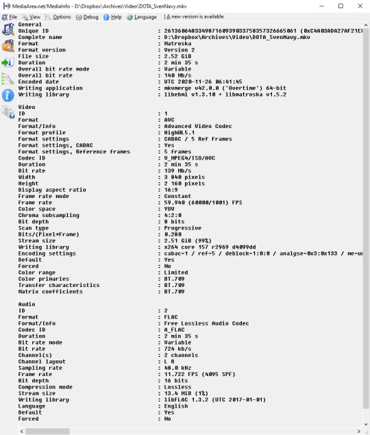
Good luck out there!
And remember to always double-check the behaviour of decoders at every step of the way with your setup. 99% of the time I see people talk about YouTube messing with the contrast of their video, it’s because they weren’t aware of how quirky Vegas can be with H.264/AVC input & its integrated encoder.
Hope this helps!
15 notes
·
View notes
Text
How I managed to get unlimited Internet for $25*
*There’s a few catches to it, but I’ll make this quick: if you are thinking more than one device, heavy gaming or thinking this is life in the fast lane... well, you’ll be disappointed. Also, this is from someone who used this service and I’m telling you... you’ll be unhappy.
How much do I pay for Home Internet service? $25/month for an unlimited hotspot... with a lot of catches. If you’re thinking “oh, I’m going to use this to power my entire home”... skip this post, don’t bother. You’re not going to get as much out of this, I PROMISE you.
Matter of fact, let me tell you who this post is for:
You want Internet Service for one device or you don’t mind swapping devices on this one connection.
It’s for your home connection so that you can reduce your dependence on your cell phone’s data plan when you’re home... or even when you’re out and about.
You’re not a gamer, you’re not planning on using it for heavy downloads, and you don’t mind tapping out at 5MB/s.
You don’t mind your data being slowed down at random times.
A secondary connection for when you’re outside your home and you don’t want to use public hotspots.
You truly understand “you get what you paid for”...
If you’re still reading and want to know what I’m talking about, then this is for you. It’s a system I currently use and when I’m at home, it’s my main internet connection for now. Once I move to a better place, I plan on dropping this plan as I’ll be getting something better than this.
But here’s how I did it...
1) Sign up for Visible and get the cheap R2 phone.
Visible is an Mobile Virtual Network Operator (MVNO) owned by Verizon. They will say they worked independent of them, but don’t be fooled by that. Visible is to Verizon as Metro by T-Mobile is to T-Mobile... it’s a prepaid division marketed as another company.
https://www.visible.com
Anyway, they offer one plan only... unlimited Internet, uncapped for $40 on your cell phone. Now, you can use your own cell phone, but the chances of it working with their company is low unless it’s an Apple phone. Got Apple? Great. Anything else? It’s a hit and miss. It’s best to check with them if you want to use your phone with them. But this ISN’T about that. This is about cheap Internet for your other device.
What you’ll do instead if buy their $19 R2 phone. For a budget phone, it’s subpar. I used to own Motorola’s that have more power than the R2. But it has a capable camera on it. However, the most important part is the hotspot, which it offers. We’re not interested in the features of the phone, but of the hotspot.
However, you’ll noticed that I said “$40″... so how do I pay $25/month? Well, that’s where step two comes in.
2) Find a “party”.
Visible got a family plan which is unique in a few ways. For starters, you don’t need to sign up your family. All you need to do is find 3 other people that are willing to split the bill and for each person, Visible will discount you and them by $5... all the way to $15, lowering the bill to $25. Now, what if one person in the party doesn’t pay? You don’t deal with them, the phone company do. So, you can sign up for a stranger’s “party” and not worry unless the person cancels their service... which could happen, but most likely won’t. And if they do, you can find a sub that will take their place.
Now, if you tried the service and you want to form your own party, you can do that. However, if you don’t want to find people to join and want to join someone’s party, you can via this reddit:
https://www.reddit.com/r/VisiblePartyPay/
Look through the links, login to your account and boom, you’re paying $25/month for the life of your account.
3) Get your phone and know the limits
Once you get your R2, you have to set it up with Visible. It can take a few minutes to a few hours. However, the most difficult part of the set up is... the Google account. Oh, you already have one? Then it’s not that difficult. It’s just another device you’re going to add to your account. If you already have an android phone, I suggest skipping to the parts that matter and try not to reinstall anything. You can use the phone just like your other phones, but at 8 GBs of space, you’re probably best just limiting it to just a hotspot. Set up the hotspot to your preferences and flip it on. Now, connect your device to it and voila... Internet for $25/month.
FAQ:
You can probably play some games. I played Hearthstone and some simple online games without issues. But don’t expect to play games that are graphic intense without some serious lag. For example: I use a cloud service called Shadow as a Secondary PC (long story). Even though it can run with just 5 MBs of bandwidth, it lags because the speed will not hold steady. And lagging in gaming means death. So, unless it’s low stakes, don’t treat this as a lifeline.
Yes, you can watch Netflix and stream video. If you want high quality tho, you’re probably going to struggle. DVD is the best it can do. The quality of my Netflix streaming or any streaming for that matter is top notch as I’m happy with 720p. I don’t need 1040p or even 4K.
Yes, it’s really unlimited. (peep the image below)
To prolong battery life, I plug the phone out of the charger and let it sit as any phone. Once it’s below 15%, I plug it back in and let it charge up to 100% and repeat the process. Treating it like a regular phone instead of keeping it plug in is old-fashioned, but a better way than to keep the phone plugged in 24/7. That will wear out the battery faster.
I could use it outside of my home. It’s a mobile phone, not a fixed location. So, you will have a second phone number. It’s a phone service which I use as a secondary line.
The Internet on the phone itself is faster than on another device. It’s meant to be used as a mobile phone service. I’m just retooling it.
R2 uses Android 9. The chances of it being upgraded to 10 is low.
You can hook it up to one device that is capable of using the Internet. It could be a tablet, a laptop, a desktop with a wireless networking card, or a game system for updates and download of files.
Since the phone is cheap, you can’t put insurance on it. It’s $19, brah.
I don’t carry around this phone day-to-day anymore. It’s redundant on my part since I have a more capable phone.
The phone I have now was intended to be used with this phone service, but sadly, the model wasn’t compatible. Otherwise, I would have cut my phone bill down by a lot. With that being said, I didn’t test this phone service beyond data.
I haven’t lost the ability to use the phone’s data once during my 4 months of continuous use. The only interruption was in April, where I simply stop paying for the phone bill.
Yes, there is a way to bypass the one device limit, but it requires hardware and the speed of service isn’t worth going beyond one device, so don’t do it.
Yes, Visble is okay with you using it exclusively as a hotspot.

If you’re wondering why I only used 40 GBs and not skyrocket above 100 GBs, it’s for a few reasons, the major one being I have spotty Internet coverage at home and used this as a secondary line and outside during the month of February. I’m only home during the evening. But I will say this... the reason that it skyrocketed at the end of February is because I put in on a PS4 to install an update to Spiderman and system updates.
The catches:
As you already know, it’s one device per hotspot connection.
It’s another phone to manage, unless you use your own phone.
The suggested phone itself is very limited in space as well as specs. A low budget Motorola will likely have more power than this phone. So, if you do use this phone as a phone, make it a low-stakes situation or a backup.
Depending on where you live, your internet speeds may slow down during prime times.
Service seems to be a hit and miss at times.
Talking to customer support is also a hit and miss. It’s literally an app or website. No phone service, just chat support with email as a second place to catch them.
Never tested it as a full-time service. It’s only at one location.
You may pay more than $25/month if someone leaves the party, but the bill will be between $30 to $40, which is still manageable.
It’s Verizon, which means they are tricky to pin down when it comes to the Net itself.
So, if you think this is useful, you can give it a try. If this article helped you out, maybe throw some funds my way.
https://ko-fi.com/nukirk
https://cash.app/$nufuturepro
Disclaimer: My experiences are mines alone. Your experiences may vary.
7 notes
·
View notes
Text
Prime Hunting Season Starting Soon
Official hunting season for 2018 is long over. With another season in 2019 just around the corner. I visited what was to be the final yard sale of the 2018 season on October 25th 2018. A brave older couple was downsizing and held a yard sale when it was 36 degrees out. Unfortunately, they were not gamers. Nor did they have any games from any kids or grandchildren. They did have some stereo equipment, and a surround sound speaker system. No music, or blu rays either though. The stereo was a shelf system, not a component type unit like I would be looking for to match the Sony TC-WE805S tape deck that I got at the start of the season. An all around bust of a sale for me. I wished them luck and headed on my way.
I closed out the last post with the PS3 find from 09.01.18. Giving me access to HD console gaming. A new era for this Old Nintendo Nerd. I do primarily game at 240p being that NES, SNES and N64 are the consoles nearest and dearest to my heart. GameCube and Wii weigh in at 480p at their absolute best, still falling short of HD. But now, with a PS3, we’ve got 720p gaming (mostly, some is 1080p). I have no problem with collecting a little for this system, I’ve heard good things about Uncharted, The Last of Us, and a smattering of a few other games that I will be looking out for.
Before we get into finds for the last, freakin 5 months, I have sold a couple things since the last post, and I should hope so, since its been forever! Right? Sorry. Life.
I had a bundle of 16 total PS1 games that I let go of. Titles were the likes of Syphon Filter, Driver, Test Drive 5, Rainbow Six, and a smattering of other luke warm titles. I’ve posted all of them up here at one point or another, so you have an idea. They were nothing I’d ever want to play, and since I only paid around $16 total for all of them at $0.99 a piece, I thought if I could average around $2 a pop on eBay id be doing OK doubling my money. They all added up to a value of about $95 on pricecharting. Now granted, that is fantasy prices, even those prices aren’t the prices the sellers MAKE when sold. Ultimately they all went for $52.99 as a lot. After fees and shipping it netted me $38.44, which comes to right about $2.40 each. 40 cents higher than I was hoping to get per game. Not bad!
The end of the last post left us with $9.73. Put that in with the $38.44 for a total of $48.17.
Additionally, I sold a disc only copy of Animal Crossing on eBay that I had laying around for $18.99. This came to $13.58 in pocket after fees and shipping. Tack that on and we now have $61.75 game hunting money moving into this post.
I’ll be honest, it’s been thin, it is cold here in the winter, there are no yard sales through the cold months at all. Places like Arizona or Florida where you could sale year round are lucky. Not here. Even donations to Goodwill slow down significantly as well, making the hunting quite a bit more difficult. I had zero finds for basically all of September. Which was surprising, it is really the last warm month here with temps still reaching 70′s and sometimes low 80s. But it wasn’t until the end of the month I ran across something at the Goodwill.
De Blob - Found 09.29.2018 at Goodwill
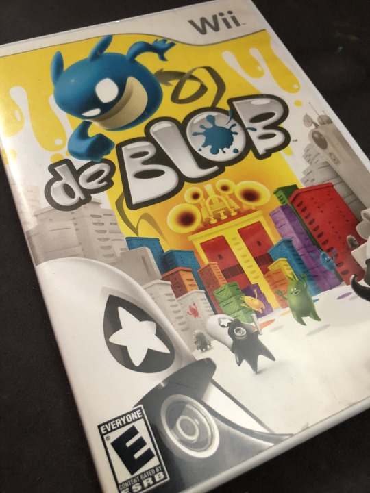
Disc, case and Manual all in pretty good shape, but nothing to write home about. If it were June and prime hunting season and I’d been getting finds, I probably wouldn’t have bought it.

But I did, and it cost me $3.21. Takes the total down to $58.54.
Next up was the first official game for my new PS3. Again nothing fantastic, but at least it rang up at the DVD price instead of the game price. Saved me $1.
Gran Turismo 5 Prologue Found 10.04.2018 at Goodwill

Minty fresh.
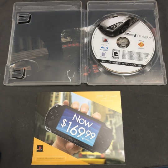
But, again nothing special, not even a full game. But I sat and played it for an hour anyway. Probably already had $2 worth of fun with the thing. Despite being labeled $5.99, they still only charged me the DVD rate of $1.99. Hah! So, $2.13 out of the till leaves us with $56.41.
The next find was literally the next day. Different Goodwill though.
Grand Theft Auto San Andreas on PS2 and Grand Theft Auto IV on PS3 - Found 10.05.2018 at Goodwill
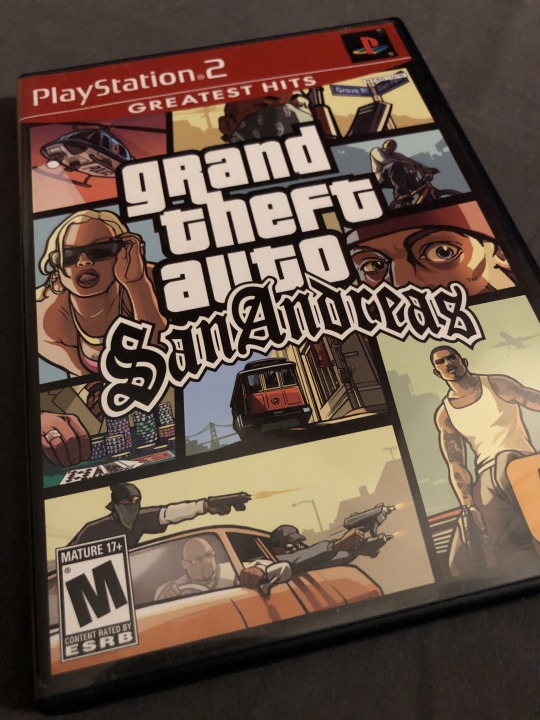
This was absolutely minty fresh as well. Both of them were. Discs, cases, and manuals / maps. I wasn’t going to buy San Andreas but when I saw that it was in as good of shape as it was, and had a bonus inside, I couldn’t not get it.
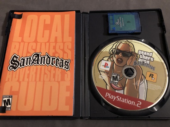
First time I’ve found a game in Goodwill with a Memory Card inside. Those are $8 to $10 each right there, and I am a little short on memory cards, so I had to get it. The game was technically the bonus, I bought it for the memory card. Heh.

Great shape for two Goodwill games, they look brand new. Plus I heard that while GTA V is superior graphically, GTA IV is better with exploration, in that you can enter buildings, and enemy AI is a lot better as well. So I thought, what the hell?
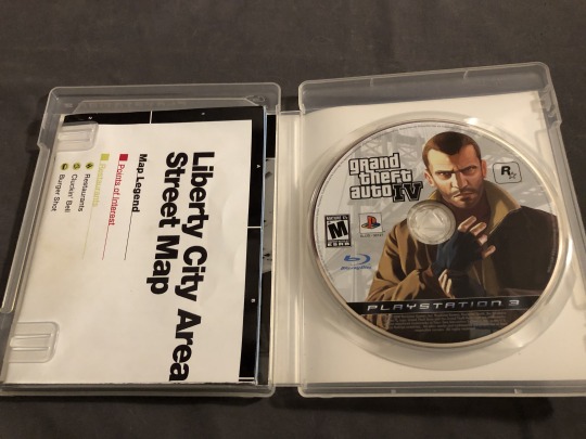
Those two ran $6.42 together taking us to $49.99.
The next find was from 10.15.2018, from Goodwill, another few halfway decent games. Borderlands, Alice, Dante’s Inferno, Marvel Vs. Capcom 3, and a Disc only copy of Skyrim. It was actually in the same case as Alice, just under the Alice Disc for some reason. I wasn’t arguing with that so I left it there.
PS3 Lot - Found 10.15.2018 at Goodwill
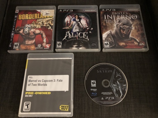
Sucks about the two basically disc only games. Marvel Vs Capcom and Skyrim. One being from Best Buy pre-owned. The other hiding under Alice in the same case. not that I’m complaining about that one. Free game? Nothing wrong with that. How Best Buy even gets disc only copies of stuff is beyond me. Game system trades or returns with games still in them? I wasn’t aware they did pre-owned anything.
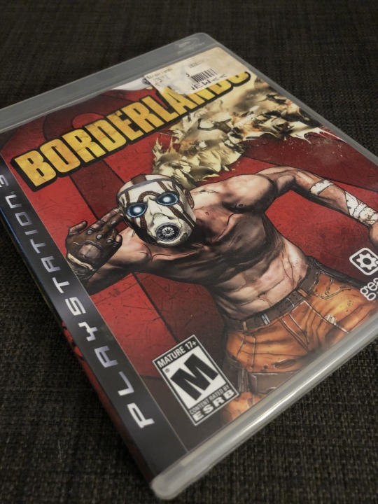
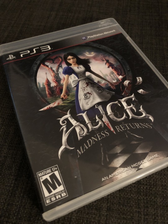
In any case... They are all in good shape. Minimal labels and damage.

Especially Alice. I dig the art on this one, and it is in very good condition.
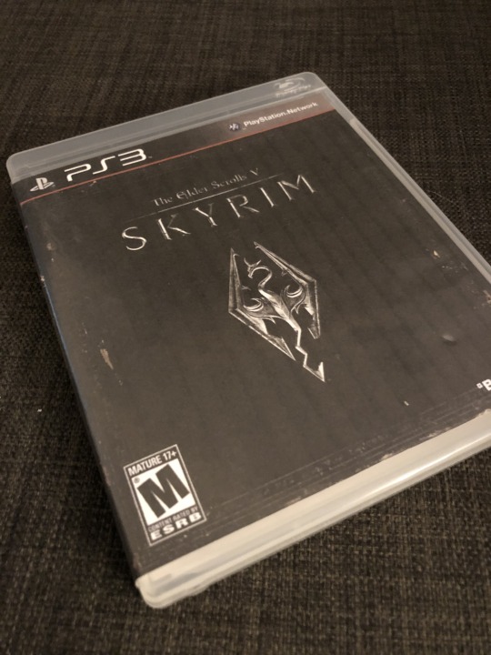
As for Skyrim, well, I had a spare case laying around for FIFA 09, and I figured, why not print out a cover for it. I couldn’t give a shit less about FIFA Soccer. You can see the print lines, but it’ll do to hold the disc.
All of this ran me $12.86 being I paid for four games at $2.99 each plus tax. This takes the hunting money down to $37.13.
Moving into November, I had a spectacular find. At least, for the hunting money total. Not so much on the video game front, because it was just a Blu-Ray movie.
Wing Commander Blue-Ray - Sealed - Found 11.08.2018 at Goodwill

This thing, just looks like cheese from the cover. I picked it up, and immediately put it back down and walked around the corner to where some more shelves are. Then I said to myself you know what? No, let me check that, immediately dismissing something out of hand like that loses people money. Pulled up eBay on my phone and about pooped my pants. A sealed one was listed for $180. I thought that has to be some looney toon’s listing. I kept scrolling and no, used ones were just under $100. Check sold listings and there were real sales for $80+. Suffice to say I bought it, of course. Listed that sucker up, and I was hoping to get over $100 for it since it was sealed, but, there was some damage to the corner. The plastic was not in tact anymore.
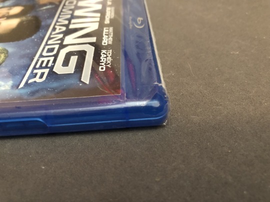
This made the listing go for a lot less than $180. However, I was still pleased to see it sell for $85.00. For a $2 item? That’s a home run! After fees and shipping it netted us a nice cool $68.67. To be fair I will pull the money I used to buy it from the game hunting money, it was $2.12 ($1.99 plus tax) dropping us to $35.01. Then, adding $68.67 gives us...
**** DRUM ROLL****
$103.68!
We are now officially above the original $100 I started this game hunting journey with.
Not a bad note to end this post on. I’ll post up the finds for the very end of 2018 in the next post. Hopefully I can cobble that together here in the next couple of weeks and have it up much faster than I got this one up. There’s a really nice co-worker find to detail.
2018.03.25
#sony#sonyplaystation#sonyplaystation2#ps2#wingcommander#bluray#wii#nintendo#nintendowii#deblob#borderlands#alicethemadnessreturns#dantesinferno#marvel#capcom#marvelvscapcom#gta#grandtheftauto#grandtheftautoIV#grand theft auto san andreas
3 notes
·
View notes
Photo

I got asked a while ago how I make my gifs and I didn’t have time to make a tutorial until now. So here’s how I make my gifs.
What you need:
-video in 720p or 1080p for good quality
-video player that has a screencapping option like kmplayer or gomplayer (there are also some others, check this post)
-photoshop (I use cs5 portable but any version should work), you can find links to download it here
This is gonna be very detailed and long tutorial so let’s start.
1. Screencapping
I use GOMplayer for taking screencaps, it’s really easy and fast. Here is the link to download it if you want to use it.
Open your video in the player. Find the scene you want to gif. Then with a right click on the mouse a menu will show up. Go to Video > Advanced Screen Capture

or simply press CTRL + G on your keyboard. When you do that, this will show up

these are my settings. You can always change the number of frames you want to capture. I like to capture more and then delete the ones I don’t need later. Also, when you’re choosing the folder to save your captured images, make sure that you make a folder for every gif because later it will be easier to import in photoshop.
So basically what you’re gonna do now is play the video, start at the beginning of your scene and having the advanced screen capture settings still on, you’re gonna press burst capture as soon as you start playing your scene.

Then you’re just gonna wait a bit til it’s done capturing, don’t press anything. You’ll see when it’s done.
Now go to the folder where you’ve saved your screencaps and delete all the pictures you don’t need. Leave 50 max in the folder.
I know this might seem complicated but once you get the hang of it, it will be so easy.
2. Importing screencaps into photoshop
Now that you have your screencaps ready, open photoshop and in the top left corner click on File > Scripts > Load Multiple DICOM files

Find your folder, click on it and press OK.

When all the layers have been loaded, it’s time to make a gif.
3. Making the gif
First, you’re gonna go to Window > Animation and you’re gonna get this

Before converting to frame animation, select the very first layer.

Then click on this

and then Convert to Frame Animation

Or you can simply press this button

and it will convert to frame animation.
Once you’ve done that, you’re gonna press the little button in the top right corner again and select Make Frames From Layers

And you will get your layers.
Now you’re gonna click on that little button once again and then Select All Frames

On the first layer click on that little arrow next to the time and select other.

You’re gonna get this little pop-up window where you’re gonna put the time of your frames.

I always put 0,06 but that varies from person to person. Most common I believe are 0,04-0,07.
Also, one note:
when you’re deleting the frames in photoshop, always, and I mean always delete it from animation window.

Because if you delete it from the layers in the bottom right corner, you’ll have a gif with blank layers. When you delete it in animation and later when you convert to timeline you’ll get this

and then just delete those layers and your gif’s gonna be fine.
One tip: when you’re selecting either layers or somethig else to delete or move, the easiest way to do it is by selecting the first layer and then while holding SHIFT on your keyboard, clicking on the last one (as I’ve done in the gif).
Okay so back to the gif.
Now we are going to crop. Depending on what kind of a gifset you’re making, you’re gonna need certain dimensions. Here are the dimensions for most common gifsets. You don’t have to strictly follow these, but you should use the size of the width stated there and change the height if you want to change dimensions.
Make sure that all of your frames are selected before you crop. When the gif is cropped, keep all the layers selected and convert to timeline

or just press this button

You’ve converted to timeline and what you’re going to do now is click on your first layer with the right click on your mouse and then Select Similar Layers

Once you’ve done that, you’re gonna go to Filter > Convert for Smart Filters

Now is the time to sharpen your gif. There are tons of actions you can use (here are some), I use this action by @selenapastel (I started using it lately cause I wanted to change my gifs a bit but this the one I used before).
4. Coloring the gif
Well, we’ve come to the coloring. What I like to do here is just use one of my psds instead of creating a new one everytime (tho I end up making a new psd quite frequently). Anyway, if you don’t feel like making a new psd, here’s tons of psds from other people who shared them for other people to use. You can also check them here, here and here. But if you wanna make your own and don’t know what exactly to do, here’s a lot of coloring tutorials so make sure to check them out.
Also, another note: every resource that you download, make sure to like or reblog the post where you found it. Don’t claim any of those resources as your own. People who share their resources have worked on them and spent time on them and are kind enough to share them for everyone to use so please give credit.
When the psd is added and you don’t really like the result, you can always adjust layers in the psd or what I like to do – put a selective color layer under the psd and adjust colors and especially neutrals and blacks.
Now make sure that the gif is the right size aka the size you’ve cropped it, go to Image > Image Size

Here is my finished gif.

5. Saving the gif
And now we’re going to save the gif. Go to File> Save for Web & Devices

These are my settings

Maximum gif size is 3mb so keep an eye on that because if it’s bigger, the gif won’t move. Also always, and I mean always make sure that the looping is on forever.
And there it is. I didn’t include how I put the text on or how I make colorings because this tutorial is already really long so if you want another tutorial on adding text and making psds, just let me know. I hope this helped, and if it did, please like or reblog this post. Also, English isn’t my first langauge so I apologize for some repetitive words or mistakes.
Also, I’ve already said it but I’m gonna say it again: I’ve put the links to posts of the resources so if you download any of those I’ve mentioned in this tutorial, please please like or reblog that post and please don’t claim it as your own.
#tutorial#gif tutorial#photoshop tutorial#itsphotoshop#yeahps#completeresources#photoshop help#*tutorial
206 notes
·
View notes
Text
a gif tutorial! uwu
hello miss tumblr user kimnatozaki here! :) this will be an in-depth post of how i make my gifs.. i’ll try my best to explain the whole process but if things are still unclear, please feel free to dm me and i’ll be more than happy to help^^
before you start
the programs i use to make gifs:
• ps cs6 • avisynth - i followed this tutorial on how to install and use it but i’ll give an explanation of how i personally use it • topaz clean and topaz denoise - downloaded from here • kmplayer - when dealing with .ts files avisynth gives an error.. so instead i use this, record the scene i want to gif and then i use avisynth on that.. for any other video file i just use avisynth on it right away)
1. getting the video
when it comes to downloading videos, make sure to get the highest quality as possible! i personally would not go anything below 720p and i usually end up choosing 1080p even if 1440p and 2160p are available (just in terms of the waiting time for avisynth and topaz to load and such, it gets a little out of hand sometimes lol) youtube is usually the way to go and for music show performances, i go to kpopexciting or if the performance is pretty recent (as in within the past hour), i go on twitter and search up the date of the performance, the group’s name in hangul and .ts (for example “180429 트와이스 .ts) and there should be a couple of people who have already posted .ts files you can download (for twice content you can check out: zardexc and twiceneuproxima)
2. getting the clip
i’ll be focusing more on giffing performances from .ts files since the extra step of recording the clip is required.. but if your working with .mp4 files you can omit this step in its entirety!
open the video up on kmplayer and press “alt c” and this window should pop up:

and those are my usual recording settings! make sure to start recording a little bit before and after the scene you want (and i forewarn you, when recording especially high quality videos, the video will get a bit laggy but that’s because it’s capturing frame by frame but like the audio will continue to play perfectly fine.. you can always check out the result of what you recorded later to see if got the scene you wanted)
3. using avisynth
now that you have the clip you wanted from above, now it’s time to use avisynth! this is where i size my gif accordingly
with clips you got from above, i recommend using normalwebm (since the clips is already shortened anyway and for the timestamp, the starting time is fine)
if you’re not working with .ts files (i.e. you skipped step 2 completely) you can use normalwebmrange to capture the clip you want to use (like above, i recommend getting a second before and after the actual part you want to get as leverage!)
i follow the same process as the person i linked above once the clip has finished loading in avisynth.. for the settings, i always use 30 slow and debilinear!
4. using ps
now to actually using ps to make the gifs phew!
open up ps > file > import > video frames to layers

the final clip after it has ran through avisynth is usually in the temp folder for me and is almost always named “video” after selcting it, this window then pops up:

these are the default settings and i personally leave them as is
once it’s all loaded, this is where you can trim the clip! after trimming, in the right corner you’ll see a downwards triangle.. click on that and then click on “convert to video timeline”
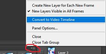
now you want to convert everything to a smart object so you can apply the sharpening! on the layers panel, select ALL the layers (select the first layer and once you scrolled up to the very last layer, press shift and then click on the last layer OR up at the top go to select > all layers) once they’re all selected, right click and choose “convert to smart object”
now you’re left with one layer in your layers panel! and now it’s time to sharpen
i use both topaz clean and topaz denoise to sharpen my gifs.. you have to play around with topaz clean a bit to find out what you like as it’s entirely based on preference! as for topaz denoise, i always choose “jpeg - light” and will usually play with the reduce blur option to adjust the sharpness
this is the gif without any topaz applied:

and after applying topaz (the difference is not too obvious but the lines now look smoother):

after you’ve sharpened to your liking, you’re single layer will include the smart filters you applied right below it.. next, right click on that layer and “convert to smart object” again until you’re left with another single layer with the smart filters no longer being present.. click on the downward triangle in your timeline again > convert frames > flatten frames to clips

this is where the real waiting begins!!! (and my most dreaded part of giffing) as it all depends on how many frames your gif has it may take a while.. so this is when you could take that much needed restroom break or get a snack or even open up the psds you plan to use so that once topaz finishes running :)
after ps + topaz has finished running, your layers panel now has all the edited frames! as a personal preference i select all those frames and group them into one so it’s easier for me to locate the psd once i add it in.. go back to the downwards triangle > convert frames > convert to frame animation.. now you should be left with only one frame in your timeline! what you want to do next is click on the downwards triangle again > make frames from layers
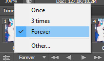
always delete the first frame and you should now have the same number of frames you had when you trimmed in the beginning in your timeline! this is now where i time the gif, select all the frames in your timeline, right click and select other.. this is all based on preference again but if your gif has a lot of frames (say 60+ i use a timing of 0.05) or if there is only a few frames (30 or less, 0.08 or i’d sometimes even go to 0.1) and don’t forget to change the timing to forever!
5. colouring and saving
you’ve made it this far and you’re now in the home stretch! the last thing to do before saving is to colour the gif to your liking~ you can check out yeahps for psds too^^ drag the psd into the workspace that has your new gif and make sure it is above your frames in the layers panel
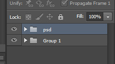
in the end i’ve come to rely on 1 of 3 base psds (depending on which one best suits the gif i’m making) and i just adjust it a bit to fit my preference.. for me i almost always go straight to editing colour balance, exposure and selective colour!!!
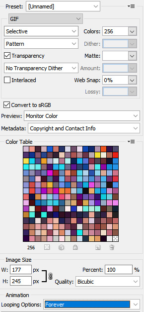
to save your gif: on your keyboard, press “alt ctrl shift s” in that order or you can go to file > save for web.. these are the settings i usually use to save my gifs! instead of pattern, i sometimes use diffusion as well :)
and this is the final product ready for tumblr!

#.txt#phew and now it's done!#if ever just come to me if you have questions and i can help you through it#gif tutorial#ps help
42 notes
·
View notes
Photo
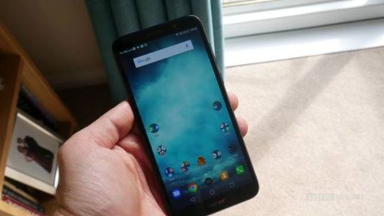
Honor 7S review: Your grandma deserves better With the Honor 10, Honor created a smartphone that challenged a lot of flagships at a very affordable mid-range price tag. The OEM has proven itself to be a master of efficiency in engineering and highly competitive in lower price categories. This is Honor’s cheapest phone yet. So, what happens when that same company takes on the budget market? What can we expect for a measly 99 pounds (~$129)? Let’s find out in this Honor 7S review. Let’s just say it’s best not to get your hopes up. Don't get your hopes up Design and features: Plain Jane Let’s start with the design. You should expect a number of concessions in a phone costing 99 pounds, and this one’s got plenty. This is a very plastic phone with a generic design. It’s also quite thick, which may not be an issue depending on your preferences – but it further betrays the phone’s budget nature. It’s not necessarily ugly, though. In fact it actually looks fairly solid — I really like the rounded edges. It’s not even close to premium, but it’s certainly acceptable. The screen is 5.45 inches, with a 1,440 x 720 resolution. A sub-1080p screen is pretty rare these days, even at this price. That said, the 18:9 aspect ratio and 73 percent screen-to-body ratio make it feel at least somewhat modern. From purely a design standpoint, this is a well-made budget device with sensible cost cutting compromises. Unfortunately, the average design is one of the device’s best aspects. Features: None to speak of Another moderately good aspect of the 7s is its 3,020mAh battery. It isn’t absurdly big, but does very well with the chipset and the low-res screen. I’ve gotten 8 hours of screen-on time with basic usage, which is pretty darn good. Taxing the CPU and connectivity will drain it a lot faster. You’re really looking at just over a day when it comes to more intensive use. There’s no fingerprint scanner here, which is a bit of a blow. There’s no face detection either, so you really are left with only the basic PIN or password for your security. Hello, old friend The 7s uses Micro-USB. Nicer features like water resistance, NFC, and wireless charging are missing — all perfectly fair and to be expected (even if the AWOL fingerprint scanner stings a bit). What strikes me as a really cheap move on the other hand is the complete lack of a speaker grill. The 7S instead uses the phone speaker for media and notifications, which creates a lot of distortion at higher volumes. It’s useful if you want to kick a YouTube habit, but otherwise actually quite unpleasant. Coupled with the 720p screen, this really isn’t a good option for media consumption. I’ve used plenty of cheap devices but none completely lacking a speaker grill! It’s only got 16GB of storage, which meant I actually had to pick and choose which apps I wanted to transfer from my previous device. This really isn’t a good option for media consumption However, there is expandable storage up to 256GB, so you’ll at least be able to store a lot of data there. Still, 16GB is very limiting, especially considering the apps that need to be installed on internal storage. There’s dual SIM, which I know will please a lot of people. Performance: Low specs meets bloated OS I’m just going to come out with it: the Honor 7S is not an impressive phone — even taking into account the low price. The Honor 7S packs a low-end Mediatek MT6739 processor, and a minimal 2GB of RAM. That’s certainly not an impressive showing on paper, but the actual real-world performance somehow manages to fall short of even the most modest expectations. Response time, load times, browsing, and smoothness all take a serious hit. Often, you’ll hit a key and wait a fraction of a second for it to respond. You’ll spend a fair amount of time looking at splash screens while apps load, or wondering if the phone’s crashed. It’s not uncommon to find basic animations freezing mid-way through. Pretty much any time the Swiftkey keyboard pops up (the pre-installed default), you’ll get a brief blank space underneath your current app. I’ve actually become bored waiting for my photos to open up. Even trying to use the wallpaper app for photos was a chore. Technically it supports split screen multitasking, but I wouldn’t bother. While most other lower end devices can handle most games just fine, the Honor 7S is not the device for you if you plan on playing 3D titles with decent performance. Even a favorite 2D title of mine — Run Gun, Jump Gun — runs in slow-mo as though everything is taking place under water. PUBG doesn’t work due to a glitch. There’s no gyroscope sensor either, so 360-degree content is off limits and VR is definitely a no go. It probably wouldn’t have the horsepower to run it anyway. It really isn’t any fun to use The performance should be better than this, even given the hardware. I suspect the issue may have something to do with the Color OS UI layer, the amount of bloat (especially egregious given the small amount of space), and a lack of optimization. The Honor 10 made up for software bloat with its Kirin 970, and some potential AI RAM management. The Honor 7S is an experiment in combining poor software optimization with sub-par hardware, and it really isn’t any fun to use. The default Huawei launcher is not pretty, but at least you can change it Phones aren’t just luxuries anymore — they’re essential tools for most of us. When you can’t rely on your device to open up the camera, maps, or even contacts quickly, you have a problem. It at least works well as a phone. Call quality was good and the phone allows turning the volume on the earpiece up extra loud to drown out background noise. It’s a nice touch, though clearly only included to sidestep the need for a speaker. Camera: Meh Believe it or not, I take no pleasure in writing a negative reviews (well, maybe just a little bit). I was really hoping the camera might be this phone’s saving grace. Honor has a habit of sticking feature-packed cameras into even its cheaper models. That’s not the case here. All the Honor 7x’s fun options have been stripped out of the app, including the pro mode and light painting. You get a few fun filters, but it’s otherwise a basic, stripped-down affair. As a result, the camera gets very little support. The good news is that the rear shooter here is 13MP, which is respectable. The selfie camera is also not bad at 5MP — it even comes with an LED light. Unfortunately, photos are dark, lack detail, and often come out blurry due to the lack of stabilization. White balance is all over the place, and a lot of shots just don’t work because of that. Low light performance is also poor, and the aperture is fairly narrow at f/2.2, limiting the depth of field effects that you can achieve. It’s not atrocious — I have seen worse. If you take a lot of photos, you’ll probably want to bring your camera along too. You won’t be hanging these on your wall. Video is available at 1080p, but seeing as there’s no gyroscope, you shouldn’t be surprised to find that there’s no stabilization here either resulting in some pretty shaky footage. Bottom line: There’s better out there I usually aim to use a phone for at least a week before writing a review , so I can give it a fair chance and catch any kinks not immediately apparent. To be completely honest, I gave up after a few days with the Honor 7S — it was simply too frustrating to use. There were already enough “kinks” for me to make up my mind. This might all seem a little unfair. Maybe it comes across as a rant (my apologies). I am perfectly aware that you shouldn’t expect the world for 99 pounds. However, other devices out offer far more impressive specs, features, and performance that cost a similar amount. Take the OPPO Realme 1 that I reviewed recently. The base model costs $110 and it comes with a better screen, more RAM, face detection, a glass back, faster processor, bigger battery, and (gasp!) speaker grill. For 50 pounds (~$65) more, you could get something like the Moto G6 Play or a host of other much more compelling devices. I could live with the design and the lack of high-end features. Even the low resolution would be fine; the sluggishness is just too much. The sound quality is also actively unpleasant. To conclude this Honor 7S review, I just can’t recommend this device. So that’s it for our Honor 7S review. If it weren’t for the poor performance, I could suggest this as a gift for your Grandma or someone else who doesn’t need any high-end features. As it is, I wouldn’t wish this on your Grandma. , via Android Authority http://bit.ly/2A2Zn4d
0 notes
Text
Twitch Creative 101
A guide to creative streaming on Twitch.tv
by: Bilvy Jane
First: Why
Software set up for a digital art stream
Stream scenes and Overlays
Understanding the Twitch platform
Third party apps
Bots and extensions
Making a living from streaming
First: Why
There are plenty of “How to start streaming” tutorials on Youtube, Reddit, Twitch, and forums all over the internet, but most if not all of them are aimed at video gamers and vloggers. I wanted to make this guide to help artists who want to start streaming, or make the move over to Twitch but don’t know how, and of course to encourage it! The Creative section of Twitch is still a fairly new area, and could do with plenty more artists to share their skill and communities, and help remove the stigma that Twitch is just a site for gamers.
I’ve been streaming here and there on various platforms for at least five years. I’ve been streaming steadily on Twitch for nearly 2 years, and have been able to call Twitch my full time job since October 2017. I hope my advice and insight helps some of you enjoy this platform!
If you would like to give feedback regarding this tutorial, or have any further questions, feel free to jump into my public Discord or reply on the Tapas forums.
Software set up for a digital art stream
I’ll be writing this section as if you’ve never streamed before, and have never used a program like OBS. I’ve not used any other streaming app before, so I can’t recommend or explain any of them. Fortunately, OBS is excellent and has everything you need!
OBS, or Open Broadcast Studio, is the program that you run your screen through, and control things like frame rate and resolution.
Download: Get “OBS Studio” from https://obsproject.com/download
Settings: Go to your preferences from the File menu or clicking the “Settings” button in the OBS window.
The Stream category is where you connect OBS to your Twitch account, so when you hit the “Start Streaming” button, OBS knows where you’re going live. Match your drop down menus like shown to connect to Twitch’s servers. The “Stream key” is where we tell OBS which Twitch channel we’re going live to; this is your unique code that connects you to your Twitch page. Don’t ever show it to anyone, or they’ll be able to stream to your account!
To find your stream key, log into Twitch and visit https://www.twitch.tv/USERNAME/dashboard/settings/streamkey , and replace “USERNAME” with your Twitch handle. Copy the code and paste it into the “Stream key” field in OBS, and your account will be linked! Now, if you hit that live button, you’ll start broadcasting on Twitch.tv/USERNAME
If you ever want to test your stream quality and watch for lag spikes, buffers etc within OBS, you can tack “?bandwidthtest=true” to the end of your stream key in OBS. This will push you live as if it were any other stream, except the video will not appear on your Twitch page and your followers will not be notified. Don’t forget to remove it once you’re ready to stream for real!
Output is a little trickier, because these settings are incredibly important but will vary from user to user. This is where we control our stream quality and make adjustments to reduce lag and buffering, by deciding on our Bitrate. To find out your Bitrate, you’ll need to know your upload speed. Your upload speed is basically your maximum allowance, and you’re going to allocate some of that to your stream.
Run an internet speed test on Speedtest.net to find this. Speedtest by default measures in mbps, but your OBS bitrate is in kbps. To convert these easily, 1000kbps = 1mbps. Easy! The following conditions are a basic rule of thumb, and you should test your stream and adjust your bitrate to make sure everything runs smoothly for your particular set up.
If you have an upload speed of less than 500kbps / 0.5mbps:
I’m afraid it’s going to be hard to stream much of anything. While it’s possible to stream on a bitrate this low, you would need a higher upload speed for extra cushioning to ensure your stream runs smoothly. I don’t recommend you try to stream, unless you’ve tested everything and can guarantee a smooth connection
If your upload speed is around 1000kbps / 1mbps:
Use between 400–700 for your bitrate, and you should be able to stream comfortably in 720p.
If your upload speed is 2000–3000kbps / 2–3mbps:
Try 1500 bitrate if you want to stream in 720p. You can try using 2000 for a 1080p stream, but you may want to test and make sure this works fine with your computer and connection.
If your upload speed is over 4000kbps / 4mbps:
You can stream comfortably in 1080p with a bitrate anywhere between 2000–3500. Using a higher bitrate will be harder on your CPU, so consider streaming at a lower bitrate & quality if your computer is older or cheaper.
No matter which category you fall into, be sure to test your stream, watch the quality and adjust if you find you’re dropping any frames. You can monitor this at the bottom of the OBS window when you’re live.
An important note to remember when testing bitrates: Gaming streamers recommend no higher than a 3500 bitrate for 1080p gaming, including first person shooters with high intensity movement and graphics. Higher than that will be lost to most viewers anyway. This should give us a general guide, that if high intensity gaming streams don’t need more than 4000, we definitely don’t need that much for drawing and painting.
It’s widely recommended you use 112 or 128 for your audio bitrate, no matter what you’re streaming.
In the Audio tab you can connect microphones, headsets etc. If you’re using a microphone and playing music, you’ll have one audio channel for the mic and another one for your desktop audio. If you’re running your stream on a Mac like me, you’ll need to run your computer audio through another app if you want anyone to hear what music you’re playing etc. Check the tutorial for that here: https://obsproject.com/forum/threads/using-soundflower-on-mac.50257/
The Video section is where we decide our resolution/quality. Keeping your bitrate in mind, select a resolution from the drop down list. The standard FPS for streaming is 29.97 or 30.
The most important thing in this section is to keep the Base (Canvas) Resolution and the Output (Scaled) Resolution the same. This is a hugely common issue when people experience slow computer processing while streaming.
The Base is the size of your canvas, which has the screen, cameras, images/overlays and text on it. When you record video through OBS, it records it using this resolution. The Output is what OBS sends to Twitch, and what appears on your stream page. If you have a Base resolution of 1080 but your output has to scale it down to 720, your computer is going to be doing loads of extra thinking to be constantly converting the video while sending it to Twitch. The only reason you should have these as two separate values if you’re recording content to upload on Youtube etc later on, or want a higher resolution copy of your stream. You’ll need a decent computer to do this, so make sure your hardware holds up to the challenge.
You’ve finished with your settings! Time to do the fun stuff!
Show your drawing: Hit that plus to create a new source. Select Display capture if you’re using a cintiq/yiynova/huion etc to capture the whole drawing screen. If you’re using a regular graphics tablet, it’s recommended you choose Window capture and select your drawing software. If you’re a traditional artist, choose the Video Capture Device and select your webcam.
For a facecam, choose Video Capture, and your mic will already be running through OBS from your Audio settings.
Customise: Position these on your screen by clicking the source within the scene, or clicking its name from your list of sources. The order they appear in the source list is the order they will appear on screen, just like drawing with layers. If you have any overlapping sources and you don’t want to accidentally click or move one of them, you can lock it by clicking the padlock in your source list.
You can right click on a source (from the scene, or from the list) to transform it, including rotations, flips, stretches etc. Select “Edit Transform” for precise and detailed options like cropping. Cropping is especially useful for fitting webcams neatly on the page.
That’s it for the OBS set up! When you hit “Start streaming”, your viewers will see exactly what’s in your selected scene. You can also switch between scenes and edit sources while live, so have fun customising your own screens!
Stream scenes and overlays
Scene Collection: The folder that contains all of your scenes, sources and settings together. Your default “Untitled” scene collection is automatically selected whenever you open OBS. Find this in the File Edit etc menu, under “Scene Collection”. It’s from this menu that you can switch between scenes and even make back ups, so if you ever switch computers, you don’t have to re-enter all of your settings again. Back up with the Export option, and restore from a file with the Import option.
Sources: The individual items within your scene. A webcam is a camera source, a border is an image source, and widgets like chat windows and alert notifications are browser sources. Every item that you see on screen is a source, basically!
Scenes: The “canvas” of your stream, where you show your drawing screen, cameras etc. This is what your viewers see.
Source Types: In the source section, add a new source with the plus button. You’ll have a variety of options, but you’ll only need to worry about a few of them.
Browsersource: Used for third party add ons mentioned in a later chapter. This covers your alert notifications, donation counters, chat boxes, and anything you’ll linking to OBS from the internet instead of uploading from your computer.
Display Capture: Ideal for Cintiq users, captures an entire monitor to show your screen without any lag or delay.
Image: This lets you link an image from your computer to appear on screen, like a border around your video, characters in the corners, background images etc.
Text: A basic text display. You can type out anything and it will appear on screen, and format fonts and sizes etc.
Video Capture Device: For displaying a webcam or other camera
Window Capture: Similar to Display Capture, but only captures a single application window of your choice. There is a slight visual delay when using this option.
Now, what to do with them
All you really need to stream is your drawing screen, or a webcam if you’re a traditional artist. I’m going to assume you want to use a webcam and microphone for the sake of this tutorial, but they’re not at all necessary.
Tiny is a custom bot I run off my computer, using a service called
Phantombot
. It’s completely free and limitless to use, but it’s just a little confusing to get set up for beginners. To get started with basic commands and bot functions, Nightbot is the bot you’ll find in everyone’s channel, and the easiest & most versatile one you can use without touching a line of code.
Log into Nightbot here https://www.nightbot.tv/ And check out some of its features. You can write custom commands, have the bot intermittently announce things in chat for you, take and play song requests from viewers, and even let the bot handle spam. Aside from all the information and silly chat games they supply, bots are like an auto mod. They can purge messages with blacklisted words, hide links, time users out for spam and all kinds of customisable actions. It’s a good way to take some of the weight off yourself and your mods
Making a Living from Streaming
So that’s the basics. That’s the very detailed intermediates as well as the basics, actually. You have everything you need to start a stream and have fun with your set up, but it takes a lot more than just widgets and overlays to succeed on Twitch. Your content and personality will be the forefront of the community you craft, but there are always things you can do to help move things along and encourage more growth.
1. Schedule: The most important step to growing your stream and audience. Even if you stream once a month, to have that day and time set in stone will mean people can always find you, and that will make them more likely to actually catch a stream. Streaming more often is always going to be better, but if you stick to the same days and advertise that schedule clearly, it’s going to be the best thing for your channel
2. The Benefits of Using a Mic: Some people just aren’t comfortable using a microphone, and it’s definitely understandable. Whether it’s anxiety or just disliking the sound of your own voice, it can be hard to want to turn it on if you aren’t used to doing so. The biggest difference a microphone can make for an art stream comes down to productivity, and being able to talk to people while you work, instead of having to constantly stop and type out responses and lose your place and flow. It also means you’ll always be heard and no one can miss one of your messages in the chat. Aside from productivity, talking directly to your viewers simply helps bridge that connection between you better, and a similar thing goes for webcams — Although not having a webcam doesn’t hinder a stream in the way not having a mic can.
3. Tell Everyone: Going live and hoping someone will find your stream isn’t going to get you anywhere! Be sure to cross promote yourself where you know your existing community will be able to find you. Every time you go live make a tweet with a link to the stream, post on Tumblr, notify on Tapas, join a discord for communal promotion and share your stream there as well! Places like Twitter and Tumblr are even more ideal because others can retweet and reblog your live notification to extend your outreach.
4. Crossing Communities: Networking is just as important for growing a stream as it is for growing a comic. Much like you can’t expect anyone to find you if you don’t tell them where you are, no one is going to know you if you stay inside a little bubble. Watch more streams, host and raid others, get involved with other communities and encourage others to make content as well. The best kind of community is a community of peers, and you’ll all play your own part in encouraging and helping each others streams grow. Furthermore, networking with the intent to make friends is always going to be more beneficial than networking for the sole purpose of getting yourself ahead. You’ll form meaningful friendships and your content will be all the more worthwhile when you’re being genuine about it and the way you share it.
5. Embrace ‘Sellout’ Culture: This one sounds kind of tacky, but listen. If you want to make a genuine living off streaming, money is going to come into it sooner or later. By ‘sellout’, I don’t mean endless, constant, and harassing self promotion within your streams. It means that if you have a tip jar, people might tip. But if you don’t have a tip jar, people can’t tip. Make custom alerts through Streamlabs for different donation amounts, keep the alert list visible on your page so people can find it and play with their options! Celebrate anniversaries with special streams and make your own merchandise. There’s no loss if nobody buys anything, but if you have it available, you might just make something of it. You need to give people the chance to support you, and you’ll probably end up pleasantly surprised by the level of generosity on Twitch.
0 notes
Text
Blink Security Camera Review 2019
sync module give your system a name then stamp on the sync module icon on this step you will need the serial number on the sync module which is located on the bottom of the unit and also your SSID and password of your Wi-Fi 2.4 gigahertz Wi-Fi guys allow the app to access your camera blink vs arlo.
so that you can just scan the QR code instead of typing it in or you can type it in manually click continue and make sure you plug in your sync module with included micro USB cord and adapter wait until the lights match up in a pattern like the one in the app which is about 30 seconds or so then click yes exit the app and go to your phone settings then to Wi-Fi and you will see a network name blank followed with numbers click on that then go back to the app and now blink vs arlo
you need to click on your Wi-Fi that you're going to use and type in your password now your sync module is added click on the icon to add the camera choose which camera you have and in this case we have the outdoor version the blink XD now just follow the video on how to setup the camera so we will need to open up the back and put in the batteries blink vs arlo remember the steps slide the latch down and pull the cover from the bottom pulling down the latch unlocks the back cover blink ships with two double-a lithium batteries.
that's good so that the camera is ready to go out of the box just put them inside and push the cover in until it clicks and locks in now you will notice that the camera will be blinking red click next on the app and this is where blink messed up on the step by step instructions blink vs arlo. I thought it was perfect well I have to open the back again because that is where the serial number is so well I guess I have to practice the pulling down the latch and pulling the copper from the bottom technique again.
I guess it gets easier every time anyways I'm just hoping that the rubber seal will hold up to opening and closing all right so I'll scan the QR code or you can type in the serial number manually click next and the app will be looking and setting up your camera now name your camera which mine I'm placing it in the backyard so I'll name it backyard now click on the snapshot icon to take a thumbnail for your camera it will also show the connection strength we have to your Wi-Fi and the sync module.
I have good signal on both well I just want to change my camera thumbnail again and click done when satisfied now that's it for the camera setup to view in live mode just click on the video camera icon there is some lag time on the live view which is typical on this Wi-Fi cameras blink vs arlo states that it has a HD video but it doesn't look like 1080p so I'm assuming and it looks like it's a 720p video now this still camera icon on the right just changes the thumbnail of the camera and doesn't save a still picture.
now before I install this outside I want to change the setting on the light when the camera records it will turn on this blue light and on
the original indoor cameras you cannot turn this off but with a blink XT you have an option to turn it off but not on the app so you have to open the back cover again and flip the switch blink vs arlo you will see on the right side near the right battery is a little toggle switch the first reck lead I think it means record LED light so it is on the right it is on right now and I just need to push the little white switch to off
which you will need a small screwdriver or this screw here to toggle the switch to up now that the blue light should be off now when recording all right I'll show you a little note on the mounting bracket that's included with the camera you
0 notes
Text
Excel Dashboard Course + Excel Power Query Course + Power Pivot Course
Excel Dashboard Course + Excel Power Query Course + Power Pivot Course
Get Excel Dashboard Course right now!
Do your Excel reports take a long time to update each month/week?
Do you spend hours collating data, updating formulas and charts and then feel like no one reads them anyway?
It doesn’t have to be that way.
In my Excel Dashboard course I teach you how to create amazing interactive Excel dashboards, like the ones below, that update with the click of the Refresh button, or with a simple copy and paste of your new data into your spreadsheet. They’ll wow your boss and take your career to the next level.
Excel Dashboard Example Separator Image So, what is an Excel Dashboard?
An Excel Dashboard provides insight, analysis and alerts. They’re fully interactive and dynamic and can help with project management, customer service, retail management, financial forecasting and much more.
Key features:
Usually fits on one page Displays key trends, comparisons and data graphically or in small tables Provides the reader with conclusions to their objective Is often interactive allowing the user to filter data and switch views themselves Employs best practices that enable the report to be updated quickly and easily (often at the click of just one button) Excel Sales and Marketing Dashboard Separator Image What the Excel Dashboard Course Will Do For You
This comprehensive Excel Dashboard Course will teach you the simple techniques you can apply in Excel to make killer dashboards that will set your skill level apart from the crowd.
I teach you how to build Excel Dashboard reports from the ground up.
By applying the simple rules I share with you, you will have the skills to be able to create reports that save loads of time (allowing you to go home early :)) and you’ll quickly become known as a Dashboard Superhero with reports that are:
Quick and easy to update, in fact they can update themselves (imagine being able to confidently say that in an interview) by pulling in data direct from your external database, Microsoft Access, the web etc. at the click of a button if you set them up right (I show you how).
Fully interactive so the reader can change the view themselves; they can filter by product, time period or any parameter you choose, they can show and hide data using check boxes, drop down lists, and option buttons to name a few.
Easy to read and interpret; plus I share with you a heat map of your page that shows you where your most important data should go and where will get the least attention.
Exactly what the reader wants; I teach you the 5 key questions to ask and to who in the planning stage of your report so you get it right first time.
Choose the right chart for your data; I teach you over 20 charts and show you which type of chart will best display your data. Just take a look at the two charts below. Both plot the same data but one is much easier to make comparisons in the data than the other. You be the judge. excel pie chart
Professional presentation. I teach you simple visualisation techniques so your reports will look like you’ve had a graphic designer involved even if you are completely lacking in artistic talent (like me).
Animated. Some types of data are great displayed in an animation. Animated charts allow the reader to get an understanding of how data moves over time. In this course I share some VBA code with you that you can apply to your charts and I show you exactly which parts of the VBA to edit.
Excel Animated Chart Separator Image Watch the Course Overview Video
Or if you prefer, continue reading for more information on the course.
For best viewing quality: press play then 1. click the cog and select 720p HD, and 2. click the icon on the bottom right of the video to view in full screen. YouTube Controls
Get other products by Excel Dashboard Course right now!
Separator Image What You Get in the Course
Over 9 hours of video tutorials specifically on Dashboards plus another 3 hours of (optional) related Excel training that will fill in any gaps in your Excel knowledge on topics like PivotTables, Lookup Functions, Macros and more.
The pace is pretty fast because I hate courses that waffle on. I like to get straight to the point so you’re up to speed fast, and I’ve designed it so that if you need to re-watch anything you can rewind and replay the videos as many times as you like, or just refer to the instructions in the workbooks.
You can download the actual Excel files used in the filming.These files contain step by step instructions so you can either use them on their own instead of the videos (these are great if you like to skim read like I do), use them to practice what you learn and build your confidence, or keep them forever as a reference tool that you can go back to later on to refresh your memory (let’s be honest, we never remember everything the first time we see it). 5 x sample Excel dashboard reports including my popular Tour de France dashboard. Use them to steal ideas from and reverse engineer.
Homework Challenge. Practice what you learn so that you don’t forget it. Plus you’ll be creating a dashboard of your own that you could use for job interviews to showcase your skills. If you like you can even send it to me and I’ll review it and give you feedback.
An index of the course topics and terminology that are covered so you can easily find a tutorial you want to watch again.
6 weeks of support from me. We have a dedicated support forum for Dashboard course members where you can post a question and I’ll post you an answer. These Q&A’s will be available for everyone in the class to learn from too (you can even post the answer to your classmate’s questions if you know it), making it a truly interactive class. Or, if you prefer you can email me your questions direct.Note: The reason the course is only open for a limited time is because I am personally providing the initial 6 weeks of support, and I can’t commit to doing that year round. So, I limit the classes to allow time for other projects and a break every now and again. That’s not to say I won’t support you after the first 6 weeks (after all you have a 12 month membership), it’s just that it might take me a few days to reply if I’m out of town etc.Support of my members is one of the benefits and it’s very important to me and is valuable to my members, as you can see from this email from Arash:“I feel like I have a 24hr support. The way you reply and support, in terms of time and effectiveness is not comparable to other websites and people who provide learning modules. You are Superb!!!” The training is delivered online and tutorials are available to watch 24/7 at your own pace. Pause, rewind, replay as many times as you like.
12 months access to the video tutorials and file downloads. There’s even a download option where you can download all videos in the course and keep them on your own PC forever.
When you’ve finished I’ll send you a ‘Certificate of Completion’ saying you’ve completed the course which you can add to your résumé/CV arsenal.
Separator Image Who is Teaching the Course?
Mynda MVP
That would be me, I’m Mynda Treacy, Co-founder of My Online Training Hub, and a Microsoft Excel MVP.
I have been working with Excel since 1995 and teaching since 2010 (not including teaching many colleagues over the years), and I’m excited to be able to share what I have learned with you.
Back when I started using Excel I was lucky, in that you weren’t expected to know how to use it! As you’d know, that’s not the case these days.
What you learn in this course will apply to all you do in Excel. From best workbook design, right through to advanced formulas and charting.
Once you’ve completed the course and practiced what you learn you’ll be able to confidently state on your resume/CV that you not only have ‘Excel Dashboard skills‘, but also ‘Advanced Excel Skills‘ because most of what I teach is very advanced.
Separator Image Get Excel Dashboard Course on IMCLibrary.com right now!
Separator Image Who Is It For?
The course is for you if you:
Want to change career or apply for a new job; Already prepare reports of any kind that require updating with new data on a regular basis (weekly, monthly….) and, or; Work with charts and, or; Work with large volumes of data and, or; Import data into Excel from another source e.g. another database, Access, Web, Text files etc. and, or; Often don’t know the best chart to use to display your data. Prerequisites:
Have access to Excel 2007 or later. Mac Users: This course is filmed in Excel for PC, however if you’re fairly savvy you will be able to map the menus you see in the videos to your Mac equivalents. Many Mac users have successfully taken this course. The Dashboard concepts and most of the formulas are applicable to any version of Excel. Be familiar with putting together any type of report in Excel to be able to apply the time saving and visualization techniques taught here. Be able to build and apply basic formulas in Excel. Pivot Table and Pivot Chart knowledge is helpful, but expertise is not necessary to take this course. Note: This course is not for complete beginners but if you’ve put together any type of report in Excel before then you will definitely benefit from the time saving tips and data visualisation techniques I share with you.
Get other products by Excel Dashboard Course right now!
Separator Image It’s Tried and Tested
Before launching this course I had some of my trusted advisors test the course for me. They come from varied industries and ability levels.
One of them didn’t know what a Dashboard was before taking the course and another is an Excel trainer.
They’ve given me feedback on some improvements which I’ve implemented, but overall their feedback was resoundingly positive.
I am forever grateful for their time and kind comments. Thank you, you know who you are.
Here are just a few of their comments:
“The design is excellent, easy to follow, examples clear.“
“I like the materials available for download, so your users can work on their own.“
“The pace of the course is perfect.“
“Your use of terminology makes learning a new language painless.”
“I especially liked Section 3 on design principles. I have always believed in data quality but data organization and presentation is so very important to communicating ideas and information.“
“I found them (the tutorials) very complete and packed with good tips and tools for presenting data.”
Separator Image Knowing How to Make Amazing Excel Dashboards Will Take Your Career to the Next Level
Excel Dashboards are the new buzzword employers are looking for.
If you have, or want a career that involves creating reports in Excel, then you need to know how to create impressive, interactive, and easy to read Dashboards
This course will get your skills up to date by teaching you how to create Dashboards that will wow your boss (or your prospective employer) even if you don’t have an artistic bone in your body….. Get other products by Excel Dashboard Course right now!
Get Excel Dashboard Course right now!
Excel Dashboard Course + Excel Power Query Course + Power Pivot Course Free Download, Excel Power Query Course Download, Power Pivot Course Groupbuy, Excel Power Query Course Free, Power Pivot Course Torrent, Power Pivot Course Course Free, Power Pivot Course Course Download
Excel Dashboard Course + Excel Power Query Course + Power Pivot Course posted first on premiumwarezstore.blogspot.com
0 notes
Text
Excel Dashboard Course + Excel Power Query Course + Power Pivot Course
Excel Dashboard Course + Excel Power Query Course + Power Pivot Course
Get Excel Dashboard Course right now!
Do your Excel reports take a long time to update each month/week?
Do you spend hours collating data, updating formulas and charts and then feel like no one reads them anyway?
It doesn’t have to be that way.
In my Excel Dashboard course I teach you how to create amazing interactive Excel dashboards, like the ones below, that update with the click of the Refresh button, or with a simple copy and paste of your new data into your spreadsheet. They’ll wow your boss and take your career to the next level.
Excel Dashboard Example Separator Image So, what is an Excel Dashboard?
An Excel Dashboard provides insight, analysis and alerts. They’re fully interactive and dynamic and can help with project management, customer service, retail management, financial forecasting and much more.
Key features:
Usually fits on one page Displays key trends, comparisons and data graphically or in small tables Provides the reader with conclusions to their objective Is often interactive allowing the user to filter data and switch views themselves Employs best practices that enable the report to be updated quickly and easily (often at the click of just one button) Excel Sales and Marketing Dashboard Separator Image What the Excel Dashboard Course Will Do For You
This comprehensive Excel Dashboard Course will teach you the simple techniques you can apply in Excel to make killer dashboards that will set your skill level apart from the crowd.
I teach you how to build Excel Dashboard reports from the ground up.
By applying the simple rules I share with you, you will have the skills to be able to create reports that save loads of time (allowing you to go home early :)) and you’ll quickly become known as a Dashboard Superhero with reports that are:
Quick and easy to update, in fact they can update themselves (imagine being able to confidently say that in an interview) by pulling in data direct from your external database, Microsoft Access, the web etc. at the click of a button if you set them up right (I show you how).
Fully interactive so the reader can change the view themselves; they can filter by product, time period or any parameter you choose, they can show and hide data using check boxes, drop down lists, and option buttons to name a few.
Easy to read and interpret; plus I share with you a heat map of your page that shows you where your most important data should go and where will get the least attention.
Exactly what the reader wants; I teach you the 5 key questions to ask and to who in the planning stage of your report so you get it right first time.
Choose the right chart for your data; I teach you over 20 charts and show you which type of chart will best display your data. Just take a look at the two charts below. Both plot the same data but one is much easier to make comparisons in the data than the other. You be the judge. excel pie chart
Professional presentation. I teach you simple visualisation techniques so your reports will look like you’ve had a graphic designer involved even if you are completely lacking in artistic talent (like me).
Animated. Some types of data are great displayed in an animation. Animated charts allow the reader to get an understanding of how data moves over time. In this course I share some VBA code with you that you can apply to your charts and I show you exactly which parts of the VBA to edit.
Excel Animated Chart Separator Image Watch the Course Overview Video
Or if you prefer, continue reading for more information on the course.
For best viewing quality: press play then 1. click the cog and select 720p HD, and 2. click the icon on the bottom right of the video to view in full screen. YouTube Controls
Get other products by Excel Dashboard Course right now!
Separator Image What You Get in the Course
Over 9 hours of video tutorials specifically on Dashboards plus another 3 hours of (optional) related Excel training that will fill in any gaps in your Excel knowledge on topics like PivotTables, Lookup Functions, Macros and more.
The pace is pretty fast because I hate courses that waffle on. I like to get straight to the point so you’re up to speed fast, and I’ve designed it so that if you need to re-watch anything you can rewind and replay the videos as many times as you like, or just refer to the instructions in the workbooks.
You can download the actual Excel files used in the filming.These files contain step by step instructions so you can either use them on their own instead of the videos (these are great if you like to skim read like I do), use them to practice what you learn and build your confidence, or keep them forever as a reference tool that you can go back to later on to refresh your memory (let’s be honest, we never remember everything the first time we see it). 5 x sample Excel dashboard reports including my popular Tour de France dashboard. Use them to steal ideas from and reverse engineer.
Homework Challenge. Practice what you learn so that you don’t forget it. Plus you’ll be creating a dashboard of your own that you could use for job interviews to showcase your skills. If you like you can even send it to me and I’ll review it and give you feedback.
An index of the course topics and terminology that are covered so you can easily find a tutorial you want to watch again.
6 weeks of support from me. We have a dedicated support forum for Dashboard course members where you can post a question and I’ll post you an answer. These Q&A’s will be available for everyone in the class to learn from too (you can even post the answer to your classmate’s questions if you know it), making it a truly interactive class. Or, if you prefer you can email me your questions direct.Note: The reason the course is only open for a limited time is because I am personally providing the initial 6 weeks of support, and I can’t commit to doing that year round. So, I limit the classes to allow time for other projects and a break every now and again. That’s not to say I won’t support you after the first 6 weeks (after all you have a 12 month membership), it’s just that it might take me a few days to reply if I’m out of town etc.Support of my members is one of the benefits and it’s very important to me and is valuable to my members, as you can see from this email from Arash:“I feel like I have a 24hr support. The way you reply and support, in terms of time and effectiveness is not comparable to other websites and people who provide learning modules. You are Superb!!!” The training is delivered online and tutorials are available to watch 24/7 at your own pace. Pause, rewind, replay as many times as you like.
12 months access to the video tutorials and file downloads. There’s even a download option where you can download all videos in the course and keep them on your own PC forever.
When you’ve finished I’ll send you a ‘Certificate of Completion’ saying you’ve completed the course which you can add to your résumé/CV arsenal.
Separator Image Who is Teaching the Course?
Mynda MVP
That would be me, I’m Mynda Treacy, Co-founder of My Online Training Hub, and a Microsoft Excel MVP.
I have been working with Excel since 1995 and teaching since 2010 (not including teaching many colleagues over the years), and I’m excited to be able to share what I have learned with you.
Back when I started using Excel I was lucky, in that you weren’t expected to know how to use it! As you’d know, that’s not the case these days.
What you learn in this course will apply to all you do in Excel. From best workbook design, right through to advanced formulas and charting.
Once you’ve completed the course and practiced what you learn you’ll be able to confidently state on your resume/CV that you not only have ‘Excel Dashboard skills‘, but also ‘Advanced Excel Skills‘ because most of what I teach is very advanced.
Separator Image Get Excel Dashboard Course on IMCLibrary.com right now!
Separator Image Who Is It For?
The course is for you if you:
Want to change career or apply for a new job; Already prepare reports of any kind that require updating with new data on a regular basis (weekly, monthly….) and, or; Work with charts and, or; Work with large volumes of data and, or; Import data into Excel from another source e.g. another database, Access, Web, Text files etc. and, or; Often don’t know the best chart to use to display your data. Prerequisites:
Have access to Excel 2007 or later. Mac Users: This course is filmed in Excel for PC, however if you’re fairly savvy you will be able to map the menus you see in the videos to your Mac equivalents. Many Mac users have successfully taken this course. The Dashboard concepts and most of the formulas are applicable to any version of Excel. Be familiar with putting together any type of report in Excel to be able to apply the time saving and visualization techniques taught here. Be able to build and apply basic formulas in Excel. Pivot Table and Pivot Chart knowledge is helpful, but expertise is not necessary to take this course. Note: This course is not for complete beginners but if you’ve put together any type of report in Excel before then you will definitely benefit from the time saving tips and data visualisation techniques I share with you.
Get other products by Excel Dashboard Course right now!
Separator Image It’s Tried and Tested
Before launching this course I had some of my trusted advisors test the course for me. They come from varied industries and ability levels.
One of them didn’t know what a Dashboard was before taking the course and another is an Excel trainer.
They’ve given me feedback on some improvements which I’ve implemented, but overall their feedback was resoundingly positive.
I am forever grateful for their time and kind comments. Thank you, you know who you are.
Here are just a few of their comments:
“The design is excellent, easy to follow, examples clear.“
“I like the materials available for download, so your users can work on their own.“
“The pace of the course is perfect.“
“Your use of terminology makes learning a new language painless.”
“I especially liked Section 3 on design principles. I have always believed in data quality but data organization and presentation is so very important to communicating ideas and information.“
“I found them (the tutorials) very complete and packed with good tips and tools for presenting data.”
Separator Image Knowing How to Make Amazing Excel Dashboards Will Take Your Career to the Next Level
Excel Dashboards are the new buzzword employers are looking for.
If you have, or want a career that involves creating reports in Excel, then you need to know how to create impressive, interactive, and easy to read Dashboards
This course will get your skills up to date by teaching you how to create Dashboards that will wow your boss (or your prospective employer) even if you don’t have an artistic bone in your body….. Get other products by Excel Dashboard Course right now!
Get Excel Dashboard Course right now!
Excel Dashboard Course + Excel Power Query Course + Power Pivot Course Free Download, Excel Power Query Course Download, Power Pivot Course Groupbuy, Excel Power Query Course Free, Power Pivot Course Torrent, Power Pivot Course Course Free, Power Pivot Course Course Download
Excel Dashboard Course + Excel Power Query Course + Power Pivot Course published first on http://ift.tt/2qxBbOD
0 notes