#anyway I'm having so much fun on krita
Explore tagged Tumblr posts
Text
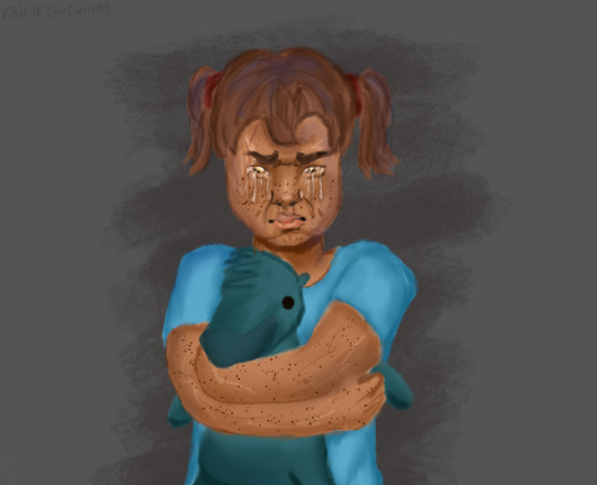
expression test with jenna! baby version <33
I don't know how to draw tears but I tried ok (also yes she's holding mr cuddlywomp)
#I think she's like..almost 4 here?#after seabound???#I was also going for like merge jenna too but like#I don't even know how old she's supposed to be here lmao 😭#lets just say post-seabound after jay left#ninjago#ninjago au#early family au#ninjago oc#oc: jenna walker#levi's art#my art#anyway I'm having so much fun on krita#you don't understand bro#tumblr killed the quality tho booooo#also not.me just realizing I forgot her ears 💀💀💀💀💀#how do u even forget ears#its finee its finee hhhhh
34 notes
·
View notes
Text
how to make cool blobby turing patterns in photoshop
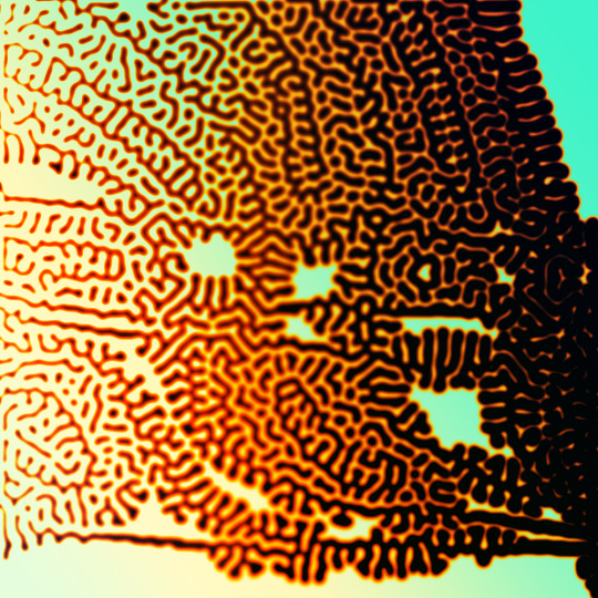
i'll preface with i learned the basic loop from skimming a tutorial on youtube, but as someone who prefers written tutorials i'm sure many would appreciate one! also, the second part of this is some of the visual effects i figured out on my own using blending modes and stuff.
i'm using photoshop CS4 on a mac so some buttons and stuff might be in different places on windows and newer photoshop versions but all the actions are the same. my canvas is 1000x1000 pixels.
UPDATES (i'm hoping these'll show up whenever you open the readmore?)
it's possible to do something similar in krita using this plugin, made by the love @arcaedex
it's also possible to do this in photopea, a free browser alternative to photoshop! the results are pretty much identical.
FIRST off you wanna get or make a black and white image of some kind. it has to be one layer. can be noise, a photo, a bunch of lines, whatever. here's mine, just some quick airbrush lines:

now find the actions tab. idk what it looks like in newer versions of photoshop but you probably won't need to dig!
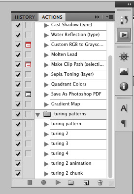
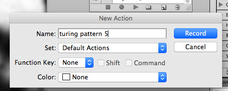
hit the little page thingy to make a new pattern. once you hit 'record', it'll record everything you do. the little square 'stop' icon will end it.
now you want to do a high pass filter. you can mess around with the radius to change the size of your squiggles, but the tutorial had it set to 6. experiment!
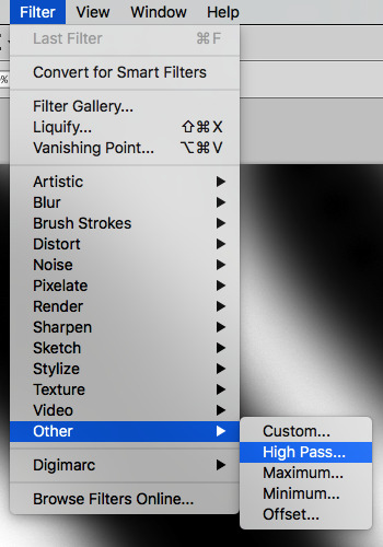
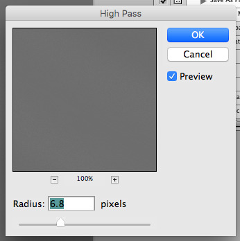
now add the 'threshold' adjustment layer. i use the adjustments tab but i think there's also a dropdown menu somewhere. keep it at the default, 128. merge it down. (control or command + E or you can right click it like some kind of weirdo)
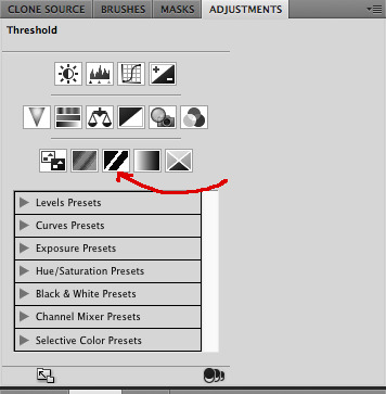
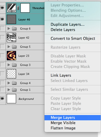
and finally, the gaussian blur! the radius of this affects the shape and size of your squiggles as well. i like to keep it around 4.5 but you can mess around with that too.
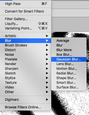
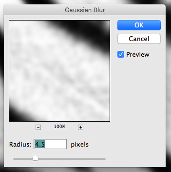
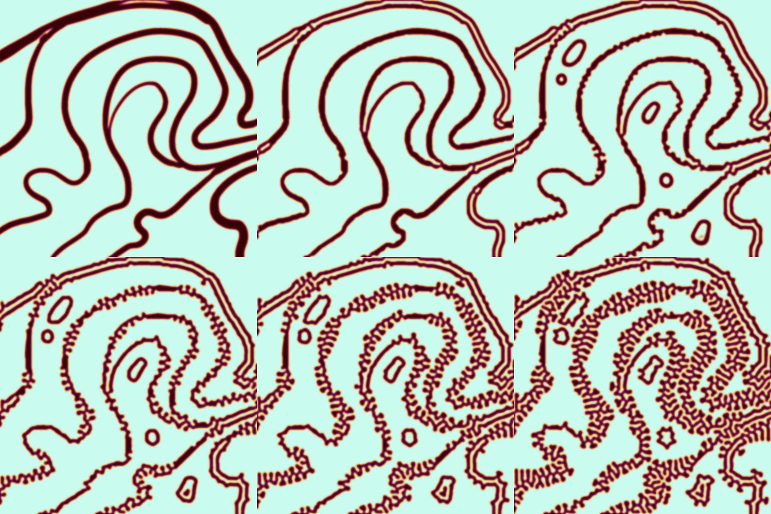
after that, hit 'stop' on the action you're recording, and then repeat it a bunch of times using the 'play' button, until you have something you like, like this:
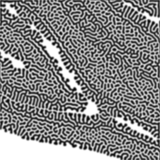
WOW!! that was fun!! and only a little tedious thanks to the power of macros. anyway, here's some fun layer blending stuff i like to do. it's with a different pattern cause i made this bit first.
anyway, using a black and white gradient (or a grey base that you do black and white airbrush on), make a layer with the vivid light. this will make the blobs look thicker or thinner.
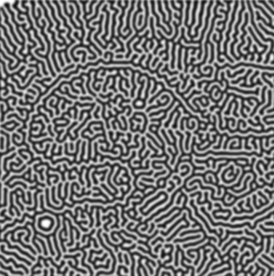

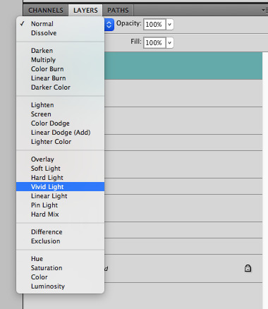

then, for cool colors, do a gradient map adjustment layer over that:

and finally, my best friend, the overlay layer. just using a gradient here bc i'm lazy, but feel free to experiment with brushes, colors, and blending modes!
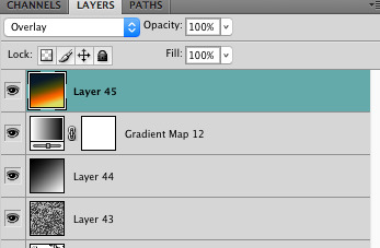

NOW GO. MAKE COOL SHIT WITH THE POWER OF MATH. AND SEND IT TO ME
also these are not hard and fast rules PLEASE mess around with them to see what kind of weird shit you can make. here's a gif. as you can see i added some random airblush blobs in the middle of it, for fun.
933 notes
·
View notes
Text
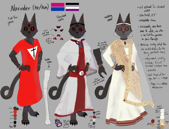
hi hey holy fuck i'm done with this. I tried to render for the first time following a "15 minute" tutorial and my noob ass turned it into a 3 hour learning experience. But now I have Narinder's reference for The Risen Lamb and the Fallen God! Rambles under readmore
SO I BARELY DRAW because I started learning how to draw like... May of last year, and then went bonkers over the summer making lots of progress and once the school year started in august I dropped it to focus on writing... and have drawn basically 1 thing in between then and now. Anyway. Last week I remembered, oh yeah, I used to draw sometimes. And suddenly had an all consuming urge to practice again.
And you know what? I forgot how fucking FUN drawing is. I take it much less seriously than I do my writing so my technique for now is pretty much "go ham and try a bunch of shit because you're getting practice and having fun with it anyway". and it IS fun until I try to do a specific thing and can't figure out how so thanks to those who tuned in to my stream tonight to see me push through the frustrating part of finishing this LMAO. uh according to the krita file this took me 13 and a half hours
If you didn't catch it a while back, the one thing I drew during my kinda-art-hiatus was my Lambert reference! Normal outfit, casual outfit (that they sometimes wear while off-duty, usually when visiting Ratau or just hanging out alone), and wedding outfit ^^
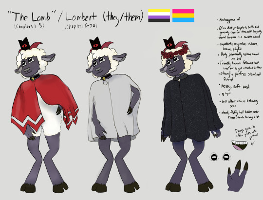
...Which means now that I have my narilamb references I can commission my friends. i have a few people who i already plan to open my wallet for.
"Ive already drawn you fanart for ur fic and now the outfits are very slightly wrong :<" ITS FINE I AM CHERISHING IT FOREVER PLS DONT CHANGE IT ITS PERFECT
"is it okay if i draw your designs" Why do yall think i would be mad about this i will eat that shit UP i would fucking LOVE that and I'm already foaming at the mouth because i'd been asked that a couple times while i was drawing narinder's reference lol
I'm still a beginner and constructive criticism is welcome! Will probably make less intensive references for the OCs in Risen/Fallen or at least draw them, Thenana and Juno for sure
#hannah's rambles#cult of the lamb#narilamb#narinder#cotl#Hannah draws#digital art#idk how else to tag this
160 notes
·
View notes
Text
Buried Treasure in the Sand, the Lynari Desert


"We once met a man who said he dreamed of finding a great treasure buried in the desert. "Everyone burst into laughter, and told him there was no such thing. "But the moment I saw this place, I felt his dream would surely come true. "The desert glittered like a sea of jewels under that shimmering sun."
~ Opening narration, the Lynari Desert
Talking under the cut:
So this took a while! It would have been up sooner, most likely, but Kirby decided to rot my brain for a while.
This is for my Pokemon/FFCC AU, and is part of what could be considered the main story, following Akari and Rei (or Dawn and Lucas). Return to Sender takes place in the same AU, though that mainly follows the train twins.
I learned a lot doing this, and although I know I could probably polish it more, I just want it to be done so that I don't lose motivation with the project and get discouraged. It's time for it to be finished, so it's finished -- not perfect, but as close as it will get.
Tried emulating the fancy script that they use for the dungeon names for the handwriting; it was tricky. Fun fact, I was so into FFCC when I was younger that I actually thought it'd be fun to absorb the script's fanciness into my own handwriting -- thus, my handwriting was once nigh illegible, but has settled to something halfway between cursive and print, still with some excessive swoopiness here and there.
It's never really stated who the narrator is referring to in the opening narration for the Lynari Desert, but I somehow always assumed that it was Hurdy/Gurdy. He would be the most likely to know of a "treasure" hidden in the desert, after all, though he might not remember why. Also, Gurdy is the one you learn the riddle from, so I guess I always just thought it was him.
Anyway, the man in question is Emmet this time around. What's he doing here? I'd love to tell you, but I'll let y'all ruminate on it because this is getting long and alas, I'm too tired to attempt much more coherent thought.
So, thank you all for reading! I am open to constructive criticism, especially about backgrounds and shading, as I consider myself to struggle with those.
Thank you very, very much, and I hope you all have a wonderful, blessed day! (ˊᗜˋ)/ᵗᑋᵃᐢᵏ ᵞᵒᵘ* <3
(program: krita; time taken: about 28 hours, cumulative)
#eggin creatin'#subway boss emmet#submas#pla akari#trainer rei#ffcc au#ffcc pokemon au#eggin's comics#might as well make a comic tag there'll probably be more in the future#this took so much longer than I meant for it to my bad#tldr I found the perfect long kirby music video to listen to for a regular commute of mine#and it got the gears turning again#and kirby descended upon my brain yet again#so yeah that happened
66 notes
·
View notes
Text
Hi! It's Tai :3 Welcome to my Main Blog!🐾
I'm an artist and animator. I use Krita as my main art program with adobe animate/flash experience. I usually make fanworks of things I'm interested in, but am working on releasing original stuff very VERY soon.


My current interest at the moment is TADC! but in the past have been interested in South Park, MLP:FiM, Little Nightmares, Invader Zim, Pokemon, and (Rot)TMNT. Also sometimes drabbles in the furry community every now and then (technically I present myself with kemonomimi, but I do consider myself a furry :p)
My Commissions are also open! Feel free to fill out the form linked below ⬇️

Commission Form
Commissioning me would mean a lot, since the money is going to help me pay bills and save up for a college! 🙏💙
Check out the Taikkommissions tag for examples if needed!
My Socials:
Youtube (semi-active)
TikTok (just when i feel like it)
Twitter (I'm definitely on here too much)
Instagram (semi-active? I don't post here as much anymore)
Cara (inactive)
I have a reblog-blog I don't use very much, but follow it anyway if you want fun stuff on your dash :3 > @taikko-reblogs
I also have a self indulgent TADC selfship archive blog! just so all the art doesn't get lost on this account :P > @taikkopom-archive
AND FINALLY the MLP x SP AU blog. > @going-down-2-my-little-park (<- very much inactive and isn't reviving anytime soon, I don't have the energy for upkeep :/)


Tag Guide:
taikko art - my art 🎨
taikko animations - miscellaneous animations, some not even on my youtube! (yet…) 🎞️
taikko talks 2 much - me just talking about whatever i feel like 💬
taikko asks - my answered asks! 📬
taikko memes - sillies i made 🫧
mikyomix sona - stuff of my old sona 👽
taikko sona - THE DOGBOY!! ME!! 🐾
Anyways, that's all. Welcome to my blog ★⌒ヽ(●’、^●)
#PINNED POST#taikko talks 2 much#adobe animate#krita#adobe flash#fan animations#fan animator#animator#animations#mlp g4#mlp fanart#mlp animation#mlp fim#my little pony#south park#south park fanart#pokemon parody#pokemon#pkmn#pokemon animation#pokemon fanart#tadc#tadc animation#tadc fanart#the amazing digital circus#tadc art#digital circus#pomni#commissions#commissions open
66 notes
·
View notes
Text
I meant to go further with this. lost the brain juice for it, so this is as much as I'll do tbh. Sorry for it's rough nature I had 0 intentions of putting too much effort into this, I knew I didn't want to waste too much time on this so this is what I cranked out in the short amount of time I allowed myself to work on this
Song is "Go" from the gatsby musical
Rant/context below the cut
okay so like, the gatsby musical released it's soundtrack like idk 8 months ago? probably more tbh, I'm too lazy to check dates atm
Gatsby's actor? JEREMY JORDAN, aka Lucifer's va. After the OST was released I was like "surely there will be animatics featuring Lucifer with this any day now" and then nothing happened. Cue like last week and I was like "HOW HAS NOBODY MADE ANYTHING??? GO IS SUCH THE PERFECT SONG FOR SPLITTING UP WITH ADAM OR WHATEVER" and I just kept imagining this whole animatic in my mind, furious that nobody's made it yet, and said "screw it, I know how to draw and make animations on krita. Time to row this boat myself"
So I just began roughing out the chunk of the song I was most invested in until I ran out of motivation to work on it. AKA no longer for fun/pleasure, it'd feel like an obligation, and I've got too many other things I want to work on MORE than an animatic so yeah this is what came out of it. It's rushed, sorry. I have no intentions of cleaning it up, making it go longer or anything, but I needed to get it out of my head for some piece of mind be able to work on other projects XD
Anyways: here are the lyrics for this section in particular, I'll be using the musical's names tho
Gatsby: We don't have to run Gatsby: We're going to face him Gatsby: We'll tell him it's over and leave him behind
Gatsby: We don't have to hide Daisy: You know that I love you Gatsby: to see that's it's over Daisy: Did I say I love you? Daisy: I love you let's go! Daisy: Before I change my mind
Gatsby: If we don't go now Daisy: We might never know Daisy and Gatsby: If we don't go now we might never know Daisy: What this could be Gatsby: What this could be Daisy: Who we really are Gatsby: Who we really are both: gooooooooo
anyways, thank you for coming to my ted talk, sorry this is unfinished and rough, I literally have so many other priorities rn, especially getting my webcomic ready to start posting in march so here

take it TAKE IT
TAKE MY SHITTY ANIMATIC

#lucilith#lucifer morningstar#hazbin hotel#lilith morningstar#lucifer#my art#animatic#the rage I have#of wanting to do so many things#and not having enough time for like 3 of them#at least this chapter is done and over with#I got the bulk of it out of my system#hopefully some of you will enjoy it#baiiii#actually real quick#for real I LOVE the Gatsby Musical#the book pretty eh#the musical is so fun#My Green Light is such a gorgeous duet between Jeremy and Eva#o yeah#Eva Noblezada aka the person whose voice sounds like the night sky#playing daisy?#and then jeremy jordan playing her duet partner??#🤌🤌🤌🤌🤌🤌🤌🤌🤌
13 notes
·
View notes
Note
For Nocturius: Other than Fi, what other character would you consider your favourite in RepComm?
For Fi: What is the one thing that scares you?
Nocturius: Hello! Thanks for asking question. I'm a chatty person so as my coresona Fi. 😉
Question for Noct: who is my favorite character in RepComm.
That's a very good one. It's funny because my fascination with Fi was pretty much a slow burn.
When I began RC I was in that THIIIIRRRRRSSST for more The Bad Batch content between season 2 and 3. I discovered the books and the game all by myself because I heard by digging in the EU that Omega and Delta squad were the ancestors of Clone Force 99. I wasn't disappointed.
I can confidentially say that Tech hit HARD in the scale of my favorite characters of all time, all fandoms. Socially misfit brainy nerdy nerd with thiccc glasses are in my favorites tropes I would totally bang. I love the CF99 as a whole too. They are all interesting individually and are magical together. I like flavored characters.
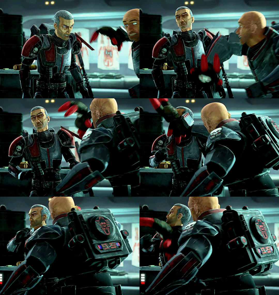
I seriously considered Tech as a potential coresona but there was already 2 on Facebook (they were inactive, but I wasn't aware of that) The slots for Fi, Niner, Darman, Boss, Sev and Fixer were open. Only Scorch-Core and Atin-Core were active when I decide to joined. (Today we have an active Niner and he is pretty chill) I also thought about Gregor and Corr. Corr-Core would have been a banger name.😆 I'm glad I choose Fi instead of them but it's an other question and I'm already far for of the main topic.

Quick drawing of Fi and Tech for the funzies. July 2024
Anyway.
I was in a mood for more clones content and pretty open-minded about getting attached to all those copy-paste men in RC. There was no nerdy nerd guy in Omega squad but there was a ''funny one masking some deeper undertones" Fi, and that ''depression-on-legs'', Atin. I was warming up to Atin at first. Niner and Dar was ok, but I related more to Atin. He was a bit of an outsider, had a hard time to connect with the group but slowly created bond with them. I liked that.
Here a graph about how I appreciate the lads of Omega squad. Done in Paint with no real science nor precision behind.
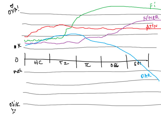
Yeah... I very disliked how Dar evolved in the last book. I get he was heavily traumatized but I really didn't like the vibe of where the story was going. We will never know if I would have seen thing differently with the two unwritten books.
Poor Dar.
I feel like I'm letting him down somehow. That just my personal feelings. He deserved better.😔
Atin plateaued at the end of Triple Zero. Dealing with Vau and being happy with Laseema. Good for him. But he didn't got any other development after that.


Some hot sketches I did in early 2024 with Laseema and Atin having QUALITY TIME. 😏
Pissed Niner, disobeying orders and being the Sam Gamgee for Darman was truly something. That was in the good bits of 501st. Someone should give that man a hug, a hot shower, a blow job and all the uj cakes he dreams about.
What is not on that graph is the Nulls, Corr and the non-clones characters.
Corr is a chill and fun guy. He became so sassy near the end.

Doodle December 2023, (before Fi-Core)
Besany, Laseema and Parja are GREAT. Ny is cool too. Bes was my girl in True Color. Laseema become a real mando lady and Parja is what Fi desperately needed. 😭I love her a lot but she doesn't have much meat to chew on storywise.

A very happy Fi with Parja, quick drawing. December 2024
Damn. I'm so happy for him. I thought for a hot second KT would match him with Jilka and I was like... meh.. nah.
Ordo is my favorite Null. Not because he is the leader or the smartest or strongest or the most badass. Nah, it's because he is an awkward little bean. 🥹 ❤️

First time I drew Fi and Ordo, Traditional ink, color in Krita (before Fi-Core and I wasn't done with reading all the books) December 2023
I think if we talk about consistency, intensity, character arc, I would say Kal Skirata is my second favorite character.

Quick drawing of Kal Skirate with no clothes, because interwebs needed it. 😌 October 2024
That smoll angry dad ... 🫠 I really want Ny (or @ithillia's OC Rose) to spoil him till he cry from being overwhelming by love and dedicated attention. Reading about that guy help me feeling more confident about maybe become a buir myself one day. As a non-binary person, I always felt weird about parenthood, but being a buir...
Aye, I can do that.
I learnt a lot about family and community with RC. Still learning a lot from Fi and Kal. Becoming a better version of myself. Being more kind and tolerant.
Kal always worked so hard to become a better father figure. To solve problems, make things work. Challenging his beliefs, evolving.
He is far to be perfect, he was pictured as an alcoholic for most of his life. ( but he improved during the books) Did plenty mistakes, was drowning in guilt and shame. I feel that.
As someone with paralyzing anxiety/depression disorders, the self-hatred is a war I have to fight everyday.
His love and desire for justice for the clones are highly relatable too.
Question for Fi: What is the one thing that scares you?
Fi Skirata : Arrrrgh vod'ika... You know I don't like to think about that sort of things...
Alright, I will answer. To be honest, there is a couple thing that scares me. Being late to dinner and having nothing left to eat, going to the 'freshers right after Corr. Mereel's holonet history...
Ok ok... I stop messing around.
I would say before my coma, I was very uncomfortable with silence. As some of you know, I lost all my pod brothers on Geonosis and it's not something we really had the time and tools to process. We knew as a cadet that losing vode was part of our life, but as commando, they were my home. My closest family and friends. That was devastating. I still honor them every night and in my actions. They died bravely and I'm the only one that still remember them. Teroch squad..
So, silence was that odd place I didn't want to be, because I was alone in my thoughts. Thinking about their lost and all the possible thing that could go wrong. I was pretty good at hiding it under music, singing, chattering. I thought reciting their names would be enough. It wasn't. But I was trained for that, I was holding on alright.
Things changed when we went on that mission on Coruscant. I loved the buzzing of the city, but being in contact with the civilians life compare to us broke something in me. The faith in the system we were built in. There was no silence in my head, just questions. questions and sometimes, I couldn't do otherwise than finding answer logically. That wasn't comforting at all.
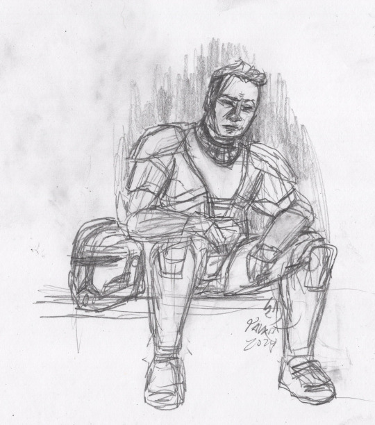
Quick sketch, moody Fi in True Colors. April 2024
Then I blew up. Early time of my recovery, things are pretty blurry and weird. I had no other choice than being alone in my head. At first, even organizing my thoughts was challenging. There was no escape in music or cracking jokes. I was very alone and confuse. Like a nightmare I wasn't able to woke up from.

Doodle, blew up Fi, few minutes before coma. April 2024
Communication and memory was the most challenging things. When people were out of the room, I wasn't able to know for how long they were gone. Where was my brothers, where was that nice lady that was taking care of me. Would they come back soon?
I would say loneliness is what I fear the most. Or more like, the ''void'' of being without any connection to people, to a cause, to be forgotten.
Y'see, we Mando believe that dying is pretty much the end of someone. Their physical being. There is no such things as a proper soul. But the thoughts of being just a bleep in the existence with letting nothing behind is terribly sad. I think, when a being is loved and remembered in people consciousness, there is some sort of legacy, some continuity.
The Force is in all of us and the universe. When alive, our actions, our feelings impact the world around us. I want to be a part of what make the galaxy a nice place.
That's why I crack jokes, that's why I try to help and defuse tension. That's why I'm a healer.
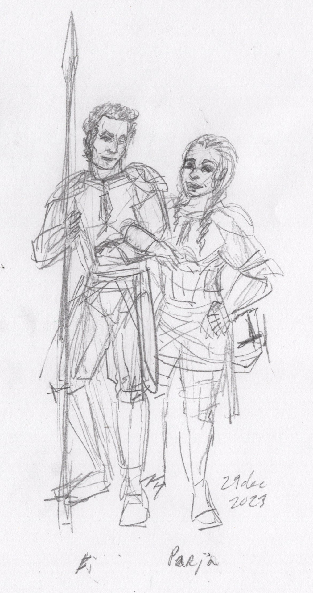
Doodle of Goldfish-memory-Fi and Parja. Order 66. Dec 2023
Our Clan. Our family and friends is what matter the most to me. That island of love, safety and trust. I would like to see all my close brothers in peace at home, with us. We can take care of each other, create new bonds. Even the darkest thing can be handle.
Miss you Darman.
#fi-core#republic commando#repcomm#fi skirata#nocturius#omega squad#kal skirata#Parja Bralor#The bad batch#Atin Skirata#niner skirata#darman skirata
11 notes
·
View notes
Note
You might have talked about this before, but what tool (device, programs, etc.) do you use for your art? I'm thinking about getting an iPad, but like...I've never really done digital, also never owned an apple product...I feel like an alien :D
i think i've answered something vaguely similar before, but fuck it new year new answer (entire thing below the cut because its long):
For most of my work now (since around Jun '24 onwards) I use the XP-Pen Artist Pro 16 with Clip Studio Paint Pro (perpetual license), total should set you back around USD560~ish. Key note is that this needs to be plugged into your laptop/pc, so if you have a shit computer this may not be the best option for you
Pros:
CSP is very full-featured, so pretty much anything you need it to do, it can do
Huge fuckin screen (16 inches) so you can have all your layer/brush menus out like a madman
Way more bang for your buck in terms of screen real estate/performance if you already have a good laptop/pc
Can work as a second monitor when you're not drawing
Cons:
Unportable
If you've never used any digital drawing tool ever, CSP is.. quite a bit to take in (dont let that scare you though, you can customize what menus you want to see etc to ur perference)
Needs to be plugged in otherwise its useless
No touch inputs (either use the controller they give u, a tourbox, or keyboard shortcuts)
If you dont need such a big screen though, theres definitely cheaper display tablets available (xp-pen artist pro 13 gen2, xp-pen artist line, huion kamvas line) -- thankfully we live in an era where Wacom's competitors are good and sometimes even better than it, so you can stretch your dollar a lot
For pre-Jun '24 I used a 2020 11inch iPad Pro with Procreate on it, which should set u back the cost of the ipad + USD13 + apple pencil -- note I still use this if I'm travelling (i drew the first mini norris on this while in japan!)
Pros:
Crazy portable - I used to bring my iPad to draw at malls with my friend (i also drew nsfw and a kid almost saw it so uh,, dont be like me)
Procreate is very stripped down in terms of drawing software so its really easy to learn the basics
You have all you need in 1 device (no need for another laptop/pc)
TOUCH INPUTS are SO useful when u first start when u need to rotate the canvas
Cons:
If you already have a laptop/pc this is gonna be more expensive
Procreate gets limiting over time - i used it from mid-2020 to early-2024 before i got sick and tired and swapped over
Apple pencil ergonomics is ass
Small screen unless u wanna splurge for the 12.9inch ipad
A fun third option if you wanna try testing the digital art waters without committing is a pen tablet (wacom intuos, xp pen deco, huion inspiroy), but those don't have screens so you need to look at ur laptop/monitor while drawing, and the hand-eye coordination may have a bit of a learning curve
Theres also free drawing softwares on both iOS and PC (autodesk sketchbook/ibis paint/krita) if you wanna fuck around on those first
But back to your main point - apple product software is generally a good experience (to me), and if you're mostly drawing on it you will learn the procreate interface more anyway so its not as important. The key between iPad VS Other Options is mostly portability & software (CSP on iPad is a subscription that I refuse to pay). And overall if you're not certain that you wanna stick to digital, get something that would be easy to sell off second handed in your country, so you dont lose your entire investment if you end up hating digital art lol
Good luck with your decision and if you have more questions, really feel free to ask -- i have a lot of fun doing product recommendation/comparison posts
8 notes
·
View notes
Note
hiiii just wanna start off by saying I love your art style and general vibes ✨️ I'm a stay-at-home partner always in search of fun things to do, and I've recently gotten back into art after not engaging with it since I was a kid (largely because your sun n moon fixation rubbed off on me 😭). I've never tried digital art and it looks cool! Do you have any advice for a beginner like me?
Oh it makes me so happy when people say I inspired them to start creating again 😭 The DCA and the fandom brought me out of my own years-long artistic funk last spring. Clown power, yeehonk 🤠 🤡
I’m planning a significantly longer post in response to an ask I got ages ago all how I learned to draw the way I do, so lookout for that.
But in the meantime, here’s a couple things I can think of off the top of my head:
Specific tools don’t matter much. I currently use Procreate and would recommend it if you have an IPad. It’s an extremely simple but effective program.
On desktop, I use Clip Studio Pro, but Krita is another program I’ve used and liked AND it’s completely free.
I do also have loads of experience with Photoshop and other Adobe products but can’t recommend them at the price, not to mention they’re not super beginner friendly.
Hardware-wise, I almost exclusively use my IPad to draw because it’s so portable. I also have a Huion Kamvas pen tablet monitor that hooks up to my desktop. But I started doing digital art with a dinky lil Wacom tablet that was less than $100. There’s definitely a bit of a disconnect at first, not looking at where you’re drawing but rather on a screen, but you get used to it.
Bottom line is to use whatever tools are convenient and comfortable for you! I even know of a great artist that exclusively draws with their mouse. I realized I hated sitting at a desk and that stopped me from practicing digitally. I got an IPad and now it’s much easier for me to work comfortably on what I love.
Point two I’d like to make is take advantage of the capabilities of working digitally. This means using the godsent undo button to your heart’s content. Download fun brushes to play with and add texture. Use perspective grids. Turn on line stabilization so your strokes are extra smooth. Like what you’ve sketched so far but want to try something different? Duplicate the layer and work from there so you can go back to the old version if you change your mind. Radically change the colors or values with adjustment layers. Use clipping masks. Abuse the liquify tool.
A lot of this might sound like gobbledygook to a digital art beginner but just googling any of this terminology will get you loads of tutorials and information for your specific setup. Also I’m happy to go into details about specific digital art techniques I’ve picked up with over a decade and a half of experience.
Finally, and most importantly—make what you want to see in the world AND what feels good to make. This ofc is not exclusive to digital art, but I always want to stress this to new artists. I realized after I got into the DCA fandom that I had been letting shame, fear, and perfectionism keep me from creating the content I was really interested in making. But then man, idk. Frickin’ robot clowns amirite ¯\_(ツ)_/¯ it’s like there was a secret agent sent into my brain and he uploaded a DCA virus into my mainframe or smth idk hacker style. tktktktkt. they’re in.
Anyway. Hope this helps! Feel free to send another message if u have more questions :3
15 notes
·
View notes
Text
Archons x WoF x Warrior Cats Concepts
update: so finals are nearing and apparently my sanity has been dragging down recently so i thought combining my hyperfixations into an au is how i cope /hj
(i actually drew this during finals, now its been sitting on my drafts for god knows how long)
so i began thinking of two separate crossover aus where the archons, specifically my comforts barbatos and morax, would look like in the following book series: Wings of Fire and Warrior Cats
so for the people who don't know both of these books series are fantasy novels surrounding dragons and cats, respectively
and because i haven't told you guys that i love dragons and cats now is the best time that i reveal it
so i present to you guys:
Character Concepts of Barbatos and Morax as dragons in Wings Of Fire style!! (FYI i plan to separate this au from WoF because i too am not very happy with the canon lore and i overall just don't rlly vibe with it and WC is just. kinda sitting there. no real plot or plan purpose. just did that for fun.)
these were the concepts i did while i was experimenting around krita and whatnots, so let's start with old gods as dragons shall we?
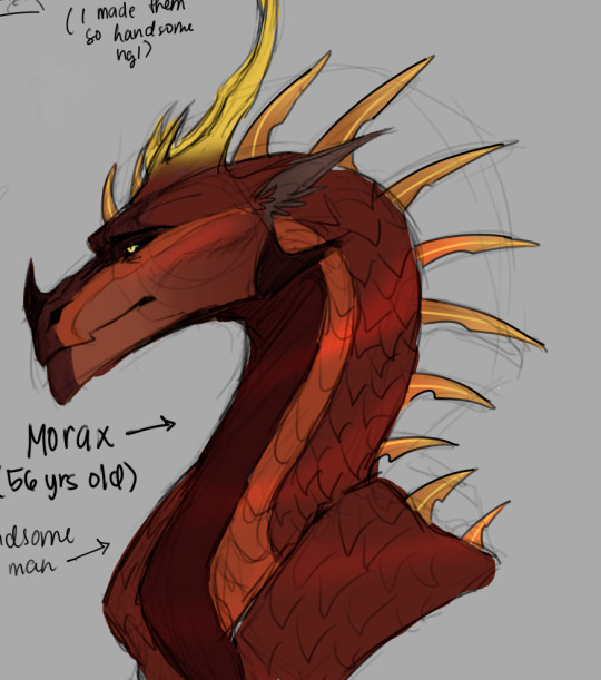
Wings of Fire (+ closer zoom-ins, ignore the doodles, i'm a little insane i know but hey this is tumblr)
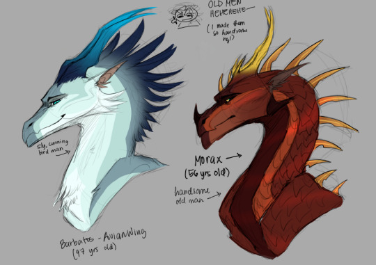
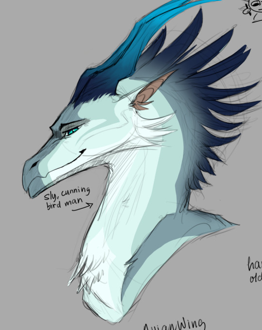
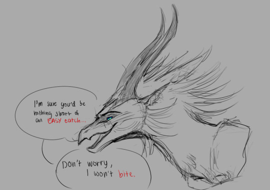
okay so just allow me to lore dump for a while, I'll also talk about the other archons who aren't featured here because I'm still thinking of concepts for them
starting with Barbatos, fellow WoF people might not recognize his species but he is an AvianWing, which are the basically bird-like dragons that i created in my au
they're very fast and agile creatures, they are known to hunt in packs like raptors and make efficient yet deadly hunters. they have sickle claws on their hindlegs and are known for their famous "songs" which are long melodious, almost song-like, calls that they use for various things such as communication, mating, echolocation, and more.
although not known for brute strength, venti doesn't let that stop him. where he lacks for brute strength and size he makes up for his speed in his slim body, force, powerful beak, and talons made up of strong muscles for pulling and slashing.
while he isn't a fan of hostility and fighting, he is much stronger, older, and wiser than he looks. he may act youthfully and even a bit silly, but this doesn't come from a place of naivety but rather a wish to enjoy life as it passes.
he is a well-known dragon around his kingdom, although he isn't a ruler, he laid the foundations of the reforms of his kingdom but refuses to take fame for himself, instead giving it to his older twin brother, Himmel (who is nameless bard and is alive in this au)
he and his brother are, of course, traveling bards, who'd like to perform on the streets or look after dragonets in the villages when their mothers weren't around.
many dragonets know and love him and Himmel, and they see them as elder brothers they like to snuggle with to hear their wonderful stories and beautiful songs.
he's kind and well-loved around his kingdom, and even established good relations with the current ruler.
cunning and swift, he has heightened senses for successful hunting. common in all AvianWings, they are known to possess a keener eye than most dragons for spotting small prey from above ground.
with that said, the look of underestimation on some dragons' faces does not go unnoticed by him.
but it doesn't matter, he could use it to his advantage anyway, so he plays along.
it wasn't until he unexpectedly turned the tables, making them face the hidden strength that he was provoked into protecting his loved ones in the distant past...
but that was all but a memory now, as he cuddled up eager dragonets with his wings chirruping and squawking when they wanted to hear his song. those wide pairs of eyes were hard to resist, even for a bard like him.
his elder brother settles them near and gently shushes them to behave before they begin, which they so obediently follow.
he chuckles, and so he sings with his voice, of tales gone by from the past, carefully woven into a meaning that one day, he hopes, the future dragonets will understand.
lore dump aside, i genuinely created the avianwings because i wanted to accommodate the WoF universe for venti and mondstadt because i thought that the bird and freedom motifs would suit him really well + the stigma of not looking strong at a glance but can shock you when you're not looking carefully. idk guys i think the birds are venti's spirit animal yk :)
next is Morax. i haven't quite thought of his lore yet, so let me go over the concepts i thought while drawing of him.
one day, i had a question in my head of a "what-if" scenario of what would morax's exuvia look like if he was in a different style of a dragon, specifically the western dragon and in WoF style, aside from the traditional lung.
now this isn't meant to be a cultural erasure, as i know the lung dragon is an important figure in Chinese mythology and formed an integral part of zhongli's character in genshin, however, i just wanted to entertain a new idea, and so i experimented with a new style of his dragon form (more specifically the European dragon style of WoF).
this isn't to say that his exuvia form looks bad or ugly, this is only a curious experiment or retelling of him in a new light.
anyway in the au i'm thinking like he's some sort of a skywing general or warrior bc the whole mountain dragon thing going on for the skywings seems really fitting for him
he's a very strong guy, well-spoken past his prime age but he still stands a formidable warrior
he's an experienced general who was trained vigorously from a very young age, and he rose to his ranks and became a famed and well-respected warrior
he also carries one of the most rarest genetic traits called metallic scales, and they reflect the sun's golden sheen under the light which earned him the title "Warrior of the Sun"
hes just a big scary dragon that looks intimidating but actually has a soft heart inside like canon morax, he may or may not have retired from his position but this was him during his prime (?)
dragon zhongli (not morax) is just a grandpa now bc i say so. hehehe
also skywings in my au are much different from their canon counterparts, they're much taller, stronger, and have more color diversity than just red or orange, and their tribe personality is different than just being thin, grumpy, or violent
(and yes all of the tribes in my au are more sensible and less arrogant than canon)
and uhm. dont mind the third doodle. i just went a little crazy if venti was a tiny bit messed up as a dragon)
moraxs dragon form and the whole metallic scales thing was heavily inspired by an artist called @sarcosse.7 on instagram. they don’t have a tumblr but their art is amazing! if you want to you can go and check them out!! they’re really good at writing and their oc lore is interesting.
next is warrior cats (and no im not beating the weird kid allegations, i genuinely cannot contain the silliness anymore, i love cats smmmmm)
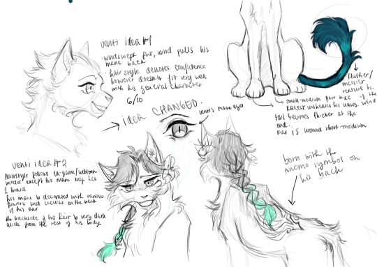
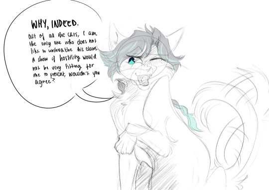
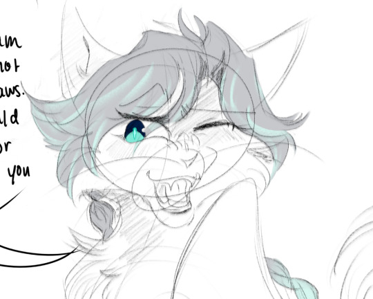
and YES DONT MIND ME I TOYED AROUND ABOUT CATS WITH HAIR. it looks cool okay don't judge me /hj (my designs my rules, i am defying the laws of logic)
on the second-third drawing, i tried to experiment with a new brush with the disney-esque feel with fluid motions (like the waving motion of his)
ANYHOWWWW. i just pictured venti as a silly mischievous lil cat. think he might be a windchill warrior or rogue or something idk. but i was thinking about how the genshin nations would look like if they were in warrior cats clans.
also cats with braids r cool
i don’t have anything else to say in here other than KITTIES
ppl i wanna call just in case: @cinnabell2 @lanternlightss @ventisslut @probably-haven
#venti#barbatos#zhongli#morax#venti genshin impact#genshin impact venti#venti genshin#genshin venti#barbatos genshin impact#barbatos genshin#genshin barbatos#genshin impact barbatos#zhongli genshin impact#genshin impact zhongli#genshin zhongli#zhongli genshin#morax genshin impact#morax genshin#genshin impact morax#genshin morax#wings of fire#wof#genshin impact au#wings of fire au#warrior cats#warrior cats au#just a thought.
12 notes
·
View notes
Note
Ah, hi there ^^" So, I recently subscribed to your channel because I ADORE your videos! ^w^ I had a few questions tbh, as I want to get into video making myself with my own art ;w; I am just so nervous >w<
But also, I was so curious, what program do you use for drawing? 🤔 I have been very curious. Hope you don't mind me asking ^^" I recently joined the Discord too, but go by a different name there >w> Kind of forgot I had a Tumblr tbh 😅
Anyway! Hope you're having a good day! ^w^
Hey! Thank you so much, I'm glad you like my videos :D Some helpful advice I've picked along my own journey for making videos is to be consistent! That's something I struggled with a lot at the start, my first channel has some stretches with MONTHS between posting loool but posting on a consistent schedule will help your channel grow so you can reach your audience :) As for programs I use, it has pretty much been PaintTool SAI from the start! I've used it since 2016 and haven't stopped using it yet. I find it just has everything I need and, despite not being made for it, it's really great for cartooning! It does cost but there are also some really great free programs out there like FireAlpaca and Krita which have very similar tools.
For making videos, I screen record using OBS and edit with Premiere Pro but honestly you don't need the adobe suite to edit videos, like my editing is SUPER basic, literally just basic cuts, crossfades with voice over and music layered on. I think there's free software out there like DaVinci Resolve which has a free version, but I'm not 100% sure how limited they are.
Remember above everything to also just have fun and take breaks when you need them! Burnout suuucks and I do not wish it on anyone. Maybe I need to take on that piece of advice too.
Hopefully this helps! Sorry for the super long reply hahaha. Wishing you the best with your videos, super glad to have you in the community!
2 notes
·
View notes
Text

Why introduce myself with just text when I can use memes amirite lmao
Anyway sup everyone, I'm Artemis! I pretty much made this blog for my fic Birthright so I can post memes, art and the occasional snippet. I'll be real w u guys it'll be mostly memes. 98% memes lmao. Very unserious stuff basically. But hey we're here to have fun while I proceed to torture these guys in text format.
Also huge shoutouts to my bestie and wife Kat for editing the first two memes on Krita for me while she signed the divorce papers because I pledged my forever loyalty to what she calls my 'BDSM mistress', the ol' reliable MS Paint. If you're reading this, she has taken the brain cell in the divorce
15 notes
·
View notes
Note
just curious, whta app/program do you use?
Okay, since I'm not the type of person to stick to only one art program/app and whatnot, here's my short reviews of every art program I ever used and the ones I still use.
PaintToolSai1/2 - pretty useful for people who don't own a drawing tablet cuz it has an amazing curve tool. Otherwise, I try not to think abt that abomination of an program.
GIMP- ummmmm..... it exists. Def not for drawing, more for photo editing or fixing ur art
Photoshop [multiple vers] - OK everyone sees it as a Lord and Savior of art. I say it's overloaded with so much stuff it can be overwhelming sometimes. Also better off fixing photos and drawings on it if you're not a professional.
FireAlpaca - making small animations on it was actually pretty fun, simple, easy, I'd recommend it to any beginner who doesn't need complicated tools just yet. But wants to try out new things and experiment.
IbisPaint- a lot of people use it and prase it, idk the damn thing never clicked with me. Especially after the "glitch that erases ur drawings with a square" thing, Tried it, now I avoid it. Nothing interesting abt it.
Medibang [currency use] - Currently wondering when they're going to treat the Pc verson and the app verson the same. A lot of stuff that are on pc are not in the app so lookout for that. it's alright, great for me and my lineart and comics and stuff. Kinda gets overwhelmed when folders get introduced for the drawing. But he's a champ yo, alright for paintings but not perfect. (Unfinished drawing)
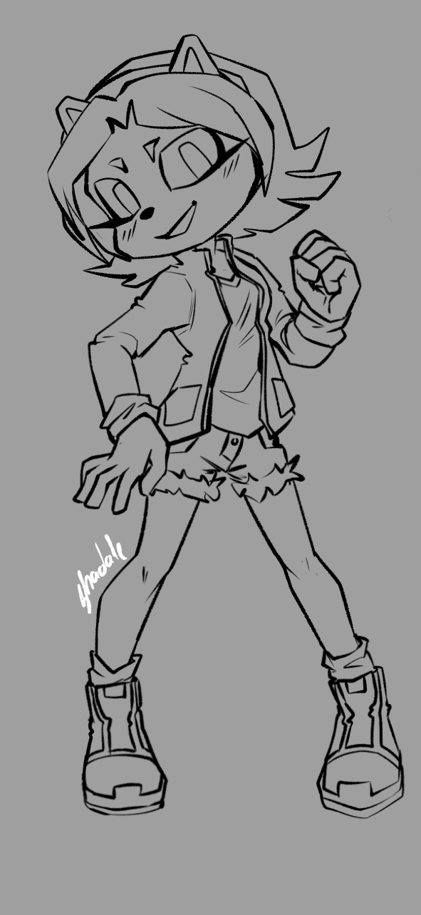
Sketchbook [currently use]- alright for paintings, not so much for lineart at least to me. Some brushes are so overpowered that the app verson struggles to render it properly. (One of my unfinished paintings in it)

Krita [currently use] - It's okay. As I stated way before, I'm in a love/hate relationship with it. It has everything an artist would need, but the damn thing crushes on itself way too much . Bro is so overpowered he struggles to find balance in his life. Eh but I love it anyway, I used krita since the proper launch when it had nothing but few brushes and stuff, when it looked like a SAI copy or sum. Amazing to think that it was inspired by GIMP out of all things. (Fast animation I made in it)
Have in mind there are lot's more programs and apps out there. It depends on what you need from a program and your own skills, and lot's of other things.... they all have their strong and weak points, that's for sure.
46 notes
·
View notes
Text
Concept artwork
05/09/2024
Hey everyone! I just finished my concept artwork for one of the storyboard panels. I chose shot no. 11 for the concept artwork since the butterfly can be seen in Shekila's eyes! It has a magical look to it, so I was inspired to color it!
Shot no. 11 -

Concept artwork for shot no. 11 -

I drew this in Photoshop since I'm familiar with the brushes and filter options on it compared to Krita. I first added the base colors (skin and hair ), added shadows, and then worked on the eyes.
In this artwork, Shekila's eyes are actually brown. However, you won't see much of the brown since the butterfly fluttering in the sky needs to be seen.
That's basically it for now. I'm not too sure if I'll have time to draw more concept artwork, but I'll try my best to draw one more! I'll have to save up some time to complete the rest of the checklist.
Update:-
I decided to erase some of the sky colors from Shekila's eyes so you can see the Brown color clearly. After softly erasing the sky, I realized that I liked her eyes being this way. You can see the clouds and the sky subtly. The butterfly on the other hand can be seen brightly at the center of her eyes.
Final concept artwork 1 -

Concept artwork 2 - 06/09/2024
Hi everyone! I'm back again with a new concept artwork. Thankfully, I feel much better now. I got some new meds from a hospital close to my place and those meds are working their magic.
Anyway, I drew one more concept artwork to satisfy myself. Before concluding the concept artwork post, I wanted to do one drawing where Shekila looks at the magical yellow butterfly (This butterfly would be Guddu's spirit being near her)
I headed over to Pinterest and I found the perfect reference for this idea of mine.
Reference -

To keep it short and sweet, I wanted this concept artwork to have a magical look to it. I wanted to place Shekila in a dark/dimly lit area to represent her feelings of sorrow. These feelings of sorrow are a result of losing both her brothers Guddu and Saroo. However, in this time of darkness, Guddu's spirit finds her to give her a sense of happiness and hope in seeing her loving brother again someday.
Work in progress screen shots -


Final concept artwork 2 -

I had so much fun working on these 2-concept artwork! Especially the 2nd one since I got a lot of time to study through and see how lighting falls onto certain areas in a figure. I would say that both of these concept artworks have a magical touch to them. Especially with the fact that the yellow butterfly is Guddu's spirit being there to cheer Shekila.
If I were to put it simply, if Guddu appeared to Saroo during his times of peril to guide little Saroo to find his way back to safety (In real life), then I'm convinced he would've appeared to Shekila to cheer her up from her feelings of depression and loss. (I would like to believe that hypothetically, Guddu would've appeared once or twice as a yellow butterfly to Shekila, but she must've forgotten those memories since she was little)
That's all for my concept artwork! I'm hoping to get started on the other work soon. Thank you for reading!
3 notes
·
View notes
Text
the enigma of (art) blend modes, and how doing brain research taught me how to better utilize them
(DISCLAIMER--I'm not actually going in-depth on different blend modes; there's other resources for that sort of thing! Rather, I'm just planning on talking about how they've been captivating to me in the past.)
I've been working with digital art programs for quite some time now, mostly for my game development pursuits, but also more recently just for fun.
Whatever program I'm using, be it Aseprite, Krita, or Paint.net, there's always this goofy little feature referred to as "blend modes". Really, all it refers to is how new colors should be made when two colors overlap on an image--particularly from different layers.
Back when I was young and naive, those layer blend modes hardly did more than just exist. Maybe I'd pull down that drop-down menu and switch around the modes every once in a while, but this was never used to help me during the creation process.
There's something about starting to use a new art program and getting overwhelmed by all the buttons on the UI. Of course, it takes time to master those menus, but when you do, it's nothing short of rewarding.
Which brings me to one of the most interesting programs I've worked with: Fiji.
Fiji isn't an art program--it's anything but. Instead, it's open source image processing software, designed for life science related analyses.
I've had the (mis)fortune of becoming acquainted with this software through my internship. When it was introduced to me last year, it was... overwhelming, to say the least.
This is what it looks like when you open it:

Not too overwhelming yet, right? Wrong. Here's what the dropdown menu for "Analyze" looks like.
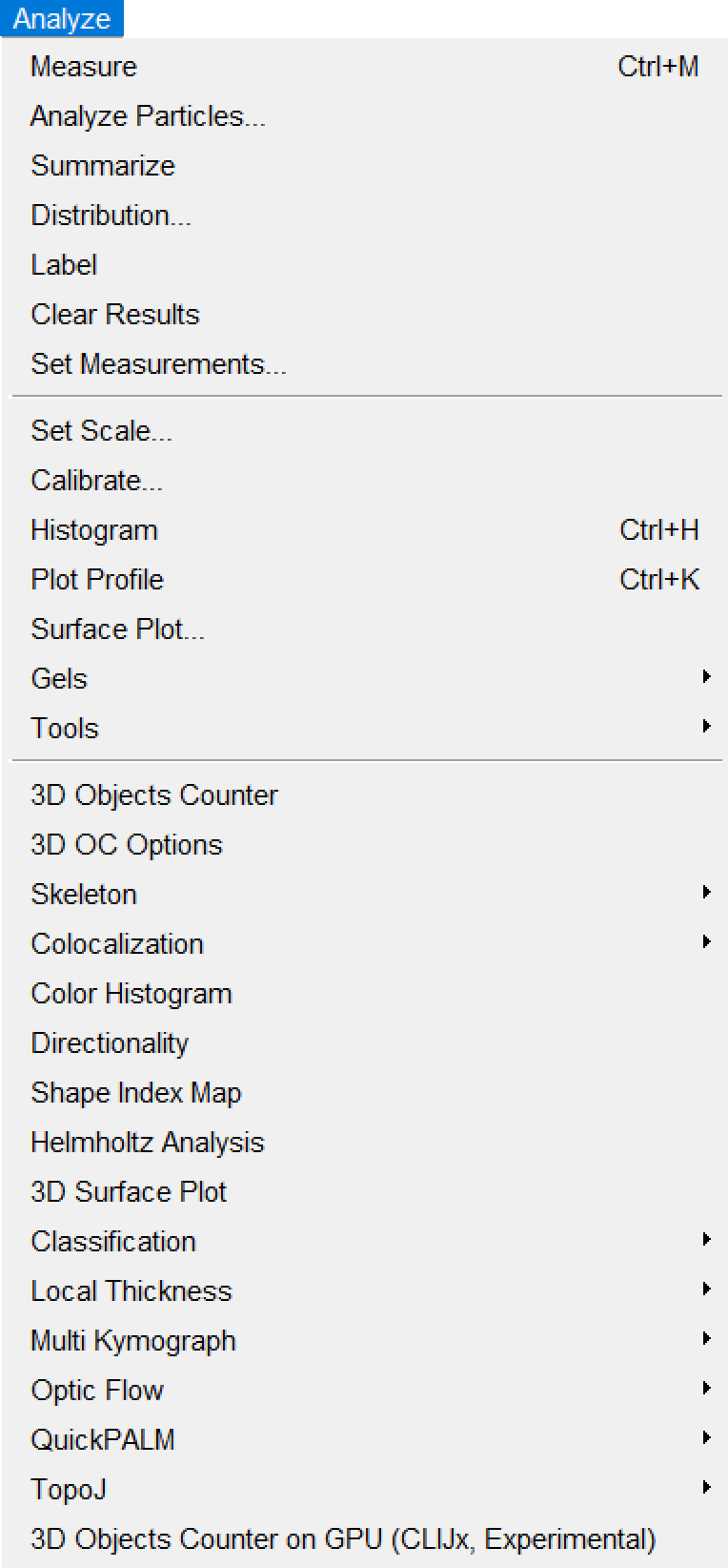
(I like how it starts with normal sounding words, before devolving into things like "Helmholtz Analysis" and "Multi Kymograph".)
If any of you are already super-mega-brain-nerds and know how to utilize all of these options, then good for you, I suppose. For the vast majority of the people who are unacquainted with neuroscience (such as myself), however, this is INCREDIBLY daunting to navigate. Imagine something just as confusing as this for the other menus.
Hell, even just importing imaging data proves labyrinthine:
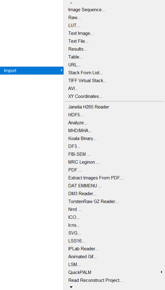
Okay. I'm done fussing over how convoluted Fiji's menus are.
I've worked with them for long enough to understand them a little better, though I still couldn't tell you what half the buttons do.
...like most of the art programs I use.
Yes, I've used Paint.NET since, like, 2018. No, I still have no idea what the "Clone Stamp" button does.
(by the way, if you're still using Paint.NET yourself for art, 1. what are you doing, and 2. Krita is much better for what I needed from an art program, so I might recommend trying that out if Paint.NET is getting on your nerves!)
Anyway, loading imaging data into Fiji usually gives you a video you can pan through. Most imaging data usually either represents a z-series, t-series, or both.
A z-series is imaging done on several layers of the subject's brain at a single time point, to create a 3D stack of images with time substituting for the depth into the brain.
On the other hand, a t-series is imaging done (usually) on a single layer of the brain throughout several time points. (Data I've worked with has ranged from 15-minute-long t-series to 100-minute-long t-series.) This again creates a 3D stack, though this time, time represents, well, time. (This is how most video is stored--even if the video itself is 2-dimensional, you're still "technically" viewing 2D slices of a 3D stack--though only super-nerds call video 3D.)
A zt-series can also be imaged by making several z-series over time, which can be processed into a 4D video. (Usually, though, the slices have to be processed through software to order them properly.)
Last year, I worked with zt-series a lot. This year, however, I've got easier work--I'm just working with t-series this time, to analyze calcium activity.
They're nicer to work with, to say the least. I've worked on automating the collection of calcium activity data by comparing the minimum and maximum values of each pixel throughout the whole t-series in order to determine where there's potentially calcium activity happening.
...in fact, once you get an image of the minimum and maximum values of each pixel across the whole t-series, you then work with those images as layers and use different functions to extract a mask that shows only potential calcium activity regions.
...
So it's adjacent to blend modes in a way.
Specifically the "Multiply" and "Divide" modes.
...
It's a bit of a stretch, of course, but working with these black-and-white images has helped me better grasp what's going on under the cover when I use those same blend modes for art.
Of course, I'm not using them masterfully yet. Really, I'm just using them to add blocky-ish shading to translucent objects.
...I'd show an example, but I can't find any pictures right now.
...
Sorry about the tangent.
I just feel like somehow this contributes to the intimate interconnectivity of everything.
Art and brain research being related on a software level.
#blog#neuroscience#neuroscientist#brain research#internship#art#art software#interconnectedness#blend modes#paint.net#krita#fiji software#imagej2#i dont know why i bother with the imagej2 tag#i highly doubt there's a vibrant imagej2 community active on tumblr#blogging about imagej2 on their blogs.#what a bunch of nerds
2 notes
·
View notes
Text
Story Board for the 11 second club animation
20/02/2025
Hi everyone! It's almost 2.30am and I'm genuinely surprised my mom's coffee is helping me to stay awake and complete this work for once haha.
Anyways, there's alot to do for this. I'm glad I was able to figure out the shots and such I want to include in the story board, but I need to properly mention each shot, describe the scene, and also have a rough sketch of the scene for today's presentations.
So, let's get started asap!
Recap on camera angles/shots/framing -
[Sometimes I have the memory of a goldfish when it comes to things like this.]
During Mika's class yesterday, I first started off by doing some research into articles that discussed about camera angles and shots. I added them to my previous blog post for me to refer to right before drawing the story board.
Here are the articles I read through to recap on my knowledge of camera angles/shots and framing -
After reading through the above articles, I was able to figure out how which camera angle, shot and framing to be assigned to each frame I've roughly sketched out.
Rough layout of the story board with the proper camera angles/shots/framing mentioned -
If you take some time to look through the image down below, you will see that I've added the required information related to each panel and I've mentioned on some drawing adjustments to be made.

Reference collection for the storyboard -
One of my main flaws I should point out is that I find it difficult to draw characters in different types of camera angles/shots without a reference. (That's on me for not practicing much on drawing that way lol.)
But this also makes it fun for me to take my own reference photos. Since I needed quick reference photos, I called my cousin brother to act as 'Joey' whereas I acted out as 'Rachel'. (Props go to my mom for helping with the picture taking :D)
You can have a look at the reference photo compilation down below -

Transcript for the animation -
It will be important to refer to this transcript when assigning dialog for the story board panels.

Story Board work in progress -
Digital drawings were all done on Krita. Here are the individual panels of the story board to have a look closely at the details.


Story Board -

0 notes