#anthony macbain
Explore tagged Tumblr posts
Text


Never-Before-Published GTA 5 Concept Art Made It to the Internet (80.lv)
Artist: Anthony Macbain / Roxie Vizcarra
24 notes
·
View notes
Text


Bully (Canis Canem Edit) character art by Anthony MacBain
#art#illustration#concept art#anthony macbain#rockstar games#bully#canis canem edit#bully canis canem edit#video game
18 notes
·
View notes
Text
The Bully Artstyle
Am I the only one who really appreciates the official Bully artstyle?
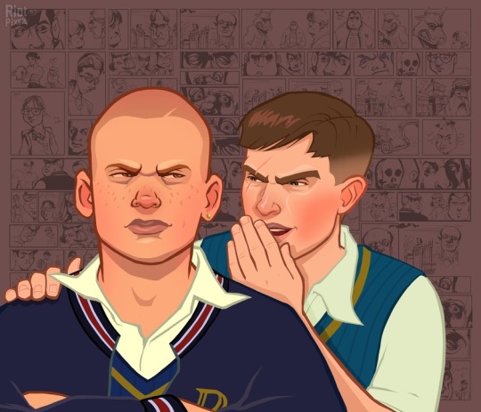
Though, calling it one style is technically wrong, since the images are made out of one front image and the comic background, both of which are made by different artists.
If you are wondering, the guy who did the main illustrations is Anthony Macbain.
If you look around his website, you will not only see his Bully art, but also that he also did some work for the GTA series.
The person who did the background illustrations is Stephen Bliss, who... also did art for GTA, believe it or not. I guess Rockstar only has that many artists that focus on semi-realism.
Obviously, since GTA is like, the most famous thing ever, his website does not focus on Bully that much. But if you scroll all the way in the Rockstar Games portion of his website, you will find the art that was used for the backgrounds! And it seems like he designed the logo too!
Now that we know who did it, I'll try to to a bit of art analysis.
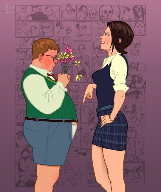
Similar to the GTA style, the style of Bully is somewhat realistic. Kind of stiff looking, to be honest. But the background illustrations kind of make up for that.
The lines are mostly the same unchanging width (except for some smaller lines for details). They do not taper much. The lines are also colored - their color is more dulled out than the colors they are containing.
The colors are also kind of dull in general (though this may only be because of my monitor.) Probably because the art is going for that realistic look. Of course, we could also look at it a bit more artistically and say that the colors are dull to fit the miserable atmosphere of Bullworth. You might also notice that there are no real whites - the shirts are either tinted yellow, or whatever color is around it. I think this is pretty neat. White fabric often tends to reflect the colors around it in real life.

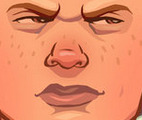
The lineart is just a bit too chunky to convey true realism, so it is stylized in a cool kinda blocky way. The shadows are also quite blocky in general. They often tend to be interesting shapes by themselves. Look at those eyebags and the shadow under the mouth!
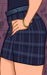
Besides the hard shadows, the art also uses some airbrush-like effects. Look at how it conveys the shininess of Pinky's belt and the softer shadow on her thigh. It is also used in Gary's hair to show the soft color transition.

The opposite of shadows, the hair highlights, are these cool zigzag shapes. I like it when artists make the hair highlight a bold shape like that. Speaking of the hair highlights, notice how they often have a similar color to the background. Like, look at this - these ones are actually a pretty bold purple, probably to mimic the way real hair can, just like fabric, reflect the color of its environment.
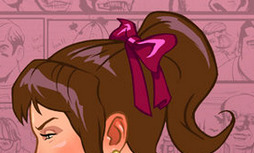
Now, let's look at the blush. A lot of the characters in these illustrations have this strong blush on their cheeks and nose. This is probably used to make them look a bit more alive. I wanted to say every character, but then I looked at the art again and found out that was just not true.
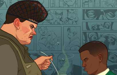
Look at these two, for example. Edna sort of has the blush, but it is single colored and blocky, making her look kinda sick, rather than more alive. The boy next to her also doesn't have the blush, probably because the brighter pink wouldn't work as well on darker skin.
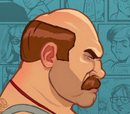
Mr Burton here also does not have the blush, because... I don't know, to be honest. Random stylistic choice, I guess.
Overall, I cannot quite name why I like the style of the main illustrations so much. It's just not the kind of thing that would usually appeal to me. I guess it's something about the realism combined with the cartoon stylisation and the slight blockiness of it all.
I have much less to say about the background illustrations. Don't get me wrong, I love them. It's just that they are only black and white, so we really cannot dissect the stylistic choices here. But also...

God, I just love the style of these. Just look at them. The caricature-ish style done with some bold inks is so cool. These have so much character, shame we never got a real comic in this style. And since they are black and white, they are as contrasting as a picture can be. Which means they are perfect for the backgrounds. And since the style is so exaggerated, it looks good even when the pictures are pretty small.
I wonder, were these done digitally, or with real ink? Both are possible, I think.
And that's about it for this post. If you have any other observations about these styles, I would love to read it. I just really like these illustrations!
#bully cce#canis canem edit#thoughts#Sorry if this is clumsily written I only wrote this in about an hour and a half
28 notes
·
View notes
Text
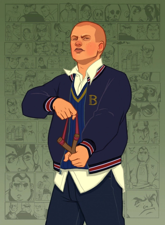
The canon queer character of the day is:
James "Jimmy" Hopkins from Bully, who is bisexual.
#james hopkins#jimmy hopkins#bully#bully game#bully scholarship edition#canis canem edit#rockstar vancouver#rockstar games#rockstar games inc#gerry rosenthal#anthony macbain#roxie vizcarra#bisexual characters#canon queer characters#canon bisexual characters#bisexual
39 notes
·
View notes
Video
tumblr
Video from the vault by The Psyched, taken from the 2012 self titled LP on Black Gladiator / Slovenly.
Video directed by Jeff Starr Logo & Lettering by Roxie Vizcarra Drawn Animation by Anthony Macbain
#The Psyched#thepsyched#black gladiator records#blackgladiatorrecords#slovenly recordings#slovenlyrecordings#Roxie Vizcarra#lettering#Anthony Macbain#animation#music video#notbadfilms#Jeff Starr
0 notes
Note
what kind of style are you most find of?
For me, I really like painterly styles. Not like oil paintings or acrylic (I do find some inspiration from those though) but just more rendered and textured art styles. And most of the time those lean on the realistic side.
On the opposite spectrum though I like art styles such as Adventure Time, Regular Show, and more curvy yet “formed” styles.
Some art inspirations of mine are Araki (Jojo), the modern Gorillaz art style, Anthony Macbain (artist of most GTA V and VI loading screen/promo art), and realistic 3D video game renders.
1 note
·
View note
Photo


From the episode In the Company of Woman (one of my fav episodes last season), we had the female entrepreneur Martha Matilda Harper.
Martha Matilda Harper was born in Oakville, Ontario. The recorded year of birth conflicts as either 1857 or 1868, most likely so that Harper could appear younger. When she was young, she didn’t have a formal education and moved to Rochester, New York to work as a domestic servant.
While in New York, she started work on her hair tonic (shampoo). Harper had floor-long hair that she used to promote the use of her hair tonics. She opened her first beauty office in 1888, Harper Method Shop which was a combination of beauty parlour and factory. She opened her franchise in Buffalo, New York in 1891 and was able to open in Chicago the following year. Her first Canadian factory was in Niagara Falls in 1921.
She married Robert Arthur MacBain in 1920.
Her company was called President Martha Matilda Harper, Inc.
Her products included hair preparations, creams and make up, permanent wave and hair colouring products.
She also opened beauty training schools in Rochester, Atlanta, Madison, and Alberta.
Her philosophy was that beauty was based in good health and every person was beautiful.
Her clients included Woodrow Wilson, Susan B Anthony, Calvin Coolidge, and Jacky Kennedy.
#murdoch mysteries#MurdochHistories#martha matilda harper#episode 1316#season 13#women power#business/entrepreneurs
24 notes
·
View notes
Photo

Red Dead Redemption: Undead Nightmare by Anthony Macbain Rockstar Games
2 notes
·
View notes
Photo

I’ve been listening to a lot of Three Point Perspective which is a great podcast all about art and they discussed the idea of a ‘dream portfolio’ which is full of the artists you admire and would like to emulate in your own work.
Obviously I have way more than nine influences but these were the first that came to mind as well as being a mix of comic book and fine art and I’m just gonna focus on these this year so I can do master studies for each them and hopefully improve my skills.
Top left to bottom right:
Phil Noto
Euan Uglow
Rachael Stott
Anna Mill
Alex Russell Flint
Ashley Witter
Charlie Bowater
Sir Michael Craig-Martin
Anthony Macbain
0 notes
Photo

99999999..., Hank’s Saloon, 11/14/15
https://allnines.bandcamp.com/
10 notes
·
View notes
Photo

I admit it, I'm a GTA addict.. Have been since the release of Vice city.
This is one of many beautiful illustrations from Grand Theft Auto IV by Anthony Macbain. I believe it is Little Jacob... Very comfy.
29 notes
·
View notes
Text
Games & Art? Be critical but know what you're talking about
After a gruelling couple of 80 hour workweeks preparing and attending the Art.Fair/Blooom! 2011 contemporary art fair for a soft launch of our art dealership Cook & Becker, I finally had some time to sit down and read up on some stuff this morning. As I obviously spend weeks mostly thinking about art, I couldn’t help but notice this comment from author, broadcaster and general UK arts guru Ekow Eshun, former director of the Institute of Contemporary Arts in the UK on the games & art debate: "I'd suggest that the things we really consider art are the things that allow us to ask profound questions about who we are, how we live and the state of the world around us. I think most games don't get to that place." Obviously the man has never played Grand Theft Auto IV in-depth. Or watched The Sopranos, Mad Men, The Wire or Treme. GTA IV is but one example, but it is without a doubt one of the most culturally relevant pieces of art and entertainment of the last couple of years. Because it does EXACTLY that what Eshun singles out as benchmark for art. The cocktail of subversive and sarcastic social commentary, the in-car radio, the skewed pop-culture reference, the art direction in combination with your role as a participant is extremely impressive and easily goes beyond mere entertainment. I remember playing it and being so absolutely impressed with it. A product of a studio at the top of their game. The brilliant thing is that because of its hugely approachable game form, GTA IV has reached millions of people with its controversial messages in a way that is both subtle AND heavy-handed. As a cultural product GTA IV has been and is arguably more influential than for example the street art pamphlets of Shepard Fairey. Rockstar artists like Stephen Bliss and Anthony Macbain have created iconic images on par with the Obama “Hope” poster with work such as "Lollipop Girl". Next year I hope to have some of their work at art shows. Art, games, media, they are colliding and reshaping quite dramatically and it is a great thing to be able to discuss it with people. One of the most interesting things for us at Blooom! for instance was to talk about video game aesthetics with art-enthusiasts and buyers who were very open towards this type of work. It is easy to forget coming from the games industry sometimes that a vast majority of the people, even art enthusiasts have no idea how this type of work is made, what the inspirations are or how it is rooted in art history. We got some really good feedback at Blooom! Even some unsolicited “This is the future of art” comments. Which is great but no reason to stop being very critical. Being critical is good, but make sure to have some knowledge about the subject you're discussing when you are.
P.S. The BBC radio discussion with Eshun was quite reasonable and even. However, I do think that most people commenting about the 'art status' of games usually don't have enought in-depth knowledge or fail to make broader connections.
9 notes
·
View notes
Text

The canon queer character of the day is:
Florian Cravic, AKA Bernie Crane, from Grand Theft Auto IV, who is gay.
#florian cravic#bernie crane#gta iv#grand theft auto iv#gta 4#grand theft auto 4#gta series#grand theft auto series#rockstar games#timothy j alex#anthony macbain#stephen bliss#gay characters#canon queer characters#canon gay characters#gay
25 notes
·
View notes
Photo
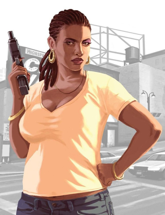
The canon queer character of the day is:
Elizabeta “Liz” Torres from Grand Theft Auto IV, who is bisexual.
#elizabeta torres#liz torres#gta iv#grand theft auto iv#gta 4#grand theft auto 4#gta tlad#gta the lost and damned#grand theft auto the lost and damned#tlad#the lost and damned#gta series#grand theft auto series#rockstar games#charleigh parker#charlie parker#anthony macbain#stephen bliss#bisexual characters#canon queer characters#canon bisexual characters#bisexual
26 notes
·
View notes
Photo

All 9's, DBA, 1/30/14
#all 9's#richard gin#dba#death by audio#anthony macbain#ted mcgrath#garage#punk#williamsburg#brooklyn#ny#nyc
4 notes
·
View notes