#and the characters being like. pretty simplified?
Explore tagged Tumblr posts
Visit Tumblr Blog
Explore Tumblr blogs with no restrictions, modern design and the best experience.
Last Seen Tumblr Blogs


Fun Fact
In February 2021, Tumblr had 518.6 million blog accounts.
Text
I really enjoyed Titan Takedown because they don't only work on TV, they basically roleplay for a living, on TV. While the Intrepid heroes are very familiar with the format of the program and also very much acquainted with TV/theater work (which is why it works so well), the righteous wrestlers have spent years playing out exagerated plots in front of a live audience and a non-live audience. They know how to work the camera, they know how to work the gestures and they know how to flow with whatever is going on in a way that not all improv actors can do, because it is a different medium with different rules.
Brennan could put both drama and a combat per episode because they follow him to wherever he leads. The only moment of doubt about it was on episode 1 for Bayley because she was still very confused as to how DnD works (which she solved superfast because by episode 2, she fucking knew her character sheet).
If you compare it with Dungeons and Drag Queens, who are also good performers in their own world and are also on a beginner side quest, you can see that they are not as comfortable with the TV (while still being comfortable), but also they get lost with NPCs or their own silly ideas and it takes a lot to get them back. Brennan had to skip to places with them because they didn't follow him as well, and I'm pretty sure that this is directly related to frequently working with narratives or not working with narratives.
It is true that Brennan simplified the world for the righteous wrestlers much more than he did for the questing queens, but again, Chelsea is the latest arrival to the wrestling world and she has been doing it for at least 10 years. That's 10 years of exagerated acting for a living.
I particularly loved Xavier because he was enjoying it like a child, while still giving the hell of a show, and Chelsea, who was on full performance mode since minute 1 with every single situation, character or conversation. Kofi and Bayley also gave a good show and had a lot of fun but it took them a bit longer to figure out how to mix it with the DnD mechanics.
Overall, I really liked it because I love to see people learning new things and having fun, and also because I just love it when people are skilled at performing.
132 notes
·
View notes
Note
Oh!!! You collect leucistic animals?!?!?
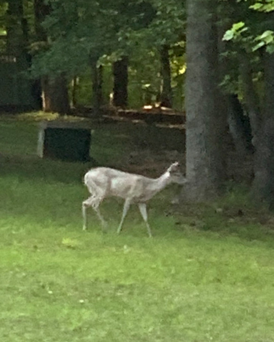
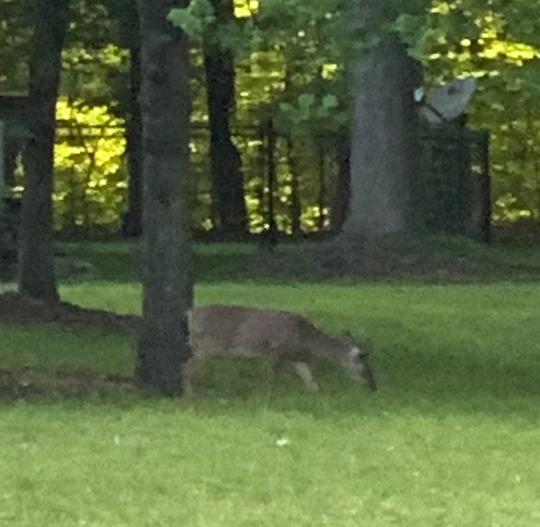
Seen in May 2024. This white tailed deer with a very pale silvery coat! She wasn’t completely white, but definitely much paler. Regular deer in the same yard for comparison. The colors are pretty accurate to real life! Sorry the photo quality is so bad, these are cropped versions of already very zoomed in photos lmao
Does this count as leucistic? Or is this a different pigmentation thing happening? I tried to find an explanation online at the time but I couldn’t find any examples of this specifically.
Oh thank you so much for thinking of me!
After several years of collecting colour morphs, I’ve decided to simplify by just keeping them all under #the leucism channel #(open to all colour morphs) because I still see tremendous pleasure and value in curating the diversity of animal colouration.
The primary personal reason in my heart, and the reason why I admire and collect colour morphs at all, is because it gives us the experience of witnessing the animal as fresh and new to our eyes. Sometimes without the distraction of colour and pattern, it takes a moment to truly understand what you are seeing - by recognising and re-cog-nising the character of the animal - which in itself reminds you of the true nature of the animal. So that being my intention, I collect them and they make me happy, but I only do it under one tag, and I’m no longer hugely interested in deciphering exactly what mutation a photo of an animal has, or hosting those arguments in my notes. So it’s a blanket thing. The Leucism Channel for tradition and recognition, and Open to All Colour Morphs because it is! This deer is definitely eligible!
As for your lovely witnessing, that does look leucistic - it can be a partial pigment loss, it doesn’t have to be “pure white” - just paler when considered from the centre point of the wild-type expression.
In domestic animals, where we select for colour morphs both purposefully and unintentionally, we use expressions like “dilution factors” to talk about genes that reduce the levels of an animal’s colour. For example, a black cat with the “dilution effect” applied becomes a “blue” cat - those cats with blueish grey fur. A black horse with cream dilution becomes a Smoky Cream, which is a silvery gold colour. You could think of it like a slider where you have (base + dilution). The dilution of a black cat is not grey or white, but blue-grey.
Leucism in wild animals encompasses the slider that is paler than wild type, and melanism encompasses the slider that is darker than wild type. (There are specific words for specific pigment losses but it is not inaccurate to start with this understanding and then expand it.) and the word we use for something that has fallen off the slider entirely is albino. Albinism carries other genetic implications and significances, which is why people will argue about it.
Thus the deer you have is quite likely to be leucistic, exhibiting characteristics of leucism, but perhaps only partially - as a dilution rather than a loss of wild-type expression.
What a lovely sighting, thank you so much!!
129 notes
·
View notes
Note
Hey I've seen that you've not been active recently, I like the comic so far, so I have a question why haven't you been active?
Sorry for not answering questions as of late! I have a few answered ones in my draft!
I DO APOLOGIZE IF THIS POST MAKES YOU FEEL UNEASY OR UNCOMFORTABLE. This post is mostly for anyone who’s curious about the lack of posts. I don’t need any comfort, compliments or reassurance, trust🫡.
(I’ve been meaning to talk about this topic in detail for a while but i know people get uncomfortable with this kind of negativity!)
“STRAIGHT FORWARD” ANSWER:
I’ve been a little less motivated to draw, thinking every drawing or comic isn’t worth looking at. Im not consistent with my art and want to change up everything if i’m not satisfied with it which makes it confusing for everyone else. Dandy’s design is a big example of that.. Lots of comparing comes into play too. I do NOT have a pretty art style what so ever. dgmw, It’s not meant to be pretty but i get embarrassed when I draw something that’s meant to be somewhat pleasing to the eyes but turns out cringy.(dandy & astro comic). There’s such pretty art out there and it feels like im destroying the beauty of the characters. I also feel like I disappoint others consistently since i have high expectations for myself. I want to improve faster and faster so i push myself. At this point i might’ve accidentally over done it. I took a break to see if that’d help things but when i came back there was a TON of negativity on tiktok.(where i started out) which also pushed me away further to draw since i liked seeing positive things about dandys world! I’m not giving up just yet, because i want to live my art and keep inspiring younger or even older artists to draw different angles and so much more!
(I will also point out, whenever I draw, it takes a lot of time. i am unfortunately a slow artist..sigh.💔)
MORE DETAILED ANSWER WITHIN:
TW: LOADS OF SELF NEGATIVITY & NEGLECT.
Let’s start from the top.
HAPPINESS?
Tiktok was where i started posting comics. (i never made a comic before, so that was my “first” time) All i really wanted to do was post relatable dw experiences for the fun of it.
I didn’t realize people would actually like a simplified, horribly colored, comic. Either way, I was having fun.
I got this really weird motivational high when others wanted more or the “next part”. i literally couldn’t fall asleep and wasn’t eating from all the thrill. I couldn’t tell if I was happy or really anxious from the attention.
I got a little afraid once i reached 10k or something like that. I didn’t have a story for the “AU” nor did i ever create one in my life. I couldn’t tell if people liked filler episodes or random episodes or if they really liked the lore/plot.(everyone was angry at qwel for not showing any lore so I got worried about that happening with me and wasting everyone’s time.)
GROWING GUILT.
At one point i took a break from the comic to create some silly little christmas special which,, i should have planned out beforehand. It felt like I made a promise to post every night for december like a christmas advent calendar(that was the plan basically).
Big mistake. I already had an insecurity/fear of disappointing others. I believed i could make these silly little shorts every night. I once again struggled to sleep and eat but this time from guilt that was growing. I finally called it quits on the 7th day(sad ik i only made it to 7 days lol) since a lot of people were concerned once i was late and i seriously didn’t want to concern anyone. I still had ideas but i couldn’t keep up with the days.
OVERWHELMING SUPPORT.
The support from the familiar faces was and still is overwhelming. Everyone was/is so nice and yet i still felt like i let everyone down? I felt like i needed to give more or try harder as thank you for supporting and being there and for treating me like a human being especially when other creators had people pushing them to make their comics. No one asked me to try harder but i felt/feel the need to push myself, or to make a better version each time.
I don’t know how to take compliments. A small thank you doesn’t feel like enough. I want to do MORE but I know I can’t.
TOOK A BREAK.
I didn’t want to take a break, but it was needed. I also needed to take advice from the familiar faces i saw because they were right. I thought I was ready to come back because, I had a story, had a plan to go at my own pace, say a simple thank you for the support, and move along. I also wanted to step out of my comfort zone and become one with the community. (Idk if this was such a good idea tbh LOL. I feel invasive like rodger or shelly.)
FANDOM NEGATIVITY.
I loved the community and how silly we all were back when it was growing. The way people portrayed the characters in their aus, created lore, ships and their names were creative, ocs, and so much more to create a somewhat healthy community. It was Dandy’s world’s prime time for me.
However,,, During March, All i saw was negativity.
No one was negative in my comments, however, whenever i went on tiktok, all it was, was(and still is) negativity. I’m not talking about slimetok or some shit hating on “us” and changing the “💔” emoji to a rotting flower, I’m talking about our OWN community hating on the new updates, hating on certain characters, on aus, on ships, hating on ANYTHING that helped create the community. Some of the community members are also something else. All of this negativity really killed my motivation(personal stuff too). Dgmw, people can have opinions, but holy shit? How much negativity are you gonna diarrhea out???????
We’ve got bigger problems in the world. I already know this! But we kind of need to be happy here and there or else we’ll all be depressed or some shit.(an escape basically.) Unfortunately I used DW to cope which is probably why i’m feeling sad about all of this negative change.
OVERTHINKING DISAPPOINTMENT.
Due to the popularity on tiktok, I felt as though i was disappointing those large amount of numbers. I do feel like i should only focus on the people who are “closer” to the account, but i’ve had another issue with that too. Anyone I feel closer to, I feel like they’re going to be more disappointed not only in the art but they’ll get bored with my personality too? I’m still trying my hardest not to care so much about disappointment but it’s been a little tricky.
Unfortunately I look at my art differently now, hating everything i post and judging myself too quickly. I spent over 150 hrs on the two long comics “Abc song” “Snowballs coming your way” or something like that, and despise them. I also disliked the gigi/flutter/looey comic even though that one had gained the most attention on tiktok.
THE POSITIVE…?
I’m still drawing/posting since people get inspired by the art/perspective and it still makes me feel worthy enough to continue the comic/drawing. I too want to like my art again, so i’m not giving up. also my little sister took my ipad for school projects so i can’t exactly draw much rn…🧍
33 notes
·
View notes
Text

here's a philosophical conundrum for you, siffrin.
if you don't have a home to go back to, what kind of person does that make you?
if you don't have memories of your own childhood, can you still consider yourself human?
if you have forgotten something as important as your country, your childhood, your family, your own name, then are you even a person?
if something is forgotten by everyone, then has that thing ever existed?
(effect works best when zoomed in!)
teehee :3
sorry odile’s part of the mdp fight has been pinging around in my brain for like. months now. i’ve had the idea for this drawing for a while. this is also partially based on isa’s act 4 friendquest (without doing bad touch) where siffrin mentions that they didn’t really have an identity before they met the party!! i wanted to play around with transparency :3333
also, for once, i’m actually putting the colored version down here! idk! i felt like the greyscale version kinda conveys the Mood a little better?? i like both tho!!

#marshdoodles#isat#in stars and time#isat spoilers#<- only because of the caption. i had to make that the caption sowwys#ahhhh this is the first time i’ve had their palettes like. close together? im glad they actually work well together lol#originally this was going to be a crowd shot instead of the party#but respectfully: i am not doing that!#this was also like. weirdly hard to draw??????#i think i spent like. over 5 hours on this. despite the canvas size being so small#and the characters being like. pretty simplified?#but i pushed through!! i think it looks pretty cool teehee
1K notes
·
View notes
Text
some very very quick costume shorthands!
#&juliet#had the absolute luck of watching this live the other night and it was. truly amazing!!! aaah#rough character designs for the younger leads (excluding like the Grown adult duos..) because?? idk#this is how it always starts. once the character designs start getting simplified like this that's when it all begins#which is hmmm timing but i really can't shut up about this musical it was so so fun. absolute vibes and energy#made me laugh and cry and was such an Experience. i adore them all but may specifically made me sob at some parts dfjkldfh#lots of thoughts! but one of the favs is how they wrote it so the existing songs and actions fit so well.#like in a rhyming bit they had frankie accept a drink and then the song was like ''drink in hand'' and i was all !!!!!!#also maybe it's local censorship? but there wasn't the kisses.. they replaced it w kissing hands and then holding hands#which is like a cute nod to the ''hand to hand holy palmers kiss' or smth but also maybe two guys doing that would not have made it past :/#oh my god i. the way rnj parallels the shakespeare duo... whdskjfhgh. may + not being a Girl kdjhgf. frankie and may. aaagh.#angelique being so so badass. i . the speech about Gender by anne and the Proposal by angelique both made the whole theatre cheer love that#also rotating stage lives in my mind rent free i ADORE the set holy moly.. also also the actors were so good. also the Projections.#also the music and costumes and special effects and aerial moments. and the ensemble. and the choreo#also the cast is so talented. and pretty. and the whole confidence part vs the vulnerability of some bits... whshjfgjkl. hhh#im just listing stuff now but it was so vibes. what an experience ever. it's also shot me directly into 14-years-old again so#spent the morning alone vibing to the soundtrack intensely... i just... sometimes things hold special places in your heart idk!!!#i don't know what to do with these designs though... like the show is such a lovely Spectacle but also idk where to branch out by myself no#there's so much to Absorb again and again. i get the feeling any true work from this i would do in a form of an animatic though.. oops#tldr? 1. &juliet very good just as itself 2. we have History 3. i got to see it live which always propels me into bonkers over musicals!#so so rough but i needed to get smth out and . whatever. an art blog is an art blog. back to hiatus now i think#<reminder to myself: this is essentially an artchive.. there's no quality control if you don't want it! have fun!! ily>
72 notes
·
View notes
Text
"Fluffier"
How could I *possibly* make him any fluffier?


#nsr#kliff#i mean... okay. i have his hair parted the wrong way#(i draw him so much that i don't look at his reference anymore)#but that can be fixed with a simple flip (shout outs)#and it's gonna be mirrored on the backside anyway#otherwise#his silhouette is pretty much the same. just simplified.#i don't want to add too many extra lines for detail because it takes away from the simplicity of it#you can see that between the first 'candy' post with just mayday and zuke and the 'assorted candy' post#and how i took out a lot of mayday's hair details to simplify her so she wouldn't stand out among the others#there are some characters that still need to be simplified further (like the blue 1010)#so. sorry. that suggestion is being vetoed~#but i will fix his hair part for accuracy
13 notes
·
View notes
Text


wanted to draw a cat. pretty satisfied w how it came out
#wheucto#art#cat#kinda a lot of details but thats okay its just a drawing#ive been drawing cats a lot recently cause i wanna know how to draw them and tried a kinda new method#which did seem to work so i'll keep trying it#anyways someone did ask / think i was a warrior cat fan and. yeah lol#pretty recently though. only started reading the books this year i think#do want to simplify this and make it cartoonier#not a character btw. more like... based on my one fursona i made at some point and donr use#back to wc fan thing. its fun how you can just. tell a persons previous fandoms based on say. how they draw cats or smth#i have watched wc stuff like moonkitti videos before i read the books_ but i dont count that as being a wc fan for me personally#anyways. have this
8 notes
·
View notes
Text
So I finally watched the 2D clone wars show, and I gotta say, it’s PHENOMENAL!!!
I now adore every second of it, in all of its sassy, oversimplified, primitively scripted, 2D glory!!!
I LOVE how Kenobi spends practically the whole time 100% done with everything, Anakin really is a disaster at heart, half the time the animators zoom in on something, just to start at a picture of a droids face while it talks - with zero motion whatsoever, Windu’s rocket punches, Yoda’s dramatic expressions, PADME and the marriage drama, the bazooka ARC (that guy had tired Rex energy, I LOVED it), a very different perspective of the moments right before Kenobi and Skywalker enter the battle of Coruscant, and it clearly was so inspirational for so many other SW shows!!! Not to mention how it flushes out so many things I’ve always wondered about!
And this is where the tradition of warning Anakin of his fate begins! And he still doesn’t get it! AND he’s 100% dramatic ALL THE TIME!!!
It’s amazing!!!
But it does bother me how many of the clones are truly treated as disposable! It’s like the only ones that make it out of the conflicts are the Jedi and the Sith! They just got mowed down left, right, and center!!! It was so cruel to them!!! And they mostly avoided giving ANY of them names!!! Cody was in it, and 1 other named guy but I couldn’t figure out what his name was. The Commander in red who led the ARCs! They were the only clones that (mostly) survived!!! It was so sad to watch them all just get disposed of so quickly and easily! They didn’t have to do that!!!
#it got worse after they actually let us see that one clone trooper’s chin!#that was the only glimpse that there are humans under there#the armor was impressive and surpassingly accurate for a simplified drawing#but why did they treat them like they were expendable???#the Jedi know better than that!#is this why they started the Clone Wars 2008 with Yoda talking about their individuality and Plo telling them they’re not expendable to him#was it because of this show???#WE NEED TO KNOW THESE THINGS DAVE!!! m#AND WHERE WAS REX!!!#the beloved captain was NOT IN IT!!!#Cody got about 5 seconds of screen time which fit his character perfectly!!!#BUT WHERE WAS REX AND HIS BLUE JAIG EYES!!!#and I gotta say the red commander who earned his red jaig eyes was pretty entertaining and dramatic#but ITS NOT THE SAME!!!#where was my hero#the clone wars#clone wars#and all the precursor stuff!!!#Techo Union experimenting on sentient beings without their consent#the bad batch#Ventress!#ilum#bariss and luminara#the mon calamari arc!#shakti#Kenobi determination to stick his face out the door and see everything directly#the way Kenobi practically volunteered Anakin to retrieve the warriors the second he realized his hand was the key#everyone being so suspicious of Palpatine but no one doing anything but protecting him the whole damn time#Anakin shedding his cape in the most dramatic way possible#and diving headlong into danger no second thought at all
18 notes
·
View notes
Note
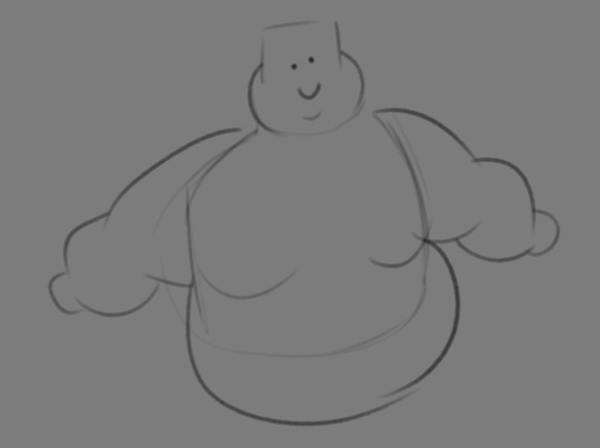
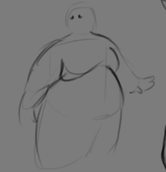
If you don't mind my asking, how do you go about drawing fat? :3
JUST THE EXCUSE I WAS LOOKING FOR
So, for me personally, a lot of the time when I draw fat characters, I'm not looking to specifically capture the specifics of fat as much as the feel of fat. Bulkier, rounder shapes in the right places that has a feeling of weight to em! A lot of that is intuition and simplification at this point, but it all works on the same frame as just any ol' person. Like take this-

For example. This is the basis for any body shape, not just the more average one that it may imply. Sure- it can be that average body shape:
But also a fat one too!

And a big part of that is knowing where fat usually tends to bunch up on the body, so lets take a look piece by piece! (Please keep in mind this is very simplified, and not completely precise in some parts)

THE FACE: Cheeks (in purple) and especially the chin (in light blue) are the places where a lot of the fat is gonna wanna gather and round out on your face! Additionally, theres a small pocket of fat beneath the cranium on the backside of your head. It's small, but it is there. I believe fat can build up elsewhere like the bridge of your nose and forehead, but generally speaking, you're gonna have a whole lot more buildup in other places first.
THE TORSO: A lot of the fat built up on the torso is gonna be sent to your tummy. More cushioning for vital organs, mostly out of the way, it just makes sense. Additionally, the lower backs fat builds up and joins with a patch of fat on your sides that forms what is typically referred to as the love handles to make that double belly look. Along with this, the immediate next target for the torso is the breasts, followed by the upper back!
THE ARMS: For this limb, a VERY notable amount of the fat present builds up on the tricep and bicep areas, lessening once you get towards the flexor and extensor areas. You can almost think of the arm as a sort of triangular shape, wide side starting from the shoulder and tapering towards the hand, which itself mostly builds up fat around the back of the hand and the fingers. The shoulders themselves don't build up too much fat unless you got a lot
THE LEGS: And finally, you can think of the legs having pretty similar curves to what you're probably already used to thinking. The front of the thighs getting a big buildup, along with the back of the calves, the other parts being flatter in turn. As far as the feet go- similarly to the hands, the top of the feet, along with the heels get most of the buildup, as fat on your soles would impede mobility. The glute, hip and crotch area will also especially build up fat, lending to the same triangular shape that you can see in the arm!
A big thing to note with fat is that it tends to taper off towards joints. Your knees, elbows, shoulders, hips, and all the other places are gonna have significantly less fat so that you remain mobile and flexible, as that's important!
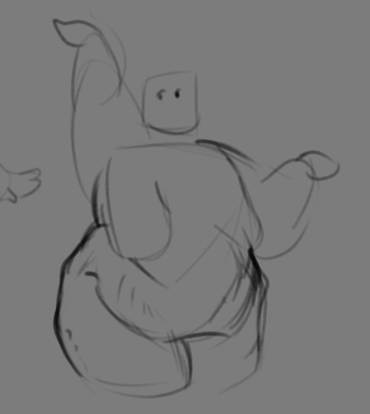
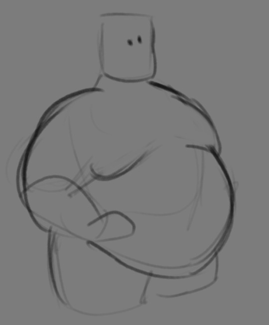
Now that we have an idea of where fat builds up on the body, you might have something that looks kinda like this
Which yes, does demonstrate a solid understanding of the places fat builds up, lacks the weight you're probably trying to convey, which brings us to out next point! Fat is well... heavy! Gravity is what gives fat much of it's shape, especially as you tread towards larger and larger bodies.
This is demonstrated really well on the arms especially-


Those big ol' bits of fat'll really start to sag when left hanging, and they will squish like hell if they run into something. I like to think of these bits of fat as big ol' ovals that squash and stretch depending on if there's an obstacle in their way or not


These are the important shapes to remember when it comes to the weightiness of fat! If you take all of this into mind, you should be getting something a lot closer to that shape you've been after!

Oh, and always remember that fat bodies come in all variety of shapes and sizes! Play around with a whole lot, and seek out all the resources you can! it'll really lend to your knowledge when it comes to this kinda stuff!
And as I always recommend when it comes to learning art- look at what your favorite artists do with fat bodies. See what you really like about the fat bodies they draw and try to replicate it in your own work, I promise you it's one of the most helpful things ever.
This is like the most basic of basics when it comes to drawing fat bodies though. If there's any additional thing about fat bodies, or maybe you want clarification on something, don't be afraid to ask! If there's enough to cover, I'll make an addition to this post!
#hat answers#my art#design talk#tutorials#yeah im unfortunately pretty tired so this gets a liiiitle rambly at the end but i think this covers like the basic basics#i hope this was helpful at all#and again dont be afraid to ask questions and stuff#if theres enough traction/questions on this i will most definitely try to clear up as much as i can in an addition to the post#whoops this took a bit!
3K notes
·
View notes
Note
I’m super curious about Atom!!!! Firstly, they’re so cute :(((( I would be so nice to them right off the bat. I could match that energy (maybe not the…liquefying people part, but I can Definitely meet the upbeat “get to know you” energy!!!!)
But I’m also curious about their little “worm transform-y” ability. There are a TON of implications to what they said about it, and I’m very interested to know which of those implications are true
So maybe I’m taking Atom too literally, but I’m pretty sure at one point they said “I can make your air.” Which, they WOULD need to make MC air, if they were to keep you in space forever. Air is limited.
But you can’t breathe in worms. So that means Atom’s worm (body?) transformation legitimately BECOMES whatever they will it to. Not just imitates. That dog food wasn’t worms, it was dog food. And the air isn’t worms, it’s air!!
And then that stretches into other questions. Could Atom take any form they wish? What would happen if they transformed all their worms? Can they feel when their worms (body??) are being transformed?
You don’t have to answer that slew of questions at the end lmao—maybe I’m reading too much into it. But!! I LOVE Atom and all the implications that their existence holds. I had a lot of fun playing the game :DD
Aaa I'm really glad you like Atom as much as you do!! I don't know if it's just new blorbo energy but I get excited to talk about them, especially in detail like this haha! I'll try to explain below the cut about their ability to create things (tw// it's long!!) but to keep it short, you're actually correct!
TLDR: Atom reconstructs their worms into different forms of matter (whether solid/liquid/gas) to produce whatever you need to survive. Because, uh,,, science. <3
Here's the lengthy explanation of what Atom can do. I'm not smart enough to explain it but I'm stealing this from another website:
Transmutation or nuclear transmutation is a process that involves a change in the nucleus of an atom. When the number of protons in the nucleus of an atom changes, the identity of that atom changes as it is turned into another element or isotope.[1] This transmutation process can be either natural or artificial.
Simplifying it further for my character, when Atom talks about being better than a planet, they kinda are! They can make anything as long as they know what it is (I've yet to come up with 'how' they discover new elements,,, it's implied in-game but I wanna flesh it out more; ask me again later keheh), and the worms that make them up is an unlimited resource/material for those exact transmutations. And if something turns into waste, like the rejected dog food, they just crunch them up to be re-used all over again.
Remember what they said about being your 'angel'? Not to be too on the nose but in a way they turned the Bidadari into your own personal terrarium, with it being the ecosystem keeping you alive in space. Which, in my personal opinion, makes the ending much more terrifying.
Here's a lightning round to answer your questions because I don't know when I'll get these kinds of questions again!!
Could Atom take any form they wish?
Nope! They're still just worms! When they 'make' something it's no longer a part of them.
2. What would happen if they transformed all their worms?
Highly unlikely to happen, but let's say for experimentation's sake Atom is forced to use up all their worms and the end result is separated from it so they can't absorb it back into themselves like the dog food. It has to leave one single organism behind, but it can't really do anything. That single organism eventually will multiply all the way back to its former (mass wriggling) glory.
3. Can they feel when their worms (body??) are being transformed?
Nope! They don't really feel anything, at the most they feel pressure and temperature changes but that's it.
THANK YOU FOR COMING TO MY TEDTALK HAVE A NICE DAY! HERE'S YOUR REWARD <3

#astronought vn#atom ask#jar of fireflies#there's probably gonna be some flaws with my explanation but with a new character retcons are inevitable oop#i hope i explained this right#i feel so scatterbrained lately aaa#too many games.... is this why devs split their games into individual blogs#thatd be a nightmare for me though id have to jump across thREE if i do it that way#oh well this is my burden to bear!!! im being so brave about it!!! /lh
282 notes
·
View notes
Text
Literary Greebling
Greebling is this thing from model-making where a flat expanse looks boring and unrealistic, so you add on some little bits and bobs (greebles) to break up the surface and make it seem "more".
I think this is a great concept to port over to writing.
For characters: You've got your backstory, your motivation, your emotional beats, all that stuff, right? Add in some quirks, some contradictions, some small, seemingly irrelevant details that make them feel textured and authentic. They don't drive the plot, they're probably not relevant to the story, they're not necessarily going to come up again, but they break up the surface and make everything feel like it exists at a higher resolution.
A character makes sure not to step on the cracks in the sidewalk, not out of superstition, but because he's just been doing it for a long time and likes being on a streak. A character carries around coins from different countries, fiddling with them while waiting in line. A character always knocks on doors to the tune of "shave and a haircut". Someone hums a song from a movie soundtrack.
For settings: It's pretty common for us to build up a setting in simplified terms, to have everything be a result of one thing or another, huge clashing forces. Real settings aren't like that, or aren't wholly like that. A city can have a unified architecture while also having a couple buildings that come from different traditions. A kingdom can have a tiny semi-autonomous zone inside it. You have, in theory, three branches of government, but in practice, there are edge cases where they're putting on each other's hats, and there are independent agencies which only answer to one of the three branches in a limited way, and you don't need too many of these things to have it feel rich and complex.
For magic systems: There's a beginner magic system where four to six elements are all perfectly set into a lattice, balanced against each other, perfectly mirroring each other. This works for certain applications, but I will submit to you that this is much better with greebles. You can have your lattice and your system of elemental weaknesses, but they need the little differences, the things that break up the flat expanse. Give your water magic a connection to the moon, let your fire magic affect rust, have it all have little knots and whorls and complications when you look closer.
Again, the point isn't that these things are plot relevant, they don't have to be, and maybe it's better if they're not. But the little non-conforming details help sell whatever you're trying to do.
288 notes
·
View notes
Text
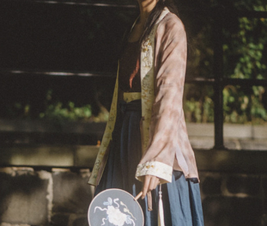
Hanfu in Components: General Garment Terms (pt1)
navigation: hanfu in components 1 2 3.1 3.2 4 5 ...
Attempting to sort of reboot the hanfu in components thing I wrote for Newhanfu a while back in a better organized way, so I guess this is a series? Purpose is to provide a more systematic way for people to learn about hanfu terminology, which is extremely complicated and constantly changing, but has mostly settled into some agreed upon definitions among the hanfu community.
Note: This is probably going to make the most sense for people who have already been interested in hanfu for a little while but don't know the technical terms for what they're seeing in the pretty pictures. If you're just starting out this might be a little overwhelming, especially since hanfu vernacular has variations based on what time period you're talking about and stuff like that! But of course feel free to look at it anyway :>
Here are terms that you'll see a lot when referring to a general type of garment. These are the equivalents to 'shirt,' 'skirt,' 'pants' etc. in English, where it's telling you broadly what kind of a garment it is, but not really any details about its style or what it might look like. I will structure my definition headers as (traditional character)/(simplified character)/(pinyin)(tone) going forward. Also using images from Cloud9 as much as I can bc I don't wanna deal with citing image sources lol, shoutout to our models
WORDS ACTUALLY JUST MEANING "CLOTHING"
衣/衣/yi1 - General term for clothing. More often than not refers to a top/shirt or a robe, but can refer to clothing in general as well, especially in modern usage. The yi radical looks like this: "衤" Basically if a character has that symbol on the left, it’s probably related to clothing in some way.
服/服/fu2 - Also a general term for clothing. Slightly more formal/technical in tone imo. Usually combined with 衣 for 衣服 (more casual everyday way of saying clothing) or with 裝 for 服裝 (more formal way of saying clothing). Think the difference in tone between ‘clothes’ vs. ‘attire.’
TOPS (the clothing kind) & ROBES


衫/衫/shan1 - Shirt, unlined. Refers to a shirt/blouse in modern usage. Within hanfu, refers to a top (usually short, but sometimes long) that is unlined.


襖/袄/ao3 - Jacket/lined top. Refers to a parka-style jacket in modern usage (棉襖). Within hanfu, refers to a top that is lined, typically on the thicker side. Can be long or short. More often than not it is worn as an outer layer.
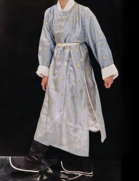
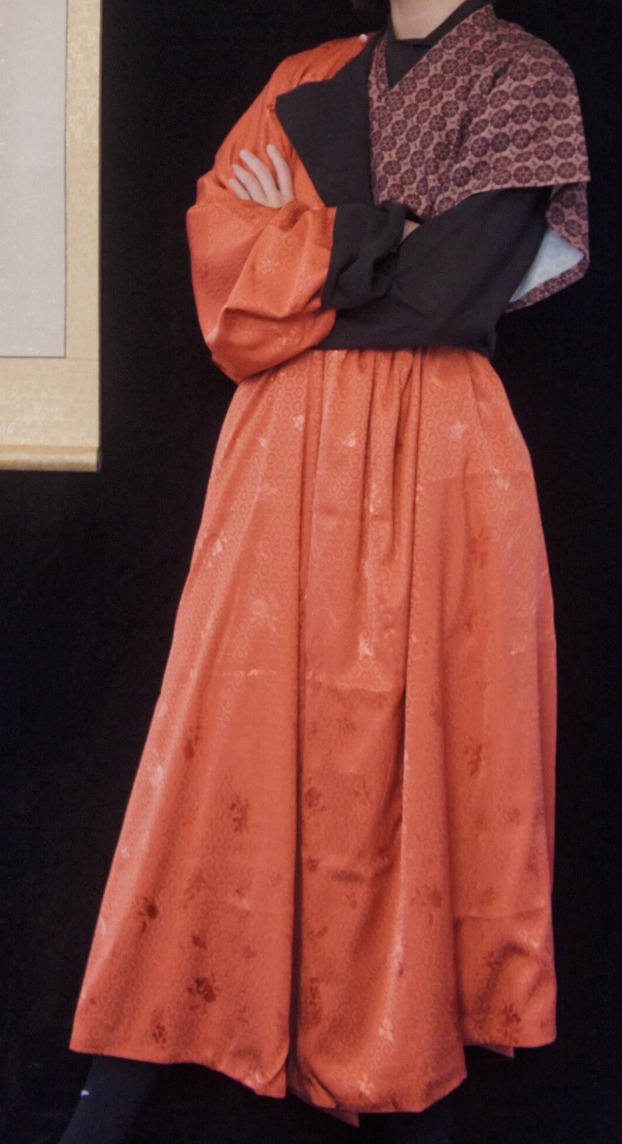
袍/袍/pao2 - Robe. Refers to a top whose length extends past the knee. Usually robes are lined, but that’s not a requirement to be considered a robe. There is overlap with 衫/襖; aka a garment can be both a 袍 and a 衫 (long unlined robe) or a 袍 and an 襖 (lined robe), but not an 襖 and a 衫 (somehow lined and unlined at the same time, disobeys the laws of physics and logic, possibly quantum entity).

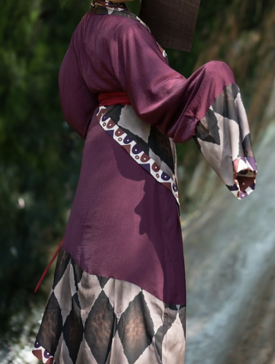
深衣/深衣/shen1 yi1 - Literally ’deep clothing,’ also can be translated as robe, but more specific in that shenyi will typically be made up of a ‘top part’ and a ‘skirt part’ that are sewn together at the waist, rather than just being a really long top.
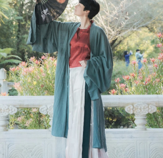
褙子/褙子/bei4 zi0 - Outer layer. Harder to define because it can refer to very different things depending on what dynasty you’re looking at. General rule though, it’s almost always an outer layer on a woman’s outfit.
BOTTOMS (the clothing kind)


裙/裙/qun2 - Skirt. Generally any garment that wraps around a person’s torso and covers the legs.


褲/裤/ku4 - Pants/trousers. Similar to skirt except there are dedicated channels for each leg, aka there’s some separation happening at the crotch. Can be open or closed crotch, almost always worn under a skirt or robe.
Obviously there's a lot of other terms too but I'll get to them with time! Still a full time student, still learning about hanfu, blah blah blah. But yeah especially the more specific terms I will probably cover in a later post. Hope this is interesting enough for now :>
navigation: hanfu in components 1 2 3.1 3.2 4 5 ...
#hanfu#hanfu fashion#hanfu photoshoot#hanyuansu#chinese hanfu#chinese history#cloud9hanfu#chinese fashion#cloud9 hanfu#九雲閣#hanfu in components
351 notes
·
View notes
Text
How Minho is hinted to be endgame since XO Kitty S1?
(And they didn't randomly change the direction of S2 or suddenly made Minho important in S2)
Because since the very beginning, it is emphasized that Kitty has 3 main love interests, Dae, Yuri, and Minho, she will end up with one of them. XO Kitty is not very very obvious from the start like TATBILB and not back to back between brothers like TSITP.
Disclaimer: I have a job, I'm writing this on the weekend, please
1. S1 episode 1 Kitty-Minho-Yuri-Dae Relay
Series, or at least kdramas, always introduce the characters that will be the focus of the season in the beginning of the 1st ep of S1.
In 1x01 first 15 minutes (half the ep duration)
-Kitty is re-introduced: her current situation, her background aka family, her next goal, how to get to her goal, her first step to reach the goal which is arriving in Korea and then KISS
-Yuri is introduced: her current situation, daughter of a rich family, influencer, famous, potential to be a close person to Kitty cus she drove Kitty to KISS
-Dae is introduced (properly for the first time): his current situation, smart student, scholarship, not from a rich family, still in love with Kitty
Then the 2nd half of the first episodes, minute 15 until 28, Kitty and Minho and Q introduce themselves to each other, then Kitty meet Dae and Yuri again.
But the ODD ONE out of this formula, the first character Kitty met was not Dae nor Yuri, but Minho. He bumped into her at the airport and then she bumped into Minho again at the party. The full introductions that we got were Kitty, then Yuri, then Dae, no Minho and yet Minho is the first person Kitty met and they bumped to eo TWICE, at the airport and then at the party. So in this case, Minho's presence is also very important to the story, foreshadowing that with the focus being these 3 characters: Kitty, Yuri, Dae first, Minho will eventually "bump" his way in to the story, he is not just Dae's friend or side character bcs he had the FIRST INTERACTION WITH KITTY.
and this whole relay in S1E1 parallels the airport relay in S1E10.
2. S1 episode 10 Kitty-Dae-Yuri-Minho Relay
In the last episode of season, we know:
1. Kitty is over Dae, but Dae still has feelings for her
2. Kitty likes Yuri who is in a relationship with Juliana
3. Minho likes Kitty
So this brings us to the obvious airport relay, first Dae runs to the airport to confess to Kitty that he still has feelings for her but when Kitty meets him, she turned him down without him confessing and they officially break up. But they both said they are eo's first love, so they still care for eo.
Then Kitty turns back and meets Yuri, she wants to confess to Yuri but they get interrupted bcs Yuri is waiting for Juliana. Yuri and Juliana reunite and Kitty walk in to the boarding gate. Yuri called her mom to convince her not to expel Kitty, showing that Yuri cares a lot about Kitty (but she ofc loves Juliana very much yes).
Then Kitty arrives at her seat, sitting down while reading her mom letters and seeing the name "Simon" but then suddenly someone beside her nudged and it's Minho. Unexpected for both Kitty and the audience. They both talk and laugh showing their good relationship, a development from their 1st meeting at the airport. This scene is pretty long and has the longest duration compared to Kitty-Dae and Kitty-Yuri at the airport earlier. Then Minho confessed his love to Kitty. Kitty was shocked and the season ends.
This last ep relay scene is actually enough as proof that Minho will be endgame and how XO Kitty will do their love triangle/hexagon/rhombus or whatever.
XO Kitty is not the usual balanced love triangle but instead, the main character (Kitty) will experience a "relay" in her love life with the 3 main love interests, to simplify it they basically gonna take turns. First love is Dae, second love is Yuri, third love is Minho.
And this concept was actually mentioned in one of the episodes in season 1 by well.. Minho himself.
3. S1 Ep 9 a reason, a season, or a lifetime

Second to last episode. Before we have that episode 10 airport relay. Opening scene.
Minho:
"A reason, a season, or a lifetime. Every relationship fits into one of those categories. I read this in a magazine. The point is, Madison and I are over. And looking back, I believe I was with her for a reason. No, she showed me I was ready for something real."
This is one of the biggest foreshadowing ever in new TV era like... ok when people watched this scene the first time they prob didn't think too deep about it, including me, because the convo is random and not that necessary? Minho can just talk about him and Madison being over without throwing a relationship quote. BUT THAT IS THE POINT. The point is that quote is random yet it was the opening scene for Ep 9. If we compare it to other opening scenes in the 1st season, the opening scenes always indicate something important for the characters' story. And most opening scenes in Season 1 are about Kitty, Yuri, and Dae then in 2nd half Minho start to show up in opening scenes.
Ep 5 opening: Kitty Dae start officially become friends and roommates
Ep 6 opening: Minho Kitty (Minho's dream)
Ep 7 opening: Kitty Yuri (Kitty's dream)
Ep 8 opening: Kitty Dae start dating
Ep 9 opening: Minho's quote
Ep 10 opening: Dae cornering Minho about Kitty
Minho said being with Madison made him realize he was ready to commit into a relationship not just hook ups or one night stand, he was serious with Stella despite her being a rebound, but sadly his first committed relationship was "fake".
While with Dae and Yuri, Kitty fell in love with Dae first and dated for more than 4 years, a season, then she liked Yuri and discovered more about her being bi, a reason.
Minho's a reason is Madison, season is Stella, lifetime is Kitty
While Kitty's season is Dae, Yuri is reason, lifetime is Minho
All left is a lifetime for both Minho and Kitty.
So Minho's quote is definitely an important foreshadowing. And Ep 9 really shows how Minho is over with Madison, but actually he went through a failed rebound, and still cares so much for Kitty.
4. The whole episode 9 of Season 1: Kitty Dae, Kitty Yuri, Kitty Minho altogether
-This ep is meant to emphasized how these 3 are Kitty's main love interests like Kitty keep having moments with them in this ep but there is this specific scene:

Foreshadowing can be through many things, characters' lines or actions are two of them, but then it's better if cinematography supports it like in this scene where Minho is standing up alone facing Kitty sitting with Yuri and Dae while calling out Yuri and Dae & defending Kitty.
It's in 1x09 where Kitty already likes Yuri while still forcing herself to date Dae and Dae still loves Kitty, means these 3 are in a love triangle rn and Yuri sitting on the floor in between Kitty and Dae, makes their sitting formation like a triangle. In 1x09 Minho alr broke up with Madison and still very much in love with Kitty, meaning we now know he IS one of Kitty's 3 main love interests.
And he is standing up while Kitty is sitting down with Yuri and Dae as a foreshadowing that Minho will have the "upper hand" after S1. And ofc he will get the "upper hand" by treating Kitty better (he defended her in this scene which is right).
"I wouldn't do that to a friend or someone I care about."
And in S2 Minho still cares so much for Kitty and also 2 of them become closer as friends.
5. More about Dae Yuri Minho as the 3 main love interests and their "relay" with Kitty or "switch up"
First half of season 1 Ep 1-5: Kitty loves Dae but Dae is fake dating Yuri and
Second half of season 1:
Ep 6 (the middle ep of S1, the first switch up)
1. Minho dreams about Kitty
2. Minho realized he fell in love with Kitty at the party (Minho switch up from not liking Kitty to loving her)
3. Kitty fell in love with Yuri at the party (Kitty switch up from Dae)
And that's why in S2 Ep 5 (the middle ep of the season) there's another switch up from Yuri-Minho to just Minho
Part 1 (Dae):
S1 Ep 1-5: Kitty liking Dae
S1 Ep 6-9: She still dated Dae while being denial about Yuri
S1 Ep 10: Kitty tells Dae the truth about her feelings for Yuri
Part 2 (Yuri):
S1 Ep 6-10: (switch up) Kitty start liking Yuri
S2 Ep 1-4: Kitty still likes Yuri
S2 Ep 5-6: Kitty and Yuri trying to fix their friendship
Part 3 (Minho):
S2 Ep 5-6: (switch up) Everyone ignoring Kitty and she spends time with Minho only, rain scene
S2 Ep 7-8: Kitty realized her feelings for Minho
6. The Families of the 3 Main Love Interests
Many people complained 💀 "why S2 is about minho's family and everyone else's families suddenly don't have problems"
Let me break it down for you sweetheart... the keyword is "family home"
Season 1:
Focus: Kitty, Yuri, Dae families + Minho's mom cameo
-Kitty: We saw her parents, Dan and Trina, opening scene of Ep 1 is at TATBILB house
-Yuri: We saw Yuri's mom right away on Ep 1 (Jina), then her dad (Sungjin Han) in Ep 2 and then her house, and throughout season 1 there are scenes at her house
-Dae: We saw Dae's father (Mr. Kim) on Ep 1 bcs well he is Yuri's driver and he works for Yuri's father, later on we saw Dae's little sister (Bora) and just like Yuri, there are scenes at his house too
-Minho: There are 2 scenes of him face timing his mother (Dami) and we saw Minho's mom face, and there is a scene where Minho telling specifically about her mother being an actress, there are scenes of Minho telling details about his family not just "my parents are divorced"
Juliana: mention of her parents, no faces
Q: told about his conservative family background, no faces of his fam, no names
Florian: told about his family problem which is the divorce of his parents, no faces of his fam, no names
Season 2:
Focus: Kitty, Minho families + a few scenes of Dae's father, mentions of Jina
Kitty: Jiwon, her great aunt Soonja, Margot, and Peter appearances throughout the season
Minho: Minho's dad (Young Moon) appearance from S2 Ep 1, one episode of the characters at Minho's dad ski cabin, one episode of the characters at Minho's dad house, Minho's step brother (Joonho), mention of his step sisters (Bianca, Soojin)
Dae: a few scenes with Mr. Kim as Yuri's driver then the accident/hospital scene, Bora cameo
Yuri: mention of Jina (i feel like Jina actress was planned to make a cameo but maybe scheduling problem)
Juliana: mention of her parents
Q: mention of his family being doctors who are strict, no names, no face
Jin: mention of his dad being athlete too, he got pressured from his dad in being athlete, no face, no names
Stella: mention of her parents wanting her to come back to Ohio, no face, no names
Praveena: mention of her parents and their job
Then in S2 last ep we know that Han family is going through lawsuit and Mr. Kim is affected positively by the lawsuit. Then Kitty is joining Minho's family summer tour.
So... Kitty, Yuri, Dae families are the focus of Season 1 and Kitty and Minho's families are the focus of Season 2. With Kitty's 3 main love interests: Dae, Yuri, Minho families are being introduced in details with their names and faces and background and specific jobs since SEASON 1. And of course in S1 we got Kitty, Yuri, and Dae houses and S2 Minho house and Kitty's family's house in Korea :)
7. The Family Plot
Season 1:
Fake dating between Yuri and Dae are related to their families, Yuri's Dad saving his face by using Dae and Dae is trying to help his family by paying tuition on his own (and his job is fake dating Yuri) and also so he wants to be a good son and brother.
Season 2:
Minho's father Young Moon is helping the school by being the new donor and opening art classes for the students, hold a kpop competition at the end of the season.
Kitty helping Dae, Yuri, and Minho with their families:
Dae, Minho, and Yuri all 3 have their family stuffs they can relate with Kitty's....
-Dae lost her mother like Kitty, Kitty gave him her mom's necklace permanently
-Yuri knew nothing about her mother like Kitty, together they found out about their mothers' friendship and Kitty helped Yuri reconcile with her mother and find her step brother
-Minho felt rejected by his family like Kitty feels rejected by her great aunt and Jiwon at first but then Minho helps Kitty and Kitty also helps Minho reconnect with his family
All 4 characters' (Kitty, Minho, Yuri, Dae) families are important to the story
8. Fate vs Minho-Kitty natural development
Kitty always talk about love as this big grand thing, sparks, MEANT TO BE, FATE.
With Dae and Yuri "fate" keep being mentioned, how she met Dae during her first Seoul trip and turns out he goes to her mom's school, how Yuri's mom is Kitty's mom best friends.
They made Minho and his family don't have any direct connection to Kitty's family. Minho and Kitty can relate to each other without having direct past connection. In Season 2, Minho understands Kitty's feeling of being rejected by her family because he felt that throughout his life. That's also one of the reasons why he keeps helping Kitty especially in the market scene. And at the end Kitty also help Minho reconcile with his dad and brother.
When Kitty met Minho, no fate no sparks. No direct family relation. They don’t have a crazy connection that forces them together because it happened naturally just based on their time together and their own values. And they both can relate to each other's family issues which bring them closer.
Minho and Kitty happen naturally and that is the whole point. He's the only one who doesn't have a specific perception of her. They met, they misjudged each other, they disliked each other, they got closer and knew more about each other through daily lives, they became friends, they finally understand each other, they fell in love.
No strings of fate, just their choices leading them to where they are now.
Minho and Kitty are breaking the kdrama's past connection trope 🙂↕️🙂↕️🙂↕️
9. Minho for Kitty Moments
Minho is already written as a character who helps, saves, and do sacrifices for Kitty since season 1.
See this list I made:

-He also once again kept defending Kitty when he found out how Dae and Yuri fake dated and lied the whole time in S1.

-Minho will always be in love with Kitty. He had two rebounds (Madison and Stella) and at the end, he realized he will never be over Kitty.
-Minho's long plane confession scene with the iconic line "a little bit or a lot" which Kitty used as her line when she realized her feelings for Minho.
-Minho always hosting events in both seasons, 1st season is his party and 2nd season is the ski trip so he has always been an impactful character since S1. And both times Kitty kinda "ruined" his events and yet he still cares so much about her.

10. Mooncovey Direct Parallels with TATBILB in SEASON 1
-With Covinsky
Minho calling Kitty "Covey" like Peter calling LJ "Covey"

The Kitchen Scene

The Preference

-With Eve & Dan
The first ever parallel was in fact in S1, Kitty-Minho Chuseok and Eve Song-Daniel Covey March Thanksgiving.
Minho fell in love on Chuseok (Korean Thanksgiving, emphasized by Kitty too on 1x05) just like Dr. Covey fell in love with Kitty's Mom on Thanksgiving.
1x05 XO Kitty is lit the episode that changed everything about mooncovey and it's a whole parallel to Kitty's parents love story, Minho made the homemade food and Kitty brought the odd one, mashed potato, her canned green beans.

Then the parallels continue until S2
11. CHUSEOK EPISODE
Other than the crazy parallels in 1x05 chuseok episode. Audience who often watch kdrama must have known how impactful is Chuseok as a Korean holiday. And they gave this whole important event episode, 85% of it to mooncovey. Like..... I don't even have to explain. They literally gave the whole Chuseok to mooncovey??? And people watched this ep thinking oh they prob just gonna be closer as friends at the end??? Mind you there is no episode special whether in S1 or S2 where 85% is Kitty-Yuri or 85% Kitty-Dae like they will always be mixes with other Kitty pairings. But this Chuseok ep is lit here you go Minho with Kitty and Yuri with Dae, done. And even in this ep Dae said Kitty hasn't contacted him at all during Chuseok, like damn girl enjoying time with Minho much??
12. Lastly, Kitty-Minho having their own theme, or The Mooncovey Leitmotif

All these songs have the same leitmotif in it and they have been played for mooncovey scenes since S1 until S2
(Kitty-Dae's leitmotif only in S1 is sad/bittersweet, Kitty-Yuri don't have any)
#xokitty#xo kitty#xo kitty s2#xokittys2#xokitty2#xo kitty season 2#kitty song covey#minho#minho moon#moon minho#katherine song covey#anna cathcart#sang heon lee#lee sangheon#to all the boys i've loved before#jenny han#mooncovey#coveymoon#kinho#kitty minho#kitty x minho#drama#western series#netflix#Spotify
183 notes
·
View notes
Text
S2’s Mistreatment of Zaun’s Independence
Season 2 was a mess; rushed, badly paced, weakly written. A show once rich with discussions of systematic oppression, brutality, and the dangers of scientific exploration felt reduced to a good vs. evil backdoor pilot (s). Breathtakingly animated yes, and there were still moments I enjoyed and forgave—but we can enjoy groundbreaking artistry while also being critical of its flaws, especially when those flaws include social issues.
Paint the Town Blue: Enforcer Violence
Season 2 we’re meant to feel bittersweet if a little triumphant when Vi dons the uniform of an Enforcer. She remains complacent as Cait uses weapons of torture on the people of the Undercity. Vi sheds her uniform not because of any ethical disagreement over the actions of oppressors but because of the desolation of a love affair. An identity shift so vast it left her feeling morally anemic.
In the final act, much like Vi, Zaunites button their new Enforcer uniforms for “the greater good”. The tone of the hand full of Zaunites crossing the bridge to join the fight against Noxus was one of heroism, of martyrdom.
Season 1 gifted us a nuanced theme of systematic oppression and cycles of brutality among enforcers. This is an unsubtle mirror of our world’s history of police violence, and as an American seeing the topic explored so vividly was a gut punch in all the right ways. Season 2 left me puzzled….did we just want to see Vi in her predestined fate as an Enforcer? Yikes!
Simplifying Silco
As much as I could gladly spend an evening with the pretty flashback, AU, and dream images of Silco, there is no escaping the mischaracterization and simplification of his character, specially as a passionate revolutionary.
Finding Vander’s letter would have made no difference. Just as an apology from Piltover would have never been enough to warrant forgiveness. He and Zaun weave together so easily in my mind. It’s easier to imagine them defanged, a “good guy” left heartbroken who just needed to let it go or else become a drug invested wasteland.
Its harder to reckon with a the poisoned man, the betrayed man, the man of rebellion and desperation. Season 1, he was a man of moral grays, pride, textured by his willingness for violence and extremes to achieve freedom for Zaun. A man who, beyond his own tragedies, knew the complexity of blame.
Violence is a cycle…yes, but by simplifying cycles of violence and placing sole blame to those unable to walk away is reckless. Cycles of violence are often birthed from subjugation, and they fester and grow as persecutors convince victims that they are the ones to blame.

The Nation of Zaun
Of all its failures, what I find the most difficult to swallow is the mistreatment of Zaun’s *not* independence and the message of forgiveness above all else.
Sevika, Councilor Sevika, is voiceless in the last Act. Not simply in her lack of lines, but in the complete mishandling of what she stands for, who she stands for. Zaun is left with one, rather reluctant and lonely Councilor at a table that was never built for her. She will remain voiceless, drowned out by the voices of those who see her fighting against Ambessa as a testament to her being “one of the good ones” as “forgiving”.
We are not meant to forgive our oppressors. Stuck beneath the boot we do not thank them for allowing us a gasp of air. Such a message in widely distributed media in a time when fascism has its head raised high, is dangerous. Yes, it’s a show based on League of Legends, but it’s also art. Art is transcendent, it reflects our world and our truths. It has power.
Instead of using this power, Arcane Season 2 had a sincere disinterest in revolution. Nuance cast to the wind to be replaced with elementary concepts of good victorious. A watered-down hoo-rah.
My hope is that this fumbling will start more conversations about the importance of thoughtful storytelling in our modern media. Continue to have those hard discussions.
200 notes
·
View notes
Note
Hello! I really love your art! I was wondering if you have any tips on how to capture the person the facial features of the person you are drawing so well?(!) Your Billy and Stu are is amazing! Although it is in your style (which I absolutely adore) you still keep their likeness/resemblance which is very hard for me to do when trying to draw them in my style! (Sorry if the wording is confusing, any tips?) Thanks!
Ah thank you so much and sorry for taking so long to reply, but I needed to figure out how to answer this.
I have put some general tips together, but I need to point out that none of these replace the time investment of learning art. It is merely a suggestion of direction for practice, and I don’t want anyone to feel discouraged if any of these tips don’t immediately make them into a master of arts. Art practice is not easy and it can be frustrating to not be up to your own standards yet, but you will get there! :) In the meantime: be kind to yourself!
That said, let’s get to the tips I can share:
1) Use references!
I usually create a reference sheet for any character I want to draw more often, with their face in lots of different angles. Being able to know how, for example, someone’s nose looks like from the side and from the front can be essential when it comes to recognition. You basically want to be able to create a 3 dimensional object with these references. I tend to need the references less the more I draw the character, after a while i just memorise their key aspects for drawing them from most angles :)
2) Figure out key-features of a person
Try to figure out how to simplify someone in a drawing. What are their most striking features that NEED to be included? Sometimes it helps when you try to think of what features a caricaturist would accentuate in a caricature of them. Here you have some features that I personally try to focus on when I draw billy:

As mentioned in the bottom right corner, the placement of these key-features is also important. Try to figure out where things are placed in relation to other facial features and mind their size as well. this becomes easier the more you do it!
If you struggle to find out what features are important you can also look up other fan-artists stylised work you like and try to see what they chose to highlight :)
3) Do studies!

4) focus on values and contrast before considering color
doing a study without a sketch by blocking in shapes can help you figure out the planes of a characters face
as you can see here, stu’s eyebrows kind of blend in with the shadows of his brow bone, which is why I usually draw his eyebrows pretty light/in a color that doesn’t have high contrast with the skin tone, it makes him instantly more recognisable in my opinion
5) Draw (a lot)
I have been drawing basically every day since I was a child, but my ability to actually draw someone recognisable has only developed in the recent years. And I don’t think I’m done with learning. In the undying words of Bob Ross: “Talent is a pursued interest. In other words, anything that you’re willing to practice, you can do”.
I hope my tips can help a bit and and perhaps lend you some motivation for the never ending practice that every artist has to face :’) <3
#ask#art tips#i guess lol#my teaching style is a bit all over the place lol. i should work on that… i do want to become a teacher after all#using billy and stu as examples is vey funny to me btw#i feel like both are a bit harder to stylise than other people but both for different reasons
262 notes
·
View notes
Text
The thing is that the dynamic between John and James does sound genuinely fascinating from the glimpses we get of it.
John says that James was always better at (social) stuff. James did go out and become a police officer, marry Lucy, and just generally have more of a "normal" life, but it's clear that Lucy thinks John and James *aren't* as dissimilar as John believes. James may have been better at masking, but he clearly didn't have an easy ride either. Still, John is envious of his brother and feels like James is what he *could* have been if he'd been able to venture out into the world. The fact that both brothers had crushes on Lucy only serves to hammer that in.
On the other hand, John is an incredibly successful puzzle solver and spending most of his life in his house in no way detracts from that. The murders he solves appear to be beyond the capabilities of James going by the reactions of everyone else. There's an argument to be had about how much is difference in solving vs being tied in by procedure and social niceties, but either way, John gets accurate results much faster than James ever did. Even if John does very much ignore behavioural factors as he attempts to simplify each crime scene to a "puzzle to be solved".
There's also something to be said for how James' coworkers didn't clock he had been replaced. How none of them even knew he *had* a twin brother. Obviously, there's an element of it being down to the writing in that the game couldn't be given away too quickly, but it does speak of a more distant relationship with his coworkers (perhaps aside from his former partner). And there's the voicemail where James says (though given the context, this can't be taken as 100% true) that he was the one most like their father, in his choice to run away. It was a hint to John, but it only worked as such because they had so little that tied them together in the first place. They grew up together, shared their childhood, and yet, they hadn't spoken in years. Makes me wonder how much of it was neither wanting to be the first to reach out. On John's side that makes total sense (James is the "social successful" one, after all) but James' side is much more a mystery (though, "they're more alike than they seem" comes to mind).
Of course, both of them were impacted by their father leaving as he did. It's spelled out several times that John and James reacted differently. John turning inwards (only pushed further by his bullies and discovering his love of puzzles) whilst James focused outwards (to become more socially successful). But we find that John doesn't want to lose the social aspects once he's found a place for himself. That James is able to go almost entirely non-contact with his family despite knowing the impact his own father had on his family. The one stuck in his house ventures out as the one surrounded by family escapes it all.
All in all, John and James are pretty interesting characters even if we only know one of them secondhand.
*However*, when we actually *see* James in person, my main thought is "that's a second David Mitchell"
#ludwig#ludwig bbc#bbc ludwig#I don't mention anywhere here but gonna forget to say if I don't but hard agree on those who say#the portrayal of john as neurodivergent/possibly autistic is surprisingly nuanced for a show that is just...#cosy murder mystery/comedy#ludwig spoilers
221 notes
·
View notes