#and sometimes I will have a full screen of just ads and not a single pinned post
Explore tagged Tumblr posts
Text
Pinterest is fucking abysmal
#ads left right and fucking center#it's always weird shit#it always pauses my music#and sometimes I will have a full screen of just ads and not a single pinned post#uuugghh#of course that's not even mentioning the fuckin reposting that makes up 99.9% of the platform#but i figured we all just understood already
3 notes
·
View notes
Text
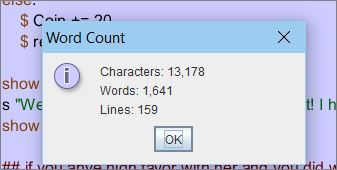
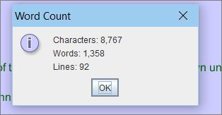


Recent game related things .. hrmm...
#I do like the inconsistency of the first map. that is actually something older but that I re-found and added to my Game Reference stuff#so that when characters reference where they're from I can be accurate. I like that the whole map is kind of shifted up that way. Where the#actual south part doesnt even count as the south since its Too Far and Scary lol. and if you say you're from 'the north' thats basically#like.. one single continent. Though some people do make distinctions like 'north midlands' or etc. still. I like the ways that common#language isn't always precisely accurate like that. and thinking about why a culture would classify things a certain way or etc. etc.#The inventory page is so funny to me because it's literally just the BASe like.. sample layout just to make sure it works properly with 0#actual design into it. just colored rectangles thrown together in MS paint. but what if I like... left it like that.. what if all the other#art in the game and UI is like stylized and fully matching BUT the inventory/journal/etc. screens I just left as plain colored blocks#with random misalignments and black spots and etc gjhbhjj... It looks unfinished in a Funny Contrast way to me.#the wordcounts are just like... my past few days of writing.. I am still not getting 2200 words a day done or whatever I needed. I'm lucky#if it's even half of that .... tee hee.. :3c I do also keep having appointments and other things going on but..grrr...#The full map of the area is probably not necessary but I thought it would be more realisitc if people were able to reference things. Like i#you have people all living in a city area probably at some point someone might mention a neighboring city or some landmark nearby#or etc. so I thought having at least the basic names of what's around for reference would be sensible. A side character mentioning#'oh yeah I don't live here full time I just travel from Marisene sometimes' or whatever makes it seem more like a Real#Fleshed Out Place than people just making vague references like 'the river' or 'i come from a city nearby' or 'i went to a place somewhere#around here' or 'the other city' or etc. lol.. Especially since global cities/global areas are weird as they operate almost like an#independent country within their walls. so it's like a micro country inside of another country usually. just plopped down in some agreed#upon plot of land that won't be too disruptive to the main country around it. That could get very complex depending on the cultural and#political backdrop of where they're placed (though obviously they try to choose the 'easiest' areas possible for it). Asen is a very mild#country without much history of conflict or anything so it's fine. But still interesting that Sifeh and the entire branched out global area#border three other districts of Asen. Which means like 3 times the local representitives you'l have to negotiate with for some major change#or anything. I think one of the 'random characters you can find around the world and have short discussions with just to make the area#feel more populated and real even though theyre not actual important npcs' is going to be a guy who actually serves on the council that#handles running the global areas and he's like.. some perpetually exhausted middle aged elf running around with a clipboard or whatever#ANYWAY...... hrgh... still trying to write when I can....#I WISH so badly that I had the scope for a simple character creation menu and all character interactions would allot for the background#of your player character. And also to have a simple day night cycle where places in the world you explore/people you talk to during the day#have new options or dialogue at night.. BUT alas... I already am so behind on everything as is lol.. aughhh... T o T#As the worlds number one Needless Detail And Complexity Enjoyer i must dilligently prevent myself from adding additional complexity
4 notes
·
View notes
Text
short little kid fic drabble for @mecachrome with single dad!lando and engineer!oscar, love you, hope you enjoy!!!!!
“Hey,” Lando says, when he wanders over to where Oscar’s sitting in front of the screens in the back of the garage. FP2 is officially over now, and he’s finished discussing some last minute set up changes with his mechanics, so he’s free to go now. His race suit has long been unzipped, and is dangling around it waist as he leans over Oscar’s shoulder. “How did it go?”
Evelyn, who is perched on Oscar’s lap and had been staring at the screens intently, perks up and turns around. “Dad! Oscar says you were the fastest, like woosh,” she points her fingers forward, determined expression on her face.
“Did he?” Lando says, making eye contact with Oscar over Evelyn’s head. Oscar smiles innocently at him. Lando had only gotten as high as P3.
“Yeah!” Evelyn continues enthusiastically. “He’s been showing me the telletries.”
Lando raises his eyebrow at Oscar. Oscar shrugs. “She asked,” he says.
Lando eyes him a little skeptically. “My five year old asked you to show her my telemetries,” he states.
Oscar shrugs. “Well technically she asked if you were the fastest ever, and so then obviously I had to prove her you were in fact, the fastest ever.”
“Obviously,” Lando says, trying not to let the smile on his face turn too fond. He had been very nervous, when he first started brining Evelyn to races, last year. But the team had taken to her like a charm, had taken her in as one of their own, and while there was a nanny to make sure she never got in the way of anyone’s work, none of the team minded entertaining her for short bits at a time.
Especially Oscar, the youngest performance engineer in McLaren’s history, always made sure to take time to explain things to Evelyn, whether it was aerodynamics, brake balance, or in this case, telemetry.
“Alright Eve,” Lando says, gesturing to Evelyn. “Time to say goodbye to Oscar, we’re going to get you those chicken nuggets I promised you, yeah?”
Evelyn’s face lights up, but then falls immediately when she glances at Oscar. “But…” She says, frowning. “I want… Can Oscar come?” She asks, face suddenly turning excited again as she turns back to Lando. “Yes! He was going to tell me more about the telletries, he can totally do that over dinner! Dad, please.”
She’s pulling the patented Norris Pleading Eyes, the ones people have told Lando time and time are impossible to say no to. He thought they were exaggerating, until he became a victim of them himself.
But he’s strong. He’s been here before. He can do this. “I don’t know, bug,” he says, ruffling her hair. “I’m sure Oscar has plans.”
Evelyn turns back to Oscar, eyes in full force, adding in a bonus pouty lip. ���I’m free,” Oscar says, immediately, because the man has no fucking backbone, clearly.
And god. The thing is, the thing Lando’s never really told anyone is that Oscar is kind of… Cute. In his own soft, nerdy way. Lando doesn’t like to dwell on it much ecuase it’s not like he’s ever going anywhere with it, not when he has Evelyn and racing and not much time for anything else, but.
But sometimes, in these little unguarded moments, he indulges himself, daydreams about a life together. A life with Oscar. Dreams about sleepy early morning and quiet late nights and all of the joy and laughter in between.
Except that way madness lies. So he tucks it away in a box called ‘Have Yout Lost Your Mind Not In A Million Years’ and moves on.
But now, with the full force of Evelyn’s Norris Pleading Eyes back on him, Oscar’s own nervous, expectant, hesitant expression behind her, he can’t help but fold, nudge the box open just a tiny little bit.
“Yeah, okay,” he says, admits defeat. “Sure. Why not.”
375 notes
·
View notes
Text
4 Minutes and the Cinematography of Nipples
I said before that I thought 4 Minutes was pretty instantaneously the best looking BL on the market for 2024 after one episode. Which, not gonna lie, is a pretty big fucking claim. There’s been a lot of BL that’s come out that’s looked good, and I do think there’s been a steady improvement overall in the market in the last few years. Personally I think Japanese and Korean BL have a stronger production quality over a majority of Thai BL but like, if that’s a hot take I guess I prefer my food spicy.
The point being~ if I’m gonna make such a hyperbolic statement, well I better back it up right?
So I’m gonna break down a few scenes from the first episode, what I liked about them, why they worked for me, and why on a technical level I think 4 Minutes has just got it going on.
For better readability you can also check out this essay here.
Sidenote: my google docs kept trying to autocorrect “Bible” to “the Bible” and idk how to teach google I mean the hot Thai actor and not the book of Jesus.
To start, I’m going to break down this scene featuring Great and his nepo baby cat:
I thought starting with this scene would be good because it’s such a low-key scene and honestly making these simplistic scenes visually interesting is very difficult! But if you have the basics down, the foundations of cinematography and film making, these simpler scenes can be really memorable.
Like yeah we’re all gonna remember this scene because shirtless Bible and oh my god Akira!? - I have only recently learned who Akira is; why is this cat getting a bigger bag than me? - but beyond that, what makes it cool to watch? What makes it interesting? What information does it showcase to the audience?
One thing I added to the video was a grid for the rule of thirds.
Rule of thirds is a shot composition technique applied to both film and photography. It’s the grid you see if you film a homevideo and helps a Director and Cinematographer figure out where to place the subject or subjects of the shot. The idea is the gridlines show you where you “should” place the subject(s) of said shot.
Like everything, the rule of thirds is a guideline in filmmaking, not a hard and fast unbreakable rule. Filmmakers like Wes Anderson like to play more with central composition shots, rather than ROT.
Anyway on to the opening shot, right after our credits and we’re moving into the shot.
To start, the first thing I notice is the scene’s color grading. Color grading in film is the manipulation of raw film footage to create specific color tones throughout a project. Sometimes this grading is more pointed and obvious, think The Matrix, while in other films it’s not as obvious but still very prominent, think Killers of the Flower Moon.
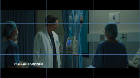
It’s not that the before credits scene looks entirely, jarringly different from the opening scene, but the hospital scene is surrounded by whites and blue tones, it’s darker, and only a single source of light exists. It gives the entire scene a much more frantic, uneasy aesthetic but it’s not so far off from the darker muted tones of the next scene that it feels jarring or out of place.
The second big thing I noticed in the episode is the use of aspect ratio. I’m not 100% sure what aspect ratio the production used exactly, but the use of widescreen as opposed to full screen in my opinion, gives the episode a more cinematic feel to it in comparison to other Thai BLs.
Example, if you look at Century of Love (2024) it appears to be filmed in the standard full screen - which I believe is 16:9? - while 4 Minutes is widescreen (thus the black bars at the top and bottom). Widescreen can give a show a more “movie like” quality to it which is part of the vibes I get from 4 Minutes.

(source)
Onto Great’s actual introduction scene.
We’re not starting the shot with static movement, but with a camera panning right. I’ve talked about camera panning and such in BL before and it’s something I’ve found doesn’t happen as often as it should. Which is a shame! It’s such a simple technique but it adds so much.
Imagine if we entered the frame with a static center shot, and then a cut to Great sleeping and turning off his alarm clock, and then another cut to above the bed. Think about how much more boring that could be visually.
Instead, we enter the scene with movement, panning over and creating some interesting visual framing.
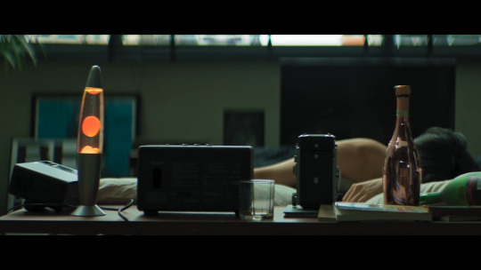
So here’s our opening shot, do you notice anything interesting? To start, what I like about this shot other than the panning movement in, is that we don’t see Great’s face yet. In fact we don’t see his face in full until about 30 seconds into the scene. This builds anticipation, yeah we all know what Bible looks like, but for the audience who doesn’t this helps build anticipation.
Who is this character? What does he look like? What’s his deal?
It also engages the audience more, if you notice part of the composition of the shot has Great in the mid-ground slightly blurred out, while the foreground emphasizes the things on his desk. He’s distant from us, the audience, sleeping off his hangover not yet ready to “join” the world yet.
Here’s another two more things I like about this shot:

Lines.
Using lines and shapes can make a scene more visually interesting and invoke different feelings to the viewer. In this shot, I get a sense of symmetry, the camera panning right, lightly drags across the screen alongside the lines below and above Great, almost creating a frame within a frame effect. As if Great is boxed into a clock in and of itself.
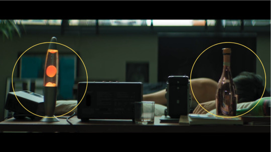
You can also see the use of balance in the scene as well, connecting back to that visual theme of symmetry as well as blocking our view of Great’s face. The lava lamb and champagne bottle are almost the same height, which helps create balance in the shot. The champagne bottle informs us Great has been drinking or does drink since it’s positioned so close to his bed, whilst also continuing to hide his face away from the viewer.
I also like that the lava lamp is a bright spot of color. The tone of the scene is mostly muted greens, and gray, but the bright orange lava lamp and even the pink champagne bottle draw our attention but don’t overwhelm us either. It provides the scene with some warmth but doesn’t offset the overall tone of the color grading.
And then, the last bit of this shot:
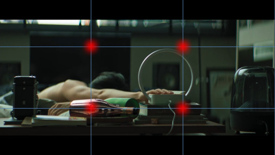
We have Great knocking over the champagne bottom, and turning off his alarm clock. Notice that the alarm clock and the champagne bottle hit those ROT dots almost exactly. There’s also the use of lines by the length of Great’s arm - I just forgot to add a line I’m a failure, a fake, fml - we see him knock over the bottle, and then we follow the line of his arm directly to the alarm clock which is also a shape, a circle.
I like that they used a clock with a specific notable shape, since by the end of this scene the clock is relevant to the story as a whole. Using a shape makes the clock more visually noticeable and memorable to the audience.
So in the next cut we’re above Great - just like Great’s gonna be above Tyme, fuckin hell I’m corny - in a medium-full shot and there’s a couple things I really like here.
I really like the use of lines here with the bed going in one direction but Great’s body going another. It’s disconcerting, and off kilter a bit.
The use of patterns plus the opposing symmetry, whereas in the previous shot the lava lamp and champagne bottle were providing balance, here one side of the bed is patterned, while the other isn’t. This creates a sense of imbalance and makes the shot more visually interesting.
This medium-full shot at a high angle makes Great smaller, and continues to showcase his dishevelment, keeping him distant from the world itself. Also notice the lack of color here as well.
What could this say about Great as a character? Or his story?

So this next cut is the one that actually inspired me to write this essay to begin with and know what I’ma eat some crow here. I originally said it was a great ROT shot but I was wrooooooong. It’s definitely a center composition shot.
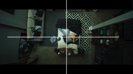
Notice as well, the bed itself is its own shape - rectangle - center in the frame, and yet the shot almost looks unbalanced again because of that singular patterned rug. It’s the only pattern in the entire shot, not even Great’s pillows have noticeable patterns on them.
The above view camera angle in a full shot creates almost an omnipresent feel, as if the audience - or something else? - were looking down upon Great. Whose face we still haven’t seen! It makes him smaller, less powerful, and almost vulnerable. Shots like this are often used in horror films like James Wan’s Malignant (2021) where the horror spector will be looking down above the would-be victim.
Another thing I like about this scene though is we have Great moving. It would be simpler and easier to have his phone just by his alarm clock, or under his pillow, but think about how much more visually interesting it is that he has to move down the bed and reach for his phone. It creates action in an actionless low stakes scene.
And now, 30 whole seconds in and we’ve finally seen Great’s face!
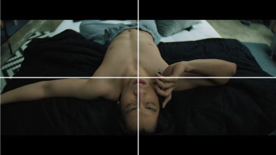
Fun fact, with the ROT grid the gridlines fall right across Bible’s nipples. That’s not a film analysis, just something I noticed entirely intentionally. Thanks Madam Director Ning Bhanbhassa Dhubthien.
The actual shot is in center composition again, as Great rolls over and reveals his face the camera begins to zoom in.
This creates movement in the scene instead of leaving the camera to statically observe it’s now, finally, inviting the audience to meet Great. Pulling us in towards him whereas before we were kept at a distance. Great’s awake and, well as ready to meet the world as somebody with a raging hangover can be.
I also like how Bible is moving constantly in this scene; he rubs his eyes and nose, he twitches his fingers, titles his head back and forth, etc it’s nothing revolutionary but it’s appreciated.
When the scene cuts, we get this shot:

I didn’t put the red dot on his nipple, it just landed there. This is all Madam Director Ning chepie.
But you can see how Great’s body is landing on all those gridlines pretty solidly. Also in the background we see his alarm clock again, a bright blurred circle in the distance. I also like the angle of this shot, as it creates depth in the frame, with Great’s head being in the foreground his lower body in the mid-ground and the background blurred out.
What follows is Akira appearing in frame. Which was really difficult to capture so I don’t have a screenshot. But what I really like is Akira entering the frame out of focus. They could have just cut to Akira, but instead they opted for Akira to enter the frame which is more interesting.
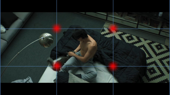
When we do cut, Akira is firmly on one of those dots so we don’t miss them in the frame. I think it’s also interesting that we’ve pulled out again, into a mid-full shot, hanging above Great, and we see that clear symmetry line again between the patterned rug and the regular carpet.
I also really love that when we got to Great sweet-talking Akira and feeding them we’re not just doing a cut, we’re panning downwards which continues to add movement to the scene. And we get that moneyed sponsor shot!

Durex can’t pay for everything okay?
So in the final bit of this scene we get focus on Great, who’s in focus, before he gets up and leaves the frame where the camera then focuses on the clock behind him.
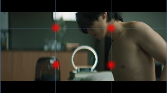
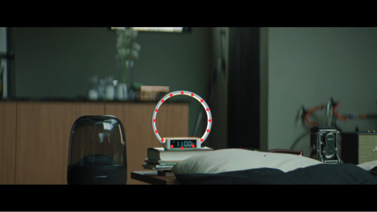
See how in the first frame the background is all blurred out, but once Great walks out of the frame - again, great that he walks out, movement!! Y’all don’t understand how boring 1000 Stars was for me to watch because of the lack of this stuff okay? - and then the focus shifts to the clock. Which is round.
God I know that sounds so dumb, but imagine the clock without that ring light bit on it, it’s just a tiny little rectangle. Not as fun or interesting to look at right? Or as noticeable especially from a distance?
This shift in focus also tells us “this is important” whatever “this” is. The subject of the shot goes from Great to the alarm clock but they are positioned as equally important. We’re meant to pay attention to this seemingly innocuous item, which we learn later in the episode is time. We’re meant to remember and note that time will be important to the story - I know with a title like 4 Minutes you’d fucking hope time would be important but have y’all ever read Youtube comments? It’s rough out there for visual comprehension okay?
So all in all this scene is only 1 minute and 40 seconds give or take. It’s very short, but I don’t think it was boring at all. I think it’s a really solid introduction to a main character. Think, Korn didn’t get this much time to showcase his introduction, his scene is shorter - though also well done - which showcases which character is more of a story priority.
This scene eases the audience into the story, inviting us to wake up into the world like Great is. It uses techniques like lines, shapes, symmetry, color and focus to make what could be a very boring scene into an interesting one.
There’s so so much I probably and certainly missed, I’m far from an expert, but I hope I was able to articulate what I liked about this scene, and why I think it looks good.
Stay tuned for more if I can manage to focus long enough to breakdown more scenes lol
Also red dots on Bible’s nipples are just funny to me it be what it be.
Further Reading:
Composition in Cinematography / THE LAST OF US
Center-Framing vs Chaos-Cinema: Mad Max vs Transformers
Camera Framing: Shot Composition & Cinematography Techniques Explained [The Shot List, Ep 2]
The Ultimate Guide to Camera Shots (50+ Types of Shots and Angles in Film)
Color Grading 101 - Everything You Need to Know
Mixing Film And Digital Footage: Killers Of The Flower Moon
In Praise of Subtle Cinematography
#4 minutes#4 minutes the series#bible sumettikul#4minutes#jesbib#chaos pikachu speaks#pikachu's bl film series
257 notes
·
View notes
Text
I saw an early screening of the Mean Girls movie last night, so here is a summary of my thoughts, comparing the movie musical to the Broadway musical, which I was lucky enough to see live in 2018!
Changed that I liked:
The usage of social media in the Broadway show made it very clear that it was written by adults who didn’t know much about Gen-Z. It was probably one of the worst parts of the show in my opinion. But Tina Fey must have done her research since 2018, because the way the movie uses TikTok, memes, vlogging, and FaceTime to push the story forward worked VERY well. I think there were some influencer cameos, but it didn’t feel they were included to show how “young and hip” they were, It actually added authenticity.
The diversity within the cast and changing last names to reflect the characters’ backgrounds (Karen Smith ➡️ Karen Shetty, Janis Sarkisian ➡️ Janis 'Imi'ike)
Cutting down “Meet the Plastics.” It’s a very exposition-heavy song and doesn’t need to be super long, even though the full version is quite catchy and fun.
All of the new jokes landed so well, probably because Tina Fey’s writing style is better suited for the screen as opposed to the stage.
This is more of a comparison of the musical vs. the original film, but a big change was The Plastics’ weaponized wokeness (which I talk about here).
The production design for most of the songs was very different. The stage musical has a lot of rock songs, which were changed to a pop sound for the movie. I personally prefer rock musicals, but it was a good way to give the movie a separate identity from its predecessor so it doesn’t risk becoming a carbon copy. It worked on some songs (“Someone Gets Hurt” and “World Burn”) but not on others (“A Cautionary Tale” and “Revenge Party”).
Cutting the joke about Regina’s ass being big. It was a very low-brow joke, which I’m not a fan of, and was just really immature. Thank God that was changed to her falling, which still shows her being embarrassed without her body being the joke.
Explicitly making Janis a lesbian! (It’s only implied in the stage show with “It’s not even true… I only have one butt”) And she goes to prom with a girl while Damien dances with a boy! ALSO THERE’S REJANIS LORE AND IT’S SO HEARTBREAKING I LOVE IT
megan thee stallion just… being there
Miss Norbury and Principal Duvall being a couple and owning a dog together!!!
As a low mezzo, I appreciated whoever decided to lower the key for “I’d Rather Be Me.” I felt very represented 🩷
Having Cady be raised in a single-parent household so it focuses in more on her relationship with her mom. Jenna Fischer was so motherly and sincere and brought a warmth to the movie. Their scene together near the end made me emotional (you’re never too old to ask your parent to stay with you until you fall asleep) (also this is my request to make jenna fischer my mom)
Changes that I didn’t like:
Cutting BOTH of Damian’s solos??? (SHE’S LEAVING!!!!!!!! JUST LIKE MY DAD!!!!!!!!!!!!!!!)
Cutting “More Is Better.” It wasn’t necessarily a memorable song, but it did give both Cady and Aaron more depth, both as separate characters and within their relationship.
While cutting some of the songs helped with pacing, cutting HALF of the score made me forget that it was a musical sometimes, which sucks because I really like musicals!!!
Other stuff:
The movie was marketed horribly. One of my friends didn’t even know it was gonna be a musical because there were no songs in the trailers 💀 (Also, this isn’t just a Mean Girls problem. The Color Purple also didn’t have any songs in the trailer. I didn’t even know Wonka was a musical until I saw it in theaters, so that was a bit of a shock.) If you’re producing a musical movie, maybe your focus groups should be musical fans, because that’s still a HUGE market.
Auliʻi Cravalho’s voice is STUNNING! She and Jaquel Spivey had great chemistry and their friendship felt so genuine!
The opening and ending transitions from the garage were everything to me
The EDITING
Angourie Rice is a great actor and fit Cady perfectly… except for her singing. Out of the entire cast she was easily the weakest in terms of vocals and it was pretty disappointing since she’s the LEAD. I could barely hear her in the new song “What Ifs” because of how quiet and breathy she was. I think it’s a better written song compared to “Roar” though.
Jon Hamm cameo!
Ashley Park cameo!
I cannot stress enough how funny this movie was. I was probably laughing louder than everyone else in the theatre.
I lost my shit during “Meet the Plastics” when Regina unzipped her jacket and Cady was staring at her boobs. She’s just like me fr 🏳️🌈
I know that Regina is a horrible person but I couldn’t find it in me to dislike her in the slightest. She just served too much cunt 😩
Christopher Briney is a good actor, but I don't think he was the right choice for Aaron Samuels. I would hate to ridicule anyone for their looks, but it still plays an important part in casting. Aaron is supposed to be a somewhat naive, wholesome, hot jock (and Regina has high standards, so he better be a fucking model). Briney is definitely a cutie, but gives off “smoldering badboy with a secret sensitive side” energy, which isn’t what Aaron should be.
The fantasy sequences (Stupid With Love, Revenge Party, October 3rd). I LOVE when movie musicals USE the medium to tell stories in a way that they can’t on a stage!!!
THE CHOREO!!! Everyone freezing then shaking in “Someone Get Hurt” AHHHH that entire number was HYPNOTIZING!!!!!!!!!!! My friend told me the choreographer’s name is Kyle Hanagami, so shout out to him. (also reneé rapp was so fucking hot while singing that oh my lord)
I will be calling my pimples “face breasts” from now on (avantika ilysm)
DAMIAN’S FRENCH COVER OF THE ICARLY THEME SONG 🙏🙏🙏🙏🙏
why was there a 0.5 camera shot of cady during revenge party 💀
“I’d Rather Be Me” was so much fun and I felt so fucking empowered. And the transition from the song to the bus was just *chef’s kiss*
“donut worry i am still your freend” 🥺
Lindsay Lohan cameo!!!!!!!!!
NOT ENOUGH RENEÉ RAPP 😭😭
Overall, the movie was not perfect, but the Broadway show already had plenty of flaws, so it’s understandably how that would affect the adaptation. I still a LOT of fun and would definitely see it again. Go stream Snow Angel by Reneé Rapp. i love women 🥰🥰🥰
#summer says stuff#mean girls#mean girls 2024#mean girls musical#mean girls broadway#tina fey#karen shetty#janis 'imi'ike#regina george#rejanis#megan thee stallion#cady heron#jenna fischer#damien hubbard#aaron samuel’s#Auliʻi Cravalho#jaquel spivey#angourie rice#cadgina#christopher briney#reneé rapp#avantika
660 notes
·
View notes
Text
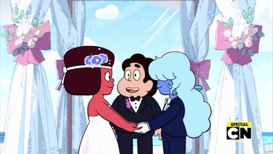
I've seen a fair number of people interpret Rebecca Sugar's (and the Crew's) decision to put Ruby in a dress as subversive, and I want to discuss why that feels like a clear miss to me.
Every time--every single time--I've heard Rebecca Sugar talk about the queer relationships on this show, it comes with this expression of wholesomeness, and often glazed with a sheen of wistfulness, flavored something like "I needed this as a child and young person, and I didn't have it." Much of Rebecca Sugar's work to bring this wedding (and other unapologetic queer relationships) to the screen was framed as an emergency--as in, we HAVE to get this out there for those kids we used to be, because we know they're drowning.
Yes, it's funny sometimes when people make jokes about Sugar deliberately "adding more gay" or "making it gayer" as a big eff-you to the people who spoke against it, but that doesn't sit right from where I'm standing. It took so much strength (and resulted in so much battle damage) to fight that fight, yes. But from everything I can see from the interviews and conversations I've seen and read, this wasn't served up in a "ha-HA, take THAT!" kind of way. These characters having these kinds of relationships should have been a non-issue, and the fact that their very wholesome kids'-show wedding and very sweet kiss and very adorable love for each other was seen as Political when it should have been just two characters in love is so sad to me.
I've seen dozens of people suggest that Ruby is in a dress and Sapphire is in a suit "to fuck with the bigoted censors in other countries" or "to give the finger to gender roles," but again, I think it is simpler and sweeter than that. Rebecca's said that Ruby in a dress is how she feels in a dress. Celebration and exploration of feminine-coded stuff felt wrong to Rebecca for a long time, like it wasn't hers, because she wasn't really a woman and didn't want it forced on her. As a result she was robbed of all the beauty that should have been a non-issue, from what TV shows and toys she was supposed to enjoy as a kid to what kind of person she was supposed to marry and what she should wear as an adult.
Ruby never got a choice about how she looked really. Once she got to choose her presentation for a significant event, this is what she chose. It means so much more to see that than to construct it primarily as a reactionary measure, as if it would somehow foil the sinister censors in more homophobic countries (who, incidentally, are not therefore forced to show Ruby in a dress even though they tried to hide that Ruby was a "she" or that she was in a romantic relationship with another "she"; y'all, they just don't show the episode).
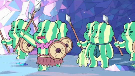
We see plenty of other examples of gender-role-related expectations being casually stepped on and squashed, like when they took the trouble to give traditionally masculine and traditionally feminine "clothes" to some watermelons to make the audience think there was a husband and wife watermelon only to have the wife be the warrior and the husband stay home with the child. With stuff like that, yeah, sure, maybe it's designed to make you think "oh isn't that very feminist of them!" Or maybe it's more "well why do I see this as a 'reversal' when it's just a thing that happened?" This show is full of ladyish beings who fight and have power. And as for Steven. . . .
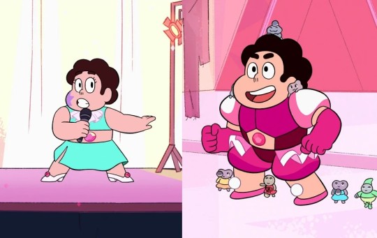
Nobody has negative reactions onscreen (or even particularly confused reactions) when Steven wears traditionally feminine clothes, and it is (of course) also not presented as a "boy in a dress gag"--it's not supposed to be funny. When they go all in slathering Steven in literal princess tropes throughout the final act of Season 5, we understand that it's because the powerful Diamonds expect him to be Pink Diamond, not because the show is trying to girlify him or embarrass him or even make the audience think positive thoughts about boys in girls' clothes. It's more neutral than that in my interpretation: "these are literally just pieces of cloth, and while some of them have meaning, they don't inherently have a gender." I don't see this as transgressive. It's just in a world where putting on what you want to wear doesn't HAVE to be a political statement. (Though obviously it CAN be, and plenty of people wear a variety of clothes as a fuck-you to whoever they want to give the finger to. I just don't see that as happening here.)
Don't get me wrong; Rebecca Sugar certainly knew about the politics (intimately) and has lived at many of their intersections. She was not ignorant of how queer people are seen in this world. She was silenced as a bisexual person because her identity supposedly didn't matter if she was with a man and planned to be with that same man forever. She was shunted into "omg a woman did this!" categories over and over again, which she wore uneasily as a nonbinary person while accepting that part of who we are is how the world sees us. But what is it like if everything someone like her embraces is seen as a statement synonymous with "fuck you" to someone else?
She is married to a person who happens to be a man and happens to be Black. Her relationship isn't a "statement" about either of those aspects of his existence; her love is simply something that is. She is Jewish working in a society that's largely Christian. Her cultural perspective to NOT center her cartoon around Christian holidays and Christian morals; her choices to make an alternate world in this specific way is simply something that is. Her queer perspective as a nonbinary bisexual person has helped inform the Gems' radical philosophy of "what if we learned to explore and define ourselves instead of doing the 'jobs' we're assigned and being told it's our nature?" Her decision to include queer people in a broadly queer cartoon isn't designed PRIMARILY as a battle against baddies, or to drown out all the relentless straightness, or to deliciously get our queer little paws all over their kids' TV. It's an act of love.
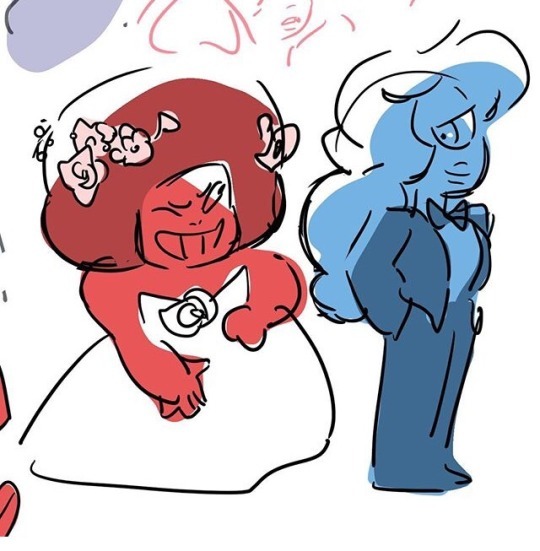
So this is just to say that though I DO understand that sometimes subversion and intentional transgression are very necessary, I do not think that's the HEART of what's going on at this Gem wedding. We got a wholesome marriage scene between two of the most lovely little flawed-but-still-somehow-perfect characters, and I very much want to see their choices as being about them. About how Ruby feels in a dress. About how Sapphire feels about not having to always wear a dress. About them incorporating a symbol of their union into their separate lives so they can have some independence in their togetherness. About them celebrating their love by letting Steven wipe his schmaltz all over them.
There are many choices in the show that ARE carefully constructed to counter existing narratives, you know, giving the Crystal Gems' only boy all the healing, pink, flower imagery; having a single-sex species that's ladyish with all the members going by "she"; featuring many nurturing male characters who cry and cook and raise kids without mothers; pairing multiple fighty ladies with gentler guys; and importantly, intentionally loading up the show with stories, characters, and imagery any gender will find appealing despite being tasked with expectations to pander to the preteen boy demographic.
But it's very important to me that the inclusion of queer characters and the featuring of their choices be seen primarily as a loving act, and way way less of a "lol screw the bigots." I want our stories to be about us. Yes, I know it's a necessary evil that sometimes our stories are also about fighting Them. But every time I see someone say they put Ruby in the dress to "piss off the homophobes" or "stump the censors" I feel a little gross. Like the time I picked out an outfit I loved and my mom said I only dressed in such an obnoxious way to upset her, and I was baffled because my aesthetic choices, my opinions, my choices had nothing to do with her. Yet they were framed like I chose these clothes primarily to cause some kind of petty harm to her, when not only was it not true but I was not even that kind of person who would gloat over intentionally irritating someone.
The queerness of this show isn't a sneaky, underhanded act trying above all to upset a bigot or celebrate someone's homophobic fury. It lives for itself. Its existence is about itself. It's so we can see ourselves in a show, and it's so people who aren't queer or don't have those experiences can see that we exist, we participate, we want very similar things, and definitely are focusing way more about celebrating our love at our own weddings rather than relishing the thought of bigots tearing their hair out and hating us.
It's dangerous to turn every act of our love into a deliberate movement in a battle strategy when their weddings just get to be weddings.
I think there’s this idea that that [queer characters] is something that applies or should be only discussed with adults that is completely wrong. And I think when you realize that talking to kids about heteronormativity is just like air that you breathe all the time, it’s kind of amazing that that is not true in any other capacity. I think if you wait to tell kids, to tell queer youth that it matters how they feel or that they are even a person, then it’s going to be too late! You have to talk about it—you have to let it be what it gets to be for everyone. I mean, like, I think about, a lot of times I think about sort of fairy tales and Disney movies and the way that love is something that is ALWAYS discussed with children. And I think also there’s this idea that’s like, oh, we should represent, you know, queer characters that are adults, because there are adults that are queer, and you should know that’s something that is happening in the adult world, but that’s not how those films or those stories are told to children. You’re told that YOU should dream about love, about this fulfilling love that YOU’RE going to have. […] The Prince and Snow White are not like someone’s PARENTS. They’re something you want to be, that you are sort of dreaming of a future where you will find happiness. Why shouldn’t everyone have that? It’s really absurd to think that everyone shouldn’t get to have that! --Rebecca Sugar
854 notes
·
View notes
Text
backburner | n.jm (teaser)
Pairing: Na Jaemin x reader
Themes: college! au, exes! au, the situationship vibes are STRONG, angst, fluff, exes to ???, reader is a serial overthinker.
Warnings: profanity, heavy ANGST, kissing, food, underage alcohol consumption and alcohol consumption in general, jaemin is lowkey an asshole, more to be added for the full fic.
Word count for teaser: 580 | Estimated word count: 12-15k
Summary: After three months of ignoring your presence entirely, Na Jaemin saunters right back into your life without so much as single warning, leaving you to once again pick up the pieces of your burning heart.
Notes from brooke: a late christmas present from me<3 i'm back to writing my college aus so i hope all of you will enjoy my pain (literally).
[send an ask to be added to the taglist!]

It was one in the morning when your phone rang.
A sigh left your chapped lips as you glanced down from the screen of your laptop to the device sitting by its side, your eyes burning at the too bright light emitting from your phone. The rest of your dorm was dark, having switched the lights off earlier at the request of your roommate, who had an early class the next day.
Unfortunately for you, you had an assignment due the next day that you had, as usual, left for the last minute. Music played through your headphones as you tried to construct what you deemed a coherent enough essay to submit.
Scrambling so you wouldn’t wake your roommate up, you pushed your headphones off and swiped the call icon across the screen of your phone, accepting it a second before you registered who the caller was. The contact glared at you as if it was mocking you for your carelessness and hastiness, causing you to bite down hard on the inside of your cheek.
Well. It was too late now.
Swallowing hard, you held your phone up to your ear and whispered. “Hello?”
“Hey.”
A breath you didn’t know you had been holding in escaped from your lips, having you shut your eyes and process his voice. It was funny, how just one inconsequential word from a single person could change your entire disposition.
“Jaemin? Are you okay?”
He hummed in response. “Yeah, I’m fine. I think I might be a little tipsy though.”
You could just imagine him right then, a glass being gripped loosely by his fingers, leaning against some wall as he spoke to you over the phone. The image was enough that you slipped out of your bed and pacing about your room as quietly as you could, restless.
“Oh. Um, don’t drink too much.”
He chuckled, a sound so familiar yet so distant to you. “I won’t, don’t worry.”
Jaemin liked alcohol, you knew this much. He liked the way it would slowly hit his head and render him more easy going than he already was, causing that pretty smile of his to show more liberally. You were well versed with everything about him, from his walk to the way his eyes would express everything he was thinking, the slightly changes making themselves completely obvious for you,
The two of you had been so in tune with each other. Sometimes, you forgot how easy that made it for it all to fall apart.
“Okay.” You weren’t really sure where you were supposed to go with this conversation anymore. “Do you need something?”
“Not really.”
“Then….then why did you call me?” Bewilderment crept into your voice as clear as day. If you were in front of him right then, perhaps he would have teased you, tucking your hair behind your ear and muttering something about how cute you were.
He stayed silent for a moment. “I just wanted to hear your voice.”
You stopped your pacing, coming to a standstill as his words settled over you. In the silence of the night, you were almost too aware of the way your heart rate increased ever so slightly.
Yunjin was right. There was hardly ever a time where your best friend’s advice wasn’t spot on, but this time you found yourself wishing you had complied and actually blocked him like she had suggested you do. Maybe then you wouldn’t have found yourself in such a position.

coming soon. | lebrookestore 2024
#jaemin x reader#na jaemin x reader#nct dream#nct dream x reader#nct x reader#nct dream scenarios#nct jaemin scenarios#jaemin scenarios#nct au#jaemin au#jaemin#na jaemin#jaemin fanfic#nct scenarios#nct fanfiction#nct dream fluff#nct dream angst#jaemin imagines#nct dream jaemin#jaemin fluff#jaemin angst#nct fluff#nct drabbles#nct dream jaemin x reader
593 notes
·
View notes
Note
Hello, oh my, damn... so english isn't my first language and i wasn't sure how to phrase it better so don't worry, i totally understand being uncomfortable and I'm sorry 😅
I did enjoy your version very much and i also think that you should definitely go for a crow reader cause that is such a cute idea!
- accidentally proposing anon
No problem! And since you're interested here's some very quick ideas I had about crow reader before I go to work today!
Alastor
Nothing phases this man anymore. Niffty literally gifted him a crown of dead roaches. So when you flutter excitedly and present him with a string of shiny can tabs, you've been collecting he accepts it graciously.
"You're quite right dear, these are incredibly colorful. Yes, very shiny are you sure you don't want to keep this? Oh! You made it for me? Well, aren't you just precious."
He makes it into a necklace or even something to decorate his horns.
Vox
Valentino likes light, you like shiny things, both of you tend to like being around screens and bright colors.
Except you don't just like screens, it's anything colorful or shiny. Actually sometimes it's not even that, its just random odds and ends that caught your attention for some reason. He gets it sometimes, textures, patterns, things like that.
But you have everything from soda can tabs to random buttons to rocks of various shapes, sizes, and colors. You have different sticks and pieces of wood you found that for some reason you then had to have. Pieces of mismatched jewelry. It's cute but it also clutters up space and he eventually designates one room for your stuff and tells you to keep it condensed. You do, and swear it's organized, but it's all just a jumbled mess to him.
He's in his lair, observing all the many different cameras, looking for some wannabe actress who owed him money, when you bounce in, barely stifling excited squaking. He sighs fondly and turns to you, knowing he's not going to be able to concentrate until he sees what you want to show him.
It's a collection of your molted feathers, the best ones, sleek and iridescent, bound together with some colorful twine you found and attached to it is a miniature glass jar filled with colorful, shiny bits of plastic, metal, and rock, and corked shut and sealed with hot glue.
It makes a nice rattle sound when he shakes it and the feathers are nice to pet and run his fingers over and..."Did you make me a fidget toy? From....random stuff you found? That's, that's actually really cute, thanks Doll."
He downplays how much he uses it, but it's literally on his key ring, so you know it goes everywhere with him and if during long meetings his staff are subjected to the consistent background noise of little shiny bits rattling around in a jar, then that's their problem.
Lucifer
As you may have noticed Lucifer also tends to collect things he has no need for. But he might need it one day! Between the two of you it does get to be a bit of a problem, so you both agree to sort through and condense your piles.
It takes days cuz you guys keep stopping to show each other cool stuff you guys have. Then, several more days just to get through his numerous rubber ducks. Eventually it's down to a single room where your collections have merged. Each item carefully chosen and presented to one another like expensive jewelry or other such luxurious things. But it's a cool rock you found, a giant bronze spring, a box full of candy wrappers with clever sayings, and a scrapbook with various brightly colored pieces of cardboard from snacks, toys, shoes, literally anything, that caught your eye.
It's anyone's guess on who adds what, but you do both have to agree on it before it's added so you don't hoard things again.
That's the end, but maybe I'll go back and add Adam and some of the other characters later. I just wanted to get my initial ideas down before work.
#hazbin hotel x reader#hazbin hotel alastor#hazbin hotel vox#hazbin hotel lucifer#vox x reader#lucifer x reader#alastor x reader
137 notes
·
View notes
Text
how i do my visual novel filtered photo backgrouds
ive had some questions about this so i figured i'd put together a quick post on my process and what goes into it.
this isnt really a tutorial and instead is just a ramble of how i do stuff with a ton of examples and pictures lol

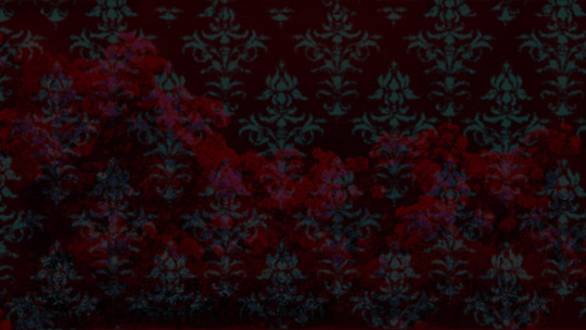

read more below. this is a long post and you probably want to be looking at these images on your computer instead of your phone
step one is that i find CC0 photos or otherwise easy licenses to use because I'm lazy and don't want to have a list of credits of random photographers caue i used one of their images but also i don't want to use stuff without crediting
because they have a general lincese that just wants you to mention the site i prefer unsplash or pixabay but there's other public domain type photo sites too obviously
so like okay heres a random picture

i have a photoshop CS5 from 10 years ago. but these can be done with gimp or krita and whatever. theres even photopea that has photoshop in the browser
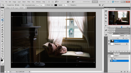
basic stuff is that i start by cropping my bg into my renpy resolution (i use 1920x1080) this is also the part where sometimes i might rotate a bg. it is a good way to add some chaos vibes to a scene
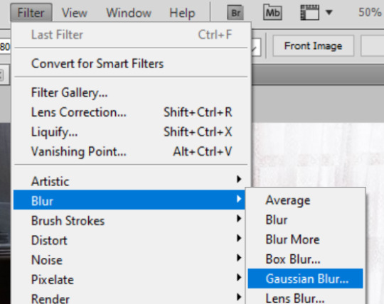
i tend to add some mild blur effect since i find that having too sharp photos as backgrounds clashes with the artstyle of my sprites. like just a couple pixels worth of blur tends to do it
the next part is called fuck around and find out

i like to play with the values to just get random results. hue/saturation for tinting the picture, messing with the curves to get some really sharp effects, or channel mixer to add more of a color
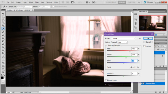
this part is just purely vibes based but i personally think reducing the colors of the background is the simplest way to create something that feels coherent. especially if you make backgrounds based on moods. like having a blue tinted bedroom vs a red tinted one really changes the atmosphere
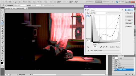
you can get some pretty intense effects but its always important to remember that its meant to be a background and there's a risk it distracts from the sprites
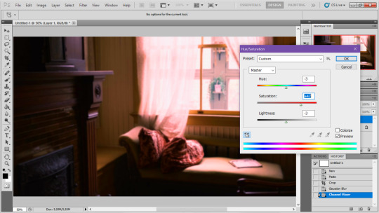
in this case im not including the effect for the curves. after the colours look fine the final step i tend to have is apply some sort of effect.

i really like changing the colour mode to indexed colour since i like crunchy pixels. (had to zoom in to 100% to show the actual effect) downside of indexed is that it doesn't look ideal unless its displayed in the exact resolution it was made in but i like it
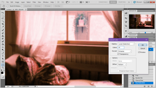
here is the images before indexed mode:
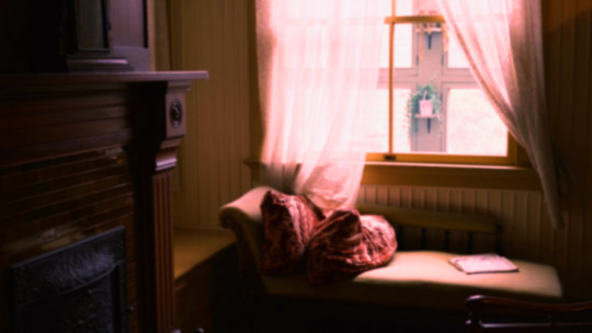
after indexed mode(i think you have to click the image and open it in full to see the actual effect):
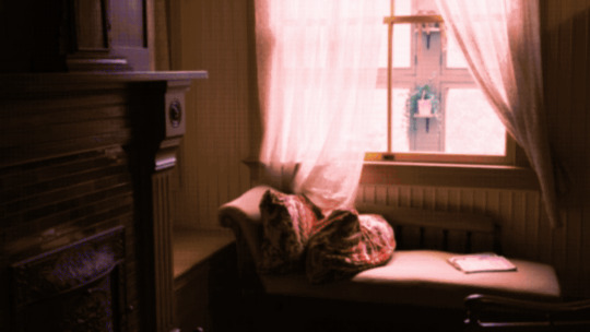
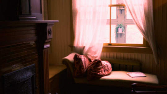
another thing ive been playing with recently has been grain+chromatic aberration combo. it makes things feel surprisingly lively with just this simple thing so you'll probably see me overusing this effect in the future

you have to mess with the numbers to get the effect you want but for me these were the parameters I've been using
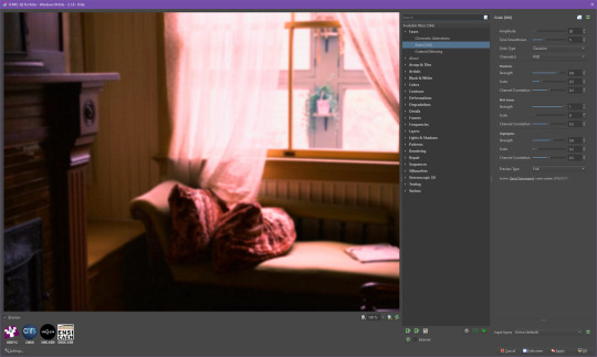

ignore the preview missing idk why it does that.
heres the image (the non indexed version) after these krita effects
one random special mention i have is that playing with layer blend modes is great
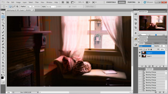
in this example i just copied the same background, mirrored it horizontally and set the layer blend mode to color and it lowered the layer opacity slightly. it just adds some.... idk what to call it visual noise? itj just fucks it up a bit. i used overlapping images and screen modes in some of the hopeless junction images i did for some pretty nice effects
i dont really know waht the blend modes do i just scroll until something looks good lmao
theres a ton you can do with these. like for example just adding a single air brush dot of a bright color on a separate layer and setting it to some blend mode to add a tint to a background
i used these both in malmaid and in the second one i just brushed on some color on a separate layer to give it a moodier vibe

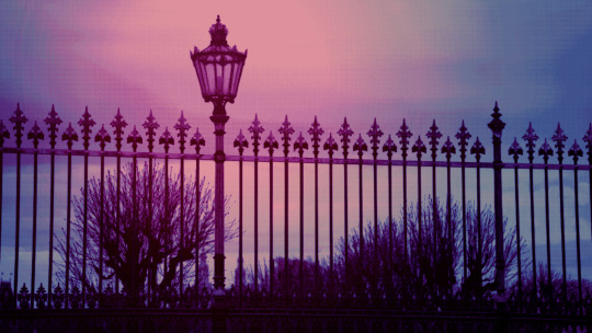
i think having variations of the same background is an extremely easy way to add some life to the bgs without having to do new stuff. like here was the hotel lobby when entering, and here is the hotel lobby when they ran away from the place. i added a radial blur with photoshop


i think theres some beaty in artifacts that come from low resolution images too. sometimes i intentionally use images that have clear compression artifacts cause i think it looks neat. i don't really worry about the details too much as the vibe is the most important thing
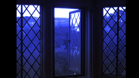
its honestly just a matter of knowing these tools exist and just fidgeting around with combinations to find what you want. it also helps to look at other backgrounds or images in general that you come across and just be curious. how was this done? how could i recreate it? that's the type of experimenting that has led me to these.
idk thats all i have to say. ty for reading and play malmaid on steam like and subscribe for more gay puppies

83 notes
·
View notes
Text
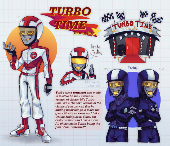
Turbo-time Remaster was a AU I have think since 2018 and now I finally make it a thing
This AU takes place in “ The internet ” if classic Turbo-time got remake in the modern world
Feel free the drop ask about this AU ! Here’s the full information about it ↴
=========================== ( sorry for my English )
About the Turbo-time Remaster ;;
The game has been updated so much to fit the world like adding Online Multiplayer where players can race with other player’s Turbo or Single Player where players are gonna have Turbo Twins racing with them. And of course they have skins too for Turbo so the players know where to spend money on. Other the clothes this games also have a karts customize like adding the patterns or changing some kart’s parts to make it fit with player’s style
Turbo-time remaster is a E10+ game with cartoony art style along with colorful light and shadows ( Imagine something like Mario kart 8 deluxe. Ya something like that )
Remaster Turbo himself ;; ( at this point if I use R! Turbo it’s Remaster Turbo and C! Turbo it’s Classic Turbo )
Remaster Turbo and classic Turbo they’re the different people. He doesn’t have any memory or any idea what happened in Litwak's Arcade before all he knows is that he's the upgraded, superior, better version of C! Turbo
R! Turbo personality, he's still high ego likes to be in the spotlight and attention but all of that is his code personality so far he’s a funny little short guy.. he’s not have an idea about taking over something other than being number one in his own game. Good that R! Turbo doesn’t “Go Turbo” yet
His design is a little different from the C! Turbo. Adding more detail on the uniform and having a more slim body to fit his sportz vibe maybe even taller than C! Turbo a bit. And the extra thing is R! Turbo have full hair because some of the Skin he have around him to take off his helmet
A little fun fact is R! Turbo likes to smoke cigarettes. He’s doing it off screen or is in other games. Oh yeah, he’s like to go hangout outside of his game too mostly at Slaughter Race because he like the place chaotic vibes
Bonus about Remaster Turbo Twins ;;
The Twins doesn’t actually have a name; most players know them as a bot for single player mode. They play the role of Turbo’s competitor and sometimes friends even they’re kinda hate Turbo sometimes
The personality of them both are very similar. Have a positive personality but sometimes they act like a jealous, hater of Turbo. The Twins design also have a little more detail added just like Turbo but one of them gonna always wear scarf so the player could know the difference between two twins
===========================
#wreck it ralph#ralph breaks the internet#wreck it ralph au#turbo wreck it ralph#turbo time remaster au#turbotastic#turbo#turbo twins#au#procreate#procreateart#procreatedrawing#drawing
86 notes
·
View notes
Text
Saw the ghost movie that I was really excited about. Was disappointing. Ultimately it was just really…okay or downright bad in the parts that weren’t concert footage. More specific comments below the cut because spoilers, I guess, but there’s really nothing that happens in this movie that matters enough to count as a spoiler.
First, if this had just been concert footage, it would have been much more enjoyable. The movie parts were not at all interesting and each cutaway made it drag on and on. I hadn’t slept well the night before the showing, so the movie itself wasn’t the reason I was dozing off at some parts…but it also wasn’t helping keep me AWAKE outside of the concert footage. No complaints about that footage (mostly, but I’ll get back to it later).
Story: whoops, Tobias Forge can’t write! Sorry, that’s a bit mean, but…I paid money to watch this, so I’ll be a little bit mean. Seriously, this thing needed at least a couple more passes with the script. Every. single. conversation. as repeating what was already brought up in the OPENING voiceover: Cardi doesn’t wanna die, doesn’t wanna stop fronting for Ghost, but everything ends eventually. Yes, we GET IT. We do not need several scenes of Cardi with his parents saying it over and over again with no additional information added to understand that. After the opening VO, we could’ve just had one scene of Cardi looking a bit forlornly at himself in the mirror, and then Sister Imperator happily telling him that “things are going to be changing in the clergy soon!” or something like that and he looks unhappy.
That’s what I thought we were getting at first, but then it just. Kept happening??? Like oh my god Tobias, I get it, Cardi doesn’t want this to end, I KNOW. The quality of the writing suggests that Tobias is one of three things: incompetent at writing anything longer than a short (maybe, but the other two are a bit more likely), had no real story to tell and this could’ve been one of the shorts so he had to pad it out to an insufferable length (definitely), or so full of himself that he thought “eh, I don’t actually have anything to say, but this way I’ll get to be on screen the whole time and the only writer credited,” (probable). It’s just so offensive considering I know there were so many resources available to make this GOOD: more time, writing assistance or hiring a real writer, etc. and yet they were not taken advantage of. If this was something just put up on YouTube I really couldn't care less about the quality, but if you're charging money for this AND are as big as Ghost is, you can't expect to slide by with mediocrity. Except he will, because apparently everyone else loved this thing. Okay. Also, the humor overall just fell super flat. There were several moments where I was like, "wait, was that a joke? was I meant to laugh there?" because they were just nothing. Also, there was a fart joke. Okay.
Acting: sorry, I’m going to be mean again. The acting in the movie parts was very. Hit or miss is what I’m gonna call it. The voice acting in the voiceovers at the beginning and the end were oddly rushed in several places? They weren’t placing words in very natural ways and it just felt like they needed to do another take for some of the lines. It’s especially noticeable in the beginning voiceover because in most of it he’s speaking at a slower pace and it’s perfect and sounds great, but then he just…speeds up sometimes? And it doesn’t feel intentional and isn’t in places that make it feel like it makes sense to speed up for dramatic effect. In Sister Imp’s voiceover at the end, she is also just speeding through it and it’s incredibly awkward, because in a lot of places it’s noticeably faster than she’s speaking in her other scenes. Like, guys, you know you can shoot more footage right??? You can put some b roll in??? You don’t have to squeeze the whole speech into the shorter shot you have if it’s going to compromise the actor’s delivery.
Tobias' acting was passable for the whole thing, though that might be partially because he's not acting with his face as much as the others, so it's less noticeable when something isn't quite working. Sister Imp did a fine job for the most part, excluding her VO and some awkwardness (and no, not intentional awkwardness) in a couple scenes with Papa Nihil. Papa was also fine; nothing to write home about but nothing terrible stood out to me. Most of the issues probably came from the special effects on him to make him ghostly, which I'm presuming involved him being on a green screen or something (I have no clue. Idk anything about making effects lmao.) I'm NOT going to really review the acting of the stagehands because that's not their main job and they already had a lot of work to do, but it wasn't so bad as to take anything away from the scenes they're in. Basically, the acting overall was okay, but not great, and it adds to how much the scenes drag on for sure.
Tiny section about the animated Mary On A Cross segment: I'm not gonna comment on the bad animation, because it's on purpose and emulating old Hanna-Barbera cartoons. My issue is that it makes zero sense and goes nowhere. Nihil chases Sister Imp around for a while looking forlorn and sad and desperate, and she runs away/beats him up while looking pissed off until they come across a graveyard and she pulls him into a kiss. Then it cuts to Nihil naked in a hotel room in the morning while she storms off angrily....okay? And? What changed her mind? Why is she still angry in the morning? Why does this matter at all? Knowing that Papa IV was the product of a one night stand is a footnote if this is all we get from it. Just weird, and didn't fit the song IMO.
Editing: super frantic and distracting in places, particularly the fast cuts in the concert footage. It's just a lot and can be disorienting. Nothing is really allowed to sit on screen for very long (which is related to another point...) but at the same time, some of the movie shots just linger for no reason. They're just awkward and clunky and repetitive. Some people disliked the crowd shots, but I thought they were fun and cute and used sparingly enough. Shout out to the dude in the nun costume!
Weird lack of concert footage: what they chose to keep and what to cut was just confusing. Most of the footage was just Tobias singing, short shots of the Ghouls rocking out, and crowd footage. Almost none of the Ghoul antics that they're known for, unless Tobias was also in shot and involved. Whenever he went backstage and a Ghoul took the spotlight (I'm sorry, I can never remember who is who, but it was usually White Guitar Ghoul if I recall correctly), it cut to a story moment which, again, were boring, repetitive, and told us nothing. It just felt disrespectful to cut out so much of the Ghouls and their performances, especially because the crowd and the fans love them a lot. They add so much to Ghost's live shows and, in my opinion, are more important to Ghost than Tobias. I don't care if that's a "controversial" Ghost opinion to have, but it really is true. I think anyone could be any of the Papas. But the Ghouls, even when they get changed out, are always so talented, so energetic, so passionate, and make Ghost what it is in a live setting. They were also missing from all but one movie scene, where one of them asks if they're doing an encore, and for a second I thought the line had been spoken by one of the stagehands. That's it.
(Okay, there's also there in the scene where Sister Imp dies, but they're just standing there.)
I can't speak for if the Ghouls themselves felt a bit sidelined or disrespected by this. I can't say for certain if they even wanted a bigger presence outside of the concert footage. But I can definitely say that, from a fan perspective, the lack of the Ghouls compared to how OFTEN Tobias is on screen, backstage, doing NOTHING when we could be watching the Ghouls was GLARINGLY obvious. It felt weird and it felt uneven. I started getting really irritated by about the third time it cut backstage when I could be watching the Ghouls! It just led to the whole thing feeling super vain and self-important considering Tobias wrote the film to be this way. Some people have defended this by saying, "well, they're the Nameless Ghouls!" but that's bullshit. They're part of Ghost canon too, so why don't we get anything from them? We can't even see a little bit about how they might be feeling regarding a Clergy mix up? Whether they care about the current Papa, or anything like that? Involving them would feel so much more interesting than just another Papa, but this one wants to KEEP singing!! Again, maybe the Ghouls didn't want to be more involved...but it felt off.
I've never seen Ghost live, so I had no frame of reference for how much was cut from the concert footage aside from the lack of Ghoul antics, which is what they're known for, but apparently several people who were at the concerts filmed for this noticed a ton of footage that was cut (again, mostly Ghouls) that they thought would have been more fun to see compared to so many backstage shots. And yet we got the sequence of him in a boxing outfit, walking through the crowd, which ended with...nothing? He just...does that? Waste of time. (AND YES, I KNOW that it is a reference. That doesn't make it good. It didn't need to be there. Replace it with something relevant.) It just exemplifies how much time is wasted in this movie.
Special effects: oh my god did anyone even look at this movie before sending it out Jesus Christ. The special effects are so bad I was genuinely shocked. When Papa IV and Papa Nihil are talking while IV is in a box (for some reason?? I actually don't know why) Nihil is weirdly sized and not lined up properly. It was odd. The greenscreen was so godawful I was honestly amazed. It's YouTuber comedy sketch levels of greenscreen quality. What the fuck? Especially compared to the amazing performance and how much work is put into their live shows, the horrid effects stood out starkly. Another comment on Nihil: his face is hard to see in some scenes. His ghostly effects make his features kind of blur together sometimes, and sometimes it doesn't, so it clearly wasn't intentional. Just another odd thing. The effect of him getting sucked into his body for his sax performance was very, very bad. I know you had the option to put more time and/or money into the effects, Tobias. Why did you not. What is your problem. Why the fuck would you put out a product of this quality for money and act like it's okay, especially considering the fact that this was marketed as a lore-heavy MOVIE and not just a concert film? If this was a smaller production I would not rag on the effects, but I know for a fact that Tobias has the resources for this to be better, and he chose to not use them. Honestly, it feels disrespectful.
That's the crux of my issues with this movie, really. It was teased as a real movie with real lore and serious effects on the canon of Ghost, and it was none of those things. The lore amounted to Sister Imp dying, which means nothing, because ghosts, and Cardi becoming Frater Imperator at the very end and then the movie ending. It's NOTHING. There's also an end credit scene apparently, which I did not stay to view, because I didn't care and I had been sitting for long enough. Basically, there are ghosts (including Sister Imp, obvi) and then another cliffhanger about meeting the new Papa, and an implication that Cardi has a twin who might be the new Papa. People are freaking out about this possibility. I have no idea why. It really doesn't seem like a big deal at this point when all the Papas have a crazy family situation. A secret twin doesn't even feel like a twist, and it's certainly not enough to count as an addition to the lore when it hasn't even been confirmed. At the risk of sounding rude, fellow Ghost fans, raise your standards. You deserve better.
And that's the crux of my issues with this whole thing. It's mediocre, it's boring, it's absolutely nothing outside of some fun concert footage, and yet it was billed as a must-see film and cost real, actual money to view. If they had been honest about it being a concert movie, I'd have been fine with that! I think they're fun, especially for those of us who can't go to live shows. But we were told it would be more than that, and it wasn't. It feels disrespectful, like Tobias knew he could just put out some slop and people would be okay with it, and it feels even worse because in a way, he was right. Tons of Ghost fans loved this movie, but the more positive reviews I see, the clearer it becomes that they just loved the chance to see the concerts, and love Ghost. Loving Ghost didn't make me love this movie. It just made me disappointed and sad. We could have gotten a great film, but we got something that was low effort because it's obvious that you can take advantage of the fans of something by throwing them crumbs and dressing it up to seem nicer than it is.
I appreciate that individual people on this production put tons of effort into this; the crew, the actors (excluding Tobias) who were clearly doing their best with what they had, and yes, I'm sure even the effects people did what they could with what they had. But all of the parts that were clearly Tobias' call were not high enough quality to be in a movie.
#yakketyyak#the band ghost#ghost bc#ghost band#papa emeritus iv#papa nihil#sister imperator#nameless ghouls#rite here rite now#movie review#sorry this is an essay this just pissed me off#we deserve better guys! if you give someone money for something#and they're already rich#or at least have a pretty large amount of money which TF or at least the company definitely has#then they're a piece of shit#don't try and tell me TF lives humble and needs monetary help i dont give a fuck the man isnt even close to broke#idgaf if u sided w TF on the lawsuit issue either lmao#whomp whomp the front man taking all the credit was expected to share the money with the ppl helping him oh nooo#u dont get to do the whole “im just a small little indie band” song and dance anymore when ur as big as ghost
24 notes
·
View notes
Note
there was a distinct point in the throne scene where i could hear the emotion really taking over percy’s voice and my jaw actually dropped. had to pause and take a lap. grab tissues. mentally plan their emmy campaign. shoutout walker scobell for having a Moment in each episode (sometimes multiple) and showing up every single time, doing each one better than the last
this ep just made me so excited for all of the trio’s actors, i feel like i’m watching the start of some very impressive careers and it’s an honor
i agree with absolutely everything you said!! truly, walker’s been impressing me since i first saw him on screen (the adam project; just a few months before he was announced for pjo). initially, i thought his comedic timing and physicality set him a cut above the rest but really, in pjo, i’ve been constantly stumped by his emotional intensity. he brings a gentleness, authenticity and emotional maturity to his portrayal of percy and the throne scene was so well done!! you can tell the thoughts behind his eyes, you can see BUILD-UP before he says something or he collapses from the poison from his face alone. again, he’s serving fucking microexpressions already which blows my mind!! his little brave smiles and wavering tones as he reassured annabeth (and himself) while he was being swallowed by gold BROKE me.
also like leah and aryan match his energy 100%!! i think i may be in the minority that wasn’t entirely convinced by their acting chops in the first two episodes (don’t come at me pls!!) but after episode five i would be a FOOL to doubt their capabilities!! leah’s portrayal of annabeth is both full of wisdom yet with the right amount of 12 yr old girl energy. it’s a balancing act. she makes annabeth both incredibly capable yet delivers annabeth’s high intensity emotional moments with expressiveness befitting a 12 yr old. but that’s the thing: she doesn’t overdo it. annabeth is just on the EDGE of losing it, she doesn’t straight up lose it because she does indeed have experience with loss before. she’s gonna do so well. and aryan has added soooooo much more to grover’s book counterpart. not only does he manage to make grover be nervous and be hesitant and grappling with some confidence issues but he also makes grover be fun and whacky and sharp and clever and SUBTLE. his scene with ares was phenomenal coz atleast for me you could see the process of his manipulation through his expressions alone. you can see the little smugness in his eyes as he manages the god of war. just so well done!! also some of aryan’s line deliveries are so goddamn hilarious. 😭
ok yeah about time i rambled about our celestial trio and their very capable actors! i hope they have thriving careers but that they stay happy and healthy throughout!
#pjo#percy jackon and the olympians#percy jackson#pjo fandom#pjo series#pjo tv show#percy pjo#pjo tv adaptation#pjo tv series#walker scobell#leah jeffries#aryan simhadri#annabeth chase#grover underwood
40 notes
·
View notes
Text
Everytime I face a new character limit on a website that didn't have them before/used to have really long ones... AUGHHhhh the modern social media world was not made for people like me (lovers of details, rambling, elaboration, thorough explanation, and nuance)
#twitter and other short form shit and everything being a Phone App On Small Screen instead of a Proper#Computer Website i feel like has just ruined the format of literally everything for me. Thoughts just keep getting more and more condensed#with detail and nuance taken away. everything over simplified into only the basics. blah blah blah. I've already probably rambled about thi#all before but it's just SO frustrating. I literally just CAN NOT talk that way!!! even if I try!!! I took multiple advanced placement#english & language arts classes in school and I literally never made below an A on any assignment EVER except for ESSAYS#where I would legit get almost failing grades just because I cannt express myself concisely. I took an english placement test thats made to#like evaluate your competency in a subject and out of the 102 multiple choice questions I only missed TWO of them. almost a perfect#score. But for the 5 open response questions (about articulating thoughts succinctly) I did not get a single one of them lol#I only got partial credit on 3. It's like I OBVIOUSLY understand the material and I know how Words Work and how to analyze and interpret#meaning and etc. etc. But it's just when I have to express myself CLEANLY I can't. It's always ''well you have very good points and you#get around to the idea eventually and I think it's very insightful - but it just needs to be shorter/the side tangent needs to be removed/#etc.'' I've always wondered if it has something to do with being on the schizophrenia spectrum and how that can cause disorganized#speech sometimes hmm..ANYWAY.. But I just naturally express myself in a very particular way which is lengthy and I can't rea#ly seem to control it. So it's basically like just.. being gradually pushed out of every place that won't accomodate people with different#ways of like perceiving and expressing or etc. Everything cannot ALWAYS be 100% 'Short and Snappy and To The Point' or a quippy one#liner or the Bare Minimum of information being provided or etc. Some peoples brains just do not work like that!!!!! Sorry I operate#in detail and elaboration lol. ANYWAY.. I still sometimes use random ''dating sites'' like OKCupid to look for platonic friends since#I never leave the house so it's hard for me to just meet friends naturally. And I just realized today that they added a RIDICULOUSLY small#character limit to their messaging system (2000 words?? augh). And also took away answer explanations (when you answer a compatibility#question you used to have a space to give detail and explain why you answered the way you did) and removed a few other features and it's ju#t like.. how the fuck is any of this actually helpful in terms of judging compatibility? take away ALL nuance and anyting that actually#is meant to tell you anything about a person? Bumble's character limits for your profile description are even more fucking insane and so#is every other disgustingly minimalistic place I've seen like.. OKC used to be superior BECAUSE it allowed for a TON of detail. like back i#2016 or something there was SO much data you could look at. long form question answers. personality trait summaries. etc. Now you have#SOO little to judge off of when evaluating compatibiility it's like. You'd have better luck just throwing a dart in a crowded street and#talking to whoever it hits. Why are people so fucking allergic to reading anything longer than 3 words and providing DETAILS!! It just seem#harder and harder to find any place to meet platonic friends where you have any amount of actual data to go off of and it isnt basically#just random 'speed dating' set up shit. AARGH. &I know 'oh just join a club& meet ppl irl' 1. erm..covid. 2.I mostly want to meet ppl#in places I'd like to move so I already know ppl when I get there. You kind of HAVE to do that online. bc I am not there yet.. WISHING for#Complexity.Com where ppl can upload full 900 page psychological files of themselves. MINIMUM profile character limit 30k words lol
6 notes
·
View notes
Text
flufftober day 24: comfort food
people often wonder how the twins communicate with each other when one is deaf and the other is blind. the answer is simple - texting.
atsumu is puzzling out algebra equations when he feels his phone vibrate and sees the screen light up. he swipes it closer to peer at the message.
worser half hey scrub help me make onigiri
worse half (me) don't you have homework to do?
worser half i finished it haven't you?
worse half (me) help me with algebra and we'll talk
worser half fine
it takes a few minutes before osamu enters the bedroom and takes his seat at the desk beside him. he opens his laptop, and atsumu moves closer until his shoulder touches his, reaching over to turn the screen brightness up. osamu hears this, navigating to the memo pad to type a message for him.
no hearing aids today?
atsumu bats his hands away to type a response. ma is buying more batteries. osamu waits a beat to listen to the screen reader, then replies.
you scrub.
"shaddup." atsumu is often non-verbal without his hearing aids, but he can't resist the urge to swear sometimes. "help me with algebra."
osamu turns in his direction to stick his tongue out, then opens his algebra homework. they're in different classes but the math they learn is the same. atsumu brings his papers closer to scribble notes, verbally asking for clarification when he's confused. osamu keeps the memo pad open to reply, although they're unhelpful responses like i can't explain it by typing lmao or just ask your teacher later.
when he's done, they move downstairs for the kitchen. a large bowl of rice is cooling by the window, several dishes of filling left on the counter. osamu jostles him to wash his hands, then points to the fridge, then knife and cutting board. finish preparin' the fillings, atsumu imagines his brother saying. he opens the fridge, and osamu squeezes past to check on the rice.
there’s already a bowl of tuna mayo with green onion ready, which he places on the counter. he takes the kombu, bonito flakes, and salmon to prepare on the cutting board. osamu is behind him, cooling the rice with a fan and adding rice vinegar. despite their inability to communicate, their movements are synchronized, familiar, a dance born from sense and instinct.
they didn’t have an easy childhood, not when their single, working mother struggled to find the middle ground between her sons' disabilities. osamu was born legally blind, but was able to utilize corrective lenses until his vision loss worsened. atsumu, on the other hand, was born with severe hearing loss, which made communicating during their early years a challenge, since he'd rather play outside than learn jsl. it wasn't until after he received his hearing aids that he started to learn, struck with the realization that his brother's vision would only worsen, whereas he could get by with assistance.
aside from additional lessons to learn their respective accommodative languages - jsl and katenji - they also learned how to help their mom with chores, which included cooking. the first dish she taught them was onigiri because it was easy, and they always had ingredients for fillings. it evolved to become a comfort food in their household, a way to relieve stress or enjoy with each other during the day.
atsumu returns each filling to their respective dish and brings them to his brother. he gently hip checks against him to warn that he’s beside him, and osamu slides the bowl of water between them. using chopsticks to ascertain the order of fillings in front of him, he grabs a handful of rice to start filling them. atsumu follows suit.
they work quickly. atsumu is never as careful with how he molds the rice, whereas osamu cradles each one like it’s a newborn baby. they take turns using the chopsticks to grab filling, take turns grabbing a piece of seaweed to wrap around the rice. soon, their tray is full, with only stray grains of rice left, which atsumu scoops to create a mini onigiri. osamu begins to clean up, and they’re both so occupied with their tasks that neither notice ma’s return.
she enters the kitchen with grocery bags in hand. osamu raises his head to call a greeting, while atsumu catches her eye and signs, “welcome back” one-handed. she smiles, putting everything down to sign back, “i’m home.” from her purse, she fetches a small paper bag with batteries for his hearing aids. atsumu takes them, signs thanks, and hurries upstairs.
he puts his hearing aids back in, switches them on. the silence of the world gradually fills with sound – water from the kitchen faucet, squeaky cupboards opening and closing, ma and osamu’s voices. atsumu joins them again, announcing his return, “ya better not be talkin’ shit ‘bout me.”
“i never stopped talkin’ shit ‘bout ya,” osamu replies, never missing a beat. ma closes the last cupboard while rolling her eyes.
“i like how both o’ ya get along enough ta make onigiri, but nothin’ else.” she’s exasperated but amused, folding the last of her grocery bags. “is this dinner, or a snack?”
“when has onigiri ever been dinner?” osamu turns the sink off and dries his hand with a dishcloth. using his fingers as a guide, he walks around the table to sit in his usual seat, and atsumu takes the other side between them.
“itadakimasu.” with their blessings, they each grab an onigiri to eat. atsumu hums, enthralled by his negitoro onigiri, while osamu is more contemplative, mumbling voice memos to his phone. ma is more appreciative, eyes closed to savor each bite. they must’ve eaten over a hundred onigiri at this table by now, each one even better than the last. atsumu can only imagine how much better they’ll become, especially as his brother continues to improve.
#flyingwargle original#drabble#haikyuu!!#miya twins#miya osamu#miya atsumu#deaf atsumu#blind osamu#resolve#maybe i'll write more drabbles with this au but we'll see#for now deaf atsumu has more drabbles#because blind osamu has a full ass fic#soon tm#flufftober2024
9 notes
·
View notes
Note
I just saw the post for the new Litost chapter and it reminded me just how amazed I am at your outlining skills. The post says Litost has 61 chapters total. How do you get so specific? How do you know how many chapters it will be? Especially 61? When I plot out a story, I get a good idea of how the story will unfold. But I can never tell how long it will end up being. Teach me your ancient magic please!
Awwww, thank you so much!!! It's complicated, but I will say I'm no expert! My brain is just hardwired a certain way with writing. Litost was originally meant to be a 4 part piece at novella length, but then I imagined a longer story that would expand it, so I asked everyone if they wanted more of it, and they did, so my outline predicted about 24/25 chapters to tell it, but the problem with my outlines is they are very detailed to help me to know where I am going and exactly what I'm writing, which led to the following:
Litost extended on me because the outline for one chapter was so detailed that it would sometimes take multiple chapters to complete what I had jotted down for that single chapter. Other times, I had surprise chapters to fill out things that were meant to happen off-screen, but they added so much more to the story that I decided to write it out instead of just "reveal" it later. So, a single chapter outline would turn into 3 to 4 chapters to tell everything I had in that outline. Before I knew it, 24/25 became 40, which became 45, which became 61. Originally, I had plans to end it with the events of Chapter 50 and write a sequel. Only I wasn't sure if I could keep up steam for a sequel because Litost is already so, so long, so I incorporated the beginning of what would have been the sequel into the ending for Litost, which gives the story a more defined ending overall, and I preferred that. Chapter 50 would have been like a massive cliffhanger ending place, and I had mixed feelings about doing that for a long time.
So, I have the whole story outlined in full, but sometimes the chapter count itself is tricky depending on how much actual writing is needed for what I have written in the outline. But at this point, it's rock solid, and it isn't going past 61 chapters. Chapter 60 is the true ending, and the final chapter is actually a telling of how it would have ended if I had stuck to the original 4 piece novella length because I thought it would be a lot of fun to tell that story, too. But I am incorporating it into the main story as a vision from the palantíri of what would have happened, anyway, had the path gone a different route, and in a way, it all ties together — and shows the inevitable intertwined fates that Halbrand and Galadriel share. It's hard to explain in advance, so I'll let the epilogue speak for itself when it comes. ;-)
It just helps me to finish something if I know the plot and journey all the way to the end before I get there. Without outlines, I lose interest and drive if I don't know exactly where it's going, so then it becomes hard for me to write. I know some people are the opposite of that, but that's just how my brain works. All of my stories are outlined to the ending because it just helps me to write them that way and complete them, and the closer I get to the ending, the more true the chapter count becomes. But I also have some artwork made for Litost that I want share, and I'm thinking of how to incorporate that into AO3 as well!
Thank you for such an interesting question! I love talking about the writing process, so this was a lot of fun to answer!!! ❤️❤️❤️
#ask me things#my fic#haladriel#saurondriel#galadriel x halbrand#halbrand x galadriel#galadriel x sauron#sauron x galadriel
11 notes
·
View notes
Note
Tell me all about LOST all I know is from Dane Cook
that is. such a funny sentence
aw shucks, its tempting, but i don't wanna give ya spoilers. and there are truly things in lost that must be experienced by your own flesh
...yes im aware of what my blog is like
so i guess i'll give a vague spoiler free overview
so. a group of plane crash survivors find themselves on a mysterious island and have to deal with the strange happenings + their weight of their individual traumas
the show is serialized and one ep more or less flows into another, so literally no ep can be skipped (no matter what anybody says) or else you'll miss something
its a large ensemble cast, ranging from the 13 to 20s range, all in all i think theres like 35 main characters
the show follows a flashback structure, each episode dedicated itself to a main plot on the island intercut with flashbacks to one character. we call these centric episodes. eg. this is a jack centric episode. sometimes an ep will have multiple characters have flashbacks in one ep. while this show didn't originate the concept of a large cast or flashback storytelling, it did popularize it in the early 2000s. so a lot of post 2004 shows wanted to be lost so bad and it shows
at first lost was a survival show but they gloss over this very quickly and its more about the weird shit going on. as time goes on, plots and mysteries stack up. this is to create intrigue, as the shows main focus is an endless parade of character studies. with the added bonus of some cool and twisty shit going on too
but because lost had so much plot, over time it got accused of being confusing and convoluted and Not Answering Questions and well. your mileage may vary. but i think its confusing if you watch it too slowly. like, it aired over a 6 year period, no wonder people got confused. its better to watch nowadays, way easier to handle
the genre of lost is: drama mystery action paranormal sci fi romance with a dash of comedy. lost is full of the saddest fucks you'll ever meet but the show contains enough levity and great colouring to make it not a huge misery fest
pretty decent racial diversity. next to no LGBT rep. more women than the average tv show. then and now
the score FUCKS
not a single bad actor in this entire show, the performances on display are fucking outstanding. and every emotion is like up to 11, which is great for my autistic brain
for those of you who find sex scenes to be tedious, i have a bit of trivia for ya: all sex in LOST happens off screen. not a single sex scene to be found. pre sex, yes, post sex, yes. making out, yes. but sex itself? footage not found. i'm neutral on the concept, i just thought that was something to point out
i highly recommend lost to, like, anybody. ever. its a masterpiece of television. even the low points are better than most shows. sometimes i take lost for granted and then i watch any other drama series and im like "oh right, lost is incredibly good"
its my third favourite show. and thats only cuz star trek and doctor who exist, and nobody is beating those fuckers
anyways do you like to see beautiful people cry and scream but it isn't cringe?* well, i've got a show for you! *okay there is some cringe. as a treat. the leading man of this show has the social grace of a cold pancake (affectionate)
thank you for your time
32 notes
·
View notes