#and no the issue is not photoshop btw its not photoshop doing this to my laptop
Explore tagged Tumblr posts
Text
i’ve been waiting for two hours now for my laptop to close photoshop so i can restart it
#i cant force a restart/power off bc its going to corrup the file i was working on#and no the issue is not photoshop btw its not photoshop doing this to my laptop#when you check task manager photoshop is barely taking up disk/memory/cpu usage#its mostly.. uhh.. the system#?#and other system-related stuff. like it’s nothing ‘third party’ or any downloaded stuff i have#and the laptop does that even when there’s nothing running anyway
1 note
·
View note
Text
"Build DXT" function with transparent PNGs slightly changes alphas compared to "Import DDS"
This is continuation of discussion from @pforestsims about which type of compression and methods of saving textures is best for CC creation. Under a cut because it's probably not of interest to most people haha
What I was told from tutorials to do when making hair retextures was to create the base texture, make as many packages for it as I have colors, then save each color as a transparent PNG (after applying the alpha to the base via layer mask) and use the Build DXT option in SimPE to replace the texture in each of the "dummy" packages I made, choosing DXT5 format.
Eventually what I switched to doing was to apply the alpha as an actual alpha channel (not a mask), then save each color as a DDS file with DXT5 compression (I had to download Intel Texture Works plugin for my version of Photoshop to be able to open/save DDS files) and to put the file into the packages using the Import DDS option in SimPE.
I noticed that the former method very slightly changes the appearance of a texture's alpha (I don't see any difference in the quality of the RGB texture itself) in a way where it felt like cloning the hair was making it thinner/a little more transparent every time
Here's dark hair with fine transparent strands that I had downloaded (its by @.spell-bloom btw) and then replaced the textures (with build dxt) because I wanted it in different colors, you can see if you look closely that the thinnest strands are a little bit thinner on the hair on the right, even though I didn't actually edit the alpha at all -- I had just extracted the volatile base color and run recolor actions on it:

So yes it's a MINISCULE difference, on the majority of hair textures it's literally a few pixels becoming more transparent, but it's just enough that I could still tell the difference when looking closely. If you can't see it in above image look closely at the forehead above the sim's left eye (our right) or on the flyaway strands at the bottom left. I promise it's more noticeable in game, actually XD
Oh and it was particularly noticeable on anything where parts of the alpha are very light, like the shaved part of this male hair clearly fades out differently on the recolor shown at right:

I haven't created makeup CC before, but I did make a mental note that if I was going to do so, I would probably want to use import DDS method because I'd think makeup is more likely than hair to have very light semitransparent sections.
This is not a REASON to switch to using "import DDS", I can totally tell that you'd have to be ridiculously nitpicky to care about it!! The actual reason I switched was that import DDS method is faster (having to click the mouse 4 or so less times per package doesn't sound like much, but it adds up if you're making 15+ recolors every time and I have chronic hand pain issues that I am always trying to find little ways to reduce, so). But I had noticed that these slight changes to the alpha were happening so I saw it as like, a convenient bonus that they weren't happening with my new DDS method of making packages.
14 notes
·
View notes
Note
I saw the Lupin recolors you did (they’re amazing btw) and I’m curious how do you keep lineart so clean on your recolors? I’ve been doing some recolors recently but my technique is usually either trace the lines on top of whatever color I’m changing to which results in slightly-sloppy and inaccurate lines or I spend a million years doing masking. But yours look so clean it’s awesome! How do you do it?
Hello, anon- thank you for the kind words and for sending an ask in!!
The screenshots anon is referring to are in this post!
Sorry it took me a while to get back to you-- I wanted to make some example images to go along with this since this is a question I've gotten quite a few times. I'll try my best to answer as concisely I can!
I personally use Clip Studio Paint (which is what I'll be using to explain this), but I've also done this with Photoshop. I'm hoping this method is simple enough so that its usable for whatever program you (or whoever else sees this guide) uses.
We'll see how it goes ¯\_(ツ)_/¯
Some bits to start:
I know this is kind of a no-brainer, but a big thing that always helps is image quality. The better the image quality, the less obvious your changes will be-- so make sure the screenshot you're recoloring has good resolution. This method (in theory) should work for lower res stuff too, but it'll be harder to avoid messy lines no matter how careful you are when selecting. Here's the images I'll be using for this example:
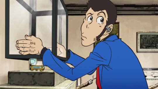
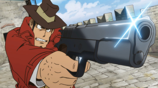
Make sure to have a backup of the original screenshot you're editing!! Even though I didn't include this in these upcoming examples, have the original below the image you're editing so you can check your progress and make sure you didn't miss any changes you wanted to make in your edit.
We'll use this pt. 4 screenshot of Lupin as our first example!
Let's say we want to make his jacket red-- it's as easy as it sounds, but it'll still take a bit of time.
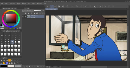
I use selection tools over masking-- primarily the polyline tool. Even after testing with masking and layer overlays, this is the best way I've found to keep line integrity and cleanliness.
When you select with the tool, you'll want to go along the edge of the actual color you want to change, not the linework.

It's going to be time-consuming (which is why I only outlined his sleeve lol) but from all the testing I've done, it's what gives the nicest results. Plus we don't even have to use any layers or masks-- we can just change the color of the screenshot directly!
To do that, we'll want to find the option to change hue, saturation, and luminosity.
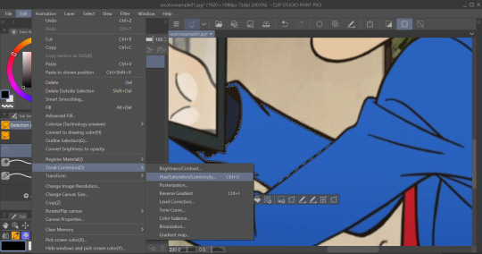
From here we can tweak the colors in whatever way we want without any of that ugly crunchy outline stuff or having to fiddle with a dozen different layer settings.
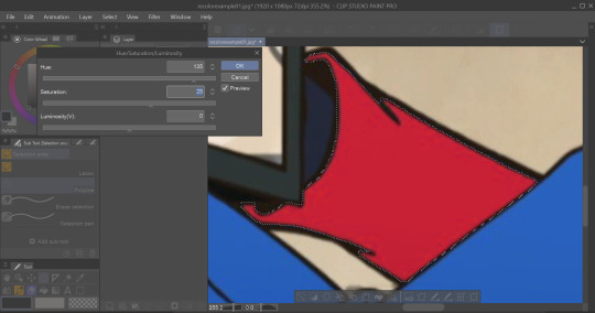
This way of doing it is really good for changing the hue, saturation, and darkness to whatever we want it to be without sacrificing line quality.
Here's the final:

Even though I eyeballed the color for example's sake, the final change doesn't look half bad!
The only catch I've come across is when you need to make something a lighter color. You can bring the luminosity of an image down, but once you bring it up you start having some unavoidable issues.
We'll use one of my favorite Zenigata screenshots for our second example.
Let's say we wanna change his red pt. 4 trench coat to his green one from pt. 3 (again, only changing the sleeve for time's sake).
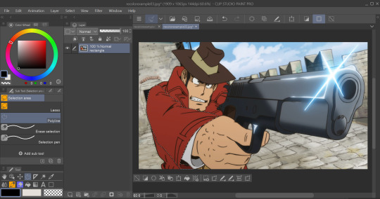
This is a tough change since there are a lot of lines and extra details on his coat that get caught and lightened in the change.
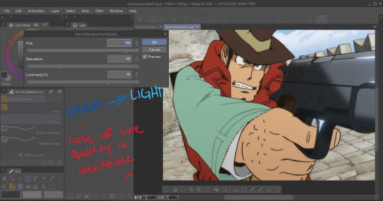
At this point we're going to have to do some line tracing.
Yeah, I'm not a fan of this part either, but unfortunately it's another time-consuming necessity if we want an edit to look as unedited as possible. Every other method I've tried to keep the lines dark ends up really corrupting the linework already in the image.

I'm sure you've noticed the edge of the selection we made in this; even though I skipped this part for time's sake you're going to want to go over those outer lines, too.
I recommend using a simple default brush set to a size that is as close to the actual linework as you can get. If the brush you're using doesn't have tapering or line size pressure just make sure it's slightly smaller than the actual lines. Stabilization isn't exactly a requirement; I'd only suggest turning on line stabilization if you aren't very confident with your linework (practice makes perfect and all that).
When we're done, it'll be pretty obvious that we went over the lines-- there's another really simple fix I found that helps to make this a little less obvious.
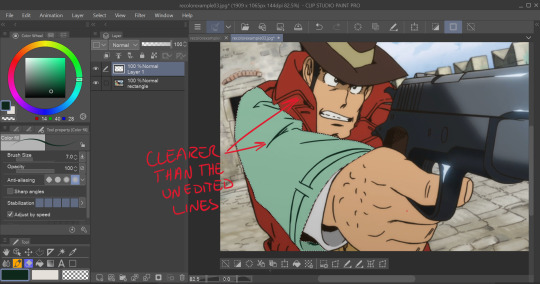
Messing with the layer opacity and the blur filter helps to bring out the linework beneath what you've gone over and makes the lines look less obviously drawn in.
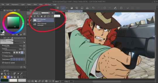
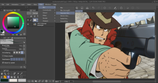
I'm sure you could also tweak the layer's settings until you find something that looks right, too-- it'll be the same sorta "experimenting until it looks right" deal as with changing the colors earlier.
I generally stick within the 2.5/3.5 range when blurring for decent res screenshots. In hindsight I probably went a little too low with the blur for this one, but you get the idea.
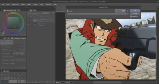
I think that it mimics the semi-blurry quality that lines tend to have in screenshots and helps to make it look less like it was drawn over.
Here's the final:
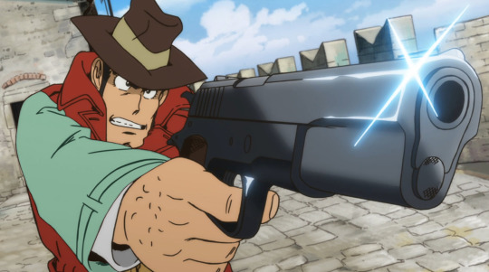
I'm sure if I bothered to do the entire trench coat it wouldn't look half bad, lol.
ANYWAYS that's a crash course on how I make lines not look like doodoo in my edits :3
Hopefully this is helpful!!
Thanks again for the ask, and if you have any more q's don't be afraid to send another ask in!🫡
#lupin iii#lupin iii recolor#lupin iii screenshot#screenshot edit guide#i have no idea what to tag this with lmao#im sure this'll be fine#tackyart#tackyanswers
9 notes
·
View notes
Note
hey babes! do you use gshade for ts4? or reshade
i downloaded gshade a little before the malware issue so i uninstalled it again but it seems that so many ppl still use it for the sims 😭 i want to use it so bad because its crisper (?) than reshade but im not abt to get malware on my pc but WDYT HEHEH
hi lovely.
i've always used reshade for ts4. gshade (i think, i might be very very wrong) was actually made by someone to specifically use for final fantasy 14, and it blew up from there. so i actually didn't know you could use gshade with other games!
in ffxiv i started off with reshade but then got some friends to help me instal gshade when i swapped to a new pc. shortly after the malware thing happened (a huge dick move if i do say so btw, wtf is wrong with people).
i am so so not computer savy, i didnt even know what malware was. i was just gonna continue using it but my friend said i definitely shouldn't, so helped me remove it from my pc and reinstall reshade. which is a good thing tbh cause now i can use all my sims reshades to take ffxiv pics too lmao!!
but yeah. be safe, remove gshade and go back to reshade. it's not worth the risk. and there's so many tools on photoshop to help you make your images sharper and clearer!
7 notes
·
View notes
Text
Day 10
So i talked to my therapist and another Vietnamese person at the cultural meet up a couple days ago about the abortion horror movie-- they havn't seen it, but it sounds like its less about the topic of abortion and more about the Vietnamese culture and different religious view points around death, killing things, and karma. interesting ! anyway, I cried in therapy and then bought myself some yanyans and soju on the walk home. so fun to get a lil treat! like i felt good when i left, did some good thought exercises, or visualization therapy, whatever you wanna call it, but as i walked through the privately owned waterfront development that I had watched the sunset in the night before, back across the bridge to my side of the canal I was rly like 'holy shit fuck this world.' In NY i work in the building associated with Domino Park in Williamsburg, part of my salary is funded directly by the developers. This is a job I wouldn't be able to have in my own neighborhood, because if i was taking payment from the developers causing displacement in my own neighborhood, i think a lot of the people i advocate and organize with would stop fucking with me or taking me seriously. I feel pretty bad about it, like why is it okay I work a job in Williamsburg, where i dont live, that I would never work in my hometown of Flushing? That is to say that making me go to therapy in the private waterfront mega development is like a cruel joke. like, the first thing i clocked when I came here was these six huge towers on the other side of the canal, and now u send me to cry about my feelings there?? maybe i'm a little too sensitive to the impacts of luxury waterfront development, because as you may be able to tell, advocacy around displacement and waterfront development actually consumes all my free time. also btw, the therapist confirmed the waterfront access is privately owned, as I assumed. Every time i cross over the canal it takes all my energy to not climb down this ladder under the bridge. I need to keep reminding myself i am a stranger in a strange land and should probs not trespass. but if i were in my own neighborhood, i wouldn't think twice.

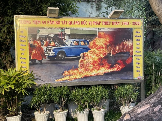
the motorbike food tour tonight was fun. in my art practice i give a lot of tours, but always forget i'm a tour guide, until i tell someone about what I do and they're like "so you're a tour guide?" Me and my student tour guide vibed about the pains of touring people around. it was a fun experience, and funny to see how him and his other tour guide co-workers kinda just circle around each other with diff tourists throughout the evening-- all the tours start at the same time and go to the same places. he said they go to the same places every night, he's been eating the same food with tourist 3-4 times a week every week for 3 months since hes had this job. if i were a local i would probably find this method of touring incredibly annoying. He took me to the Thích Quảng Đức statue commemorating the monk that burned alive in the street advocating for religious freedom. He noted that the photos of the event that were distributed globally in the 1960's edit out the gas canister because it makes it look more profound and like he acted alone. You can see the bad 1960's photoshop blur in the left side of the image under the car tier. super interesting note on propaganda. Im glad I didn't come here without a guide, i would not have known that. I asked if this act of protest was effective, and if it worked to get what the Buddhist community wanted-- he said it got global eyes on the issue due to the distribution of the images. I mentioned to him that an american guy burned himself alive on the supreme court steps because of climate change last year, he was very surprised that there was basically no media coverage of that and he had not heard about it.
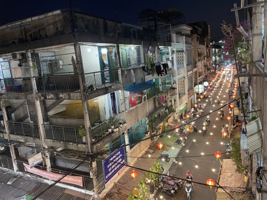
The tour groups kept circling around one another when we arrived at a public housing complex. we were basically walking through the projects taking photos, like honestly not a nice thing to be making a spectacle out of the people living in public housing projects. all these tour groups climbed 2-3 flights of stairs and walk around these peoples front doors, it happens every night. super obnoxious tbh. perhaps regrettably, I couldn't help but snap some pics, the lanterns were still up from the tet holiday, and the lighting was just right. These types of developments are what the book im reading is about, titled "building socialism: the afterlife of east german architecture in urban vietnam". I shared a photo of the cover before, these buildings look almost identical.
He pointed out the water tower and then we left.

2 notes
·
View notes
Text
The assumption that all production is a monolith is certainly a choice here. Two major things on cinematography:
Cinematographers are generally good at their job. They know way more than you could ever know about lighting a scene. Someone taking a screenshot and "brightening" it in software like photoshop is NEVER going to prove the point you think you're proving. Because lighting doesn't work that way and you're taking a 2D still of a 3D film that already has processing and compression and using a brightening tool. Like that's not how that works at all. This is a dumb comparison to make. You don't have the original captured image and all of its data. You cannot adjust the brightness with a screenshot: you need to be able to process the full image data.
A big downfall, though: Movies are lit specifically for the best case scenario of lighting and color nuance. Theater screens and projectors are supposed to be kept clean, working, and up to spec, and movies are lit for that purpose. A movie is rarely "too dark" it's just that you're watching it sub-optimally on a computer, phone, or TV, or god forbid on a movie projector that hasn't had its routine maintenance (something that notably got worse because of the pandemic!). This isn't your fault as a consumer btw, it's just a stupid disparity that exists.
Cinematographers light differently than you'd expect. White is meant to be seen as the BRIGHTEST thing on the screen. Every ounce of brightness is lit down based on that. Your computer screen? There are things just as bright as white because of the way brightness is done on computer monitors. Cinematographers use a system called False Color in order to identify and "visualize" brightness levels:


Note that Brightness has to do with literal light output and not hue or saturation. Those are different things.
Cinematographers use False Color overlays when adjusting for lighting on set in order to determine the appropriate levels based around pure white being the brightest thing ever on screen and pure black being the darkest possible thing.
Because of this: compression is a bitch. If you're watching on any at-home device your device is compressing the shit out of the bottom end of the spectrum! You are seeing LESS detail than intended. There will be artifacting there that's typically pretty visible. This doesn't happen with (maintained) projectors.
When you watch on an at-home device you are viewing with less color nuance than is actually captured on camera.
These cinematographers are not "lazy". They're not using "flat lighting" (jesus christ) and they rarely have to "fix things on set" like this post is implying. Their lights and lighting are often just fine. The bigger issue is the technology disparity between what Cinematographers are lighting for--for NUANCE and COLOR RANGE--versus what color range output the average person's device is capable of putting out.
Also, if you're ever watching a pirated movie or show, unfortunately it is highly likely it's in less quality than the original and the compression, artifacting, and overall quality is going to be worse. Not saying you're wrong for doing this (fuck the streaming service hell world), just making mention that pirating does sometimes affect quality.
See Also: VFX is absolutely a bitch too, but we do talk about it wrong. CGI tech is really good now, but I've seen VFX artists on twitter talk about how the biggest issues arise when the production team doesn't have a solid vision for what they want and keep changing their mind or making adjustments to what's needed. Less time to work on the CGI means less quality CGI. Sometimes the lighting and color grading of post-production is affected by this problem as well. If you watched either of Denis Villeneuve's DUNE films, it's worth watching any behind the scenes production stuff you can. You'll note that Villeneuve and Greig Fraser (my favorite cinematographer of all time btw) worked very hard with visual development, story boarding, and pre-production so that they had a clear vision for going into solving cinematography problems in advance, which also makes post-production go smoother. A lot of times it's not even the Director and Cinematographer's fault if they aren't given the time or budget to make things go as smoothly as DUNE.
So yeah, posts like this irritate me because a lot of assumptions are made by people who know very little about how cinematography works. There are little snippets here and there that are correct (like the rushed/lack of vision VFX stuff), but a lot of it gets pinned on either the director or cinematographer, which is often unfair. Someone doesn't get in Greig Fraser's position (or even lower!) by being bad at lighting on set. It's a job with an impossibly high skill ceiling. There is stuff with more mediocre cinematography, but the issues are rarely going to be "lazy lighting". It's usually something else.

OMG. Somebody said it out loud.
Disney is absolutely not the only studio doing this though.
It seems to have become standard practice across movies and series everywhere.
Anything that doesn't do it is like a breath of sunlight and fresh air inside a dank musty cave.
It's part of the 'fix it in post-production' epidemic sweeping through the studios. Fix it in post is often used as a time/money-saving measure - and is absolutely part of the same mess that the WGA is fighting against currently.
Rather than fixing things on-set - audio, lighting, something in-frame that shouldn't be, etc. (which is all handled by unionized crew) - they leave it for the CG folks (not unionized) to edit later.
(on ridiculously tight schedules that leave them scrambling, cutting corners, and working inhumane hours)
See also: that part where scripts aren't finished, because the studio won't fully staff the writers room, and won't pay to have writers on-set for day-of-filming script questions and fixes (which could resolve issues such as 'what kind of lighting do we need here?')
Anyway, all this shit we, as audiences, keep complaining about - bad lighting, bad sound, wonky visual effects, over-usage of not-great CGI, stilted acting on green-screen sets, scripts that seem not-quite-finished, costumes that look like they're cheap and flimsy, terrible hair and makeup, films and series that aren't as polished as they could be...
Plus the complaints we have about streaming services and their shenanigans...
All of that is enmeshed in the extreme capitalism that has taken over everything, including entertainment, to the point that studios are abusing their workforce and churning out material that - at best just doesn't live up to its potential - at worst, is just unwatchable shit.
#as an additional note: brightness and saturation are NOT the same thing and people usually talk about brightness in a way that#they actually mean saturation. brightness is just the LITERAL LIGHT OUTPUT#i'm not gonna go into that though. go look it up yourself folks.#i'm so tired of people making things up for posts like this btw it's just. so exhausting.
27K notes
·
View notes
Text
Vent: A Disgrace to Europe.
This is going to be another serious post. Due to its content, and my own anxieties surrounding the situation, I won't be posting anything else today after this. No photoshop btw this time.
30 years ago, we saw the dissolution of the United Soviet Socialist Republic with the resignation of Mikhail Gorbachev and the disbandment of the regime. It was a fight to get that point, with KGB coups and political civil unrest throughout the nation of Russia. When it was done, however, an age of freedom and interconnection not previously seen in the nation quickly swooped in and provided Russia and the rest of the world with a: democratic, independent, informational and beneficial intercontinental connection (thanks, internet).
In the time that these connections weren't around, genocide, famine and tyranny reigned across the Soviet Union undeterred by international interference. Among these tragedies was 'Holodomor,' the Stalinist strategic famine imposed on the Ukrainian Soviets. Why? Well, not much is known in documentation, but what is known is that it was an intentional culling with the intent of Russo-domination and a singular ideology. A cultural genocide with the intent of expansion and power.
Today here in Canada, Ukrainian survivors and families of Holodomor strongly connect with the Western world in solidarity for what happened long ago. The aforementioned dissolution of the Soviet Republic simply reinforced our connection with a nation oppressed by an authoritarian regime intent on ascertaining power.
In the years of diplomacy and work that the world has built up to never again see the light of conflict like the World Wars, or the tension of the Cold War again, Russia and their disgraceful 20yr Emperor Putin has taken it upon themselves to squash the peace we've worked for. Former KGB agent Putin and the nationalist Russian census have yearned for the return of the Soviet Union, and they're starting with their heritage's closest relative (that wants nothing to do with them anymore).
Wasn't always like this. My uncle of Ukrainian background once tolerated Russia in spite of their impact on his family. Since 2012, and I'm assuming especially now, the same can no longer be said. Russia is a disgrace to Europe.
So long as that dictator is still in power, peace in Europe is now but a stillborn dream. Unfortunately, Russia carved a ways for him to stick around for whatever remaining years he has to make the world a shittier place.
And if that wasn't enough? Chinese tensions with Taiwan are escalating too as their air force intrudes Taiwanese air zones, just-in-time to make the international situation surrounding Ukraine all the worse. As time goes on, things are looking progressively more dire for world peace, thanks to the tight grip that these nations have on their power-hungry, radical minds.
As if Chinese influence wasn't enough of an issue, in areas like America, things are a lot more domestic for the continent. In a post-Trump North America, where elections are meddled with by an infiltrating Russian influence, we've got numbnuts like Tucker Carlson blatantly spewing off pro-Putin BS like no tomorrow. Ukrainian dictator this! Putin's not invading that! Of course, seeing as Trump was Putin's lil shmuggims, every one Trumpoid in America is going to forget the history of the nation and the threat they pose to democracy, in favour of blindly supporting whatever Mr. Combover has to say. Alas, once the tragedies of Ukraine are blatant, Carlson back-peddles on his crap likely to keep his sponsors with him. It's a load of disingenuous bullshit.
The situation in Ukraine is nuanced. No one party is innocent as we look back to what started this mess. National politics in the nation were unstable with Russian identity/Ukrainian independence for a while, and the situation has been difficult to resolve diplomatically. But nothing, nothing warrants what is happening now; The innocent lives and integrity of a nation, being forced to the mercy of Russia's bombings and assault. It's an invasion, not a military operation. Let's not sugar coat their crap.
I pray for the safety of the Ukrainians, and their ability to persevere through the oppression of those god damned attackers. Godspeed, Ukraine, love from Canada.
3 notes
·
View notes
Note
Hi! Can I ask how you make your gifsets? (program, process)? Hope you have an amazing day, your Daisy gifs are gorgeous btw ❤️💔
hello!! hope you also have a great day, and thank you!! and sorry this took a little longer to put together than i thought it would!!
i'll try to explain my process as best i can, and hopefully it makes sense.
program(s)
first, i use photoshop 2021 to make gifs, and i use mplayer osx extended for screencaps. also, i try to avoid using clips from YouTube because the quality usually isn't as good, but if I do have to use that I use 4k video downloader
process
first, first thing you need is the clip that you want to make gif from. the easiest way to find this (in my opinion) is just to search "[...] scene pack" or "[...] mega link." I usually try to make sure the clips i use are 1080p because anything less than that is lower in quality and the gifs aren't as sharp.
second, i open the clip in mplayer to get the screencaps ill use to make the gif. i do this by pausing the video right before the part i want to gif, then pressing and holding command+shift+s (for mac) until ive got the full scene. if you want, you can create a folder on your desktop for screencaps, but I usually just leave them there and delete them once im done.
the next step is when i actually open photoshop. to start, go to file>script>load files into stack
this is where you're going to load in the screencaps you just took. go to browse, then select the first screencap and hold down shift until you select the last screencap, then hit ok
after that i usually crop my gifs. in general, i use 540px x 400px, but that changes based on what exactly im giffing. the way i crop gifs is by clicking the crop icon on the left side, then, above the workspace, selecting W x H x Resolution > 540 px x 400 px > px/in
the next parts so the most complicated part to explain so im gonna use a picture for reference
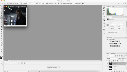
click create frame animation

next, go to the three horizontal lines across from the word “timeline” at the bottom. once that menu opens, click “make frames from layers” at this point the gif is backwards, so you’ll want to go back to that same menu and click “reverse frames.”
now that your gif’s frames in the correct order, you can set frame delay. select all the frames in the timeline, then right click so get a box that looks like this:

i almost always set frame delay to .05, but if i have less than ~20 frames ill set it to 0.06
next, click the symbol in the bottom left corner (you can see it in the photo above) to convert the frames to a video timeline
after this, on the bottom right side, select each layer of the gif under the “layers” tab. right click, then select “convert to smart object.” this will allow you to sharpen your gifs. to do that, at the top of the screen go to filter>sharpen>smart sharpen. the settings i use are 500% at 0.4px, then i sharpen again 10% at 10px
here's the gif before sharpening:
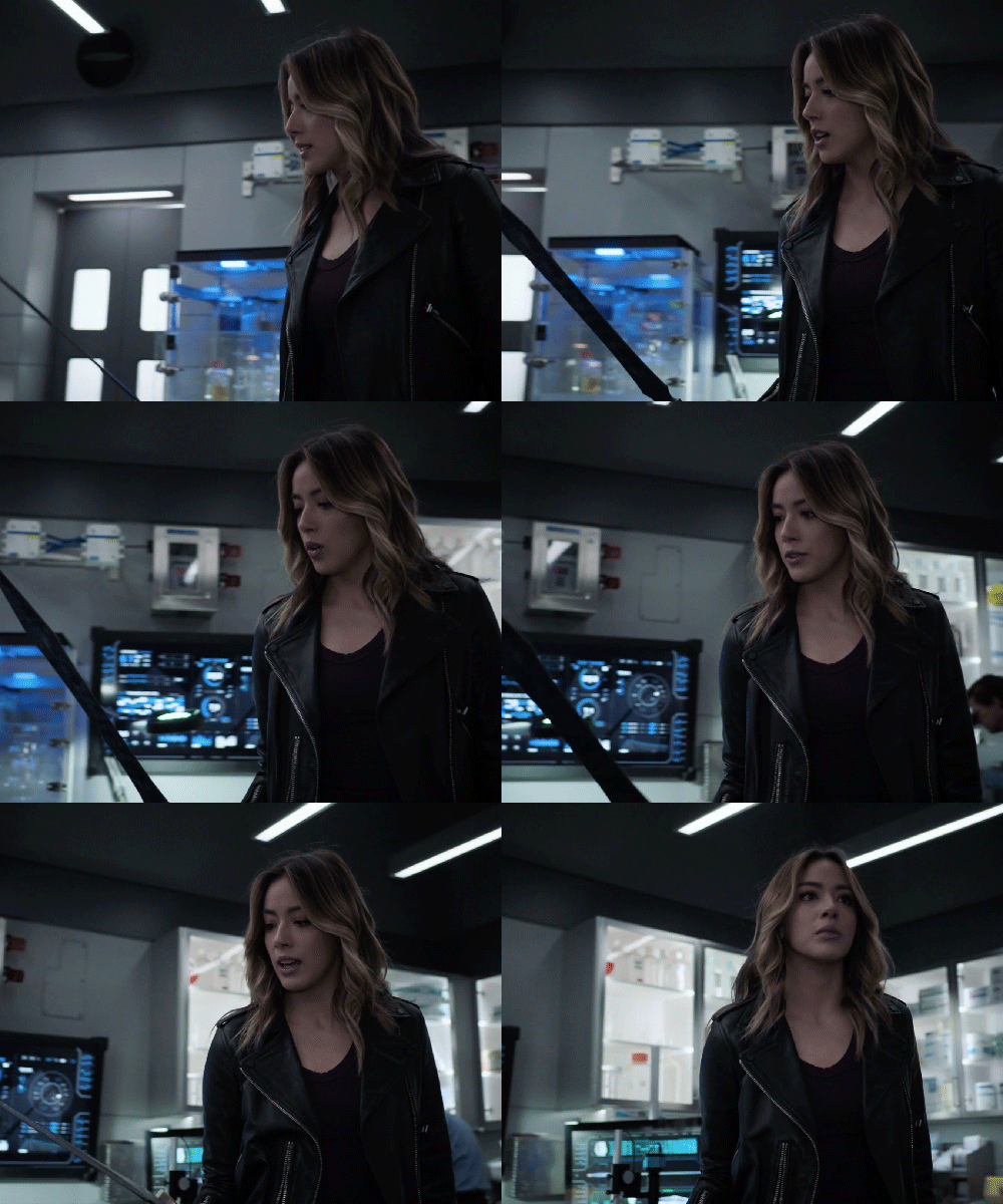
sharpened 500% at 0.4px:
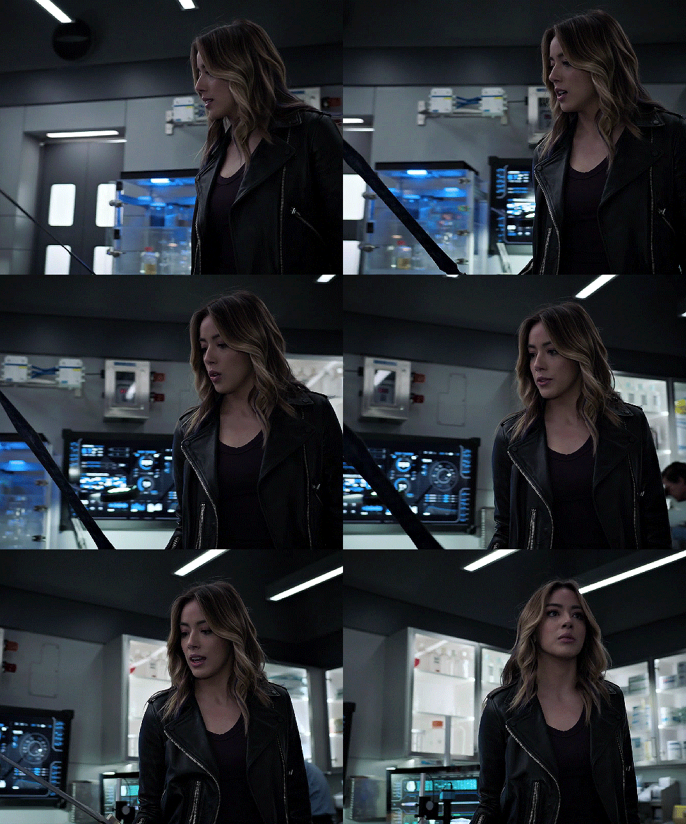
sharpened 500% at 0.4px then 10% at 10px
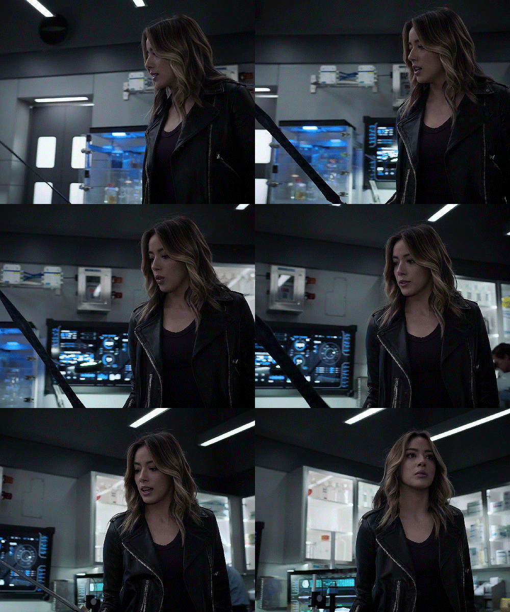
coloring
once this parts done you can start coloring your gifs/adding adjustment layers. the main ones I typically use, in order, are curves, brightness, levels, selective color, and vibrance. the first three adjust the lighting of the gif and the last two adjust the color. other layers i use are saturation, color balance, and photo filter, which all adjust color.
to add adjustment layers, you can either 1. go to layer>add adjustment layer>select the layer type 2. pick a layer type from the icons on the right side (above the layer list)
honestly, the easiest way to do this part is to just select “auto” and photoshop will automatically adjust curves, brightness, and levels, but i usually slightly tweak it from here until im happy with it.
curves: use the white dropper to select the lightest part of the gif and the black dropper to select the darkest part. you can manually adjust the curve within the little graph too, but typically you don't need to (i only do when the actual scene the gifs from has a tint i don't like, ex. if its really green ill go to the dropbar, go to green, then adjust it until ive mostly neutralized it)
brightness/contrast: brightening too much will sometimes decrease the quality, where increasing the contrast will sometimes help increase the quality
levels: honestly you can almost always get away with not using this unless the lighting in a scene is really bad/weird. use auto then adjust as needed
this is what the gif looks like after adding adjustment layers: curves: input 85, output 92 brightness: brightness 19, contrast-32 levels: 0,1.11,255

now you can get to actually playing around with colors!
the first thing i do is add a layer of selective color, go to black, then increase black. this is one of the last ways to increase quality slightly, as it can make the gifs look a little sharper.
next i add vibrance. typically, unless the scene itself is already pretty colorful, ill increase vibrance almost fully, and slightly increase saturation. the issue with increasing saturation too much, especially when your giffing people, is the colors start to look really unnatural
for this particular gif, i added a hue/saturation layer, then decreased red and increase blue and cyan, because there was a lot of both of those colors in the background and i wanted it to stand out more. i then added another selective color layer and increased cyan for both blue and cyan.
these are the specific adjustments i made: selective color: black>black +9% vibrance: vibrance +76, saturation +10 hue/saturation: red -15 selective color: blue>cyan +75%, cyan>cyan 49% hue/saturation: blue +4, cyan +5
saving
once you're done coloring, you can save your gif. to do this, go to file>export>save for web (legacy)
these are the save settings i use:
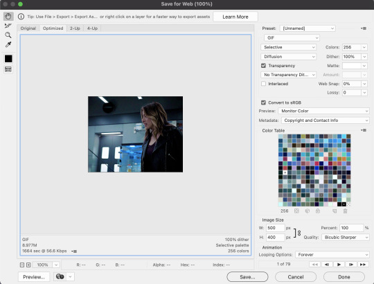
also, the gif size limit for tumblr is 10M, so make sure your gifs are all under that size. if they're too big, you can either adjust the image size on the save page (or while making the gif) or shorten the gif
and here's the final product!
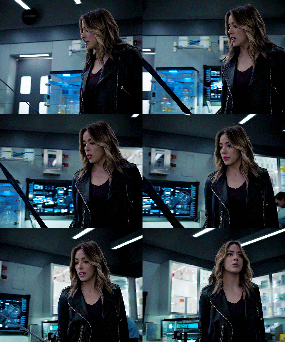
i hope this was helpful :)
5 notes
·
View notes
Note
I really don't understand the "why do you make everyone so white" question, first of all, they're fictional characters, they can be anything and everything, second of all, I really don't think you can go to an artist who draws fan art and accuse them of not drawing an anime character realistically when most Japanese anime characters have blue and purple and pink hair/eyes, AND have mostly white skin, it just seems kinds hypocritical ¯\_(ツ)_/¯
I would understand the frustration if they were real people but otherwise, there should be no issue, in my opinion at least
Anyway, your art is amazing ♡♡♡
Thank you for emphasizing the fact I try describe over and over. It's just an art style and the characters I draw don't and never could exist irl with their facial features. C'mon..., its a fictophilia like artstyle.
I heard about art breeder btw and saw a couple of pictures for official characters that look quite realistic. I am not artbreeder and I am not aiming to paint or structure the faces like the artbreeder program but in the end also they look kinda all "alike" since people will always choose the pretty facial proportions and structures for faces.
Mah, thank you again for understanding. I really don't want to paint real people, if I want real people I go on the street and take a look cuz there won't be any filters or photoshop, either.
And one more thing, I don't use references, so in the end all charas might look always a bit alike... of course I try to change them always a bit but mah... its not easy.
10 notes
·
View notes
Text
How I Color in Photoshop
I’ve been asked before how I do coloring. I hesitate to call this a tutorial as that implies this is the RIGHT way to do it. Instead, this is just how I do it. My image is a bit risque, but I think Tumblr will be okay with it. This assumes you already have a drawing saved as some sort of file that can be opened in Photoshop. The principal is the same in about every program, but the specifics of how to do things are different. So I’m starting with this:
(BTW, if the images are too small, try right-clicking and Open In New Tab. Seems to show a bigger image.)
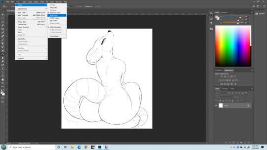
So first off, you may need to change the mode to RGB to work with it. I’ve opened the file here and am changing the mode to RGB. (Edit > Mode > RGB). Once that’s done, we can start working with adding a flat color, a soft shade and a shine layer to it. That’s what I’ll be up to here.

Next, I like to make the line layer editable, so I click the little lock icon there. By default when you do this it will name it Layer 0. That’s fine. If you’re anal you can change it to Line Layer or something.
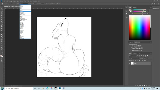
Next I’m changing the Line Layer to Multiply. This is pretty critical. You can do it from the top menu there, or there’s a place just above the layer name (where we Unlocked earlier) too. Either does the same thing. As best I understand, Multiply says to combine other layers with this layer So when we color, the white areas will be colored, the black lines won’t be.
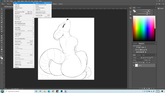
Now I’m adding a new layer that my flat colors will “live” on. It can be a Normal layer since it’s going UNDER the line layer and nothing needs be seen underneath it.

Okay, you can see my new layer on the bottom right I named Flat Color. That’s where our actual colors will be painted. (or more accurately, PENCILED!). You can drag layers above and below each other there, and this layer needs to be under the line layer. I used to make this the Multiply layer and had the line layer underneath it. That works, but will lead to issues later on as you learn to do more layers, so best to just always keep the line layer on top and MOST other layers under it.

Last step before we get to work. I do NOT paint flat colors with a paintbrush. I use a PENCIL. Because the pencil tool is pixel-perfect. That is, there’s no soft edges on a pencil line. Each pixel is either fully colored, or it’s not at all. Even the hardest brushes still have bleed over from pixel to pixel. The size of the pencil really depends on the size of the lines in the line art, but typically I set it at about 5 pixels. That’s pretty small, but lets me get into tight places. I’ve seen others do this differently - but this isn’t about them. It’s how I do it.
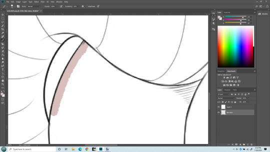
Time to zoom in and get coloring. I’ve chosen my color. Obviously this pencil is bigger than 5 pixels, but I wanted it to be clear what I’m doing. I’m drawing with my pencil right into the line itself. If I stray outside, I use the eraser (ALSO SET TO PENCIL SO IT ERASES PIXEL PERFECT) and keep the edge of the color underneath the black lines. I don’t care about the other side because Flood Fill/Paint Bucket will handle that later.
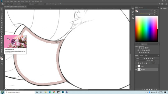
Here I’ve finished drawing the color inside her butt cheek, keeping the edge under the black lines. In practice I’d have gone on to everything that needs to be colored with the same flat color, but keeping this simple. Now I’m switching to Flood Fill/Paint bucket and am going to fill in the rest with one click. It normally will fill the entire section pixel-perfect, though sometimes around very tight angles it may miss a few. Those I fix with a pencil directly.

Bang! Butt cheek filled with a solid flat color. Now draw the rest of the damn owl. No, but seriously I will do this for the entire character with the various colors I want. For her I did this color for her body, a pinkish color for the tail and nose, a white and a green for the eyes. But there’s another advantage of doing this - I can select entire body parts by just selecting the Flat Color layer and use the magic wand to select everything that is that one color. Trust me, that’s a real benefit. You can get stylish later on, but having this flat layer is still awfully handy to keep FLAT. Okay. On to shading. Notice I now have a 3rd layer in between the Line and the Flat layers. It’s where I’m going to do Soft Shading. I also put it in between the line and flat layers, and I set the layer type again to MULTIPLY. Because I do want the flat colors showing through it.
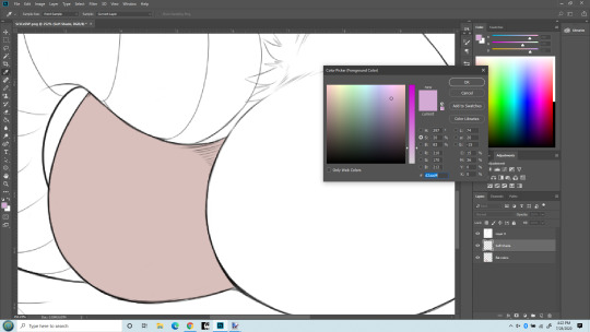
Now I’m getting ready for soft shading. I almost always you a greyish-purple color for shading. For me, it just seems to work the best. I know there are more intricate things, but this is a basics lesson. Another thing, when doing Soft Shading, I use a HUGE paintbrush set to the softest possible setting. Typically the brush spans the entire size of the body part I’m painting. I also SELECT just the part I’m shading. Sometime that takes some patience with the lasso tool, sometimes you get lucky and can just use the Flat layer to select, then move back to the Soft Shade layer. The important thing is to select only the part you are going to shade. You’ll have to do it over again on the other parts. Ideally the separation between the body parts will be a nice line you can hide the transition inside of. Othewise the Smudge tool is your friend to correct small mistakes in shading.

HUGE soft round brush. I think I used about 400px here. But the important part is, you don’t even put the center of the brush inside the section you’re shading! The shading is done with the edge of the brush. Essentially you’re almost doing a gradient.

Zoomed out with a nice soft shading. I did use a similarly soft eraser to work it back a little too.
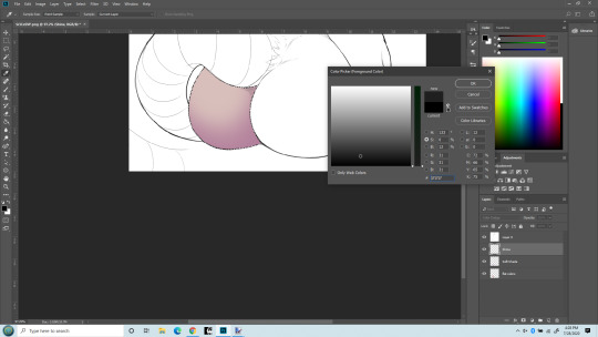
BONUS! Notice the new layer? SHINE layer! I put it above the soft shade. Really I’d probably do a hard shade layer in as well, done similarly to the soft shade in the same color but with a smaller, harder edged brush and just in limited places.
But I want to show the MAGIC of COLOR DODGE! That’s what my Shine layer is set to. Essentially if you color in black, nothing changes. If you color in a grey, it lightens the colors underneath. If you color in white, no matter the underlaying color, you get white. There are other blending types that work similarly but I just like the effect of color dodge best.
Also, note the color I’m chosing. It’s ALMOST black (which would result in no change). It takes only a very small bit of not-black to make a big difference. Going to give that cheek a highlight. First, with a soft brush at maybe 40px.
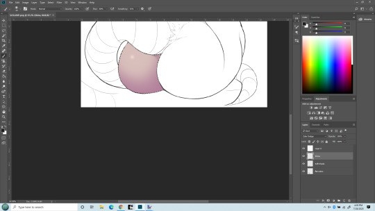
What a difference a little dot makes!!! Now that cheek’s really popping out! The type of brush used when making a highlight makes a big difference too. I do tend to overdo this, I know - but I like it! I can’t help myself! One last thing - what if I use a hard-edge brush instead of soft for the highlight?

Same size brush, but now its hard edged highlight. Really the softness (or other texture used) defines the kind of surface it’s on. The soft looks more natural, esp. on skin. The hard edge looks more like rubber/latex surface. (Neither look like rat fur, but sometimes you don’t care!)
That’s it. This is how I do stuff. Plenty of other things I could have mentioned. Reflection layer is a biggie. I like to do both soft and hard shading too. Eyes of course. Nothing makes a picture shine like good eyes. And then there’s what I truly call Highlights - a layer that goes on top of the line layer, so it can obscure even the lines. Backgrounds, which I’m not very good at but I almost always do them anyway because I like pictures that define a place and time as well as just a character. Shadows (as opposed to shading) which is frankly an art form in itself. But I’ve already put in more pictures of a rat butt than Tumblr is happy with so I’ll end it here.
5 notes
·
View notes
Note
Hi, would you mybe show us what your lighting setup for the Venessa Jeong post looked like? Thank you :)
Hello, I’m sorry I can’t show you the exact setup, since, I delete my raw files as soon as I’m done rendering them (a way to force myself to move on to another “project”). Btw, I’m using blender.
But, I could tell you how.
I, basically, just play around with the lights, until it satisfies my idea for the scene. I place the lights on the side where I want them to reflect on my main subject, and point it at them/their part(e.g. sim), and adjust the strength to a level that would highlight my main subject and give off the right atmosphere. In the case of Venessa Jeong, and Penny Pizzazz, I used 5 lights/lamps, surrounding them, in a c(ish) formation, but with different strengths. 2 on their left sides with the darker colors (blue/purple to make it sim like its night time), one at the front usually this is the lightest and strongest to emphasize on the face of the sim, other 2 on the right with lighter colors(yellow ochre/orange-ish) for contrast. Please be reminded tho, that I’m still exploring, and in no way a pro at this yet. (I still have issues with shadows. And use photoshop to deal with it, out of frustration.) Like you did, I still ask for tips/guides, and mainly google tutorials to learn. I advice that you do the same and continue exploring and experimenting for better results.
This is not much, but I hope it helps. I’m glad I could learn with you guys. Goodluck. Have a good day :)♥
2 notes
·
View notes
Note
Someone, a long time ago, an "insider" told someone else in my group about 5H girls being total slaves to their contracts and that even sexual favors are needed to be done. They used the example from LM having to flirt with business executives and that's also a reason why Sinu never leaves Camila beside, even in PR or any kind of meeting. They said Lauren had already did it, (IDK) and I wonder what you think about this? It was a long time ago too.
Trigger warning: This post is gonna be on the topic of sexual violence. Skip this post if that’s triggering for you.
“an “insider” told someone else in my group”What is this “group” you’re referring to? How come you have someone claiming to be an industry insider coming up to this group? Can you please provide more context and background to this setting? Thanks :)
“about 5H girls being total slaves to their contracts”
I mean, it’s not really an exaggerated sentiment. Much has already been said and written about music industry contracts subjecting artists to slavery-like conditions
youtube
youtube
Prince Compares Record Contracts To Slavery In Rare Meeting With Media
“Record contracts are just like — I’m gonna say the word – slavery”
Singer-Songwriter The-Dream: ‘Artists Are Treated Like Slaves’
“Plenty of passionate owners have built record labels that ripped off their artists.That’s because artists are treated like slaves. We have terrible contracts, we have streaming services that pay one-tenth of a cent per play, we have no laws to protect us.”
“and that even sexual favors are needed to be done”
I mean, I highly doubt that the contracts would stipulate that sexual favors are included. That would be highly dubious and probably illegal. But I have no doubt that a patriarchal industry rife with overt sexism and misogyny, with huge power disparities at play, would be a veritable breeding ground for abuses of power, harassment, and sexual violence.
Remember Harvey Weinstein and the #MeToo movement? This man was lauded, praised and publicly adored for over 30 years. That is a fucking long time, and he was a fucking huge industry player. He was a fucking head honcho figure. Over three decades worth of professional working women were subjected to harassment and sexual violence at his hands. Some of them, many amongst them, are high profile female performers whom you’ve probably watched on screen. He blatantly abused his position of power to intimidate women into silence, and to punish and freeze women out of the industry for their rejection or for standing up to him. This wasn’t him with a knife in a back alley preying on women one-on-one. This was him holding a position of power and influence, along with his colleagues, his employees, industry partners, industry players, any stakeholder in the system who is subject to being influenced by the power and money of a huge industry player like Harvey Weinstein - they all contributed to and protected this system of abuse. This is a systemic issue. This is not a Harvey Weinstein issue. This is an issue with the status quo. The women who came forward about him - we wouldn’t even know whether they’re only a small fraction of the number of women he has abused. How do you keep that many survivors silent over a period of several decades? Shame and fear. Fear of retribution. Fear of succumbing to the trauma, the shame that comes with experiencing being a victim of sexual violence and acknowledging that pain and owning it publicly. The #MeToo movement presented a vocal platform and somewhat of a safe space for survivors to share their experiences with the public, but also with each other, to recognize that they are not alone in this and they had support.
Now consider this: the music industry hasn’t yet had anything close to a #MeToo movement. How fucking dark is that?
You mentioned Little Mix’s comments
“‘Someone from our US record label said, “Go and flirt with all those important men.” I was like, “Why have I got to go in and flirt to get my song on the radio?”’ They consider themselves fortunate they had each other as back-up. Things might have been different if they were solo and left to fend for themselves.”
Just look at Kesha and how our favorite evil corporation, Sony Music, has thrown its enormous weight and money into protecting their very own rapists
“Sony Music Entertainment is looking to get out of a court ruling that ordered the record label to tell Kesha and her legal team who it interviewed during an internal investigation into Lukas “Dr. Luke” Gottwald.”
Oh, about those “internal investigations” like the one Sony conducted? Just an example of how the industry doesn’t have safe standards for reporting sexual harassment so that it can be investigated properly by legal authorities. This is something Dina LaPolt, Fifth Harmony’s legal representative, is very conscious of given she was part of a group who drafted recommendations to address this.
“[…] we recommend music industry companies and law firms adopt the following internal practices […] Make instances of harassment an express exception to NDAs and arbitration provisions.”
Take Taylor Swift’s case against David Mueller
“It highlighted the underreporting of sexual assault”
Taylor Swift Speaks Out About Believing Sexual Assault Victims on Anniversary of Her Trial Verdict
“I guess I just think about all the people that weren’t believed and the people who haven’t been believed, and the people who are afraid to speak up because they think they won’t be believed”
“I figured that if he would be brazen enough to assault me under these risky circumstances and high stakes, imagine what he might do to a vulnerable, young artist if given the chance. It was important to report the incident to his radio station because I felt like they needed to know”
Wanna know how prevalent sexual harassment is? Very.
A New Survey Finds 81 Percent Of Women Have Experienced Sexual Harassment
Almost every adult woman I know has been subjected to some form of sexual harassment in their life time, whether they themselves have recognized it or not. If you have yet to experience any form of sexual harassment, count yourself lucky up to this point, but you have to understand that it’s a game of probability and statistics as you go forward. If we’re playing “six degrees of Kevin Bacon” then I already know several first and second degree connections who have been victims of contact sexual violence. I am certain I know plenty more people who have been victims of contact sexual violence, I just don’t KNOW of their experiences. Because we are silent.
I am so fucking grateful that Sinu goes with Camila everywhere. I am so fucking grateful that the girls’ parents travelled with them for at least some part of their tours/work commitments. I feel that, similar to Little Mix, I am so grateful that Fifth Harmony were in a group together. I hope they were protected. I hope they protected each other. We know they’ve all been subjected to some form of sexual harassment - most notably online, whether it’s Camila having someone say “suck my dick” during one of her live Q&As, or perverts creating photoshopped porn images of them (btw the Mattmila and Tyren accounts that do this? That’s sexual violence FYI), but also the people who make inappropriate comments or actions in person. Remember that Camila stopped doing koala hugs because people at meet and greets took advantage. That is a polite way of describing that those people sexually harassed her. I have no doubt that behind the scenes, they’ve been subjected to some form of sexual harassment in their workplace by industry staffers - I have no doubt that this could only have intensified as they got older, and probably more so once they all went solo.
“They said Lauren had already did it, (IDK) and I wonder what you think about this”
What was “it” that Lauren had supposedly already done, and who was this “insider” and what was this “group” you claim they were talking to? :\
This is what I think about sexual harassment/violence, as it pertains to the girls:
Statistically speaking, one or more of the girls is likely to have been/or to be subjected to contact sexual violence during their lifetime (Camila being groped during koala hugs actually already counts)
Just taking into account the articles shared above even, I don’t doubt that sexual violence is prevalent and underreported to the point of being almost invisible within the music industry. Keep this in mind when reading the next paragraph.
Lauren has not publicly spoken about any personal experiences of contact sexual violence within the industry. There have neither been public comments made by her or her representatives to suggest that she has definitely experienced contact sexual violence within the industry, nor have there been public comments made by her or her representatives to suggest that she has never experienced contact sexual violence within the industry (at the time of this posting)
I fucking pray (disclaimer: this is hyperbole, I’m not religious) that the girls were protected and safe from that, and that they continue to be safe and protected from that. But I genuinely believe that they have the strength and resilience to overcome and survive whatever trauma they may have been subjected to without our knowledge, or will be subjected to without our knowledge, going forward. Now let’s all go watch Captain Marvel and continue to be inspired to take down the patriarchy.
IMPORTANT NOTE: This is a sensitive topic. I will ask this of all of you armchair WebMDs hanging out here looking to catastrophize these girls’ lives in order to come up with some tragedy porn for your idle minds: this post is not an invitation for you to theorize and hypothesize whether or not some celebrity has been a victim of sexual harassment or sexual violence based on your armchair pseudo-analysis of their body language and facial expressions in their social media posts. Please respect that this is a sensitive topic and refrain from making baseless statements about what may or may not have happened purely from your own projections.
#ask#anon#trigger warning#taylor swift#kesha#ke$ha#little mix#fifth harmony#camila cabello#lauren jauregui#ally brooke#dinah jane#normani#metoo#camren
43 notes
·
View notes
Text
Going down memory lane
Just a little photo post.
June 9th 2017
I come back after more than a year, ready to try this out again.
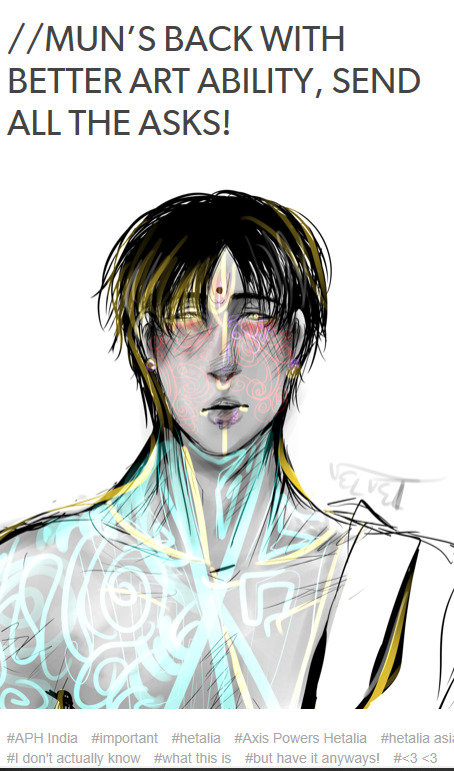
I love how I'm always straight with ya guys in the tags yeesh.
July 4th 2017
The start of my first proper event, the Gandharva Event! (Though I've revised his design greatly ever since- there's no trace of Shiv in this anymore!!)
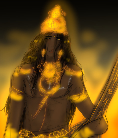
July 24th 2017
My first interaction with @grandparomeaskblog !!! When will I stop drawing your son in compromising situations-
August 28 2018
The very very first glimpse of Mr. G!

Also August 28
The day I started lowkey introducing the world to Shiv's 2500 year old crush.
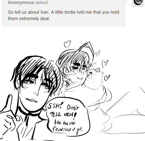
September 1 2017
Young Shiv art!
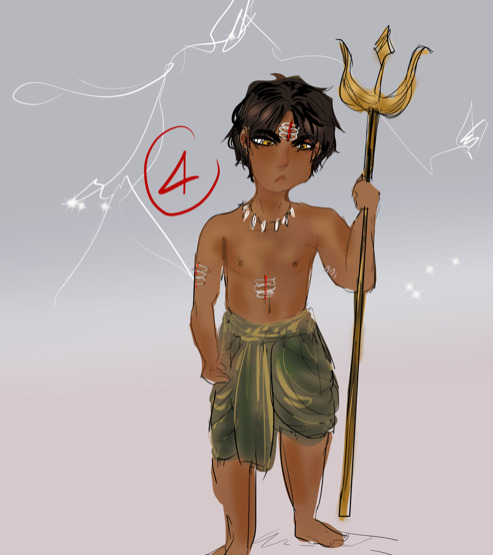
September 9 2017
The most cursed artwork in this entire blog, thanks to aforementioned Grandpa Rome and Mr. Camel ( @de-beste-persian-empire)
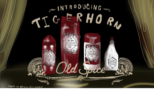
September 16 2017
I think, this is the first sridevi we got on this blog. No introduction, nothing.

Same day and we have Sridevi being as demanding of sweets as she always is, and our lovely Aarya! @ask-ladylotus. The world deserves more india wamen.

September 21 2017
One of my favourite answers to date: Jugaad

September 24 2017
Gosh I don't like the art here at all, but here's the start of the lotus/god angst.

Same Day
The cutest darn Shiv ever. I hope I've kept this side of him alive.
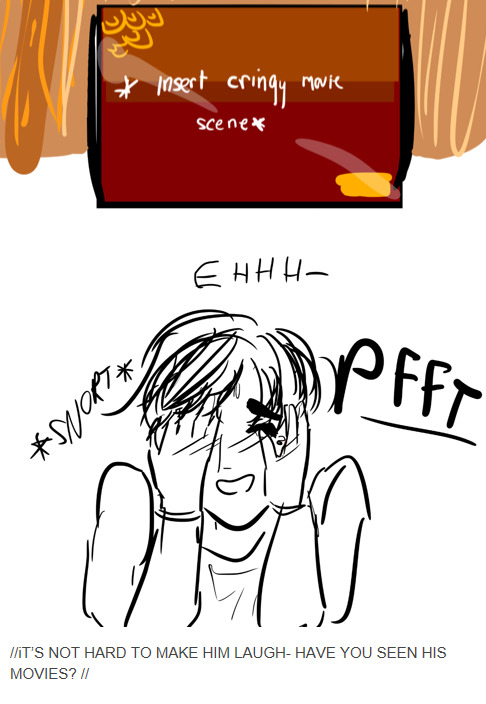
Same Day
I think this is interesting because it seems that I was really fond of a more metaphorical approach to some questions and I'm still like that today: Jealousy
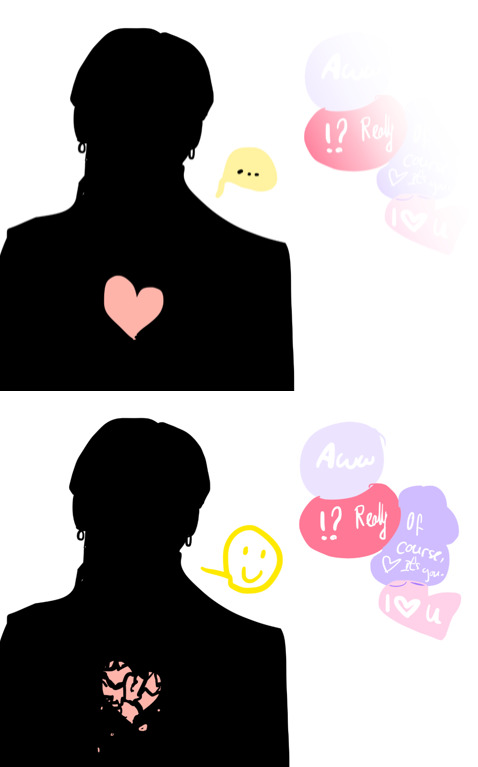
Same Day: Start of the God (dream) Event
September 30 2017
Yeah that's really what they looked like then.
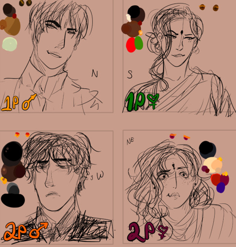
October 5 2017
This may have happened nearly 2000 years ago but I do keep referencing it so here, boys and their issues.

October 24 2017
Same story, more details

October 26 2017
This is truly one of the most beautiful works I've made, and this is when I start getting very fond of this kind of storylike narrative, bright colours and literal metaphors.
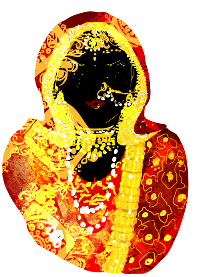
November 3 2017
Jerks.

November 5 2017
Mr and Mrs. did have their casual pretend intimacy. Now she's alone but Mr. Gold has Zar. I hope we see her grow now that her fake love partner's dead and reborn.
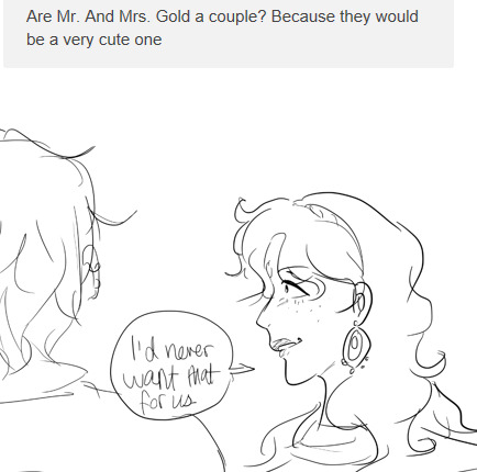
December 19 2017
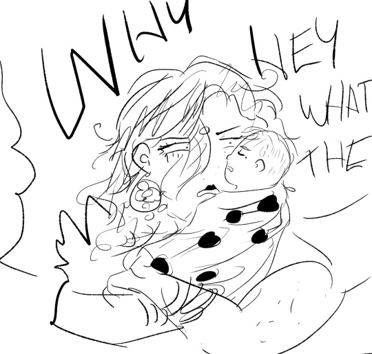
This is about when I fell in love with both of them tbh. Btw the baby was carefully delivered to an orphanage and quickly adopted by one of Mr. G's workers.
December 28 2017
The start of a legend. The Highschool AU. Would you believe me if I told you that Gypty and I still work on it casually or see various futures spawned from it?

January 15 2018 (Welcome to 2018 my good folks, we made it)
This isn't important content but artwise, It's when I really started pushing for dynamic stylistic choices for my art.

January 16 2018
You really really see it here, and also I start indulging more in patterns to brighten up the simplicity of everyday life. I'd also say this is where the general body differences are most exaggerated between them all (even with sridevi as a child).
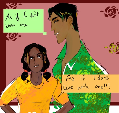
January 22 2018
A comment on Arthur Kirkland.

January 23 2018
A memory of the Sack of Delhi. It may strain your eyes (unfortunately I can't say that was on purpose), but it's a tribute to a nation who's heart has been stamped on by circumstances that no one can predict, yet its spark still lights. From an art standpoint, I was very proud of the expression I felt I conveyed well in this panel.
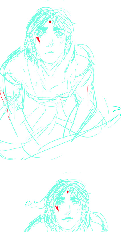
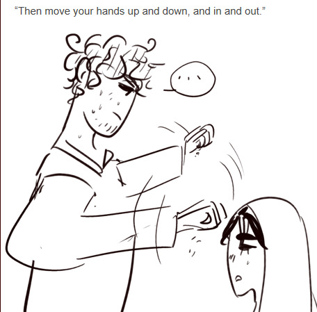
January 28 2018
Listen the amount of research I put into giving you a culturally intriguing gag response-
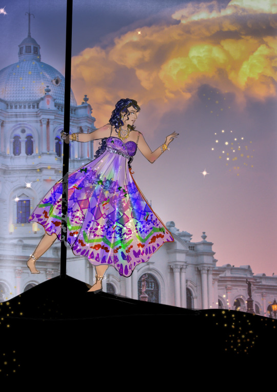
February 2 2019
Mrs. Gold, I definitely improved a lot with colour usage here.
February 1 2018
This is where I have truly tried too hard on colours but I'm really warming up to it. (Oh nu is my icon that old- i'll get a new one soon I promise)
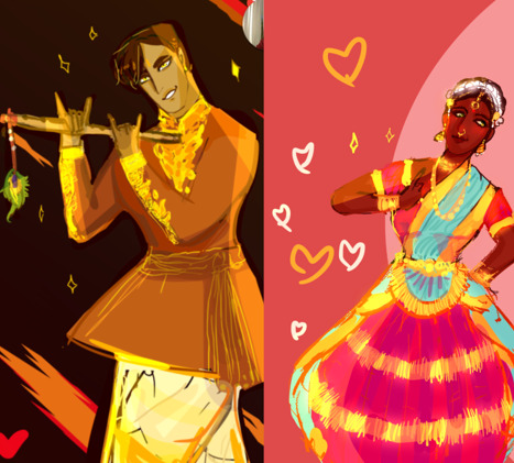
Please just take a moment, if you're someone who is an artist and is on a journey, to compare this piece with some of the earlier ones in this post. This improvement wasn't completely random. It started with looking for stylistic changes in the way I drew- in my case, really exaggerating the flowiness of my strokes and sharp points (messing around with a grittier brush, helped me a lot too, if you're someone who sticks with soft brushes or mechanical pencils, I couldn't recommend trying to use a textured brush or irl charcoal to get a grasp on the type of mood you want to evoke). At some stage it became a love story with color too, but colour takes time and lots of adjustment, which is why you won't see much of it in my blog.
March 5 2018
This is where I really start pushing the exaggeration on Mr. G, but only to get a feel for him. He evolved from a chunky nosed, physically imposing figure with a laughable quantity of gold, to something more desperate and dependant on money, something lean and mean with a nose that could poke an eye out. And here, most prominent is the shape of his lips, which had grown more prominent than before and very good for emphasizing his frown (and hell to work with when trying for his dimpled smile).

March 11 2018
I drew this for an rp starter since words couldn't describe what was in my head. I think it's a fine example of my adoration for patterns- but not just patterns, the idea of luxury beyond compare. It's prominent in my blog but only because I have the brain of a magpie and am constantly like ‘ooo shiny’. But really, I drew what I liked, so I improved. Find something you like drawing if you haven't yet. It can be skulls, it can be leaves, feathers, find your motifs and everything will honestly follow along.
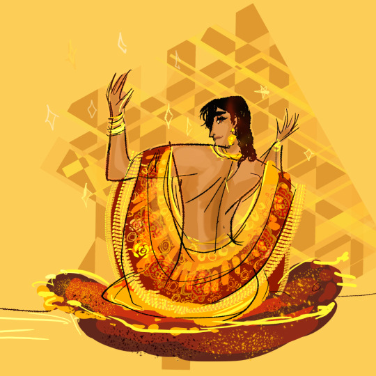
May 17 2018
Post exam-hiatus, I am back with the gang, my art style is a bit rusty but boy have I got intimately involved with colours.

May 22 2018
I can't get colours out of my head, I'm thinking about them day and night, I need to create, I need to and so I do. (In all honesty I am certain that something greatly inspired me to do this but I cannot recall what).

June 12 2018
The Kill Cindy 2k18 movement is born. I can finally show you the Mr. G I have been hiding from you all.

July 1 2018
Something I can point out now is that while I think my colours work (honestly i was making use of patterns to distract you all at this stage- before I returned from my hiatus, I'd been rejected in an interview for an animation course and the key point my interviewer made was that my sense of colour was jarring, so I really was sensitive over it but seeking out improvement), what I would change is that adding a clear light source and allowing an atmosphere (by adjusting the main figures’ hues slightly to match the background) to emerge in my art would make it a lot better. And I start to grasp at this knowledge.
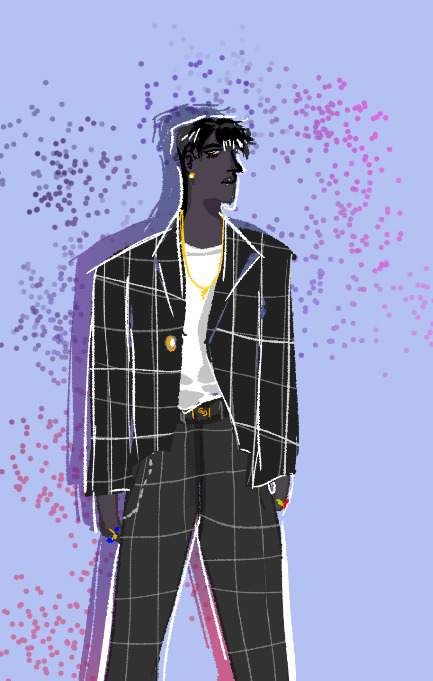
August 19 2018
The start of the bodyswap event, I swear I'll get back to it. I just want to use it as a stepping stone to get some meaningful character development out of it, thus it's ongoing.

See here, this is where I just stop caring about skin and character colour as something that should more or less be constant. Now it's vibrant and blinding for no other reason than I want to make you feel (granted, I did that too much here and it makes things hard to understand much less appreciate).
September 8 2018
Here I'm really just feeling the colours, Shiv's home is easy- everything is luxurious but at once welcoming (or at the very least, pampering), Sridevi's home on the other hand was shown to be neater and almost less personal, there isn't much immersion allowed in her place but in Shiv's..oh man.
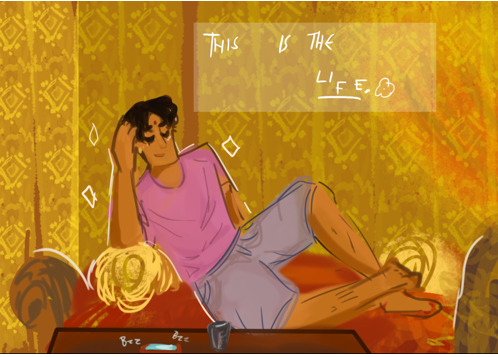
November 2018
As you can see, activity has been dwindling what with rigorous college days and having moved to a new city. It should pick up eventually, but let me close this off with some new art.

Do I have something to say about this piece? Yes, I do! The point of view is Shiv's, thus the warm colours and the way he blends into the background. The main figure here is not himself or his 2nd player, but the vibrant peacocks, that exist in a shade of blue too vibrant to be real. In between the two sentient figures, is our young Mr. Gold, clearly he has the favour of these birds but he doesn't seem very affected by them- unlike the jealous Shiv. He's the dullest colour present and he wears the blandest clothing, the matters of peacocks (be they blue or orange) do not apply to him and he is at once alienated.
Today, November 14th 2018

So after everything, here we are. Is this what all my art was moving towards? No it isn't, it's really just me playing around with photoshop brushes, but the mood of this image is something I feel that I've conveyed with integrity. That's what I want to keep striving for. Thank you all for staying with this blog as long as you have, thank you to all my newer followers, I've linked most of these points to their original posts, I hope that Tumblr does not break them. Love you all!
#mun post#long post#some of the posts include triggering content such as#tw marital abuse#tw insects#and that's basically it#aph india
9 notes
·
View notes
Text
i did try drawing ocelot btw but i earnestly forgot how to draw for a bit. i put the gesture lines down and didnt know what to do afterwards.LOL
but drawing chef healed me i remembered its just lines and blocks. i think it was the brush lol (i have photoshop on one computer with the basic brushes and csp with my faves on another). the pen has to lead me a bit via the characteristics .. i wish you could import csp brushes to photoshop :| drawing hard sometimes and everyone is so talented i can get self conscious really easily lol <- guy with issues
1 note
·
View note
Text
Wordpress localhost ampps alternative

WORDPRESS LOCALHOST AMPPS ALTERNATIVE PDF
WORDPRESS LOCALHOST AMPPS ALTERNATIVE INSTALL
WORDPRESS LOCALHOST AMPPS ALTERNATIVE SOFTWARE
Gimp, the free Photoshop alternative, is currently celebrating its 20 year anniversary. Patterns can be created via the Clones tool, making linked copies of objects, and a wide range of file types are available for export, both raster and vector. Common controls like fill/stroke and text on a path are included along with transformation options and boolean operations on shapes.
WORDPRESS LOCALHOST AMPPS ALTERNATIVE SOFTWARE
Available for Windows, Mac and Linux, this software has all the vector tools you need. Inkscape is one of the better known alternatives to Illustrator. Unlike Indesign, Scribus files are XML-based, making damaged files much easier to recover.
WORDPRESS LOCALHOST AMPPS ALTERNATIVE PDF
Scribus also supports CMYK and spot colors and provides easy PDF creation. Similar to InDesign’s feature set, it has vector drawing tools, import/export options, grids and detailed type adjustment to name a few. Scribus is a page layout program packed with valuable features and runs on a variety of operating systems. I prefer to design on a Mac, but I did not want to ignore the roughly 75% of people who use Windows. Platform specific alternatives are not included in this list of free software. If there are other apps that you think should be on this list be sure to mention them in the comments! Most open source projects do not have the level of finesse that paid programs do, but they can get the job done.īelow are listed nine open source counterparts to industry standard programs, including software for graphic design, photography, web development and 3D modeling. In other words, open source software is non-proprietary and can be developed, modified and distributed freely. “Open source software is software whose source code is available for modification or enhancement by anyone.” For someone new to the field the cost of these tools can be difficult to swallow.Īdobe’s monthly subscription model alleviates some of the upfront cost and provides a generous discount for students, but for those not in school a subscription for all the apps adds up to about $600/year.įor those looking to avoid a price tag altogether, open source software is the solution.
WORDPRESS LOCALHOST AMPPS ALTERNATIVE INSTALL
It has simple interface where you can specify AMPPS to install the WordPress on the created Domain.Aspiring creatives looking to get their feet wet in design often get sticker shock when researching industry standard programs. :) Then I simply put the files directly on my server via FTP and obviously import the database on my server.ĮDIT: BTW, AMPPS allows to install WordPress in a single click. So the URL of my live website and the local are same. Also if I have bought a domain say and i want to add a customized wordpress site on, I create a the domain in the AMPPS with the same name. Now install wordpress using the ip you specified(browser should have that ip in the address bar), in my case 192.168.1.26. You should see the contents of mywebsite folder directly(or contents index.php if it has any). Now when you access 192.168.1.26 (in my case) from other machine in your network or your same machine. (Change the path, ip, etc according to your need). ScriptAlias /cgi-bin/ "e:/program files/ampps/"E:/Program Files/ampps/apache/logs/192.168.1.26.log" combined This line ( Include conf/extra/nf ) should be present in nfĬontents of nf: NameVirtualHost 192.168.1.26:80 You must create a domain(VirtualHost in apache)Īdd the following contents in the file nf, make sure it is included in Apache Configuration. For this exact issue, before developing a website.

0 notes
Text
hey it’s a tutorial on how i make gifs
its a long one
carly, what programs do i need?
what a good question! basically, you need a program to record video (if you’re making gifs of video games), a program to take frames of the video you recorded (or the movie or show you’re giffing because you can do that too, obviously), and a graphic processing program (it’s photoshop, you need photoshop)
also if you’re recording your own game footage you need a computer capable of running that game well. ideally you want medium to high settings at 60fps (this varies; like you want to record, say, skyrim at high settings and probably modded, but newer games like mass effect andromeda, just medium-high settings should be fine!)
for video recording, i strongly recommend:
nvidia shadowplay
i think you can only use this if you have an nvidia graphics card. it’s very good because it automatically records at 60fps and at up to 4k (so like it’s good for taking regular video for video purposes also) and it starts up very quickly (so when you hit record, it’s only a few seconds before it starts recording). in-game, you hit alt+f9 to start recording.
xbox game dvr
i used this for a long time and it’s perfectly satisfactory, and great if you don’t have an nvidia graphics card. it comes with windows 10. you need to go into windows settings and set the quality to High and the framerate to 60fps. the only drawback is that it takes a hot minute to start up the first time you use it in a gaming session (like 10-30 seconds) and there are some games it won’t open over (i had issues with both assassin’s creed odyssey and far cry 5). in-game, you hit ctrl+alt+r to start recording.
for frame-taking:
gomplayer
has a slightly imprecise method of screenshotting, that is you have to time your “burst capture” while the video is playing - you can’t find the spot you want, pause it, start your capturing, and then play the video to have it start at an exact moment. however it really captures every frame and i’ve never had any issues with it. best advice is to record more frames than you need to and delete the ones you don’t need in windows explorer or photoshop. to open the screen-capture window, you hit ctrl+g
potplayer
i used this one for a long time, too! it does what i said gomplayer doesn’t do, which means you can pause it and start screencapturing and it’ll start from where you paused it when you hit play. i’ve had a few issues with it not actually capturing every frame even when i have it set to do so. but that might be just me. to open the screen capture window, you hit ctrl+g
for graphic handing:
photoshop. specifically cs5 -- that’s what i’ve used for about half a decade. i’m sure a lot of the steps are similar in cs6 and cc but i’ve never used either of them and i can’t help you learn those.
that’s it. no other options.
okay great!!!!!!! you got ur software set up. now what???
if you want to make gifs of video games where you use your own footage, read this bit. if not skip down to the next header.
at the most basic level, with creative cropping, you don’t really have to do anything more than record the screen of the game you’re playing. for a lot of games, this is what you have to do (dragon age origins and 2, stardew valley, etc). HOWEVER. there are ways to get different shots in some games and i’ll take you through skyrim/fallout 4 and dragon age inquisition (and i think other frostbite engine games?) if you have questions about other games you’re welcome to ask!
bethesda products (skyrim and fallout 4 mainly)
bethesda is very nice and includes console commands that let you get some good cinematic shots in their base games. these are the same for both skyrim and fallout 4 because they’re the same engine.
tfc
your bread and butter, baby. this is “toggle free camera” or “toggle fly camera” -- it detaches you from your character basically, and you can fly around. if you are in third person when you enter the console command, your character will remain visible and you can take pictures of them. in first person, theyre not. (also, drawn weapons will disappear in first person). note that in fallout 4 third person, your character will continue to rotate/strafe as you move the camera.
you can add a 1 to the end of the command (tfc 1) and it will also freeze time. this is good for taking screenshots, not gifs
entering tfc again will turn it off
tm
‘toggle menu’ -- this turns off the hud, including the crosshair. this is. very important. you don’t want the menu in ur gifs ok.
it also hides the console window! so it may be a little confusing. but generally if the grass/water/dust is moving, the console window isn’t open.
typing tm again will reenable the menus
sucsm #
the default free cam is very fast and imprecise. i usually use sucsm 1 to slow down the speed at which the camera moves.
sgtm #
set global time multiplier. this one isn’t hugely necessary but i still find myself using it sometimes. default is 1. you can set it to, like sgtm .01 to basically freeze the game while you get the camera into position if you’re trying to capture an action. also sometimes if i think things are moving too fast or too slow i’ll change the timescale. MAKE SURE you set it back to 1 when you’re done!
i Heavily suggest, especially for skyrim, that you use an ENB if your computer can handle it. it makes the game look nice, but it also usually includes depth of field which i am an absolute slut for. if not, use the mod dynavision for a DoF effect (available for both skyrim and fo4!)
and then you just have fun with it. getting good shots takes some practice. play with it. i tend to record long sessions (~5-10 minutes) with a LOT of different shots to pick from when i watch it back.
frostbite engine (dragon age inquisition and mass effect andromeda, notably)
here’s where we use the Cinematic Tools, lads! these are a little more difficult. note that there are ct for a lot of games that i don’t play but i’m assuming they work the same. i’ve also never used CT in andromeda but it’s the same engine so they also probably work the same. so i’m mainly talking about DA:Inquisition.
OKAY SO. start the game. load ‘er up. you want to run origin and DAI as admin, and then once you’re in game, start the CT as admin, too. the controls window will open, and then another command prompt type window will open and hack into the matrix. you don’t have to do anything with it, but note that if you close the command prompt window, it will close the game.
okay! party time. there are lots of other tutorials on using the CT, btw, so if i don’t explain it sufficiently you can either ask me or look up other tutorials.
first, i usually take gifs of characters in DAI, which means i wait until cutscenes so we can see them talking or making faces or whatever. you can also do scenery gifs or whatever!
so we’re in a cutscene. first and foremost check “freeze time” and then “enable”. set up your shots. start recording. THEN uncheck “freeze time”. that’s all in the “free camera” tab of the CT and technically all you need. But wait, there’s more. we’ve got two other tabs!
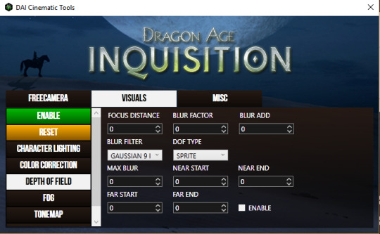
in this tab, I most often use “depth of field” because we’ve already established that i love a strong DoF. all these things are a little hard to understand and mostly require a lot of messing around.
focus distance
pretty self explanatory -- it’s the distance from the camera that objects will be in focus. for portraits, i usually have it at 1.125.
blur factor
how blurry the stuff that’s out of focus will be. i usually set it somewhere between 4 and 7, though you can go higher or lower. dealer’s choice.
blur add
makes everything blurry regardless of focus. don’t use it.
blur filter
i almost always set it to gaussian 9 but it doesn’t make that much of a difference.
dof type
always set it to sprite
max blur
i absolutely do not know what this does and don’t use it.
near start/end
with this you can kind of expand “focus distance” to include more varied distances. i usually don’t mess with this and i suggest you don’t.
far start/end
most useful in outdoor scenes. usually it’ll be set to like 100, meaning that there’s a gradient way out to the most blurred parts. if you bring it lower, the gradient distance gets shorter, so the background gets blurrier closer to your focus. what i set it to depends entirely on the scene. just try messing with it and see what it does for you.
make sure you hit the green enable button on the left and Also tick “enable” on the DOF screen to use it.
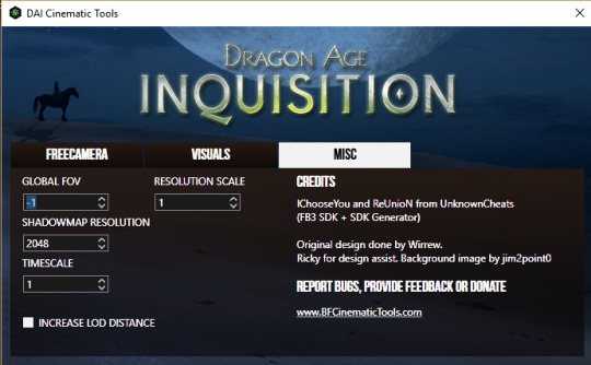
this tab is a little more useful for screenshotting but i’ll include it since i’m going over the CT anyway. i have never messed with global fov or timescale BUT
shadowmap resolution
i usually set it down to 512 for smooth, soft, realistic shadows. otherwise they look kinda stripey.
resolution scale
NOT FOR GIFS. do not use this for gifs. but DEFINITELY do use it for screencaps. set it to two (i’ve had my computer freeze from trying to set it to 4, so like, be careful). it basically doubles the resolution of everything on screen and makes it very pretty but it’ll ruin your framerate so don’t try to record with it.
okay, I’ve got my footage, now what!
now we’re gonna open it in whichever player you picked.
GOMPLAYER:
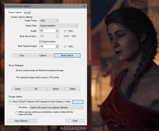
for gomplayer, you’re going to press ctrl + g to bring up the screencapture window. i Don’t remember what the original settings are, but you wanna make sure your quality is set to 255 (highest) and that it’s set to original resolution.
now the slightly hard part. you gotta hit “burst capture” while the video is playing, so it’s slightly imprecise. for that reason i have the number (burst capture images) set much higher than i’ll use, so that i make up for the imprecision. after you capture, go in and delete the frames you don’t need, either in windows explorer or after you’ve loaded them into photoshop.
POTPLAYER:
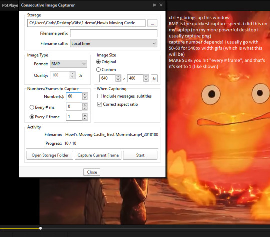
just pause your video, hit ctrl+g, copy my settings, click start, and then play your video. potplayer will capture every frame.
i should have mentioned this earlier but you have to have a folder to save your screencaps in. i usually organize by GIFS>game name># what its a gif of>a numbered folder for each gif in the set. but it’s up to you. just probably don’t save to your desktop or wherever the default location is.
AND NOW THE FUN PART!!
open photoshop!!! if it’s your first time here, go to window>animation so that you’ll. have the animation window open.
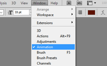
now go file > load files into stack > browse, and find the frames we just took. select em all. click ok.
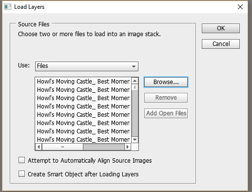
you’re probably going to start off in timeline view. we don’t want that yet. click the box in the bottom right corner that looks like multiple little boxes to switch to frame view.
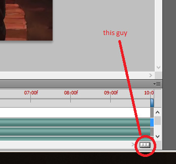
in frame view, click the menu box thing. and click “make frames from layers” and then “reverse frames”
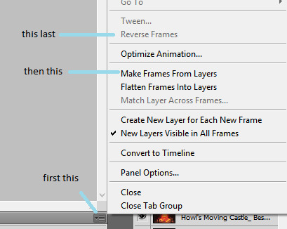
now select all your frames, and on any one of them, select the arrow next to “0.0 sec” (this is the frame delay). select “other”
what you set the frame delay to depends on what your footage frame delay originally was. if you’re using game footage, it was probably 60fps, in which case you should set the delay to 0.04 sec. if it was 30 fps, I usually go 0.06 to 0.08. play around with it and decide which you like best. there’s a play button so you can see how the delay looks before you continue.
now we switch back over to timeline view. so click the same button as we used to get to frame view.
now select all your layers, in the layer panel. right click on them and click “convert to smart object”
here is usually where I do my scaling/cropping. tumblr photoset sizes are 540px for full width, 268 for 2 wide, and 177 for 3 wide. KEEP IN MIND when making especially 540px gifs that the size limit is 3mb. so you can’t make them super tall or super long (time-wise).
the gif of calcifer i’m making is going to be 540x250. make use of set image size (ctrl + alt + i) and canvas size (ctrl + alt +c). set the width of 540 with image size and then crop the canvas to your desired height with canvas size.
okay! technically we can be done. this is what my gif looks like right now:
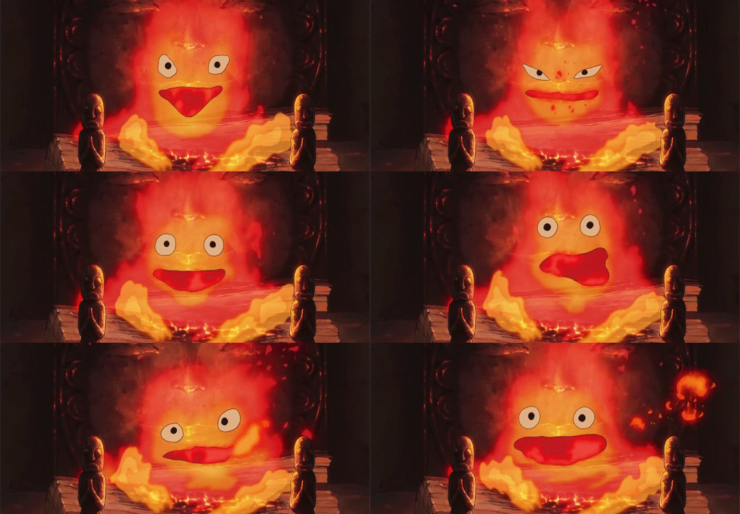
however i like to color and edit mine. yknow. here are my sharpening settings. I cannot help you with coloring because i’m bad at it. at best i will suggest you look at and download resource colorings from blogs like itsphotoshop
anyway, to sharpen: filter>sharpen>smart sharpen
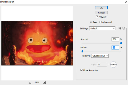
and then apply your coloring. and save with ctrl + alt + shift + s, or just file > save for web and devices. set your file type to GIF. two things to look at:
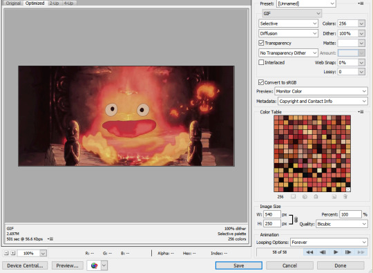
1) MAKE SURE YOU SET THE LOOPING OPTIONS TO “FOREVER”. i put this in caps because I am an idiot who messed this up all the time when i first started.
2) keep an eye on your file size!! if it’s over 3mb (mine, down in the left corner, says it’s 2.697, so it’s fine) then you can try to reduce the number of colors. but don’t go below 128 colors, because then it starts to look bad. instead you can try reducing the height or going back and cutting down the number of frames (so basically remaking the gif again :( ).
okay great, click save. save it. you’re done. here’s our calcifer.
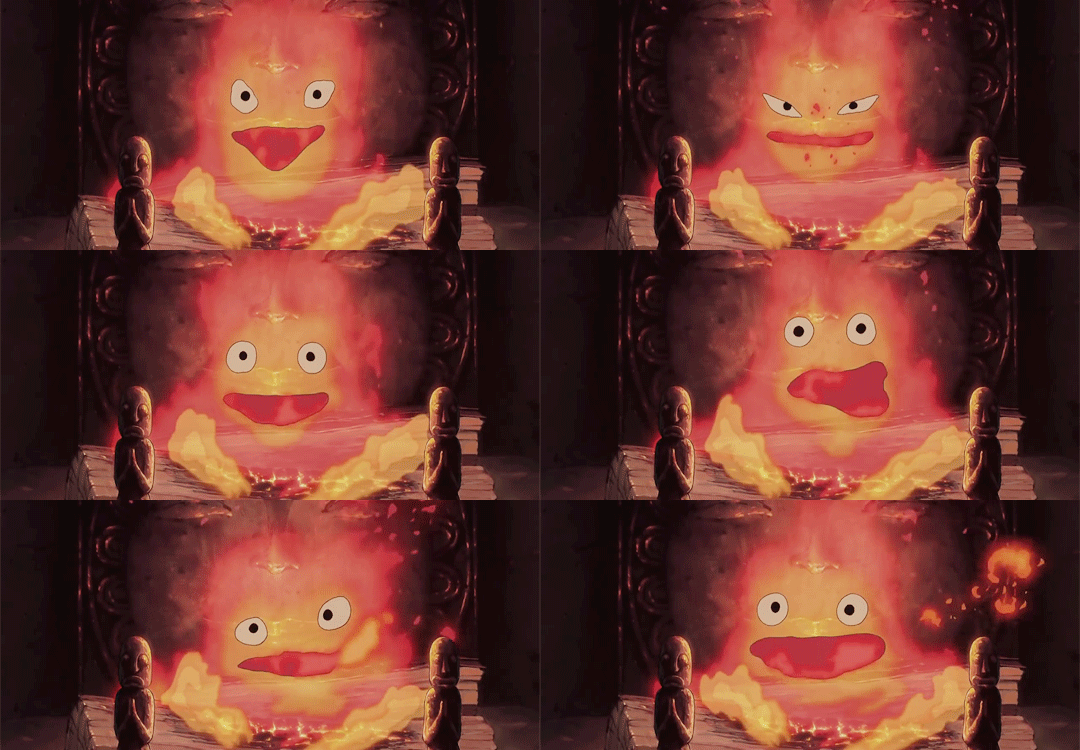
and that’s it! i hope this made sense and like. absolutely ask if you have questions.
#i have been meaning to do this for. months. and finally got around to it these last few weeks!!!!#boy i really hope this all makes sense#carly tells tales#i'm not kidding this is really long. click read more at your own risk.
5 notes
·
View notes