#and my artstyle did change a bit since that
Explore tagged Tumblr posts
Note
Now yes, I come for the ahem art request. You could make Kinji dressed to marry someone, just that X,DD
alright !!

Groom Kinji for the dra fandom !!
#danganronpa another#dra#kinji uehara#me doing art#maybe i should redraw the dra characters in my current style sometime#because#it's been a while since i drew most of them#and my artstyle did change a bit since that#(perhaps it even improved ?)#yeah#if you want to see that#send me asks/comments to draw whatever character you wanna see
25 notes
·
View notes
Text
So, I’m making my own pj masks au and I have already like a summary of the au so I decided to make some character design/fan art because I can 🐀✨ (I made drawings in my sketchbook🤓)
This au is basiclly like the original show but if instead of the pj getting their powers since they were little they got them in their teen years, I’m so original I know 😛, (It's sarcasm but just let me be happy 🐒).
I don’t want to explain the au right now because I’m tierd and because it’s still is progress but anyway, here I have the first character design of my au and i decided to start with one of my favorite characters… Octobella 🗣️🗣️🗣️ (Just for u to know, my artstyle is a bit messy 🥹)

So this is like her octopus from or how ever u want to call it. I was going for like something similar to her original design and gave her some more jewelry because queen loves crystals!!! Love my sea witch 🐙✨
Next is her human form??? I’m still figuring things out…

Yes I have her headcanons because it would make my life easier. Well, Her name is Isabella because when I was doing reaserch o found out that “Bella” means “beautiful” or something like that and I found it quite fitting for her. Her last name is Havström because I found out that It’s a swedish surname that means “sea current” (please correct me if I’m wrong because I’m not familiar with it) She is swede because aperantly sea witches are very popular in Norse mythology. In the au, Bella comes frome a large line of powerfull sea witches and they are known for their potions and crystals, she can change her appearance at will between her “human form” and octopus form. In short, she is interested in the pj masks because they get their powers from a crystal and she LOVES crystals.
I made her a short queen in her senior year of high school, (she is older that the pj masks since they are in their junior year). Queen dyies her hair blond 👀.
In my au, Bella is part of a really wealthy family from Sweden but moved to the states arround middle school because her family’s business started growing very well in the states ,(yes, my au is based in the states even though the pj masks is from france but oh well). I imagine that she meet Greg before the other pj masks, they were neighbors in a quite a wealthy neighborhood, Greg went to the same middle school as Amaya and Connor but Bella’s parents and his parents were friends and they saw each other very often. At one point, Bella and Greg where good friends but when Greg started high school, Bella changed schools to go to the same school as Greg and she made his life miserable when she was a sophomore and he was a freshmen, but when she was in her junior year she went to study abroad and greg was in peace (at least until she came back). There is gonna be an episode arround season 2 that shows when Bella comes back from studying abroad (I want to make her apear untill season 2 so this is like spoiler and I’m sorry 😔, and yes, I’m planning the au as if it was a series ☝️🤓).
And to finish this, u might already have noticed that Dylan (Armadylan) is in the corner with Bella, so in a part of the au they are like a couple but like a toxic kind of one because Dylan genuinely likes Bella but she only uses him, I’m planning that she wants to use him to do some kind of spell that would put Dylan in danger but I can’t say much now ,I don’t want to give a lot of detail because this post is already really long and I’m too tired but I promise that in a future post I will explain about it !!!
This post only had like the main idea of what I want to do with Octobella in the au but in future posts I’ll go with much more detail 😨.
Omg, if ur still here, Tysm!! and I hope u liked it !!!
Why did I made it so long 😭😭😭
🐀✨

Here is the full picture if u were wondering. ✨
#pj masks#pj masks au#artwork#artists on tumblr#traditional art#pj masks octobella#octodylan#justice for armadylan#Pj masks teen au
57 notes
·
View notes
Note
Just wanted to say that you inspire me A LOT.
I always loved you art. I love how your artstyle changed to something more unique. I love how expressive your art is. Also I love when you draw Error and Ink, they're my favorite boys/couple.
Since I discovered you usually don't use too much sketches I got REALLY happy, because I do the same!!!! And I was afraid it won't work, but you showed me how I can keep going!!!
Now I'm kinda studying your artstyle a bit (don't worry, mine is still different) and I encourage you to keep drawing!!!!! I'll be here, waiting:3
Specially the human versions. Would you mind if I ask you to make Error and Ink human? Just and idea, you don't really need to!!!
Well, you're one of my favorite artists, and I just wanted you to know that! Love your art and your kindness when you talk to your fans!! I hope I'll be good as you one day :]
Have a nice day!!
I did it >:))
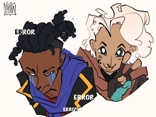
And thank you so much!! I feel so happy to hear that!! ;0; 😭😭❤️😭❤️😭🥺🥺
807 notes
·
View notes
Text
how i do my visual novel filtered photo backgrouds
ive had some questions about this so i figured i'd put together a quick post on my process and what goes into it.
this isnt really a tutorial and instead is just a ramble of how i do stuff with a ton of examples and pictures lol
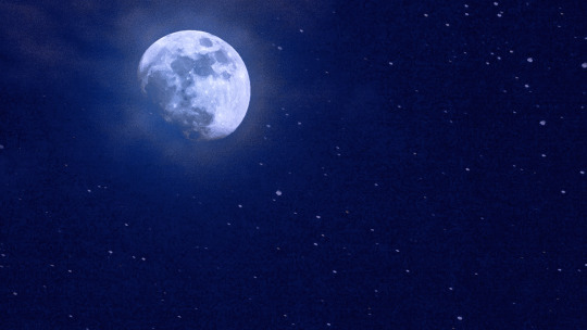
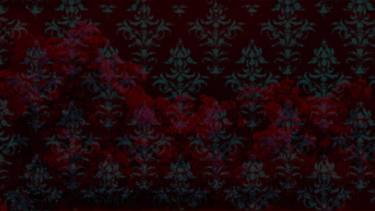
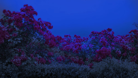
read more below. this is a long post and you probably want to be looking at these images on your computer instead of your phone
step one is that i find CC0 photos or otherwise easy licenses to use because I'm lazy and don't want to have a list of credits of random photographers caue i used one of their images but also i don't want to use stuff without crediting
because they have a general lincese that just wants you to mention the site i prefer unsplash or pixabay but there's other public domain type photo sites too obviously
so like okay heres a random picture

i have a photoshop CS5 from 10 years ago. but these can be done with gimp or krita and whatever. theres even photopea that has photoshop in the browser
basic stuff is that i start by cropping my bg into my renpy resolution (i use 1920x1080) this is also the part where sometimes i might rotate a bg. it is a good way to add some chaos vibes to a scene
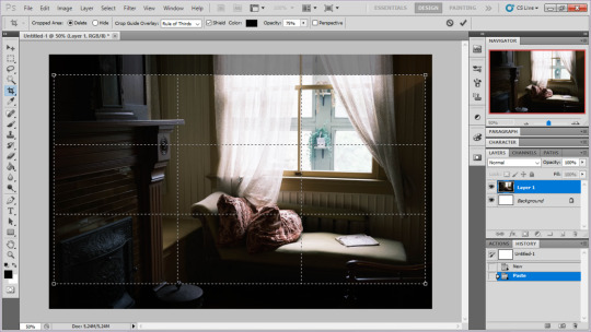
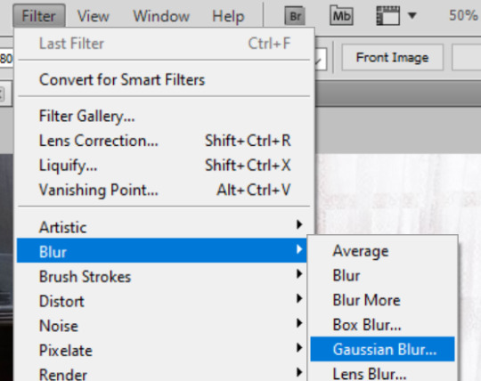
i tend to add some mild blur effect since i find that having too sharp photos as backgrounds clashes with the artstyle of my sprites. like just a couple pixels worth of blur tends to do it
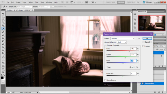
the next part is called fuck around and find out

i like to play with the values to just get random results. hue/saturation for tinting the picture, messing with the curves to get some really sharp effects, or channel mixer to add more of a color
this part is just purely vibes based but i personally think reducing the colors of the background is the simplest way to create something that feels coherent. especially if you make backgrounds based on moods. like having a blue tinted bedroom vs a red tinted one really changes the atmosphere
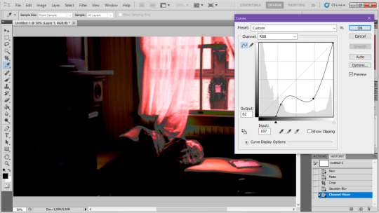
you can get some pretty intense effects but its always important to remember that its meant to be a background and there's a risk it distracts from the sprites
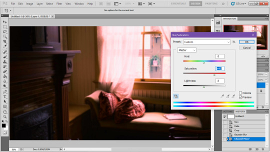
in this case im not including the effect for the curves. after the colours look fine the final step i tend to have is apply some sort of effect.

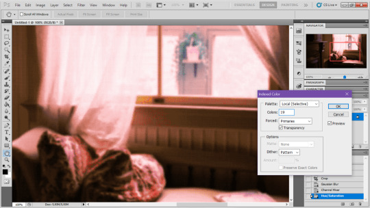
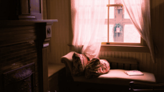
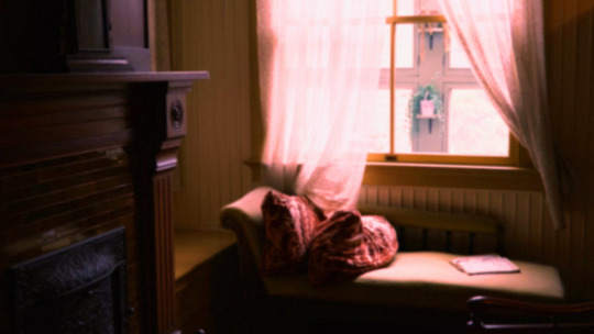
i really like changing the colour mode to indexed colour since i like crunchy pixels. (had to zoom in to 100% to show the actual effect) downside of indexed is that it doesn't look ideal unless its displayed in the exact resolution it was made in but i like it
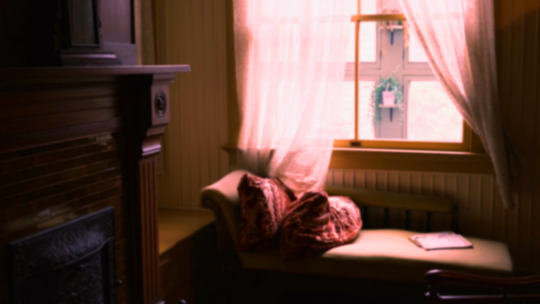
here is the images before indexed mode:
after indexed mode(i think you have to click the image and open it in full to see the actual effect):
another thing ive been playing with recently has been grain+chromatic aberration combo. it makes things feel surprisingly lively with just this simple thing so you'll probably see me overusing this effect in the future

you have to mess with the numbers to get the effect you want but for me these were the parameters I've been using
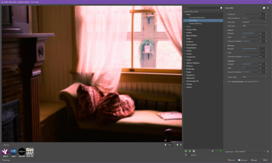

ignore the preview missing idk why it does that.
heres the image (the non indexed version) after these krita effects
one random special mention i have is that playing with layer blend modes is great
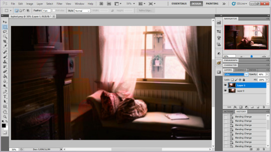
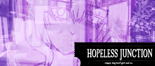
in this example i just copied the same background, mirrored it horizontally and set the layer blend mode to color and it lowered the layer opacity slightly. it just adds some.... idk what to call it visual noise? itj just fucks it up a bit. i used overlapping images and screen modes in some of the hopeless junction images i did for some pretty nice effects
i dont really know waht the blend modes do i just scroll until something looks good lmao
theres a ton you can do with these. like for example just adding a single air brush dot of a bright color on a separate layer and setting it to some blend mode to add a tint to a background
i used these both in malmaid and in the second one i just brushed on some color on a separate layer to give it a moodier vibe
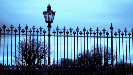
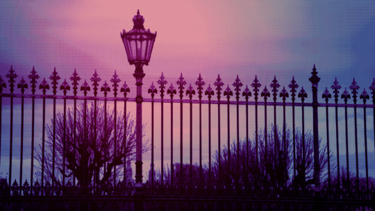
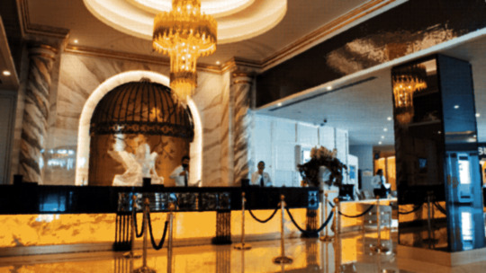
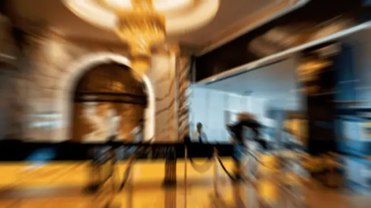
i think having variations of the same background is an extremely easy way to add some life to the bgs without having to do new stuff. like here was the hotel lobby when entering, and here is the hotel lobby when they ran away from the place. i added a radial blur with photoshop
i think theres some beaty in artifacts that come from low resolution images too. sometimes i intentionally use images that have clear compression artifacts cause i think it looks neat. i don't really worry about the details too much as the vibe is the most important thing
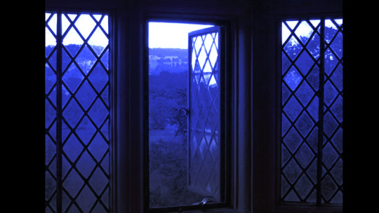
its honestly just a matter of knowing these tools exist and just fidgeting around with combinations to find what you want. it also helps to look at other backgrounds or images in general that you come across and just be curious. how was this done? how could i recreate it? that's the type of experimenting that has led me to these.
idk thats all i have to say. ty for reading and play malmaid on steam like and subscribe for more gay puppies

133 notes
·
View notes
Note
Hi! So I want to make a Spooky Month OC but I suck at drawing, do you have any tips or advices about drawing characters in the Spooky Month artstyle?
Okay so, I might not be the right person for this, cause I also am not all that great at drawing in the Spooky Month artstyle, but I did some character design at school so I might be able to give a few tips! Please do take everything I say with a grain of salt tho!
Spooky Month's strong suit is definitely character design. It's SO expressive and well done it's genuinely unreal. You might want to know exactly what your character is gonna be doing, or how their personality is gonna be like, because character design in Spooky Month cares a lot about things like these. For example: Radford works at a cinema, so of course he's wearing 3D glasses, but also his HAIR IS LITERALLY SHAPED LIKE A POPCORN.
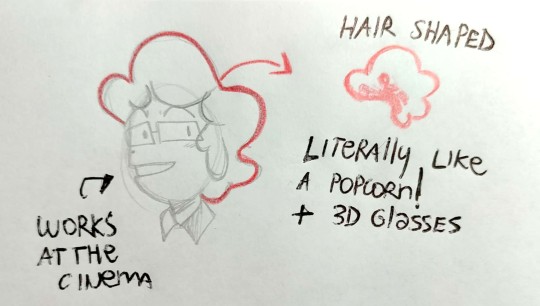
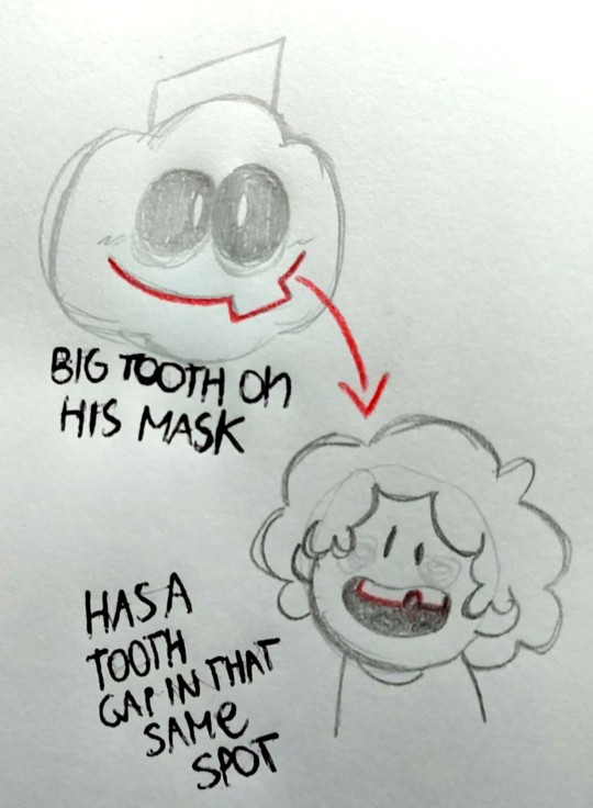
So maybe decide on a job for your character, and try to start from there, get crazy with shapes and have fun! Spooky Month characters have designs that are both extremely simple to draw, since they use mostly basic shapes, but also are extremely thought out and meaningful. Another example of great character design is Pump
Now, I have no idea if you already had an OC in mind, but make sure to choose the right shapes to represent it. Something I see around in the fandom is people making these OCs that are like, serial killers and dangerous people and stuff, but then give them the "Lila"-like oval head. And honestly, nothing wrong with that, that's a choice you can use! But still, shapes allow us to understand a lot about how a character is just by looking at them. So you might want to experiment around a bit!
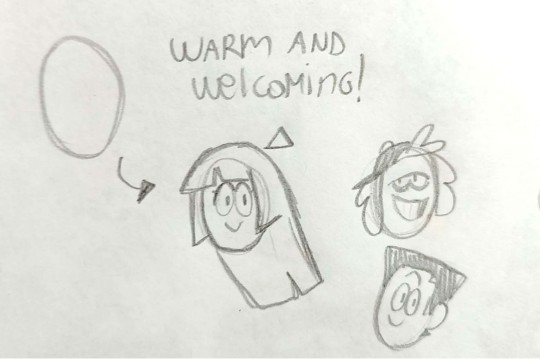
Ovals in Spooky Month are the "good" shape, let's just say. Most character with an oval head are sweet, helpful, kind-natured! It's often paired with oval eyes, so it's mostly a shape that's used for not villainous characters.
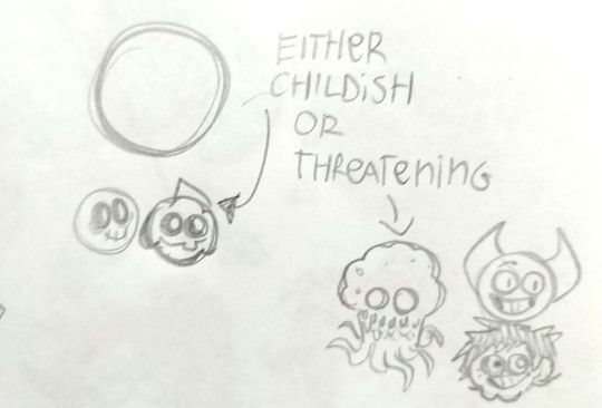
Circles are a bit more complicated, because Spooky Month subvertes the Circle Characters. While yes, they're also used to draw children, such as Skid and Pump, so they may come off as unthreatening at first, most main villains, such as Eyes, Bob and Dexter Doll (which is meant to represent the likes of a child, so that's a nice contrast), are mostly circle-shaped.
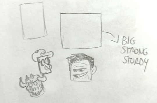
There's a very wide range of Square characters in Spooky Month. Square characters are usually bulky, big and strong. They often come off as threatening (such as Moloch), but there are so many other fun things you can do with them. Like, take Frank. EVERYTHING in his design should alarm us, him being square-shaped, the black eyes, the wide smile. Yet, he has a shape of the eyes that's very relaxed and chill, so we end up trusting him. As for Dexter, he's a mix of circles and squares, so we can't really understand his intentions right away, because he's shaped in the most confusing way possible. He's just made to be unsettling and leaving us to wonder if he's a bad guy or just an oddball.
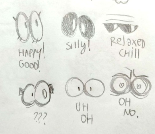
You can do SO MANY fun things by mixing up shapes of faces and eyes it's INSANE. Also, you can mix up other characters' features to create a new one, if you're planning to do a fankid or stuff like that. Look at Ross, he's literally a mixture of all his parents' features!

My main tips for drawing in the Spooky Month artstyle are mostly
1) Play around with shapes. Be as cartoony as possible.
2) Try to be consistent with proportions, because, based on personal experience, if you draw the pupils of the eyes slightly off it changes the whole character's expression drastically
3) don't worry too much about details, Spooky Month has a very simple artstyle. You don't have to draw a perfectly anatomically correct hand, just whip up some cartoony three-to-four fingers and you're good to go
4) try to redraw some pre-existing screenshots from the serie to get familiarity with the way Pelo draws expressions. It helps a bunch.
So yeah, that's all! Good luck with your oc :)
#spooky month#spooky month art#spooky month oc#spooky month au#spooky month fanart#radford spooky month#spooky month radford#sm radford#sm ross#spooky month ross#spooky month dexter#dexter erotoph#sm dexter#dexter doll#sm moloch#moloch#spooky month moloch#sm jaune#spooky month jaune#spooky month aaron#sm aaron#spooky month frank#sm frank#spooky month skid#skid and pump#sm skid#pump wonder#sm pump#spooky month pump#spooky month eyes
122 notes
·
View notes
Text
Welcome to the library.
Faust hopes you find your book in this place.
Hm? No, no, nothing is amiss, Faust assures you. This is how it has always been here, and how it will always be, ever since I created the library.
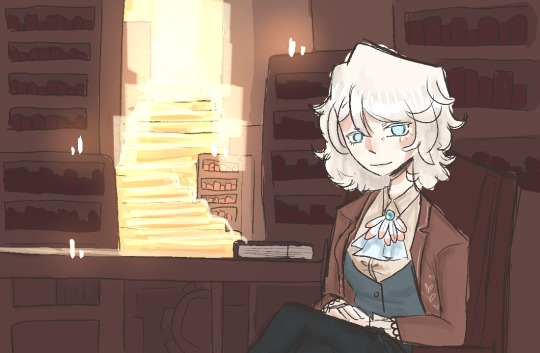

CHARACTERS UNLOCKED:
Faust and Heathcliff
List of characters
Current Chapter:
1. Eat you alive
List of chapters

BLOG INFO:
//well hi there! This is a blog for my swap au between ruina and Limbus company! I thought it’d be fun to make a blog for it!
//this is specifically an interactive story askblog, meaning we’re starting at the beginning of ruina, and through asks, we’ll unlock new characters and such!
//artstyle may differ between posts. This is simply for ease of drawing. My main style (that you see in this post) will be reserved for comics, whereas my simpler style will be used for most asks.
//Please read below the read more if you want to ask, just so you have more info! Have a fun time here :)
Interactive askblog? What's that?
Basically, you all help progress and change what happens in the story! This isn't only done by unlocking characters, but by also deciding what occurs in the story, and how character relationships may change.
Sending asks:
Don’t be afraid to get silly! Though this blog is trying to get through a story, I don’t want it to be 100% serious.
Please don’t spam asks trying to send Heathcliff books. They get lost in the post. And the system doesn’t work like that! Try to get him thinking about a certain topic
Have a canon char or oc or even an abnormality you want to interact with us with? Send them in! You can either send them in to fight, or just to ask questions, either works!
Story progression
As seen on the characters post, you need certain things to unlock new characters. A new book, and for Heathcliff or Faust to talk about a certain thing. Chapters progress every time a new character is unlocked. They don’t really mean much else, and are just there as a way for me to track things.
I’ve tried not to make progression quests hard, but if you need a hint, I will provide one.
Characters
“Whose swapped with who??” You’ll have to stay and find out. I’m not revealing.
“This character works better swapped with this character though...” though I did base off of personality or story similarities, most of these swaps don’t actually impact the characters themselves, so it doesn’t matter who they swapped with in the end, I think.
Also, characters maayyy be a bit ooc, as I'm not too well versed with all of them. I'll get better, I promise <3.
//That is all for now! I will probably update this eventually however
// Most asks will be answered with a piece of art, bigger asks may get lil comics of art, and small asks that I can't draw for will just be text. Though I aim to have at least 90% be art. so answering may be slow, I apologize
//Normal blog rules and all that. Be nice, be respectful, no NSFW... yknow?
//This blog is also ran by the same person (me <3) who runs @dieci-association .
34 notes
·
View notes
Note
what are some things that inspired your wheatley design 😲😲 i think he looks absolutely lovely in your artstyle and i would love to know if you had any inspirations for his design (i also may or may not have a crush on him)
thank you!! idk if you mean his human or android design but i’ll explain both :D starting off with his android design, he is the very first one i did for any of the portal charas so every other core design is based off his technically lol (except glados whose design varies quite a bit but yknow, she’s the queen and all). i was inspired by other ppl’s android designs for sure, i knew i wanted to include round glasses (robots wearing glasses is peak character design imo very funny), messy hair, his core on his chest because i love it as a design choice even if it’s the most common one i’ve seen. and his handles are an important part of him so i had to add them somewhere, i had seen some artists out them on his shoulders and i was like YES thats cool. So i did that. and the second handle hanging around his hips/legs because i felt like the lower body of my design was lacking with silhouette elements. as i was playing the game for the first time he immediately striked me as a butler-y type of character?? so his android design has a “classier” look (he started wearing a bowtie after he was assigned the job in the extended relaxation center to. Appear friendlier i guess lmao). Despite loving all the tall android wheat designs i’d see online, I always pictured him as quite short, and since he does call himself ‘tiny little wheatley’ i thought it couldve fit to give him a shorter model than the majority of the other cores.
As for his human design, it evolved quite a bit overtime. i was totally, 100% influenced by all the blonde wheatleys with blue eyes i’ve seen in fanart 😭 i did kinda picture him as a ginger at first, but blonde wheatley absolutely took over LMAO. my first human design of him didn’t satisfy me in the slightest tho so i decided to change it by making him chubby and have more facial hair/body hair in general and i immediately went oh yes, now THIS is a wheatley im happy with lol. i had seen a lot of different interpretations of his human look and i personally love the most when people draw him short and fat so i was like. i NEED to upgrade him. other than that his human design is much simpler than his android one bc i do think he’d look like just Some Guy. Some stressed anxious guy who’s constantly on edge in his work place and has little to no time nor energy to dress up much. Very average office guy. He kinda balances out his android self who is fancier.
so in short, my inspo was other amazing portal fanartists 🫶🏻🫶🏻🫶🏻 i love yall
34 notes
·
View notes
Note
i made some fanart ^_^ i seriously love this design!! she reminds me of velma from scooby doo!!! :3

THIS IS SO PRETTY HELLO WHAT THANK YOU
OH MY GOD OH MY GOD THANK YOU
@book-casee LOOK!!!!!!!! EVERYONE FOLLOW MINIREZI NOW!!!!!!!!
I love your artstyle thank you so much!! Yippee yippee fanart yippee
Since you did this I shall show you her godtier and her when she was a baby


She's a bit darker here which is purposeful, all she and all of the alpha crew in BB go through a specific arc and it's to show their change ::::D

Then this is her as a baby! She was quite the unhappy baby, seeing time and all
Fun facts about her: She keeps track of things with sticky notes, what replaces her associated element is Sleep, and she still has Bec! Except his name in BB is GCAU- he's a caucasian shepherd dog, and he replaces GCAT's role. You might notice that his name is based off of RNA ::::)
ALSO ONCE AGAIN THANK YOU SO MUCH MINIREZI RGG OH MY GODD
18 notes
·
View notes
Note
Hewwo!!! :3 I hope you are having an amazing day, here is a whole plate of cupcakes! Would it be possible for you to share a few lore details about your Eclipsed By You AU story? I keep looking at the designs and I am so curious about what will be happening, I would wish to nibble on tiny lore crumbs, pretty please?
ama!! hihi! ! i meant to answer your ask much sooner! anyways, since you asked so nicely (and because i am pathetically weak to any sweets </3) prepare for some SERIOUS yappage under that cut
✦ AuDHD demands that I explain EBY origins before any details but you can totally skip this if you want! (Scroll till you see blue text! :3) So... Eclipsed By You was intended to be au/fic just for myself after work when I first got into DCA. I literally was pantsing a self-insert fic from just gameplay, voicelines, and a collection of scenarios I wrote in my notes app before I actually interacted with the DCA fandom lol. I was already in the process of writing it to be a proper fic and planned to make an AO3 acc to post it! I took some time away from it tho cause I got busy irl. During my break I did start to interact more the fandom! The first proper DCA fic I read was 'Solar Lunacy' by BamSara a few months back as a recommendation from a mutual I had from another fandom. I had told them about my fic idea and they suggested I read the fic as my fic had reminded them of SL. After reading through, I was kind of bummed initially because I really didn't think I had anything unique to offer with my own fic that I was hoping to share. I stopped writing it cause damn comparison truly is the thief of joy. SL and EBY had similar ideas going on and I just didn't feel like it was worth posting my fic cause it didn't feel "special" to me anymore. It was easy to give up since writing is really not my strong suit at all, so then I fell back to just drawing! I only came back to it despite the 19 other DCA aus I have lined up rn cause honestly I remembered that wrote it for my own enjoyment! Why did that have to change? Albeit, I did scrap lots of what I initially wrote and started fresh cause my interpretation of DCA changed. Regardless, EBY was always going to be a self-indulgent DCA/Reader fic taking place at the Pizza Plex. Sure not anything original, but that's just a fact of being a creative in general tbh. I felt silly when I realized that haha. I'm having fun and they make me smile, so who cares if its been done before lol. I still enjoy Solar Lunacy and still am a fan of BamSara! (the cotl content has been fueling me lmao)
✦ Some bits on Eclipsed By You- The main part of your ask lol! ✿ On the au/fic name: I actually stole it from another au (of the many) I have. No particular reason for it! I was writing EBY and that au around the same time and alternated working on the two throughout the day. That au is now nameless (actually it's nicknamed "Messiah" as I type) cause EBY grew onto me for what it is now! ✿ On DCA's designs: This might be kind of disappointing lol but- there isn't much of a lore/plot reason for their designs? They just look that way cause... why not :3 It's also part of just how I interpret DCA into my artstyle. Otherwise, they can be interpreted as the canon designs early on! Atleast until some future upgrades! ✿ When in SB are we? Everywhere /hj. EBY will have some pre-virus and post-virus stuff just for funsies! I'm dying to yap but if I say anymore I will get carried away 100%. ✿ On EBY!Eclipse: For this au, Eclipse is his own "person" you could say. With his own AI and personality chip to pair! Carefully built to be a dedicated host and theater bot. He is, including Sun and Moon, the entertainment <3. They are a singular animatronic in this fic! (like those 3 in 1 soaps except it's DCA /j) ✿ On EBY!Y/N: (EBY is a reader-insert, but intended to be written as gender neutral and an adult.) Y/N gets their own bit of lore and issues that may or may not be the stress/frustration from my 2 irl jobs thinly veiled lmao. They work part-time at the Plex as a general theater staff member! Each week, their tasks rotating between concessions, being an usher, and working along side the theater bots! (Kind of like a theater tech.) This is a part-time job just to keep them afloat while they work on their last bit of certifications and training to be a caretaker! They are pretty passionate about helping those in need. A sweetheart honestly. Though, if you don't like kids, maybe look away. Wholesome moments with the littles and DCA + Y/N is pretty decent with kids themselves. (Lots of projection from my own experiences working with children and elderly, as a caregiver turned caretaker. I kind of want to highlight some of my experiences with Y/N.) ✿ On EBY!Sun and Moon: These two are goofballs alongside Eclipse through and through. They all get to be sweet, soft, and doting I promise. Originally, before scrapping a good chunk of the og writing, EBY had a beloved sweetheart anxous Sun and aggressive Moon who was kind of an asshole(Before the rewrite, EBY felt so different. Like everyone was just tolerating eachother and fragments being held together with glitter glue n' dreams. I am very very glad it's different now lol.) Eclipse stayed fairly consistent though. Sweet house husband that he is. Now, Sun is just as unhinged as Moon (making him just as much as a threat!), but we will persevere with the power of friendship <3 We're gonna have some aloof Sun moments. He takes his job pretty seriously! Some goofy Moon bits who's giggles are light and airy. He is very unserious I fear. They're both trying their best, in their own ways. There's not much I can say rn without spoiling haha. It's hard to stay vague hrm. Or atleast I can't think of anything specific to add right now. (I may be able to answer some specific questions if you have any, my brain is just foggy rn) ✿ I'm simplifying it down to your "typical pizza plex fic" with pre-virus and post-fire shenanigans. I'm sorry if none of that is telling I can't think of anything specific cause I'm pretty sleepy rn so maybe it's a little boring sounding but I love it anyways haha Expect some canon-typical violence and non-sexual intimacy! I have intentions on writing the relationship between Y/N and DCA ambiguous so it can be seen as queerplatonic or romantic. (But this could very easily changed, I'm a shameless robokisser sigh.)
#pingquery#EBY#eclipsed by you#im fighting myself to speak and to also not say a single thing#self control whomst#self insert turned reader insert that is still pretty self indulgent all around#writing is not rlly a passion for me rn but i try anyways!!#i just cant draw every single idea i come up with so its easier to write?? idk it's def not my strong suite lmao#im looking forward to writing dialogue and scenarios ive had stashed away for a while#i hope that made sense im so sleepy rn my eyes are literally blinking at 2 different speeds dear god#again im happy to answer more about EBY that my eepy brain missed
17 notes
·
View notes
Text
feel free to ignore this but i needed to get out my feelings somewhere shgjdj
anyways. my relationship with my art has been so weird lately. because like, ever since i've started this blog, ive imporved so much. i know i did, im not blind — even looking at the art i posted here at the very beginning vs the art i do now, the difference is obvious to me. drawing art for this silly game pushed me to try new things and experiment in a way that i otherwise wouldn't have the motivation to. and that's great!! im really proud of myself!!
but ive been trying to change up my artstyle a bit — i want it to be a better expression of myself, to reflex my interests and personality and the way my mind sees things. after all, if ive improved so much, why cant i improve even more? i know the direction i want to go towards. ive looked at other artists, gathered tons and tons of inspiration. and yet no matter what i do or try, i can't come even close to what i want to achieve.
i feel like ive hit a roadblock. like ive reached the limit of my potential and there's nowhere i can go from here and i just... have no idea what to do about it
#💌 personal#dont get me wrong i still really like my art!!#i just.... i wish i could improve MORE#but i dont know HOW to#and im starting to feel like maybe i cant do that at all#like ive used up all of my skills already
8 notes
·
View notes
Text
WARNING : May be disturbing for some people, Blood
I would sometimes forget I am artist. It was ling time since I posted art here so why not changed it.
I am still currently working on my TADC AU comic and on surprise comic. But I wanted to draw something in my fav artstyle. And since I did lot of animals in this style, why not JAX?
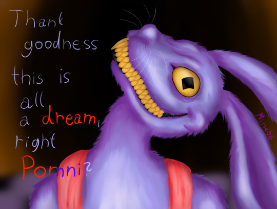

I will do whole cast so who should be next?
1/8
Little bonus when I played with it a bit

#the amazing digital circus#tadc jax#the amazing digital circus jax#jax#jax fanart#tadc fanart#tadc#the amazing digital circus fanart#creepy cute#creepy art#creepy jax because he is an asshole#Why did I drew hom that good when I hate him?#fanart#my artwork#my art#digital art
25 notes
·
View notes
Text

After doing that one quick redesign of Salacia's Royal Design, I'd finally decide to pick up the chance to draw their own Kids again (since I've always desired of wanting to draw something for the Family of King Poseidon's New Life in my AU.
So since that in my Re-written version of "Sponge On The Run" has a much better Redemption Arc for the Antagonist that isn't rushed where his Disguised form is actually his True Self & hasn't grown into Elderhood yet.
In my AU, Deities still stay young but when their come of death has come (meaning that they are secretly Mortal in the World of SB in My HC), they tend to fade into Dust & Become the Stars in the Universe's Galaxy like the Zodiac Signs (either when they reached to Old Age or Can Get Easily Killed or Something, I dunno, Cartoon Logic).
This takes a Few Years after the Events of the Ending in My Version of the Third Movie where Salacia gets pregnant & they ended up having a Few Heirs. Since Poseidon has already changed just like the Original, he ends up becoming a Proud Father while also spoiling his own Children for Love while also that He and Salacia start to become even more responsible rulers of their Kingdom when they entered Parenthood.
(But yeah, not to mention, during their first steps of "Parenthood", things already become a Quick Disaster for their Kids when they begin to cause mischief as Chancellor would be the one have to take care of all of his Bosses' heirs).
I've also decided to change Poseidon's hair a bit in my New Artstyle, since in the Original he actually had more of a Dark Purple Hair despite that I always did made his Hair Black based on some Marketings, as well as their own Raven-Haired Daughters.
King Poseidon (c) Stephen Hillenburg & Nickelodeon
Queen Salacia & Their Children (Prince Proteus, Princess Benthesikyme "Blenda", Princess Rhode "Elly", & Princess Kymopoleia "Leia") (c) Me
#spongebob squarepants#the spongebob movie sponge on the run#sponge on the run#spongebob#spongebob squarepants fanart#spongebob fanart#poseidon#king poseidon#salacia#queen salacia#proteus#prince proteus#benthesikyme#princess benthesikyme#blenda#rhode#rhodos#princess rhode#elly#kymopoleia#princess kymopoleia#family#oc x canon#fanchild#fanchildren#spongebob au#polacia
13 notes
·
View notes
Note
What was it like for you starting out as a beginner artist? How did you improve?
I mostly just incessantly practiced, experimented, and observed a lot for as long as I can remember. I grew up on a lot of videos going over tips and techniques for beginner artists and mostly just observed their processes and would try to bring them into my art. Othertimes I would just constantly experiment with my artstyle (what if I made the shoulders more defined, what if I changed the size of how I draw eyes, what if tried drawing different body types, what if I tried a pose with a lot more foreshortening etc etc). I tried to push myself a bit further everytime like maybe spending more time on the overall piece, adding backgrounds, drawing multiple people interacting. Drawing challenges also helped a lot I think since they pushed me out of my comfort zone or forced me to approach my art in different way than what I was used to. Things like “draw something using only one line and not lifting your pen from the paper”, or “create a bunch of random shapes using a colored marker and then turn them into characters/objects”, or even just dtiys challenges were great for this. A lot of the drawings I made from these didn’t really end up being things I was super proud of after finishing them, but thats fine since I still learned a lot and they still helped with improving. A lot of it was honestly just not being afraid to draw something I might not be happy with later in the name of getting that practice in and trying new things all the time.
I hope this is helpful, but I’m not too sure so I’m sorry if it isn’t, this is the best way I could think of summarizing it!
#pedia says stuff#asks#not drawing#so sorry it took a while to answer this#i had a bit of trouble putting it into words and was worried i was just defaulting to the usual answer of ‘i practiced’#but this whole thing still might boil down to ‘i practiced’ so. so sorry i tried#i just got excited all the time over learning new things and still do#shoutout to younger me who excitedly got up at 5am to look up fun2draw tutorials so i could work on that before getting ready for school#shoutout to me in middle school who got so stressed out when people would watch me draw#so i just learned to draw really really fast as like a stress thing#also sidenote if anyone ever does the ‘omg you draw?? can you draw me??’#hit them with the ‘sure here are my prices’. 90% of the time they will either back off or actually be willing to pay#i WISHHHHH i knew that in school instead of being too nice to say no
34 notes
·
View notes
Note
I really love your art and your artstyle!!! I'm trying to learn to draw and I'm struggling to find a way to draw faces and especially eyes that I like, could you maybe share some tips on how you draw faces because omg I am so in awe of how cool your art looks! :D
FKEKVKKEKD OMG THANK YOU SO MUCH 🥺🥺 I'M SO HONORED
Honestly, the best advice I can give is to study tf out of art styles you like, bc that's exactly what I did with TGS. The amount of pages I just stared at and tried to lowkey memorize is ungodly, and once I started drawing the characters and trying to emulate sage's style, I kinda just kept getting better from there. My ability to draw poses and full body stuff also got exponentially better VERY quickly, TGS is just magic like that, I swear.
Also, for eyes specifically, referencing each characters eyes and testing different expressions is kinda the way to go. I use my physical copy of Vol 1 a LOT for referencing (especially for Hyde and Lanyon)
(A LOT more under the cut lmao)
Also, just drawing headshots of the characters over and over helps too, especially in pen! I have literal DOZENS of random 5- 10 minute pen doodles. The nice thing about the pen stuff is that, yeah, youll mess up a lot and not be super satisfied with most of them, but it forces you to be a bit more careful about how you place things and steadier with you hand, at least in my experience.
(The sillies)
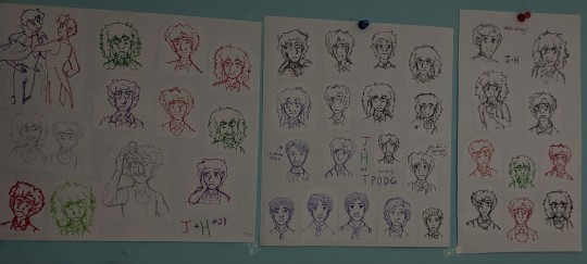
See? Most of them really suck, but they made me pay a lot more attention to what I was doing and what I wanted to do. It also helped me grasp quirks of the characters and drawing expressions a lot better. Plus, this isn't even all of them, I've got a bunch more in a little envelope I made.
Also, looking on Pinterest for pose references probably would also help, or taking pics of yourself for reference, but I'm built different (stubborn and lazy) so I rawdog my anatomy and poses 🗣️🗣️
Otherwise, I can also give a little doodle example with Whole Jekyll on how I currently draw in pencil and such :3
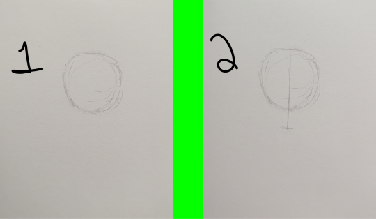
Start with circle, then give it a nice center line and chin
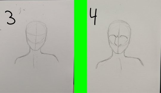
Then I throw in the neck and shoulders (which tend to change a decent bit bc anatomy is hard), the eye line, which goes through the middle of the circle, and then I like to do a line down the chest to figure out which way I want him pointing, since he's at a tilt. I also change this quite often, along with where I want the face pointing lmao. Once I've figured out direction, I draw the nose starting at the bottom of the circle and up to the eye line. I also then draw the top of the eyes first. The eye line (and apparently the center line 💀) is of course a suggestion, and I tend to mess around with the eye shape until it looks mostly right.
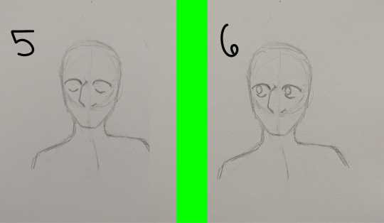
Then the bottoms of the eyes and the pupils get thrown in, which I have to redraw pretty often to try and make them match better. I also usually leave the eyes blank bc I'm lazy af and can't draw pupils too well, I will shade them tho and that makes them look better.
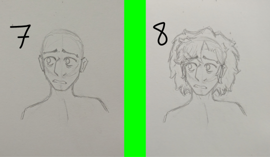
Then bbg gets ears (which I usually start around the corners of the eyes and go down to just above the little curve of the jaw), eyebrows (also just mess around with these til they look right) and a mouth (I HATE drawing mouths 😋😋), then they get their hair (also have to redraw a bunch)
Also, to show Whole Jekylls other eye, I pinned his hair back, so there's a treat, Whole Jekyll enjoyers <3 bbg can fully see 😍 (Mind Lanyon probably forced him too)
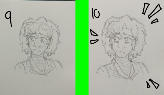
Then I shade his eyes, give him clothes and fix up any quick things that were bothering me (in this his nose) and go back with the edge of a rectangle eraser and get those guidelines and extra lines out (sometimes they're still a little visible, but maybe just don't draw them as heavy handed as I do 💀) and Bada Bing Bada boom! Doodle done :3 of course its not the best, but it doesn't have to be, thats the joy of doodles
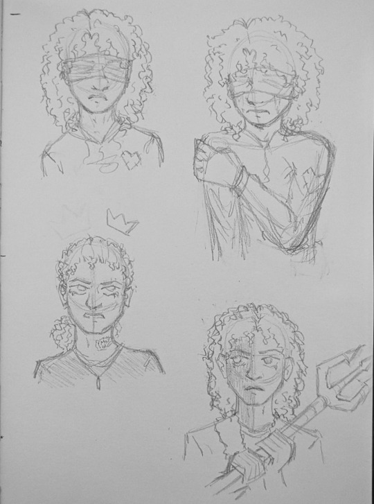
Heres another good pic to kinda show how I use my guidelines (and how messy my doodles usually are, it's part of my charm guys, I swear--)
Otherwise like, my progress shots for drawings look goofy af lmao, like--
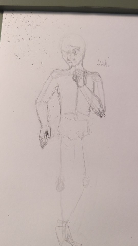
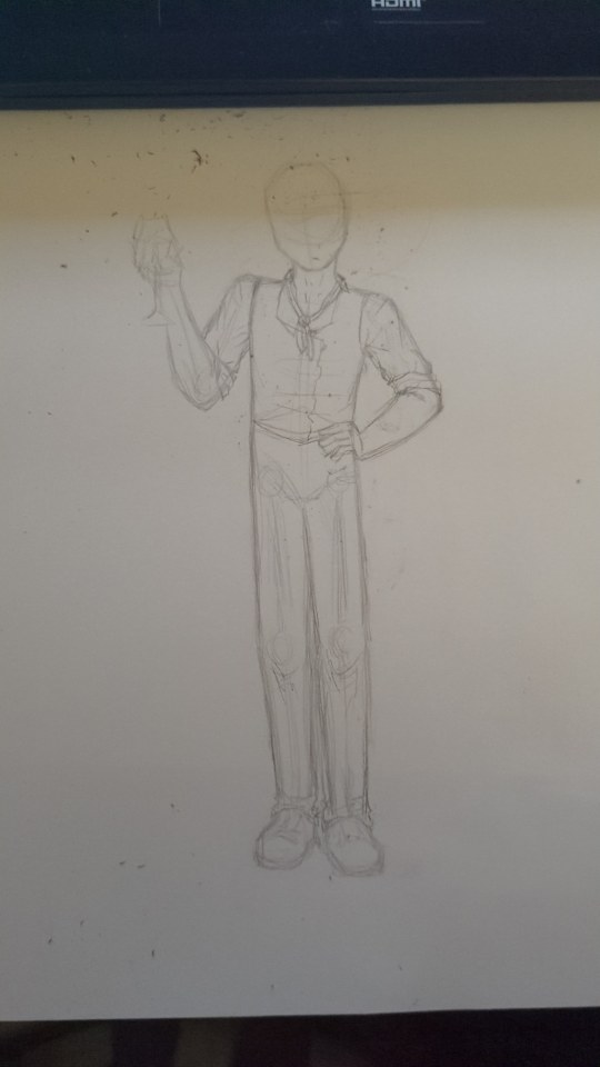
Messy af, incorrect proportions, wrong anatomy, eugh. just takes time (and a lot of redrawing) to get to the final pieces.
But yeah!!! Eyes are annoying, it just takes a lot of tweaking and repetition.
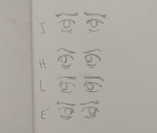
Like, I redrew some of these eyes a decent few times and some of them are still off, like cmon Lanyon, why you gotta be so hard for me to draw 💔
Anyways!!! Thats probably the best I can offer right this second lmao, sometimes I kinda wish I could record drawing and stuff but I don't do stuff purely digital often enough to. I do have a full speed paint for that drawing of Jekyll in Hydes mind clothes tho, so idk maybe I'll share that if anyone wants me to lmao.
But yeah! Thank you so much for the ask and the kind words, I hope this helps! or is at least entertaining lmao
18 notes
·
View notes
Note
I'm sorry if this is a very sensitive topic for you, but curiosity got the best of me. What was the reason for you switching to a new blog? Since you mentioned that you didn't have a choice but didn't really divulge any details. Did someone send you hate for something you did? Or was it something else? Also sorry if this seems incredibly redundant or I come across as oblivious, I had only been following the events on your old blog for a very short time before you deleted it. Also also sorry for asking so late at night
Hello, anon!
That's actually a pretty difficult question to answer,,
I probably did have a choice to leave the original blog and not make everything so difficult
The reasons behind this might be a bit personal. Long story short, I have a lot of problems. Like, a lot.
Lately it has been just too much. As you may have already known, as a ukrainian, i am having troubles with my mental and physical health (though i was having issues with that even before the war. Difficultly of life in an abusive family, what can i say..)
*sigh*, i am not even close to being mentally stable, and in addition to that i am just terrible at having social media. I tend to overthink a lot and take words too close to heart, which may result in a lot of stress and gradually lead to deleting the account.
I came to thought that people started becoming rather hostile and unwelcoming towards me. I wanted to disappear, to have another chance. I changed my username, i tried changing my artstyle. I was even afraid of interacting with my "ex" mutuals, as i thought i would be too annoying and it probably would be better if i just vanish for good. Besides, i have considered unaliving myself a lot and i thought that if i do, in fact, commit to that, it might be better to delete the account, rather than just leaving it as it is.
Andd there is still a lot of shit going on. I need an operation, I soon won't have a roof over my head once again, and i might have to move back to Kharkiv. Also i am so physically sick that i feel like i am literally dying (hello eating disorder and two hours of sleep)
Sorry, anon. The answer looks more like a big vent post :(
Though i hope i have satisfied your curiosity. If you have any other questions, feel free to ask
And sorry for any mistakes i might've made
or absence of logic
I am sooo eepy, you can't imagine

11 notes
·
View notes
Text
TWST: The Hall Of Mirrors - Baby Update, January 24’
ART:
Guys I don’t think I’m going to be able to put art in the game because I lack a tablet. As much as I want to, it would require making *way* too many images.
So, I’m making the TW game a pure piece of interactive fanfiction as a text-based game only. I’ve poured so many hours into it and I think I would rather go extend the plot/add on details so you can visualize it rather than stress anymore about putting art in. I know I said previously that I was taking time off from it, but I actually spent a good chunk of my free time last month trying to get art to scan in. Twine does not like imagery. No, no it does not.
So I’m just going to take a wee bit more time and make the plot more detailed. I also really want to get back to writing more here >_<
PLOT:
Like I said, I’m taking more time to add in detail. Without art I feel that it needs more to make the visuals pop.
AUDIO:
I haven’t given up on this bit quite yet. Since this is a fan game that isn’t getting monetized or anything, I don’t feel the need to make original music. I’ll see if I can find anything I like enough to fit the vibes
~ On that note, this is the last written update I’m giving. I might post some pictures when I feel it's in a good place, or ask if anyone would like to test the game out (catch any technical errors or bugs)….but yeah, I’m pretty much done now? I think? Hard to believe I’ve slowly been writing this since July. It’ll be weird to not work on it anymore, but also nice since I want to write other things hehe. I will say that this is the biggest thing I have ever made for any fandom, and I hope it's something I can look back on fondly.
(Small rant below about the art because I’m me and my perfectionism demands I offer an explanation)
Like, I did the math and it just isn’t feasible to do with what I have sadly. The game was going to have 15cgs for each route’s climax. I also got a bit crazy and even did base sketches for 15 cga for the after endings without really thinking about how rough it was going to be. You can customize your Mc by their clothing, body size, eye color, hair length and color, and hair type. If I had a tablet then I could make a singular CG as the base, and then basically make a bunch of copies where I make small changes so that the proper combination will pop up depending on the choices you made. It would have took a long time but I could have done it - although using a quick combination showed that there were hundreds of different possible combinations.
I mean, there are 2 clothing options, 4 body types, 8 eye colors, 4 hair types, 4 hair lengths, and i think 6 hair colors if I remember right. I also put in customization features that have you answer Q’s that I can’t predict to edit the cg with. Regardless that’s 2X4X8X4X4X6 = 6,144 possible combinations for ONE cg. That’s kind of rough even with a tablet, so without one is just like…death. It would be 2x4x4x4 = 128 different iterations of the image (as things that are not just color changes that can be quickly altered). That’s 128 versions of 15 images. That’s 1,920 drawings. Even if they were going to be in a very simple artstyle, heck even a sketch, it’s not feasible.
I love Otomes and have always wanted to play one where your customized MC is featured in the cgs. Making a game like that is one of my life goals - but not for a fan game. If I’m doing that then it’s going to be an original work.
I’m sorry for hyping it up and making false promises. I really did want to make it happen for my mini fangame, but this is kinda just my little side project and stressing over it was zapping the fun away. So now we’re going back to plan A and just sticking to a text game >_<
30 notes
·
View notes