#and i have to click the 'explore more' link next to the 'my list' title just to easily find it
Explore tagged Tumblr posts
Text
considering how many times i've already rewatched lockwood & co it's frankly shocking that netflix rarely even puts it in the "watch it again" section, let alone at the top of the list, where it frankly should stay.
#75% of the time it's not even in the carousel of stuff from my list that actually displays#and i have to click the 'explore more' link next to the 'my list' title just to easily find it#if i were a suspicious person i might think they were trying to stop me from watching it the umpteenth time#*shrugs*#lockwood & co#tv: lockwood & co#idk maybe the algorithm is just judging me#maybe the netflix ai thinks i've watched the show about the child soldiers in the ghost war too many times
9 notes
·
View notes
Text


laura | theme by sage
get the code: static preview // (temp) preview @tina-snow a sidebar theme with sticky reblog & like buttons
features (more info below the cut):
toggle: tags on click, explore tab, sidebar stats, updates
leftbar includes icon/follow button, home/ask/archive/extra links/updates, scroll to top
right sidebar includes an uploadable image, custom description, search bar, & optional sidebar stats
fixed day/night & tumblr controls buttons
customizable: blog title, description, colors, body & title fonts, and font size
leftbar has up to 4 links & the explore tab with up to 6 extra links
npf supported, responsive design, scroll to top, 4 corner options, tabler icons
nothing needs to be changed in the code, everything can be changed in the customize panel!
terms:
reblog if using
do not touch the credit
all terms / faq
credits listed in the code / credits page
please consider supporting me ♡
blog name !! important
make sure you fill out the blog name field, this is what will show on the top of all your original posts. to clarify: your blog name is your blog’s url - for example: phantomcodes
responsive sidebar
when the browser window gets too small the sidebar will disappear and become toggleable, the sidebar toggle button will appear on the top right side next to the day/night button
reminders
remember tumblr’s customize panel is buggy, you may have to toggle the options on/off before saving
i’m still on a sort of semi-hiatus, i’ll be around for questions but please check my faq, answered asks, etc. before asking - i will not answer repeated questions!
#themehunter#theme hunter#code hunter#tumblr resources#tumblr themes#tumblr codes#completeresources#allresources#userbru#userdre#usernik#useraashna#tuserlucie#laura#phantom code#phantom theme
698 notes
·
View notes
Text
Random-Mailbox's Favorite Sailor Moon Fics - Week 51 - Furniture
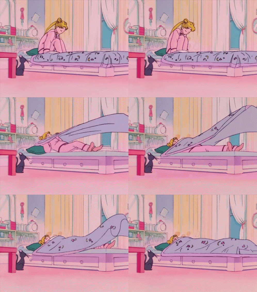
Second last post of the series is here! This week is light and fluffy as we look at furniture themed stories. (sorry for posting it a little later than usual on a Monday - this weekend completely got away from me).
As always, my apologies in advance for spoiling some of these for you (Fic Titles are linked to either FFN or AO3 entries).
My Own Little Stage: A Collection of Prompts: Chapter 1: Prompt: Rose Chair - @tinacentury
Neo Queen Serenity is VERY excited about new office chair she got for her King Endymion.
Usagi, Mamoru, and the Three Mattresses - @kaleidodreams
Finding just the right mattress that works for both partners is a very important step. Patience is an absolute must!
Little Strawberry Couch - @sailorspacecougar
Usagi might have forgotten to check dimensions on her latest online purchase, causing chaos when she insists that the old one needs to go before it gets delivered.
Usagi and the Spinny Chair - Star17P
Who doesn't love a spinny chair?!
at heart's rest (five scenes from a relationship) - @fated-addiction
In this story we get a look through the various stages of Usagi and Mamoru's relationship and the prominent role that their couch plays in it over the years.
Mamoru on the couch - @caelenath
Above is a link to the tag that @caelenath created for her musings on why would Mamoru have to sleep on the couch. Inspiring the Little Strawberry Couch story posted above and this amazing post where you should check ALL the reblogs / additions from @areptiledysfunction1107 , @danni-bunny , @linlamont , @master-ray5 , @riverlethe , @shnuggletea and @reispinkoveralls.
---
That's it for this week! Next Monday is my last and 52nd post of the series - wrapping it up with Crystal Tokyo stories.
Here are the links to the previous Tumblr posts in these series to explore more amazing works based on different themes - make sure to check them out if you haven't had a chance! (Click on title name to go to the post) - I will keep updating the list every week as new posts come up:
Week 1 - Groundhog Day
Week 2 - Established Relationships
Week 3 - Sex Positivity
Week 4 - Unfinished Stories
Week 5 - Darker Stories
Week 6 - Potions 🧪
Week 7 - Reveals
Week 8 - 👻Halloween🎃
Week 9 - Wrong Perceptions
Week 10 - Non-Senshi AU
Week 11 - In-Progress Fics
Week 12 - Mutual Pining
Week 13 - Enemies to Lovers
Week 14 - Slow Burn
Week 15 - Christmas Part 1 - Ugly Christmas Sweaters and Santa!
Week 16 - Christmas Part 2
Week 17 - New Years
Week 18 - High School AU
Week 19 - Slice of Life
Week 20 - Coffee shop AU
Week 21 - Huddle for Warmth
Week 22 - Friends to Lovers
Week 23 - ❤️Valentines Day❤️
Week 24 - Do a Grouch a Favour Day (or Cheer Up Fics)
Week 25 - Soulmate AU
Week 26 - Amnesia Fics (and resources)
Week 27 - 🍀St Patrick's Day🍀
Week 28 - Fix it Fics
Week 29 - Prompt: Mug
Week 30 - Flowers
Week 31 - Traditions
Week 32 - Dreams
Week 33 - Friends
Week 34 - Body-Swap
Week 35 - Medical Assistance
Week 36 - Sex Pollen
Week 37 - Psychometry
Week 38 - What If
Week 39 - Missing Scenes Part I
Week 40 - Green Jacket
Week 41 - Dr Chiba
Week 42 - Birthdays
Week 43 - Fluff
Week 44 - First Kiss
Week 45 - Reviving Shitennou
Week 46 - Tutoring
Week 47 - Thunderstorms
Week 48 - Food
Week 49 - Proposals
Week 50 - Locked In
#sailor moon#usagi x mamoru#fic rec#fic list#sailor moon fanfiction#usamamo#furniture#rose chair#mamoru on the couch#couch#mattress
44 notes
·
View notes
Text
Anime Lovers Unite: How Animedao Takes Your Viewing Experience to the Next Level
Introduction

Anime has captured the hearts of millions of fans around the world. With its unique storytelling and captivating visuals, it has become a global phenomenon. As an anime lover myself, I am always on the lookout for new platforms that can enhance my viewing experience. One such platform that has caught my attention is animedao.
The rise of anime streaming platforms
In recent years, the popularity of anime has skyrocketed, leading to the rise of numerous streaming platforms. These platforms offer a wide range of anime series and movies, allowing fans to access their favorite shows anytime, anywhere. Animedao is one such platform that has gained a strong following due to its vast library and user-friendly interface.
Gone are the days when anime enthusiasts had to rely on DVDs or fansubs to watch their favorite shows. The advent of anime streaming platforms has revolutionized the way we consume anime. These platforms provide a vast library of anime series and movies, making it easier than ever to access our beloved content. Animedao is one such platform that has gained immense popularity among anime lovers.
What sets Animedao apart
What sets Animedao apart from other anime streaming platforms is its commitment to providing a seamless and enjoyable viewing experience. The platform boasts a clean and intuitive interface, making it easy for users to navigate and find their favorite anime titles. Additionally, Animedao offers a wide range of anime genres, ensuring that there is something for every type of anime lover.
One of the standout features of Anime dao is its commitment to providing high-quality streaming. The platform ensures that anime episodes are available in HD, allowing viewers to fully immerse themselves in the captivating visuals. Additionally, Animedao regularly updates its library with the latest episodes, ensuring that users can stay up to date with their favorite series.
Exploring the features of Animedao
One of the standout features of Animedao is its extensive library of anime series and movies. Whether you are a fan of action, romance, or fantasy, you are sure to find something that caters to your taste. The platform also provides detailed information about each anime, including a synopsis, release date, and user ratings. This allows users to make informed decisions about what to watch next.
Another notable feature of Animedao is its high-quality video playback. The platform ensures that anime shows and movies are streamed in the best possible quality, providing viewers with a truly immersive experience. Additionally, Animedao offers multiple streaming options, allowing users to choose their preferred video resolution and streaming server.
How to use Anime dao effectively
Using Animedao is a breeze, thanks to its user-friendly interface. To get started, simply create an account on the platform and log in. Once logged in, you can start browsing through the extensive anime library. You can search for specific titles using the search bar or explore different genres and categories. Animedao also provides recommendations based on your viewing history, making it easier for you to discover new anime series and movies.
When you find an anime title that interests you, simply click on it to access more information. Animedao provides a detailed synopsis, user ratings, and a list of episodes for each anime. You can also add anime to your favorites list for easy access in the future. Once you have selected an anime to watch, click on the episode you want to start with, and enjoy the show!
Integrating Animedao with MyAnimeList
For avid anime fans who like to keep track of their watched shows and maintain a comprehensive anime list, Animedao offers integration with MyAnimeList. MyAnimeList is a popular platform where users can create and manage their anime lists. By linking your Animedao account with MyAnimeList, you can sync your watched anime, update your list, and keep track of your progress across both platforms seamlessly.
Animedao vs. MyAnimeList: A comparison
While both Animedao and MyAnimeList are popular among anime lovers, they serve different purposes. Animedao is primarily a streaming platform that offers a wide range of anime series and movies, whereas MyAnimeList focuses on creating and maintaining anime lists. However, the integration between the two platforms allows users to have the best of both worlds. You can enjoy streaming anime on Animedao while keeping track of your watched shows on MyAnimeList.
The future of anime streaming: Animedao's role
As anime continues to gain popularity worldwide, the demand for high-quality streaming platforms is on the rise. Animedao has positioned itself as a frontrunner in the anime streaming industry by providing a user-friendly interface, extensive library, and superior video playback. With its commitment to continuously improving the viewing experience for anime lovers, Animedao is poised to play a significant role in the future of anime streaming.
Is Animedao Shutting Down?
Rumors have been circulating about the possible shutdown of Animedao, leaving fans worried about the fate of their beloved platform. However, it is essential to separate fact from fiction. As of now, Animedao is still up and running, providing anime lovers with their daily dose of entertainment. While it is true that some anime streaming sites have faced legal challenges, Animedao has managed to maintain its operation and continues to be a reliable source for anime enthusiasts worldwide.
In the event that Animedao faces any legal issues in the future, it is crucial to have alternative platforms ready. One such platform is MyAnimeList, a popular online community where anime fans can track, rate, and discuss their favorite shows. MyAnimeList not only provides a comprehensive database of anime and manga but also offers a streaming section where you can watch anime legally. By diversifying your sources and exploring different platforms, you can ensure that your anime watching experience remains uninterrupted.
Reviews and feedback from Animedao users
The success of any platform can be measured by the satisfaction of its users. Animedao has garnered positive reviews and feedback from anime enthusiasts around the globe. Users praise the platform for its vast library, reliable streaming, and user-friendly interface. Many have also expressed appreciation for the integration with MyAnimeList, as it allows them to easily manage their anime lists. Overall, the feedback from Animedao users highlights the platform's commitment to providing a top-notch anime viewing experience.
Enhancing your anime viewing experience with Animedao
If you are an anime lover looking to take your viewing experience to the next level, Animedao is the platform for you. With its extensive library, user-friendly interface, and seamless integration with MyAnimeList, Animedao offers everything you need to satisfy your anime cravings. So why wait? Sign up for Animedao today and immerse yourself in the wonderful world of anime like never before.
Conclusion
Anime lovers, rejoice! With Animedao, you can elevate your anime viewing experience to new heights. This hidden gem offers a vast collection of anime cartoons and movies, all available for free. The user-friendly interface, high-quality videos, and extensive library make myanimelist a must-visit platform for any anime enthusiast. However, it is essential to stay informed about potential legal challenges and have backup platforms such as MyAnimeList in case of any disruptions. So, what are you waiting for? Visit Animedao today and immerse yourself in the captivating world of anime.
0 notes
Text
Week 9
Learning InDesign
The goal of this lesson was to introduce us to InDesign and to learn some basic tool/methods and processes that can help us when making our Book Design in both Fundamentals and DT1.
We’ve been learning how to use Photoshop and Illustrator which help us create and edit images, InDesign on the other hand is used to assemble elements together on a large document like cookbooks, magazines, newspapers, etc.
We started off with learning how to use text in InDesign and specifically paragraph and character styles. Using the type tool (T) we created a text box and filled it with placeholder text (with text box selected, right click and select ‘Fill with Placeholder Text’).


In InDesign, a paragraph is any text that is separated by two carriage returns. A carriage return is just hitting the return key after creating a title, bullet point, list item, or passage of text. To create a paragraph style, select the text you want to use as a paragraph style, then apply the necessary settings (bold, italic, size up/down, underline, etc). After opening the styles window (Window ��� Styles - Paragraph Styles), a window should come up and just by clicking the + button a style is added. The same process is used for creating character styles, but these are limited to characters or words.

A specific paragraph style that we explored was bullets and numbering which is interesting quite complicated to add to an InDesign document. I did find the process of creating this style quite hard but overall, the paragraph/character style process was easy to understand and will be helpful when creating my book design in DT1. I did find this tool quite boring especially because it becomes somewhat obsolete when you aren’t creating complicated paragraphs although I do see how it can help make this process more efficient.

The next part we learnt about was using images in InDesign. InDesign uses linked images which means all the images used in a document are linked to an image on the computer, this makes having a designated folder for these images really important and allows images on an InDesign document to be updated in real time if edited. A key part of using images in InDesign is how to resize them, unlike Photoshop and Illustrator, images in InDesign can’t just be resized as is, by doing that it crops the image, so you have hold Cmd/Ctrl when resizing and shift to resize it proportionally.

A cool tool that can be used in InDesign is the text wrap, which as the name implies, wraps the text around an object (usually an image), you edit the text wrap setting more by going to Windows – Text Wrap. I really like this tool as it creates some interesting effects with the text, and I think would be good to use in my book design for DT1.

To add to the text wrap, we also were shown how to paste an image into a shape (Copy Image - Draw the shape – Right Click – Paste Into) and with the text wrap we were able to make the text wrap around the object shape.

Overall, it was good to learn about these different tools and methods in InDesign, which would be helpful in other classes. I enjoyed learning about the text wrap tool and playing around with linked images by editing them in Photoshop and seeing them update in InDesign.
0 notes
Text
Filmora 12 Update PART 2: Exciting New Features in Version 12.3 | FunWithFilmora.co.uk
https://www.youtube.com/watch?v=qUVNIbpi_7A Discover the latest Filmora 12 Update! In the NEW Filmora V12.3 we'll explore the exciting new features and enhancements that will take your video creations to the next level. Filmora has regular updates and the latest version in Filmora 12 has new features such as Color Wheels, Sharpen and Effect Masks. Video Title: Filmora 12 Update PART 2: Exciting New Features in Version 12.3 | FunWithFilmora.co.uk This video explores information on the NEW Filmora 12 Update in V12.3 - Step-By-Step Tutorial, but also covers the following topics: Exploring the Filmora 12 update How to update Filmora 12 ✅ Subscribe To The Channel Fun with Filmora To Create Amazing Videos With Wondershare Filmora Video Editing Software: https://www.youtube.com/@funwithfilmora ✅ Important Links To Follow: 👉 Wondershare sign-up link: https://bit.ly/400qDal 👉 – Get a FREE 30 Day Trial with a TubeBuddy Paid Plan to optimise and grow your channel https://www.tubebuddy.com/freetrial?a=FunWithFilmora 👉 – Looking for unlimited downloads of stock videos, royalty-free music, photos, graphics, graphic templates & more then why not get a paid subscription to Envato Elements https://1.envato.market/0JaNME ✅ Stay Connected With Me. 👉 Website: https://funwithfilmora.co.uk/ 👉 Instagram: https://www.instagram.com/funwithfilmora/ 👉 Facebook: https://web.facebook.com/funwithfilmora1/?_rdc=1&_rdr 👉 Twitter: https://twitter.com/FilmoraFun 👉 TikTok: https://www.tiktok.com/@funwithfilmora?lang=en ✅ For Business Inquiries: [email protected] ============================= ✅ Recommended Playlists: 👉 Shorts: https://www.youtube.com/@funwithfilmora/shorts 👉 Tutorials: https://youtube.com/playlist?list=PLt5FyPoxYDE3v8kU94PE26eGvX0yhbIP3 ✅ Other Videos You Might Be Interested In Watching: 👉 How would you like the chance to win £50 every month? https://youtu.be/Sf0vGZnW8sw 👉 Filmora 12 Update PART 1: Exciting New Features in Version 12.3 https://youtu.be/Y5RgayEnavs 👉Captivate Your Audience: Creating Video Openers That Stand Out with Filmora https://youtu.be/pjRtAkqrwug 👉 Master Color Grading In Filmora: Manual & Presets Step-by-Step Tutorial https://youtu.be/B7ulF3ALYns 👉 Create A Professional & Stunning Slideshow With Filmora: Step-by-Step Guide https://youtu.be/zkML5dymEWo ============================= ✅ About Fun with Filmora. Fun with Filmora is about creating videos with the easy-to-use yet powerful Wondershare Filmora video editing software and having fun at the same time. I will show creative videos edited with Filmora and tutorials on how to use this amazing piece of software. For Collaboration and Business inquiries, please use the contact information below: 📩 Email: [email protected] 🔔 Subscribe To The Channel Fun with Filmora To Create Amazing Videos With Wondershare Filmora Video Editing Software: https://www.youtube.com/@funwithfilmora ================================= #Filmora12 #Filmora12.3 #FilmoraCertifiedCreative #madewithFilmora #WondershareFilmora #Filmora Disclaimer: We do not accept any liability for any loss or damage which is incurred by you acting or not acting as a result of listening to any of our publications. For all videos on my channel: This information is for general & educational purposes only. Always consult with an attorney, CPA, or financial professional for advice based on your specific situation Copyright Disclaimer: Under Section 107 of the Copyright Act 1976, allowance is made for "fair use" for purposes such as criticism, comment, news reporting, teaching, scholarship, and research. Fair use is a use permitted by copyright statute that might otherwise be infringing. Non-profit, educational, or personal use tips the balance in favour of fair use Affiliate Links: This page contains affiliate links. If you choose to purchase after clicking a link, I may receive a commission at no extra cost to you. © Fun with Filmora. via https://www.youtube.com/channel/UCDiv61hEGgjC1JWO79J02Fg May 31, 2023 at 07:00PM
#videoeditingtips#filmoravideo#chatgpt#seohacks#youtubetips#videocreation#slideshowcreator#filmoratutorial#videomarketing
0 notes
Text
re-learning html without the pressure of a project deadline
When practicing HTML again, I worked through a PowerPoint presentation given to us by my lecturer Phil. It went a lot smoother than expected, and actually was a lot simpler than I thought it would be. I decided to document my process of going through it:
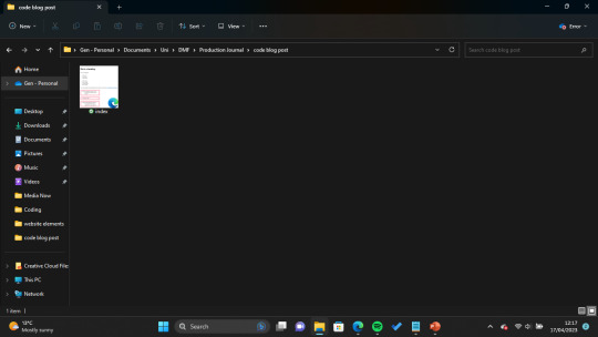
To start off with I created a NotePad file and saved it on my desktop under the name "index.html" as the tutorial advised. I have also experimented with other coding software - such as Adobe Dreamweaver and Visual Studio Code - but this was my first time coding without any of the helpful autofill suggestions and colour-coding both of these applications offer.
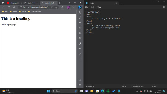
Next, I set up the basics of the HTML page, including its document type and title. Then I added my first heading and paragraph. I decided to keep my text pretty clear and to the point so that I wouldn't get mixed up looking through the code.
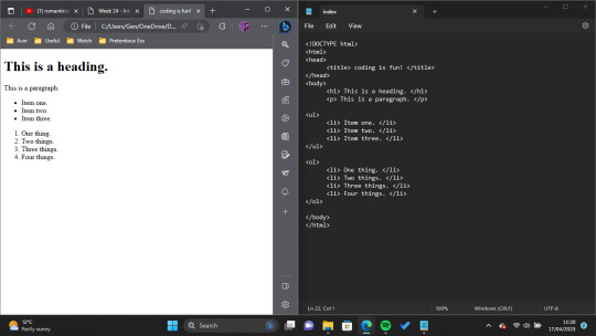
After this I experimented with lists! We didn't really need anything like this when coding our Narrative Project, so it was nice to just have fun and explore the many possibilities HTML has to offer.
As I have had experience coding images from the previous project, I decided to skip these for now and focus my learning on things which I didn't know.
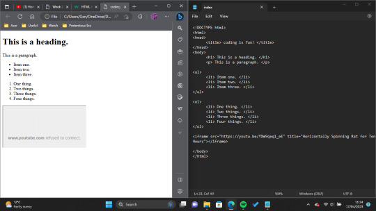
The next thing I decided to try was "inline frame" or <iframe> tags. The presentation I worked through describes inline frames as "An HTML document embedded inside another... Typically, MS Stream or YouTube videos." To play with this, I tried to link a YouTube video (to make myself chuckle, I decided on this video posted by the account Rat. However, even though my code was correct, YouTube wouldn't show the video on the page, so I ended up scrapping this feature.

So that the Horizontally Spinning Rat video still got a feature on the page, my next experiment was with hyperlinks! I tried this a couple of different ways, first of all by leaving it as just a generic hyperlink that opens in lieu of whatever webpage you're on, but - once again, supported by the tutorial provided - was able to change it so that the video opened in a new tab when clicked.

The last thing I wanted to experiment with was adding boxes and borders and I did this by attempting to use the CSS box model. I learned the base code for this from this W3Schools tutorial, and used it to essentially add a pink border around all of my <div> code (which essentially gives some really clean line breaks).
All in all, I really enjoyed this exercise. Admittedly the code I produced here is nothing special, and the web file is quite plain to look at, but as I have already used a lot of style functions for other projects I wanted to focus purely on things which were new to me. Coding in NotePad wasn't as hard as I was worried it would be, either, though it was frustrating having to comb through personally to figure out what wasn't working each time I made a mistake (I decided to leave those moments out of my walkthrough as there would have been many.) In the future, when I have more time, I would love to explore creating my own websites in this way, and giving them more interactivity.
My newfound interest in interactive websites I owe almost entirely to the ARG Welcome Home, created by Tumblr user partycoffin. ARG stands for Alternate Reality Game, and essentially these games use real world mediums like websites and social media to tell a story (. I feel particularly inspired by Clown's website as it is of the psychological horror genre, and utilises a lot of hidden/floating text elements to tell its story. I would love to have the ability to create something like it one day, I just think it's so cool.
Bibliography:
Clown. (2023) Welcome Home. Available at: https://www.clownillustration.com/welcomehomeyou (Accessed: 17 April 2023).
Rat (2022) 'Horizontally Spinning Rat for 10 Hours' [YouTube] 15 May. Available at: https://www.youtube.com/watch?v=YXm9qeq1_eE (Accessed: 17 April 2023).
Richardson, P. (2023) 'Into Web Design'. MD4004: Digital Media Foundations. Kingston University London. Unpublished.
w3schools (2023) CSS Box Model. Available at: https://www.w3schools.com/css/css_boxmodel.asp (Accessed:17 April 2023).
0 notes
Text
Why you should give Text Adventure games a try (and how to do so)
There is not nearly enough love for Text Adventure Games here on Tumblr. Or anywhere really. But especially here, I feel like you guys would really get a kick out of them. Here's why:
(quick note, I'm gonna be using the words Text Adventure and Interactive Fiction pretty interchangeably here. Technically that's not perfectly accurate, they are technically different things, but I don't care to explain the difference Just roll with it.)
So
Do you like weird short stories told through unconventional mediums? That's most of what Interactive Fiction is
You like story based video games but hate the finicky combat? Congrats, there is literally no combat skill required beyond the ability to type "hit guard with crowbar"
Blind or visually impaired? Since these games are (with a few exceptions) entirely text based, they work great with a screen reader!
Sick of profit motivated AAA titles with no creative integrity? Well, these games are almost always produced by a single nerd (usually a horrid amalgamation of computer geek and literature geek) with no budget and no responsibilities of the product they're making. And they're usually not paid, since these games are free. Text Adventure is a labour of love, and in most games you can feel the care and effort the creator has put into the game.
Sick of spending $20-70 on a video game? Lucky you, I've been playing TA for years and I have not spent a cent in doing so (Fallen Londen will try to make you pay. But Fallen Londen sucks and is run by bigots. Fuck Fallen London.) Games are either available free on a browser, or as free, small downloadable files (most of which can be played using the Parchment Interpreter)
Wish you read more, but reliant on the quick dopamine of digital media? Well now you can read while also being an active participant in the narrative.
Bad at puzzles? Me too! Games from the 80s and 90s, as well as more famous newer games, have walkthroughs and hints easily available online. Newer games tend to either have a "hint" command, or come with a walkthrough file.
Do you like weird surrealist horror? Well there's... A lot of it.
Okay, but where do I start?
So there are two types of text adventure. The one you might be more accustomed to, and which sees more modern use, is called Hypertext Interactive Fiction. The other is called Parser Interactive Fiction, it's generally seen in older games, as well as games that are larger, feature more puzzles, or involve more exploration.
Hypertext games
Basically, the game will give you a scenario, and then a list of options (hypertext links) to click on to decide what to do next. These are usually more beginner friendly since you don't need to fiddle around with parsers, but personally I find them a bit limiting. Nonetheless, if you're new to Text Adventure, they're a good place to start.
Some of my favourites hypertext games (summaries in green)
My Father's Long, Long Legs is an interactive horror story about family, unease, and loss. Really more of a story than a game, but still good. Very nice use of sound. It does have some visual aspects, so this one might not work with screen readers
Scene Kid Simulator is pretty much what it says on the tin. A cute, nostalgic, coming-of-age slice of life story from the POV of a 2000s scene preteen. Nothing special, but a fun time.
The Uncle Who Works at Nintendo is a strange, unconventional, witty, and heartfelt horror game. Your friend has an uncle who he says works for Nintendo. You're about to meet him, or so he says. A fun and spooky look at childhood, childhood friendships, and childhood lies.
16 Ways to Kill a Vampire at McDonald's is... A joy to play. The name says it all honestly. Witty, charming, tense, engaging, and emotional when it wants to be. I actually found this one through a lucky Tumblr Blaze, which makes sense since this is perfectly suited to Tumblr sensibilities. This one has more puzzle aspects than most hypertext games, but it's still relatively easy and beginner friendly. You're a vampire hunter. It's your night off, and you go to McDonald's. But there's something wrong with the customer sitting beside you...
Toadstools is a game about hunting mushrooms. You have trespassed in a national park and you are wandering blindly through the woods looking for rare fungi. Good luck :)
Parser games
Okay these fuckers are where I really get excited. These games have the classic flashing cursor line where you input text like "go north", "search bookshelf", or "kiss my husband", and the game's rudimentary AI parses your input to decide what happens next. These are my favourites. They really allow you the feeling of exploring the game world, immerse you in the protagonist and the story, using just text on a screen and simple inputs. This does make them considerably more difficult, since a) you need to decide the right way to phrase what you want to do, otherwise it won't work, and b) more possibilities means more chances to mess up and miss things. Unlike video games, your cursor won't light up when you see something important, you'll have to search stuff and work things out on your own But, in my opinion, it is so, so worth it. Summaries in red
The first text adventure game I ever played was One Eye Open. It's an extremely graphic and gory medical horror game (although I would consider it tasteful medical horror, in that it never derives horror from medical procedures, disability, or ooOoHh gross scary sick people) You play as a volunteer test subject for a medical research facility, having to unravel the mystery of the hospital's bloody past. It's good. It's fun. It's tense. It has some really dumb mechanics. Don't play if you're sensitive to descriptions of gore, death, or corpses. This one doesn't have a walkthrough, but I've played it enough times to know the puzzles by heart, DM me if you need help.
Anchorhead is possibly my favourite piece of interactive fiction I've ever played. It's incredible. You play as a newlywed woman, moving to the small seaside town of Anchorhead after your husband Michael inherited a mansion from some distant relatives. There's something wrong with the town though. There's definitely something wrong with your husband's mysterious ancestors. And you're starting to think that there might be something strange happening to Michael. Get ready for some wonderfully atmospheric and immersive Lovecraftian horror, action sequences that are incredibly vibrant for Text Adventure, and a super compelling mystery that the game lets you work out on your own. The puzzles here are hard. I'm not gonna lie, I used a walkthrough at several points during this game. But my god it's worth it. Big massive huge content warning here for mentions of incest, sexual assault, and pedophilia. Not in excess, and nothing explicit, but it will be mentioned as part of the story.
Little Blue Men is a short, strange, sci-fi-ish horror-ish comedy-ish game by the same author as Anchorhead, though the two games are wildly different. You are an office worker. Cope with it. Take The Stanley Parable, Stella Firma, and Hitchhiker's Guide to the Galaxy, mash 'em together, and you have Little Blue Men. It's bizarre. It's evocative. It's pretty darn good.
Coloratura is a strangely beautiful sci-fi story. You're a weird little alien blob. You've been separated from your home and are trapped aboard a human spaceship. You need to get home, need to make the humans understand in the only ways you can: color and song.
Slouching Towards Bedlam is a brilliant little steampunk game about language, choice, cults, Armageddon, and triangles. This game has multiple endings. It's neat in that none of the endings are really "good" or "bad". Rather, you need to decide where you stand, and act in the way you think is best.
The Lurking Horror is the grandparent of horror interactive fiction, released in the late 80s. You're a tech student in university. Something more than electricity is powering the school's computers. Find it, but don't die along the way. Besides the comically archaic descriptions of computers, this game doesn't feel all that dated. It's tricky, puzzle-heavy, and charmingly surreal. (Fun fact, this game and another old TA game called Zork inspired the "darkness kills you" mechanic which would later be popularized in Don't Starve!)
Nine Lives is a very short, very weird, very cartoony game where you play a cat that is very bad at staying alive. Cw for non-graphic but repeated cat death.
Spider and Web is one of the most ingenious uses of Text Adventure as a medium I've ever seen. It's famous for having one of, if not the singular best puzzles in video game history. It's tense, it's fast-paced, it introduces you to mechanics slowly and then lets you test them out on your own. I won't spoil too much, but you play as a very badass spy, reliving your brilliant heist during an interrogation. This game even features a character destined to be a Tumblr Sexyman. It really has it all.
If anyone actually read through all this, and has even considered playing any of these games, I'll be a little surprised. This post turned out a lot longer than I wanted it to be. It was meant to just be "hey interactive fiction is a cool and underappreciated medium, go check it out", but this is my special interest, and not one I often get to talk about. I guess this was me infodumping to the only place that will listen, the empty void of the internet. But these games are fun. And they do not get enough love. Text games are a dying genre, if they're not dead already. Give them a chance, show them some love.
#video games#games#text adventures#interactive fiction#horror#horror games#lovecraftian horror#anchorhead#if#decided not to mention Cragne Manor#because that's a beast all it's own#and it isn't really worth reccomending unless you're already an Anchorhead fan and seasoned IF player#swarm's nonsense#gaming
854 notes
·
View notes
Text
A quick guide for those who want to download anime torrents
I highly recommend using https://www.tokyotosho.info .
It has a search bar somewhere at the top of the page, but not quite at the top, smth like this:
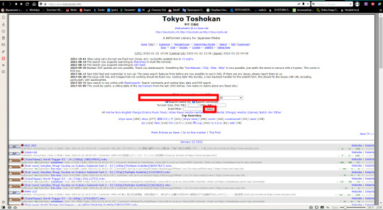
Type the title of the anime that you are searching for and press the “search” button (click on it with a mouse). Even part of the title may work, like in my case (Vanitas) for some obvious reasons. :)
Here is what you will see:
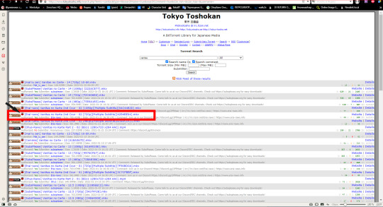
Just choose from the list. The bigger are the green numbers on the right (next to the letter “S”), the better. In torrent files, you download a file from a bunch of people scattered along the net. To put it simply, these green numbers show you the amount of ppl who are online now and ready to share with you. Which is why it’s better to avoid search results with 0 or small green numbers. The red numbers are irrelevant to you. The green numbers next to the letter “C” are not that important too, they just show how many times this very file was downloaded completely.
After your choice is made, right click on the smol icon next to the file that you’ve chosen to download (it is marked with the black arrow on my screencap). Copy the magnet link that appears after that. You need to insert it into your torrent client, a program that downloads torrents. You will be offered to choose a place to save your file, which is easy to figure I guess. :)
Some more tips:

if there is an orange thingo with the word “anime” on it next to a file, it’s an English subbed anime;
if the thingo says “raw”, then the file has no subs;
you can find out how other categories, like “non-eglish”, “manga”, etc look like if you explore the site further.
As for me, I usually download English-subbed files bcos I watch them and sometimes make gifs out of them. To make gifs, you need to turn the subtitles off. If you use a player that doesn’t allow you to do it, you’ll have to use raw files.
I guess that’s all, feel free to ask me questions if needed. :)
#long post#link#tutorial#I guess??/#Idk how to call it honestly#I had planned to write this for my friend#but then decided that it might be useful to others too#I am sorry if I explain like a captain obvious or like a weirdo#my English is not that good ^///^
52 notes
·
View notes
Text
Tumblr Master Post
(Third Mensiversary)
Hey, guys! So, instead of the usual monthly post, I decided to consolidate everything. From now on, I will update the following list and reblog it every 22nd. Enjoy!
Please note that Tumblr either cannot or will not preserve my formatting. So, I have used Google Docs as well. Please click on this link if you’d prefer that. It’s open to all. Thanks!
My posts are almost XWP-related and can be categorized into eight main categories (The pic below is merely for record-keeping and visualization purposes; scroll down for the actual links):

Questions
Curious— Why does everyone think Gabrielle/Renée O’Connor has green eyes?
A Favor to the God of War?— What in the world was the favor Ares wanted from Gabrielle during “Sacrifice”?
Smoking Gun?— Why did Hope knowing Solan’s name give her away as his killer?
Good Luck, Kid!— Why was security so bad in “Maternal Instincts”?
The Love of Your Love— Wasn’t the second verse of this song frustrating and hurtful to Gabrielle?
The (Many) Problem(s) with Ares— Why does so little about Ares’s character make sense?
Hard Ask— Can I PLEASE get a willing, able, AND reliable beta-reader for my Xena fanfic???
The (Many) Problem(s) with Ares [Reblog]— Three more questions about the god of war
No Way— Is the titular image of “Xena: Warrior Princess” what it seems?
Episode Reflections
Random Thoughts While Watching XWP— funny moments from “A Family Affair,” “Them Bones, Them Bones,” “Married with Fishsticks,” and “Coming Home”
Observations from “Sins of the Past”— fifteen things I noticed while watching the episode for the second time (first after completing the series)
Running Commentary on “A Family Affair”— just what it sounds like XD
Concluding Thoughts on “A Family Affair”— a defense of Hope and Gabrielle
Echoes Across the Years— how Solan’s last conversation with his mother echoed Gabrielle’s first with the warrior princess
Redeeming “Fishsticks,” Part 1— how the adults and themes in Gabrielle’s dreamworld held great significance
Redeeming “Fishsticks,” Part 2— how Crustacea’s monstrous children were re-imaginations of Hope and The Destroyer
Fault— my thoughts on the series finale
Good Luck, Kid! [Reblog]— a fun little extension of the original post showing the impression Gabrielle made on Hope
Original Fanfic Excerpts
The Mother of Hope, a collection of one-shots exploring Gabrielle’s thoughts, feelings, and experiences with/about her daughter
Disparity— Hope’s and Gabrielle’s conversation during the final commercial break of “A Family Affair”
Somewhere— Gabrielle searching Tartarus for Hope while Ares was harassing Xena and Solan in “God Fearing Child”
Super Challenge— the entire Rift Arc summed up in a single conversation, the lines of dialogue coming from each of the twelve Rift episodes of season three
Aperture— Gabrielle’s thoughts the night of her wedding
The Daughter of Duality, Hope’s life story from her perspective
My Great Hope— Seraphin prepares her goddess for childbirth
Hope Rising— Baby Hope makes a terrible mistake
“Tears of a Goddess: Blood Rain,” a one-shot exploring “Motherhood” from the goddess of love’s perspective
Useless— Aphrodite agonizes over what to do when alone with Gabrielle and Eve
Tears of a Goddess, a story in which Aphrodite comes clean about the large part she played in Gabrielle’s life behind the scenes
Gabrielle Rages against Xena— the bard finds herself at Aphrodite’s temple, heartbroken and lost after the series finale
Aphrodite Ribs Gabrielle— Aphrodite complains about Gabrielle’s mishaps throughout the show
Rapprochement, a story about Xena and Gabrielle hashing out The Rift Arc before finally coming together as a couple
The Answer— Xena reminds Gabrielle of who she is
Divine Intervention— Aphrodite blesses Xena and Gabrielle’s union
Adventures in Moving Forward, a chronicle of Aphrodite’s and Gabrielle’s adventures together post-AFIN and all my other XWP stories
Stranger— Aphrodite protects Gabrielle from a mob in Brittania
The Betrayer, Gabrielle's untold experience during “The Deliverer.”
Disturbance— Xena makes an unexpected suggestion on how to stop Gabrielle’s recurring nightmare
Deception— Khrafstar fills multiple voids in Gabrielle’s heart
Defilement— Reality slips away from Gabrielle with the loss of her blood innocence
Desecration— Gabrielle becomes one with darkness
Dissolution— The return of Gabrielle’s hero brings about only more tragedy
Fan Theories
Soul Orbits and Psychic Echoes— how Xena and Gabrielle got their children through equal and opposite people and circumstances
Shazam!— how Xena might be able to come back after the series finale
Man-Killer— what really happened to Toris
An Unsung Hero— Aphrodite being Gabrielle’s guardian angel throughout the Rift Arc
Infamous, Infuriated— why Xena engaged in the GabDrag (and BardBraining)
Solving Some Problems with Ares— answering two of my own questions about the god of war
Odd, Sort of Beautiful Symmetry— how we ended up with Annie and Harry
Soul Orbits and Psychic Echoes [Reblog]— an extension of the original theory that focuses more on Solan and Hope themselves
Solving More Problems with Ares— answering my next questions about the god of war
Episode Cracksubs
The Comedy of Amphipolis— “The Haunting of Amphipolis”
What in the Gurkhan?— “Who’s Gurkhan?”
Them Bones and Boneheads— “Them Bones, Them Bones”
TL;DRs— cliff-notes version of longer posts
TL;DR #1: Soul Orbits and Psychic Echoes
TL;DR #2: Infamous, Infuriated
TL;DR #3: The (Many) Problem(s) with Ares
Funny Little Moments— (Five:) a series highlighting overlooked silly things from each episode, illustrated in pictures and cracksubs / (More:) summation posts showcasing additional funny moments from each episode, in half-season chunks
Five Funny Little Moments #1: “Sins of the Past”
Five Funny Little Moments #2: Chariots of War
Five Funny Little Moments #3: Dreamworker
Five Funny Little Moments #4: Cradle of Hope
Five Funny Little Moments #5: The Path Not Taken
Five Funny Little Moments #6: The Reckoning
Five Funny Little Moments #7: The Titans
Five Funny Little Moments #8: Prometheus
Five Funny Little Moments #9: Death in Chains
Five Funny Little Moments #10: Hooves and Harlots
Five Funny Little Moments #11: The Black Wolf
Five Funny Little Moments #12: Beware Greeks Bearing Gifts
Miscellaneous
Golden Ticket— Renee O’Connor’s initial responses to me on Instagram
Bath Time— a fun self-challenge involving making a story from recently downloaded/screenshot images in just a few minutes
Mensiversary— review of my first month on Tumblr
Confirmation/Affirmation— Steven L. Sears’s essay of support for my Furies theory
K.O.— Renée O’Connor liking my comment about ^
Hooray!— The Mother of Hope is finished (kinda)
Aww…— a quick picture post to try something new while I was bummed about the deadly tech bug that obliterated my posts for weeks
Second Mensiversary— review of my second month on Tumblr
NOOO!— a lamentation related to The Mother of Hope
The (Many) Problem(s) with Ares [Reblog/Response]— answering a reader
More Funny Little Moments #1: Season 1, Episodes 1-12
*Other
Black Hole— a poem about depression
It’s Nothing— a poem on invalidation
What the?— the beginning of the bug :(
#xwp#xena warrior princess#xena#xena and gabrielle#gabrielle#link post#fan theory#fanfic#fanfiction#xena fanfiction#gabrielle fanfiction#cracksubs
61 notes
·
View notes
Text
About Warnings, Fic Genres, Tropes and Spoilers
Some time ago, I read a 2013 post about a writer who was against adding warnings to any stories. If you're a follower of mine or know Fanfiction 101, you probably know my opinion about warnings. But you might not know my opinion about something the author of that post compared warnings to. So, I'll use this post to talk more about warnings and the other subject "associated" to it.
I don't remember exactly the title of the post, but I do remember it got me curious. I wondered what could be so bad about warnings to the point someone made a post to just say why they dislike it and even encourage people not to use. So I clicked on the link to see what this post was about. Right after reading the said post, I could only think about the saying "curiousity killed the cat". Because that's exactly what happened. The poor curious cat was brutally murdered. That was probably the biggest load of crap I've ever read about fanfiction lore and, believe me, I have read tons of bullshit about it. Yet, this particular post is, by far, one of the worst.
To sum up, the person basically stated that giving warnings can be spoilery because if you tell your reader there's going to be a specific scene with something usually upsetting in the piece you posted, you're giving away too much information. But thing is: how can a message listing a few subjects about a fictional story be spoilery? If we follow that logic, we can't create summaries for stories either, after all they're a reduced version of your entire story and oh em gee! It mentions characters, settings and give away the main plot in three sentences. Fic recs? Absolutely not! You're totally ruining the experience for other readers and they'll obviously no longer be interested on reading it! Engaging in fandom activities like WIP Wednesday or Sunday Six? Don't even think about it!
Now, let me put down the sarcasm sign down for a second and give an example to prove my point. This is a warning I use for one of my series:
Warning: This series contains mature content (detailed description of sex scenes, misogyny, grief, emotional and psychological manipulation; mentions of cancer treatment, cyberbullying and racism) that can be disturbing/upsetting for some people. Reader discretion is advised.
What do readers know about my series when they read this warning? The target audience and eight themes will be explored throughout the series. That's it. It doesn't tell them how every single thing appears in the series, when they will happen, if they're part of the main plot or subplots, which characters will be involved in the scenes focused on those themes. The answer to all those questions is unclear to any new reader who stumble upon my series and that's precisely the point. By adding this warning to my series main page, my goal is to say that my story contains those subjects and if a new reader isn't ready to read about those topics without getting upset or triggered by them, they can simply close the tab or scroll past it.
I believe my biggest issue with the post is how the author fails to acknowledge that warnings about sensitive topics and triggering subjects is a way to be respectful to the reader. When a reader knows a story will contain triggers, they're given the chance to be prepared for what comes next or they can choose not to read and avoid getting upset and, in worst case scenarios, reliving a painful experience that they probably wish they could forget.
The author of that said post even dared to add "I have past experiences with [insert a deeply problematic subject here] but I have no problem reading about that." Well, good for you, darling. But guess what? Your views and experiences about that subject aren't universal! Some people will get upset, will feel triggered and might even have mental crisis or breakdown by reading a scene with that same subject you have no problem with. You cannot assume every reader will have the same reaction to the same story. People are different, pal!
I have seen other subjects that are related to spoilers such genres and tropes, but once again, I find these assumptions stupid. How can anyone say genres and tropes are spoilers if all they know about the story are tiny bits of it through the header? The tone and/or a trope or two used in it tell you nothing about it. As a reader, there are some days I don't feel like reading smut, or gore or death. Knowing the fic genre and tropes used will actually give me a chance to choose if I want to read that story right away and save it for later. Besides, every story is different. Just because the author said they're series is a soulmates or enemies to lovers AU, you can't assume you know the whole story.
When I think about spoilers, I think about information that will make me give up reading/listening/watching an entire piece because I know everything there is to know about it. I am kinda biased to talk about it since I don't mind getting spoilers at all (a friend of mine told me exactly how one of my favorite series ended and I watched it anyway because I was still curious lol). But the obsession with "no spoilers" often confuses knowing some info to get you excited with "I already know how the story goes."
The whole point of giving some information about your story by adding tropes, genres and warnings is to help the audience decide if they want to read your fic or not. Unless the story is literally a ficlet with less than 300 words, giving some basic information about a story isn't spoilery. So, get over yourself and let people warn their readers about important stuff!
13 notes
·
View notes
Text
Random-Mailbox's Favorite Sailor Moon Fics - Week 48 - Food

Today's post theme is Food! How bad Usagi is canonically in making it and what big part it plays in the lives of the senshi.
As always, my apologies in advance for spoiling some of these for you (Fic Titles are linked to either FFN or AO3 entries).
in your arms i’ll stay; my only love - sugared_lips
In this one-shot, Usagi is dealing with her insecurities due to the comments other senshi have made, finally letting Mamoru in to help.
Bento - bakaprincess85
Having poisoned Mamoru once with cookies, Usagi decides she needs to learn how to cook properly.
[side note: make sure you are logged into your AO3 account to access this story, it has been locked down with all the scraping and reposting on other platforms without writer consent]
Good Intentions - SaraJaye
Usagi attempts to make dinner for Mamoru with very explosive results
Snippets: Chapter 2: Bacon - @uglygreenjacket
In this OS, Usagi shows bacon full appreciation it deserves
Nothing a Little Cake Can't Solve - @she-dreams-in-pink
Usagi and Mamoru end up at an impromptu cake testing when trying to hide from the rain.
Box of Chocolates: Chapter 2: Day 4: Date Night - @kasienda
Juggling careers and little kids is HARD! In this short story, Mamoru and Usagi do their best to try and reconnect after 5 weeks 3 days and 4 hours of mostly surviving in the same vicinity.
My Own Little Stage: A Collection of Prompts: Chapter 2: You Look Hungry - @tinacentury
In a post break-up setting, Mamoru comes to Usagi's rescue in more ways than one.
Burnt Cake - @imjustheretoseetheprivateblogs
In this @smquickies2023 story, Mako is doing her best to try to work around a faulty oven and very distracting boyfriend.
---
That's all for this week, next Monday we will cover some proposal stories.
Here are the links to the previous Tumblr posts in these series to explore more amazing works based on different themes - make sure to check them out if you haven't had a chance! (Click on title name to go to the post) - I will keep updating the list every week as new posts come up:
Week 1 - Groundhog Day
Week 2 - Established Relationships
Week 3 - Sex Positivity
Week 4 - Unfinished Stories
Week 5 - Darker Stories
Week 6 - Potions 🧪
Week 7 - Reveals
Week 8 - 👻Halloween🎃
Week 9 - Wrong Perceptions
Week 10 - Non-Senshi AU
Week 11 - In-Progress Fics
Week 12 - Mutual Pining
Week 13 - Enemies to Lovers
Week 14 - Slow Burn
Week 15 - Christmas Part 1 - Ugly Christmas Sweaters and Santa!
Week 16 - Christmas Part 2
Week 17 - New Years
Week 18 - High School AU
Week 19 - Slice of Life
Week 20 - Coffee shop AU
Week 21 - Huddle for Warmth
Week 22 - Friends to Lovers
Week 23 - ❤️Valentines Day❤️
Week 24 - Do a Grouch a Favour Day (or Cheer Up Fics)
Week 25 - Soulmate AU
Week 26 - Amnesia Fics (and resources)
Week 27 - 🍀St Patrick's Day🍀
Week 28 - Fix it Fics
Week 29 - Prompt: Mug
Week 30 - Flowers
Week 31 - Traditions
Week 32 - Dreams
Week 33 - Friends
Week 34 - Body-Swap
Week 35 - Medical Assistance
Week 36 - Sex Pollen
Week 37 - Psychometry
Week 38 - What If
Week 39 - Missing Scenes Part I
Week 40 - Green Jacket
Week 41 - Dr Chiba
Week 42 - Birthdays
Week 43 - Fluff
Week 44 - First Kiss
Week 45 - Reviving Shitennou
Week 46 - Tutoring
Week 47 - Thunderstorms
34 notes
·
View notes
Text
if your library doesn’t have an item you need, you can submit a request for them to purchase it! note that this is mostly true for public and academic/university/college libraries; school libraries don’t regularly offer this option, though you can speak with your librarian to learn more about what you can do.
submitting a request doesn’t guarantee they’ll purchase it 100% of the time, but it’s a good way to express your needs, and libraries often use this information to identify areas where their collection and services are lacking and create acquisitions plans! this is an especially useful option if you want:
a new or upcoming book! identifying highly-anticipated releases helps libraries make decisions about ordering books, developing collections, and planning outreach/programming
a translation or format (e.g. large print, braille, screen-readable e-book, audiobook on CD or tape, audiobook on playaway) that you need to access the work.
purchase requests are a great way to encourage your library to buy upcoming books that you’re excited about! this is a really good option for supporting authors, especially when you can’t buy the book yourself. read on for more info. keep in mind also that most libraries have privacy policies that protect any identifying data about patrons, including what individuals check out and what they request. if you’re not sure what your library’s policy is, check their website or contact their reference desk (see below).
if your library doesn’t have a book you want, there are a few options you can and should explore before jumping to a purchase request:
see if it’s available in alternate formats through other library tools! many libraries subscribe to publisher databases or ebook/audiobook borrowing platforms like overdrive. the items available here will not always be listed/discoverable in your library’s catalog system.
request it through interlibrary loan (ILL) or outerlibrary loan (OLL)! these are both commonly used terms for requesting items from other libraries. different libraries use these differently but most should offer one or both.
contact your library’s reference desk to see if they can help you find another way to access the thing you want! you can often get in touch with a librarian directly online; it’ll usually be listed as “ask a librarian chat” or something similar. most libraries will also answer questions over the phone or email, in person or will have a “contact us” web form you can submit.
so if you’ve checked out your options and you’re sure you want to purchase request, the process is pretty straightforward! my local public library’s website has this handy little link right at the bottom, but it’ll usually be listed as “request a purchase” or “recommend a purchase”

[image description: this image shows a list of links in black text on a grey background. The list of links is titled “Popular services”. The services listed are: reserve a computer, check your email, recommend a purchase, outerlibrary loan, ask a librarian, computing and wireless, reserve meeting rooms, email newsletters, and curbside pickup. The link that says “recommend a purchase” is circled in red.]
most libraries will have a webform that you fill out with item information that’ll look something like this:

[image description: this image shows half of an unfilled web form written in black text on a white background. The first field says Title above it. It is a textbox. The next field is a textbox titled Author/creator. The third field is a textbox titled Publisher. The fourth field is a textbox titled Date of publication. Below the textbox it says “Use the format YYYY-MM-DD (e.g., 2018-12-25)”. The fifth field is a textbox titled ISBN. Below the textbox it says “Please do not include any spaces or hyphens in the ISBN. The final field is titled Type of material. It has single-selection buttons for two options: Adult and Children’s/Teen.]

[image description: this image shows half of an unfilled web form written in black text on a white background. The first field has the title Format above it. It is a dropdown menu with the option “CD - Music” selected. The next field is a textbox titled Subject. The next field is a textbox. Above the textbox are the words “Where did you hear about this title?. Below the textbox it says “Give specific sources if possible. It might help us find more great materials”. The final field is an expandable textbox. It is titled “Additional comments”.]
the key things to remember when filling out the form are:
be specific if you need a specific format, translation, or edition!
not sure if the format/translation you want exists? use worldcat.org to find out! their search engine has this handy “view all formats and languages”/”view all editions” option that lets you see what might be available. it’s not guaranteed to be exhaustive, but it’s a good starting point. note that worldcat categorizes books (incl. ebooks) as distinct from audiobooks. clicking this button on a print book listing will show me only other print and ebook formats, and clicking it on an audiobook listing will only show me other audiobook formats.

[image description: This image shows a worldcat.org search result listing for the book We Had a Little Real Estate Problem by Kliph Nesteroff. The listing tells us that it is for an English-language print biography published 2021 by Simon & Schuster. The listing includes two links. One says “View all formats and languages”. This link is circled in red. The other link says “View all editions”.]
speaking of worldcat, it can be a great place to find the publication information you might need to populate the form. that said, try not to stress too much about the ISBN. it’ll be different for hardcover versus paperback versus ebook and vary between editions. just focus on being very specific about it if you need a specific format or language to access it.
if your library’s form includes a comments field, this can be a good place to put feedback for context, such as “our library doesn’t have many books on X topic and I’d like more” or “I think this book is an important text for my program/major” or “I recommend this text to a lot of my students and think it would be good if it were more easily accessible”. this kind of information is very helpful for librarians trying to decide how to develop their collections.
i hope that helps! it’s not a very complicated process, but i wanted to make sure to provide some context about how library purchases can help authors, improve your accessibility options, and show your library that there’s a demand for books on specific topics! i also hope to provide some clarification about library privacy policies and making your voice heard at your library.
#i know this might seem stupidly simple but i'm just remembering like two years ago when h*ather h*vrilesky#tweeted that it's insulting to authors to tell them you're going to check their book out from the library and#library twitter absolutely descended on her#there are lots of ways to support authors even if you can't buy their books yourself!!!#and i think it's easy to feel like there's nothing you can do it you don't personally have money and i want to remind people that#using public services and telling them ways they can better serve you is also a great way to get involved!#personal nonsense#long post#library science#i was worried this was too commonsense but i mean i work in a library so of course i know this is an option#but not everyone does
67 notes
·
View notes
Text
Larry Fic Rec -- June/July
hii!! so I’ve got some fics that I read in June and July (until now). If you see a ✰ next to a title it means I really liked it and it’s one of my favs from the ones I listed. If there’s a 🔒 next to title it means you have to be logged in to read.
[Click on the title for link]
_ _ _ _ _ _ _ _
Latitude by nikogda (44k)
Summary: Harry’s a hybrid on a boat about to be hit by a storm and Louis is the human who comes to his rescue. That storm is all the time they have to fall in love before going their separate ways. That is, until almost a year later…
Ever Since I Tried Your Way by Anonymous ✰ (25k)
Summary: Harry had been kissed before, but never like this.He’d shared sweet, curious kisses behind bleachers and in soda shop booths, one or two more daring ones in cars parked on dark suburban streets, but the girls he’d kissed had never filled him with the desperation that erupted from Louis’ touch. He parted his lips and pulled him closer, as though he could breathe Louis straight into his lungs, as if he could swallow him. He wanted to consume Louis the way he consumed the body and blood of Christ. He wanted to place Louis on his tongue and feel him dissolve into a frothy mess of starch and saliva. He wanted to gulp him down until his teeth were stained purple and he was drunk on him. He wanted him in some violent holy way that made his hands shake where they were twisted in Louis’ shirt.
In 1949 Harry left his bride at the altar, running away from the only life he'd known. When a kindhearted farmer offers him a ride in his truck and a place to sleep the two find themselves inexplicably drawn together. Isolated on Louis' farm with nobody but a field of dairy cows to intrude, the men are finally able to explore the parts of themselves they've spent their lives hiding away.
No Candle No Light (No Friendzone To My Love) by Anonymous (11k)
Summary: Louis glanced at his friend, glaring daggers and Niall chuckled. He looked like his idea could end world hunger and Louis was horrified. [...]“Come on, Niall! Tell me!” Harry insisted, excited.“You can threaten him other than with violence. You said you want a little revenge, right? What if an ex-boyfriend came to reconquer you? You know, the jealous and aggressive kind.”Harry sighed loudly, closing his eyes. Louis frowned, just like Liam and Zayn. What was he talking about? And why was he still looking at Louis that way?“Niall, this could’ve been a nice idea if I had an ex-boyfriend, but-”“Let me explain!” Niall barged in. “ You don’t have an ex-boyfriend but you can pretend you have one! I’m sure Louis would love to help you with that.”Liam almost choked on his wine and Zayn bit so hard on his lip to contain his laughter that it might have bled. Niall looked satisfied as hell, of course he was the little shit, and Louis just had time to flip him the finger before Harry turned to him. He was fucking delighted.
Or the one where helping Harry getting rid of his boyfriend may be the only way to his heart
Sugar by lettersfromvenus (15k) ✰
Summary:
“I hope our paths will ‘croissant’ again.”
There’s a little smiley face drawn next to the words, and it’s ridiculous, Louis knows, but he can’t help the swell of butterflies that he feels as he reads over the words once more. An odd fellow indeed, he thinks.A moment later he shakes his head and collects himself, because he really does need to get home; he’s sure that Harry is probably watching him from behind the counter, all sweet, smug smiles and pink cheeks. And if he’s being honest, he’s not entirely sure he won’t toss his groceries into the trash and walk straight back into the bakery if he doesn’t leave now, so… he really does need to get going.
Before he goes on his way, though, he plucks the note from the top of the container and carefully tucks it inside of his wallet to protect it from the rain.
That’s how it begins.
Only Been Here One Time by alienharry (10k)
Summary:
“Good morning, Liam. Harry.” Louis nods at them both and then cocks his head. “Are you aware you have four nipples, Harry?”
Harry looks down at his chest, suddenly worried. He doesn’t know how many nipples humans have, but four must not be a usual amount. “Should I have six?”
“Not unless you’ve a litter of kittens to feed.”
Soft Hands, Fast Feet, Can’t Lose by dolce_piccante (112k) ✰
I KNOW ITS ICONIC BUT I READ IT A MONTH AGO SO I THOUGHT I’D INCLUDE IT HERE.
Summary: American Uni AU. Harry Styles is a frat boy football star from the wealthy Styles Family athletic dynasty. A celebrity among football fans, he knows how to play, he knows how to party, and he knows how to fuck (all of which is well known among his legion of admirers).
Louis Tomlinson is a student and an athlete, but his similarities to Harry end there. Intelligent, focused, independent, and completely uninterested in Harry’s charms, Louis is an anomaly in a world ruled by football.
A bet about the pair, who might be more similar than they originally thought, brings them together. Shakespeare, ballet, Disney, football, library chats, running, accidental spooning, Daredevil and Domino’s Pizza all blend into one big friendship Frappucino, but who will win in the end?
It’s All Brand New by midnightwhistleberries (10k)
Summary: “Harry,” Louis intones emphatically, “literally everyone in the U.K. has known that I’m openly bisexual since 2011.”
“’Cept you, I guess,” supplies Niall.
In which Harry studies engineering, loves Madonna, and can't tell if Louis likes him or just keeps coming back to the record store because he's some sort of musical hoarder. Louis is famous, Harry has no idea, communication issues are rampant and fluffy pining ensues.
Fool For You by flowercrownfemme, lesbianferrissbueller (46k) ✰
Summary: “It’s not a game.” Harry scoffed, trying to push past him once more but Louis held his ground. “And I’ve never once told you a lie.” “All you do is lie," Harry argued. "Jests and tricks and made up stories, that’s your trade. I’d never trust a word from your mouth.” “I tell stories,” Louis conceded, “but a good one must be based on truth. And my stories tend to get a bit more truthful when I’m around you, Princess.”
In which Harry is a brooding prince who's scarcely smiled since the death of his mother and Louis is the dashing jester hired to change that.
streetwise hercules by bottomlinsons (7k) 🔒
Summary: I said,” Louis’ voice is venomous, “who the fuck is this?”Right. This is Harry’s part.
(Uni AU, where Louis pretends to be Harry's boyfriend to scare away his one night stands.)
Close Enough To Touch by stinky28 (7k)
Summary: “You are killing it!” The stranger shouts in his ear, to which Louis raises a brow, setting up the next transition and song, bobbing a bit in place before glancing over to the stranger and Oh. Red.
He’s staring right at a very large, oddly tied red bow tie. It takes up the whole stranger’s chest and..it’s bloody brilliant. He fucking loves it. He feels himself break into a giant grin, looking up at Mr. Red Bowtie’s face and Oh. Fuck.
OR an au where louis is the dj for the met gala after party and harry can’t leave his side.
Hate Me To The Moon by harrystylesandstuff (83k)
Summary: The last thing Harry wanted was to spend his entire summer stuck with his dad's new fiancée and her kids. He wants no more when he learns she's a very religious dictator, raising a sixteen year old nun and a clean cut potential priest ass kisser.
Everything takes a slightly different turn, however, when Harry finds out his future step-brother is actually the rude stranger he caught sucking off a guy in a pub, far from the reserved Christian his mom thinks he is...
AU where Harry is a sexy nerd, Louis is a great actor, and they both pretend to hate each other's guts to convince themselves they're not feeling things future step-brothers shouldn't feel...
hush. by Wankerville (41k)
Summary: “I don't like you like that, Harry.”
“See,” Harry starts, Louis can hear the smile in his voice, “that's where I think you're lying.”
or an au where small towns suck, louis is losing it, and harry’s just too perfect.
The Unsuccessful Promise by trysomecats (11k)
Summary: At the end of the previous school year, Louis swore to everyone that he would return in the fall as an alpha. He made this promise especially to his arch-nemesis Harry Styles, who has already presented as an alpha himself. Unfortunately over summer break, the worst thing possible happens: Louis presents as an omega. Now school is back in session and he has to return and face the consequences of pre-determining his status.
Featuring Liam and Zayn as Louis' doting and exasperated parents.
Autumn At My Window by TheCellarDoor (20k)
Summary: A canon-compliant AU, in which Harry and Louis are both in the band and have been sharing flats and hotel rooms for nearly five years, but never made the leap past 'friends who are too close for comfort'.
Featuring a lot of pining, Louis' addiction to Harry's scent, and a whole lot of sexual tension that might just snap loose when they decide to spend some time together all on their own.
OKAY! That’s it for now cause I don’t want this post to be too long (oof i’ve read a lot actually). I have Fic Rec June/July Part Two in drafts and im also gonna collect fics that I’ve read on my kindle (its usually above 50k and make a fic rec with them). Stay tuned and follow my blog so you don’t miss it idk <33.
PLEASE GIVE ME YOUR FEEDBACK ON THIS: I can make: Iconic Fics, My Fav Fics or try and do some themed fic rec. LET ME KNOW IF YOU’D WANT THAT!
#larry#stylinson#fanfiction#fic rec#fic reccomendations#recommandations#fanfiction recommendation#larry fanfic#larry fanfiction#larry fanfic rec#larry stylinson#one direction#harry styles#louis tomlinson#harry and louis#styles#tomlinson#harry tomlinson#my babies#i read a lot wowo#ao3#ao3 fic rec#1d#gay fics#aus#stories#fictional characters#fic fest#niall horan#zayn malik
62 notes
·
View notes
Text
Berlin City Girl [b.b.]
Pairing: Bucky x Reader Description: You decide to move to a completely new city that you’ve never been to before and ask your neighbor for some eggs. Prompt: Seeing a new city for the first time. For: @softbiker‘s challenge. Sorry, it’s suuuper late. Warnings: awkwarness, the title of this one shot should have a warning for German people my age lol, not proofread.
M A S T E R L I S T

This was a big thing to cross off your bucket list. Moving to a city you haven‘t been to before. Berlin, Germany. You had done a lot of research on the are you would be moving in. It was fairly central and you knew most people understood English there. It wasn‘t super cheap to live there, but definitely more affordable than living in New York City or Los Angeles. „Hallo.“ „Hello, I need to get to Friedrichshain.“ You showed the driver the address on the phone. Seeing the skyline was breathtaking, not New York breathtaking, but Berlin was still an amazing sight to see. It was afternoon by now and the warm light of the sun was letting the city shine in all its colors. That was your new home. The drive through the city was eye-opening. Driving through different parts of the city was like driving through different countries. Sometimes the houses looked super modern, sometimes super old. You knew you had a lot to explore here.
You‘ve never been so glad to move into an already furnished apartment. The two suitcases alone were already hard enough to get up the stairs. After taking a breather, sitting on top of your suitcases you finally gained back control over your lungs and got out your keys. Shk. Click. The door opened a bit automatically from the draft in the house. You fully opened it and walked into a living room filled with evening sunlight. After heaving in your suitcases you went on a little tour of your new home. You‘d only seen it through the screen until now. Big living room, average-sized bedroom with a full-sized bed and a fairly small bathroom, but there were always sacrifices to make. In this case it was a bathtub. Laying on your new couch you contemplated to go grocery shopping or not. You were already completely ruined from the long flight and would rather ask a neighbor for some eggs or something like that. But you had also learned that Germany mostly are grumpy when it comes to the topic of neighbors. You figured it‘s because all of them had that distanced approach and nobody actually tried to go towards each other. With a shrug you corrected your hair in the mirror next to the door and grabbed your keys. Three knocks. Shuffling behind the door. A door being slightly opened with a safety lock still visible. An incredibly blue eye looked at you and you offered a smile, „Hey, I‘m Y/N. I just moved in across and wanted to ask if you had maybe some eggs you could borrow me. I‘m totally obliterated by the 12-hour flight I just had.“ The pin of the safety lock was taken out and the door fully opened. Now you saw both ocean blue eyes and the size of the man living across from you. „Oh, yeah, sure. Gimme a second.“ He mumbled almost shy before vanishing from the door to shuffle through his kitchen. You took a tiny peek inside and saw a rather grey-ish interior. There was some red and mint here and there, but mostly the apartment was decorated very monotone. He came out of his kitchen door with a box of six eggs, „These should be fine.“ „Thank you so much. When I go grocery shopping tomorrow I‘ll bring you some again.“ You smiled at him gratefully. „You don‘t have to...Y/N was the name, right?“ You nodded, „My name‘s Bucky.“ „Nice to meet you, Bucky. You‘re also American?“ You asked. „Yes, from Brooklyn.“ He smiled politely. „Always wanted to visit New York City.“ You gave a little dreamy expression. „It‘s a nice place.“ He shrugged with a big grin on his face. „Well, uh, I‘m gonna make myself dinner. See you around, Bucky.“ You took a step back with the eggs in your hand. „See you around, Y/N.“ With that smile the door closed. You felt like you knew his face from somewhere, but you couldn‘t quite put your finger on it. The only category you could put him in was, „Something before the blip.“ You had been one of the 50% that was gone for 5 years. Thankfully that also meant your savings account had continued for the 5 years you were gone. With a bowl of scrambled eggs you sat down in front of your laptop and watched some Youtube videos for basic German. „Hello, Hallo. How are you, wie geht es dir? Left, links. Right, rechts. Forward, geradeaus. Can I have ___, Kann ich ___ haben? Why, warum? Where, wo? What, was? Who, wer? How, wie? She, sie. He, er. They, es.“ You watched these a few times a week to at least understand the basics. You didn‘t know how big the grin was on the other side of that living room wall. Your pronunciation was cute, but you didn‘t know that. The next morning was spent with getting breakfast and some other things in the Späti down the street and then unpacking your suitcases. „I should bake. This place still smells so stale.“ You mumbled when you looked into the fridge for the third time that hour. So you started making cookies from scratch, spending the better part of your morning in your kitchen and browsing decor while waiting for the cookies to bake. Right after you put the cookies onto the counter to cool down there were two knocks on your door. You peaked through a slightly opened door to see Bucky standing there. In full light your neighbor looked even better. In his hands was a vase full of flowers. „Oh, hey, Bucky.“ You smiled and opened the door fully. „Um, hey. Just thought a welcome gift would be appropriate.“ He smiled and held out the white vase filled with tulips. „Oh god, thank you. You didn‘t have to! I know Germans usually don‘t do this, so I didn‘t really expect anything.“ You looked back up to the giant man looking past you, his nose moving. „I just made cookies to get the dusty smell out of the apartment. If you wanna come in we can wait together till they are cooled down.“ You smiled up and he looked at you with a first reluctant but then eager nod. „Ignore the dust on the furniture. My morning consisted of anything but cleaning.“ You chuckled. „Oh, I don‘t mind if there are cookies.“ He chuckled. He looked so scarily big, but you could already see the softie behind those muscles. „Patience. I just got them out.“ You raised a brow and he innocently stood there and looked up while you put the vase in the center of the kitchen isle, desperately trying to find two other decor pieces to make it look better. Before you could even react his left hand had reached for one, „Hey! They are still hot, don‘t burn yourse-“ You looked at his left hand, just now noticing the different colored fingers and it clicked. „Oh, that‘s why I know your face.“ You facepalmed yourself and got a chuckle back. Great, your neighbor wasn‘t just nice, but also a supersoldier with an assassin past. Better not fuck it up with him. „I bet that‘s one of the best things to use that arm for.“ You pointed out and caught him off-guard. „You know, getting food out of the oven without mittens. Stealing burning hot food. That kinda stuff.“ You shrugged and got a laugh back. „Sure, it has its benefits in the kitchen.“ He smiled at you brightly. You had already made a friend in Berlin and you hadn‘t even left the house to meet anyone. „I can show you around a bit if you want, by the way.“ He suggested while stealing another cookie. „I‘d love that.“ You shook your head as he innocently ate the cookie. „Manchild.“
#25 things challenge#bucky barnes#bucky barnes x reader#bucky barnes x you#james buchanan barnes#bucky barnes x y/n#james barnes#bucky x you#bucky x reader#bucky x y/n#the winter soldier#captain america#mcu#marvel#marvel cinematic universe#bucky fanfic#mine#neighbor au#neighbour au#text
37 notes
·
View notes
Text
Carrd.co
Hello roleplayers!! Are you looking for an easy, good-looking, and accessible place to host your blog info on outside of Tumblr? Is Google Docs just not cutting it for you? Then I have a solution for you. Consider checking out Carrd.co.
Carrd lets you create “simple, free, fully responsive one-page sites for pretty much anything.” And I know what you’re thinking -- ‘One page? Surely I can’t put all my info on just one page!’ But I assure you, you can. Despite being technically one page, your content can be easily spread across multiple sections for clear organization, much like a blog with pop-ups or tabs here on Tumblr.

Check out this sample site I whipped up to see what I mean.
In this post, I will walk through how I made this sample Carrd site, to demonstrate how simple and customizable it is. But first, to answer what you’re already wondering -- what makes Carrd any better than Google Docs? And I have three answers for you:
There is no issue of privacy or security. Your account name and email is not accessible anywhere on your Carrd site, nor are any viewers visible.
Carrd is much more mobile friendly than Google Docs. I don’t even attempt to open Docs on my phone anymore, as they’re a bit of a nightmare and I can never do it anonymously. But I’ve never once struggled with a Carrd site. Everything is automatically put into a mobile friendly format, and if the automatic settings do mess up, you have the ability to go in and manually change how things will be displayed on mobile.
This may be a bit more personal opinion, but I found Carrd easier to customize as far as colors, images, backgrounds, etc. After about ten minutes, I was comfortably manipulating all of the elements on my site, and much happier with the end result than anything I’ve seen on Docs.
Join me under the cut for a walkthrough of creating the site linked above.
As a note, I’m not intending this to be a full guide to all of Carrd’s features, just a general overview to see how things are laid out. It’s fairly intuitive so once you see the basics, you should be able to play around with it more and get your site just the way you want it.
When you create a Carrd account, you will be given this screen. (If you’re on the main dashboard instead, click New Site.)

You can either explore premade templates below, or you can start from scratch by clicking the link in “blank canvas”. I prefer a blank slate myself, but I encourage you to check out the templates if they seem easier for you.
After clicking “blank canvas” you will arrive at this screen.

These are just Carrd’s instructions. I’ll hit ‘Okay, got it!’ to get rid of it.

The first thing I want to do is customize the background. It’s a good starting point. To do that, click on the three lines in the top right corner...

...and select Background.
Options will open on the left side of the screen, as seen here. Your customization options are fairly straightforward.
You can change the color...

Or change it to something else entirely. I’m going to use an image.


After uploading your image, you have the option to recrop it.


Now I hit accept, and this will be my site’s background.
There are other options as well, that can reposition the image, change its size, tile it, etc.
I can also add a gradient or a pattern to this image. I’m going to scroll down to Overlay and select Gradient.

And change those colors and the angle a bit.

Ahh, lovely. I’ll also add a pattern...
But that looks rather ugly. I think I’ll play with the color, size, and thickness a bit more.

I like that. Nice and subtle. Let’s call the background done.

Now let’s customize the page itself. This isn’t necessary, if you like the text directly on top of your background, but I like how neat it looks.
Go back to the three lines, and this time select Page.


Under Style, I’m going to change Default to Box.


You can change the position, padding, and other settings of the box in this sidebar. Personally, I want to round the corners...
...change the color...

...and change the opacity.

I’d also like to add a border...
...plus a customized drop shadow.

And we’ll call that done.

Now! Let’s see what this site looks like on mobile. In the top right menu, to the left of the save icon, is an icon that looks like a phone. Click that.
As you can see, your view resized to demonstrate how your site will appear to a mobile user. It’s a very good reference. I’m going to switch back to desktop now (the same button, which now looks like a computer monitor).

Let’s get some content on this site now! I’m going to start with the text that’s already present, that says ‘Nothing here yet! :)’. Click on that.
Options for this text will appear. First, I’m going to click the word Text itself. This will cycle through various options, such as default text, headings, subheadings, etc. I want this to be my site title, so I settle on that. (This step isn’t necessary at all, but I find it helps keep me a bit more organized.)

Now, for the content itself. The box is where I enter what I want this text to say. Markdown instructions for bold, italics, links, etc. are always below the box for easy reference.

I want to change how this text looks. Above Site Title, you’ll see an icon that looks like a paintbrush. Click it to reveal the next tab.
Here you can change color, font, size, weight, and anything else that strikes your fancy. There are a lot of options here and they’re pretty straightforward, so play around with it. Here’s what I settled on.
Remember you can check it on mobile, as well.

Time to add more text. Let’s start with a bio, maybe?
Hit the plus sign in the upper right menu to add new content, then select text.

By default, new text will match the formatting of the most recent text used. I’m going to the first tab, the one marked A, and making this text Paragraph.
Then I go back to the paintbrush tab to make some changes to the style.
Then back to the first tab to add some content. I’m just dropping in some lorem ipsum, since this is only a sample. Obviously you’d want something a bit more practical here.

Let’s say I want a link in there. I’ll follow the markdown format to get one (instructions are below the box, as always).
Now it’s in there, as the third sentence. You can see it underlined. But I want to customize that link. If I go back to the paintbrush tab, options for Link and Hover have appeared. I can change the color there.

And if I scroll all the way down, I can change the link style from Underlined to Plain.
That looks nice. I’ll call that done.
Let’s add a subheading to that section. I’ll add another text box.

Then click and drag it above the previous one.
On the first tab, I’m going to change this one to Main Heading.

Then customize it as before.

Now for the actual text itself.
Lovely.
Let’s add some rules! I want to add a new title, so for that, I’m going to select the text that says About. Then in the bottom left is a button that looks like two overlapping squares. This will copy the text, so we don’t need to reformat it identically.

Click and drag the new title where you want it, and change the text to what you want.
I’m going to add a list now. It’s one of. the other options under the plus sign.

As you can see, some bullet points have appeared. Markdown instructions are still under the box where you enter the content. I’m going to fill it with lorem ipsum again.

Under the paintbrush tab, you’ll see that there are multiple tabs. The first lets you change some style and formatting.

The second lets you change the bullets themselves. I’m going to play with that a bit.
The third lets you change the actual text formatting. (I don’t know why my purple bullet points disappeared, I must have hit an undo at some point without noticing. Pretend they’re still purple.)

And I’ll call that done.
Mobile check!
Not bad.
But the question of the hour, how do you make these separate pages? Let me show you. Under the plus sign, choose Control.

A blue dotted line will appear. Drag this to the top of what you would like to be a new section.

On the left tab, the type should read Section Break. Type in something simple and easy to remember under Name.

This has designated everything under the Control as a new section. We need to create a link to it in the very first section.
I prefer to use Buttons for this, but any link option on this site should work. I’m going to add a Button under the Sample Site title.

By clicking the small word Button (inside the box on the left tab), I can change its settings.
The Label is what the button will actually say. The URL is where the button will take me. I can enter any URL, but if I enter the name of the Control I made with a # in front of it, it will take me to that section.

There are options to. change colors of each button individually, but I prefer to go to the paintbrush tab and change their appearance altogether, so each new button in this group will look the same.


Unfortunately, you can’t properly preview the section breaks while you’re editing. So I’m going to publish this site now so I can view it. Go to the three lines in the top right and choose Publish. Fill out all the options there, then hit Publish. (You can also save as a draft here, if you want to keep your progress but aren’t ready to publish yet, but this doesn’t let you preview it properly.)


Now, if I hit view site, I will be able to see it properly. And as you can tell...
It only displays everything up until that first section break. And when I click the About button that I made...

...everything else appears.
So it’s working! Let’s go back to the editor and add another section break for the rules.
(As a note, you can also set something as a Scroll Point rather than a Section Break, so that any links will scroll down to that spot as opposed to hiding then revealing a new section. You may prefer that option, it’s in the dropdown under Type.)
Now I want to go back to my button...
...scroll down on the left options tab and choose Add.
This creates a second button within this group, that I can edit the same as the first.

Lovely. Let’s preview this in mobile quickly.

Notice how the buttons automatically resized for full width on mobile, and are displaying differently than they appeared on desktop? This is by default, but you can change this behavior if you wish. Select the buttons, and on the paintbrush tab, scroll all the way down until you see Mobile.
By default, it’s set to Auto, where it makes its best guess at what will work for mobile. If you switch to Manual, you can change its behavior.
If I change the dropdown under Layout from Stack to Default, it will display as it does on desktop.

For something as simple as buttons, this likely doesn’t matter, and full width buttons may actually be more mobile friendly. But it’s important to know where these options are, in case something is actually broken on mobile and requires fixing. Check everything on your site in mobile to make sure it actually works.
Let’s publish this again to preview it now.

Our new button looks good, and both redirect you to the appropriate place.

But wait!! Once you’re in one section... there’s no button to get back!! I’m trapped!! This is very important. Always provide a way to leave the current section, so your viewer doesn’t get stuck somewhere on your site.
The easiest way to do this is to add a new Control on your first section, called #home. Then, at the bottom of each section, add a button that will link back to it. (You could also add buttons for all the sections at the bottom of each, but I find that more tedious to set up. But it’s entirely down to your preference.)

Now if you republish the site, it should all be functional, and you can navigate it with ease.


Let’s check the actual site on mobile, too. I’m going to actually get out my phone and go to the URL.

It all looks good there, so I will call this one done.
And that’s a rough guide to using Carrd.co! Obviously this is geared more towards my style and preferences, but there are so many ways to customize this to suit your needs and tastes. I also didn’t cover things like images and videos, as I feel they’re pretty straightforward.
A few notes:
Carrd currently limits free users to only three sites per account. However, Gmail’s alias trick and SessionBox totally work. I run multiple Carrd accounts as easily as I run multiple Tumblrs.
A free Carrd site can only have up to 100 items on it. For my sites, I haven’t even come close to that limit, but I can see larger blogs or multimuses potentially struggling with that.
401 notes
·
View notes