#and how to save images not in jpg
Explore tagged Tumblr posts
Text
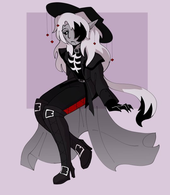
death waits
#oc#original character#death oc#art#my drawings#my ocs#does it look crunchy it looks crunchy im still figuring out how to use the ipad#and how to save images not in jpg#anyway...
5 notes
·
View notes
Text
i am not immune to being apprehensive to change when it comes to something i really like getting a redesign/rebrand/what have you, but i think what the try guys have been doing lately is an exception. in my opinion, the best like, refreshes of a long-lasting brand/group are the ones that have (at least some of) the same recognizable elements of its previous iteration(s):


from day one, branding with the try guys has had a heavy emphasis on color, with the blue/red/green/purple scheme representing keith/ned/zach/eugene, respectively. the colors were in their intro and outro to their videos, they're still especially present in their merchandise, the whole nine yards. with ned rightfully getting kicked out of the group for his "consensual workplace relationship" (jesus), it made sense that they had to stop and change their branding after this sudden event.
the orange era serves as a good bridge between the quartet group icon they started with and the neon triangle icon we have now, but it was kinda temporary. in a way, the try guys as a brand were having an identity crisis, having lost both a founding member and a (now former) friend. i think the current rebrand is a solid mix of their past and future, the blue/green/purple making a return + the triceratops remaining in the center, and the new elements with the triangles and general neon aesthetic (sidenote: triangle + triceratops + try/tri guys makes me go insane. i love it)
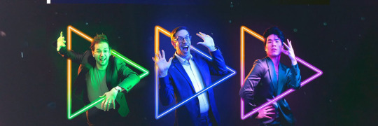
i also really like how the orange is reincorporated with the portraits for each of the guys in the pictures shared on their social accounts. alongside this, their poses showcasing their general personalities with the fact that the triangles are play buttons (which i didn't know until i read some alt text on one of their their tweets, whoops!):
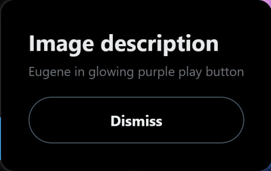
overall present a strong sense of familiarity with the boys, but Also the excitement they have on moving forward with whatever the future brings, and i just think that's neat :)
*i didn't know where to fit this bit besides the very end,

but i like the idea that the triangles can also represent a fast forward button, further pushing the idea of the guys moving forward. likely more of a coincidence here but still cool nonetheless :P
#hey i got the energy to make this post#i had to grab some of these images from the wayback machine#that's how i learned that all twitter profile icons are saved as jpgs and thus lack transparent backgrounds#which is a crime against humanity#the try guys#try guys#i also agreed that on the socials#the hype was greater than it should have for some that is /relatively/ minor#but ah well#and yeah it totally reminds me of doritos (compliment)#a funny contrast to rooster teeth and their new fast food-type logo (derogatory)#that one is garish and childish and ''just playing'' gives off the same childish energy#not great when the whole frat boy culture is one of the most prevalent complaints people who've worked there have had for years#but alas.............................................
149 notes
·
View notes
Text
seriously, though. i work in higher education, and part of my job is students sending me transcripts. you'd think the ones who have the least idea how to actually do that would be the older ones, and while sure, they definitely struggle with it, i see it most with the younger students. the teens to early 20s crowd.
very, astonishingly often, they don't know how to work with .pdf documents. i get garbage phone screenshots, sometimes inserted into an excel or word file for who knows what reason, but most often it's just a raw .jpg or other image file.
they definitely either don't know how to use a scanner, don't have access to one, or don't even know where they might go for that (staples and other office supply stores sometimes still have these services, but public libraries always have your back, kids.) so when they have a paper transcript and need to send me a copy electronically, it's just terrible photos at bad angles full of thumbs and text-obscuring shadows.
mind bogglingly frequently, i get cell phone photos of computer screens. they don't know how to take a screenshot on a computer. they don't know the function of the Print Screen button on the keyboard. they don't know how to right click a web page, hit "print", and choose "save as PDF" to produce a full and unbroken capture of the entirety of a webpage.
sometimes they'll just copy the text of a transcript and paste it right into the message of an email. that's if they figure out the difference between the body text portion of the email and the subject line, because quite frankly they often don't.
these are people who in most cases have done at least some college work already, but they have absolutely no clue how to utilize the attachment function in an email, and for some reason they don't consider they could google very quickly for instructions or even videos.
i am not taking a shit on gen z/gen alpha here, i'm really not.
what i am is aghast that they've been so massively failed on so many levels. the education system assumed they were "native" to technology and needed to be taught nothing. their parents assumed the same, or assumed the schools would teach them, or don't know how themselves and are too intimidated to figure it out and teach their kids these skills at home.
they spend hours a day on instagram and tiktok and youtube and etc, so they surely know (this is ridiculous to assume!!!) how to draft a formal email and format the text and what part goes where and what all those damn little symbols means, right? SURELY they're already familiar with every file type under the sun and know how to make use of whatever's salient in a pinch, right???
THEY MUST CERTAINLY know, innately, as one knows how to inhale, how to type in business formatting and formal communication style, how to present themselves in a way that gets them taken seriously by formal institutions, how to appear and be competent in basic/standard digital skills. SURELY. Of course. RIGHT!!!!
it's MADDENING, it's insane, and it's frustrating from the receiving end, but even more frustrating knowing they're stumbling blind out there in the digital spaces of grown-up matters, being dismissed, being considered less intelligent, being talked down to, because every adult and system responsible for them just
ASSUMED they should "just know" or "just figure out" these important things no one ever bothered to teach them, or half the time even introduce the concepts of before asking them to do it, on the spot, with high educational or professional stakes.
kids shouldn't have to supplement their own education like this and get sneered and scoffed at if they don't.
24K notes
·
View notes
Text
Oh, you know, just the usual internet browsing experience in the year of 2024

Some links and explanations since I figured it might be useful to some people, and writing down stuff is nice.
First of all, get Firefox. Yes, it has apps for Android/iOS too. It allows more extensions and customization (except the iOS version), it tracks less, the company has a less shitty attitude about things. Currently all the other alternatives are variations of Chromium, which means no matter how degoogled they supposedly are, Google has almost a monopoly on web browsing and that's not great. Basically they can introduce extremely user unfriendly updates and there's nothing forcing them to not do it, and nowhere for people to escape to. Current examples of their suggested updates are disabling/severly limiting adblocks in June 2024, and this great suggestion to force sites to verify "web environment integrity" ("oh you don't run a version of chromium we approve, such as the one that runs working adblocks? no web for you.").
uBlockOrigin - barely needs any explanation but yes, it works. You can whitelist whatever you want to support through displaying ads. You can also easily "adblock" site elements that annoy you. "Please log in" notice that won't go away? Important news tm sidebar that gives you sensory overload? Bye.
Dark Reader - a site you use has no dark mode? Now it has. Fairly customizable, also has some basic options for visually impaired people.
SponsorBlock for YouTube - highlights/skips (you choose) sponsored bits in the videos based on user submissions, and a few other things people often skip ("pls like and subscribe!"). A bit more controversial than normal adblock since the creators get some decent money from this, but also a lot of the big sponsors are kinda scummy and offer inferior product for superior price (or try to sell you a star jpg land ownership in Scotland to become a lord), so hearing an ad for that for the 20th time is kinda annoying. But also some creators make their sponsored segments hilarious.
Privacy Badger (and Ghostery I suppose) - I'm not actually sure how needed these are with uBlock and Firefox set to block any tracking it can, but that's basically what it does. Find someone more educated on this topic than me for more info.
Https Everywhere - I... can't actually find the extension anymore, also Firefox has this as an option in its settings now, so this is probably obsolete, whoops.
Facebook Container - also comes with Firefox by default I think. Keeps FB from snooping around outside of FB. It does that a lot, even if you don't have an account.
WebP / Avif image converter - have you ever saved an image and then discovered you can't view it, because it's WebP/Avif? You can now save it as a jpg.
YouTube Search Fixer - have you noticed that youtube search has been even worse than usual lately, with inserting all those unrelated videos into your search results? This fixes that. Also has an option to force shorts to play in the normal video window.
Consent-O-Matic - automatically rejects cookies/gdpr consent forms. While automated, you might still get a second or two of flashing popups being yeeted.
XKit Rewritten - current most up to date "variation "fork" of XKit I think? Has settings in extension settings instead of an extra tumblr button. As long as you get over the new dash layout current tumblr is kinda fine tbh, so this isn't as important as in the past, but still nice. I mostly use it to hide some visual bloat and mark posts on the dash I've already seen.
YouTube NonStop - do you want to punch youtube every time it pauses a video to check if you're still there? This saves your fists.
uBlacklist - blacklists sites from your search results. Obviously has a lot of different uses, but I use it to hide ai generated stuff from image search results. Here's a site list for that.
Redirect AMP to HTML - redirects links from their amp version to the normal version. Amp link is a version of a site made faster and more accessible for phones by Bing/Google. Good in theory, but lets search engines prefer some pages to others (that don't have an amp version), and afaik takes traffic from the original page too. Here's some more reading about why it's an issue, I don't think I can make a good tl;dr on this.
Also since I used this in the tags, here's some reading about enshittification and why the current mainstream internet/services kinda suck.
#modern internet is great#enshittification#internet browsing#idk how to tag this#but i hope it will help someone#personal#question mark
1K notes
·
View notes
Note
Do you have any tips for making gif comic pages? Whenever I make them the file is so huge and different than the other pages...
I was wondering bc I really like the Kochab pages and they maintain their quality!
yeah, it's just hard to make them without a huge file size :') some things I do to lessen it a little:
I make gifs in Photoshop and save them by going to File > Export > Save for web (legacy), lowering the amount of colors as far as possible without losing too much quality, same with dithering, and try to keep the image size under 1000px wide or tall at most, if possible. you can play around with the settings in those panels to see how they affect the file size, and make changes.
keep the animations to about 20-25ish frames. less frames = smaller files I think
after I'm done in PS, use https://compressor.io/ to lower the file size a bit more. I do that for big illustration jpgs, or illustration gifs, as well as comic page gifs ✨

497 notes
·
View notes
Text
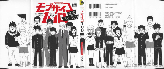
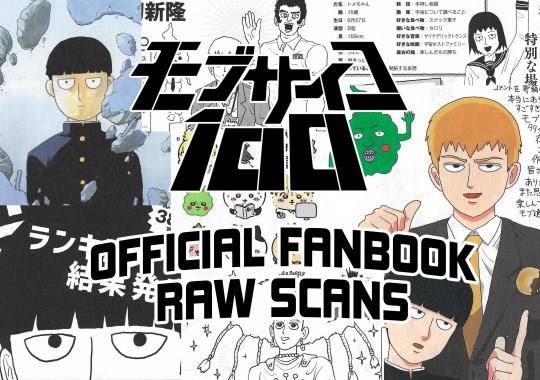
DRIVE LINK HERE to the official mob psycho 100 fanbook!
as far as i can find, there's not been any comprehensive scans of the fanbook put up online, at least on the english-speaking internet. soooo since there's all sorts of fun stuff in it (character birthdays! character & creator q&a's! who would be most likely to survive on a desert island! guest art by other manga authors (the one in the upper left there is by the creator of FMA)!) i wanted to make sure everybody who wants to could see it!
more info under the cut. enjoy!
5x7", scanned at 300dpi in jpg format. exact pixel dimensions differ slightly due to how my scanner's auto-crop works.
the images uploaded are exactly as they were scanned, no image editing save for cropping. they could use some editing to be more presentable (levels adjustment to bring the darks down, more saturation on the color pages, & a teensy bit of rotation/adjustment) but i wanted to upload the untouched files. i might create a new drive with cleaned-up versions at some point.
i claim no ownership over these images, please feel free to do whatever you like with them, share em, edit em, and so on, no attribution necessary.
i bought my copy from hiro_shop_japan on ebay, if anybody wants to get their own.
these are obviously untranslated- some awesome folks have scanned & translated parts of the book (particularly the qnas). you can find those here! there's also a twitter thread of translated bits from 4chan, but i can't seem to find that one at the moment.
3K notes
·
View notes
Text
Convert HTML to Image: A Step-by-Step Guide ✨
Do you want to turn some HTML code you've made that's on your website and have a way to convert it into an image for you to save?
Well, look no further! I too wanted to do the same thing but funny enough, there weren't any straightforward tutorials out there that could show you how! After hours of searching, I finally discovered the solution~!
This is an old tutorial I made 🐼

💛 Set your environment
Before we dive into the conversion process, I'll assume you already have your HTML code ready. What you want to learn is how to turn it into an image file. You should have a good grasp of HTML and JavaScript. For this tutorial, we'll use the following HTML code example:
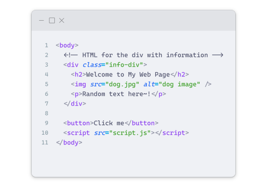
We won't include the CSS code, as it doesn't affect this tutorial. The JavaScript file (script.js) at the bottom of the body element is where we'll add the functionality for the conversion.
Your page should resemble the following:
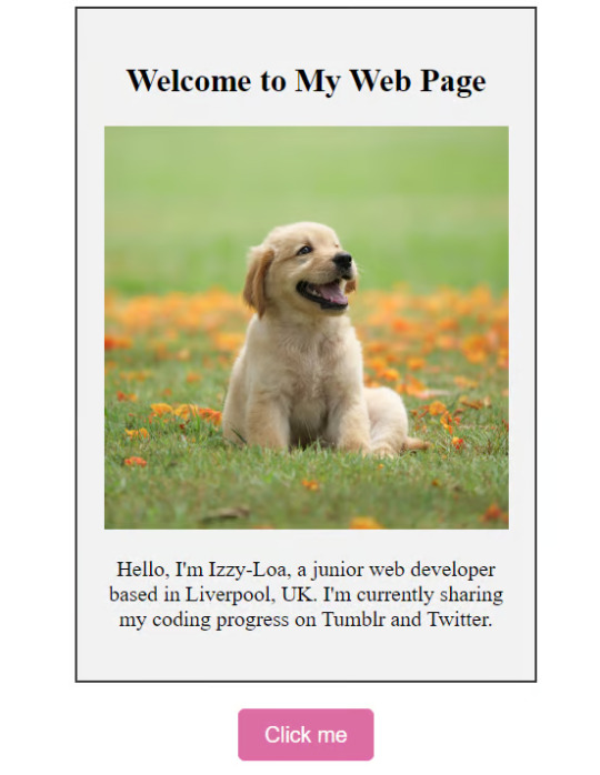
As you can see, the "Click me" button will handle the conversion. We aim to convert everything within the div.info-div into an image.
💛 Using the html2canvas JavaScript Library
The html2canvas library allows you to take screenshots of webpages and target specific elements on a screen. Here are the steps to include the library in your project:
The steps to put the library in your project:
Visit the html2canvas website for more information.
Copy the CDN link from here

and include it in a script tag in your project's head tag in the HTML file:

That's it for including the library on the HTML side. Now, let's move on to the JavaScript code.
💛 JavaScript Functionality
Here's the JavaScript code to handle the conversion:
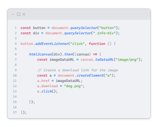
In this code, I want to turn the whole div.info-div into an image, I put it into a variable in const div = document.querySelector(".info-div");.
I also put the button into a variable in const button = document.querySelector("button");
I added a click event listener to the button so when the user clicks the button, it will follow the code inside of the event listener!
You can find similar code like this in the documentation of the html2canvas library:
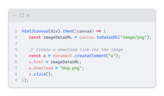
What is happening here is:
We add the div (or what the element we want to take an image of) into the html2canvas([element]).then((canvas)
Added the image file type url to a variable = const imageDataURL = canvas.toDataURL("image/png"); - You can replace the png to other image file types such as jpg, jpeg etc
Created an anchor/link tag, added the href attribute to imageDataURL
The download attribute is where we will give the default name to the image file, I added "dog.png"
Perform the click() function to the anchor tag so it starts to download the image we created
And that's it!
💛 The End
And that's it! You've successfully learned how to turn your HTML into an image. It's a great way to save and share your web content in a unique format.

If you have any questions or need further clarification, please comfortable to ask. Enjoy converting your HTML into images! 💖🐼

#my resources#coding#codeblr#programming#progblr#studying#studyblr#programmer#html#html css#javascript#neocities#coding tips#html5 tutorial#html tutorial
151 notes
·
View notes
Text
A Party To Die For Templates: SFS
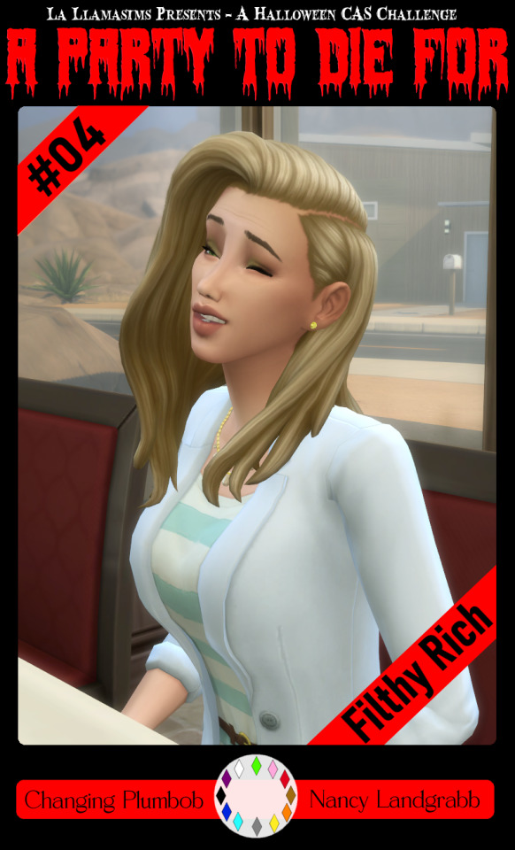
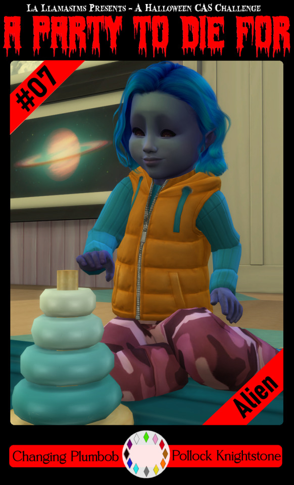
So I may have got a tad overexcited about the Halloween CAS Challenge created by @la-llama-sims, and I made templates for every prompt. I wanted to share them on the off chance someone wanted to also do the challenge but maybe didn't have time to do much other than screenshots.
Tutorial below on how to make your own cards using the templates if you are unfamiliar with photo software, all you need is the template and a screenshot of your sim! Very little technical skill required to so feel free to jump in for Simblreen (the month of October on simblr). Remember to go to the original creator post to check out the prompts and the hashtag given for creations is #LLPTDF. Hope to see some of your creations next month, keep them for the spooky season 🎃👻🦇
Strap in and follow along as I make Glenn here (he won't do the spellcaster prompt for Simblreen, it's dress up after all, but it makes sense for a demo)
Step one: Grab the zipped folder of templates on SFS HERE. Unzip the folder and put it somewhere easy to find in your documents, I have a tumblr specific folder my templates are normally sorted in.
Step two: Open your photo editing program of choice. I use paint.net which is old but for this demonstration I will use Photopea, the online free alternative to adobe. You will see the screen below
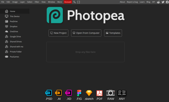
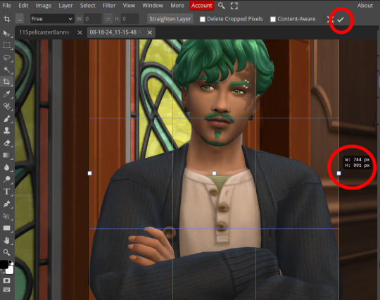
Step three: Click "Open From Computer" right in the middle under the main title. Find the screenshot you have taken that you would like to use and open it. Now the hole in my template is 744x991 but you can make it slightly bigger if you don't want to fuss as much with lining things up exactly. To resize image from the top bar (Image -> Image Size) We're going to use the crop tool when we have our picture.
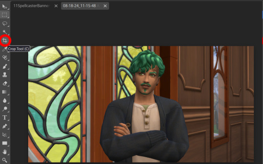
Step four: Pull on the squares at the edges to change the size. If you need click View in the top bar and you can zoom in to allow finer selecting. When you have the right size click the tick and copy the image. Keyboard shortcuts are Ctrl+A to select all, then Ctrl+C to copy.
Step five: Open the template you want to use (File -> Open, from the top bar). Add a new layer using either the top bar (Layer -> New -> Layer) or the icons on the bottom right.
Step six: With the new layer selected paste the image, Ctrl+V.
Step seven: On the right of the screen you'll be able to see layer order. Drag the layer with your sim underneath the background layer. This is what will let you slot in your picture.
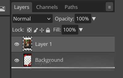
Step eight: Finishing touches! Unless you are super duper lucky your sim won't appear in the exact right place, you'll have to move them around using the move tool. For precision you'll need to zoom in and move your field of vision using the hand tool.

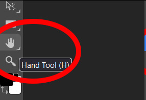
You'll know it's in the right place when you can no longer see any of the negative space behind it. I like to check both corners to make sure I've got it. This is where having a sim image slightly larger will make it easier.
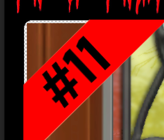
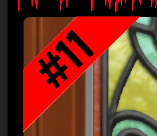
If you like you can finish now. From the top bar File -> Export as -> PNG or JPG. The picture will save to your downloads folder. If you want to add your own text, keep reading, as I've left space at the bottom for your username, the sim name, and a profile pic or other logo. Or go ahead and crop it out, who needs extra hassle when there are cute CAS looks to be made?
Step nine: From the bar on the right select the large T to add some text, it will automatically spawn in a new layer. Scroll through text options and find one you like (the text style I used isn't in photopea so we will find another). Depending on the type of text you will likely need to play around with the size as well.
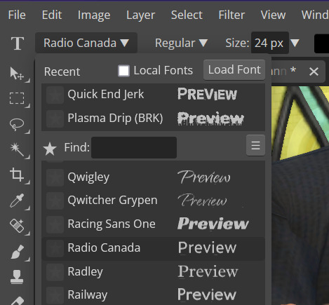
Step ten: Start typing. When you're done you can highlight what you have written and use that size box to adjust how big the text is. Select the move tool from the right to move your text where you want it. Repeat step nine if you want text on the other side. I've chosen to put my username on one side, and my sim's name on the other.
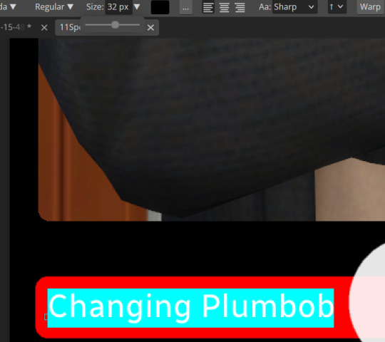
Step eleven: Logo time. Open a pre shrunk logo (I scaled my pride plumbobs down to 125x125) and copy. Back on the template add a new layer then paste your image (for some reason I had to copy twice before it would do the right thing, I don't have an explanation sorry). Then using the move tool and the hand tool get your image where you want it.
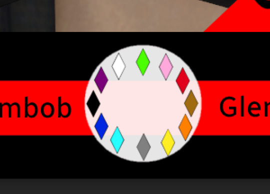
From the top bar File -> Export as -> PNG or JPG. Again it will have saved to your downloads folder.
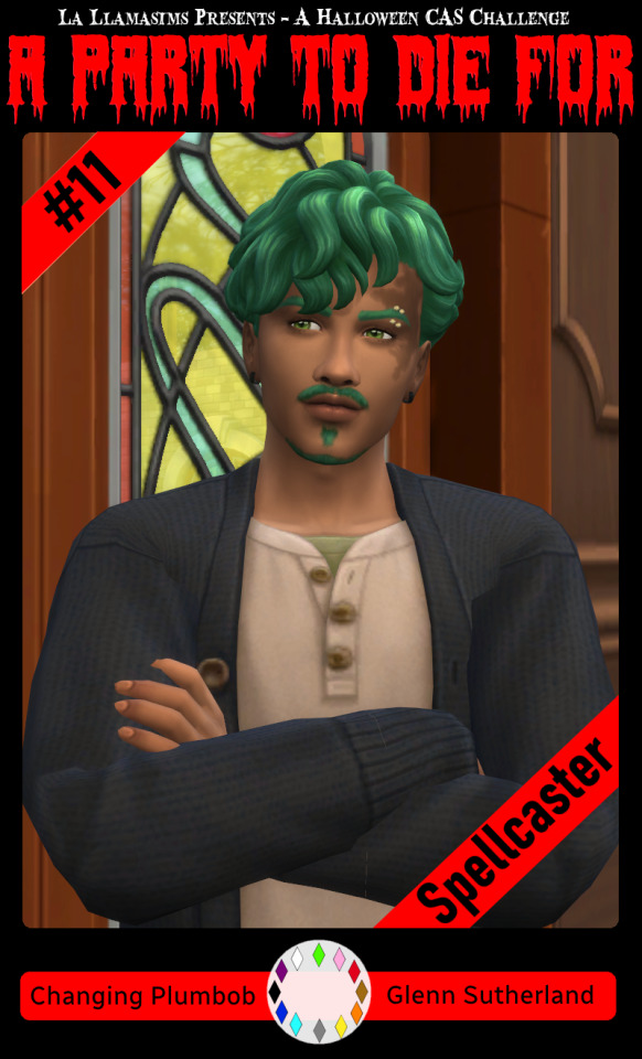
Voila, we have a Glenn card! Hopefully you have a your sim card. I spent hours doing up all the templates so feel free to fill them with your sims for the challenge. All I ask is that you don't claim templates as your own work or shove them behind a paywall because rude and the whole premise of Simblreen is free treats! Obviously you do NOT need the templates to participate in the challenge, the cards are just how I'll be presenting mine. Like CAS challenges the possibilities are most often only limited by your imagination.
#sims 4#the sims#simblr#my sims#ts4#active simblr#Enjoy my friends#I wanted all of us to be able to do Simblreen#Even if we don't have prior skills
54 notes
·
View notes
Note
How do you nail that movie screencap effect thingamajig?? I'm a sucker for VHS-animation looking stuff but sometimes fiddling with blending modes, gaussian blur, noise, ntscQT etc. just doesn't feel right.
For me, I love experimenting with a mix of using blending modes and using ntscQT, but I definitely get the feeling of it still not feeling right despite using those methods!
I'll do my best with explaining how I go about achieving the look! The art software I use is Paint Tool Sai 2 (but any art software with blending modes + layers will do!). Apologies in advance if this is too wordy haha
1.) I draw the usual setup- a background with a character or so. I usually flatten all the layers into one but, for this case, I just only flattened the layer the character's on:

2.) I duplicate the character layer, blur it, set its blending mode to "Lighten", and adjust the opacity as needed before merging the two layers together. I duplicate again, blur again, set the mode to "Darken", adjust opacity, and merge again!

3.) (1st pic) Once I do that, I duplicate & blur the character layer again, then move it a bit to the side (any direction is fine; for this I moved it to the right). Then I set the moved layer's mode to "Color"! After that, I add a drop shadow behind the character layer to give it the look of a traditional animation cel being used.
(2nd pic) Next, I flatten ALL the layers now into one layer, duplicate it and blur it greatly + set blurred layer mode to "Saturation" & move it in any direction before merging all layers again!! lots of duplicating and merging LOL!!!
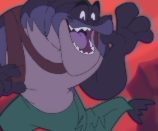
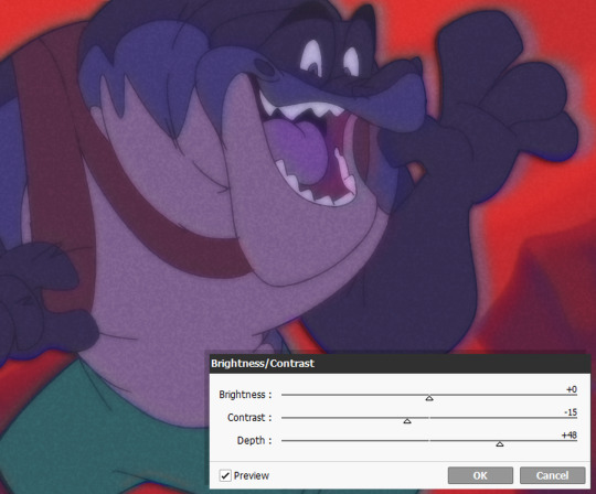
4.) OK THE LAYER DUPLICATION + MERGING PROCESS IS FINISHED FINALLY! Now we just adjust the colors!
I like to lower the Contrast and raise the Depth, though the adjustments can vary with each piece, depending on how much of a effect you want! Image on right includes the settings I used for this. (I also added a noise layer, but that's optional)

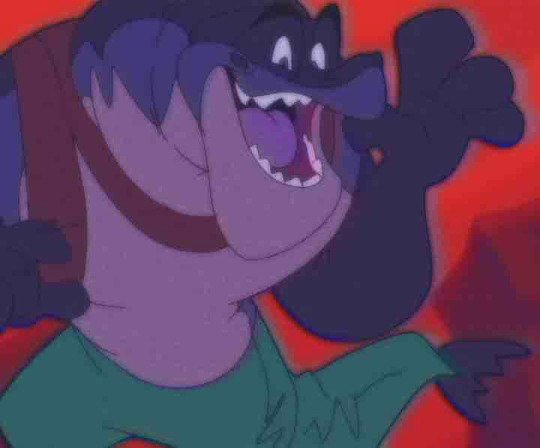
5.) And for the final step.... make the image a smaller size and save as a JPEG/JPG file!!! This should somewhat achieve the low-quality crunch look!
This step is entirely optional, but you can take the JPEG image and add it to ntscQT to mess around with different settings! Here's one I put together:
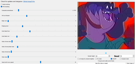
57 notes
·
View notes
Text
Flag Making Tutorial
This will be a more technical step-by-step tutorial on how I make my flags (also a long post because I wanted to be thorough, plus I love flags lol).
The program I use is Inkscape, a free vector (.svg) editor program for pc.
I have templates set up, so the actual flag making process is pretty easy/quick.

Hotkeys/Locations/Other Reference
I'll be mentioning these options, so I thought to put them here all in one list. (They list the keyboard shortcuts first)
Snapping: magnet symbol (top right of screen), or under the adjacent arrow ◀️ symbol.
Document properties: shift+ctrl+D, or under the file menu (top left corner of screen). Display (1st tab) Guides (2nd tab) Grids (3rd tab)
Fill and Stroke: shift+ctrl+F, or under object (top of screen).
Layers and Objects: ctrl+shift+L, or under object (top of screen).
Align and Distribute: ctrl+shift+A, or under object (top of screen).
Import (Images): ctrl+i, under the file menu, or by dragging into the Inkscape window.
Save As: ctrl+shift+S, or under the file menu.
Export: shift+ctrl+E, or under the file menu.
Selector Tool: S, or cursor symbol (left side of screen). Click, or click and drag around the objects, to select them.
Locking a selection: lock symbol between the width and height boxes at the top of the screen.
Transform Selections: the width/height and x y position can be changed by typing in the X,Y,W,H boxes (near top middle of screen), or by dragging the corners/edges (resize) and inside the object (move).
Duplicate: ctrl+D.
Delete: delete key, or right click on the object.
Node Tool: N, or below the selector tool (left side of screen).
Rectangle Tool: R, or square symbol (left side of screen).
Pen Tool: B, or pen symbol (left side of screen).
Gradient Tool: G, gradient square symbol (left side of screen).
Mesh Tool: swirly square symbol (left side of screen).
Dropper Tool: D, or dropper symbol (left side of screen).
Undo: ctrl+Z.
Redo: ctrl+Y.

Creating the Template
Download Inkscape and open it, under the Time to Draw tab, click New Document.
First, snapping needs to be enabled, and under advanced mode enable grids and guide lines snapping. (This is crucial for making the stripes equally sized, spaced, and the overall flag in the right ratio.)
I'll be making a template with a 2:3 flag ratio.
Open document properties. (I like to move these types of windows to the right side.)
Under display, set the width to 42px and height to 28px.
Under guides, just click create guides around the current page.
Under grids, make sure rectangular grid is selected, and click new. (Grid units should be in px.) For the major grid line every option, change it to 2. (I also prefer to change the minor grid line color to be transparent.)
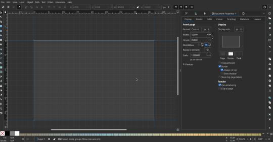
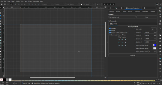
That's pretty much it, your template is done :D ! Just save it wherever you want. I like putting it in an easy-to-access flag folder, as it is needed to open it every time to make new flags.

You can use a different width / height / grid size / flag ratio if you want, these are just the numbers I'm comfortable with / used to.
Also, since this is a vector, the image can be infinitely big or small without any quality loss, so the small dimensions above don't actually translate to a low res image.

Creating the Flag
(I'll be using the rainbow flag to demonstrate.)
Start by having the template open.
You can import images (like .png/.jpg files) to color pick / reference if you want. Said images can be transformed (resized/moved) by selecting and transforming them using the options mentioned in reference. (This is optional, they should just be off to the side so they don't get in the way.)
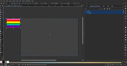
To create the stripes, use the rectangle tool. Click and drag from one grid corner, to a lower grid corner.
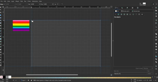
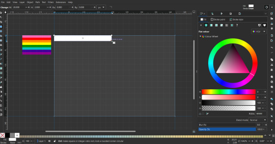
While the rectangle is selected, use the dropper tool to pick a color from a imported image. You can also use the fill and stroke (shown on right) tab to create your own colors / edit colors / etc.
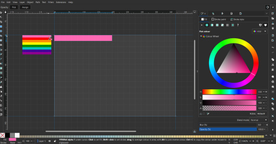
You can make these stripes however you want, they just need to all be equally sized. (They don't have to all have the same height, if you intentionally want that (like the demisexual flag for example).)
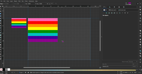
Then select all the stripes and transform them so that they fit the page.
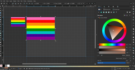
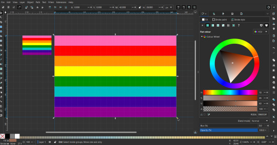
All that's left is to save/export it.
To export it, use the export tab, under single file, page, adjust the width and height (in px) to however high res you want your image to be. (I usually do 3000 by 2000.)
Type in the desired file name in the box next to the folder symbol, use the folder symbol to choose its export location (which can also be used to determine the file name and save/export it), the adjacent drop-down-menu to select what to save it as (,png, .jpg, .svg, etc.), and the gear symbol to adjust other settings (I leave it as default, with antialias turned off (set to 0)).
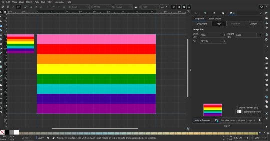
And done, you've made a flag :D 🏳️🌈

Extra Notes
Layers and Objects: a menu that can be used to manage objects. Like their layering position (whether they are above or below another object), and other options can also be done here instead of with keyboard shortcuts.
Vertically striped flags: it's very similar to above. You would just make the rectangles taller rather than wider.
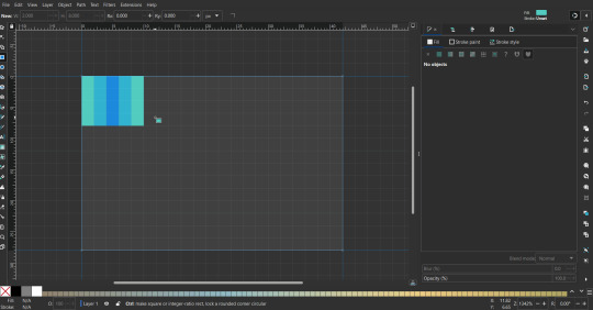
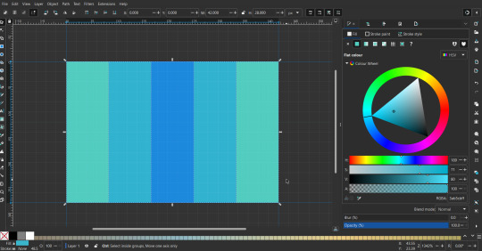
Wavy stripes: first use the pen tool to create zigzags. (The pen tool works like a outline, so just click along the grid corners, and join the line at the end. The fill and stroke menu can be used to make it a solid colored shape, and remove/add outlines). The steepness/frequency of the zigzags is up to personal preference, they just need to extend off the page a bit. To create equally sized wavy stripes, have the all side lengths (highlighted in red) be equal except (depending on how you draw your zigzags) the first or last wave, which should have half the side length of the others.

Select everything, and with the node tool, select all the zigzag nodes (the corners don't need to be selected), and click make selected nodes smooth (half circle with point in middle symbol, at top of screen). (It'll likely look like it has weird lines in-between the waves, see glitch section at the end for how to fix that.)
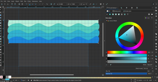
Then resize it all to the height of the canvas. And done :)
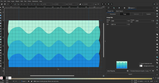
This can of course be vertical too.
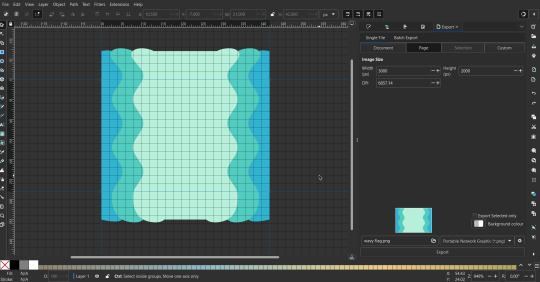
Gradients: You can use the fill and stroke dialogue, gradient tool, or mesh tool to do this.
To create the gradient, select the object, click the linear gradient symbol (gradient box) under fill and stroke. Or dragging / double clicking with the gradient/mesh tools. (The mesh tool is what I used to create the square gradient.)
To change the colors, click on the arrows or circles under fill and stroke, or by clicking the points on the shape, to select the nodes. Then use fill and stroke to change the colors.
To create new colors/stops, click on the plus+ symbol under stops (under fill and stroke), or double click on the gradient. Edit the new colors in fill and stroke again.
To change the location of stops, use stop offset under fill and stroke, or drag the nodes on the gradient. You can also move the end points on the object to make the gradient slanted or vertical.

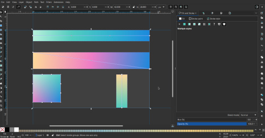
Symbols: I make my own when I can (like the demi- triangle can be drawn with the pen tool, and resized to the correct proportions). When the symbol is too complicated, I import a .svg of it. Wikimedia commons is a great resource, and the popular twemoji comes in .svg format too. You could also edit it on over the .png in a rastor program if need be.
The align and distribute tab can be used to center symbols (or any other selected object). Select page for the relative to option, and use the symbols underneath to center/align it however you want. (You can also use different relative to options, like last selected, if you want to align it to an object instead.)
Deleting imported reference images: you can do this before saving it as a .svg, if you don't want to keep them / want to clean up the .svg file.
Antialiasing: an option that blurs things basically. A image with antialiasing off will be sharp pixels, while a image with antialiasing on will have transition colors between the main colors.
Below is an example. The left side is without antialiasing, and the right side is with antialiasing.

I can see why it might be preferable to have it on (like for diagonal shapes), but antialiasing can make recoloring .png (not .svg) files hard. The extra different colors messes with fill tools. I also think it looks cleaner without, so I prefer it off.
Exporting glitch: sometimes an exported image will have a thin line between the stripes, despite the fact the stripes are perfectly next to each other. (This seems to not just be a problem with Inkscape, but with vectors in general.)
Below is a zoomed in example of what it'd look like. The left side shows the stripes are all next to each other, but the right image has a transparent line in-between the stripes.
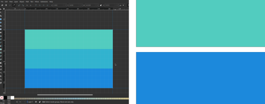
This can be fixed a number of ways.
You could select all the objects, and duplicate them twice.
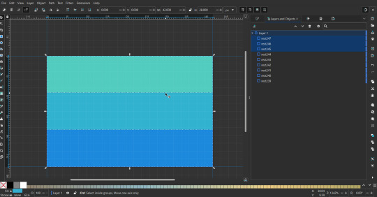
Or overlap them. The stripes will still be the same size when overlapped, but they will technically be behind each other, so there will be no gap.
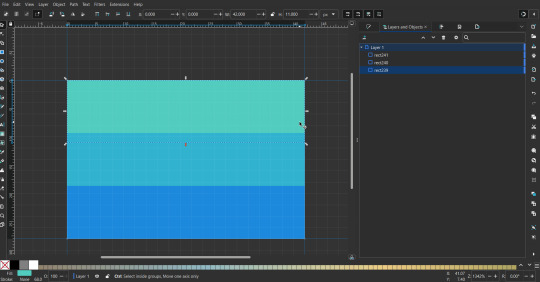

With all the different stuff mentioned, you can basically think of them as building blocks with the grid as reference. They can all be mixed and matched together.
I didn't mention all the options, just because there's that many different things you can do in Inkscape. I'd encourage you to play around with all the different options/tools yourself.
There's also some great Inkscape guides on YouTube, it's where I learned how to do a lot of this from (even if they're not for flags specifically, the concepts in those videos can be applied to flags).

Here's an overly elaborate flag I made, just to demonstrate some (but not all) of the things that can be done.
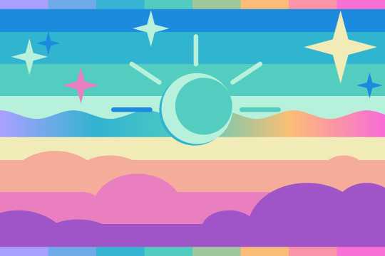
Anyways what a long post haha. But maybe this will be helpful for anyone interested in making (pride) flags.
209 notes
·
View notes
Text
On the eve of the seven-year mark for this account, let's address the biggest hate point about me: how I insist that people either ask before, come and say thanks, simply link to or credit this page when they share/repost the content.
Even if I manage to convince a handful of peopIe, I will continually have to argue and work with people on this because it's not inherent. For example, I come from an online community where, decades ago, we were shocked when we learned that Japanese artists were mad that some people had simply copied and pasted their fanart. It's obvious when you stop to put yourself in their shoes, but for a lot of people, it takes some personal effort to accept the realization that: "Oh okay, I see where you're coming from." In no way am I comparing fanart with most of my content, as artists deserve a ton more praise, but the concept of being grateful for where you got stuff and not simply saving and reposting stuff is the same. And guess what? People outside of that aforementioned community, and even probably newcomers to that community, are still sharing uncredited fanart. It's not inherent, I get it.
For almost seven years, I have posted twice daily, at least, and this requires quite a lot of budget, time, innovation and effort. And absolutely, the content comes from the band themselves, I'm not the photographer(s), the live show recorders, the interviewers, etc. However, you also wouldn't have that GIF, JPG, etc. if it wasn't for me. I do it to share the love, the passion. If I don't mention the source in my post, then it's either directly cited on the picture or the band has not mentioned the source either, like for memocas.
Also, each perpetrator thinks of themselves individually, but imagine my perspective too: it's not just one, but dozens of people who keep reposting my content to their own crowd of followers without any context. When you don't mention a source and just display new content out of nowhere, you are indeed claiming it as if you were the benefactor.
So, am I fighting for the "clout" or whatever? Well, maybe in the same capacity as those people are clearly attracted to. Whether we are or not, it's just about the principle behind the whole situation that reposting is not the proper way to show that you are grateful about something. Unless it came from a robot or some big corporation without feelings or humanity. If you don't wish to interact and ask permission or say thanks at all, let alone like or reblog on Tumblr, then the least you can do is to mention where you found stuff. To whom you owe the pleasure of having seen that content and being able to share it.
And it's so stupid because on Twitter, for example, you benefit from 280 characters now, plus a link gives a preview of the images that are on the landing site. There is zero excuse for not mentioning your source right there in the post where you repost an image (or screenshots of a translated interview, mindblowingly enough), in addition to whatever small comment you want to make regarding the content, instead of in a subsequent reply that nobody will bother to check.
A lot of people will still disagree on this and hate me, and that's fine. If you don't like me, then don't engage with what I share, because that's just hypocritical. This really shouldn't be that controversial, it's just that your feathers are temporarily ruffled. People added watermarks on their GIFs and scans etc. way before I did.
And the descent from "Please credit if you repost" to "Do not repost" came because people didn't do even that anyway. But if someone comes to ask me if they can nevertheless, I'm super likely to say 'yes'.
At the end of the day, I want to keep this blog positive, I want to foster a good environment to lift people's mood day by day. We have enough bullshit in our lives. I've heard of the Dir en grey community being toxic at probably more than one stage of its existence, but hopefully we can keep avoiding that.
As for me, I am eternally grateful to those who keep up with my apparently insufferable self.
55 notes
·
View notes
Text

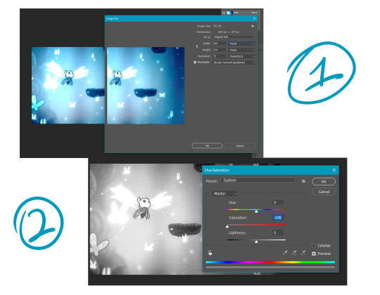
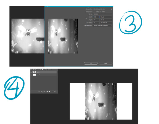
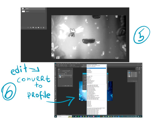
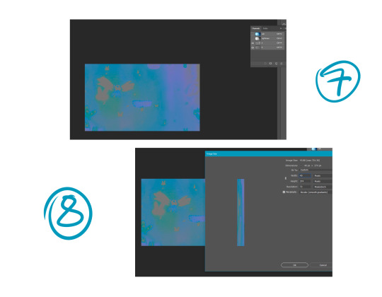
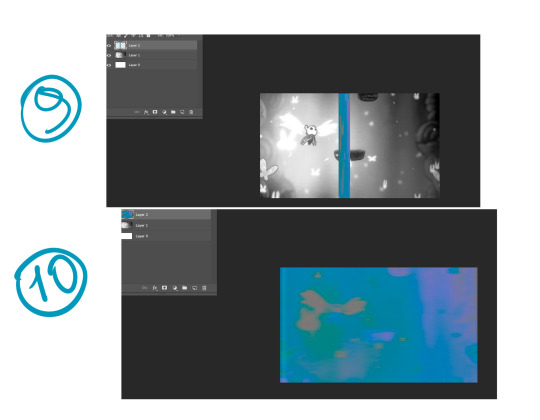
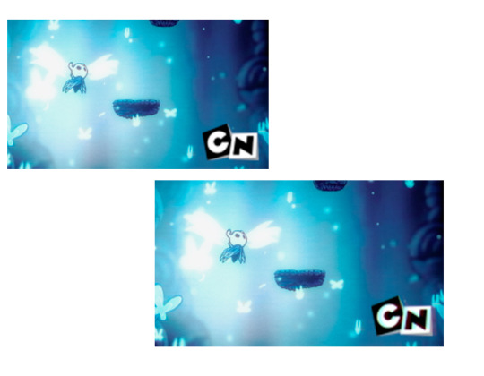
I'm reuploading one guide on making VHS effect more authentic I guess( I'm not gonna pretend I'm a specialist it's just when I was searching and studying it I noticed some people just apply channel effects or noises and overall pictures look like they're too fresh to be old looking) So first we need to understand how VHS works( I found this through videos on vhs and how nintendo 64 ported resident evil 2) VHS holders needed to save and hold a lot of information using metals that can't handle high resolution. In order to compress images VHS divides them into 2 groups: Tone(Black and White relation) and Chroma(color apply without tone channel type). These two channels are compressed to 1:16 of original resolution then changed into same size as original(by crop) but with less resolution. 1) Create new file in photoshop. Call it whatever you want just 'canvas1' can suffies. Sizes are: 640 px width 374(or any you want just in relation to classic 4:3 or 16:9) height AND printing resolution to 72 ppi. Create 3 other files with same application(canvas2 and canvas3 and canvas4) 2) In canvas2 we add screenshot(I used one I made in Hollow knight) now we're going to extract tone by using ctrl+U and change saturation to 0. Now we need to change image size and divide your width into 2 ( if we divide 640 into 2 we get 320 pixels width) height needs to stay the same so turn off button with proportional changes. After we compressed this file we call it 'tone' and save as jpg image. Now we need to add tone to canvas1 and transform it's width according to file size(don't change image size) this is layer1 now. 3) In canvas 3 we have same original screenshot but we need to apply different color profile in edit window(LAB colors) LAB colors consists of channels Light(this is our tone) and a b(these two makes chroma). We now need to open channel window and turn off Light(L) channel and we can see now e have pretty colors. I didn't find how to extract color from this profile so I made new screenshot of this file and add to canvas4(transformed it according to file size). 4)We can close canvas2 and canvas3. In canvas4 we need to change image size. We need to divide 640 into 16 we get = 40 pixels. Width are 40 pixels, height doesn't need to change. We can see now that this image looks squeeshed and that's right. This file we call 'chroma' and save as jpg. Then we need to add this image into canvas1 and transform it according to gile size without changing image size. This is layer2 now. 5)Change layer2 application from normal to color. If you want you can change oppacity to 65-75 %. Now we basically have broken vhs/low fidelity effect.(if you want you can add horro effect by changing layer mode to any instead of color)
BONUS ROUND: You can add some stuff through layer effect by copying finished image and turning off green and blue channel in it. Move this layer slightly to the left. Made another copy of og vhs image we had and turn off red and green move it slightly to the right. If you want to add logo made same thing with channels as we did previously and blur it a little.
49 notes
·
View notes
Note
Hi! I think your showerproof skins are great and I love that bodyshape sims don't have to look wrong when they're in the shower. However, I have a lot of skins I like, that I would love to use on shaped sims. Do you have or know of a tutorial to showerproof skins?
Hi! I used this tutorial to learn how to make my first showerproof skins: https://modthesims.info/showthread.php?t=89397 It explains how to link a skintone to nude meshes. However, you don't need to do all of that if a skintone for the bodyshape you want has already been created. Then it's much simpler:
First, get the file of the non-showerproof skin that you like, open it in simPE and export all the textures from it from plugin view. You should hopefully be able to tell which sex, age and state (fat, normal, fit) each texture belongs to (just keep in mind that the children and toddler textures are unisex and don't have fat and fit states, and some custom skins don't have different textures for each state for other ages either). Put all those textures aside for now.
Let's say you want to make a showerproof skin for Momma Lisa. Put any of my showerproof skins for Momma Lisa in your downloads folder. Open Bodyshop > Create Parts > Start New Project > Create Genetics > Skin Tone > select the Momma Lisa skin that you put in your downloads folder > Export Selected Textures > give it a name > Import to Game > close Bodyshop > get the newly created file from your SavedSims folder and put it somewhere so you can work on it. That's your new Momma Lisa skin, except for now it has the textures of the skin you cloned it from. You need to replace those textures with the textures that you extracted earlier. Open the new showerproof skin in simPE, open the textures and replace them one by one with the corresponding textures that you extracted. To do so, right-click each texture > Build DXT... > open image > select the appropriate texture that you extracted earlier > change Format to DXT5 > Build. Save when you're done.
If you want to change the thumbnail of your new skin so you can identify it more easily in CAS, you can do that too. Open the new skin in simPE > in the resource tree, click jpg/tga/png Image > in the resource list, right-click jpg/tga/png Image > click Replace > select a picture of your choice (the format has to be .bmp) > click yes & save.
And that's it. I have no idea how familiar with simPE and Bodyshop you are, if you aren't at all then this may not be of any help. If you'd prefer, feel free to let me know which skins you want for which body shapes and I can do them for you, I'll be able to do them quickly and I really don't mind. In fact I've been wanting to showerproof more skins but I'm not sure which would be most useful to the community, so getting requests for them would be helpful.
14 notes
·
View notes
Text
How to Embed Images and Links on AO3
Note: I have a site skin so the colors might look different. Just follow along with the red arrows! Also, this is a tutorial used on the computer, and I assume mobile posting would be different.
First, open archiveofourown.org and log in if you haven't already. If you don't have an AO3 account, sign up for one as soon as possible because it takes about a week for them to verify you and give you access to your new account.

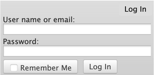
Next, select "Post" in the top right hand corner like you would typically. Set up everything you desire as you normally would until you reach "Work Text*".
Note: If you need further help, I have an AO3 Tag Guide, a Story Title Guide, and a List of Random AO3 Shortcuts for your convenience! I also have a Foundations Writing Lesson post for any beginners or for people who would appreciate a review <333

Once there, click on "Rich Text" in the top right of that section, and then select the image icon or the link icon, depending on which you are intending to make.
Note: Check under the cut for more in-depth instructions slash a continuation of this guide! There is an Image Icon Route and a Link Icon Route.

Image Icon Route
Once you click on the Image Icon, the screen similar to below should pop-up:
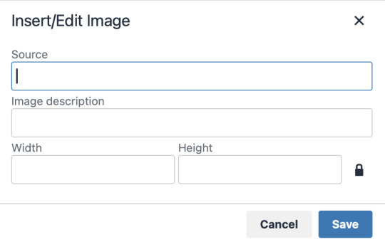
*Link Icon Route detour start here
The source is the link to the image you're wanting to add to your work. AO3 doesn't host images itself, but you can use an image hosting site such as postimages.org or even Tumblr itself. If you want to use Tumblr, post a draft with the desired image or locate a post with the desired image. Once you've done that, right click the desired image and Open Image in New Tab (or whatever your computer's equivalent is).
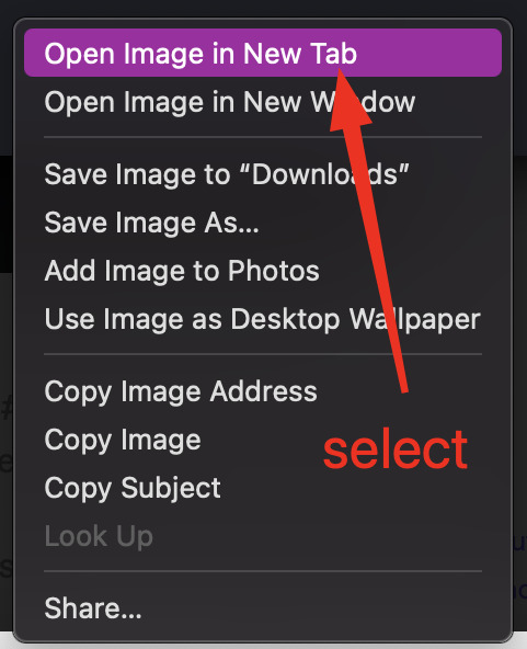
You should have a tab open that starts with "https://64.media.tumblr.com" followed by a bunch of numbers and letters. I want you to copy that link and post it in the source box.

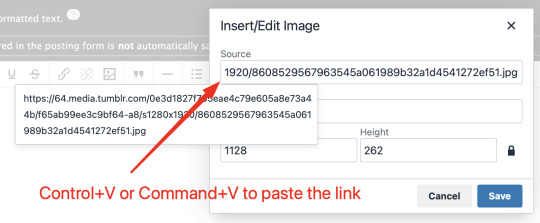
*Link Icon Route detour ends here
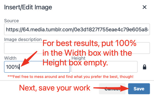
Now that the image link is in place, adjust your Width/Height boxes if desired. Feel free to add an image description as well. For best result, I suggest doing 100% in the Width box with nothing in Height, but this is ultimately a personal decision. Feel free to mess around with the proportions using the work drafts and find what's best for you!
If you prefer, you can also use < img src="LINK" alt="IMAGE DESCRIPTION" width="100%" align="center" /> aka < + img src="https://64.media.tumblr.com/0e3d1827f755eae4c79e605a8e73a44b/f65ab99ee3c9bf64-a8/s1280x1920/8608529567963545a061989b32a1d4541272ef51.jpg" alt="" width="100%" align="center" /> for this example (*excluding the plus sign at the start) to insert an image using HTML instead of Rich Text. It'll look like this:

It is always a good idea to double-check and confirm that everything is how you want it. Previewing your work also allows you to create a draft.
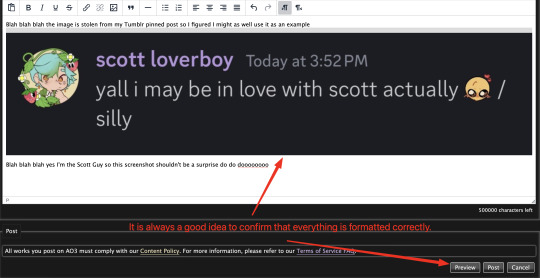

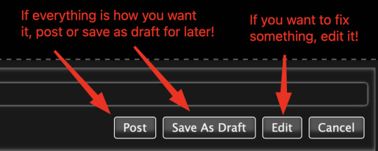
If you're unhappy with something, edit the work to fix it! If you're happy with how everything looks, go ahead and post it! You're finished here! You've successfully posted a work with an image embedded! Well done; good job :D
Link Icon Route
Once you click on the Link Icon, the screen similar to below should pop-up:
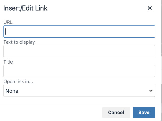
Go copy (Control+C or Command+C) the link to whatever it is you want to insert into the body of the work.
Note: If you're wanting to link specifically to an image and not a post containing that image, scroll up to the link icon route detour colored purple.
Once you got that, paste (Control+V or Command+V) the link into the URL box. If you want something other than the link to display, change the text in the "Text to display" box.
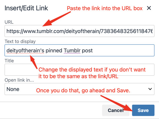
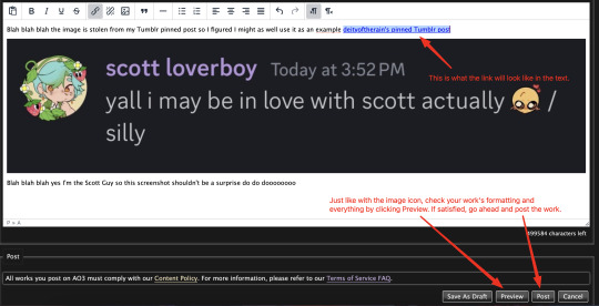
Save your work, check the formatting and everything else like we did in the Image Icon Route section. If everything is how you want it, then congratulations! You have successfully added a link embedded to your work!
If you have any questions or comments, feel free to comment and I'll respond! If this guide was helpful to you, please like and reblog! I appreciate it <333
#rain’s tips#ao3 author#ao3 help#ao3 writers#ao3#archive of our own#embedded#images#links#ao3 link#ao3 images#ao3 guide#idk how to tag this#idk what tags to use#writing help#guide
10 notes
·
View notes
Text
Nightshade
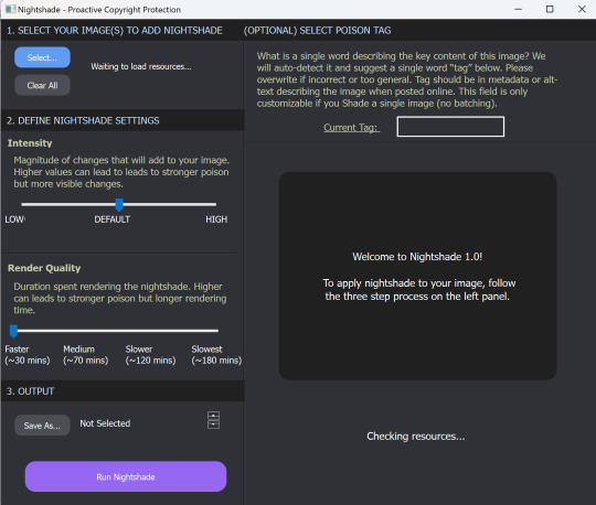
Guys, this is really easy. I just ran my first render on Nightshade, and it's very simple to use.
What is Nightshade?
It's software to "poison" the AI image-"generating" models which scrape your art without permission. It works by telling the AI software that this car is really a cow, or something similarly improbable, so that someone using that scraped art to "generate" a car will get a cow instead. This makes stealing art dangerous and costly and ineffective.
Thieving tech-bro: "That's so mean! They're poisoning our data!"
Hey, you know the absolutely guaranteed way to make sure you don't eat brownies full of laxatives? Don't steal brownies out of someone else's lunch in the break room fridge. This will only poison data that's stolen. Be ethical, be unaffected.
Download Nightshade here.
How To Use Nightshade
First, you can choose how intense to make the poison. :D It does increase render time, but that's okay, we know wars aren't won in a moment.
You can specify a tag for your primary image content ("fire," "rabbit," "forest," etc.) to establish content for the scrapers, and it reminds you to use this tag in the alt text and description, and in the post, for maximum impact.
Nightshade takes a while to download and then again to update libraries on first open, but that's a one-time thing. And then it takes a while to render, but again, we are here to preserve art and save the internet, so I can wait a bit to post.
And the output quality is good! Allegedly there are some image effects, but I'm not good enough to spot the difference when I have the before and after together.
Tips:
The guide says to run Nightshade last, after resizing, watermarking, etc. This will be most effective.
Do Nightshade before Glaze, if you choose to do both.
Render in PNG for best results but it's okay to convert to JPG after.
Remember to use your content tag in alt test, description, and your post! This is exactly where you'd be putting accessibility text anyway, so it's good practice with or without Nightshade.
Please share, please protect!
Note: I'm not an artist, I'm a writer, but I'm using Nightshade on promo images I'm putting together for a future project, because those software companies didn't buy that stock art either and I won't make it available to them for free on the license I purchased.
Please share, please protect!
(Now, speaking as a writer, I wish we had something similar for text!)
47 notes
·
View notes
Note
HEY YOU
Um...
Hi hope you're having a a wonderful day
I just wanted to ask since you're a digital artist... how do you color your art?? Because I'm a traditional artist trying to become a digital artist but I have no clue how to color my work (I made the mistake of using 'fill' on ibis paint before realizing oh wait that's not how digital artists color their work dummy) like I know base color and all that but the layers... how... How color? Line art no fun...
*cries*
I have no idea what I'm doing 😭
Don't feel pressured to answer this or anything, just thought to ask you since your art is so CRUNCHY I LOVE IT
Hello there!! I hope you're having a nice day as well
Sure! I'm very happy you like my art and as I also started as a traditional artist, I'm glad to entail some tips! :]
Base colors:
After finishing the lineart (can be sketch too), I use the Magic Wand tool and click it on outside of the lineart. This will give you a silhouette, but in the wrong space. Therefore, we have to go to 'Selection -> Inverse selection', after, you can proceed to use the fill tool on a separate new layer, beneath the lineart.

(Advanced tip: if you use Clip Studio Paint (CSP), there's an asset called 'Erase Along Edge'. Set your lineart layer to a reference layer (light house icon) and you can continue to erase and adjust the silhouette more easily with this eraser!)
Next, make a folder, clip it down to the silhouette, within this folder, add separate layers for each base color. This will help you manage your colors more effectively.
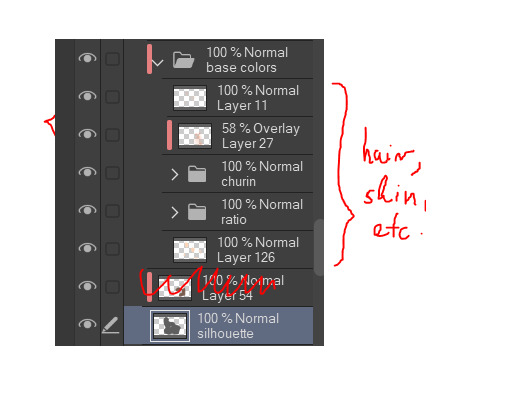
Shading:
This is extremely tricky and I cannot give a standardized process for this, but I'll attempt to do so. There are much better ways to do this I'm sure, the one I entail on forward is a bit time consuming (but it might only be a personal thing as I tend to over-render)
My method:
For a simplified method, skip all the purple colored parts of text.
We are going to continue working here:
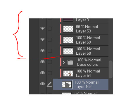
I fill a separate layer with all black, and set the layer to color mode. This is to help us see the values better. Should we play around with contrast, brightness, focus points etc.
Then, with a layer, set to multiply mode, I begin shading shadows. Can be grey for now.
After I'm done, I use a layer to block out bright parts, with white. It makes it very dramatic, bless. (You can use different colors for this of course, I just keep this specifically very bright.)
Additionally, make a separate layer, use it for reflection lights with a lightish gray.
Adjust, add, tweak layers to ensure your overall image meets your expectations, including background. Most of the times, I even additionally paint a complete image by blocking out bigger shapes (messy and undefined) to see how the values should match in this stage.
Simplified demonstration:
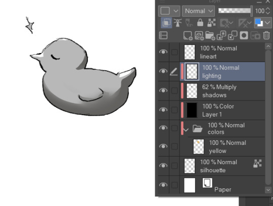
We'll come back to these layers later.
Hide the previous black color layer. We now have colors again, but it's all so muddy.

Therefore, we alpha lock our previous layers of shading, and fill it over with colors. Unsatisfied by any colors? Use the Hue/Saturation/Brightness sliders or add a new correction layer. Important thing to note that you can use other colors than this purple/blue one in the image below for the multiply layer.
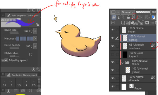
I use correction layers unapologetically. My favourite is Tone Curve + Gradient Map.
Naturally, I have a lot more layers than this in the demonstrated picture, such as Overlay layers to emphasize focus points or further darkening parts with multiply layers, etc. I do most of the hard work during rendering stage! Excuse me for the low effort rubber duck also hahah. Here's a closer example for what I usually do:
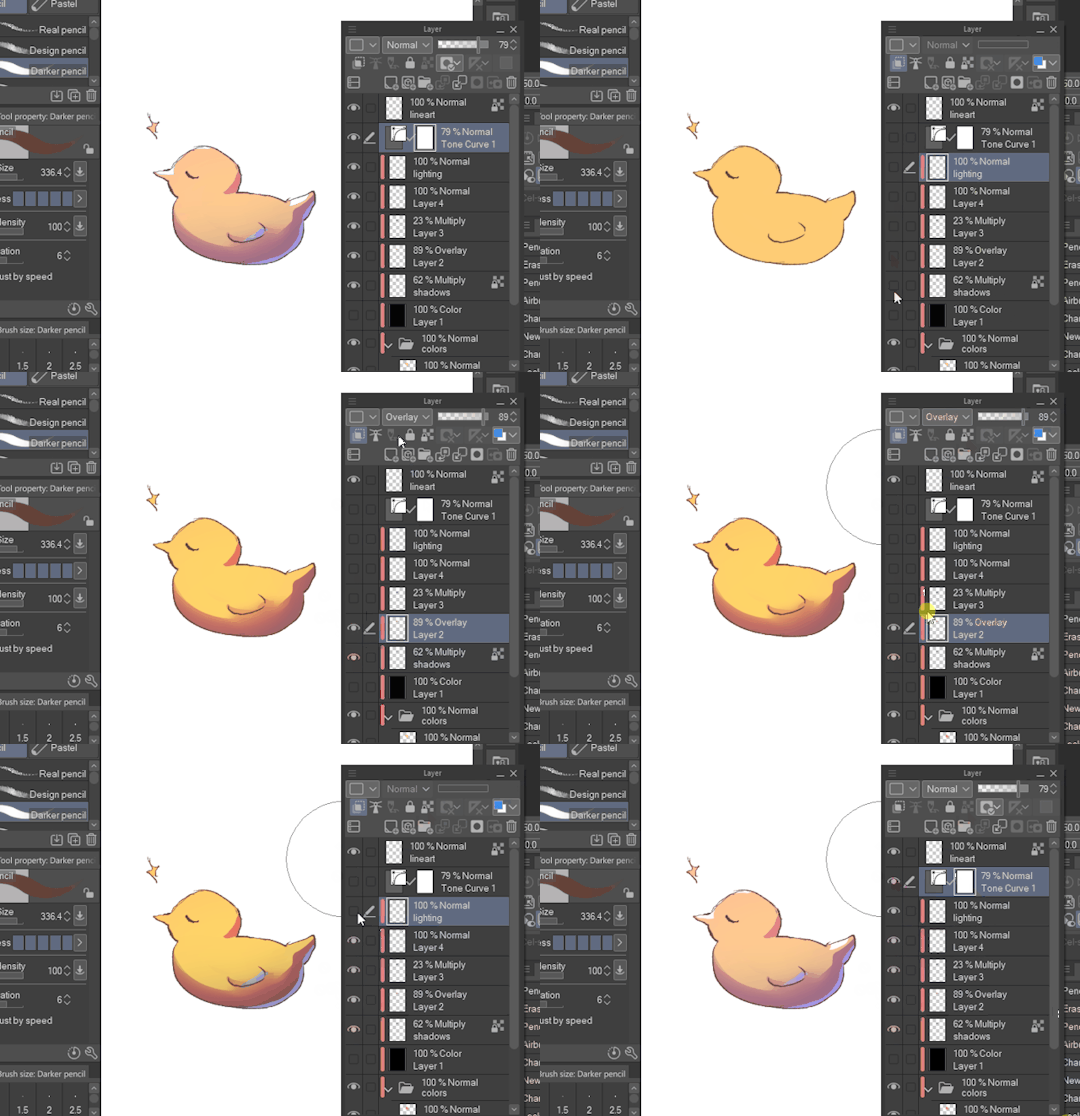
All we got left to do is Rendering (painting over mistakes) and Effects. I cannot give much advice on Rendering, it's pretty much the same as in traditional art.
Effects:
I sometimes leave little speckles/sparkles over my art to make it more detailed.
After, there can be correction layers, simply to adjust the final look.
I usually save the image as png or jpg (or in CSP case, merge all visible layers to a new layer) and add noise.
Sometimes, when I just want to post a sketch I add a 3d effect but in Photoshop. It helps a bit in faking extra details.
That's the end of my process! I hope this proved of help, and I wish you a smooth journey :D In the future, I can post timeline speed paints, if there is interest.
My other related threads are this (on my process) and this (on mindset and learning).
You can see me working in action through gifs here. (The gifs include extra planning stages (mentioned in the previous 'on my process' thread, but they follow the same principles I mentioned.)
----
Another note: it is possible to get a cracked version of CSP, which I won't entail because of account safety reasons, but if you research it, a pointer I can give is that the distributor's name starts with 'o'.
#if there's any related questions feel free to send more#thanks for the ask!#art guide#asks#art tutorial
21 notes
·
View notes